
4. Creating a Page Layout
• The basics of webpage design
• How to create design thumbnails and wireframes
• How to insert and format new components into a predefined CSS layout
• How to use the Code Navigator to identify CSS formatting
• How to check for browser compatibility
Whether you use thumbnails and wireframes or just a vivid imagination, Dreamweaver can quickly turn design concepts into complete, standards-based CSS layouts.
Web design basics
Before you begin any web design project for yourself or for a client, there are three important questions you need to answer:
• What is the purpose of the website?
• Who is the customer?
• How do they get here?
What is the purpose of the website?
Will the website sell or support a product or service? Is your site for entertainment or games? Will you provide information or news? Will you need a shopping cart or database? Do you need to accept credit card payments or electronic transfers? Knowing the purpose of the website tells you what type of content you’ll be developing and working with and what types of technologies you’ll need to incorporate.
Who is the customer?
Are the customers adults, children, seniors, professionals, hobbyists, men, women, everyone? Knowing who your market will be is vital to the overall design and functionality of your site. A site intended for children probably needs more animation, interactivity, and bright engaging colors. Adults will want serious content and in-depth analysis. Seniors may need larger type and other accessibility enhancements.
A good first step is to check out the competition. Is there an existing website performing the same service or selling the same product? Are they successful? You don’t have to mimic others just because they’re doing the same thing. Look at Google and Yahoo. They perform the same basic service, but their site designs couldn’t be more different from one another.
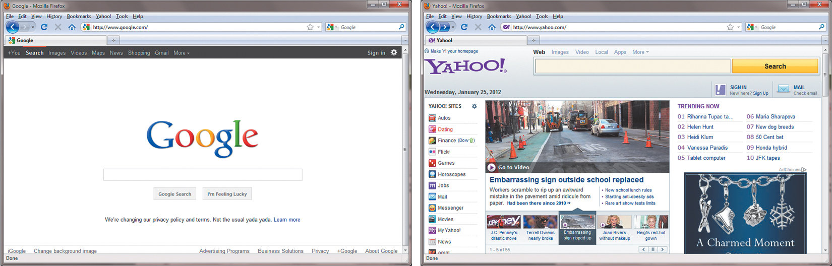
Could two sites be more different than Google and Yahoo? Yet they both perform the same service.
How do they get here?
This sounds like an odd question when speaking of the Internet. But, just as with a brick-and-mortar business, your online customers can come to you in a variety of ways. For example, are they accessing your site on a desktop computer, laptop, tablet, or cell phone? Are they using high-speed Internet, wireless, or dial-up service? What browser do they most like to use, and what is the size and resolution of the display? These answers will tell you a lot about what kind of experience your customers will expect. Dial-up and cell phone users may not want to see a lot of graphics or video, while users with large flat-panel displays and high-speed connections may demand as much bang and sizzle as you can send at them.
So, where do you get this information? Some you’ll have to get through painstaking research and demographic analysis. Some you’ll get from educated guesses based on your own tastes and understanding of your market. But a lot of it is actually available on the Internet itself. W3Schools, for one, keeps track of tons of statistics regarding access and usage, all updated regularly:
• w3schools.com/browsers/browsers_stats.asp: Provides more information about browser statistics.
• w3schools.com/browsers/browsers_os.asp: Gives the breakdown on operating systems. In 2011, they started to track the usage of mobile devices on the Internet.
• w3schools.com/browsers/browsers_display.asp: Lets you find out the latest information on the resolutions, or size, of screens using the Internet.
If you are redesigning an existing site, your web hosting service itself may provide valuable statistics on historical traffic patterns and even the visitors themselves. If you host your own site, third-party tools are available, like Google Analytics and Adobe Omniture, which you can incorporate into your code to do the tracking for you for free or for a small fee.
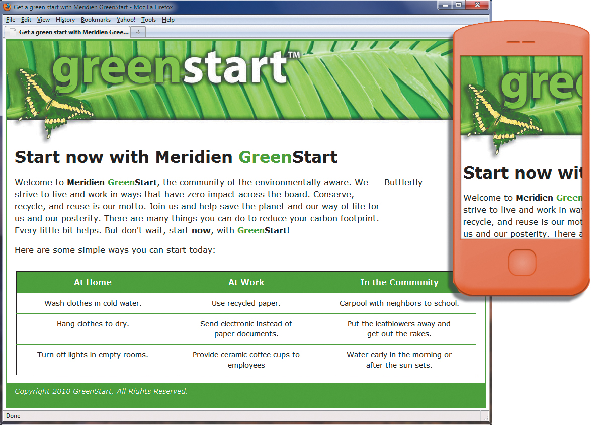
When you boil down all the statistics, this is what you will find as of the beginning of 2012. Windows (80 to 90 percent) dominates the Internet, with most users divided almost equally between Firefox (37 percent) and Google Chrome (33 percent), with various versions of Internet Explorer (22 percent) taking third position. The vast majority of browsers are set to a resolution higher than 1024 pixels by 768 pixels. If it weren’t for the growth in usage of cell phones and smartphones for accessing the Internet, these statistics would be great news for most web designers and developers. Designing a website that can look good and work effectively for both flat-panel displays and cell phones is a tall order.
Each day, more people are using cell phones and other mobile devices to access the Internet. Some users may use them now to access the Internet more frequently than they use desktop computers. This presents a nagging problem to web designers. For one thing, cell phone screens are a fraction of the size of even the smallest flat-panel display. How do you cram a two- or three-column page design into a meager 200 to 300 pixels? Another problem is that many device manufacturers have decided to follow Apple’s decision to drop support for Flash-based content on their mobile devices. Keep all these statistics in mind as you go through the process of designing your site.
Many of the concepts of print design are not applicable to the web, because you are not in control of the user’s experience. A page carefully designed for a typical flat panel is basically useless on a cell phone.
Scenario
For the purposes of this book you will be working to develop a website for Meridien GreenStart, a fictitious community-based organization dedicated to green investment and action. This website will offer a variety of products and services and require a broad range of webpage types, including dynamic pages using server-based technologies like PHP.
Your customers come from a broad demographic including all ages and education levels. They are people who are concerned about environmental conditions and who are dedicated to conservation, recycling, and the reuse of natural and human resources.
Your marketing research indicates that most of your customers use desktop computers or laptops, connecting via high-speed Internet services, but that you can expect 10 to 20 percent of your visitors via cell phone and other mobile devices.
Working with thumbnails and wireframes
The next step, after you have nailed down the answers to the three questions about your website purpose, customer demographic, and access model, is to determine how many pages you’ll need, what those pages will do, and finally, what they will look like.
Creating thumbnails
Many web designers start by drawing thumbnails with pencil and paper. Think of thumbnails as a graphical shopping list of the pages you’ll need to create for the website. Thumbnails can also help you work out the basic website navigation structure. Draw lines between the thumbnails showing how your navigation will connect them.
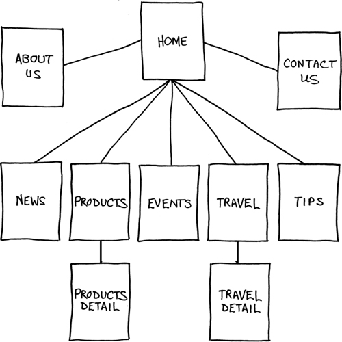
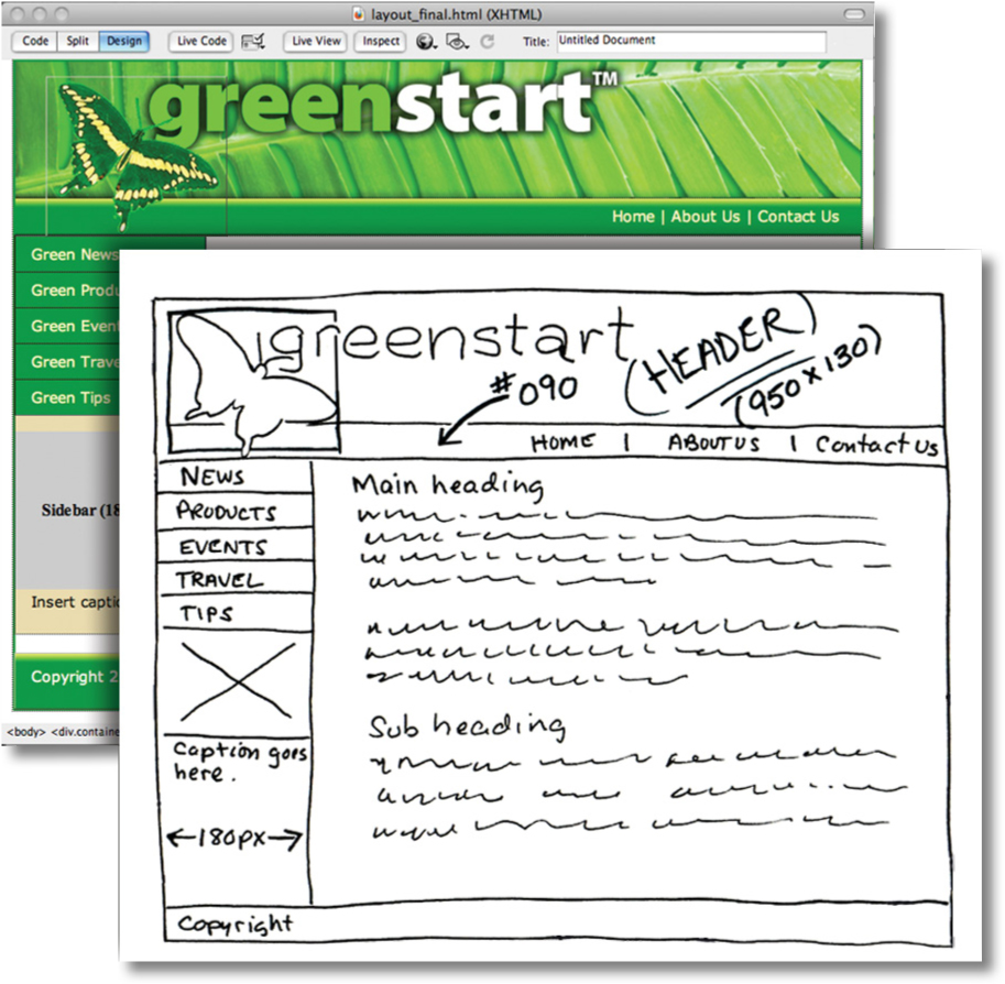
Thumbnails list the pages that need to be built and how they are connected to each other.
Most sites are divided into levels. Typically, the first level includes all the pages in your main navigation menu, the ones a visitor can reach directly from the home page. The second level includes pages you can reach only through specific actions or from specific locations, say from a shopping cart or product detail page.
Creating a page design
Once you’ve figured out what your site needs in terms of pages, products, and services, you can then turn to what those pages will look like. Make a list of components you want on each page, such as headers and footers, navigation, and areas for the main content and the sidebars (if any). Put aside any items that won’t be needed on every page. What other factors do you need to consider?
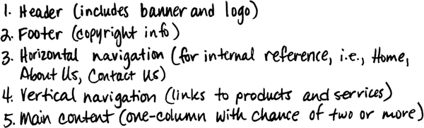
Identifying the essential components for each page helps in creating an effective page design and structure that will meet your needs.
Do you have a company logo, business identity, graphic imagery, or color scheme you want to accent? Do you have publications, brochures, or current advertising campaigns you want to emulate? It helps to gather them all in one place so you can see everything all at once on a desk or conference table. If you’re lucky, a theme will rise organically from this collage.
Once you’ve created your checklist of the components that you’ll need on each page, sketch out several rough layouts that work for these components. Most designers settle on one basic page design that is a compromise between flexibility and sizzle. Some site designs may naturally lean toward using more than one basic layout. But resist the urge to design each page separately. Minimizing the number of page designs may sound like a major limitation, but it’s key to producing a professional-looking site. It’s the reason why some professionals, like doctors and airline pilots, wear uniforms. Using a consistent page design, or template, lends a sense of professionalism and gives confidence to your visitor.
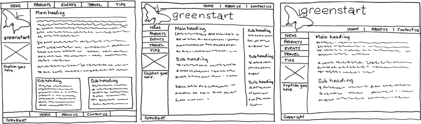
Wireframes allow you to experiment with page designs quickly and easily without wasting time with code.
While you figure out what your pages will look like, you’ll have to address the size and placement of the basic components. Where you put a component can drastically affect its impact and usefulness. In print, designers know that the upper-left corner of a layout is considered one of the “power positions,” a place where you want to locate important aspects of a design, such as a logo or title. This is because in western culture we read from left to right, top to bottom. The second power position is the lower-right corner because this is the last thing your eyes will see when you’re finished reading.
Unfortunately, in web design this theory doesn’t work so well because of one simple reason: You can never be certain how the user is seeing your design. Are they on a 20-inch flat panel or a 2-inch cell phone?
In most instances, the only thing you can be certain of is that the user can see the upper-left corner of any page. Do you want to waste this position by slapping the company logo here? Or, make the site more useful by slipping in a navigation menu? This is one of the key predicaments of the web designer. Do you go for design sizzle, workable utility, or something in between?
Creating wireframes
After you pick the winning design, wireframing is a fast way to work out the structure of each page in the site. A wireframe is like a thumbnail, but bigger, that sketches out each page and fills in more details about the components, such as actual link names and main headings. This step helps to catch or anticipate problems before you smack into them when working in the code.
The wireframe for the final design should identify the components and feature markup for content, color, and dimensions.
Once the basic concepts are worked out, many designers take an extra step and create a full-size mockup or “proof of concept” using a program like Adobe Fireworks, Photoshop, or even Illustrator. It’s a handy thing to do because you’ll find that some clients just aren’t comfortable giving an approval based only on pencil sketches. The advantage here is that all these programs allow you to export the results to full-size images (JPEG, GIF, or PNG) that can be viewed in a browser. Such mockups are as good as seeing the real thing but may take only a fraction of the time to produce.
In some cases, creating a mockup in Photoshop, Fireworks, or Illustrator can save hours of tedious coding to receive a needed approval.
For years, designers have started the design process in Fireworks, where they can create a fully functional mockup (with menus, links, and hotspots) that can then be exported to a CSS-based HTML layout and then edited in Dreamweaver.
Defining a Dreamweaver site
From this point forward, the lessons in this book function within a Dreamweaver site. You will create webpages from scratch and use existing files and resources that are stored on your hard drive, which combined make up what’s called your local site. When you are ready to upload your site to the Internet (see Lesson 15, “Publishing to the Web”), you publish your completed files to a web host server, which then becomes your remote site. The folder structures and files of the local and remote sites are usually mirrors of each other.
First, let’s set up your local site:
1. Launch Adobe Dreamweaver CS6, if necessary.
2. Choose Site > New Site. The Site Setup dialog box appears.
If you’ve used any previous version of Dreamweaver, you will notice that the Site Setup dialog box has been slightly redesigned. Along with the options for creating a standard Dreamweaver site, the dialog offers the ability to create a site based on the services offered by Adobe Business Catalyst. Business Catalyst is an online, hosted application that allows you to build and manage rich, dynamic web-based businesses. To learn more about the capabilities of Business Catalyst, check out www.BusinessCatalyst.com.
To create a standard website in Dreamweaver CS6, you need only name it and select the local site folder. Site names typically relate to a specific project or client and will appear in the Files panel. This name is intended for your own purposes, so there are no limitations to the name you can choose. It’s a good idea to use a name that clearly describes the purpose of the website.
3. In the Site Name field, type DW-CS6.
4. Next to the Local Site Folder field, click the folder ( ) icon. When the Choose
Root Folder dialog box opens, navigate to the DW-CS6 folder containing the lesson files you copied from the Adobe Dreamweaver CS6 Classroom in a Book CD and click Select/Choose.
You could click Save at this time and begin working on your new website, but we’ll add one more piece of handy information.
5. Click the arrow ( ) next to the Advanced Settings category to reveal the tabs listed there. Select the Local Info category.
Although it’s not required, a good policy for site management is to store different file types in separate folders. For example, many websites provide individual folders for images, PDFs, video, and so on. Dreamweaver assists in this endeavor by including an option for a Default Images folder. Later, as you insert images from other places on your computer, Dreamweaver will use this setting to automatically move the images into the site structure.
6. Next to the Default Images Folder field, click the folder () icon. When the dialog box opens, navigate to the DW-CS6/images folder containing the files you copied from the Adobe Dreamweaver CS6 Classroom in a Book CD and click Select/Choose.
You’ve entered all the information required to begin your new site. In subsequent lessons, you’ll add more information to enable you to upload files to your remote site and test dynamic webpages.
7. In the Site Setup dialog box, click Save.
The site name DW-CS6 now appears in the site list pop-up menu in the Files panel.
Setting up a site is a crucial first step in beginning any project in Dreamweaver. Knowing where the site root folder is located helps Dreamweaver determine link pathways and enables many site-wide options, such as Find and Replace.
Using the Welcome screen
The Dreamweaver Welcome screen provides quick access to recent pages, easy creation of a range of page types, and a direct connection to several key Help topics. The Welcome screen appears when you first start the program or when no other documents are open. Let’s use the Welcome screen to explore ways to create and open documents.
1. In the Create New column of the Welcome screen, click HTML to create a new, blank HTML page instantly.
The Welcome screen reappears.
3. In the Open A Recent Item section of the Welcome screen, click the Open button. This allows you to browse for files to open in Dreamweaver. Click Cancel.
The Welcome screen shows you a list of up to nine of your recently opened files; however, your installation may not display any used files at this point. Choosing a file from this list is a quick alternative to choosing File > Open when you want to edit an existing page you have recently opened or created.
You will use the Welcome screen several times in this book. When you’ve completed the lessons in this book, you may prefer not to use the Welcome screen or even see it. If so, you can disable it by selecting the Don’t Show Again option in the lower left of the window. You can re-enable the Welcome screen in the General category of the Dreamweaver Preferences panel.
Previewing your completed file
To understand the layout you will work on in this lesson, preview the completed page in Dreamweaver.
1. In Dreamweaver CS6, press F8/Shift-Cmd-F to open the Files panel, and select DW-CS6 from the site list.
2. In the Files panel, expand the Lesson04 folder.
3. Double-click layout_finished.html to open it.
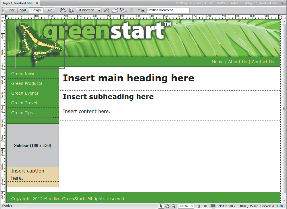
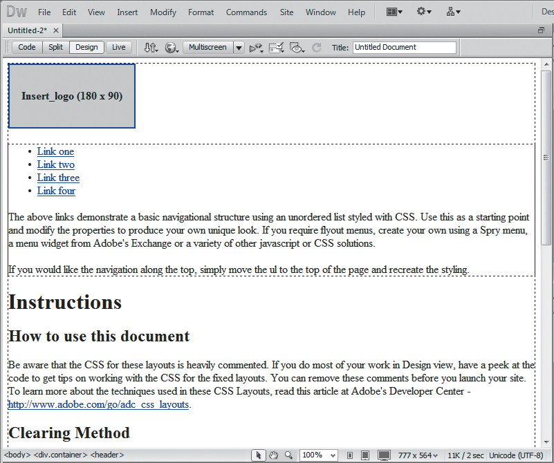
This page represents the completed layout you will create in this lesson. It is based on the wireframe drawings made earlier in this lesson and uses one of the new HTML5 CSS layouts available in Dreamweaver. Take a few moments to familiarize yourself with the design and components on the page. Can you determine what makes this layout different from existing HTML 4-based designs? You will learn the differences as you work through this lesson.
4. Choose File > Close.
Modifying an existing CSS layout
The predefined CSS layouts provided by Dreamweaver are always a good starting point. They are easy to modify and adaptable to most projects. Using a Dreamweaver CSS layout, you will create a proof-of-concept page to match the final wireframe design. This page will then be used to create the main project template in subsequent lessons. Let’s find the layout that best matches the wireframe.
If for some reason you can’t or don’t want to use an HTML5-based layout, see the sidebar “Alternate HTML 4 workflow” later in this lesson.
1. Choose File > New.
2. Choose Blank Page > HTML in the New Page dialog box.
Dreamweaver CS6 offers 16 standard HTML 4 layouts and two HTML5 CSS layouts. Although the HTML5 layouts use some of the new semantic content elements, they are nearly identical to the HTML 4 designs. Unless you need to support an installed base of older browsers (like IE5 & 6), there’s little to worry about using the newer layouts. Let’s choose one of the HTML5 layouts that best fits the needs of the new site.
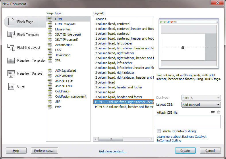
The layout “HTML5: 2 column fixed, right sidebar, header and footer” has the most in common with the target design. The only difference is that the sidebar element is aligned to the right of the layout instead of to the left. You will align this element to the left later in this lesson.
3. Select HTML5: 2 column fixed, right sidebar, header and footer from the layout list. Click Open/Create.
4. Switch to Design view, if necessary.
5. Insert the cursor anywhere in the page content. Observe the names and order of the tag selectors at the bottom of the document window.
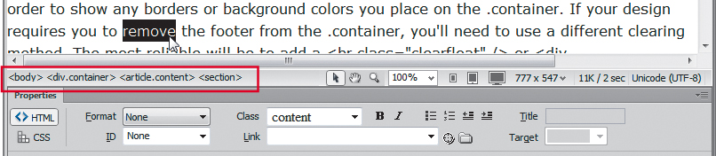
The display order of elements in the tag selector directly correlates to the page’s code structure. Elements appearing to the left are parents, or containers, of all elements to the right. The element farthest to the left is the highest in the page structure. As you can see, the <body> element is highest and <div.container> is second.
As you click around the page sections, you will be able to determine the HTML structure without having to delve into the Code view window at all. In many ways, the tag selector interface makes the job of identifying the HTML skeleton much easier, especially in complex page designs.
The page consists of four main content elements, three subsections, and a single element that wraps around all the others. All but one of these are new HTML5 elements, including <header>, <footer>, <nav>, <aside>, <article>, and <section>. The only <div> elements in this layout are being used to hold the sidebar content and to hold everything together. Using these new elements means that you can apply complex CSS styling while reducing the complexity of the code overall. You can still use class and id attributes, but the new semantic elements reduce the need for this technique.
To understand exactly how much this design depends on CSS, it’s sometimes a good idea to shut off CSS styling.
6. Choose View > Style Rendering > Display Styles to disable CSS styling in Design view.
Style display is typically on by default (showing a check mark in the menu). By clicking this option in the menu, you’ll toggle CSS styling off temporarily.
7. Note the identity and order of each page component.
Without CSS, the HTML skeleton is exposed for all to see. It’s instructive to know what the page will look like if somehow the cascading style sheet is disabled or not supported by a particular browser. Now it’s easier to identify the page components and their structure. Although it is not strictly required, items that display higher on the page, like <header>, usually are inserted before other elements that appear lower, like <footer>.
Another important aspect you should notice is the navigation menu. Without the CSS styling, the navigation menu reverted back to a simple bulleted, or unordered, list with hyperlinks. Not too long ago this menu would have been built with images and complex rollover animation. If the images failed to load, the menu usually became a jumbled, unusable mess. The hyperlinks continued to work, but without the images there were no words to tell the user what they were clicking. But navigation built on text-based lists, on the other hand, will always be usable, even without styling.
8. Choose View > Style Rendering > Display Styles to turn on CSS styling again.
It’s a good idea to get into the habit of saving files before you modify any settings or add content. Dreamweaver doesn’t offer a backup or recovered-file feature; if it crashes before you save, all your work in any open, unsaved file will be lost. Get into the habit of saving your files on a regular basis. It will prevent the loss of data and important changes to your files.
9. Choose File > Save. In the Save As dialog box, navigate to the site root folder, if necessary. Name the file mylayout.html and click Save.
Dreamweaver normally saves HTML files to the default folder specified in the site definition, but it’s a good idea to double-check the destination to make sure your files end up in the right place. All HTML pages created for the final site will be saved in the site root folder.
Adding a background image to the header
CSS styles are the current standard for all web styling and layout. In the following exercises, you’ll apply background colors and a background image to a page section, adjust element alignment and the page width, and modify several text properties. All these changes are accomplished using Dreamweaver’s CSS Styles panel.
If you start at the top of the page and work down, the first step would be to insert the graphical banner that appears in the final design. You could insert the banner directly into the header, but adding it as a background image has the advantage of leaving that element open for other content. It will also allow the design to be more adaptable to other applications, like cell phones and mobile devices.
1. Select the image placeholder Insert_logo (180x90) in the header. Press Delete.
When you delete the image placeholder, the empty header will collapse to a fraction of its former size because it has no CSS height specification.
2. Choose Window > CSS Styles to display the CSS Styles panel, if necessary.
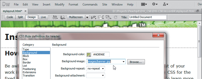
3. In the CSS Styles panel, double-click the header rule to edit it.
The “CSS Rule Definition for header” dialog box appears.
4. In the Background category of the “CSS Rule Definition for header” dialog box, click the Browse button next to the Background-image field.
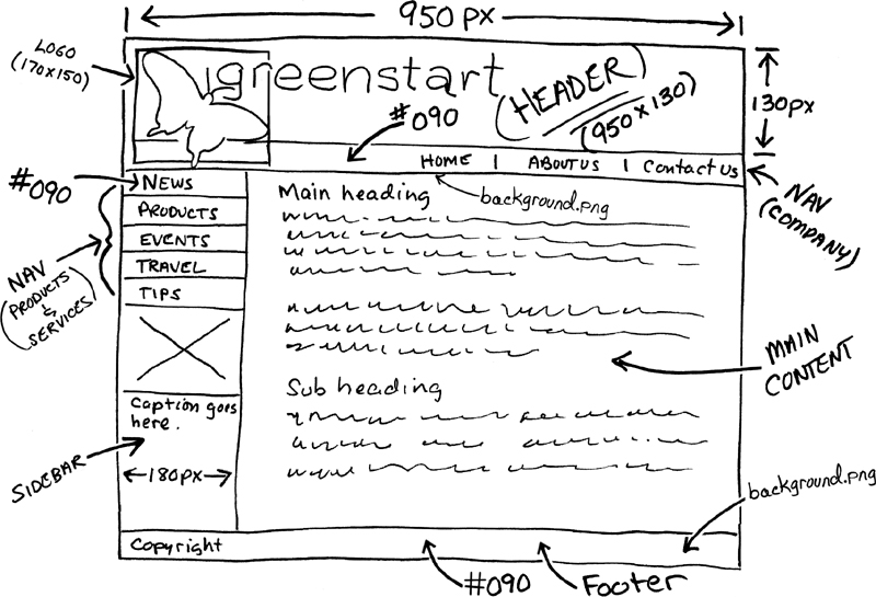
5. Select banner.jpg and note the dimensions of the image in the preview.
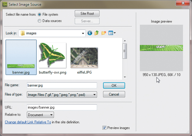
The image is 950 by 130 pixels.
6. Click OK/Choose to select the background image.
Background images repeat both vertically and horizontally by default. This isn’t a problem at the moment, but to ensure that this setting doesn’t cause any undesirable effects in the future, you’ll need to change the repeat behavior.
7. Choose no-repeat from the Background-repeat menu.
8. Click Apply to view the results.
The header is wide enough but not tall enough to display the entire background image. Since background images aren’t truly inserted into an element, they have no effect (positive or negative) on the size of a container. To ensure that the <div> is large enough to display the entire image, you need to add a height specification to the header rule.
9. In the Box category, type 130 in the Height field and choose px from the pop-up menu to the right of the Height field. Click Apply.
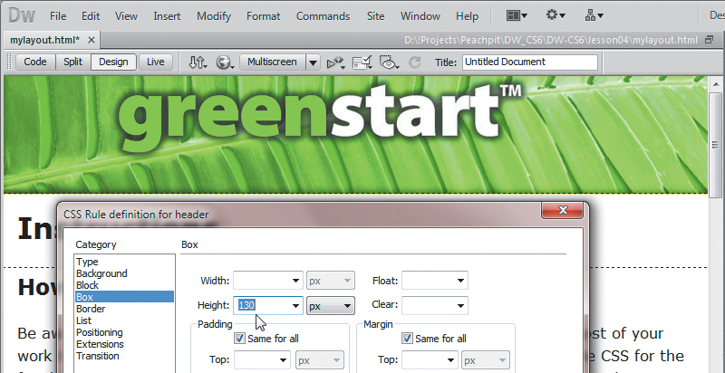
The background appears fully in the <header> element. Note that the image is slightly narrower than the container. We’ll adjust the width of the layout later. We don’t want to set the width on the <header> element itself. You learned in Lesson 3 that the width of block elements, like <header>, defaults to the entire width of their parent element. Before clicking OK, we need to add some finishing touches to the element.
The <header> element contains a background color that doesn’t match your site color scheme. Let’s apply one that does.
10. In the Background category, type #090 in the Background-color field. Click OK.
You won’t see the background color unless the background image fails to load.
11. Choose File > Save.
Inserting new components
The wireframe design shows two new elements that don’t exist in the current layout. The first contains the butterfly image, the second the horizontal navigation bar. Did you notice that the butterfly actually overlaps both the header and the horizontal navigation bar? There are several ways to achieve this effect. In this case, an absolutely positioned (AP) <div> will work nicely.
1. Insert the cursor into the header, if necessary. Select the <header> tag selector. Press the Left Arrow key.
This procedure should insert the cursor before the opening <header> tag. If you had pressed the Right Arrow key, the cursor would move outside the closing </header> tag instead. Remember this technique—you’ll use it frequently in Dreamweaver when you want to insert the cursor in a specific location before or after a code element without resorting to Code view.
2. Choose Insert > Layout Objects > AP Div.
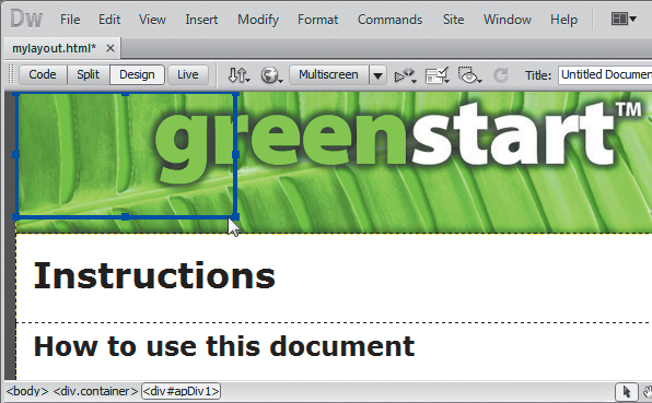
An AP div will appear at the top left of the header. Note the ID (#apDiv1) assigned to the new div in the tag selector. A corresponding rule has been added to the CSS Styles panel.
In previous versions of HTML, an AP div would have been assigned its size and position using inline HTML attributes. In a concession to new CSS-based web standards, these specifications are now applied by CSS via a unique ID created by Dreamweaver at the moment you insert the element.
AP divs were used extensively in the past to create highly structured, fixed-layout web designs. This technique has declined dramatically in recent years as the need to support cell phones and other mobile devices has increased. For certain applications, AP divs are still handy.
3. Click the <div#apDiv1> tag selector.
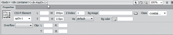
The Property inspector displays the specifications for <div#apDiv1>. Note the element’s width and height. Another property to be aware of is the z-index. This setting determines whether the element displays above or below another object. By default, all elements have a z-index of zero (0). On the other hand, the AP div has a z-index of 1, which means it will appear above all the other elements on the page. All the values displayed in the Property inspector are actually stored in the #apDiv1 rule that was generated automatically by Dreamweaver.
4. Insert the cursor into <div#apDiv1>.
5. Choose Insert > Image. Select butterfly-ovr.png from the images folder. Observe the dimensions of the image: 170 pixels by 158 pixels.
The Image Tag Accessibility Attributes dialog box appears.
7. Type GreenStart Logo in the Alternate text field in the Image Tag Accessibility Attributes dialog box. Click OK.
The butterfly appears in the AP div.
You’ll notice that the AP div is slightly wider than the butterfly image. Although the extra space shouldn’t cause any trouble, it’s a good idea to match the dimensions of the container to the image.
8. Double-click the #apDiv1 rule in the CSS Styles panel.
The “CSS Rule definition for #apDiv1” dialog box appears.
9. In the Box category, change the width to 170 px. Change the height to 158 px.
The <div> dimensions now match the height and width of the image.
10. Deselect the Same For All check boxes for Margins.
11. Type 10 px in the Top margin field. Type 30 px in the Left margin field. Click OK.
When the rule definition dialog box vanishes, <div#apDiv1> appears floating over the header, 10 pixels from the top and 30 pixels to the left of its original position.
An AP div acts like a free agent. It ignores the other page components and can even be positioned above or below other <div> elements and content.
The <div#apDiv1> is complete. Now, let’s add another new component that will hold the horizontal navigation shown in the site design specs. The vertical navigation menu will hold links to the organization’s products and services. The horizontal navigation will be used to link back to the organization’s home page, mission statement, and contact information.
In HTML 4, you probably would have inserted the links into another <div> element and used a class or id attribute to differentiate it from the other <div> elements in the file. Instead, HTML5 provides a new element geared specifically toward such components: <nav>.
12. Insert the cursor back into the header. Click the <header> tag selector. Press the Right Arrow key.
The cursor should now appear after the ending </header> tag.
13. Press Ctrl-T/Cmd-T to activate the Tag Editor.
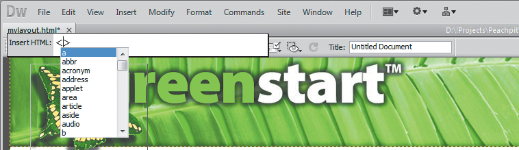
The Tag Editor appears, allowing you to add HTML components or edit existing tags without having to switch to Code view.
The <nav> element is new in HTML5. If you need to use HTML 4 code and structures, see the sidebar “Alternate HTML 4 workflow” earlier in this lesson.
14. Type nav. Press Return/Enter as necessary to complete the tag.
An empty <nav> element has been inserted into the code, and the cursor has been inserted within this element—ready for you to enter any content.
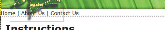
15. In the Property inspector, select Paragraph from the Format pop-up menu. Type Home | About Us | Contact Us in the new <p> element as placeholders for navigation links.
You will convert these to actual hyperlinks in Lesson 9, “Working with Navigation.” For now, let’s create a new CSS rule to format this element.
16. Select the <p> tag selector at the bottom of the document window.
17. In the CSS Styles panel, click the New CSS Rule button.
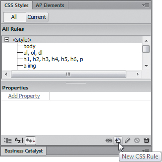
18. If necessary, select Compound from the Selector Type menu.
The Selector Name window should display .container nav p.
19. Click the Less Specific button to remove the notation .container from the selector name.
The Selector Name window should display nav p.
20. Click OK to create the rule.
The “CSS Rule Definition for nav p” dialog box should appear.
21. In the Type category, type 90 in the Font-size field and select the percentage sign (%) from the pop-up list. Type #FFC in the Color field. Select Bold from the Font-weight field.
22. In the Background category, type #090 in the Background-color field.
23. In the Block category, select Right from the Text-align field.
24. In the Box category, deselect the Same For All check box for Padding. Enter 5 px in the Top padding field. Enter 20 px in the Right padding field. Enter 5 px in the Bottom padding field.
To enter separate values in the Bottom field, remember to deselect the Same For All check boxes in each section first.
25. In the Border category, deselect the Same For All check boxes for Style, Width, and Color. Enter the following values only in the corresponding Bottom border fields: solid, 2 px, #060.
26. Click OK in the CSS Rule Definition dialog box. Press Ctrl-S/Cmd-S to save the file.
The new <nav> element appears below the header fully formatted and filled with your placeholder text aligned to the right.
Changing element alignment
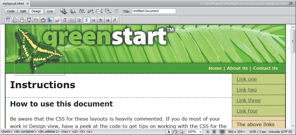
The proposed design calls for the sidebar to appear on the left side of the layout, but this layout puts it on the right. Dreamweaver does offer HTML 4 layouts that match the design criteria much more closely, but it was hard to resist working with an HTML5 layout and all the new semantic elements. Besides, adjusting the layout is a lot easier than you may think.
1. In Design view, insert the cursor anywhere in the right sidebar.
2. Click the Code Navigator ( ) icon, or right-click in the sidebar and select the Code Navigator option from the context menu.
The Code Navigator window opens, displaying all CSS rule names that may affect the selected element.
3. Identify the rule that aligns the sidebar to the right.
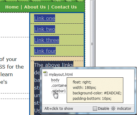
The obvious culprit is the .sidebar1 rule, which contains the declaration float: right.
4. In the CSS Styles panel, double-click the .sidebar1 rule to edit it.
5. In the Box category, change the float property from right to left.
6. Click Apply to preview the change.
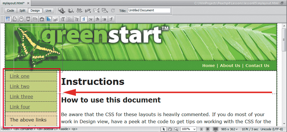
The sidebar moves to the left side of the layout.
7. Click OK and save the file.
Modifying the page width and background color
Before you convert this file into the project template, let’s tighten up the formatting and the placeholder content. For example, the overall width has to be modified to match the banner image. Before you can adjust the width, you’ll first have to identify the CSS rule that controls the page width.
1. If necessary, select View > Rulers > Show or press Alt-Ctrl-R/Opt-Cmd-R to display the rulers in the Design window.
You can use the rulers to measure the width and height of HTML elements or images. The orientation of the rulers defaults to the upper-left corner of the Design window. To give you more flexibility, you can set this zero point anywhere in the Design window.
2. Position the cursor over the axis point of the horizontal and vertical rulers. Drag the crosshairs to the upper-left corner of the header element in the current layout. Note the width of the layout.
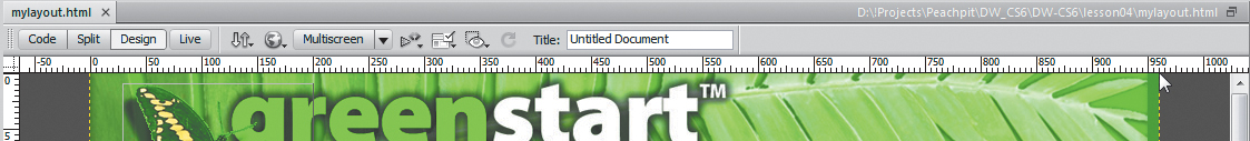
Using the ruler, you can see that the layout is between 960 and 970 pixels wide.
3. Insert the cursor into any content area of the layout.
Observe the tag selector display to locate any elements that may control the width of the entire page; it would have to be an element that contains all the other elements. The only elements that fit this criterion are <body> and <div.container>.
4. Click the Code Navigator () icon, or right-click in the sidebar and select Code Navigator from the context menu.
The Code Navigator window opens, displaying all CSS rule names that may affect the selected element.
5. Move the cursor over the body and .container rules to locate the specification that may control the page width.
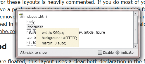
Can you identify the rule that controls the width of the entire page? The .container rule contains the declaration width: 960px. By now you should be getting good at CSS forensics using the tag selector interface and the Code Navigator.
6. Double-click the .container rule in the CSS Styles panel.
7. In the Box category, change the width to 950 px. Click OK.
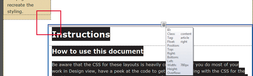
The <div.container> element now matches the width of the banner image, but you may have experienced an unintended consequence when you changed the overall width. In our example, the main content area shifted down below the sidebar. To understand what happened, you’ll have to do a quick investigation.
8. In the CSS Styles panel, click the .content rule and check its properties. Note its width: 780 pixels.
9. Click the .sidebar1 rule and check its width: 180 pixels.
Combined, the two <div> elements total 960 pixels, the same as the original layout width. The elements are too wide to sit side by side in the main container and thereby prompted the unexpected shift. This type of error is common in web design and is easily fixed by adjusting the width of either of the two child elements.
10. Click the .content rule in the CSS Styles panel. In the Properties section of the panel, change the width to 770 px.
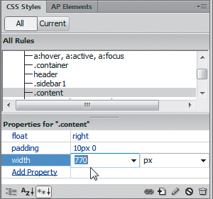
The <div.content> element returns to its intended position. This was a good reminder that the size, placement, and specifications of page elements have important interactions that can affect the final design and display of your elements and of the entire page.
The current background color of the page detracts from the overall design. Let’s remove it.
11. Double-click the body rule. In the Background category, change the Background-color to #FFF. Click OK.
Note that the absence of the background color gives the impression that the page’s content area drifts off into the wide expanse. You could give <div.container> a different background color, or you could simply add a border to give the content elements a definitive edge. For this application, a thin border makes the most sense.
12. Double-click the .container rule. In the Border category, if necessary select the Same For All check boxes and enter the following values for all border fields: solid, 2px, and #060. Click OK.
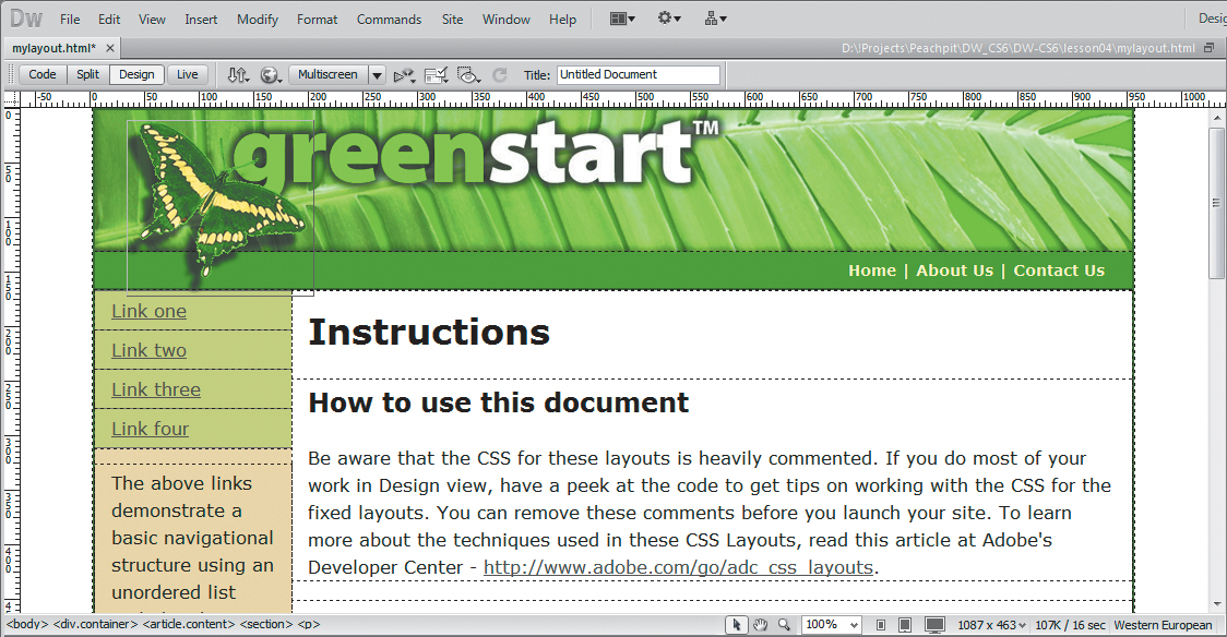
A dark green border appears around the page edge.
13. Save the file.
Modifying existing content and formatting
As you can see, the CSS layout comes equipped with a vertical navigation menu. The generic hyperlinks are simply placeholders waiting for your final content. Let’s change the placeholder text in the menu to match the pages outlined in the thumb-nails created earlier, and modify the colors to match the site color scheme.
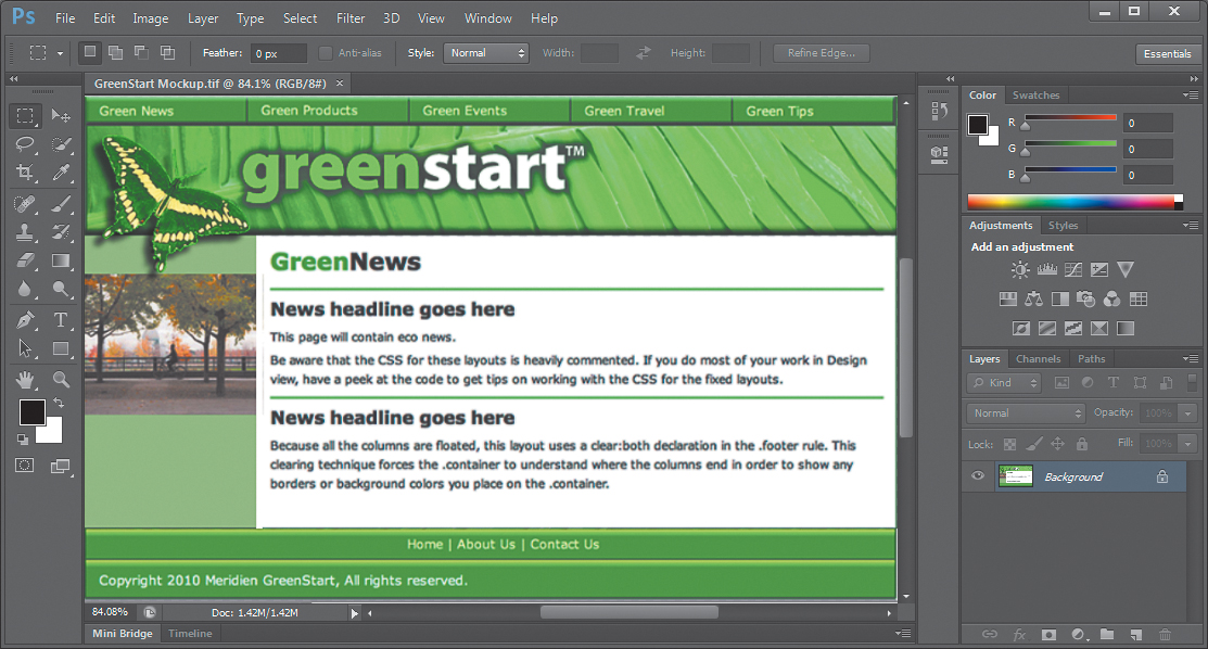
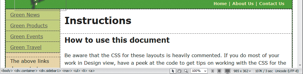
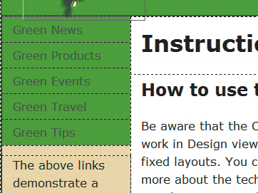
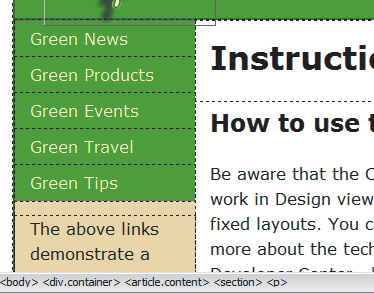
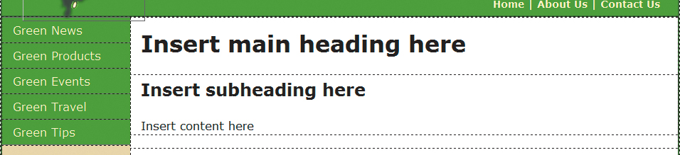
1. Select the placeholder text Link one in the first menu button. Type Green News. Change Link two to read Green Products. Change Link three to read Green Events. Change Link four to read Green Travel.
One of the advantages of using bulleted lists as navigational menus is that it’s easy to insert new links.
2. With the cursor still at the end of the words Green Travel, press Enter/Return. Type Green Tips.
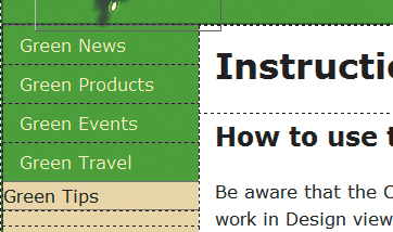
The new text appears in what looks like a button structure, but the background color doesn’t match and the text doesn’t align with other menu items. You could probably figure out what’s wrong in Design view, but in this case, the problem may be identified faster in Code view.
3. Click the <li> tag selector for the new link item, select Code view. Observe the menu items and compare the first four with the last. Can you see the difference?
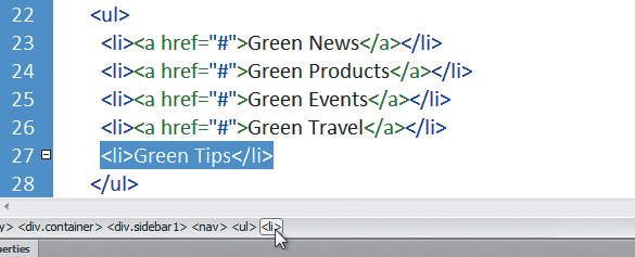
The difference is obvious in Code view. The last item is formatted with the <li> element like the others—as part of the bulleted list—but it doesn’t feature the markup <a href="#"> used in the other items to create the hyperlink placeholder. For Green Tips to look like the other menu items, you have to add a hyperlink, or at least a similar placeholder.
4. Select the text Green Tips. In the Link field of the HTML Property inspector, type # and press Enter/Return.
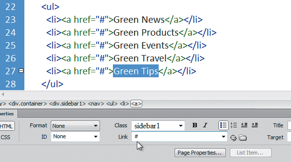
The code in all the items is identical now.
5. Select Design view.
All the menu items are identically formatted now. You’ll learn more about how to format text with CSS to create a dynamic HTML menu in Lesson 5, “Working with Cascading Style Sheets.”
The current menu color doesn’t match the site color scheme. To change the color, you’ll have to use the Code Navigator to find which CSS rule controls this formatting.
6. Insert the cursor into any of the menu items.
7. Click the Code Navigator () icon, or right-click in the menu and select Code Navigator from the context menu.
The Code Navigator window opens, displaying a list of 12 CSS rules that affect the targeted element. In some cases, the rules listed may only affect the element in a roundabout way, as in the body rule, which affects all HTML elements on the page.
8. Check each of the rules and note which ones format aspects of the menu items.
Remember, more than one rule can, and probably will, format each page element. You’re looking for a background color that’s applied to the menu items themselves. Be careful. There’s probably more than one background color in the listed rules, so if you find one, it’s important to determine whether it actually affects the menu or something else.
9. Examine each rule until you find the pertinent styling.
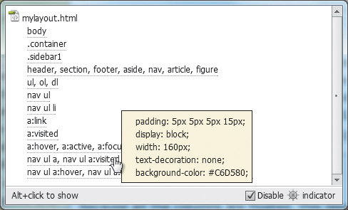
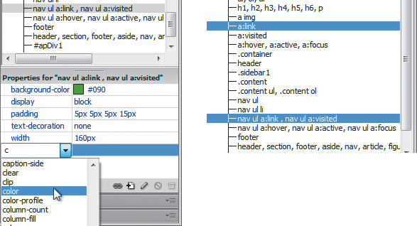
The .sidebar1 rule specifies a background color, but it affects the whole <div> element and not just the menu. The one you’re actually looking for is applied by the rule nav ul a, nav ul a:visited. If you parsed the meaning of the rule selector, it tells you that it specifies the background color for an <a> (hyperlink) element that is contained in a <ul> (unordered list) element that is contained in a <nav> element. The second half of the selector then styles the visited state of the hyperlink, too. Sound right?
10. Locate the rule nav ul a, nav ul a:visited in the CSS Styles panel and select it. In the Properties section of the panel, change the existing background color to #090.
The background color of the menu items now matches the horizontal <nav> element. But the black text is difficult to read against the green background color. As you see in the horizontal menu, a lighter color would be more appropriate. You can use the Properties section of the CSS Styles panel to add, as well as edit, element properties.
11. Click the Add Property link in the Properties section of the CSS Styles panel.
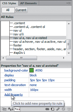
A new property field appears.
No matter how you create or modify the formatting, Dreamweaver updates the CSS markup wherever needed.
12. Choose Color from the Property field menu. Type #FFC in the Value field.
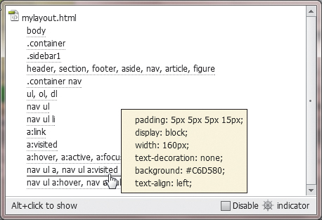
The link text does not change color as expected. Unfortunately, Dreamweaver missed a problem in the style sheet. The text display in Design view is currently honoring the formatting in the a:link rule, which applies default formatting to hyperlinks on the page. According to the Code Navigator, the navula, nav ul a:visited rule is more specific, and that’s why it’s listed lower in the Code Navigator display. The selectors a and a:link are supposed to be equivalent. They both format the default state of hyperlinks, but in the case of this display, a:link is being given precedence. Luckily, there’s an easy fix.
The CSS notation a:link is one of four pseudo-selectors that are used to format various default hyperlink behaviors. You will learn more about these pseudo-selectors in Lesson 9, “Working with Navigation.”
13. In the CSS Styles panel, right-click the nav ul a, nav ul a:visited rule and select Edit Selector from the context menu, or simply click the name and edit it in the panel list.
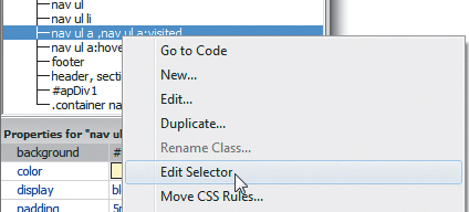
14. Change the first half of the selector name to nav ul a:link, nav ul a:visited, and press Enter/Return to complete the selector.
The link text in the vertical menu now displays in the desired color.
15. Save the file.
Inserting an image placeholder
The sidebar will feature photos, captions, and short blurbs on environmental topics. Let’s insert a placeholder image and caption below the vertical menu.
1. Insert the cursor into the text directly below the vertical menu. Click the <p> tag selector.
The placeholder image should not be inserted within the <p> element. If it were, it would inherit any margins, padding, and other formatting applied to the paragraph, which could cause it to disrupt the layout.
2. Press the Left Arrow key.
As you have seen in earlier exercises, the cursor moves to the left of the opening <p> tag in the code but stays within the <aside> element.
3. Choose Insert > Image Objects > Image Placeholder.
The Image Placeholder dialog box appears.
The alternate HTML 4 layout doesn’t use the <aside> element. The <p> element is inserted directly following the vertical menu.
4. In the Image Placeholder dialog box, type Sidebar in the Name field.
Type 180 in the Width field.
Type 150 in the Height field.
Click OK.
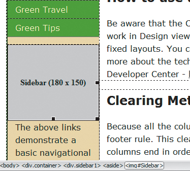
An image placeholder appears in <div.sidebar1> below the vertical menu.
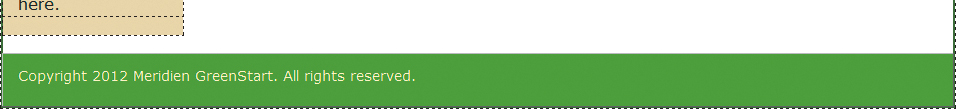
5. Select all the text below the image placeholder. Type Insert caption here.
The caption placeholder replaces the text.
6. Press Ctrl-S/Cmd-S to save.
Inserting placeholder text
Let’s simplify the layout by replacing the existing headings and text in the main content area.
1. Double-click to select the heading Instructions. Type Insert main heading here to replace the text.
2. Select the heading How to use this document. Type Insert subheading here to replace the text.
3. Select the placeholder text in that same <section> element. Type Insert content here to replace it.
4. Select and delete the remaining three <section> elements and all their content.
5. Press Ctrl-S/Cmd-S to save.
Modifying the footer
Let’s reformat the footer and insert the copyright information.
1. Double-click the <footer> rule in the CSS Styles panel.
2. In the Type category, enter 90% in the Font-size field and #FFC in the Color field.
3. In the Background category, type #090 into the Background-color field. Click OK.
4. Select the placeholder text in the footer. Type Copyright 2012 Meridien GreenStart. All rights reserved.
5. Press Ctrl-S/Cmd-S to save.
The basic page layout is complete.
Checking browser compatibility
The CSS layouts included with Dreamweaver have been thoroughly tested to work flawlessly in all modern browsers. However, during the lesson you made major modifications to the original layout. These changes could have ramifications in the compatibility of the code in certain browsers. Before you use this page as your project template, you should check its compatibility.
1. If necessary, open mylayout.html in Dreamweaver.
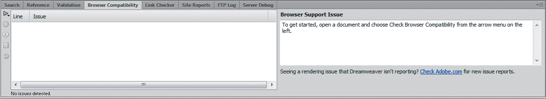
2. Choose File > Check Page > Browser Compatibility.
When the Report box opens, there should be no issues listed.
3. To collapse the report, double-click the Browser Compatibility tab in the Report panel; or to close the entire tab group, right-click the tab and choose Close Tab Group from the context menu.
Congratulations. You created a workable basic page layout for your project template and learned how to insert additional components, image placeholders, text, and headings; adjust CSS formatting; and check for browser compatibility. In the upcoming lessons, you will work further on this file to complete the site template, tweak the CSS formatting and set up the template structure.
Review questions
1. What three questions should you ask before starting any web design project?
2. What is the purpose of using thumbnails and wireframes?
3. What is the advantage of inserting the banner as a background image?
4. How can you insert the cursor before or after an element without using Code view?
5. How does the Code Navigator assist in designing your website layout?
6. What advantages can be had by using HTML5-based markup?
Review answers
1. What is the purpose of the website? Who is the customer? How did they get here? These questions, and their answers, are essential in helping you develop the design, content, and strategy of your site.
2. Thumbnails and wireframes are quick techniques for roughing out the design and structure of your site without having to waste lots of time coding sample pages.
3. By inserting the banner or other large graphics as a background image, you leave the container free for other content.
4. Select an element using its tag selector, and press the Left Arrow or Right Arrow key to move the cursor before or after the selected element.
5. The Code Navigator serves the role of a CSS detective. It allows you to investigate what CSS rules are formatting a selected element and how they are applied.
6. HTML5 has introduced new semantic elements that help to streamline code creation and styling. These elements also allow search engines, like Google and Yahoo, to index your pages more quickly and effectively.