
5. Working with Cascading Style Sheets
• Manage CSS rules using the CSS Styles panel
• Learn about the theory and strategy of CSS rule design
• Create new CSS rules
• Create and apply custom CSS classes
• Create descendant selectors
• Create styles for page layout elements
• Move CSS rules to an external style sheet
• Create style sheets for print applications
Today, pages designed in compliance with web standards separate the content from the formatting. Stored in a cascading style sheet (CSS), the formatting can be quickly changed and substituted for specific applications and devices.
Previewing the completed file
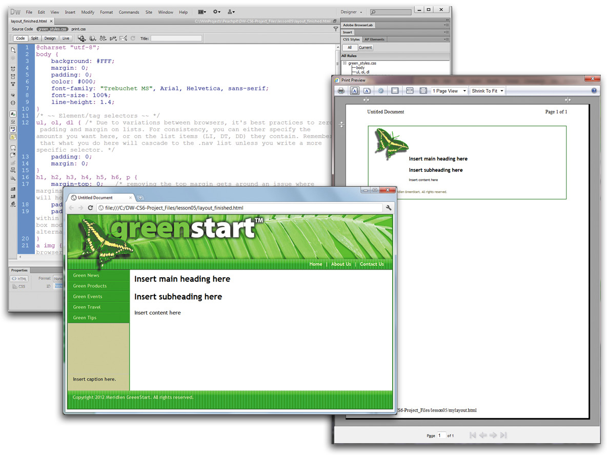
To see the finished page you’ll create in this lesson, you can preview it in a browser.
1. Launch your favorite browser. Select File > Open or press Ctrl-O/Cmd-O.
The process of opening a file on your local hard drive may differ depending on the browser you choose to use. If the suggested command does not work as described, consult the appropriate Help materials.
2. Navigate to the lesson05 folder. Select layout_finished.html and click OK/Open.
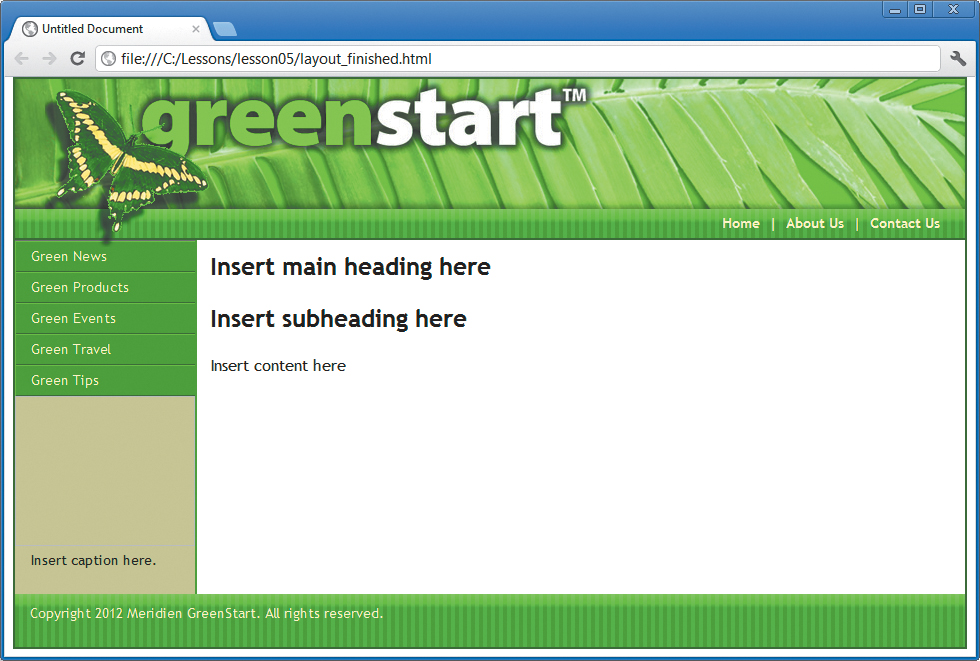
The page loads in the browser window. Note the layout, various colors, and other formats applied to the text and page elements—all created by cascading style sheets (CSS).
Working with the CSS Styles panel
In Lesson 4, “Creating a Page Layout,” you used one of the CSS layouts provided by Dreamweaver to start building your project site template page. These layouts come equipped with an underlying structure and a set of predefined CSS rules that establish the basic design and formatting of the page components and content. In the upcoming exercises in this lesson, you’ll modify these rules and add new ones to complete the site design. But before you proceed, it’s vital to your role as a designer to understand the existing structure and formatting before you can effectively complete your tasks. It’s important to take a few minutes to examine the rules and understand what role they perform in the current document.
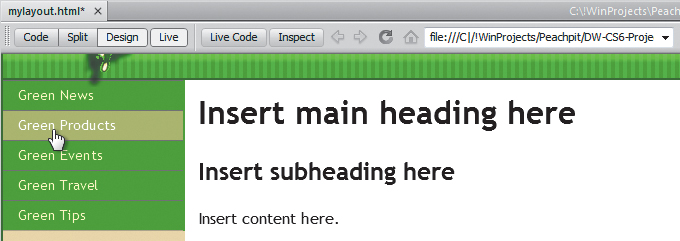
1. Open mylayout.html from the site root folder, if necessary. Or, if you are starting from scratch in this exercise, see the “Jumpstart” instructions in the “Getting Started” section at the beginning of the book.
2. If the CSS Styles panel isn’t visible, select Window > CSS Styles to display it.
The CSS Styles panel displays the <style> tag, indicating that the style sheet is embedded in the <head> section of the document.
3. Select Code view and locate the <head> section (starting at line 3). Locate the <style type="text/css"> element (line 6) and examine the subsequent code entries.
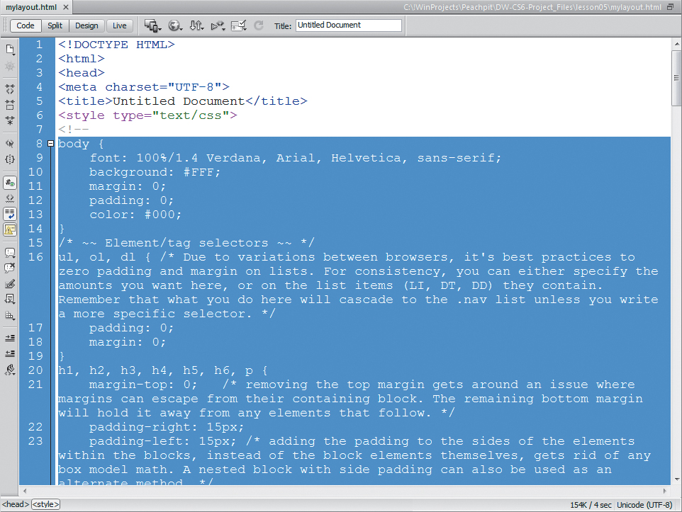
All the CSS rules displayed in the list are contained within the <style> element.
If you don’t see line numbers along the side of your Code view window, choose View > Code View Options > Line Numbers to turn on this feature.
4. Note the names and order of the selectors within the CSS code.
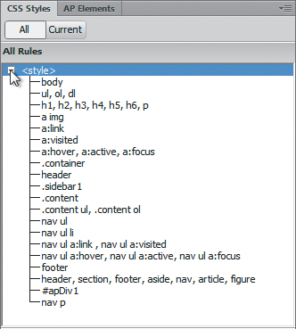
5. In the CSS Styles panel, expand and examine the list of rules.
The CSS markup is contained within an HTML <!-- --> comment entry. That’s because CSS is not considered valid HTML markup and may not be supported in some applications or devices. Using the comment structure allows such applications to ignore the CSS.
The list shows the same selector names in the same order you saw in Code view. There is a one-to-one relationship between the CSS code and the CSS Styles panel. When you create new rules or edit existing ones, Dreamweaver makes all the changes in the code for you, saving you time and reducing the possibility of code-entry errors. The CSS Styles panel is just one of the many productivity enhancements that you’ll use and master in this book.
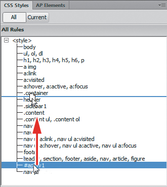
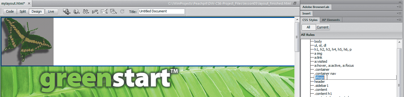
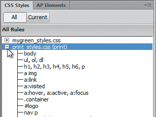
You should have 20 rules at this time—18 that came with the CSS layout, and 2 you made yourself in the previous lesson. The order of your rules may vary from that shown in the figure below. The CSS Styles panel makes it easy to reorder the list.
In the last lesson, you created <div#apDiv1> and inserted it into the layout. The #apDiv1 rule applies to the <div> holding the butterfly logo and appears in the code between <div.container> and <header>. But as you can see in the CSS Styles panel above, the rule reference appears near the bottom of all the rules. In this instance, moving this rule within the style sheet will not affect how it formats the element but it will make it easier to find if you need to edit it later.
Before you move any other rules, you should first understand what function each one performs and how they relate to one another.
6. Select the #apDiv1 rule and drag it directly underneath the .container rule.
Dreamweaver has moved the rule within the list, but that’s not all. It has also rewritten the code in the embedded style sheet, moving the rule to its new position. Arranging related rules together can save time later when you need to format specific elements or components. But be on the lookout for unintended consequences. Moving rules in the list can upset the established cascade or inheritance relationships you have already created. Review Lesson 3, “CSS Basics,” if you need a refresher on these theories.
7. Select the body rule in the CSS Styles panel. Observe the properties and values that appear in the Property section of the panel.
Most of these settings came with the layout, although you changed the background color in the last lesson. Note that the margins and padding are set to zero.
8. Select the ul, ol, dl rule and observe the values that appear.
As in the body rule, this rule sets all margin and padding values to zero. Do you know why? An experienced web designer could select each rule in turn and probably figure out the reasons for each of the formats and settings. But you don’t need to resort to hiring a consultant when Dreamweaver provides much of the information you need already.
9. Right-click the ul, ol, dl rule and choose Go To Code from the context menu.
If you are in Design view, Dreamweaver will display the document in Split view and then focus on the section of code that contains the ul, ol, dl rule. In Code view, it will jump to the appropriate lines that contain the rule. Observe the text between the opening /* and closing */ notation. This is the way you add comments to cascading style sheets. Like HTML comments, this text usually provides behind-the-scenes information that will not be displayed within the browser or affect any elements. Comments are a good way to leave handy reminders within the body of the webpage or to leave notes to yourself or others explaining why you wrote the code in a particular fashion. You’ll notice that some of the comments are used to introduce a set of rules, and others are embedded in the rules themselves.
10. Scroll down through the style sheet and study the comments, paying close attention to the embedded ones.
The more you understand what these predefined rules are doing, the better results you can achieve for your final site. Here’s what you’ll find: the body, header, .container, .sidebar1, .content, and footer rules define the basic structural elements of the page. The rules a:img, a:link, a:visited, a:hover, a:active, and a:focus set up the appearance and performance of the default hyperlink behavior; nav ul, nav ul li, nav ul a:link, nav ul a:visited, nav ul a:hover, nav ul a:active, and nav ul a:focus define the look and behavior of the vertical menu. The remaining rules are intended to reset default formatting or add some desired styling as outlined in the embedded comments.
For the most part, there’s nothing unacceptable or fatal in the current order of the rules, but keeping related rules together will pay productivity dividends later when the style sheet gets more complicated. It will help you find specific rules quickly and help remind you what you have already styled within your page.
When moving rules using the CSS Styles panel, the position of comments that are not embedded may not be preserved.
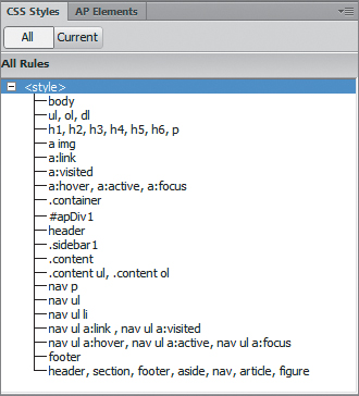
11. Using the CSS Styles panel, reorder the rules in the list, as necessary, so they match the order shown in the figure below.
Now that you are more aware of the rules and rule order, remember that it’s a good practice to take special care with rule order when you create new styles from this point forward.
12. Save the file.
Working with type
One of the first basic choices any designer must make for a website is selecting the default typeface or typefaces. The typeface can evoke all sorts of feelings in your visitors, ranging from security to elegance to sheer fun and humor. Some designers may use multiple typefaces for different purposes throughout the site. Others select a single base typeface that may match their normal corporate themes or culture. CSS gives you tremendous control over page appearance.
Selecting a font group
In this exercise, you will learn how to apply a global site typeface by editing a single rule.
1. If necessary, open mylayout.html and select Design view.
2. In the CSS Styles panel, double-click the body rule.
You learned in Lesson 3 that the body rule is the parent of all the visible page elements. When you apply styles to body, all child elements will inherit these specifications by default.
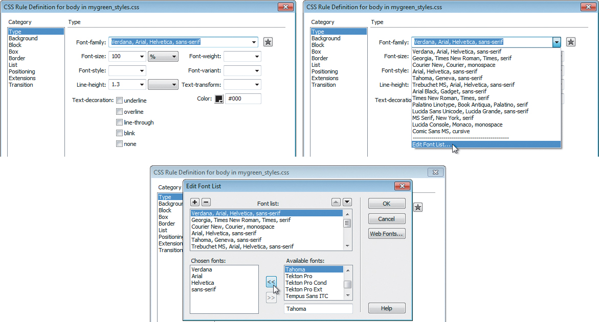
3. When the “CSS Rule Definition for body” dialog box opens, observe the entry displayed in the Font-family field: Verdana, Arial, Helvetica, sans-serif.
The field displays three typefaces and a design category. Why? Can’t Dreamweaver make up its mind?
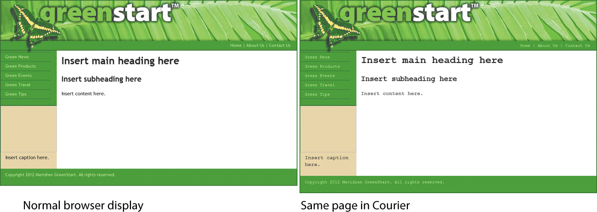
The answer is a simple but ingenious solution to a problem that has nagged the web from the very beginning: The fonts you see in your browser are not actually part of the webpage or the server; they are supplied by the computer that’s browsing the site. Although most computers have many fonts in common, they don’t all have the same fonts. What this means is that if you choose a specific font and it isn’t installed on the visitor’s computer, your carefully designed and formatted webpage could immediately and tragically appear in Courier or some other equally undesirable typeface.
The solution is to specify fonts in groups; the browser is given a second, third, and perhaps fourth (or more) choice to default to before it picks for itself (egads!). Some call this technique degrading gracefully.
Dreamweaver CS6 offers more than a dozen predefined font groups. If you don’t see a combination you like, you can select the Edit Font List option at the bottom of the Font-family field menu and create your own.
But before you start building your own group, remember this: Once you pick your favorite font, try to figure out what fonts are installed on your visitors’ computers and add them to the list. For example, you may prefer the font Hoefelter Allgemeine Bold Condensed, but it’s unlikely that a majority of web users have it installed on their computers. By all means, select Hoefelter as your first choice, just don’t forget to slip in some of the more tried-and-true fonts, such as Arial, Helvetica, Tahoma, Times New Roman, Trebuchet MS, Verdana, and finally, serif and sans serif.
4. From the Font-family menu, choose Trebuchet MS, Arial, Helvetica, sans-serif. Click OK.
You have successfully changed the basic font of the entire webpage by editing one rule. All the text on the page now displays in Trebuchet MS. If Trebuchet MS is not available on a visitor’s computer, the page will default to Arial, then to Helvetica, and then to a sans serif font.
Altering font size
In addition to changing the font, you can also alter text size with CSS. In the body rule, the font size is set to 100%. This sets the default size of all HTML elements on the page. Headings, paragraphs, and list elements are all sized relative to this setting. All elements on the page will inherit this setting unless it’s overridden by a more specific rule.
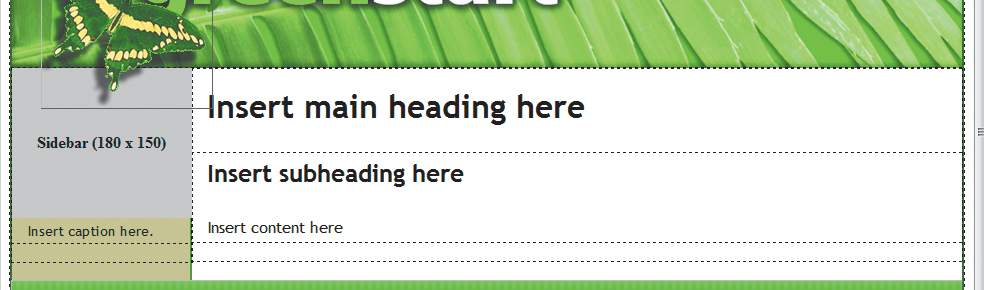
Font size can convey the relative importance of the content on the page. Headings are typically larger than the text they introduce for that reason. This page is divided into two areas: the main content and the sidebar. To give the main content more emphasis, let’s reduce the size of the text that appears under the vertical menu.
1. Insert the cursor in the caption under the vertical menu. Observe the tag selectors at the bottom of the document window. Identify the element that contains this caption.
The caption is a <p> element contained in the <aside> element, which is contained in the <div.sidebar1> element. To reduce the text size, you could create a new compound rule to format any of those elements. But before you choose which element you want to format, let’s examine any potential conflicts that may arise from that decision.
Creating a rule for the <p> element would target paragraphs within the sidebar but ignore any other elements you wish to insert there. You could format <div. sidebar1> itself; the specifications would certainly affect both headings and paragraphs, but they also would apply to every element in the sidebar, including the vertical menu. In this instance, the best option would be to create a new rule that formats the <aside> element. Such a rule would narrowly target the styling to content contained therein and ignore the vertical menu altogether.
2. Select <aside> from the tag selector at the bottom of the document window, and click the New CSS Rule ( ) icon.
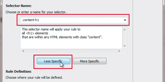
3. In the New CSS Rule dialog box, select Compound from the Selector Type drop-down menu.
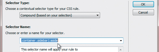
The Selector Name field displays .container .sidebar1 aside.
4. Click the Less Specific button once to remove the .container class. Click OK.
5. In the “CSS Rule Definition For .sidebar1 aside” dialog box, type 90 in the Font-size field and choose % from the unit of measurement menu. Click OK.
By using a compound selector, you are targeting only <aside> elements that appear in <div. sidebar1>, which will prevent any unwanted inheritance issue if an <aside> element exists elsewhere in the page.
The text in the <aside> element now displays at 90 percent of its original size.
6. Choose File > Save.
Using images for graphical effects
Many designers resort to images to add graphical flair when code-based techniques can be problematic. But large images can consume too much Internet bandwidth and make pages slow to load and respond. In some cases, a strategically designed small image can be used to create interesting 3D shapes and effects. In this exercise, you will learn how to create a three-dimensional effect with the help of a tiny image graphic and the CSS background property.
1. Select Design view, if necessary.
2. In the CSS Styles panel, double-click the nav p rule.
3. Select the Background category. Click the Browse button next to the Background-image field.
The Select Image Source dialog box appears.
4. Navigate to DW-CS6 > images and select background.png. Observe the image dimensions and preview.

The image is 8 pixels by 75 pixels and 49 kilobytes in size. Notice the lighter shade of green at the top of the graphic. Since the page is 950 pixels wide, you know that this graphic could never fill the horizontal menu unless it were copied and pasted hundreds of times. But you don’t need to resort to such antics if you simply use the background-repeat property.
5. Click OK/Choose. Click Apply.
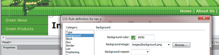
The background image repeats automatically—both vertically and horizontally—to fill the entire horizontal menu seamlessly, giving the menu a three-dimensional appearance and an interesting textural effect. Some graphics, like this one, are not designed to repeat in both directions. This graphic was intended to create a rounded 3D effect for the top edge of a page element, so you shouldn’t let it repeat vertically at all. CSS allows you to control the repeat function and limit it to either the vertical or horizontal axis.
When a graphic provides a textural effect along with shading, like background.png, it’s import that it is tall enough or wide enough to fill the entire element as necessary. Note that this graphic is much taller than the element it was inserted into.
6. Choose repeat-x from the Background-repeat field menu. Click OK.
The graphic will repeat only horizontally now; it automatically aligns to the top of the <nav> element by default. Let’s add the same background to the <footer> element too.
7. Double-click the footer rule to edit it.
8. In the Background-image field, browse and select background.png. Choose repeat-x from the Background-repeat field menu. Click OK.
The background image fills the <footer> element.
9. Choose File > Save.
Creating new CSS rules
In most of the previous exercises, you edited the rules that were predefined in the CSS layout. In the next exercise, you will learn how to create your own custom rules for HTML elements, classes, and IDs.
Creating descendant selectors
The predefined style sheet declares a rule for multiple elements that will affect all h1, h2, h3, h4, h5, h6, and p tags no matter where they appear on the page. But if you want to target a style at a specific tag within a specific element, it requires a descendant selector. Dreamweaver makes it easy to create such rules. In this exercise, you will create a descendant selector that will target specific CSS styling to the <h1> element in the main content area.
1. Insert the cursor in the main heading in the main content area. Note the names and order of the tag selectors at the bottom of the document window.
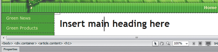
The heading is an <h1> element sitting in <article.content> sitting in <div. container> sitting in the <body> element. As described earlier in this chapter, when creating new rules take care about where they appear in the style sheet. Rules at the top of the sheet can pass formatting to rules appearing later (using inheritance) or cancel settings because of higher specificity. Inserting a rule in the wrong place could cause the browsers to ignore it altogether.
2. Select the .content rule in the CSS Styles panel.
Because you selected the .content rule first, Dreamweaver will insert the new rule immediately following it in the style sheet.
When the cursor is inserted into the page content, Dreamweaver will always create the compound selector for you, even if the Compound option is not displayed when the dialog box first appears.
3. In the CSS Styles panel, click the New CSS Rule () icon. If the Compound selector type is not displayed, choose it from the Selector Type menu.
The New CSS Rule dialog box opens. Typically, when the cursor is inserted into page content, the dialog box defaults to the Compound selector type and displays a descendant selector based on the location of the cursor—in this case, .container .content h1.
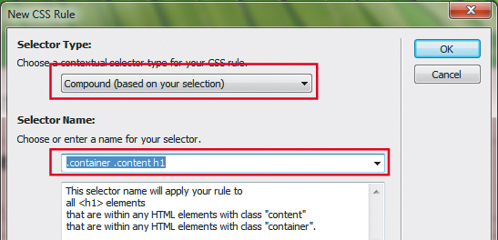
If you remember the CSS syntax you learned in Lesson 3, you know that this new rule will affect <h1> elements, but only when they appear within an element formatted with a class of .content and when both appear within an element formatted with a class of .container. The great thing about this rule is that it will leave all other <h1> elements unaffected.
Since there will only be one <article.content> element in this page design, there’s no need for such specificity in the rule. Whenever possible, rules should be simplified to reduce the total amount of code that needs to be downloaded. In this case, it’s only the notation .container that isn’t needed, but unnecessary code adds up across the entire site (and Internet) overall.
4. In the New CSS Rule dialog box, click the Less Specific button. Click OK.
The word .container is removed from the Selector Name field.
5. In the Type category of the “CSS Rule Definition For .content h1” dialog box, enter 200% in the Font-size field.
6. In the Box category, deselect Same For All in the Margin section and enter 10px in the Top margin field only. Enter 5px in the Bottom margin field. Click OK.
The main heading doesn’t change in size but appears 10 pixels lower on the page. Note that the new rule was inserted directly after the .content rule in the CSS Styles panel.
7. Save the file.
Creating custom classes
CSS class attributes allow you to apply custom formatting to a specific element or to a portion of a specific element. Let’s create a class that will allow you to apply the logo color to text in the file.
1. In the CSS Styles panel, click the New CSS Rule icon.
2. Choose Class from the Selector Type menu. Type green in the Selector Name field. Click OK.
When the desired styling doesn’t appear as expected, use the Code Navigator to suss out the conflict.
3. In the “CSS Rule Definition For .green” dialog box, type #090 in the Color field of the Type category. Click OK.
The .green rule is added to the style sheet. In most instances, a class attribute has a higher specificity than the default styling applied to any given element and will override it, so it shouldn’t matter where in the style sheet it appears.
Dreamweaver makes it easy to apply classes. Let’s apply the class to an entire element.
4. Insert the cursor anywhere in the <h1> element in <article.content>. Make sure the cursor is flashing in the element and that no text is selected.
5. In the Property inspector, choose green from the Class menu.
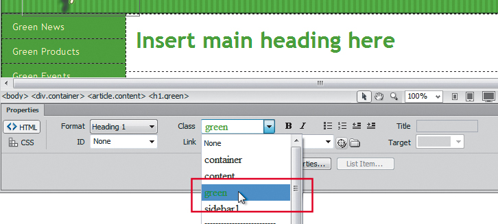
In some cases, you may have to click the appropriate tag selector before selecting the class from the Property inspector.
All the text in the <h1> element is now formatted in the color #090 (green). At the bottom of the document window, <h1.green> now displays in the tag selector.
6. Switch to Code view. Examine the opening tag of the <h1> element.

The rule is applied as an attribute to the tag as <h1 class="green">. When the cursor is inserted in an existing element, Dreamweaver assumes you want to apply the class to the entire element.
Now, let’s remove the CSS class from the element.
7. Insert the cursor anywhere in the formatted <h1> element in Code view.
Even while you are in Code view, the tag selector displays <h1.green> and green appears in the Class menu of the Property inspector.
8. Choose None from the Class menu of the Property inspector.
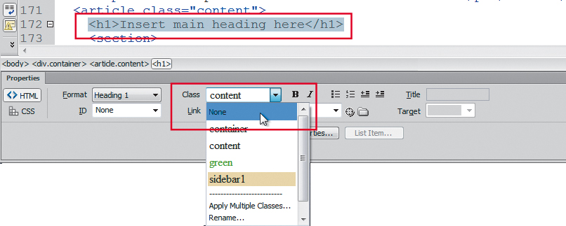
The class attribute is removed from the code. The tag selector now displays a plain <h1> tag. Although you applied None, the Class menu shows content instead of None, indicating the class attribute assigned to the parent element containing the <h1>.
Next let’s apply a class to a range of text.
9. Select the words main heading in the <h1> element. Choose green from the Class menu in the Property inspector.
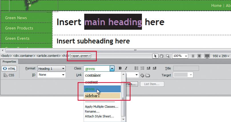
The class is applied to the selected text using the notation <span class= "green">. The span tag has no default formatting of its own and is intended to create custom inline styling like this.
Now remove the class.
10. Switch to Design view. Insert the cursor anywhere in the formatted text. Choose None from the Class menu.
The text returns to the original formatting. When the cursor is inserted in a class-formatted element, Dreamweaver assumes you want to remove the formatting from the entire range of text.
11. Save the file.
Creating custom IDs
The CSS id attribute is given the highest specific weight in CSS styling because it is used to identify unique content on a webpage and therefore should trump all other styling. The AP div containing the butterfly logo is a good example of a unique element. The <div#apDiv1> is positioned at a carefully specified location on the page, and you can be pretty certain you’ll have only one such <div> on each page. Let’s modify the existing rule for this element to reflect its use in the layout.
1. Select the #apDiv1 rule in the CSS Styles panel. Right-click the selector name and choose Edit Selector from the context menu.
The selector name becomes editable in the panel list.
2. Change the name to #logo. Press Enter/Return to complete the editing process.
The rule name changes, but it no longer formats <div#apDiv1>. The layout reflects the default behavior of an unformatted <div> element—without height and width and other key attributes applied—and it expands to the full width of <div.container> and pushes the <header> element down below the height of the butterfly image.
To restore the layout to its intended appearance, you have to assign the new #logo rule to <div#apDiv1>.
3. Insert the cursor in <div#apDiv1> or click the butterfly to select it. Then, click the <div#apDiv1> tag selector at the bottom of the document window.
The Property inspector displays the properties of <div#apDiv1>. Note the ID displayed in the Property inspector.
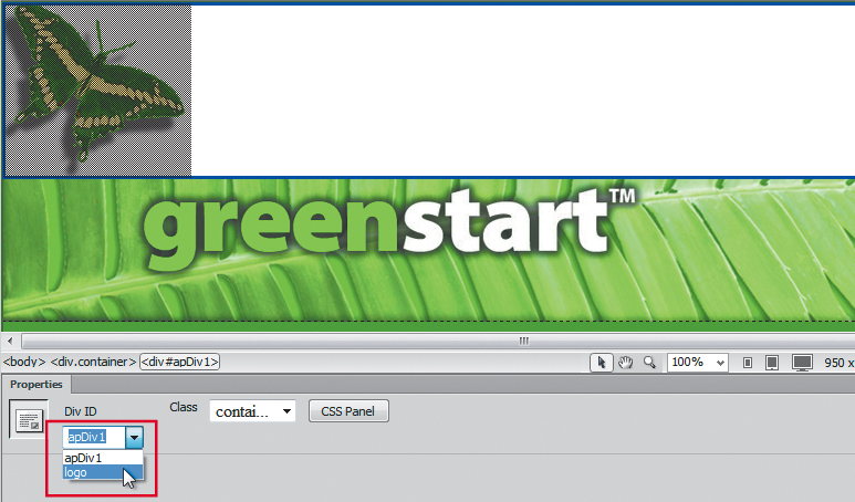
Note that the menu has two apparent options: apDiv1 and logo.
5. Choose logo from the ID field pop-up menu.
Reformatted, <div#logo> resumes its former size and positioning.
On a Mac, you may not be able to access the ID pop-up menu at all if no unassigned IDs are available.
Classes can be used as many times as you want, but an ID is supposed to be used only once per page. Although you could conceivably type the same ID multiple times manually yourself, Dreamweaver won’t offer any help in your attempt at rule breaking. You can demonstrate this functionality with a simple test.
6. Examine the CSS Styles panel and note the available class and ID selectors.
There are four classes and one ID selector defined in the panel.
7. Insert the cursor in <div#logo>. Click the <div#logo> tag selector.
The Property inspector reflects the specifications applied to <div#logo>.
8. Open the ID field pop-up menu and examine the available IDs.
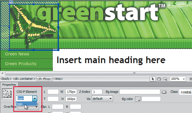
The only ID available is logo. What happened to apDiv1? The original name apDiv1 no longer appears in the style sheet and therefore won’t appear in the pop-up menu. Additionally, as each ID stored in the style sheet is used in your layout, Dreamweaver interactively removes it from the menu to prevent you from accidentally using it a second time.
Don’t take this behavior to mean that there’s a law saying id and class attributes must appear in the style sheet before you can use them within a page. Many designers create these attributes first and then define them later, or use them to differentiate specific page structures, or to create hyperlink destinations. Some class and id attributes may never appear in the style sheets or pop-up menus. The Dreamweaver menus are intended to make it easier to assign classes and IDs that already exist, not to limit your creativity.
9. In the Class field menu, choose green.
The tag selector displays <div#logo.green>. As you can see, it’s possible to assign both an id and a class attribute to an element at the same time, which may come in handy in certain situations.
10. Insert the cursor in the horizontal menu <nav>. Click the <nav> tag selector.
11. In the Property inspector, open the ID menu and examine the available IDs.
The only available ID option is None because logo is already assigned.
12. Open the Class field menu. Examine the available class attributes.
Note that all class attributes are available. The Dreamweaver interface allows you to apply class attributes to multiple elements, but it prevents you from applying id attributes more than once.
13. Close the Class menu without making a selection.
14. Save the file.
You should now know some of the differences between classes and IDs, as well as how to create, edit, and assign them to elements on your page. Next, you’ll learn how to combine these attributes using CSS to create interactive behaviors for hyperlinks.
Creating an interactive menu
By combining descendant selectors, classes, and IDs, you can produce amazing behaviors from seemingly static elements.
1. If necessary, switch to Design view and click the Live view button.
The document window will preview the layout as it would appear in a browser. Videos, Flash animation, and JavaScript behaviors will all perform as they would on the Internet.
2. Position the cursor over the vertical navigation menu in the sidebar. Observe the behavior and appearance of the menu items.
Rollover refers back to the time when the computer mouse contained a ball that mechanically produced the cursor movement on your screen.
As the mouse moves over each button, the cursor icon changes to the hand pointer, indicating that the menu items are formatted as hyperlinks. The buttons also change color momentarily as the mouse passes, or rolls, over each, producing a dramatic graphical experience. These rollover effects are all enabled by HTML hyperlink behaviors and can be formatted by CSS.
3. Position the mouse cursor over the items in the horizontal navigation menu in <nav>. Observe the behavior and appearance of the menu items, if any.
The pointer and background color do not change. The items are not formatted as hyperlinks.
4. Click the Live view button to return to the normal document display.
Dreamweaver prevents you from making changes to your content in the Design view window while Live view is enabled, but you may edit the CSS. If desired, you can change both the content and styling using the Code view window at any time.
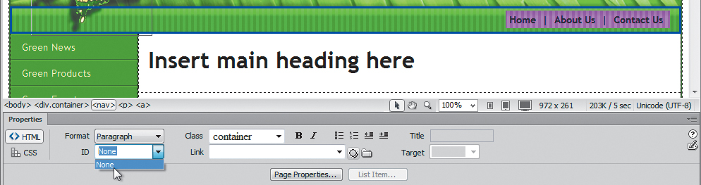
5. Select the word Home in the <nav> element. Do not select the spaces on either side of the word or the vertical bars, or pipes, that separate the words.
6. Type # in the Link field of the Property inspector. Press Enter/Return.
Adding a hash mark (#) in the Link field creates a hyperlink placeholder and will allow you to create and test the necessary formatting for the horizontal navigation menu without having to create an actual link. Note that the text now displays the formatting of a typical text hyperlink.
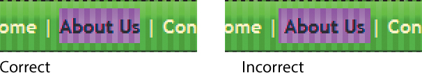
7. Add hyperlink placeholders to the items About Us and Contact Us.
Be sure to select both words in each item before applying the placeholder. If you don’t, each word will be treated as separate links instead of as one.
To make the horizontal menu look more like the vertical one, you’ll have to remove the underscore and change the text color. Let’s start with the underscore.
8. Insert the cursor in any of the hyperlinks in the horizontal <nav> element. Select the nav p rule in the CSS Styles panel. Click the New CSS Rule icon.
Since the horizontal and vertical menus are based on the same HTML5 <nav> element, you should be aware that this rule applies styling that could be inherited by both. Watch for any undesirable side effects.
9. Choose Compound from the Selector Type menu, if necessary.
The Selector Name field displays .container nav p a.
10. In the New CSS Rule dialog box, click the Less Specific button.
The .container class is removed from the Selector Name field. The class notation .container is not needed in this instance.
When a link has been used, it usually changes color, indicating that you visited that destination earlier. This is the normal, or default, behavior of hyperlinks. However, in the vertical and horizontal menus, we do not want the links to change their appearance after you click them. To prevent or reset this behavior, you can create a compound rule that will format both states of the link at once.
11. If necessary, insert the cursor in the Selector Name field. Press Ctrl-A/Cmd-A to select the entire selector name. Press Ctrl-C/Cmd-C to copy the selector.
12. Press the Right Arrow key to move the cursor to the end of the selector text. Type :link to add it at the end of the selector name.
The new selector nav p a:link is more specific and will preclude any potential inheritance from the default a:link rule appearing elsewhere in the style sheet, as happened with the vertical menu earlier.
13. If necessary, move the cursor to the end of the selector text. Type a comma (,) and press the spacebar to insert a space. Press Ctrl-V/Cmd-V to paste the selector from the clipboard.
14. Type :visited at the end of the pasted selector.
The selector should now appear as nav p a:link, nav p a:visited in the Selector Name field. The comma works like the word “and” allowing you to include two or more selectors in one name. By combining these two selectors into one rule, you are formatting the default properties of both hyperlink states at once.
15. Click OK.
The new nav p a:link, nav p a:visited rule appears in the CSS Styles panel below the nav p rule.
16. In the Type category’s Text Decoration option, select none. Click Apply.
The underscore is removed from the hyperlinks. Now let’s change the default hyperlink text color.
17. Type #FFC in the Color field. Click OK.
The blue hyperlink text color is replaced by pale yellow (#FFC), which is easier to see on the green background. Let’s test the hyperlink properties of the items in the horizontal menu.
18. Click the Live view button. Position the cursor over the hyperlink placeholders in the horizontal menu.
The mouse icon changes to the hand pointer, indicating that the text is formatted as a hyperlink. But these hyperlinks have none of the flair of the vertical menu, with its changing background color. As explained, that interactive behavior is controlled by the pseudoclass a:hover. Let’s use this selector to create a similar behavior.
19. Click the Live view button to return to the normal document display. Save the file.
Modifying hyperlink behavior
In this exercise, you will modify the default hyperlink behavior and add interactivity.
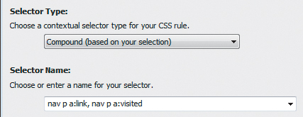
1. Insert the cursor in any one of the hyperlinks in the horizontal menu. You don’t need to select any characters in the link. Select the nav p a:link, nav p a:visited rule in the CSS Styles panel. Click the New CSS Rule icon.
The New CSS Rule dialog box appears with the Compound selector type displayed and the text .container nav p a entered in the Selector Name field.
The a:hover state inherits much of its formatting from a or a:link. In most cases, you only need to declare values for formatting that will change when this state is activated.
2. Make sure the Compound selector type is selected in the New CSS Rule dialog box. Edit the Selector Name to say nav p a:hover, nav p a:active, and click OK.
The new nav p a:hover, nav p a:active rule appears in the CSS Styles panel. The “CSS Rule Definition for nav p a:hover, nav p a:active” dialog box appears.
3. In the Type category’s Color field, type #FFF.
In the Background category’s Background-color field, type #060. Click OK.
4. Activate Live view, and test the hyperlink behavior in the horizontal menu.

The background behind the hyperlink text changes to dark green as the mouse passes over it. This is a good start, but you may notice that the color change doesn’t extend to the top or bottom edges of the <nav> or even to the pipes dividing one link from another. You can create a more interesting effect by adding a little padding to the element.
Do you know why you added space to padding and not to margins? Adding space to the margins won’t work because margins add space outside the background color.
5. Deactivate Live view. Double-click the nav p a:hover, nav p a:active rule to edit it.
6. In the Box category, enter 5px in the Padding field and make sure that the Same For All check box is selected. Click OK.
7. Activate Live view and test the hyperlink behavior in the horizontal menu.
The background color of each link now extends five pixels all around the hyperlink. Unfortunately, there’s an unintended consequence: Not only does the padding cause the background to extend five pixels out from the text on either side of the link, but it also causes the other text to shift five pixels from its default position whenever the a:hover state is activated. Luckily, the solution to this problem is quite simple. Have you figured out what you need to do?
8. In the CSS Styles panel Properties section, select the padding property for the rule nav p a:hover, nav p a:active. Click the Delete CSS Property ( ) icon at the bottom of the panel.
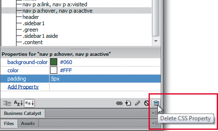
The Trash Can icon in the CSS Styles panel is context sensitive. It can be used to delete a rule property or the entire rule, depending on how it is invoked. Before using it, note the tooltip that appears when the cursor hovers over it.
9. Double-click the nav p a:link, nav p a:visited rule to edit it. In the Box category, enter 5px in the Padding field, with the Same For All option selected. Click OK.
10. Activate Live view and test the hyperlink behavior in the horizontal menu.
When the mouse moves over the links, the background color extends five pixels around the link without shifting. Do you understand why you added the padding to the default hyperlink? By adding padding to the default state, the hover state automatically inherits the extra padding and allows the background color to work as desired, without shifting the text.
11. Save the file.
Congratulations. You’ve created your own version of the interactive navigation menu in the horizontal <nav> element. But you may have noticed that the predefined background color selection for the a:hover state in the vertical menu doesn’t match the color of the horizontal menu. To be consistent, the colors used in the site should adhere to the overall site theme.
Modifying existing hyperlink behavior
As you gain more experience in web design and working with CSS, identifying design inconsistencies and knowing how to correct them becomes easier. Since you know that the hover state is responsible for creating the interactive link behavior, it should be a simple matter to change the background color in the vertical menu. The first step is to assess what rules pertain specifically to the vertical menu itself.
1. Insert the cursor into one of the vertical menu items. Observe the names and the order of elements in the tag selector display.
The vertical menu is using a <ul> (unordered list) element inserted in an HTML5 <nav> element.
2. Locate any rules in the CSS Styles panel that format the <nav> element. Is there an a:hover pseudoclass associated with it?
The CSS Styles panel displays the nav ul a:hover, nav ul a:active, nav ul a:focus rule that formats the hyperlink behavior you’re looking for.
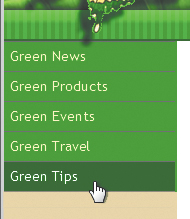
3. Double-click the nav ul a:hover, nav ul a:active, nav ul a:focus rule to edit it. In the Background category, change the background color to #060. Click OK.
4. Using Live view, test the behavior of the vertical menu.
The background color of the vertical menu now matches the horizontal menu and the site color scheme.
5. Save the file.
Adding visual appeal to menus
Another popular CSS trick that can give menus a bit more visual interest is to vary the border colors. By applying different colors to each border, you can give the buttons a 3D appearance. As in the previous exercise, you first need to locate the rules formatting the elements.
1. Insert the cursor in one of the menu items and examine the tag selector display.
The menu buttons are built using <nav>, <ul>, <li>, and <a> elements. By now, you should know that the <ul> element creates the entire list—not the individual items or buttons—and that you can eliminate it as a suspect. The <li> element creates list items.
2. Select the nav ul li rule in the CSS Styles panel. Observe the attributes displayed in the Properties section of the panel.
The nav ul li rule formats the basic structure of the menu button.
3. Double-click the nav ul li rule.
4. Select the Border category in “CSS Rule Definition For nav ul li.”
Enter solid, 1px, #0C0 in the Top border fields.
Enter solid, 1px, #060 in the Right border fields.
Enter solid, 1px, #060 in the Bottom border fields.
Enter solid, 1px, #0C0 in the Left border fields. Click OK.
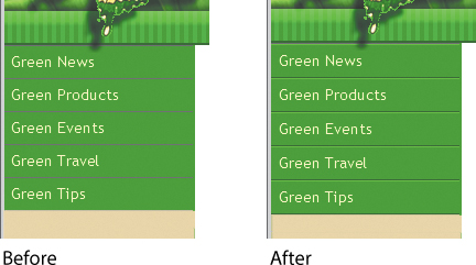
By adding lighter colors to the top and left and darker colors to the right and bottom, you have created a subtle but effective three-dimensional effect.
5. Save the file.
Creating faux columns
Although multicolumn designs are very popular on the web, HTML and CSS have no built-in commands to produce true column structures in a webpage. Instead, columnar designs—like the one used in the Dreamweaver CSS layouts—are simulated by using several types of HTML elements and various formatting techniques, usually combining margins and the float attribute. HTML5 and CSS3 can display text in multiple columns, but for the time being, the page layouts themselves will still depend on the older techniques.
Unfortunately, these methods have their limitations and downsides. For example, one of the problems with the layout used in this lesson is getting both columns to display at the same height. Either one column or the other will almost always be shorter. Since the sidebar has a background color, there will be a visible gap at the bottom as content is added to the main page.
There are methods, using JavaScript and other coding tricks, to force columns to display at equal height, but these are not fully supported by all browsers and could cause your page to break unexpectedly. Many designers sidestep the issue altogether simply by refusing to use background colors. Then no one will notice any discrepancy.
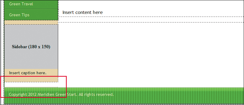
It’s difficult, using only CSS formatting, to get all the columns to appear to be the same length in multicolumn designs.
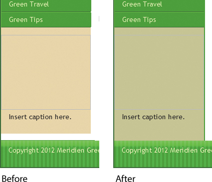
Instead, you will create the effect of a full-height sidebar column by using a background graphic combined with the CSS repeat function. This technique works well with fixed-width website designs, like this one.
1. Insert the cursor in <div.sidebar1> below the vertical menu. Examine the tag selector display.
The <div.sidebar1> element is within <div.container>, and both are contained in the body element.
2. Select the .sidebar1 rule in the CSS Styles panel. Examine its properties.
The .sidebar1 rule applies a background color to the sidebar. Since the background color assigned to the <div> appears already to be failing to extend to the bottom of the document, the .sidebar1 rule is not the solution to this problem. Since <div.container> holds the sidebar as well as the main content, it’s an obvious candidate for the faux column. First, it’s a good idea to remove the background color from the sidebar if it’s not producing the desired results.
3. Select the background color reference in the Properties section of the CSS Styles panel. Click the Delete CSS Property () icon at the bottom of the panel.
Now, you’ll modify the .container rule to produce the desired background effect for the sidebar.
4. Double-click the .container rule. In the Background category, click the Browse button. Select divider.png from the default images folder. Click OK/Choose.
5. Choose repeat-y in the Background-repeat field menu. Click OK.
A graphic 182 pixels wide appears at the left edge of <div.container> and extends from the top to the bottom. Since the other structural elements are contained entirely within <div.container>, the background appears behind them and is visible only where appropriate.
Let’s make a couple of additional tweaks to the sidebar. First, let’s remove the extra space that appears between the menu and the image placeholder. You’ll need to identify the rule or rules that may be creating this styling.
6. Insert the cursor in the last button of the vertical menu. Right-click the button and choose Code Navigator from the context menu.
The Code Navigator appears, displaying a list of 12 CSS rules affecting this item. Chances are a margin setting is producing the spacing effect.
7. Scan the rules for a bottom-margin setting.
The nav ul rule features a bottom-margin of 15 pixels.
8. Select the nav ul rule in the CSS Styles panel. Select the bottom-margin setting in the Properties section. Click the Delete CSS Property () icon.
The gap between the menu and the image placeholder closes up. Finally, let’s make the text in the vertical menu match that in the horizontal menu.
9. Double-click the rule nav ul.
10. In the Type category, enter 90% in the Font-size field. Click OK.
11. Save the file.
Moving rules to an external style sheet
When prototyping a webpage design, it’s more practical to keep the CSS embedded. It makes the process of testing and uploading quick and simple. But an internal style sheet can style only one page. An external style sheet can be linked to any number of pages and, for most web applications, is the normal and preferred workflow. Before this page is put into production as a template, it’s a good idea to move the CSS styles from the <head> section of the document to an external CSS style sheet. Dreamweaver provides the means to handle that task quickly and easily.
1. In the CSS Styles panel, select the first defined style: body. Hold the Shift key and select the last style.
The last style in your style sheet may differ from the figure. Remember to select the last one.
2. In the CSS Styles panel, choose Move CSS Rules from the Options menu in the upper-right corner of the panel.
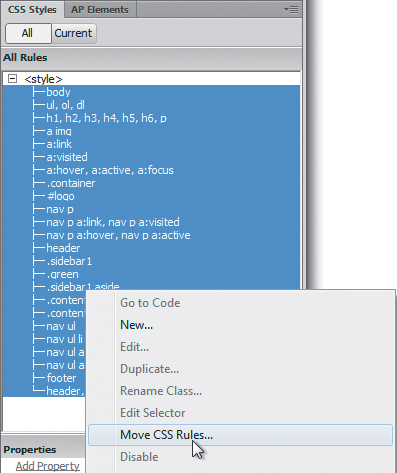
You could also right-click the selected area to access the Move CSS Rules option from the context menu.
3. When the Move To External Style Sheet dialog box appears, choose A New Style Sheet in the Move Rules To options. Click OK.
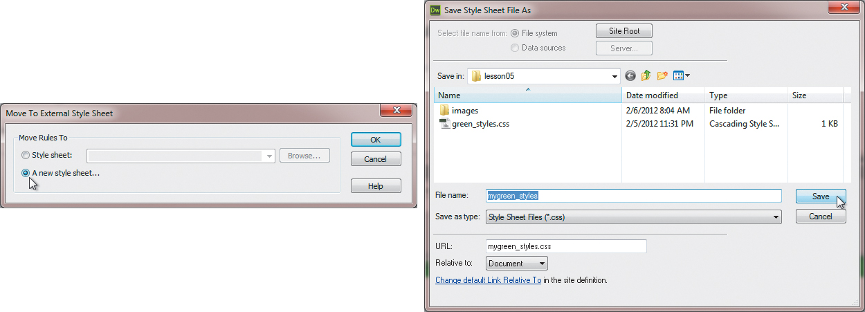
The Save Style Sheet File As dialog box appears.
4. Navigate to the site root folder, if necessary. Type mygreen_styles in the File Name field. Click Save.
Dreamweaver adds the .css extension to the filename, moves the selected styles from the <head> area to the newly defined style sheet, and simultaneously inserts a link to the style sheet. Note at the top of the document window that Dreamweaver now displays the name of the external style sheet in the Related Files interface.
The last chore is to remove the no-longer-needed <style> tag.
5. In the CSS Styles panel, click the <style> notation and then press Delete or click the Trash Can icon.
If the reference does not disappear, you can right-click it and choose Delete from the context menu.
6. Choose File > Save All. Or, press Ctrl-Alt-Shift-S/Cmd-Ctrl-S to access the keyboard shortcut for the Save All command you created in Lesson 1, “Customizing Your Workspace.”
Once you move the CSS to an external file, remember to use the Save All command moving forward. Pressing Ctrl-S/Cmd-S saves only the top document in the Dreamweaver interface. Other files that are open and referenced that have been changed are not automatically saved.
Creating style sheets for other media
Current best practices call for the separation of presentation (CSS) from content (the HTML tags, text, and other page elements). The reason is simple: By separating the formatting, which may only be relevant for one type of medium, one HTML document can be formatted instantly for multiple purposes. More than one style sheet can be linked to a page. By creating and attaching style sheets optimized for other media, the specific browsing application can select the appropriate style sheet and formatting for its own needs. For example, the style sheet created and applied in the previous exercises was designed for a typical computer display. In this exercise, you’ll convert a CSS screen-media file to one optimized for printing devices.
Today, designers frequently include a “Print” link on pages heavy with text or for sales receipts so that users can send the information to a printer more effectively. Print style sheets often adjust colors to work better for laser and inkjet printers, hide unneeded page elements, or adjust page sizes and layouts to be more suitable for printing.
When the print queue is activated, the printing application checks for a print-media style sheet. If one is present, the relevant CSS rules are taken into account. If not, the printer defers to the rules in the existing “screen” or “all-media” style sheets or to the CSS defaults for print output.
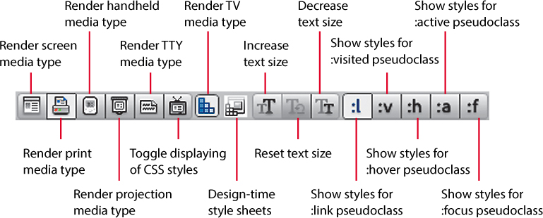
Displaying the Style Rendering toolbar
If no media-type attribute appears in a style sheet, the browser or web application assumes that the CSS styles are intended for screen display. By default, Dreamweaver’s Design view also defaults to screen styles and will ignore other media types. However, you have the ability to switch what media type is rendered in Design view by using the Style Rendering toolbar. That way, you can preview how different media types will render without having to access those applications or workflows.
1. If necessary, open the mylayout.html file by double-clicking its filename in the Files panel.
2. Choose View > Toolbars > Style Rendering.
The Style Rendering toolbar appears above the document window. Leave it visible for the next exercise.
Converting an existing style sheet for print
Although you can develop a print style sheet from scratch, it’s usually much faster to convert an existing screen-media style sheet. The first step is to save the existing external style sheet under a new name.
1. In the Files panel, double-click mygreen_styles.css to open it.
2. Choose File > Save As.
3. When the Save As dialog box opens, type print_styles.css in the File Name/Save As field. Make sure the site root folder is targeted. Click Save.
4. If necessary, open mylayout.html from the site root folder. In the CSS Styles panel, click the Attach Style Sheet ( ) icon.
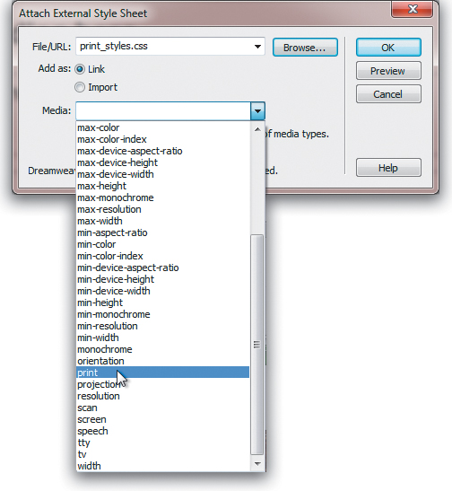
The Attach External Style Sheet dialog box opens.
5. Click Browse.
The Select Style Sheet File dialog box appears.
6. Select print_styles.css from the site root folder. Click OK/Choose.
7. In the Attach External Style Sheet dialog box, select the Link option for the Add As value. From the Media field menu, choose print. Click OK.
8. In the CSS Styles panel, click the All button, if necessary.
A new entry—print_styles.css—has been added. At the moment, both style sheets are identical. You will modify the print style sheet in the next exercise.
9. Close print_styles.css and mygreen_styles.css.
10. Save mylayout.html.
Hiding unwanted page components
Using the Style Rendering toolbar, you can see your document rendered according to the print-media style rules.
1. In the Style Rendering toolbar, click the Render Print Media Type ( ) icon.
Remember to click the Render Screen Media Type icon when you’re ready to work on screen-media formatting again.
One of the main differences between screen and print media is that interactive items on a webpage are often meaningless in print. This would include all navigation elements in the horizontal and vertical menus. Using the print-media style sheet, you can hide unwanted portions of a page. Let’s start with the horizontal and vertical menus. Before you can hide these menus, we need to create a new rule.
2. Insert the cursor in one of the links in the horizontal menu.
3. Click the <nav> tag selector at the bottom of the document window.
4. In the CSS Styles panel, click the New CSS Rule icon.
The New CSS Rule dialog box appears.
5. If necessary, select the Compound selector type.
The Selector name .container nav appears in the field.
6. Click OK.
This rule will apply to both the horizontal and the vertical menus.
7. In the Block category, select None from the Display menu. Click OK.
Both <nav> elements disappear from the document window. No, they haven’t been deleted; Dreamweaver has simply stopped rendering them temporarily as long as the Render Print Media Type icon is selected.
The content in the rest of the <div.sidebar1> is also not needed for printing. Let’s turn it off, too.
8. In the print_styles.css rule list, double-click the .sidebar1 rule.
9. In the Block category, choose None from the Display field menu. Click OK.
The sidebar vanishes, and the main content expands to the full width of the <div.container>. The background image is visible under the content and may make it harder to read the text.
10. In the print_styles.css rule list, double-click .container.
11. In the Background category, delete the divider.png image reference in the Background-image field. Delete repeat-y from the Background-repeat field. Click Apply.
Note that the background image continues to display in <div.container>. Deleting the image reference is not enough. Although the print application defers to the print-media style sheet, formatting is still inherited from all referenced CSS style sheets. Even though you deleted the background image reference in the print style sheet, it’s still applied in the screen styles. It won’t disappear until you reset the rule by choosing none. This goes for other such rules, too.
12. Choose none from the Background-image field menu. Click Apply.
The background image vanishes. Let’s check the page in Live view.
13. Click OK to complete the change. Click the Live view button.
Although the Style Rendering toolbar is set to Print, Dreamweaver ignores the print-media styles and renders the page for the screen. That’s because Live view is intended for browser preview only and can’t render print-based styling. To properly test the page, you have to use the print preview function in an actual browser.
14. Save all files. Choose File > Preview in Browser and select your preferred browser.
15. Once the page has loaded in the browser, activate print preview.
Some browsers have a different technique to access the print preview mode. You may need to choose File > Print first and access the preview function from within the Print dialog box.
From the preview, you may assume that all print applications will convert text to black and drop background colors and images, but don’t be fooled. Always test this functionality in all browsers first to see what other styles you need to modify for printing.
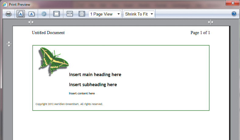
As you can see, the print application converted the text to black and automatically dropped all the background images and colors, but it is still printing the butterfly logo and the page borders. Let’s eliminate the border.
16. In the print_styles.css rules, double-click .container. In the Border category, if necessary, select the Same For All option in the Style section. Choose none from the Top Style field. Click OK.
17. Save all files.
18. Choose File > Preview in Browser and select your preferred browser.
19. Once the page has loaded in the browser, activate print preview.
The border has been removed successfully.
20. Save All files.
As you can see, it’s easy to adapt a screen style sheet for print. You should know enough now to keep the butterfly logo from printing, too. Take a few minutes here and see if you can do it.
Removing unneeded styles
Even with the changes you made in the previous exercises, many rules in the two style sheets are identical. It doesn’t make sense to keep two sets of styles that do the same job. Whenever you can remove unneeded code from your pages, you should do so. It reduces file size and allows the pages to download and respond more quickly. Let’s remove from the print-media sheet any rules that haven’t changed or that don’t pertain anymore. You can delete unneeded styles using the CSS Styles panel. But be careful—even though a rule hasn’t changed doesn’t mean it’s not needed for print rendering.
1. In Dreamweaver, select all rules that format the nav ul menu in print_styles.css. Click the Delete CSS Rule icon, or right-click the selected rules and choose Delete from the context menu. Click Yes to delete multiple rules.
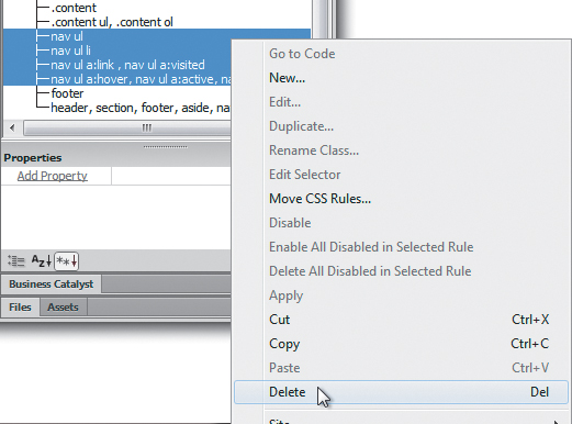
Since the vertical menu isn’t displayed, there’s no need for those rules. In fact, you can remove all the rules that format hyperlink behavior.
2. Select all hyperlink rules in print_styles.css and delete them, this includes rules that style a, a:link, a:visited, a:hover, and a:active properties.
Don’t worry. You don’t need these styles, because the hyperlinks in the horizontal and vertical menus are not printing, and the other rules are still identical to the ones in the screen styles and will be inherited, if supported by the print application. After deleting any rules, make sure you test the page in the browser and in the print application.
3. Save all files.
4. Click the Render Screen Media Type ( ) icon. Observe the screen display in Design view.
Dreamweaver renders the document for the web.
5. Click the Render For Print Media Type () icon.
Dreamweaver renders the screen using the print style sheet. You have adapted a screen-media style sheet to render a webpage more appropriately in print.
You have completed the basic design of the page that will be used as the project template, and you have adapted it to print media. In the next lesson, you will learn how to convert this layout into a dynamic web template.
Review questions
1. How do you attach an existing external style sheet to a webpage?
2. How can you target a specific type of formatting to content in a webpage?
3. What method can you use to hide specific content on a webpage?
4. How do you apply an existing CSS class to a page element?
5. What is the purpose of creating style sheets for different media?
Review answers
1. In the CSS Styles panel, choose Attach Style Sheet. In the Attach External Style Sheet dialog box, choose the desired CSS file and select the media type.
2. You can create a custom class or ID using descendant selectors to target formatting to specific elements or element configurations on a page.
3. In the style sheet, set the Block display property of the element, class, or ID to none to hide any content you don’t want to display.
4. One method is to select the element and then choose the desired style from the Class menu in the Property inspector.
5. Creating and attaching style sheets for different types of media enables the page to adapt to applications other than web browsers, such as print applications.