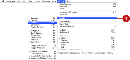
2. Navigating the Library Module
What You’ll Do
Introduction
After you import your photos into a Lightroom catalog, the next step is to preview them in the Library module. There are various panels, tools, and view modes that you can use to sort, filter, and preview your photos in the Library.
In this chapter, you learn how to use the Catalog panel and Filter Bar to locate specific groups of images to work with, and how to use the Folders panel to move or rename the system folders where your catalog images are stored. You also learn how to locate and select images in Grid View mode, and then use the Navigator panel to preview them in both standard and close-up Loupe views.
This chapter also explains how to preview multiple images in Compare view and Survey view. In addition, you’ll learn how to quickly apply useful commands by utilizing the controls available in the customizable Library Toolbar. You’ll also learn how to locate and select images using the Filmstrip.
Navigator Panel
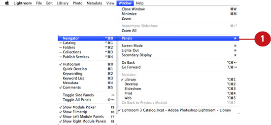
The Navigator is the topmost panel in the left sidebar. The Navigator is useful for zooming and scrolling around an image in Loupe view mode. By clicking the FIT or FILL buttons at the top of the Navigator, you can fit the entire image in the Content area (without crops) or fill the entire area with the image (with crops). You can also display the image at 100% of its size by clicking the 1:1 button. The last zoom button enables you to apply a custom view percentage.
Preview images with the Navigator panel
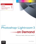
 To display the Navigator panel, choose Window > Panels > Navigator.
Timesaver
Press Control+Cmd+0 (Mac) or Ctrl+Shift+0 (Win) to show or hide the Navigator panel quickly.
 Select any photograph from the Library Content area or the Filmstrip.

 At the top of the Navigator panel, click any of the following zoom buttons to display the image in Loupe view mode:
• FIT—Click to fit the entire image in the Content area.
• FILL—Click to fill the entire Content area with the image.
• 1:1—Click to view the image at 100% of its size in the Content area.
• Custom View—Choose a zoom ratio from the Navigator panel flyout menu.
 When displaying the photo in FILL, 1:1, or Custom View modes, click and drag the Navigator target icon to change the image area displayed in the Content area.
Catalog Panel
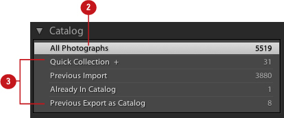
The Catalog panel enables you to control which catalog images are displayed in the Content area. You can choose to display every image in the catalog by selecting All Photographs, or choose to only display images that are part of a temporary collection, by selecting items such as Previous Import, Previous Export as Catalog, or Quick Collection. Temporary collections can also be removed from the Catalog panel list by right/Control-clicking and choosing Remove the temporary collection from the contextual menu.
Select groups of catalog images to work with in the Library
To display the Catalog panel, choose Window > Panels > Catalog.

Timesaver
Press Control+Cmd+1 (Mac) or Ctrl+Shift+1 (Win) to show or hide the Catalog panel quickly.
To view all the photographs in the current catalog, select All Photographs from the Catalog panel.
Important
To ensure accurate search results, be sure to select All Photographs from the Catalog panel before performing a filtered search.
As you work in Lightroom, various other items appear in the Catalog panel, including the following:
• Current Import
• Quick Collection
• Previous Import
• Already In Catalog
• Previous Export as Catalog
• Missing Files
Select any of these items in the Catalog panel to display just those images in the Content area.

Temporary collection displayed in Content area and Filmstrip
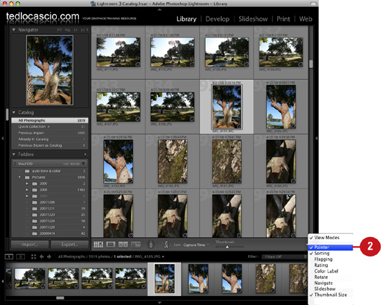
Library Toolbar
The Toolbar is located below the Content area and above the Filmstrip. You can use the Toolbar to access certain commands and apply them quickly. By clicking the various buttons displayed in the Toolbar, you can accomplish certain tasks, such as switching view modes, increasing or decreasing the amount of thumbnails displayed in Grid view, changing thumbnail sort order from ascending to descending (or vice versa), and much more. You can customize the Toolbar to display the button commands you apply most.
Display various options in the Library Toolbar
To display the Library Toolbar, choose View > Show Toolbar.

Choose which tools you would like to display from the Library Toolbar flyout menu. In Grid View, these options include: Painter, Sorting, Flagging, Rating, Color Label, Rotate, Navigate, Slideshow, Thumbnail Size, and Info.
Important
The Library Toolbar can be customized individually for both Grid view and Loupe view modes.
In Loupe view, these options include Sorting, Flagging, Rating, Color Label, Rotate, Navigate, Slideshow, Zoom, and Info.
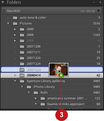
Folders Panel
The Folders panel displays your system’s folder hierarchy for the images that have been added to the current Lightroom catalog. If the images are stored in more than one volume, each disk is displayed with a separate volume header. The green light in the header signifies that the drive is connected and has storage space available. The two numbers in the header indicate the amount of free space available versus the capacity of the drive. Missing folders are displayed in gray with a question mark icon.
Manage catalog folders from within Lightroom
To display the Folders panel, choose Window > Panels > Folders.
Timesaver
Press Control+Cmd+2 (Mac) or Ctrl+Shift+2 (Win) to show or hide the Folders panel quickly.
Click the toggle arrows to reveal your system’s folder hierarchy and display each folder’s contents.
Click and drag any image from the Content area to move it from one folder to another. You can also rearrange the hierarchy of folders by repositioning them in the Folders panel. Any changes made to the folder structure in Lightroom are reflected at the system level.
Important
When applying the previous step, a warning dialog box appears to remind you that this change is reflected on the system level.
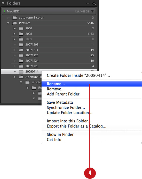
To rename a folder, right/Control-click it in the Folders panel and choose Rename from the contextual menu. Enter the new name in the Rename Folder dialog box that appears and click Save.
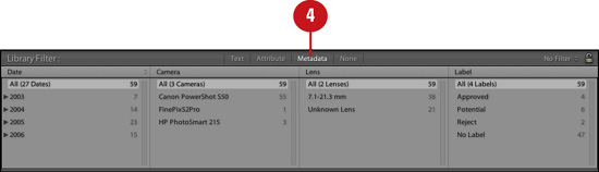
Filter Bar
The Filter Bar is located below the Module picker and above the Content area. It is hidden by default, but can be displayed quickly by pressing the backward slash key (). You can use the Filter Bar to search for photos by text (such as filename), attribute (such as rating or color label), or metadata stored in the file (such as shot date or camera type).
Search for images by text, attribute, or metadata
To display the Filter Bar, choose View > Show Filter Bar.

Click the Text button to display the Text Filter options in the Filter Bar.

Click the Attribute button to display the Attribute Filter options in the Filter Bar.
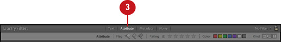
Click the Metadata button to display the Metadata Filter options in the Filter Bar.
Timesaver
Shift-click the Text, Attribute, or Metadata buttons to add their respective options to the Filter Bar display and perform a detailed search. Shift-click the buttons again to remove them.
Changing Grid View Options
In Grid view, you can choose to display the thumbnails, and any additional info and clickable markers, in compact or expanded cells. Compact Cells (the default display option) limits the amount of image info and clickable markers you can display surrounding each thumbnail. Expanded Cells enables more space to display additional tools and info.
Choose general cell view options
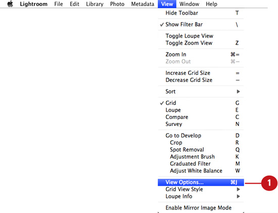
Under the View menu, choose View Options.
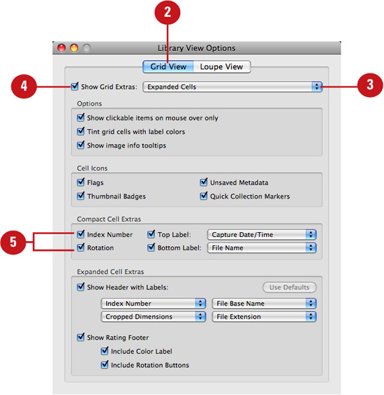
In the Library View Options dialog box that appears, click the Grid View tab.

Enable Show Grid Extras.
Enable any of the following general Grid View options:
• Show Clickable Items on Mouse Over Only—Enable this option to display clickable items, such as Quick Collection markers and rotation buttons, only when mousing over a grid cell.
• Tint Grid Cells with Label Colors—Enable this option to apply color labels to the image thumbnail border.
• Show Image Info Tooltips—Enable this option to display tooltips when mousing over items in a grid cell.
 Choose which icons to display in the grid cell. Options include Flags, Thumbnail Badges, Quick Collection Markers, and Unsaved Metadata.
Choose Compact Cell view options
Under the View menu, choose View Options.

In the Library View Options dialog box that appears, click the Grid View tab.
Enable Show Grid Extras.
Choose Compact Cells from the top drop-down list.
Enable any of the following Compact Cell Extra grid view options:
• Index Number—Enable this option to display a large dimmed number in the cell background.
• Top Label—Enable this option to display extra image info above the thumbnail. Choose which info to display from the drop-down list provided.
• Rotation—Enable this option to display clickable rotation icons in the bottom corners of the grid cell. These icons can be used to rotate the photo clockwise or counterclockwise.
• Bottom Label—Enable this option to display extra image info below the thumbnail. Choose which info to display from the drop-down list provided.
Choose Expanded Cell view options
Under the View menu, choose View Options.

In the Library View Options dialog box that appears, click the Grid View tab.

Enable Show Grid Extras.
Choose Expanded Cells from the top drop-down list.
Enable any of the following Expanded Cell Extra grid view options:
• Show Header with Labels—Enable this option to display extra image info in a header above the thumbnail. Choose which info to display from the four drop-down lists provided.
• Show Rating Footer—Enable this option to display ratings in a footer area below the thumbnail. You can also choose to display color labels and rotation buttons in the footer. Note that all the footer options are clickable, enabling you to apply ratings and color labels, and rotate the photo clockwise or counterclockwise.
Setting Loupe View Options
Loupe view enables you to zoom and scroll around a single image in the Content area of the Library module. The Loupe view mode contains it own set of options, which you can choose from the Loupe view tab of the View Options dialog box. These options enable you to display specific information about the photo over the upper-left corner of the image in Loupe View mode.
Choose Loupe view options
Under the View menu, choose View Options.

In the Library View Options dialog box that appears, click the Loupe View tab.
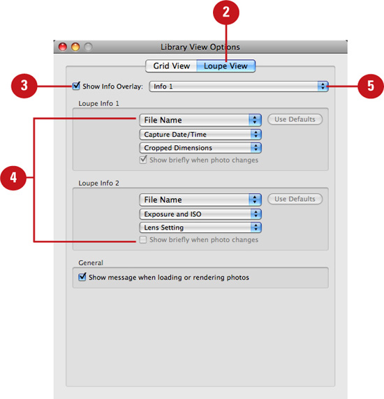
Enable Show Info Overlay.
Choose which info to display for Loupe Info 1 and Loupe Info 2 from the drop-down lists provided.
Choose to display either Info 1 or Info 2 from the top drop-down list.
The chosen info is displayed in the upper-left corner of the photo in Loupe view.
Important
If the Show Info Overlay option is disabled, you can enable the Show briefly when photo changes option. Doing so displays the Info Overlay for just a few seconds in Loupe view.
Timesaver
Press Cmd+I (Mac) or Ctrl+I (Win) to show or hide the Info Overlay in Loupe View mode. Press I to toggle between Info 1 and Info 2.
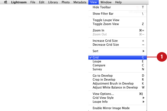
Navigating the Library Grid
In Grid view, you can scroll through catalog photos by clicking and dragging the scroll bar located to the right of the Content area. You can select an image by clicking its thumbnail in the grid, or select multiple adjacent images by Shift-clicking. To select multiple non-adjacent images, Cmd+click (Mac) or Ctrl+click (Win). The primary (or active) selection is always highlighted in a lighter shade of gray and is the image that appears in the Navigator panel.
Browse photos in the catalog
If you’re not already in Grid view, choose Grid from the View menu or click the Grid View button in the Library Toolbar.
In the Toolbar, click and drag the Thumbnails slider to the right to increase the size of the thumbnails; click and drag to the left to decrease their size.

Timesaver
Press the + key to increase the cell size by one cell per row; press the - key to decrease by one cell per row.
Click any thumbnail in the grid to select it.
Timesaver
Shift+click to select multiple adjacent photos; Cmd+click (Mac) or Ctrl+click (Win) to select multiple non-adjacent photos.
Click the top, bottom, or side bar arrows to hide the side panels, Filmstip, or Module Picker. Doing so expands the Content area and creates more room for the thumbnails.
Timesaver
Press Tab to show or hide the side panels; press Shift+Tab to show or hide the side panels, Filmstrip, and Module Picker all at once.
With both side panels, the Filmstrip, and the Module Picker hidden.
Navigating in Loupe View
In Loupe View mode, you can only view one image at a time in the Content area (when multiple images are selected in the grid or Filmstrip, the image displayed in Loupe view is the primary selection). However, you can select other images to view in Loupe View mode, without having to return to Grid View. By clicking the left and right arrow keys in Loupe View mode, you can display the previous or next photos in the catalog or in your current catalog selection.
Zoom into an image
Click any thumbnail in the grid to select it.

Important
If you have multiple thumbnails selected, the primary selection (the image with the lightest shade of gray surrounding it) is targeted. This is also the photo that appears in the Navigator panel.
To open the primary selected photo in Loupe View mode, choose Loupe from the View menu, or click the Loupe View button in the Library Toolbar.
The photo is displayed so that it either fits in the Content area or fills it, depending on which option you clicked last in the Navigator panel.
Click the left or right arrow keys to display the previous or next catalog images in Loupe View mode.
Important
If you have multiple thumbnails selected, you will only be able to display those images in Loupe View mode.

Use the left/right arrow keys to display the previous/next catalog images.
Changing Loupe Zoom Views
There are two different ways that you can view images in Loupe view: in standard Loupe view or close-up Loupe view. Entering standard Loupe view is the same as clicking either the FIT or FILL buttons in the Navigator panel; entering close-up Loupe view is the same as clicking either the 1:1 or custom magnification buttons.
Toggle zoom views
Click any thumbnail in the grid to select it.

Important
If you have multiple thumbnails selected, the primary selection (the image with the lightest shade of gray surrounding it) is targeted. This is also the photo that appears in the Navigator panel.
To open the primary selected photo in standard Loupe View mode, choose Loupe from the View menu, or click the Loupe View button in the Library Toolbar.
Timesaver
You can also double-click any thumbnail in the grid to open it in standard Loupe View mode.
The photo is displayed so that it either fits in the Content area or fills it, depending on which option you clicked last in the Navigator panel.
To enter close-up Loupe view, choose View > Toggle Zoom View. Doing so zooms in to the photo at either 1:1 magnification, or a custom view setting, depending on which option you clicked last in the Navigator panel.

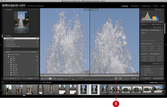
Working in Compare View
In addition to Grid view and Loupe view, the Library module also contains a Compare view, which enables you to select two similiar images from the Grid or Filmstrip, and view them side by side in the Content area. Doing so can help you decide which photo to work with in the Develop module or output in the Print module. In Compare view, the primary selection becomes the Select photo, and the secondary image becomes the Candidate. You can choose to sync the magnification levels and scroll locations for both photos, or unsync them and compare the photos using different view settings.
Compare photos side-by-side
In Grid view or the Filmstrip, Shift+click to select two adjacent photos; Cmd+click (Mac) or Ctrl+click (Win) to select two non-adjacent photos.

To open the selected photos in Compare View mode, choose Compare from the View menu, or click the Compare View button in the Library Toolbar.
Both photos are displayed so that they either fit in the Content area or fill it, depending on which option you clicked last in the Navigator panel. The primary selected photo is displayed to the left with a white border, and the Candidate photo to the right. The white border indicates which image is targeted.
Important
You can switch the focus to the Candidate photo by clicking it in the Content area. Doing so places the white border around the photo and enables you to work with it in the Navigator panel.
With the Link Focus option enabled, drag the Zoom slider to change the magnification level for both photos.
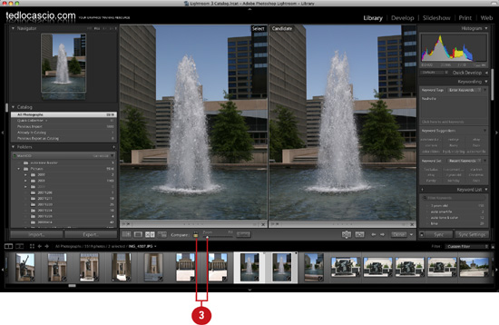
Important
With the Link Focus option disabled, you can view the photos at different magnification levels and scroll locations.
Click and drag over the targeted photo to scroll to a different area, or move the target icon in the Navigator panel.

Click the Swap button in the Library Toolbar to make the Candidate the Select photo and vice versa.
 Click the Make Select button in the Library Toolbar to make the Candidate the Select photo and apply the next photo in the Filmstrip as the new Candidate.
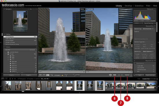
 Click the left or right arrow buttons in the Library Toolbar to select the previous or next photo in the Filmstrip as the Candidate.
Timesaver
You can also use the left or right arrow keys to select the previous or next photo as the Candidate.
 Click Done to display the primary selected photo in Loupe View mode.
Working in Survey View
Survey view is similar to Compare view in that it enables you to select and preview more than one image at a time. However, in Compare view, you can only select two images from the Grid or Filmstrip and view them in the Content area, whereas in Survey view, you can select and preview an entire series of images. You can access clickable markers by hovering your mouse over an image in Survey view. This is a great way to apply ratings, labels, or flags to a related series of photos in Lightroom.
Preview multiple selected photos at a time
In Grid view or the Filmstrip, Shift+click to select multiple adjacent photos; Cmd+click (Mac) or Ctrl+click (Win) to select multiple non adjacent photos.
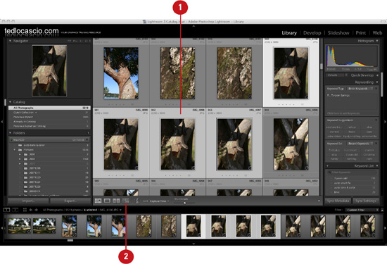
To open the selected photos in Survey View mode, choose Survey from the View menu, or click the Survey View button in the Library Toolbar.
The photos are displayed as large as possible in the Content area. The primary selected photo is displayed with a white border.
Important
You can change your primary selection by clicking a different photo in the Content area, or by clicking the left/right arrow keys or buttons in the Library Toolbar. Doing so places the white border around the photo and enables you to work with it in the Navigator panel.
When you hover over an image in the Content area, a black X appears in the lower-right corner of the thumbnail. Click the X to remove the image from the current selection and from Survey view.
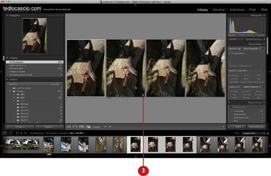
The thumbnails automatically resize to fill the extra space in the Content area.
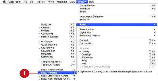
Navigating with the Filmstrip
The Filmstrip is located along the bottom of the interface, below the side panels and Content area. You can use the Filmstrip to locate and select images from the catalog, in the same way that you can with the Grid. The benefit to using the Filmstrip is that it is accessible in all modules, and not just the Library. The downside is that, unlike the Grid, you can’t display as much info surrounding the thumbnails. However, there is a preference in the Interface tab of the Preferences dialog box that gives you the option to display ratings and picks in the Filmstrip.
Browse through and select catalog images in any module
If the Filmstrip is not already visible, choose Window > Panels > Show Filmstrip, or click the up arrow located at the bottom of the interface.
To resize the Filmstrip, click its top edge and drag it up or down.
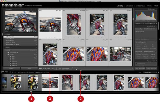
The current file path is displayed at the top of the Filmstrip. To access a recent resource, such as a catalog, folder, or collection, choose one from the drop-down list provided.
Use the slider bar, or click the side arrows to scroll through the thumbnails manually.
Use the left or right arrow keys to select the previous or next photo in the Filmstrip.