
Many great image editing techniques are based on the ‘selection’ prowess of the photographer. Being able to manipulate the selection tools to isolate the precise pixels that you wish to edit is a key skill that we all should possess. The following techniques will help you build on your existing selection skills.
6.01 Adding to and Subtracting from Selections
Suitable for Elements – 5.0, 4.0, 3.0, 2.0, 1.0 | Difficulty level – Basic Related techniques – 6.02, 6.03, 6.04, 6.05 | Tools used – Magic Wand, Lasso, Marquee
Only on a very rare occasion will you be able to create the perfect selection with a single tool applied once. Most editing jobs require the building of selections using multiple tools, creating new selections that are either added to, or subtracted from, existing selections. Photoshop Elements provides a range of features that are designed for just this purpose.
When a selection tool is in use four selection modes are available in the option bar. By switching between these modes whist making additional selections you can:
Create a new selection each time the tool is applied,
Add to an existing selection,
Subtract from an existing selection, or
Make a selection from the intersection of the new and old selections.
The modes are available for all selection tools the exception being that the Intersect mode can not be used with the Magic Selection Brush or the Selection Brush tools. The New Selection option being the default. Complex areas of a picture can be isolated by making a series of selections choosing the necessary tool (Lasso, Marquee, Magic Wand, Selection Brush or Magic Selection Brush) and mode (new, add to, subtract from, intersection of) as you go. The mode of the current tool can also be changed using a keyboard shortcut whilst selecting. Hold down the Shift key to add to a selection or the Alt key.
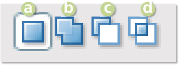
Adding to selections >> Modify your selections by switching selection modes using the buttons found in the Options menu. (a) New selection. (b) Add to selection. (c) Subtract from selection. (d) Make new selection from the intersection.
6.02 Using the Selection Brush
Suitable for Elements – 5.0, 4.0, 3.0, 2.0 | Difficulty level – Intermediate | Resources – Web image 6.02 Related techniques – 6.01, 6.03, 6.04, 6.05 | Tools used – Selection tools | Menus used – Select
Responding to photographers’ demands for even more options for making selections, Adobe included the Selection Brush for the first time in version 2.0 of Elements. The tool lets you paint a selection onto your image. The size, shape and edge softness of the selection are based on the brush properties you currently have set. These can be altered in the Brush Presets pop-up palette located in the options bar.
The tool can be used in two modes – Selection and Mask:
• The Selection mode is used to paint over the area you wish to select. The Mask mode works by reverse painting in the areas you want to ‘mask from the selection’.
• The Mask mode is particularly well suited for showing the soft or feathered edge selections made when painting with a soft-edged brush or when making detailed edits to the selection.
Holding down the Alt (Windows) or Option (Mac) keys whilst dragging the brush switches the tool from adding to the selection to taking away from the area.

Painting selections >> The Selection Brush tool allows the user to create selections by painting directly onto the picture surface.

Selection Brush modes >> The Selection Brush can work in either selection or mask modes.
Suitable for Elements – 5.0, 4.0 | Difficulty level – Intermediate | Resources – Web image 6.03 Related techniques – 6.01, 6.02, 6.04, 6.05 | Tools used – Selection tools | Menus used – Select
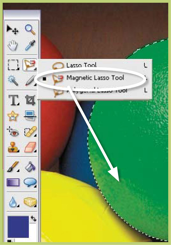
Along with the Selection Brush tool the Magic Selection Brush provides Elements users with an unique approach to creating and modifying selections. As we have seen, when using the Selection Brush the user must paint over the area to be encompassed by the selection. The accuracy of this painting step determines the accuracy of the final selection. For example, painting over an edge accidently will result in the creation of a selection that goes beyond this picture part. The Magic Selection Brush provides a quicker, easier and, in most cases, more accurate way to make selections by combining both the drawing and color selection approaches of the other tools we have covered. To make a selection choose the tool from the tool bar. If it is hidden from view click the small arrow at the bottom right of the Selection Brush button to reveal the tool. Now use the tool to scribble or place dots on the picture parts that you want to select. Once you finish drawing release the mouse button, Elements will then create a selection based on the parts you have painted. You don’t have to be too careful with your initial painting as the program registers the color, tone and texture of the picture parts and then intelligently searches for other similar pixels to include in the selection.
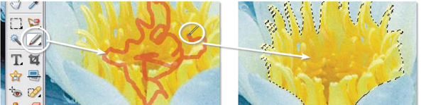
Scribble your selections >> After using the Magic Selection Brush to draw over the picture parts to be selected, Elements automatically generates a selection of all the adjacent areas in the picture that have similar color, texture or tone.
Refining the Areas Selected with Magic Selection Brush
Although this new tool does a pretty good job of selecting alike areas there will always be occasions when either too much or too little of the picture has been included. Just like the other tools we have looked at, the Magic Selection Brush allows you to easily modify existing selections. To include other areas in the selection click the Indicate Foreground button in the tool’s options bar and paint or place a dot on a new picture part. This step will cause Elements to regenerate the selection to include your changes (note that after making your initial markup, the tool automatically switches to Indicate Foreground for refining the selection). To remove an area from the selection, click on the Indicate Background button and scribble or dot the part to eliminate. Again Elements will regenerate the selection to account for the changes. The Shift and Alt keys can be used whilst drawing to change modes on-the-fly and add to or subtract from the selection. As Elements regenerates the selection with each change it may be more efficient to refine a selection by switching to the Selection Brush and manually finishing a selection.
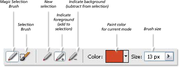
Adjusting the magic >> The options bar of the Magic Selection Brush contains several modes that can be used for altering or refining the selection created by the tool. You can add other picture parts to a selection by clicking on the indicate foreground mode and then painting over the new area. Parts already selected can be removed by changing to the indicate background mode and painting on these areas.
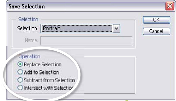
6.04 Saving and Loading Selections
Suitable for Elements – 5.0, 4.0, 3.0, 2.0, 1.0 | Difficulty level – Intermediate | Resources – Web image 6.04 Related techniques – 6.01, 6.03, 6.04, 6.05 | Tools used – Selection tools | Menus used – Select
Photoshop Elements thankfully gives you the option to save all your hard selecting work so that it can be used again later. With your selection active choose the Save Selection option from the Select menu. Your selection will now be saved as part of the file when you save in PSD, TIFF, PDF or JPEG 2000 formats. When you open the file later you can retrieve the selection by choosing Load Selection from the same menu. This feature is particularly useful when making sophisticated multi-step selections, as you can make sequential saves, marking your progress and ensuring that you never lose your work. The Save Selection dialog also provides you with another way to modify your selections. Here you will find the option to save a newly created selection in any of the four selection modes we looked at earlier. This provides you with an alternative method for building complex selections which is based on making a selection and then saving it as an addition. In this way you can create a sophisticated selection one step at a time.
Save Selection dialog >> You can also choose to modify your selection via the modes in the Save Selection dialog.
Step 1 >> Use your favorite tool to make your first selection.
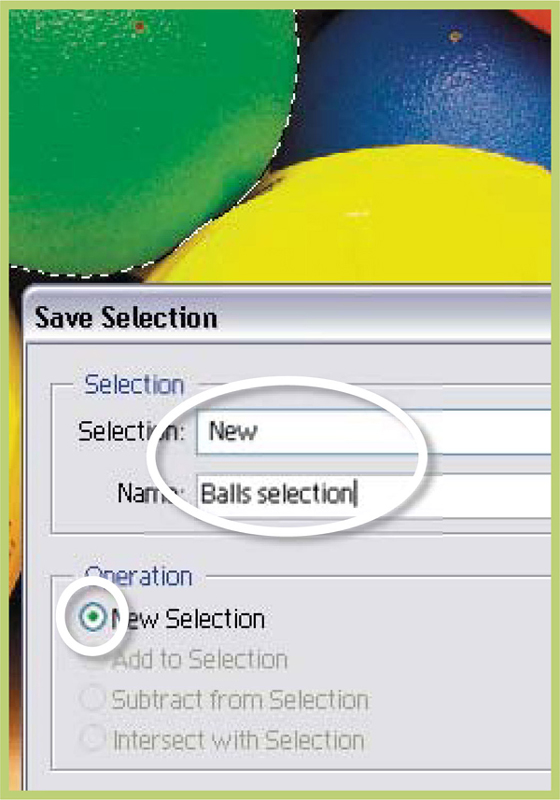
Step 2 >> Save this as a new selection using the Select > Save Selection feature. Deselect (Ctrl + D).
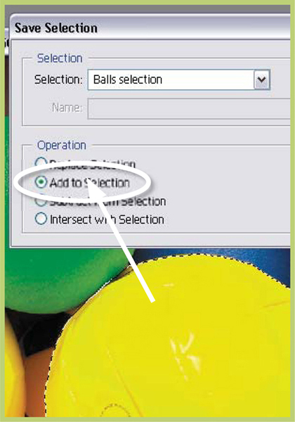
Step 3 >> Make a new selection and then save it using the Add to Selection mode in the Save dialog.
Suitable for Elements – 5.0, 4.0, 3.0, 2.0, 1.0 | Difficulty level – Intermediate | Resources – Web image 6.04 Related techniques – 6.01, 6.02, 6.04 | Tools used – Selection tools | Menus used – Select
Apart from adding to and subtracting from selections, Photoshop Elements also offers several other ways to modify your selections. Nested under the Select menu, most of these options change the positioning or character of the selection’s edge. They can provide quick ways to adjust your selections.
Select > Feather adjusts the smoothness of the transition between selected and non-selected areas. Low values are used for sharp-edged selections and higher values for softer ones.
Select > Modify > Border creates a border of a specific pixel width at the selection’s edge. Add color to this border using the Edit>Fill command. This option only creates soft edge borders. Use Edit>Stroke to create hard-edged lines around a selection.
Select > Modify > Smooth searches for unselected pixels within the nominated radius. If these areas are surrounded by selected pixels then they will be included in the selection; if the surrounding areas are not selected then they will be removed from the selection.
Select > Modify > Expand increases the size of the selection evenly by the pixel amount selected.
Select > Modify > Contract decreases the selection size by the pixel amount selected.
Select > Grow selects pixels adjacent to the selection that are within the tolerance range of the Magic Wand settings.
Select > Similar chooses all pixels throughout the picture that fall within the Magic Wand tolerance settings.

Feather >> Use this option to create graduated edges to your selections.

Border >> This option creates a soft-edged border, a specific number of pixels wide.

Smooth >> Use this option to include random unselected pixels in an otherwise selected area.
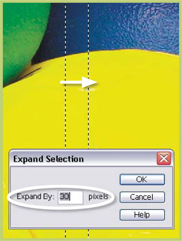
Expand >> Increase a selection’s size by a given number of pixels with this command.

Contract >> Reduce the size of the selection by a given number of pixels adjacent pixels with this setting.
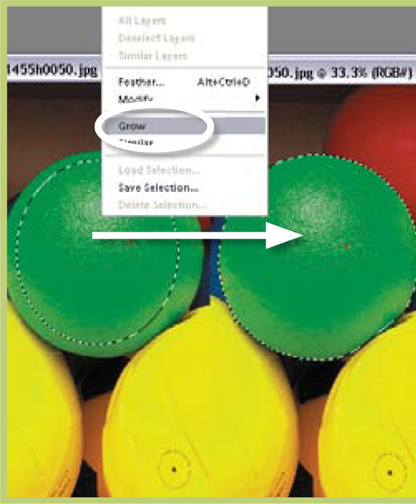
Grow >> Use this option to select all adjacent pixels that fall within the current Magic Wand settings.

Similar >> This command selects all other pixels in the whole image that fall within the Magic Wand settings.
Suitable for Elements – 5.0, 4.0, 3.0, 2.0, 1.0 | Difficulty level – Intermediate | Resources – Web image 6.06 Related techniques – 6.01, 6.02, 6.03, 6.05 | Tools used – Selection tools | Menus used – Image
By combining the abilities of the transformation tools that Photoshop Elements provides with several selection techniques you have the power to seamlessly change the way that your pictures look. The features grouped under the Transform heading include tools that can alter the scale and rotation of your picture as well as those that can be used to skew, distort or apply perspective to the image. These changes can be made to the photograph as a whole, to the contents of a layer, to a selection or to a shape that you have drawn. Not all transformation options are available in all situations. For example, the Distort & Perspective options cannot be applied to the contents of a text layer.

Select, copy and paste >> By manipulating selected parts of your picture you can change a straight image into something that on the one hand is obviously not real, but because it has been so seamlessly altered, it has an aspect of believability. Here the eyes and mouth of the subject have been selected, copied and enlarged before being blended back into the original picture.

Transform >> The Free Transform tool provides a fast and effective way to manipulate the size and shape of your pictures.
When a transformation tool is active the image area will be surrounded by a ‘bounding box’ containing several adjustment handles at its corners and sides. By dragging these handles you will be able to manipulate the picture. Most experienced image editors use the Free Transform tool (Image > Transform > Free Transform) for all their transformation changes. With this one feature and a few different keyboard combinations you can perform all your image adjustments without selecting another feature. Use the guide below to help you use the Free Transform tool:
To scale – drag on one of the corner handles of the bounding box.
To scale from the center - press the Alt key whilst dragging a corner handle.
To maintain aspect ratio whilst scaling – hold down the Shift key whilst dragging.
To rotate – move the cursor outside the bounding box until it changes to a curved two-ended arrow, then click and drag to rotate the picture.
To distort – hold down the Ctrl key whilst dragging any handle.
To skew – hold down the Ctrl + Shift keys whilst dragging a side handle.
To apply a perspective change – hold down Ctrl + Alt + Shift whilst dragging a corner handle.
To commit changes – double-click inside the bounding box or hit Enter, or click the Commit icon (green tick) at the bottom of the marquee.
In the example the exaggerated eyes and mouth were created by firstly selecting the face parts, feathering the edge of the selection (Select > Feather) and then copying (Edit > Copy) and pasting (Edit > Paste) each part onto a new layer. With the appropriate layer selected the parts were then enlarged using the Free Transform feature (Image > Transform > Free Transform) and distorted a little (Image > Transform > Distort) to suit the rest of the face. As a final step a soft-edged eraser was used to remove sections of the face parts that didn’t match the picture below. This step helped to blend changes into the original image.

Step 1 >> Copy and paste onto new layers parts of the picture that were selected using a feather.
Step 2 >> Change the size of the face parts and apply some distortion using the Free Transform tool. Double-click inside the bounding box to commit your changes.
Step 3 >> Carefully erase the edge of the transformed face parts to blend them with the rest of the original image below.
6.07 Precise Control of Selection Size
Suitable for Elements – 5.0, 4.0, 3.0, 2.0, 1.0 | Difficulty level – Intermediate Related techniques – 6.01, 6.02, 6.03, 6.04 | Tools used – Marquee | Menus used – Window, Edit, View
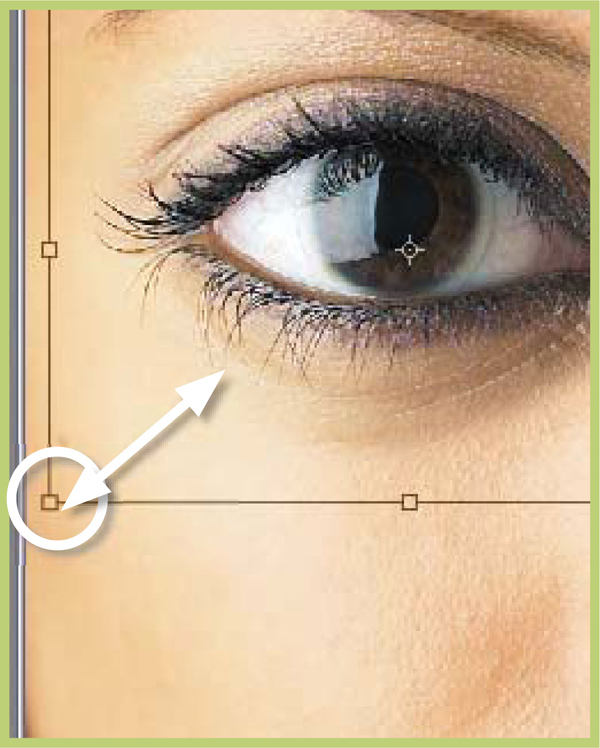
There will be times when you will need to know the precise size of the selections you make. You can get this information from the Info palette (Window > Info) where Elements reports the width and height of your selection in the units selected in the Units preferences (Edit > Preferences > Units and Rulers). This dialog also shows the exact position of the cursor. This can be helpful when you need to start and end a selection at a set screen reference.

Info >> The Info palette shows the position of the cursor (a) as well as the size of the selection (b).

Fixed Size selections>> Make precise selections by inserting the dimensions directly into the Marquee’s option bar.
If instead of just viewing the dimensions of the selection you actually want to specify the size, you can input these values into the options bar of the Marquee tool. After selecting the tool, choose Fixed Size from the Style drop-down menu in the Options bar. You can then enter the value for width and height into the fields in the bar. Now when you click on the canvas with the Marquee tool, a selection of the precise dimensions you input will appear on the picture. As with the Info dialog the measurement units used here are controlled by the settings in the Units and Rulers preferences.
Another way to precisely control the size of your selections is to use the Elements Grid system as a guide. Simply display the Grid over your picture (View > Grid) and switch on the Snap to Grid option (View > Snap to Grid). Now as you are drawing a selection the cursor will align itself with the grid lines or intersections. The interval of the grid lines and spacings can be altered via the Grid preferences (Edit > Preferences > Grid).

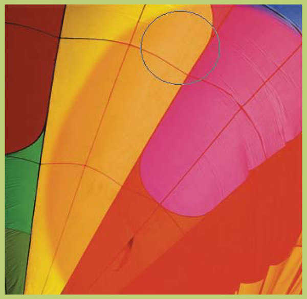
Grid as guide >> Use the Elements Grid option to help make precise selection. Image courtesy of www.darranleal.com.au.
In a lot of ways traditional film-based shooting is very similar to digital photography. After all, apart from a few useful additions such as a preview screen on the back and a slot for my memory card, my digital camera is not unlike my film camera (in fact they even share the same lenses). But thinking that these similarities extend to the pictures themselves can mean that you are missing out on some of the more powerful capabilities of your digital pictures.
Digital Pictures are not Always Flat
The traditional photograph contains all the picture elements in a single plane. Digital images captured by a camera or sourced from a scanner are also flat files. And for a lot of new digital photographers this is how their files remain – flat. All editing and enhancing work is conducted on the original picture, but things can be different.
Most image editing packages contain the ability to use layers with your pictures. This feature releases your images from having to keep all their information in a flat file. Different image parts, added text and certain enhancement tasks can all be kept on separate layers. The layers are kept in a stack and the image you see on screen in the work area is a composite of all the layers.
Sound confusing? Well try imagining for example that each of the image parts of a simple portrait photograph are stored on separate plastic sheets. These are your layers. The background sits at the bottom. The portrait is laid on top of the background and the text is placed on top. When viewed from above the solid part of each layer obscures the picture beneath. Whilst the picture parts are based on separate layers they can be moved, edited or enhanced independently of each other. If they are saved using a file format like Photoshop’s PSD file (which is layer friendly) all the layers will be preserved and present next time the file is opened.
Types of Layers
Image layers: This is the most basic and common layer type, containing any picture parts or image details. Background is a special type of image layer.
Text layers: Designed solely for text, these layers allow the user to edit and enhance the text after the layer has been made.
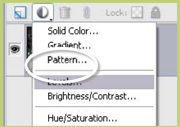
Fill layers: Users can also apply a Solid Color, Gradient or Pattern to an image as a separate layer.
Adjustment layers: These layers alter the layers that are arranged below them in the stack. They act as a filter through which the lower layers are viewed. You can use adjustment layers to perform many of the enhancement tasks that you would normally apply directly to an image layer without changing the image itself.
Shape layers: Drawing with any of the shape tools creates a new vector-based Shape layer. The layer contains a thumbnail for the shape as well as the color of the layer.
Frame layers: In Elements 5.0 Adobe introduces a new layer type to coincide with its Photo Layout creation project. Called the Frame layer, its role is to store both the frame and the picture that sits within it. Both the component parts remain as separate individual images despite being stored as one layer. What does this mean in day-to-day editing? Well it means that you can do things like change the size, shape and orientation of either the frame and picture combination, or the picture, independently of each other.
Background layers: An image can only have one background layer. It is the bottom-most layer in the stack. No other layers can be moved beneath this layer. You cannot adjust this layer’s opacity or its blending mode. You can convert background layers to standard image layer’s by double-clicking the layer in the Layers palette, setting your desired layer options in the dialog provided and then clicking OK.

Layers >> A digital picture is often composed of many parts, each stored on a separate layer. Image courtesy of www.ablestock.com © 2005.

Layer types >> (a) Text or type layer, (b) image layer with chequered transparent area, (c) background layer, (d) Layer palette, (e) preview window with separate layers viewed as a composite image. Image courtesy of www.ablestock.
Adding Layers
When a picture is first downloaded from your digital camera or imported into Photoshop Elements it usually contains a single layer. It is a ‘flat file’. By default the program classifies the picture as a background layer. You can add extra ‘empty’ layers to your picture by clicking the New Layer button at the bottom of the Layer’s palette or choosing the Layer option from the New sub-menu in the Layer menu (Layer > New > Layer). The new layer is positioned above your currently selected layer. Some actions, such as adding text with the Type tool, automatically create a new layer for the content. This is true when adding adjustment and fill layers to your image. When selecting, copying and pasting image parts, Photoshop also creates a new layer for the copied portion of the picture.
Photoshop Elements’s Layers palette displays all your layers and their settings in the one palette. If the palette isn’t already on screen when opening the program, it may be hidden in the Pallete Bin or you may have to choose the option from the Window menu (Window > Layers). The individual layers are displayed, one on top of the other, in a ‘layer stack’. The image is viewed from the top down through the layers. When looking at the picture on screen we see a preview of how the image looks when all the layers are combined. Each layer is represented by a thumbnail on the right and a name on the left. The size of the thumbnail can be changed, as can the name of the layer. By default each new layer is named sequentially (layer 1, layer 2, layer 3). This is fine when your image contains a few different picture parts, but for more complex illustrations it is helpful to rename the layers with titles that help to remind you of their content (portrait, sky, tree).
Visible layers >> When the Eye icon is present the layer is visible. Clicking on the eye turns the icon off, removing the layer from the preview window.
You can edit or enhance only one layer at a time. To select the layer that you want to change you need to click on the layer. At this point the layer will change to a different color from the rest in the stack. This layer is now the selected layer and can be edited in isolation from the others that make up the picture. Layers can be turned off by clicking the eye symbol on the far left of the layer so that it is no longer showing. This action removes the layer from view but not from the stack. You can turn the layer back on again by clicking the space where the eye symbol was. Holding down the Alt key whilst clicking on a layer’s eye symbol will turn off or hide all layers other than the one that you are clicking.
Manipulating Layers
Layers can be moved up and down the layer stack by click-dragging. Moving a layer upwards will mean that its picture content may obscure more of the details in the layers below. Moving downwards progressively positions the layer’s details further behind the picture parts of the layers above.
You can reposition the content of any layers (except background layers) using the Move tool. Two or more layers can be linked together so that when the content of one layer is moved the other details follow precisely. Simply multi-select the layers in the Layers palette and then click on the Chain icon (Link Layers button) at the top of the palette. The chain will be added to all the linked layers on the right of the thumbnail. Unwanted layers can be deleted by click-dragging them to the Dustbin icon at the top of the Layers palette.
Layer Styles
In early image editing programs creating a drop shadow edge to a picture was a process that involved many steps. Thankfully Elements includes this as one of the many built-in styles that can be quickly and easily applied to your layers. Users can add effects by clicking on the Artwork and Effects palette tab in the Palettes pane and selecting a layer style from those listed in the Special Effects section. You can edit the style settings by double-clicking on the small Starburst icon on the right of the thumbnail in the Layers palette.

Blending modes >> Changing the blending mode of upper layers will cause them to interact differently with the layers beneath. The example above shows how altering the blending mode of the text layer changes the way that it interacts with the image and background layers.
(a) Normal mode.
(b) Color Burn mode.
(c) Difference mode.
(d) Overlay mode.
(e) Luminosity mode.
(f) Color Dodge mode.
(g) Exclusion mode.
(h) Hue mode.
(i) linear mode.
Blending Modes and Opacity
As well as layer styles, or effects, the opacity (how transparent a layer is) of each layer can be altered by dragging the Opacity slider down from 100% to the desired level of translucency. The lower the number the more detail will show through from the layers below. The Opacity slider is located at the top of the Layers palette and changes the selected layer only. On the left of the Opacity control is a drop-down menu containing a range of blending modes. The default selection is ‘normal’, which means that the detail in upper layers obscures the layers beneath. Switching to a different blending mode will alter the way in which the layers interact. For more details see the full blending mode example in the Appendix.
Layer shortcuts
• To display Layers palette – Choose Window>Layers |
• To make a new layer – Choose Layer>New>Layer |
• To access Layers options – Click More button in the upper right-hand corner of the Layers palette |
• To create a new adjustment layer – Choose Layer>New Adjustment Layer and select the layer type |
• To change the size of layer thumbnails – Choose Palette options from the Layers Palette menu and select a thumbnail size |
• To add a style or effect to a layer – Select the layer and choose a style from those listed in the Layer Styles section of the Artwork and Effects palette. |
Masking in traditional photography is used to physically protect part of the picture from development or exposure. In black and white darkrooms this process often involved the positioning of specially cut ‘ruby’ red sheets over the photographic paper, which shielded this part of the picture from being exposed during the enlargement process.
The digital version of masking is also designed to restrict effects to only certain portions of an image. Photoshop Elements provides a variety of ways to employ a masking system when editing your pictures.
6.08 Painting Masks with the Selection Brush
Suitable for Elements – 5.0, 4.0, 3.0, 2.0 | Difficulty level – Intermediate | Resources – Web image 6.08 Related techniques – 6.02, 6.03 | Tools used – Selection Brush
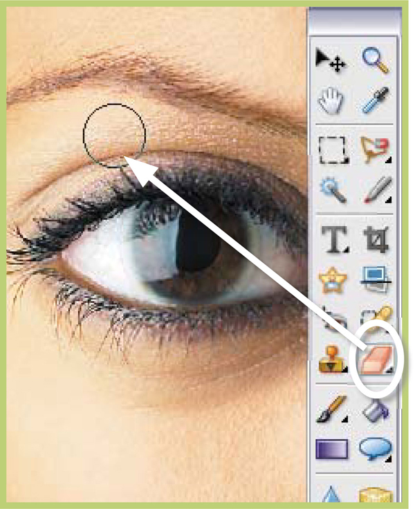
The Selection Brush was a welcome addition to the Photoshop Elements tools line up when it was added in revision 2.0 of the program and, although its primary purpose is to aid the creation of complex selections, it can also be used in a ‘Rubylith’ Mask mode. Activate the mode by selecting the Mask option from the mode drop-down menu in the Tools option bar. Now when the brush is dragged across the surface of a picture it will leave a red, semi-transparent mask behind it. The mask will protect these parts of the picture from the effects of filters, color changes and tonal correction.
The size and edge softness of the Selection Brush as well as the mask opacity (overlay opacity) and mask color can be altered in the options bar. Switching back to the Selection mode will turn off the mask and make a selection from the parts of the picture that weren’t painted. Whilst in Mask mode painting with the brush will add to the mask. Applying the brush in the Selection mode will add to the selection, which effectively is removing masked areas. You can also save carefully painted masks using the Save Selection option in the Select menu and pre-saved selections can be converted into a mask by loading the selection and then switching back to Mask mode. A quick tip for powers users – Alt-clicking the Layer Mask thumbnail displays shows the rubylith mask, which is handy when making lots of adjustments to the selected area.

Step 1 >> Choose the Selection Brush (under the Magic Selection Brush) from the tool box and switch the brush to Mask mode.
Step 2 >> Paint on the parts of the picture that you want to shield from the editing process.

Step 3 >> Apply the editing changes to the non-masked areas. Here we applied the Crystallize filter.
6.09 Fill and Adjustment Layer Masks
Suitable for Elements – 5.0, 4.0, 3.0, 2.0, 1.0 | Difficulty level – Intermediate | Resources – Web image 6.08 Related techniques – 6.08, 6.10, 6.11 | Menus used – Layer
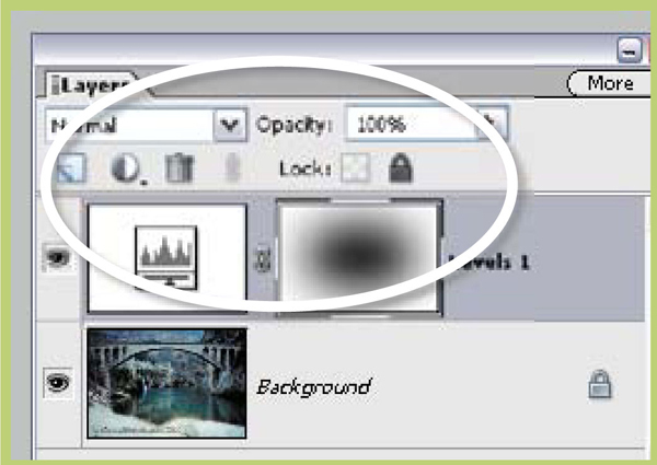
Another form of masking is available to Elements users via the Fill and Adjustment Layers features. Each time you add one of these layers to an image two thumbnails are created in the Layers palette. The one on the left controls the settings for the adjustment layer. Double-clicking this thumbnail brings up the dialog box and the settings used for the fill or adjustment layer. The thumbnail on the right represents the layer’s mask which governs how and where the settings are applied to the image.
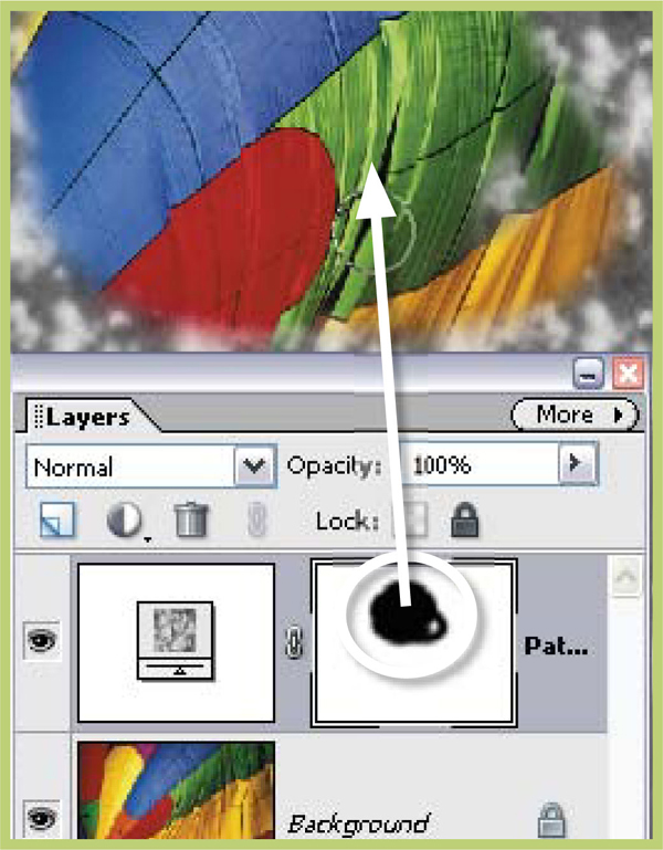
Eraser >> Erasing parts of the fill layer reveals the picture beneath.
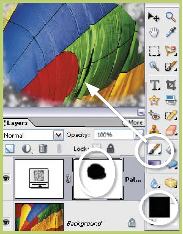
Black paint >> Painting the mask with black paint has the same effect as erasing.
White paint >> Painting with white paint restores the mask and the pattern.
The mask is a grayscale image. In its default state it is colored white, meaning that no part of the layer’s effects are being masked or held back from the picture below. Conversely, if the thumbnail is totally black then none of the layer’s effects is applied to the picture. In this monochrome world shades of gray equate to various levels of transparency. With this in mind we can control which parts of the picture are altered by the fill or adjustment layer and which parts remain unchanged by painting (in black and white and gray) and erasing directly on the layer mask.
To start editing a layer mask, firstly apply a fill layer such as Pattern to the image. Check to see that the default colors (white and black) are selected for the Elements foreground and background colors. Next select the Eraser tool, and with the fill layer selected in the Layer palette, proceed to remove part of the layer. The pattern is removed and the picture beneath shows through and a black mark now appears in the layer thumbnail corresponding to your erasing actions. Switch to the Paint Brush tool and select black as your foreground color and paint onto the patterned surface. Again this action masks the picture beneath from the effects of the fill layer and adds more black areas to the thumbnail. Painting with white as your foreground color restores the mask and paints back the pattern. You can experiment with transparent effects by painting on the mask with gray. The lighter the gray the more the pattern will dominate, the darker the gray the less the pattern will be seen. A similar semi-transparent effect can be achieved if the opacity of the eraser or brush is reduced.
6.10 Using Selections with Layer Masks
Suitable for Elements – 5.0, 4.0, 3.0, 2.0, 1.0 | Difficulty level – Intermediate Resources – Web image 6.08 | Related techniques – 6.08, 6.09, 6.11 | Tools used – Select
In addition to employing painting and erasing tools to work directly on the layer mask you can also use a selection in conjunction with an adjustment or fill layer to restrict the area of your image that is altered. Make a selection in the normal way and then, with the selection still active, create a new adjustment or fill layer. The selection confines the changes made by the new adjustment/fill layer. You will notice the selected area is colored white in the Layer Mask thumbnail. A layer mask made in this way can be edited using the same painting techniques as discussed above.

Selection >> By having a selection active when you make a new adjustment or fill layer you immediately restrict the effects of this layer to just the confines of the selection.
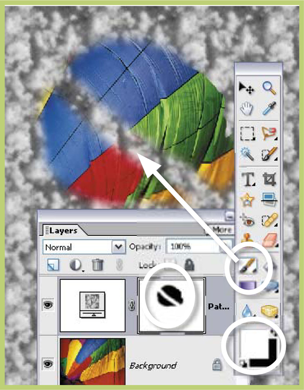
6.11 ‘Group with Previous’ Masks
Suitable for Elements – 5.0, 4.0, 3.0, 2.0, 1.0 | Difficulty level – Intermediate | Resources – Web image 6.08 | Related techniques – 6.08, 6.09, 6.10 | Menus used – Layer
The final masking technique that Photoshop Elements employs uses the special Group with Previous command found in the Layer menu. This command uses the transparency surrounding objects on a layer as a mask for the content of any layers that are above it in the stack. In the example the balloon image was placed above the test text layer. With the balloon layer active the Group with Previous command (Layer > Group with Previous) was selected. The example image now fills the text shape but is masked from showing through the rest of the layer by the transparency surrounding the type. This technique also works with shapes and filled selections drawn on a separate layer surrounded by transparency.

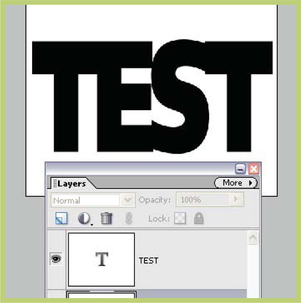
Step 1 >> Create some bold text in a new document with a white background layer.
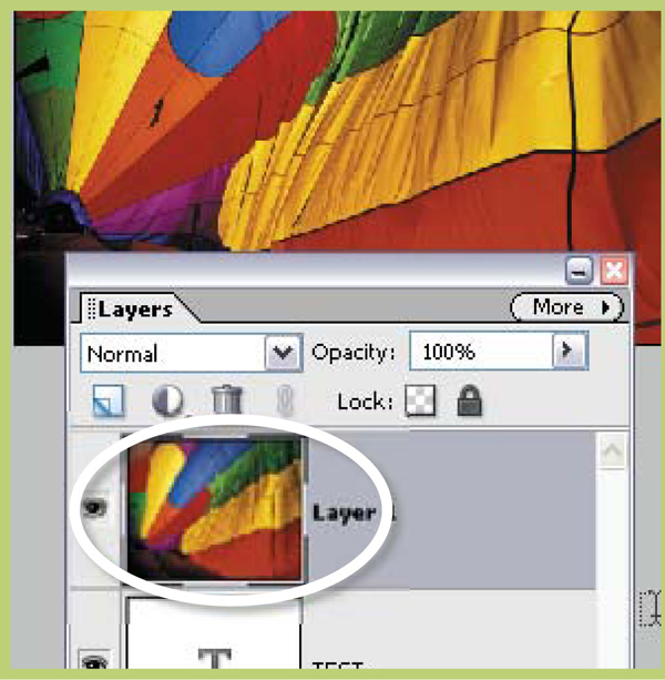
Step 2 >> Copy and paste a color image in a layer above the text.
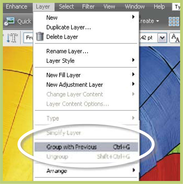
Step 3 >> Select the color layer and choose the Group with Previous command from the Layers menu.
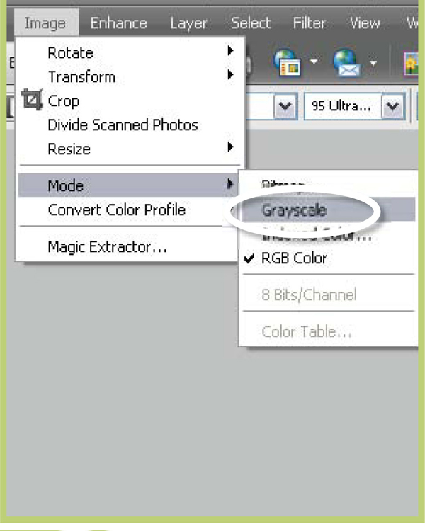
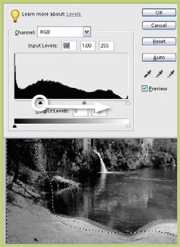
Step 1 >> Select Image > Mode > Grayscale and then click on the OK button in the Discard Color warning box.
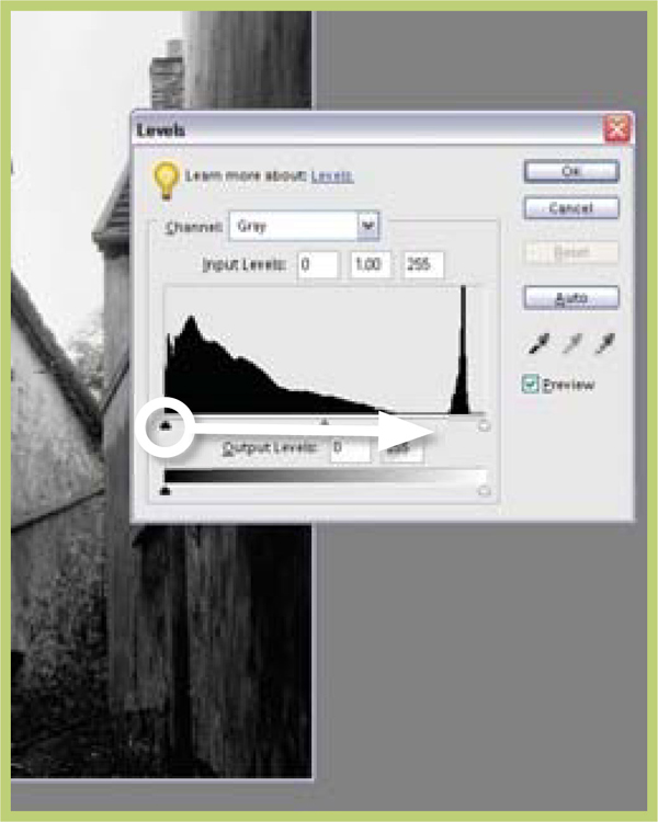
Step 2 >> Using the Levels control, map the dark pixels to black by dragging the black point slider to the right.
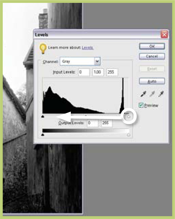
Step 3 >> Correct the highlights by dragging the white point slider to the left.
Converting Color to Black and White
One of the real advantages of shooting digital is the ease with which you can convert color images to black and white. Gone are the days of having to carry two camera bodies, one loaded with color film the other with black and white. Now you simply shoot color all the time and then convert selected images to black and white using a few simple steps.

Increase contrast >> By moving the black and white input sliders towards the center of the dialog you can increase the contrast of your picture.
6.12 Changing the Mode to Grayscale
Suitable for Elements – 5.0, 4.0, 3.0, 2.0, 1.0 | Difficulty level – Basic | Resources – Web image 6.12 | Related techniques – 6.13, 6.14 | Menus used – Image, Enhance
The simplest way to lose the colors in your picture is to convert the image to a grayscale. This process changes the photograph from having three color channels (red, green and blue) to being constructed of a single channel that contains the picture’s detail only. Often this conversion produces a flat and lacklustre photograph and so a little manipulation of the tones is in order. My first point of call to help solve this problem would always be the Levels dialog (Enhance > Adjust Brightness and Contrast > Levels). Using this control you can make sure that your image tones are spread across the grayscale spectrum.
Most grayscale conversion pictures need a general contrast increase. You can achieve this by moving the black and white input sliders towards the center of the dialog. Holding the Alt key down whilst you are moving the slider will enable you to preview the pixels that are being converted to pure black or pure white. Your aim is to map the darkest pixels in the picture to black and the lightest ones to white. Work carefully here as a heavy handed approach will produce pictures where delicate shadow and highlight details are lost forever.

Grayscale >> You can convert your color digital photographs to grayscale using two different methods in Adobe Photoshop Elements.
The simplest is to change color modes from RGB to Grayscale. The alternative is to desaturate the photograph. This process has the added advantage of leaving the black and white picture in RGB mode so that color can be added to the monochrome later.
Images created with either process do benefit from some adjustment of tones after conversion.
6.13 Desaturate the Color File
Suitable for Elements – 5.0, 4.0, 3.0, 2.0, 1.0 | Difficulty level – Basic | Resources – Web image 6.13 Related techniques – 6.12, 6.14, 6.15 | Tools used – Dodge and Burn-in | Menus used – Image
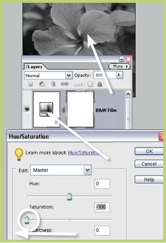
Photoshop Elements uses the term ‘saturation’ to refer to the strength of the colors in a picture. Increasing saturation makes the colors in a picture more vivid, decreasing saturation makes the hues weaker. The program employs the Hue/Saturation (Enhance > Adjust Color > Hue Saturation) control to adjust the color’s strength. If the Saturation slider is moved all the way to the left of the dialog (to a setting of –100) then all color is removed from the picture. You are effectively left with a grayscale or black and white photograph that is very similar to the ‘convert to grayscale’ version above but with one important difference – the picture is still an RGB file. This means that even though the photograph no longer contains any color, the color mode it is stored in is capable of supporting color. So if you are wanting to try a little digital hand coloring, or experiment with pictures that contain monochrome as well as color components, then this is the technique for you. More details on these techniques can be found later in this chapter. Be warned though, once your picture is desaturated the color is lost for ever and so it is always a good idea to save a copy of the color version of the image before proceeding.

Step 1 >> Select the Hue/Saturation control from the Adjust Color heading in the Enhance menu.

Step 2 >> Move the Saturation slider completely to the left, removing all color from the picture.
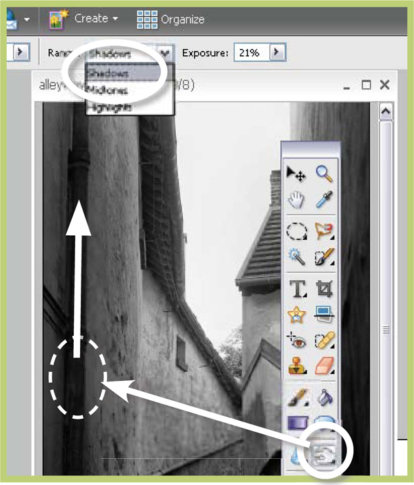
Step 3 >> Use the Dodging and Burning-in tools to lighten and darken selected areas of the picture.
![]()
You can shortcut the desaturation process by selecting Enhance > Adjust Color > Remove Color, which provides the same results as using the Hue/Saturation control but in a single step.
Once the picture has been desaturated you may need to tweak the shadow, highlight and mid tones using the Levels feature. Finally, add some drama to the picture by selectively lightening and darkening parts of the image using the Dodging and Burning-in tools. Used judiciously these devices can change the whole atmosphere of a photograph. In the example, I darkened the walls closest to the viewer and lightened those parts of the French alleyway that were in the background. These changes increased the sense of distance in the picture as well as helping to draw the viewer’s eyes into the picture.
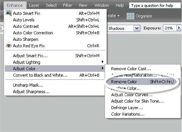
Desaturation shortcut >> The Enhance > Adjust Color > Remove Color option is a shortcut that produces the same results as moving the Saturation slider to −100 in the Hue/Saturation feature.

Saturation control >> By decreasing the saturation of the colors in a picture completely you convert the image to just black and white.
6.14 A More Sophisticated Approach
Suitable for Elements – 5.0, 4.0, 3.0, 2.0, 1.0 | Difficulty level – Basic | Resources – Web image 6.14 Related techniques – 6.12, 6.13, 6.15 | Menus used – Layer
Despite the straightforward nature of the two conversion approaches detailed above, transforming a color photo to grayscale is not as simple as it first seems. Many converted images seem a little flat and lack the separation of tones that existed in the original photo. The trick with good conversions from color to grayscale is ensuring that the hues in the original picture are translated into distinct and different tones. For this reason no one conversion process will be suitable for all pictures.
Take for instance the example of a red flower photographed against the background of rich green foliage. When converted to grayscale by switching modes or desaturating there is a tendency for both the red of the flower and the green of the leaves to be converted to the same gray tone, making the monochrome picture much less vibrant and dynamic than the original. In order to restore some visual separation between flower and background it is necessary to convert these hues to different grays.
Just such a technique was developed by the Adobe evangelist, Russell Brown (www.russellbrown.com). The original method was designed for Photoshop but works just as well with Elements. It uses the Adjustment Layers technology in Photoshop Elements as a way to both convert the color image to black and white and also to control how the colors are represented in the grayscale. Like a lot of Russell’s techniques it leaves the original image unchanged in the background. Hence this style of image enhancing is called non-destructive editing.

Step 1 >> Make a new Hue/Saturation layer above your background. Don’t make any changes to the default settings for this layer.
Set the mode of the adjustment layer to Color. Label this layer ‘Filter’.
Step 2 >> Make a second Hue/Saturation adjustment layer above the Filter layer and alter the settings so Saturation is −100. Call this layer Black and White Film. The monochrome image now on screen is the standard result we would expect if we just desaturated the colored original.

Step 3 >> Next double-click on the layer thumbnail in the Filter layer and move the Hue slider. This changes the way that the color values are translated to black and white. Similarly, if you move the Saturation slider you can emphasize particular parts of the image.

More control >> For more precise control of the separation of tones you can restrict your changes to a single color group (red, blue, green, cyan, magenta) by selecting it from the drop-down menu before manipulating the Hue and Saturation controls.

Gray conversion options >> Photoshop Elements provides a variety of options when you are wanting to convert color pictures to a grayscale or black and white photo.
(a) Original color photo.
(b) Change to grayscale mode.
(c) Desaturate the photo.
(d) The Russell Brown technique.
6.15 The New Convert to Black and White Feature
Suitable for Elements – 5.0 | Difficulty level – Basic | Resources – Web image 6.15 | Related techniques – 6.12, 6.13, 6.14 | Menus used – Enhance
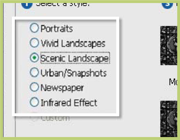
Taking this idea further the brand new Convert to Black and White feature (Editor: Enhance > Convert to Black and White) provides the ability to customize the way that color areas are mapped to gray during the conversion process. The dialog consists of a large before and after previews, a series of six conversion presets that are based on popular subject types, an Amount slider that controls the strength of the changes and eight thumbnail buttons for fine-tuning the results.
This new feature provides the options for more sophisticated conversions by allowing the user to adjust which colors (red, green or blue) feature more prominently in the final result.

Convert to Black and White >> Photoshop Elements 5.0 contains a brand new control for transforming color photos to grayscale. The Convert to Black and White feature allows you to control how the colors are mapped to gray.
(a) Original color photo.
(b) Desaturate or Remove Color conversion.
(c) Convert to Black and White conversion emphasizing the blue areas in the original color photo.
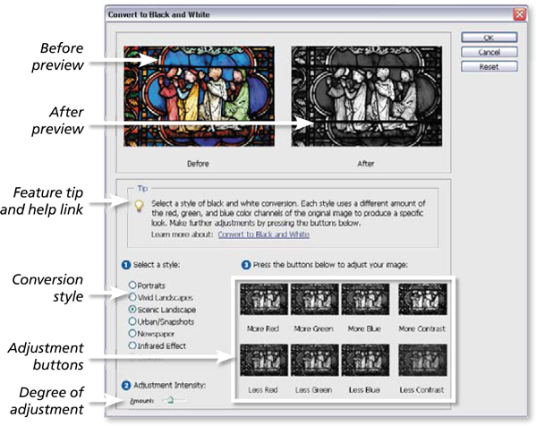
Convert to Black and White >> The Convert to Black and White dialog contains a before and after preview, six different conversion styles or flavor presets as well as a set of adjustment buttons that can be used for customizing the way that particular colors are mapped to gray.
This new feature is great for situations where the color contrast of a scene isn’t reflected in the monochrome conversion. Imagine the color contrast of a red rose against green foliage. Using a simple conversion feature such as Remove Color would result in both the rose and foliage being the same tone of gray. With Convert to Black and White the contrast of the original can be retained in the result by boosting or reducing the prominence of green or red parts of the picture.
Step 1 >> With a suitable color image open in the Full Edit workspace select the Convert to Black and White feature from the Enhance menu. Click through the different conversion styles checking the After preview for a suitable result. Click OK to apply the conversion, Reset to remove current settings or Cancel to quit the feature.
Step 2 >> For a more customized conversion start by selecting a conversion style that is closest to your desired result and then fine-tune the results by clicking one of the adjustment buttons – more blue/less blue, etc. The effects can be more dramatic by also clicking the opposite of another another option – less/more red.

Step 3 >> In situations where the changes made with each click of an adjustment button are too great alter the Adjustment Intensity slider that is located in the bottom left of the dialog. Moved the slider to the left for smaller increments of change and to the right for more dramatic effects.
![]()
Super pro tip: The bwconvert.txt file located in the C:ProgramFilesAdobePhotoshop Elements 5.0Required folder sets the values for the presets in the feature. This can be easily edited if a user wants to have their own conversion preset values. Of course, I highly recommend backing up the installed version of the file so that you can easily restore the settings back to the default values.
Advanced Dodging and Burning-In
After years of my ‘hit and miss’ approach to dodging and burning in the darkroom I can still remember my reaction to seeing Photoshop Elements performing real-time lightening and darkening – ‘You are kidding!’. Not only could I paint in light and dark areas on my picture using a soft-edged brush, I could also vary the strength of the effect and the size of the brush used for application. In addition, I could choose to alter shadow, mid tones or highlights separately and ‘undo’ my actions with a single keystroke. All this flexibility and with the lights on as well!
I would think that most new users to Photoshop Elements would experience much of the same excitement as I did when they first discover the Dodge and Burn-in tools. For the majority of simple enhancement tasks a few quick strokes of these tools will provide plenty of control over your picture’s tones, but there are occasions when you need a little more flexibility. I use the following techniques to provide a little more customization to my dodging and burning in my work.
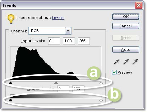
Input and output sliders >>
(a) Black, mid tone and white Input sliders.
(b) Black and white Output sliders.
6.16 Using Selections to Change Tone
Suitable for Elements – 5.0, 4.0, 3.0, 2.0, 1.0 | Difficulty level – Intermediate | Resources – Web Image 6.16 Related Techniques – 6.17 | Tools used – Selection tools| Menus used – Select
You can evenly alter the tone of a large area of your picture quickly by making a feathered selection of the area first and then using the Levels control to darken or lighten the pixels. The amount you feather the selection will determine how soft the transition will be between dodged or burnt areas and the original picture. Using the Levels feature gives you great control over the brightness of shadow, mid tone and highlight areas.
By manipulating the Input and Output sliders you can selectively alter specific tones in your image. You can also decrease or increase the contrast of the selection as well.
Use this table to help get you started.
Required image change |
Action to take |
To lighten the mid tones of a selected area |
Move the midpoint input triangle to the left |
To darken the mid tones of a selected area |
Move the midpoint input triangle to the right |
To lighten the mid tones and highlights |
Move the white point input triangle to the left |
To darken the mid tones and shadows |
Move the black point input triangle to the right |
To lighten the shadow tones |
Move the black point output triangle to the right |
To darken the highlight tones |
Move the white point output triangle to the left |
To decrease contrast |
Move the white and black point Output sliders closer together |
To increase contrast |
Move the white and black point Input sliders closer together |
Step 1 >> Using one of the selection tools draw a rough selection around selection. Use a large pixel amount for the area to dodge or burn-in.
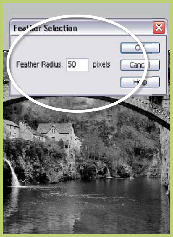
Step 2 >> Inverse and feather the selection. Use a large pixel amount for high-resolution pictures.
Step 3 >> With the selection still active manipulate the Levels Input and Output sliders to darken/lighten tones.
Pro’s Tip: Non-Destructive Dodging and Burning-In
If you want to dodge and burn but not make any permanent changes to the picture you can use the same feathered selection technique, but apply the changes through an adjustment layer. Make the selection as before, inversing (Select > Inverse) and feathering (Select > Feather) the edge. With the selection still active, click onto the Create New Adjustment Layer button on the bottom of the Layers palette and choose Levels. If the Layers palette is not visible then you can perform the same action via the Layer menu (Layer > New Adjustment Layer). The Levels dialog appears and any changes made with the sliders alter the tones in the selected area of the picture just as before. The difference with this approach is that the dodging and burning-in takes place via an adjustment layer, leaving the original picture unchanged in the layer beneath. The selection is used as a basis to form a mask in the adjustment layer. We view the levels changes through the clear areas of this mask only. A second advantage to this approach is that the levels settings can be changed at a later date. Simply double-click the thumbnail on the left-hand side of the layer and alter the Levels settings.
Step 1 >> With your feathered selection active click the New Adjustment Layer button.
Step 2 >> Select the Levels adjustment layer and adjust the dialog’s settings to Dodge and Burn-in.
A second non-destructive approach that was pioneered by Julianne Kost starts with you creating two empty layers above the background or image layer. Name them Dodge and Burn and set the blending mode for both of them to Soft Light. Using a Black brush at a low opacity (10–15%) paint on the burn layer to darken areas. Use a White brush at the same opacity on the dodge layer to lighten. This provides a non-destructive, subtle and artistic method for dodging and burning-in.

Dodging and burning-in >> Dodging and burning-in has always been used to add a little visual drama into photographs. The careful lightening and darkening of areas of the print can create a sense of depth and also help to direct the viewer’s eye to specific focal points in the image. Image courtesy of www.ablestock.com Copyright 2005.
6.17 Erase Back Through Tonal Layers
Suitable for Elements – 5.0, 4.0, 3.0, 2.0, 1.0 | Difficulty level – Intermediate | Resources – Web image 6.17 | Related Techniques – 6.15 | Tools used – Eraser Menus used – Enhance, Layer
A more artistic approach to dodging and burning-in can be found in a technique that involves making several different copies of the base picture. The background layer can be copied by either choosing Layer > Duplicate Layer or by dragging the layer to the Create New Layer button at the bottom of the Layer’s palette.
Each copy is stored on a separate layer and the overall tone of the duplicate image is changed using the Layers control. In the example I have created four layers, labelled them light, mid tone, dark and very dark, and changed their tones accordingly. Next I selected the Eraser tool, set the mode to brush, the edge option to soft and the opacity to 20%. I then clicked on the Eye icon in both the light and mid tone layers and selected the dark layer. Using the Eraser in overlapping strokes, I gradually removed sections of the dark layer to reveal the very dark layer beneath. I then selected the mid tone layer and performed the same action and finally I selected the light layer and erased sections to reveal the darker layers below. If this all sounds a little confusing, try thinking of the erasing action as actually painting the image darker, or burning the picture area in, and take my advice – make sure that you name your layers as you create them. This technique works particularly well if used with a graphics tablet as the opacity of the erasing stroke can be linked to the pressure on the stylus. Pressing harder with the stylus erases more of the layer and creates a greater change. Lighter strokes can be used to produce more subtle adjustments.
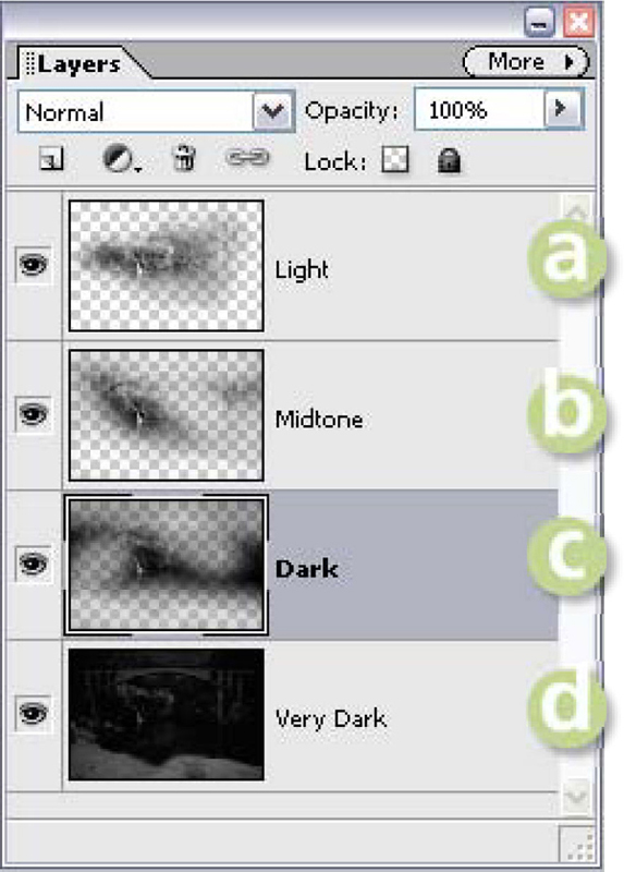
Dodge and burn via erase >> Make creative tonal changes using the Eraser tool and several adjusted layer copies.
(a) Light copy.
(b) Mid tone/normal copy.
(c) Dark copy.
(d) Very dark copy.
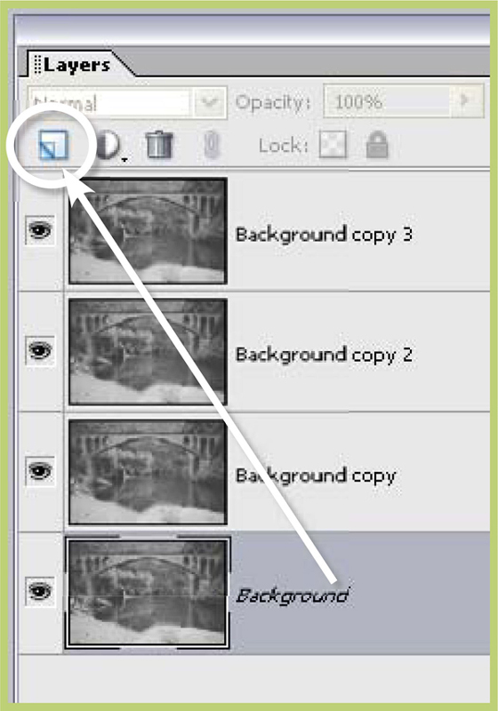
Step 1 >> Make several copies of the basic image layer by dragging the layer to the Create New Layer button.
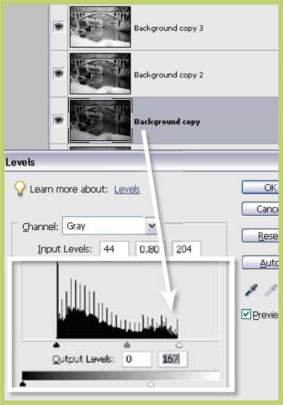
Step 2 >> Select each layer in turn and alter the overall brightness using the Levels dialog.
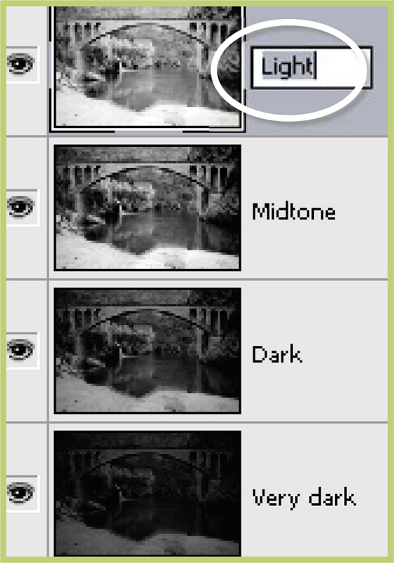
Step 3 >> Rename the layers by double-clicking the names in the Layer’s palette.
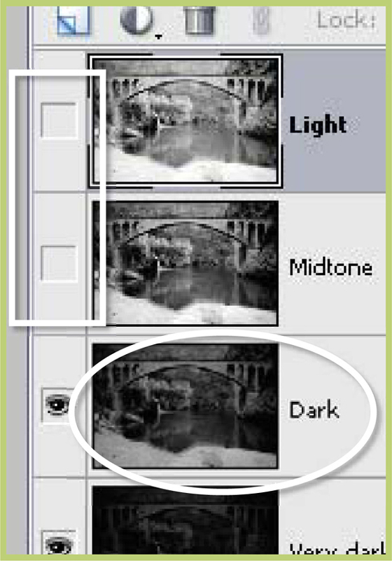
Step 4 >> Turn off the Eye icon for the light and mid tone layers and select the dark layer.
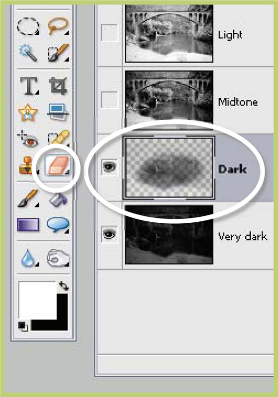
Step 5 >> Using the Eraser tool remove parts of the dark layer to reveal the very dark picture below.
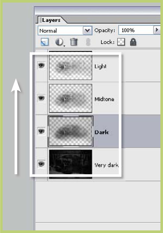
Step 6 >> Work your way through the other layers gradually removing unwanted areas to build up the picture.
6.18 Paint on Dodging and Burning-In
Suitable for Elements – 5.0, 4.0, 3.0, 2.0, 1.0 | Difficulty level – Intermediate | Resources – Web image 6.181 Related Techniques – 6.16, 6.17 | Tools used – Brush | Menus used – Layer
What if you want the flexibility of painting in your density changes (dodging and burning) but wanted to apply these changes non-destructively to your photo? Well, a solution can be found by combining aspects of the last technique with our understanding of adjustment layers and their associated layer masks.
Start by adding a Levels adjustment layer (Editor: Layer > New Adjustment Layer > Levels) to your photo. In the Levels dialog drag the Input midpoint slider to the right and the Output white point slider to the left. This will created an adjustment layer effect that darkens the whole image. Think of this change as how the image would look if you applied the Burn tool to the whole picture. Click OK to apply the change. Nothing new here you say. True, but what if we could selectively paint in this effect rather than apply it to the whole image? Well here is the trick. Click on the mask of the adjustment layer and fill it with black (Editor: Edit > Fill Layer). Remember black hides the adjustment layer effect so you should see the original tones of your photo restored in the preview window. With the mask still selected choose a soft-edged brush, lower the opacity slightly and make sure the paint colour is white.
Now paint onto the surface of the photo. The painted areas will darken. In reality you are not painting the photo but rather painting the mask and in so doing adding the adjustment layer effect in these areas.

‘Paint on’ image changes >> Use the mask of the Levels adjustment layer to paint burn and dodge effects non-destructively onto your photos.
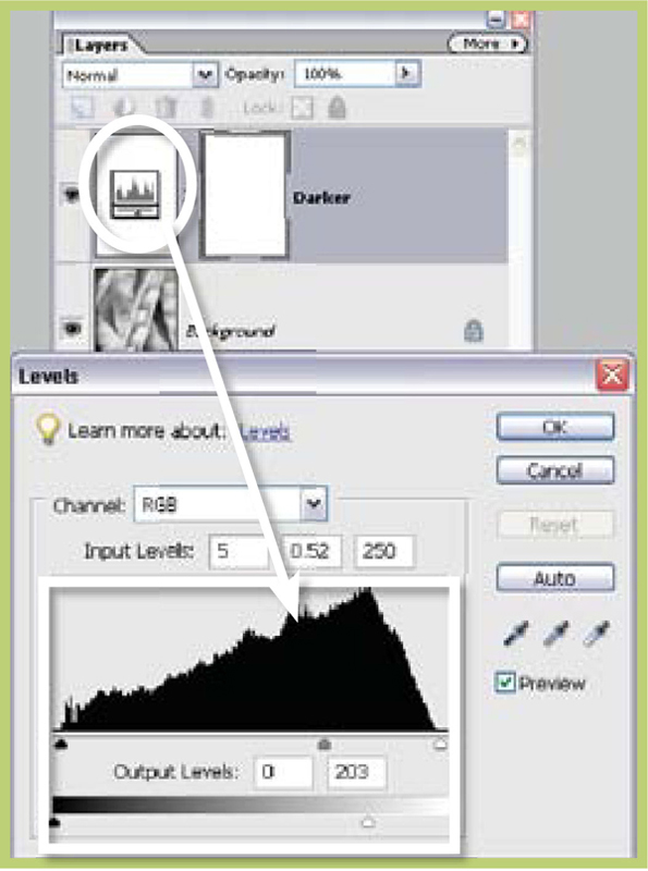
Step 1 >> Create a new Levels adjustment layer that darkens the photo.
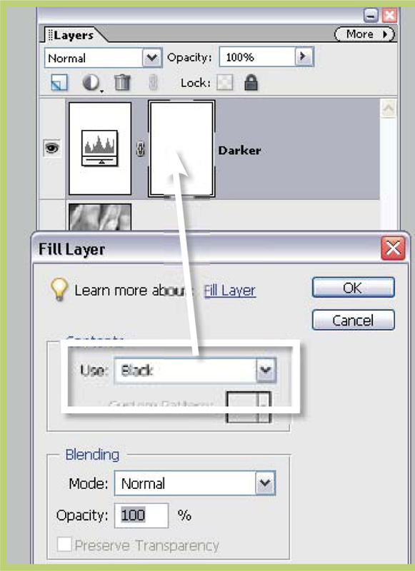
Step 2 >> Select the layer mask of the adjustment layer in the Layers palette and fill with black.

Step 3 >> To burn non-destructively brush onto the photo with white whilst the layer mask is still selected.
Enhance Your Poorly Exposed Pictures
Good exposure is the cornerstone of great images. No matter how good your subject is, how well you have composed the image or how brilliantly you captured the scene, if your exposure is a little astray then you will be left with a less than perfect result. This is just as true for digital images as it was for traditional photographs. Overexposure leads to delicate highlight detail being recorded as pure white; underexposure on the other hand produces a picture with little detail in the shadow areas.
The best way to solve these problems is to re-shoot your picture using an aperture and shutter combination that will produce a well-exposed image but, as we all know, sometimes a ‘re-shoot’ is just not possible. So how can Photoshop Elements help us enhance our poorly exposed pictures? I have found the following techniques particularly helpful when trying to enhance, or should that be disguise, images that are suffering from bad exposure.
6.19 Screening Image Layers to Enhance Tones
Suitable for Elements – 5.0, 5.0, 4.0, 3.0, 2.0, 1.0 | Difficulty level – Intermediate | Resources – Web image 6.17 Related Techniques – 6.20 | Menus used – Layer, Enhance
The shadow and mid tones of a picture are areas that suffer greatly when a photograph is underexposed. Valuable details are lost, the individual tones are too dark and the whole area is lacking in contrast. One way to help rectify this problem is to make an exact copy of the pictures and then combine the two images together in order to multiply the apparent detail and tone in the shadow areas. Photoshop Elements, via layers and blending modes, provides us with the tools necessary to perform these actions.

Step 1 >> Copy the background layer by dragging it to the New Layer and then change the blending mode button in the Layers dialog.
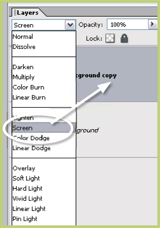
Step 2 >> Select the copied layer and then change the blending mode to Screen.

Step 3 >> As a final touch insert a Levels Adjustment layer between the two layers. Peg the black and white points and lighten the mid tones by dragging the midpoint to the left.
Firstly, duplicate the background (image layer) by dragging it to the New Layer button at the bottom of the Layers dialog. Now, with the copy layer selected, change the layer blending mode to Screen. You should see an immediate brightening of the picture and the appearance of more detail in the shadow areas.
As a final tweaking of the image insert a Levels adjustment layer between the two layers. Do this by clicking on the bottom layer first and then selecting Levels from the drop-down list found when clicking the Create New Adjustment Layer button at the bottom of the Layers palette. Peg the highlights and shadows of the picture by moving the black and white points towards the center until they meet the first pixels in the histogram. Next, move the mid tone to the left to increase the overall brightness of the image.

Correcting underexposure >> The best way to guarantee a great looking image where the tones are well distributed is to ensure that your exposure settings are correct before pushing the button. If, as is the case in this example, your camera meter is fooled by the scene then you can rescue an underexposed picture using a technique that involves duplicating the base image and then selecting the Screen option as the blending mode.
Those of you who are intimate with Elements will no doubt be asking ‘Why not just use the Fill Flash or Shadows/Highlights feature to fix this underexposure problem?’ and you are right to ask that question. The Fill Flash option is a great tool for lightening mid to dark tones that have plenty of details, but I have found that this ‘duplication layers’ technique provides a more pleasing result for underexposed images with little shadow information.
Solving Exposure Problems When Shooting
The statue picture not only provides a great example for this technique but also demonstrates how such underexposure can occur. Set against a white overcast sky this dark statue was underexposed because the camera’s meter was fooled by the bright sky behind the subject and therefore provided a shutter/aperture combination which was too dark. The thinking photographer would have predicted this problem and used the Exposure Compensation system on the camera to increase exposure by one to one-and-one-half stops to adjust for the back lighting. Most mid range digital cameras and above incorporate an Exposure Override system like this.

Exposure compensation >> Use the camera’s Exposure Compensation system to override your camera’s settings.
To try this for yourself, the next time you encounter a back lit scene shoot two pictures – one with the camera set to auto and the other where you have added to the exposure. Compare the results later on the desktop, or better still, check your exposure in the field by examining the histogram graph of your image on you camera’s monitor. This graph works exactly the same way as the graph in the Levels feature in Photoshop Elements. It displays the spread of tones of your image across a grayscale from black to white. Underexposure will result in a graph that bunches towards the black end of the spectrum whereas overexposure moves the pixels towards the white point. A simple check of this graph when shooting can indicate whether you need to adjust your camera and re-shoot to compensate for an exposure problem.

Step 1 >> With the image at 100% magnification apply the Add Noise filter with Uniform/Monochrome settings.

Step 2 >> Select Burn-in tool, reduce exposure to 10% and choose mid tone range. Set brush size and edge softness.

Step 3 >> Burn-in the white area using several overlapping strokes to build up the effect. Change to Shadow range and repeat if necessary.
6.20 Adding Detail to Highlights and Shadows
Suitable for Elements – 5.0, 4.0, 3.0, 2.0, 1.0 | Difficulty level – Intermediate | Tools used – Dodging and Burning-in Menus used – Filter
Sometimes, despite the utmost care on behalf of the photographer, digital images are captured with little or no shadow or highlight details. This scenario should ring true for any reader who has had the pleasure of photographing in very sunny countries. Along with the warmth, strong sun can provide a problem with contrast for the photographer. The deepest shadows and the brightest highlights are so far apart that even the best digital cameras have difficulty in recording all the tones. The result is a picture where either shadow or highlight detail (or in some extreme cases both) is not recorded. These parts of the picture are converted to pure black and white pixels in a process referred to as ‘clipping’.
The same scenario can occur when using a scanner to convert slide or film originals into digital files. Incorrect scanner settings coupled with slides that are very dark or negatives that have been overdeveloped are the circumstances that most often produce ‘clipped’ files.
When presented with such pictures the experienced Elements user will attempt to restore detail in the highlight and shadow areas using the program’s Dodging and Burning-in tools. But often such action only results in murky gray highlights and washed out shadow areas. The problem is that the program has no detail in these parts to actually lighten or darken. A solution to this scenario is to add a little (very little) texture to the image and then dodge and burn-in. The texture breaks up the pure white and pure black areas by filling these picture parts with random multi-tone (black, gray and white) pixels. This gives the tools some detail, albeit artificially created, to work on.
I use the Add Noise filter (Filter > Noise > Add Noise) to provide the texture and then select the Dodging tool set to mid tones to work on the dark tones, or you could use the Burning-in tool also set to mid tones to work on the highlights. A low exposure value of around 10% is coupled with repeated strokes over the offending area. To restrict the noise to just the highlight areas you could select these first using the Magic Wand and then apply the Noise filter.

Texture burn-in >> (a) Original image with blown highlights. (b) Highlights burnt in using Burn-in tool. (c) Highlights burnt in after adding a little texture.
This technique does have its down side. It doesn’t recreate lost details and you will need to degrade your image by making it more noisy before you can dodge and burn. So it can’t be considered a magic ‘cure all’ for problem pictures but it can help you get a little detail into that annoyingly white highlight or that equally frustrating blocked shadow area.
One of the most enduring techniques utilized by photographers the world over is the practice of toning or changing the color of their black and white prints. The Sepia tone (brown) look has come to be linked with quality image production partly because it was a process that increased the longevity of black and white pictures and partly because only committed photographers would take their work through this extra processing step. Digital photographers have the tools at hand to not only ‘tone’ their black and white images but also to apply this same technique to their color ones.
Toning >> Use the Hue/Saturation control (Enhance > Adjust Color > Hue/Saturation) to quickly and effectively add a tint to your color images.
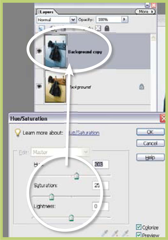
6.21 Using Hue and Saturation to Tone Your Pictures
Suitable for Elements – 5.0, 4.0, 3.0, 2.0, 1.0 | Difficulty level – Intermediate | Resources – Web image 6.21 Related techniques – 6.22 | Menus used – Enhance
The simplest and fastest way to add color is to use the Hue/Saturation control (Enhance > Adjust > Color > Hue/Saturation). This can be applied directly to the whole image or as an adjustment layer (Layer > New Adjustment Layer > Hue Saturation). To change the feature into a toning tool click the Colorize option in the bottom right of the box. The picture will switch to a single color monochrome (one color plus white and black). The Hue slider now controls the color of your tone.
The sepia look in the example is a value of 30 on the Hue slider. The Saturation slider varies the strength of the color. The Saturation value used in the example was 25. The Lightness slider adjusts the brightness of the image but changes of this nature should be left for the Levels feature.
The predictability of this digital toning system means that you can achieve the same tint in each image for a whole series of pictures. The recipes for regularly used tones, or favorite colors, can easily be noted down for later use or if toning using an adjustment layer then the layer can be dragged from one image to another. You can even create a Toning palette like the example on the next page, which provides a range of tint options as well as hue strengths.

Hue/Saturation toning >> Check the Colorize option to convert the dialog to Toning mode.

Step 1 >> Select the Hue/Saturation control from the Enhance menu. For grayscale images change the mode to RGB color first(Image>Mode>RGB Color).

Step 2 >> Place a tick in the Colorize and Preview checkboxes.

Step 3 >> Adjust the Hue slider to change tint color and the Saturation slider to change tint strength.
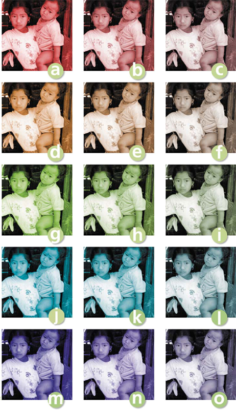
Toner recipes>> Use the recipes for the tints below to help guide you when toning using the Hue/Saturation control. Simply plug in the following numbers for the Hue, Saturation and Lightness sliders.
(a) 0, 75, 0
(b) 0, 50, 0
(c) 0, 25, 0
(d) 30, 75, 0
(e) 30, 50, 0
(f) 30, 25, 0
(g) 80, 75, 0
(h) 80, 50, 0
(i) 80, 25, 0
(j) 190, 75, 0
(k) 190, 50, 0
(l) 190, 25, 0
(m) 250, 75, 0
(n) 250, 50, 0
(o) 250, 25, 0
Once you have mastered the art of toning your pictures it is time to spread your ‘tinting’ wings a little. One of my favorite after-printing effects back in my darkroom days was split toning. This process involved passing a completed black and white print through two differently colored and separate toning baths. This resulted in the print containing a mixture of two different tints.
For example, when an image is split toned with sepia first and then blue toner the resultant picture has warm (brown) highlights and mid tones, and cool (blue) shadows. Getting the right toning balance between the two solutions was difficult and then trying to repeat the process uniformly over a series of images was even harder. Thankfully I can replicate the results of split toning in my digital picture with a lot less trouble and a lot more predictability.
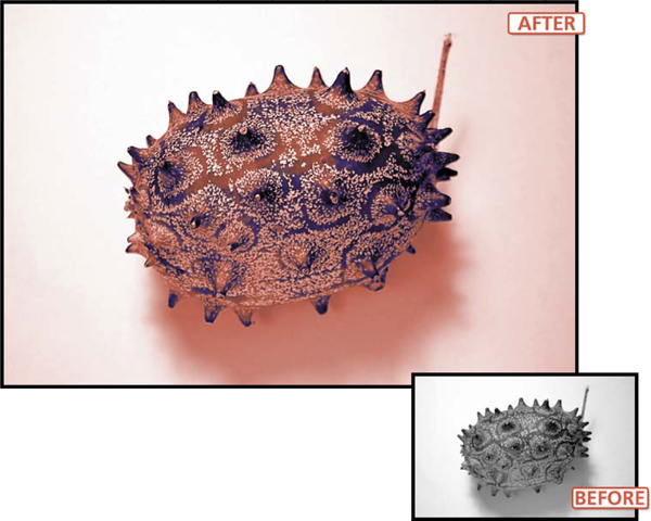
Split tone >> With the aid of some tricky selection techniques it is possible to tint different tonal ranges of an image with alternative colors. This style of tinting is called split toning and traditionally is created by passing a photographic print through multiple toning baths.
Suitable for Elements – 5.0, 4.0, 3.0, 2.0, 1.0 | Difficulty level – Intermediate Resources – Web image 6.22 Related techniques – 6.23 | Tools used – Magic Wand | Menus used – Select, Enhance
In order to tint a select range of tones such as mid tones and shadows I must first select these areas of the image. The Magic Wand tool makes selections based on color and tone and so is perfectly placed for this type of selection. Normally we would use this tool with the Contiguous option turned on so that the selection comprises pixels that sit next to each other, but for this task turn this option off. The Tolerance value for the tool can range from 0 to 255. This setting determines how close to the selected pixel’s tone the other pixels need to be before they too are included in the selection. The 0 setting is used to select other pixels in the image with exactly the same color and tone, whereas a setting of 20 will select other pixels that vary by as much as 20 tonal/color steps from the original.

Magic Wand settings >> When using the Magic Wand to select a range of tones in an image be sure to turn off the Contiguous setting, increase the Tolerance value and then select your reference pixel.
With this in mind we can easily employ this tool to select just the shadow and mid tones of an image by setting the tolerance to a value of about 120 and then selecting the darkest part of the image (which we will assume has a value of 0 and therefore is black). The Magic Wand will then search the picture for pixels with a tonal value between 0 and 120. The resultant selection will include both shadows and mid tones. It is then a simple matter of using the Hue/Saturation control to colorize these tones. To tint the rest of the pixels in the picture in an alternative color you must first invert the selection (Select>Inverse) and then repeat the Hue/Saturation toning procedure.
To soften the transition at the split of the two colors apply a feather of 1 or 2 pixels (Select > Feather) after your initial selection.

Step 1 >> Select the Magic Wand tool, adjust the Tolerance value and deselect the Contiguous option.
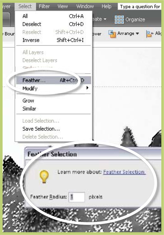
Step 2 >> Feather the selection by a value of 1 or 2 pixels to soften the split between toning colors.

Step 3 >> Tone the selected areas using the Hue/Saturation control.

Step 4 >> Inverse the selection and tone the remaining pixels using an alternative color.
Suitable for Elements – 5.0, 4.0, 3.0, 2.0, 1.0 | Difficulty level – Intermediate | Resources – Web image 6.23 Related Techniques – 6.22 | Tools used – Eraser | Menus used – Layer, Enhance
You can extend the split toning idea beyond its darkroom origins by using this technique to create an image where one part of the picture is toned one color whilst the rest is colored in an alternative hue. To achieve this effect duplicate the image layer and then select and tone each layer in turn. Then use the eraser to remove parts of the upper layer to reveal the color of the layer beneath.

Erasing toned layers >> By duplicating the image layer and then toning the two layers it is possible to erase through the upper layer to reveal the alternate colored layer below.
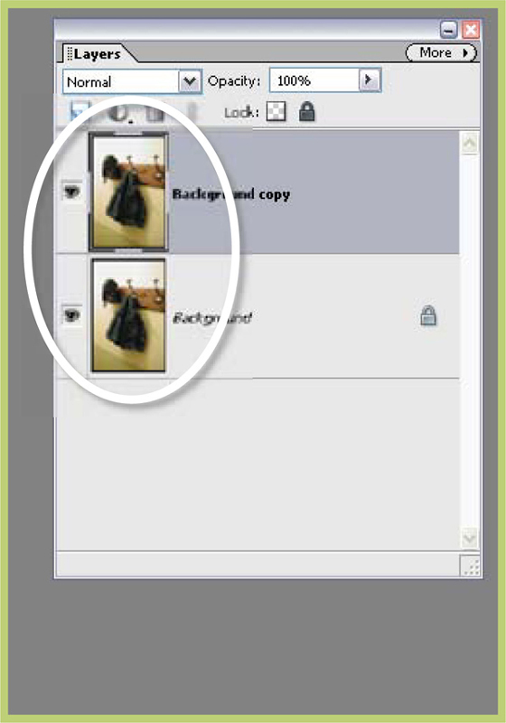
Step 1 >> Duplicate the base image layer by dragging it to the New Layer button at the bottom of the Layers dialog.
Step 2 >> Select each layer in turn and tone using the Hue/Saturation control set to Colorize.
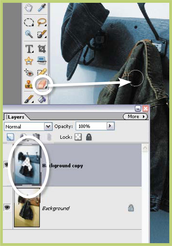
Step 3 >> Select the uppermost layer and then choose the Eraser tool. Use the tool to remove the parts of the picture which you want colored the alternate color.
Color and black and white >> By combining your selection skills, Elements’ masking options and the features of the Gradient Map adjustment layers you can create an image where black and white and color happily coexist.
The same ‘two-layer erase back’ technique can be used for creating photographs which contain both color and black and white elements, but I prefer to use a different method based around Elements’ masking options.
6.24 Layer Mask and Gradient Map
Suitable for Elements – 5.0, 4.0, 3.0, 2.0, 1.0 | Difficulty level – Intermediate | Resources – Web image 6.24 Related Techniques – 6.23 | Tools used – Selection tools | Menus used – Select, Layer
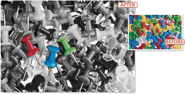
With the color image open make a selection of the objects that will not be converted to black and white. In the example I used a combination of the Magnetic Lasso and the standard Lasso tools to select the three map pins, but you could also use the Magic Selection Brush to achieve the same results. Next, feather the selection (Select > Feather) slightly with a setting of 1 pixel to soften the edge of the effect. Invert the selection (Select > Inverse) so that the background (everything other than the map pins) is now selected. Then, with the selection still active, create a new Gradient Map adjustment layer (Layer > New Adjustment Layer > Gradient Map). When the Gradient Map dialog appears select the map with a smooth transition from black to white and click OK. Elements uses your selection to mask out the adjustment layer effects and restrict them from being applied to the originally selected map pins. You can create a multitude of other effects using the same process but different gradient maps or adjustment layers.

More effects >> You can create other effects using the same masking technique with the Threshold (a), Posterize (b) and Invert (c) Adjustment Layers options.
![]()
Make sure that you save your selections (Select > Save Selection) as you make them. This way you can always reload them later if you need to.

Step 1 >> Make a selection of the parts of the image that you want to remain in color.

Step 2 >> Feather the selection by 1 pixel and then Inverse the selection.

Step 3 >> With the selection still active create a new Gradient Map adjustment layer.
Creating a great border is one of those finishing touches that can really make your images stand apart from the crowd. Using Photoshop Elements you can easily create and apply a variety of different border styles to your photographs.
Suitable for Elements – 5.0, 4.0, 3.0, 2.0, 1.0 | Difficulty level – Intermediate | Resources – Web image 6.24 Related Techniques – 6.26 | Tools used – Marquee | Menus used – Select, Window, Edit
A basic line border can be created by selecting the whole image (Select > Select All) and then stroking (Edit > Stroke) the selection on the inside with the foreground color. For fancier styles Elements provides a range of Frame and Edge treatments in its Artwork and Effects palette (Window > Artwork and Effects). Some frames require you to make a selection first; others can be applied directly to the picture with no preliminary actions.

Stroked frame >> Use the Eyedropper tool to select a suitable border color from the image. Select all the picture (Select > Select All). Stroke the selection (Edit > Stroke Selection) on the inside with the foreground color and a width of 10 pixels.
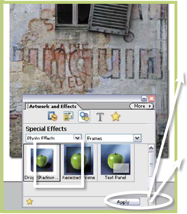
Photo Effects >> Display the Artwork and Effects palette (Window > Artwork and Effects) and then select the Special Effects > Photo Effects section. Choose frames from the drop-down list and then Drop Shadow from the thumbnails. Press the Apply button.
6.26 Sophisticated Edges Using Grayscale Masks
Suitable for Elements – 5.0, 4.0, 3.0, 2.0, 1.0 | Difficulty level – Intermediate | Resources – Web image 6.26 Related techniques – 6.25 | Tools used – Paint Brush | Menus used – layer
You can create truly imaginative edges by using a grayscale mask to hide the edges of the picture. Start by using the Elements drawing tools to paint a black shape with rough edges on a white background. This is our grayscale mask. Ideally the dimensions of the painting should be the same as the picture to be framed. With both the picture and the mask open as separate documents, use the Move tool to drag the mask image on top of the picture. The mask will become a new layer. Use the Free Transform tool (Image > Transform > Free Transform) to scale the mask to fit the image precisely.
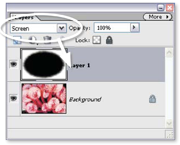
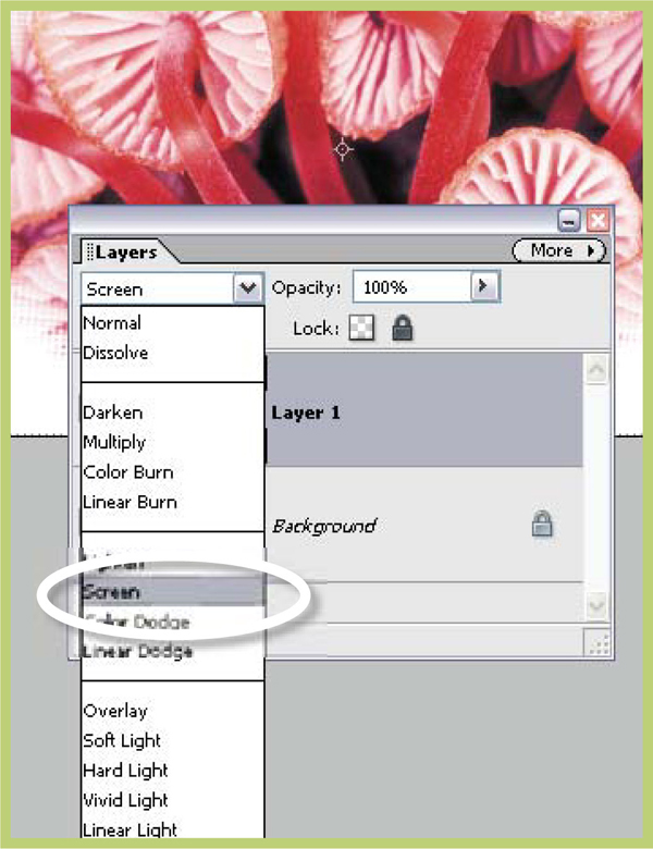
Grayscale mask borders >> You can use a grayscale mask to produce a creative border effect by stacking the mask on top and then changing the layer mode to Screen.
With the mask layer still active change the layer mode to Screen. This will cause the image from beneath to show through the black parts of the mask whilst the white areas of the mask hide the rest of the picture below.
This technique can also be used to create an image-filled border by inverting the mask before changing modes. This way the center of the picture is hidden by the white portion of the mask and the edges are filled with the image from below.
![]()
Search the web for pre-made grayscale masks that can be downloaded and used directly in Elements.

Step 1 >> Create or download grayscale mask. Open image and mask. Drag mask onto image as a new layer.

Step 2 >> With the mask layer selected use the Transformation tool (Image>Transform>Free Transform) to scale the mask to fit the image.
Step 3 >> Switch the mask layer’s mode to Screen to create the edge effect. To invert the effect select Image > Adjustments > Invert before changing the mode.
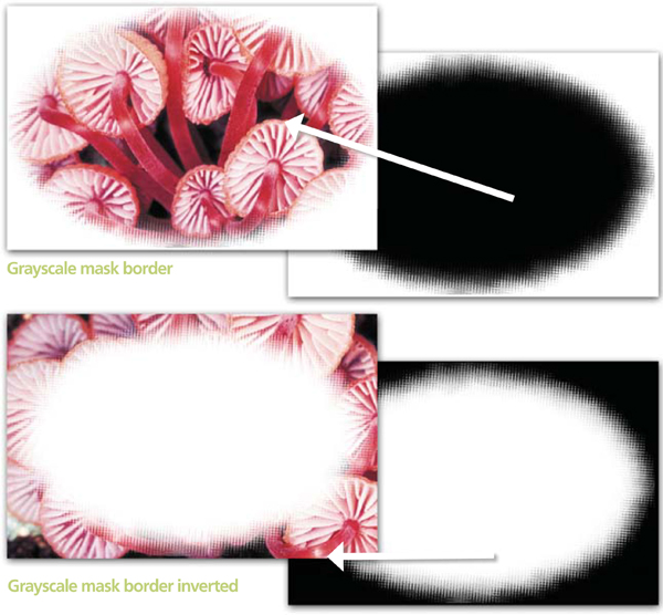
Picture edges >> More sophisticated masks of all manner of shapes, sizes and styles can be created using grayscale masks. By inverting the mask (Image > Adjustment > Invert) you can also create an edge filled with a picture rather than a picture surrounded by an edge.
6.27 Creating Frames with Frame Layers
Suitable for Elements – 5.0, 4.0, 3.0, 2.0, 1.0 | Difficulty level – Intermediate | Resources – Web image 6.26 | Related techniques – 6.25 Tools used – Paint Brush | Menus used – layer
Frame layers are brand new to Elements and have been introduced as part of the new system of creating multi-page themed documents (Photo Creation or .PSE documents). Here, we will just take a quick look at the framing abilities of the new technology, but for a fuller description of how to create and edit PSE files go to Chapter 12.
Frame layers combine both the picture and the frame in a single layer. This a really cool aspect of this technology as it means that not only can the frame and layer combination be sized and rotated as a single composition, but the picture can also be manipulated independent of the frame. Photoshop Elements 5.0 ships with a huge collection of frames that can be quickly and easily added to your pictures.
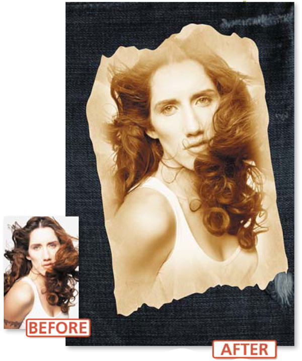
Frame layers >> Frame layers are a new way to dynamically add fancy borders to your photos.
The various designs are collated in the Artwork and Effects palette (under the Frames option in the Artwork section of the palette). To add a frame to a picture that is already open in the Full Edit workspace display the palette first ( Window > Artwork and Effects) and then click on the Artwork button (Frame with sun icon) at the top left of the palette. Next choose the Frames option from the left-hand drop-down menu and the Frame grouping from the menu on the right. After locating the frame type you want to add to your photo click on its thumbnail and then press the Apply button at the bottom of the palette.
Elements automatically creates a new Frame layer, adds your photo to it and then provides a small adjustment palette at the top of the framed image containing controls for sizing, rotating and replacing your photo. Alternatively, extra positioning and sizing options are available from the right-click menu. Click on the photo and then click-drag the corner handles to resize the frame and image together or the rotate handle to pivot the combination. Double-click the Move tool on the photo to select just the picture and use the handles to alter the photo independently of the frame.
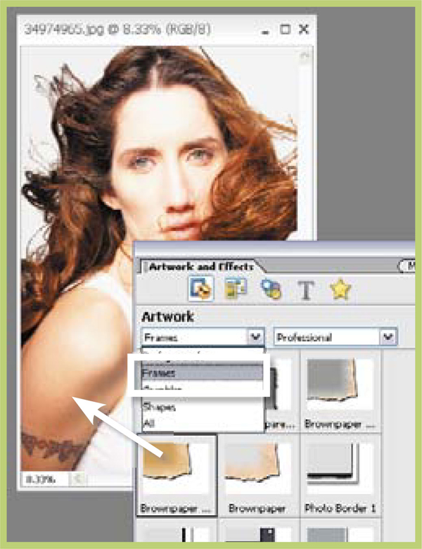
Step 1 >> With a photo open in the editing space display the Frames section of the Artwork and Effects palette. Select the Frame Style thumbnail and click the Apply button.

Step 2 >> Elements automatically creates a new Frame layer and places your photo in the frame design. Adjust the size and orientation of the picture using the pop-up adjustment palette.
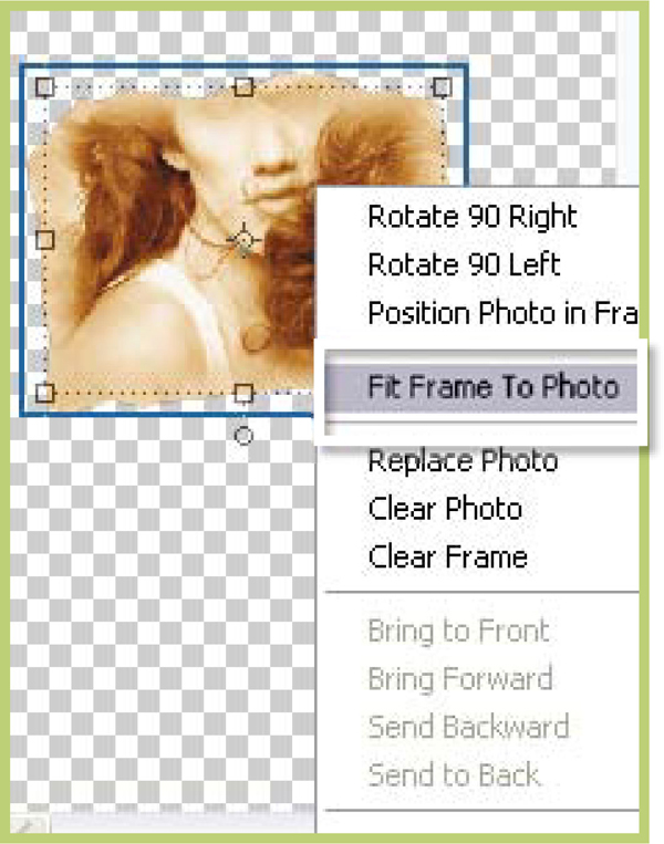
Step 3 >> More picture controls are available from the right-click menu. In most cases the Fit Frame To Photo option should be selected first and then any fine-tuning added later.
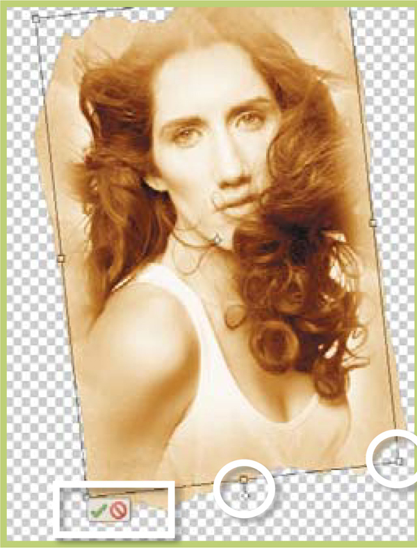
Step 4 >> Single-click the photo to select both frame and photo. Doubleclick to pick the photo only. Use the corner and rotate handles to fine-tune the size of picture and frame.
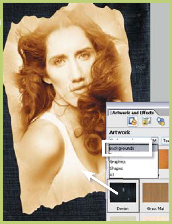
Step 5 >> To finish add a background to the composition by selecting the Background option from the left-hand menu. Next Choose the background and then click Apply.
Texture is a traditional photographic visual element that is often overlooked when working digitally. All but the highest quality professional films have visible grain when they are printed. This is especially true when the print size goes beyond the standard 6 x 4 inches. In fact we are so familiar with the idea that grain is part of the photographic process that putting a little texture into an otherwise grainless digital picture can lend a traditional ‘look and feel’ to the image.
Many photographers add a little texture to their pictures as part of their regular image editing process. Some go beyond this and produce photographs with huge clumps of grain that resemble the results often seen with prints made from old style high ISO films.
Suitable for Elements – 5.0, 4.0, 3.0, 2.0, 1.0 | Difficulty level – Intermediate | Resources – Web image 6.28 Related techniques – 6.29, 6.30 | Menus used – Filter
The simplest method for adding texture to your picture is to use the Add Noise filter (Filter > Noise > Add Noise). The feature is provided with a preview dialog which allows you to alter the ‘Amount’ of noise that is added to the photograph, the style of noise – Gaussian or Uniform – and whether the noise is random colored pixels or just monochrome. As with most filters it is important to use this feature carefully as once the filter is applied and the file saved you will not be able to undo its effects. For this reason, it pays to make a duplicate file of your picture which you can texturize without risk of destroying the original image.
![]()
Be sure to preview the image at least 100% when adding noise to ensure that the effect is not too strong. If in doubt, make a test print of sections of the picture with different Add Noise settings to preview the hard copy results.
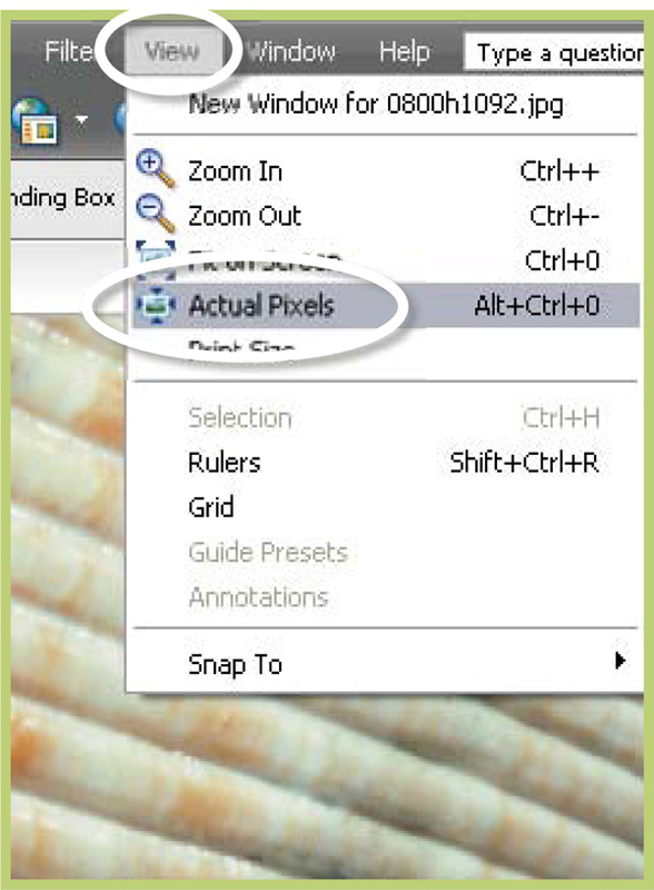
Step 1 >> Zoom in so that the picture is at least at 100% view.
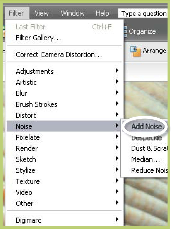
Step 2 >> Select the Add Noise filter from the Filter menu.

Step 3 >> Adjust the Amount slider to change the strength of the effect and pick the noise type and color.
Suitable for Elements – 5.0, 4.0, 3.0, 2.0, 1.0 | Difficulty level – Intermediate | Resources – Web image 6.29 Related techniques – 6.28, 6.30 | Menus used – Filter
As an alternative that provides a few more options than the technique above you can use the Grain filter (Filter > Texture > Grain) to add your choice of 10 different grain textures to your picture. Ranging from ‘regular’ through ‘horizontal’ to ‘speckle’ this filter produces a spectacular variety of texture effects. The feature’s dialog also provides an Intensity slider to govern the strength of the texture and a Contrast control.
The trick to creating good texture using this feature is the balancing of Intensity and Contrast settings. If the texture is too strong the shape and color of the original subject matter can be lost. If the contrast is too high then shadow and highlight details can be lost.
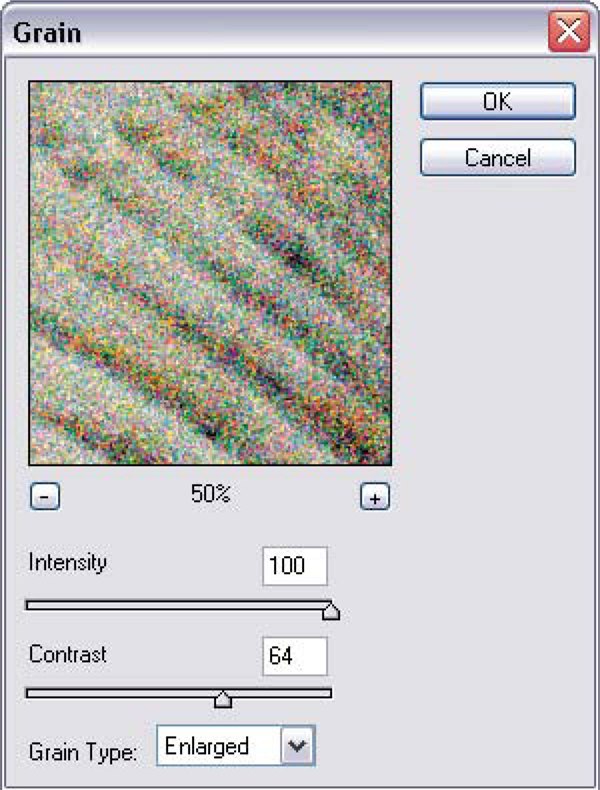
Adding grain >> The Grain dialog provides a preview thumbnail, Intensity and Contrast sliders and a selection of 10 different grain types.

Texture options for the Grain filter >> The Grain filter provides a range of unique texture options that can be applied to your picture. (a) Regular. (b) Sprinkles. (c) Clumped. (d) Enlarged. (e) Stippled. (f) Horizontal. (g) Speckle.
Suitable for Elements – 5.0, 4.0, 3.0, 2.0, 1.0 | Difficulty level – Intermediate | Resources – Web image 6.30 Related techniques – 6.28, 6.29 | Menus used – Layer, Filter
As we have already seen adjustment layers are a great way to manipulate your pictures without actually altering the original image. This approach to image editing is referred to as ‘non-destructive’ as the integrity of the starting picture is always maintained. Mistakes or radical manipulations can always be reversed by switching off the adjustment layer leaving the untouched original below. Although there are no such things as Filter adjustment layers it would be handy to be able to use this same approach when making whole non-reversible image changes such as adding texture or noise to your pictures.
Such a technique was used in the following example. Despite the appearance of texture throughout the whole photograph the starting picture is still preserved at the bottom of the layer stack. To get the same results with your own pictures start by making a new layer (Layer > New > Layer) above the image. Next, fill this layer with 50% gray (Edit > Fill Layer) and Add Noise (Filter > Noise > Add Noise) to the layer. Change the mode of the gray textured layer to either Soft Light, Hard Light, Linear Light or Vivid Light. Notice how the texture is now applied to the picture. To soften the effect reduce the opacity of the texture layer.
Using this technique you not only preserve the integrity of the original picture but you can also alter the strength of the effect at any time. In addition, it is also a great way to apply the same amount and style of grain to several layers in a stack without having to individually select and filter each layer.
![]()
To apply the same texture settings to a series of images of the same size simply drag and drop the gray texture layer into each of the open documents.
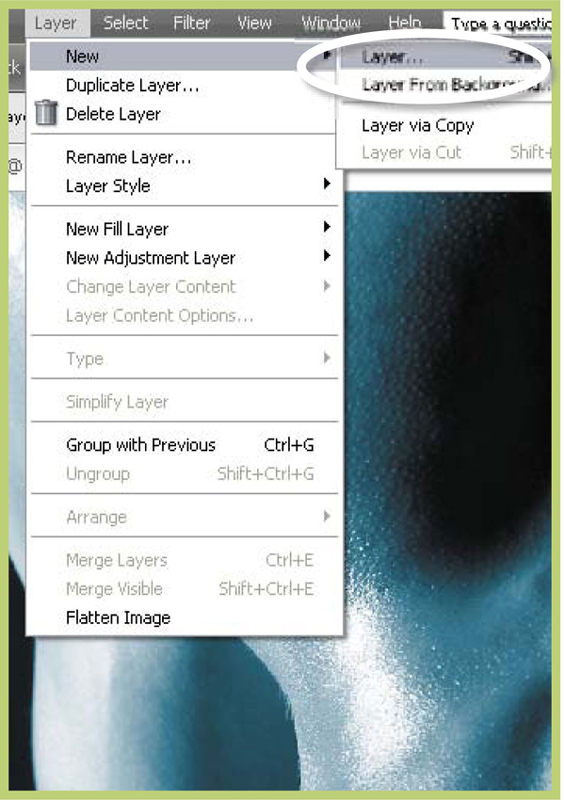
Step 1 >> Create a new layer above the image layer or background.
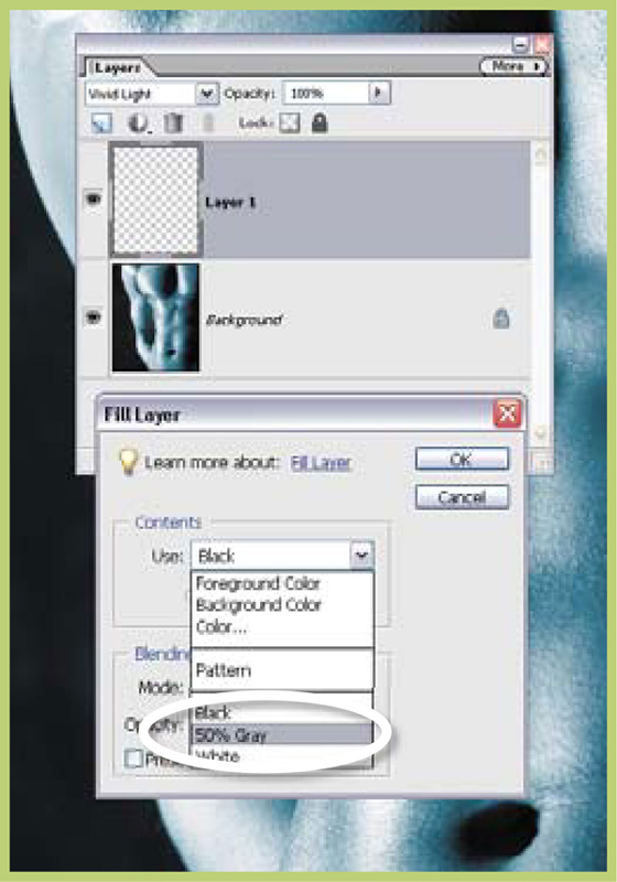
Step 2 >> Fill the layer with 50% gray using the Edit > Fill layer command.
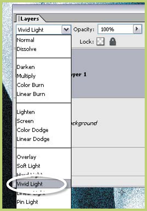
Step 3 >> Texture the layer with Add Noise and switch the layer mode to Vivid Light.
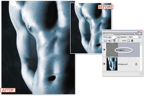
Controllable texture >> By adding texture to a 50% gray layer above the image and then using the blending modes to apply the texture to the picture you can add grain to your picture non-destructively. Image courtesy of www.ablestock.com copyright 2005.
To most of us sharpening is a way of improving the clarity of photos using a single-click option such as Enhance > Auto Sharpen in Elements, but why should we relinquish control when it comes to this final step in the editing process? Here we look a little deeper at some of the more customizable options that allow the user to more easily match the sharpening effect with the subject matter and output destination of their photos.
Sharpening – What are the Options?
Photoshop Elements provides a variety of sharpening options designed to increase the clarity of digital photographs. In previous versions these options were listed in the Filter > Sharpen menu and include the Sharpen, Sharpen Edges, Sharpen More and Unsharp Mask filters. In version 5.0 the options are now grouped under the Enhance menu and include Auto Sharpen, Unsharp Mask and Adjust Sharpness filters.
Digital sharpening techniques are based on increasing the contrast between adjacent pixels in the image. When viewed from a distance, this change makes the picture appear sharper or more defined. So applying a sharpening filter does not, and will never, make a poorly focused picture suddenly appear as if it has been focused correctly. Instead these filters are designed to make your photos appear more sharply defined.

New sharpen options >> Elements 5.0 groups its sharpening options under the Enhance menu. Unsharp Mask remains but the other filters have been replaced with the one-step Auto Sharpen and the sophisticated Adjust Sharpness options.
For many users selecting an option such as the Auto Sharpen is about as far as they go when it comes to thinking about how to sharpen their pictures, but this ‘one-click’ filter fail to take into account the content of the photo and the intended use for the image – two factors that should determine the amount of sharpening you apply. So for the ultimate control of your sharpening use the advanced features in the new Adjust Sharpen filter, or the tried and tested Unsharp Mask filter. Both these options contain controls that allow the user to manipulate the strength of the sharpening effect and adjust which parts of the picture the filters are applied. Let’s look at each in turn.
6.31 Unsharp Masking to the Rescue
Suitable for Elements – 5.0, 4.0, 3.0, 2.0, 1.0 | Difficulty level – Intermediate | Resources – Web image 6.31 Related techniques – 6.32, 6.33 | Menus used – Enhance
Of the various sharpen filters that Photoshop Elements contains the Unsharp Mask provides some of the greatest control over the sharpening process by giving the user a range of sliders which, when adjusted, alter the way the effect is applied to pictures. Though a little confusing to start with, the Unsharp Mask filter is one of the best ways to make your scans or digital photographs clearer. However, to get the most out of the feature you must understand and control carefully each of the three sliders. So how does the feature work?
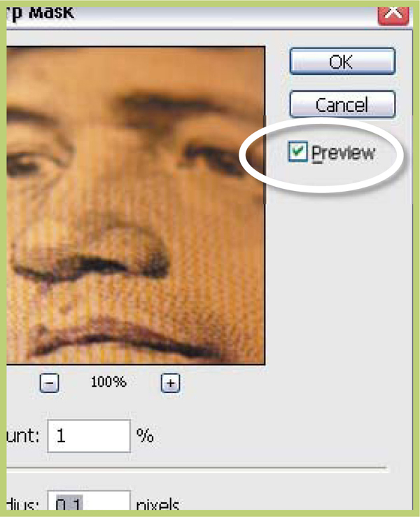
Step 1 >> Make sure that your picture is zoomed in or magnified to at least 100% before selecting the Unsharp Mask option from the Enhance menu. Select the Preview option in the dialogue to ensure that the sharpening effects are shown on the full image.
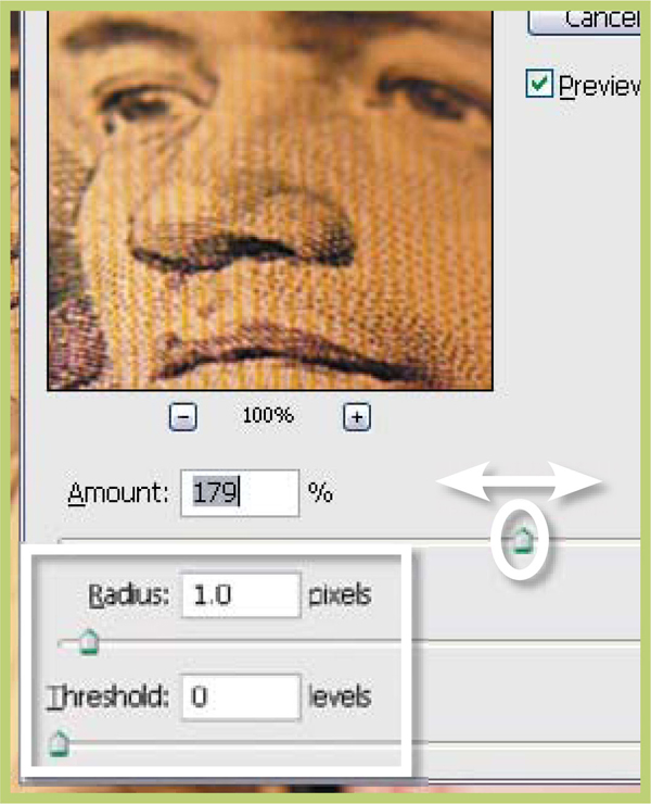
Step 2 >> Start with the radius set to 1 and the Threshold value adjusted to 0. Gradually move the Amount slider upwards watching the sharpening effect as you go. Stop when you find a setting where the picture appears clearer but contains no sharpening ‘halos’.
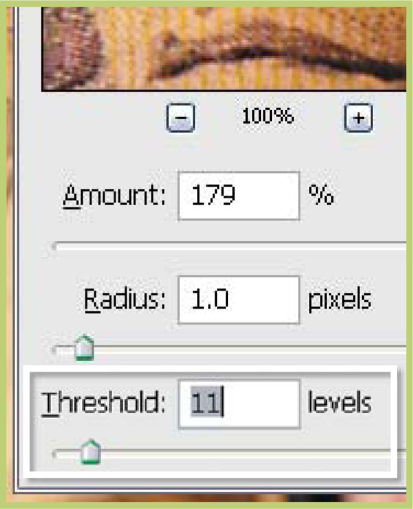
Step 3 >> To restrict the effect from being applied to skin tones, blue skies or other areas of smooth tone gradually increase the Threshold slider until the sharpening is just being applied to the picture’s edges.
The Amount slider controls the strength of the sharpening effect. Larger numbers will produce more pronounced results whereas smaller values will create more subtle effects. Values of 50% to 100% are suitable for low-resolution pictures whereas settings between 150% and 200% can be used on images with a higher resolution.
The Radius slider value determines the number of pixels around the edge that are affected by the sharpening. A low value only sharpens edge pixels. High settings can produce noticeable halo effects around your picture so start with a low value first. Typically values between 1 and 2 are used for high-resolution images, settings of 1 or less for screen images.
The Threshold slider is used to determine how different the pixels must be before they are considered an edge and therefore sharpened. A value of 0 will sharpen all the pixels in an image whereas a setting of 10 will only apply the effect to those areas that are different by at least 10 levels or more from their surrounding pixels. To ensure that no sharpening occurs in sky or skin tone areas set this value to 8 or more.
Unsharp Mask Top Tip:
Be careful when you are using the Unsharp Mask filter with your pictures. A little sharpening will improve the look of your photographs but too much sharpening is really noticeable and almost impossible to repair once applied to your picture. If you are unsure of your settings, apply the effect to a copy of the image first.
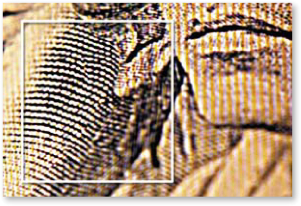
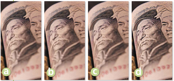
Adding clarity >> Careful sharpening can really add to the clarity of a digital photo, but like most enhancement techniques it is best to make such changes subtly. (a) No-sharpening. (b) After Unsharp Mask. (c) After Adjust Sharpness. (d) High Pass/Blend Light mode approach.
6.32 Adjust Sharpness for the Ultimate Control
Suitable for Elements – 5.0 | Difficulty level – Intermediate | Resources – Web image 6.31 Related techniques – 6.31, 6.33 | Menus used – Enhance
Until the release of Photoshop Elements 5.0 the best way to take control of the sharpening in your photographs was to use the Unsharp Mask filter. But the most recent release has included a brand new sharpening tool that will easily steal this crown. The Adjust Sharpness filter (Enhance > Adjust Sharpness) provides all the control that we are familiar with in the Unsharp Mask dialog plus better edge detection abilities, which leads to less apparent sharpening halos. The Filter dialog contains a zoomable preview, sliders to control the sharpening plus a drop-down menu where you can choose the type of sharpening to apply. You can control the sharpening effect with the following settings:
Amount – Strength of sharpening effect.
Radius – Determines the extent of sharpening. Higher values equal more obvious edge effects.
Remove – Determines sharpening algorithm used. Gaussian Blur uses the same approach as the Unsharp Mask filter. Lens Blur concentrates on sharpening details and produces results with fewer halos. Motion Blur reduces the effects of blur caused by camera shake or subject movement.
Angle – Sets Motion Blur direction.
More Refined – Longer processing for better results.
New Adjust Sharpness >> The Adjust Sharpness feature in Elements 5.0 extends the customized sharpening ability first started with the Unsharp Mask filter.
Step 1 >> Make sure that your picture is zoomed in or magnified to at least 100% and then select the Enhance > Adjust Sharpness filter. Select the Preview option in the dialogue to ensure that the sharpening effects are shown on the full image and also tick the More Refined option unless you are working with a large file or a slow computer.

Step 2 >> Choose the Lens Blur entry from the Remove menu. This option provides the best sharpening with least halo artifacts. Choose Gaussian Blur if you want to simulate Unsharp Mask results or Motion Blur if you are trying to get rid of the effects of camera shake.

Step 3 >> Start with the radius set to 1 and gradually move the Amount slider upwards watching the sharpening effect as you go. Stop when you find a setting where the picture appears clearer but contains no sharpening ‘halos’.
One of the options for the new Adjust Sharpness filter is the Motion Blur entry in the Remove menu. The options listed in this menu determine the way in which sharpening is applied to the picture or more specifically, the algorithm used when filtering. The Motion Blur option is different to the other choices as it provides a method of reducing the effects of blur in a photo due to the camera or subject moving during the exposure. When Motion Blur is selected you have the added option of inputting an angle for the blur reducing action. This can be achieved with the dial control by click-dragging the mouse or by inputting a specific angle.

Suitable for Elements – 5.0, 4.0, 3.0, 2.0, 1.0 | Difficulty level – Intermediate | Resources – Web image 6.31 Related techniques – 6.32, 6.31 | Menus used – Layer, Filter
There is no getting away from the fact that sharpening photos with filters alters them irreversibly and forever. For this reason many photographers duplicate their precious pictures multiple times and apply different sharpening options to the copies depending on their intended use. This is not a bad approach, especially if you have plenty of storage space to hand, but what if you could sharpen your photos without altering the original pixels? Well surprisingly the Blending Modes feature located in Photoshop Elements provides the key to just such a technique. In particular, we will use the Hard Light Blend Mode in conjunction with the High Pass filter to create a non-destructive sharpening effect. The High Pass filter provides the mechanism for controlling where the sharpening occurs by isolating the edges in a picture and then converting the rest of the image to mid gray. This is perfect for use with Hard Light blend mode as the mid gray areas will not be affected at all and the sharpening changes will only be applied to the edges of the photo.

Step 1 >> Make a copy (Layer > Duplicate Layer) of the picture layer that you want to sharpen. Filter the copied layer with the High Pass filter (Filter > Other > High Pass) and press OK.

Step 2 >> With the filtered layer still selected switch the blend mode to Hard Light. This mode blends both the dark and light parts of the filtered layer with the picture layer, causing an increase in contrast.

Step 3 >> Adjust the opacity of this layer to govern the level of sharpening. Sharpening using this technique means that you can remove or adjust the strength of the effect later by manipulating the filtered layer.