Chapter 3
Developing for Android TV
IN THIS CHAPTER
 Running Android apps for television sets
Running Android Studio's TV app
Creating an Android TV app
Do you remember the first time you heard about “the cloud”? Most people understand that “the cloud” doesn’t refer to condensed water vapor; it refers to that collection of hardware and software that feeds us our contacts, our calendars, and our bookmarks wherever we go. Some buzzwords like the word “cloud” enter our psyches without fuss or fanfare. Other buzzwords knock us on the head and say “Pay attention to me. I will become important.”
You may have had an interesting response when you first heard about the ten-foot experience, and may have wondered why anyone needed a ten-foot TV screen. Most of us have seen 70-inch TV screens in stores and may have wanted to know how a ten-foot device would fit into the average consumer's living room.
In the phrase ten-foot experience, “ten feet” doesn't refer to the screen size. It refers to the user's distance from the device. The basic idea is, when a user isn't right up against a screen (the way we are with computer monitors and cellphone screens), the user interface must be designed accordingly. You can't have lots of detail on a television screen because the user can't see very much detail. In addition, many TVs don't have the kinds of input facilities that computers (or even smartphones) have. Most TVs now ship with a USB port where you can plug in a keyboard or other input device and it works fine, but you buy such a device separately. Even so, most people are limited to a remote control or a game controller, which are crude instruments compared with a keyboard or mouse. The onscreen keyboards found with most TVs today would work fine if a TV had a touchscreen, but moving around the keyboard with a remote control can be time consuming and frustrating.
The ten-foot experience plays an important role in the creation of good Android TV apps. For many apps, the user doesn't do any continuous (smooth) scrolling. Instead, scrolling jumps from one item to the next. Of course, when the user searches for a favorite program, you need text or speech input. For text input, a keyboard appears on the screen, and the user scrolls from key to key (a slow and tedious process) using the remote unless the user has a keyboard plugged into the TV. For speech input, the user says a phrase out loud. When the device's voice recognizer gets the phrase all wrong, the user says the phrase a second time (much louder this time). Yelling titles into a remote control device can be embarrassing if you're living in a house with other people.
Anyway, this chapter provides a brief introduction to Android's TV app development environment.
Getting Started
To get started with Android TV development, follow the same steps that you follow for creating a Phone and Tablet project, but make the following changes:
- When you see the Choose Your Project dialog box, select TV and then Android TV Activity. Note that, unlike other template types, you have a choice only between adding no activity at all or using the Android TV Activity template.
- Type 05_03_01 in the Name field of the Configure Your Project dialog box and type com.allmycode.p05_03_01 in the Package Name field.
After you create your project, plug an Android TV device into your development computer. If you don't have such a device (or don't want to move the device from your living room to your office), create an Android TV AVD on your development computer. To do so, follow the steps that you follow in the “Configuring a wearable device emulator” section of Chapter 2 of this minibook for creating an Android Wear AVD. (The only change is to select TV instead of Wear when you pick a device category.)
 Android Studio currently provides two TV emulators based on their resolution: 720p and 1080p. There are no 4K or other emulators, so you need a device to test apps for these environments. The emulator screenshots in this chapter rely on the 720p version. The 720p emulator will probably work best for a wide range of app types, but you may want to target 1080p for high-end apps.
When you see the Select a System Image dialog box, you must download one of the Android TV images, even if you have downloaded other system images for other uses in the book. This chapter uses the Q system image. As part of obtaining the Android TV image, you must read and accept a special licensing agreement. The installation process will proceed much like the one outlined in the “Configuring a wearable device emulator” section of Chapter 2 of this minibook. Unlike phones and watches, you generally use a TV in the landscape position and don’t need to worry that someone will change the orientation on you. However, if you insist, Android Studio will let you create a portrait orientation emulator.
 This is one time when you might want to select Hardware – GLES 2.0 in the Graphics field of the Verify Configuration dialog box if possible. The TV emulator runs so slowly without this feature that you might end up old and gray before the emulator even comes online. However, to use this feature, you need a high-end graphics card in your system. A graphics card with good gaming features works best. You might consider an NVidia Titan V (
https://www.nvidia.com/en-us/titan/titan-v/) to be overkill, but you really do need serious processing power to move quickly.
You probably would have tried various settings and updating your hardware without reading about them in this chapter. One way or another, you get a skeletal app with an enormous amount of meat on its bones. (The word “skeletal” doesn't do justice to this newly created app — you’re really seeing the most basic form of app you can create, yet it requires an enormous amount of code.) The Project tool window's tree is shown in Figure 3-1.

FIGURE 3-1: Android Studio's skeletal TV app.
Running the Skeletal App
Most television sets don't have touchscreens. Some, however — like the Music Computing MCLCDTTV65104k — provide a touchscreen by default. In addition, you can obtain a touchscreen overlay for your television that you mount to the front of the set and plug into the USB port on your set. This chapter focuses on most TVs and limits the gizmos to those that come with the emulator. When creating your app, remember that your user won’t have access to a mouse or any of the other usual amenities of computers. All this said, when you start the emulator, you see the same set of controls that you had when working with a phone, tablet, or wearable device. The controls onscreen also react to a click, so except for the form factor, working with this app is much like working with the other apps in this book.
To run the app, be sure to select a usable emulator or have your physical device plugged into your computer’s USB port. Choose Run⇒ Run ‘app’ as normal. When the emulator starts, which usually takes a while, you see a Finish Setting Up Your TV screen, like the one shown in Figure 3-2. You don’t actually have to do anything on this screen, but it’s the first sign that something useful is happening with your app. However, if you want, you can play around with this fully functional screen when your app isn’t running.

FIGURE 3-2: You see this emulator screen when your app isn’t running.
You may see a screen that asks about what sort of storage you want to use. This screen goes away after a few seconds, so you can ignore it. Normally the Videos by Your Company display appears next, as shown in Figure 3-3.

FIGURE 3-3: The skeletal app's main activity.
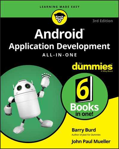
However, in some cases, you may need to click Apps on the Finish Setting Up Your TV screen to display the list of apps shown in Figure 3-4. The Videos by Your Company app appears on the right end (the one with a ticket stub with a right-pointing arrow on it).
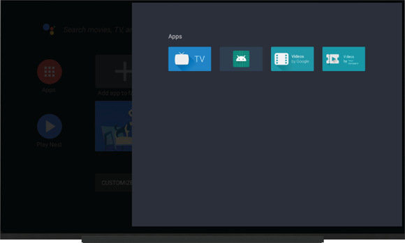
FIGURE 3-4: Start your app manually when required.
The app's layout has several rows. In Figure 3-3, the top row has the heading Category Zero and has several Movie ABC entries. The next several rows don't look like real rows. In fact, only one of the headings (Category Zero) appears immediately to the left of its corresponding items. The Category Two row heading appears roughly midway between the top and bottom of the screen, but the movie items in the Category Two row appear near the bottom of the screen. This happens because the items are taller than the headings, and the layout tries to keep as many headings on the screen as possible. When the user scrolls from one heading to another (say, from Category Zero to Category Two), the rows of items scroll proportionately so that the Category Two heading is immediately to the left of its Category Two items.
In Figure 3-4, Category Zero is highlighted. If you scroll rightward from Category Zero, you see a highlighted version of a video (the leftmost video in the Category Zero row). See Figure 3-5.

FIGURE 3-5: You've scrolled to one of the videos.
If you press Enter with a video selected, you see what should be a detail screen for that particular video. However, the screen is essentially blank.
The emulator's Back button returns you to the grid full of videos. If you scroll downward, you eventually reach a list of preferences. (See Figure 3-6.)
The richness of Android Studio's skeletal TV app might seem strange. But there's method to this madness. It's all about the ten-foot experience, also known as the lean-back experience.
FIGURE 3-6: Some preferences.
When you use a computer, you're in work mode. You lean forward and try to accomplish something. (It might be something frivolous, but it's an accomplishment nevertheless.) When you watch television, you're not in work mode. You want to minimize any accomplishment phase. Your primary purpose is to lean back and enjoy the show. You want to relax. So, with Android TV, it's especially important that the user interface is unobtrusive. You want every interface to look like every other interface. That way, you can use simple reflexes to navigate from category to category, from movie to movie, and from a highlighted movie to details about the movie. If the skeletal app has so much prebuilt scaffolding, it's to make that scaffolding be the same for every app's interface. With such a familiar interface, users can ignore the app's interface and relax with their favorite movies.
Dissecting the TV App
The TV app comes with a lot of code, and it’s helpful to wander about and explore it in detail. The app helps you create a consistent appearance in your own offerings. The following sections help you take the app apart so that you can better see how it works.
Adding to the standard AndroidManifest.xml
Many of the apps in this book have an AndroidManifest.xml file that borders on simple, but that's not the case with this app. In addition to the usual MainActivity, you also have a DetailsActivity, PlaybackActivity, and BrowseErrorActivity. Each of these activities has its own .kt file, as shown previously in Figure 3-1. They also appear as activities in the <application> element.
However, these activities aren't the main event. What you really find interesting are the <uses-feature> entries shown here:
<uses-feature
    android:name="android.hardware.touchscreen"
    android:required="false"/>
<uses-feature
    android:name="android.software.leanback"
    android:required="true"/>
The first entry, android.hardware.touchscreen, lets you click the screen and have something happen. If you load this app on a regular TV, it may not have a touchscreen, so working with the app will be harder. Some TVs also ship with what is called a multitouch display that uses multiple touch gestures. In other words, the display can detect more than one touch at a time. To get this functionality, you change android.hardware.touchscreen to something like android.hardware.touchscreen.multitouch.distinct.
The second entry merely tells the compiler that this software runs on an Android TV and not another device. It replaces the android.hardware.type.television entry that you may find in older examples. Along with the addition of the android.software.leanback feature, you also find that the <intent-filter> element and <category> entry also reflect the TV nature of the app by using <category android:name="android.intent.category.LEANBACK_LAUNCHER" />.
Looking into build.gradle (Module: app)
Even build.gradle reflects the change in app venue. Most of the entries are similar to those that you use to build other app types, but note the leanback addition shown in bold in the following code:
dependencies {
    implementation fileTree(dir: 'libs', include: ['*.jar'])
    implementation
        "org.jetbrains.kotlin:kotlin-stdlib-jdk7:$kotlin_version"
    implementation 'androidx.leanback:leanback:1.0.0'
    implementation 'androidx.appcompat:appcompat:1.0.2'
    implementation 'com.github.bumptech.glide:glide:3.8.0'
}
Defining a layout
What will underwhelm you the most about this app is the lack of layout. You find some interesting generic graphics in the drawable folder and two activity layouts in the layout folder. However, both layouts are incredibly simple because you perform most of the display work within the code. For example, here's the activity_main.xml file, which is a far cry from most of the examples in the book:
<?xml version="1.0" encoding="utf-8"?>
<fragment xmlns:android="http://schemas.android.com/apk/res/android"
    xmlns:tools="http://schemas.android.com/tools"
    android:id="@+id/main_browse_fragment"
    android:name="com.allmycode.p05_03_01.MainFragment"
    android:layout_width="match_parent"
    android:layout_height="match_parent"
    tools:context=".MainActivity"
    tools:deviceIds="tv"
    tools:ignore="MergeRootFrame"/>
Oddly enough, MainActivity.kt is similarly devoid of content. All you really have in that file is the override for onCreate(). The overview of the work to do to present a list of movies appears in MainFragment.kt, where you find a list of tasks to perform in onActivityCreated():
override fun onActivityCreated(savedInstanceState: Bundle?) {
    Log.i(TAG, "onCreate")
    super.onActivityCreated(savedInstanceState)

    prepareBackgroundManager()

    setupUIElements()

    loadRows()

    setupEventListeners()
}
The first two items on the list, prepareBackgroundManager() and setupUIElements(), are what you expect for creating a display. The last step, setupEventListeners(), makes the app interactive so that something happens as the result of a click. However, when you get to loadRows(), things get interesting because now you're dealing with data. The loadRows() function creates an adapter — a data source — as shown in Listing 3-1. The sections that follow discuss this part of the app in more detail.
LISTING 3-1: Providing a Data Source
private fun loadRows() {
    val list = MovieList.list

    val rowsAdapter = ArrayObjectAdapter(ListRowPresenter())
    val cardPresenter = CardPresenter()

    for (i in 0 until NUM_ROWS) {
        if (i != 0) {
            Collections.shuffle(list)
        }
        val listRowAdapter = ArrayObjectAdapter(cardPresenter)
        for (j in 0 until NUM_COLS) {
            listRowAdapter.add(list[j % 5])
        }
        val header = HeaderItem(i.toLong(),
            MovieList.MOVIE_CATEGORY[i])
        rowsAdapter.add(ListRow(header, listRowAdapter))
    }

    val gridHeader = HeaderItem(NUM_ROWS.toLong(), "PREFERENCES")

    val mGridPresenter = GridItemPresenter()
    val gridRowAdapter =
        ArrayObjectAdapter(mGridPresenter)
    gridRowAdapter.add(resources.getString(R.string.grid_view))
    gridRowAdapter.add(getString(R.string.error_fragment))
    gridRowAdapter.add(
        resources.getString(R.string.personal_settings))
    rowsAdapter.add(ListRow(gridHeader, gridRowAdapter))

    adapter = rowsAdapter
}
The adapter and the presenter
Central to the mission of the code in Listing 3-1 are the notions of an adapter (MovieList.list), found in MovieList.kt, and a presenter (CardPresenter), found in CardPresenter.kt. An adapter stores data, and a presenter displays the data that an adapter stores. That's the way Android's TV classes separate data from presentation. The loadRows() function provides the functionality needed to move the data from MovieList.list to cardPresenter using the ArrayObjectAdapter.
It's a classic principle of app development:
Data and presentation don't belong in the same parts of your code.
If you interleave your data code with your presentation code, modifying the presentation is difficult to do without messing up the data. Data is data, whether it's displayed on a 70-inch TV or a 1-inch watch screen.
Imagine dealing with data about a movie, as described earlier. In a more realistic app, the data might include the title, the release date, a synopsis, the actors' names, a link to a trailer, and other information. A user might view the data on an Android TV. But in another setting, the same user might view the same data on a computer, a smartphone, or whatever other device is available. With the presentation code separated from the data code, you can provide several alternatives for displaying the same data. With one class to store the data, you can plug in a big TV display one time, a smartphone display another time, and a ten-inch laptop display the next time. You can offer the user a choice of interfaces — one for daytime browsing and another for nighttime perusal. You're ready for any kind of display because the code to control the data doesn't care what display logic is behind it.
Imagine changing the way you store each movie's release date. Instead of storing an ordinary Gregorian calendar date, you decide to store each movie's Star Trek star date. (According to one online calculator, the first Matrix movie was released in the United States on star date –323754.8.) With the data decoupled from the display, you don't have to inform your display code about this data storage change. The data code already has a function named getReleaseDate(), and the presentation code calls this method during the app's run. While you're setting up the data code to handle star dates, you modify the getReleaseDate() method to convert between star dates and Gregorian dates. The display code doesn't know about this change, and what the display code doesn't know won't hurt it.
Using the Adapter class
Figure 3-7 illustrates the relationships among classes used in Listing 3-1.
For an adapter, TV apps normally use the ArrayObjectAdapter class (a member of the 'androidx.leanback:leanback:1.0.0' package). When you construct a new ArrayObjectAdapter, you supply a Presenter in the constructor call, such as the following:
val rowsAdapter = ArrayObjectAdapter(ListRowPresenter()): Applies a dimming effect to each of the rows, as described athttps://developer.android.com/reference/android/support/v17/leanback/widget/ListRowPresenter
FIGURE 3-7: Adapters, presenters, and other good stuff.
val listRowAdapter = ArrayObjectAdapter(cardPresenter): Determines how to display the individual movies you want to displayval gridRowAdapter = ArrayObjectAdapter(mGridPresenter): Creates a grid in which to place each of the movies contained within cardPresenter
Thus, each ArrayObjectAdapter has its own presenter.
Each presenter constructs its own ViewHolder. (The ViewHolder class is an inner class of the Presenter class. Each presenter actually constructs its own Presenter.ViewHolder.) The next section tells you how this process works within the presenter.
A ViewHolder holds a view. (Don't look so surprised!) An instance of the ViewHolder class has no methods of its own and has only one public field. The public field is the view field. A ViewHolder instance's view field refers to whatever view the ViewHolder is holding. A presenter displays views, and a presenter gets its views from the ViewHolder. You can think of the ViewHolder as a cache for views.
In Listing 3-1, a call to an adapter's add() function adds an object to the adapter. This adding process happens in a number of ways:
- Adding a list of movies to a row (
listRowAdapter) - Adding rows of movies to a movie collection (
rowsAdapter) - Adding the rows of movies and other display details to a grid (
gridRowAdapter)
Using the Presenter class
When you construct a new ArrayObjectAdapter, you supply a presenter in the constructor call. Thus, an ArrayObjectAdapter has its own presenter. Keep that idea in mind while you read the following facts:
-
The presenter belonging to a row of items handles the presenting of an individual item (
CardPresenter, which appears inCardPresenter.kt). A card is a rectangular area in which an object's data are displayed. In Figure 3-5, shown previously, the highlighted card's title is Zeitgeist 2010_ Year in Review.
 - The presenter belonging to the entire list of items (think of a table with rows and columns) handles the presentation of those rows (
ListRowPresenter, which is provided for you by Android). - The presenter belonging to an entire grid handles the presenting of grid elements (
GridItemPresenter, which appears in theMainFragment.ktfile as aninner class).
The CardPresenter class offers a good example of how a presenter is constructed. Listing 3-2 shows the essential code given with the example app. (It has other elements as well, but these are the functions you should focus on.)
LISTING 3-2: The Presenter
override fun onCreateViewHolder(parent: ViewGroup):
    Presenter.ViewHolder {

    Log.d(TAG, "onCreateViewHolder")

    sDefaultBackgroundColor = ContextCompat.getColor(parent.context,
        R.color.default_background)
    sSelectedBackgroundColor =
        ContextCompat.getColor(parent.context,
            R.color.selected_background)
    mDefaultCardImage = ContextCompat.getDrawable(parent.context,
       R.drawable.movie)

    val cardView = object : ImageCardView(parent.context) {
        override fun setSelected(selected: Boolean) {
            updateCardBackgroundColor(this, selected)
            super.setSelected(selected)
        }
    }

    cardView.isFocusable = true
    cardView.isFocusableInTouchMode = true
    updateCardBackgroundColor(cardView, false)
    return Presenter.ViewHolder(cardView)
}

override fun onBindViewHolder(viewHolder: Presenter.ViewHolder,
    item: Any) {
    val movie = item as Movie
    val cardView = viewHolder.view as ImageCardView

    Log.d(TAG, "onBindViewHolder")
    if (movie.cardImageUrl != null) {
        cardView.titleText = movie.title
        cardView.contentText = movie.studio
        cardView.setMainImageDimensions(CARD_WIDTH, CARD_HEIGHT)
        Glide.with(viewHolder.view.context)
            .load(movie.cardImageUrl)
            .centerCrop()
            .error(mDefaultCardImage)
            .into(cardView.mainImageView)
    }
}

override fun onUnbindViewHolder(viewHolder: Presenter.ViewHolder) {
    Log.d(TAG, "onUnbindViewHolder")
    val cardView = viewHolder.view as ImageCardView
    // Remove references to images so that the garbage collector can
    // free up memory
    cardView.badgeImage = null
    cardView.mainImage = null
}
The presenter in Listing 3-2 has three required methods:
-
The
onCreateViewHoldermethod does what its name suggests. It creates aViewHolderinstance.The
ViewHolderinstance has a view. How nice! -
The
onBindViewHoldermethod binds data to aViewHolderinstance.In Listing 3-2, the view in the
ViewHoldergets the properties needed to interact with the movie data. In particular, the card's title,cardView.titleText, becomes the content ofmovie.title. -
The
onUnbindViewHoldermethod can do some cleanup when the data in a view becomes obsolete.In Listing 3-2, the
onUnbindViewHoldermethod removes the references to the images so that the garbage collector can free the memory they use.