A key component of any well-designed Android app is the toolbar. The toolbar includes actions that the user can take, provides an additional mechanism for navigation, and also provides design consistency and branding.
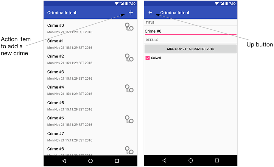
In this chapter, you will create a menu for CriminalIntent that will be displayed in the toolbar. This menu will have an action item that lets users add a new crime. You will also enable the Up button in the toolbar (Figure 13.1).
The toolbar component was added to Android in Android 5.0 (Lollipop). Prior to Lollipop, the action bar was the recommended component for navigation and actions within an app.
The action bar and toolbar are very similar components. The toolbar builds on top of the action bar. It has a tweaked UI and is more flexible in the ways that you can use it.
CriminalIntent supports API 19 and newer, which means that you cannot use the native toolbar on all supported versions of Android. Luckily, the toolbar has been back-ported to the AppCompat library. The AppCompat library allows you to provide a Lollipop’d toolbar on any version of Android back to API 9 (Android 2.3).
You are already using the AppCompat library. As of this writing, new projects come with it automatically. But what if you need to add the AppCompat library to a legacy project? AppCompat has a few requirements that you will need to know about.
The AppCompat library requires that you:
-
add the AppCompat dependency
-
use one of the AppCompat themes
-
ensure that all activities are a subclass of AppCompatActivity
In Chapter 7 you added the AppCompat dependency to CriminalIntent. The next step is to ensure that you are using one of AppCompat’s themes. The AppCompat library comes with three themes:
-
Theme.AppCompat – a dark theme
-
Theme.AppCompat.Light – a light theme
-
Theme.AppCompat.Light.DarkActionBar – a light theme with a dark toolbar
The theme for your application is specified at the application level and optionally per activity in your AndroidManifest.xml.
Open AndroidManifest.xml and look at the application tag.
Notice the android:theme attribute.
You should see something similar to Listing 13.1.
Listing 13.1 The stock manifest (AndroidManifest.xml)
<application
    android:allowBackup="true"
    android:icon="@mipmap/ic_launcher"
    android:label="@string/app_name"
    android:supportsRtl="true"
    android:theme="@style/AppTheme" >
The AppTheme is defined in res/values/styles.xml. Open this file and ensure that the parent theme of your AppTheme matches the shaded portion shown in Listing 13.2. For now, do not worry about the attributes inside the theme. You will update those soon.
Listing 13.2 Using an AppCompat theme (res/values/styles.xml)
<resources>

    <style name="AppTheme" parent="Theme.AppCompat.Light.DarkActionBar">
      <!-- Customize your theme here. -->
      <item name="colorPrimary">@color/colorPrimary</item>
      <item name="colorPrimaryDark">@color/colorPrimaryDark</item>
      <item name="colorAccent">@color/colorAccent</item>
    </style>

</resources>
You will learn much more about styles and themes in Chapter 22.
The final requirement to use the AppCompat library is to ensure that all of your activities subclass AppCompatActivity. You have been using AppCompatActivity since Chapter 7 for the support fragment implementation, so no changes are necessary.
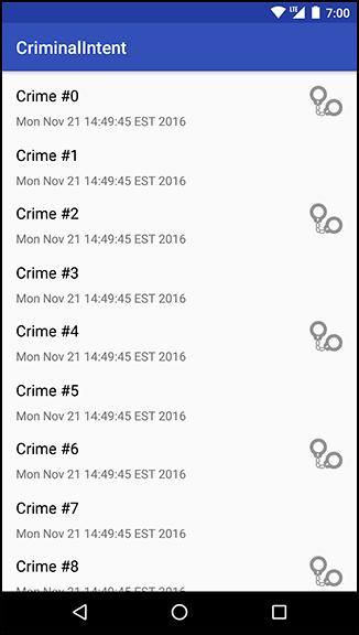
If you have made any updates so far in this chapter, run CriminalIntent and ensure that the app does not crash. You should see something similar to Figure 13.2.