
The Android platform is designed to operate on a variety of different device types, screen sizes, and screen resolutions. To assist developers in meeting this challenge, Android provides a rich toolkit of user interface components to utilize and customize to the needs of their specific application. Android also relies very heavily on an extensible XML framework and set resource qualifiers to create liquid layouts that can adapt to these environmental changes. In this chapter, we take a look at some practical ways to shape this framework to fit your specific development needs.
(API Level 1)
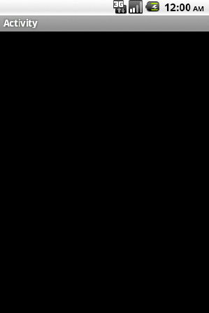
Customize the window attributes and features using themes and the WindowManager. Without any customization, an Activity in an Android application will load with the default system theme, looking something like Figure 2-1.
The window color will be black, with a title bar (often grey) at the top of the Activity. The status bar is visible above everything, with a slight shadow effect underneath it. These are all customizable aspects of the application that are controlled by the Window, and can be set for the entire application or for specific Activities.
A Theme in Android is a type of appearance style that is applicable to an entire application or Activity. There are two choices when applying a theme: use a system theme or create a custom one. In either case, a theme is applied in the AndroidManifest.xml file as shown in Listing 2-1.
Example 2.1. AndroidManifest.xml
<?xml version="1.0" encoding="utf-8"?>
<manifest xmlns:android="http://schemas.android.com/apk/res/android"
    ...>
    <!—Apply to the application tag for a global theme -->
    <application android:theme="THEME_NAME"
        ...>
        <!—Apply to the activity tag for an individual theme -->
        <activity android:name=".Activity" android:theme="THEME_NAME"
            ...>
            <intent-filter>
                  ...
            </intent-filter>
        </activity>
    </application>
</manifest>
System Themes
The styles.xml packaged with the Android framework includes a few options for themes with some useful custom properties set. Referencing R.style in the SDK documentation will provide the full list, but here are a few useful examples:
Theme.NoTitleBar: Remove the title bar from components with this theme applied.
Theme.NoTitleBar.Fullscreen: Remove the title bar and status bar, filling the entire screen.
Theme.Dialog: A useful theme to make an Activity look like a dialog.
Theme.Wallpaper (API Level 5): Apply the user's wallpaper choice as the window background.
Listing 2-2 is an example of a system theme applied to the entire application by setting the android:theme attribute in the AndroidManifest.xml file:
Example 2.2. Manifest with Theme Set on Application
<?xml version="1.0" encoding="utf-8"?>
<manifest xmlns:android="http://schemas.android.com/apk/res/android"
    ...>
    <!—Apply to the application tag for a global theme -->
    <application android:theme="Theme.NoTitleBar"
        ...>
        ...
    </application>
</manifest>
Custom Themes
Sometimes the provided system choices aren't enough. After all, some of the customizable elements in the window are not even addressed in the system options. Defining a custom theme to do the job is simple.
If there is not one already, create a styles.xml file in the res/values path of the project. Remember, themes are just styles applied on a wider scale, so they are defined in the same place. Theme aspects related to window customization can be found in the R.attr reference of the SDK, but here are the most common items:
android:windowNoTitleGoverns whether to remove the default title bar.
Set to
trueto remove the title bar.
android:windowFullscreenGoverns whether to remove the system status bar.
Set to
trueto remove the status bar and fill the entire screen.
android:windowBackgroundColor or drawable resource to apply as a background
Set to color or drawable value or resource
android:windowContentOverlayDrawable placed over the window content foreground. By default, this is a shadow below the status bar.
Set to any resource to use in place of the default status bar shadow, or null (
@nullin XML) to remove it.
android:windowTitleBackgroundStyleStyle to apply to the window's title view
Set to any style resource.
android:windowTitleSizeHeight of the window's title view
Set to any dimension or dimension resource
android:windowTitleStyleStyle to apply to the window's title text
Set to any style resource
Listing 2-3 is an example of a styles.xml file that creates two custom themes:
MyTheme.One: No title bar and the default status bar shadow removedMyTheme.Two: Fullscreen with a custom background image
Example 2.3. res/values/styles.xml with Two Custom Themes
<?xml version="1.0" encoding="utf-8"?>
<resources>
    <style name="MyTheme.One" parent="@android:style/Theme">
        <item name="android:windowNoTitle">true</item>
        <item name="android:windowContentOverlay">@null</item>
    </style>
    <style name="MyTheme.Two" parent="@android:style/Theme">
        <item name="android:windowBackground">@drawable/window_bg</item>
        <item name="android:windowFullscreen">true</item>
    </style>
</resources>
Notice that a theme (or style) may also indicate a parent from which to inherit properties, so the entire theme need not be created from scratch. In the example, we chose to inherit from Android's default system theme, customizing only the properties that we needed to differentiate. All platform themes are defined in res/values/themes.xml of the Android package. Refer to the SDK documentation on styles and themes for more details.
Listing 2-4 shows how to apply these themes to individual Activity instances in the AndroidManifest.xml:
Example 2.4. Manifest with Themes Set on Each Activity
<?xml version="1.0" encoding="utf-8"?>
<manifest xmlns:android="http://schemas.android.com/apk/res/android"
    ...>
    <!—Apply to the application tag for a global theme -->
    <application
        ...>
        <!—Apply to the activity tag for an individual theme -->
        <activity android:name=".ActivityOne" android:theme="MyTheme.One"
            ...>
            <intent-filter>
                  ...
            </intent-filter>
        </activity>
        <activity android:name=".ActivityTwo" android:theme="MyTheme.Two"
            ...>
            <intent-filter>
                  ...
            </intent-filter>
        </activity>

    </application>
</manifest>
Customizing Window Features in Code
In addition to using style XML, window properties may also be customized from the Java code in an Activity. This method opens up a slightly different feature set to the developer for customization, although there is some overlap with the XML styling.
Customizing the window through code involves making requests of the system using the Activity.requestWindowFeature() method for each feature change prior to setting the content view for the Activity.
Note
All requests for extended window features with Activity.requestWindowFeature() must be made PRIOR to calling Activity.setContentView(). Any changes made after this point will not take place.
The features you can request from the window, and their meanings, are defined in the following:
FEATURE_CUSTOM_TITLE:Set a custom layout resource as the Activity title view.FEATURE_NO_TITLE:Remove the title view from Activity.FEATURE_PROGRESS:Utilize a determinate (0-100%) progress bar in the title.FEATURE_INDETERMINATE_PROGRESS:Utilize a small indeterminate (circular) progress indicator in the title view.FEATURE_LEFT_ICON:Include a small title icon on the left side of the title view.FEATURE_RIGHT_ICON:Include a small title icon on the right side of the title view.
FEATURE_CUSTOM_TITLE
Use this window feature to replace the standard title with a completely custom layout resource (see Listing 2-5).
Example 2.5. Activity Setting a Custom TitleLlayout
protected void onCreate(Bundle savedInstanceState) {
    super.onCreate(savedInstanceState);
    //Request window features before setContentView
    requestWindowFeature(Window.FEATURE_CUSTOM_TITLE);
    setContentView(R.layout.main);

    //Set the layout resource to use for the custom title
    getWindow().setFeatureInt(Window.FEATURE_CUSTOM_TITLE, R.layout.custom_title);

}
Note
Because this feature completely replaces the default title view, it cannot be combined with any of the other window feature flags.
FEATURE_NO_TITLE
Use this window feature to remove the standard title view (see Listing 2-6).
Example 2.6. Activity Removing the Standard Title View
protected void onCreate(Bundle savedInstanceState) {
    super.onCreate(savedInstanceState);
    //Request window features before setContentView
    requestWindowFeature(Window.FEATURE_NO_TITLE);
    setContentView(R.layout.main);

}
Note
Because this feature completely removes the default title view, it cannot be combined with any of the other window feature flags.
FEATURE_PROGRESS
Use this window feature to access a determinate progress bar in the window title. The progress can be set to any value from 0 (0%) to 10000 (100%) (see Listing 2-7.)
Example 2.7. Activity Using Window's Progress Bar
protected void onCreate(Bundle savedInstanceState) {
    super.onCreate(savedInstanceState);
    //Request window features before setContentView
    requestWindowFeature(Window.FEATURE_PROGRESS);
    setContentView(R.layout.main);

    //Set the progress bar visibility
    setProgressBarVisibility(true);
    //Control progress value with setProgress
    setProgress(0);
    //Setting progress to 100% will cause it to disappear
    setProgress(10000);

}
FEATURE_INDETERMINATE_PROGRESS
Use this window feature to access an indeterminate progress indicator to show background activity. Since this indicator is indeterminate, it can only be shown or hidden (see Listing 2-8).
Example 2.8. Activity Using Window's Indeterminate Progress Bar
protected void onCreate(Bundle savedInstanceState) {
    super.onCreate(savedInstanceState);
    //Request window features before setContentView
    requestWindowFeature(Window.FEATURE_INDETERMINATE_PROGRESS);
    setContentView(R.layout.main);

    //Show the progress indicator
    setProgressBarIndeterminateVisibility(true);

    //Hide the progress indicator
setProgressBarIndeterminateVisibility(false);
}
FEATURE_LEFT_ICON
Use this window feature to place a small drawable icon on the left side of the title view (see Listing 2-9).
Example 2.9. Activity Using Feature Icon
protected void onCreate(Bundle savedInstanceState) {
    super.onCreate(savedInstanceState);
    //Request window features before setContentView
    requestWindowFeature(Window.FEATURE_LEFT_ICON);
    setContentView(R.layout.main);

    //Set the layout resource to use for the custom title
setFeatureDrawableResource(Window.FEATURE_LEFT_ICON, R.drawable.icon); }
FEATURE_RIGHT_ICON
Use this window feature to place a right-aligned small drawable icon (see Listing 2-10).
Example 2.10. Activity Using Feature Icon
protected void onCreate(Bundle savedInstanceState) {
    super.onCreate(savedInstanceState);
    //Request window features before setContentView
    requestWindowFeature(Window.FEATURE_RIGHT_ICON);
    setContentView(R.layout.main);

    //Set the layout resource to use for the custom title
    setFeatureDrawableResource(Window.FEATURE_RIGHT_ICON, R.drawable.icon);
}
Note
FEATURE_RIGHT_ICON does NOT necessarily mean the icon will be placed on the right side of the title text.
Figure 2-2 shows an Activity with all the icon and progress features enabled simultaneously. Note the locations of all the elements relative to each other in this view.
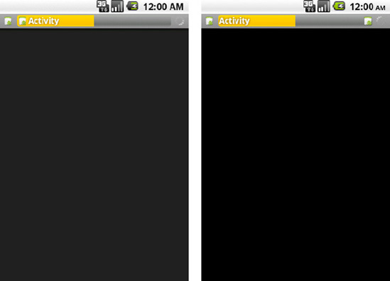
Figure 2.2. Window features enabled in a pre-Froyo Activity (left) and an Activity from Froyo and later (right)
Notice that in API Levels prior to 8 (Froyo), the layout of the RIGHT feature icon was still on the left-hand side of the title text. API Levels 8 and higher corrected this issue, and now display the icon on the right side of the view, although still to the left of the indeterminate progress indicator, if it is visible.
(API Level 1)
Whether using one of the many views and widgets available in the Android SDK or creating a custom display, all applications need views to interact with the user. The preferred method for creating user interfaces in Android is to define them in XML and inflate them at runtime.
The view structure in Android is a tree, with the root typically being the Activity or Window's content view. ViewGroups are special views that manage the display of one or more child views, of which could be another ViewGroup, and the tree continues to grow. All the standard layout classes descend from ViewGroup, and are the most common choices for the root node of the XML layout file.
Let's define a layout with two Button instances, and an EditText to accept user input. We can define a file in res/layout/ called main.xml with the following contents (see Listing 2-11).
Example 2.11. res/layout/main.xml
<LinearLayout xmlns:android="http://schemas.android.com/apk/res/android"
  android:layout_width="fill_parent"
  android:layout_height="fill_parent"
  android:orientation="vertical">
  <EditText
    android:id="@+id/editText"
    android:layout_width="fill_parent"
    android:layout_height="wrap_content"
  />
  <LinearLayout
    android:layout_width="fill_parent"
    android:layout_height="wrap_content"
    android:orientation="horizontal">
    <Button
      android:id="@+id/save"
      android:layout_width="wrap_content"
android:layout_height="wrap_content"
android:text="Save"
/>
<Button
android:id="@+id/cancel"
android:layout_width="wrap_content"
android:layout_height="wrap_content"
android:text="Cancel"
/>
</LinearLayout>
</LinearLayout>LinearLayout is a ViewGroup that lays out its elements one after the other in either a horizontal or vertical fashion. In main.xml, the EditText and inner LinearLayout are laid out vertically in order. The contents of the inner LinearLayout (the buttons) are laid out horizontally. The view elements with an android:id value are elements that will need to be referenced in the Java code for further customization or display.
To make this layout the display contents of an Activity, it must be inflated at runtime. The Activity.setContentView() method is overloaded with a convenience method to do this for you, only requiring the layout ID value. In this case, setting the layout in the Activity is as simple as this:
public void onCreate(Bundle savedInstanceState) {
    super.onCreate(savedInstanceState);
    setContentView(R.layout.main);
    //Continue Activity initialization
}
Nothing beyond supplying the ID value (main.xml automatically has an ID of R.layout.main) is required. If the layout needs a little more customization before it is attached to the window, you can inflate it manually and do some work before adding it as the content view. Listing 2-12 inflates the same layout and adds a third button before displaying it.
Example 2.12. Layout Modification Prior to Display
public void onCreate(Bundle savedInstanceState) {
    super.onCreate(savedInstanceState);
    //Inflate the layout file
    LinearLayout layout = (LinearLayout)getLayoutInflater().inflate(R.layout.main, null);
    //Add a new button
    Button reset = new Button(this);
    reset.setText("Reset Form");
    layout.addView(reset,
        new LinearLayout.LayoutParams(LayoutParams.FILL_PARENT, LayoutParams.WRAP_CONTENT));

    //Attach the view to the window
    setContentView(layout);
}
In this instance the XML layout is inflated in the Activity code using a LayoutInflater, whose inflate() method returns a handle to the inflated View. Since LayoutInflater.inflate() returns a View, we must cast it to the specific subclass in the XML in order to do more than just attach it to the window.
(API Level 1)
Ensure that the view object is clickable, and attach a View.OnClickListener to handle the event. By default, many widgets in the SDK are already clickable, such as Button, ImageButton, and CheckBox. However, any View can be made to receive click events by setting android:clickable="true" in XML or by calling View.setClickable(true) from code.
To receive and handle the click events, create an OnClickListener and attach it to the view object. In this example, the view is a button defined in the root layout like so:
<Button
  android:id="@+id/myButton"
  android:layout_width="wrap_content"
  android:layout_height="wrap_content"
  android:text="My Button"
/>
In the Activity code, the button is retrieved by its android:id value and the listener attached (see Listing 2-13).
Example 2.13. Setting Listener on a Button
public void onCreate(Bundle savedInstanceState) {
    super.onCreate(savedInstanceState);
    //Retrieve the button object
    Button myButton = (Button)findViewById(R.id.myButton);
    //Attach the listener
    myButton.setOnClickListener(clickListener);
}

//Listener object to handle the click events
View.OnClickListener clickListener = new View.OnClickListener() {
public void onClick(View v) {
//Code to handle the click event
{
};(API Level 4)
Starting with API Level 4, there is a more efficient way to attach basic click listeners to view widgets. View widgets can set the android:onClick attribute in XML, and the runtime will user Java Reflection to call the required method when events occur. If we modify the previous example to use this method, the button's XML will become the following:
<Button
  android:layout_width="wrap_content"
  android:layout_height="wrap_content"
  android:text="My Button"
  android:onClick="onMyButtonClick"
/>
The android:id attribute is no longer required in this example since the only reason we referenced it in code was to add the listener. This simplifies the Java code as well to look like Listing 2-14.
Your application uses graphic assets that do not scale well using Android's traditional mechanism for scaling images up on higher resolution screens.
(API Level 4)
Use resource qualifiers and supply multiple sizes of each asset. The Android SDK has defined four types of screen resolutions, or densities, listed here:
Low (ldpi): 120dpi
Medium (mdpi): 160dpi
High (hdpi): 240dpi
Extra High (xhdpi): 320dpi (Added in API Level 8)
By default, an Android project may only have one res/drawable/ directory where all graphic assets are stored. In this case, Android will take those images to be 1:1 in size on medium resolution screens. When the application is run on a higher resolution screen, Android will scale up the image to 150% (200% for xhdpi), which can result in loss of quality.
To avoid this issue, it is recommended that you provide multiple copies of each image resource at different resolutions and place them into resource qualified directory paths.
res/drawable-ldpi/75% of the size at mdpi
res/drawable-mdpi/Noted as the original image size
res/drawable-hdpi/150% of the size at mdpi
res/drawable-xhdpi/200% of the size at mdpi
Only if application supports API Level 8 as the minimum target
The image must have the same file name in all directories. For example, if you had left the default icon value in AndroidManifest.xml (i.e. android:icon="@drawable/icon"), then you would place the following resource files in the project.
res/drawable-ldpi/icon.png (36×36 pixels)
res/drawable-mdpi/icon.png (48×48 pixels)
res/drawable-hdpi/icon.png (72×72 pixels)
res/drawable-xhdpi/icon.png (96×96 pixels, if supported)
Android will select the asset that fits the device resolution and display it as the application icon on the Launcher screen, resulting in no scaling and no loss of image quality.
As another example, a logo image is to be displayed several places throughout an application, and is 200×200 pixels on a medium-resolution device. That image should be provided in all supported sizes using resource qualifiers.
res/drawable-ldpi/logo.png (150×150 pixels)
res/drawable-mdpi/logo.png (200×200 pixels)
res/drawable-hdpi/logo.png (300×300 pixels)
This application doesn't support extra-high resolution displays, so we only provide three images. When the time comes to reference this resource, simply use @drawable/logo (from XML) or R.drawable.logo (from Java code), and Android will display the appropriate resource.
A certain Activity in your application should not be allowed to rotate, or rotation requires more direct intervention from the application code.
(API Level 1)
Using static declarations in the AndroidManifest.xml file, each individual Activity can be modified to lock into either portrait or landscape orientation. This can only be applied to the <activity> tag, so it cannot be done once for the entire application scope. Simply add android:screenOrientation="portrait" or android:screenOrientation="landscape" to the <activity> element and they will always display in the specified orientation, regardless of how the device is positioned.
There is also an option you can pass in the XML entitled "behind." If an Activity element has android:screenOrientation="behind" set, it will take it's settings from the previous Activity in the stack. This can be a useful way for an Activity to match the locked orientation of its originator for some slightly more dynamic behavior.
Theexample AndroidManifest.xml depicted in Listing 2-15 has three Activities. Two of them are locked into portrait orientation (MainActivity and ResultActivity), while the UserEntryActivity is allowed to rotate, presumably because the user may want to rotate and use a physical keyboard.
Example 2.15. Manifest with Some Activities Locked in Portrait
<?xml version="1.0" encoding="utf-8"?>
<manifest xmlns:android="http://schemas.android.com/apk/res/android"
      package="com.examples.rotation"
      android:versionCode="1"
      android:versionName="1.0">
    <application android:icon="@drawable/icon" android:label="@string/app_name">
        <activity android:name=".MainActivity"
            android:label="@string/app_name"
            android:screenOrientation="portrait">
            <intent-filter>
<action android:name="android.intent.action.MAIN" />
<category android:name="android.intent.category.LAUNCHER" />
</intent-filter>
</activity>
<activity android:name=".ResultActivity"
android:screenOrientation="portrait" />
<activity android:name=".UserEntryActivity" />
</application>
</manifest>Conditions exist during which the screen should not rotate, but the condition is temporary, or dependant on user wishes.
(API Level 1)
Using the requested orientation mechanism in Android, an application can adjust the screen orientation used to display the Activity, fixing it to a specific orientation or releasing it to the device to decide. This is accomplished through the use of the Activity.setRequestedOrientation() method, which takes an integer constant from the ActivityInfo.screenOrientation attribute grouping.
By default, the requested orientation is set to SCREEN_ORIENTATION_UNSPECIFIED, which allows the device to decide for itself which orientation should be used. This is a decision typically based on the physical orientation of the device. The current requested orientation can be retrieved at any time as well using Activity.getRequestedOrientation().
As an example of this, let's create a ToggleButton instance that controls whether or not to lock the current orientation, allowing the user to control at any point whether or not the Activity should change orientation.
Somewhere in the main.xml layout, a ToggleButton instance is defined:
<ToggleButton
    android:id="@+id/toggleButton"
    android:layout_width="wrap_content"
    android:layout_height="wrap_content"
    android:textOff="Lock"
    android:textOn="LOCKED"
/>
In the Activity code, we will create a listener to the button's state that locks and releases the screen orientation based on its current value (see Listing 2-16).
Example 2.16. Activity to Dynamically Lock/Unlock Screen Orientation
public class LockActivity extends Activity {

    protected void onCreate(Bundle savedInstanceState) {
        super.onCreate(savedInstanceState);
        setContentView(R.layout.main);

        //Get handle to the button resource
        ToggleButton toggle = (ToggleButton)findViewById(R.id.toggleButton);
        //Set the default state before adding the listener
        if( getRequestedOrientation() != ActivityInfo.SCREEN_ORIENTATION_UNSPECIFIED ) {
            toggle.setChecked(true);
        } else {
            toggle.setChecked(false);
        }
        //Attach the listener to the button
        toggle.setOnCheckedChangeListener(listener);
    }

    OnCheckedChangeListener listener = new OnCheckedChangeListener() {
        public void onCheckedChanged(CompoundButton buttonView, boolean isChecked) {
            int current = getResources().getConfiguration().orientation;
            if(isChecked) {
                switch(current) {
                case Configuration.ORIENTATION_LANDSCAPE:
                    setRequestedOrientation(ActivityInfo.SCREEN_ORIENTATION_LANDSCAPE);
                    break;
                case Configuration.ORIENTATION_PORTRAIT:
                    setRequestedOrientation(ActivityInfo.SCREEN_ORIENTATION_PORTRAIT);
                    break;
                default:
                    setRequestedOrientation(ActivityInfo.SCREEN_ORIENTATION_UNSPECIFIED);
                }
            } else {
                setRequestedOrientation(ActivityInfo.SCREEN_ORIENTATION_UNSPECIFIED);
            }
        }
    }

}
The code in the listener is the key ingredient to this recipe. If the user presses the button and it toggles to the ON state, the current orientation is read by storing the orientation parameter from Resources.getConfiguration(). The Configuration object and the requested orientation use different constants to map the states, so we switch on the current orientation and call setRequestedOrientation() with the appropriate constant.
Note
If an orientation is requested that is different from the current state, and your Activity is in the foreground, the Activity will change immediately to accommodate the request.
If the user presses the button and it toggles to the OFF state, we no longer want to lock the orientation, so setRequestedOrientation() is called with the SCREEN_ORIENTATION_UNSPECIFIED constant again to return control back to the device. This may also cause an immediate change to occur if the device orientation dictates that the Activity be different than where the application had it locked.
Note
Setting a request orientation does not keep the default Activity lifecycle from occurring. If a device configuration change occurs (keyboard slides out or device orientation changes), the Activity will still be destroyed and recreated, so all rules about persisting Activity state still apply.
The default behavior destroying and recreating an Activity during rotation causes an unacceptable performance penalty in the application.
Without customization, Android will respond to configuration changes by finishing the current Activity instance and creating a new one in its place, appropriate for the new configuration. This can cause undue performance penalties since the UI state must be saved, and the UI completely rebuilt.
(API Level 1)
Utilize the android:configChanges manifest parameter to instruct Android that a certain Activity will handle rotation events without assistance from the runtime. This not only reduces the amount of work required from Android, destroying and recreating the Activity instance, but also from your application. With the Activity instance intact, the application does not have to necessarily spend time to save and restore the current state in order to maintain consistency to the user.
An Activity that registers for one or more configuration changes will be notified via the Activity.onConfigurationChanged() callback method, where it can perform any necessary manual handling associated with the change.
There are two configuration change parameters the Activity should register for in order to handle rotation completely: orientation and keyboardHidden. The orientation parameter registers the Activity for any event when the device orientation changes. The keyboardHidden parameter registers the Activity for the event when the user slides a physical keyboard in or out. While the latter may not be directly of interest, if you do not register for these events Android will recreate your Activity when they occur, which may subvert your efforts in handling rotation in the first place.
These parameters are added to any <activity> element in AndroidManifest.xml like so:
<activity android:name=".MyActivity" android:configChanges="orientation|keyboardHidden" />
Multiple changes can be registered in the same assignment statement, using a pipe "|" character between them. Because these parameters cannot be applied to an <application> element, each individual Activity must register in the AndroidManifest.xml.
With the Activity registered, a configuration change results in a call to the Activity's onConfigurationChanged() method. Listing 2-17 is a simple Activity definition that can be used to handle the callback received when the changes occur.
Example 2.17. Activity to Manage Rotation Manually
public class MyActivity extends Activity {

    @Override
    protected void onCreate(Bundle savedInstanceState) {
        //Calling super is required
        super.onCreate(savedInstanceState);
        //Load view resources
        loadView();
    }

    @Override
    public void onConfigurationChanged(Configuration newConfig) {
        //Calling super is required
        super.onConfigurationChanged(newConfig);
        //Store important UI state
        saveState();
        //Reload the view resources
        loadView();
    }

    private void saveState() {
        //Implement any code to persist the UI state
    }

    private void loadView() {
        setContentView(R.layout.main);

        //Handle any other required UI changes upon a new configuration
        //Including restoring and stored state
    }
}
Note
Google does not recommend handling rotation in this fashion unless it is necessary for the application's performance. All configuration-specific resources must be loaded manually in response to each change event.
It is worth noting that Google recommends allowing the default recreation behavior on Activity rotation unless the performance of your application requires circumventing it. Primarily, this is because you lose all assistance Android provides for loading alternative resources if you have them stored in resource qualified directories (such as res/layout-land/ for landscape layouts).
In the example Activity, all code dealing with the view layout is abstracted to a private method, loadView(), called from both onCreate() and onConfigurationChanged(). In this method, code like setContentView() is placed to ensure that the appropriate layout is loaded to match the configuration.
Calling setContentView() will completely reload the view, so any UI state that is important still needs to be saved, and without the assistance of lifecycle callbacks like onSaveInstanceState() and onRestoreInstanceState(). The example implements a method called saveState() for this purpose.
You want to provide the user with multiple actions to take as a result of them selecting some part of the user interface.
Using a ContextMenu is a useful solution, particularly when you want to provide a list of actions based on an item click in a ListView or other AdapterView. This is because the ContextMenu.ContextMenuInfo object provides useful information about the specific item that was selected, such as id and position, which may be helpful in constructing the menu.
First, create an XML file in res/menu/ to define the menu itself; we'll call this one contextmenu.xml (see Listing 2-18).
Example 2.18. res/menu/contextmenu.xml
<?xml version="1.0" encoding="utf-8"?>
<menu xmlns:android="http://schemas.android.com/apk/res/android">
  <item
    android:id="@+id/menu_delete"
android:title="Delete Item"
/>
<item
android:id="@+id/menu_copy"
android:title="Copy Item"
/>
<item
android:id="@+id/menu_edit"
android:title="Edit Item"
/>
</menu>Then, utilize onCreateContextMenu() and onContextItemSelected() in the Activity to inflate the menu and handle user selection (see Listing 2-19).
Example 2.19. Activity Utilizing Custom Menu
@Override
public void onCreateContextMenu(ContextMenu menu, View v, ContextMenu.ContextMenuInfo menuInfo) {
    super.onCreateContextMenu(menu, v, menuInfo);
    getMenuInflater().inflate(R.menu.contextmenu, menu);
    menu.setHeaderTitle("Choose an Option");
}

@Override
public boolean onContextItemSelected(MenuItem item) {
    //Switch on the item's ID to find the action the user selected
    switch(item.getItemId()) {
    case R.id.menu_delete:
        //Perform delete actions
        return true;
    case R.id.menu_copy:
        //Perform copy actions
        return true;
    case R.id.menu_edit:
        //Perform edit actions
        return true;
    }
    return super.onContextItemSelected(item);
}
In order for these callback methods to fire, you must register the view that will trigger the menu. In effect, this sets the View.OnCreateContextMenuListener for the view to the current Activity:
@Override
protected void onCreate(Bundle savedInstanceState) {
    super.onCreate(savedInstanceState);
    //Register a button for context events
    Button button = new Button(this);
    registerForContextMenu(button);

    setContentView(button);
}
The key ingredient to this recipe is calling the Activity.openContextMenu() method to manually trigger the menu at any time. The default behavior in Android is for many views to show a ContextMenu when a long-press occurs as an alternate to the main click action. However, in this case we want the menu to be the main action, so we call openContextMenu() from the action listener method:
public void onClick(View v) {
openContextMenu(v);
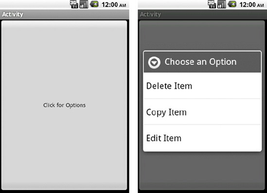
}Tying all the pieces together, we have a simple Activity that registers a button to show our menu when tapped (see Listing 2-20).
Example 2.20. Activity Utilizing Context Action Menu
public class MyActivity extends Activity {

    protected void onCreate(Bundle savedInstanceState) {
        super.onCreate(savedInstanceState);
        //Register a button for context events
        Button button = new Button(this);
        button.setText("Click for Options");
        button.setOnClickListener(listener);
        registerForContextMenu(button);

        setContentView(button);
    }

    View.OnClickListener listener = new View.OnClickListener() {
        public void onClick(View v) {
            openContextMenu(v);
        }
    };

    @Override
    public void onCreateContextMenu(ContextMenu menu, View v,
                ContextMenu.ContextMenuInfo menuInfo) {
        super.onCreateContextMenu(menu, v, menuInfo);
        getMenuInflater().inflate(R.menu.contextmenu, menu);
        menu.setHeaderTitle("Choose an Option");
    }

    @Override
    public boolean onContextItemSelected(MenuItem item) {
        //Switch on the item's ID to find the action the user selected
        switch(item.getItemId()) {
        case R.id.menu_delete:
            //Perform delete actions
            return true;
        case R.id.menu_copy:
            //Perform copy actions
            return true;
        case R.id.menu_edit:
            //Perform edit actions
            return true;
        }
        return super.onContextItemSelected(item);
    }

}
The resulting application is shown in Figure 2-3.
Using an AlertDialog.Builder a similar AlertDialog can be constructed, but with some additional options. AlertDialog is a very versatile class for creating simple pop-ups to get feedback from the user. With AlertDialog.Builder, a single or multi-choice list, buttons, and a message string can all be easily added into one compact widget.
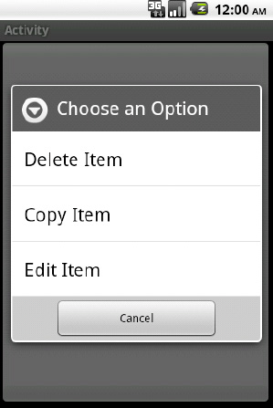
To illustrate this, let's create the same pop-up selection as before using an AlertDialog. This time, we will add a cancel button to the bottom of the options list (see Listing 2-21).
Example 2.21. Action Menu Using AlertDialog
public class MyActivity extends Activity {

    AlertDialog actions;

    @Override
    protectedvoid onCreate(Bundle savedInstanceState) {
        super.onCreate(savedInstanceState);
        setTitle("Activity");
        Button button = new Button(this);
        button.setText("Click for Options");
        button.setOnClickListener(buttonListener);

        AlertDialog.Builder builder = new AlertDialog.Builder(this);
builder.setTitle("Choose an Option");
String[] options = {"Delete Item","Copy Item","Edit Item"};
builder.setItems(options, actionListener);
builder.setNegativeButton("Cancel", null);
actions = builder.create();
setContentView(button);
}
//List selection action handled here
DialogInterface.OnClickListener actionListener =
new DialogInterface.OnClickListener() {
@Override
public void onClick(DialogInterface dialog, int which) {
switch(which) {
case 0: //Delete
break;
case 1: //Copy
break;
case 2: //Edit
break;
default:
break;
}
}
};
//Button action handled here (pop up the dialog)
View.OnClickListener buttonListener = new View.OnClickListener() {
@Override
public void onClick(View v) {
actions.show();
}
};
}In this example, we create a new AlertDialog.Builder instance and use its convenience methods to add:
A title, using
setTitle()The selectable list of options, using
setItems()with an array of strings (also works with array resources)A Cancel button, using
setNegativeButton()
The listener that we attach to the list items returns which list item was selected as a zero-based index into the array we supplied, so the switch statement checks for each of the three cases that apply. We pass in null for the Cancel button's listener, because in this instance we just want cancel to dismiss the dialog. If there is some important work to be done on cancel, another listener could be passed in to the setNegativeButton() method.
The resulting application now looks like Figure 2-4 when the button is pressed.
Your application needs to do something beyond displaying a standard menu when the user presses the hardware MENU button.
Intercepting this event can be done inside of an Activity or View by overriding the onKeyDown() or onKeyUp() method:
@Override
public boolean onKeyUp(int keyCode, KeyEvent event) {
    if(keyCode == KeyEvent.KEYCODE_MENU) {
        //Create and display a custom menu view
//Return true to consume the event
return true;
}
//Pass other events along their way up the chain
return super.onKeyUp(keyCode, event);
}Note
Activity.onKeyDown() and Activity.onKeyUp() are only called if none if its child views handle the event first. It is important that you return a true value when consuming these events so they don't get improperly handed up the chain.
The next example illustrates an Activity that displays a custom set of buttons wrapped in a simple AlertDialog in place of the traditional options menu when the user presses the MENU key. In Listing 2-23, we will create a layout for our buttons in res/layout/ and call it custommenu.xml.
Example 2.22. res/layout/custommenu.xml
<?xml version="1.0" encoding="utf-8"?>
<LinearLayoutxmlns:android="http://schemas.android.com/apk/res/android"
  android:layout_width="fill_parent"
  android:layout_height="wrap_content"
  android:orientation="horizontal">
  <ImageButton
    android:layout_width="fill_parent"
    android:layout_height="wrap_content"
    android:layout_weight="1"
    android:src="@android:drawable/ic_menu_send"
  />
  <ImageButton
    android:layout_width="fill_parent"
    android:layout_height="wrap_content"
    android:layout_weight="1"
    android:src="@android:drawable/ic_menu_save"
  />
  <ImageButton
    android:layout_width="fill_parent"
    android:layout_height="wrap_content"
    android:layout_weight="1"
    android:src="@android:drawable/ic_menu_search"
  />
  <ImageButton
    android:layout_width="fill_parent"
    android:layout_height="wrap_content"
    android:layout_weight="1"
    android:src="@android:drawable/ic_menu_preferences"
  />
</LinearLayout>
This is a layout with four buttons of equal weight (so the space evenly across the screen), displaying some of the default menu images in Android. In Listing 2-24, we can inflate this layout and apply it as the view to an AlertDialog.
Example 2.23. Activity Overriding Menu Action
public class MyActivity extends Activity {
MenuDialog menuDialog;
privateclass MenuDialog extends AlertDialog {
public MenuDialog(Context context) {
super(context);
setTitle("Menu");
View menu = getLayoutInflater().inflate(R.layout.custommenu, null);
setView(menu);
}
@Override
public boolean onKeyUp(int keyCode, KeyEvent event) {
if(keyCode == KeyEvent.KEYCODE_MENU) {
dismiss();
returntrue;
}
returnsuper.onKeyUp(keyCode, event);
}
}
@Override
public boolean onKeyUp(int keyCode, KeyEvent event) {
if(keyCode == KeyEvent.KEYCODE_MENU) {
if(menuDialog == null) {
menuDialog = new MenuDialog(this);
}
menuDialog.show();
return true;
}
return super.onKeyUp(keyCode, event);
}
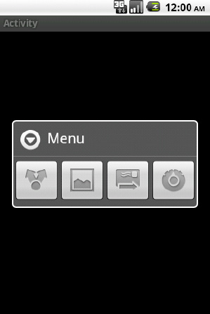
}Here we choose to monitor the Activity.onKeyUp() method, and handle the event if it was a MENU press by creating and displaying a custom subclass of AlertDialog.
This example creates a custom class for the dialog so we can extend the AlertDialog.onKeyUp() method to dismiss the custom menu when the user presses the MENU button again. We cannot handle this event in the Activity, because the AlertDialog consumes all key events while it is in the foreground. We do this so we match the existing functionality of Android's standard menu, and thus don't disrupt the user's expectation of how the application should behave.
When the previous Activity is loaded, and the MENU button pressed, we get something like Figure 2-5.
(API Level 1)
Similar to overriding the function of the MENU button, the hardware BACK button sends a KeyEvent to your Activity that can be intercepted and handled in your application code.
In the same fashion as Recipe 2-9, overriding onKeyDown() will give you the control:
@Override
public boolean onKeyDown(int keyCode, KeyEvent event) {
    if(keyCode == KeyEvent.KEYCODE_BACK) {
        //Implement a custom back function
//Return true to consume the event
return true;
}
//Pass other events along their way up the chain
return super.onKeyDown(keyCode, event);
}Warning
Overriding hardware button events should be done with care. All hardware buttons have consistent functionality across the Android system, and adjusting the functionality to work outside these bounds will be confusing and upsetting to users.
Unlike the previous example, you can not reliably use onKeyUp(), because the default behavior (such as finishing the current Activity) occurs when the key is pressed, as opposed to when it is released. For this reason, onKeyUp() will often never get called for the BACK key.
(API Level 5)
Starting with Eclair, the SDK included the Activity.onBackPressed() callback method. This method can be overridden to perform custom processing if your application is targeting SDK Level 5 or higher.
@Override
public void onBackPressed() {
    //Custom back button processing
    //Must manually finish when complete
    finish();
}
The default implementation of this method simply calls finish() for you, so if you want the Activity to close after your processing is complete, the implementation will need to call finish() directly.
(API Level 1)
The act of the user hitting the HOME button sends an Intent to the system telling it to load the Home Activity. This is no different from starting any other Activity in your application; you just have to construct the proper Intent to get the effect.
Add the following lines wherever you want this action to occur in your Activity:
Intent intent = new Intent(Intent.ACTION_MAIN);
intent.addCategory(Intent.CATEGORY_HOME);
startActivity(intent);
A common use of this function is to override the back button to go home instead of to the previous Activity. This is useful in cases where everything underneath the foreground Activity may be protected (a login screen, for instance), and letting the default back button behavior occur could allow unsecured access to the system. Here is an example of using the two in concert to make a certain Activity bring up the home screen when back is pressed:
@Override
public boolean onKeyDown(int keyCode, KeyEvent event) {
    if(keyCode == KeyEvent.KEYCODE_BACK) {
        Intent intent = new Intent(Intent.ACTION_MAIN);
        intent.addCategory(Intent.CATEGORY_HOME);
        startActivity(intent);
        returntrue;
    }
    returnsuper.onKeyDown(keyCode, event);
}Your application needs to continuously monitor for text changes in a TextView widget (like EditText).
(API Level 1)
Implement the android.text.TextWatcher interface. TextWatcher provides three callback methods during the process of updating text:
public void beforeTextChanged(CharSequence s, int start, int count, int after);
public void onTextChanged(CharSequence s, int start, int before, int count);
public void afterTextChanged(Editable s);
The beforeTextChanged() and onTextChanged() methods are provided mainly as notifications, as you cannot actually make changes to the CharSequence in either of these methods. If you are attempting to intercept the text entered into the view, changes may be made when afterTextChanged() is called.
To register a TextWatcher instance with a TextView, call the TextView.addTextChangedListener() method. Notice from the syntax that more than one TextWatcher can be registered with a TextView.
A simple use of TextWatcher is to create a live character counter that follows an EditText as the user types or deletes information. Listing 2-22 is an example Activity that implements TextWatcher for this purpose, registers with an EditText widget, and prints the character count in the Activity title.
Example 2.24. Character Counter Activity
public class MyActivity extends Activity implements TextWatcher {

EditText text;
int textCount;

    @Override
    protected void onCreate(Bundle savedInstanceState) {
        super.onCreate(savedInstanceState);
        //Create an EditText widget and add the watcher
        text = new EditText(this);
        text.addTextChangedListener(this);

        setContentView(text);
    }

    /* TextWatcher Implemention Methods */
    public void beforeTextChanged(CharSequence s, int start, int count, int after) { }

    public void onTextChanged(CharSequence s, int start, int before, int end) {
        textCount = text.getText().length();
        setTitle(String.valueOf(textCount));
    }

    public void afterTextChanged(Editable s) { }

}
Because our needs do not include modifying the text being inserted, we can read the count from onTextChanged(), which happens as soon as the text change occurs. The other methods are unused and left empty.
The SDK has a handful of predefined TextWatcher instances to format text input; PhoneNumberFormattingTextWatcher is one of these. Their job is to apply standard formatting for the user while they type, reducing the number of keystrokes required to enter legible data.
In Listing 2-23, we create a CurrencyTextWatcher to insert the currency symbol and separator point into a TextView.
Example 2.25. Currency Formatter
public class CurrencyTextWatcher implements TextWatcher {

    boolean mEditing;

    public CurrencyTextWatcher() {
        mEditing = false;
}

    public synchronizedvoid afterTextChanged(Editable s) {
        if(!mEditing) {
            mEditing = true;

            //Strip symbols
            String digits = s.toString().replaceAll("\D", "");
            NumberFormat nf = NumberFormat.getCurrencyInstance();
            try{
                String formatted = nf.format(Double.parseDouble(digits)/100);
                s.replace(0, s.length(), formatted);
            } catch (NumberFormatException nfe) {
                    s.clear();
            }

            mEditing = false;
        }
    }

    public void beforeTextChanged(CharSequence s, int start, int count, int after) { }

    public void onTextChanged(CharSequence s, int start, int before, int count) { }

}
Note
Making changes to the Editable value in afterTextChanged() will cause the TextWatcher methods to be called again (after all, you just changed the text). For this reason, custom TextWatcher implementations that edit should use a boolean or some other tracking mechanism to track where the editing is coming from, or you may create an infinite loop.
We can apply this custom text formatter to an EditText in an Activity (see Listing 2-22).
Example 2.26. Activity Using Currency Formatter
public class MyActivity extends Activity {

    EditText text;

    @Override
    protected void onCreate(Bundle savedInstanceState) {
        super.onCreate(savedInstanceState);
        text = new EditText(this);
        text.addTextChangedListener(new CurrencyTextWatcher());
setContentView(text);
}
}It is very handy if you are formatting user input with this formatter to define the EditText in XML so you can apply the android:inputType and android:digits constraints to easily protect the field against entry errors. In particular, adding android:digits="0123456789." (notice the period at the end for a decimal point) to the EditText will protect this formatter as well as the user.
(API Level 1)
Use the built-in marquee feature of TextView. When the content of a TextView is too large to fit within it bounds, the text is truncated by default. This truncation can be configured using the android:ellipsize attribute, which can be set to one of the following options:
none
Default.
Truncate the end of the text with no visual indicator.
start
Truncate the start of the text with an ellipsis at the beginning of the view.
middle
Truncate the middle of the text with an ellipsis in the middle of the view.
end
Truncate the end of the text with an ellipsis at the end of the view.
marquee
Do not ellipsize; animate and scroll the text while selected.
Note
The marquee feature is designed to only animate and scroll the text when the TextView is selected. Setting the android:ellipsize attribute to marquee alone will not animate the view.
In order to create an automated ticker that repeats indefinitely, we add a TextView to an XML layout that looks like this:
<TextView
  android:id="@+id/ticker"
  android:layout_width="fill_parent"
  android:layout_height="wrap_content"
  android:singleLine="true"
  android:scrollHorizontally="true"
  android:ellipsize="marquee"
  android:marqueeRepeatLimit="marquee_forever"
/>
The key attributes to configuring this view are the last four. Without android:singleLine and android:scrollHorizontally, the TextView will not properly lay itself out to allow for the text to be longer than the view (a key requirement for ticker scrolling). Setting the android:ellipsize and android:marqueeRepeatLimit allow the scrolling to occur, and for an indefinite amount of time. The repeat limit can be set to any integer value as well, which will repeat the scrolling animation that many times and then stop.
With the TextView attributes properly set in XML, the Java code must set the selected state to true, which enables the scrolling animation:
TextView ticker = (TextView)findViewById(R.id.ticker);
ticker.setSelected(true);
If you need to have the animation start and stop based on certain events in the user interface, just call setSelected() each time with either true or false, respectively.
(API Level 1)
An Animation object can be applied to any view and run using the View.startAnimation() method; this will run the animation immediately. You may also use View.setAnimation() to schedule an animation and attach the object to a view but not run it immediately. In this case, the Animation must have its start time parameter set.
For convenience, the Android SDK provides a handful of transition animations that you can apply to views, which can be loaded at runtime using the AnimationUtils class:
Slide and Fade In
Slide Up and Fade In
AnimationUtils.makeInChildBottomAnimation()View always slides up from the bottom.
Slide and Fade Out
AnimationUtils.makeOutAnimation()Use the boolean parameter to determine if the slide is left or right.
Fade Out
Fade In
AnimationUtils.loadAnimation()Set the int parameter to
android.R.anim.fade_in.
Note
These transition animations only temporarily change how the view is drawn. The visibility parameter of the view must also be set if you mean to permanently add or remove the object.
Listing 2-25 animates the appearance and disappearance of a View with each Button click event.
Example 2.27. res/layout/main.xml
<?xml version="1.0" encoding="utf-8"?>
<LinearLayout xmlns:android="http://schemas.android.com/apk/res/android"
  android:orientation="vertical"
  android:layout_width="fill_parent"
  android:layout_height="fill_parent">
  <Button
    android:id="@+id/toggleButton"
android:layout_width="fill_parent"
android:layout_height="wrap_content"
android:text="Click to Toggle"
/>
<View
android:id="@+id/theView"
android:layout_width="fill_parent"
android:layout_height="wrap_content"
android:background="#AAA"
/>
</LinearLayout>In Listing 2-26 each user action on the Button toggles the visibility of the grey View below it with an animation.
Example 2.28. Activity Animating View Transitions
public class AnimateActivity extends Activity implements View.OnClickListener {

    View viewToAnimate;

    @Override
    public void onCreate(Bundle savedInstanceState) {
        super.onCreate(savedInstanceState);
        setContentView(R.layout.main);

        Button button = (Button)findViewById(R.id.toggleButton);
        button.setOnClickListener(this);

        viewToAnimate = findViewById(R.id.theView);
    }

    @Override
    public void onClick(View v) {
        if(viewToAnimate.getVisibility() == View.VISIBLE) {
            //If the view is visible already, slide it out to the right
            Animation out = AnimationUtils.makeOutAnimation(this, true);
            viewToAnimate.startAnimation(out);
            viewToAnimate.setVisibility(View.INVISIBLE);
        } else {
            //If the view is hidden, do a fade_in in-place
            Animation in = AnimationUtils.loadAnimation(this, android.R.anim.fade_in);
            viewToAnimate.startAnimation(in);
            viewToAnimate.setVisibility(View.VISIBLE);
        }
    }
}
The view is hidden by sliding off to the right and fading out simultaneously, whereas the view simple fades into place when it is shown. We chose a simple View as the target here to demonstrate that any UI element (since they all subclass from View) can be animated in this way.
Creating custom animations to add effect to views by scaling, rotation, and transforming them can provide invaluable additions to a user interface as well. In Android, we can create the following Animation elements:
AlphaAnimation
Animate changes to a view's transparency.
RotateAnimation
Animate changes to a view's rotation.
The point about which rotation occurs is configurable. The top, left corner is chosen by default.
ScaleAnimation
Animate changes to a view's scale (size).
The center point of the scale change is configurable. The top, left corner is chosen by default.
TranslateAnimation
Animate changes to a view's position.
Let's illustrate how to construct and add a custom animation object by creating a sample application that creates a "coin flip" effect on an image (see Listing 2-28).
Example 2.29. res/layout/main.xml
<?xml version="1.0" encoding="utf-8"?>
<RelativeLayout xmlns:android="http://schemas.android.com/apk/res/android"
  android:layout_width="fill_parent"
  android:layout_height="fill_parent">
  <ImageView
    android:id="@+id/flip_image"
    android:layout_width="wrap_content"
    android:layout_height="wrap_content"
    android:layout_centerInParent="true"
  />
</RelativeLayout>
Example 2.30. Activity with Custom Animations
public class Flipper extends Activity {

    boolean isHeads;
    ScaleAnimation shrink, grow;
    ImageView flipImage;

    @Override
    public void onCreate(Bundle savedInstanceState) {
        super.onCreate(savedInstanceState);
        setContentView(R.layout.main);

        flipImage = (ImageView)findViewById(R.id.flip_image);
flipImage.setImageResource(R.drawable.heads);
isHeads = true;
shrink = new ScaleAnimation(1.0f, 0.0f, 1.0f, 1.0f,
ScaleAnimation.RELATIVE_TO_SELF, 0.5f,
ScaleAnimation.RELATIVE_TO_SELF, 0.5f);
shrink.setDuration(150);
shrink.setAnimationListener(new Animation.AnimationListener() {
@Override
public void onAnimationStart(Animation animation) {}
@Override
public void onAnimationRepeat(Animation animation) {}
@Override
public void onAnimationEnd(Animation animation) {
if(isHeads) {
isHeads = false;
flipImage.setImageResource(R.drawable.tails);
} else {
isHeads = true;
flipImage.setImageResource(R.drawable.heads);
}
flipImage.startAnimation(grow);
}
});
grow = new ScaleAnimation(0.0f, 1.0f, 1.0f, 1.0f,
ScaleAnimation.RELATIVE_TO_SELF, 0.5f,
ScaleAnimation.RELATIVE_TO_SELF, 0.5f);
grow.setDuration(150);
}
@Override
public boolean onTouchEvent(MotionEvent event) {
if(event.getAction() == MotionEvent.ACTION_DOWN) {
flipImage.startAnimation(shrink);
returntrue;
}
returnsuper.onTouchEvent(event);
}
}This example includes the following pertinent components:
Two image resources for the coin's head and tail (we named them heads.png and tails.png).
These images may be any two-image resources placed in res/drawable. The ImageView defaults to displaying the heads image.
Two ScaleAnimation objects
Shrink: Reduce the image width from full to nothing about the center.
Grow: Increase the image width from nothing to full about the center.
Anonymous AnimationListener to link the two animations in sequence
Custom animation objects can be defined either in XML or in code. In the next section we will look at making the animations as XML resources. Here we created the two ScaleAnimation objects using the following constructor:
ScaleAnimation(
  float fromX,
  float toX,
  float fromY,
  float toY,
  int pivotXType,
  float pivotXValue,
  int pivotYType,
  float pibotYValue
)
The first four parameters are the horizontal and vertical scaling factors to apply. Notice in the example the X went from 100-0% to shrink and 0-100% to grow, while leaving the Y alone at 100% always.
The remaining parameters define an anchor point for the view while the animation occurs. In this case, we are telling the application to anchor the midpoint of the view, and bring both sides in toward the middle as the view shrinks. The reverse is true for expanding the image: the center stays in place and the image grows outward towards its original edges.
Android does not inherently have a way to link multiple animation objects together in a sequence, so we use an Animation.AnimationListener for this purpose. The listener has methods to notify when an animation begins, repeats, and completes. In this case, we are only interested in the latter so that when the shrink animation is done, we can automatically start the grow animation after it.
The final method used in the example is to setDuration() method to set the animation duration of time. The value supplied here is in milliseconds, so our entire coin flip would take 300ms to complete, 150ms apiece for each ScaleAnimation.
Many times the custom animation you are searching to create requires a combination of the basic types described previously; this is where AnimationSet becomes useful. AnimationSet defines a group of animations that should be run simultaneously. By default, all animations will be started together, and complete at their respective durations.
In this section we will also expose how to define custom animations using Android's preferred method of XML resources. XML animations should be defined in the res/anim/ folder of a project. The following tags are supported, and all of them can be either the root or child node of an animation:
<alpha>: An AlphaAnimation object<rotate>: A RotateAnimation object<scale>: A ScaleAnimation object<translate>: A TranslateAnimation object<set>: An AnimationSet
Only the <set> tag, however, can be a parent and contain other animation tags.
In this example, let's take our coin flip animations and add another dimension. We will pair each ScaleAnimation with a TranslateAnimation as a set. The desired effect will be for the image to slide up and down the screen as it "flips." To do this, in Listings 2-29 and 2-32 we will define our animations in two XML files and place them in res/anim/. The first will be grow.xml.
Example 2.31. res/anim/grow.xml
<?xml version="1.0" encoding="utf-8"?>
<set xmlns:android="http://schemas.android.com/apk/res/android">
  <scale
    android:duration="150"
    android:fromXScale="0.0"
    android:toXScale="1.0"
    android:fromYScale="1.0"
    android:toYScale="1.0"
    android:pivotX="50%"
    android:pivotY="50%"
  />
<translate
    android:duration="150"
    android:fromXDelta="0%"
    android:toXDelta="0%"
    android:fromYDelta="50%"
    android:toYDelta="0%"
  />
</set>
Followed by shrink.xml:
Example 2.32. res/anim/shrink.xml
<?xml version="1.0" encoding="utf-8"?>
<set xmlns:android="http://schemas.android.com/apk/res/android">
<scale
    android:duration="150"
    android:fromXScale="1.0"
    android:toXScale="0.0"
    android:fromYScale="1.0"
    android:toYScale="1.0"
    android:pivotX="50%"
    android:pivotY="50%"
  />
  <translate
    android:duration="150"
    android:fromXDelta="0%"
    android:toXDelta="0%"
android:fromYDelta="0%"
android:toYDelta="50%"
/>
</set>Defining the scale values isn't any different than previously when using the constructor in code. One thing to make note of, however, is the definition style of units for the pivot parameters. All animation dimensions that can be defined as ABSOULUTE, RELATIVE_TO_SELF, or RELATIVE_TO_PARENT use the following XML syntax:
ABSOLUTE: Use a float value to represent an actual pixel value (e.g., "5.0").RELATIVE_TO_SELF: Use a percent value from 0-100 (e.g., "50%").RELATIVE_TO_PARENT: Use a percent value with a 'p' suffix (e.g., "25%p").
With these animation files defined, we can modify the previous example to now load these sets (see Listings 2-33 and 2-34).
Example 2.33. res/layout/main.xml
<?xml version="1.0" encoding="utf-8"?>
<RelativeLayout xmlns:android="http://schemas.android.com/apk/res/android"
  android:layout_width="fill_parent"
  android:layout_height="fill_parent">
  <ImageView
    android:id="@+id/flip_image"
    android:layout_width="wrap_content"
    android:layout_height="wrap_content"
    android:layout_centerInParent="true"
  />
</RelativeLayout>
Example 2.34. Activity Using Animation Sets
public class Flipper extends Activity {

    boolean isHeads;
    Animation shrink, grow;
    ImageView flipImage;

    @Override
    public void onCreate(Bundle savedInstanceState) {
        super.onCreate(savedInstanceState);
        setContentView(R.layout.main);

        flipImage = (ImageView)findViewById(R.id.flip_image);
        flipImage.setImageResource(R.drawable.heads);
        isHeads = true;

        shrink = AnimationUtils.loadAnimation(this, R.anim.shrink);
        shrink.setAnimationListener(new Animation.AnimationListener() {
            @Override
            public void onAnimationStart(Animation animation) {}

            @Override
public void onAnimationRepeat(Animation animation) {}
@Override
public void onAnimationEnd(Animation animation) {
if(isHeads) {
isHeads = false;
flipImage.setImageResource(R.drawable.tails);
} else {
isHeads = true;
flipImage.setImageResource(R.drawable.heads);
}
flipImage.startAnimation(grow);
}
});
grow = AnimationUtils.loadAnimation(this, R.anim.grow);
}
@Override
public boolean onTouchEvent(MotionEvent event) {
if(event.getAction() == MotionEvent.ACTION_DOWN) {
flipImage.startAnimation(shrink);
returntrue;
}
returnsuper.onTouchEvent(event);
}
}The result is a coin that flips, but also slides down and up the y-axis of the screen slightly with each flip.
Your application needs to create custom backgrounds with gradients and rounded corners, and you don't want to waste time scaling lots of image files.
(API Level 1)
Use Android's most powerful implementation of the XML resources system: creating shape drawables. When you are able to do so, creating these views as an XML resource makes sense because they are inherently scalable, and they will fit themselves to the bounds of the view when set as a background.
When defining a drawable in XML using the <shape> tag, the actual result is a GradientDrawable object. You may define objects in the shape of a rectangle, oval, line, or ring; although the rectangle is the most commonly used for backgrounds. In particular, when working with the rectangle the following parameters can be defined for the shape:
Corner radius
Define the radius to use for rounding all four corners, or individual radii to round each corner differently
Gradient
Linear, radial, or sweep
Two or Three color values
Orientation on any multiple of 45 degrees (0 is left to right, 90 bottom to top, and so on.)
Solid Color
Single color to fill the shape
Doesn't play nice with gradient also defined
Stroke
Border around shape
Define width and color
Size and Padding
Creating static background images for views can be tricky, given that the image must often be created in multiple sizes to display properly on all devices. This issue is compounded if it is expected that the size of the view may dynamically change based on its contents.
To avoid this problem, we create an XML file in res/drawable to describe a shape that we can apply as the android:background attribute of any View.
Our first example for this technique will be to create a gradient rectangle that is suitable to be applied as the background of individual rows inside of a ListView. The XML for this shape is defined in Listing 2-35.
Example 2.35. res/drawable/backgradient.xml
<?xml version="1.0" encoding="utf-8"?>
<shape xmlns:android="http://schemas.android.com/apk/res/android"
  android:shape="rectangle">
  <gradient
    android:startColor="#EFEFEF"
    android:endColor="#989898"
    android:type="linear"
    android:angle="270"
  />
</shape>
Here we chose a linear gradient between two shades of grey, moving from top to bottom. If we wanted to add a third color to the gradient, we would add an android:middleColor attribute to the <gradient> tag.
Now, this drawable can be referenced by any view or layout used to create the custom items of your ListView (we will discusss more about creating these views in Recipe 2-23). The drawable would be added as the background by including the attribute android:background="@drawable/backgradient" to the view's XML, or calling View.setBackgroundResource(R.drawable.backgradient) in Java code.
Tip
The limit on colors in XML is three, but the constructor for GradientDrawable takes an int[] parameter for colors, and you may pass as many as you like.
When we apply this drawable as the background to rows in a ListView, the result will be similar to Figure 2-6.
Another popular use of XML drawables is to create a background for a layout that visually groups a handful of widgets together. For style, rounded corners and a thin border are often applied as well. This shape defined in XML would look like Listing 2-36.
Example 2.36. res/drawable/roundback.xml
<?xml version="1.0" encoding="utf-8"?>
<shape xmlns:android="http://schemas.android.com/apk/res/android"
  android:shape="rectangle">
  <solid
    android:color="#FFF"
  />
  <corners
    android:radius="10dip"
  />
  <stroke
    android:width="5dip"
    android:color="#555"
  />
</shape>
In this case, we chose white for the fill color and grey for the border stroke. As mentioned in the previous example, this drawable can be referenced by any view or layout as the background by including the attribute android:background="@drawable/roundback" to the view's XML, or calling View.setBackgroundResource(R.drawable.roundback) in Java code.
When applied as the background to a view, the result is shown in Figure 2-7.

You want to customize an element such as a Button or CheckBox that has multiple states (default, pressed, selected, and so on).
(API Level 1)
Create a state-list drawable to apply to the element. Whether you have defined your drawable graphics yourself in XML, or you are using images, Android provides the means via another XML element, the <selector>, to create a single reference to multiple images and the conditions under which they should be visible.
Let's take a look at an example state-list drawable, and the discuss its parts:
<?xml version="1.0" encoding="utf-8"?>
<selector xmlns:android="http://schemas.android.com/apk/res/android">
  <item android:state_enabled="false" android:drawable="@drawable/disabled" />
  <itemandroid:state_pressed="true"android:drawable="@drawable/selected" />
  <item android:state_focused="true"android:drawable="@drawable/selected" />
  <item android:drawable="@drawable/default" />
</selector>
Note
The <selector> is order specific. Android will return the drawable of the first state it matches completely as it traverses the list. Bear this in mind when determining which state attributes to apply to each item.
Each item in the list identifies the state(s) that must be in effect for the referenced drawable to be the one chosen. Multiple state parameters can be added for one item if multiple state values need to be matched. Android will traverse the list and pick the first state that matches all criteria of the current view the drawable is attached to. For this reason, it is considered good practice to put your normal, or default state at the bottom of the list with no criteria attached.
Here is a list of the most commonly useful state attributes. All of these are boolean values:
state_enabledValue the view would return from
isEnabled().
state_pressedView is pressed by the user on the touch screen.
state_focusedView has focus.
state_selectedView is selected by the user using keys or a D-pad.
state_checkedValue a checkable view would return from
isChecked().
Now, let's look at how to apply these state-list drawables to different views.
Widgets like Button are designed to have their background drawable change when the view moves through the above states. As such, the android:background attribute in XML, or the View.setBackgroundDrawable() method are the proper method for attaching the state-list. Listing 2-37 is an example with a file defined in res/drawable/ called button_states.xml:
Example 2.37. res/drawable/button_states.xml
<?xml version="1.0" encoding="utf-8"?>
<selector xmlns:android="http://schemas.android.com/apk/res/android">
  <item android:state_enabled="false" android:drawable="@drawable/disabled" />
  <itemandroid:state_pressed="true"android:drawable="@drawable/selected" />
  <item android:drawable="@drawable/default" />
</selector>
The three @drawable resources listed here are images in the project that the selector is meant to switch between. As we mentioned in the previous section, the last item will be returned as the default if no other items include matching states to the current view, therefore we do not need to include a state to match on that item. Attaching this to a view defined in XML looks like the following:
<Button
  android:layout_width="wrap_content"
  android:layout_height="wrap_content"
  android:text="My Button"
  android:background="@drawable/button_states"
/>
Many of the widgets that implement the Checkable interface, like CheckBox and other subclasses of CompoundButton, have a slightly different mechanism for changing state. In these cases, the background is not associated with the state, and customizing the drawable to represent the "checked" states is done through another attribute called the button. In XML, this is the android:button attribute, and in code the CompoundButton.setButtonDrawable() method should do the trick.
Listing 2-38 is an example with a file defined in res/drawable/ called check_states.xml. Again, the @drawable resources listed are meant to reference images in the project to be switched.
Example 2.38. res/drawable/check_states.xml
<?xml version="1.0" encoding="utf-8"?>
  <selector xmlns:android="http://schemas.android.com/apk/res/android">
  <item android:state_enabled="false" android:drawable="@drawable/disabled" />
  <itemandroid:state_checked="true"android:drawable="@drawable/checked" />
  <item android:drawable="@drawable/unchecked" />
</selector>
And attached to a CheckBox in XML:
<CheckBox
  android:layout_width="wrap_content"
  android:layout_height="wrap_content"
  android:button="@drawable/check_states"
/>
You need to apply one image or shape as a clipping mask to define the visible boundaries of second image in your application.
(API Level 1)
Using 2D Graphics and a PorterDuffXferMode, you can apply any arbitrary mask (in the form of another Bitmap) to a Bitmap image. The basic steps to this recipe are as follows:
Create a mutable Bitmap (blank), and a Canvas to draw into it.
Draw the mask pattern into onto the Canvas first.
Apply a
PorterDuffXferModeto the Paint.Draw the source image on the Canvas using the transfer mode.
They key ingredient being the PorterDuffXferMode, which considers the current state of both the source and destination objects during a paint operation. The destination is the existing Canvas data, and the source is the graphic data being applied in the current operation.
There are many mode parameters that can be attached to this, which create varying effects on the result, but for masking we are interested in using the PorterDuff.Mode.SRC_IN mode. This mode will only draw at locations where the source and destination overlap, and the pixels drawn will be from the source; in other words, the source is clipped by the bounds of the destination.
One extremely common use of this technique is to apply rounded corners to a Bitmap image before displaying it in an ImageView. For this example, Figure 2-8 is the original image we will be masking.

We will first create a rounded rectangle on our canvas with the required corner radius, and this will serve as our "mask" for the image. Then, applying the PorterDuff.Mode.SRC_IN transform as we paint the source image into the same canvas, the result will be the source image with rounded corners.
This is because the SRC_IN transfer mode tells the paint object to only paint pixels on the canvas locations where there is overlap between the source and destination (the rounded rectangle we already drew), and the pixels that get drawn come from the source. Listing 2-39 is the code inside an Activity.
Example 2.39. Activity Applying Rounded Rectangle Mask to Bitmap
public class MaskActivity extends Activity {
    /** Called when the activity is first created. */
    @Override
    public void onCreate(Bundle savedInstanceState) {
        super.onCreate(savedInstanceState);
        ImageView iv = new ImageView(this);

        //Create and load images (immutable, typically)
        Bitmap source = BitmapFactory.decodeResource(getResources(), R.drawable.dog);

        //Create a *mutable* location, and a canvas to draw into it
        Bitmap result = Bitmap.createBitmap(source.getWidth(), source.getHeight(),
Config.ARGB_8888);
Canvas canvas = new Canvas(result);
Paint paint = new Paint(Paint.ANTI_ALIAS_FLAG);
//Create and draw the rounded rectangle "mask" first
RectF rect = new RectF(0,0,source.getWidth(),source.getHeight());
float radius = 25.0f;
paint.setColor(Color.BLACK);
canvas.drawRoundRect(rect, radius, radius, paint);
//Switch over and paint the source using the transfer mode
paint.setXfermode(new PorterDuffXfermode(Mode.SRC_IN));
canvas.drawBitmap(source, 0, 0, paint);
paint.setXfermode(null);
iv.setImageBitmap(result);
setContentView(iv);
}
}The result for your efforts are shown in Figure 2-9.

Let's looks at an example that's a little more interesting. Here we take two images, the source image and an image representing the mask we want to apply – in this case, and upside-down triangle (see Figure 2-10).

The chosen mask image does not have to conform to the style chosen here, with black pixels for the mask and transparent everywhere else. However, it is the best choice to guarantee that the system draws the mask exactly as you expect it to be. Listing 2-40 is the simple Activity code to mask the image and display it in a view.
Example 2.40. Activity Applying Arbitrary Mask to Bitmap
public class MaskActivity extends Activity {

@Override
    public void onCreate(Bundle savedInstanceState) {
        super.onCreate(savedInstanceState);
        ImageView iv = new ImageView(this);

        //Create and load images (immutable, typically)
        Bitmap source = BitmapFactory.decodeResource(getResources(), R.drawable.dog);
        Bitmap mask = BitmapFactory.decodeResource(getResources(), R.drawable.triangle);

        //Create a *mutable* location, and a canvas to draw into it
        Bitmap result = Bitmap.createBitmap(source.getWidth(), source.getHeight(),
Config.ARGB_8888);
        Canvas canvas = new Canvas(result);
        Paint paint = new Paint(Paint.ANTI_ALIAS_FLAG);

        //Draw the mask image first, then paint the source using the transfer mode
        canvas.drawBitmap(mask, 0, 0, paint);
        paint.setXfermode(new PorterDuffXfermode(Mode.SRC_IN));
        canvas.drawBitmap(source, 0, 0, paint);
        paint.setXfermode(null);

        iv.setImageBitmap(result);
        setContentView(iv);
    }
}
As with before, we draw the mask onto the canvas first and then draw the source image in using the PorterDuff.Mode.SRC_IN mode to only paint the source pixels where they overlap the existing mask pixels. The result looks something like Figure 2-11.

Applying the PorterDuffXferMode in this fashion to blend two images can create lots of interesting results. Try taking this same example code, but changing the PorterDuff.Mode parameter to one of the many other options. Each of the modes will blend the two Bitmaps in a slightly different way. Have fun with it!
You want to create a user dialog that has multiple input fields or some other set of information that needs to be persisted if the device is rotated.
(API Level 1)
Don't use a dialog at all; create an Activity with the Dialog theme. Dialogs are managed objects that must be handled properly when the device rotates while they are visible, otherwise they will cause a leaked reference in the window manager. You can mitigate this issue by having your Activity manage the dialog for you using methods like Activity.showDialog() and Activity.dismissDialog() to present it, but that only solves one problem.
The Dialog does not have any mechanism of its own to persist state through a rotation, and this job (by design) falls back to the Activity that presented it. This results in extra required effort to ensure that the Dialog can pass back or persist any values entered into it before it is dismissed.
If you have an interface to present to the user that will need to persist state and stay front facing through rotation, a better solution is to make it an Activity. This allows that object access to the full set of lifecycle callback methods for saving/restoring state. Plus, as an Activity, it does not have to be managed to dismiss and present again during rotation, which removes the worry of leaking references. You can still make the Activity behave like a Dialog from the user's perspective using the Theme.Dialog system theme.
Listing 2-41 is an example of a simple Activity that has a title and some text in a TextView.
Example 2.41. Activity to be Themed As a Dialog
public class DialogActivity extends Activity {
    @Override
    public void onCreate(Bundle savedInstanceState) {
        super.onCreate(savedInstanceState);
        setTitle("Activity");
        TextView tv = new TextView(this);
        tv.setText("I'm Really An Activity!");
        //Add some padding to keep the dialog borders away
        tv.setPadding(15, 15, 15, 15);
        setContentView(tv);
    }
}
We can apply the Dialog theme to this Activity in the AndroidManifest.xml file for the application (see Figure 2-42).
Example 2.42. Manifest Setting the Above Activity with the Dialog Theme
<?xml version="1.0" encoding="utf-8"?>
<manifest xmlns:android="http://schemas.android.com/apk/res/android"
      package="com.examples.dialogs"
      android:versionCode="1"
      android:versionName="1.0">
    <application android:icon="@drawable/icon" android:label="@string/app_name">
        <activity android:name=".DialogActivity"
                  android:label="@string/app_name"
                  android:theme="@android:style/Theme.Dialog">
            <intent-filter>
                <action android:name="android.intent.action.MAIN" />
                <category android:name="android.intent.category.LAUNCHER" />
            </intent-filter>
        </activity>
    </application>
</manifest>
Note the android:theme="@android:style/Theme.Dialog" parameter, which creates the look and feel of a Dialog, with all the benefits of a full-blown Activity. When you run this application, you will see a screen like that shown in Figure 2-12.
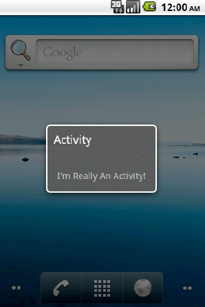
Notice that, even though this is an Activity for all intents and purposes, it can act as a Dialog inside of your user interface, partially covering the Activity underneath it (in this case, the Home screen).
Your application must be universal, running on different screen sizes and orientations. You need to provide different layout resources for each of these instances.
(API Level 4)
Build multiple layout files, and use resource qualifiers to let Android pick what's appropriate. We will look at using resources to create resources specific for different screen orientations and sizes.
In order to create different resources for an Activity to use in portrait versus landscape, use the following qualifiers:
resource-land
resource-port
This works for all resource types, but the most common in this case is to do this with layouts. Therefore, instead of a res/layout/ directory in the project, there would be a res/layout-port/ and a res/layout-land/ directory.
Note
It is good practice to include a default resource directory without a qualifier. This gives Android something to fall back on if it is running on a device that doesn't match any of the specific criteria you list.
There are also screen size qualifiers (physical size, not to be confused with pixel density) that we can use to target large screen devices like tablets. In most cases, a single layout will suffice for all physical screen sizes of mobile phone. However, you may want to add more features to a tablet layout to assist in filling the noticeably more screen real estate the user has to operate. The following resource qualifiers are acceptable for physical screen size:
resource-small
resource-medium
resource-large
So, to include a tablet-only layout to a universal application we could add a res/layout-large/directory as well.
Let's look at a quick example that puts this into practice. We'll define a single Activity, that loads a single layout resource in code. However, this layout will be define three times in the resources to produce different results in portrait, landscape, and on a tablet. First, the Activity, which is shown in Listing 2-43.
Example 2.43. Simple Activity Loading One Layout
public class UniversalActivity extends Activity {

    @Override
    public void onCreate(Bundle savedInstanceState) {
        super.onCreate(savedInstanceState);
        setContentView(R.layout.main);
    }
}
We'll now define a default/portrait layout in res/layout/main.xml (see Listing 2-44).
Example 2.44. res/layout/main.xml
<?xml version="1.0" encoding="utf-8"?>
<!-- PORTRAIT/DEFAULT LAYOUT -->
<LinearLayout xmlns:android="http://schemas.android.com/apk/res/android"
  android:orientation="vertical"
  android:layout_width="fill_parent"
  android:layout_height="fill_parent">
  <TextView
    android:layout_width="fill_parent"
    android:layout_height="wrap_content"
    android:text="This is a vertical layout for PORTRAIT"
  />
  <Button
    android:layout_width="wrap_content"
    android:layout_height="wrap_content"
    android:text="Button One"
  />
  <Button
    android:layout_width="wrap_content"
    android:layout_height="wrap_content"
    android:text="Button Two"
  />
</LinearLayout>
And a landscape version in res/layout-land/main.xml (see Figure 2-45).
Example 2.45. res/layout-land/main.xml
<?xml version="1.0" encoding="utf-8"?>
<!-- LANDSCAPE LAYOUT -->
<LinearLayout xmlns:android="http://schemas.android.com/apk/res/android"
  android:orientation="horizontal"
  android:layout_width="fill_parent"
  android:layout_height="fill_parent">
  <TextView
    android:layout_width="wrap_content"
    android:layout_height="wrap_content"
    android:text="The is a horizontal layout for LANDSCAPE"
  />
  <Button
    android:layout_width="wrap_content"
    android:layout_height="wrap_content"
    android:text="Button One"
  />
  <Button
    android:layout_width="wrap_content"
android:layout_height="wrap_content"
android:text="Button Two"
/>
</LinearLayout>We have now reordered our layout to be horizontal on a landscape screen.
The tablet version in res/layout-large/main.xml (see Figure 2-46).
Example 2.46. res/layout-large/main.xml
<?xml version="1.0" encoding="utf-8"?>
<!-- LARGE LAYOUT -->
<LinearLayout xmlns:android="http://schemas.android.com/apk/res/android"
  android:orientation="vertical"
  android:layout_width="fill_parent"
  android:layout_height="fill_parent">
  <TextView
    android:layout_width="fill_parent"
    android:layout_height="wrap_content"
    android:text="This is the layout for TABLETS"
  />
  <Button
    android:layout_width="wrap_content"
    android:layout_height="wrap_content"
    android:text="Button One"
  />
  <Button
    android:layout_width="wrap_content"
    android:layout_height="wrap_content"
    android:text="Button Two"
  />
  <Button
    android:layout_width="wrap_content"
    android:layout_height="wrap_content"
    android:text="Button Three"
  />
  <Button
    android:layout_width="wrap_content"
    android:layout_height="wrap_content"
    android:text="Button Four"
  />
</LinearLayout>
Since we have more screen real estate to work with, there are a couple extra buttons for the user to interact with.
Now, when we run the application, you can see how Android selects the appropriate layout to match our configuration, whether it is portrait and landscape on the phone (see Figure 2-13), or running on a larger tablet screen (see Figure 2-14).

In API Level 9 (Android 2.3), one more resource qualifier was added to support "extra large" screens:
resource-xlarge
According to the SDK documentation, a traditionally "large" screen is one in the range of approximately 5 to 7 inches. The new qualifier for "extra large" covers screens roughly 7 to 10+ inches in size.
If your application is built against API Level 9, you should include your tablet layouts in the res/layout-xlarge/ directory as well. Keeping in mind that tables running Android 2.2 or earlier will only recognize res/layout-large/ as a valid qualifier.
You want to customize the appearance of the soft keyboard's enter key, the action that occurs when a user tap it, or both.
(API Level 3)
Customize the Input Method (IME) options for the widget in which the keyboard is entering data.
When the keyboard is visible on screen, the text on the return key typically has an action based on the order of focusable items in the view. While unspecified, the keyboard will display a "next" action if there are more focusables in the view to move to, or a "done" action if the last item is currently focused on. This value is customizable, however, for each input view by setting the android:imeOptions value in the view's XML. The values you may set to customize the return key are listed here:
actionUnspecified: Default. Display action of the device's choice
Action event will be IME_NULL
actionGo: Display "Go" as the return key
Action event will be IME_ACTION_GO
actionSearch: Display a search glass as the return key
Action event will be IME_ACTION_SEARCH
actionSend: Display "Send" as the return key
Action event will be IME_ACTION_SEND
actionNext: Display "Next" as the return key
Action event will be IME_ACTION_NEXT
actionDone: Display "Done" as the return key
Action event will be IME_ACTION_DONE
Let's look at an example layout with two editable text fields, shown in Listing 2-47. The first will display the search glass on the return key, and the second will display "Go."
Example 2.47. Layout with Custom Input Options on EditText Widgets
<LinearLayout xmlns:android="http://schemas.android.com/apk/res/android"
  android:layout_width="fill_parent"
  android:layout_height="fill_parent"
  android:orientation="vertical">
  <EditText
    android:id="@+id/text1"
    android:layout_width="fill_parent"
    android:layout_height="wrap_content"
android:imeOptions="actionSearch"
/>
<EditText
android:id="@+id/text2"
android:layout_width="fill_parent"
android:layout_height="wrap_content"
android:imeOptions="actionGo"
/>
</LinearLayout>The resulting display of the keyboard will vary somewhat as some manufacturer specific UI kits include different keyboards, but the results on a pure Google UI will show up like in Figure 2-15.

Note
Custom editor options only apply to the soft input methods. Changing this value will not affect the events that get generated when the user presses return on a physical hardware keyboard.
Customizing what happens when the user presses the enter key can be just as important as adjusting its display. Overriding the default behavior of any action simply requires that a TextView.OnEditorActionListener be attached to the view of interest. Let's continue with the example layout above, and this time add a custom action to both views (see Listing 2-48).
Example 2.48. Activity Implementing a Custom Keyboard Action
public class MyActivity extends Activity implements OnEditorActionListener {

    @Override
    public void onCreate(Bundle savedInstanceState) {
        super.onCreate(savedInstanceState);
        setContentView(R.layout.main);

        //Add the listener to the views
        EditText text1 = (EditText)findViewById(R.id.text1);
        text1.setOnEditorActionListener(this);
        EditText text2 = (EditText)findViewById(R.id.text2);
        text2.setOnEditorActionListener(this);
    }

    @Override
    public boolean onEditorAction(TextView v, int actionId, KeyEvent event) {
        if(actionId == IME_ACTION_SEARCH) {
            //Handle search key click
            return true;
        }
        if(actionId == IME_ACTION_GO) {
            //Handle go key click
            return true;
        }
        return false;
    }
}
The boolean return value of onEditorAction() tells the system whether your implementation has consumed the event or whether it should be passed on to the next possible responder, if any. It is important for you to return true when your implementation handles the event so no other processing occurs. However, it is just as important for you to return false when you are not handling the event so your application does not steal key events from the rest of the system.
(API Level 3)
Tell the Input Method Manager explicitly to hide any visible Input Methods using the InputMethodManager.hideSoftInputFromWindow() method.
Here is an example of how to call this method inside of a View.OnClickListener:
public void onClick(View view) {
    InputMethodManager imm = (InputMethodManager)getSystemService(
            Context.INPUT_METHOD_SERVICE);
    imm.hideSoftInputFromWindow(view.getWindowToken(), 0);
}
Notice the hideSoftInputFromWindow() take an IBinder window token as a parameter. This can be retrieved from any View object currently attached to the window via View.getWindowToken(). In most cases, the callback method for the specific event will either have a reference to the TextView where the editing is taking place, or the View that was tapped to generate the event (like a Button). These views are the most convenient objects to call on to get the window token and pass it to the InputMethodManager.
You want to display a custom view when an AdapterView (ListView, GridView, and the like) has an empty data set.
(API Level 1)
Lay out the view you would like displayed in the same tree as the AdapterView and call AdapterView.setEmptyView() to have the AdapterView manage it. The AdapterView will switch the visibility parameters between itself and its empty view based on the result of the attached ListAdapter's isEmpty() method.
Note
Be sure to include both the AdapterView and the empty view in your layout. The AdapterView ONLY changes the visibility parameters on the two objects; it does not insert or remove them in the layout tree.
Here is how this would look with a simple TextView used as the empty. First, a layout that includes both views, shown in Listing 2-49.
Example 2.49. Layout Containing AdapterView and an Empty View
<?xml version="1.0" encoding="utf-8"?>
<FrameLayout xmlns:android="http://schemas.android.com/apk/res/android"
  android:layout_width="fill_parent"
  android:layout_height="fill_parent">
  <TextView
    android:id="@+id/myempty"
    android:layout_width="fill_parent"
    android:layout_height="wrap_content"
    android:text="No Items to Display"
  />
  <ListView
    android:id="@+id/mylist"
    android:layout_width="fill_parent"
    android:layout_height="fill_parent"
  />
</FrameLayout>
Then, in the Activity, give the ListView a reference to the empty view so it can be managed (see Listing 2-50).
Example 2.50. Activity Connecting the Empty View to the List
public void onCreate(Bundle savedInstanceState) {
    super.onCreate(savedInstanceState);
    ListView list = (ListView)findViewById(R.id.mylist);
    TextView empty = (TextView)findViewById(R.id.myempty);
    //Attach the reference
    list.setEmptyView(empty);

    //Continue adding adapters and data to the list

}Empty views don't have to be simple and boring like the single TextView. Let's try to make things a little more useful for the user and add a refresh button when the list is empty (see Listing 2-51).
Example 2.51. Interactive Empty Layout
<?xml version="1.0" encoding="utf-8"?>
<FrameLayout xmlns:android="http://schemas.android.com/apk/res/android"
  android:layout_width="fill_parent"
  android:layout_height="fill_parent">
  <LinearLayout
    android:id="@+id/myempty"
    android:layout_width="fill_parent"
    android:layout_height="wrap_content"
    android:orientation="vertical">
<TextView
android:layout_width="fill_parent"
android:layout_height="wrap_content"
android:text="No Items to Display"
/>
<Button
android:layout_width="fill_parent"
android:layout_height="wrap_content"
android:text="Tap Here to Refresh"
/>
</LinearLayout>
<ListView
android:id="@+id/mylist"
android:layout_width="fill_parent"
android:layout_height="fill_parent"
/>
</FrameLayout>Now, with the same Activity code from before, we have set an entire layout as the empty view, and added the ability for the user to do something about their lack of data.
(API Level 1)
Create a custom XML layout and pass it to one of the common adapters, or extend your own. You can then apply custom state drawables for overriding the background and selected states of each row.
If your needs are simple, create a layout that can connect to an existing ListAdapter for population; we'll use ArrayAdapter as an example. The ArrayAdapter can take parameters for a custom layout resource to inflate and the ID of one TextView in that layout to populate with data. Let's create some custom drawables for the background and a layout that meets these requirements (see Listings 2-52 through 2-54).
Example 2.52. res/drawable/row_background_default.xml
<?xml version="1.0" encoding="utf-8"?>
<shape xmlns:android="http://schemas.android.com/apk/res/android"
  android:shape="rectangle">
<gradient
    android:startColor="#EFEFEF"
    android:endColor="#989898"
    android:type="linear"
    android:angle="270"
  />
</shape>
Example 2.53. res/drawable/row_background_pressed.xml
<?xml version="1.0" encoding="utf-8"?>
<shape xmlns:android="http://schemas.android.com/apk/res/android"
  android:shape="rectangle">
  <gradient
    android:startColor="#0B8CF2"
    android:endColor="#0661E5"
    android:type="linear"
    android:angle="270"
  />
</shape>
Example 2.54. res/drawable/row_background.xml
<?xml version="1.0" encoding="utf-8"?>
<selector xmlns:android="http://schemas.android.com/apk/res/android">
  <item android:state_pressed="true" android:drawable="@drawable/row_background_pressed"/>
  <item android:drawable="@drawable/row_background_default"/>
</selector>
Listing 2-55 shows a custom layout with the text fully centered in the row instead of aligned to the left.
Example 2.55. res/layout/custom_row.xml
<?xml version="1.0" encoding="utf-8"?>
<LinearLayout xmlns:android="http://schemas.android.com/apk/res/android"
  android:layout_width="fill_parent"
  android:layout_height="wrap_content"
  android:padding="10dip"
  android:background="@drawable/row_background">
  <TextView
    android:id="@+id/line1"
    android:layout_width="wrap_content"
    android:layout_height="wrap_content"
    android:layout_gravity="center"
    />
</LinearLayout>
This layout has the custom gradient state-list set as its background; setting up the default and pressed states for each item in the list. Now, since we have defined a layout that matches up with what an ArrayAdapter expects, we can create one and set it on our list without any further customization (see Listing 2-56).
Example 2.56. Activity Using the Custom Row Layout
public void onCreate(Bundle savedInstanceState) {
    super.onCreate(savedInstanceState);
    ListView list = new ListView(this);
    ArrayAdapter<String> adapter = new ArrayAdapter<String>(this,
R.layout.custom_row,
R.id.line1,
new String[] {"Bill","Tom","Sally","Jenny"});
list.setAdapter(adapter);
setContentView(list);
}Sometimes customizing the list rows means extending a ListAdapter as well. This is usually the case if you have multiple pieces of data in a single row, or if any of them are not text. In this example, let's utilize the custom drawables again for the background, but make the layout a little more interesting (see Listing 2-57).
Example 2.57. res/layout/custom_row.xml Modified
<?xml version="1.0" encoding="utf-8"?>
<RelativeLayout xmlns:android="http://schemas.android.com/apk/res/android"
  android:layout_width="fill_parent"
  android:layout_height="wrap_content"
  android:orientation="horizontal"
  android:padding="10dip">
  <ImageView
    android:id="@+id/leftimage"
    android:layout_width="32dip"
    android:layout_height="32dip"
  />
  <ImageView
    android:id="@+id/rightimage"
    android:layout_width="32dip"
    android:layout_height="32dip"
    android:layout_alignParentRight="true"
  />

  <TextView
    android:id="@+id/line1"
    android:layout_width="fill_parent"
    android:layout_height="wrap_content"
    android:layout_toLeftOf="@id/rightimage"
    android:layout_toRightOf="@id/leftimage"
    android:layout_centerVertical="true"
    android:gravity="center_horizontal"
  />
</RelativeLayout>
This layout contains the same centered TextView, but bordered with an ImageView on each side. In order to apply this layout to the ListView, we will need to extend one of the ListAdapters in the SDK. Which one you extend is dependent on the data source you are presenting in the list. If the data is still just a simple array of strings, and extension of ArrayAdapter is sufficient. If the data is more complex, a full extension of the abstract BaseAdapter may be necessary. The only required method to extend is getView(), which governs how each row in the list is presented.
In our case, the data is a simple array of strings, so we will create a simple extension of ArrayAdapter (see Listing 2-58).
Example 2.58. Activity and Custom ListAdapter to Display the New Layout
public class MyActivity extends Activity {

    public void onCreate(Bundle savedInstanceState) {
        super.onCreate(savedInstanceState);
        ListView list = new ListView(this);
        setContentView(list);

        CustomAdapter adapter = new CustomAdapter(this,
                    R.layout.custom_row,
                    R.id.line1,
                    new String[] {"Bill","Tom","Sally","Jenny"});
        list.setAdapter(adapter);

    }

    privateclass CustomAdapter extends ArrayAdapter<String> {

        public CustomAdapter(Context context, int layout, int resId, String[] items) {
            //Call through to ArrayAdapter implementation
            super(context, layout, resId, items);
        }

        @Override
        public View getView(int position, View convertView, ViewGroup parent) {
            View row = convertView;
            //Inflate a new row if one isn't recycled
            if(row == null) {
                row = getLayoutInflater().inflate(R.layout.custom_row, parent, false);
            }

            String item = getItem(position);
            ImageView left = (ImageView)row.findViewById(R.id.leftimage);
            ImageView right = (ImageView)row.findViewById(R.id.rightimage);
            TextView text = (TextView)row.findViewById(R.id.line1);

            left.setImageResource(R.drawable.icon);
            right.setImageResource(R.drawable.icon);
            text.setText(item);

            return row;
        }
    }
}
Notice that we use the same constructor to create an instance of the adapter as before, since it is inherited from ArrayAdapter. Because we are overriding the view display mechanism of the adapter, the only reason the R.layout.custom_row and R.id.line1 are now passed into the constructor is that they are required parameters of the constructor; they don't serve a useful purpose in this example anymore.
Now, when the ListView wants to display a row it will call getView() on its adapter, which we have customized so we can control how each row returns. The getView() method is passed a parameter called the convertView, which is very important for performance. Layout inflation from XML is an expensive process, and to minimize its impact on the system, ListView recycles views as the list scrolls. If a recycled view is available to be reused, it is passed into getView() as the convertView. Whenever possible, reuse these views instead of inflating new ones to keep the scrolling performance of the list fast and responsive.
In this example, call getItem() to get the current value at that position in the list (our array of Strings), and then later on set that value on the TextView for that row. We can also set the images in each row to something significant for the data, although here they are set to the app icon for simplicity.
(API Level 1)
Use the SimplerExpandableListAdapter code defined here and an ExpandableListView. Android doesn't officially have an extensible way to create sections in a list, but it does offer the ExpandableListView widget and associated adapters designed to handle a two-dimensional data structure in a sectioned list. The drawback is that the adapters provided with the SDK to handle this data are cumbersome to work with for simple data structures.
Enter the SimplerExpandableListAdapter (see Listing 2-59), an extension of the BaseExpandableListAdapter that, as an example, handles an Array of string arrays, with a separate string array for the section titles.
Example 2.59. SimplerExpandableListAdapter
public class SimplerExpandableListAdapter extends BaseExpandableListAdapter {
    private Context mContext;
    private String[][] mContents;
    private String[] mTitles;

    public SimplerExpandableListAdapter(Context context, String[] titles, String[][] contents) {
        super();
        //Check arguments
        if(titles.length != contents.length) {
            thrownew IllegalArgumentException("Titles and Contents must be the same size.");
}
mContext = context;
mContents = contents;
mTitles = titles;
}
//Return a child item
@Override
public String getChild(int groupPosition, int childPosition) {
return mContents[groupPosition][childPosition];
}
//Return a item's id
@Override
public long getChildId(int groupPosition, int childPosition) {
return 0;
}
//Return view for each item row
@Override
public View getChildView(int groupPosition, int childPosition,
boolean isLastChild, View convertView, ViewGroup parent) {
TextView row = (TextView)convertView;
if(row == null) {
row = new TextView(mContext);
}
row.setText(mContents[groupPosition][childPosition]);
return row;
}
//Return number of items in each section
@Override
public int getChildrenCount(int groupPosition) {
return mContents[groupPosition].length;
}
//Return sections
@Override
public String[] getGroup(int groupPosition) {
return mContents[groupPosition];
}
//Return the number of sections
@Override
public int getGroupCount() {
return mContents.length;
}
//Return a section's id
@Override
public long getGroupId(int groupPosition) {
return 0;
}
//Return a view for each section header
@Overridepublic View getGroupView(int groupPosition, boolean isExpanded,
View convertView, ViewGroup parent) {
TextView row = (TextView)convertView;
if(row == null) {
row = new TextView(mContext);
}
row.setTypeface(Typeface.DEFAULT_BOLD);
row.setText(mTitles[groupPosition]);
return row;
}
@Override
public boolean hasStableIds() {
returnfalse;
}
@Override
public boolean isChildSelectable(int groupPosition, int childPosition) {
returntrue;
}
}Now we can create a simple data structure and use it to populate an ExpandableListView in an example Activity (see Listing 2-60).
Example 2.60. Activity Using the SImplerExpandableListAdapter
public void onCreate(Bundle savedInstanceState) {
    super.onCreate(savedInstanceState);
    //Set up an expandable list
    ExpandableListView list = new ExpandableListView(this);
    list.setGroupIndicator(null);
    list.setChildIndicator(null);
    //Set up simple data and the new adapter
    String[] titles = {"Fruits","Vegetables","Meats"};
    String[] fruits = {"Apples","Oranges"};
    String[] veggies = {"Carrots","Peas","Broccoli"};
    String[] meats = {"Pork","Chicken"};
    String[][] contents = {fruits,veggies,meats};
    SimplerExpandableListAdapter adapter = new SimplerExpandableListAdapter(this,
titles, contents);

    list.setAdapter(adapter);
    setContentView(list);
}There is one catch to utilizing ExpandableListView in this fashion: it expands. ExpandableListView is designed to expand and collapse the child data underneath the group heading when the heading it tapped. Also, by default all the groups are collapsed, so you can only see the header items.
In some cases this may be desirable behavior, but often it is not if you just want to add section headers. In that case, there are two addition steps to take:
In the Activity code, expand all the groups. Something like
for(int i=0; i < adapter.getGroupCount(); i++) {
    list.expandGroup(i);
}
In the Adapter, override onGroupCollapsed() to force re-expansion. This will require adding a reference to the list widget to the adapter.
@Override
public void onGroupCollapsed(int groupPosition) {
    list.expandGroup(groupPosition);
}
(API Level 1)
Create a custom widget by extending a common ViewGroup and adding functionality. One of the simplest, and most powerful ways to create custom or reusable user interface elements is to create compound controls leveraging the existing widgets provided by the Android SDK.
ViewGroup, and its subclasses LinearLayout, RelativeLayout, and so on, give you the tools to make this simple by assisting you with component placement, so you can be more concerned with the added functionality.
Let's create an example by making a widget that the Android SDK does not have natively: a button containing either an image or text as its content. To do this, we are going to create the TextImageButton class, which is an extension of FrameLayout. It will contain a TextView to handle text content, and an ImageView for image content (see Listing 2-61).
Example 2.61. Custom TextImageButton Widget
public class TextImageButton extends FrameLayout {

    private ImageView imageView;
    private TextView textView;
/* Constructors */
public TextImageButton(Context context) {
this(context, null);
}
public TextImageButton(Context context, AttributeSet attrs) {
this(context, attrs, 0);
}
public TextImageButton(Context context, AttributeSet attrs, int defaultStyle) {
super(context, attrs, defaultStyle);
imageView = new ImageView(context, attrs, defaultStyle);
textView = new TextView(context, attrs, defaultStyle);
//create layout parameters
FrameLayout.LayoutParams params = new FrameLayout.LayoutParams(
LayoutParams.FILL_PARENT, LayoutParams.FILL_PARENT);
//Add the views
this.addView(imageView, params);
this.addView(textView, params);
//Make this view interactive
setClickable(true);
setFocusable(true);
//Set the default system button background
setBackgroundResource(android.R.drawable.btn_default);
//If image is present, switch to image mode
if(imageView.getDrawable() != null) {
textView.setVisibility(View.GONE);
imageView.setVisibility(View.VISIBLE);
} else {
textView.setVisibility(View.VISIBLE);
imageView.setVisibility(View.GONE);
}
}
/* Accessors */
public void setText(CharSequence text) {
//Switch to text
textView.setVisibility(View.VISIBLE);
imageView.setVisibility(View.GONE);
//Apply text
textView.setText(text);
}
public void setImageResource(int resId) {
//Switch to image
textView.setVisibility(View.GONE);
imageView.setVisibility(View.VISIBLE);
//Apply image
imageView.setImageResource(resId);
}
public void setImageDrawable(Drawable drawable) {
//Switch to image
textView.setVisibility(View.GONE);
imageView.setVisibility(View.VISIBLE);//Apply image
imageView.setImageDrawable(drawable);
}
}All of the widgets in the SDK have three constructors. The first constructor takes only Context as a parameter and is generally used to create a new view in code. The remaining two are used when a view is inflated from XML, where the attributes defined in the XML file are passed in as the AttributeSet parameter. Here we use Java's this() notation to drill the first two constructors down to the one that really does all the work. Building the custom control in this fashion ensures that we can still define this view in XML layouts. Without implementing the attributed constructors, this would not be possible.
The constructor creates a TextView and ImageView, and places them inside the layout. FrameLayout is not an interactive view by default, so the constructor makes the control clickable and focusable so it can handle user interaction events; we also set the system's default button background on the view as a cue to the user that this widget is interactive. The remaining code sets the default display mode (either text or image) based on the data that was passed in as attributes.
The accessor functions are added as a convenience to later switch the button contents. These functions are also tasked with switching between text and image mode if the content change warrants it.
Because this custom control is not in the android.view or android.widget packages, we must use the fully qualified name when it is used in an XML layout. Listings 2-62 and 2-63 show an example Activity display the custom widget.
Example 2.62. res/layout/main.xml
<?xml version="1.0" encoding="utf-8"?>
<LinearLayout xmlns:android="http://schemas.android.com/apk/res/android"
  android:layout_width="fill_parent"
  android:layout_height="fill_parent"
  android:orientation="vertical">
  <com.examples.customwidgets.TextImageButton
    android:layout_width="wrap_content"
    android:layout_height="wrap_content"
    android:textColor="#000"
    android:text="Click Me!"
  />
  <com.examples.customwidgets.TextImageButton
    android:layout_width="wrap_content"
    android:layout_height="wrap_content"
    android:src="@drawable/icon"
  />
</LinearLayout>
Example 2.63. Activity Using the New Custom Widget
public class MyActivity extends Activity {

    @Override
    public void onCreate(Bundle savedInstanceState) {
        super.onCreate(savedInstanceState);
setContentView(R.layout.main);
}
}Notice that we can still use traditional attributes to define properties like the text or image to display. This is due to the fact that we construct each item (the FrameLayout, TextView, and ImageView) with the attributed constructors, so each view sets the parameters it is interested in, and ignores the rest.
If we define an Acitivity to use this layout, the results look like Figure 2-16.
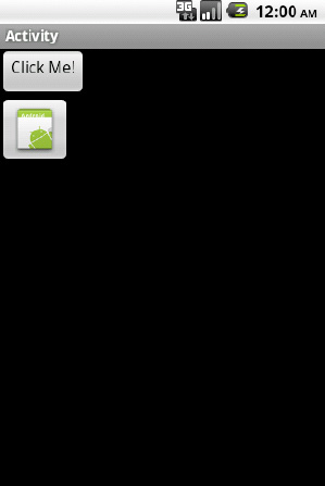
Chapter 1 introduced a units-conversion Android app named UC. In addition to exploring UC's source code, this chapter explored this app's resources, starting with the main.xml layout file that describes how the app's main screen is laid out.
Coding layout and other resource files by hand is at best a tedious undertaking, even for advanced developers. For this reason, Professor Brendan Burns created a tool named DroidDraw.
DroidDraw is a Java-based tool that facilitates building an Android app's user interface. This tool does not generate app logic. Instead, it generates XML layout and other resource information that can be merged into another development tool's app project.
DroidDraw is hosted at the droiddraw.org web site. From this web site's main page, you can try out DroidDraw as a Java applet, or you can download the DroidDraw application for the Mac OS X, Windows, and Linux platforms.
For example, click the main page's Windows link and download droiddraw-r1b18.zip to obtain DroidDraw for Windows. (Release 1, Build 18 is the latest DroidDraw version at time of writing.)
Unarchive droiddraw-r1b18.zip and you'll discover droiddraw.exe and droiddraw.jar (an executable JAR file) for launching DroidDraw. From the Windows Explorer, double-click either filename to launch this tool.
Tip
Specify java -jar droiddraw.jar to launch DroidDraw at the command line via the JAR file.
Figure 2-17 presents DroidDraw's user interface.

Figure 2-17 reveals a simple user interface consisting of a menubar, a screen area, a tabbed area, and an output area. You can drag each area's border by a small amount to enlarge or shrink that area.
The menubar consists of File, Edit, Properties, and Help menus. File presents the following menu items:
Open: Open an Android layout file (such as
main.xml)Save: Save the current layout information to the last opened layout file. A dialog box is displayed if no layout file has been opened.
Save As: Display a dialog box that prompts the user for the name of a layout file and saves the current layout information to this file.
Quit: Exit DroidDraw. Unsaved changes will be lost.
The Edit menu presents the following menu items:
Cut: Remove the selected text plus the character to the right of the selected text from the output area.
Copy: Copy the selected text from the output area to the clipboard.
Paste: Paste the contents of the clipboard over the current selection or at the current caret position in the output area.
Select All: Select the entire contents of the output area.
Clear Screen: Remove all widgets and layout information from the user interface displayed in the screen area.
Set Ids from Labels: Instead of assigning text such as
"@+id/widget29"to a widget'sandroid:idXML attribute, assign a widget's value (such as a button's OK text) toandroid:id; "@+id/Ok", for example. This text is displayed in the output area the next time the XML layout information is generated.
Unlike the File and Edit menus, the menu items for the Project menu don't appear to be fully implemented.
The Help menu presents the following menu items:
Tutorial: Point the default browser to
http://www.droiddraw.org/tutorial.htmlto explore some interesting DroidDraw tutorials.About: Present a simple about dialog box without any version information.
Donate: Point the default browser to the PayPal web site to make a donation that supports continued DroidDraw development.
The screen area presents visual feedback for the Android screen being built. It also provides Root Layout and Screen Size dropdown listboxes for choosing which layout serves as the ultimate parent layout (choices include AbsoluteLayout, LinearLayout, RelativeLayout, ScrollView, and TableLayout), and for choosing the target screen size so you'll know what the user interface looks like when displayed on that screen (choices include QVGA Landscape, QVGA Portrait, HVGA Landscape, and HVGA Portrait).
The tabbed area provides a Widgets tab whose widgets can be dragged to the screen, a Layouts tab whose layouts can be dragged to the screen, a Properties tab for entering values for the selected widget's/layout's properties, Strings/Colors/Arrays tabs for entering these resources, and a Support tab for making a donation.
Finally, the output area presents a textarea that displays the XML equivalent of the displayed screen when you click its Generate button. The Load button doesn't appear to accomplish anything useful (althought it appears to undo a clear screen operation).
Suppose you're building an app that displays (via a textview component) a randomly selected famous quotation in response to a button click. You decide to use DroidDraw to build the app's single screen.
Start DroidDraw, leave HVGA Portrait as the screen size, and replace AbsoluteLayout with LinearLayout as the root layout in order to present the textview and button components in a vertical column.
Note
Unlike Android, which chooses horizontal as the default orientation for LinearLayout, DroidDraw chooses vertical as the default orientation.
On the Widgets tab, select TextView and drag it to the screen. Select the Properties tab, and enter fill_parent into the Width textfield, 100px into the Height textfield, and Quotation into the Text textfield. Click Apply; Figure 2-18 shows the resulting screen.
On the Widgets tab, select Button and drag it to the screen. Select the Properties tab, and enter fill_parent into the Width textfield and Get Quote into the Text textfield. Click Apply; Figure 2-19 shows the resulting screen.
Select Save As from the File menu to save this screen's XML to a resource file named main.xml. As you learned in Chapter 1, this file is ultimately placed in the layout subdirectory of an Android project's res directory.
Alternatively, you could click the Generate button (at the bottom of the Output area) to generate the screen's XML (see Listing 2-64), select this text (via Edit's Select All menu item), and copy it to the clipboard (via Edit's Copy menu item) for later use.
Example 2.64. main.xml
<?xml version="1.0" encoding="utf-8"?>
<LinearLayout
  android:id="@+id/widget27"
  android:layout_width="fill_parent"
  android:layout_height="fill_parent"
  xmlns:android="http://schemas.android.com/apk/res/android"
  android:orientation="vertical"
  >
<TextView
  android:id="@+id/widget29"
  android:layout_width="fill_parent"
  android:layout_height="100px"
  android:text="Quotation"
  >
</TextView>
<Button
  android:id="@+id/widget30"
  android:layout_width="fill_parent"
  android:layout_height="wrap_content"
  android:text="Get Quote"
  >
</Button>
</LinearLayout>
DroidDraw assigns text to XML properties rather than employing resource references. For example, Listing 2-64 assigns "Quotation" instead of "@string/quotation" to the TextView element's android:text property.
Although embedding strings is inconvenient from a maintenance perspective, you can use the Strings tab to enter string resource name/value pairs and click the Save button to save these resources to a strings.xml file, and manually enter the references later.
As you have seen, Android provides some very flexible and extensible user interface tools in the provided SDK. Properly leveraging these tools means you can be free of worrying whether or not your application will look and feel the same across the broad range of devices running Android today.
In this chapter, we have explored how to use Android's resource framework to supply resources for multiple devices. You saw techniques for manipulating static images as well as creating drawables of your own. We looked at overriding the default behavior of the window decorations as well as system input methods. We looked at ways to add user value through animating views. Finally we extended the default toolkit by creating new custom controls and customizing the AdapterViews used to display sets of data.
In the next chapter, we will look at using the SDK to communicate with the outside world; accessing network resources and talking to other devices.