CHAPTER 5
Introduction
Very few images require the array of adjustments and creative tools available in an image editing application like Photoshop. Some images are fine just the way they are and require little or no adjustment beyond what the Raw decoder produces from the data as they were shot. The vast majority require only minor tweaks, maybe small White Balance and Levels adjustments and sharpening. A few, with exposure problems or color casts, may require more intensive care.
Aperture provides all the tools you need to carry out these everyday darkroom tasks as well as features that allow you to produce more creative results. All of Aperture’s Adjustment tools can be found on the Adjustments Inspector or Head Up Display (HUD). This chapter provides an explanation of how each of them works and shows how you can use them to fix commonly occurring problems and to produce black and white (B & W) and tinted monochrome versions.
The Adjustments Inspector
Everything needed for analyzing and editing images can be found on the Adjustments Inspector. With a few exceptions, such as the Red Eye, Retouch, Spot and Patch tools and Aperture 2’s new edit plug-ins, these adjustments are global – they affect the entire image. Aperture doesn’t have selection tools, masks, adjustment layers or any other method for selectively applying these changes.
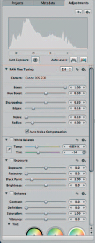
Fig. 5.1 The Adjustments Inspector.
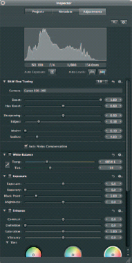
Fig. 5.2 The Adjustments HUD.
Each section in the Adjustments Inspector is called a ‘brick’. The Inspector is organized so that the most frequently used bricks – Raw Fine Tuning, White Balance and Exposure, appear near the top of the Inspector. Bricks are also organized to provide a logical workflow progressing from top to bottom. At the very top is the Histogram, the key analytical tool which should inform most of the decisions you make about how to edit and enhance images.
Immediately below the Histogram, Auto Exposure, Auto Levels Combined and Auto Levels Separate buttons are provided for single-click automatic tonal optimization. Sometimes they produce excellent first-time results, but treat them with caution and think of them more as a place to start or as an indication of the direction to take with your manual corrections.
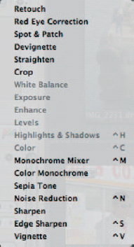
Fig. 5.3 The Add Adjustments pop-up menu.
The Adjustments Inspector (Fig. 5.3) has an Add Adjustments pop-up menu and an Adjustment Action pop-up menu. The first of these contains additional adjustments that don’t appear on the Adjustments Inspector by default. These include Vignette and Devignette, Straighten, Crop, Monochrome Mixer, Noise Reduction and Edge Sharpen. The Adjustments Action pop-up menu also includes Histogram display options, color value sample and display options and an option to remove all adjustments from the current selection (Fig. 5.4).
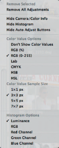
Fig. 5.4 The Adjustments Action pop-up menu.
The Adjustments HUD
The Adjustments HUD replicates the adjustments and controls on the Adjustments Inspector and works in almost exactly the same way. In this chapter, the terms Adjustments HUD and Adjustments Inspector are used interchangeably. HUDs are free-floating; their purpose is to provide a more flexible workspace and to allow you to make edits in Full Screen mode without unnecessary screen clutter.
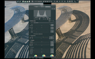
Fig.5.5 Press the ![]() and
and ![]() keys to activate full screen view and display the Adjustments HUD. Position your mouse at on the top edge of the screen to display the toolbar and at the bottom edge of the screen to display the Filmstrip.
keys to activate full screen view and display the Adjustments HUD. Position your mouse at on the top edge of the screen to display the toolbar and at the bottom edge of the screen to display the Filmstrip.
Making image adjustments requires continual visual assessment of the changes you make using the controls on the Adjustments HUD. The best way to do this is in Full Screen mode, often at 100% view magnification and with nothing to distract from as objective an assessment as possible of the image color, tonal values and other qualitative factors and how they are changing in response to your inputs.
You can display the Adjustments HUD and enter Full Screen view by selecting Window> Show Inspector HUD followed by View> Full Screen, then clicking the Adjustments button on the Inspectors HUD. But it’s much simpler using the keyboard shortcuts ![]() and
and ![]() in any order. Press
in any order. Press ![]() again to exit Full Screen view (Fig. 5.5).
again to exit Full Screen view (Fig. 5.5).
In Full Screen view, position the cursor on the top edge of the screen to display the Toolbar and at the bottom edge of the screen to display the Filmstrip. When making adjustments it’s often helpful to display the Master alongside the adjusted Version to provide a before-and-after comparison.
The Adjustment HUD Brick by Brick
The Histogram
Aside from the image itself, the Histogram provides more information about digital image tonal and color quality than any other single analytical tool. It can tell you if there is clipping of the highlight or shadow detail; if an image lacks contrast; even if there is a color cast.
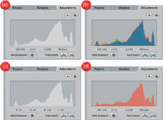
Fig. 5.6 The Histogram can be configured from the Adjustments Action pop-up menu to display luminance (a); overlayed red, green and blue channels (b); or individual (red here) color channels (c). When the cursor is positioned over the image the RGB values of the underlying pixels are displayed, otherwise camera Exif data is shown (d).
Aperture’s Histogram works in much the same way as those on digital SLR (dSLR) cameras and in other image editing applications such as Photoshop. If you’re not sure how the Histogram works, see the detailed description on page 196. The Histogram Options section of the Adjustments Action pop-up menu provides five view options: luminance, RGB, and individual red, green and blue channels (Fig. 5.6).
Show Camera/Color Info displays the red, green, blue and luminance values of pixels immediately below the cursor. Use the Loupe to position the cursor more accurately. The Color Value Sample Size determines the sample size used to produce the color value and can be set at the individual pixel level, or taken from an averaged sample up to 7×7 pixels square. When the cursor isn’t over image pixels the ISO, aperture, shutter speed and focal length data is displayed. You can hide this information as well as the Auto Adjust buttons and the Histogram itself.
Raw Fine Tuning Brick
For the most part, the process of converting Raw data into an RGB file in Aperture happens automatically. See Chapter 1 for a detailed explanation of what this involves. The Raw Fine Tuning brick appears only when a Raw file is selected. The Decode Version pop-up menu provides four decoder options. Version 2.0 is the most recent and best Raw decoder. It’s the default option and the one you should use in nearly all circumstances. The 2.0 DNG decoder is for decoding RAW files for which Aperture has no native support that have been converted to Adobe DNG format. For more detailed information about using these decode options, migrating files from earlier decoder versions and the other controls in the Raw Fine Tuning brick, see Chapter 1.
White Balance
White Balance is the process of evaluating the color of ambient light in a scene. This determines which surfaces should appear neutral in color and from this all other color values are derived. Incorrect White Balance results in an unnatural color cast.
White Balance is initially determined in-camera using a preset, such as Daylight or Tungsten, or an automatic White Balance setting. If you shoot Raw, the camera White Balance setting becomes largely irrelevant, because you can set White Balance retrospectively using Aperture’s White Balance controls. Shooting with auto White Balance set on the camera is a good general policy, alternatively if your normal policy is to determine White Balance by shooting a gray reference card this remains a valid option.
The White Balance brick has three controls: an eyedropper, used to set White Balance from a neutral area in the image; a Temp slider which initially indicates the camera White Balance, color temperature and a Tint slider.
Using the eyedropper, click on a neutral area in the image – a gray card if you use one, a white wall or other neutral area. When you do this you’ll see the Temp and Tint sliders take up new positions based on the sample area.
The Temp slider indicates the assessed color temperature in Kelvin of the ambient light conditions in the scene. Dragging it to the right and increasing the color temperature value therefore makes the scene warmer. By dragging the slider to the right you are telling Aperture that the light in the scene was bluer than the White Balance setting indicated by the camera, and therefore the image becomes warmer (Fig. 5.8).
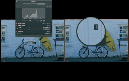
Fig. 5.7 Use the eyedropper to set the White Balance by clicking on a neutral white, gray or black area of the image. The Loupe allows you to make a more accurate selection. The pixel value of the sample (defined in the Adjustments HUD Action pop-up menu) is shown. The closer together the red, green and blue values are, the closer to neutral the sample is and, therefore, the less shift will be applied.
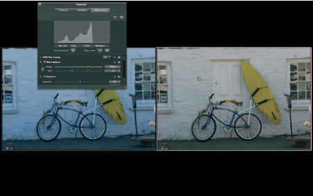
Fig. 5.8 With the eyedropper adjustment made, use the Temp slider to fine tune the White Balance adjustment.
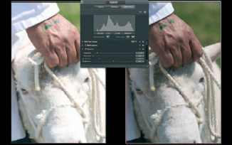
Fig. 5.9 This image has been overexposed by a full stop. Dragging the Exposure slider to the left to a value of –1.13 restores all of the highlight detail producing a textbook Histogram with a full tonal range.
Once the White Balance is set to your satisfaction, use the Tint slider to remove any green or magenta color cast. Moving the slider right adds magenta; moving it to the left adds green.
Exposure
The Exposure brick provides tools for improving overall image tonality and correcting common problems like over and underexposure. It has four sliders: Exposure, Recovery, Black Point and Brightness. Don’t think of the Exposure brick as something to be used only for problem images. Even correctly exposed well-balanced images can be improved with minor Exposure adjustments (Fig. 5.9).
Use the Exposure slider to correct over- and underexposed images. Dragging to the right increases ‘exposure’; dragging to the left decreases it. The Exposure slider range is −2 to +2; the value slider (drag in the exposure value field) extends this to −9.99 to +9.99. Exposure is very effective at restoring highlight and shadow detail in images that are up to two stops either side of the correct exposure setting; beyond that, even with Raw images, good quality results are hard to achieve.
The Recovery slider is a new addition in Aperture 2 designed to rescue ‘blown’ or clipped highlights in images that are overexposed or where the camera sensor has been unable to record the highlight detail in a subject with high dynamic range (HDR). The difference made by using the Recovery slider can be quite subtle, but it is effective when used in conjunction with Exposure and other tonal controls such as Highlights and Shadows. See the section on correcting exposure problems later in this chapter (Fig. 5.10).
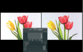
Fig. 5.10 The Recovery slider is used to recover blown highlight detail – here it has done a first-rate job of recovering the detail in the yellow tulip on the left. In most circumstances, you’ll need to use the Recovery slider in combination with other tonal adjustments to achieve a good result.
Black Point controls shadow detail and can be used to add contrast to the shadow regions or to restore detail to crushed shadows. A check of the Histogram will reveal whether an image requires Black Point adjustment. If the left side is clipped, drag the Black Point slider to the left to restore shadow detail. If the Histogram stops short of the left side, drag the Black Point slider to the right to increase contrast in the shadows.
Brightness adjusts luminance values of image pixels across the entire tonal range whilst maintaining the Histogram end points – in other words it won’t clip shadow or highlight detail.
Enhance
The Enhance brick consists of five controls: Contrast, Definition, Saturation, Vibrancy and Tint. Contrast and Saturation are image editing standards. Contrast increases or decreases image contrast by ‘stretching the Histogram’, i.e. extending B & W points and evenly redistributing the values in between.
Saturation increases or reduces color saturation of all the hues in the image by the same amount. In-camera processing of JPEG files usually applies a preset saturation boost and Raw files can appear desaturated by comparison. Small increases in saturation produce a marked visual effect and few images will need more than 1.20 to add punch to the colors. Keep an eye on the Histogram to avoid color clipping. Dragging the Saturation slider to the extreme left desaturates images to monochrome, but provides no tonal control. Use the Monochrome Mixer to produce B & W images. See the Color to B&W example on page 219 for a detailed explanation of how to use the Monochrome Mixer.
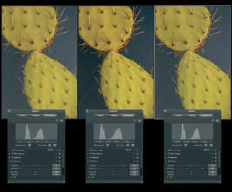
Fig. 5.11 Contrast vs. Definition. The contrast slider in the Enhance brick increases or decreases overall contrast in an image by stretching the Histogram, moving pixels out towards the edges, whitening light tones and making dark grays blacker. Note the difference in the Histogram for the original (left) and contrast adjusted version (center). Aperture 2’s new Definition slider adds punch to images by increasing contrast in local areas without affecting the overall image contrast. The Histogram of the definition adjusted image (right) is almost identical to that of the original.
Dfinition is a new tool which increases local contrast without affecting overall image contrast. It can help to reduce haze and to improve images that, despite having a full tonal range, appear flat or muddy. The default position for the definition slider is on the far left at 0 and the maximum is 1.0.
Drag the slider to the right to increase definition. Note that, as you do this, overall tonality is unaffected and the Histogram display remains unchanged. Definition produces a similar effect to applying Photoshop’s Unsharp Mask filter with a low amount and high radius value, a technique commonly used to make images ‘pop’ (Fig. 5.11).
Vibrancy is another tool that’s new to Aperture 2. Like Saturation, it changes the saturation of colors, but not all hues are equally affected and the results are more subtle than with the Saturation slider. Colors that are already well saturated are affected less by increasing Vibrancy than those that are muted. Likewise, when reducing Vibrancy, the most saturated colors are more affected.
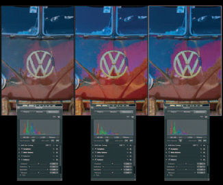
Fig. 5.12 Saturation vs. Vibrancy. The center image shows the original (left) with a saturation adjustment of +2.0, which is the maximum that can be applied using the slider. Saturation increases uniformly regardless of the existing pixel color values. Note from the center Histogram that the saturation increase has resulted in color clipping of the blue channel. The Vibrancy adjustment (right) has a maximum limit of one and it doesn’t affect pixels which are already close to full saturation, producing a more balanced, natural-looking result.
Vibrancy is configured to ignore skin tones so you can safely use it to change color saturation in portraits and model shots (Fig. 5.12).
The Tint controls allow for selective color correction in the shadow, midtone and highlight tonal ranges. To correct a color cast in the highlights click the White eyedropper and sample a highlight region of the image in which the cast is most prominent, then make fine tuning adjustments using the color wheel.
The Tint controls are effectively selective White Balance controls. As such, changes to White Balance will affect Tint adjustments and vice versa. Though you don’t need to adhere rigidly to it, the layout of the Adjustments HUD provides a good guide for adjustment workflow. Tint adjustments are best made after overall White Balance has been set.
Levels
Another standard image editing tool, Levels, provides control over tonal distribution via three sliders which remap shadow, mid-tone and highlight regions of the Histogram. Check the Levels box to activate the adjustment and display the Histogram.
The Black, Gray (midtone) and White Levels sliders below the Histogram provide three adjustment points. Click the Quarter tone controls button to display two additional adjusters for the shadow and highlight quarter tones. Use Levels to increase contrast in images where the Histogram display falls short of either end of the graph and to increase (or decrease) brightness in the midtones. Generally speaking, the way to do this is to drag the B & W Levels sliders until they touch either end of the Histogram – this is more or less what the Auto Levels button under the Histogram does. Use the Channel pop-up menu to adjust the red green and blue channels individually, for example, to neutralise color casts.
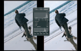
Fig. 5.13 Use Levels to improve image tonality. The most commonly applied Levels adjustment involves dragging the White and Black Levels sliders to touch either end of the Histogram, improving image contrast. Dragging the Gray Levels slider to the left increases brightness in the midtones.
Highlights and Shadows
Highlights and Shadows is another tool designed for recovering detail at the extremes of the tonal range. The Shadows slider works well on images with a full tonal range that are lacking shadow detail due to a subject with a high dynamic range having been exposed to retain highlight detail, e.g. silhouettes. With underexposed images that have already undergone Exposure and Levels adjustments; however, there is a significant risk of introducing unacceptable levels of noise into the shadow areas. Keep an eye out for this by viewing images at 100% (press ![]() ) or using the Loupe to examine shadow areas while using the Shadows slider.
) or using the Loupe to examine shadow areas while using the Shadows slider.
Click the disclosure triangle to display the Highlights and Shadows advanced controls. Generally speaking, you won’t need to bother with these advanced controls, which is why they are normally tucked away under a disclosure triangle. However, with some images, for example, those with specular highlights such as reflections on water or metal, you may be able to improve on the results achieved using the basic controls.
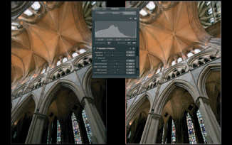
Fig. 5.14 The Shadows slider of the Highlights and Shadows brick acts like a fill flash, restoring detail in dense shadow areas.
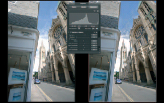
Fig. 5.15 The Highlights slider of the Highlights and Shadows adjustment is one of several tools that help restore detail to blown highlights. It works well on its own, better if used in conjunction with other highlight rescue adjustments like Exposure and Recovery.
Mostly with these controls it’s a case of suck it and see; knowing what they do is often not nearly as helpful as seeing the results, so experiment. The Radius slider defines the size of the clump of pixels that Aperture analyzes to determine what constitutes a highlight. The default position for Radius is 200. Increasing it effectively reduces the overall effect of the Highlights slider and can be helpful if large amounts of Highlights adjustment result in unnatural looking flattened highlights.
Color correction controls the saturation increase in shadow detail uncovered using the Shadows slider; the default position is 0. Recovered shadow detail often doesn’t match surrounding areas for color, increasing saturation using the Color Correction slider can help remedy this.
The High Tonal Width slider determines the tonal range that the Highlights slider affects. If you increase the High Tonal Width by dragging the slider to the right, more of the highlights – extending into the light three-quarter tones – will be affected by the Highlights adjustment. The Low Tonal Width slider does the same thing for the Shadows adjustment.
Mid Contrast adjusts contrast in the midtones. Like contrast, it stretches the Histogram, but in a non-linear fashion, pushing the midtones out to the quarter and three-quarter tones. You’d use this to compensate for compression of midtone values caused by Highlights and Shadows adjustments; if this is necessary, you might first want to experiment with reducing the High and Low Tonal Width settings.
Color
The Color brick provides controls for selective Color adjustment and can be used to subtly modify, for example, skin tones, skies, or foliage or for more radical color replacement tasks such as changing the color of clothing. Even in the absence of selection and masking tools these controls can do a very effective job.
The range of the color adjustment is initially set by selecting a base color from one of the six color swatches at the top of the brick. To more accurately define the base color use the eyedropper to sample pixels from the image. The Range slider expands or contracts the range of colors either side of the base color that is affected by the Color adjustments. If you want to make adjustments to more than one hue range, click the Expanded View button at the top of the Color brick to display separate controls for each color (Fig. 5.16).
The Hue slider shifts the color value of pixels within range of the base color. The extent and direction of the shift is controlled by the Hue slider. It helps if you picture the color values you are attempting to adjust positioned on the visible spectrum, or a color wheel, much in the way that the base color swatches at the top of the Color brick run from red through yellow, green, cyan and blue, to magenta.
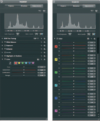
Fig. 5.16 (a) The Color brick in default view showing the six base color swatches (b) and in expanded view displaying individual Hue, Saturation, Luminance and Range sliders for each color. Use the color eyedropper to select a custom base color from within the image.
When you select, for example, the blue swatch, note the color on the hue slider, which extends from blue in the center to cyan at one end and magenta at the other. Drag the slider to the right to shift blue pixels in the image towards magenta and to the left to shift them towards cyan.
The initial value of the hue control when the slider is in the center position is zero. The values at either end of the slider are 60 and ‒60, which result in a shift of one color position, i.e. blue to cyan or magenta. Using the value slider extends the shift range to 180 and −180. As you might expect, this shifts hues 180 degrees on the color wheel to produce their complementary color. In other words a hue value of −180 turns blues to yellows and produces the same effect as dragging the value slider in the opposite direction to −180.
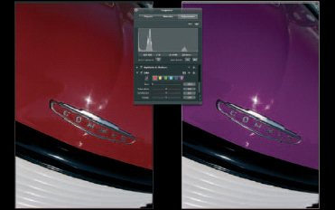
Fig. 5.17 When colors in an image are well isolated, like the red in this vintage car, changing them is relatively straightforward. Select the Red swatch, or use the eyedropper to sample from the image and drag the Hue slider until you get the color you want. Dragging the slider to its limit shifts the hue one swatch along, 60 degrees around the color wheel, in this instance from red to magenta. You can use the Value slider to go all the way to 180 degrees – the complementary of the original color.
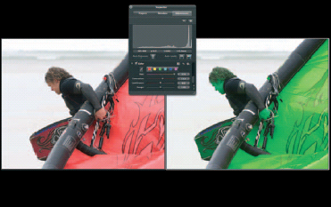
Fig. 5.18 It isn’t always so easy to isolate individual colors. In this case shifting the hue value of the reds in the image affects the skin tones as well as the kite. In the absence of more sophisticated color sampling or masking tools the options here are to use a color adjustment plug-in, or round trip the image to Photoshop.
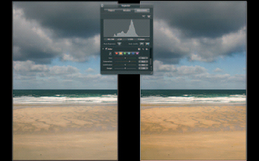
Fig. 5.19 Use a Color adjustment to boost saturation of specific colors. Here, sampling the sand with the color eyedropper allows us to boost the saturation of the beach, making it look warmer and more inviting, without affecting the sea and sky.
The Saturation slider is used to increase or decrease color saturation of pixels within the selected color range and luminance changes the brightness of those pixels. Used on its own, you can use the Saturation slider to selectively boost saturation. For example, by selecting only yellows you can boost the saturation of sand in beach shots without affecting blue skies (Fig. 5.19).
With subtle color changes it can often be difficult to gauge the extent of the selected color range and, therefore, to know what parts of the image are being affected. The best way to proceed in such circumstances is to make your selection using either the eyedropper or color swatches and then increase the saturation to its maximum of 100. It will now be obvious which pixels are affected by any hue changes – drag the Hue Value slider to 180 to make the selection even more obvious. Next, use the Range slider to extend or limit the range of selected pixels until only those colors you want to change are affected. Finally, return the Saturation and hue sliders to their original positions and make the desired color adjustments.
When attempting extreme color changes, the chances of a successful outcome will be increased if you choose hue shifts that are appropriate given the tonal qualities of the original color. It’s unrealistic to expect to turn bright yellow flowers into dark blue ones, but if you settle for pale blue, you’ll probably succeed.
Other Adjustments
The Adjustment tools covered in the next section of this chapter don’t appear on the default Adjustments Inspector/HUD; you add them as required from the Add Adjustment pop-up menu.
Spot and Patch and Retouch
Aperture’s retouching tools consist of the Spot and Patch tool and the Retouch tool. Both are essentially clone tool variants and can be used to retouch blemishes such as sensor dust spots and skin blemishes and for basic cloning operations. Spot and Patch was introduced in Aperture 1.0 and superseded by the more capable Retouch tool in Aperture 2. The Spot and Patch tool has been retained for reasons of backward compatibility.
Aperture 2 allows you to work with images that were previously edited with the Spot and Patch tool, but for all other retouching jobs the Retouch tool provides more options and produces better results. For the sake of completeness, a brief description of the functioning of the Spot and Patch tool is given below.
The Spot and Patch tool has two modes – Spot and Patch. The former is used to retouch textureless areas of flat color, for example, to remove dust spots from sky areas. A resizeable target disk is positioned over the spot, and color detail from surrounding pixels is used to automatically retouch it (Fig. 5.20).
Fig. 5.20 Aperture’s Spot and Patch tool has been superseded in Version 2 by the more able Retouch. Use it to edit images that have been spotted and patched in earlier Versions or better still, remove the Spot and Patch adjustments and redo them using Retouch.
In Patch mode, a source area is also specified and the tool works like a more conventional cloner. In both modes the Adjustments Inspector provides controls for the radius (the size of the spot or patch), (edge) softness, opacity, detail (blur) and angle.
The retouch tool works more like a brush – retouching is applied using brush strokes, rather than by defining a circular target area. Like its predecessor, the retouch brush has two operating modes – repair and clone. Repair is used to retouch spots, blemishes and other unwanted detail and to cover the offending pixels using both color and texture detail from other parts of the image, usually closely matching pixels from the surrounding area.
To use the Retouch tool either select it from the Toolbar or choose Retouch from the Add Adjustments pop-up menu on the Adjustments HUD. The Retouch HUD displays the tool’s controls and a Retouch brick, with a Stroke Indicator, and Delete and Reset buttons, is added to the Adjustments HUD (Fig. 5.21).
The default mode for the tool is repair. Use the Radius slider or, if it has one, the central scroll wheel on your mouse to change the brush size to suit the area to be retouched and if necessary adjust the edge softness and opacity of the brush using the other two sliders.
‘Automatically choose source’ selects an area matching in texture and color for you. It works well in most circumstances and you should leave the box checked at least for your initial attempts. Detect edges is a useful feature which masks edge detail from the effects of the Clone tool so that you can, for example, repair a dust spot in the sky without cloning out the branches of a tree.
Fig. 5.21 Repairing with the Retouch tool. The Retouch tool automatically retouches out blemishes or, in this case a bird, using pixels from the surrounding area, or source pixels chosen by ![]() clicking. It’s quick and produces seamless results with very little effort.
clicking. It’s quick and produces seamless results with very little effort.
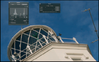
Fig. 5.22 In Clone mode the Retouch brush works like a conventional non-aligned clone brush. ![]() click to define the source point from which pixels are copied to the destination. The brush has no ‘aligned’ mode; each stroke is cloned from the original source point. Strokes can be deleted in reverse order to which they were applied using the Delete button on the Retouch brick of the Adjustments HUD.
click to define the source point from which pixels are copied to the destination. The brush has no ‘aligned’ mode; each stroke is cloned from the original source point. Strokes can be deleted in reverse order to which they were applied using the Delete button on the Retouch brick of the Adjustments HUD.
If your initial attempts using these settings don’t produce successful results uncheck the Automatically choose source button, hold down the ![]() key and click using the crosshair target on a suitable source area.
key and click using the crosshair target on a suitable source area.
If you click the Clone button in the Clone tool HUD the Clone tool behaves like a conventional clone brush – copying pixels from a specified source area to the destination. ![]() click to define the source then paint over the target area having first defined the brush size, softness and opacity (Fig. 5.22).
click to define the source then paint over the target area having first defined the brush size, softness and opacity (Fig. 5.22).
If you make a mistake while repairing or cloning, press ![]()
![]() to undo the last brush stroke. Continue pressing
to undo the last brush stroke. Continue pressing ![]()
![]() to undo your brush strokes in reverse order. You can also remove strokes in the reverse order to which they were applied at any time by pressing the Delete button on the Retouch brick in the Adjustments HUD. To remove all retouching click the Reset button.
to undo your brush strokes in reverse order. You can also remove strokes in the reverse order to which they were applied at any time by pressing the Delete button on the Retouch brick in the Adjustments HUD. To remove all retouching click the Reset button.
Its improved ability to deal with texture and the excellent edge detection feature mean that you can now deal with most minor retouching jobs within Aperture. For more involved cloning, however, you’ll still need to round trip images to Photoshop.
Vignette and Devignette
A vignette is an image that fades or darkens at the edges. The term is widely used to describe any image with a soft-edged border, but Aperture’s Vignette adjustment produces a more subtle effect that fades from the center becoming darker at the edges. This simulates an effect common in early photography caused by light falloff at the periphery of images due to lens limitations. It was also simulated in the darkroom using oval-shaped templates to burn image edges on an enlarger. Vignetting isn’t entirely an historical artifact; it’s still common with super-wide angle and fisheye lenses and Aperture’s Devignette adjustment can be used to rectify the problem.
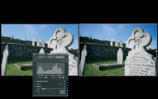
Fig. 5.23 Aperture’s new Vignette adjustment is a subtle affair. The Gamma Version shown here produces a more pronounced effect than the alternative, Exposure, which reproduces the kind of light falloff typical with older wide-angle lenses.
To add a Vignette adjustment, select Vignette from the Add Adjustment pop-up menu. There are two basic vignette types – Gamma and Exposure – selected from the Type pop-up menu. Gamma vignettes are intended for artistic effect and are more pronounced than Exposure vignettes, which are designed to simulate a lens-produced vignette (Fig. 5.23).
There are only two controls for both types of vignette. Amount controls the degree of edge darkening and size specifies the distance from the center of the image at which the effect begins. Vignettes are applied after cropping so, if you crop an image after applying a vignette, the vignette is freshly applied to the cropped image to maintain the visual effect.
Devignette does the opposite of Vignette: it lightens image edges restoring brightness in image areas that have been darkened due to light falloff at the periphery of the image circle produced by the lens. In modern super-wide angle and fisheye lenses vignetting, if it exists at all, is likely to be marginal and restricted to the very edges. You’ll need to experiment with the amount and size parameters to find the right settings for specific lenses, which you can then save as a preset using the Action pop-up menu (Fig. 5.24).
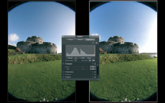
Fig. 5.24 Devignette is used to compensate for light falloff at the periphery of images, a problem these days mostly confined to ultra-wide angle and fisheye lenses. If you crop an image to which Devignette has been applied, the vignette is applied first to maintain the correct parameters for the lens.
Fig. 5.25 Drag with the Crop tool to define the Crop area. Use the Crop HUD to constrain the aspect ratio to the formats available from the pop-up menu. Like all other adjustments in Aperture, Crop is reversible and the original image dimensions can be restored at any time.
Crop and Straighten
Crop and straighten adjustments can be applied either by selecting them from the Add Adjustment pop-up menu or by selecting the Crop or Straighten tools from the tool strip. If you do the latter the appropriate brick is automatically added to the Adjustments Inspector and to subsequently access the controls you need to select the appropriate tool.
To crop an image drag with the Crop tool to define the crop area and drag inside the crop area to reposition it. A selection of size presets is available from the Crop HUD. To remove a crop, or any other ‘additional’ adjustment from an image, select the brick and choose Remove selected from the Adjustment Action pop-up menu.
Fig. 5.26 The Straighten tool provides a grid to help you align horizontal and vertical edges. Edges are automatically cropped.
The Straighten tool is actually a Crop and Straighten tool in one. To use it, select it from the tool strip and drag inside the image to simultaneously rotate and crop it to maintain straight edges. A grid overlay appears so that you can align horizontal or vertical edges. Note that when the Crop tool is selected you can use the slider in the Adjustments Inspector to rotate the image. Likewise, you can enter specific x and y, width and height values when cropping.
Monochrome Mixer, Color Monochrome and Sepia Tone
The Monochrome Mixer is a channel mixer control that converts color images to monochrome with a high degree of control over tonal reproduction. It can be used to simulate the effects of colored filters with B & W film. In film photography, colored filters are used to lighten same color tones and darken complementary colors. Typically, yellow, orange or red filters are used in landscape photography to darken blue skies and emphasize cloud detail.
The Monochrome Mixer default preset combines 30% of the red channel, 59% green and 11% blue. This takes most of its information from the green channel, which, due to the make-up of the Bayer mosaic used by most dSLRs, contains most of the image data and is a good all-round solution.
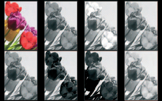
Fig. 5.27 The Monochrome Mixer presets simulate colored filters for B & W photography. Clockwise from top left: Original, Monochrome (30% red, 59% green, 11% blue), red, orange, yellow, green, blue and custom (68% red, 36% green, 0% blue).
The preset pop-up menu contains five color filter options and a custom filter which you can define yourself. Additionally, as with all of the Adjustments you can create presets. To find out more about creating presets, see page 201.
Color Monochrome produces a color tinted image. The name is in fact a little misleading as a monochrome image is produced only when the effect is applied at its maximum setting of 1.0 – the default position of the adjustment’s Intensity slider. Between 0 and 1 the image is progressively desaturated and tinted. Only at the higher settings of around 0.8 and above is most of the color removed from the image. This can be used to produce a quite pleasing effect which combines a desaturated, almost hand-colored look with tinting. The default sepia tint color can be changed using the Colors Palette.
Sepia Tone is effectively the same as the Color Monochrome adjustment without the option of changing the tint color. For more detailed information on using the Monochrome mixer and tinting images, see the section on creative techniques starting on page 209.
Noise Reduction
Digital noise becomes apparent in images made at high ISO settings and using long exposure times. It can also become an issue where underexposed images are corrected to produce an acceptable result. Aperture’s Noise Reduction filter is designed to reduce digital noise.
Fig. 5.28 Drag the Noise Reduction Radius slider to reduce the noise apparent in images shot at high ISO ratings, with long exposures, or those that have undergone tonal re-adjustment of the shadows. Restore blurred image detail using the Edge Detail slider.
There are two controls: radius and edge detail. Noise Reduction attempts to isolate noisy pixels by comparing them with neighboring pixels. The radius control determines the size of the area analyzed. In practical terms the higher the radius value, the more aggressively the noise reduction is applied. High radius values, however, lead to overall softening of the image. The Edge Detail slider can be used to restore sharpness to image detail affected in this way. Inevitably, noise reduction involves a compromise; at some point, you will find radius and edge detail settings which result in acceptable noise reduction without unacceptable loss of image detail (Fig. 5.28).
Sharpening Tools
Possibly because Aperture and other tools provide more than one way of doing it, sharpening is a process which is often not very well understood. Though it’s not a common misconception among photographers, it’s worth clarifying that sharpening is not intended to fix images that are out of focus. Digital image editors, Aperture included, provide a wealth of tools for fixing exposure problems but, if your images are out of focus, you’re out of luck and those shots are destined for the reject pile.
All Sharpening tools work on the same principle – that image sharpness can be enhanced by increasing contrast in local areas of existing high contrast. To put it another way, if neighboring pixels in an image vary widely in luminance, that’s probably an edge, and the edge can be sharpened by further increasing the contrast.
The difficulty for sharpening algorithms lies in differentiating true edges from other image detail. Over-zealous sharpening can exaggerate noise, make skin, skies and areas of flat color look granular, exacerbate fringing caused by chromatic aberration and cause ‘haloing’ (light fringing) in very high contrast edges.
But don’t let that put you off. Nearly all digital images, and certainly all Raw images, require some level of sharpening and, used judiciously, sharpening can radically improve overall image definition.
Aperture provides three sharpening tools designed for two different purposes. The first of these is the Sharpening slider in the Raw Fine Tuning brick. This Sharpening filter is designed to overcome the softness that results as a consequence of the demosaicing stage of the Raw conversion process. For a more detailed explanation of this, see Chapter 1.
Some people prefer to deactivate Sharpening by dragging the Sharpening slider all the way to the left and do all of their sharpening outside of the Raw decoding process. If there is a quality advantage to be gained from this approach, we’ve yet to see it demonstrated.
The default Sharpening applied in the Raw Fine Tuning brick is tailored to the characteristics of the specific camera model. The amount of sharpening applied is small and a better end result can be achieved by using the default Sharpening setting in the Raw Fine Tuning brick for all images and subsequently applying less aggressive sharpening than would otherwise be necessary using the other Sharpening tools (Fig. 5.29).
Another advantage of this approach is that you’ll be working with sharper images that are closer to their final output appearance all the way through your adjustment workflow. This is particularly relevant while applying contrast-related adjustments such as Contrast and Definition, which are affected by sharpness adjustments.
Outside of the Raw decoder, Aperture has two sharpening adjustments: Sharpen and Edge Sharpen. Sharpen is a fairly basic Sharpening filter which was introduced in Version 1 of Aperture. The superior and more sophisticated Sharpen Edges Adjustment was introduced in Aperture 1.5, but Sharpen was retained for the sake of backwards compatibility.
Fig. 5.29 Sharpening applied during the Raw decoding process is based on camera characteristics and is so marginal, it’s actually quite difficult to see the effect. (a) The image has had the default sharpening applied and (b) it has been removed. On balance, it’s best to leave Sharpening at its default settings.
Aperture’s Edge Sharpen is a sophisticated professional sharpening tool. It uses an edge mask so that only edges are sharpened and sharpens on the basis of luminance, rather than RGB data. This approach avoids many of the problems mentioned above.
Edge Sharpen does one other thing that helps produce excellent results while avoiding some of the drawbacks of conventional sharpening tools – it applies its sharpening algorithm in three passes. Multi-pass sharpening techniques are nothing new. It’s long been argued that several applications of low levels of Unsharp Mask in Photoshop produce a better end result, with less risk of haloing than a single large application. Aperture’s Edge Sharpen Adjustment simply automates this process.
If you’re used to Unsharp masking in Photoshop, Edge Sharpen may seem a little underpowered at first, because it doesn’t provide a range that extends beyond that needed for natural-looking results. Edge Sharpen has three sliders. The first, Intensity, controls the amount of sharpening applied to the image. Edges determines what’s an edge and what isn’t. At lower settings only fine detail is sharpened and as you drag the slider to the right, the number of pixels that qualify as edges increases. In practical terms, overall image sharpness increases as you drag the Edges slider to the right, but beyond a certain point you’ll start to lose detail.
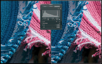
Fig. 5.30 Even at the maximum setting for Intensity and Edges it’s difficult to go over the top with Edge Sharpen. Clearly this image (right) has been over-sharpened, but it’s not possible to produce the kind of ultra high contrast effects you can get with Photoshop’s Unsharp Mask.
The final slider, Falloff, determines the degree of edge sharpening that is applied in subsequent passes. Edge sharpening is a three-pass process with each pass applied using a different pixel radius. The first pass is applied at a radius of 1 pixel, the second 2 pixels and the third pass is applied using a 4 pixel radius.
The Falloff slider determines the percentage of the total sharpening power applied during the second and third passes. At a setting of 0.7, the amount of sharpening applied during each pass is:
• 1st pass: 100%
• 2nd pass: 70%
• 3rd pass: 49%
Setting the Falloff slider to zero results in all the sharpening being applied in a single pass with a 1 pixel radius. At 1, all three passes receive the same amount of sharpening. The sum of the three sharpening passes is always equal to the value indicated on the intensity slider (Fig. 5.31).
The first thing to do when applying any kind of sharpening adjustment is press ![]() . It’s impossible to gauge the effect of a Sharpening tool at anything other than the pixel level provided by 100% view. Hold down the
. It’s impossible to gauge the effect of a Sharpening tool at anything other than the pixel level provided by 100% view. Hold down the ![]() and drag in the Viewer so that you can see a representative part of the image that includes both fine detail and flat areas of color or out-of-focus regions.
and drag in the Viewer so that you can see a representative part of the image that includes both fine detail and flat areas of color or out-of-focus regions.
Fig. 5.31 All of these images have had the default amount of Edge Sharpen applied −0.81 Intensity, 0.22 Edges. The top image has had a Falloff setting of 0.69, whereas the Falloff for the center image was set to 1.00 and for the bottom image to 0. For many images the Falloff setting won’t make a huge difference to the result, but it can help you obtain acceptable results with high contrast images where haloing might otherwise be a problem.
Select the Edge Sharpen Adjustment from the Add Adjustment pop-up menu. Drag the Intensity slider all the way to the right until the value field reads 1.00. Next press ![]() to activate the Loupe, right- or
to activate the Loupe, right- or ![]() click inside it and select 800% view from the context menu and position the Loupe over a contrasting edge. Then, drag the Edges slider to the right until you can see evidence of haloing – a pronounced light or dark fringe that extends beyond the edge details – and drag the slider back towards the left until the halo disappears.
click inside it and select 800% view from the context menu and position the Loupe over a contrasting edge. Then, drag the Edges slider to the right until you can see evidence of haloing – a pronounced light or dark fringe that extends beyond the edge details – and drag the slider back towards the left until the halo disappears.
Press ![]() to deactivate the Loupe and reduce the intensity until a natural looking, but sharp result is obtained and the image loses its harsh contrasty appearance. Apple recommends restricting intensity levels to 0.5 or lower but depending on the camera, lens, subject matter and intended output, higher levels of sharpening intensity may be required.
to deactivate the Loupe and reduce the intensity until a natural looking, but sharp result is obtained and the image loses its harsh contrasty appearance. Apple recommends restricting intensity levels to 0.5 or lower but depending on the camera, lens, subject matter and intended output, higher levels of sharpening intensity may be required.
For most images, you can leave the Falloff slider at its default 0.69 setting. In images where it’s difficult to attain a good overall level of edge sharpness without introducing haloing the Falloff slider can make the difference. Set the Intensity and Edges sliders as described, but accept a degree of haloing when setting the Edge parameter. Then use the Falloff control while examining the offending edges with the Loupe to reduce or remove the halo (Fig. 5.32a–c).
How to Use the Histogram
The importance of the Histogram in analyzing an image’s tonal qualities and assessing the impact of changes you make using Aperture’s Adjustment controls can’t be over-emphasized. The Histogram confirms what you can see with your eyes (and, sometimes, things that aren’t so apparent), but it also provides a diagnostic review of exactly what’s happening with an images’ tonal range.
The Histogram is a graph of the frequency of pixels, displayed on the y-axis, against their value, displayed along the x-axis. Assuming the luminance channel is displayed, for an 8-bit RGB image (for the sake of simplicity), the range of the x-axis extends from 0 on the left to 255 on the right (Fig. 5.33).
Fig. 5.32a To gauge the correct amount of Edge Sharpen to apply, activate the Loupe (press ![]() ) and position it over some edge detail. Drag the Intensity slider to the maximum, then drag the Edges slider to the right until you see the edge start to halo – light and/or dark bands of color will appear either side of it.
) and position it over some edge detail. Drag the Intensity slider to the maximum, then drag the Edges slider to the right until you see the edge start to halo – light and/or dark bands of color will appear either side of it.
Fig. 5.32b Next, drag the Edges slider back towards the left until the haloing disappears.
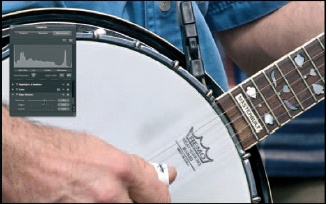
Fig. 5.32c Finally, reduce the intensity to produce a more subtle and natural-looking degree of sharpening.
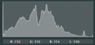
Fig. 5.33 The Histogram shows pixel luminance along the x-axis and frequency on the y-axis. The taller the column, the more pixels of that value occur in the image. Moving from left to right, pixel values increase in value and tone from black (0) to white (255).
Pixels with a luminance value of 0 are black, those with a value of 255 are white. Everything else is in-between those two values, ranging from the deep shadows to bright highlights. For a well-exposed scene with a full range of tones the Histogram extends the full width of the chart with peaks and troughs (but, unless there’s a serious problem, no gaps) corresponding to the number of pixels at each luminance level. All being well, the graph tails off close to either end where the incidence of pixels at the extremes of the tonal range declines to zero.
The most common problem identified by the Histogram is clipping – where the graph appears cut off at one end rather than declining gradually to zero. This indicates that the camera sensor has been unable to capture the full tonal range in the scene though, as we shall see, especially in the case of highlight clipping, much of this detail can be recovered.
At a glance, the Histogram can tell you if an image is over- or underexposed, if the highlights or shadows are clipped, or if it lacks contrast. Just as important, the Histogram can be your guide when making adjustments, providing vital feedback to ensure that you don’t lose highlight detail when making exposure adjustments or introduce noise by stretching the tonal range in the shadows.
Figure 5.34 shows Histogram profiles for some common problems. Generally speaking, when making tonal adjustments you should use the Histogram’s luminance view. This displays the tonal range clearly without cluttering the graph with color information that you probably don’t need.
Aside from the obvious, like clipping values at either end of the range, when using adjustments you should maintain an awareness of what’s happening to the tonal range in the Histogram. Although problems of image degradation common with 8-bit RGB files (e.g. posterisation – discontinuities in the Histogram caused by stretching tonal values across too wide a range) are unlikely when working with 12- or 16-bit Raw data, you should nonetheless be aware of the consequences of shifting tonal data around and the difference between using similar tools, e.g. Black Point and Shadows, to achieve the same end – Recovery of Shadow detail. While visual observation of the image can get you a long way to achieving your goal, if you keep one eye on the Histogram you can also ensure the integrity of your image data and, ultimately, the quality of the end result.
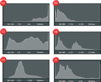
Fig. 5.34 (a) Overexposure, (b) underexposure, (c) clipped highlights, (d) clipped shadows, (e) low contrast and (e) high contrast (high dynamic range with clipped highlights and shadows).
Hot and Cold Spots and Clipping Overlays
Aperture 2’s new clipping overlays provide useful visual feedback which can help you when making tonal adjustments using controls in the Exposure and Levels adjustments. To activate the overlay hold down the ![]() key while dragging the sliders (Fig. 5.35).
key while dragging the sliders (Fig. 5.35).
The overlay color indicates which color channel the clipping occurs in. White indicates clipping in all channels, red in the red channel and so on. Yellow means clipping is occurring in both the red and green channels. The Aperture User manual contains a complete list of the clipping overlay colors and their corresponding channels.
You can change the color overlays to monochrome in the Appearance tab of the Preferences window. The lighter the gray, the more channels are being clipped. Generally speaking, you should aim to eliminate clipping in all channels.
The clipping overlays work for the following Exposure adjustment controls:
• The Exposure slider shows highlight
• The Recovery slider shows highlight clipping. clipping.
• The Black Point slider shows shadow clipping.
Fig. 5.35 Holding down the ![]() key while moving the White Levels slider activates the highlight clipping overlay. Here clipping has started to occur in the blue and green channels and would eventually occur in all three channels indicated by a white color.
key while moving the White Levels slider activates the highlight clipping overlay. Here clipping has started to occur in the blue and green channels and would eventually occur in all three channels indicated by a white color.
And these Levels controls:
• Black Levels slider shows shadow clipping
• The White Levels slider shows highlight clipping.
Selecting View > Highlight Hot and Cold Areas, performs a similar function. The Hot and Cold areas are displayed permanently, rather than only when using certain adjustment sliders which makes them a little less convenient. Also, clipping for individual color channels is not shown; hot areas appear red, cold areas appear blue. They can be quickly toggled on and off by pressing ![]()
![]()
![]() .
.
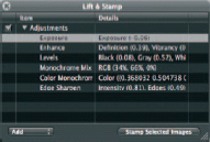
Fig. 5.36 Right click an image and select Lift Adjustments to display the Lift and Stamp HUD showing only adjustments. Click the disclosure triangle and select and delete any you don’t want, then select the images you want to apply the adjustment to and click the Stamp Selected Images button.
Copying Adjustments Using Lift and Stamp
Adjustments you have made to one image can quickly be applied to others using the Lift and Stamp tool. You can do this by clicking the Lift tool in the tool strip, but this will open the Lift and Stamp HUD with metadata as well as adjustments selected. To work only with the adjustments right click the image you want to copy the adjustments from and select Lift Adjustments from the contextual menu. Click the Adjustments disclosure triangle to see a list of adjustments and delete any that you don’t want by selecting them and pressing ![]() .
.
Select the images in the Browser that you want to apply the lifted adjustments to, and then click the Stamp Selected Images button on the Lift and Stamp HUD (Fig. 5.36).
Using Adjustment Presets
You’ll frequently apply adjustments with the exact same settings to multiple images. As part of your workflow you might want to, for example, routinely apply Edge Sharpen to images, or apply the same noise reduction settings to all images shot at 800 ISO.
Presets make it easy for you to do this by saving commonly used settings so you can apply them from the Preset menu, rather than having to repeatedly adjust individual sliders by the same amount. To save an adjustment preset, select Save as preset from the Adjustments Action pop-up menu (Fig. 5.37).
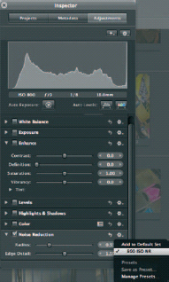
Fig. 5.37 Saved adjustment presets are added to the Adjustment Action pop-up menu.
Common Problems and How to Correct Them
Overexposure
With Raw images, there’s a fine line between ensuring that you use the full range of available bits to capture as much of the tonal information in as scene as possible and overexposure. But even when you go a little too far, and end up with a Histogram that’s clipped on the right hand side, Raw images seem to have something in reserve that Aperture is very good at recovering. Aperture’s Exposure and highlight recovery tools can rescue highlight detail from images that, on an initial assessment, seem beyond the pale.
The tools you need for correcting overexposure and recovering highlights are located primarily in the Exposure brick. You can increase your chances of a successful result by careful tweaking of the Raw Fine Tuning controls and by employing a combination of adjustments including Highlights and Shadows and Levels.
Because they require different approaches, we’ll deal separately with overexposure and high dynamic range problems. Overexposure occurs when you (or your camera, if you’re shooting using an Auto Exposure mode) select the wrong aperture and shutter speed combination for the scene you are photographing which results in more light hitting the sensor than would result in a balanced exposure recording all the tones in the scene and producing a Histogram like that in Fig. 5.38.
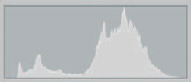
Fig. 5.38 The Histogram from a correctly exposed image.
A very overexposed image has a Histogram which looks like that in Fig. 5.39. There are no pixel values in the left half of the Histogram and everything is bunched up on the right side, resulting in loss of highlight detail (Fig. 5.39).
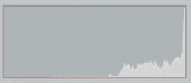
Fig. 5.39 The Histogram from an overexposed image.
In some ways, overexposure is easier to deal with than high dynamic range problems, because all of the tonal values need to be shifted leftwards on the Histogram, i.e. darkened. The primary adjustment for accomplishing this is the Exposure slider in the Exposure brick of the Adjustments HUD.
As a first step open the Exposure brick and drag the Exposure slider towards the left until you can see the right side of the Histogram. The slider is not linear, but is calibrated to provide more control at lower adjustment settings. The further you move the slider towards the end of the scale, the more effect incremental adjustments have. The first four-fifths of the slider’s range change the Exposure value from 0 to −1 and the final fifth changes it from −1 to −2.
If an exposure value of −2 is insufficient to bring the right-hand edge of the Histogram within range you can add further Exposure adjustment by dragging the value slider. This can take you all the way to −9.99 but, if an image requires more than two stops of exposure correction it’s unlikely you’ll obtain a great quality result.
With the exposure adjustment made, all of the Histogram should now be within range, but the image may still be lacking highlight detail. You can use the recovery slider to regain some of this, but with very overexposed images combining it with the Highlight and Shadows Adjustments is often more effective.
First drag the Recovery slider all the way to the right, then use the Highlights slider to further bring overexposed regions into the highlight and three-quarter tone area of the Histogram. If at this stage of the process you discover that the right edge of the Histogram is well within the right boundary, but the image still lacks highlight detail, return to the Exposure slider and ease off the original setting by dragging the slider slightly back towards the center and compensate by adding more Highlight adjustment. By re-adjustment of these two controls – Exposure and Highlights – you should be able to reach a position which looks good visually and, from a Histogram standpoint, with reasonably good detail in the three-quarter tones and highlights.
The final problem you are likely to have with an overexposed image is that the Histogram falls short on the left-hand side, the shadows look washed out and the image lacks contrast. You can fix this either by dragging the Black Point slider in the Exposure Brick to the right or by using a Levels adjustment (Figs 5.40–5.46).
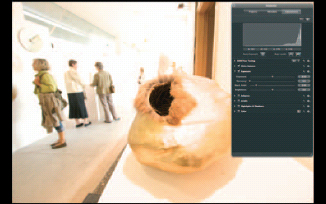
Fig. 5.40 Dealing with overexposed images. This image is quite badly overexposed, but not beyond rescuing.
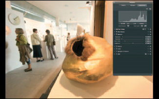
Fig. 5.41 First, use the Exposure slider to bring the right side of the Histogram into view.
Fig. 5.42 Then use the recovery slider to try to get some detail back into the highlights.
Fig. 5.43 If you can’t get sufficient detail into the highlights with Recovery, move on to Highlights and Shadows.
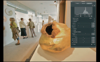
Fig. 5.44 Return to the Exposure adjustment and ease off to accommodate the recovery and Highlights changes.
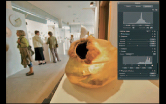
Fig. 5.45 Finally, add some density to the shadows using the Black Levels slider.
Fig. 5.46 Before (top) and after (bottom).
Slight Overexposure and High Dynamic Range
In most situations the range of tones in a scene, from solid black to pure white, can adequately be captured by dSLR sensors which are capable of capturing around seven stops. In subjects that exceed this range something has to go and you’ll lose detail in either the highlights, shadows or both.
High dynamic range is also a term applied to a technique which combines several bracketed exposures in order to capture tonal detail in scenes with a dynamic range that it would not be possible to capture with a single exposure. HDR images use 32-bit floating point data which is usually tone mapped to a 16- or 8-bit integer format in order to print it or display it on a monitor.
Aperture doesn’t provide such HDR compositing tools, but it is so good at recovering highlight detail that you can often get excellent results from a single image, provided it is well exposed.
The first place to start is the Raw decoder, which applies contrast to the image during the decoding process. In the 1.1 decoder this is controlled using a single Boost slider; the 2.0 decoder has two sliders, Boost and Hue Boost. Boost controls contrast and Hue Boost maintains the hues as the contrast is increased.
Reducing the Boost from its default setting of 1.0 can recover a significant amount of lost highlight detail. Don’t try to fix everything in one hit. Boost controls the contrast over the entire tonal range, so keep an eye on the Histogram and watch out for compression of the midtones and loss of detail in the shadows.
Generally speaking, you shouldn’t be reducing the boost beyond the mid-way 0.5 mark. You can always come back and re-adjust it if necessary when the other adjustments have been made.
Next open the Exposure Brick and drag the Recovery slider to the right. Recovery is a new tool specifically designed to recover blown highlights. Its effects can appear to be quite subtle, and recovery is more successful in images with clipping in only one- or two-color channels than where all three are blown. Hold down the ![]() key to use the highlight clipping overlay and keep dragging the slider right until all of the clipping is eliminated or at least substantially reduced.
key to use the highlight clipping overlay and keep dragging the slider right until all of the clipping is eliminated or at least substantially reduced.
Although the highlights are no longer clipped, they still lack detail which can now be recovered using Highlights and Shadows. Drag the Highlights slider to the right to restore as much of the remaining highlight detail as you can.
Restoring highlight detail involves reducing the brightness of pixels in the highlights – effectively squeezing the right-hand side of the Histogram to restore detail to clipped highlight areas. Sometimes, a consequence of this is that the midtones are compressed and images can begin to look dark and flat as a result.
Although it seems somewhat counter-intuitive to brighten an image that you’ve spent time and effort in restoring highlight detail to, adjust the brightness to lighten the midtone values. Finally, you may need to restore some contrast by moving the Black Point slider to the right until the left side of the Histogram approaches the edge. At all times during this process your eyes should be on the Histogram as well as on the image (Figs 5.47–5.52).
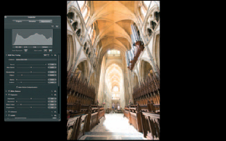
Fig. 5.47 The range of tones in this image is too wide to be captured by the camera sensor. An exposure has been made that captures the shadow detail without clipping, but the highlights are blown out. With high dynamic range subjects, this is the kind of Histogram you want to see. To reverse the old adage, Expose for the shadows, Develop for the highlights.
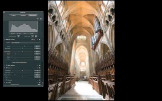
Fig. 5.48 Initiate highlight recovery by reducing Boost in the Raw Fine Tuning brick. Boost applies quite an aggressive contrast increase and reducing it to around half its default value can make a big difference, but don’t try to do it all with the Boost slider.
Fig. 5.49 Next, drag the Recovery slider to the right while holding down the ![]() key until none of the color channels is clipped.
key until none of the color channels is clipped.
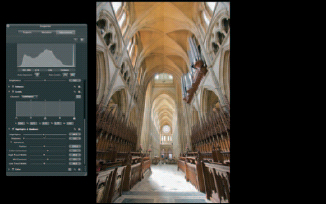
Fig. 5.50 Restore additional highlight detail using a Highlights and Shadows adjustment. Drag the Highlights slider to the right.
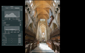
Fig. 5.51 Finally, restore contrast using a Levels adjustment. Drag the Black Levels slider slightly to the right to add density to the shadow detail.
Fig. 5.52 Before (left) and after (right).
Underexposure
Severe Underexposure
Underexposure is a more difficult problem to remedy than overexposure and therefore one which, if at all possible, should be avoided. The problem with adjusting underexposed images is that what tonal information there is, is recorded using only a fraction of the bits available to the camera sensor. See Chapter 1 for a more detailed explanation of why this is so.
A consequence of dealing with image data recorded using relatively few bits is that edits carry the risk of enhancing noise as well as genuine image data. While the Histogram can tell you how healthy an image is in terms of tonal distribution, the only way to tell if you’ve produced a noisy image is to take a close look at it. Very often when dealing with underexposed images, noise is simply something you have to live with.
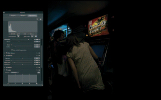
Fig. 5.53 This is the kind of severely underexposed image you might get if a flash fails to fire. It can be rescued, but spreading the relatively small amount of data recorded in the shadow region of the Histogram will introduce severe noise.
First let’s look at a case of severe underexposure. Figure 5.53 shows an indoor shot that’s several stops underexposed and exhibits a typical underexposed Histogram – there’s very little pixel data in the right half of the Histogram. Dragging the Exposure slider to the right side of the scale results in some improvement, but the shadows and midtones are still heavily compressed. Dragging the Exposure Value slider to around 2.60 results in further improvement but the Histogram indicates that any further increase in exposure risks clipping the highlights in the illuminated panel above the dance machine.
To recover the deep shadows, first drag the Black Point slider from its default value of 3 towards the left end of the scale. A Black Point value of 0 reintroduces some shadow detail without affecting the contrast too badly.
Next open the Highlights and Shadows brick. The Shadows adjustment is designed specifically to reintroduce detail into dense shadows, drag the slider to the right to further enhance the shadow detail. You might find it helpful while you’re doing this to toggle the Shadows adjustment on and off using the Highlights and Shadows checkbox. Note when you drag the Shadows slider to the right the Histogram shifts in the same direction, but the Black Point – the left-most pixel values on the chart – remains fixed.
At this stage of the process noise will almost certainly start to become apparent even at less than actual size view. To get a proper look at just how bad the problem is, press the ![]() key to view the image’s actual size or press
key to view the image’s actual size or press ![]() for the Loupe.
for the Loupe.
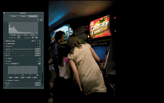
Fig. 5.54 Start with a hefty Exposure adjustment. Dragging the slider will only get you to 2.0; for larger adjustments like this one you need to drag the Value slider (position the cursor over the value field and drag) or enter the value in the field.
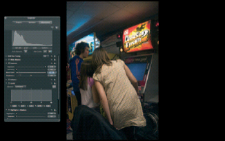
Fig. 5.55 Drag the Black Point slider to the left to get back yet more shadow detail. Reducing the Black Point value to 0 recovers some shadow without a big reduction in contrast.
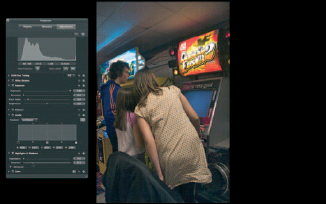
Fig. 5.56 Now use a Highlights and Shadows adjustment to lighten the shadows up to the midtones. Drag the Shadows slider to the right.
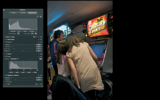
Fig. 5.57 Finally, you may need to reintroduce some density to the blacks to restore contrast and reduce the impact of noise. Here we’ve done that with a Black Levels slider adjustment.
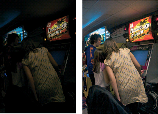
Fig. 5.58 Before (left) and after (right).
Fig. 5.59 This shot has tonal detail extending into the highlights, but the shadows have been clipped and the foreground detail is dark.
The only effective way to deal with it is to back off the Shadows and Black Point adjustments to reintroduce clipping of the shadows, or alternatively to clip the blacks with a Levels adjustment. The noise is inherent in the Shadow data and the two are, practically speaking, inseparable. You can also try reducing the impact of the noise using Noise reduction.
Mild Underexposure and Shadow Recovery
Much more common than the sort of severe underexposure just dealt with, is an image in which some degree of shadow clipping has occurred either as a result of slight underexposure or because of high dynamic range in a scene. In an attempt to hold the highlights, an exposure has been made which has lost some of the shadow detail.
The Histogram for this kind of image looks like that in Fig. 5.59. Unlike the underexposed image the pixel data extends well across the Histogram and is almost touching the right side, but the left side is clipped indicating that some shadow detail has been lost.
Depending on how close to the right side of the Histogram the highlights are, you may get away with a small amount of positive Exposure adjustment, but in an image with a full tonal range you’re likely to lose highlights as you gain shadows, so it’s probably best avoided.
The Shadow slider of the Highlights and Shadows adjustment is designed specifically for this task and is most likely the only thing you’ll need. Drag the Shadows slider to the right until the spike disappears from the left side of the Histogram. Depending on the nature of the subject and the degree of Shadows adjustment necessary it may also help to boost the midtone contrast a little.
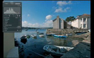
Fig. 5.60 The Highlights and Shadows adjustment was designed to address exactly this kind of problem. Dragging the Shadows slider to 33 provides a ‘fill flash’ effect.
As always when making adjustments that stretch the shadow region of the Histogram, be on the lookout for noise. If this becomes apparent, rather than backing off the Shadows adjustment you may get more mileage (in other words, reduce the degree of visible noise with less of a compromise on shadow recovery) by increasing the radius value and/or decreasing the Low Tonal Width value. To access these controls check the Advanced disclosure triangle.
Low Contrast (flat) Images
Low contrast images can be identified by a Histogram that doesn’t reach either end of the chart. There are no pixels with values in the shadow or highlight tonal ranges and, in the absence of rich blacks and pure whites or values close to them, images look flat and washed out.
Fixing poor contrast simply involves stretching the Histogram and evenly redistributing the tonal values so they extend to either end. The Auto Levels tool usually makes a pretty good job of this, but you can do the job almost as quickly using a manual Levels adjustment and, even if you do use Auto Levels you’ll probably need to make a slight adjustment to it anyway.
Figure 5.61 shows a flat image that’s lacking in contrast. Click the Auto Levels button and open the Levels brick to view the adjustment that has been made. Auto Levels had adjusted the White Levels slider to 0.86 and the Black Levels slider to 0.02. The mid-point Gamma Level has moved from its default position of 0.5 to 0.44 as a consequence of the overall tonal redistribution resulting from the White and Black Levels shifts.
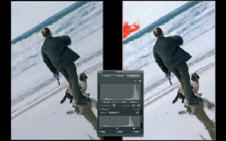
Fig. 5.61 To fix poor contrast start by clicking the Auto Levels button; this will adjust the B&W Levels sliders to the ends of the Histogram.
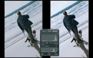
Fig. 5.62 Depending on the image, further adjustment may be necessary. Turn on Highlight Hot and Cold Areas (View > Highlight Hot and Cold Areas or ![]()
![]()
![]() ) to see any clipping that may have occurred.
) to see any clipping that may have occurred.
The result isn’t bad, but some highlight detail in the sky has been lost and the shadows still lack sufficient punch. Turn on Highlight Hot and Cold Areas (View> Highlight Hot and Cold Areas or ![]()
![]()
![]() ) to see any clipping that may have occurred. To restore the highlights drag the White Point slider back to the right until all of the red-colored hot pixels disappear.
) to see any clipping that may have occurred. To restore the highlights drag the White Point slider back to the right until all of the red-colored hot pixels disappear.
Next, drag the Black Levels slider to the right to add density to the shadows. Shadow clipping is indicated by cold, blue-colored pixels. A little filling in of the jacket is acceptable in order to produce an image with improved overall contrast (Fig. 5.62).
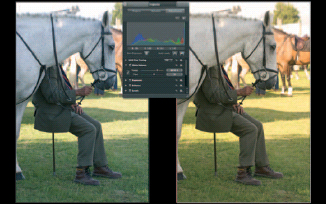
Fig. 5.63 The first stage in your color correction workflow should be to set the White Balance. This early evening scene was determined by the camera’s Auto White Balance to have a color temperature of 5693 K and has resulted in a cold image with a blue horse. Increasing the White Balance to 8030 K results in a warmer, more natural-looking image with a white horse.
Dealing with Color Casts
Using White Balance
Color casts are most often caused by incorrect White Balance and are therefore easily corrected using the White Balance adjustment. Incorrect White Balance leads to either a blue cast if the White Balance is set too low or a yellow cast if it is set too high. Setting White Balance for tungsten lighting with a color temperature of 3500 K and then shooting outdoors leads to a pronounced blue cast and doing the reverse – setting daylight White Balance of 5500 K and shooting indoors – leads to a pronounced orange/yellow caste. In between exists a range of problems most often caused by a camera’s Automatic White Balance setting getting it wrong.
As mentioned earlier, if White Balance is critical, a neutral gray card can be photographed in the scene and subsequently used to set White Balance using the White Balance adjustment’s eyedropper.
In the absence of a gray card use the White Balance eyedropper to click on any neutral area in the image, the Loupe automatically appears when the eyedropper is selected to help you make an accurate selection.
Further manual adjustment is likely to be necessary after you’ve used the eyedropper. Move the Temp slider to the right to increase the indicated source color temperature and make the image warmer (more yellow) and to the left to make it cooler (more blue).
The Tint slider is used to correct green/purple casts. Depending on the camera and the scene, its usual position is in the 0–10 range and, on the rare occasions you might need to adjust it to eliminate a slight purple or green cast, only small variations should be necessary.
Using Tint
Uniform White Balance problems are easily dealt with using the White Balance adjustment, but sometimes color casts are not uniform. Scenes lit by a mixture of daylight and artificial light, e.g. interiors with room lighting switched on and daylight coming in through windows, are impossible to color balance using White Balance. If you adjust for the room lighting, areas lit by daylight appear blue and vice versa.
In these situations, the Tint controls on the Enhance brick provide a solution. First, set the overall White Balance as just described. You will need to have, at the outset, a clear idea of how you want the final image to look. It will probably not be possible, or even desirable, to completely neutralize all casts. Usually, in an interior short you’ll want to maintain a degree of warmth in the image and eliminate the worst of the blue daylight cast, so start by using White Balance to achieve the desired color temperature of the interior lighting.
Next, click the Tint disclosure triangle on the Enhance brick to reveal the Tint color wheels. The three sliders control Tint adjustment in the shadow, midtone and highlight regions, respectively. Each has an eyedropper which you can use to sample from the image, but provided you can identify where the cast is, you’re probably better off just dragging the White Point spot in the center of the relevant color wheel and visually assessing the result.
In Fig. 5.64, the offending blue cast is in the highlights and midtones outside the window. Dragging the Gray and White Tint controls to the yellow side of the color wheels considerably neutralizes the blue cast. If you find it hard to judge the degree of correction, temporarily increase the Saturation slider to exaggerate your changes.
Fortunately, most of the interior of this shot falls into the shadow regions and so is unaffected. Tonal ranges aren’t always so accommodating and you may find it is impossible to correct the cast without adversely affecting acceptable parts of the image. If this happens the only resort is to round-trip the image to Photoshop and attempt to correct the cast using a mask layer (Fig. 5.64).
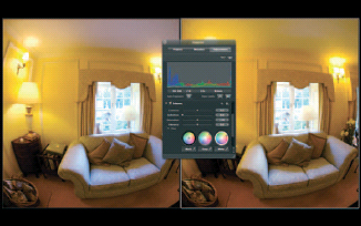
Fig. 5.64 Use the Tint controls of the Enhance brick to deal with color casts caused by mixed lighting. Here the blue cast on the sofa caused by the daylight entering through the window has been reduced by adjusting the Gray and White Tint color wheels.
Using Levels
You can correct a color cast using the individual red, green and blue channels of the Levels adjustment. Although you can visually gauge the effect of editing individual color channels while adjusting the sliders, some knowledge of color theory will help you make the right choices. A detailed explanation of color theory is outside the scope of this book; however, those not familiar with basic color theory might find it helpful to know that adding one of the three primary colors to an RGB image has the same effect as subtracting its complementary color (i.e. the opposite color on the color wheel). So:
• adding red is the same as removing cyan;
• adding green is the same as removing magenta;
• adding blue is the same as removing yellow.
Using a Levels adjustment to address color cast issues has the advantage that you can confine your adjustments to specific parts of the tonal range. To remove a blue cast from the midtones select the blue channel from the Channel pop-up menu in the Levels brick and drag the Gray Levels slider to the right. This removes blue (adds yellow) to the midtones.
To remove blue from the shadows drag the Black Levels slider to the right. If you want to remove blue from the highlights, you will need to drag the White Levels slider to the left on both the red and green channels. You can’t drag the White Levels slider to the right and adding red and green is the same as removing blue.
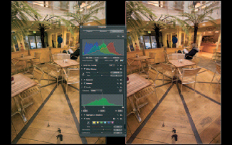
Fig. 5.65 This image has a slight green cast in both the shadow and highlight regions. To remove the green cast from the shadows, select the green channel in the Levels brick and drag the Black Levels slider to the right to remove green.
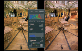
Fig. 5.66 You can’t add green to the highlights using green channel, but adding green is the same as removing its complementary color, magenta, which is the same as removing blue and red. Select the blue channel from the Channel pop-up menu in the Levels brick and drag the White Levels slider to the left.
As a general rule, drag the Levels sliders at the bottom of the Histogram to the right to remove the selected channel color and to the left to add it. For more control over color casts in specific tonal regions click the Quarter Tone controls button and use the quarter and three-quarter Tone Levels sliders.
Creative Techniques
Color to B&W
Although it doesn’t provide a wealth of creative options, Aperture has a good set of tools for converting color images to monochrome and applying tints. Whether for weddings and portraiture, fine art photography or just experimentation, you can quickly and easily produce monochrome and tinted versions from color Masters.
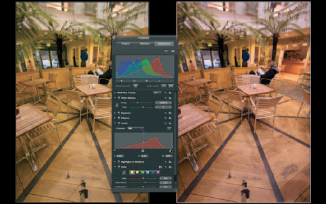
Fig. 5.67 Finally, select the red channel and drag the White Levels slider to the left.
If you’ve used Photoshop’s Channel Mixer, or B & W filters, or if you’ve used colored filters in B & W film photography, you’ll quickly feel at home with Aperture’s Monochrome Mixer. To add the Monochrome Mixer to the Adjustments HUD, select it from the Add Adjustments pop-up menu.
The Monochrome Mixer mixes tonal data from the RGB images’ three-color channels to produce a monochrome result. Initially the mix is set at 30% red, 59% green and 11% blue, which produces a well-balanced result.
By changing the mix you can emulate the results produced when using color filters with B & W film. For example, dragging the red slider to 100% and reducing blue and green to zero has the same effect as a red filter – lightening the tone of red elements in the image and darkening greens.
To reproduce the effect of a yellow filter use 50% red and 50% green. You can obviously reproduce any color filter you like in this way; the only general rule you need to follow is to ensure that the sum of the three channels equals 100% if you don’t want to lighten or darken the image overall.
The Preset pop-up menu provides five preset colored filters and there’s a custom setting which you can define. If you need a lot of filter variants you can add additional ones to the Presets section of the Action pop-up menu.
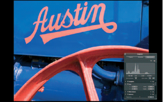
Fig. 5.68 This graphic shot is a good candidate for conversion to B & W using the Monochrome Mixer because the predominant colors are well spaced on the color wheel and will be easy to separate.
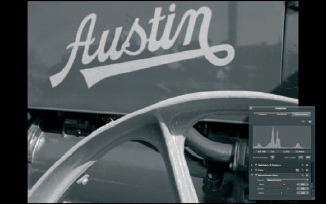
Fig. 5.69 Select the Monochrome Mixer from the Add Adjustment pop-up menu. The default result isn’t bad with good tonal separation between the orange Austin lettering and wheel and the blue paintwork.
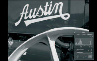
Fig. 5.70 Selecting the Monochrome with orange filter preset lightens the orange lettering and wheel and darkens the blue paintwork, providing a more dramatic contrast between the two.
You can usually get the effect you’re looking for – whether it’s roses with light flowers and dark foliage, or dark skies with billowing cumulus clouds – by following the general rule that a filter lightens the tones of same or similar colors and darkens those of complementary colors. Hence for the rose you’d choose a red filter or orange for a less dramatic effect. Start with a preset, then use the sliders – keeping in mind the 100% rule – to make minor tonal adjustments (Figs 5.68–5.70).
Tinting
Aperture has two tint adjustments – Sepia Tone and Color Monochrome. Sepia Tone is little more than a single tint version of Color Monochrome. You can do everything Sepia Tone does, and more using Color Monochrome so, other than including an example of what Sepia Tone does, we’ll concentrate on Color Monochrome.
To add a Color Monochrome adjustment select it from the Add Adjustment pop-up menu. There are only two controls: a color swatch and an intensity slider. The default color is sepia and the intensity is the maximum 1.0. At this intensity all the colors in the image are replaced by the tint.
To change the color, click the color swatch and select a new tint color using the Colors Palette. The image updates in real time so you can see the effect immediately. Drag the Intensity slider to the right to reduce the tint intensity and reintroduce some of the original image color.
Fig. 5.71 Sepia Tone is a one-trick pony; use the more versatile Color Monochrome instead.
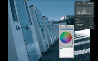
Fig. 5.72 At intensity settings below 1.00, Color Monochrome combines a desaturated version of the original with a monochrome tint. Click the Color Monochrome swatch to select the tint color using the Color Palette.
Reducing the tint intensity produces a pleasing effect. The reduced color saturation and tint combine to produce an effect that looks part tint, part hand colored. But it isn’t a B & W tint in the conventional sense of a mono print which has had a chemical toner applied. To reproduce this effect, combine Monochrome Mixer and Color Monochrome adjustments.
First add the Monochrome Mixer adjustment as described earlier. One of the advantages of this method is that you have more control over tonal reproduction. Choose a color filter preset, and use the Red, Green and Blue sliders to achieve the desired tonal balance.
Next, apply the Color Monochrome adjustment. Select the desired color tint and adjust the intensity. Now, instead of a mix between the original image colors and the tint, the Intensity slider progressively replaces the tones in the B & W image, producing a conventional mono color tint.
You can continue to adjust the red, green and blue balance in the Monochrome Mixer to optimize the effect after the color tint has been applied. You may also want to make a Levels adjustment to lighten the midtones.
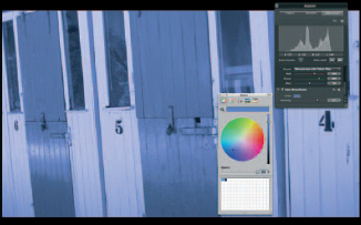
Fig. 5.73 For a true monochrome tint, with greater control over tonal reproduction, combine Monochrome Mixer and Color Monochrome adjustments.
By comparison with the transfer function-based Duo- tri- and quad-tone and mask-based split-toning effects possible in Photoshop, Aperture’s Color Monochrome adjustment is relatively unsophisticated. Hopefully, Apple will improve on it in future releases (Figs 5.72 and 5.73).