CHAPTER 2
The Aperture Workspace
Aperture is part of Apple’s ‘Pro’ application lineup, where it sits beside Final Cut Studio, Logic and Shake. As such, it sports the distinctive dark interface that Apple uses for these products, and works best on high resolution displays as it adopts a smaller on-screen font and a range of complex panels and palettes. It’s even better when spread across two screens, where the management and editing workspaces will be separated out from each other and your pictures will have room to breathe (Fig. 2.1).
The interface is split into resizable areas dedicated to specific tasks, such as Project management, image editing, photo browsing and viewing at larger sizes. Each one is contained within the Aperture application interface rather than spun off as a separate panel as things are in Photoshop. This follows the methods used in Final Cut Studio, iTunes and iPhoto. There are exceptions, however, in the form of head-up displays (HUDs) and the innovative full-screen mode. When running in full-screen, Aperture hides its rigid gray interface and instead adopts a black background to better show off your photos, and strips at the top and bottom of the display showing, respectively, tools and thumbnails. The HUDs, meanwhile, are semi-transparent dialog that overlay the main interface and allow you to perform a range of tasks which includes assigning keywords and editing colors and exposure. They can be used in regular and full-screen modes.
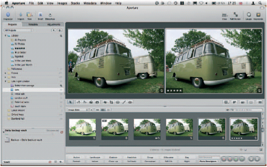
Fig. 2.1 The Aperture interface follows the design of Apple’s Pro apps, with a dark background, smaller font, and distinctive panels inside a unified interface. The main working area is the large Viewer, below which is the Browser, used for selecting images. To the left is the Inspector, used for organizing and adjusting.
In its regular layout, Aperture’s three most obvious palettes are the Projects panel, the Viewer and the Browser. By default, these sit to the left, top and bottom of the display respectively. The Adjustments and Metadata panels sit behind the Projects panel and you can switch between them either by clicking the tabs at the top of the pane or by tapping ![]() to cycle through all three.
to cycle through all three.
Supplementary to these are the Toolbar and Control Bar. The Toolbar sits at the very top of the screen, just below the OS X menu bar, and handles image imports, creates books, galleries, slideshows and so on, emails your photos, invokes the Loupe and applies keywords to your files.
The Control Bar sits at the very bottom of the screen. It handles the way in which your images are displayed in the Viewer and – if you’ve called up the relevant dialog – provides for an easy way to rate pictures, add keywords and skip through your Library.
Everyone will use Aperture in different ways, and while some will never step out of the regular interface layout, others will spend all of their time working in full-screen. In this mode, it is particularly beneficial to have a good working knowledge of Aperture’s keyboard shortcuts as it will allow you to work without constantly showing the hidden Toolbars and menus that sit at the top and bottom of the screen.
In this chapter, we will examine each element of the Aperture interface in detail, walk you through the various options open to power users, and explain how to use each to best effect. We’ll also point out the essential keyboard shortcuts wherever they apply.
First, though, we’ll take you through how Aperture stores your images. A thorough understanding of its filing system goes a long way to understand how it applies edits and adjustments to your files.
How Aperture Stores Your Images
Aperture stores all of your images in its Library. Under the hood, this is a complex collection of folders, sub-folders, packaged files and original images, accompanied by thumbnails, previews and metadata files describing how they should be organized and what changes you have made to them.
At a system level – on your hard drive – your images are organized in a complex series of embedded folders hidden inside a package in your Pictures folder called Aperture Library. Double-clicking this will open Aperture, but right-clicking and selecting Show Package Contents will open it up for inspection. While there is no harm in taking a look at what it contains, you should resist the temptation to fiddle with its contents, as doing so could cause irreparable damage to your Photo Library, and you risk losing some or all of your images.
Within this package, you’ll see two folders – Built-in Smart Albums and Aperture.aplib – which control how Aperture organizes your files, along with a series of folders whose names match the Projects in your Aperture Project pane. These are the roots of an extensive folder tree that contains a directory for every sub-folder in your Library, and at the furthest ends of each branch, your original Raw images, plus thumbnails and previews in JPEG format, which were created when you imported your pictures (Fig. 2.2).
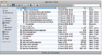
Fig. 2.2 Any images you import into Aperture directly are stored in its Library, a packaged folder than can be explored through the Finder. Never tamper with the contents or you could irreparably damage your collection.
Why does Aperture put each photo into a folder of its own? Because every time you make an adjustment, it leaves the original untouched and simply makes a note of the changes in the form of text-based XML files that sit alongside it and are applied every time you switch between Versions.
By gathering everything together in one place, it keeps your drive tidy and unfragmented. This also means that it can use plain-English filenames, which makes identifying which file relates to which version easier as you always know that Version-2. apversion will be the second revision of the original photo from which the folder took its name, Version-3. apversion will be the third, and so on. Clustering all of these images together would have made it impossible to create such an easily navigable file structure, and would have necessitated greatly extended filenames to differentiate second versions of each file which would be impossible to separate for anyone manually trawling the directories as we do now.
Fortunately, all of this is hidden inside Aperture itself, which makes a thorough understanding of the Library’s underlying directory structure unnecessary. All images are organized in the Projects panel and selected in the Browser, which presents lists or thumbnails of files below the main editing window, the Viewer (Fig. 2.3).
The precise sub-divisions of your images are up to you. If you want, you can have a single large Project containing everything you’ve ever imported, although this would be barely any easier to navigate than the on-disk file structure. Instead, you should use Projects to split your photos by assignment or subject – say France, Jill’s Wedding and so on – with Albums inside each one to further categorize the contents – such as Lyon, Paris, Marseilles, and Dress, Cake, Ceremony in the examples above. Supplementary to these are Light Tables, used to help sort and filter your images; Web galleries, pages and Journals used to publish them online; and Books.
Above your Projects panel are Aperture’s ‘Smart’ folders, which are split off from the Projects by any Web galleries that you might have created (see p. 316). These are automatically populated when you import images into Projects elsewhere in the application, and then start to rate them, and you can add your own Smart folders to further automate your photo management. With the predefined Smart folders, you have an immediate access to the very best images across all categories by clicking on the automatically maintained five-star group in the Library. This will help when it comes to maintaining a portfolio of your best work.
The ‘All Projects’ Album at the very top of the Library section shows thumbnail views of every Project you have created in the application. Rolling your mouse across them from left to right or right to left flicks through all the images they contain, allowing you to quickly preview their contents, thereby helping you distinguish between similarly named Projects (Italy 2008 and Italy 2009, for example).
We’ll explore these subdivisions in greater detail in the pages that follow.
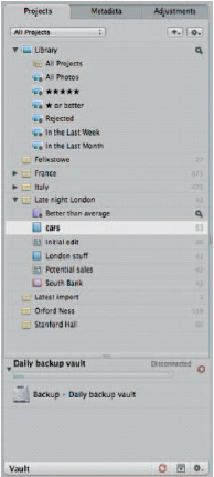
Fig. 2.3 The Projects Inspector organizes not only Projects, but also folders, Albums, Smart Albums and the products you make with your images, such as Web pages, Galleries, Journals and Books.
Digital Masters and Versions
Every photo you import into Aperture is a Digital Master. Regardless of the format, it is considered sacred within the application and will never be touched by any of the editing tools at your disposal. Even cropped images still exist in their original format in the directory structure we described above; so that should you suffer a serious drive corruption after which Aperture can no longer open your Library itself, you can still go back and manually copy the images yourself. This assumes, of course, that the drive hasn’t failed, in which case you may need to employ the services of expensive data recovery specialists.
Fig. 2.4 Whenever you make an adjustment to a Digital Master, Aperture creates a new Version. This sports a numeric badge, which shows how many Versions of the picture exist in your Library.
When you use the Adjustments panel to edit an image for the first time, Aperture creates what it calls a Version. It will then show a small numeric icon in the corner of the original showing how many Versions (including the Master) it now holds in its Library. Digital Masters and their Versions are organized into Stacks, which can be expanded and contracted by clicking on an icon, called the Stack button. A detailed section on Stacks starts on p. 55 (Fig. 2.4).
The Browser – the strip running along the bottom of the screen – shows your imported images as either a series of thumbnails (in grid or film strip view) or a detailed list of files, similar to the Finder in Mac OS X. When shown as thumbnails, they are displayed as icons at the size you specify using the slider at the bottom of the Aperture interface, and each Stack is outlined using a thick gray border. In the list view, Versions are organized within a folder that takes the name of the original image. It doesn’t look like a folder as it also sports the Digital Master’s shooting metadata, but a disclosure triangle in the margin betrays its true purpose, and, in this respect, it works just like folders in the Finder.
If you have already made some edits to a photo and want to make another copy to be able to try an alternative set of adjustments, you have two options. ![]()
![]() will copy the currently selected Version and all of its adjustments to a new Version in the Stack, allowing you to pick up further adjustments from the point you have already reached without doing further edits to what could already be a perfectly tweaked Version.
will copy the currently selected Version and all of its adjustments to a new Version in the Stack, allowing you to pick up further adjustments from the point you have already reached without doing further edits to what could already be a perfectly tweaked Version. ![]()
![]() , meanwhile, creates a fresh copy of the original, untouched image, allowing you to start making adjustments from scratch giving you two distinct Versions that you can then go on to compare side by side. Whichever you choose, the resulting copy will be added to the current Stack.
, meanwhile, creates a fresh copy of the original, untouched image, allowing you to start making adjustments from scratch giving you two distinct Versions that you can then go on to compare side by side. Whichever you choose, the resulting copy will be added to the current Stack.
Versions can be treated in exactly the same way as Masters; you can print, copy, duplicate and export them. They can be rated separately from the original, you can have as many subsequent editions as you like, and you can use any one of them, or indeed several editions of the same Master, in a single Book, Gallery, Light Table, Web page or Journal.
Projects Inspector
The Projects Inspector is where you will do most of your organization. It shows top-level folders, Projects and the products you’re making with your images, such as Light Tables, Galleries and Books. It doesn’t show individual images as these are organized through the Browser, which sits below or to one side of the Viewer.
The Projects Inspector is pre-filled with smart folders that organize your images by rating or date, to which you can add your own Projects, Albums, Smart Albums, Books, Light Tables, Web galleries, Web journals and Web pages.
Adding too many items to the Inspector can lead to an oversized and unwieldy list in which the contents scroll beyond the bottom of the screen. This is where the All Projects drop-down comes into play. Located immediately above the pre-determined Smart Albums, it lets you display all your Projects, Albums, and so on (the default), or strip down the listing to just your favorite entries, or those you would have used recently. This latter option is particularly handy if you have a single assignment on the go to which you’ll be returning frequently without using any of your other resources.
The combined Projects, Metadata and Adjustments panel can be quickly hidden and revealed by clicking the Inspector button on the main toolbar or using the keyboard shortcut ‘![]() ’. This is particularly useful when working on a small screen, such as a 13-inch MacBook. In this instance, the same collection of inspector panels can be used through an HUD, called up by tapping ‘
’. This is particularly useful when working on a small screen, such as a 13-inch MacBook. In this instance, the same collection of inspector panels can be used through an HUD, called up by tapping ‘![]() ’ with an image selected (Fig. 2.5).
’ with an image selected (Fig. 2.5).
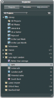
Fig. 2.5 Many elements of the Aperture interface are duplicated in the form of HUDs, including the Inspector, containing the Projects, Metadata and Adjustments panels.
Browser
The Browser is the panel through which you organize your photos and files. It works in tandem with the Projects panel, and shows the images displayed inside each Project, Web Album, folder, and so on (Fig. 2.6).
It can display your images in two ways: either as thumbnails organized in a grid formation (![]()
![]() ), or as a list of files (
), or as a list of files (![]()
![]() ) accompanied by supplementary metadata showing key attributes including aperture, shutter speed, creation data and focal length. You can sort any of these attributes by clicking the header above each column. Clicking a selected column header for a second time reverses the sorting order. So, clicking the ISO column once will sort your images in order of increasing sensitivity – say, from 100 ISO to 1600 ISO – while tapping it for a second time would sort it in order of decreasing sensitivity. Depending how you use this feature, it could let you quickly identify underexposed or grainy images, depending on which end of the scale is uppermost.
) accompanied by supplementary metadata showing key attributes including aperture, shutter speed, creation data and focal length. You can sort any of these attributes by clicking the header above each column. Clicking a selected column header for a second time reverses the sorting order. So, clicking the ISO column once will sort your images in order of increasing sensitivity – say, from 100 ISO to 1600 ISO – while tapping it for a second time would sort it in order of decreasing sensitivity. Depending how you use this feature, it could let you quickly identify underexposed or grainy images, depending on which end of the scale is uppermost.
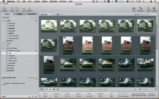
Fig. 2.6 The Browser usually appears as a strip running across the bottom of the interface, below the Viewer. However, it can also be maximized to occupy the majority of the screen for those occasions when organization and management are more important than adjustments and editing.
These sorting tools are replicated immediately above the Browser in a sorting criteria drop-down and a Sorting Order button (sporting a triangle icon). This is of less use in the list view than it is when your images are organized as a grid where you won’t have access to the column headers.
Dragging the slider at the bottom of the screen adjusts the size of the thumbnails displayed in any Browser view allowing you to get the best of both worlds by selecting the list view and maximizing the thumbnails. The results won’t be as large as they are in the grid view, but they are perfectly serviceable.
Fig. 2.7 The Toolbar runs across the top of the Aperture interface, just as it does in most applications, and is home to some of the application’s most commonly used functions, including Project creation, and calling up the Loupe.
Toolbar
The Toolbar runs across the top of the Aperture interface, just as it does in Word, Excel, Finder windows in Mac OS X and in most mainstream applications. Its importance has been greatly reduced in Aperture 2; for while it was once used to open and close panels, rotate, crop and straighten images, fix red eye and apply selective patches to your work, it has benefited from a radical slimming down, and now focuses on core features (Fig. 2.7).
The first icon on the Toolbar – Inspector – hides and shows the combined Properties, Metadata and Adjustments panel on the left of the interface. The blue arrow to the right of this opens the Import tool to add photos to your Library. Technically, you could do the same by inserting a media card into an attached reader or connecting a camera (assuming you have Mac OS X set to treat Aperture as the default application for handling incoming photos), but by manually invoking the Import tool you could also add images from internal or external drives and network stores.
Controlling Image Imports
If you would rather not have Aperture pop up every time you insert a memory card, perhaps because you’d rather store your images in iPhoto or save them directly to a backed-up network drive, its auto appearance can be disabled in the operating system. It will then be up to you to manually invoke the Import command in whichever application you choose.
To disable Aperture’s automatic appearance, or activate the same if iPhoto or another application appears each time you insert a card or connect a camera, open Aperture’s Preferences (![]()
![]() ) and change the setting beside ‘When camera is connected, open:’ using the drop-down menu, selecting Aperture or ‘No Application’ as appropriate (Fig. 2.8).
) and change the setting beside ‘When camera is connected, open:’ using the drop-down menu, selecting Aperture or ‘No Application’ as appropriate (Fig. 2.8).
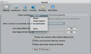
Fig. 2.8 Control what happens when you plug in a camera or insert a card into a media reader by specifying whether Aperture, an alternative or no application at all should launch.
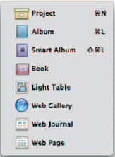
Fig. 2.9 The New menu is your first point of call when creating Projects to contain your images, or producing creative items, like Web pages or Books.
Import and New are grouped together using dotted dividers. There is good reason for this: they work hand in hand when adding photos to your Library. If you were to click Import when the top level of your Library was selected, Aperture would automatically generate a new Project – called Untitled Project – to hold them. This is efficient as it keeps everything tidy and saves you from having loose images floating around, yet at the same time it is also far from descriptive. You can still sort using metadata keywords attached to the files at the point of import, but it is useful to also have a list of appropriately named Projects and folders in view to which you can quickly jump (Fig. 2.9).
By using the New button menu, you can generate more appropriately named Projects before importing, saving you the headache of having to retrospectively rename them.
This same menu is also where you’d turn to create Albums, Smart Albums, Books, Light Tables, Web galleries, Web journals and Web pages. The relative importance of the Projects, Albums and Smart Albums is clear from the fact that they have keyboard equivalents (![]()
![]() ,
, ![]()
![]() and
and ![]()
![]()
![]() respectively), whereas the others do not. Why? Because they are used for organizing your images and so relate to everything you do. The others are creation actions, and so will apply only to a selection of images. As ever, it’s worth getting familiar with these shortcuts as they are excellent timesavers.
respectively), whereas the others do not. Why? Because they are used for organizing your images and so relate to everything you do. The others are creation actions, and so will apply only to a selection of images. As ever, it’s worth getting familiar with these shortcuts as they are excellent timesavers.
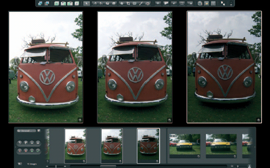
Fig. 2.10 Aperture’s Full Screen mode lets you devote every available pixel to the task of editing your photos. The film strip at the bottom of the screen, and the Toolbar at the top can both be set to automatically slide off the screen as your mouse moves away from them.
Equally useful are the shortcuts that duplicate the Toolbar’s View and Full Screen buttons. V cycles through the three options in the View menu switching between Browser only (your thumbnails or file list), Viewer only (the selected image) and a combination of the two. These views always appear within the Aperture interface with the menu, Inspectors and borders in place. To devote the whole of your screen to your images, tap ‘![]() ’ or click the Toolbar’s Full Screen button. This fades away the Aperture interface and switches to a black background allowing you to focus all of your attention on the image in hand (Fig. 2.10).
’ or click the Toolbar’s Full Screen button. This fades away the Aperture interface and switches to a black background allowing you to focus all of your attention on the image in hand (Fig. 2.10).
The Loupe, the Toolbar’s penultimate feature, is one of Aperture’s most radical tools. It lets you examine an open image at up to 1600% magnification or, if you drag it over your thumbnails, view parts of them at higher zoom levels without fully opening them. More usefully, it will optionally display a crosshair at the center of its lens, detailing the individual color values of the center-most pixel (Figs 2.11 and 2.12).
Fig. 2.11 The Loupe lets you examine details in photos and thumbnails at up to 1600% magnification while maintaining an overall view on the rest of the screen.
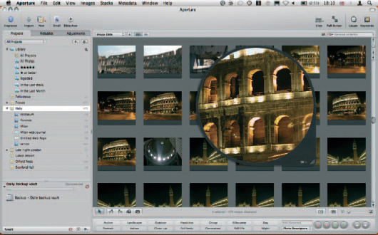
Fig. 2.12 The Loupe lets you examine details in photos and thumbnails at up to 1600% magnification while maintaining an overall view on the rest of the screen.
Dragging the Loupe around by its gray border is somewhat imprecise, so Apple has provided a second, more accurate way to position this tool. Click and hold in the center of its lens and you’ll see that a thick white circle will shrink down to the mouse point. Drag this to its new position and let go to have the Loupe zoom the circle until it fills the tool’s full frame.
The Loupe can sometimes be restrictive, showing less than you would want at any time. Tapping ![]() at any time therefore toggles the selected image between fitting in the viewer, and zooming to 100% magnification.
at any time therefore toggles the selected image between fitting in the viewer, and zooming to 100% magnification.
It’s unlikely you’ll fit the whole image on screen at this level, in which case you’ll have to drag it around by moving the small red rectangle in the semi-opaque box that overlays the picture. This box indicates the visible portion within the whole image. If you prefer to mimic Photoshop’s Drag tool, hold ![]() while dragging on the image itself for more accurate positioning.
while dragging on the image itself for more accurate positioning.
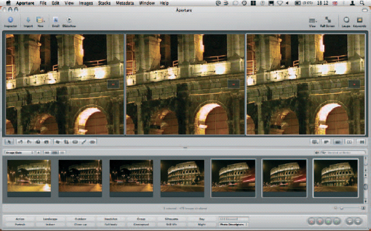
Fig. 2.13 Using the Zoom tool with several images opened side by side lets you compare fine details on each one when making your initial judgements.
The Zoom tool can be combined with other View modes. Tapping ![]() while in three-up view will, subject to your Mac being fitted with sufficient Ram to handle the images, show all three images at 100% zoom side by side, which is an excellent way to compare particular parts of different Versions of a Digital Master. Once zoomed, you can scroll the images simultaneously by holding
while in three-up view will, subject to your Mac being fitted with sufficient Ram to handle the images, show all three images at 100% zoom side by side, which is an excellent way to compare particular parts of different Versions of a Digital Master. Once zoomed, you can scroll the images simultaneously by holding ![]() and the
and the ![]() and then dragging with the mouse (Fig. 2.13).
and then dragging with the mouse (Fig. 2.13).
This leaves only the Keywords HUD – the right-most button on the toolbar. In its default state, this displays all the keywords in the system database that were added either when an image was imported, or when it was already in use. These keywords are persistent, and will remain in the database even if their associated images have since been removed. The Keywords HUD is the panel through which you can import and export keywords, organize them into logical folders, and apply them to thumbnails and images by dragging them from the palette onto the pictures themselves (Fig. 2.14).
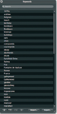
Fig. 2.14 The Keywords HUD is the place to turn when you want to recycle tags you have already applied to one image and place them on another. From here you can also add new keywords and organize those already in your Library.
If you have been using Aperture since its first appearance, you may find the new slimmed-down Toolbar to be rather too svelte for your needs. Likewise, if there are a small handful of tasks that you perform on a regular basis that aren’t represented in its default state then you may feel that the Toolbar is more form than function. In this case, you can customize it by right-clicking on any blank area of the Toolbar and choosing Customize Toolbar and then dragging optional elements onto the bar itself. To reset it after making changes, drag the default set back onto the bar and it will replace any additions you have made.
Control Bar and Keyword Controls
The Control Bar exists to help you organize your workspace more efficiently, and has just a few features that impact directly on your images. It’s hidden by default, but revealed (and subsequently re-hidden) by tapping ‘![]() ’, which when combined with
’, which when combined with ![]() , will also show and hide the Keywords tool allowing you to quickly add pre-defined keywords to your images to make searching more efficient. It sits at the bottom of the screen.
, will also show and hide the Keywords tool allowing you to quickly add pre-defined keywords to your images to make searching more efficient. It sits at the bottom of the screen.
The Control Bar lets you manage your journey through the images in your current project and, like most of the other features in the application, can be bypassed once you’ve taken the time to learn some simple keyboard shortcuts.
It has been considerably slimmed down in Aperture 2; although the dedicated buttons for some of its former tasks may have disappeared, the keyboard shortcuts still languish within the application. Getting to know them can dramatically increase the speed at which you manage your Library.
Once you can work without reference to the Control Bar, your productivity will increase exponentially. It is fortunate that in all cases Apple has chosen logical keyboard shortcuts to represent each function performed by the different parts of the bar. If you are to learn the mouse-free operation of just one part of Aperture, make it this one.
Navigating Your Photos Using the Control Bar
The two simplest buttons on the Control Bar are the white forwards and backwards arrows. These move one step in either direction through the images in the currently selected Project, folder, Album or Smart Album, even if the Browser is hidden.
Combining these buttons with ![]() ,
, ![]() and
and ![]() lets you use them in a more intelligent way to view and compare several images at once. Here, switching from clicking the buttons to using the
lets you use them in a more intelligent way to view and compare several images at once. Here, switching from clicking the buttons to using the ![]() and
and ![]() cursor keys on your keyboard pays dividends.
cursor keys on your keyboard pays dividends.
![]()
![]() and
and ![]()
![]() keeps the current image selected and adds the next or previous picture to the selection, displaying them side by side in the Viewer. Making further movements in either direction adds further images to the collection shown in the Viewer. Displaying several images side by side in this way lets you make adjustments to any one of them while comparing it with others in the collection, thereby easing the task of matching colors, brightness and simulated exposure across multiple related images.
keeps the current image selected and adds the next or previous picture to the selection, displaying them side by side in the Viewer. Making further movements in either direction adds further images to the collection shown in the Viewer. Displaying several images side by side in this way lets you make adjustments to any one of them while comparing it with others in the collection, thereby easing the task of matching colors, brightness and simulated exposure across multiple related images.
The image in any selection of this sort to which Aperture will apply any adjustments you make has a thick white border. Letting go of the ![]() key and using the arrow keys to move back and forth through the selection will move this border, and thus change the image to which the adjustments will be applied.
key and using the arrow keys to move back and forth through the selection will move this border, and thus change the image to which the adjustments will be applied.
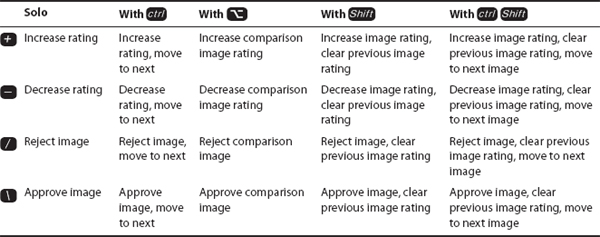
However, some features apply across all selected images at once. Notable among them are changes to the metadata and star ratings. Using ‘![]() ’ and ‘
’ and ‘![]() ’ to increase and decrease ratings while you have multiple images selected at one time in this way will apply the changes to every image in the selection. The changes are relative to their existing rating; so if you have three images, out of which one is an unrated one while the other two are rated 2 and 5 respectively, then tapping ‘
’ to increase and decrease ratings while you have multiple images selected at one time in this way will apply the changes to every image in the selection. The changes are relative to their existing rating; so if you have three images, out of which one is an unrated one while the other two are rated 2 and 5 respectively, then tapping ‘![]() ’ once will give one star to the unrated image and the two-star image would have its rating increased to three, but the five star image would see its rating unchanged as it was already rated the highest.
’ once will give one star to the unrated image and the two-star image would have its rating increased to three, but the five star image would see its rating unchanged as it was already rated the highest.
The inverse is also true. Tapping ‘![]() ’ instead of ‘
’ instead of ‘![]() ’ would have decreased every image’s existing rating by one star, so that the unrated star is rejected. It would then appear in the Rejected Smart Album at the top of the Projects pane.
’ would have decreased every image’s existing rating by one star, so that the unrated star is rejected. It would then appear in the Rejected Smart Album at the top of the Projects pane.
You could compare your images in a similar way, which we’ll explore later.
Rating and Sorting Images with the Control Bar
The rating and sorting controls are among the Control Bar’s most complex tools. This is because Apple has managed to cram an enormous number of features into each one using a series of combined modifiers. Fortunately, the system is logical and regular throughout each one, so if you’d rather learn how to perform the same tasks on the keyboard, rather than using the mouse, you need learn only four shortcuts along with their five modifiers.
Rating images should be your first task after they are imported. It helps you quickly sort the good from the average, and the average from the bad, and then concentrate your efforts on only the best material from any session.
Ratings run on a scale of one to five, and are applied using the numbers ![]() to
to ![]() on the keyboard. They can also be applied comparatively using the green and red Up and Down buttons on the Control Bar, which respectively increases and decreases a picture’s rating from its current setting. The same can be achieved on the keyboard using either ‘
on the keyboard. They can also be applied comparatively using the green and red Up and Down buttons on the Control Bar, which respectively increases and decreases a picture’s rating from its current setting. The same can be achieved on the keyboard using either ‘![]() ’ or ‘
’ or ‘![]() ’ to increase the rating and ‘
’ to increase the rating and ‘![]() ’ to reduce it, while combining these with the
’ to reduce it, while combining these with the ![]() key will increase or decrease the rating of the image by one point and then move on to the next image in the Browser or selected range.
key will increase or decrease the rating of the image by one point and then move on to the next image in the Browser or selected range.
Images can be rejected outright using the Control Bar’s red cross, and given a five-star rating using the green tick or, on the keyboard, using ![]() on the numeric keypad (if you have one) and
on the numeric keypad (if you have one) and ![]() on the keyboard respectively. Once rated, they appear in the appropriate Smart folder at the top of the Projects pane.
on the keyboard respectively. Once rated, they appear in the appropriate Smart folder at the top of the Projects pane.
Rating is often done in a linear fashion, where we move backwards and forwards through the photos from our latest shoot and rate them in turn. As such, each is rated before you have seen what comes next, and so you can often find that the next picture is better than the one you have just rated. Combining ![]() rather than
rather than ![]() with ‘
with ‘![]() ’, ‘
’, ‘![]() ’ or ‘
’ or ‘![]() ’ will apply a rating change to your current image and simultaneously remove the rating applied to the previous one, while holding
’ will apply a rating change to your current image and simultaneously remove the rating applied to the previous one, while holding ![]()
![]() and using the relevant rating increment command will perform three tasks at once. First, it will clear the previous image rating; second, it will increment the rating of the current image either up or down; and third, it will move on to the next.
and using the relevant rating increment command will perform three tasks at once. First, it will clear the previous image rating; second, it will increment the rating of the current image either up or down; and third, it will move on to the next.
This is an effective, but slightly messy way to work. You should always be rating images from a shoot on the basis of how they compare to the other images taken at the same time, and this is best done when comparing them side by side.
By tapping ![]() when viewing an image, you’ll set it as the comparison reference item. It will shift to one side of the Viewer and take on a green border. You can now click or move through other photos in your Library using the arrow keys or mouse and see each one lined up against the reference shot. Using the standard ratings keys outlined above, you can then mark each image against the reference shot, but at the same time increase or decrease the reference shot rating by holding down the modifier
when viewing an image, you’ll set it as the comparison reference item. It will shift to one side of the Viewer and take on a green border. You can now click or move through other photos in your Library using the arrow keys or mouse and see each one lined up against the reference shot. Using the standard ratings keys outlined above, you can then mark each image against the reference shot, but at the same time increase or decrease the reference shot rating by holding down the modifier ![]() , so while ‘
, so while ‘![]() ’ would increase the rating of the currently selected image (outlined in white), ‘
’ would increase the rating of the currently selected image (outlined in white), ‘![]()
![]() ’ would increase that of the reference shot against which you are comparing everything (outlined in green). ‘
’ would increase that of the reference shot against which you are comparing everything (outlined in green). ‘![]()
![]() ’ and ‘
’ and ‘![]() ’ on its own would perform their respective functions in the same way.
’ on its own would perform their respective functions in the same way.
When you have finished comparing your images, ![]()
![]() takes you back out of Compare mode. The most recently selected image will take center stage, and can then be used as a reference point for future comparison by immediately hitting
takes you back out of Compare mode. The most recently selected image will take center stage, and can then be used as a reference point for future comparison by immediately hitting ![]() again.
again.
So, the modifiers you need to remember are ![]() ,
, ![]() ,
, ![]() and
and ![]() . Combine them with ‘
. Combine them with ‘![]() ’ and ‘
’ and ‘![]() ’ to step through your ratings, and the
’ to step through your ratings, and the ![]() and
and ![]() slashes, and you have a total of 20 rating functions at your fingertips.
slashes, and you have a total of 20 rating functions at your fingertips.
Selecting and Displaying Images Using the Viewer Toolbar
The Viewer Toolbar sits just below the main area for displaying your images. It is split equally between editing tools and viewing tools. The former, which sit at the left-hand end of the bar, lets you straighten, rotate and crop your images, and perform some of the simpler traditional ‘editing’ techniques, which in many cases are duplicated in the Adjustments Inspector. The latter, which sits at the right-hand end, controls how your images are displayed (Fig. 2.15).
The first of these buttons, showing a screen icon, controls how images selected in the Browser will be shown in the Viewer, allowing you to switch between single- and multi-image configurations. You will spend most of your time with this setting at Multi, which will display any number of images when selected in the Browser (or a single image if you have selected only one). This is limited by the resolution of your screen. On a MacBook, for example, with the Inspector, Browser and Viewer activated, Aperture will show around 12 images within the Viewer before lopping off those it can’t fit. If you select a 13th, both this and the 12th will disappear to make room for 11 thumbnails and a note saying ‘and 2 more…’. Carry on with this and the number will simply increase.
There are five possible viewing modes in this menu: Multi, Primary, Three Up, Compare and Stack. The shortcuts for each are easy to remember, either because they are ![]() plus the second letter of each one (
plus the second letter of each one (![]() ,
, ![]() ,
, ![]() ,
, ![]() and
and ![]() ), or because taken together they seem to spell out You Are Hot in text speak.
), or because taken together they seem to spell out You Are Hot in text speak.
Each of these display modes helps you to compare a number of images side by side, thus filtering down the results of your latest shoot to just the best of the best (Fig. 2.16).
Multi: View one or more images on the screen at any time. This is the most common mode in which you will work. Adjustments will be applied to images one at a time, even if you have more than one image on display, with the image to which the adjustments will be made indicated by a thicker white border.
![]()
Fig. 2.15 The Viewer Toolbar performs some basic edits to your images, but is best used to organize the way in which they are displayed in the Viewer.
Primary: Lets you select several images to make changes, but displays only the primary one of the selection in the Viewer.
Three Up: The viewer will always show three images in a row – the selected image in the center and, on either side, the images that come before and after it. If you have selected the first image in a Project, folder or Album then you will see only that and the one that follows. If you have selected the last then you will see only that and the one that preceded it.
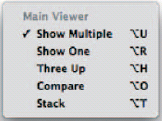
Fig. 2.16 The Viewing Modes menu lets you switch between five different ways of displaying your images on screen. Each has a particular purpose, determined by the task you want to accomplish.
Compare: Press ![]() to select a reference image against which you want to compare other images in your Library, or press
to select a reference image against which you want to compare other images in your Library, or press ![]()
![]() to enter the Compare view. As you scroll through the images in the Browser they will be lined up, in turn, beside the reference image so that you can rate them against each other. When you find the one you judge to be better than the reference image, hit
to enter the Compare view. As you scroll through the images in the Browser they will be lined up, in turn, beside the reference image so that you can rate them against each other. When you find the one you judge to be better than the reference image, hit ![]() again to make it the new reference image and then continue moving through the Library to complete your comparison. You can compare several images against the reference frame by holding
again to make it the new reference image and then continue moving through the Library to complete your comparison. You can compare several images against the reference frame by holding ![]() while clicking them in the Browser.
while clicking them in the Browser.
Stack: Aperture will automatically open all the images in a Stack, side by side. The pick image – the one you have set to act as the representative for the Stack, and which will be used in photo books – will be used as a reference image against which you will compare the other images in the Stack. This lets you pick the very best image in any Stack and promote it over all of the others so that it is used in the products you create in Aperture.
If you have two monitors connected to your system, or you are running an iMac or a notebook Mac, all of which have an integrated screen and to which you can connect a second display, then you can take advantage of the extra space this will offer by using both simultaneously within Aperture.
Each display can be set up separately, and you can specify from the same menu what each one should show. The options outlined above will always remain true for the primary display, but the secondary viewer gives you the options for Mirror, Alternate, Span, Blank, or Desktop.
Mirror: As when you are giving a presentation using a notebook and a projector, this displays a similar – although not quite identical – view on the primary and secondary displays. The primary display shows the usual Aperture interface, including any selected images, while those same selected images are shown on the secondary display.
Alternate: This option displays the current image on the secondary viewer allowing you to maximize your editing space while devoting the whole of your primary display to the Aperture application interface.
Span: Displays multiple images on both monitors, splitting the number of open images as evenly as possible. This is particularly useful when you are using the Compare view, as you can display both your reference and comparison images as large as possible on separate screens. If you decide to do this, it is important to ensure that both screens are properly color-managed so that the output of each is properly comparable.
Blank: Pick this option if you want to reduce distractions by displaying an empty black screen on the secondary display.
Desktop: Although this name suggests that you will only be able to view your Mac’s desktop on the secondary screen with this option selected, it is misleading. It actually confines Aperture to just one monitor even if you’re running in Full Screen mode, and lets you use the other monitor for alternative applications.
To the right of the View menu, you’ll see a negative strip – the Show Master button (shortcut ![]() ). This switches back and forth between the Version you’re working on and the Digital Master from which it was created, effectively removing all of your adjustments to give you a quick view of the original to see whether your work is having the effect you want.
). This switches back and forth between the Version you’re working on and the Digital Master from which it was created, effectively removing all of your adjustments to give you a quick view of the original to see whether your work is having the effect you want.
Beside this, the Zoom button, which shows your image at 100%, is replicated by the shortcut ![]() . To its right, there are Primary Only, which has no shortcut, and Quick Preview (shortcut
. To its right, there are Primary Only, which has no shortcut, and Quick Preview (shortcut ![]() ).
).
Primary Only restricts the number of images you’ll work on when you have selected several of them at once. By dragging a selection around several images in a Browser, or ![]() or
or ![]() clicking more than one, you can move several images into the Viewer at one time. In this way you can batch-develop them simultaneously by applying adjustments across the whole selection rather than just one at a time. However, while this is perfect for initial editing, where you may need to correct a color cast or exposure problem across a whole session of photos, it is no good for making individual tweaks that would fix problems in just one.
clicking more than one, you can move several images into the Viewer at one time. In this way you can batch-develop them simultaneously by applying adjustments across the whole selection rather than just one at a time. However, while this is perfect for initial editing, where you may need to correct a color cast or exposure problem across a whole session of photos, it is no good for making individual tweaks that would fix problems in just one.
To save you from deselecting all of your chosen images, making the change to the one in question and then re-selecting, toggling Primary Only means your edits will apply only to the image in your selection sporting a thicker white border. This is known – as the name might suggest –the primary image.
You can change the primary image in a selected group by clicking it with the mouse – in either the Browser or the Viewer – or by moving the border selection around using the cursor keys (Fig. 2.17).
Once your change has been made you can go back to editing the primary photo as part of a group by switching off the toggle again.
Quick Preview (shortcut ![]() ) temporarily ignores the original files that make up your Digital Masters and Versions; instead it reads only the compressed JPEG previews stored beside each one in the Library package. These are of a lower quality, but they also take up less space on disk, and so load more quickly. This lets you skip through a large collection of images quickly, while displaying each of them in the Viewer rather than just the Browser. You can not make adjustments in this mode, and so Aperture displays a Quick Preview line below the image in the Viewer, and highlights its selection in the Browser with a yellow background. You can, however, make changes to the metadata (Fig. 2.18).
) temporarily ignores the original files that make up your Digital Masters and Versions; instead it reads only the compressed JPEG previews stored beside each one in the Library package. These are of a lower quality, but they also take up less space on disk, and so load more quickly. This lets you skip through a large collection of images quickly, while displaying each of them in the Viewer rather than just the Browser. You can not make adjustments in this mode, and so Aperture displays a Quick Preview line below the image in the Viewer, and highlights its selection in the Browser with a yellow background. You can, however, make changes to the metadata (Fig. 2.18).
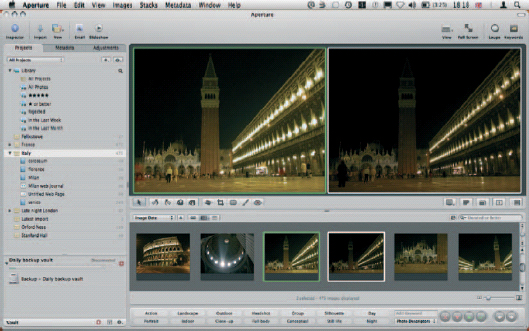
Fig. 2.17 When comparing images, the reference photo is always indicated by a green border. This will be pinned open and compared against a sequence of images from the Browser, each of which is bordered in white.
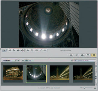
Fig. 2.18 When working in Quick Preview mode, Aperture applies a yellow border to your image, in both the Viewer and the Browser, and details the mode on the Viewer toolbar, to warn you that it is emulating your output device on screen.
That is the last of the buttons that control the way Aperture displays and selects your images. You’ll soon realize that these features will be among the most often used in the application, and so it pays to learn their shortcuts early on, to save you excessive mousing time.
Full-Screen and Dual-Screen Mode
Aperture comes into its own when given room to breathe. While it’s happy running on a MacBook or MacBook Pro for quick-and-dirty photo selections on the road, you’ll work faster and more productively with two screens, or at the very least a large wide display you can devote entirely to the application.
Switching to Full Screen mode removes most of the toolbars and control panels, and maximizes your image on screen. The Browser becomes a thumbnail-based strip running along the bottom of the display, which can be set to automatically hide using ‘![]()
![]() ’. If set to hide, it will reappear when you move the mouse to the bottom of the screen, at which point the image will shrink to remain fully visible.
’. If set to hide, it will reappear when you move the mouse to the bottom of the screen, at which point the image will shrink to remain fully visible.
Likewise, by default, the Toolbar at the top of the screen remains visible at all times, but can be set to Auto Hide by moving the slider on the furthest right of the bar – the toggle for ‘Always show toolbar’.
Adjustments and Metadata Inspectors
The Adjustments and Metadata Inspectors sit behind the Projects panel. They differ slightly from the Projects panel in that while that pane focuses purely on management, the Adjustments and Metadata Inspectors make virtual changes to the files themselves, writing these to the Aperture Library so that they remain associated with each Digital Master. Obviously, you can’t see any changes you make to the metadata, unless you’re looking at them in the Inspector itself, but any changes you make here are used by the application to control how they are filed. They also form the basis of filtering decisions made by Smart Folders.
The Adjustments Inspector
The Adjustments Inspector can be displayed either within the unified Aperture interface, or as an HUD. It is split into sections that can be expanded and collapsed using disclosure triangles so that you can focus only on the edits you need to make. You’ll notice that whenever you make an adjustment the check box beside that part of the Adjustments Inspector’s name – say, Exposure, Levels or Enhance, for example – will be ticked. By clearing the box you can quickly remove the adjustment and so reset your image. You can also undo the adjustment, but leave that part of the panel active, by clicking the backward-curling Undo arrow to the right of its name (Fig. 2.19).
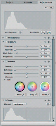
Fig. 2.19 The Adjustments Inspector lets you apply non-destructive edits to your photos. Each one is applied photo-wide, and can be removed by clearing the check box beside each section’s name.
If you find yourself applying the same change several times across multiple Projects, it makes sense to save it as a preset. This way you can come back to it every time you need to use it, and be sure that you are always applying the adjustment at the same level. This would be particularly useful in a studio environment where you are unable to block out all of the available natural light. In a situation such as this, the color temperature will change over the course of the day – even with studio lighting in place – and you may want to create a series of presets to account for these changes throughout the course of the day. Each one would be given a plain English name, like morning light correction, afternoon light correction and evening light correction.
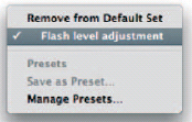
Fig. 2.20 If you find yourself applying the same adjustments to several images, you can save your settings as a preset to ensure that you make the same tweak every time you edit a photo taken under the same conditions.
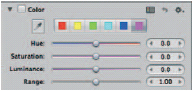
Fig. 2.21
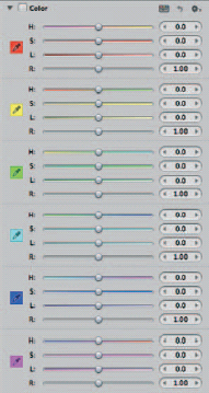
Fig. 2.21 & 2.22 Several components of the Adjustments Inspector have standard and expanded views. A classic example is the color component, which caters for regular and advanced needs.
Presets are created by making your adjustment and then clicking on the cog on the right of the relevant section of the Adjustments Inspector and picking Save as Preset. You’ll then be given an opportunity to name it, after which it will appear on the same menu under a Presets sub-heading (Fig. 2.20).
Some panes on the Adjustments Inspector have two levels of disclosure: fully closed, which is their default state, and an extended version that gives you access to a wider range of adjustments. The Color pane is a prime example. By default it gives you access to hue, saturation, luminance and range sliders with an eyedropper for sampling from the active image and buttons for the principal subtractive and additive colors (red, green, blue, cyan, magenta and yellow). However, clicking the Switch to Expanded View button to the left of the curled Undo arrow shows a far larger dialog giving you simultaneous access to the Hue, Saturation, Luminance and Range sliders for every principal tone side by side to save you from clicking back and forth between them (Figs 2.21 and 2.22).
The Adjustments panel is also where you’ll crop, fix red eye and straighten your images. These panes, along with up to 19 others, are hidden by default, but can be added to the Adjustments panel through the menu on the ‘+’ button just above the Levels pane. All of these panes are replicated in the HUD version of the Adjustments Inspector.
The Metadata Inspector
The Metadata Inspector displays everything Aperture knows about your images. This information is used to file and filter your assets, and also to assign rights and captions in the output. Some of it is generated automatically based on the attributes of the photo, other parts are written by your camera at the time of capture, and the remainder is input by yourself, either at the point of importing the pictures into your Library, or over time as you work with them.
As with other panels in Aperture, its views can be extensively customized allowing you to cycle through a large quantity of information in a relatively small area.
One of the most extensive Metadata views is that afforded by selecting ‘All IPTC’ (International Press Telecommunications Council) from the pop-up menu at the top of the pane. IPTC oversees standards for transferring information between photographers and publishers. However, this is overkill in most situations, and so it pays to selectively choose subsets of this information by cycling through other options in the pop-up.
The options available here – called views – can be streamlined by deleting those you don’t use through Manage Views on the Shortcut menu. You can add your own views using the same menu.
Adding and Editing Views in the Metadata Panel
Each view needs a name which will appear in the pop-up menu that lets you switch between views shipped with the application. Your own views will appear at the bottom of the menu by default, but you can rearrange them through the Manage option on the Shortcut menu.
Once you have named your view, you can start adding attributes to be displayed whenever that view is selected by checking the boxes beside the various tag names at the bottom of the Metadata Inspector. These are split into various common sections defined by the keywords, Exif, IPTC, Other and Archive tags at the bottom of the dialog. Some, such as camera make, model, the year the picture was taken, and so on, will be pre-populated as shown in the Value column, so you can immediately see what changes will be made to the Metadata view of each image by checking those tags’ boxes. This is a live view of the data in your system, which will change as you select another image (Fig. 2.23).
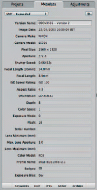
Fig. 2.23 A lot of the metadata attached to your photos is written by your camera at the point you took the picture. This records shooting conditions and camera settings, and is completely searchable.
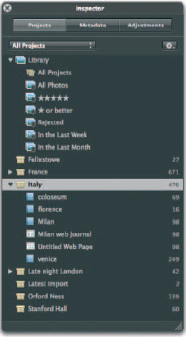
Fig. 2.24 The Projects Inspector is home to far more than just Projects, as it is also the place where you create and organize folders, Smart folders, Albums, Books, Light Tables, Web galleries, pages and Journals.
To remove a tag from the view, simply click the negative button to the right of its variable box in the view’s main area. To finish editing the view, drag the divider between the view and the tags down to the bottom of the screen or use the shortcut ‘![]()
![]() ’, at which point the negative bars will disappear.
’, at which point the negative bars will disappear.
The same principle applies to editing existing views. Either tap ‘![]()
![]() ’ and pick the Edit option from the Shortcut menu or press one of the Tag Category buttons at the foot of the dialog to open the lists of available tags.
’ and pick the Edit option from the Shortcut menu or press one of the Tag Category buttons at the foot of the dialog to open the lists of available tags.
Organising Images
Aperture uses folders, Albums, Smart Albums and Projects for organizing your images, and it’s not immediately clear how each works; the differences are subtle (Fig. 2.24).
Folders
Folders work in exactly the same way as they do in the Finder, and look like the Mac OS X equivalent. They are blue tabbed containers for the other files and collections in your Aperture Library. However, they can only contain Albums, Smart Albums, other folders and Projects; not images themselves. As such, think of them as handy dividers, or bookmarks that let you skip to a particular collection.
Their use is solely to keep related work together, and to allow you to collapse long lists of elements so that they take up less space in the Project panel. They are your only navigational tool – as opposed to search and indexing tool – so maximise their potential by using sub-folders inside main folders. For example, a Europe folder may contain Projects for Hungary, Spain and France; sub-folders for Paris, Lyon and Marseilles inside France; and further sub-folders for architecture, churches and people inside the Paris folder. You can now expand and contract each one, thus navigating through your folder structure without having the Project pane so long that it scrolls off the bottom of the screen.
Clicking on a folder will always show the contents of every element it contains, so if you couldn’t remember whether you’d put Notre Dame cathedral in the Parisian architecture or churches folder, clicking on Paris would show you the contents of both, along with those pictures filed inside ‘people. Clicking France would show you all pictures filed under Paris, Lyon, or Marseilles, regardless of how far down they were buried within any further sub-folders, while clicking on Europe would show all pictures from the three named countries, the cities within them and the folders, Albums, Smart Albums and Projects within.
Folders may look like dumb containers but – used wisely – are actually powerful filtering tools.
Projects
Projects are the first layer inside your folder, and they contain all of your images and the work you are doing on them. Such work could include Web galleries, Contact Sheets, Light Tables, or Books. The closest equivalent elsewhere on the Mac would be a directory in the Finder, which can lead to some confusion with folders in Aperture which, as we have seen, work in a very different way. Folders in Aperture are repositories for the products in which you use your photos, never your photos themselves.
Masters and Versions
Your Projects will contain two types of image, and neither is defined by the format in which it is shot. Known as Digital Masters and Versions, the latter is a copy of your original – the Digital Master – to which you have made some edits.
Regardless of the changes you make to the images in your Projects, Aperture will always preserve your originals. This allows you to experiment and refine your results to an infinite degree, safe in the knowledge that should you take things one step too far you can roll back to the original picture.
Digital Masters are effectively the negatives from which all successive images are developed. These derivative images are called Versions.
Stacks
You can have an unlimited number of Versions of any Digital Master, and by default they will be organized into Stacks. This is Aperture’s way of keeping things tidy by piling up images so your workspace doesn’t get too cluttered. In the Grid view they will be displayed side by side, but by switching to the List view you’ll see that an icon of the original is shown, alongside which there is a disclosure triangle. Clicking this shows the Digital Master and any Versions inside, with each Version given a number (Fig. 2.25).
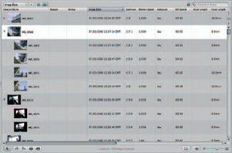
Fig. 2.25 Versions are organized into Stacks, helping you to relate derivative images to their originals. In the List view each Stack looks like a folder, accompanied by a disclosure triangle.
Each Master or Version can be exported individually, and selecting more than one at a time lets you compare them side by side in the Viewer.
Images can also be stacked automatically on the basis of how quickly they were taken in succession. Anyone with a dSLR will know how easy it is to take several pictures in quick succession with a single press of the shutter. The chances are these are very similar editions of the same scene – perhaps dogs chasing a ball, athletes jumping hurdles or kids blowing out birthday candles – and the chances are you’ll only want the one image out of ten that captures the moment you were after.
By organizing them into Stacks, Aperture lets you keep the whole sequence in one place, without having them fanned out across your workspace, thus saving screen space.
Workspace Layouts
Aperture is a great saver of screen space. However, it really flourishes when given room to breathe, and the ideal Aperture set-up is a dual-screen environment, where you can keep the main organizational guts of the application – the File Manager, Project Pane, Adjustment and Metadata panels – on a secondary screen off to one side, and have the image on which you are working maximized on the primary display directly in front of you.
Standard Workspace Layout
There are three primary interface layouts: Browser Only, Viewer Only and Browser & Viewer. Browser & Viewer is the default one and you can cycle through all three modes by tapping ‘![]() ’, or selecting them from the drop-down view menu on the Toolbar (Fig. 2.26).
’, or selecting them from the drop-down view menu on the Toolbar (Fig. 2.26).
Browser Only and Viewer Only Modes
Browser Only uses all of the space to the right of the Projects pane to browse images in any selected folders, Albums or Projects. It’s primarily used for getting an overview of the images in use, and not for editing, because the images will usually be rendered too small for you to see what you’re doing without using the Loupe or increasing the magnification, which negates the benefit of being able to see more files in one place.
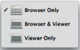
Fig. 2.26 Aperture offers three view modes to suit your specific organizational and editing needs.
Once you have identified the image with which you want to work, you should maximize the viewer to give your chosen image prominence as you make your adjustments.
Swapping and Rotating Workspaces
Workspaces can be turned through 90 degrees with ‘![]()
![]() ’, and flipped with ‘
’, and flipped with ‘![]()
![]() ’. Rotating them puts the Browser and Viewer windows side by side rather than above and below, while swapping them does exactly what the name suggests. The Project pane never moves in either of these operations, but a rotated layout of three columns rather than one column (the Projects pane) and two horizontal windows for the Viewer and Browser is better suited to single-screen use, as it allows portrait-oriented images more room to breathe (Figs 2.27 and 2.28).
’. Rotating them puts the Browser and Viewer windows side by side rather than above and below, while swapping them does exactly what the name suggests. The Project pane never moves in either of these operations, but a rotated layout of three columns rather than one column (the Projects pane) and two horizontal windows for the Viewer and Browser is better suited to single-screen use, as it allows portrait-oriented images more room to breathe (Figs 2.27 and 2.28).
Ratings and Keywords
The key to good management is an effective index. Attaching keywords to your images means you can easily search across all albums, Projects, books, Light Tables and Web galleries, and pull out every matching image. In extensive Libraries this can be a real timesaver, and when combined with ratings you can further refine your results to show only the best in each class.
Ratings can be applied or changed quickly by selecting an image in the Browser’s grid or list and using the number keys ![]() to
to ![]() . Pressing
. Pressing ![]() will remove any existing rating and
will remove any existing rating and ![]()
![]() will reject an image. Ratings can also be applied in an abstract, rather than absolute, manner by increments. Tapping ‘
will reject an image. Ratings can also be applied in an abstract, rather than absolute, manner by increments. Tapping ‘![]() ’ increases an image’s current rating (unless it already stands at 5), while
’ increases an image’s current rating (unless it already stands at 5), while ![]()
![]() takes it down by one point.
takes it down by one point.
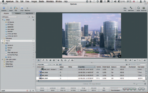
Fig. 2.27 The Aperture interface can be rotated and flipped to suit the most appropriate way of working, depending on the orientation of each selected image.
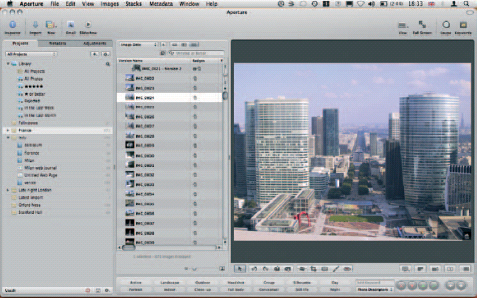
Fig. 2.28 Here we have swapped the default interface arrangement for a series of vertical panes that better suits the image on which we are working.
Fig. 2.29 Keywords can be applied by using keyboard shortcuts, but are also available through the Keywords toolbar at the foot of the Aperture interface.
Keywords, too, can be applied using hotkeys on the keyboard. The Keyword Viewer (![]()
![]() ) sits at the bottom of the Aperture interface and is split into seven logical sections: people, photo descriptors, stock categories, snapshots, wedding (details), wedding (prep) and weddings. Each contains a set of buttons that apply associated keywords to the selected image. So people contains man, woman, couple, boy, for example, while wedding (prep) includes hair, flowers, makeup and decorations (Fig. 2.29).
) sits at the bottom of the Aperture interface and is split into seven logical sections: people, photo descriptors, stock categories, snapshots, wedding (details), wedding (prep) and weddings. Each contains a set of buttons that apply associated keywords to the selected image. So people contains man, woman, couple, boy, for example, while wedding (prep) includes hair, flowers, makeup and decorations (Fig. 2.29).
You can add your own sections and buttons by selecting Edit buttons from the menu in the bottom right hand corner. This opens a panel with three panes: one for your button sets, one for their component buttons and one showing the keywords you have already applied to your images while importing them.
Star t a new set by clicking the ‘+’ below the first pane and give it a name. Here we’re calling ours Europe. Next, drag corresponding entries from the Keywords Library, far right, into the Contents pane in the center. This adds each one to the new section you have just created. If you haven’t imported any images yet, using one of the keywords you want, add a new one to the Library using the Add Keyword and Add Subordinate Keyword buttons. The former creates a top-level keyword, such as birthday, into which you’d add entries such as cake, candles, presents and games using the latter.
Once you have added as many keywords as you need to the Contents pane, OK out of the dialog and you’ll find them present in the Keywords bar at the bottom of the screen. The first eight or fewer will have been assigned keyboard shortcuts, allowing you to tap ![]()
![]() to
to ![]()
![]() to apply them, and
to apply them, and ![]()
![]()
![]() to
to ![]()
![]()
![]() to subsequently remove them. If you have more than nine, the remaining entries will lack a key combination, and must be applied by clicking their buttons on the Keywords Toolbar.
to subsequently remove them. If you have more than nine, the remaining entries will lack a key combination, and must be applied by clicking their buttons on the Keywords Toolbar.
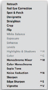
Fig. 2.30 Features missing from the Adjustments inspector? Not a problem – tailor its look and feel to your specific needs.
Adjustments and Filters
The adjustments panel is where you’ll do the most of your work. It consists of collapsible panels that can be checked on and off to quickly roll back changes.
Apart from odd exceptions like red-eye removal, spot and patch, and retouch, Aperture works on a whole-picture basis. It relies on you to have shot a well-balanced image in the first place without excessively burnt-out or deeply shadowed areas that you’ll need to recover later.
The Adjustments panel is split into sections, each of which is mirrored on the Adjustments HUD. Each one deals with a different kind of adjustment, and they can be shown and hidden by clicking the ‘+’ button at the top of the Inspector and checking the ones you want. Beside this is the Preferences button (it looks like a cog), which changes the information displayed in the panel. This allows you to show and hide the value of the color over which your mouse is positioned, and hide or show the Histogram and auto-adjust options (Fig. 2.30).
From here you can also select your color value options (RGB, Lab, CMYK, HSB or HSL), the number of pixels it will take into account when assessing a value (blocks of 1 × 1, 3 × 3, 5 × 5 or 7 × 7), and what the Histogram should show (luminance by default, but optionally RGB, or just the individual red, green and blue channels).
Whenever you make a change in one of these sections, it is activated with a small tick appearing beside the section name. Unchecking this box removes the adjustment. In this way, it is best to think of edits made in Aperture like adjustment layers in Photoshop, although here their range is far wider, even covering such potentially destructive edits as crops and rotations.
Overlays
The various items of data associated with your images are, for the most part, hidden when the Adjustments and Filters or Metadata panels are closed. What is left is restricted to Star ratings and Version counts in the Browser, and just a rating in the Viewer, all of which overlays the images or thumbnails to which they refer.
There are times when you will want more detailed data, in which case you’ll expand them with ![]()
![]() and
and ![]()
![]() for the data in the Viewer and Browser respectively. While expanding the Browser data means you lose the filename and can thus concentrate fully on your thumbnails, in the Viewer you end up with a broad survey of the shooting conditions for each image. This spans aperture, shutter speed and exposure compensation; actual- and 35 mm-equivalent focal length, applied keywords, Version name, image date and rating. Combined, they allow you to close a lot of the HUDs on which this information is found.
for the data in the Viewer and Browser respectively. While expanding the Browser data means you lose the filename and can thus concentrate fully on your thumbnails, in the Viewer you end up with a broad survey of the shooting conditions for each image. This spans aperture, shutter speed and exposure compensation; actual- and 35 mm-equivalent focal length, applied keywords, Version name, image date and rating. Combined, they allow you to close a lot of the HUDs on which this information is found.
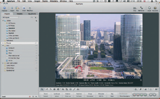
Fig. 2.31 Use shortcuts to temporarily expose more of the Metadata attached to your images within the Viewer itself.
That is where we’re heading next (Fig. 2.31).
Head up Displays
As we have already explained, Aperture really gives your photos the opportunity to breathe. On a suitably equipped Mac, it is perfectly happy working across two monitors, devoting one to the organizational workspace, and the other to a Full-Screen view of your photos so that you can edit them with the best possible view.
However, even on a single-screen Mac, or a portable such as a MacBook, you can do much to maximize your working space while keeping every tool handy, thanks to its extensive use of Head up displays – or, in Apple parlance, HUDs.
These are floating, semi-opaque Versions of the key panels, allowing you to bring them into and out of view when required, and still see your work through them. They take their name from the displays projected onto cockpit windshields in fighter aircraft.
They are common across many Apple applications, and even break out of the professional application line-up; HUDs are also found in Pages, its consumer word processor, and iPhoto.
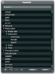
Fig. 2.32 The Keywords HUD organizes keywords already applied to your images, and lets you remove or add new ones. Keywords can also be organized into sub-groups for better organization on the Keywords Toolbar.
Some panels always work as HUDs, regardless of your view mode, while others appear in this form only when you’re working in Full Screen. The keywords HUD (![]()
![]() ), for example, only ever appears as a floating panel, whatever your screen mode, because it duplicates features already found on the interface proper. By appearing in the applications in two incarnations, it is more accessible and can be shown even when the main keywords interface is closed or inaccessible. It presents a list of keywords already applied to images in your Library so that you can then apply them with a single click to whichever photo is selected at the moment. The first time you use it, you’ll find that it already includes a range of pre-defined keywords relating to weddings, stock photography, and so on. You can add to these in exactly the same way as described on p. 139 using the Add Keyword and Add Subordinate Keyword buttons at the bottom of the HUD, and likewise delete existing entries using the Remove Keyword button to the right. This is explained in more detail in Chapter 4 (Fig. 2.32).
), for example, only ever appears as a floating panel, whatever your screen mode, because it duplicates features already found on the interface proper. By appearing in the applications in two incarnations, it is more accessible and can be shown even when the main keywords interface is closed or inaccessible. It presents a list of keywords already applied to images in your Library so that you can then apply them with a single click to whichever photo is selected at the moment. The first time you use it, you’ll find that it already includes a range of pre-defined keywords relating to weddings, stock photography, and so on. You can add to these in exactly the same way as described on p. 139 using the Add Keyword and Add Subordinate Keyword buttons at the bottom of the HUD, and likewise delete existing entries using the Remove Keyword button to the right. This is explained in more detail in Chapter 4 (Fig. 2.32).
The Filter panel is also always shown as a HUD. It is invoked by clicking the button beside the search box at the top of the Browser panel, and appears as a pop-up that can be torn off and floated out on its own. This allows you to create Smart Albums, and gives you a live preview of the results as you define each query’s search criteria.
The Inspector, containing the Projects, Metadata and Adjustments panels (shortcut ![]() ) exactly mirrors the panel shown in the regular interface.
) exactly mirrors the panel shown in the regular interface.
Query HUD
With so much metadata at its disposal, Aperture makes short work of keeping your photos in order. It relies heavily on the data you input to do this as you feed it keywords, correct time zones on import, apply copyright information and assign bylines to your work. Then, once it sits inside Aperture, you organize it into Projects and folders, make adjustments, and build them into products for output. All of this is passive, but every action tells Aperture a little more about your assets, and adds to the extensive database of metadata it uses to keep things in order. By combining them with the data supplied by your camera about its settings and the shooting conditions it encountered, you’ll soon have access to a comprehensive profile of every image on your system.
The Filter HUD gives you access to all of this data when performing complex searches of your Library. It uses your currently selected Project or folder as its starting point, so pick your initial location before showing it and then click the Filter button, on the right-hand side of the Browser toolbar, beside the Search box. To make system-wide search of all your images, select All Photos in the Projects Inspector as your starting point (Fig. 2.33).
The palette that pops up is notionally attached to the Toolbar, but can be torn off and repositioned anywhere on screen. It is a table of variable fields for rating, dates (calendar), keywords and import sessions, and lets you specify whether results should match some or all of your search criteria to qualify for inclusion in the Smart folder it will create. None of these criteria can be removed, but they can be left undefined, and thus ignored, and you can add a further nine search criteria using the ‘+’ pop-up at the top of the Filter interface, which includes a handy Other Metadata option giving you access with less common variables, such as aspect ratio, pixel size, and master pixel size. Used in combination, these various attributes should be enough to let you strip down your Library to a single image if you so desire.
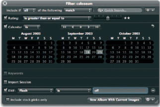
Fig. 2.33 The Query HUD lets you quickly sort your images thanks to its understanding of the metadata that already exists in your Library.
To use any search variable in the Filter HUD, fill the check box beside its name and then use the pop-up menus and data grids that appear, to specify your requirements. Most of these dialogs are pre-populated with data from your Library allowing you to simply click further check boxes to narrow down the range of images it captures, as for several term variables you would be unlikely to remember the valid terms yourself. While you might remember some of the keywords you have used, for example, it is highly unlikely you would remember all of the import sessions you used to add assets to your Library.
Each section of the Filter HUD uses plain-English commands, so the calendar section gives you the option of trimming down to exact dates, regardless of what was taken on that day (if anything) or instead choosing that the date should not be one on which you took no photos, and also not be the dates selected in the calendar below.
You can select ranges by holding ![]() when clicking the opposite extremes of a selection, and several disparate variables by using
when clicking the opposite extremes of a selection, and several disparate variables by using ![]() . If you later want to deselect them, click again, and to deactivate a complete section, untick the selection’s check box.
. If you later want to deselect them, click again, and to deactivate a complete section, untick the selection’s check box.
Aperture will maintain a live preview of the results of your Filter queries in the Browser window. Once these show what you were aiming for, it’s time to either save or use the results using the buttons at the bottom of the HUD. The ‘New Album with Current Images’ button does just what its name suggests, but the Shortcut button beside it gives you access to Aperture’s Light Table, book, and Web publishing features using the results as the source material.
Inspector HUD
The Inspector HUD works in exactly the same way as the Inspector pane in the main interface. It is hidden and revealed using the keyboard shortcut ![]() , or through the View menu, and is functionally identical to the regular Adjustments, Metadata and Projects Inspectors in the main interface.
, or through the View menu, and is functionally identical to the regular Adjustments, Metadata and Projects Inspectors in the main interface.
Opening and closing sections in this HUD performs the same action – simultaneously – in the regular equivalent found in the main Aperture interface, as you can see if you keep both open at the same time. Collapsing and expanding panels, and moving sliders in the Adjustments pane will be mirrored, regardless of the Version of the Inspector in which you’re working, and the same is true of the Projects pane. The only panel on which it doesn’t work is Metadata, allowing you to show, say, General metadata in the Inspector, and Full ITPC in the HUD.
The real point of having a HUD that mirrors one built into the main interface, though, is that you can either close the primary interface, or switch it to something else, allowing you to display both the Metadata and Adjustments panels at once, for example, in the main Aperture interface and the HUD.
The only real difference between the two is the fact that you can’t import images into the HUD-based Library. Clicking the Toolbar’s Import button when the Inspector is closed, or switched to the Adjustments or Metadata views, will return you to the main Projects pane and import the images there, even if it is already open in the HUD.
Lift and Stamp HUD
The Lift and Stamp HUD is like a sophisticated clipboard, along the same lines as that used in Word, Numbers or Photoshop. However, rather than holding plain text or parts of an image you’re working on, it is used to transport data between different images to save you from applying them manually yourself. That data includes all metadata and adjustments applied to your image from the point it was imported into Aperture, including the keywords. Rotations are not lifted, for a very obvious reason: while most cameras will now record whether a photo was taken in portrait or landscape orientation and write this data to the image file, it’s not a universal capability. As such, you may need to rotate some images in your Library but not others. If this rotation data was recorded when you lifted adjustments data from your images, and the data were then stamped onto a range of other images, you may find yourself having to spin some of them back.
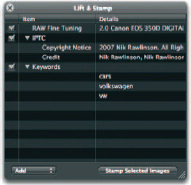
Fig. 2.34 The Lift and Stamp HUD acts as a sophisticated clipboard, used to transport metadata and adjustments from one image to another. Each field copied to it can be individually disabled, or deleted altogether.
The HUD is opened either by using the lift and stamp tools on the top of the Browser, or through its entry on the Window menu. We’d recommend leaving it closed until you start using the tools as it’s otherwise redundant (Fig. 2.34).
To transfer data from one image to another using Lift and Stamp, either select your source image and press ![]()
![]()
![]() or press the Lift button on the Viewer’s Toolbar. It’s fourth from the left and sports the icon of a luggage tag with an upwards-pointing arrow coming out of it. Alternatively, press
or press the Lift button on the Viewer’s Toolbar. It’s fourth from the left and sports the icon of a luggage tag with an upwards-pointing arrow coming out of it. Alternatively, press ![]() to select the Lift tool, rather than to directly lift the data. This will change the cursor to an upwards-pointing arrow; clicking with this on any image will copy the metadata and applied adjustments and drop them onto the Lift and Stamp HUD.
to select the Lift tool, rather than to directly lift the data. This will change the cursor to an upwards-pointing arrow; clicking with this on any image will copy the metadata and applied adjustments and drop them onto the Lift and Stamp HUD.
Each class of data is separated out, so that keywords sit apart from adjustments, and IPTC data are hived off in a section of their own. Each data set is stored in a collapsible section that is expanded using a disclosure triangle to show what it contains.
If you were then to apply these data to another image, they would be pasted in their entirety, which saves you a lot of time in performing the same edits or filing tasks on multiple photos one by one. However, there are many occasions when you will not want to drop the data wholesale. In these instances, you can temporarily disable them by unchecking the tick box beside each one. This will disable all of the data in that section, so if you have captured three adjustments in lifting the metadata from an image, unchecking the adjustments box means none of them will be applied to any other images when the data is stamped. You can be more selective about the range of data that is or is not stamped by instead expanding each data section using the disclosure triangles, and then clicking on each individual entry within, and pressing the ![]() key to remove them. Note that none of these disabling and deletion measures has any effect on the original image from which the metadata were lifted. To remove the attributes from there you’ll have to resort to the Adjustments and Metadata Inspectors.
key to remove them. Note that none of these disabling and deletion measures has any effect on the original image from which the metadata were lifted. To remove the attributes from there you’ll have to resort to the Adjustments and Metadata Inspectors.
Once you have filtered the lifted data down to just the attributes that you want to apply to other images in the Library, you will take one of two courses of action. If you lifted the data by pressing ![]() to select the Lift tool and used the upwards-pointing arrow, you would notice that as soon as you copied the data the arrow would flip to point downwards. Using this to click on any other image in your Library – even in a different Project – will apply the checked and active metadata displayed in the Lift and Stamp HUD (Fig. 2.35).
to select the Lift tool and used the upwards-pointing arrow, you would notice that as soon as you copied the data the arrow would flip to point downwards. Using this to click on any other image in your Library – even in a different Project – will apply the checked and active metadata displayed in the Lift and Stamp HUD (Fig. 2.35).
If you collected the metadata by clicking the Lift button or the ![]()
![]()
![]() shortcut, select the image to which you’d like to apply the edited metadata and click the Stamp button (next to Lift), press the shortcut
shortcut, select the image to which you’d like to apply the edited metadata and click the Stamp button (next to Lift), press the shortcut ![]()
![]()
![]() to stamp immediately, or use
to stamp immediately, or use ![]()
![]() to invoke the Stamp tool without stamping so that you can go on to stamp elsewhere. Once the tool is selected in this latter manner, it remains active, allowing you to apply the data to several disparate images in your Library. If all of the images to which you want to apply the data sit beside each other, you can select them by click-dragging across them or
to invoke the Stamp tool without stamping so that you can go on to stamp elsewhere. Once the tool is selected in this latter manner, it remains active, allowing you to apply the data to several disparate images in your Library. If all of the images to which you want to apply the data sit beside each other, you can select them by click-dragging across them or ![]() clicking a selection range and then using the Stamp Selected Images button on the HUD.
clicking a selection range and then using the Stamp Selected Images button on the HUD.
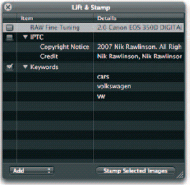
Fig. 2.35 Here, we have deselected the Raw fine tuning and IPTC sections of the lifted data so that they will not be applied to other images once they are stamped.
The captured metadata will remain active in the HUD even when it has been closed, allowing you to go on and apply them to further images without your screen being cluttered up by a redundant panel you no longer need, but will reopen every time you use any of the shortcuts or buttons to capture new data.
Before closing it, then, take note of the pop-up menu in the lower left corner of the HUD that switches between Add and Replace. When set to Replace, any new data captured using the Lift tool will overwrite what already exist in the HUD. Set to Add, the new data will be appended to what you have already gathered.
Lift and Stamp is a deceptively powerful tool, which will greatly speed and simplify your workflow, whether in processing adjustments as a batch to meet particular requirements, or in updating an existing filing system to meet changing requirements.
Metadata Overlays
Technically, it’s not an HUD, as you can’t interact with it, but the metadata overlay for your images is well worth investigating – particularly if you often work in grid or film strip mode and so don’t have access to all of the data shown in the Browser’s list view. Toggle it on and off by tapping ![]() and, when active, move your mouse over the thumbnails to see key metadata shown on a semi-transparent overlay. It also works with images shown in the Viewer, so is an easy way of differentiating between two very similar images when displayed side by side.
and, when active, move your mouse over the thumbnails to see key metadata shown on a semi-transparent overlay. It also works with images shown in the Viewer, so is an easy way of differentiating between two very similar images when displayed side by side.
Using Aperture for the First Time
Aperture is built from the ground up for photographers, not computer technicians. As such, Apple has gone a long way to make it easy to understand and non-threatening. Even first-time users should be up and running in minutes, and will be pleasantly surprised by the amount of hand-holding on offer, making Aperture’s workflow a more intuitive, productive one than that offered by Photoshop.
The Aperture Welcome screen offers five options for first-time users, the three most important of which go straight to importing photos into your newly created Library from either your camera or another location on your Mac’s hard drive (Fig. 2.36).
Mac OS X’s Unified Media Browser lets you use any photo managed by an Apple application – iPhoto or Aperture – in any compatible application, so you can view your Libraries in office tools like Keynote and Pages, or use them as desktop backgrounds or screen savers. By providing third-party developers with hooks into this system, Apple also allows these Libraries to appear in applications developed externally, such as RapidWeaver, so it’s no surprise that Aperture and iPhoto can also happily exchange assets between themselves. As described elsewhere (see p. 286), this lets you use your photos to create products that are not available to each application, using iPhoto assets in Aperture to produce the more advanced Web pages not available in iPhoto, and Aperture assets in iPhoto to produce a calendar.
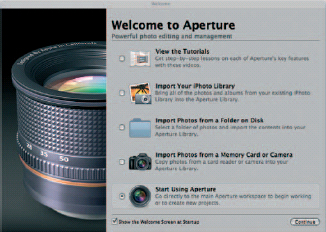
Fig. 2.36 The Aperture splash screen gives you an easy way in to the application’s most common starting points. When you get more familiar with the program, however, it will probably be disabled.
However, there remain good reasons not to import your iPhoto Library into Aperture including, not least, the fact that by maintaining a separate iPhoto Library you can use this for more personal projects, and save cluttering up your Aperture Library with family photos.
The remaining choices are a series of tutorials, leaping straight into Aperture, or importing photos from a memory card, which we’ll come to in a moment. In the meantime, though, you should decide whether you want this splash screen to appear every time you start Aperture, and uncheck the box in the lower left corner if not, and also be prepared to decide whether Aperture should fire up every time you insert a memory card or attach your camera to your system. All of these options are reversible, so your choice here is not necessarily definitive. To bring back the splash screen at a later data, open Aperture Preferences (![]()
![]() ) and pick Reset All Warnings from the General Tab. To change what should happen whenever you insert a card or attach your camera, pick an option from the pop-up beside ‘When a camera is connected, open’ on the same tab.
) and pick Reset All Warnings from the General Tab. To change what should happen whenever you insert a card or attach your camera, pick an option from the pop-up beside ‘When a camera is connected, open’ on the same tab.
We have covered importing your photos extensively elsewhere (p. 77), and hence will not repeat that here, but you should bear in mind that as you are starting from scratch with a brand new Aperture Library, you are in an enviable position. Here you can lay the foundations for a well-thought out filing system designed from day one to make your assets as easy to find and use as is possible. As such, you should pay particular attention to the metadata fields at the foot of the right-hand column in the Import dialog, accurately adjust the time offset if you were shooting in a different time zone but hadn’t reset your camera’s clock, and choose an appropriate folder structure. By default, Aperture will import your images into a new, untitled Project that you can rename later, but if you’d rather pre-empt this, then create a new Project immediately using the Toolbar’s ‘New’ drop-down, and the focus of the import dialog will shift, as indicated by the output arrow, which will skip down to the new Project.
Bear in mind at this point that there is no obligation to import all of the images in a folder, camera or memory card; use Mac OS X’s usual selection tools – ![]() clicking to select a range or
clicking to select a range or ![]() clicking to select non-contiguous images – to specify the ones that should be imported.
clicking to select non-contiguous images – to specify the ones that should be imported.
Aperture will go about importing your images. The speed at which it can do this depends on the speed of your system, the speed of your interface (USB 1 or USB 2 makes a big difference) and the number of other applications you have running at the same time. Aperture isn’t just copying your images from the memory media to your hard drive: assuming your camera isn’t shooting simultaneous JPEG and Raw files, and you have not set it to use these as preview sources, it is also building a series of JPEG previews in the background, which will let you view your work more quickly.
If you want to track its progress you can do so through the Activity Monitor (Window > Show Activity), which displays the progress of every function the software conducts.
Customizing Aperture
Now that you have imported your first batch of photos, it’s time to start thinking about how Aperture works, and whether this is right for you. The application is designed to be used by both the mouse and keyboard simultaneously, and you will benefit greatly if you take the time to learn at least those shortcuts that you’ll use most often. However, these can be confusing if they are different to those used by any of your other most commonly used applications.
In this instance, you may want to tailor which keys are used and what they do. This is done through the Aperture Commands > Customize… menu option, which opens an on-screen representation of the keyboard, with the various functions highlighted. Click through the various keys on the keyboard to see what they do in the Key Detail pane below right, and use the Command List pane below left to drill down on the key combination subsets and the modifier keys at the top of the interface to see how each function changes when combined with ![]() ,
, ![]() ,
, ![]() , and
, and ![]() (Fig. 2.37).
(Fig. 2.37).
Aperture is rightly protective of the default set of key combinations, which are the ones used throughout this book.
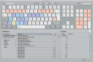
Fig. 2.37 Use the keyboard customization features to specify combinations that more closely match the way you are used to working in other applications on your Mac. Aperture will be careful not to let you overwrite core combinations used by the operating system, and warn you if you are going to overwrite any of its own.
As such, it won’t let you define your own without first creating a complete copy of the originals. Use the pop-up menu at the top of the Command Editor dialog to duplicate the existing set, giving it a name of your own, and then set about defining your own key combinations (Fig. 2.38).
Do this by picking the option to which you want to assign a shortcut from the Command List on the left of the dialog and then press the key combination you want to use. Start with the shortcut keys ![]() ,
, ![]() ,
, ![]() ,
, ![]() and watch the on-screen keyboard as you press them, as a spot that appears on some of them will show that the key is already in use for another shortcut. If you ignore this, you’ll see a warning, either forbidding you from using it if it’s assigned to a system command, such as
and watch the on-screen keyboard as you press them, as a spot that appears on some of them will show that the key is already in use for another shortcut. If you ignore this, you’ll see a warning, either forbidding you from using it if it’s assigned to a system command, such as ![]()
![]() for closing windows and
for closing windows and ![]()
![]() for opening Preferences, or overwriting it if it’s only used by Aperture, such as
for opening Preferences, or overwriting it if it’s only used by Aperture, such as ![]()
![]() for sending an image by email.
for sending an image by email.
Exporting Shortcut Presets
Once you have set up your preferred shortcuts, you can export the settings for use on other Aperture installations. This is useful if you have installed the application on more than one Mac – perhaps because you have both a notebook installed for use in the field and a desktop edition for editing in the studio, you use it in two applications, or you want to roll out a standardized, tweaked edition of the application across several Macs in a creative environment.
Fig. 2.38 Before you can specify your own keyboard shortcuts, you must make a duplicate set of the default combination, to save you from destroying what is already in place.
Click the pop-up menu and pick Export from the options. Give your presets a name and pick a location, and Aperture will save a binary presets file with the extension .apcommands. To import this on a different Mac, pick Aperture > Commands > Import.
You can then switch between your installed customization and the defaults by choosing from your local menu in the Aperture > Commands > Default flyout, or your imported settings from the bottom of the menu.
Managing Color
Photos, in whatever medium, are merely representations of light and color in a scene. To get the most out of Aperture, therefore, it is critical that you set it up to best reproduce these tones on screen, and when outputting your work.
Mac OS X manages color using ColorSync, an operating system level function that translates the colors captured and displayed by components of your set-up – including cameras, monitors, and printers – so that they can be universally understood. This is important because not all devices can display the same range of colors, and so a certain amount of interpretation has to take part to simulate some tones on those devices with a narrower color gamut. Further, what one printer thinks is pure red may vary widely from another, and still more dramatically from the pure red of a pixel on your display, or a photosite sensor in your camera.
Without color management, you could have no confidence that the adjustments made to your images in Aperture would be accurately represented in a photo book, on a Web page, or in the output from your home or office inkjet printer.
Every device attached to your Mac should therefore include a color profile, which defines the range of colors it can handle. You can see the installed profiles by opening Applications > Utilities > ColorSync Utility. Clicking through them will display their relative abilities, which will vary widely. Contrast the abilities of your display, found by expanding the Computer and Displays sections using the disclosure triangles, with that of your printer, found in the Other section – again hidden by a disclosure triangle. If you are using a consumer Mac with an integrated display, such as a MacBook, you may be surprised at how many more colors your printer can handle, even if it’s a consumer inkjet. In the grab (Fig. 2.39), we have held the gamut of our printer for comparison by clicking the downward-pointing arrow in its profile graph and picking Hold for Comparison, and then clicking back to the profile for our screen (Color LCD under Displays). The display’s profile is the colored graph which, as you’ll see, is far narrower than the ghosted white profile representing the gamut available to our printer, shown behind it. This means that our printer can reproduce a wider range of tones right across the spectrum than our screen, and so rather than using pure tones our screen will have to work hard to interpolate a wide variety of colors so that it can approximate – as closely as possible – the results you will see when you come to print.
ColorSync handles this approximation by using a device-independent profile as a conduit for this color information in the same way that native English and Italian speakers may use German as a lingua franca if neither understands the other’s native tongue.
These generic profiles span the usual range of Lab, CMYK and RGB colorspaces, and can be examined in the System section of ColorSync Utility, and Mac OS X needs to be told how these generic profiles differ from those of your output devices. As such, investing in an inexpensive calibration tool such as Pantone’s Huey, which includes a sensor to affix to your display during the calibration process, should be considered a minimal first step. More expensive and extensive alternatives are also available.
Fig. 2.39 ColorSync Utility manages color translation between various applications and hardware devices attached to your Mac. Here, we are comparing the relative color gamuts of a screen and a printer.
Regardless of the price of the tool you choose, the process of calibrating your monitor is very similar in all instances. The bundled software will display a range of pure colors on your screen, and you position the optical sensor over them. This samples the colors produced and compares what it sees with what it knows the software to be producing using any variations it detects to build a profile that will be used to correct the display.
However, monitors change over time, and their performance can be affected by age, temperature and a range of other environmental factors. As such, while performing a one-off calibration when you first start using Aperture pays dividends, frequent re-testing is required if you want to rely on your display long-term.
Setting Your Preferences
You should now work your way through Aperture’s Preferences dialog, setting up the application to work however is best for you. In its default state, it is configured in the way that Apple considers to be most beneficial to the greatest number of users, after extensive focus group testing. However, it won’t suit all tastes. Many users will find that a black background in the Browser lets them focus more clearly on their work; the same goes for the Viewer.
Both of these run on a scale from black to white set using sliders on the Preferences Appearances tab, where you can also specify whether adjusted images should sport identifying icons and Stack Count badges (Fig. 2.40).
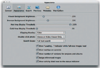
Fig. 2.40 Use the appearance tab in Aperture’s Preferences to specify the background color of the Viewer and Browser. Many users will find they have fewer distractions and are better able to concentrate on their images when these are both set to black.
The Export and Metadata tabs are best left as they are for the time being, as these can be adjusted as and when needed using other parts of the application at the times when you are exporting your files, or changing the displayed data relating to your images. Setting them now would be to second-guess your future needs. Making the changes as and when they crop up means you should be able to make more accurate, relevant choices.
The Web Gallery tab, which we cover in detail on p. 312, is only accessible if you have an active Internet connection, and will only show useful data if you are signed up for Apple’s £59 a year MobileMe service. If you are, then it’s worth changing the gallery publishing setting to hourly, daily or weekly, so that the changes you make to published Galleries will automatically be reflected on your site without you having to manually republish them yourself. From here you can also stop publishing selected Galleries and upgrade your MobileMe Web space.
The last remaining tab – Previews – controls how Aperture goes about generating JPEG equivalents of your images inside its Library package. These speed up Aperture’s operation by giving it less demanding files to open when scrolling through your Library in the Browser. You should only uncheck the box for creating these at the time of creating new Projects if you have a very good reason, as doing it then – when the images are imported into the system – is passive, and takes place in the background.
By now Aperture is ready for daily use. Over time you will continue to hone it to meet your own specific needs, as you can never know from day one precisely how you will use it. You can now import the remainder of your images into its Library ready for use in future creative Projects.