
Histograms are used to group and represent numerical (continuous) variables. For example, you may want to know the distribution of voters' ages in an election. A histogram is often confused with a bar chart; however, a bar chart is more general, and we will cover those later. In a histogram, a continuous variable is grouped into bins of specific sizes and the bins have a range that covers the maximum and minimum of the variable in question.
Histograms can be classified as follows:
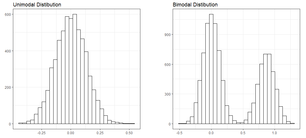
- Unimodal: A distribution with a single maximum or mode; for example, a normal distribution:
- A normal distribution (or a bell-shaped curve) is symmetrical. An example is the grade distribution of students in a class. A unimodal distribution may or may not be symmetrical. It can be positively or negatively skewed, as well.
- Positively or negatively skewed (also known as right-skewed or left-skewed): Skewness is a measure of the asymmetry of the probability distribution of a real-valued random variable about its mean. The skewness value can be positive, negative, or undefined.
- A left-skewed distribution has a long tail to the left while a right-skewed distribution has a long tail to the right. An example of a right-skewed distribution might be the US household income, with a long tail of higher-income groups.
- Bimodal: Bimodal distribution resembles the back of a two-humped camel. It shows the outcomes of two processes, with different distributions that are combined into one set of data. For example, you might expect to see a bimodal distribution in the height distribution of an entire population. There would be a peak around the average height of a man, and a peak around the typical height of a woman.
- Unitary distribution: This distribution follows a uniform pattern that has approximately the same number of values in each group. In the real world, one can only find approximately uniform distributions. An example is the speed of a car versus time if moving at constant speed (zero acceleration), or the uniform distribution of heat in a microwave:
Let's take a look at another image:

It's important to study the shapes of distributions, as they can reveal a lot about the nature of data. We will see some real-world examples of histograms in the datasets that we will explore.
You can read more about the shapes of histograms at https://www.moresteam.com/toolbox/histogram.cfm
and https://www.siyavula.com/read/maths/grade-11/statistics/11-statistics-05.
Find out more about normal distributions at http://onlinestatbook.com/2/normal_distribution/history_normal.html.
You will find more real-world examples at
https://stats.stackexchange.com/questions/33776/real-life-examples-of-common-distributions.
We discussed the different kinds of geometric objects that we will be working on, and we created our fist plot using two different methods (qplot and hist). Now, let's use another command: ggplot. We will use the humidity data that we loaded previously.
As seen in the preceding section, we can create a default histogram by using one of the commands in the base R package: hist. This is seen in the following command:
hist(df_hum$Vancouver)
The default histogram that will be created is as follows:
