
In this section, we'll use density plots to compare loan distributions for different credit grades.
- Use the loan data and plot a histogram for the loan amounts. Subdivide it into the different grades, as follows:
ggplot(df3,aes(x=loan_amnt)) + geom_histogram() + facet_ wrap(~grade)
Take a look at the following output screenshot:
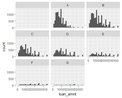
- We cannot see the shapes of the E, F, and G grades very clearly. Also, all of the grades have different histogram counts. Let's use a density plot to compare them, as follows:
ggplot(df3,aes(x=loan_amnt)) + geom_density() + facet_wrap(~grade)
Take a look at the following output screenshot:

Analysis
Density plots make it much easier to see the shapes. All of the plots are normalized to unit area, which means adjusting the values measured on different scales to a common scale. You can see that for the F and G grades, the loan amounts are much broader, and almost all of the loan amounts have equal probabilities, but for A, B, C, and D, you can see right-skewed histograms, implying that most people in these credit grades take out smaller loans, of about 5,000. The distribution for credit grade A is narrowest, and the distribution becomes broader as the credit grade worsens.
You can read more about the specs at: http://serialmentor.com/dataviz/histograms-density-plots.html.