
In this section, we'll make a correlation plot for all continuous variables in the gapminder dataset. Let's begin by implementing the following steps:
- Choose only continuous variables by using the following command:
dfs1 <- dfs[,colnames(dfs)[4:9]]
- Remove all NAs; otherwise, the correlation will not work, because it requires finite values:
dfs1 <- na.omit(dfs1)
- Get the correlation matrix, M, using the following command:
M <- cor(dfs1)
- Plot the correlation matrix using the following command:
corrplot(M,method="circle")
The plot will look as follows:

- The preceding plot looks messy because of its long names. Let's change the long names to shorter names. Also, use another method for corrplot("number"), so that we can see the values of the correlation coefficients:
colnames(dfs1) <-c("gdp","electricity","mort","pov","bmi_m","bmi_f")
M <- cor(dfs1) corrplot(M,method="number")
The plot will look as follows:

You can also try other methods for the correlation plots, as follows:
corrplot(M,method="pie")
corrplot(M,method="ellipse")
The plot will look as follows:
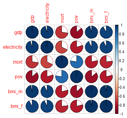
Analysis
In the first plot, the fractions in the pie give an idea of how strong the correlations are, and the colors indicate whether the correlations are positive or negative. In the second case, the width of the ellipse gives an indication of the correlation.