Chapter 1. Machine Learning
Machine learning expands the boundaries of what’s possible by allowing computers to solve problems that were intractable just a few short years ago. From fraud detection and medical diagnoses to product recommendations and cars that “see” what’s in front of them, machine learning impacts our lives every day. As you read this, scientists are using machine learning to unlock the secrets of the human genome. When we one day cure cancer, we will thank machine learning for making it possible.
Machine learning is revolutionary because it provides an alternative to algorithmic problem-solving. Given a recipe, or algorithm, it’s not difficult to write an app that hashes a password or computes a monthly mortgage payment. You code up the algorithm, feed it input, and receive output in return. It’s another proposition altogether to write code that determines whether a photo contains a cat or a dog. You can try to do it algorithmically, but the minute you get it working, you’ll come across a cat or dog picture that breaks the algorithm.
Machine learning takes a different approach to turning input into output. Rather than relying on you to implement an algorithm, it examines a dataset of inputs and outputs and learns how to generate output of its own in a process known as training. Under the hood, special algorithms called learning algorithms fit mathematical models to the data and codify the relationship between data going in and data coming out. Once trained, a model can accept new inputs and generate outputs consistent with the ones in the training data.
To use machine learning to distinguish between cats and dogs, you don’t code a cat-versus-dog algorithm. Instead, you train a machine learning model with cat and dog photos. Success depends on the learning algorithm used and the quality and volume of the training data.
Part of becoming a machine learning engineer is familiarizing yourself with the various learning algorithms and developing an intuition for when to use one versus another. That intuition comes from experience and from an understanding of how machine learning fits mathematical models to data. This chapter represents the first step on that journey. It begins with an overview of machine learning and the most common types of machine learning models, and it concludes by introducing two popular learning algorithms and using them to build simple yet fully functional models.
What Is Machine Learning?
At an existential level, machine learning (ML) is a means for finding patterns in numbers and exploiting those patterns to make predictions. ML makes it possible to train a model with rows or sequences of 1s and 0s, and to learn from the data so that, given a new sequence, the model can predict what the result will be. Learning is the process by which ML finds patterns that can be used to predict future outputs, and it’s where the “learning” in “machine learning” comes from.
As an example, consider the table of 1s and 0s depicted in Figure 1-1. Each number in the fourth column is somehow based on the three numbers preceding it in the same row. What’s the missing number?

Figure 1-1. Simple dataset consisting of 0s and 1s
One possible solution is that for a given row, if the first three columns contain more 0s than 1s, then the fourth contains a 0. If the first three columns contain more 1s than 0s, then the answer is 1. By this logic, the empty box should contain a 1. Data scientists refer to the column containing answers (the red column in the figure) as the label column. The remaining columns are feature columns. The goal of a predictive model is to find patterns in the rows in the feature columns that allow it to predict what the label will be.
If all datasets were this simple, you wouldn’t need machine learning. But real-world datasets are larger and more complex. What if the dataset contained millions of rows and thousands of columns, which, as it happens, is common in machine learning? For that matter, what if the dataset resembled the one in Figure 1-2?

Figure 1-2. A more complex dataset
It’s difficult for any human to examine this dataset and come up with a set of rules for predicting whether the red box should contain a 0 or a 1. (And no, it’s not as simple as counting 1s and 0s.) Just imagine how much more difficult it would be if the dataset really did have millions of rows and thousands of columns.
That’s what machine learning is all about: finding patterns in massive datasets of numbers. It doesn’t matter whether there are 100 rows or 1,000,000 rows. In many cases, more is better, because 100 rows might not provide enough samples for patterns to be discerned.
It isn’t an oversimplification to say that machine learning solves problems by mathematically modeling patterns in sets of numbers. Most any problem can be reduced to a set of numbers. For example, one of the common applications for ML today is sentiment analysis: looking at a text sample such as a movie review or a comment left on a website and assigning it a 0 for negative sentiment (for example, “The food was bland and the service was terrible.”) or a 1 for positive sentiment (“Excellent food and service. Can’t wait to visit again!”). Some reviews might be mixed—for example, “The burger was great but the fries were soggy”—so we use the probability that the label is a 1 as a sentiment score. A very negative comment might score a 0.1, while a very positive comment might score a 0.9, as in there’s a 90% chance that it expresses positive sentiment.
Sentiment analyzers and other models that work with text are frequently trained on datasets like the one in Figure 1-3, which contains one row for every text sample and one column for every word in the corpus of text (all the words in the dataset). A typical dataset like this one might contain millions of rows and 20,000 or more columns. Each row contains a 0 for negative sentiment in the label column, or a 1 for positive sentiment. Within each row are word counts—the number of times a given word appears in an individual sample. The dataset is sparse, meaning it is mostly 0s with an occasional nonzero number sprinkled in. But machine learning doesn’t care about the makeup of the numbers. If there are patterns that can be exploited to determine whether the next sample expresses positive or negative sentiment, it will find them. Spam filters use datasets such as these with 1s and 0s in the label column denoting spam and nonspam messages. This allows modern spam filters to achieve an astonishing degree of accuracy. Moreover, these models grow smarter over time as they are trained with more and more emails.

Figure 1-3. Dataset for sentiment analysis
Sentiment analysis is an example of a text classification task: analyzing a text sample and classifying it as positive or negative. Machine learning has proven adept at image classification as well. A simple example of image classification is looking at photos of cats and dogs and classifying each one as a cat picture (0) or a dog picture (1). Real-world uses for image classification include flagging defective parts coming off an assembly line, identifying objects in view of a self-driving car, and recognizing faces in photos.
Image classification models are trained with datasets like the one in Figure 1-4, in which each row represents an image and each column holds a pixel value. A dataset with 1,000,000 images that are 200 pixels wide and 200 pixels high contains 1,000,000 rows and 40,000 columns. That’s 40 billion numbers in all, or 120,000,000,000 if the images are color rather than grayscale. (In color images, pixel values comprise three numbers rather than one.) The label column contains a number representing the class or category to which the corresponding image belongs—in this case, the person whose face appears in the picture: 0 for Gerhard Schroeder, 1 for George W. Bush, and so on.

Figure 1-4. Dataset for image classification
These facial images come from a famous public dataset called Labeled Faces in the Wild, or LFW for short. It is one of countless labeled datasets that are published in various places for public consumption. Machine learning isn’t hard when you have labeled datasets to work with—datasets that others (often grad students) have laboriously spent hours labeling with 1s and 0s. In the real world, engineers sometimes spend the bulk of their time generating these datasets. One of the more popular repositories for public datasets is Kaggle.com, which makes lots of useful datasets available and holds competitions allowing budding ML practitioners to test their skills.
Machine Learning Versus Artificial Intelligence
The terms machine learning and artificial intelligence (AI) are used almost interchangeably today, but in fact, each term has a specific meaning, as shown in Figure 1-5.
Technically speaking, machine learning is a subset of AI, which encompasses not only machine learning models but also other types of models such as expert systems (systems that make decisions based on rules that you define) and reinforcement learning systems, which learn behaviors by rewarding positive outcomes while penalizing negative ones. An example of a reinforcement learning system is AlphaGo, which was the first computer program to beat a professional human Go player. It trains on games that have already been played and learns strategies for winning on its own.
As a practical matter, what most people refer to as AI today is in fact deep learning, which is a subset of machine learning. Deep learning is machine learning performed with neural networks. (There are forms of deep learning that don’t involve neural networks—deep Boltzmann machines are one example—but the vast majority of deep learning today involves neural networks.) Thus, ML models can be divided into conventional models that use learning algorithms to model patterns in data, and deep-learning models that use neural networks to do the same.

Figure 1-5. Relationship between machine learning, deep learning, and AI
Over time, data scientists have devised special types of neural networks that excel at certain tasks, including tasks involving computer vision—for example, distilling information from images—and tasks that involve human languages such as translating English to French. We’ll take a deep dive into neural networks beginning in Chapter 8, and you’ll learn specifically how deep learning has elevated machine learning to new heights.
Supervised Versus Unsupervised Learning
Most ML models fall into one of two broad categories: supervised learning models and unsupervised learning models. The purpose of supervised learning models is to make predictions. You train them with labeled data so that they can take future inputs and predict what the labels will be. Most of the ML models in use today are supervised learning models. A great example is the model that the US Postal Service uses to turn handwritten zip codes into digits that a computer can recognize to sort the mail. Another example is the model that your credit card company uses to authorize purchases.
Unsupervised learning models, by contrast, don’t require labeled data. Their purpose is to provide insights into existing data, or to group data into categories and categorize future inputs accordingly. A classic example of unsupervised learning is inspecting records regarding products purchased from your company and the customers who purchased them to determine which customers might be most interested in a new product you are launching and then building a marketing campaign that targets those customers.
A spam filter is a supervised learning model. It requires labeled data. A model that segments customers based on incomes, credit scores, and purchasing history is an unsupervised learning model, and the data that it consumes doesn’t have to be labeled. To help drive home the difference, the remainder of this chapter explores supervised and unsupervised learning in greater detail.
Unsupervised Learning with k-Means Clustering
Unsupervised learning frequently employs a technique called clustering. The purpose of clustering is to group data by similarity. The most popular clustering algorithm is k-means clustering, which takes n data samples and groups them into m clusters, where m is a number you specify.
Grouping is performed using an iterative process that computes a centroid for each cluster and assigns samples to clusters based on their proximity to the cluster centroids. If the distance from a particular sample to the centroid of cluster 1 is 2.0 and the distance from the same sample to the center of cluster 2 is 3.0, then the sample is assigned to cluster 1. In Figure 1-6, 200 samples are loosely arranged in three clusters. The diagram on the left shows the raw, ungrouped samples. The diagram on the right shows the cluster centroids (the red dots) with the samples colored by cluster.

Figure 1-6. Data points grouped using k-means clustering
How do you code up an unsupervised learning model that implements k-means clustering? The easiest way to do it is to use the world’s most popular machine learning library: Scikit-Learn. It’s free, it’s open source, and it’s written in Python. The documentation is great, and if you have a question, chances are you’ll find an answer by Googling it. I’ll use Scikit for most of the examples in the first half of this book. The book’s Preface describes how to install Scikit and configure your computer to run my examples (or use a Docker container to do the same), so if you haven’t done so already, now’s a great time to set up your environment.
To get your feet wet with k-means clustering, start by creating a new Jupyter notebook and pasting the following statements into the first cell:
%matplotlibinlineimportmatplotlib.pyplotaspltimportseabornassnssns.set()
Run that cell, and then run the following code in the next cell to generate a semirandom assortment of x and y coordinate pairs. This code uses Scikit’s make_blobs function to generate the coordinate pairs, and Matplotlib’s scatter function to plot them:
fromsklearn.datasetsimportmake_blobspoints,cluster_indexes=make_blobs(n_samples=300,centers=4,cluster_std=0.8,random_state=0)x=points[:,0]y=points[:,1]plt.scatter(x,y,s=50,alpha=0.7)
Your output should be identical to mine, thanks to the random_state parameter that seeds the random-number generator used internally by make_blobs:

Next, use k-means clustering to divide the coordinate pairs into four groups. Then render the cluster centroids in red and color-code the data points by cluster. Scikit’s KMeans class does the heavy lifting, and once it’s fit to the coordinate pairs, you can get the locations of the centroids from KMeans’ cluster_centers_ attribute:
fromsklearn.clusterimportKMeanskmeans=KMeans(n_clusters=4,random_state=0)kmeans.fit(points)predicted_cluster_indexes=kmeans.predict(points)plt.scatter(x,y,c=predicted_cluster_indexes,s=50,alpha=0.7,cmap='viridis')centers=kmeans.cluster_centers_plt.scatter(centers[:,0],centers[:,1],c='red',s=100)
Here is the result:

Try setting n_clusters to other values, such as 3 and 5, to see how the points are grouped with different cluster counts. Which begs the question: how do you know what the right number of clusters is? The answer isn’t always obvious from looking at a plot, and if the data has more than three dimensions, you can’t plot it anyway.
One way to pick the right number is with the elbow method, which plots inertias (the sum of the squared distances of the data points to the closest cluster center) obtained from KMeans.inertia_ as a function of cluster counts. Plot inertias this way and look for the sharpest elbow in the curve:
inertias=[]foriinrange(1,10):kmeans=KMeans(n_clusters=i,random_state=0)kmeans.fit(points)inertias.append(kmeans.inertia_)plt.plot(range(1,10),inertias)plt.xlabel('Number of clusters')plt.ylabel('Inertia')
In this example, it appears that 4 is the right number of clusters:

In real life, the elbow might not be so distinct. That’s OK, because by clustering the data in different ways, you sometimes obtain insights that you wouldn’t obtain otherwise.
Applying k-Means Clustering to Customer Data
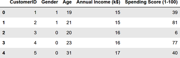
Let’s use k-means clustering to tackle a real problem: segmenting customers to identify ones to target with a promotion to increase their purchasing activity. The dataset that you’ll use is a sample customer segmentation dataset named customers.csv. Start by creating a subdirectory named Data in the folder where your notebooks reside, downloading customers.csv, and copying it into the Data subdirectory. Then use the following code to load the dataset into a Pandas DataFrame and display the first five rows:
importpandasaspdcustomers=pd.read_csv('Data/customers.csv')customers.head()
From the output, you learn that the dataset contains five columns, two of which describe the customer’s annual income and spending score. The latter is a value from 0 to 100. The higher the number, the more this customer has spent with your company in the past:

Now use the following code to plot the annual incomes and spending scores:
%matplotlibinlineimportmatplotlib.pyplotaspltimportseabornassnssns.set()points=customers.iloc[:,3:5].valuesx=points[:,0]y=points[:,1]plt.scatter(x,y,s=50,alpha=0.7)plt.xlabel('Annual Income (k$)')plt.ylabel('Spending Score')
From the results, it appears that the data points fall into roughly five clusters:

Use the following code to segment the customers into five clusters and highlight the clusters:
fromsklearn.clusterimportKMeanskmeans=KMeans(n_clusters=5,random_state=0)kmeans.fit(points)predicted_cluster_indexes=kmeans.predict(points)plt.scatter(x,y,c=predicted_cluster_indexes,s=50,alpha=0.7,cmap='viridis')plt.xlabel('Annual Income (k$)')plt.ylabel('Spending Score')centers=kmeans.cluster_centers_plt.scatter(centers[:,0],centers[:,1],c='red',s=100)
Here is the result:

The customers in the lower-right quadrant of the chart might be good ones to target with a promotion to increase their spending. Why? Because they have high incomes but low spending scores. Use the following statements to create a copy of the DataFrame and add a column named Cluster containing cluster indexes:
df=customers.copy()df['Cluster']=kmeans.predict(points)df.head()
Here is the output:

Now use the following code to output the IDs of customers who have high incomes but low spending scores:
importnumpyasnp# Get the cluster index for a customer with a high income and low spending scorecluster=kmeans.predict(np.array([[120,20]]))[0]# Filter the DataFrame to include only customers in that clusterclustered_df=df[df['Cluster']==cluster]# Show the customer IDsclustered_df['CustomerID'].values
You could easily use the resulting customer IDs to extract names and email addresses from a customer database:
array([125,129,131,135,137,139,141,145,147,149,151,153,155,157,159,161,163,165,167,169,171,173,175,177,179,181,183,185,187,189,191,193,195,197,199],dtype=int64)
The key here is that you used clustering to group customers by annual income and spending score. Once customers are grouped in this manner, it’s a simple matter to enumerate the customers in each cluster.
Segmenting Customers Using More Than Two Dimensions
The previous example was an easy one because you used just two variables: annual incomes and spending scores. You could have done the same without help from machine learning. But now let’s segment the customers again, this time using everything except the customer IDs. Start by replacing the strings "Male" and "Female" in the Gender column with 1s and 0s, a process known as label encoding. This is necessary because machine learning can only deal with numerical data:
fromsklearn.preprocessingimportLabelEncoderdf=customers.copy()encoder=LabelEncoder()df['Gender']=encoder.fit_transform(df['Gender'])df.head()
The Gender column now contains 1s and 0s:
Extract the gender, age, annual income, and spending score columns. Then use the elbow method to determine the optimum number of clusters based on these features:
points=df.iloc[:,1:5].valuesinertias=[]foriinrange(1,10):kmeans=KMeans(n_clusters=i,random_state=0)kmeans.fit(points)inertias.append(kmeans.inertia_)plt.plot(range(1,10),inertias)plt.xlabel('Number of Clusters')plt.ylabel('Inertia')
The elbow is less distinct this time, but 5 appears to be a reasonable number:

Segment the customers into five clusters and add a column named Cluster containing the index of the cluster (0-4) to which the customer was assigned:
kmeans=KMeans(n_clusters=5,random_state=0)kmeans.fit(points)df['Cluster']=kmeans.predict(points)df.head()
Here is the output:

You have a cluster number for each customer, but what does it mean? You can’t plot gender, age, annual income, and spending score in a two-dimensional chart the way you plotted annual income and spending score in the previous example. But you can get the mean (average) of these values for each cluster from the cluster centroids. Create a new DataFrame with columns for average age, average income, and so on, and then show the results in a table:
results=pd.DataFrame(columns=['Cluster','Average Age','Average Income','Average Spending Index','Number of Females','Number of Males'])fori,centerinenumerate(kmeans.cluster_centers_):age=center[1]# Average age for current clusterincome=center[2]# Average income for current clusterspend=center[3]# Average spending score for current clustergdf=df[df['Cluster']==i]females=gdf[gdf['Gender']==0].shape[0]males=gdf[gdf['Gender']==1].shape[0]results.loc[i]=([i,age,income,spend,females,males])results.head()
The output is as follows:
Based on this, if you were going to target customers with high incomes but low spending scores for a promotion, which group of customers (which cluster) would you choose? Would it matter whether you targeted males or females? For that matter, what if your goal was to create a loyalty program rewarding customers with high spending scores, but you wanted to give preference to younger customers who might be loyal customers for a long time? Which cluster would you target then?
Among the more interesting insights that clustering reveals is that some of the biggest spenders are young people (average age = 25.5) with modest incomes. Those customers are more likely to be female than male. All of this is useful information to have if you’re growing a company and want to better understand the demographics that you serve.
Note
k-means might be the most commonly used clustering algorithm, but it’s not the only one. Others include agglomerative clustering, which clusters data points in a hierarchical manner, and DBSCAN, which stands for density-based spatial clustering of applications with noise. DBSCAN doesn’t require the cluster count to be specified ahead of time. It can also identify points that fall outside the clusters it identifies, which is useful for detecting outliers—anomalous data points that don’t fit in with the rest. Scikit-Learn provides implementations of both algorithms in its AgglomerativeClustering and DBSCAN classes.
Do real companies use clustering to extract insights from customer data? Indeed they do. During grad school, my son, now a data analyst for Delta Air Lines, interned at a pet supplies company. He used k-means clustering to determine that the number one reason that leads coming in through the company’s website weren’t converted to sales was the length of time between when the lead came in and Sales first contacted the customer. As a result, his employer introduced additional automation to the sales workflow to ensure that leads were acted on quickly. That’s unsupervised learning at work. And it’s a splendid example of a company using machine learning to improve its business processes.
Supervised Learning
Unsupervised learning is an important branch of machine learning, but when most people hear the term machine learning they think about supervised learning. Recall that supervised learning models make predictions. For example, they predict whether a credit card transaction is fraudulent or a flight will arrive on time. They’re also trained with labeled data.
Supervised learning models come in two varieties: regression models and classification models. The purpose of a regression model is to predict a numeric outcome such as the price that a home will sell for or the age of a person in a photo. Classification models, by contrast, predict a class or category from a finite set of classes defined in the training data. Examples include whether a credit card transaction is legitimate or fraudulent and what number a handwritten digit represents. The former is a binary classification model because there are just two possible outcomes: the transaction is legitimate or it’s not. The latter is an example of multiclass classification. Because there are 10 digits (0–9) in the Western Arabic numeral system, there are 10 possible classes that a handwritten digit could represent.
The two types of supervised learning models are pictured in Figure 1-7. On the left, the goal is to input an x and predict what y will be. On the right, the goal is to input an x and a y and predict what class the point corresponds to: a triangle or an ellipse. In both cases, the purpose of applying machine learning to the problem is to build a model for making predictions. Rather than build that model yourself, you train a machine learning model with labeled data and allow it to devise a mathematical model for you.

Figure 1-7. Regression versus classification
For these datasets, you could easily build mathematical models without resorting to machine learning. For a regression model, you could draw a line through the data points and use the equation of that line to predict a y given an x (Figure 1-8). For a classification model, you could draw a line that cleanly separates triangles from ellipses—what data scientists call a classification boundary—and predict which class a new point represents by determining whether the point falls above or below the line. A point just above the line would be a triangle, while a point just below it would classify as an ellipse.

Figure 1-8. Regression line and linear separation boundary
In the real world, datasets are rarely this orderly. They typically look more like the ones in Figure 1-9, in which there is no single line you can draw to correlate the x and y values on the left or cleanly separate the classes on the right. The goal, therefore, is to build the best model you can. That means picking the learning algorithm that produces the most accurate model.

Figure 1-9. Real-world datasets
There are many supervised learning algorithms. They go by names such as linear regression, random forests, gradient-boosting machines (GBMs), and support vector machines (SVMs). Many, but not all, can be used for regression and classification. Even seasoned data scientists frequently experiment to determine which learning algorithm produces the most accurate model. These and other learning algorithms will be covered in subsequent chapters.
k-Nearest Neighbors
One of the simplest supervised learning algorithms is k-nearest neighbors. The premise behind it is that given a set of data points, you can predict a label for a new point by examining the points nearest it. For a simple regression problem in which each data point is characterized by x and y coordinates, this means that given an x, you can predict a y by finding the n points with the nearest xs and averaging their ys. For a classification problem, you find the n points closest to the point whose class you want to predict and choose the class with the highest occurrence count. If n = 5 and the five nearest neighbors include three triangles and two ellipses, then the answer is a triangle, as pictured in Figure 1-10.

Figure 1-10. Classification with k-nearest neighbors
Here’s an example involving regression. Suppose you have 20 data points describing how much programmers earn per year based on years of experience. Figure 1-11 plots years of experience on the x-axis and annual income on the y-axis. Your goal is to predict what someone with 10 years of experience should earn. In this example, x = 10, and you want to predict what y should be.

Figure 1-11. Programmers’ salaries in dollars versus years of experience
Applying k-nearest neighbors with n = 10 identifies the points highlighted in orange in Figure 1-12 as the nearest neighbors—the 10 whose x coordinates are closest to x = 10. The average of these points’ y coordinates is 94,838. Therefore, k-nearest neighbors with n = 10 predicts that a programmer with 10 years of experience will earn $94,838, as indicated by the red dot.

Figure 1-12. Regression with k-nearest neighbors and n = 10
The value of n that you use with k-nearest neighbors frequently influences the outcome. Figure 1-13 shows the same solution with n = 5. The answer is slightly different this time because the average y for the five nearest neighbors is 98,713.
In real life, it’s a little more nuanced because while the dataset has just one label column, it probably has several feature columns—not just x, but x1, x2, x3, and so on. You can compute distances in n-dimensional space easily enough, but there are several ways to measure distances to identify a point’s nearest neighbors, including Euclidean distance, Manhattan distance, and Minkowski distance. You can even use weights so that nearby points contribute more to the outcome than faraway points. And rather than find the n nearest neighbors, you can select all the neighbors within a given radius, a technique known as radius neighbors. Still, the principle is the same regardless of the number of dimensions in the dataset, the method used to measure distance, or whether you choose n nearest neighbors or all the neighbors within a specified radius: find data points that are similar to the target point and use them to regress or classify the target.

Figure 1-13. Regression with k-nearest neighbors and n = 5
Using k-Nearest Neighbors to Classify Flowers
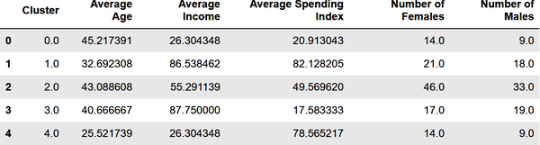
Scikit-Learn includes classes named KNeighborsRegressor and KNeighborsClassifier to help you train regression and classification models using the k-nearest neighbors learning algorithm. It also includes classes named RadiusNeighborsRegressor and RadiusNeighborsClassifier that accept a radius rather than a number of neighbors. Let’s look at an example that uses KNeighborsClassifier to classify flowers using the famous Iris dataset. That dataset includes 150 samples, each representing one of three species of iris. Each row contains four measurements—sepal length, sepal width, petal length, and petal width, all in centimeters—plus a label: 0 for a setosa iris, 1 for versicolor, and 2 for virginica. Figure 1-14 shows an example of each species and illustrates the difference between petals and sepals.
Figure 1-14. Iris dataset (Middle panel: “Blue Flag Flower Close-Up [Iris Versicolor]” by Danielle Langlois is licensed under CC BY-SA 2.5, https://creativecommons.org/licenses/by-sa/2.5/deed.en; rightmost panel: “Image of Iris Virginica Shrevei BLUE FLAG” by Frank Mayfield is licensed under CC BY-SA 2.0, https://creativecommons.org/licenses/by-sa/2.0/deed.en)
To train a machine learning model to differentiate between species of iris based on sepal and petal measurements, begin by running the following code in a Jupyter notebook to load the dataset, add a column containing the class name, and show the first five rows:
importpandasaspdfromsklearn.datasetsimportload_irisiris=load_iris()df=pd.DataFrame(iris.data,columns=iris.feature_names)df['class']=iris.targetdf['class name']=iris.target_names[iris['target']]df.head()
The Iris dataset is one of several sample datasets included with Scikit. That’s why you can load it by calling Scikit’s load_iris function rather than reading it from an external file. Here’s the output from the code:

Before you train a machine learning model from the data, you need to split the dataset into two datasets: one for training and one for testing. That’s important, because if you don’t test a model with data it hasn’t seen before—that is, data it wasn’t trained with—you have no idea how accurate it is at making predictions.
Fortunately, Scikit’s train_test_split function makes it easy to split a dataset using a fractional split that you specify. Use the following statements to perform an 80/20 split with 80% of the rows set aside for training and 20% reserved for testing:
fromsklearn.model_selectionimporttrain_test_splitx_train,x_test,y_train,y_test=train_test_split(iris.data,iris.target,test_size=0.2,random_state=0)
Now, x_train and y_train hold 120 rows of randomly selected measurements and labels, while x_test and y_test hold the remaining 30. Although 80/20 splits are customary for small datasets like this one, there’s no rule saying you have to split 80/20. The more data you train with, the more accurate the model is. (That’s not strictly true, but generally speaking, you always want as much training data as you can get.) The more data you test with, the more confidence you have in measurements of the model’s accuracy. For a small dataset, 80/20 is a reasonable place to start.
The next step is to train a machine learning model. Thanks to Scikit, that requires just a few lines of code:
fromsklearn.neighborsimportKNeighborsClassifiermodel=KNeighborsClassifier()model.fit(x_train,y_train)
In Scikit, you create a machine learning model by instantiating the class encapsulating the learning algorithm you selected—in this case, KNeighborsClassifier. Then you call fit on the model to train it by fitting it to the training data. With just 120 rows of training data, training happens very quickly.
The final step is to use the 30 rows of test data split off from the original dataset to measure the model’s accuracy. In Scikit, that’s accomplished by calling the model’s score method:
model.score(x_test,y_test)
In this example, score returns 0.966667, which means the model got it right about 97% of the time when making predictions with the features in x_test and comparing the predicted labels to the actual labels in y_test.
Of course, the whole purpose of training a predictive model is to make predictions with it. In Scikit, you make a prediction by calling the model’s predict method. Use the following statements to predict the class—0 for setosa, 1 for versicolor, and 2 for virginica—identifying the species of an iris whose sepal length is 5.6 cm, sepal width is 4.4 cm, petal length is 1.2 cm, and petal width is 0.4 cm:
model.predict([[5.6,4.4,1.2,0.4]])
The predict method can make multiple predictions in a single call. That’s why you pass it a list of lists rather than just a list. It returns a list whose length equals the number of lists you passed in. Since you passed just one list to predict, the return value is a list with one value. In this example, the predicted class is 0, meaning the model predicted that an iris whose sepal length is 5.6 cm, sepal width is 4.4 cm, petal length is 1.2 cm, and petal width is 0.4 cm is mostly likely a setosa iris.
When you create a KNeighborsClassifier without specifying the number of neighbors, it defaults to 5. You can specify the number of neighbors this way:
model=KNeighborsClassifier(n_neighbors=10)
Try fitting (training) and scoring the model again using n_neighbors=10. Does the model score the same? Does predict still predict class 0? Feel free to experiment with other n_neighbors values to get a feel for their effect on the outcome.
The process employed here—load the data, split the data, create a classifier or regressor, call fit to fit it to the training data, call score to assess the model’s accuracy using test data, and finally, call predict to make predictions—is one that you will use over and over with Scikit. In the real world, data frequently requires cleaning before it’s used for training and testing. For example, you might have to remove rows with missing values or dedupe the data to eliminate redundant rows. You’ll see plenty of examples of this later, but in this example, the data was complete and well structured right out of the box, and therefore required no further preparation.
Summary
Machine learning offers engineers and software developers an alternative approach to problem-solving. Rather than use traditional computer algorithms to transform input into output, machine learning relies on learning algorithms to build mathematical models from training data. Then it uses those models to turn future inputs into outputs.
Most machine learning models fall into either of two categories. Unsupervised learning models are widely used to analyze datasets by highlighting similarities and differences. They don’t require labeled data. Supervised learning models learn from labeled data in order to make predictions—for example, to predict whether a credit card transaction is legitimate. Supervised learning can be used to solve regression problems or classification problems. Regression models predict numeric outcomes, while classification models predict classes (categories).
k-means clustering is a popular unsupervised learning algorithm, while k-nearest neighbors is a simple yet effective supervised learning algorithm. Many, but not all, supervised learning algorithms can be used for regression and for classification. Scikit-Learn’s KNeighborsRegressor class, for example, applies k-nearest neighbors to regression problems, while KNeighborsClassifier applies the same algorithm to classification problems.
Educators often use k-nearest neighbors to introduce supervised learning because it’s easily understood and it performs reasonably well in a variety of problem domains. With k-nearest neighbors under your belt, the next step on the road to machine learning proficiency is getting to know other supervised learning algorithms. That’s the focus of Chapter 2, which introduces several popular learning algorithms in the context of regression modeling.