4
Putting It All Into Perspective
Painting is just another way of keeping a diary.
~ Pablo Picasso

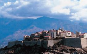
BLUE AND WHITE, SANTORINI
Watercolor on Arches 140-lb. (300gsm) cold-pressed paper 26" × 20" (66cm × 51cm) Collection of Jan Stewart and Gordon Allen
Your perspective is what makes you, you. You can bring more of yourself to your paintings and drawings with the art of perspective.
The traditional way to use perspective is to create the illusion of depth and dimension on a flat surface. Another way to use perspective is what I like to call creative framing. Creative framing is using an out-ofthe ordinary vantage point to translate your inner impressions. The creative exercises in this chapter will show you how to use both of these approaches. Get ready for some new perspectives on perspective!
A comfortable understanding of perspective drawing—the traditional method—allows the viewer to see a landscape or interior from the artist’s point of view. In the watercolor painting on the opposite page, I made use of one-point perspective to beckon the viewer to cross the threshold and step into this Greek island lane. As you look at this watercolor, it is as if you are standing in my shoes while I was creating it. Step a little to the left or right and you would see a different view.
Now, take a look at the sketchbook drawing on this page. It is a mixture of perspectives and conflicting planes. I drew it as if seeing the buildings from many different vantage points all at once. I wanted to suggest the quality of a hand-built environment—houses all cobbled together, no square corners or right angles in sight. Manipulating traditional ideas of perspective produces a very personal and playful vision of this same Greek village.
Keeping an artistic journal as a daily reference point helps me put my life into perspective, too. Some days, life is a jumble. As I sit down with my journal, I wonder what to capture. Shall I concentrate on just one narrow slice of my day? Or, embrace the larger constellation of my life? I use my artistic journal to reflect on my surroundings and sensations. Journaling is a wonderful way to discover your point of view and find a natural focus. The act of keeping art in my everyday life helps me truly acknowledge the present, appreciate the past and anticipate the future.
Bird’s-Eye View
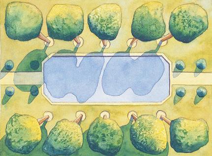
One of my favorite art escapes is imagining a landscape from an aerial perspective. There is something dreamlike about visualizing flying above a garden and seeing it from a bird’s-eye view. I love the play of shadow patterns against the blueprint of strong garden elements. Painting from a bird’s-eye view puts fundamentals of one-point perspective effortlessly into your hands. You will quite naturally discover rules of one-point perspective while doing this creative exercise.
I learned to use perspective only when I felt the need to show depth more convincingly in my paintings. So, I had a quick consultation with my friend, Bill, an architect. He simplified the basics for me quickly over coffee, drawing on the back of an envelope. Off to the studio I went to experiment. My advice is to avoid getting hung up on the rules and mathematics. Instead, dive into this exercise and learn to play with perspective—don’t stress about it.
Escape from the ordinary by envisioning a garden in your mind’s eye from the sky.
Imagine a Garden From Above
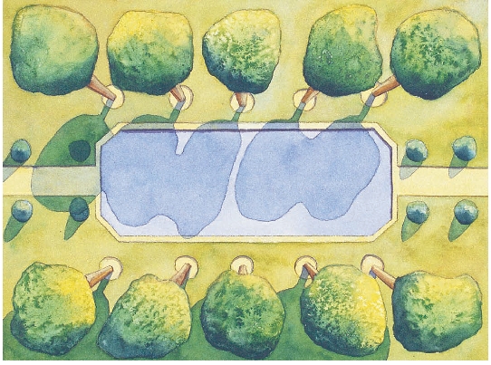
There are many drawings in my journal of imaginary gardens as seen from above. My own garden at home is a tiny, shady courtyard. Perhaps that’s why I love to imagine landscapes with big expansive lawns, pools, tall trees and blazing sunlight. This watercolor painting came from one of these imagined garden sketches. One-point perspective helped me bring dimension and depth to the painting, inviting the viewer to look down into the garden from a point directly above. Seeing the garden from above allows me to highlight the shadow patterns of the trees and bushes, as well as show a footprint of the whole garden plan. I included a pathway at the right and left to suggest that the garden continues into the distance.

Use One-Point Perspective for Depth
This invented landscape allowed me to decide exactly where the bird in my bird’s-eye view is suspended over the garden. I decided that the bird is flying directly above the center of the garden. Think of a bird flying with a camera and taking a picture while hovering directly above the middle of the pool. That point is the vanishing point. That’s the point of view of this painting and all the lines of the tree trunks refer to that point. That is one-point perspective in a nutshell (or eggshell). All you have to do is slant all the tree trunks so that they line up pointing to the vanishing point. Use a straightedge to connect the dots of the tree trunks to the vanishing point. That’s all there is to figuring out the angles of the trees.
Demonstration: Make a Garden
MATERIALS
Arches 140-lb. (300gsm) cold-pressed paper
Drafting tape
Full-spectrum triad pigments Permanent Rose, Winsor Blue (Red Shade), Winsor Lemon
Nos. 2 and 4 rounds
Pencil
Salt
Straightedge or ruler
![]() PAGE-A-DAY IDEA
PAGE-A-DAY IDEA
Paint Your Home From a Bird’s-Eye View
Pretend you are a bird flying above your own home and garden. All you can see is the design of the garden, not all the branches and leaves and certainly not any garden debris. Concentrate on the overall blueprint, not the details. You may want to invent what you would like your garden to look like. This can be a wonderful wintertime journal activity. If you don’t have a garden where you live, invent one. In fact, don’t stop there, invent a house or cottage to put beside it. Use one-point perspective to create a sense of depth as you look deep into your garden space.
![]() Follow along with me as I paint an invented garden landscape as seen from a bird’s-eye view. I discovered this style of painting several years ago when I stood at the top of a tall Venetian tower and looked at the garden directly below. I loved seeing the design the trees and their shadow patterns made from this unusual vantage point.
Follow along with me as I paint an invented garden landscape as seen from a bird’s-eye view. I discovered this style of painting several years ago when I stood at the top of a tall Venetian tower and looked at the garden directly below. I loved seeing the design the trees and their shadow patterns made from this unusual vantage point.

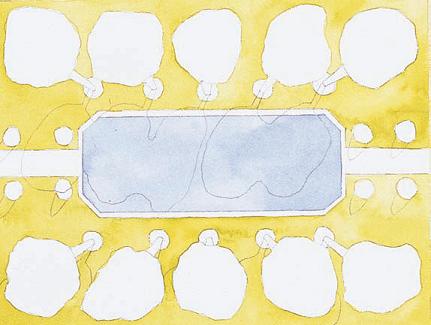
1 Draw the Garden Elements
Enlarge my painting on a photocopier and trace it onto a piece of watercolor paper. (Or create your own bird’s-eye design.) An easy way to trace is to place your drawing or photocopy behind your piece of watercolor paper and set them up against a bright windowpane. You will be able to see the drawing right through the 140-lb. (300gsm) watercolor paper. Tape the edges of the drawing with drafting tape. Be sure to draw in the shadow patterns made by the trees. Notice that all the shadows of the trees are parallel with one another. This is always true of shadows emanating from the sun.
2 Paint the Grass Areas
Mix an ample amount of green for the grass by combining Winsor Lemon with Winsor Blue. With a no. 4 round, paint all the lawn areas an even yellow-green. Continue with the no. 4 round to paint the pool an evenly applied blue shade, using Winsor Blue with a touch of Permanent Rose.

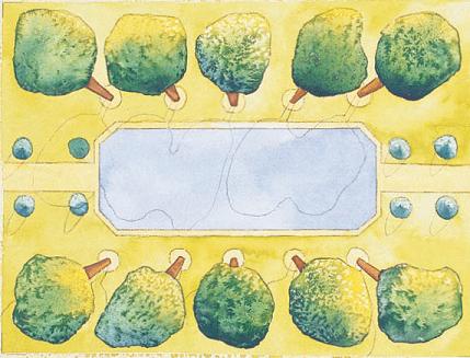
3 Paint the Trees and Bushes
Use the no. 4 round to paint the foliage of the trees a light yellow-green mixed with predominantly Winsor Lemon and a small touch of Winsor Blue for the sunlit areas, and dark green for the shadow side. I mixed a dark green hue by first creating a bright green of Winsor Blue and Winsor Lemon. To that mixture I added a small bit of Permanent Rose to gray the color to a deep, dark green. While the paint is still shiny wet, drop in salt for a textured appearance. It helps to draw an arrow or symbol on the taped edge to remind you of the direction of the sun.
4 Paint the Pathways and Tree Trunks
With a no. 2 round, paint the pathways a light yellow-tan made by mixing Winsor Lemon with a bit of Permanent Rose. Paint the trunks of the trees a brown shade using the no. 2 round, keeping the sunlit side lighter, and darkening the shadow side. My trick for mixing rich browns is to make a bright orange with approximately equal amounts of Winsor Lemon and Permanent Rose. Then add little bits of Winsor Blue to gray it to just the right brown color.
5 Paint the Shadows
The trees and bushes cast deep shadows from the sunlight. With the no. 2 round, darken the lawn, pool and pathways in the shadow areas. Use a more concentrated mixture of the same pool blue you used originally. Mix the grass shadow color from Winsor Blue and Winsor Lemon. Remember to pay attention to the angle of your shadows; they should be parallel to one another to replicate how shadows from the sun appear. Remove the tape and take a visual walk in your imagined landscape.
Piazza Perspective
Invite some friends or family members to Italy! Along the way, you will discover two-point perspective as you paint your loved ones into a Renaissance town square.
Perspective drawing teases the eye into seeing and believing an illusion of depth. The best way to learn perspective drawing is by having some fun with it. With this creative exercise you will gain a comfortable intuitive understanding of how two-point perspective works, all by putting your hands to work building a piazza. Come along and I’ll show you the tricks and techniques you’ll need for the construction of this painting.
I know it’s easy to get stumped and confused by the rules of perspective drawing. Trust me on this one—your painting will be dramatic and realistic after completing this creative itinerary.
Use Two Eyes to Create Three Dimensions
Here is a trick about perspective drawing. Figures of the same height, on the same plane, all have their eyes at the same level, no matter how close or far away they are. This is a useful thing for the artist to know.
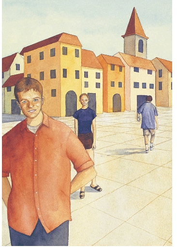
Let’s look at our Italian piazza. I drew all three figures as if they were all basically the same height. The eye level, my vantage point, is the reference point for everything in the drawing. My son, standing closest to me, is the young man at the left. (I can almost hear him say, “Hurry up and finish drawing, Mom!”) My daughter, in the middle, is standing further back. My husband, at the right, is walking even further back in the piazza.
Notice that all eyes are at the same horizontal level—the eye level—even though the figures are in different places on the town square. That’s the interesting thing about this particular perspective situation. Keep the eye levels of the figures constant (assuming everyone is about the same height) and the feet will end up in the right spot. If you want to put a shorter person or child in the picture, you simply have to lower the eye level a little bit below the standard reference point.

Vanishing Points Create Perspective
Take a look at the rooflines and tops and bottoms of the windows. They all slope downwards, meeting at two vanishing points, one at the right and one at the left. Now look at the base of the buildings. They slope upwards, meeting at the same two vanishing points. Above the eye level, lines slope down; below the eye level, lines slope up. Two-point perspective comes into play when you look at a building from an angle. Basically, when you can see two sides of a building, then you’ll have two vanishing points, which means two-point perspective. Simple enough! To simplify further, note that all the vertical lines of our buildings stay parallel to each other.
Let’s look at the paving stones of the piazza. See how the lines of the pavement also meet at the two vanishing points. Use perspective to make a tile floor or paving blocks look realistic.
Demonstration: Paint With Perspective
MATERIALS
Arches 140-lb. (300gsm) cold-pressed paper cut into small squares
Drafting tape
Full-spectrum triad pigments Permanent Rose, Winsor Blue (Red Shade), Winsor Lemon
Nos. 2, 4 and 6 rounds
Pencil
Salt
Straightedge or ruler
![]() Look through your photo references for people you would like to include in your painting. I added the figures by tracing them from photographs. The drawing of my son was taken from a small photo, which I enlarged on a photocopier and then traced onto the watercolor paper. I traced both my daughter and husband directly from the photos. I knew that no matter how large or small they were, if I placed their eyes at the same level, they would end up being in the right spot for correct perspective. I fudged a little bit because all three people are not exactly the same height, but it still works well enough to be convincing. That's what I mean about not getting too hung up on the math. I use perspective as a tool and technique to support, rather than stymie, my creativity. Just remember to keep the eye level constant, that's the trick.
Look through your photo references for people you would like to include in your painting. I added the figures by tracing them from photographs. The drawing of my son was taken from a small photo, which I enlarged on a photocopier and then traced onto the watercolor paper. I traced both my daughter and husband directly from the photos. I knew that no matter how large or small they were, if I placed their eyes at the same level, they would end up being in the right spot for correct perspective. I fudged a little bit because all three people are not exactly the same height, but it still works well enough to be convincing. That's what I mean about not getting too hung up on the math. I use perspective as a tool and technique to support, rather than stymie, my creativity. Just remember to keep the eye level constant, that's the trick.

Reference Photographs

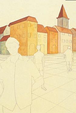
1 Draw Your Figures in the Piazza
Enlarge the piazza painting on a photocopier, and trace just the buildings and pavement onto a piece of watercolor paper. Leave the figures out. Draw in the vanishing points and eye level in pencil (they will be well past your drawing so use a large enough piece of paper).
Trace your figures into the drawing, placing them wherever you want them. Make sure the eyes are placed at the eye level. Erase the eye level line once you have all the figures in place. Make adjustments to accommodate large height differences between your figures. Put the eyes of a very tall person above the eye level, and the eyes of a very small child below the eye level.
Tape the edges of the drawing with drafting tape. With the no. 6 round, underpaint by covering the whole paper with a very light, muted yellow shade. The yellow under-painting will infuse the painting with a golden, old-world accent.
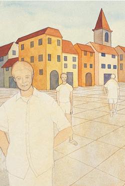
2 Paint the Buildings and Roofs
Check with a straightedge to insure that the angles of the roofs lead to their vanishing points. Use the no. 4 round to paint the buildings with different shades of yellows, oranges, pinks and warm grays. Paint the roofs a terra-cotta orange color.
3 Paint the Pavement and Windows
Use the straightedge to check the tops and bottoms of the windows; be sure they lead to their vanishing points. Paint the windows dark blue.
Paint a light tan mixture all over the pavement of the square using the no. 6 round. While the paint is still wet, use the corner of a credit card or a bamboo pen to scratch along the lines of the pavement blocks. Inscribing into the wet paint produces darker lines when it dries. With a no. 2 round, paint a natural looking shade on the faces, and other areas on the figures where skin is showing.

4 Paint the Faces and Figures
With a no. 2 round, paint the faces of the figures by referring to the photographs. Add the shadows cast by the figures on the pavement. Darken the shadow side of the roofs and the buildings. Take off the tape and admire your painting. Congratulations! You have just painted using two-point perspective.
Leave Out a Ground
My students laugh when I tell them that what I leave out of a landscape painting is more important than what I put in. I say that to remind all of us that we don’t have to include every tree, branch and leaf we see. In fact, the more you refine your vision, the more successful you are at revealing the essence of your personal experience. Artist Raoul Dufy said, “My eyes were made to efface what is ugly.” By that I think he meant “Go ahead and take out that clutter if you want so we can see what you really, truly love about this landscape.”
Before composing a landscape painting, take a good look at your subject, and identify the foreground, middle ground and background. Isolate each of these areas in your mind, seeing each one distinct from the other two. Practice this reframing process when painting outdoors or when working from a photograph. Then, give yourself license to simply eliminate one, or even two, of these grounds. What’s left is the passionate distillation of your unique vision.
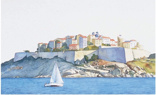
Eliminate the Background and Preserve the White of the Paper
This watercolor painting was inspired by a photograph taken by my friend, Robert Cantor, while on vacation in Corsica. After a mental reframing process, I decided to concentrate on the two elements most significant to me, the sea and sailboat of the foreground, and the citadel of the middle ground. I eliminated the background mountains, sky and clouds. Leaving the background area unpainted focuses attention on the stunning play of light and shadow on the walls, rocks and houses of the citadel, and the graceful sailboat skimming the brilliant blue sea. It also made it faster to paint!
Make Seven Paintings From One Landscape
Leaving out a ground is a liberating form of creative framing. You can easily paint the same scene several times, leaving out and including different grounds as you change your frame of mind. In fact, you can frame one subject at least seven different ways.
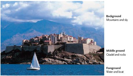
Foreground, Middle Ground and Background
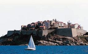
PHOTOGRAPH BY ROBERT CANTOR

Foreground Only

Middle Ground Only
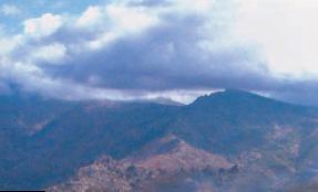
Background Only
Foreground and Middle Ground

Foreground and Background
Middle Ground and Background
Panoramic Perspective
Another fun art escape exercise is the painted panorama. Practice creative framing by isolating a narrow slice of a photograph into a panoramic perspective. Use this technique to salvage a poor photograph or make a good picture even better. There are no rules about how long or how narrow the image should be. Whatever gives you the most exciting visual information should be your rule of thumb for determining the borders. You can also make what I call keyhole paintings by framing a narrow vertical slice of a photograph, in addition to the horizontal framing shown here.

Isolate a Narrow Band
Robert Cantor took this photograph of the fourth 1998 Yankees-Padres World Series game. I isolated the action of the pitcher and batter, eliminating most of the photograph. The panoramic framework allows me to cut out the least interesting elements—the tops of the heads of the press in the front and much of the stadium stands. The charged energy of the game is heightened by paring down the photograph and reframing it to highlight what’s most essential—the players and the closest fans.
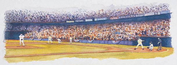
Watercolor With a Wide-Angle Lens
I like to fade the edges of my panoramas to create painted vignettes. This technique subtly suggests to the viewer that there is more to this scene, but I’m showing you the best parts. I painted this image on a piece of 9" × 12" (23cm × 30cm) Arches 90-lb. (190gsm) cold-pressed watercolor paper. I used 90-lb. paper because I planned to display this painting in a folded frame format. The 90-lb. paper is best for this purpose because it folds crisply.
![]() PAGE-A-DAY IDEA
PAGE-A-DAY IDEA
Get Involved in the Action
Sports are perfect for panoramic paintings because the interest is often spread over a wide field. Make paintings from quickly drawn sketches completed on site at ball-games. Or use the VCR to freeze-frame a highlight of a recorded sports event. Take your journal along with you to your children and grandchildren’s sports practices and events. I loved making panoramic drawings during my daughter’s ballet classes, and while sitting on the bleachers at my son’s baseball games. Here is a trick to capture the action. Freeze just one moment with a quick drawing. Use your one-minute drawing skills from chapter two to capture the basic gesture of the figures. Use your memory to add definition. Since the background isn’t in constant motion, you can take your time filling in the surrounding details.
Demonstration: Make a Panoramic Viewfinder
MATERIALS
Heavy paper, 85" x 11" (22cm x 28cm) sheet of white cover stock paper, or other stiff white paper
Pencil
Ruler
Scissors
![]() Reframe your photographs by looking at them through a panoramic viewfinder that you can easily make. See your photographs in a new light by cutting out distracting elements and focusing in on the visual action.
Reframe your photographs by looking at them through a panoramic viewfinder that you can easily make. See your photographs in a new light by cutting out distracting elements and focusing in on the visual action.

1 Cut the Paper in Half
Cut an 85" × 11" (22cm × 28cm) piece of white cover stock (or other sturdy white paper) in half, ending up with two identical 55" × 5" (13cm × 22cm) pieces.

2 Cut The Viewfinder
With a ruler, mark a 2-inch (5cm) border along the top edge and the left side edge. Cut along the lines, creating a 2-inch (5cm) wide right-angled corner. Cut the other piece of paper the same way.

3 Overlap the Pieces
Overlap the two right angle corners to create a panoramic viewfinder. You can adjust the height and length of the opening to frame the visual action of your photograph to its best advantage.

Frame Your Panorama
I moved and adjusted the two pieces of the viewfinder until I found just the right image to frame. I found precisely the elements in the photograph that I wanted to include in the painting.
Demonstration: Create a Folded Frame for Your Panoramas
MATERIALS
Arches 90-lb. (190gsm) cold-pressed paper, cut 9" x 12" (23cm x 30cm)
Bone folder or table knife
Craft knife
Double stick tape
Full-spectrum triad pigments Permanent Rose, Winsor Blue (Red Shade), Winsor Lemon
No. 2 round
Pencil
Straightedge or ruler
![]() Bring your art out of the studio and into your life! Display your painted panoramas in a handmade folded frame on your desk, table or shelf. I like being able to artfully display my watercolors without having to go to the bother and expense of a traditional mat and frame. This handmade folded frame is a wonderful way to present art to your friends. Slip it into an envelope and fill someone’s letter box with an artistic surprise.
Bring your art out of the studio and into your life! Display your painted panoramas in a handmade folded frame on your desk, table or shelf. I like being able to artfully display my watercolors without having to go to the bother and expense of a traditional mat and frame. This handmade folded frame is a wonderful way to present art to your friends. Slip it into an envelope and fill someone’s letter box with an artistic surprise.
For this exercise you will need a bone folder or a table knife. A bone folder is a book art tool used to fold paper by hand. The typical folder is made of white bone, about 6 inches (15cm) long and 1 inch (25mm) wide, with a tapered point.

1 Paint the Panorama
Fold a 9" × 12" (23cm × 30cm) piece of 90-lb. (190gsm) cold-pressed Arches watercolor paper in half. Score the line of the fold with a bone folder or the dull edge of a table knife blade before folding to get a crisp fold. Paint your panoramic composition on the bottom half of the folded paper. As you paint, the fold should be facing upward in a mountain position, rather than a valley position.

2 Fold and Cut the Display Frame
When your painting is dry, make the folds as indicated. Always fold through one single layer of paper at a time for cleaner and more accurate folds. Slit the center of the paper with a straightedge and craft knife as indicated by the dotted line in the diagram.

3 Display Your Painting
Paint the two inside panels with a color complimentary to your painting. Fold as shown and seal both ends with double stick tape. Give your creation to a friend or display it on your desk at work. This folded frame format makes a wonderful painted display card.
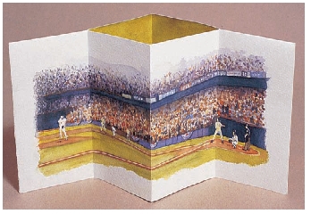
Panorama Folded Frame
The Sensory Perspective
Each of our five senses is a precious gift. Create a shrine of appreciation to each of them by painting abstract watercolors inspired by sensory mindfulness. The five-senses exercise invites you to be attentive to each of your senses, one at a time. What story is your sense of hearing telling you? What scents does your nose detect in the air right now? What taste sensations are lingering on your tongue? Where do your eyes pause and focus? How does your skin feel?
Discover a place of sanctuary. Is it a favorite park? A room in your home? A city street? A garden? Wherever that place is for you, take a few moments for what I call a sensory walk. Gently shut down the rest of your mind, and as you walk, simply listen, smell, see, taste and feel. Hold onto each impression for a moment. Heighten the awareness of your body and mind in space and time. Become a vessel for a sensory engagement with the natural world.
Normally, we blend all our sensations together into one overall impression. The differnece with this exercise is that you isolate each of your senses, and reflect on each one separately. This is a great way to creatively frame your personal perspective.
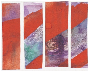
Sense of Hearing
I made this watercolor painting while I was sitting in a café by the yacht harbor in a small Mediterranean town in France. I was sitting peacefully, sipping a fresh-squeezed lemonade, listening to the gentle sounds of water lapping against the ancient seawall and splashing against the yachts anchored in the harbor. All of a sudden, an ambulance arrived, with a screaming siren. The red stripes in my painting represent the sound of the blaring horn, in contrast to the soft purples and greens representing the sound of the waves and water, and tinkle of cups and glasses in the café. After completing the painting, I cut it into four strips to create a collage. You can see that some sounds appear louder than others!

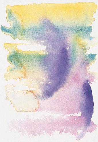
Sense of Taste
I like to make five-senses paintings on blank watercolor postcards. These are very handy, especially when traveling. This painting represents my sense of taste while in Turkey. I savored the fresh vegetables, the rich Turkish coffee, delicious black olives, tangy goat cheese…all that and more is in this watercolor! To create texture I scratched into the wet paint with the edge of a credit card, sprinkled salt onto the wet paint, and spattered red paint from my paint brush.
Sense of Touch
As I sat in the sun on the rooftop of my Istanbul hotel, I thought about all the sensations of touch I remembered from the previous two weeks in Turkey. Soft warm breezes and sharper, cooler winds, brisk dives into the sea, the smoothness of hand-polished woodwork on our boat, the relaxed feeling throughout my whole body as I lay on the deck as we sailed. It was a pleasure to recall all these sensory memories, and great fun to bundle them up into an abstract painting.

Sense of Smell
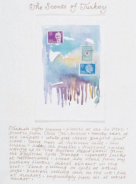
This little painting on a watercolor postcard represents what I perceived through my sense of smell as I took a sensory walk in a seaside town. The restaurants must have been preparing for lunch. My nose picked up the marine air of the sea and the pungent scents of the fisherman’s fresh catch, as well as very tangible notes of garlic, olive oil and eggplant sautéing. All the scents were distinct, but they melded together into a beautiful sensory concoction.

Sense of Sight
I feel as if I’m back in the Italian seaside town of Portovenere when I see this watercolor. After a sensory walk, I settled into a fine café and encapsulated my impressions of sight into this abstract painting. As I look at it now, I recall the warm tan tones of the ever-present stone building blocks and the brilliantly colorful umbrellas of all the cafés lining the harbor. Sunshine and bright Italian fabric colors round out my impression. It’s amazing how many memories these watercolors bring back. The act of creating from the treasury of your sensory storehouse is a powerful spiritual experience.
List Your Impressions
After you complete a five-senses painting, make a list of all the impressions that flood your mind. Just list them, don’t bother with sentences. You will be surprised by how much awareness you carry, and how many feelings you can remember as you start listing them. This is a page in my artistic journal from a trip to Turkey. This watercolor is dedicated to the sense of smell. My friend, Andrea, gave me some Turkish stamps. I loved the colors and designs, so I added them to the image. I attached my painting to a page in my journal with some double stick mounting tabs. I enjoyed the process of remembering and reliving all the wonderful scents of Turkey. The listing format freed me from worrying about grammar or sentence structure. I just kept listing and listing until I ran out of room.
