
6
Let’s Go Outside and Paint!
I would like to paint the way a bird sings.
~Monet

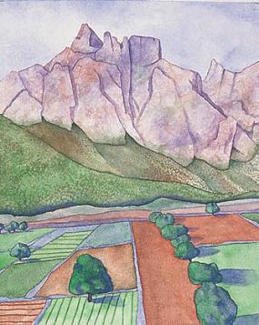
PROVENCE: SUMMER ABUNDANCE
Watercolor on Arches 140-lb. (300gsm) cold-pressed paper 28" × 20" (71cm × 51cm) Collection of Susan Monti
I love to paint outdoors. In this chapter, I’d like to share with you my joy of landscape painting. My best work comes when I am relaxed and enjoying myself. My four-step strategy to plein air painting helps me to “paint the way a bird sings”—freely, intuitively and passionately.
How do you get from seeing to painting? What are the steps to get you there? Over the years, I discovered four key steps to painting a landscape. Each step leads you quite naturally to the next one— from inspiration to shapes to values to color.
An essential element is painting with passionate color, rather than photographic color. In this chapter, you will learn how to convey the mood of the landscape with my four color triads. It’s time to get acquainted with the dynamic personalities of what I call the full-spectrum, earth, water and sun triads!
No two artists will capture a scene in the same way. Your impressions reveal what only you distill from a moment and place in time. It is a delightful truth that everyone experiences the kaleidoscope of life uniquely. I hope the projects and suggestions in this chapter will persuade you to go outside and paint your world!
Inspiration: The First Step
If we create from the heart, nearly everything works. If from the head, almost nothing.
~ Marc Chagall
The first step allows you to absorb the beauty of nature. You can be inspired by any number of aspects in a natural setting. The important thing is that you recognize what stirs you. Let that spiritual force propel your painting. Although this is the single most significant step to painting with expression, strangely, it is often overlooked. Get in touch with your emotional response to the landscape, otherwise you will have nothing to communicate to the viewer.
Take advantage of all your senses: sight, sound, touch, smell and taste. Look this way and that, until you find one view that attracts your attention more than others. Take a moment to ask yourself, “What is it about this place that I want to take home with me? What do I want to remember?” That is the element you need to emphasize in your painting.
Always refer back to your original source of inspiration. My quest is to produce paintings of beauty, originality and meaning. This initial step reminds me to put first things first, to reflect on what inspires my sight and my soul, and incorporate that essence in my artwork. As Paul Cézanne said, “Painting from nature is not copying the object; it is realizing one’s sensations.”

Record Your Inspiration
Painting landscapes en plein air has deepened my experience as an observer and traveler. I always take photos to include in my artistic journal. But a photo can never substitute for the on-site, in-the-moment acknowledgment of your sensations. This photograph was taken of a landscape in the south of France, and is the inspiration for Provence: Summer Abundance . I wanted to encompass all my passion for this countryside in my watercolor painting.

Brainstorm Your Emotional Response
After taking some moments to drink in the landscape, I like to record my sensations by writing in my artistic journal. I always make note of the time of day and the date. In the process of brainstorming my sensory reactions, I find it easy to distinguish vivid sources of artistic inspiration.
![]() PAGE-A-DAY IDEA
PAGE-A-DAY IDEA
Write It Down
Start by recording your impressions of a landscape in your sketchbook journal. Write for ten minutes continuously, without stopping. Chronicle your primary reactions and responses, without editing. A variation on this method is to write without lifting your pencil off the paper, one word flowing right into the next. I find this practice quite liberating.
Here are some questions to get you going:
![]() How does the air feel on your skin?
How does the air feel on your skin?
![]() Which colors attract your eye?
Which colors attract your eye?
![]() What fragrances or odors does your nose detect?
What fragrances or odors does your nose detect?
![]() What sounds do you hear?
What sounds do you hear?
![]() What does your sense of taste detect?
What does your sense of taste detect?
![]() Does the light or shadow in one area particularly attract you?
Does the light or shadow in one area particularly attract you?
After your ten-minute free-write, give your painting-to-be a working title, even before you begin painting. This working title will gently remind you to always refer back to your original inspiration, directing your attention to what you most want to communicate in your painting. The title can be descriptive, The Red Door, or metaphoric, Wild and Free. Remember: this is your own unique experience. Celebrate it!
Shape Plan: The Second Step
Drawing is not form, it is a way of seeing form.
~ Edgar Degas
Step two is simple; less is more! This is especially true when composing a landscape. Artists talk about learning to see. For me, that magic moment occurred when I learned to shift my vision from all the leaves on a tree and instead, saw a tree as one large shape.
Convey the essence of your inspiration by stretching beyond detailed representation. Simplify all you see in the landscape into ten to twelve abstract shapes. Focus on the big picture and eliminate detail. See shapes, rather than individual objects. Create unity by linking and interlocking shapes like pieces in a jigsaw puzzle. The underlying structure to your painting comes from seeing the landscape in as few shapes as possible.


Create a Strong Composition With Shape Plans
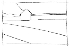
Take out your sketchbook and make thumbnail shape plans of your subject. Vary the format from horizontal to vertical. Draw the outline of the shapes with no detail at all. The more you experiment with different ways to frame your subject, the more original your composition will be. Crop the scene in different ways until you come up with a design that reflects your inspiration from step one. Draw from a variety of angles; come in close on the subject, and view it from far away. Give yourself the time to discover an inspired composition, expressing your response to the landscape. Experiment with a variety of shape plans. If you have drawn more than twelve shapes, take another look. Combine shapes. Take out unnecessary detail. Remember, less is more.

Reference Photo
![]() PAGE-A-DAY IDEA
PAGE-A-DAY IDEA
Walk on the Wild Side
I know a wonderful landscape photographer. He can make a familiar scene appear totally fresh by showing the viewer a completely new perspective. His secret is to assume that for the first fifteen minutes all his shots will be the usual, trite responses. After he gets the obvious out of his system, he begins to discover unusual angles. I’ve seen him crouch down on his hands and knees to shoot up at a sharp angle and jump on top of a stone wall to shoot his subject from above. I follow his advice when plein air painting and assume that my first drawings are going to be the most ordinary ones. I allow myself the time to work past conventional compositions. After my first attempts, I start seeing from a more unique perspective. Give yourself permission to get warmed up and go a little wild. Walk around and explore the landscape for fifteen minutes to allow unexpected viewpoints to arise. Discover the hidden beauty.
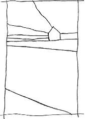
Look for an Underlying Design Select one shape plan from your thumbnails to develop into a painting. Count your shapes—remember no more than twelve. All shapes fit into each other in jigsaw puzzle fashion. Can you find an underlying structural design to your composition? Do all the shapes fit into a larger pattern that ties the whole image together? Look at the dotted lines to see the Z structure that underlies this entire composition. Think about the design as a whole and how all the elements work together.
Value Plan: The Third Step
A well-composed painting is half-done.
~ Pierre Bonnard
![]() PAGE-A-DAY IDEA
PAGE-A-DAY IDEA
Make a Music Spiral
Let yourself go in free response to music. Copy the dynamics of music in spontaneous, abstract painting. Start with a mark in the center of a new journal page. Start small and continue adding brushstrokes spiraling out from the center while you listen to the music. Use dynamic music with a lot of tempo changes. As you listen, make marks with a no. 2 round. Use Sumi ink, India ink or Winsor Blue watercolor so that you can clearly record variations in value. When the music comes to a crescendo, signal a focal point by using the darkest value against the white of the paper. When the music is soft and lyrical, place light values together to suggest the musical harmony. When the tempo or dynamics vary, change your brushstrokes. An intricate spiral design will emerge as you visualize the music. Your design will vary dramatically with the music. Try it next with a color triad!
In step three you turn your shape plan into a value plan. Values are the relative lightness and darkness of a color. They range from the pure white of the paper to the blackest black, and all shades of gray in between.
In music, there are soft, lyrical passages. There are also places where the dynamics are loud and the cymbals crash. The same is true in painting. The value choices you make can create areas of intensity. They can also create passages that sing with a softer, gentler voice.
The eye is attracted to contrast. Wherever you place the lightest light next to the darkest dark, you create a point of interest. In essence, you are crashing the cymbals and banging the drums! Likewise, you create serene sustaining passages when you stay within a narrower range of values.
Build a Value Chart
It’s a good idea to make your own value chart to add to your artistic journal for reference. I find it’s best to use Winsor Blue, a pigment that can go from very, very light to very, very dark. Draw five squares on a piece of watercolor paper, labeled from 1 to 5 as shown. Start by filling in the square for value 5 with as dark a blue as you can, using Winsor Blue. The darker you can make it, the better. Next, fill in value 3, the middle square. Take your time to match the value in my chart. Next fill in the square for value 4. Your shade should be halfway between value 3 and value 5. Lastly, complete the value chart by filling in the square for value 2. It is halfway between value 1 (white of the paper) and value 3.

1

2

3

4

5
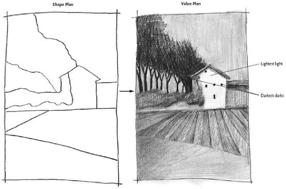
Go From the Shape Plan to the Value Plan
Add shading in pencil to indicate your value choices on top of your shape plan. Put in your darkest values first. Next, add the lightest values. Where they meet is your painting’s center of interest. Now add midtones everywhere else. Where there is no shading, you are indicating white of the paper, or value 1. Are you sure that is what you want in that area? Refer back to the brainstorming you did in step one. Does your value plan reflect your original inspiration and working title? Are you bringing the viewer’s attention where you most want it? Refer back to your value chart to remind yourself of the full range of values possible.
Using a Red Filter to See Values
Being able to see the highlights, shadows and everything in between is a skill worth learning. A trick I learned from a photographer friend is to use a red filter to view the landscape. Photographers find it useful to previsualize the landscape, obscuring color to mimic the contrast in black and white film. As you look at the landscape through a red filter, all the value contrasts are heightened. You’ll find it easier to see the lightest lights, the darkest darks and all the midtones in between because most of the color information is filtered out. I buy inexpensive clear red acetate at the art supply store and cut a piece into a 6" × 4" (15cm × 10cm) rectangle. Tape the acetate onto the back of an inexpensive 5" × 7" (13cm × 15cm) mat with a 3" × 41*****2" (8cm × 11cm) pre-cut window. I tuck it into my sketchbook so I have it handy while I’m composing my landscapes. Use what you learn by looking through the red filter when making your value plan.

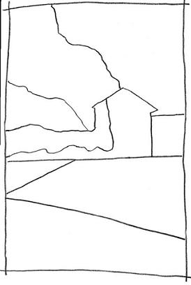
Turn Your Inspiration Into Shapes
This is a photograph I took while on a painting vacation in the Dordogne region of France. I was attracted to the irises growing like purple flags in the pocket garden in front of the house. I had a little bit of time to draw and paint, so I pulled out my sketchbook. I spent a few minutes brainstorming what appealed to me about this village house. I realized I loved the contrast between the rugged stone construction and the brilliant, fresh, dewy iris garden tucked into the front of the house. Next, I got started making thumbnail shape plans. I chose one to develop further into a painting.

Identify Values With a Red Filter
I was ready to make my value plan. I pulled my red acetate filter out of a pocket in my sketchbook to see the values in this scene more clearly. I’m glad I had my red filter with me while I was on location because it helped me make a value sketch. I was able to see how the light flowers in front of the irises stand out from the darker foliage behind them. Also, it helped me notice the dark value of the wooden shutters and door set against the stones of the house.
Moving From Landscape to Painting
The landscape artist has the ability to transform reality to better communicate an emotional response. I often elect to make my own value choices when painting a landscape. You can bring the viewer’s attention to any aspect of your painting by simply pumping up the value contrast.

Add Values on Top of Shapes in Your Artistic Journal
Here’s my on-location value plan, which I drew on top of my shape plan. I wanted to be sure to get the shapes of the shadows as they danced across the lane and in front of the house. On reflection, I see that I didn’t include the clouds in my drawing. If I paint this scene again, I think I will include the dramatic cloud formations in the photograph. You can always paint the same scene more than once.
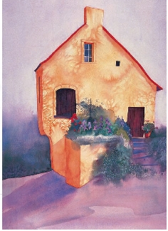
Put Inspiration Into Your Painting
This is my finished watercolor, Village House With Irises. Everything came together because of creative planning. I feel relaxed when it comes to painting, and simply enjoy myself, because I have a plan and know how I am going to proceed. The success of a painting very often has little to do with the actual time spent painting. Rather it has more to do with the time taken to plan your painting so you know how to go forward without anxiety. No plans are rigid, however, and adjustments happen as you dive into the creative process.
Color: The Fourth Step
It is not pure fantasy to say that the color red is like the sound of a trumpet.
~ Joyce Cary
![]() PAGE-A-DAY IDEA
PAGE-A-DAY IDEA
Make a Triad Sampler
Start with a quick landscape sketch on a journal page with a .50mm or wider felt-tip pen. Make four photocopies of your drawing on white cover stock. Paint each photocopied sketch with a different triad. Apply the paint loosely on top of the drawing. Splash on color mixtures to reveal the personality, temperament and possibilities of each color triad. Don’t forget to make note of the triad you used for each painting. When dry, add your triad samplers to your journal. Use the slit method described and you will be able to remove your four triad paintings for future color reference. You may need to trim the cover stock to fit your journal page. See if you feel the same way about the personality of the four triads as I do. Do my descriptions of each triad hold true for you? If other labels work better for you, use them.
Painting on-location is an art form of the moment—best done quickly before the light changes or you get uncomfortable. I always paint with triads when out-of-doors. Triads are a creative shortcut to vibrant color blends. With just three well-chosen pigments, I am confident of eye-catching and harmonious color mixes. The best part about painting with triads is that each of them conveys a different mood. Becoming familiar with the characteristics of each triad gives you a powerful catalyst for color expression. Each trio of pigments is a connoisseur’s recipe for creating atmospheric colors and an eloquent way to convey your original inspiration.
Triads Have Attitude
I painted the watercolor, Village House With Irises, using my sun triad. I knew before I started painting that this trio of pigments would create sun-drenched color blends—luminous violets, yellow-oranges and greens. It gave me confidence to know that all my mixes would be well balanced and communicate the mood of this summery scene.
Capture the Mood With Color Triads
Each triad interprets the landscape in a unique way. Marry the color mood of your watercolor with the emotional message you want to send to the viewer through your choice of triad. Painting with the three limited colors of a triad has the advantage of keeping the whole painting harmonious. Indeed, in some cases, you won’t be able to mix a match for the local color you see from the pigments in your triad. This is not a limitation! It is an invitation to paint passionately, rather than photographically. Put your personality into your painting, and let the viewer know what you feel about your subject, rather than merely reproducing it.

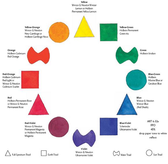
Full-Spectrum Triad
Sun Triad

Water Triad

Earth Triad
Triads Have Personality!
My palette is made up of twelve colors that form four different triads. I call them the full-spectrum, earth, water and sun triads. As I got to know each triad, it became clear to me that each one possesses an essentially unique personality. The way the pigments blend, mix and marry within each trio of colors creates an unmistakable atmosphere and mood. I realized I had unlocked a marvelous tool for self-expression. I gave the triads names corresponding to their color personalities.
Later I realized that these names echo the ancient world’s understanding of the four elements of the universe— air, earth, water and fire. However, don’t take these labels too literally. The sun triad is a lot more than yellows and oranges. The water triad is a lot more than blues and grays. And, the earth triad is a lot more than greens and browns.

Full-Spectrum Triad
![]() Winsor & Newton Winsor Lemon or Holbein Permanent Yellow Lemon
Winsor & Newton Winsor Lemon or Holbein Permanent Yellow Lemon
![]() Winsor & Newton Winsor Blue (Red Shade)
Winsor & Newton Winsor Blue (Red Shade)
![]() Holbein Permanent Rose or Winsor & Newton Permanent Rose
Holbein Permanent Rose or Winsor & Newton Permanent Rose
Characteristics: Multihued, fullness, airy, wind, abundance, potential, promise, horn of plenty, cornucopia, rich, profusion, treasure, fruitfulness, vigor, transparency, clear light, optimism, clarity, luscious, succulence, wholeness, fulfillment, well-being…

Earth Triad
![]() Holbein Permanent Green #2
Holbein Permanent Green #2
![]() Schmincke Ultramarine Violet
Schmincke Ultramarine Violet
![]() Holbein Cadmium Red Light or Winsor & Newton Cadmium Scarlet
Holbein Cadmium Red Light or Winsor & Newton Cadmium Scarlet
Characteristics: Minerals, stones, tile, bricks, cliffs, soil, mountains, weathered texture, dusty, sandy, fields, farms, plant life, orchards, weeds, natural elements, wood, texture, grasses, strength, groundedness, calm, terra firma…
![]() PAGE-A-DAY IDEA
PAGE-A-DAY IDEA
Construct a Color Library
One good way to get to know the triads is by making a color library of each one in your sketchbook. Open to a new page and paint each pure pigment at the three points of a triangle. Fill in the triangle with blends and mixes in between the pure pigments. Discover for yourself the temperament and spirit rooted in each one. Identify some characteristics of your own. Does one triad speak to you more than the others? For more ideas on color libraries.

Water Triad
![]() Holbein Viridian
Holbein Viridian
![]() Winsor & Newton Ultramarine Violet
Winsor & Newton Ultramarine Violet
![]() Holbein Cadmium Red Orange
Holbein Cadmium Red Orange
Characteristics: Watery, moist, misty, foggy, coolness, drizzly, hazy, vaporous, cloudy, dewy, low light, waterways, forests, dawn and dusk, less focused, underwater, subterranean, mysterious, secretive, deep, silent, moonlit…

Sun Triad
![]() Holbein Marine Blue or Holbein Cerulean Blue
Holbein Marine Blue or Holbein Cerulean Blue
![]() Winsor & Newton Permanent Magenta or Holbein Permanent Magenta
Winsor & Newton Permanent Magenta or Holbein Permanent Magenta
![]() Winsor & Newton New Gamboge or Holbein Gamboge Nova
Winsor & Newton New Gamboge or Holbein Gamboge Nova
Characteristics: Warmth, floral, sun-drenched, foliage, blooming, meadows, deserts, wildflowers, sun and shadow patterns, bright sunlight, fire, comfort, luminous light, joyful, pleasure, active, lush, velvety, burnished, radiant, flamelike, aglow, candlelit, golden, vivid…
Get to Know the Full-Spectrum Triad

The Full-Spectrum Triad
![]() Winsor & Newton Winsor Lemon or Holbein Permanent Yellow Lemon
Winsor & Newton Winsor Lemon or Holbein Permanent Yellow Lemon
![]() Winsor & Newton Winsor Blue (Red Shade)
Winsor & Newton Winsor Blue (Red Shade)
![]() Holbein Permanent Rose or Winsor & Newton Permanent Rose
Holbein Permanent Rose or Winsor & Newton Permanent Rose

Four Steps and the Full-Spectrum Triad Makes Plein Air Painting Fun
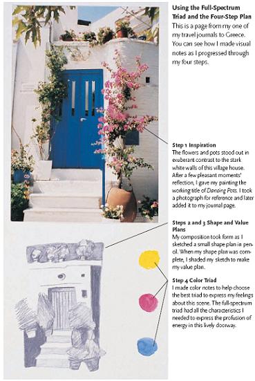
My journals are filled with small, playful watercolor paintings, which are often the inspiration for larger works completed back home in the studio. I cherish my travel journals as a resource book of ideas. My four steps help make painting outdoors a carefree and satisfying experience. Here is my painting Dancing Pots from my Greek travel journal.
Note how slits cut in the journal page with a craft knife support the painting done on a separate sheet of watercolor paper. This simple technique allows you to safely insert paintings into your artistic journal without degrading them with adhesive.
Get to Know the Earth Triad

The Earth Triad
![]() Holbein Permanent Green #2
Holbein Permanent Green #2
![]() Schmincke Ultramarine Violet
Schmincke Ultramarine Violet
![]() Holbein Cadmium Red Light or Winsor & Newton Cadmium Scarlet
Holbein Cadmium Red Light or Winsor & Newton Cadmium Scarlet
![]() PAGE-A-DAY IDEA
PAGE-A-DAY IDEA
Turn a New Leaf
Take an artistic ramble to collect leaves, twigs, flowers, weeds and other natural treasures. Every season offers its own special bounty. When you are back in the studio, sort through your collection and select a few to paint. Place each object directly on top of a new page in your journal. Play with the position of your botanical finds until you find an arrangement you like. When you are satisfied with your composition, simply hold each object in place and trace around the outside edges with a no. 2 pencil. Remove the objects after tracing them. Add watercolor to your drawing by using the earth triad to mix the rich colors of your nature study.

Express the Essence of the Scene With the Earth Triad
I love the way painting with a limited palette encourages color choices that aren’t a photographic match for the landscape, but instead lead me to make more personal, emotional choices. I gave myself permission to play with color in this watercolor, and use nonlocal colors for the trees, the vineyard stakes and the soil in the foreground. I knew that by using the earth triad, I would end up with a harmonious combination of colors, all conveying the richness of this vineyard scene.
WILLAMETTE VALLEY VINEYARD
Watercolor on Arches 140-lb. (300gsm) cold-pressed paper 7" × 11" (18cm × 28cm)
Demonstration: Use the Earth Triad
MATERIALS
Bamboo pen
Arches 140-lb. (300gsm) cold-pressed paper, cut to fit inside sketchbook
Earth triad pigments Cadmium Scarlet, Permanent Green #2, Ultramarine Violet
Facial tissues
Nos. 4 and 6 rounds
Salt
![]() The earth triad helped me to create beautiful colors—all summoning up this robust, natural environment. Paint this landscape yourself to learn how painting with triads helps you understand color by painting with a limited palette. When painting a landscape, a rule of thumb is to paint the most distant areas first.
The earth triad helped me to create beautiful colors—all summoning up this robust, natural environment. Paint this landscape yourself to learn how painting with triads helps you understand color by painting with a limited palette. When painting a landscape, a rule of thumb is to paint the most distant areas first.

1 Paint What Is Furthest Away
Wet the whole sky area with clean water. Then brush on diluted Schmincke Ultramarine Violet with a no. 6 round. Use a clean, dry tissue to lift some of the wet paint to suggest clouds.
Dilute a mixture of Winsor & Newton Cadmium Scarlet with Schmincke Ultramarine Violet and brush it over the entire mountain area with a no. 6 round. Suggest grassy areas by dropping in diluted Holbein Permanent Green #2 tinted with Winsor & Newton Cadmium Scarlet on some of the mountains while they are still wet. When dry, add shadows to the mountains with a darker shade mixed from Ultramarine Violet and Cadmium Scarlet.

2 Texture the Foothills With Salt
Paint the green foothills with a mixture of Holbein Permanent Green #2 and Winsor & Newton Cadmium Scarlet with a no. 6 round. Sprinkle each area with salt while it’s still shiny wet to create a textured surface to suggest forests and shrubbery.
3 Paint the Fields and Trees
Paint the farmland in the valley. Use unmixed Holbein Permanent Green #2 in the bright yellow-green fields. Create red-browns by mixing Winsor & Newton Cadmium Scarlet and Schmincke Ultramarine Violet, touched with just enough Holbein Permanent Green #2 to brown it. Scratch a pen nib into the surface of the wet paint to create dark lines for rows and furrows. Paint the trees green, created with Holbein Permanent Green #2 and a bit of Schmincke Ultramarine Violet to cool it down. Use pure Schmincke Ultramarine Violet for the shadows of the trees.
Get to Know the Water Triad

The Water Triad
![]() Holbein Viridian
Holbein Viridian
![]() Winsor & Newton Ultramarine Violet
Winsor & Newton Ultramarine Violet
![]() Holbein Cadmium Red Orange
Holbein Cadmium Red Orange
![]() PAGE-A-DAY IDEA
PAGE-A-DAY IDEA
Studio on Wheels
Inclement weather does not have to be an obstacle to the plein air painter. Fog and rain are commonplace where I live, but even during the wet months, I can still satisfy my urge to paint on site. My secret is to get in my car and drive to a scenic spot. All I do is point my car in front of an inspiring landscape and set up my studio on wheels. Fill your car’s cup holders with a cup of water for painting and a cup to hold your brushes. Lay out your drawing and watercolor tool kits on the passenger seat. Bring along some CDs or tapes to play while you explore the four seasons, good weather or not. Try out the water triad as you paint during a rainstorm, cozy and warm in your portable studio. It’s fun to be a foul weather painter.
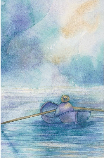
Make Watery Watercolors With the Water Triad
One of the great things about triad painting is that when you become familiar with the personality of each one, it takes no time to make color choices. This is a page from one of my artistic journals. I wanted to make a watercolor sketch of a lone fisherman at a nearby lake on a brisk fall day, but I didn’t want to spend a long time outside getting cold. I knew that the water triad would help me convey this misty scene. In essence, I let the watercolor pigments do some of the interpretive work for me. I painted the whole piece of watercolor paper with a soft, loose wash of the three water triad colors. After it dried, I sketched the fisherman in his canoe in pencil and then painted in the shapes.

Paint the Foggy, Foggy Dew
This watercolor explores the silvery, hazy quality of sunrise in an Oregon forest. The water triad conveys the soft, unfocused light of early morning, peeking between dense old-growth fir trees. The feeling of coolness and wetness in this palette lends itself to expressing water and reflections in a dewy way. The fir tree at the left was painted with a mixture of Holbein Viridian and Winsor & Newton Ultramarine Violet. I sprinkled salt on the wet paint to give the tree shape some texture and an illusion of depth. The water was painted all in one try. When dry, I added reflections of the tree trunks in the water. I then ran a clean no. 4 round horizontally across the reflections in the water, and gently lifted off some of the pigment to suggest ripples.
Get to Know the Sun Triad

The Sun Triad
![]() Holbein Marine Blue or Holbein Cerulean Blue
Holbein Marine Blue or Holbein Cerulean Blue
![]() Winsor & Newton Permanent Magenta or Holbein Permanent Magenta
Winsor & Newton Permanent Magenta or Holbein Permanent Magenta
![]() Winsor & Newton New Gamboge or Holbein Gamboge Nova
Winsor & Newton New Gamboge or Holbein Gamboge Nova
![]() PAGE-A-DAY IDEA
PAGE-A-DAY IDEA
Great Expectations
Fuse expectation with experience in a two-part journal exercise. Before going to an artistic event, open to a new page in your journal, and draw in pencil for just five minutes. Briefly record something about the upcoming event. There are no rules. Just draw whatever comes to your mind about the movie, concert, art exhibition, dance performance, lecture or museum you are going to see. After it is over, embellish and modify your preconception drawing. Erase, or go on top of your original pencil drawing, adding new or revised images. Use felt-tip pens to highlight the final drawing. Then choose a triad to add color. This exercise reveals the evolution of perception. Experience a heightened focus of attention during an event as you anticipate further reflection in your journal afterward. It helps me hold onto the beauty of a dance, the lilt of a song and the creativity of the artist.

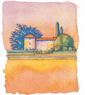
Paint Sun and Shadows With the Sun Triad
This is a little watercolor sketch made in the south of France, painted on a page in my travel journal. The color mixing was easy for me. I knew that the sun triad would help me convey the warmth of this sunlit scene. I could depend upon the harmony of the color mixes to fashion an atmosphere corresponding to what I most enjoy in the south of France—the strong light, olive trees, cypress trees and houses with tile roofs kissed by the sun on one side and bathed in warm shadows on the other.

The Landscape Is Aglow With the Sun Triad
Triadic painting means that you can quickly match the mood you want to convey in your paintings with specific color combinations. I wanted to capture the strong afternoon light and shadows of Provence, therefore I used the sun triad in this watercolor. Permanent Magenta and New Gamboge combine brilliantly for the rich orange of the painted stucco walls of the building. I sprinkled a little salt onto the wet paint for a textured look. It was a breeze to create the blues of the sky and the sign, using Marine Blue with a touch of Permanent Magenta. The dark green of the doors and shutters was created by mixing Marine Blue and New Gamboge to make a blue green, then adding a touch of the third pigment in the triad (Permanent Magenta) to gray it. The sign on the building says it all—“Paint in Provence” (with the sun triad).
My Color Palette
My palette is made up of just twelve pigments, one for each of the hues of the traditional color wheel. Each of the triads is balanced evenly around the color wheel. The idea is to keep it simple with twelve versatile and well-chosen pigments. From these twelve pigments, you can literally mix any color.
Each of these pigments has excellent lightfastness for color durability and longevity. I’m reminded of what J.S. Bach said of his son, C.P.E. Bach, “His music is Prussian Blue: it fades.” In those days, apparently Prussian Blue was not lightfast.
Another important quality of my palette is that each of these pigments is a pure color. Painting with pure pigments is essential to mixing vibrant colors. When you mix two colors together, you want to know that you are mixing just those two colors. For example, to get a brilliant violet, you mix together red and blue. With premixed pigments, there are colors other than pure red in your red pigment, and colors other than pure blue in your blue. You are actually mixing more than just red and blue together, you are mixing trace amounts of other colors that dull the brilliance of your violet.
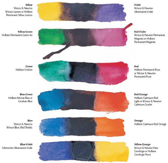
Perfect Complements Create Perfect Blacks
Color theory tells us that any complementary pairs mixed together create black. Complements are those pigments that are directly opposite each other on the color wheel.
Over the years, friends, students, friendly art supply stores and paint manufacturers have all offered me dabs and tubes of paint to try. When I eventually found just the right twelve pigments, I shouted “Eureka! I’ve got it!” Each pair of complements makes a perfect black.
You may want to replace a tube of paint for one that is close in color to one in my palette. There is an easy litmus test to see if your pigment is an accurate color substitute. Mix your pigment with its complement, and see if you, too, get black. If so, you have found a substitute.
The Palette Layout
My palette is like a good friend. It has been with me all over the world, and is the same one I rely on in my studio. I always use the Jones Color Round watercolor palette. It is specifically designed for the twelve pigments of the color wheel. This feature is a big help to the watercolor painter. You can purchase this palette at most fine art supply resources.
![]() PAGE-A-DAY IDEA
PAGE-A-DAY IDEA
Make Your Own Template
If you are using the palette I use, the Jones Color Round palette, you will want the template to be 7" (18cm) in diameter. If you are using a different palette, measure the diameter of that palette to determine how large to make your template. When your template is made, have it laminated for extra durability. Cut out the large outside circle of the template and the three small pigment circles with scissors. Use the black lines as a guide. Place the template over the palette. Now you are ready to pick a triad and experience the freedom of triadic painting.

Organize Your Pigments in a Circle
I’ve used this palette for years and love its color wheel organization, size and portability. To make it totally portable, fill each well with the correct pigment and let the paint dry until hard. Be patient, this thorough drying process can take a few days. When completely hardened, there are no dripping paint messes to worry about. When I’m ready to use a pigment, I spray it lightly with water to soften the paint.

Isolate the Triads With a Template
I designed my triad template to fit on top of my palette. As you rotate the template, you expose just the three pigments of each triad.
I love to visually isolate the colors of each triad. This prevents me from accidentally sticking my brush in the wrong well when in the whirl of painting. The less I have to think in a logical and linear way, the more I am free to be creative. All my planning comes before I start painting. My triad template is the secret to painting without working to remember which pigments are included in the triad.
Conclusion: Be an Art Explorer
The artist is an explorer—both of things you can see, and things you can’t see. Explorers make fantastic discoveries, but they also sometimes reach a dead end. This is a natural part of the process. As an art explorer, I give myself permission to take risks, reach dead ends and try new things that don’t always work out. That is the special privilege of the private experience in the artistic journal. Think of your journal work as exploration, rather than accomplishment, and discovery, rather than achievement. You never know what new worlds you will find when you embark on an uncharted art journey. Use your artistic journal to make private, personal art. You don’t need to share it with the public unless you choose. Explore your creativity wholeheartedy, and most importantly, relax. Open your journal, fill a page every day, and allow the magic to happen.
![]() PAGE-A-DAY IDEA
PAGE-A-DAY IDEA
Final Thoughts
![]() Break the rules and take artistic liberties. Paint the sky yellow, the trees purple, the grass orange and the water red!
Break the rules and take artistic liberties. Paint the sky yellow, the trees purple, the grass orange and the water red!
![]() The art critic is on vacation—toss judgement out the window. Nothing squelches creativity more than the daunting expectation of perfection.
The art critic is on vacation—toss judgement out the window. Nothing squelches creativity more than the daunting expectation of perfection.
![]() Have fun! Experiment with what you already know, and extend it into the unknown. Liberate yourself from predictability. Open up to the exhilaration of discovery.
Have fun! Experiment with what you already know, and extend it into the unknown. Liberate yourself from predictability. Open up to the exhilaration of discovery.

Dive In, the Water’s Fine!
Take the plunge and explore your creativity from the inside out. Pay attention to what captures your interest on a daily basis. Use your journal to make artistic gestures reflecting the pulse of your life. This is the rhythm and music of what is meaningful to you, and it contains the symbols of personal imagery. These two watercolor paintings are a good example. They came about after reading recent newspaper articles about the plight of salmon in the Northwest United States. I made some visual notations in my artistic journal, and from that a series of paintings evolved.
BLUE FISH, BLUE WATER
Watercolor on crinkled Masa paper collage on Arches 140-lb. (300gsm) cold-pressed watercolor paper 7" × 10" (18cm × 25cm)
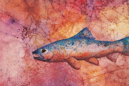
BLUE FISH, RED WATER
Watercolor on crinkled Masa
paper collage on Arches 140-lb. (300gsm) cold-pressed paper 7" × 10" (18cm × 25cm) Collection of Teri Wadsworth and John Paul