
Chapter Six
Pitfall 5: Analytical Aberrations
“Data is a tool for enhancing intuition.”
—Hilary Mason
How We Analyze Data
What is the purpose of collecting data? People gather and store data for at least three different reasons that I can discern. One reason is that they want to build an arsenal of evidence with which to prove a point or defend an agenda that they already had to begin with. This path is problematic for obvious reasons, and yet we all find ourselves traveling on it from time to time.
Another reason people collect data is that they want to feed it into an artificial intelligence algorithm to automate some process or carry out some task. This purpose involves a set of activities that I haven't really included in this book. But it, too, is fraught with pitfall after pitfall, on which I hope to write at some point in the future.
A third reason is that they might be collecting data in order to compile information to help them better understand their situation, to answer questions they have in their mind, and to unearth new questions that they didn't think to ask.
This last purpose is what we call data analysis, or analytics.
Pitfall 5A: The Intuition/Analysis False Dichotomy
Some years ago I saw a television commercial for Business Intelligence (BI) software in which a customer being interviewed had the following to say:
We used to use intuition; now we use analytics.
In other words, we're being asked to believe that the business owner was able to make progress by replacing decision making using intuition with decision making using analytics.
The statement didn't sit well with me, so I immediately tweeted the following:
Software ad: “We used to use intuition; now we use analytics.” This is the wrong mindset. One should complement, not replace, the other.
Working in the BI industry for many years, I heard similar attacks on human intuition from many different sides, and I don't agree with it at all. Here's my feeling on the topic in a nutshell: in a world awash with data, human intuition is actually more valuable than ever. Briefly, human intuition is the spark plug that makes the analytics engine run.
Intuition Wasn't Always a Byword
Contrast the commercial's negative attitude toward human intuition with Albert Einstein's rather glowing appraisal (Figure 6.1).
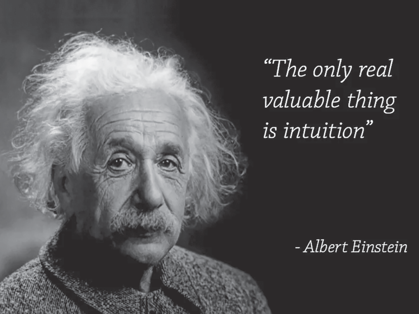
FIGURE 6.1 Albert Einstein.
Source: https://pixabay.com/photos/albert-einstein-portrait-1933340/.
Without a doubt, it would be hard to come up with a more positive statement about intuition than this.
So, which is it? Is human intuition a faulty and antiquated decision-making tool, in dire need of replacement with something better, or is it the only valuable thing there is?
Before we go any further, we should define the terms. The Oxford English Dictionary defines intuition as follows:
The ability to understand something immediately, without the need for conscious reasoning.
It comes from the Latin root word intueri, meaning to look at or gaze upon. Thus, the etymology of the word links it with the human visual system. Sight and intuition both occur instantaneously and effortlessly. Both can also mislead, of which more later. With intuition, as with sight, the awareness comes before any logical explanation.
The link between intuition and sight is often a very literal one. In social situations, we intuitively sense other people's emotions when we first lay eyes on their facial expressions (Figure 6.2).
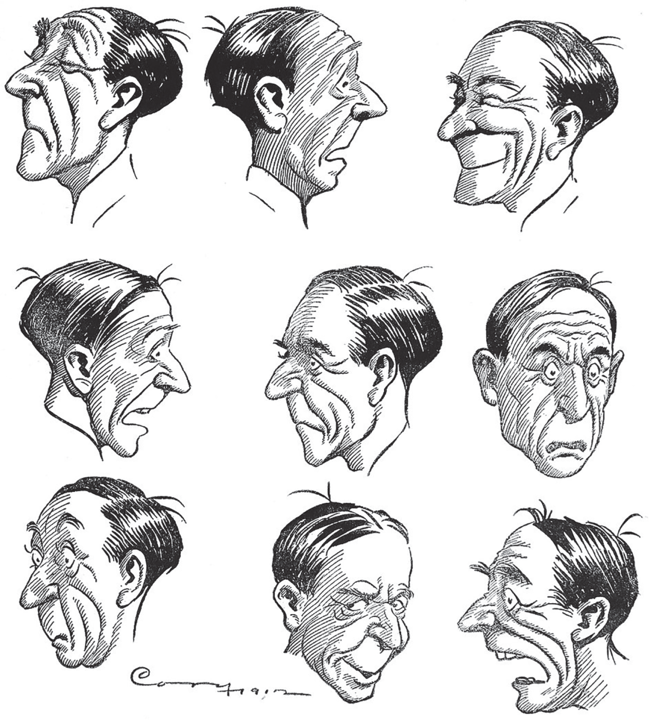
FIGURE 6.2 Facial expressions.
Source: J. Campbell Cory, The Cartoonist's Art (Chicago: Tumbo Company, 1912).
And with abstract representations of data, we spot the marks that have certain unusual attributes in an intuitive way – that is, we notice them without having to think about it. We call these attributes “preattentive.” Noticing them doesn't take effort; it's as if it happens to us. Figure 6.3 shows two versions of the same scatterplot, which plots the top scoring players in the North American professional hockey league in terms of the number of shots they took on net and the number of goals they scored over their career (for those who played after shots on net began being collected as a statistic).
The shapes in the scatterplot are determined by the position of the player. If I wanted to determine how many left wing players (indicated by arrows, or triangles, pointing to the left) are present in the view, it would be very time-consuming and error prone for me to use the top version of the graph. With this version, I need to scan the shapes, find each left arrow, keep its location in my mind so that I don't double count it, and hope I don't miss any. If I use the bottom version of the graph, however, answering the question becomes quite simple, and I can have a high degree of confidence that the answer is 12.
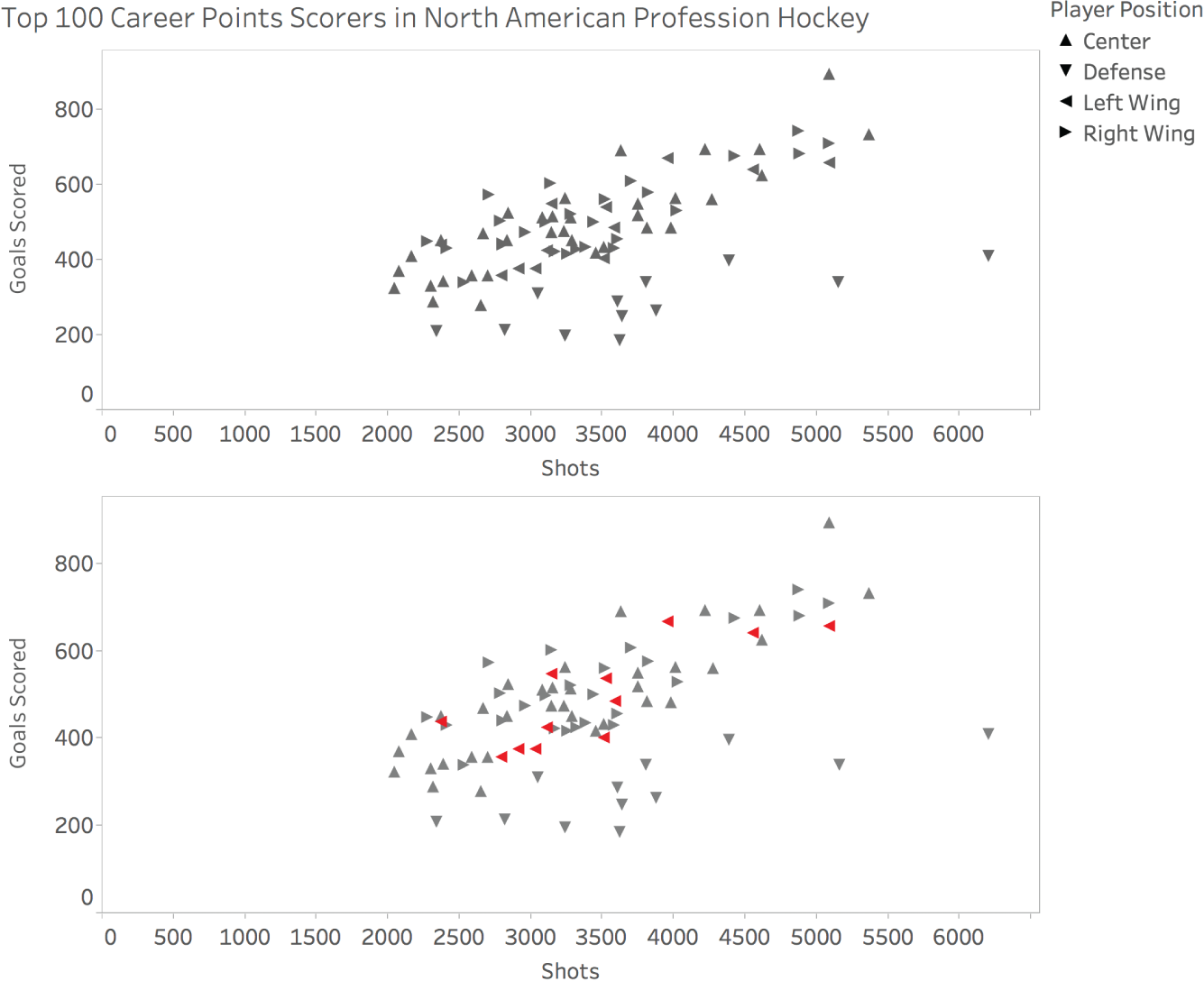
FIGURE 6.3 Two versions of the same hockey player scatterplot.
So there is a component of our intuition that we engage when we read charts and graphs. Similarly, we can feel a compelling sense of confidence in a specific situation about what is happening and why, as well as what's going to happen in the future, and what we should do about it now. This is what's commonly meant when someone says a person has a great intuition about a specific field.
Intuition is commonly contrasted with reason, “the power of the mind to think, understand, and form judgments by a process of logic.” Logic, in turn, involves “strict principles of validity.” And analytics is “information resulting from the systematic analysis of data or statistics.”
To make the best decisions in business and in life, we need to be adept at many different forms of thinking, including intuition, and we need to know how to incorporate many different types of inputs, including numerical data and statistics (analytics). Intuition and analytics don't have to be seen as mutually exclusive at all. In fact, they can be viewed as complementary.
Let me give some examples of how intuition provides the spark for the analytical process.
Five Reasons Why Intuition Still Matters
1. Knowing WHY any of it matters in the first place
Any process has an almost infinite number of variables that could be tracked and analyzed. On which should we spend our time? Knowing where to start can be a problem, especially if we know very little about the subject we're dealing with.
One school of thought goes something like this: collect data on everything and let an algorithm tell you which to pay attention to.
Sorry, I don't buy it.
First, not even the NSA collects data on “everything.” I guarantee you a filter has been applied to narrow the set of inputs. God may have counted every hair on your head, but I seriously doubt anyone else has.
Second, while data mining algorithms can discover notable patterns in huge data sets, only human intuition can discern between the useful patterns and the useless ones. They get their very “usefulness” from our goals and values.
2. Knowing WHAT the data is telling us (and what it's not telling us)
Once we pick data to collect and metrics to analyze, what do the numbers tell us? We talked about preattentive attributes briefly – via data visualization, our intuition can be put to good use interpreting the important 1s and 0s in the databases we've meticulously built.
Using intuition in this way isn't a perfect process though. Just as we might recoil from a garden hose that our instincts tell us is a snake, we can see signals in data that aren't really there. Alternatively, we can miss really important signals that are there. Just because intuition doesn't work perfectly, though, doesn't mean it should be discarded. We just need to hone our intuition for working with numbers, and we need to distrust it somewhat.
3. Knowing WHERE to look next
Jonas Salk, the American medical researcher who developed the first polio vaccine, had the following to say about intuition in his book Anatomy of Reality: Merging of Intuition and Reason:
Intuition will tell the thinking mind where to look next.
He made a discovery that has saved the lives of countless people in the world, and he chalked up an important part of his success to intuition. Often the best outcome of an interaction with data is that we sense another, even better question to ask. And the process iterates. The realization of the next place to look can form in our mind like an intuitive spark. The light bulb analogy applies.
4. Knowing WHEN to stop looking and take action
For many types of questions or problems, we could continue to search for a solution ad nauseum. Think of a chess game. What's the “best move” to make at a given point in the game? Russian chess Grandmaster Garry Kasparov understood something about this question, as stated in his book How Life Imitates Chess (Figure 6.4).
There comes a point in time when it's best to stop analyzing and make a move. Knowing when we've arrived at this point is a function of intuition. If we don't have this intuitive switch, we can suffer from “analysis paralysis,” and then we go nowhere. We've all been there. Kasparov went on to say:
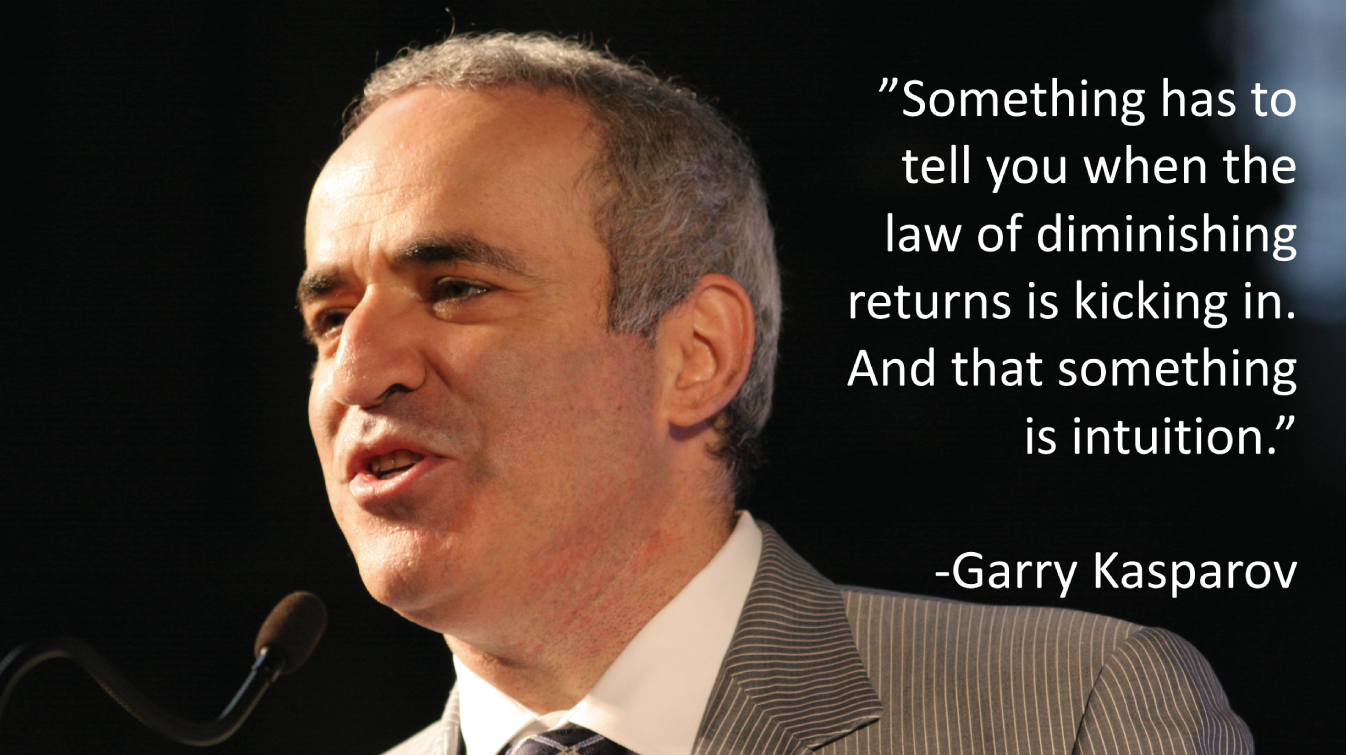
FIGURE 6.4 Quote from Garry Kasparov's book How Life Imitates Chess.
Source: https://commons.wikimedia.org/wiki/File:Garry_Kasparov_IMG_0130.JPG. Used under CC BY-SA 3.0.
The things we usually think of as advantages – having more time to think and analyze, having more information at our disposal – can short-circuit what matters even more: our intuition.
5. Knowing WHO needs to hear, and HOW to get through to them
A key part of the data discovery process is communicating our findings with others. We can use our intuition to choose the best message, channel, venue, visualization types, aesthetic elements, timing, tone, pace, and so on. If we have a deep understanding of our audience, we will intuitively know what will get through to them, and what will fall on deaf ears. When we get it right, it can be a wonder to behold. Think Hans Rosling.
Who is Hans Rosling? He is the late Swedish physician, world health statistician, and co-founder of the Gapminder Foundation. He delivered a TED talk titled “The best stats you've ever seen” that has been viewed over 13.5 million times to date.1 In it, he brings data to life like many of us had never seen before. He used an animated bubble chart to dispel many myths about the state of health and development across the world, enthusiastically describing the movement of the country circles across the screen more like a sportscaster calling a horse race than an academic describing statistical trends.
I got a chance to meet Dr. Rosling at a software conference in Seattle in 2016 where he was delivering a keynote about the changing face of the world's population. What object did he use to illustrate the growth projection by age group? Toilet paper, of course.2 In a peak moment for my career, it was my job to go to the local drug store and buy Hans his toilet paper. It's all downhill from there, people.
Crafting the communication is a creative process, and human intuition will need to be tapped to do it well. Rosling understood that.
So there you have it: not only does data not replace intuition and render it irrelevant, but intuition is actually the thing that makes data of any value at all. Take out intuition, and you take out why, what, where, when, who, and how. Sure, data may be the “new oil,” but human intuition is the spark plug that ignites the fuel in the engine.
For the reasons outlined above, I don't believe that human intuition will ever be rendered obsolete. No matter how smart our algorithms get, no matter how sophisticated our tools or methods, the intuitive “spark” in the human mind will always be the key element in our thoughts, in our decisions, and in our discoveries. Data and analytics can be the fuel lit by these sparks, and they can provide a way to make sure we're headed in the right direction, but they can't replace human intuition. Not the way I understand it, anyway.
I don't think the creators of the commercial would necessarily disagree with this point of view, so it likely comes down to semantics. Maybe the business owner in the commercial should have said, “We used to rely on intuition alone, now we combine it with analytics to make even better decisions.” Slightly less snappy, I know. But at least intuition doesn't get thrown under the bus.
Pitfall 5B: Exuberant Extrapolations
While data analysis is often primarily concerned with understanding what has taken place in the past, people often think of “analytics” as the application of tools and techniques to use data in order to make decisions about the future. That involves predicting what's going to happen next, and how actions we take and changes we set in motion are likely to affect future trends.
But predicting what's going to happen in the future can be risky business, and the analytical process of forecasting is fraught with hazards and pitfalls galore. That's not to say we shouldn't attempt to do it, but rather that we should do so with humility and a sense of humor about it, with our pitfall radar on full power. It helps to be aware of our often wildly inaccurate “data-driven” prognostications. Seeing how often we and others have gotten it wrong can serve as a healthy reminder to us.
Let's consider the problem we run into when we extrapolate trends into the future. One remarkable way that our world has changed over the course of the past half century is that people born in every single country are expected to live a lot longer now than those born in the 1960s.
For example, if we look at life expectancy in both North and South Korea through the 1960s and 1970s, we see that life expectancy started that period at around 50 years of age to the mid-60s. That is, people born in both sections of the Korean peninsula in 1960 were expected to live to around 50 years of age, and those born a decade and a half later in both places were expected to live to around 65 years of age (Figure 6.5).
I call this a “very steady increase” because linear regression trendlines for both countries, shown in the plot as dashed lines, have p-values of less than 0.0001, and coefficients of determination, R^2, above 0.95, meaning that the change in the x variable (Year) accounts for a very high percentage of the variation observed in the y value (Life Expectancy). In other words, a straight line that minimizes the vertical distance between each data point and the line comes close to touching all of the points.
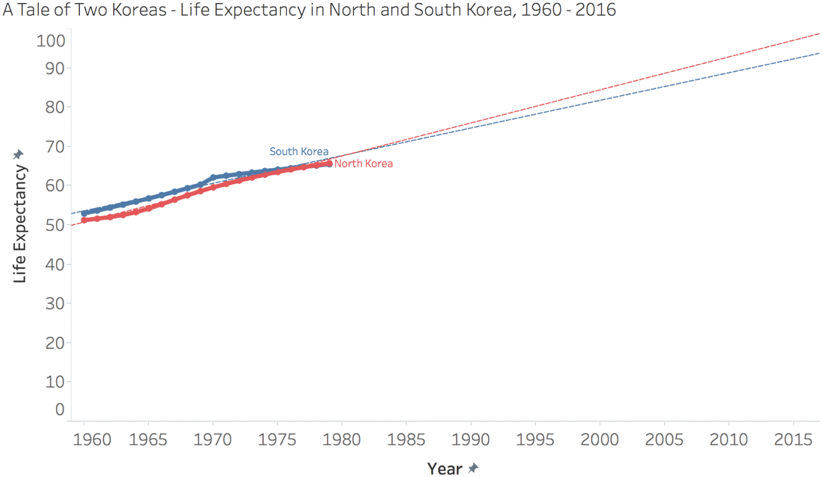
FIGURE 6.5 A tale of two Koreas: life expectancy in North and South Korea, 1960–2016.
An even simpler way to say it? The data points for each series come really close to forming a straight line.
If someone in 1980 were to have relied solely on the linear nature of this 20-year time series to predict the life expectancies of both North and South Koreans who would be born 35 years into the future, they would have come up with life expectancies of 96 years for North Korea and 92 years for South Korea in the year 2015.
Of course, that's not what we really see, and this shouldn't surprise anyone. The reasons are obvious. First, because we can reason that the life expectancy of our species, even though it may increase in a linear fashion for some period of time, can't continue increasing at the same rate indefinitely. The data will start to hit a natural ceiling, because people don't live forever. Where is the ceiling, exactly? No one knows for sure. But if we extend the series ahead to the end of our own current century, people born on the Korean peninsula can expect to live for around 170 years. Not likely, and no one is saying that.
But that's not the only reason why our 1980s friend's prediction would have been way off. Take a look at the way the actual trendlines played out over the course of the past 35 years, leaving us where we are at present with life expectancies of around 82 for South Korea and 71 for North Korea (Figure 6.6).
While life expectancy of those born in South Korea continued to increase in a highly linear fashion (R^2 = 0.986), we can see that it's starting to bend downward and take on an expected nonlinear shape as it approaches some unknown asymptote.
But the case of North Korea is quite different. A very notable shift occurred on the north side of the peninsula, and life expectancy actually dropped by 5 years during the 1990s as inhabitants in that country struggled with poor food availability and lack of access to other critical resources. Perhaps some people in 1980 had reason to be concerned about developing conditions in North Korea, but how would they have factored that knowledge into their forecast?
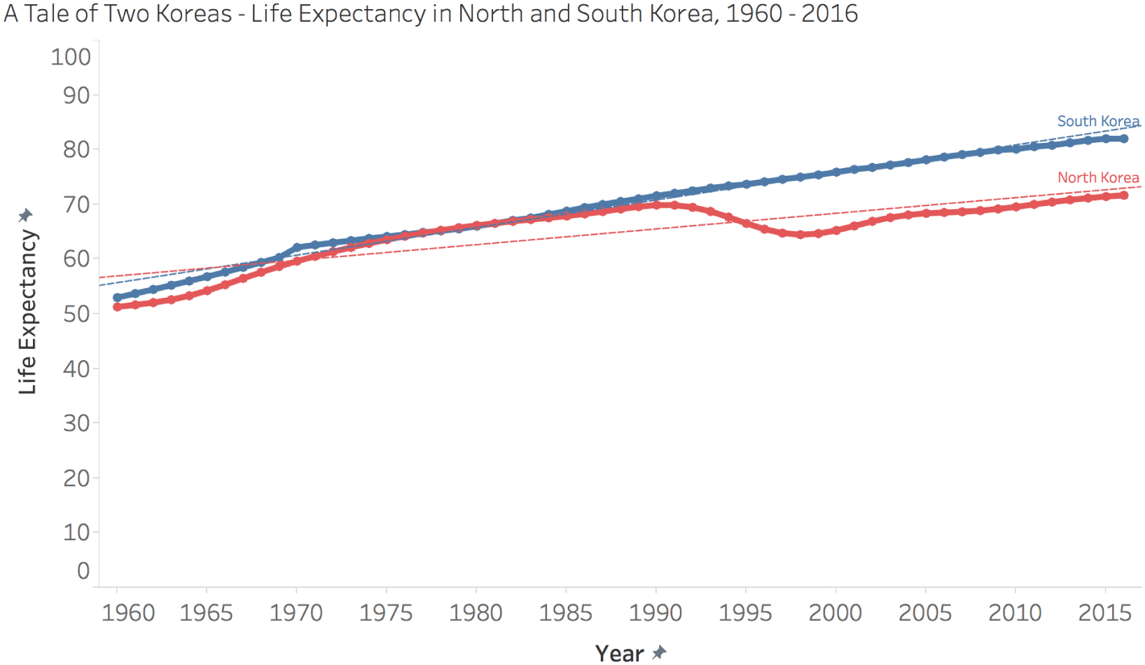
FIGURE 6.6 A tale of two Koreas: life expectancy in North and South Korea, 1960–2016.
Sometimes, the forecast works out fairly nicely. In the case of Brazil, for example, growth in life expectancy has continued to be highly linear since 1960. Extrapolating the 1960 to 1975 trend in a linear fashion, we would've predicted a life expectancy of around 79 in Brazil by 2015. The actual life expectancy of Brazilians born in 2015 was 75. Not exactly Nostradamus-level, but not that bad, either.
Other times, though, it doesn't work out very nicely at all. In the case of China, for example, a linear extrapolation from 1975 would've produced a wild and unlikely prediction of 126 years for the life expectancy of people born in that country by 2015. Of course, the dramatic increases seen in the 1960s weren't sustained over the rest of the latter half of the twentieth century, and life expectancy for people born in China in 2015 was 76 years. (See Figure 6.7.)
The case of life expectancy in China shines the spotlight on one other area of caution when we fit equations to empirical data. Often we fit many different mathematical models to a data series, and we take the one with the closest fit, or the coefficient of determination closest to 1.0, regardless of what that model implies.
It turns out that the slight “S-shaped” curve in life expectancy in China between 1960 and the early 1970s follows a polynomial equation incredibly closely. Fitting a polynomial curve to the data yields a coefficient of determination, R^2, of 0.999899. It's really remarkable how close the data comes to a perfect polynomial equation. It actually makes me wonder how it was obtained.
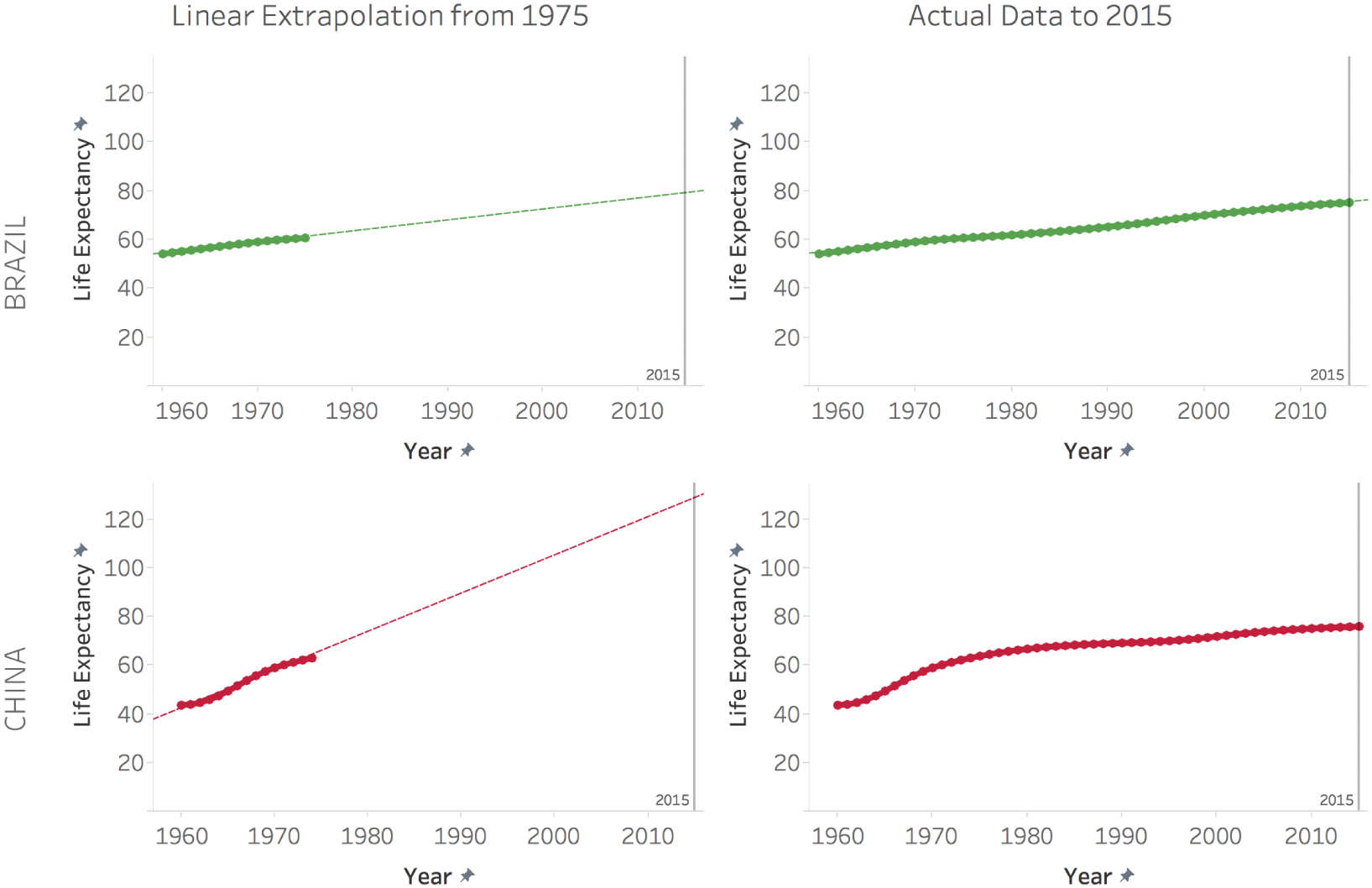
FIGURE 6.7 Linear extrapolation from 1975.
Setting that aside, take a look at the curve in Figure 6.8, zoomed in to see the shape and the model in more detail.
It doesn't take a genius to figure out that this model is even less useful for predicting future life expectancies than a linear one. It produces a completely nonsensical forecast, with life expectancies crashing to 0 and even becoming negative in a matter of a decade and a half.
It's actually pretty lucky for us when a model that fits the data so well turns out to be quite outrageous. It's as if there's a pitfall in the road, but it has a huge warning sign with bright flashing lights right in front of it. If we fall into that one, we're not really paying very close attention at all.
This has been a fun exercise in comparing a hypothetical extrapolation made by a fictional, unwitting analyst in the past with how things actually turned out. In this scenario, we have the benefit of the subsequent data points to see how extrapolation would have resulted in better accuracy in some countries than in others.
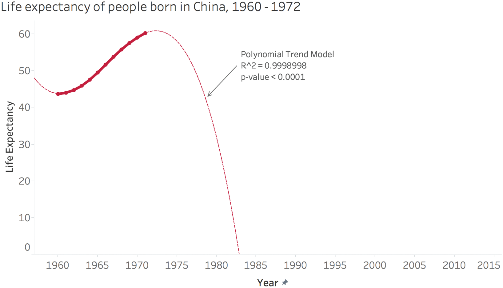
FIGURE 6.8 Life expectancy of people born in China, 1960–1972.
Sometimes we're not looking beyond existing data points, we're looking between them. That's the case for the next section, where we look at interpolations.
Pitfall 5C: Ill-Advised Interpolations
Any collection of time-series data involves a decision about sampling rate – the number of samples taken in a given unit of time. It's more commonly considered in signal processing and sound waves, where rates are measured in kilohertz (kHz) or thousands of samples per second, but it's a relevant factor to consider in any time-based data set. How often will data be collected? How much time will pass between each successive measurement? When we analyze or visualize the data, at what level of aggregation will we base our inquiry?
Let's continue using the same World Bank life expectancy data set to illustrate the impact of this choice on a macro scale – dealing with data on an annual basis.
The slopegraph is a popular way to visualize change over time. With a slopegraph, we simply connect the data from one period of time to the data from another, future period of time using a straight line. If we select seven specific countries and create a slopegraph showing how much life expectancy increased in each country in 1960 as opposed to 2015, we get the visual in Figure 6.9.
If you stop and think about it, we have just created an infinite number of brand new, fictional data points – the limitless number of points that lie on the line drawn between the two values. And what's the key takeaway from this fabrication? All countries increased in life expectancy between 1960 and 2015. It's not wrong to say that, by the way. It's a simple fact.
But it's woefully incomplete.
Let's see what happens when we add the annual values between these two years – over half a century of data about life expectancy. How does the story change? See Figure 6.10.
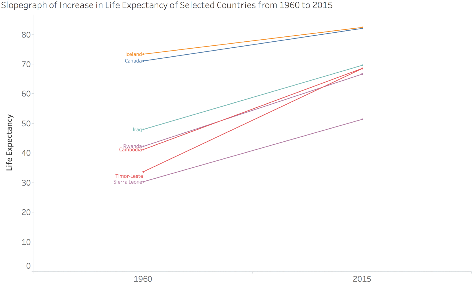
FIGURE 6.9 Slopegraph of increase in life expectancy.
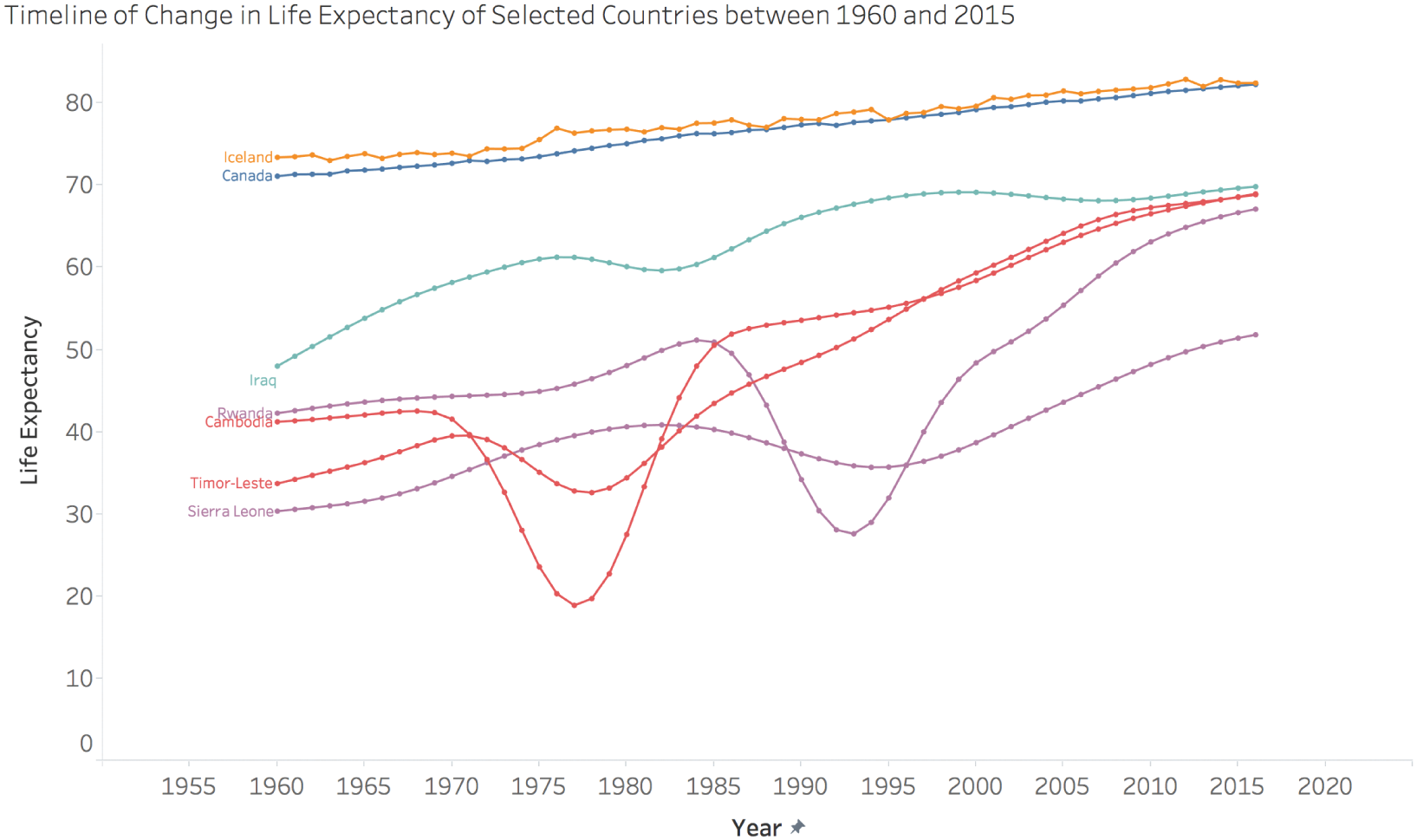
FIGURE 6.10 Timeline of change in life expectancy.
This visual tells a very different story, doesn't it? No longer missing are the tragic periods of war in Cambodia, Timor-Leste, Sierra Leone, and Rwanda. Yes, these countries saw dramatic increases in life expectancy over the course of the 55 years of time shown here. But they had to overcome massive bloodshed to get there. Life expectancy in Cambodia dropped to under 20 years of age in 1977 and 1978, the year I was born. The slopegraph fails miserably by completely omitting this story. It doesn't come close to telling us the full story.
Iraq is an interesting case, as well. The story that is missing from the slopegraph is that life expectancy in that country has hardly increased at all since the mid-1990s. Babies born in Iraq in 1995 were expected to live to 68 or 69 years of age, and the same can be said for babies born there in 2015. Two decades of stagnation. You don't see that in the slopegraph.
Finally, the comparison between Canada and Iceland is a technical one, but interesting all the same. In the slopegraph, it looks like these countries more or less follow each other closely. And they do. But if you compare how they look in the full timeline, you'll see that Iceland's line is somewhat jagged, with lots of small year-to-year noise, whereas Canada's line is much smoother. What's going on there? I'm not quite sure, but I can surmise that it has something to do with the way each country estimates and reports on life expectancy each year, and perhaps also the size of the population of each country. Clearly, they have different procedures, different ways of calculating and estimating this metric, different methods.
Does that matter? Maybe, and maybe not. It depends on the type of comparisons you're making with this data. It's definitely interesting to note that there are clearly multiple ways of coming up with each country's time series. The main point I'm driving home here is that when we choose a low sampling rate, we might miss this point altogether.
Let's consider a different, real-world example of dealing with time-series data that involves attempting to predict a highly volatile economic variable – unemployment.
Pitfall 5D: Funky Forecasts
Each February, the U.S. Bureau of Labor Statistics releases the average unemployment rate (not seasonally adjusted) for the previous year. Historical records are kept, so you can see annual unemployment rates going back to 1947.3
Another thing that happens right around this time is that the president's Office of Management and Budget also publishes their forecasts for a number of economic indicators, including unemployment. The forecast covers the current year and another 10 years into the future.
Additionally, the Obama White House preserved and published a record of all of the previously released forecasts going all the way back to President Ford's administration in 1975.4 The forecasts actually changed from a five-year time horizon to a ten-year time horizon in FY1997 of Bill Clinton's presidency.
What this provides us with, then, is an interesting opportunity to match up what each administration predicted unemployment to be with what it actually turned out to be. In Figure 6.11, the dark line represents the actual average annual unemployment and the thin blue and red lines represent forecasts made by Democratic and Republican presidents, respectively. Thin vertical lines indicate each president's four-year or eight-year time in office.
What does this tell us? It indicates pretty clearly that no matter what the unemployment situation actually was – whether it was on the rise or on the decline – each president's staff predicted a return to around 5% average annual unemployment. Of course, unemployment moves in waves with the economy, so it's just not realistic to predict an almost perfectly steady unemployment rate for a whole decade, as George W. Bush's team did in FY 2008, or as Clinton's team did in FY 1998.
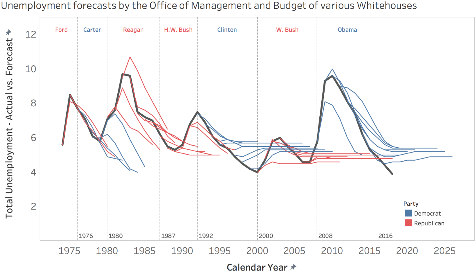
FIGURE 6.11 Unemployment forecasts by the Office of Management and Budget of various White House administrations.
Most presidents have done just that, though. They have predicted a fairly immediate return to the 4% to 6% range.
When actual unemployment spiked in 2009, did any of the previous forecasts, including the ones that were published only a year or two prior to the ramp-up, predict the rising trend? Of course not. Can you imagine the uproar it would cause? “In spite of record low unemployment, the president's staff is predicting a rapid increase in unemployment that will begin in two years’ time.” Here's a highlighted version of the previous chart that shows the actual unemployment, and Bush's glib prediction in FY 2008 (Figure 6.12).
Now you may say, “Ben, there's a big difference between what a politician thinks is going to happen, and what he or she is willing to say to the general public is going to happen.” And I'd agree with that. No one is accusing them of being sincere here. But I do think it's interesting that presidents continue to publish this fiction. And I do think it's interesting that an annual prediction of “things are about to return to a sane level” gets any attention whatsoever.
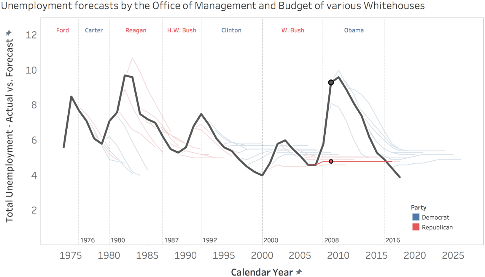
FIGURE 6.12 Unemployment forecasts.
There are honest predictions, and there are things we tell ourselves to make ourselves feel better. I think it's clear which we're dealing with here.
Pitfall 5E: Moronic Measures
It's relatively obvious that life expectancy and unemployment are metrics that matter. They can be confusing and controversial, but tracking how long people live and how many people are out of work is not controversial at all. But that's just not the case for all metrics.
Data is used to measure and compare human beings in many ways in the world we live in. We get accustomed at a very young age through the school system to being tracked, scored, assessed, and ultimately judged by numbers and figures. This typically continues well into our adult lives – sales reps get ranked based on performance to quota, employees get their annual performance review, authors and professors get rated online, and so on.
These numbers and figures can be related to different kinds of things:
- They can be based on our levels of activity – how much did we do something?
- They can be the subjective opinions of others – what did someone or some group of people think of us?
- They can be some objective measure of results, performance, or output – what was the result of our efforts?
High achievers and competitive people can react pretty strongly to news about poor performance scores, no matter what the metric. That fact was on display during the 2018 North American professional basketball league playoffs, when global basketball star LeBron James, playing for the professional team in Cleveland at the time, was told by a sports reporter that he's recording the slowest average speed of anyone on the floor thus far in the Eastern Conference finals series that was being played against the team from Boston.5 This metric is based on the league's relatively new player tracking system.
Is the Best Player Really the Slowest?
Technically, the reporter was right, at least as much as we trust the accuracy of the player tracking system. It was actually worse than just that series, though. As amazing as he is, James was, in fact, tied with one other player for dead last out of the 60 players who had played 8 or more games with player tracking activated in that year's playoffs.
So what was James's reaction to this information?
That's the dumbest sh*t I've ever heard. That tracking bullsh*t can kiss my a**. The slowest guy? Get out of here.
So, basically, he didn't like it. He didn't stop there:
Tell them to track how tired I am after the game, track that sh*t. I'm No. 1 in the NBA on how tired I am after the game.
Thou Dost Protest Too Much
What I find most interesting is that he didn't object along the lines that I thought would be most obvious – to point to his league-leading scoring statistics,6 his freakishly high efficiency and game impact metrics,7 or his team's incredible play to that point. Those would be objections about the use of an activity metric (how fast was he running up and down the court) instead of an output metric (how much was he actually contributing and helping his team to win).
He could have just laughed and said, “Imagine what I could do if I actually ran hard.” But no – he took exception to a metric that seemed to indicate he wasn't trying hard. He appealed to something else entirely – how tired he felt after the game – to counteract that implication.
Is Average Speed a Bogus Metric?
So is it the “dumbest sh*t” to use this particular metric to track basketball player performance in the first place? Is average speed over the course of a game a good performance indicator of that player's contribution to the outcome of the game? Perhaps not.
But is there a better way to measure a player's actual impact on a game? It turns out there are many different ways to measure this. An interesting way to measure player contribution is known as PIE – Player Impact Estimate – and it seeks to measure “a player's overall statistical contribution against the total statistics in games in which they play.” Or, “in its simplest terms, PIE shows what % of game events did that player or team achieve.”8
Of course, no one would be surprised to find out that LeBron had the highest PIE of any player in the playoffs at that point, and it wasn't even close. LeBron was involved in 23.4% of game events by that point in the 2018 playoffs. The next closest player was Victor Oladipo of the Indiana Pacers with a PIE of 19.3.
So how does average speed relate to PIE? If LeBron was last in the former and first in the latter, we'd guess that there's not a strong positive correlation. And we'd guess right. If we correlate average speed with PIE, we see that there's a very weak correlation (the coefficient of determination, R^2, is only 0.056) (Figure 6.13).
What's interesting is that this view shows that LeBron is way up in the top left corner of this chart – he had a low average speed and a high player impact estimate compared to other players. But as it turned out, he was in really good company in this top left quadrant, with 10 of the 12 remaining 2018 All-Stars also in this space. It would appear that the very best players don't seem to have to run fast over the course of an entire game.
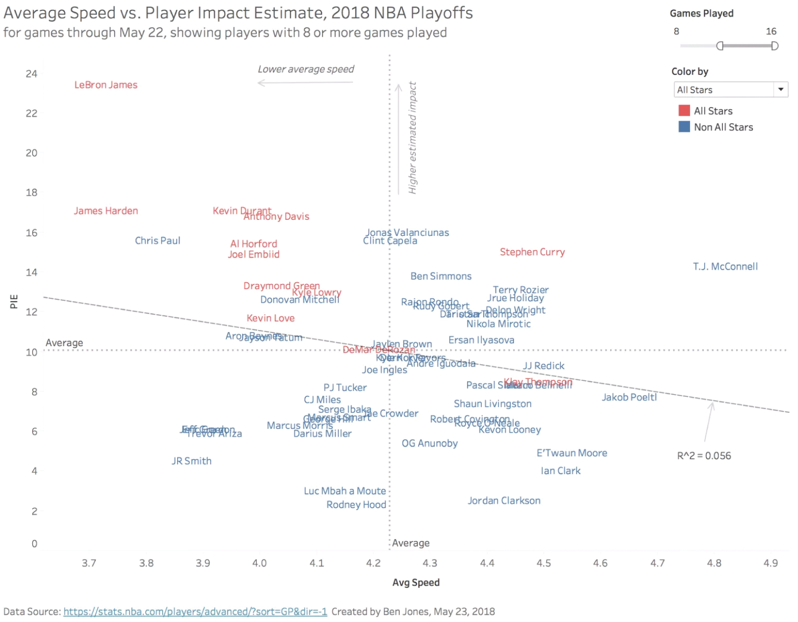
FIGURE 6.13 Average speed versus player impact estimate.
It's interesting to compare the lessons from this situation with the way an analyst might present performance scores in a company. The analyst should seek to get buy-in from stakeholders before sharing performance metrics with them. People tend to take measurements of their effort and performance very personally. I know I do. We'd do well to relax a little about that, but it's human nature.
We should also take care to put the emphasis on the metrics that actually matter. If a metric doesn't matter, we shouldn't use it to gauge performance. And activity and opinion metrics are one thing, but they should always be secondary in importance to output or performance scores. Just measuring how much people do something will simply prompt them to increase the volume on that particular activity. Just measuring how much someone else approves of them will lead them to suck up to that person. We all want to contribute to a winning team, and our personal performance metrics should reflect that.
At the same time, though, data is data, and tracking things can help in interesting ways. Perhaps the training staff could use the average speed data to track a player's recovery from an injury. Or perhaps a certain, ahem, all-star player later in his career could benefit from keeping average speed down to conserve energy for the final round. Or perhaps a coaching staff could evaluate their team's performance when they play an “up-tempo” style versus running the game at a slower place. Who knows?
In other words, data is only “the dumbest sh*t you've ever heard” when it's used for the wrong things.
Notes
- 1 https://www.ted.com/talks/hans_rosling_shows_the_best_stats_you_ve_ever_seen?language=en.
- 2 https://www.youtube.com/watch?v=dnmDc-oR9eA.
- 3 https://www.bls.gov/cps/prev_yrs.htm.
- 4 https://obamawhitehouse.archives.gov/sites/default/files/omb/budget/fy2017/assets/historicadministrationforecasts.xls.
- 5 https://theathletic.com/363766/2018/05/22/final-thoughts-on-lebron-james-and-the-speed-required-to-tie-this-series/.
- 6 https://stats.nba.com/leaders/.
- 7 https://stats.nba.com/players/advanced/?sort=PIE&dir=-1&CF=MIN*GE*15&Season=2017-18&SeasonType=Playoffs.
- 8 https://stats.nba.com/help/glossary/#pie.