
Chapter Four
Pitfall 3: Mathematical Miscues
“Calculation never made a hero.”
—John Henry Newman
How We Calculate Data
There are heroes and there are goats. As the epigraph states, calculation may have “never made a hero” – a status more commonly attributed to women and men who pull off daring acts of bravado in spite of great odds – but failure to calculate properly has definitely made more than one goat.
Infamous examples abound, such as the disintegration of the Mars Climate Orbiter1 on September 23, 1999, due to atmospheric stresses resulting from a problematic trajectory that brought it too close to the red planet. The root cause of the faulty trajectory? A piece of software provided by Lockheed Martin calculated impulse from thruster firing in non-SI pound-force seconds while a second piece of software provided by NASA read that result, expecting it to be in Newton seconds per the specification. One pound-force is equivalent to 4.45 Newtons, so the calculation was off by quite a bit.
These cases remind us that to err truly is human. And also that it can be really easy to get the math wrong. It's a pitfall we fall into so often.
We make calculations any time we apply mathematical processes to our data. Some basic examples include:
- Summing quantities to various levels of aggregation, such as buckets of time – the amount of some quantity per week, or month, or year
- Dividing quantities in our data with other quantities in our data to produce rates or ratios
- Working with proportions or percentages
- Converting from one unit of measure to another
If you feel like these basic types of calculations are so simple that they're sure to be free from errors, you're wrong. I've fallen into these data pitfalls on many occasions, and I've seen others fall into them time and time again. I'm sure you have seen it, too. We'll save more advanced computations for later chapters. Let's just start with the basics and work up from there.
Pitfall 3A: Aggravating Aggregations
We aggregate data when we group records that have an attribute in common. There are all kinds of such groupings that we deal with in our world. Sometimes groups in our data form a hierarchy. Here are just a handful:
- Time: hour, day, week, month, year
- Geography: city, county, state, country
- Organization: employee, team, department, company
- Sports: team, division, conference, league
- Product: SKU, product type, category, brand
Whether we're reporting sales at various levels or tallying votes for an election, these aggregation calculations can be critical to our success. Let's consider an example from the world of aviation.
The U.S. Federal Aviation Administration allows pilots to voluntarily report instances where their aircraft strikes wildlife during takeoff, flight, approach, or landing.2 I know, gruesome, and pretty scary from the point of view of the pilot, the passengers, and especially the poor critter. They also provide the data to the public, so we can have a sense of what's going on.
Let's say we got our hands on a particular extract from these records, and we wanted to know how the reported number of wildlife strikes has been changing over time, if at all. We create a timeline (Figure 4.1) of recorded strikes, by year.
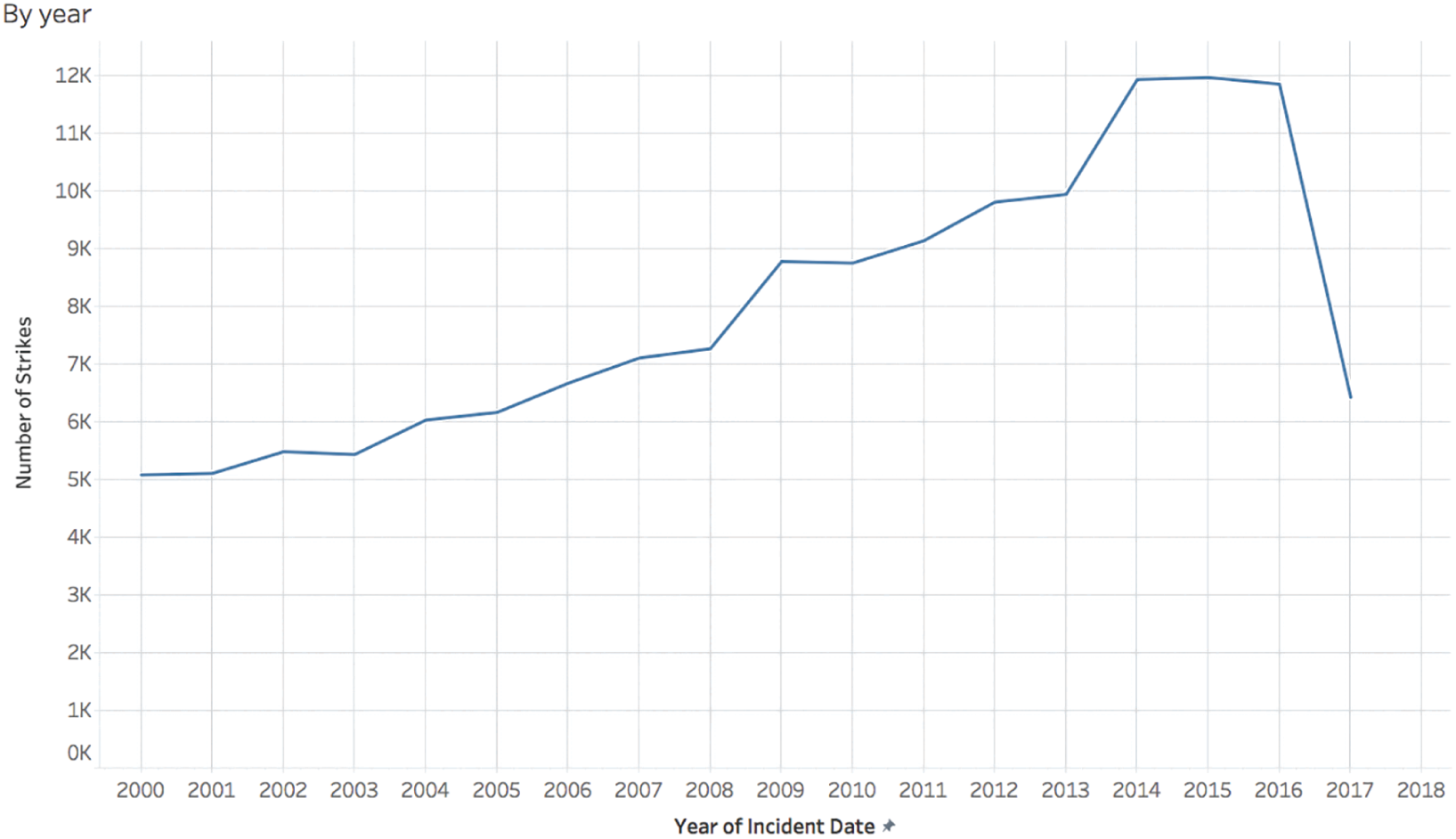
FIGURE 4.1 Count of reported wildlife strikes by aircraft in the U.S., by year.
We can see from this timeline that there are records in our extract going as far back as 2000. It seems to indicate an increasing trend in reported strikes, and then a dramatic drop in the most recent year for which there is data, 2017. Why the sudden decrease in reported strikes not seen for a full decade? Was there some effective new technology implemented at airports all over the country? A mass migration of birds and animals south? A strike by the FAA employees responsible for managing the data?
The answer that's immediately obvious as soon as you know it is that we're only looking at an extract that includes partial data for 2017. If we increase the level of granularity to month or week, we can see that the data only goes through roughly the middle of the year in 2017 (Figure 4.2).
To be exact, the latest recorded wildlife strike in our data set reportedly occurred on July 31, 2017, at 11:55:00 p.m. The earliest recorded wildlife strike in the extract occurred on January 1, 2000, at 9:43:00 a.m. This is the range of our data in terms of reported collision dates, and brings us to an important tip to help us avoid falling into the common pitfall of mistaking mismatching levels of aggregation with actual trends in the data:
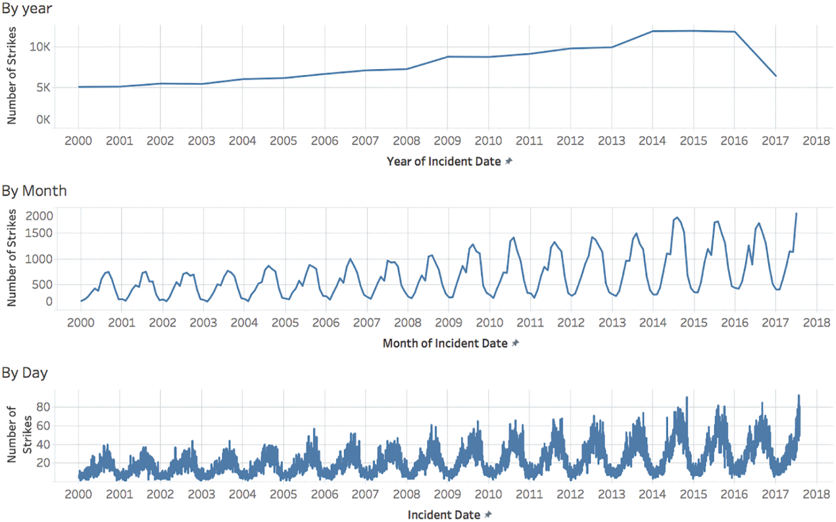
FIGURE 4.2 Visualizing reported collisions by various levels of data aggregation.
Explore the contours of your data to become acquainted with the minimum and maximum values of all measures in the data source, and their ranges.
If you'll permit me a brief tangent for a moment, I have to credit my friend Michael Mixon (on Twitter @mix_pix) for introducing me to the phrase “explore the contours of your data.” He mentioned it in a discussion some years ago and it has stuck with me ever since, because it's perfect. It reminds me to make sure I spend a little bit of time upfront finding out the boundaries of the data I'm analyzing – the minimum and maximum values of each quantitative measure in the data set, for example – before coming to any conclusions about what the data says.
I imagine it's not unlike coming upon an uncharted island, like the Polynesians who first discovered and settled New Zealand around 700 years ago and became the Maori people. Or similar to the explorer James Cook who, in late 1769 through early 1770, was the first European to completely circumnavigate the pair of islands that make up the native home of the Maori (Figure 4.3).
What's interesting is that Cook actually wasn't the first European to find New Zealand. Over a century before him, in 1642, the Dutch navigator Abel Tasman came upon it in his ship the Zeehaen, but he didn't go fully around it or explore its shores nearly as thoroughly as Cook did. That's why Cook's expedition correctly identified the area between the north and south islands of New Zealand as a strait and therefore a navigable waterway, not a bight – merely a bend or curve in the coastline without passage through – as the Dutchman mistakenly thought it to be. And that's why that area between the north and south islands of New Zealand is called Cook Strait3 instead of Zeehaen's Bight, as Tasman originally named it. It's a great object lesson for us, because it shows how, when we fail to thoroughly explore the contours, we can arrive upon mistaken and erroneous conclusions about the terrain, in navigation just as in data.

FIGURE 4.3 An imagined circumnavigation of the New Zealand island pair.
Source: https://en.wikipedia.org/wiki/Cook_Strait. Used under CC BY-SA 3.0.
Okay, thanks for humoring me with that brief digression – back to our wildlife strikes data set. Now it may seem silly that someone would assume a partial year was actually a full year, especially when the data so obviously drops off precipitously. Most people would figure that out right away, wouldn't they? You'd be surprised. Whenever I show this timeline to students in my data visualization classes and ask them what could explain the dramatic decline in reported strikes in 2017, they come up with a whole host of interesting theories like the ones I mentioned above, even when I'm careful to use the word “reported” in my question. It's very much related to the data-reality gap we talked about a couple of chapters ago; in this case we make the erroneous assumption that the data point for “2017” includes all of 2017.
There are times, though, when our particular angle of analysis makes it even less likely that we'll be aware that we're looking at partial data in one or more levels of our aggregated view. What if we wanted to explore seasonality of wildlife strikes – do strikes occur most often in winter months or summer months, for example? If we went about seeking an answer to this question without first exploring the contours of our data, we would start our analysis with a view of total reported strikes by month for the entire data set. Figure 4.4 shows what we'd create very quickly and easily with today's powerful analytics and visualization software.
One of our first observations would likely be that the month with the greatest number of reported wildlife strikes is July. The number of strikes is at its lowest in the winter months of December, January, and February, and then the count slowly increases through the spring, dipping slightly from May to June before surging to reach its peak in July. After this peak, the counts steadily decline month by month.
Well, what we already know from exploring our data's contours previously is that the records end on July 31, 2017, so there is one extra month of data included in the bars for January through July than for August through December. If we add yearly segments to the monthly bars – one segment for each year with data – and color only the 2017 segments red, we see that comparing each month in this way isn't strictly an apples-to-apples comparison (Figure 4.5):
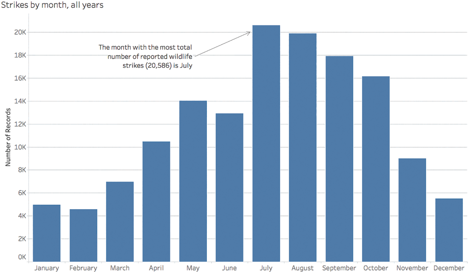
FIGURE 4.4 Wildlife strikes by month.
January, February, March, April, May, June, and July all include data from 18 different years, and the rest of the months only include data for 17 different years because 2017 is a partial year in our particular data set. If we filter out the 2017 data from the data set entirely, then we take off the red segments from the bars above, and each monthly bar includes data for the exact same number of years. Once we do so, we quickly notice that July isn't actually the month with the most number of reported wildlife strikes at all (Figure 4.6).
August, not July, is the month with the highest total number of strikes when we adjust the bounds of our data so that monthly comparisons are closer to an apples-to-apples comparison. We see a slight increase in reported strikes from July to August, and then the counts steadily drop after that, month by month, until the end of the year.
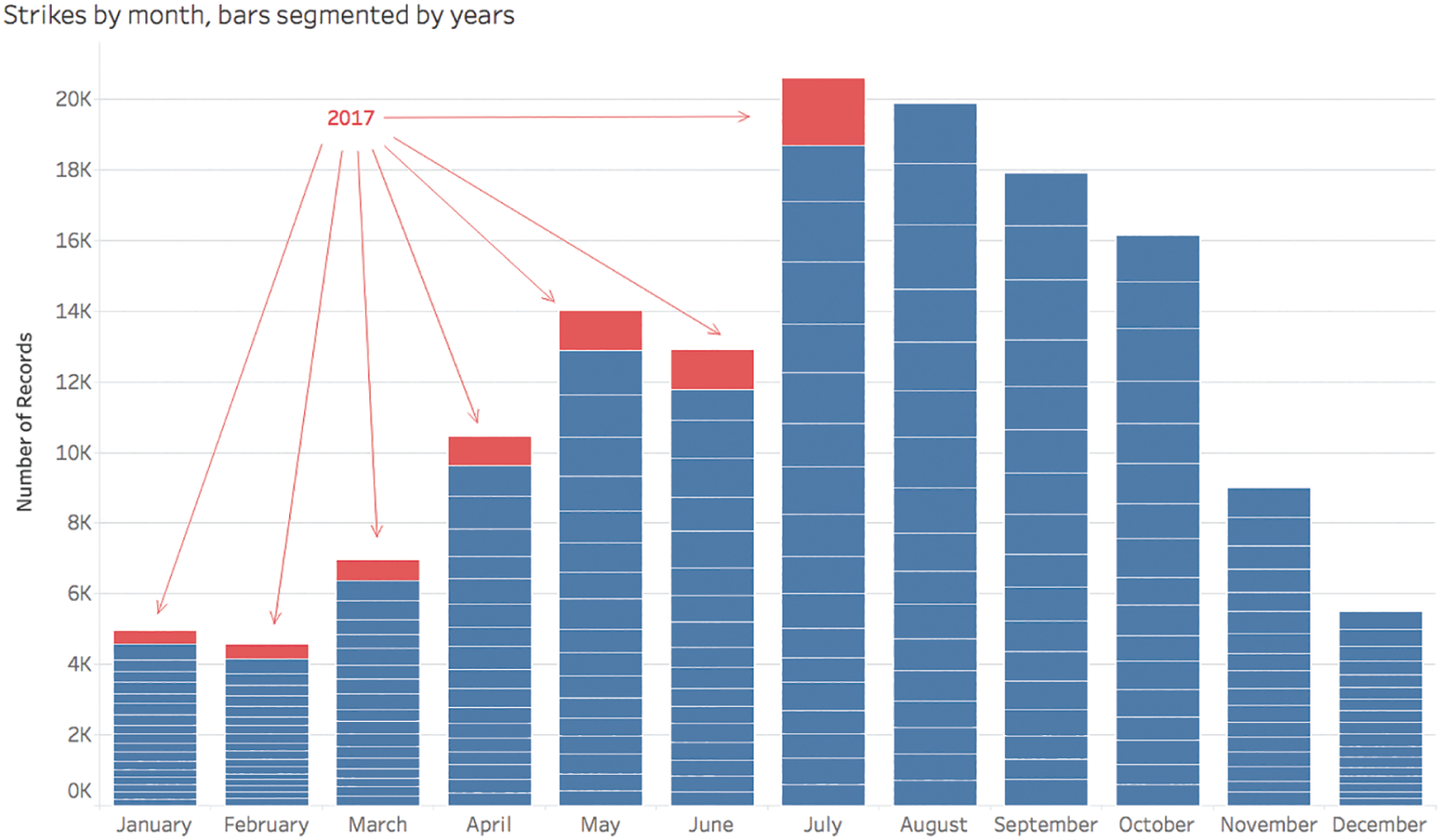
FIGURE 4.5 Wildlife strikes by month, with added yearly bar segments.
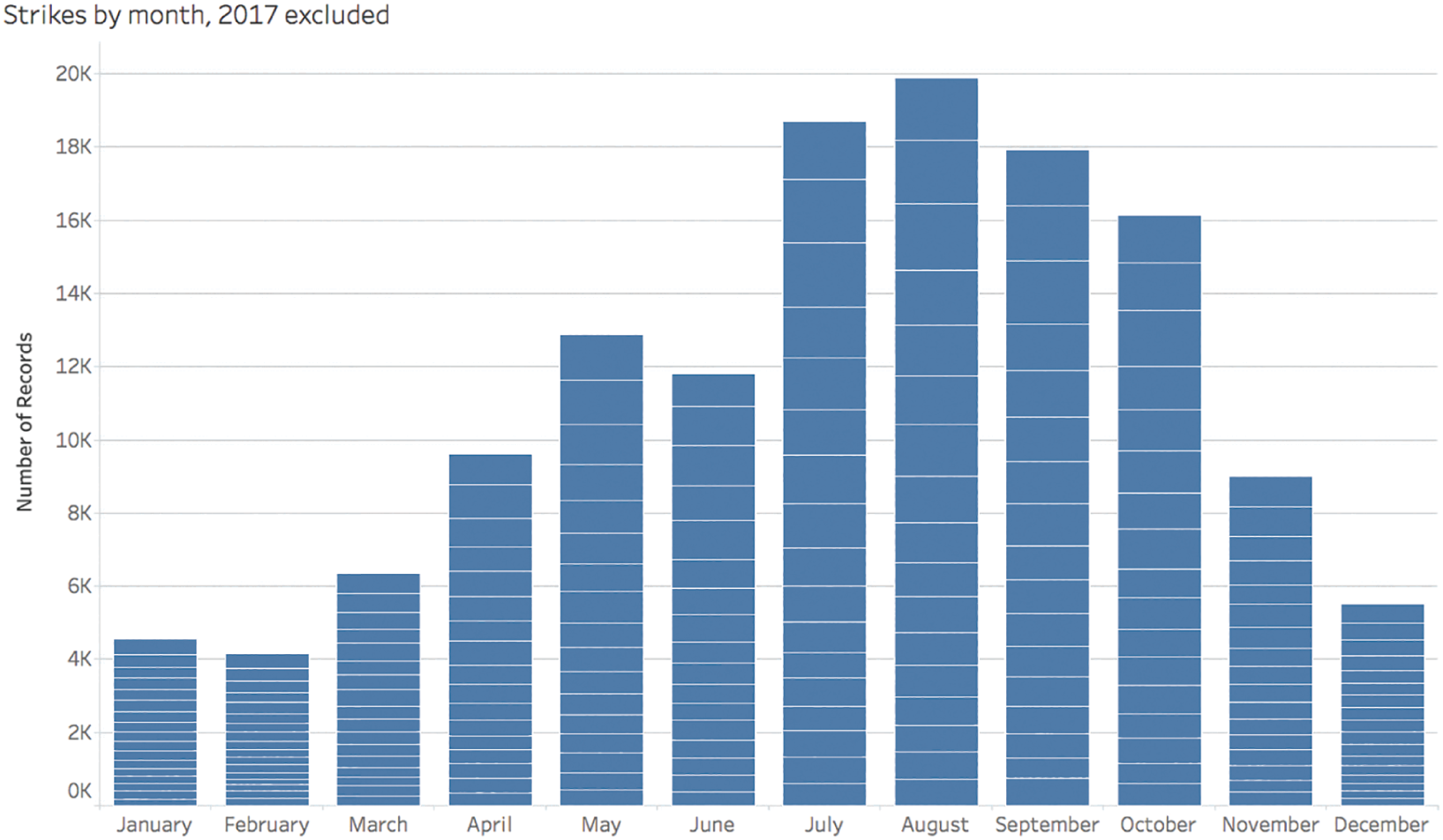
FIGURE 4.6 Wildlife strikes by month, with yearly segments, 2017 data excluded.
If we went away from a quick and cursory analysis thinking July is the peak month, we'd be just like Abel Tasman sailing away from the Cook Strait thinking surely the shoreline must be closed off to passage through. How many times have we been mistaken about a basic fact about our data because we simply overlooked the boundaries of the data set with which we are interacting?
Pitfall 3B: Missing Values
There's another issue that pops up quite often when aggregating data and comparing across categories. We've just seen that quirks related to the outer boundaries of our data can give us confusing results if we're not careful, but sometimes there can be idiosyncrasies in the interior regions of the data as well, away from the extreme values. To illustrate this pitfall, let's step cautiously into a rather haunted realm.
I became interested one particular day in visualizing the complete works of American author and poet Edgar Allan Poe. The day happened to be October 7, the anniversary of his mysterious death in Baltimore at the age of 40. As I sit down to write this chapter, I'm 40 years old as well, but I can still recall reading a number of his dark and chilling works back in middle school and high school. Who could forget works such as “The Raven,” “The Tell-Tale Heart,” and “The Cask of Amontillado”?
But I wondered just how prolific a writer he had been over the course of his life. I had no idea how many works in total he had written or published, at what age he started and stopped, and whether he had particular droughts of production during that time.
Luckily, I stumbled on a Wikipedia page of his entire bibliography containing tables of each of his known works organized by type of literature and sorted by the date each work was written.4 There are about 150 works in all, with a few that are disputed. That's certainly more than I've read, and far more than I expected to find out that he had written; I had guessed a few dozen at most.
The tables on the Wikipedia page sometimes provide a complete date for a particular work, sometimes only and month and year is listed, and other times just the year. If we clean up these tables a little and create a timeline of the count of works written by Edgar Allan Poe by year, here's what we see (Figure 4.7).
We can see right away that he started writing in 1824, the year he would've turned 15, and he wrote up until and including the year of his death, 1849. It looks like his most productive year, at least in terms of the number of different works written, was 1845, when he wrote 13 pieces. Now, consider – in which year of his career did he produce the fewest number of works?
If you're like me, your eyes will immediately look for the lowest points on the timeline – namely, the points for 1824 and 1825 with a value of 1. In each of those two years, Poe wrote just one single work of literature. We'll give him a break, because he was just a teenager in those years. There we go, final answer: he wrote the fewest pieces of literature in 1824 and 1825.
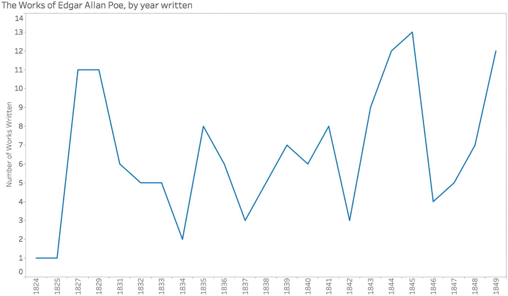
FIGURE 4.7 A timeline of the complete works of Edgar Allan Poe by year published.
Of course, by now you've come to expect that your first answer to questions I pose in this book is almost always wrong, and that's true in this case, as well. Those are not the years in which he wrote the fewest pieces of literature. If you find yourself in the bottom of that pitfall right now, don't feel bad; a number of your fellow readers are right down there with you, and so was I. The key, as always, is to look much more closely, just like Sherlock Holmes examining a crime scene.
The years march along the horizontal axis one after another in sequence, but if you examine the values, you'll notice that there are a few years missing in the series. There are no values on the x-axis for 1826, 1828, and 1830. In those years, Poe evidently published nothing. What's tricky, though, is that because the years are being treated as qualitative ordinal and not quantitative (this was the default of the software package I used for this chart, Tableau Desktop), it's difficult to notice that these years are missing from the timeline. Even the slopes around these years are skewed.
We might be tempted to switch from a discrete variable to a continuous one on the horizontal axis, but this actually makes matters worse, making it seem as if Poe wrote 6 works in 1826, 11 in 1828, and then about 8.5 in 1830 (Figure 4.8).
The x-axis may not skip any values in this iteration like it did in the first one, but the lines are still drawn from point to point and don't give a proper sense of a break in the values. His three nonproductive years are completely hidden from us in this view. If this is all we saw and all we showed to our audience, we'd be in the dark about his actual productivity pattern.
In order to clearly see the missing years – the years with zero works written – we'll need to switch back to discrete years on the horizontal axis (creating headers or “buckets” of years once again instead of a continuous axis as in the previous iteration), and tell the software to show missing values at the default location, zero. Doing so provides us with the much more accurate view shown in Figure 4.9.
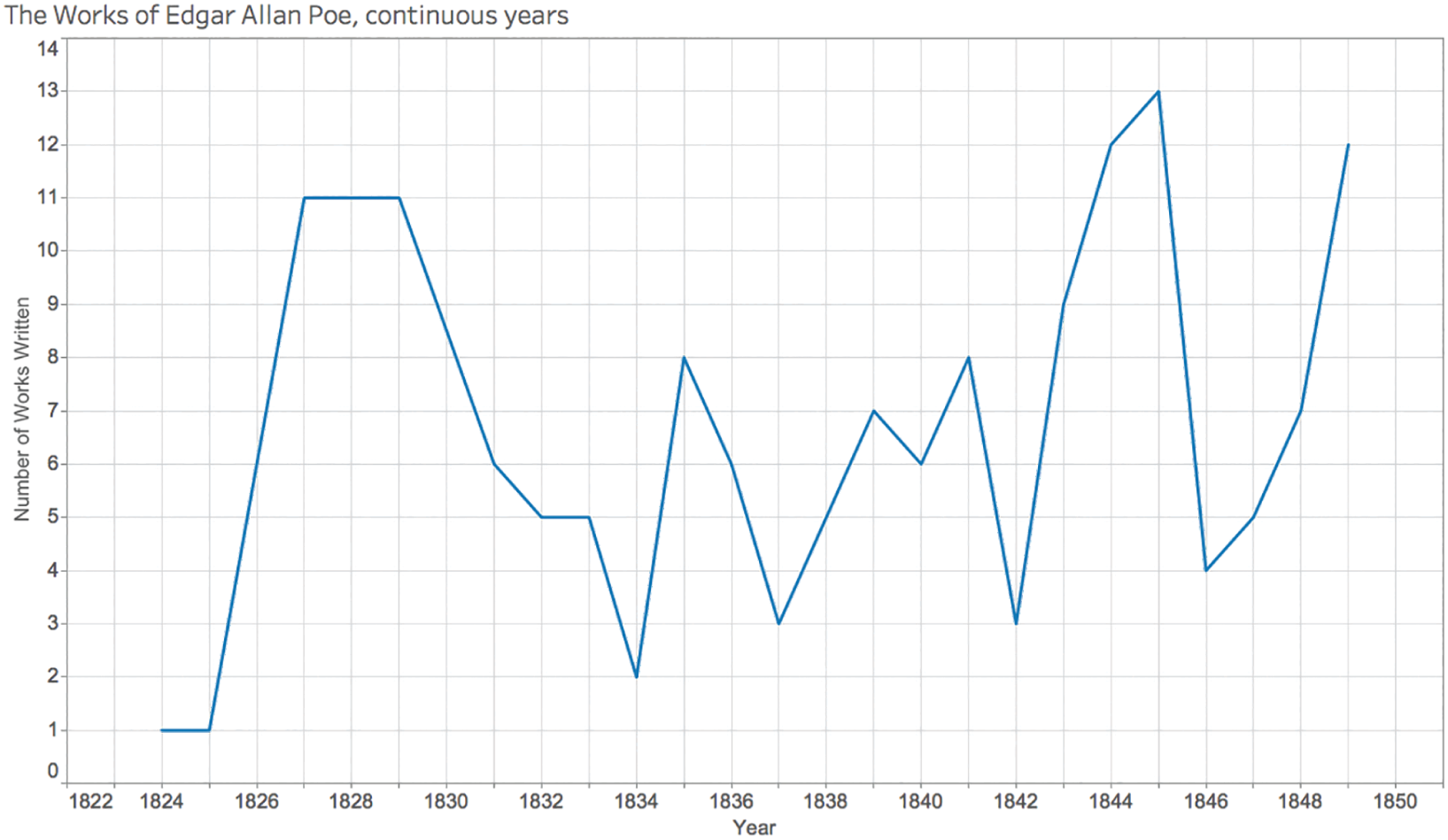
FIGURE 4.8 A timeline of Poe's works with years plotted continuously on the x-axis.
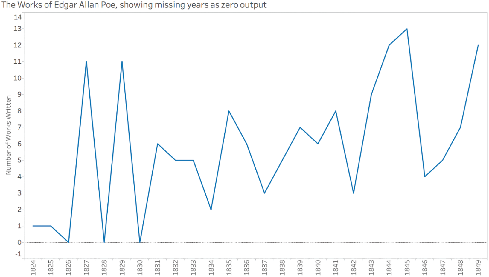
FIGURE 4.9 A timeline of Poe's works showing missing years at the default value of zero.
We could also elect to plot the data as a series of columns instead of as a continuous line, and we could create a box for each work to give a better sense of the heights of the columns without requiring the reader to refer to the y-axis, as seen in Figure 4.10.
Now I want to stress that I didn't go to any great lengths to doctor the first two misleading views with the intent to confuse you and write a book about it. Not at all, and that's not the point of this book. The two misleading views of Poe's works are how the software plotted my data by default, and that's exactly the problem to which I'm trying to alert you.
It's not a problem with this particular software, per se. It's a problem with how we decide to handle missing values. We'll approach this problem differently in different circumstances. If we were looking at election statistics or data from the summer games, for example, would we necessarily want the timeline to drop to zero every time we come across a year without data? No, because we know these events only happen every two or four years or so. In those cases, the default would probably work just fine.

FIGURE 4.10 Poe's works depicted as columns, with missing years shown.
Missing values within our data set are dangerous lurkers waiting to trip us up, but there's another type of snag about which to be alert.
Pitfall 3C: Tripping on Totals
I have a special relationship with this next pitfall, because I actually fell into it while trying to warn people about it. You have to learn to laugh at yourself about this stuff. I was at the University of Southern California just this past year, conducting a training session for journalists specializing in health data. I mentioned to them that I was writing this very chapter of this very book, and that I'd be alerting them to various pitfalls during the course of my presentation and workshop.
When I conduct training sessions, I prefer, whenever possible, to work with data that's interesting and relevant to the audience. This is a tricky business because that means I'll be showing them data on a topic about which they're familiar, and at the same time I myself am not. It actually makes it fun, though, because I get to be the learner and ask them questions about the field while they get to learn from me about working with data.
At this particular workshop, since it was in my former home state of California, I elected to visualize infectious diseases – sorted by county, year, and sex – contracted by California residents from 2001 through 2015, with data provided by the Center for Infectious Diseases within the California Department of Public Health.5 I made a very lame joke about how we'd be working with some really dirty data, and then we dived right in.
The first question we asked of the data was a simple one: how many total infectious diseases were reportedly contracted by California residents over this time period? By totaling the number of records in the data set, the answer we got was 15,002,836 (Figure 4.11).
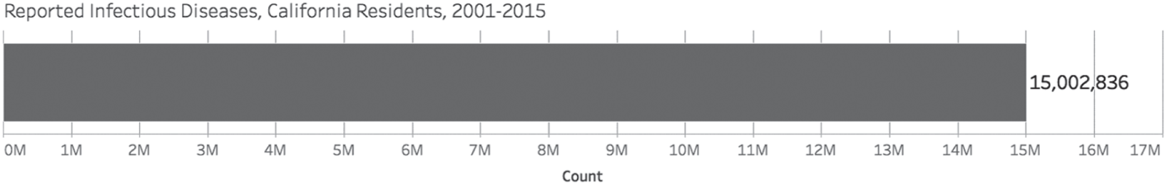
FIGURE 4.11 Reported infectious diseases.
But I have to admit, it was a total setup. I had looked at the data beforehand, and I knew there was something funky about the way the file was structured. Every county, year, and disease combination had three rows in the spreadsheet: one for male residents, one for female residents, and another for the total number of residents, so male plus female. Figure 4.12 is a snapshot of the first 10 entries in the data set.
What this means, then, is that a simple SUM function of the Count column will result in a total that accounts for each case twice. Each case of a male resident of California contracting a disease is counted twice, once in the row where Sex is equal to “Male” and another time in the row where Sex is equal to “Total.” Same goes for female.
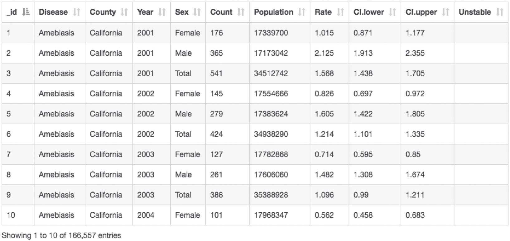
FIGURE 4.12 First 10 entries in the data set.
So I asked them next what else they would like to know about infectious diseases reported right here in California, and of course a budding data journalist in the audience raised a hand and, as if planted ahead of time, asked, “Are there more for male or female?”
I smiled a Grinch-like smile and proclaimed that I thought the question was a marvelous one, and I prompted them to look for the answer by adding Sex to the bar color encoding, as seen in Figure 4.13.
There was a moment of silence in the room as the confused students looked at the bar, and I, in what was probably a very unconvincing way, feigned shock at the result.
“What have we here? There is a value in the Sex attribute called ‘Total’ that accounts for 50% of the total reported diseases. That means we're double counting, doesn't it? There aren't 15 million reported infectious disease cases in California from 2001 to 2015, there are only half of that amount, around 7.5 million. Our first answer was off by factor of 2! I told you we'd fall into our share of pitfalls. This one is called ‘Trespassing Totals,’ because the presence of a ‘Total’ row in the data can cause all sorts of problems with aggregations.”
My soapbox speech was over, the students considered themselves duly warned, and the instructor considered himself pretty darn smart. We went on with the analysis of this same data set.
Not too far down the road of data discovery, we began to explore infectious disease counts by county. Naturally, we created a map (Figure 4.14):
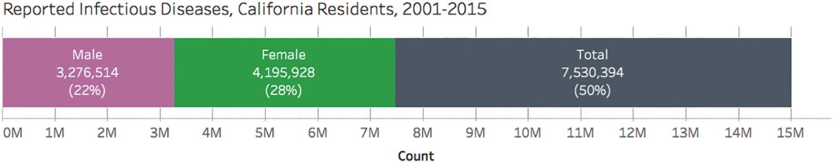
FIGURE 4.13 Reported infectious diseases.

FIGURE 4.14 Choropleth map for tuberculosis infections, 2015.
We were moving right along, but then one of the trainees asked, “Hey, Ben, what does the ‘1 unknown’ message in the bottom right corner of the map mean?”
I hadn't noticed it at first, so I clicked on it, and what I saw made me stop for a moment, and then I burst out laughing. There was a row for each disease and year combination for each county, but there was an additional row with the county “California” (Figure 4.15).
Why was that so funny? Well, New York state has a New York county, but California definitely doesn't have a California county. I can only imagine that the people who created and published the data set wanted to include a row for each disease and year combination that provided the reported cases for all of the counties added together, and they used the state name as a placeholder for “All counties.”
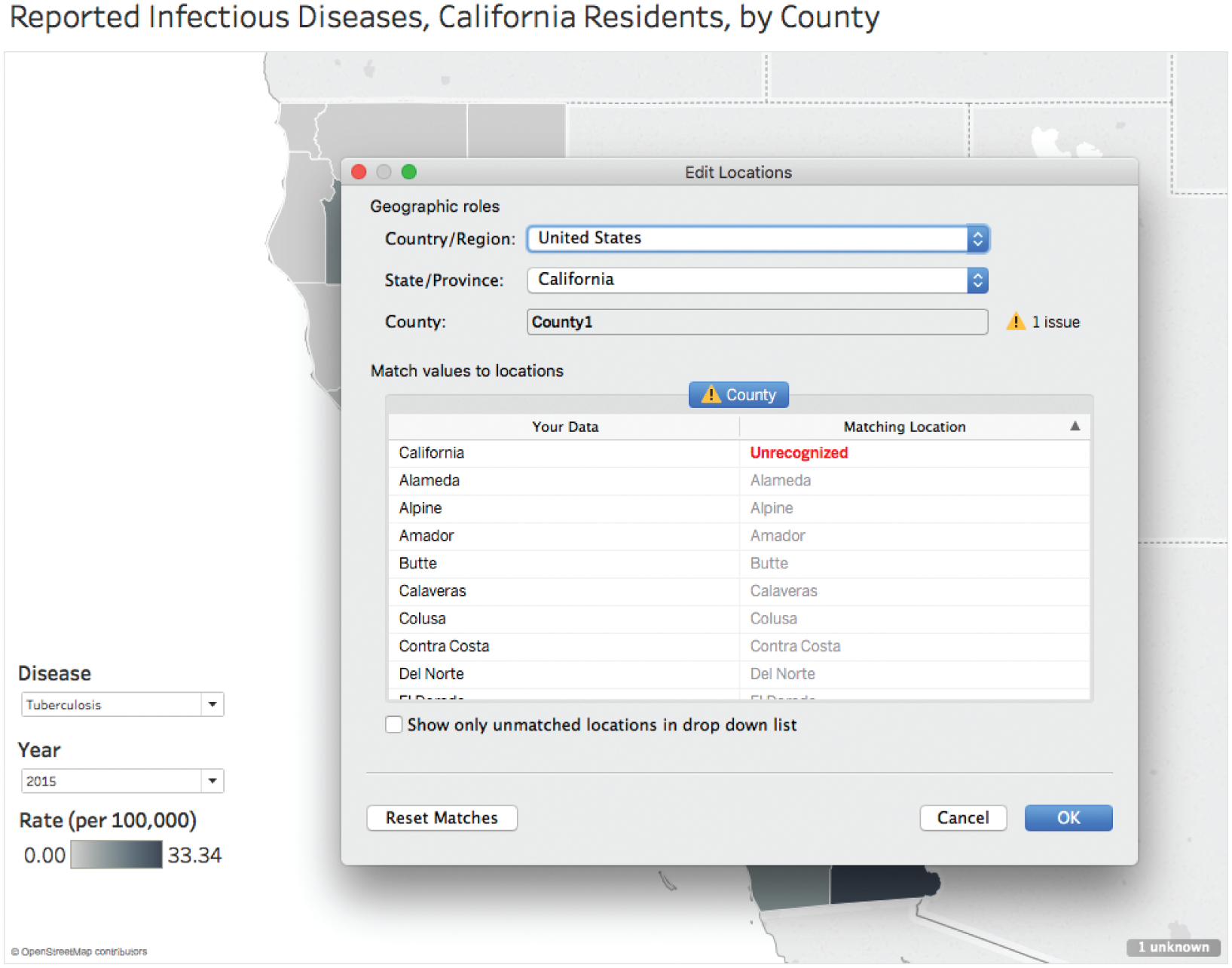
FIGURE 4.15 Geographic roles.
This fact by itself isn't really very funny at all, I admit, but what it meant was the answer to our initial question of how many total infectious diseases had been reported – 15 million – wasn't off by a factor of 2, it was off by a factor of 4! The actual number isn't 7.5 million, it's 3.74 million. We were counting twice for each gender, and then twice again for each county because of pesky total rows.
The very pitfall I was trying to show them was one I had fallen into twice as deep as I thought I had. Data sure has a way of humbling us, doesn't it?
So we've seen how aggregating data can result in some categories being empty, or null, and how we can sometimes miss interesting findings when we rely on software defaults and don't look closely enough at the view. We've also seen how pesky total rows can be found within our data, and can make even the simplest answers wrong by an order of magnitude.
We need to be aware of these aspects of our data before we jump to conclusions about what the views and the results of our analysis are telling us. If we don't explore the contours of our data, as well as its interior, we're at risk of thinking some trends exist when they don't, and we're at risk of missing some key observations.
Aggregating data is a relatively simple mathematical operation (some would even call it trivial), and yet we've seen how even these basic steps can be tricky. Let's consider what happens when we do something slightly more involved, mathematically: working with ratios.
Pitfall 3D: Preposterous Percents
Let's switch topics to show another way in which our faulty math can lead us astray when we analyze data. Our next example deals with percents – very powerful, but often very tricky figures to work with. Each year the World Bank tabulates and publishes a data set that estimates the percent of each country's population that lives in an urban environment.6 I love the World Bank's data team.
The timeline displayed on the World Bank site shows that the overall worldwide figure for percent of urban population has increased from 33.6% in 1960 to 54.3% in 2016. This site also lets us download a data set of this proportion, which lets us drill down into the figures at a country and regional level.
With that data in hand, we can create a simple world map of the percent of each country that reportedly lived in an urban environment in 2016 (Figure 4.16). This map uses the viridis color palette7 to show the countries of lower urban population (yellow and light green) and those with higher urban populations (blue to purple).
I don't know about you, but my eyes focus in on the yellow country shape in Africa, which is Eritrea. Did it really have an urban population of 0%, the value corresponding to bright yellow in the viridis color palette?
It turns out that it's not the only bright yellow country on the map, the other two are just too small to see – Kosovo and Saint Martin. Kosovo is a partially recognized state and Saint Martin is an overseas collectivity of France, but Eritrea is a member of the African Union and the United Nations. Its largest city, Asmara, has about 650,000 people living in it.
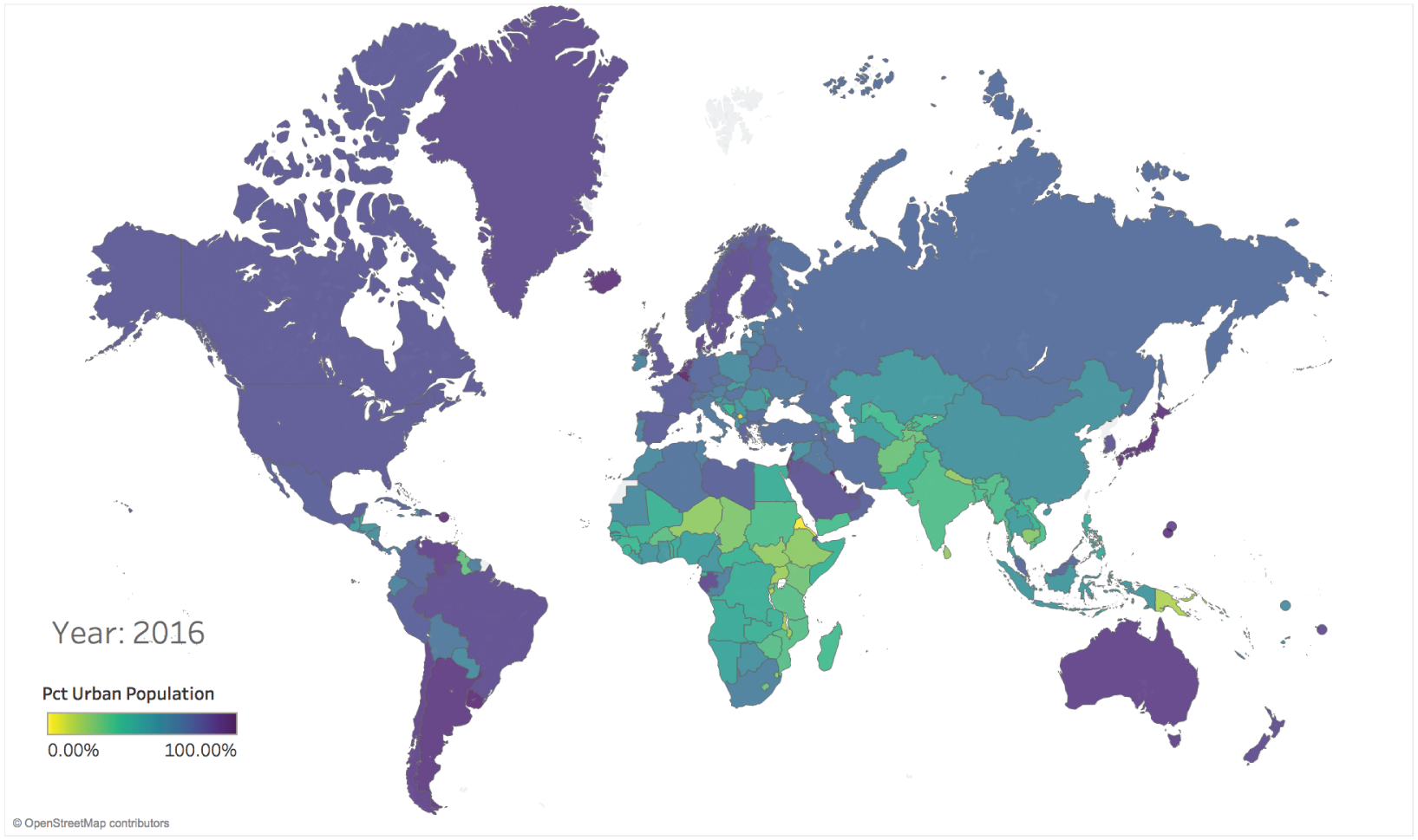
FIGURE 4.16 Percent of urban population in 2016, all countries included.
It turns out that the World Bank data set that we just downloaded has a null (blank) value for these countries. Why the values for these three countries is null isn't fully clear, but regardless of the rationale, our map defaulted the null value for these two countries to 0%, which is misleading to the viewer of the map, as far as Eritrea is concerned (Figure 4.17).
We can exclude these three countries from the map, leaving an updated world map showing percent of urban population by country, with no nulls included (Figure 4.18).
Fair enough – our map is now less misleading, but what if we wanted to analyze percent of urban population at a regional level instead of at a country level? For example, what percent of North American residents lived in a city in 2016?
Lucky for us, the World Bank includes a region data field for each country, and the region North America includes the United States, Canada, and Bermuda (Mexico is included in the Latin America and Caribbean region). We can quickly list out the percent of urban population for each of these three countries, as shown in Figure 4.19.
But how do we determine the percent for the entire region from these three country-level figures? Clearly adding them up to get 263.80% would be silly and no one would ever sum percents that don't have a common denominator like that (I've done it more than once).
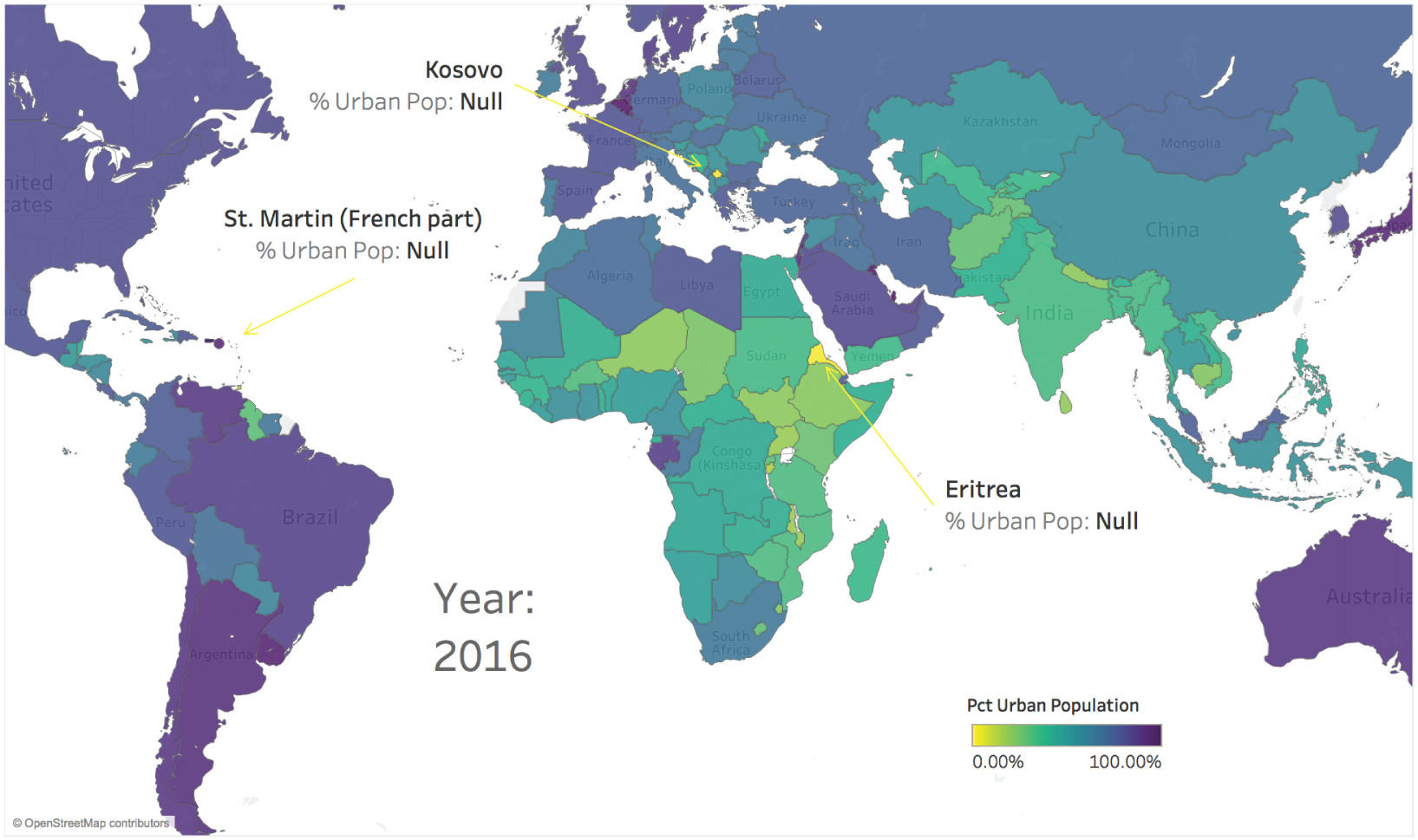
FIGURE 4.17 Percent of urban population in 2016, all countries included.
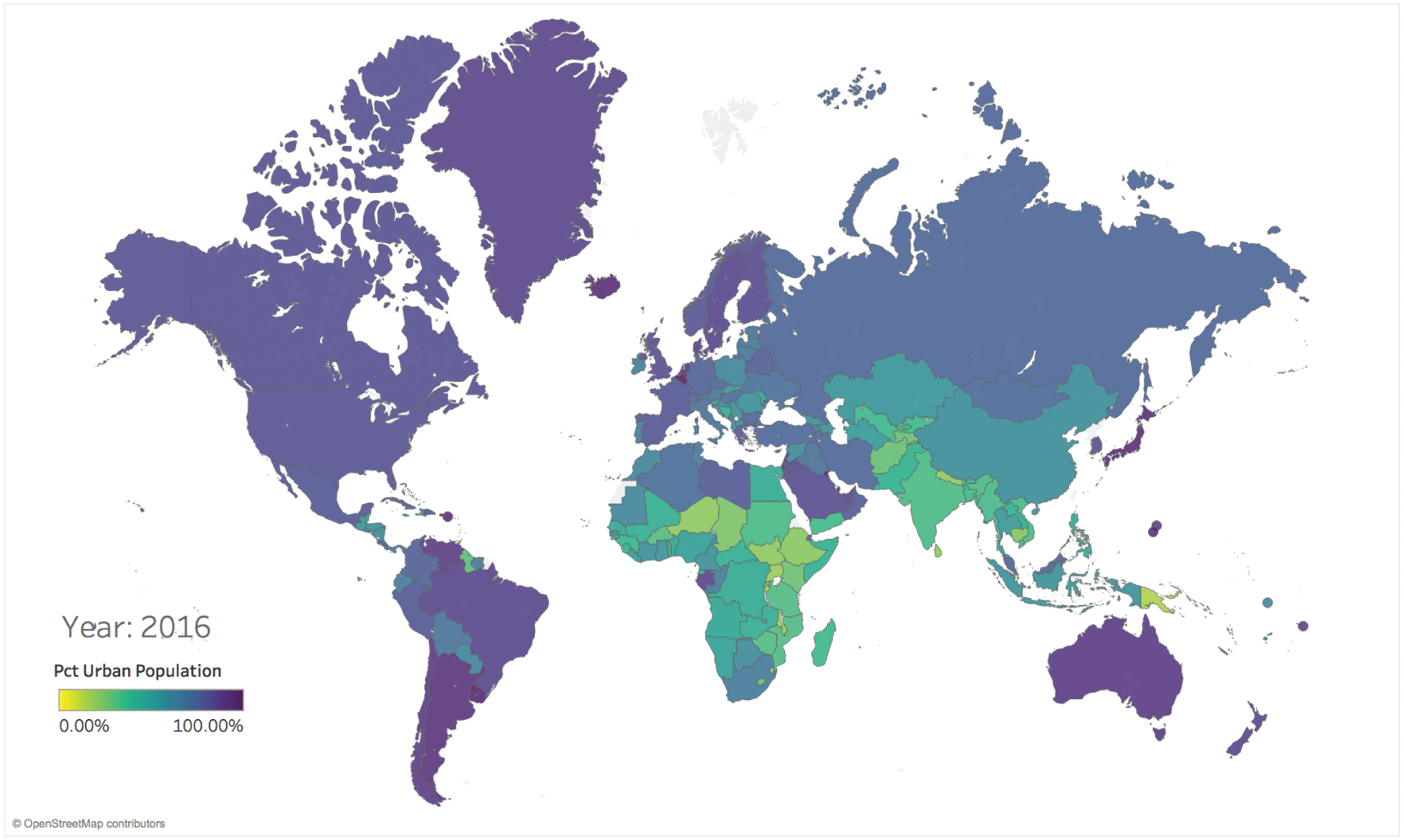
FIGURE 4.18 Percent of urban population in 2016, null values excluded.
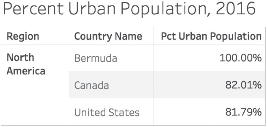
FIGURE 4.19 Table showing percent of urban population for countries in North America.
Clearly the answer is to average these values, right? So, a simple arithmetic average of the three countries in North America can be obtained by adding them up to get 263.80%, and then dividing that figure by 3 (one for each country). When we do that, we compute an average percent of urban population of 87.93% for the region (Figure 4.20).
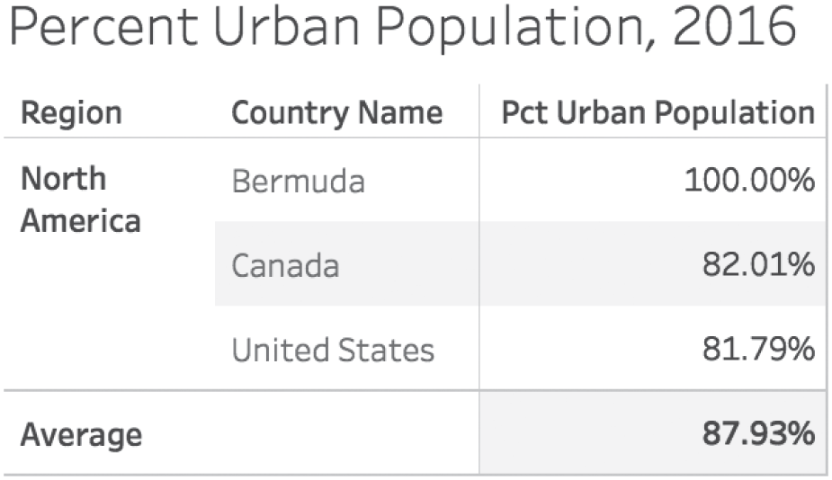
FIGURE 4.20 Computing the regional percent using the arithmetic average, or mean (wrong!).
Done and done! Right?
Wrong. We can't combine these percents in this way. It's a very common pitfall. Why can't we just average the percents? It's easy enough to do with modern spreadsheet and analytics software. If it's so easy to do with software, isn't it probably correct? Not even close. That's why I'm writing this book, remember?
The problem is related to the fact that each of the percents is a quotient of two numbers. The numerator for each quotient is the number of people who live in an urban environment in that particular country, and the denominator is the total population in that particular country.
So the denominators aren't the same at all (Figure 4.21).
When we ask about the urban population of North America, we're looking for the total number of people living in cities in North America divided by the total population of North America. But if we remember back to fourth-grade math, when we add quotients together, we don't add the denominators, only the numerators (when the denominators are common). So in other words, we could only legitimately add the quotients together if each of the countries all had the exact same population. We don't even know the populations of each country, because those figures aren't included in the data set we downloaded.

FIGURE 4.21 Percent of urban population for each country shown as a quotient.
So it seems we're at an impasse then, and unable to answer our question at the regional level. With just this data set, that's true, we can't. I think that part of the problem is that it feels like we should be able to answer the question at the regional level. Each country has a value, and each country is grouped into regions. It's simple aggregation, right? Yes, it's simple to do that math. And that's why pitfalls are so dangerous.
We could do that exact aggregation and answer the question at the regional level if we were analyzing values that aren't rates, ratios, or percentages, such as total population. That would be fine. There are no denominators to worry about matching with non-quotient values.
As it turns out, the total population data set is the missing key that can help us get where we want to go with our regional question with percent of urban population. And luckily the World Bank also publishes a separate data set with total population figures for each country over time.8 Did I mention that I love the World Bank's data team?
If we download and blend or join the data set for country population, we can add the total population figures to the original table. Doing so shows us right away why we ran into trouble with our original arithmetic average approach – the populations of these three countries are drastically different (Figure 4.22).
Using this table, it would be fairly straightforward to determine the denominator for our regional quotient – the total population of North America (as defined by the World Bank). We could just add the three numbers in the final column to get 359,457,493.
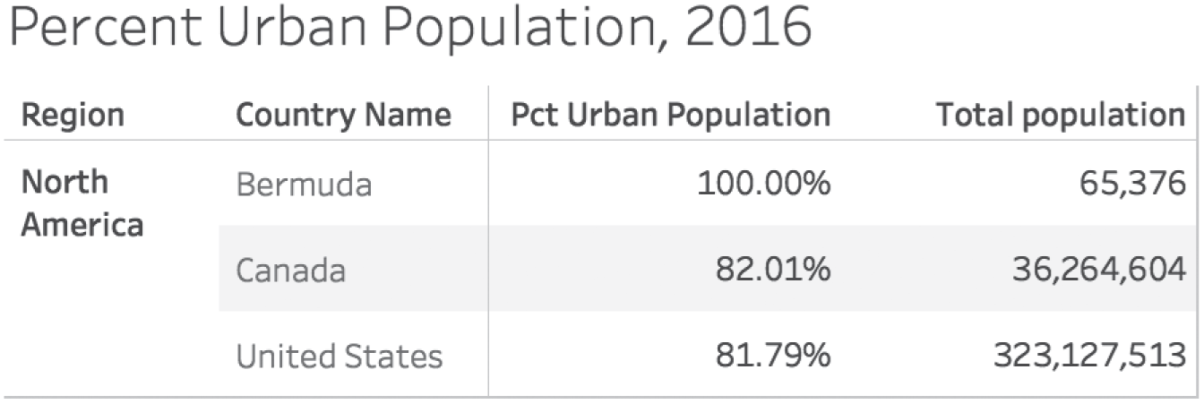
FIGURE 4.22 Table with both percent of urban population and total population.
So now all we need is the total urban population of each country, which we can estimate by multiplying the percent of urban population by the total population for each country. Once we have that, we can easily calculate the regional quotient by dividing these two numbers together to get 81.81% (Figure 4.23).
Looking at this table, we can see that the regional percent of urban population is very close to the value for the United States. It's only two hundredths of a percent higher than the U.S. value, to be precise. And the reason for this is obvious now: the United States dominates the population in the region, with almost 90% of the inhabitants living there. Bermuda, which has 100% of its residents living in a city, only accounts for less than 0.02% of the total population of the region. So to give them equal weighting when determining the regional average wouldn't be accurate at all.
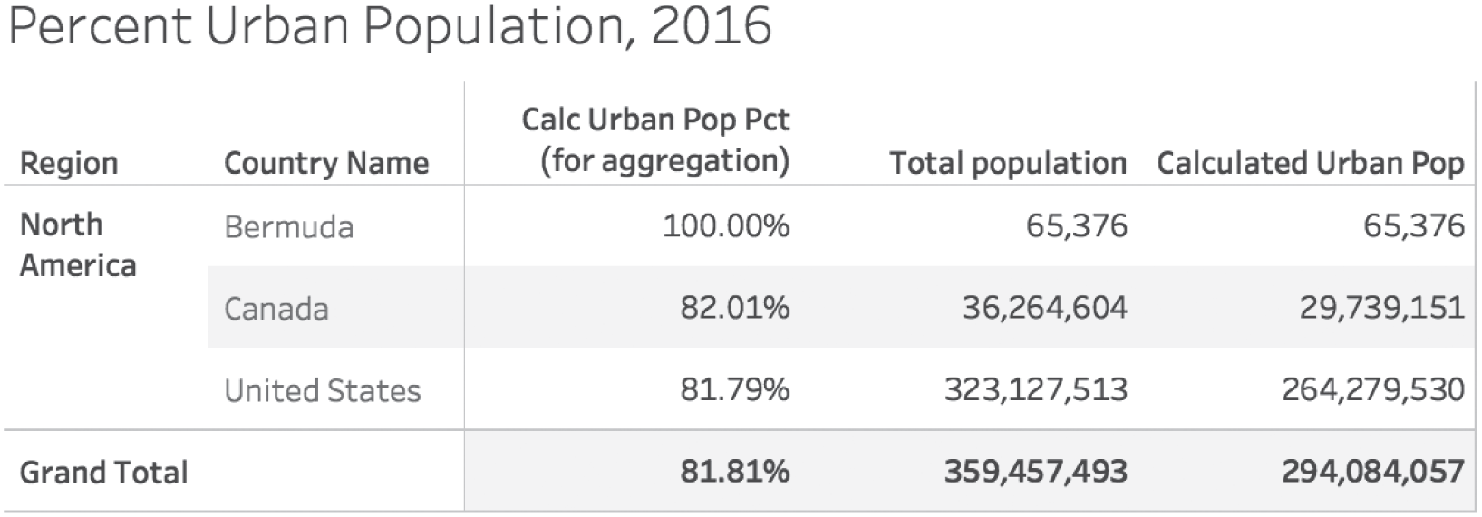
FIGURE 4.23 Table showing percent of urban population, total population, and estimated urban population.
Another way to look at this is to place each of the three countries on a scatterplot of urban population versus percent of urban population, size the circles by population, and add both regional percentages – the correct one and the incorrect one (Figure 4.24).
It was convenient to show this pitfall and how to avoid it step by step for North America because there are only three countries listed in the region, so the full regional table is easy to show. A similar analysis, however, could be done for each of the regions in the World Bank data set. If we did so, we could create the slopegraph seen in Figure 4.25, which shows how the incorrect urban percents compare with the correct urban percents for each region. Notice how wrong we would've been for the Latin America and Caribbean region, which jumps up from 65% to over 80% urban when we take into account population instead of just averaging the values for each country.
This seems like a simple error, and once you see it you can't imagine ever falling into this pitfall. But it's very easy to overlook the signs and fall headfirst into it. You get that face-palm feeling every time you find yourself down there. After a while, you spot it quite quickly. Be very careful when aggregating rates, ratios, percents, and proportions. It's tricky business.

FIGURE 4.24 Scatterplot of North American countries.

FIGURE 4.25 Slopegraph showing difference between incorrect (left) and correct (right) regional percents.
Pitfall 3E: Unmatching Units
The next aspect of this common pitfall has to do with the way we measure things. When we perform mathematical operations on different quantities in our data, we need to make sure we're aware of the units of measure involved. If we don't take care, we might not be dealing with an apples-to-apples scenario, and we might end up with highly erroneous results from our calculations.
I already mentioned the infamous example of the Mars Climate Orbiter (Figure 4.26) at the beginning this chapter. What happened was that the orbiter traveled far too close to the surface of Mars and likely incinerated as a result. The cause for this faulty trajectory was that a Lockheed Martin software system on earth output thruster firing impulse results in pound-force seconds (lbf-s), while a second system created by NASA expected those results in Newton-seconds (N-s) based on the specification for each system. One pound-force is equal to 4.45 Newtons, so the calculation resulted in a lot less thrust than the orbiter actually needed to stay at a safe altitude. The total cost for the mission was $327.4 million, and perhaps a bigger loss was the delay in acquiring valuable information about the surface and atmosphere of our neighbor in the solar system.

FIGURE 4.26 Artist's rendering of the Mars Climate Orbiter.
Source: https://en.wikipedia.org/wiki/Mars_Climate_Orbiter#/media/File:Mars_Climate_Orbiter_2.jpg. Public domain.
I recall that while going through engineering school at the University of California at Los Angeles in the late 1990s, units of measure were a big deal. As students, we would routinely be required to convert from the International System of Units (SI, abbreviated from the French Système international d'unités) to English Engineering units and vice versa on assignments, lab experiments, and exams. It would've been a rookie mistake to forget to convert units. My classmates and I made such rookie mistakes all the time.
It's really easy to sit back and whine about this situation. After all, only three countries in the world at present don't use the metric system as the national system of units: Liberia, Myanmar, and the United States. Try to imagine, though, if you lived in antiquity, when traveling to another neighboring town meant encountering a totally unique system of measuring length, mass, and time, often based on a local feudal lord's thumb size or foot length or something like that.
We have the French Revolution to thank for the pressure to adopt a common set of units of measure. And we're close. The cost for the United States to switch every road sign, every law, every regulatory requirement, every package label would be massive and those costs would be incurred over years or even decades. But how much more could be saved in reduced errors, streamlined cross-border trade, and international communications over the long run? You can tell which side I'm on, not because I'm a globalist (I am), but because I'm in favor of making data pitfalls less menacing. Hence, this book.
For those of my dear readers who aren't engineers or scientists, you're probably sitting there thinking to yourself, “Phew, I sure am glad I don't have to worry about this problem! After all, I don't design Mars Orbiters or Rovers or anything like that.”
First, let's all acknowledge how cool it would be to design Mars Orbiters and Rovers and literally everything like that.
Second, not so fast. You have to consider units of measure, too. You know it's true. Ever put a tablespoon of salt into a dish instead of the teaspoon the recipe calls for? Me too. Yuck.
Here are ten different ways I've fallen to the very bottom of this nasty pitfall in a variety of contexts, including business contexts:
- Calculating cost or revenue with different currencies: U.S. dollars versus euros versus yen
- Calculating inventory with different units of measure: “eaches” (individual units) versus boxes of 10, or palettes of 10 packages of 10 boxes
- Comparing temperatures: Celsius versus Fahrenheit (versus Kelvin)
- Doing math with literally any quantity, where suffixes like K (thousands), M (millions), and B (billions) are used
- Working with location data when latitude and longitude are expressed in degrees minutes seconds (DMS) versus decimal degrees (dd)
- Working with 2-D spatial location using cartesian (x,y) versus polar (r,θ) coordinates
- Working with angles in degrees versus radians
- Counting or doing math with values in hexadecimal, decimal, or binary
- Determining shipping dates when working with calendar days versus business days
Some of these items on the list above are quite tricky and we encounter them on a fairly regular basis. Take the last one, for example – shipping duration. When, exactly, will my package arrive, taking into account weekends and holidays? And is it U.S. holidays, or do I need to consider Canadian or UK holidays, too? Technically, the base unit of measure is one day regardless, but we're measuring time in groups of certain types of days. It may seem like a technicality, but it could mean the difference between getting that critical package on time and having to go on our trip without it.
The best way to fall into this pitfall is to dive into a data set without taking time to consult the metadata tables. Metadata is our best friend when it comes to understand what, exactly, we're dealing with, and why it's critical to rigorously document the data sets we create. A data field might be entitled “shipping time,” but what is the operational definition of this field? Another data field might be entitled “quantity,” but is that measured in units, boxes, or something else? Yet another data field is called “price,” but what is the currency?
We always need to consult the metadata. If there is no metadata, we need to demand it. Every time I've worked with a data set that has been rigorously documented – with each field described in detail so as to answer my unit of measure questions, among others – I've appreciated the time spent on defining every field.
One detail to watch out for is that sometimes a data set will have a field that includes records with different units – a mixed data field. Often, in those cases, there's a second accompanying column, or data field, that specifies the unit of measure for each field. Those are particularly complex cases where we might need to write IF/THEN calculations based on the unit of measure (often “UoM”) field in order to convert all values into common units prior to performing simple aggregation calculations like Sum and Average.
In this chapter I attempted to give a sense of the kinds of mathematical errors that I've come across, but there are a great many others that I didn't mention. Every data set will challenge us in some way mathematically, and the impact could amount to orders of magnitude errors.
We're almost lucky when the erroneous result is ridiculously large (a population that's 2,000% urban?) because it becomes immediately clear that we've fallen into this pitfall. When the magnitude of the error is much smaller, though, we could be in big trouble, and we won't know it until it's too late, and all that expensive equipment is plummeting to its molten demise 225 million kilometers away.
But wait, how many miles would that be?
Notes
- 1 https://en.wikipedia.org/wiki/Mars_Climate_Orbiter.
- 2 https://wildlife.faa.gov/.
- 3 https://en.wikipedia.org/wiki/Cook_Strait.
- 4 https://en.wikipedia.org/wiki/Edgar_Allan_Poe_bibliography.
- 5 https://data.chhs.ca.gov/dataset/infectious-disease-cases-by-county-year-and-sex.
- 6 https://data.worldbank.org/indicator/SP.URB.TOTL.IN.ZS.
- 7 https://cran.r-project.org/web/packages/viridis/vignettes/intro-to-viridis.html.
- 8 https://data.worldbank.org/indicator/SP.POP.TOTL.