
Chapter Seven
Pitfall 6: Graphical Gaffes
“Visualization gives you answers to questions you didn’t know you had.”
—Ben Schneiderman
How We Visualize Data
There are two reasons I wanted to write this book in the first place. The first reason is that I noticed students in the data classes I teach were making a lot of the same mistakes on their assignments that I had made when I started my own data journey many years ago. What if there were a book that pointed out a number of these common mistakes to them? Would my students make these errors less often? Would I have made the same mistakes less often if I had read such a book back when I first started?
I'm not just talking about creating bad charts, though. I'm talking about the types of mistakes we've covered thus far – thinking about data and using it inappropriately, getting the stats and calculations wrong, using dirty data without knowing it – you name it.
That leads me to the second reason I wanted to write this book. It seemed to me that a large portion of the conversation about data visualization on social media was centering on which chart type to use and not use, and how to get the visual encodings and channels right.
Poor maligned chart types like the pie chart and the word cloud were getting bullied at every corner of the “dataviz” online playground. Everyone who was “in the know” seemed to hate these chart types as well as a few others, like packed bubble charts. Some even declared them to be “evil,” and others signaled their membership in the “Dataviz Cool Kidz Club” by ridiculing someone who had just published one.
I don't think there's actually a club with that name, by the way, but you get my point.
Now I'm not saying pie charts, word clouds, or bubble charts are always great choices; there are many situations in which they're not very useful or effective. Even when you can make a case that they're warranted, they're quite easy to get wrong. Anyone teaching data to new learners should make that clear.
On the other hand, though, I thought about all the times I made a beautiful bar chart that adhered to all the various gurus’ edicts, only to find out later that I had made my sanctioned masterpiece with fundamentally flawed data, or based on wonky calculations that should never have been computed in the first place. Did anyone scoff at these purveyors of pure falsehood? No – they were bar charts, after all.
That's why the first five pitfalls were all dedicated to problems that appear in the process before we get around to presenting visuals to an audience. As we've seen, there are many such pitfalls, and they're often hard to spot. These pitfalls don't always get noticed or talked about.
To mix my metaphors, the first five pitfalls are the part of the iceberg that's below the surface.
But of course, the ones that are easier to notice – that is, the highly visual ones – do tend to get a lot of ink and press. And well they should. As the part of the process with which our audience directly interacts, the visuals we create matter a great deal. Making mistakes in this crucial part of the process would be like throwing an interception from the 1-yard line at the very end of the American football championship game. We made it all that way and put in all that hard work to avoid so many other mistakes. What a shame it would be to fail at the very end.
Hopefully, though, I've made the case in the first six chapters of this book that graphical gaffes aren't the only potential pitfalls we encounter when working with data. If you agree with me on that point, then I've accomplished one of my main goals already.
So with that out of the way, I'd like to shift my focus in this chapter to the ways we get the pixels wrong when we create abstract visual representations from our data. These pitfalls are, without a doubt, critical to be aware of and avoid.
Pitfall 6A: Challenging Charts
Much has already been written about which charts work well and which don't work so well in different scenarios. There are even beautiful diagrams and posters that arrange chart type icons according to each chart's common purpose, such as to show change over time, or the distribution of a variable, or part-to-whole relationships.
I recommend you take a look at one of the many chart chooser graphics, such as Jon Schwabish's Graphic Continuum1 or the Financial Times's Visual Vocabulary.2 These are great for helping you see the realm of the possible, and for considering how charts relate to one another and can be grouped.
I also recommend the book Creating More Effective Graphs by Naomi Robbins for a close look at different problems that we can run into when creating charts, or How Charts Lie by Alberto Cairo, which effectively lays out various ways we can be misled by charts and chart choices. In these books you will find numerous graphical gaffes to avoid.
On top of these helpful pieces created by talented practitioners, much academic research has been carried out to help us understand how the human mind makes sense of quantitative information encoded in visual form. Tamara Munzner, a well-known and highly respected data visualization researcher at the University of British Columbia, has put together a priceless textbook in Visualization Analysis & Design. I've been teaching with this book at the University of Washington's Continuum College for the past few years. It's very thorough and rigorous.
I don't intend to repeat or summarize the contents of these amazing resources in this chapter. Instead, I'd like to relate how people, including and especially myself, can fail in the crucial step of chart selection and creation.
But you definitely won't hear me say, “Chart Type A is good, Chart Type B is bad, and Chart Type C is downright evil.” I just don't think about it that way.
To me, chart types are somewhat like letters in the English language. There are “e” and “t” charts (bar charts, line charts), and there are “q” and “z” charts (pie charts, word clouds). The former are used to great effect in many, many cases, and the latter don't find appropriate and effective usage very often at all. Figure 7.1 shows how often the 26 different letters of the English alphabet are used in English text, and I imagine we could make a similar histogram showing effective chart usage frequency.
It's perfectly okay with me that some charts are used more frequently than others. However, I think it makes no sense at all to banish any single chart to oblivion just because it's rarely used or easy to get wrong. Should we get rid of the letter “j” just because it isn't used very often in the English language? I sure hope not, for obvious personal reasons. We'd only be limiting ourselves if we did. This will be a refrain of the current chapter.
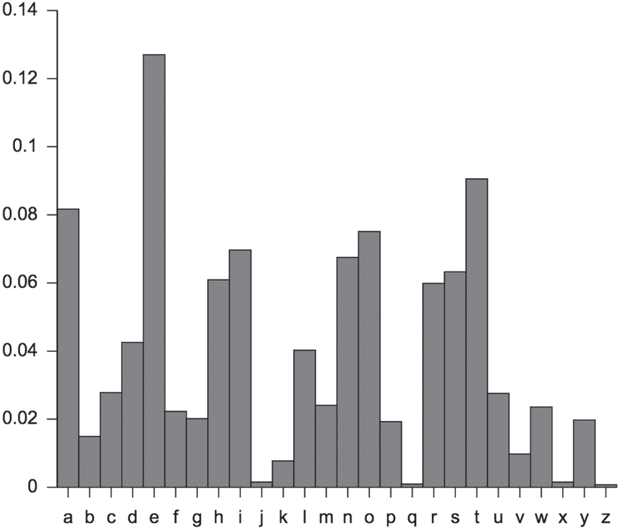
FIGURE 7.1 Relative frequencies of letters in English text.
Source: https://en.wikipedia.org/wiki/Letter_frequency#/media/File:English_letter_frequency_(alphabetic).svg. Public domain.
.svg)
But while no one is advocating that we eliminate certain letters from the alphabet – at least no one of whom I'm aware – there definitely are people who are lobbying to get rid of certain chart types altogether.
“Okay, fair enough,” you say, “then what are the pitfalls we can fall into when we go to choose and build a particular chart to visualize data for an audience?”
Let's look at them.
Instead of taking the typical approach of listing common blunders like truncating a bar chart's y-axis or using 333 slices in a pie chart, I'm going to break up this category of pitfalls into three subcategories that are based on what I consider to be three distinct purposes of data visualizations.
Data visualizations are either used (1) to help people complete a task, or (2) to give them a general awareness of the way things are, or (3) to enable them to explore the topic for themselves. The pitfalls in these three subcategories are quite a bit different.
Data Visualization for Specific Tasks
This first subcategory is by far the most important for businesses. In this scenario, the chart or graph is like a hammer or a screwdriver: a person or group of people is using it to perform a very specific task, to get a job done.
Think about a supply chain professional placing orders with vendors to keep raw materials in stock while minimizing inventory carrying costs. Or think about an investor deciding which assets in a portfolio to buy, sell, and hold on a particular day. Wouldn't they commonly use data visualizations to do these tasks?
In the case of such job aides, designing the tool to fit the exact user or users and the specific details of their task is critical. It's not unlike the process of designing any instrument or application. It's just another type of thing for which the principles of user interface design apply.
Whenever a data visualization is being used primarily as a tool, it's necessary to develop a deep understanding of four key elements in order to identify requirements and how to validate that they have been met:
- User: Who is the person or people who will be using it, what do they care about, and why do they care about those things?
- Task: What task or tasks do they need to get done, how often, what questions do they need to answer, or what information do they need to gather in order to do it well, both in terms of quality and timeliness?
- Data: What data is relevant to the job and what needs to be done to make use of it?
- Performance: How does the final deliverable need to behave in order to be useful, such as dimensions and resolution, or data refresh frequency?
Let's consider a simple illustrative scenario in which the chart choice and the way it's built don't exactly help a certain person do a specific task. Instead of dreaming up a fake business scenario and using some fabricated sales database (I really struggle with made-up data), I'll use a personal example just to demonstrate the point.
Every April 30, I hike to the top of Mount Si in North Bend, Washington, just outside of Seattle, where I live. As I've mentioned, I love spending time on the trails and just being around the trees and the views. I know, it's corny, but I feel like it helps me balance out the data-heavy, digital side of my life.
To be fair, though, I do wear a GPS watch and geek out on the trip stats when I get home. So I don't quite manage to leave behind my inner data nerd in the car at the trailhead. That's okay with me for now.
Why April 30? That was the day my father passed away in 2015. When I heard the news, I knew I needed to climb that mountain to clear my mind and just find a way to be with him somehow, some way. Whether he was or wasn't there isn't the point and doesn't really matter to me. He was there in my thoughts.
Wait, how does any of this relate to graphical gaffes or pitfalls or anything? Good question. I'm getting there. Thanks for indulging me.
It's May 3 as I'm writing this right now, and I just finished doing my annual remembrance pilgrimage a few days ago. It happened to be a particularly clear day, and I had a lot of work to get done later that day, so I wanted to start the hike while it was still dark and see if I could get to the top in time to catch the sunrise, which was to take place at 5:54 a.m. Last year when I went to do this hike, I left early in search of the sunrise as well, but there was a huge fog covering the top of the mountain. It was difficult enough to see the trail that morning, much less the horizon.
But last year's trip provided something of value to me for this time around: my trip stats, including a full record of the time, elevation gain, and distance traveled over the course of the trek.
So that's my starting point. Let's go through the four key elements to get our bearings:
- User: Ben Jones, hiker and data geek extraordinaire
- Cares about having an inspiring sunrise hike to the top of Mount Si
- Why? To remember his father, get some exercise, and enjoy nature
- Task: Get to the top of Mount Si at or just before sunrise
- How often? Once per year
- Answers/information needed?
-
- What time will the sun rise on April 30 in North Bend, Washington?
- How long will it take to get to the top of Mount Si?
- How much buffer time is needed to account for variation in trip time?
- What does success look like?
-
- Arriving at the of the mountain before sunrise
- Not arriving more than 15 minutes before sunrise, to avoid a long, cold wait
- Data: Sunrise info from search query, detailed Mount Si hiking stats from previous trek
- Sunrise time is a single constant; no data prep needed
- Historical trek stats can be obtained from watch app and/or fitness social network
- Buffer time is a choice based on assumed variability in travel time
- Performance: No data refresh needed; analysis based on static data only
I'll keep it simple and leave out of this example the time it takes me to drive from my house to the trailhead as well as the time it'll take me to get out of bed, fully dressed, and on the road. Those are the other pieces of information I'll need to set my alarm before going to bed. But for the purposes of this example, we'll stick with hike start time as our task and objective.
At this point, all I need from the visuals of my previous trip is a good idea of how long it will take me to get to the top of the mountain, which I can deduct, along with a 15-minute buffer, from the 5:54 a.m. sunrise time to determine the time I'll need to start on the trail.
A quick download of my data allowed me to recreate what I saw when I went to my online fitness portal, more or less (Figure 7.2).
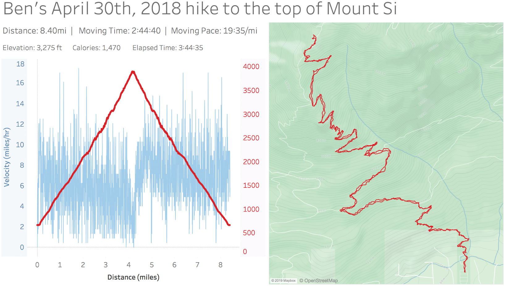
FIGURE 7.2 A recreation of the data visualizations my fitness network site provided.
As I looked at these charts, I realized that they didn't really allow me to get a good answer to my question. The dashboard gave me many helpful pieces of information – the total round-trip distance, the total time I was moving, as well as the total elapsed time (minus stationary resting time), and an elevation profile as a function of distance traveled. I knew I went up and came straight back, so I assumed that the trail to the top was close to 4 miles long, and I could see that I was moving at a pace of around 20 minutes per mile over the course of the entire trip. But I could also see that my pace was faster on the way down from the top, so I couldn't really rely on this variable to do some back-of-the-napkin math to determine the time to the top based on distance and velocity. Not at the level of precision I was looking for, anyway. There was too much of a chance I'd miss the 15-minute window of time I was shooting for between 5:39 a.m. and 5:54 a.m.
Now, this isn't intended to be a criticism of the fitness social network where I store my trip stats. While I was genuinely surprised that I didn't find a single chart with time on the horizontal x-axis, I'd have to acknowledge that they didn't exactly set out to design this dashboard for my specific task of determining when to start on the trail to catch a glimpse of the sunrise that morning.
That being said, I was able to download my stats and do a quick dashboard redesign in Tableau to better suit my needs. Doing so allowed me to see very quickly that I reached the top of the mountain almost exactly two hours after I left my car at the trailhead the previous year (Figure 7.3).
Notice that I added two new charts with time on the horizontal axis. The first shows a timeline of my altitude in the top left corner. The second shows a timeline of total distance traveled in the bottom left corner. The altitude timeline is most helpful in my specific scenario because it's immediately obvious how long it took me to get to the top – the x-value corresponding to beginning of the middle plateau of the curve – 2 hours.
On other hikes, however, there may be no mountain to climb. The path could just be a loop around a lake, or an “out-and-back” along the shore of a river. In such cases, altitude might not be as helpful to determine the time it would take to reach a certain point along the path between the start and the finish. For those cases, time on the x-axis and distance traveled on the y-axis – the bottom left chart – will enable me find to the amount of time it took to reach any point along the path.
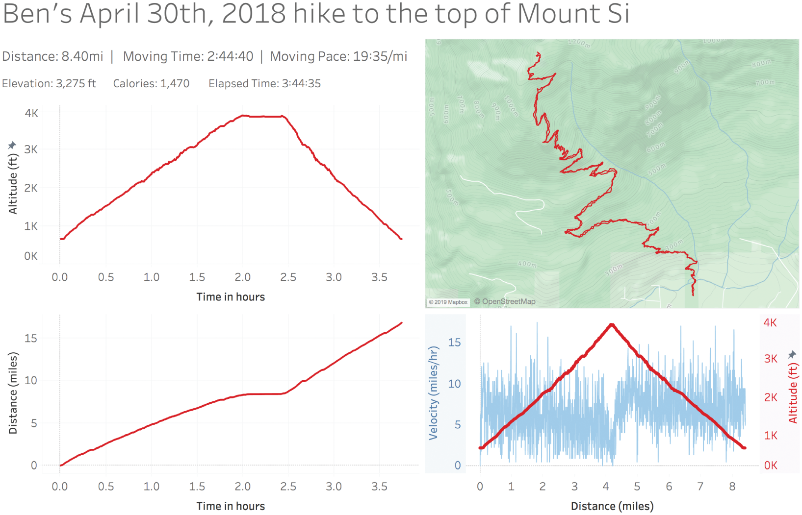
FIGURE 7.3 My extended analysis of my 2018 trip stats.
This time-distance view also helps because it lets me visually identify any long periods of rest – horizontal portions of the line where time keeps going but distance doesn't. Maybe I stopped to read a book, or eat lunch, or take some photographs. In this instance, I can see clearly that the only time I really stopped moving was for about 30 minutes right after reaching the top of the mountain. I can't use horizontal sections of the time-altitude view for this same purpose because it's possible that a horizontal section of this line corresponds with a flat section of the trail where I was still moving but at a constant elevation.
So now I have the final variable for my equation – estimated ascent time – and I was able to complete my simple task to determine the time to leave my car at the trailhead in order to make it to the top in time for sunrise:

And how'd the sunrise hike go, after all that? Well, I slept through my alarm and didn't start on the trail until 8:00 a.m. So it goes. Next year, for sure.
Now this may seem like a strange approach to begin to describe graphical gaffes. In many ways, it wasn't even a gaffe at all. The social network designed their dashboard; it didn't happen to help me do a rather specific task. There's no horrendous pie chart with 333 slices, no ghastly packed bubble chart. Just a line chart and a map that didn't help me complete my task.
Notice I didn't go into detail about whether line charts or bar charts are the “right” choice in this instance, or whether a dual axis for the altitude and velocity line chart was kosher or not. I think those debates can tend to miss the point. In this case, what was needed was a line chart, but one with time as the x-axis rather than distance in miles. The problem wasn't the chart type. It was the choice of the variable mapped to one of the axes.
My goal in using this example is to illustrate that “good enough” is highly dependent on the details of the task our audience needs to perform. It would be easy to start listing off various rules of thumb to use when choosing charts. Others have certainly done that to great effect. But if you're building something for someone who needs to perform a certain task or tasks, the final product will have to stand the test of usage. Pointing to a data viz guru's checklist will not save you if your users can't get their job done.
Data Visualization for General Awareness
Some visualizations aren't built in order to help someone perform a specific task or function. These types of visualizations lack a direct and immediate linkage to a job, unlike the ones we just considered.
Think about the times you've seen a chart on a news site showing the latest unemployment figures, or a slide in a presentation by an executive in your company that shows recent sales performance. Many times you aren't being asked to take facts in those charts and use them to perform any specific action right then and there, or even in the near future, or at all. Other people might be using these same exact visuals in that way – as tools – but some people who see them don't need to carry out a function other than just to become aware, to update their understanding of the way things are or have been.
As presenters of data visualizations, often we just want our audience to understand something about their environment – a trend, a pattern, a breakdown, a way in which things have been progressing. If we ask ourselves what we want our audience to do with that information, we might have a hard time coming up with a clear answer sometimes. We might just want them to know something.
What pitfalls can we fall into when we seek to simply inform people using data visualizations – nothing more, nothing less? Let's take a look at a number of different types of charts that illustrate these pitfalls. We'll stick with a specific data set to do so: reported cases of crime in Orlando, Florida.3 I visited Orlando in 2018 to speak and train at a journalism conference, and I found this data set so that my audience could learn using data that was relevant to our immediate surroundings.
The data set on the city of Orlando's open data portal comes with the following description:
This dataset comes from the Orlando Police Department records management system. It includes all Part 1 and Part 2 crimes as defined by the FBI's Uniform Crime Reporting standards. When multiple crimes are committed the highest level of crime is what is shown. The data includes only Open and Closed cases and does not include informational cases without arrests. This data excludes crimes where the victim or offender data is or could be legally protected.
This paragraph is followed by a long list of excluded crimes, including domestic violence, elderly abuse, and a list of sexual offenses, among others. So it's important to note that this data set says nothing about those types of crimes.
It's also important to note, going back to our discussion about the gap between data and reality in our chapter on epistemic errors, that we're not looking at actual crime, just reported crime. There's a difference. The site where I found the data also includes a disclaimer that “operations and policy regarding reporting might change,” so be careful about considering comparisons over time. In other words, a jump or a dip in one type of reported crime could be due to a change in the way police are doing their jobs, not necessarily due to a change in criminal activity itself. Not mentioning these caveats and disclaimers is misleading in and of itself. It can be inconvenient for us to do so because we might feel it will pull the rug out from under our own feet as we seek to make a powerful case to our audience. But it's just not ethical to omit these details once we know them.
1. Showing them a chart that's misleading
If we wanted to impress upon our audience that reported cases of narcotics are on the rise in Orlando, chances are that if we show them this 40-week timeline, we'd affect their understanding quite convincingly (Figure 7.4).
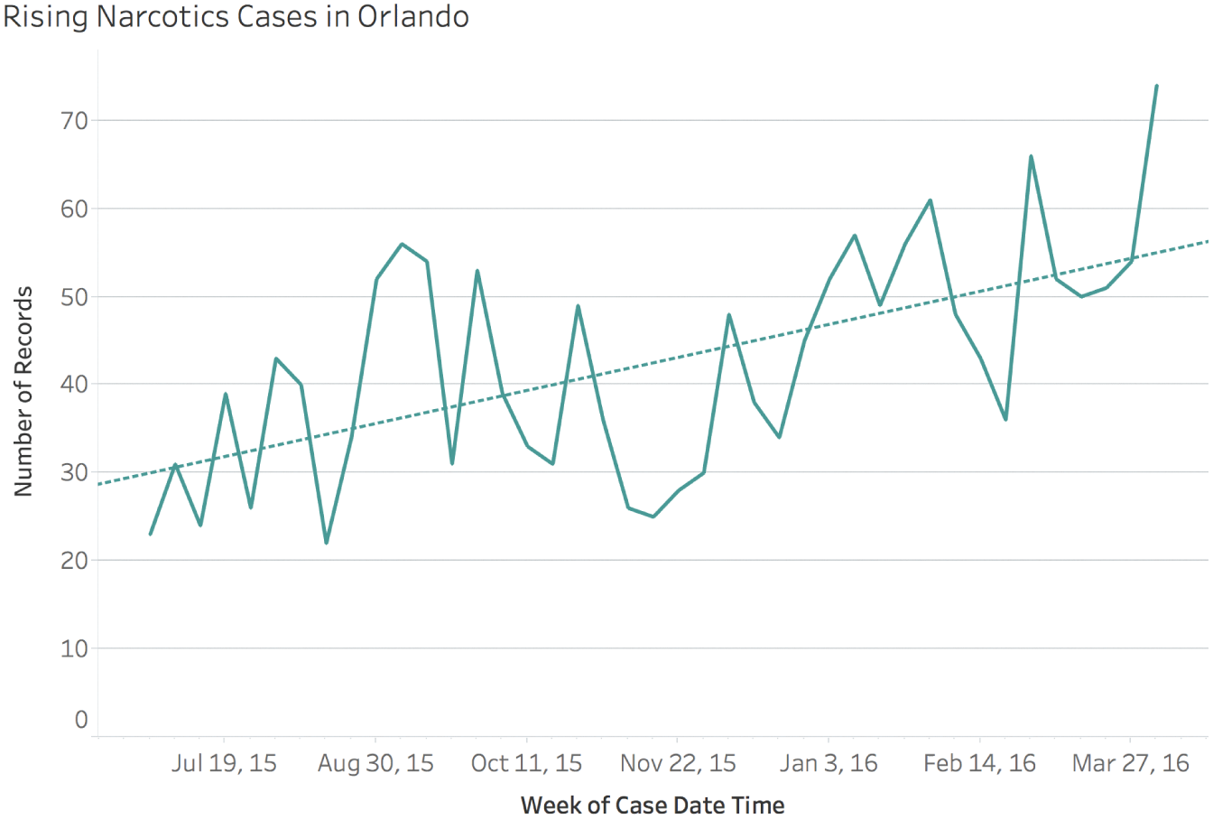
FIGURE 7.4 Reported cases of narcotics crimes in Orlando for 41 weeks, June 2015–April 2016.
There's nothing factually incorrect about this chart at all. It's not even poorly designed. But it's terribly misleading. Why?
Because if we open up the time window on the horizontal axis and explore the trend of reported cases of narcotics covering the entire 8-year period, the data tells a very different story. The initial 40-week period is shown in the shaded gray region in Figure 7.5.
Now, this may be an innocent case of failing to examine the trend in broader context. Or it may be a case of outright deception by intentional cherry-picking. In either case, though, we have made a tremendous graphical gaffe by showing our audience something that left them with the exact wrong impression.
It's possible to play with the configurations of many different types of charts to mislead an audience. This is just one simple example. I'll refer you once again to Alberto Cairo's How Charts Lie, as well as an older book by Darrell Huff, How to Lie with Statistics.
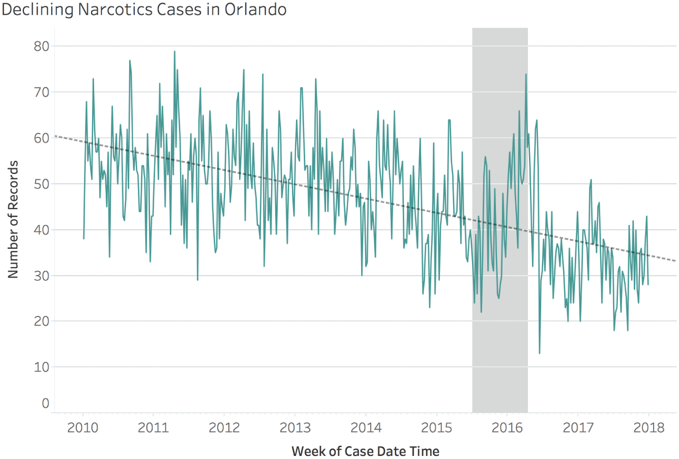
FIGURE 7.5 Weekly reported cases of narcotics crimes in Orlando, 2010–2017.
The fact that it's possible to pull the wool over people's eyes in this way has caused many to be wary of statistics for a very long time. The following quote comes from a book called Chartography in Ten Lessons4 by Frank Julian Warne that was published in 1919, a full century prior to the year in which I am finishing writing this book:
To the average citizen statistics are as incomprehensible as a Chinese puzzle. To him they are a mental “Mystic Moorish Maze.” He looks upon columns of figures with suspicion because he cannot understand them. Perhaps he has so often been misled by the wrong use of statistics or by the use of incorrect statistics that he has become skeptical of them as representing reliable evidence as to facts and, like an automaton, he mechanically repeats “while figures may not lie, all liars, figure,” or the equally common libel, “there are three kinds of lies – lies, damn lies and statistics.”
Misleading people with charts injects some bad karma into the universe. We're still paying for the decisions of a few generations ago that led people into this exact pitfall. As a result, the collective human psyche is quite wary that data and charts are likely purveyors of trickery and falsehood, not truth.
2. Showing them a chart that's confusing
Slightly less egregious than the previous type of chart that misleads is the one that confuses an audience. The only reason this type of pitfall isn't as bad is because our audience doesn't walk away with the wrong idea. They walk away with no idea at all, just a bewildering feeling that they must've missed something.
There are really many more ways to confuse people with data than I can list or explain here. Many basic charts are confusing to people, let alone more complex ones such as a box-and-whisker plot. Does this mean we stop using them? No, but we may need to take a moment to orient our audience so that they understand what they're looking at.
But one of the most common ways to confuse someone with a chart is to include too much in the view. For example, if we wanted to focus our audience's attention on reported cases of shoplifting, and we showed them this timeline, we'd be right at the bottom of this pitfall (Figure 7.6).
Do you see what happens when you look at this chart? If you're like me, you make an honest and even an earnest attempt to verify that the presenter or the writer of the accompanying text is telling you something accurate. You struggle to find what you're looking for, and you start to get confused and then frustrated. The lines and the colors and the way they cross and overlap just make your brain scream when it can't find the information it's looking for. And then you give up.
Why do we insist on showing so much data to our audience all the time? It's like there's this irresistible temptation to include everything in the view, as if we'll get extra credit for adding all that data we've played with. Are we trying to impress them? We're not, we're just confusing them. Strip away all the extraneous stuff, or at least let it fade into the background.
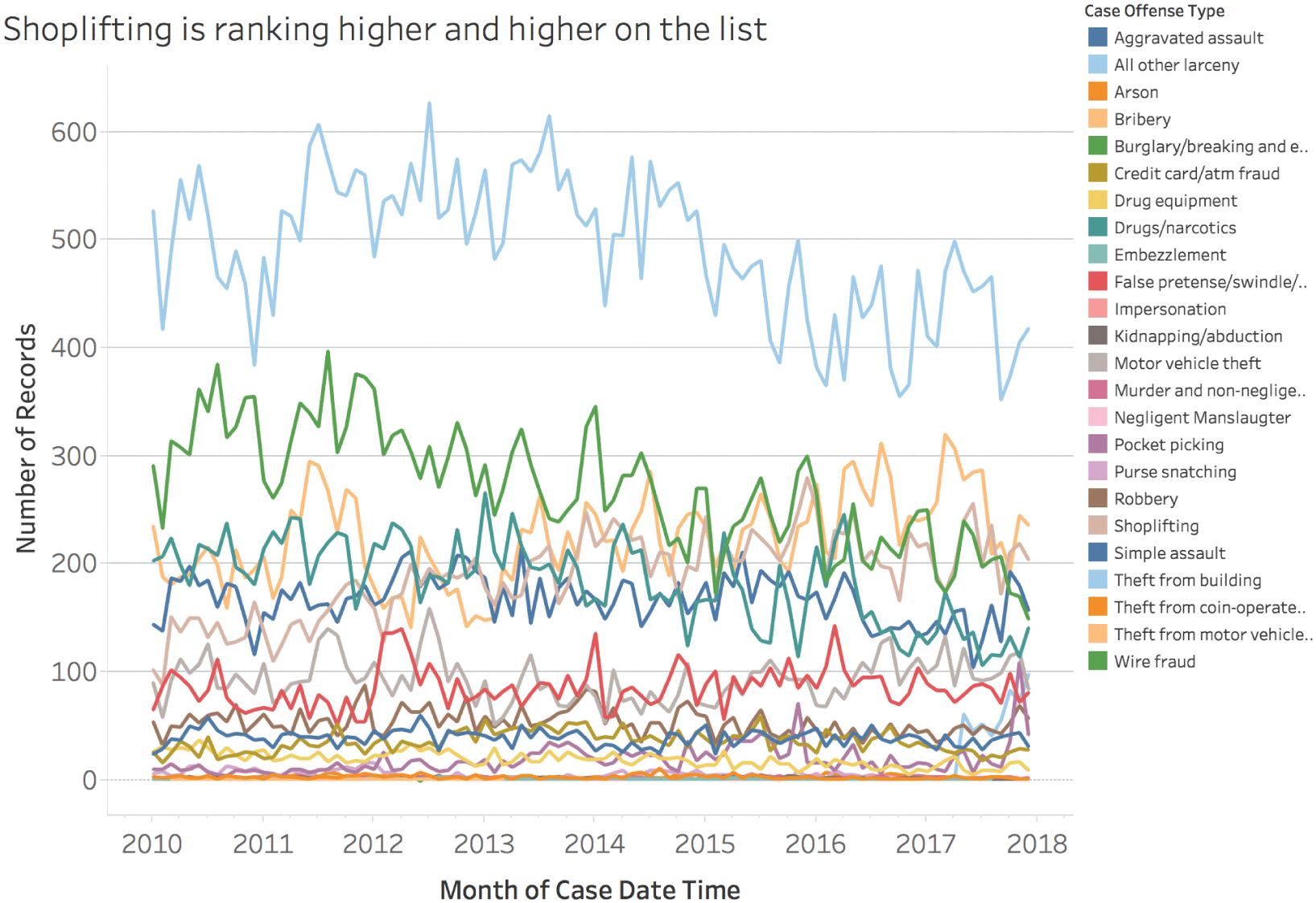
FIGURE 7.6 A line chart showing 24 different categories of reported crimes in Orlando.
You might hear this type of chart referred to as a “spaghetti chart” for obvious reasons. Notice a few things about it, if you don't mind. First, notice that “Shoplifting” has been given a light beige color. This was assigned as a default from the Tableau Desktop product I used to create it. Now, there's nothing inherently wrong with beige, but it sure is hard to pick the beige line out of the jumbled lines. If that happens to be the default assignment for the exact line or mark to which we want to draw attention, we will want to change it to something more noticeable.
Next, consider how many different lines there are. If you count the items in the legend, you'll see that there are 24 different lines. But there are only 20 different colors in the default color palette that the software applied to the offense type variable. So when it gets to the 21st item in the alphabetically ordered list, the software applies the same color that it applied to the first item. The 22nd item gets the same color as item number 2, and so on. Accepting defaults like that can be a rookie mistake, to be sure, but I've made that mistake many times, and many times well after I've been able to call myself a rookie.
What's the effect of this color confounding (which we'll consider more in the next chapter)? Take a look at the top line. It's light blue. Find light blue in the legend. To what offense type does it correspond? Does it correspond to “All other larceny” or “Theft from building”? We can't tell just by looking at the static version. We'd need to hover over an interactive version, or click on the legend to see that it's the “All other larceny” category. If a chart requires interaction to answer an important question, but it's presented in static form, then that's a surefire way to confuse people.
Going back to our original goal of bringing awareness to the shoplifting data, we can change the color for “Shoplifting” from light beige to something bolder, a color that's uniquely assigned to that value. Then, since our point is about the increase in rank, we'll leave the other lines in the view instead of removing them altogether, but we'll give them a lighter appearance or apply transparency to them to make the line series we want our audience to notice stand out (Figure 7.7).
Taking the time to make these minor but important tweaks to our charts will go a long way to ensuring our audience isn't staring at the screen or the page with that furrowed brow and that feeling of being completely lost. We don't want that.
3. Showing them a chart that doesn't convey the insight we want to impart
Let's say you and I are trying to educate a group of citizens about the state of reported crimes in Orlando, and we have a slide in which we'd like to make it immediately clear that three categories – theft, burglary, and assault – together have accounted for three out of every four reported crimes. Which of the following four alternatives in Figure 7.8 would you choose to make this point to your audience?
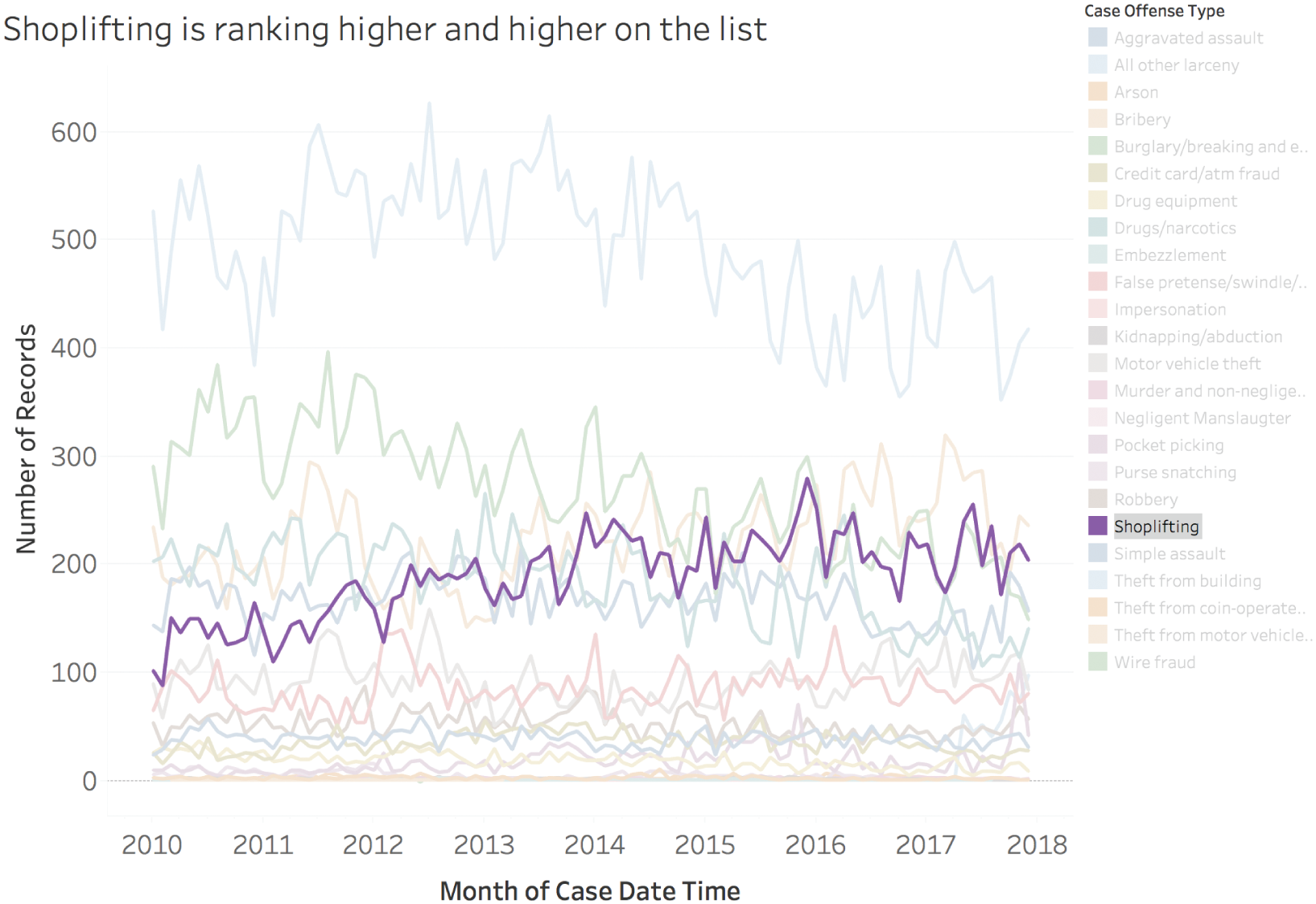
FIGURE 7.7 Focusing our audience's attention on the shoplifting timeline.
I'd argue that the pie chart and the treemap both make this point fairly well, and that the bar chart and the packed bubble chart don't. The reason is that the pie chart and the treemap each group all of the marks – slices in the case of the pie chart and rectangles in the case of the treemap – into a single, cohesive unit. In the case of the pie chart, the three slices we're asking our audience to pay attention to stop at almost exactly 9 o'clock, or 75% of a whole circle.
I'd argue that using 12 distinct color hues to make a point like this is a bit distracting, and that a simplified version of the color palette would make the point even easier for our audience to observe (Figure 7.9).
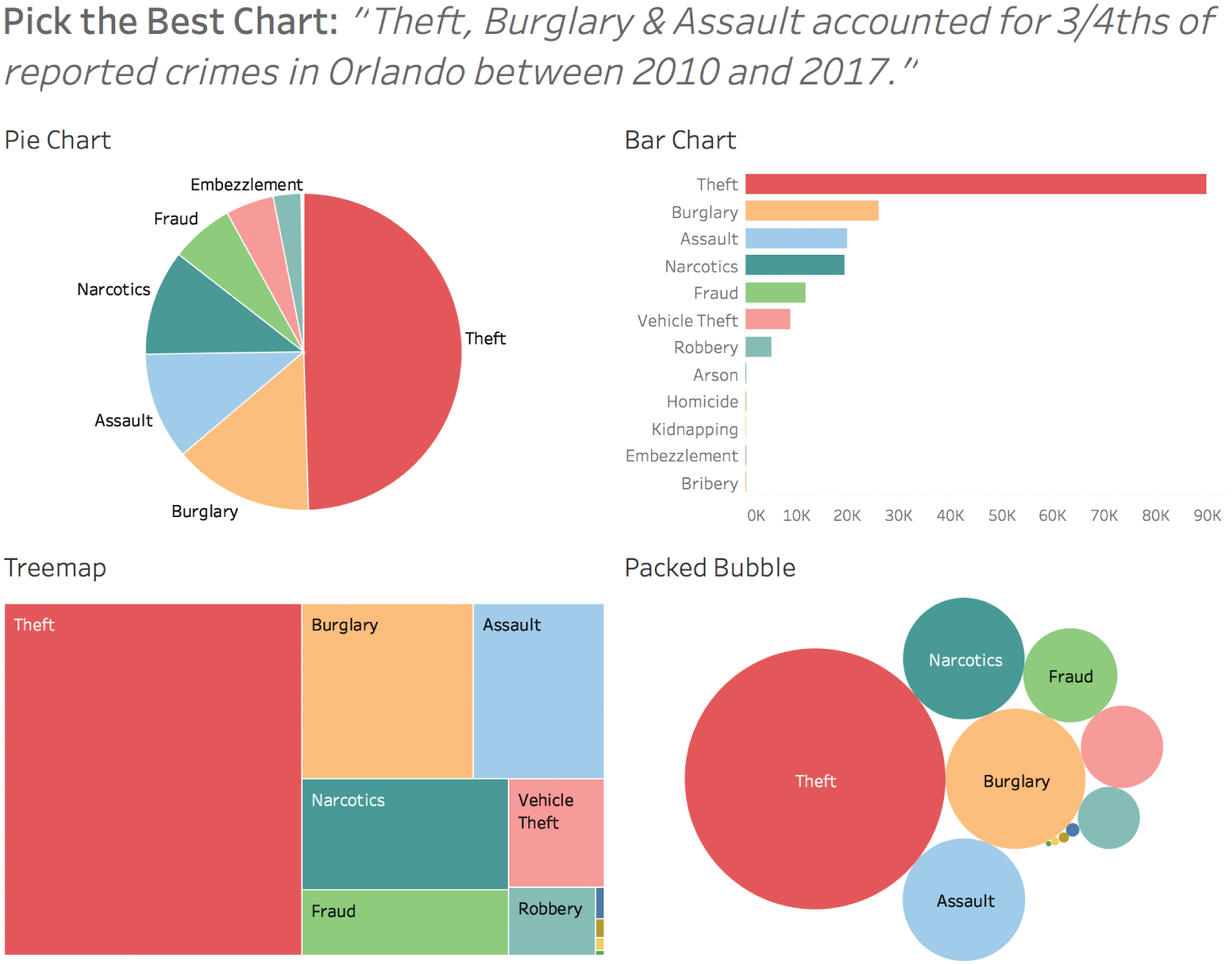
FIGURE 7.8 Four chart types that show number of reported crimes by category.
Notice how the simplified color scheme doesn't really make the share figure any clearer in the case of the bar chart and the packed bubble charts. That's because each mark in these two charts – rectangles in the case of the bar chart and circles in the case of the packed bubble chart – are separated in a way that doesn't give the notion of a cohesive single unit like the others do.
So we have two chart types that make the point we're trying to make abundantly clear and immediately noticeable. But we should ask ourselves another very important question: Is it actually fair and accurate to show this group of reported crimes as a single, whole unit? Think back to the caveats that were listed about this data: it only includes Part 1 and Part 2 crimes based on the FBI's standards. It only includes cases that were both opened and closed. In the case of multiple crimes, it only includes the highest level. And it doesn't include crimes where the victim or offender's identity could be legally protected.
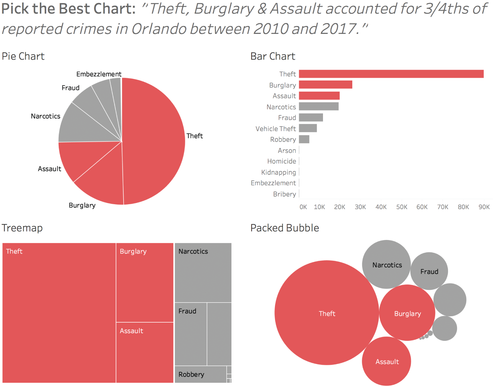
FIGURE 7.9 A simplified color palette to focus on the top three categories.
That's a lot of caveats, isn't it? Does this data set represent a single anything, then? Perhaps not. If not, maybe it would be better to use a chart type, like a bar chart, that doesn't impart the notion of part-to-whole. If we do decide to show our audience a part-to-whole chart type like a pie chart or a treemap, and certain substantial elements aren't included in the data for whatever reason, we'll want to make that very clear to our audience. If we don't, we can be pretty sure that we'll be misleading them.
4. Showing them a chart that doesn't convey the insight with enough precision
Let's say we wanted to make a different point altogether – that there have been a similar number of reported cases of assault and narcotics crimes in Orlando from 2010 to 2017, but that cases of assault have just barely outpaced narcotics over that time period.
Of the following seven charts in Figure 7.10, which would be the best to accompany this point in a presentation we would deliver or an article we would write?
Only the bar chart makes this point clear. It's the only one of the seven where the marks for assault and narcotics share a common baseline, allowing us to compare their relative count (bar length) with any degree of precision. With the other six charts, there's really no way to tell which one of the two categories occurred more often. It's pretty clear that they're quite close in occurrence, but without making inferences based on the sort order, there's just no way to tell without adding labels.
If, for some reason, our audience needs to understand the relative sizes with even greater precision than the bar chart affords, we can always add the raw counts and percentages (Figure 7.11).
Adding data values as labels like this is an effective way to enable our audience to make precise comparisons. A list or table of values alone would also convey this precision, but it would lack the visual encoding that conveys patterns and general notions of relative size at a glance.
5. Showing them a chart that misses the real point
In describing this pitfall so far, we have concerned ourselves with individual charts, and whether they convey our message well to our audience and provide them with a general awareness that sufficiently matches reality. We have considered ways to create charts that introduce flaws that mislead, confuse, or provide inadequate visual corroboration for the point we're trying to make. We can classify these blunders as “sins of commission” – that is, they all involve an action that produces the problem.
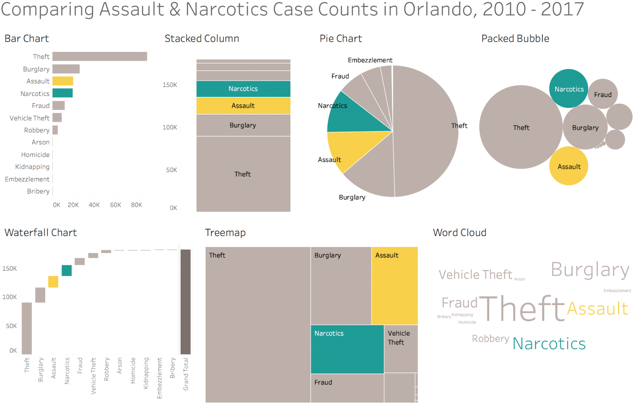
FIGURE 7.10 Seven ways to compare reported cases of assault and narcotics crimes in Orlando.
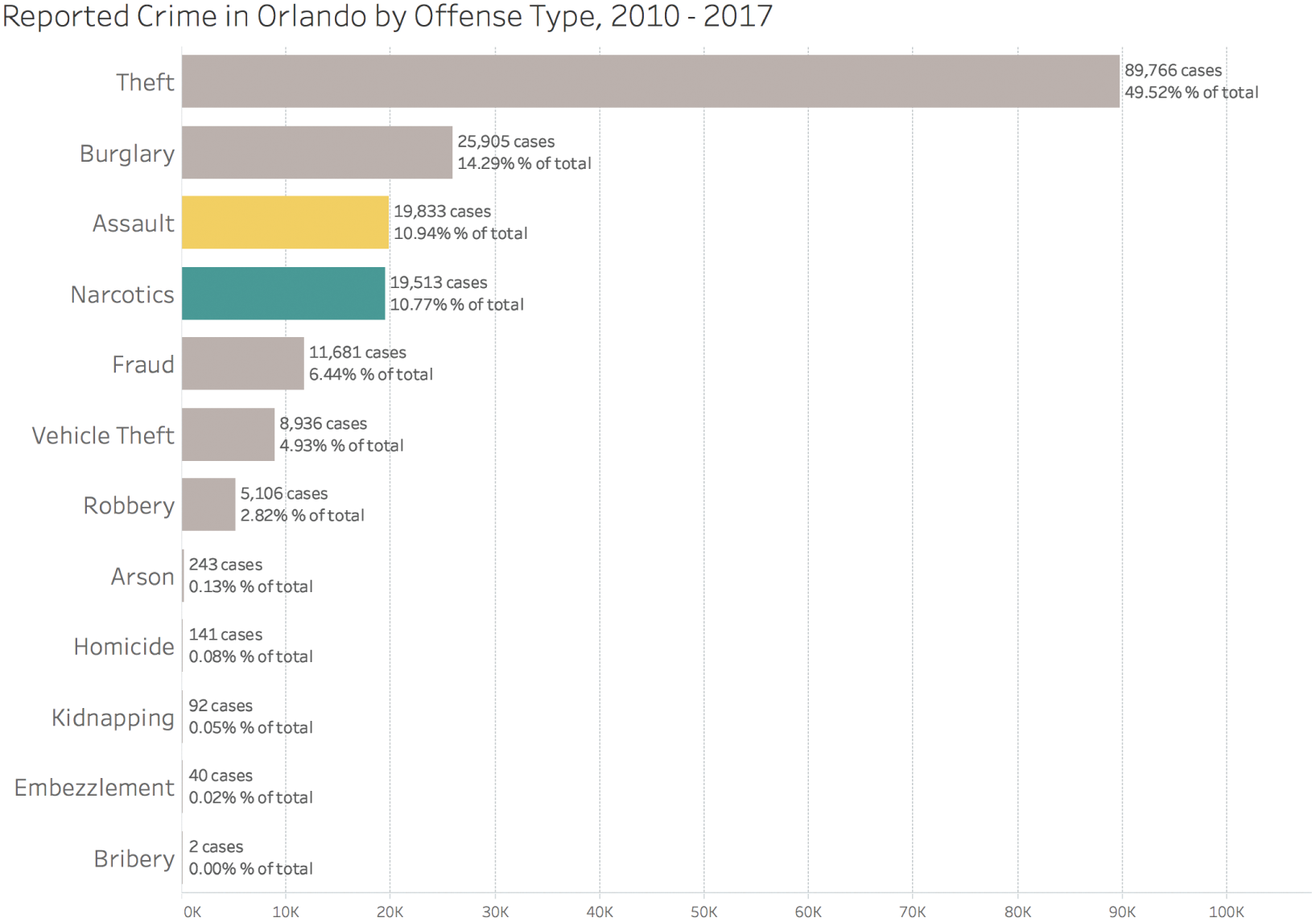
FIGURE 7.11 Adding data labels and gridlines to afford greater precision of comparison.
But there's another way a chart can fail to convey our message. It can miss the point. Like failing to add an exclamation mark to a crucial sentence, or like criticizing the crew of the Titanic for their arrangement of the deck chairs, we can leave out something even more important and thereby commit a “sin of omission.”
For example, if we wanted to impress upon our audience that theft is the most frequently reported category of Part 1 and Part 2 crimes in Orlando, we could show them the pie chart or treemap in Figure 7.12 to drive home the point that theft accounted for almost half of all such cases between 2010 and 2017.
And if we stopped there, we'd have missed the point. Why? Because if we look at the way the number of reported cases of theft in Orlando has changed on a monthly basis over this time, we'd see that it's growing in overall share (Figure 7.13).
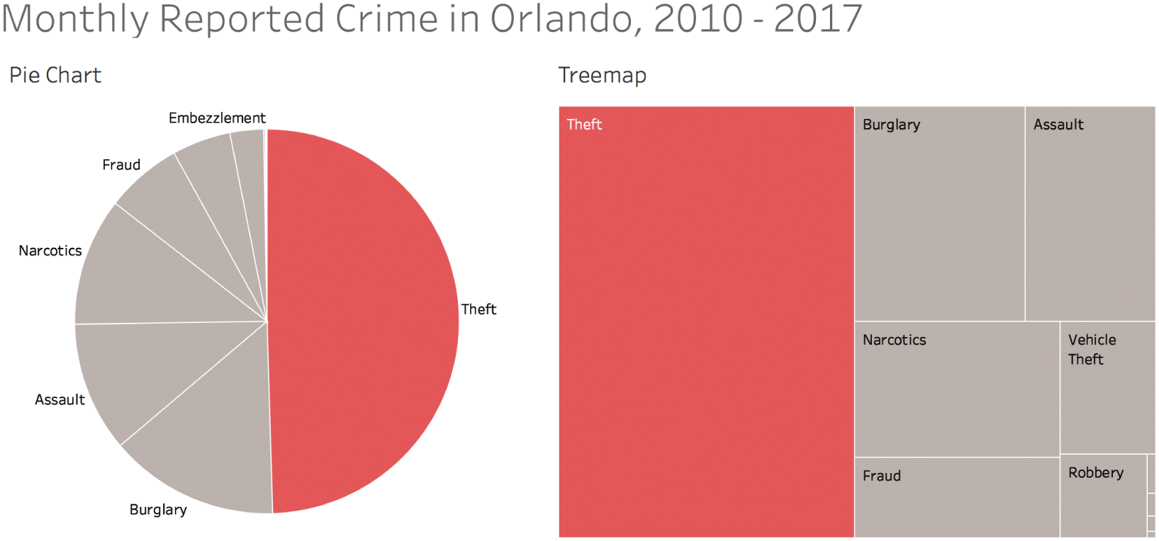
FIGURE 7.12 A pie chart and a treemap that convey that theft accounts for half of the crime.
In fact, if we look at the mix of reported Part 1 and Part 2 crimes in Orlando for 2017 alone, we see that theft accounted for just over 55% of such crimes (Figure 7.14).
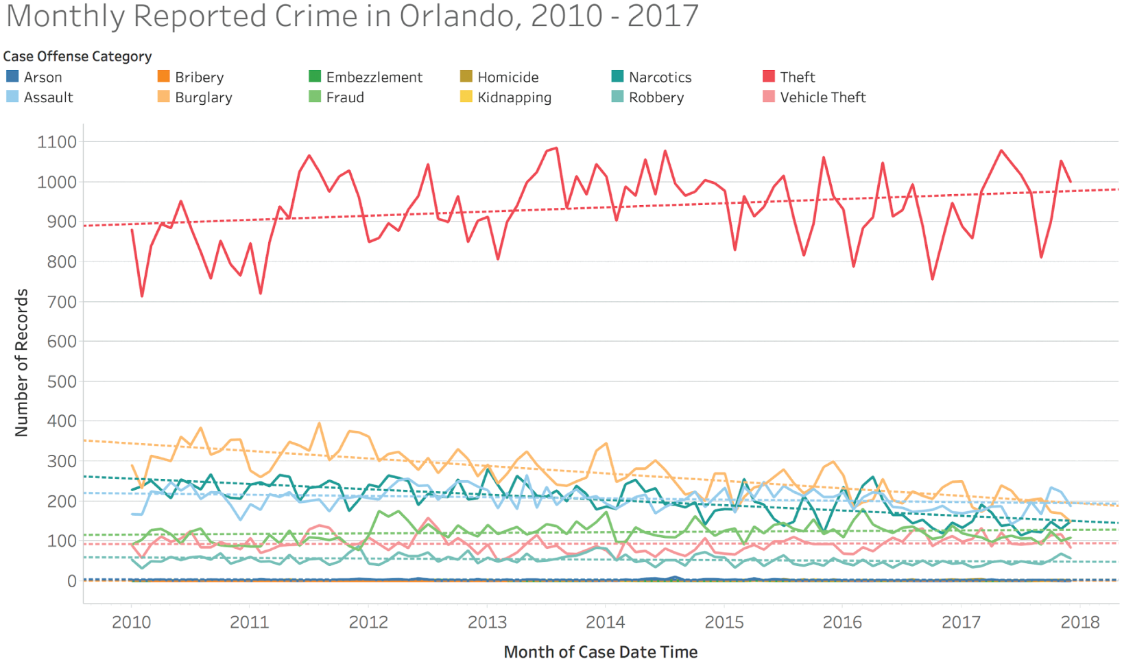
FIGURE 7.13 A timeline showing the change in number of reported cases of crime by category.
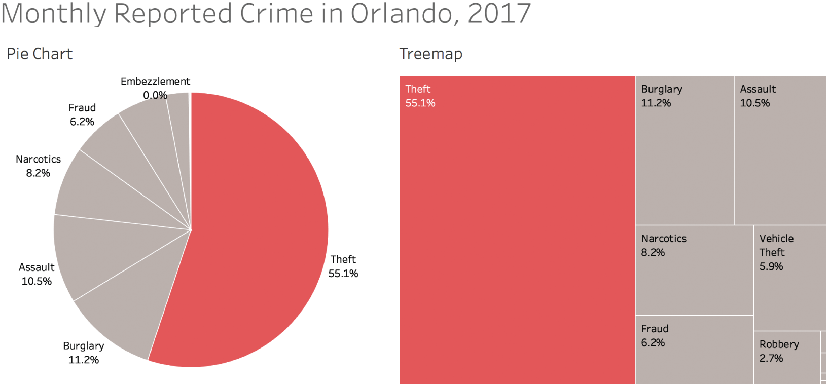
FIGURE 7.14 Breakdown of reported crime by category for 2017.
By comparison, theft accounted for only 45% in 2010 (Figure 7.15).
The bottom line is that we didn't make the point as strongly as we could have. Our original chart selection failed to convey the fact that theft has significantly increased in share over the time period we were showing and is now much higher than it once was.
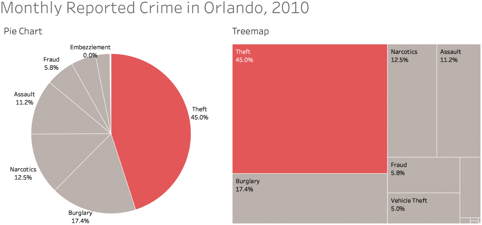
FIGURE 7.15 Breakdown of reported crime by category for 2010.
When we showed the original chart covering 2010 through 2017, did we give our audience a general awareness of reality? Yes, but we didn't make them aware of a fact that's perhaps even more important. We picked the right chart type (assuming we believe we're dealing with a reasonable “whole”), we chose color in such a way as to draw attention to our main point and category of emphasis, and we even added labels for added precision. And we did so with great courage, feeling confident that our pie chart was good enough in spite of the many pie-chart-hating hecklers we knew would throw tomatoes.
But we sold ourselves short by omitting a critical fact.
Data Visualization for Open Exploration
Many times when we create charts, graphs, maps, and dashboards, we do so for our own understanding rather than to present to an audience. We're not in “data storytelling mode” quite yet, we're still in “data story finding mode.” That's okay, and there's a time for this critical step in the process. It's actually a very enjoyable step when you enter a state of playful flow with a data set or even multiple data sets. You're deep in the data, finding out interesting things and coming up with brand new questions you didn't know you had, just like the epigraph of this chapter indicates is possible.
I love the way EDA – Exploratory Data Analysis – embraces the messiness and fluid nature of this process. The way we explore data today, we often aren't constrained by rigid hypothesis testing or statistical rigor that can slow down the process to a crawl.
But we need to be careful with this rapid pace of exploration, too. Modern business intelligence and analytics tools allow us to do so much with data so quickly that it can be easy to fall into a pitfall by creating a chart that misleads us in the early stages of the process.
Like a teenager scrolling through an Instagram feed at lightning speed, we fly through a series of charts, but we never actually stop to pay close, diligent attention to any one view. We never actually spend quality time with the data; we just explore in such a rush and then publish or present without ever having slowed down to really see things with clarity and focus.
For example, let's think about that rising trend of reported thefts in Orlando. It was really easy to drag a trendline on top of the line chart and see the line sloping upward and take away from a step that took all of 10 seconds that theft is getting higher and higher each month that goes by. After all, the line is angling upward, right?
But if we consider an individuals control chart5 (Figure 7.16), which is designed to help us understand whether changes in a time series can be interpreted as signals or mere noise, then we see a slightly different story.
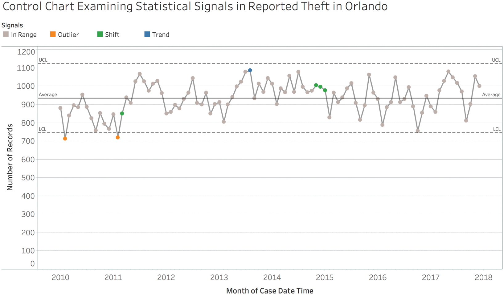
FIGURE 7.16 An individuals control chart showing signals in the time series of reported thefts.
Yes, there were months in 2010 and 2011 that were lower than we would expect (“outliers” either above the upper control limit – UCL, or below the lower control limit – LCL), and there was even a rising trend in 2013 (6 points or more all increasing or decreasing) and a shift to end 2014 and begin 2015 (9 points or more all on one side of the average line). But since January 2015, the number of reported cases of theft in Orlando hasn't see any statistically significant changes at all. That's 35 straight months of noise. Would a core message that theft is rising and rising every month really be warranted by the data?
If we had just rushed on to the next chart without stopping to look more closely at this one finding, we might have missed the deeper understanding we gained by slowing down and analyzing more deeply.
Pitfall 6B: Data Dogmatism
Like in other forms of expression and communication, there are no black-and-white rules in data visualization, only rules of thumb.
I don't believe that we can ever declare that a particular visualization type either “works” or “doesn't work” in all conceivable instances. This binary approach is very tempting, I'll admit. We get to feel confident that we're avoiding some huge mistake, and we get to feel better about ourselves when we see someone else breaking that particular rule. I started off in this field with that mindset.
The more I've seen and experienced, though, the more I prefer a sliding grayscale of effectiveness over the black-and-white “works”/“doesn't work” paradigm. It's true that some chart choices work better than others, but it's highly dependent on the objective, the audience, and the context.
This paradigm makes it harder to decide what to do and what not to do, but I believe this approach embraces the complexity inherent in the task of communicating with other hearts and minds.
Sometimes the most effective choice in a particular situation might surprise us. Let's consider two fields that are seemingly unrelated to data visualization: chess and writing. Data visualization is like chess in that both involve a huge number of alternative “moves.” These moves are subject to common thinking about what gives a player an advantage over their opponent.
For those not familiar with the basics of chess strategy, the different pieces of the board are assigned different points, from the single point of the lowly pawn to the full nine points of the ultra-powerful queen. Generally speaking, a player would not want to lose a queen in exchange for a pawn or other lesser piece. But Russian chess grandmaster Garry Kasparov decided to sacrifice his queen early in a game against Vladimir Kramnik in 1994.6 He went on to win that game in decisive fashion.
What matters is not who ends up with the most points from pieces on the board, but who puts his opponent's king in checkmate. It's possible, but not exactly common, to achieve checkmate while making some surprising decisions that seem to put the player at a disadvantage, at least in terms of material.
In the second analogy, data visualization is like writing in that both involve communicating complex thoughts and emotions to an audience. Typically, when writing for a reader or group of readers, common rules of spelling, syntax, and grammar apply. Students who break these rules in school get poor grades on their writing. But American novelist, playwright, and screenwriter Cormac McCarthy decided to eschew virtually all punctuation in his 2006 novel The Road. He won the 2007 Pulitzer Prize for Fiction for that novel.7
Now, would I recommend either of those decisions to a novice chess player or writer? No, but I wouldn't completely eliminate them from the set of all possible solutions, either. A brilliant diagram in Tamara Munzner's Visualization Analysis & Design illustrates why (Figure 7.17).
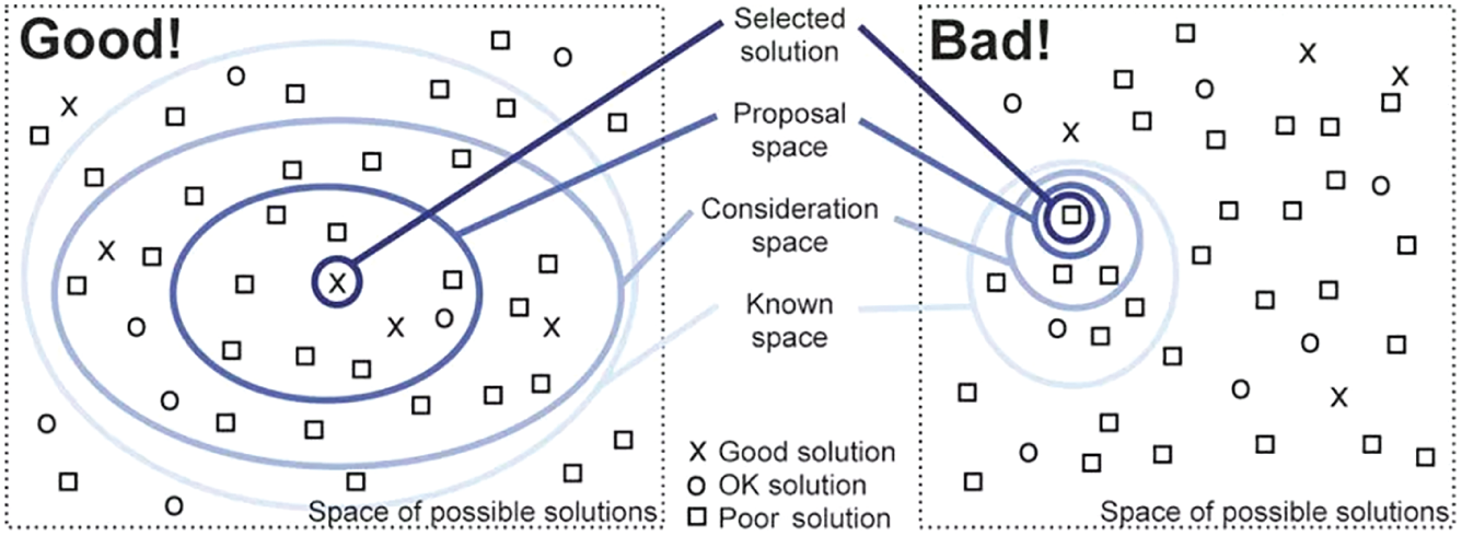
FIGURE 7.17 Two approaches to choosing selecting solutions.
If we start with a larger consideration space shown in the diagram on the left, it's more likely to contain a good solution by virtue of its expansiveness. On the other hand, labeling certain visualization types as “bad” and eliminating them from the set of possible solutions paints us into a corner, as shown in the diagram on the right.
Why do that? Telling a budding chess player never to sacrifice a queen, or telling a novice novelist never to leave out a period or comma under any circumstances isn't doing them any favors. These decisions can sometimes be made to great effect.
For example, consider the word cloud. Most would argue that it's not terribly useful. Some have even argued that it's downright harmful.8 There's a good reason for that, and in certain situations it's very true – it will do nothing but confuse your audience.
It's difficult to make precise comparisons using this chart type, without a doubt. Words or sequences with more characters are given more pixels than shorter strings that appear more frequently in the text. And using a word cloud to analyze or describe blocks of text, such as a political debate, is often misleading because the words are considered entirely out of context.
Fair enough. Let's banish all word clouds, then, and malign any software product that makes it possible to create one, right?
I wouldn't go so far. Word clouds have a valid use, even if it is rare. What if we had a few brief moments during a presentation to impress upon a large room of people, including some sitting way in the back, that there are only a handful of most commonly used passwords, and they're pretty ridiculous. Isn't it at least possible that a word cloud could suffice for this purpose?
Would you choose a bar chart, a treemap, or a packed bubble over a word cloud, in this scenario? You decide (Figure 7.18).
I admit it – I'd likely choose the word cloud in the scenario I described. The passwords jump right off the screen at my audience, even for the folks in the back. It doesn't matter to me whether they can tell that “password” is used 1.23 times more frequently than “123456.” That level of precision isn't required for the task I need them to carry out in this hypothetical scenario. The other chart types all suffer from the fact that only a fraction of the words even fit in the view at all. The bar chart only has 17 of the top 100 showing, with a vertical scrollbar to access all the others. The packed bubble only lets my audience see five of the passwords before the sequences don't fit in the circles anymore.
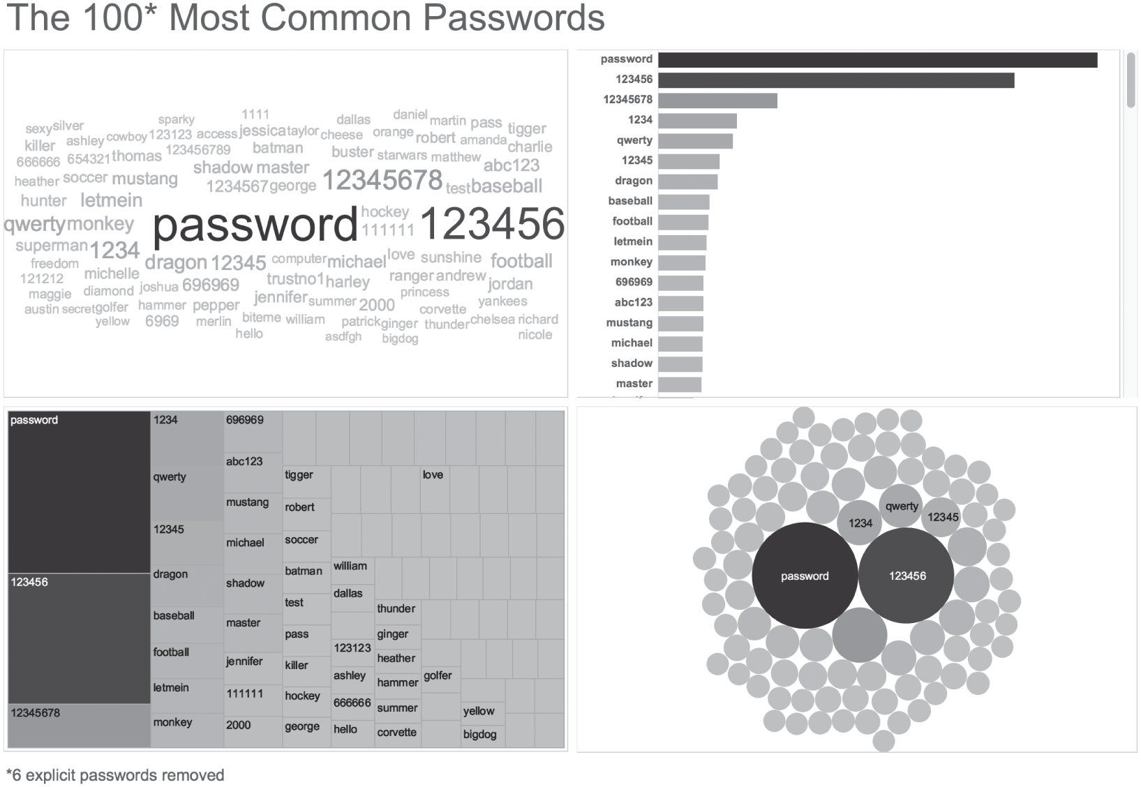
FIGURE 7.18 Four ways to show the 100 most common passwords.
With these other three charts, the audience can't scan the full list at a glance to get a general sense of what's contained in it – names, numbers, sports, “batman.”
If what you take from this example is that I think word clouds are awesome and you should use them all the time, you've completely missed my meaning. In most instances, word clouds aren't very good at all, just like sacrificing one's queen or omitting quotation marks entirely from a novel.
But every now and then, they do the trick.
Without a doubt, we can list many other scenarios where we would choose one of the other three chart types instead of the word cloud. Choosing a particular chart type depends on many factors. That's a good thing, and frankly, I love that about data visualization.
Since there are so many variables in play, and since we hardly ever know the objective, the audience, or the full context of a particular project, we need to be humble when providing a critique of someone else's data visualization. All we see is a single snapshot of the visual. Was this created as part of a larger presentation or write-up? Did it also include a verbal component when delivered? What knowledge, skills, and attitudes did the intended audience members possess? What are the tasks that needed to be carried out associated with the visualization? What level of precision was necessary to carry out those tasks?
These questions, and many more, really matter. If you're the kind of person who scoffs at the very mention of word clouds, your critique of my example above would be swift and harsh. And it would largely be misguided.
I enjoy that there are so many creative and talented people in the data visualization space who are trying new things. Freedom to innovate is necessary for any field to thrive. But making blanket statements about certain visualization types isn't helpful, and it tends to reduce the overall spirit of freedom to innovate.
“Innovation” doesn't just involve creating new chart types. It can also include using existing chart types in new and creative ways. Or applying current techniques to new and interesting data sets. Or combining data visualization with other forms of expression, visual or otherwise. As long as we can have a respectful and considerate dialogue about what works well and what could be done to improve on the innovation, I say bring it on.
Adding the winning ideas to the known solution space is good for us all.
Pitfall 6C: The Optimize/Satisfice False Dichotomy
In data visualization, is there a single “best” way to visualize data in a particular scenario and for a particular audience, or are there multiple “good enough” ways? This debate has surfaced at least a handful of times in the data visualization world.
Some say there is definitely a best solution in a given situation. Others say it's possible that multiple visuals all suffice in a given situation.
Could both be right?
This is going to sound strange, but I think both are right, and there's room for both approaches in the field of data visualization. Let me explain.
Luckily for us, very intelligent people have been studying how to choose between a variety of alternatives for over a century now. Decision making of this sort is the realm of operations research (also called “operational research,” “management science,” and “decision science”). Another way of asking the lead-in question is:
- Q: When choosing how to show data to a particular audience, should I keep looking until I find a single optimum solution, or should I stop as soon as I find one of many that achieves some minimum level of acceptability (also called the “acceptability threshold” or “aspiration level”)?
The former approach is called optimization, and the latter was given the name “satisficing” (a combination of the words satisfy and suffice) by Nobel laureate Herbert A. Simon in 1956.9
So which approach should we take? Should we optimize or satisfice when visualizing data? Which approach we take depends on three factors:
- Whether or not the decision problem is tractable
- Whether or not all of the information is available
- Whether or not we have time and resources to get the necessary information
But what is the “payoff function” for data visualizations?
This is a critical question, and from where I think some of the debate stems. Part of the challenge in ranking alternative solutions to a data visualization problem is determining what variables go into the payoff function, and their relative weight or importance. The payoff function is how we compare alternatives. Which choice is better? Why is it better? How much better?
A few data visualization purists whose work I've read would claim that we can judge the merits of a data visualization by one criterion and one criterion only: namely, whether it makes the data as easy to interpret as possible. By stating this, the purist is proposing a particular payoff function: increased comprehensibility = increased payoff.
But is comprehensibility the only variable that matters (did our audience accurately and precisely understand the relative proportions?) or should other variables be factored in as well, such as:
- Attention (Did our audience take notice?)
- Impact (Did they care about what we showed them?)
- Aesthetics (Did they find the visuals appealing?)
- Memorability (Did they remember the medium and/or the message some time into the future?)
- Behavior (Did they take some desired action as a result?)
Figure 7.19 shows how I tend to think about measuring payoff, or success, of a particular solution with hypothetical scores (and yes, I've been accused of overthinking things many times before):
Notice that if you were to use this rubric, you'd be able to decide whether or not a particular category matters by moving the toggle on the far left, and you'd be able to set the values for “Actual” (How well does my visualization satisfy this factor currently?) and “Required” (How well does it need to satisfy this factor for me to achieve my goal?).
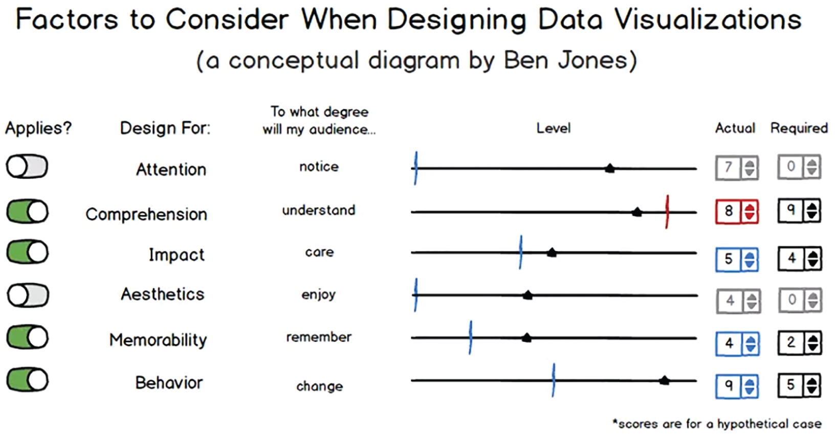
FIGURE 7.19 An example of how to determine which factors are important.
The “Actual” score would move the sliding triangle along the “Level” line from 0 to 10, and the “Required” value would determine where the target line is positioned similarly. Red target lines would correspond to factors that aren't met to a satisfactory level (triangles that lie to the left of the line), such as the target line for the “Comprehension” factor in the example.
It's pretty easy to conceive of situations, and I'd venture to say that most of us have experienced this first-hand, where a particular visualization type may have afforded increased precision of comparison, but that extra precision wasn't necessary for the task at hand, and the visualization was inferior in some other respect that doomed our efforts to failure.
Comprehensibility may be the single most important factor in data visualization, but I don't agree that it's the only factor we could potentially be concerned with. Not every data visualization scenario requires ultimate precision, just as engineers don't specify the same tight tolerances for a $15 scooter as they do for a $450M space shuttle.
Also, visualization types can make one type of comparison easier (say, part-to-whole) but another comparison more difficult (say, part-to-part).
Trade-Offs Abound
What seems clear, then, is that if we want to optimize using all of these variables (and likely others) for our particular scenario and audience, then we'll need to do a lot of work, and it will take a lot of time. If the audience is narrowly defined (say, for example, the board of directors of a specific nonprofit organization), then we simply can't test all of the variables (such as behavior – what will they do?) ahead of time. We have to forge ahead with imperfect information, and use something called bounded rationality – the idea that decision making involves inherent limitations in our knowledge, and we'll have to pick something that is “good enough.”
And if we get the data at 11:30 a.m. and the meeting is at 3 p.m. on the same day? Running a battery of tests often just isn't practical.
But what if we feel that optimization is critical in a particular case? We can start by simplifying things for ourselves, focusing on just one or two input variables, making some key assumptions about who our audience will be, what their state of mind will be when we present to them, and how their reactions will be similar to or different from the reactions of a test audience. We reduce the degrees of freedom and optimize a much simpler equation. I'm all for knowing which chart types are more comprehensible than others. In a pinch, this is really good information to have at our disposal.
There Is Room for Both Approaches
Simon noted in his Nobel laureate speech that “decision makers can satisfice either by finding optimum solutions for a simplified world, or by finding satisfactory solutions for a more realistic world. Neither approach, in general, dominates the other, and both have continued to co-exist in the world of management science.”10
I believe both should co-exist in the world of data visualization, too. We'll all be better off if people continue to test and find optimum visualizations for simplified and controlled scenarios in the lab, and we'll be better off if people continue to forge ahead and create “good enough” visualizations in the real world, taking into account a broader set of criteria and embracing the unknowns and messy uncertainties of communicating with other thinking and feeling human minds.
Notes
- 1 https://policyviz.com/2014/09/09/graphic-continuum/.
- 2 https://github.com/ft-interactive/chart-doctor/tree/master/visual-vocabulary.
- 3 https://data.cityoforlando.net/Orlando-Police/OPD-Crimes/4y9m-jbmz.
- 4 https://play.google.com/books/reader?id=8SQoAAAAYAAJ&printsec=frontcover&pg=GBS.PR3.
- 5 https://en.wikipedia.org/wiki/Control_chart.
- 6 https://www.youtube.com/watch?v=VommuOQabIw.
- 7 https://en.wikipedia.org/wiki/The_Road.
- 8 https://www.niemanlab.org/2011/10/word-clouds-considered-harmful/.
- 9 https://en.wikipedia.org/wiki/Satisficing.
- 10 https://www.jstor.org/stable/1808698?seq=1#page_scan_tab_contents.