
Chapter Three
Pitfall 2: Technical Trespasses
“All I have to do is work on transition and technique.”
—Usain Bolt
How We Process Data
Now that we've had a chance to clear the air about some important philosophical concepts, let's dive into a highly technical part of the data working process that typically happens at the very beginning. Some call it data wrangling; some call it data munging. It's the not-so-glamorous process of getting your data into the proper condition and shape to do the analysis in the first place.
If we compare the data working process to building a house, these data preparation steps are kind of like laying the foundation, and installing the plumbing and the electrical. When it's all said and done, you don't really see any of those things, but if they screwed them up, you're sure not going to want to live there. And working on these parts of the house after people have moved in only gets messier and more difficult.
But this part of the process isn't just critical for the rest of the endeavor; it's also typical for it to take the bulk of the time. An oft-cited figure is that cleaning, structuring, and preparing your data for analysis can account for as much as 50 to 80% of the overall time of the data working project.1
So then, identifying and learning to avoid the pitfalls in these critical, time-consuming, and, let's be honest, tedious steps in the process is really important to our success.
Let's start by accepting a few fundamental principles of data wrangling:
- Virtually every data set is dirty and in need of cleaning in some way, shape, or form.
- The transitions are where many of the mistakes happen – reformatting, blending, joining, etc.
- We can learn techniques that will help us avoid forging ahead with dirty data or screwing up the transitions.
If you agree with these principles, then you'll agree that pitfalls abound in the upfront work of preparing data for analysis, but that we can do something about it. As frustrating as these data wrangling issues may be, and as ugly as the process is to deal with them, it can be rewarding to tidy things up, just like that feeling you get when your closet is finally sorted and organized. It's kind of a relief when it's done, no?
Pitfall 2A: The Dirty Data Pitfall
Data is dirty. Let's just get that out there. How is it dirty? In all sorts of ways. Misspelled text values, date format problems, mismatching units, missing values, null values, incompatible geospatial coordinate formats, the list goes on and on. As ggplot2 creator Hadley Wickham eloquently stated in his book R for Data Science, modifying a popular Leo Tolstoy quote, “Tidy datasets are all alike, but every messy dataset is messy in its own way.”2
Open data that you can download for free on the web from government departments can be particularly filthy. Let's take a fun data set to work with: car tow data. The Baltimore City Department of Transportation provides a downloadable record of over 61,300 car tow events dating from January 2017 back to October 2012.3 Figure 3.1 shows what the first 11 columns of the earliest tow events look like.
As the software marketers would have us believe, we can quickly connect to our data and presto! Just like that, we can drag and drop our way to answers and powerful insights in our data. Sounds promising, doesn’t it? Let's try it out. Every vehicle was manufactured in a particular year, and the good folks at the tow yards have done us the fabulous favor of capturing this attribute for us in the data. I'd like to know the typical year of manufacture of cars towed in Baltimore, so I simply compute the average vehicle year and round to the nearest integer and I get … 23?
Hmm, that seems strange. It surely can't mean 1923, and clearly 2023 isn't possible, unless maybe they're all DeLoreans. What's going on here? How can the average vehicle year be 23?
Let's look more closely, as we so often have to do with data. We don't actually have to look too closely at this data set to start to figure out that something happened in the processing of vehicle year from the tow yard to the form to the digital record.
Even just a quick glance at the column for vehicle Year in the spreadsheet itself shows us we're in for some serious trouble with this attribute. The very first value is 99, which is presumably 1999. The next value is 91, and we're comfortable that we can assume this car's year is most likely 1991. But what about the value in the third row – 4? My best guess is that this represents 2004. Also, there's a blank cell as well as a “?” farther down in this same column – does this mean in the first case the person recording the tow purposefully left it blank while in the latter they just didn't know the vehicle year? There could be more than one meaning for these values.
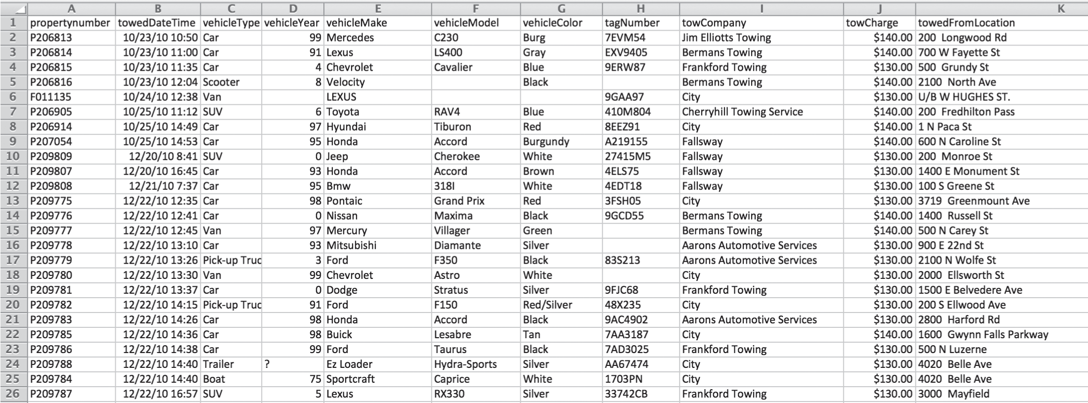
FIGURE 3.1 Baltimore City Department of Transportation tow records.
Let's stop for a second and think about the process involved in collecting and storing this data. When's the last time you had your car towed? I needed a tow the week prior to writing this very sentence after an unfortunate fender bender close to my home in Bellevue, Washington. I stood out in the rain and the dark in the middle of the road and waited for the police officer and the tow truck operator to complete the soggy paperwork and decide who got which carbon copy. Presumably data is created from forms that were produced in moments just like this. When my tow truck driver asked me for my vehicle year, I'm pretty sure I told him it was a 2011, but I didn't see whether he wrote down “2011,” “11,” or maybe “'11” with an apostrophe in front of the first digit. And I have no idea who keyed this information into a computer, or what software was used to generate the form they filled out required in this field. Much is lost in translation, and evidently some people missed the Y2K memo a couple decades ago.
But without a doubt, we can have some sympathy for the tow truck drivers and the data entry clerks at the tow yard. If I had to type in over 61,000 rows like this, I'd probably get a lot of them wrong, too. So what are we going to do about this messy quantitative field telling us the year of the vehicle that was towed? Let's visualize it using a histogram (Figure 3.2).
We can clearly see that there are two groups, and that it appears at first glance that there is nothing in between them. The first group on the left has vehicle year values between 0 and 17. We can guess that these are cars built between 2000 and 2017. The second group has vehicle year values between 82 and 99. These were most likely built between 1982 and 1999. We can adjust the vehicle years by adding 2000 to vehicle years between 0 and 17 and 1900 to years greater than that.
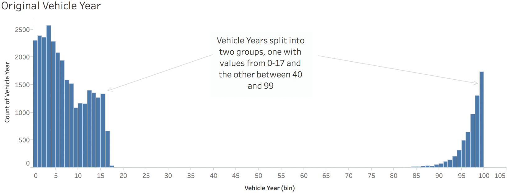
FIGURE 3.2 The raw vehicle year data visualized in a histogram.
The corrected histogram looks like Figure 3.3.
This looks much better! We're done, right? Not so fast. Often, the first adjustment or correction is a course adjustment, but more fine-tuning is needed. We can mop the floor, but sometimes we need to go back and use a spot cleaner on a tough blemish. This data set still has some of those.
We can see that the corrected vehicle year histogram has a very long tail to the left. It looks like there's nothing there, but there are actually really short bars for individual values at 1920 (originally 20), 1940 (originally 40), 1960 (originally 60), and 1963 (originally 63). Are these really old cars that got towed? Let's see what they are in Figure 3.4.
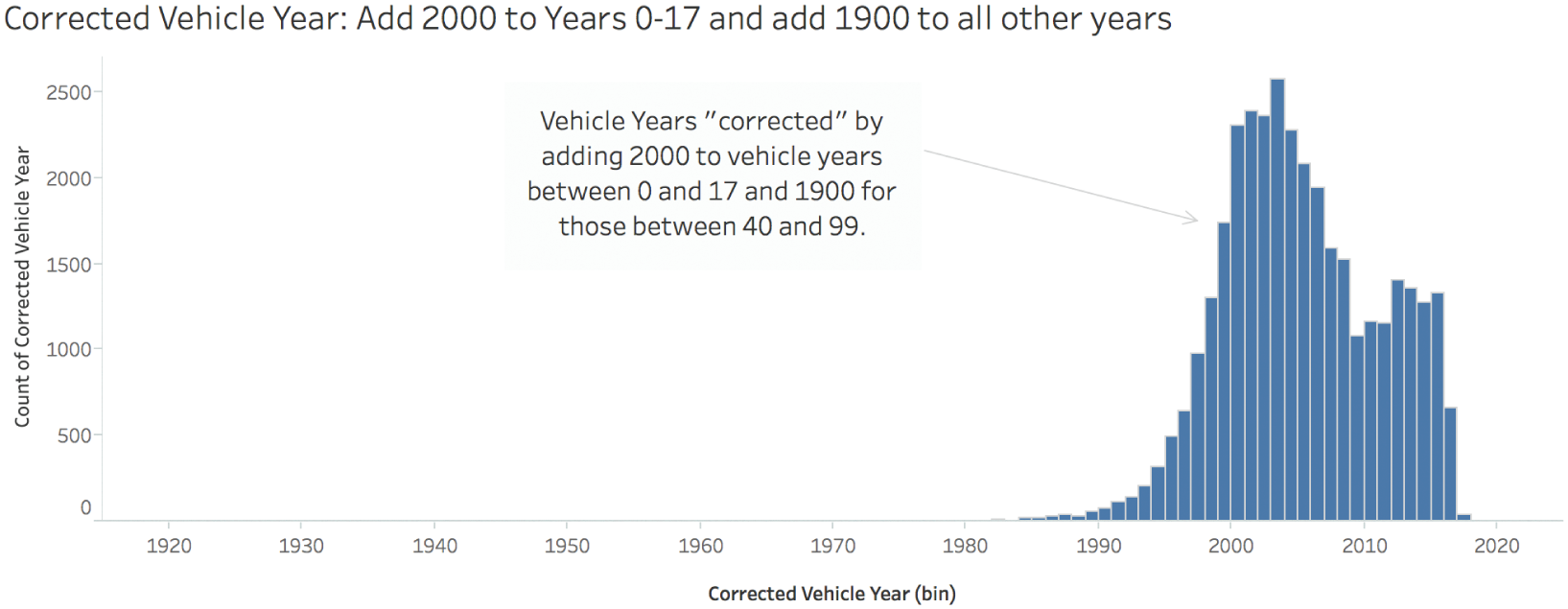
FIGURE 3.3 The adjusted vehicle year data visualized in a histogram.
Now, we can be pretty sure that the “Toyota Camray” (sic) is actually a Toyota Camry, and there's no way it was made in 1920, because Toyota didn't start making this model until 1982.4 The Volvo S40 definitely isn't from 1940, but we can guess why an S40 would have a “40” entered in this field. The Jeep Liberty couldn't possibly be from 1960, because Jeep only made this model between 2002 and 2012.5 The 1963 “Cadillac Sedan Deville” could very well be a 1963 Cadillac Sedan de Ville, so we'll assume that value is correct.
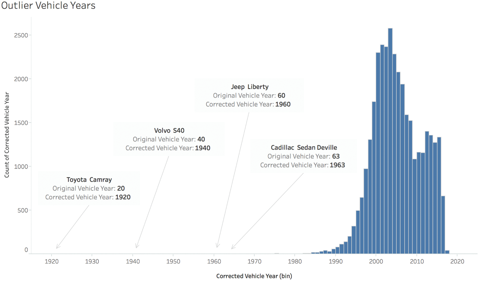
FIGURE 3.4 Outliers in the adjusted vehicle year data.
So now what do we do with the other three that are clearly erroneous vehicle year values? Do we filter them out? Do we do more research and find out what model year they actually are? Do we just leave them alone as they are?
That largely depends on the analysis we need to do, and whether these values can make a big difference on our findings. As we'll discuss later, outlier values can have a large impact on the average (arithmetic mean), so we should be deliberate about our choice, and we should leave detailed notes about any adjustments we make, or any clearly erroneous values that we leave in the view for our audience.
As it is, I'll leave those four questionable values in the data set, and I'll recalculate the average vehicle year to be 2005, rounded to the nearest integer. That seems like it makes a lot more sense than 23, doesn't it? Removing those four outliers only changes the computed average by one thousandth of a year, and it is completely washed out in the rounding to the nearest integer. So I feel fine leaving them in for my analysis, even though I'm pretty sure they're wrong. They don't materially affect the insight I glean.
Speaking of this insight, what does the average vehicle year really tell us here? I presented this data to a class of data science students at the for-profit education company Metis in Seattle earlier this year. One very bright student pointed out that while the statistic 2005 is interesting, it's slightly misleading, because the set of possible vehicle years isn't constant over the time. You can't tow a 2017 Buick in 2014. So it's more meaningful to obtain an average vehicle year within each tow year, and then track how this average changes as time goes along. We'll have more to say about averages in the coming chapters.
Let's talk more about that “Camray” though. This misspelling gives us a window into another dirty aspect of this data set, the Vehicle Make field. We'll start with this field, because in theory that should be much more limited in its range of values than the Vehicle Model field. Most makes (e.g. Honda) have many models (Civic, Accord, etc.)
It turns out there are actually 899 distinct entries in the Vehicle Make field in our data set. Figure 3.5 shows the top 100, ranked (and sized) by the total number of entries (tow events) in the data set.
We can quickly identify vehicle makes that we would expect to see: Chevrolet, Toyota, Honda, Dodge, Ford, Acura. But we also see Chevy, and even “Cheverolet” and “Chevolet.” We see “MAZDA,” and even “Mazada.” We see “1,” and also “Unknown.” Uh-oh, there's Hyundai, which is fine, but there's also “Hyundia.”
And the word cloud only shows the top 100 most towed makes. There are still 799 more to go! In the overall list, we find Dodge, but also “Dode,” “Dodg,” “Dodg3e,” “Dodgfe,” “Dfdge,” “Dpdge,” and so on. And don't get me started with all the other permutations of “Chevrolet.” One of my favorites, though, is “Peterbutt.” I got a chuckle out of this misspelling of “Peterbilt.” You also have to get a kick out of “Mitsubishit” making an appearance in the list.
But seriously, what the heck are we supposed to do with such a huge mess? How could we ever know which was the most common vehicle make reportedly towed during that time range?

FIGURE 3.5 This word cloud gives a general sense of which vehicle makes were most often towed.
OpenRefine6 is a helpful tool that can be downloaded for free and used to identify and quickly combine similar values in a column, among other handy things. If we open the data set in OpenRefine and carry out a cluster function on the Vehicle Make field, choosing a key collision method with an ngram-fingerprint keying function and ngram size of 1, we can get a quick sense of just how many erroneous values there are for each vehicle make (Figure 3.6).
This specific algorithm has found 113 different clusters to merge, and we can review them one by one as we scroll down the page. I highly recommend doing this, because when we do, we see that the algorithm isn't perfect. For example, it wants to create a cluster for both “Dodger” and “Dodge,” and it suggests merging “Suzuui” (clearly a misspelling of “Suzuki”) into the Isuzu cluster (Figure 3.7).
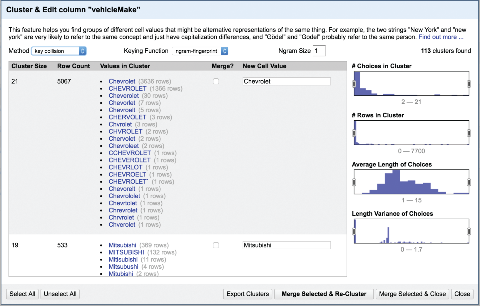
FIGURE 3.6 Clustering of vehicle make names in OpenRefine.
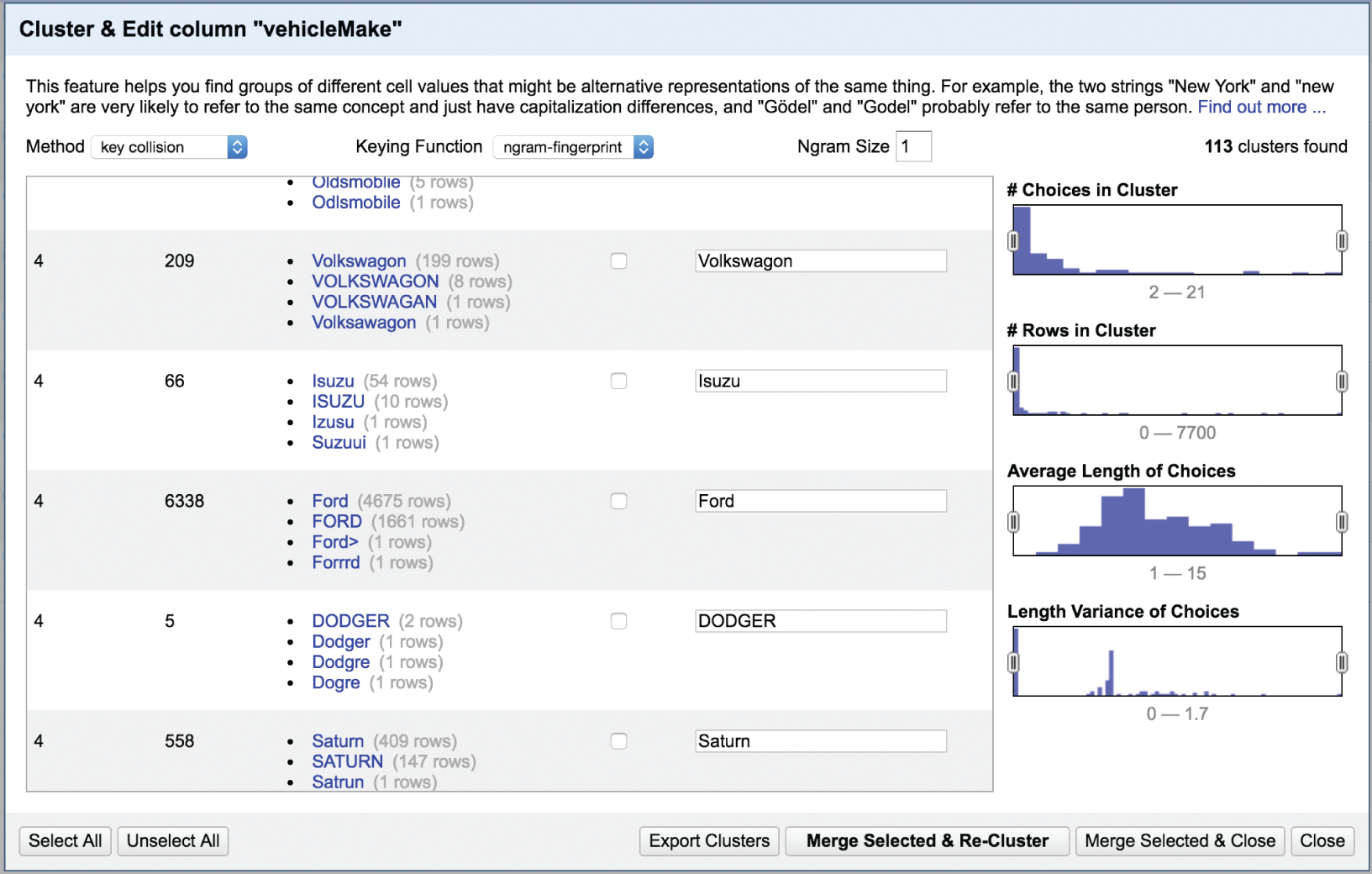
FIGURE 3.7 Imperfections in the recommendations of the clustering algorithm.
We also notice also in Figure 3.7 that Open Refine has suggested that we create a distinct cluster for “Volkswagon,” right? If you're thinking there's nothing wrong with that, as I first did, you'd miss the fact that the four different values in this group are all misspellings of “Volkswagen,” which is the correct spelling. If we scroll, we'd find that the algorithm suggested a separate group for this correct spelling, which we can correct. If we do, we'll find that there are 36 different ways Volkswagen was spelled in the data set (Figure 3.8).
When we use the ngram-fingerprint algorithm and do a quick search for obvious misses, we can effectively reduce the count of distinct values in the Vehicle Make field from 899 to just 507. That's a huge reduction in complexity. But are we done?
We can continue to try different clustering methods – if we run a nearest neighbor Levenshtein algorithm we can further reduce the distinct number of values to 473. Finally, we can review each of these 473 values and look at them one by one, adjusting them by editing each value that didn't get picked up in the clusters, which effectively finds and replaces all instances of the erroneous values. For example, neither of these algorithms decided the two records having the vehicle make “Acira” should belong with the “Acura” group, so I went ahead and manually changed them myself (Figure 3.9).
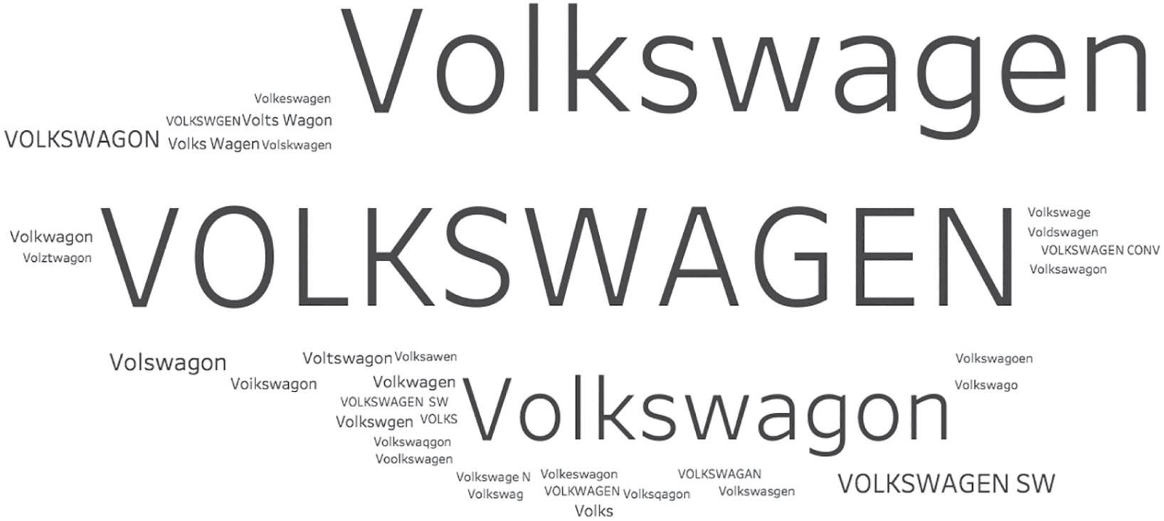
FIGURE 3.8 The 36 different ways Volkswagen was spelled in the data set.
This is time-consuming stuff, but imagine how much more painful it would be if we had to sift through all 899 distinct values for the Vehicle Make field. At least the clustering algorithms knock the number down to about half.
After about half an hour of going through the list and manually fixing a number of obviously incorrect entries that didn't get grouped with the others using the clustering algorithms, I ended up with 336 total distinct values for Vehicle Make. Note that I still ended up with interesting entries like “Burnt Car,” “Pete,” “Rocket,” and a whole host of numbers in this field, so it's not perfect. But that field is a whole lot less dirty than when I started.
But so what? Was it worth it? How did it affect our analysis? Let's take a look at the before-and-after analysis of top Vehicle Makes by number of tow events in Figure 3.10.
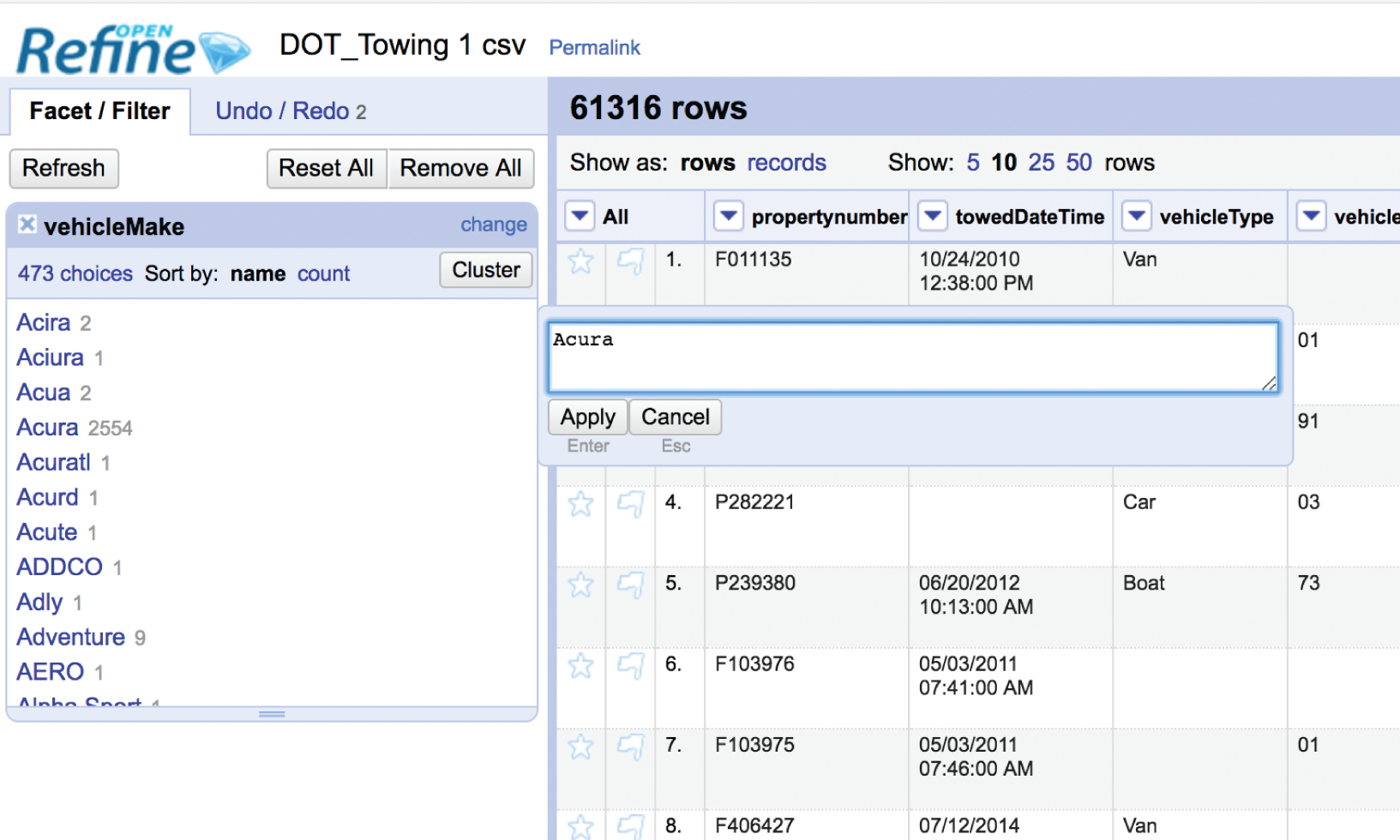
FIGURE 3.9 Editing the data values one by one that the clustering algorithm didn't catch.
Notice that the top two vehicle makes, Honda and Ford, are still in the top two spots, but have increased by 2,454 (+46%) and 1,685 tows (+36%), respectively. Their position in the list may not have changed, but those are some significant jumps in value.
And not all makes remained in the same spot on the ranking list. Toyota moved from the fourth spot up to the third spot, and Chevrolet dropped from 3rd to 4th in rank. Both also increased in count by a few thousand. Notably, Jeep jumped from 15th to 10th, and Volkswagen, which wasn't even in the top 25 originally, ends up in the 11th spot after our clustering, merging, and cleaning effort.
So yes, the effort to clean up the dirty data field results in a material change to our analysis. We would've had some serious misconceptions about which vehicles were towed the most, and how often the most common vehicle makes were reportedly towed by Baltimore DOT during this time period.
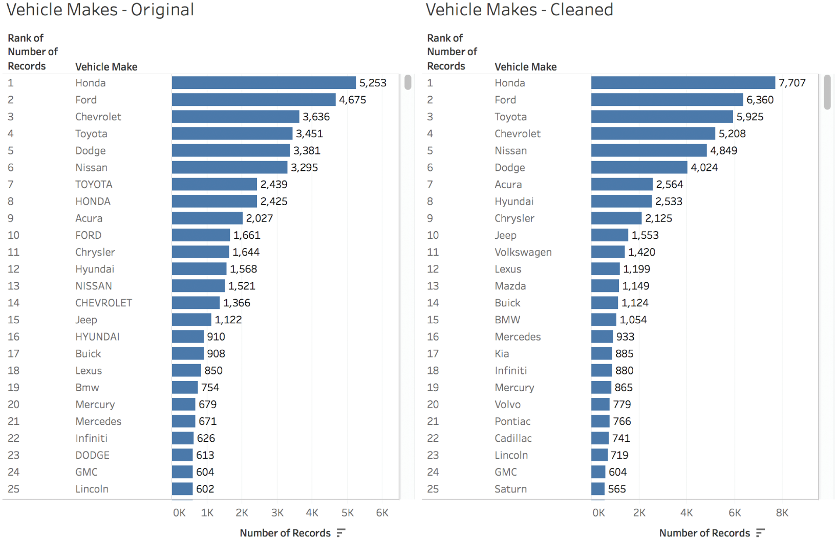
FIGURE 3.10 Before and after: analysis of vehicle make frequencies before cleaning and after.
So cleaning the data, at least to the degree that we cleaned it, mattered in the end.
How Do We Know When Our Data Is Clean Enough?
But when is a given data set clean enough? Like a kitchen countertop, it can always be cleaner. We hit a point of diminishing returns in our preparation of any data set, though, where more elbow grease and scrubbing doesn't yield sufficient incremental benefit to warrant the time and effort.
Where is that point? How do we know when we've arrived? Of course it depends on the sensitivity and criticality of the decisions and the tasks our analysis will inform. Are we landing a rover on Mars? Okay, that's one thing. But what if you don't need that level of precision?
Let's stick with the Baltimore vehicle towing example, and consider a fictional scenario. Say you're Vince, and you run Vince's Auto Body & Paint Shop, which happens to be right next to one of the two tow yards. You've been noticing that owners of cars that get towed are coming to you for paint touch-up after they claim their vehicles from the yard. You're thinking of running a promotion to attract more business of that type, and you want to make sure you have enough of the right kind of paint.
You get the data and look at the vehicle color breakdown. Here's what you see (Figure 3.11).
You have a pretty good sense, now, of the main colors of cars, but is it good enough for your buyers to start placing orders? How can we summarize what we know so far?
- 70.1% of the records reportedly are cars with one of 17 main color values: Black, Silver, White, Blue, and so on.
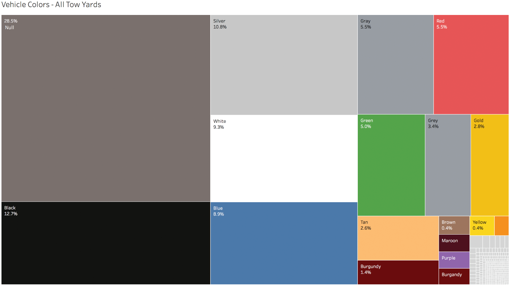
FIGURE 3.11 A treemap of vehicle colors based on towing records to the yards.
- 28.5% of the records don't have any color indicated at all – the field is blank, or null.
- The final 1.4% are records associated with 360 different values in the vehicle color field.
- A quick glance indicates that this 1.4% includes both unusual colors such as Beige and Navy, but also alternative values of the main colors, like “black” with a lower case “b,” as well as misspellings such as “Greeen” and “Clack,” among many others.
What do you do? The data is dirty, sure, but is it dirty enough? Should you spend any time on this at all? Well, a few things are relatively easy to do. Merging “Gray” and “Grey” into one category, and also “Burgandy” and “Burgundy” seem like useful steps that don't take much time and would affect your paint supply orders somewhat. The top 17 colors are actually just 15 colors, after all. That wasn't too hard. That was like wiping the big coffee spill off the kitchen counter.
The next big issue to address is the fact that there are so many null values. You can do a few things here. You can just filter them out and go with the resulting percentages. That would basically be assuming that the null group is filled with vehicles that have the exact same color breakdown as the non-null records. Might not be a horrible assumption, given your level of required precision.
But with a little extra digging, you find that you're in luck! Almost all of the null values – 17,123 out of 17,491 – are actually associated with the other tow yard across town. The folks at the tow yard next to your shop are much more diligent about capturing vehicle color – only 368 of the 44,193 records at your location have null color values. So nulls really aren't much of a problem at all for you after all. You've been dealt a get-out-of-dirty-data-jail-free card (this time).
Here's what the color breakdown of your target customers looks like (Figure 3.12).
Null now accounts for only 0.8% of the filtered records, and the “Other” bucket accounts for 1.9%. If “Other” were a paint color, it would be the eleventh most common color – not even in the top 10. In other words, you have a pretty good handle on 97.3% of the potential demand, provided good records were kept, and as long as color frequency in the near future matches what has been. That's probably good enough to roll with, right?

FIGURE 3.12 A treemap of records of towed vehicles to the Pulaski tow yard only.
Time out. We still have a few colors spelled different ways in the top 15, and the entire data set is still case sensitive. We need to fix that, and it should be easy enough to do.
Let's write a quick calculation to do the following (Figure 3.13):
- Convert both “Grey” and “grey” to “gray.”
- Convert both “Burgandy” and “burgandy” to “burgundy.”
- Convert all text values to lowercase (e.g. merge “Blue” and “blue,” “Red” and “red,” etc.).
Once we create this new corrected vehicle color field, we can update our treemap and filter out the null values as well as all records with color field values not included in the top 15. Figure 3.14 is our final output that we send to our buyers for coordination of inventory and orders with our paint vendors ahead of the promotion to the tow yard customers.
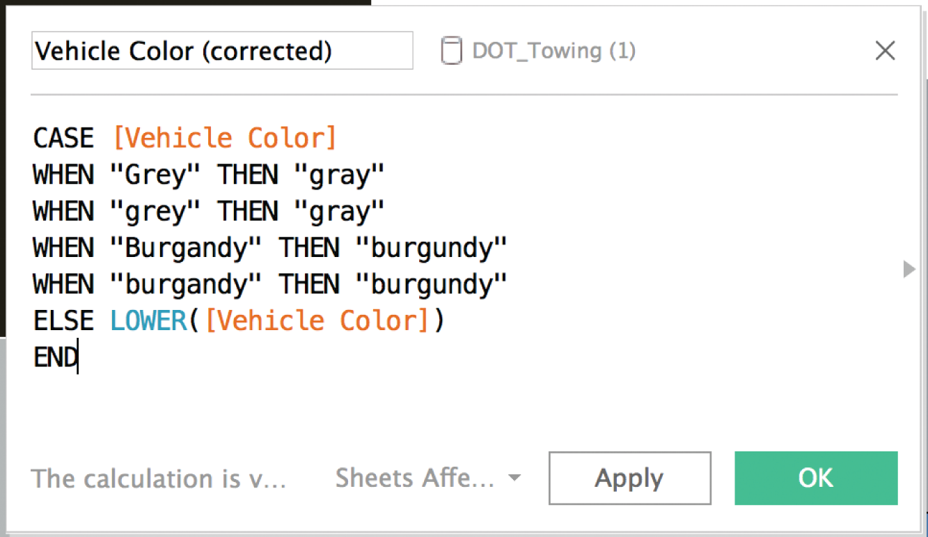
FIGURE 3.13 A calculated field in Tableau to correct for a few known discrepancies in the color field.
That was probably a good balance of relatively simple and speedy data cleaning steps with an updated analysis that gives us that extra bit of confidence in our findings. Recall that our initial analysis yielded the following skewed “insight”:
- Q: What percentage of all recorded vehicles towed during the time period had a color value of “Gray”?
- A: 5.5%
If we ran with this, we'd have dramatically underordered gray paint, which actually accounted for about one-eighth of all recorded vehicle colors at the tow yard next to us. We can take another pass using Tableau Prep, and use the pronunciation algorithm to catch some of the rarer misspellings of vehicle color as shown in Figure 3.15.
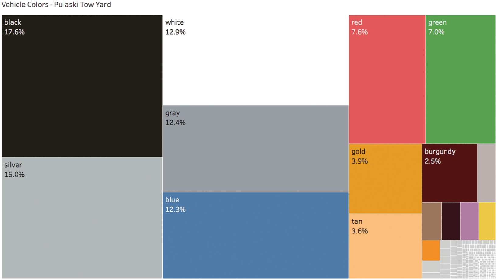
FIGURE 3.14 The final treemap of known, non-null vehicle colors towed to the Pulaski yard.
We see that there aren't quite 50 misspellings of gray; there are only 17, including “Greyu,” “Grety,” “Greyw,” “Greyy,” “Frey,” and our good friend “Gary.” This wasn't difficult, thanks to the magic of algorithms and software, but did our analysis change materially based on our more rigorous cleaning operation? Here's the new treemap we produced after the second pass of cleaning color names using Tableau Prep (Figure 3.16).
We added a second digit to interrogate further, but it doesn't seem like the proportions have changed significantly. Gray increases from 12.4% to 12.54%. Not a huge jump, and probably not enough to affect our order quantities. Performing this more detailed cleaning operation certainly didn't hurt, and it was simple enough, but we would've probably been okay with the coarser cleaning operation in our first pass.
But how were we supposed to know ahead of time if the second pass would've mattered? The key is to consider the “Other” bucket, the dirty values “in the weeds” – those in the bottom of the pareto chart. In our case, we're talking about the 360 values in the vehicle color field that make up the bottom 1.9% of records. Is this group large enough for our particular task that we really need to crack into it, or would we be fine if they magically all happened to be the exact same value? Like everything in life, there's the horrible, there's the impeccable, and, somewhere in between, there's good enough.
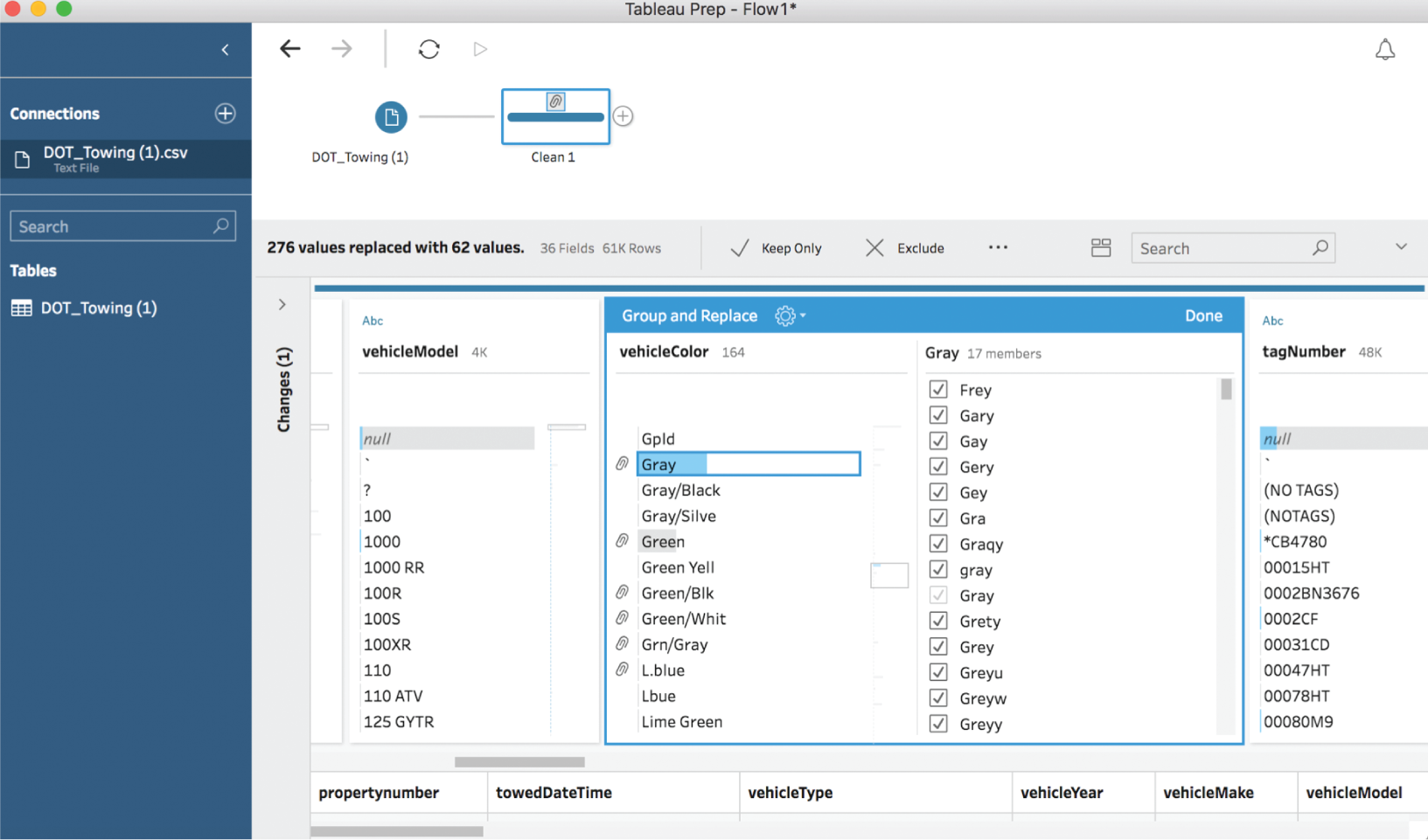
FIGURE 3.15 Cleaning car colors further.
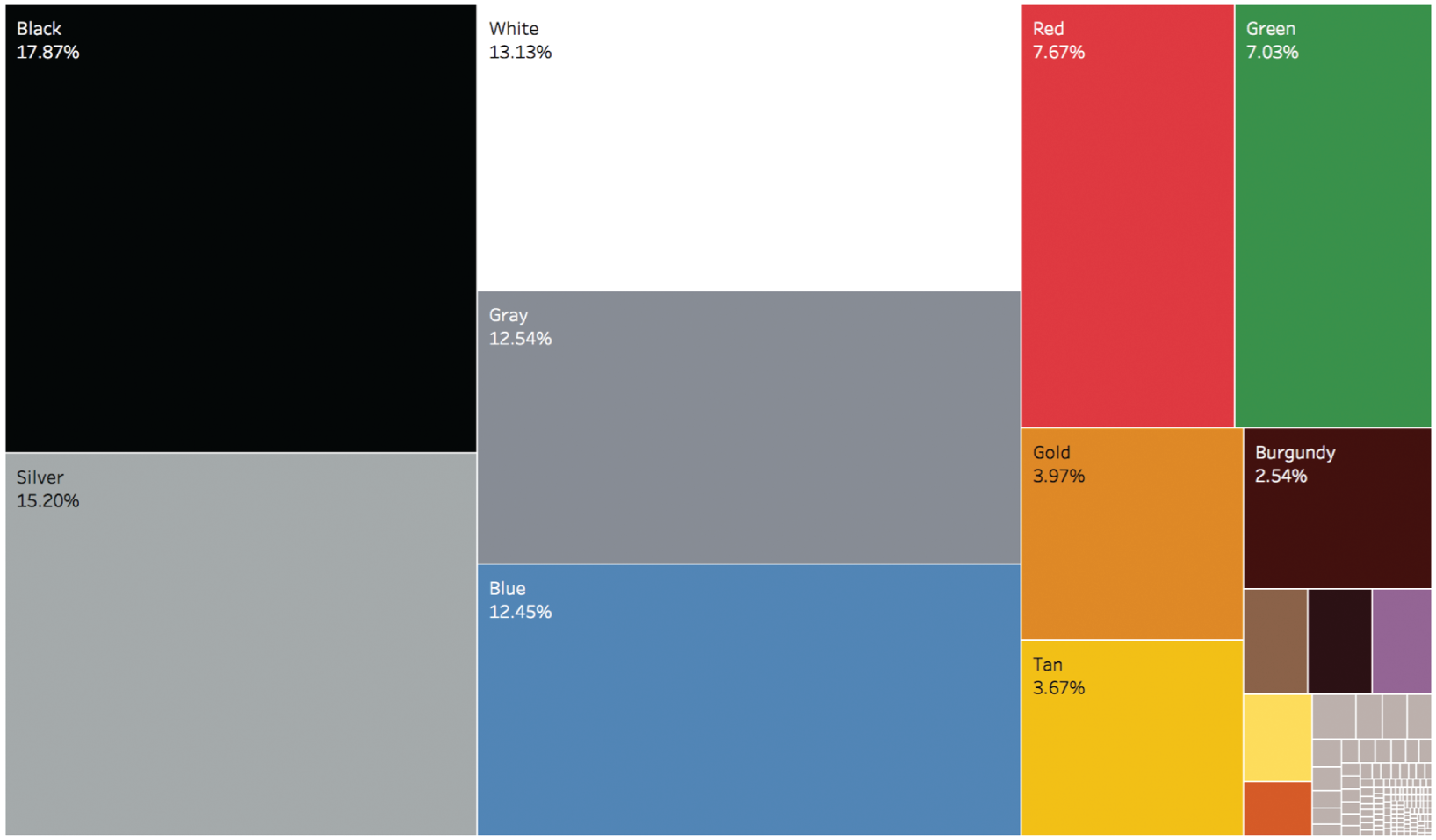
FIGURE 3.16 The treemap resulting from our second cleaning pass using Tableau Prep.
Thank goodness for that.
Pitfall 2B: Bad Blends and Joins
As we've seen, dirty data can be challenging to face when working with just one data set all by itself. It can be even more of a headache when bringing more than one data set together into the same analysis. Whether we're working with SQL joins, merging or appending data in an analytics tool like Tableau or Power BI, or working with an old familiar friend, the VLOOKUP function in Excel, we're stepping onto a portion of the path with some treacherous pitfalls. Let's see what can happen.
Now let's say you're Allison, a marketing director at a consumer products company. You want to grow your website so that you can position your company's product as a global leader in its category. You want to understand where your web traffic came from in 2016, so you use Google Analytics to create a map of Pageviews of your site (Figure 3.17).
This is really helpful, and it tells you that the bulk of your traffic is coming from the United States, India, the UK, Canada, and Australia. But you want to dig a little deeper. You'd like to compare the amount of traffic to your site in 2016 with the population of each country in 2016. Are there some countries with really high traffic compared to how many people live there? Or on the other hand, those where the traffic doesn't seem to match up with the opportunity based on population alone?
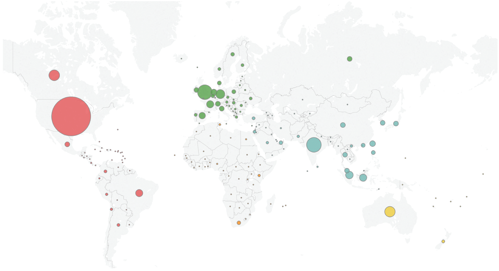
FIGURE 3.17 A world map of 2016 Pageviews of Allison's company website.
To do that, you'll need to bring another data set into the analysis – one that gives you population for each country in your Google Analytics data. You find a World Bank web page7 that lets you download 2016 country population as an Excel file or CSV, and you also stumble across a page on Wikipedia8 that lists the population of sovereign states and dependent territories based on projections published by the United Nations. Could one of these do the trick?
You decide to consider each of these lists independently. First, the list in Google Analytics that you've just mapped includes 180 distinct values. In comparison, the World Bank population Excel file contains 228 distinct values. You can tell that part of the reason the World Bank list is larger is that it also includes values that group countries together like “World,” “North America,” and “High income.” So some rows aren't individual countries at all. The Wikipedia list, which also includes dependent territories such as the Cook Islands and Guam, contains 234 distinct values – it's the largest of the three. (See Figure 3.18.)
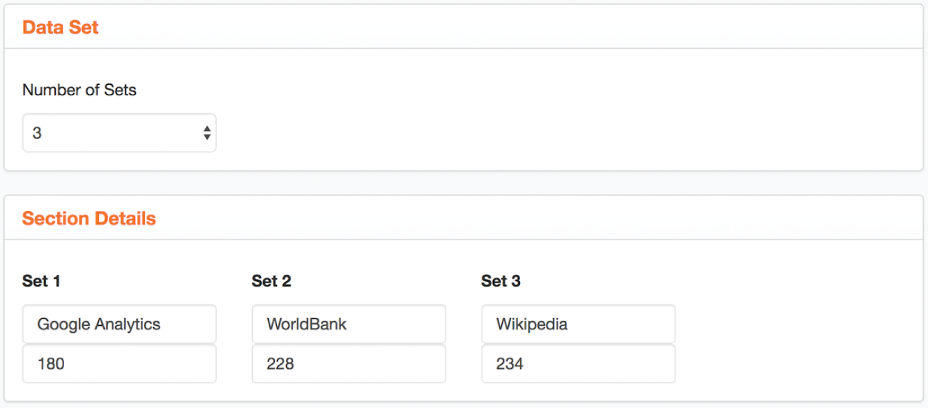
FIGURE 3.18 An overview of the number of distinct country names in three different data sets.
So there's clearly not a 1:1:1 match in the respective country name lists between these different data sources. A quick exploration of the total number of distinct values in each list is a helpful step to get an idea of what you're working with, but it doesn't tell you the whole story. You decide to match up the Google Analytics list with each list independently to get a sense of whether your analysis will be complete.
First, when you consider how the Google Analytics list compares with the World Bank population list, you notice that there are 82 string values in the World Bank field list that aren't included in the Google Analytics country list. But since this list includes a number of grouped values, and since Google Analytics is your primary source for traffic data, you're not as concerned with these as you are with the 34 countries in Google Analytics that aren't included in the World Bank list.
Google Analytics has 34 unmatched values, the two lists have 146 in common, and the World Bank has 82 unmatched values, yielding the Venn diagram in Figure 3.19 and the list of 34 countries unique to Google Analytics:
Instead of “St. Kitts & Nevis,” the World Bank has the entry “St. Kitts and Nevis.” Instead of “Bahamas,” the World Bank uses “Bahamas, The.” Instead of “U.S. Virgin Islands,” they list “Virgin Islands (U.S.).” Rather than “Hong Kong,” the World Bank gives us population figures for “Hong Kong SAR, China.” While Google Analytics includes Pageview data for “Taiwan,” the World Bank has no entry at all for this part of the world, presumably due to the fact that China often seeks to reign in any organization that refers to this island as a sovereign nation.
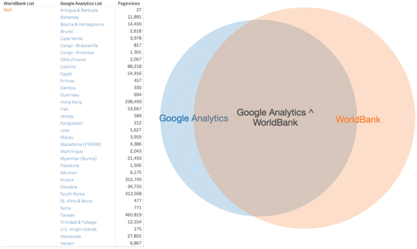
FIGURE 3.19 A Venn diagram showing overlap between Google Analytics and World Bank.
The fact that there are mismatches, missing values, and small differences in the strings used to indicate various countries means that there's a risk that you'll miss them in your analysis. Why?
If you were to do an inner join on this field in SQL, where you only keep records with country values in common (the overlapping area of the two circles in the Venn diagram in Figure 3.19), then these 34 countries would be left out of the resulting table. Even if you do a left-outer join, or alternatively a VLOOKUP in Excel, in which you keep both the overlapping records as well as any that are unique to Google Analytics, the population value for these 34 countries will be empty, null, because there is no exact match in the World Bank data set.
Would it matter? It depends. Here's the pageview per thousand inhabitants analysis using the original World Bank data set (on the left) and using a cleaned version (on the right), where the country names were made to match and the population of Taiwan was added (Figure 3.20).
Did it make a difference? Three of the top 25 countries in terms of views per thousand people would have been missing from your analysis if you didn't take into account the mismatching values in the country field.
Next, you do a similar comparison of the Google Analytics list and the Wikipedia list, and find that Google Analytics has 16 unmatched values, the two have 164 in common, and Wikipedia has 70 unmatched values (Figure 3.21).
Just for fun, you compare all three, and discover that there are 145 country names that appear in all three lists (Figure 3.22).
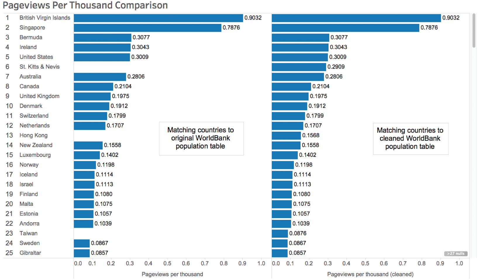
FIGURE 3.20 Comparison of pageviews per thousand analysis before and after cleaning.
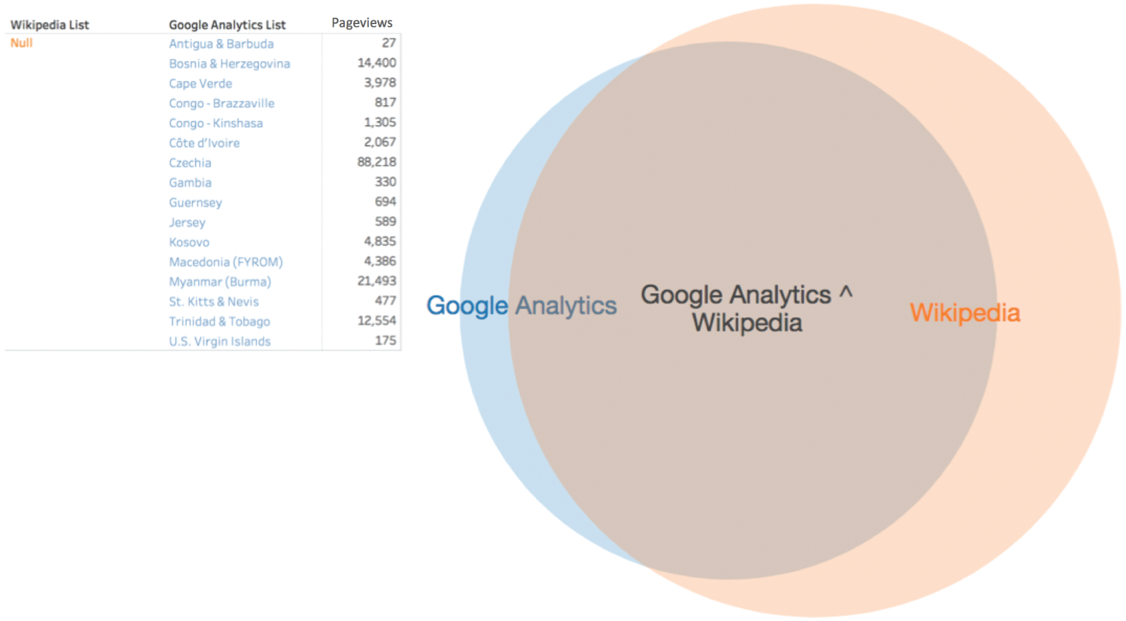
FIGURE 3.21 A Venn diagram showing overlap between Google Analytics and the Wikipedia population list.

FIGURE 3.22 A Venn diagram comparing all three country name lists.
So you decide that the Wikipedia list is a better match with your original Google Analytics data set because it has more records in common, and you only have to adjust 16 values to get them to line up perfectly. That's not so bad, so you find and replace those 16 values in the data set you have created from the Wikipedia page and get to work.
This has been a successful story, so far. Allison has avoided the common pitfall of bringing together two data sets and doing calculations and analysis of the two merged tables without first considering the areas of overlap and lack thereof.
A technicality? Sure, but that's exactly why it's called a technical trespass.
Notes
- 1 https://www.nytimes.com/2014/08/18/technology/for-big-data-scientists-hurdle-to-insights-is-janitor-work.html.
- 2 https://r4ds.had.co.nz/tidy-data.html.
- 3 https://data.baltimorecity.gov/Transportation/DOT-Towing/k78j-azhn.
- 4 https://en.wikipedia.org/wiki/Toyota_Camry.
- 5 https://en.wikipedia.org/wiki/Jeep_Liberty.
- 6 http://openrefine.org/.
- 7 https://data.worldbank.org/data-catalog/Population-ranking-table.
- 8 https://en.wikipedia.org/wiki/List_of_countries_by_population_(United_Nations).