
Among hikers and climbers, they say that “there is no such thing as bad weather—only inappropriate clothing.” And as anybody who has spent some time outdoors can attest, it is often precisely trips undertaken under more challenging circumstances that lead to the most noteworthy memories. But one has to be willing to put oneself out there.
In a similar spirit, I don’t think there is really such a thing as “bad data”—only inappropriate approaches. To be sure, there are datasets that require more work (because of missing data, background noise, poor encoding, inconvenient file formats, and so on), but they don’t pose fundamental challenges. Given sufficient effort, these problems can be overcome, and there are useful techniques for handling such situations (like tricks for staying warm during a late-November hike).
But basically, that’s remaining within familiar territory. To discover new vistas, one has to be willing to follow an unmarked trail and see where it leads. Or equivalently, when working with data, one has to dare to have an opinion about where the data is leading and then check whether one was right about it. Note that this takes courage: it is far safer to merely describe what one sees, but doing so is missing a whole lot of action.
Let’s evaluate some trail reports. Later, we’ll regroup and see what lessons we have learned.
A manufacturing company had developed a rather clever scheme to reduce the number of defective items shipped to their customers—at no additional cost. The basic idea was to use a quantity that was already being measured for each newly manufactured item (let’s call it the “size”—it wasn’t, but it won’t matter) as indicator of the item quality. If the size was “off,” then the item probably was not going to work right. To the manufacturer, the key benefit of this indirect approach was the low cost. The size was already being measured as part of the manufacturing process, so it did not impose an additional overhead. (The main problem with quality assurance always is that it has to be cheap.)
They put a system in place that flagged items that seemed “off” as candidates for manual inspection. The question was: how well was this system working? How good was it at actually detecting defective items? This was not so easy to tell, because the overall defect rate was quite low: about 1 item in 10,000 leaving the manufacturing line was later found to be truly defective. What fraction of defects would this new tagging system be able to detect, and how many functioning items would it incorrectly label as defective? (This was a key question. Because all flagged items were sent to manual testing, a large number of such false positives drove up the cost quickly—remember, the idea was for the overall process to be cheap!)
There’s the assignment. What would you do?
Well, the central, but silent, assumption behind the entire scheme is that there is a “typical” value for the size of each item, and that the observed (measured) values will scatter in some region around it. Only if these assumptions are fulfilled does it even make sense to say that one particular item is “off,” meaning outside the typical range. Moreover, because we try to detect a 1 in 10,000 effect, we need to understand the distribution out in the tails.
You can’t tell 0.01% tail probabilities from a histogram, so you need to employ a more formal method to understand the shape of the point distribution, such as a probability plot. Which probability plot? To prepare one, you have to select a specific distribution. Which one? Is it obvious that the data will be Gaussian distributed?
No, it is not. But it is a reasonable choice: one of the assumptions is that the observed deviations from the “typical” size are due to random effects. The Gaussian distribution, which describes the sum of many random contributions, should provide a good description for such a system.

Figure 7-1. A normal probability plot. Note how the tails of the dataset do not agree with the model.
A typical probability plot for data from the manufacturing plant is shown in Figure 7-1. If the points fall onto a straight line in a probability plot, then this indicates that the data is indeed distributed according to the theoretical distribution. Moreover, the intercept of the line yields the empirical mean of the dataset and the slope of the line the standard deviation. (The size of the data was only recorded to within two decimal places, resulting in the step-like appearance of the plot.)
In light of this, Figure 7-1 may look like an excellent fit, but in fact it is catastrophic! Remember that we are trying to detect a 1 in 10,000 effect—in other words, we expect only about 1 in 10,000 items to be “off,” indicating a possibly defective item. Figure 7-1 shows data for 10,000 items, about 20 of which are rather obviously outliers. In other words, the number of outliers is about 20 times larger than expected! Because the whole scheme is based on the assumption that only defective items will lead to measurements that are “off,” Figure 7-1 tells us that we are in trouble: the number of outliers is 20 times larger than what we would expect.
Figure 7-1 poses a question, though: what causes these outliers? They are relatively few in absolute terms, but much more frequent than would be allowed on purely statistical grounds. But these data points are there. Something must cause them. What is it?
Before proceeding, I’d like to emphasize that with this last question, we have left the realm of the data itself. The answer to this question cannot be found by examining the dataset—we are now examining the environment that produced this data instead. In other words, the skills required at this point are less those of the “data scientist,” but more those one expects from a “gum shoe detective.” But sometimes that’s what it takes.
In the present case, the data collection process was fully automated, so we rule out manual data entry errors. The measuring equipment itself was officially calibrated and regularly checked and maintained, so we rule out any systematic malfunction there. We audited the data processing steps after the data had been obtained, but found nothing: data was not dropped, munged, overwritten—the recording seemed faithful. Ultimately, we insisted on visiting the manufacturing plant itself (hard hat, protective vest, the whole nine yards). Eventually, we simply observed the measuring equipment for several hours, from a distance. And then it became clear: every so often (a few times per hour) an employee would accidentally bump against the apparatus. Or an item would land heavily on a nearby conveyor. Or a fork lift would go by. All these events happened rarely—but still more frequently than the defects we tried to detect!
Ultimately, the “cheap” defect reduction mechanism envisioned by the plant management was not so cheap at all: to make it work, it would be necessary to bring the data collection step up to the same level of accuracy and repeatability as was the case for the main manufacturing process. That would change the economics of the whole project, making it practically infeasible from an economic perspective.
Is this a case of “bad data?” Certainly, if you simply want the system to work. But the failure is hardly the data’s fault—the data itself never claimed that it would be suitable for the intended purpose! But nobody had bothered to state the assumptions on which the entire scheme rested clearly and in timeand to validate that these assumptions were, in fact, fulfilled.
It is not fair to blame the mountain for being covered with snow when one didn’t bother to bring crampons.
Paradoxically, wrong turns can lead to the most desirable destinations. They can take us to otherwise hidden places—as long as we don’t cling too strongly to the original plan and instead pay attention to the actual scenery.
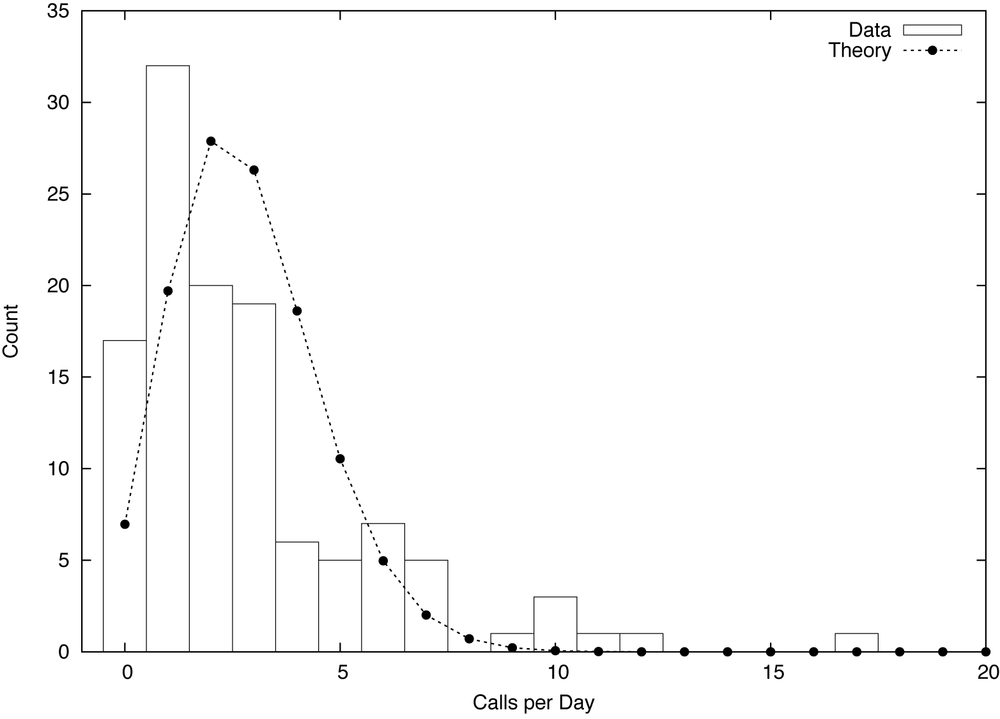
Figure 7-2. Histogram of calls received per business day by a small business, together with the best fit Poisson distribution.
Figure 7-2 shows a histogram for the number of phone calls placed per business day to a small business—let’s say, a building contractor. (The histogram informs us that there were 17 days with no calls, 32 days with one call, 20 days with two calls, and so on.) Knowing nothing else, what can we say about this system?
Well, we might expect the calls to be distributed according to a Poisson distribution:

The Poisson distribution is the natural choice to model the frequency of rare events. It depends only on a single parameter, λ, the average number of calls per day. Given the data in the histogram, it is easy to obtain a numerical estimate for the parameter:
Once λ is fixed, the distribution p(k, λ) is completely determined.It should therefore fit the data without further adjustments. But look what happens! The curve based on the best estimate for λ fits the data very poorly (see Figure 7-2). Clearly, the Poisson distribution is not the right model for this data.
But how can that be? The Poisson model should work: it applies very generally as long as the following three conditions are fulfilled:
Events occur at a constant rate
Events are independent of each other
Events do not occur simultaneously
However, as Figure 7-2 tells us, at least one of those conditions must be violated. If it weren’t, the model would fit. So, which one is it?
It can’t be the third: by construction, phones do not allow for this possibility. It could be the first, but a time series plot of the calls per day does not exhibit any obvious changes in trend. (Remember that we are only considering business days, and have thereby already excluded the influence of the weekend.) That leaves the second condition. Is it possible that calls are not independent? How can we know—is there any information that we have not used yet?
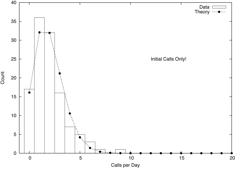
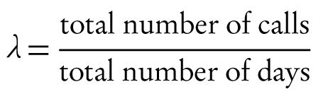
Figure 7-3. Same as Figure 7-2, but this time taking into account only the first call from each caller (that is, ignoring follow-up calls).
Yes, there is. So far we have ignored the identity of the callers. If we take this information into account, it turns out that about one third of all calls are follow-up calls from callers that have called at least once before. Obviously, follow-up calls are not independent of their preceding calls and we should not expect the Poisson model to represent them well. The histogram in Figure 7-3 includes only the initial call for each caller, and it turns out that the Poisson distribution now describes this dataset reasonably well.
The lesson here is that our innocuous dataset contains two different types of calls: initial calls and follow-ups. Both follow different patterns and need to be treated separately if we want to understand this system fully. In hindsight, this is obvious (almost all discoveries are), but it wasn’t obvious when we started. What precipitated this “discovery” was a failure: the failure of the data to fit the model we had proposed. But this failure could only occur because we had stuck our neck out and actually made a concrete proposition!
This is extremely important: to gain insight that goes beyond the merely descriptive, we need to formulate a prescriptive statement. In other words, we need to make a statement about what we expect the data to do (not merely what we already know it does—that would be descriptive). To make such a statement, we typically have to combine specific observations made about the data with other information or with abstract reasoning in order to arrive at a hypothetical theory—which, in turn, we can put to the test. If the theory makes predictions that turn out to be true, we have reason to believe that our reasoning about the system was correct. And that means that we now know more about the system than the data itself is telling us directly.
So, was this “bad data?” You betcha—and thankfully so. Only because it was “bad” did it help us to learn something new.
Although it has never happened to me, I have heard stories of people getting on the highway in the wrong direction, and not noticing it until they ended up on the beach instead of in the mountains. I can see how it could happen. The road is straight, there are no intersections—what could possibly go wrong? One could infer from this that even if there are no intersections to worry about, it is worth confirming the direction one is going in.
There is a specific trap when working with data that can have an equally devastating effect: producing results that are entirely off the mark—and you won’t even know it! I am speaking of highly skewed (specifically: power-law) point distributions. Unless they are diagnosed and treated properly, they will ruin all standard calculations. Deceivingly, the results will look just fine but will be next to meaningless.
Such datasets occur all the time. A company may serve 2.6 million web pages per month and count 100,000 unique visitors, thus concluding that the “typical visitor” consumes about 26 page views per month. A retailer carries 1 million different types of items and ships 50 million units and concludes that it ships “on average” 50 units of each item. A service provider has 20,000 accounts, generating a total of $5 million in revenue, and therefore figures that “each account” is worth $250.

Figure 7-4. Histogram of the number of page views generated by each user in a month. The inset shows the same data using double-logarithmic scales, revealing power-law behavior.
In all these cases (and many, many more), the apparently obvious conclusions will turn out to be very, very wrong. Figure 7-4 shows a histogram for the first example, which exhibits the features typical of all such situations. The two most noteworthy features are the very large number of visitors producing only very few (one or two) page views per month, and the very small number of visitors generating an excessively large number of views. The “typical visitor” making 26 views is not typical for anything: not for the large majority of visitors making few visits and not typical for the majority of page views either, which stem from the handful of visitors generating thousands of hits each. In the case of the retailer, a handful of items will make up a significant fraction of shipped units, while the vast majority of the catalogue ships only one or two items. And so on.
It is easy to see how the wrong conclusions were reached: not only does the methodology seem totally reasonable (what could possibly be wrong with “page views per user”?), but it is also deceptively simple to calculate. All that is required are separate counts of page views and users. To generate a graph like Figure 7-4 instead requires a separate counter for each of the 100,000 users. Moreover, 26 hits per month and user sure sounds like a reasonable number.
The underlying problem here is the mistaken assumption that there is such a thing as a “typical visitor.” It’s an appealing assumption, and one that is very often correct: there really is such a thing as the “typical temperature in New York in June” or the “average weight of a 30 year old male.” But in the three examples described above, and in many other areas that are often (but not exclusively) related to human behavior, variations are so dominant that it does not make sense to identify any particular value as “typical.” Everything is possible.
How, then, can we identify cases where there is no typical value and standard summary statistics break down? Although the ultimate diagnostic tool is a double-logarithmic plot of the full histogram as shown in Figure 7-4, an early warning sign is excessively large values for the calculated width of the distribution (for the visitor data, the standard deviation comes out to roughly 437, which should be compared to the mean, of only 26). Once the full histogram information is available, we can plot the Lorenz curve and even calculate a numerical measure for the skewness of the distribution (such as the Gini coefficient) for further diagnosis and analysis.
Figure 7-5. Cumulative distribution function for the data from Figure 7-4. Notice the reduced scale of the horizontal axis.
Figure 7-5 suggests a way to deal with such data. The graph shows a cumulative distribution plot, that is, the cumulative fraction of people and page views, attributable to visitors having consumed fewer than x pages per month. As we can see, the bottom 90% of visitors made fewer than 20 visits, and generated less than 15% of page views. On the other hand, the top 1% of users made more than 250 visits each, and together accounted for more than 60% of page views. The graph suggests therefore to partition the population into three groups, each of which is in itself either relatively homogeneous (the bottom 90% and the middle 9%) or so small that it can almost be treated on an individual basis (the top 1%, or an even smaller set of extremely high-frequency users).
Datasets exhibiting power-law distributions come close to being “bad data”: datasets for which standard methods silently fail and that need to be treated carefully on a case-by-case basis. On the other hand, once properly diagnosed, such datasets become manageable and even offer real opportunities. For instance, we can go tell the account manager that he or she doesn’t have to worry about all of the 20,000 accounts individually, but instead can focus on the top 150 and still capture 85% of expected revenue!
What can we make of these disparate stories? Let’s recap: the manufacturer’s defect reduction scheme ran into trouble because they had failed to verify that the quality of the data lived up to their expectations. In the phone traffic study, the unexpected disagreement between the data and a theoretical model led to the discovery of additional structure and information in the data that would otherwise have gone unnoticed. And the third (and more generic) example points to a common failure mode in real-world situations where the most basic summary statistics (mean or median) fail to give a realistic representation of the true behavior.
What’s common in all these scenarios is that it was not the data that was the problem. The problem was the discrepancy between the data and our ideas about what the data should be like. More clearly: it’s not so much the data that is “bad,” but our poor assumptions that make it so. However, as the second story shows, if we become aware of the disagreement between the actual data and our expectations, this discrepancy can lead to a form of “creative tension,” which brings with it the opportunity for additional insights.
In my experience, failure to verify basic assumptions about the data (in regards to quality and availability, point distribution, and fundamental properties) is the most common mistake being made in data-oriented projects. I think three factors contribute to this phenomenon. One is wishful thinking: “Oh, it’s all going to work just fine.” Another is the absence of glory: verifying all assumptions requires solid, careful, often tedious work, without much opportunity to use interesting tools or exciting technologies.
But most importantly, I think many people are unaware of the importance of assumptions, in particular when it comes to the effect they have on subsequent calculations being performed on a dataset. Every statistical or computational method makes certain assumptions about its inputs—but I don’t think most users are sufficiently aware of this fact (much less of the details regarding the applicable range of validity of each method). Moreover, it takes experience in a wide variety of situations to understand the various ways in which datasets may be “bad”—“bad” in the sense of “failing to live up to expectations.” A curious variant of this problem is the absence of formal education in “empirical methods.” Nobody who has ever taken a hands-on, experimental “senior lab” class (as is a standard requirement in basically all physics, chemistry, biology, or engineering departments) will have quite the same naive confidence in the absolute validity of a dataset as someone whose only experience with data is “in a file” or “from the database.” Statistical sampling and the various forms of bias that occur are another rich source of confusion, and one that not only requires a sharp and open mind to detect, but also lots of experience.
At the same time, making assumptions explicit can help to reduce basic mistakes and lead to new ideas. We should always ask ourselves what the data should do, given our knowledge about the underlying system, and then examine what the data actually does do. Trying to formulate such hypotheses (which are necessarily hypotheses about the system, not the data!) will lead to a deeper engagement and therefore to a better understanding of the problem. Being able to come up with good, meaningful hypotheses that lead to fruitful analyses takes a certain amount of inspiration and intellectual courage. One must be willing to stretch one’s mind in order to acquire sufficient familiarity with background information about the specific business domain and about models and theories that might apply (the Poisson distribution, and the conditions under which it applies, was an example of such a “background” theory). If those hypotheses can be verified against the data, they lend additional credibility not only to the theory, but also to the data itself. (For instance, silly mistakes in data extraction routines often become apparent because the data, once extracted, violates some invariant that we know it must fulfill—provided we check.) More interestingly, if the data does not fit the hypothesis, this provides a hint for additional, deeper analysis—possibly to the point that we extend the range of our attention beyond the dataset itself to the entire system. (One might even get an exciting trip to a manufacturing plant out of it, as we have seen.)
One may ask whether such activities should be considered part of a data scientist’s job. Paraphrasing Martin Fowler: Only if you want your work to be relevant!
A scientist who is worth his salt is not there to crunch data (that would be a lab technician’s job). A scientist is there to increase understanding, and that always must mean: understanding of the system that is the subject of the study, not just the data. Data and data analysis are merely means to an end, not ends in themselves. Instead, one has to think about the underlying system and how it works in order to come up with some hypothesis that can be verified or falsified. Only in this way can we develop deeper insights, beyond merely phenomenological descriptions.
Moreover, it is very much the scientist’s responsibility to question the validity of one’s own work from end to end. (Who else would even be qualified to do this?) And doing so includes evaluating the validity and suitability of the dataset itself: where it came from, how it was gathered, whether it has possibly been contaminated. As the first and second examples show, a scientist can spot faulty experimental setups, because of his or her ability to test the data for internal consistency and for agreement with known theories, and thereby prevent wrong conclusions and faulty analyses. What possibly could be more importantto a scientist? And if that means taking a trip to the factory, I’ll be glad to go.