“You were enlightened?”
“No. I didn’t feel the bliss of enlightenment. Instead… I was surrounded by an endless sorrow.”

Data is good to the extent that it can be quickly analyzed to reveal valuable information. With good data, we’re able to learn something about the world, to increase revenue, to reduce cost, or to reduce risk. When data is locked up in the wrong representation, however, the value it holds can be hidden away by accidental complexity.
Let’s start our journey in the context of a seemingly simple problem faced by many IT-intensive enterprises: keeping track of who is paying for costs incurred by the business. To name but a few types of costs, consider servers, software licenses, support contracts, rent in the data center, Amazon EC2 costs, the cost of teams building software and providing support; the list goes on. As a business grows and the costs associated to run the business increase, sooner or later, someone will ask, “What are we paying for?”
From a business owner or executive perspective, not every department within a business uses shared assets to the same degree. As such, it doesn’t make sense to evenly split costs across the entire business. Doing so may hide the fact that a particular line of business isn’t profitable and should be shut down. For large enterprises, this could be a multimillion dollar problem.
An accountant would likely think of cost allocation in terms of accounts called cost centers. Cost centers have both revenue and costs, and subtracting cost from revenue yields either profit or loss. We need a way to track the incoming costs from cost drivers (the expenses we incur to run the business) to all cost centers. Let’s euphemistically call our cost drivers assets, in the hope that they’ll contribute to our business being profitable. To start modeling the cost allocation domain, we can use a technique from the relational database world called Entity-Relationship (ER) modeling. Entities correspond to the concepts in our domain that will be uniquely identified. Relationships capture attributes describing connections among entities. Please see Figure 13-1 for an ER diagram of this scenario. The cost allocation relationships we’ll consider are:
One Asset can be allocated to many Cost Centers; one Cost Center can have many Assets.
One Department can have many Cost Centers; one Cost Center can belong to many Departments.
One Asset can be allocated to many Departments; one Department can have many Assets.
One Asset can be allocated to many Services; one Service can have many Assets.
One Service can be allocated to many Products; one Product uses many Services.
One Product can be allocated to many Departments; one Department can have many Products.
One Product can be allocated to many Cost Centers; one Cost Center can have many Products.
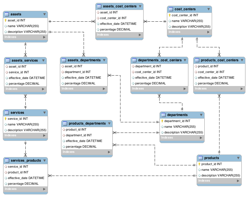
We’ve identified five entities and seven associative entities that capture our many-to-many relationships. Our entities need a name and description, and our allocation relationships need an effective date and percentage to capture the allocation ratio. This gives us the basis of a conceptual schema that we can use to attack the problem.
The longest path that an asset a1 could take through the entities in this schema would involve the asset being allocated to a number of services (sn), products (pn), departments (dn), and cost centers (cn). The resulting number of rows for a1 is r1 and is given by:
If sn = 5, pn = 2, dn = 2, and cn = 3, we have 60 rows for a1. If this represents an average number of allocation rows per asset, then we would have 600,000 rows in a final report covering 10,000 assets.
Assume we’ve inserted some sample representative data into the above schema. What data would the allocation report rows contain? Let’s take a simple case, an asset allocated to two cost centers. An SQL query to retrieve our allocations is:
select * from assets
inner join assets_cost_centers on assets.asset_id =
assets_cost_centers.asset_id
inner join cost_centers on assets_cost_centers.cost_center_id =
cost_centers.cost_center_id;
Two sample rows might look like the following:
| asset_id | name | description | asset_id | cost_center_id | effective_date | percentage | cost_center_id | name | description |
|---|---|---|---|---|---|---|---|---|---|
1 | web server | the box… | 1 | 1 | 2012-01-01… | 0.20000 | 1 | IT 101 | web services |
1 | web server | the box… | 1 | 2 | 2012-01-01… | 0.80000 | 2 | SAAS 202 | software services |
The percentage attribute in each row gives us the ratio of the asset’s cost that the cost center will be charged. In general, the total asset allocation to the cost center in each row is the product of the allocation percentages on the relationships in between the asset and the cost center. For an asset with n such relationships, the total allocation percentage, atotal, is given by:

If the server costs us $1,000/month, the IT 101 cost center will pay $200 and the IS 202 cost center will pay $800.
This is fairly trivial for a direct allocation, but let’s look at the query for asset to service, service to product, product to department, and department to cost center:
select * from assets
inner join assets_services on assets.asset_id = assets_services.asset_id
inner join services on assets_services.service_id = services.service_id
inner join services_products on services.service_id =
           services_products.service_id
inner join products on services_products.product_id = products.product_id
inner join products_departments on products.product_id =
           products_departments.product_id
inner join departments on products_departments.department_id =
           departments.department_id
inner join departments_cost_centers on departments.department_id =
           departments_cost_centers.department_id
inner join cost_centers on departments_cost_centers.cost_center_id =
           cost_centers.cost_center_id
One of the resulting rows would look like:
| asset | percentage | service | percentage | product | percentage | department | percentage | cost_center |
|---|---|---|---|---|---|---|---|---|
file server | 0.10000 | Data Science S… | 0.40000 | Search Engine | 0.7000 | R&D | 0.25000 | SAAS 201 |
Our allocation percentage here is now the product of the allocation percentages in between the asset and the cost center. For this row, we have

A server with a $3,000 monthly charge would, therefore, cost the SAAS 202 cost center $21 per month.
These are only the two corner cases, representing the shortest and the longest queries. We’ll also need queries for all the cases in between if we continue with this design to cover assets allocated to departments and products allocated to cost centers. Each new level of the query adds to a combinatorial explosion and begs many questions about the design. What happens if we change the allocation rules? What if a product can be allocated directly to a cost center instead of passing through a department? Are the queries efficient as the amount of data in the system increases? Is the system testable? To make matters worse, a real-world allocation model would also contain many more entities and associative entities.
We’ve introduced the problem and sketched out a rudimentary solution in just a few pages, but imagine how a real system like this might evolve over an extended period of months or even years with a team of people involved. It’s easy to see how the complexity could be overlooked or taken for granted as the nature of the problem we set out to solve.
A system can start out simple, but very quickly become complex. This fact has been deeply explored in the study of complex systems and cellular automata. To see this idea in action, consider a classic technique for defining a complex graphical object by starting with two simple objects:

“One begins with two shapes, an initiator and a generator…each stage of the construction begins with a broken line and consists in replacing each straight interval with a copy of the generator, reduced and displaced so as to have the same end points as those of the interval being replaced.”
Benoît Mandelbrot[62]
In just three iterations of this algorithm, we can create a famous shape known as the Koch snowflake.[63]

Not so different than what just happened with our relational schema, is it? Our entities play the role of the “straight interval,” and the associative many-to-many entities act as the complexity generators.
The Hidden Network Emerges
Let’s step back. If we were to just step up to a whiteboard and draw out what we were trying to accomplish with the asset allocations for our servers, our sketch might look something like Figure 13-2.
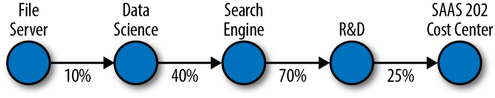
The visual model makes it easier to see that, for purposes of calculating allocated cost, there really isn’t a great deal of difference among these “types.” At the most fundamental level, there are dots, lines, and text describing both. We can read the first dot and line in this drawing as, “The File Server asset is allocated 10% to the Data Science service.”
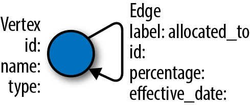
We can simplify our ER data model dramatically if we take a cue from this visual model and define our domain in terms of these dots, lines, and text descriptions. Because our lines are directed, and we don’t have any cycles, our allocation model is actually a directed acyclic graph. The dots are vertices, the lines are edges, and the properties are key-value pairs that optionally add additional information to each vertex and edge.
We don’t need typed entities to represent our vertices and edges. We
can simply include a type property on our vertices to
capture whether the vertex represents, for example, an asset or a service.
We can use labels on the edges to represent that each edge represents an
allocation. We can capture the percentage and effective date of the
allocation as a property on the edge, along with any other properties we
might need.
Given that we now have only vertices that can be allocated to one another, our schema reduces from the model in the ER diagram to Figure 13-3.
Once we have decided on a graph data structure to model our domain, we have a choice to make about how we will persist the data. We could continue to use a relational database to represent our graph, perhaps storing the list of allocations as an adjacency list of edges. SQL is a set-oriented language, however, and expressing graph concepts is not its strength. Whatever our schema, using SQL and RDBMS technology to solve graph problems courts an impedance mismatch often seen in object-oriented systems backed by relational databases.
Impedance matching originates in the field of electrical engineering and is the process of matching source and load impedance to maximize power transfer and minimize signal reflection in the transmission line. The object-relational impedance mismatch is a metaphor applying when a relational database schema (source) is at odds with the target object model in object-oriented languages such as Java or Ruby (load), necessitating a mapping between the two (signal reflection/power loss). Object-relational mapping (ORM) frameworks such as Hibernate, MyBatis, and ActiveRecord attempt to abstract away this complexity. The downside is that each tool introduces a potentially long learning curve, possible performance concerns, and of course, bugs.
Ideally, we want to minimize the complexity and distraction that these extra layers can introduce and keep our solution close to our data model. This expressivity is a key driver behind a host of persistence solutions that operate outside of the relational model. The term NoSQL (Not Only SQL) has arisen over the last few years to cover systems oriented around alternative data models such as documents, key-value pairs, and graphs. Rather than discarding relational models, NoSQL solutions espouse polyglot persistence: Using multiple data models and persistence engines within an application in order to use the right tool at the right time.
Graph databases allow us to natively reason about our data in terms of vertices, edges, properties, and traversals across a network. Several popular graph databases on the market today include Titan, Neo4j, and OrientDB. Each of these solutions implements a Java interface known as Blueprints,[64] an Application Programming Interface (API) that provides a common abstraction layer on top of many popular graph databases and allows graph frameworks to interoperate across vendor implementations. Like most offerings in the NoSQL space, graph databases don’t require a fixed schema, thus accommodating rapid prototyping and iterative development. Many graph database solutions are also open source, with commercial licensing and support available from the vendors.
Because graph databases don’t support SQL, querying must be done through client frameworks and vendor-specific API’s. Blueprints-compliant graph databases can use Gremlin,[65] a graph traversal framework built on the JVM that includes implementations in Groovy, Java, Scala, and Clojure. Let’s use Gremlin to create our allocations graph and compare it to our relational solution.
Using Gremlin, we can define the allocations for the three asset allocations we’ve explored. We can start exploring the graph using the Gremlin Groovy console and a TinkerGraph, an in-memory graph useful for experimental sessions:
g = new TinkerGraph()

==>tinkergraph[vertices:0 edges:0]
We then add vertices to the graph, passing in a Map of properties:
fs = g.addVertex([name:'File Server', type:'Asset'])
s  = g.addVertex([name:'Data Science', type:'Service'])
We then create a relationship between our file server and data science service:
allocation = g.addEdge(fs, s, 'allocated_to',
[percentage:0.1, effective_date:'2012-01-01'])
After adding our allocations, we can query the graph for paths. The equivalent of the first inner join from our relation schema from assets to services becomes a path to the head vertices (inV) of the outgoing edges (outE) from an asset vertex (g.v(0)):
gremlin> g.v(0).outE.inV.path

==>[v[1], e[6][1-allocated_to->3], v[3]]
Inspecting the properties on this path gives us:
==>{name=File Server, type=Asset}
==>{percentage=0.10, effective_date=2012-01-01}
==>{name=Data Science, type=Service}
To find all paths to cost centers, we can start the traversal with
the collection of asset nodes and loop until we encounter vertices of type
cost center:
g.V('type', 'Asset').as('allocated').outE.inV.loop('allocated')
    {it.loops < 6}{it.object.type == 'Cost Center'}.path

==>[v[0], e[2][0-allocated_to->1], v[1], e[6][1-allocated_to->3],
    v[3], e[7][3-allocated_to->4], v[4], e[8][4-allocated_to->5], v[5]]
This concise expression has the benefit of returning all allocation paths shorter than six edges away from the start of the traversal. If we follow the pattern above and add all of the allocation edges from our relational design, the query will return our three paths:
==>[v[0], e[2][0-allocated_to->1], v[1], e[6][1-allocated_to->3],
    v[3], e[7][3-allocated_to->4], v[4], e[8][4-allocated_to->5], v[5]]
==>[v[9], e[11][9-allocated_to->10], v[10]]
==>[v[9], e[12][9-allocated_to->5], v[5]]
Given these paths, it would be a simple matter to extract the allocation percentage property from each edge to obtain the final allocation from asset to cost center by applying a post-processing closure:[66]
g.V('type', 'Asset').as('allocated').outE.inV.loop('allocated'){it.loops < 6}
    {it.object.type == 'Cost Center'}.path{it.name}{it.percentage}

==>[File Server, 0.10, Data Science, 0.40, Search Engine, 0.70, R&D, 0.25,
    SAAS 202]
==>[Web Server, 0.20, IT 101]
==>[Web Server, 0.80, SAAS 202]The graph-based solution exploits the ease of finding paths through a directed graph. In addition to the reporting concern we explored in which we sought out all paths between two points, pathfinding has useful applications in risk management, impact analysis, and optimization. But paths are really just the beginning of what networks can do. Graph databases and query languages like Gremlin allow for networks, “graphs that represent something real,”[67] to be included in modern application architectures.
The field of network science is devoted to exploring more advanced structural properties and dynamics of networks. Applications in sociology include measuring authority and influence and predicting diffusion of information and ideas through crowds. In economics, network properties can be used to model systemic risk and predict how well the network can survive disruptions.
Going back to our allocations example, we might be interested in evaluating the relative importance of a service based on the profitability of the cost centers to which it eventually allocates out. Put another way, services that allocate out to the most profitable cost centers could be considered the most important in the business from a risk management perspective, since interruptions in one of these services could lead to disruption of the firm’s most profitable lines of business. This perspective allows the allocation model to become data useful for operations, resource planning, and budgeting.
There are also many examples of businesses capitalizing on network properties. Facebook is powered by its Open Graph, the “people and the connections they have to everything they care about.”[68] Facebook provides an API to access this social network and make it available for integration into other networked datasets.
On Twitter, the network structure resulting from friends and followers leads to recommendations of “Who to follow.” On LinkedIn, network-based recommendations include “Jobs you may be interested in” and “Groups you may like.” The recommendation engine hunch.com is built on a “Taste Graph” that “uses signals from around the Web to map members with their predicted affinity for products, services, other people, websites, or just about anything, and customizes recommended topics for them.”[69]
A search on Google can be considered a type of recommendation about which of possibly millions of search hits are most relevant for a particular query. Google is a $100B company primarily because it was able to substantially improve the relevance of hits in a web search through the PageRank algorithm.[70] PageRank views the Web as a graph in which the vertices are web pages and the edges are the hyperlinks among them. A link implicitly conveys relevance. A linked document therefore has a higher chance of being relevant in a search if the incoming links are themselves highly linked and very relevant.
It’s interesting to consider that PageRank is based on topological network properties. That is, the structure of the Web alone provides a predictive metric for how relevant a given page will be, even before considering a web page’s content. This is a perfect example of network structure providing value above and beyond the data in the source of the vertices. If you have related data that you don’t explore as a network, you may be missing opportunities to learn something valuable.
We’ve seen two models of how to solve a cost allocation problem. The relational model closely matched the domain, but added accidental complexity to an already inherently complicated problem. An alternative graphical model allowed us to dramatically simplify the representation of the data and easily extract the allocation paths we needed using open-source tools.
A big part of our jobs as data scientists and engineers is to manage complexity. Having multiple data models to work with will allow you to use the right tool for the job at hand. Graphs are a surprisingly useful abstraction for managing the inherent complexity in networks while introducing minimal accidental complexity.
Hopefully, the next time you encounter highly connected data, you’ll recognize it as a network and you’ll be better equipped to wring out all the valuable information it’s hiding. Good luck in finding the value in your data…may your models serve you well and bring you more enlightenment than sorrow!
Thanks to my colleagues at Aurelius for critical feedback: Dr. Marko Rodriguez, Dr. Matthias Bröcheler, and Stephen Mallette. Thanks also to the entire TinkerPop community for supporting the graph database landscape with Blueprints, Gremlin, and the rest of the TinkerPop software stack. Thanks to my wife Sarah Aslanifar for early reviews and for AsciiDoc translation of the original manuscript. Last, but certainly not least, thanks to Q and the O’Reilly team for making Bad Data Handbook happen!
[62] Przemyslaw Prusinkiewicz and Aristid Lindenmayer. 1996. The Algorithmic Beauty of Plants. Springer-Verlag New York, Inc., New York, NY, USA.
[67] Ted G. Lewis. 2009. Network Science: Theory and Applications. Wiley Publishing.
[69] “eBay Acquires Recommendation Engine Hunch.com,” http://www.businesswire.com/news/home/20111121005831/en
[70] Brin, S.; Page, L. 1998. “The anatomy of a large-scale hypertextual Web search engine.” Computer Networks and ISDN Systems 30: 107–117