
You are given a dataset of unknown provenance. How do you know if the data is any good?
It is not uncommon to be handed a dataset without a lot of information as to where it came from, how it was collected, what the fields mean, and so on. In fact, it’s probably more common to receive data in this way than not. In many cases, the data has gone through many hands and multiple transformations since it was gathered, and nobody really knows what it all means anymore. In this chapter, I’ll walk you through a step-by-step approach to understanding, validating, and ultimately turning a dataset into usable information. In particular, I’ll talk about specific ways to look at the data, and show some examples of what I learned from doing so.
As a bit of background, I have been dealing with quite a variety of data for the past 25 years or so. I’ve written code to process accelerometer and hydrophone signals for analysis of dams and other large structures (as an undergraduate student in Engineering at Harvey Mudd College), analyzed recordings of calls from various species of bats (as a graduate student in Electrical Engineering at the University of Washington), built systems to visualize imaging sonar data (as a Graduate Research Assistant at the Applied Physics Lab), used large amounts of crawled web content to build content filtering systems (as the co-founder and CTO of N2H2, Inc.), designed intranet search systems for portal software (at DataChannel), and combined multiple sets of directory assistance data into a searchable website (as CTO at WhitePages.com). For the past five years or so, I’ve spent most of my time at Demand Media using a wide variety of data sources to build optimization systems for advertising and content recommendation systems, with various side excursions into large-scale data-driven search engine optimization (SEO) and search engine marketing (SEM).
Most of my examples will be related to work I’ve done in Ad Optimization, Content Recommendation, SEO, and SEM. These areas, as with most, have their own terminology, so a few term definitions may be helpful.
Table 2-1. Term Definitions
When receiving a dataset, the first hurdle is often basic accessibility. However, I’m going to skip over most of these issues and assume that you can read the physical medium, uncompress or otherwise extract the files, and get it into a readable format of some sort. Once that is done, the next important task is to understand the structure of the data. There are many different data structures commonly used to transfer data, and many more that are (thankfully) used less frequently. I’m going to focus on the most common (and easiest to handle) formats: columnar, XML, JSON, and Excel.
The single most common format that I see is some version of columnar (i.e., the data is arranged in rows and columns). The columns may be separated by tabs, commas, or other characters, and/or they may be of a fixed length. The rows are almost always separated by newline and/or carriage return characters. Or for smaller datasets the data may be in a proprietary format, such as those that various versions of Excel have used, but are easily converted to a simpler textual format using the appropriate software. I often receive Excel spreadsheets, and almost always promptly export them to a tab-delimited text file.
Comma-separated value (CSV) files are the most common. In these files, each record has its own line, and each field is separated by a comma. Some or all of the values (particularly commas within a field) may also be surrounded by quotes or other characters to protect them. Most commonly, double quotes are put around strings containing commas when the comma is used as the delimiter. Sometimes all strings are protected; other times only those that include the delimiter are protected. Excel can automatically load CSV files, and most languages have libraries for handling them as well.
Note
In the example code below, I will be making occasional use of some basic UNIX commands: particularly echo and cat. This is simply to provide clarity around sample data. Lines that are meant to be typed or at least understood in the context of a UNIX shell start with the dollar-sign ($) character. For example, because tabs and spaces look a lot alike on the page, I will sometimes write something along the lines of
$ echo -e 'Field 1	Field 2
Row 2
'
to create sample data containing two rows, the first of which has two fields separated by a tab character. I also illustrate most pipelines verbosely, by starting them with
$ cat filename |
even though in actual practice, you may very well just specify the filename as a parameter to the first command. That is,
$ cat filename | sed -e 's/cat/dog/'
is functionally identical to the shorter (and slightly more efficient)
$ sed -e 's/cat/dog/' filename
Here is a Perl one-liner that extracts the third and first columns from a CSV file:
$ echo -e 'Column 1,"Column 2, protected","Column 3"'
Column 1,"Column 2, protected","Column 3"

$ echo -e 'Column 1,"Column 2, protected","Column 3"' |
        perl -MText::CSV -ne '
        $csv = Text::CSV->new();
        $csv->parse($_); print join("	",($csv->fields())[2,0]);'
Column 3        Column 1
Here is a more readable version of the Perl script:
useText::CSV;while(<>){my$csv=Text::CSV->new();$csv->parse($_);my@fields=$csv->fields();join(" ",@fields[2,0])," ";}
Most data does not include tab characters, so it is a fairly safe and therefore popular, delimiter. Tab-delimited files typically completely disallow tab characters in the data itself, so don’t use quotes or escape sequences, making them easier to work with than CSV files. They can be easily handled by typical UNIX command line utilities such as perl, awk, cut, join, comm, and the like, and many simple visualization tools such as Excel can semi-automatically import tab-separated-value files, putting each field into a separate column for easy manual fiddling.
Here are some simple examples of printing out the first and third columns of a tab-delimited string. The cut command will only print out data in the order it appears, but other tools can rearrange it. Here are examples of cut printing the first and third columns, and awk and perl printing the third and first columns, in that order:
$ echo -e 'Column 1	Column 2	Column 3
'
Column 1     Column 2     Column 3
cut:
$ echo -e 'Column 1	Column 2	Column 3
' |
        cut -f1,3
Column 1 Column 3awk:
$ echo -e 'Column 1	Column 2	Column 3
' |
        awk -F"	" -v OFS="	" '{ print $3,$1 }'
Column 3 Column 1perl:
$ echo -e 'Column 1	Column 2	Column 3
' |
        perl -a -F"	" -n -e '$OFS="	"; print @F[2,0],"
"'
Column 3        Column 1
In some arenas, XML is a common data format. Although they haven’t really caught on widely, some databases (e.g., BaseX) store XML internally, and many can export data in XML. As with CSV, most languages have libraries that will parse it into native data structures for analysis and transformation.
Here is a Perl one-liner that extracts fields from an XML string:
$ echo -e '<config>
	<key name="key1" value="value 1">

	<description>Description 1</description>

	</key>
</config>'
<config>
     <key name="key1" value="value 1">
     <description>Description 1</description>
     </key>
</config>

$ echo '<config><key name="key1" value="value 1">
        <description>Description 1</description>
        </key></config>' |
        perl -MXML::Simple -e 'my $ref = XMLin(<>);
        print $ref->{"key"}->{"description"}'
Description 1
Here is a more readable version of the Perl script:
useXML::Simple;my$ref=XMLin(join('',<>));$ref->{"key"}->{"description"}';
Although primarily used in web APIs to transfer information between servers and JavaScript clients, JSON is also sometimes used to transfer bulk data. There are a number of databases that either use JSON internally (e.g., CouchDB) or use a serialized form of it (e.g., MongoDB), and thus a data dump from these systems is often in JSON.
Here is a Perl one-liner that extracts a node from a JSON document:
$ echo '{"config": {"key1":"value 1","description":"Description 1"}}'
{"config": {"key1":"value 1","description":"Description 1"}}

$ echo '{"config": {"key1":"value 1","description":"Description 1"}}' |
        perl -MJSON::XS -e 'my $json = decode_json(<>);
        print $json->{"config"}->{"description"}'
Description 1
Here is a more readable version of the Perl script:
useJSON::XS;my$json=decode_json(join('',<>));$json->{"config"}->{"description"}';
Once you have the data in a format where you can view and manipulate it, the next step is to figure out what the data means. In some (regrettably rare) cases, all of the information about the data is provided. Usually, though, it takes some sleuthing. Depending on the format of the data, there may be a header row that can provide some clues, or each data element may have a key. If you’re lucky, they will be reasonably verbose and in a language you understand, or at least that someone you know can read. I’ve asked my Russian QA guy for help more than once. This is yet another advantage of diversity in the workplace!
One common error is misinterpreting the units or meaning of a field. Currency fields may be expressed in dollars, cents, or even micros (e.g., Google’s AdSense API). Revenue fields may be gross or net. Distances may be in miles, kilometers, feet, and so on. Looking at both the definitions and actual values in the fields will help avoid misinterpretations that can lead to incorrect conclusions.
You should also look at some of the values to make sure they make sense in the context of the fields. For example, a PageView field should probably contain integers, not decimals or strings. Currency fields (prices, costs, PPC, RPM) should probably be decimals with two to four digits after the decimal. A User Agent field should contain strings that look like common user agents. IP addresses should be integers or dotted quads.
A common issue in datasets is missing or empty values. Sometimes these are fine, while other times they invalidate the record. These values can be expressed in many ways. I’ve seen them show up as nothing at all (e.g., consecutive tab characters in a tab-delimited file), an empty string (contained either with single or double quotes), the explicit string NULL or undefined or N/A or NaN, and the number 0, among others. No matter how they appear in your dataset, knowing what to expect and checking to make sure the data matches that expectation will reduce problems as you start to use the data.
I often extend these anecdotal checks to true validation of the fields. Most of these types of validations are best done with regular expressions. For historical reasons (i.e., I’ve been using it for 20-some years), I usually write my validation scripts in Perl, but there are many good choices available. Virtually every language has a regular expression implementation.
For enumerable fields, do all of the values fall into the proper set? For example, a “month” field should only contain months (integers between 0 and 12, string values of Jan, Feb, … or January, February, …).
my$valid_month=map{$_=>1}(0..12,qw(Jan Feb Mar Apr May Jun Jul Aug Sep Oct Nov DecJanuary February March April May June July AugustSeptember October November December));"Invalid!"unless($valid_month{$month_to_check});
For numeric fields, are all of the values numbers? Here is a check to see if the third column consists entirely of digits.
$ cat sample.txt
one     two     3
one     two     three
1       2       3
1       2       three

$ cat sample.txt |
        perl -ape 'warn if $F[2] !~ /^d+$/'
one     two     3
Warning: something's wrong at -e line 1, <> line 2.
one     two     three
1       2       3
Warning: something's wrong at -e line 1, <> line 4.
1       2       three
For fixed-format fields, do all of the values match a regular expression? For example, IP addresses are often shown as dotted quads (e.g., 127.0.0.1), which can be matched with something like ^d+.d+.d+.d+$ (or more rigorous variants).
$ cat sample.txt
fink.com     127.0.0.1
bogus.com     1.2.3

$ cat sample.txt |
        perl -ape 'warn "Invalid IP!" if $F[1] !~ /^d+.d+.d+.d+$/'
fink.com     127.0.0.1
Invalid IP! at -e line 1, <> line 2.
bogus.com 1.2.3For numeric fields, I like to do some simple statistical checks. Does the minimum value make sense in the context of the field? The minimum value of a counter (number of clicks, number of pageviews, and so on) should be 0 or greater, as should many other types of fields (e.g., PPC, CTR, CPM). Similarly, does the maximum value make sense? Very few fields can logically accommodate values in the billions, and in many cases much smaller numbers than that don’t make sense.
Depending on the exact definition, a ratio like CTR should not exceed 1. Of course, no matter the definition, it often will (this book is about bad data, after all…), but it generally shouldn’t be much greater than 1. Certainly if you see values in the hundreds or thousands, there is likely a problem.
Financial values should also have a reasonable upper bound. At least for the types of data I’ve dealt with, PPC or CPC values in the hundreds of dollars might make sense, but certainly not values in the thousands or more. Your acceptable ranges will probably be different, but whatever they are, check the data to make sure it looks plausible.
You can also look at the average value of a field (or similar statistic like the mode or median) to see if it makes sense. For example, if the sale price of a widget is somewhere around $10, but the average in your “Widget Price” field is $999, then something is not right. This can also help in checking units. Perhaps 999 is a reasonable value if that field is expressed in cents instead of dollars.
The nice thing about these checks is that they can be easily automated, which is very handy for datasets that are periodically updated. Spending a couple of hours checking a new dataset is not too onerous, and can be very valuable for gaining an intuitive feel for the data, but doing it again isn’t nearly as much fun. And if you have an hourly feed, you might as well work as a Jungle Cruise tour guide at Disneyland (“I had so much fun, I’m going to go again! And again! And again…”).
Another technique that I find very helpful is to create a histogram of the values in a data field. This is especially helpful for extremely large datasets, where the simple statistics discussed above barely touch the surface of the data. A histogram is a count of the number of times each unique value appears in a dataset, so it can be generated on nonnumeric values where the statistical approach isn’t applicable.
For example, consider a dataset containing referral keywords, which are phrases searched for using Google, Bing, or some other search engine that led to pageviews on a site. A large website can receive millions of referrals from searches for hundreds of thousands of unique keywords per day, and over a reasonable span of time can see billions of unique keywords. We can’t use statistical concepts like minimum, maximum, or average to summarize the data because the key field is nonnumeric: keywords are arbitrary strings of characters.
We can use a histogram to summarize this very large nonnumeric dataset. A first order histogram counts the number of referrals per keyword. However, if we have billions of keywords in our dataset, our histogram will be enormous and not terribly useful. We can perform another level of aggregation, using the number of referrals per keyword as the value, resulting in a much smaller and more useful summary. This histogram will show the number of keywords having each number of referrals. Because small differences in the number of referrals isn’t very meaningful, we can further summarize by placing the values into bins (e.g., 1-10 referrals, 11-20 referrals, 21-29 referrals, and so on). The specific bins will depend on the data, of course.
For many simple datasets, a quick pipeline of commands can give you a useful histogram. For example, let’s say you have a simple text file (sample.txt) containing some enumerated field (e.g., URLs, keywords, names, months). To create a quick histogram of the data, simply run:
$ cat sample.txt | sort | uniq -c
So, what’s going on here? The cat command reads a file and sends the contents of it to STDOUT. The pipe symbol ( | ) catches this data and sends it on to the next command in the pipeline (making the pipe character an excellent choice!), in this case the sort command, which does exactly what you’d expect: it sorts the data. For our purposes we actually don’t care whether or not the data is sorted, but we do need identical rows to be adjacent to each other, as the next command, uniq, relies on that. This (aptly named, although what happened to the “ue” at the end I don’t know) command will output each unique row only once, and when given the -c option, will prepend it with the number of rows it saw. So overall, this pipeline will give us the number of times each row appears in the file: that is, a histogram!
Here is an example.
Example 2-1. Generating a Sample Histogram of Months
$ cat sample.txt
January
January
February
October
January
March
September
September
February

$ cat sample.txt | sort
February
February
January
January
January
March
October
September
September

$ cat sample.txt | sort | uniq -c
      2 February
      3 January
      1 March
      1 October
      2 September
For slightly more complicated datasets, such as a tab-delimited file, simply add a filter to extract the desired column. There are several (okay, many) options for extracting a column, and the “best” choice depends on the specifics of the data and the filter criteria. The simplest is probably the cut command, especially for tab-delimited data. You simply specify which column (or columns) you want as a command line parameter. For example, if we are given a file containing names in the first column and ages in the second column and asked how many people are of each age, we can use the following code:
$ cat sample2.txt
Joe     14
Marci   17
Jim     16
Bob     17
Liz     15
Sam     14

$ cat sample2.txt | cut -f2 | sort | uniq -c
      2 14
      1 15
      1 16
      2 17
The first column contains the counts, the second the ages. So two kids are 14-year-olds, one is 15-year-old, one is 16-year-old, and two are 17-year-olds.
The awk language is another popular choice for selecting columns (and can do much, much more), albeit with a slightly more complicated syntax:
$ cat sample2.txt |
        awk '{print $2}' | sort | uniq -c
      2 14
      1 15
      1 16
      2 17
As with virtually all text-handling tasks, Perl can also be used (and as with anything in Perl, there are many ways to do it). Here are a few examples:
$ cat sample2.txt |
        perl -ane 'print $F[1],"
"' | sort | uniq -c
      2 14
      1 15
      1 16
      2 17

$ cat sample2.txt |
        perl -ne 'chomp; @F = split(/	/,$_); print $F[1],"
"' | sort | uniq -c
      2 14
      1 15
      1 16
      2 17
For real datasets (i.e., ones consisting of lots of data points), a histogram provides a reasonable approximation of the distribution function and can be assessed as such. For example, you typically expect a fairly smooth function. It may be flat, or Gaussian (looks like a bell curve), or even decay exponentially (long-tail), but a discontinuity in the graph should be viewed with suspicion: it may indicate some kind of problem with the data.
One example of a histogram study that I found useful was for a dataset consisting of estimated PPC values for two sets of about 7.5 million keywords. The data had been collected by third parties and I was given very little information about the methodology they used to collect it. The data files were comma-delimited text files of keywords and corresponding PPC values.
Example 2-2. PPC Data File
waco tourism, $0.99
calibre cpa, $1.99,,,,,
c# courses,$2.99 ,,,,,
cad computer aided dispatch, $1.49 ,,,,,
cadre et album photo, $1.39 ,,,,,
cabana beach apartments san marcos, $1.09,,,
"chemistry books, a level", $0.99
cake decorating classes in san antonio, $1.59 ,,,,,
k & company, $0.50
p&o mini cruises, $0.99
c# data grid,$1.79 ,,,,,
advanced medical imaging denver, $9.99 ,,,,,
canadian commercial lending, $4.99 ,,,,,
cabin vacation packages, $1.89 ,,,,,
c5 envelope printing, $1.69 ,,,,,
mesothelioma applied research, $32.79 ,,,,,
ca antivirus support, $1.29 ,,,,,
"trap, toilet", $0.99
c fold towels, $1.19 ,,,,,
cabin rentals wa, $0.99
Because this dataset was in CSV (including some embedded commas in quoted fields), the quick tricks described above don’t work perfectly. A quick first approximation can be done by removing those entries with embedded commas, then using a pipeline similar to the above. We’ll do that by skipping the rows that contain the double-quote character. First, though, let’s check to see how many records we’ll skip.
$ cat data*.txt | grep -c '"'
5505
$ cat data*.txt | wc -l
7533789
We only discarded 0.07% of the records, which isn’t going to affect anything, so our pipeline is:
$ cat ppc_data_sample.txt | grep -v '"' | cut -d, -f2 | sort | uniq -c | sort -k2
      1  $0.50
      3  $0.99
      1  $1.09
      1  $1.19
      1  $1.29
      1  $1.39
      1  $1.49
      1  $1.59
      1  $1.69
      1  $1.79
      1  $1.89
      1  $1.99
      1  $2.99
      1  $32.79
      1  $4.99
      1  $9.99
This may look a little complicated, so let’s walk through it step-by-step. First, we create a data stream by using the cat command and a shell glob that matches all of the data files. Next, we use the grep command with the -v option to remove those rows that contain the double-quote character, which the CSV format uses to encapsulate the delimiter character (the comma, in our case) when it appears in a field. Then we use the cut command to extract the second field (where fields are defined by the comma character). We then sort the resulting rows so that duplicates will be in adjacent rows. Next we use the uniq command with the -c option to count the number of occurrences of each row. Finally, we sort the resulting output by the second column (the PPC value).
In reality, this results in a pretty messy outcome, because the format of the PPC values varies (some have white space between the comma and dollar sign, some don’t, among other variations). If we want cleaner output, as well as a generally more flexible solution, we can write a quick Perl script to clean and aggregate the data:
usestrict;usewarnings;useText::CSV_XS;my$csv=Text::CSV_XS->new({binary=>1});my%count;while(<>){chomp;s/cM//;$csv->parse($_)||next;my$ppc=($csv->fields())[1];$ppc=~s/^[ $]+//;$count{$ppc}++;}foreachmy$ppc(sort{$a<=>$b}keys%count){"$ppc $count{$ppc} ";}
For our sample dataset shown above, this results in a similar output, but with the two discarded $0.99 records included and the values as actual values rather than strings of varying format:
0.50    1
0.99    5
1.09    1
1.19    1
1.29    1
1.39    1
1.49    1
1.59    1
1.69    1
1.79    1
1.89    1
1.99    1
2.99    1
4.99    1
9.99    1
32.79   1
For the real dataset, the output looks like:
0.05    1071347
0.06    2993
0.07    3359
0.08    3876
0.09    4803
0.10    443838
0.11    28565
0.12    32335
0.13    36113
0.14    42957
0.15    50026
...
23.97   1
24.64   1
24.82   1
25.11   1
25.93   1
26.07   1
26.51   1
27.52   1
32.79   1
As an aside, if your data is already in a SQL database, generating a histogram is very easy. For example, assume we have a table called MyTable containing the data described above, with two columns: Term and PPC. We simply aggregate by PPC:
SELECT PPC, COUNT(1) AS Terms
FROM MyTable
GROUP BY PPC
ORDER BY PPC ASC
No matter how we generate this data, the interesting features can most easily be visualized by graphing it, as shown in Figure 2-1.
There are a lot of keywords with relatively small PPC values, and then an exponential decay (note that the vertical axis is on a logarithmic scale) as PPC values increase. However, there is a big gap in the middle of the graph! There are almost no PPC values between $15.00 and $15.88, and then more than expected (based on the shape of the curve) from $15.89 to about $18.00, leading me to hypothesize that the methodology used to generate this data shifted everything between $15.00 and $15.88 up by $0.89 or so. After talking to the data source, we found out two things. First, this was indeed due to the algorithm they used to test PPC values. Second, they had no idea that their algorithm had this unfortunate characteristic! By doing this analysis we knew to avoid ascribing relative values to any keywords with PPC values between $15.89 and $18.00, and they knew to fix their algorithm.
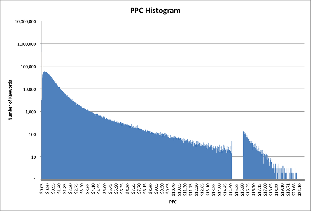
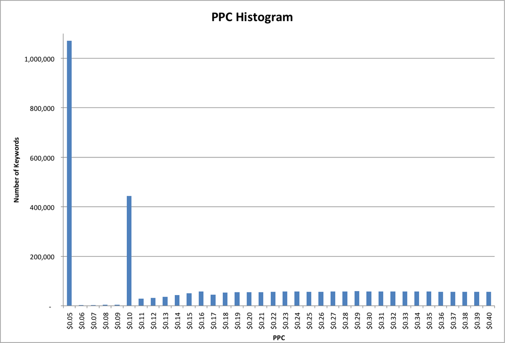
Another interesting feature of this dataset is that the minimum value is $0.05. This could be caused by the marketplace being measured as having a minimum bid, or the algorithm estimating the bids starting at $0.05, or the data being post-filtered to remove bids below $0.05, or perhaps other explanations. In this case, it turned out to be the first option: the marketplace where the data was collected had a minimum bid of five cents. In fact, if we zoom in on the low-PPC end of the histogram (Figure 2-2), we can see another interesting feature. Although there are over a million keywords with a PPC value of $0.05, there are virtually none (less than 3,000 to be precise) with a PPC value of $0.06, and similarly up to $0.09. Then there are quite a few (almost 500,000) at $0.10, and again fewer (less than 30,000) at $0.11 and up. So apparently the marketplace has two different minimum bids, depending on some unknown factor.
Another example of the usefulness of a histogram came from looking at search referral data. When users click on links to a website on a Google search results page, Google (sometimes) passes along the “rank” of the listing (1 for the first result on the page, 2 for the second, and so on) along with the query keyword. This information is very valuable to websites because it tells them how their content ranks in the Google results for various keywords. However, it can be pretty noisy data. Google is constantly testing their algorithms and user behavior by changing the order of results on a page. The order of results is also affected by characteristics of the specific user, such as their country, past search and click behavior, or even their friends’ recommendations. As a result, this rank data will typically show many different ranks for a single keyword/URL combination, making interpretation difficult. Some people also contend that Google purposefully obfuscates this data, calling into question any usefulness.
In order to see if this rank data had value, I looked at the referral data from a large website with a significant amount of referral traffic (millions of referrals per day) from Google. Rather than the usual raw source of standard web server log files, I had the luxury of data already stored in a data warehouse, with the relevant fields already extracted out of the URL of the referring page. This gave me fields of date, URL, referring keyword, and rank for each pageview. I created a histogram showing the number of pageviews for each Rank (Figure 2-3):

Looking at the histogram, we can clearly see this data isn’t random or severely obfuscated; there is a very clear pattern that corresponds to expected user behavior. For example, there is a big discontinuity between the number of views from Rank 10 vs the views from Rank 11, between 20 and 21, and so on. This corresponds to the Google’s default of 10 results per page.
Within a page (other than the first—more on that later), we can also see that more users click on the first position on the page than the second, more on the second than the third, and so forth. Interestingly, more people click on the last couple of results than those “lost” in the middle of the page. This behavior has been well-documented by various other mechanisms, so seeing this fine-grained detail in the histogram lends a lot of credence to the validity of this dataset.
So why is this latter pattern different for the first page than the others? Remember that this data isn’t showing CTR (click-through rate), it’s showing total pageviews. This particular site doesn’t have all that many pages that rank on the top of the first page for high-volume terms, but it does have a fair number that rank second and third, so even though the CTR on the first position is the highest (as shown on the other pages), that doesn’t show up for the first page. As the rank increases across the third, fourth, and subsequent pages, the amount of traffic flattens out, so the pageview numbers start to look more like the CTR.
Up to now, I’ve talked about histograms based on counts of rows sharing a common value in a column. As we’ve seen, this is useful in a variety of contexts, but for some use cases this method provides too much detail, making it difficult to see useful patterns. For example, let’s look at the problem of analyzing recommendation patterns. This could be movie recommendations for a user, product recommendations for another product, or many other possibilities, but for this example I’ll use article recommendations. Imagine a content-rich website containing millions of articles on a wide variety of topics. In order to help a reader navigate from the current article to another that they might find interesting or useful, the site provides a short list of recommendations based on manual curation by an editor, semantic similarity, and/or past traffic patterns.
We’ll start with a dataset consisting of recommendation pairs: one recommendation per row, with the first column containing the URL of the source article and the second the URL of the destination article.
Example 2-3. Sample Recommendation File
http://example.com/fry_an_egg.html       http://example.com/boil_an_egg.html
http://example.com/fry_an_egg.html       http://example.com/fry_bacon.html
http://example.com/boil_an_egg.html      http://example.com/fry_an_egg.html
http://example.com/boil_an_egg.html      http://example.com/make_devilled_eggs.html
http://example.com/boil_an_egg.html      http://example.com/color_easter_eggs.html
http://example.com/color_easter_eggs.html        http://example.com/boil_an_egg.html
...
So readers learning how to fry an egg would be shown articles on boiling eggs and frying bacon, and readers learning how to boil an egg would be shown articles on frying eggs, making devilled eggs, and coloring Easter eggs.
For a large site, this could be a large-ish file. One site I work with has about 3.3 million articles, with up to 30 recommendations per article, resulting in close to 100 million recommendations. Because these are automatically regenerated nightly, it is important yet challenging to ensure that the system is producing reasonable recommendations. Manually checking a statistically significant sample would take too long, so we rely on statistical checks. For example, how are the recommendations distributed? Are there some articles that are recommended thousands of times, while others are never recommended at all?
We can generate a histogram showing how many times each article is recommended as described above:
Example 2-4. Generate a Recommendation Destination Histogram
$ cat recommendation_file.txt | cut -f2 | sort | uniq -c

2 http://example.com/boil_an_egg.html
1 http://example.com/fry_bacon.html
1 http://example.com/fry_an_egg.html
1 http://example.com/make_devilled_eggs.html
1 http://example.com/color_easter_eggs.html
“How to Boil an Egg” was recommended twice, while the other four articles were recommended once each. That’s fine and dandy, but with 3.3M articles, we’re going to have 3.3M rows in our histogram, which isn’t very useful. Even worse, the keys are URLs, so there really isn’t any way to combine them into bins like we would normally do with numeric keys. To provide a more useful view of the data, we can aggregate once more, creating a histogram of our histogram:
Example 2-5. Generate a Recommendation Destination Count Histogram
$ cat recommendation_file.txt
| cut -f2
| sort
| uniq -c
| sort -n
| awk '{print $1}'
| uniq -c

4 1
1 2
Four articles were recommended once, and one article was recommended twice.
Using this same technique on a 33 million recommendation dataset (top 10 recommendations for each of 3.3 million articles), we get a graph like that in Figure 2-4, or if we convert it to a cumulative distribution, we get Figure 2-5.
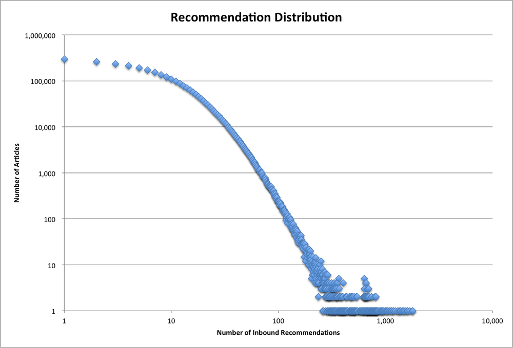
Note that the distribution graph uses a log-log scale while the cumulative distribution graph has a linear vertical scale. Overall, the dataset looks reasonable; we have a nice smooth curve with no big discontinuities. Most articles receive only a few recommendations, with about 300,000 receiving a single recommendation. The number of articles falls rapidly as the number of recommendations increases, with about half of the articles having seven or fewer recommendations. The most popular article receives about 1,800 recommendations.
We can run this analysis on recommendation sets generated by different algorithms in order to help us understand the behavior of the algorithms. For example, if a new algorithm produces a wider distribution, we know that more articles are receiving a disproportionate share of recommendations. Or if the distribution is completely different—say a bell curve around the average number of recommendations (10, in our example)—then the recommendations are being distributed very evenly.

Although a histogram generally doesn’t make sense for time-series data, similar visualization techniques can be helpful, particularly when the data can be aggregated across other dimensions. For example, web server logs can be aggregated up to pageviews per minute, hour, or day, then viewed as a time series. This is particularly useful for finding missing data, which can badly skew the conclusions of certain analyses if not handled properly.
Most website owners like to carefully watch their traffic volumes in order to detect problems on their site, with their marketing campaigns, with their search engine optimization, and so on. For many sites, this is greatly complicated by changes in traffic caused by factors completely independent of the site itself. Some of these, like seasonality, are somewhat predictable, which can reduce the number of panic drills over a traffic drop that turns out to have nothing to do with the site. Seasonality can be tricky, as it is in part a function of the type of site: a tax advice site will see very different seasonal traffic patterns than one on gardening, for example. In addition, common sense doesn’t always provide a good guide and almost never provides a quantitative guide. Does a 30% drop in traffic on Superbowl Sunday make sense? When schools start to let out in the spring, how much will traffic drop? Sites with large amounts of historical traffic data can build models (explicitly or implicitly via “tribal knowledge”), but what about a new site or a translation of an existing site?
In order to address this, I tried using the publicly available Wikipedia logs to build a long-term, large-scale seasonality model for traffic in various languages. Wikipedia serves close to 500M pages per day, a bit more than half of them in English. An automated process provides aggregations of these by language (site), hour, and page. As with any automated process, it fails sometimes, which results in lower counts for a specific hour or day. This can cause havoc in a seasonality model, implying a drop in traffic that isn’t real.
My first pass through the Wikipedia data yielded some nonsensical values. 1.06E69 pageviews on June 7th of 2011?!? That was easy to discard. After trimming out a few more large outliers, I had the time-series graph shown in Figure 2-6.

You can see that there are still some outliers, both low and high. In addition, the overall shape is very fuzzy. Zooming in (Figure 2-7), we can see that some of this fuzziness is due to variation by day of week. As with most informational sites, weekdays see a lot more traffic than weekends.
Because we’re looking for longer-term trends, I chose to look at the median of each week in order to both remove some of the outliers and get rid of the day-of-week variation (Figure 2-8).
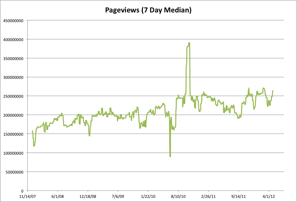
Now we start to see a clearer picture. Overall traffic has been trending up over the past several years, as expected. There are still some pretty big dips and spikes, as well as a lot of variation over the course of each year. Because the data came in hourly files, one way we can detect bad data is by counting how many hours of data we have for each day. Obviously, there should be 24 hours per day (with some potential shifting around of Daylight Savings Time boundaries, depending on how Wikipedia logs).
Adding the number of hours to the graph results in Figure 2-9, which shows quite a few days with less than 24 hours, and a couple with more (up to 30!). May 11th, 2009, had 30 hours, and May 12th had 27. Closer inspection shows likely data duplication. For example, there are two files for hour 01 of 2009-05-11, each of which contains about the same number of pageviews as hour 00 and hour 02. It is likely that something in the system that generated these files from the raw web server logs duplicated some of the data.
Example 2-6. Wikipedia EN Page Counts for May 11th, 2009
$ grep -P '^en	' pagecounts-20090511-*.gz.summary
pagecounts-20090511-000000.gz.summary:en        20090511        9419692
pagecounts-20090511-010000.gz.summary:en        20090511        9454193
pagecounts-20090511-010001.gz.summary:en        20090511        8297669 <== duplicate
pagecounts-20090511-020000.gz.summary:en        20090511        9915606
pagecounts-20090511-030000.gz.summary:en        20090511        9855711
pagecounts-20090511-040000.gz.summary:en        20090511        9038523
pagecounts-20090511-050000.gz.summary:en        20090511        8200638
pagecounts-20090511-060000.gz.summary:en        20090511        7270928
pagecounts-20090511-060001.gz.summary:en        20090511        7271485 <== duplicate
pagecounts-20090511-070000.gz.summary:en        20090511        6750575
pagecounts-20090511-070001.gz.summary:en        20090511        6752474 <== duplicate
pagecounts-20090511-080000.gz.summary:en        20090511        6392987
pagecounts-20090511-090000.gz.summary:en        20090511        6581155
pagecounts-20090511-100000.gz.summary:en        20090511        6641253
pagecounts-20090511-110000.gz.summary:en        20090511        6826325
pagecounts-20090511-120000.gz.summary:en        20090511        7433542
pagecounts-20090511-130000.gz.summary:en        20090511        8560776
pagecounts-20090511-130001.gz.summary:en        20090511        8548498 <== duplicate
pagecounts-20090511-140000.gz.summary:en        20090511        9911342
pagecounts-20090511-150000.gz.summary:en        20090511        9708457
pagecounts-20090511-150001.gz.summary:en        20090511        10696488 <== duplicate
pagecounts-20090511-160000.gz.summary:en        20090511        11218779
pagecounts-20090511-170000.gz.summary:en        20090511        11241469
pagecounts-20090511-180000.gz.summary:en        20090511        11743829
pagecounts-20090511-190000.gz.summary:en        20090511        11988334
pagecounts-20090511-190001.gz.summary:en        20090511        10823951 <== duplicate
pagecounts-20090511-200000.gz.summary:en        20090511        12107136
pagecounts-20090511-210000.gz.summary:en        20090511        12145627
pagecounts-20090511-220000.gz.summary:en        20090511        11178888
pagecounts-20090511-230000.gz.summary:en        20090511        10131273
Removing these duplicate entries rationalizes the chart a bit more, but doesn’t really address the largest variations in traffic volume, nor does estimating the data volumes for the missing files. In particular, there were 24 hourly files each day from June 12th through June 15th, 2010, yet that time period shows the largest drop in the graph. Similarly, the biggest positive outlier is the first three weeks of October, 2010, where the traffic surged from roughly 240M to 375M pageviews/day, yet there are no extra files during that period. So this points us to a need for deeper analysis of those time periods, and cautions us to be careful about drawing conclusions from this dataset.
Data seldom arrives neatly packaged with a quality guarantee. In fact, it often arrives with little or no documentation of where it came from, how it was gathered, or what to watch out for when using it. However, some relatively simple analysis techniques can provide a lot of insight into a dataset. This analysis will often provide interesting insights into an area of interest. At the minimum, these “sniff tests” provide areas to explore or watch out for.