“Letterforms that honor and elucidate what humans see and say deserve to be honored in their turn. Well-chosen words deserve well-chosen letters; these in their turn deserve to be set with affection, intelligence, knowledge, and skill.Typographyis a link, and it ought, as a matter of honor, courtesy and pure delight, to be as strong as the others in the chain.”
—Robert Bringhurst
This quote from Bringhurst’s master work, The Elements of Typographic Style, Second Edition (Hartley and Marks, 2002), sums up the essence of type in Animate CC. The words we put on the stage and subsequently put into motion on devices, tablets, and computer screens are usually well chosen. They have to be, because they are the communication messengers, providing the users with access to understanding the message you are trying to communicate. In this chapter, we focus on using type to do just that.
There seems to be a notion that type “is that gray stuff that goes around your cool images or interfaces”. This is just plain wrong. The words are how you or your client are communicating with your users and if you make those words hard to read, illegible, or otherwise “play” with them the users are barred from understanding. To provide your users with that understanding you need to understand the role of type in Animate CC. To start that exploration, you need to understand what type is in Animate and, just as importantly, what you can do with it to honor the communication messengers of your content.
We’ll cover the following in this chapter:
The basics of type
Using the Text properties
Adding Typekit fonts and Google fonts
How to format text
Using JavaScript to create, format, and present text
Using ActionScript to create, format, and present text
Creating scrollable text blocks
The following files are used in this chapter (all found in Chapter06/Exercise Files_CH06):
TextFormat.fla
TextJS.fla
TextAS3.fla
ScollableJS.fla
ScollableAS3.fla
The source files are available online at http://www.apress.com/us/book/9781484223758 .
Fonts and Typefaces
Before we define what a font is and what a typeface is, let’s get really clear on one point: type is not that gray stuff that fits around your “whizzy” Animate CC projects. It is your primary communications tool.
Reading is hardwired into us. If it wasn’t, you wouldn’t be looking at this sentence and assimilating it in your brain. You have a need for information, and the printed word is how you get it. The thing is, the choice of font and how you present the text not only affects the message but also affects the information. You can see this in Figure 6-1. The phrase “Animate CC Rocks” takes on a different meaning in each instance of the phrase. Using the same Times typeface but with the bold and italic variants, the message “changes” depending on the style applied.
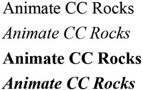
Figure 6-1. It is all about the message
You can take this to the next level and see that not only variants but typeface has an effect on the message. Figure 6-2 shows five examples of the same information presented using different typefaces. You can see how the message changes even more dramatically.
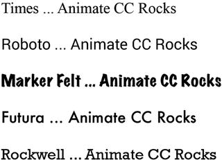
Figure 6-2. It is all about the message and the typeface chosen
When choosing your fonts , you also have to be aware of their impact on readability and legibility. Both are achieved by an acute awareness of the qualities and attributes that make type readable. These attributes include the typeface, the size, the color, and so on.
To illustrate this point, take a look at a small exercise one of the authors uses in his classes. What word is shown in Figure 6-3? Don’t be too hasty to say legibility. What are the sixth, seventh, eighth, and ninth characters? Which letters are the first and second letters? Suddenly things become a bit disorienting.

Figure 6-3. What word is this?
This disorientation is important for you to understand. Our visual clue to legibility and readability, as shown in Figure 6-4, is the flow along the tops of the letters. This is why text that consists of all capital letters is so hard to read.

Figure 6-4. We get our clues to letterforms from the tops of the letters
We include this exercise because there is a huge temptation on the part of people new to Animate CC to prove they’re one of the “cool kids” and use font and color combinations that make otherwise legible text impossible to read. A good example of this is Figure 6-5. The word is set in a medium gray color on a dark gray background. The text is very difficult to read, and yet somehow the “cool kids” think this is some sweet action. Wrong! They just killed all access to the information contained in the text. The next figure, Figure 6-6, goes in the opposite direction. Type is used as a clear communications vehicle for the message.

Figure 6-5. It is all about the message and the font you choose
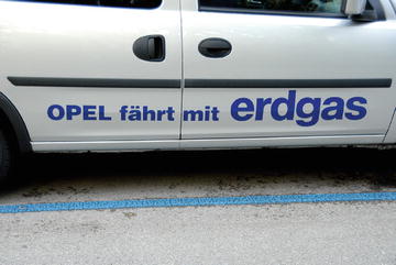
Figure 6-6. The message—“Opel drives on natural gas”—comes through loud and clear
Even though paying attention to design is critical, from a type perspective, font-rendering technology in Flash Player was a huge issue until the introduction of CoolType in Flash Professional CS4.
Adobe CoolType
There is a significant technology under Animate’s hood and we suspect that not a lot of people will pay much attention to it. The technology is CoolType.
Designers are an odd bunch. They can pick out something that doesn’t “look quite right” with what seems to be a cursory glance at the page or the screen. For years, designers have noted that type on screens just didn’t “look right,” and as strange as this may seem, they were correct. This was an odd situation because Adobe has always been in the lead with font technologies, and yet one of its flagship applications seemed to be lagging in this important area. We won’t get into the reasons why—they are complex and tediously technical—but font rendering and management has always been a sore point with designers. CoolType may have just put that one to rest.
To understand how big a deal this is, you have to go back into the gray mists of time to around 1984 and the introduction of the Macintosh. For many of you, 1984 is a murky year in your childhood. For some of us, especially one of the authors, it was the year that graphic layout started its move from art boards, waxers, and X-Acto knives to the computer screen. Two players—Apple and Adobe—made this possible. Apple supplied the computer and the LaserWriter printer, while Adobe supplied PostScript.
To that point, layout on a computer was interesting, but the problem was that stuff called type. A letter would show up on the computer screen, but it would be blocky. There was essentially no way to differentiate a capital letter A using Garamond from its Times counterpart. This was because of the way computers rendered on-screen type. Essentially, the letters were constructed in a grid of pixels that gave them the rather blocky, pixelated look we have come to call the jaggies. PostScript, developed by Adobe, somewhat solved this problem by creating a language—PostScript—that, in very simple terms, “drew” the letter over the pixels and gave designers what they wanted: Garamond As that actually looked like Garamond As on the screen. The fact that they looked even crisper when run through the LaserWriter was also a huge factor in moving the graphics industry to computers.
Still, designers spent a lot of time complaining about on-screen resolution and font crispness. They had a point because, no matter how you cut it on the screen, text had some serious readability issues because pixels were still being lit up to create letters. As the Web took hold and devices took off, designers noticed the fonts they used still didn’t look “quite right” because the text was being displayed on-screen and subject to the lingering problems inherent in on-screen text.
As we have stated, the relatively poor readability of text on-screen compared to its paper counterpart has been a significant sticking point with designers almost from the word “Go.” The source of the problem is low-resolution computer screens. While the resolution of the typical printer is often 600 dots per inch (dpi) or more, the resolution of the average laptop, smartphone, tablet, or desktop screen is significantly lower. This means type that looks crisp and smooth on paper appears coarse and jagged on-screen .
To combat the jaggies, traditional grayscale font anti-aliasing(also called font smoothing) buffs out the corners in text by filling in the edges of bitmapped characters with various shades of gray pixels, which can make text at small point sizes appear blurry. Animate CC’s predecessor, Flash Professional, attempted to address this issue when it introduced a number of anti-aliasing features in 2004. Though a huge improvement, designers were still unhappy because their text still didn’t look “quite right.” They looked at the introduction of CoolType to Acrobat in 2000 and asked, “Uh, what about us?” The thing is, a lot of our work was in color, and adding fuzzy gray pixels around colorful letters wasn’t making life easier for either party.
CoolType to the Rescue
What CoolType does is create clearer, crisper type using a font-rendering technique Adobe calls color anti-aliasing, which works on digital liquid crystal display (LCD) screens such as those in laptops, handheld devices, and flat-panel desktop monitors. Unlike conventional anti-aliasing, which manipulates only whole pixels, CoolType controls the individual red, green, and blue subpixels on a digital LCD screen. The key word here is subpixels. The hundreds of thousands of squares on the screen, which are the pixels, are actually further subdivided into even more squares. These are the subpixels, which are something like quarks in the realm of the formerly indivisible atom.
According to Adobe, by adjusting the intensity of the subpixels independently, the strokes of a character can be aligned on any subpixel boundary, thus achieving sharper, more precise smoothing along the edges of characters. Using this subpixel technique, CoolType can dramatically increase horizontal resolution for improved readability. Again, the keyword in that last sentence is horizontal. We read text across the page, which means the characters are even sharper, which, in turn, makes them even more legible and readable.
What’s the big deal with subpixels? If you have a tablet or smartphone the screen most likely uses a proprietary technology to render subpixels on an LCD screen. The result is the crisp text you are looking at every day.
Typefaces and Fonts
What is a typeface , and what is a font? Technically speaking, a typefaceis an organized collection of glyphs (usually letters, numbers, and punctuation) that shares stylistic consistency. A font is one particular size or variety of a typeface. So, Arial 10 and Arial 12 represent two distinct fonts but belong to the same typeface. The same goes for Arial and Arial Bold or the fonts—Times, Times Italic, Times Bold, Times Bold Italic—used in Figure 6-1: separate fonts that belong to the same font family. In everyday talk, for better or worse, most people simply use the word font for all the of preceding.
Animate CC offers an interesting advantage when it comes to typography: although HTML is capable only of displaying fonts that are installed on the viewer’s computer or available as a web font, Animate CC can display whatever font you like. Want to use some zany dingbat characters or an extravagant cursive font you designed yourself? Have at it. Even input text fields—the sort typed into by the user—can be displayed in whatever font suits your fancy.
Does this sound too good to be true? Well, everything has a price. Fonts can add to a project’s overall file size—the more ornate, the greater the penalty. Take a moment to consider what fonts are, and you’ll see that this makes sense. Most fonts store a mathematical description of the lines and curves that define each glyph. Simple shapes require less description than complex shapes .
Does that sound oddly familiar? It should because most fonts today are drawn in a PostScript drawing application. In fact, Illustrator CC is rapidly becoming the tool of choice among the type design community.
Animate CC supports the following font formats: TrueType, OpenType, PostScript Type 1, bitmap (Macintosh), and device fonts.
Using Adobe Typekit
Choosing a font is a decision driven by personal preference or the requirements of the project where a particular font is used by your client for branding purposes. In many cases, the odds are pretty good that you won’t have the font in your computer and will have to obtain it. This is not as big a deal as it used to be. Back then one would have to purchase the font for a couple hundred dollars and a common complaint was the purchase would only be used once for that particular project. With the introduction of Typekit into the Creative Cloud you now have access to one of the most extensive font libraries out there and, best of all, the cost to download and use any font in the Typekit Library is included in your annual Creative Cloud subscription.
Even better is the fact you can download and install Typekit fonts from within Animate CC. Here’s how:
Open a new HTML5 Canvas document and, when it opens, select the Text tool and click on the stage. A text field will appear and the Properties panel will light up to show you the Text options.
Underneath the Instance name area in the Properties panel is a drop-down offering you two choices: Static Text and Dynamic Text. Think of static text as simply being text that won’t change and dynamic text as being text that will change either through the use of JavaScript or some sort of user interaction such as a touch or click event. Another way of looking at it is Static Text is limited to the fonts installed on your computer and Dynamic Text uses live web fonts. Select Dynamic Text.
Click the Globe button aside the Family property area of the Character section in the Properties panel. You have two choices: Typekit or Google Fonts. Click Typekit and the dialog shown in Figure 6-7 appears. You may need to click through the Typekit intro screen to see this.
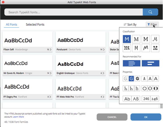
Figure 6-7. The Add Typekit Web Fonts dialog box lets you refine your search through use of the Filter menu
What has happened is you are, thanks to your Creative Cloud subscription, handed what could at first seem to be an overwhelming font selection list. If you are looking for a particular font, you can enter its name in the Search box. You can also cut back on the list by filtering what you are looking for, as shown in Figure 6-7.
Click on the gray area at the bottom of a font and you will see all of the variations and weights that will be included in the download. If you open your Font Family drop-down, the font will be there in the Web fonts area at the top of the Font list.
If you desire to change the type from Dynamic to Static, you will see that Static has now been grayed out. There is a workaround:
Open a web browser, head over to typekit.com and log into Typekit using your Adobe ID. The difference here is the inclusion of an Availability area with a Sync button on the right side of the web page (see Figure 6-8).
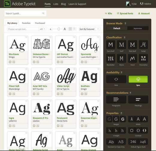
Figure 6-8. Select Sync to download and install a font on your computer
Select Sync and search for the font you need.
Click on the font name. This will open the weights and styles of your selected font . The Web and Sync icons you see beside each style tell you the font can be used as a web font and Sync tells you can be installed on your computer and used as a static text.
Click the green Use Fonts button and you can select the members of the Font family you wish to install, as shown in Figure 6-9.
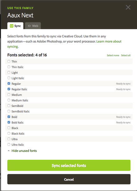
Figure 6-9. Choose the members of the Font Family to be synced with your computer
Click the Sync selected fonts button and, providing you have your Creative Cloud Desktop app running, the font will be downloaded and installed. You will be notified via the desktop app when this process has completed.
Return to Animate CC, select the text box, and choose Static Text. When you open your Family list, your font, as shown in Figure 6-10, will appear.
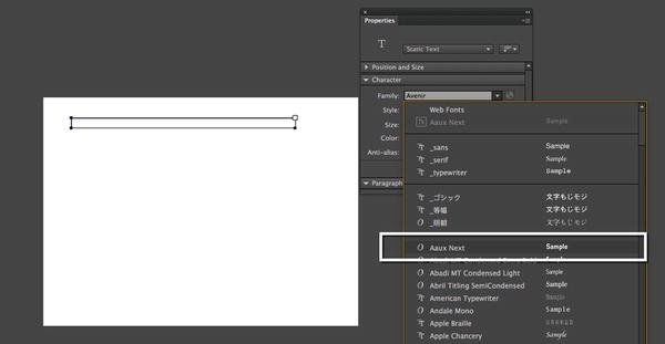
Figure 6-10. The Aaux Next font has been downloaded and installed for use as static text
Using Google Fonts
It should come as no surprise that Google Fonts are available as a Dynamic Text option for HTML5 Canvas documents through Animate CC. Since the introduction of this royalty-free font service in 2010, the collection has grown to over 800 fonts and has become a sort of de facto go-to service when web designers and developers are looking for high-quality fonts for use in the web and app development projects. Follow these steps to add a Google Font:
Open a new HTML5 Canvas document, select the Text tool and be sure to choose Dynamic in the Text Type drop-down. Now draw out a text box.
In the Properties panel, click the Globe icon beside the Family and select Google Fonts from the drop-down. This will open the Google Fonts dialog box shown in Figure 6-11. If you want to refine your search, select a Category in the Category drop-down menu.
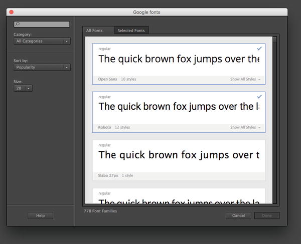
Figure 6-11. The Google Fonts dialog box
Choose the Fonts you want to use and if you want to see the Styles contained in the font click Show All Styles.
To add the font, click the Done button and the fonts will appear in the Web Fonts listing.
Working with Device Fonts
If you want, you certainly can go with fonts that are installed on the user’s machine, just like HTML does. The benefit is that your project’s weight will be completely unaffected by text content. The drawback is that you have to count on your audience having the same font(s) installed as you do (not a good idea) or choose among three very generic font categories: _sans (sans-serif), _serif, and _typewriter (monospace). These are the device fonts, and they are ideal for use on mobile devices.
In the Properties panel , take a look at your font choices in the font drop-down list. The top three, shown in Figure 6-12, are preceded by an underscore. That’s the tip off. If you select one of these fonts, Animate CC will choose on your behalf whatever it thinks is the closest fit on the viewer’s computer. _sans will probably be Arial or Helvetica, _serif will probably be Times New Roman or Times, and _typewriter will probably be Courier New or Courier—but who knows for sure?
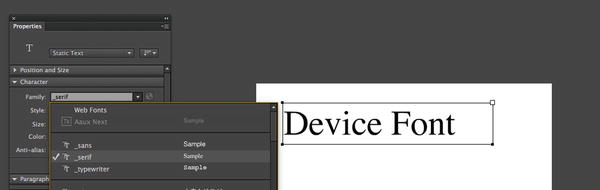
Figure 6-12. The device fonts work everywhere but have limitations
Another place where you can use device fonts is in those situations where you choose a font, such as Helvetica, and you aren’t sure whether the user has the font. As shown in Figure 6-13, you can select Use Device Fonts in the Anti-alias drop-down menu , and the fonts will be substituted at runtime. This option is only available for ActionScript 3.0 documents.
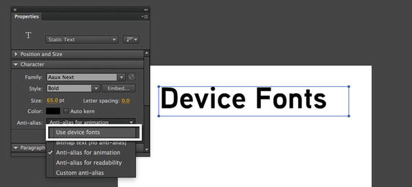
Figure 6-13. Device fonts can be used to override the fonts in the movie at runtime
Currently Animate CC can’t treat device fonts as graphics . Tweening stuff containing a device font is going to be unpredictable.
Also realize the term device font is a “weasel word” for “pick the closest approximation.” This means you lose all control over the spacing and length of the text on the screen at runtime. Depending on the font chosen by the user’s machine, you may wind up having the user view your work through a font that has a bigger x-height than your font. If you need an exact match, device fonts aren’t the way to go.
X-height? What’s that? It is the height of the letter X in the font, and this proportional characteristic can vary widely in different typefaces of the same size. Tall x-heights are two-thirds the height of a capital letter and short when they are one-half the height of a capital letter. Staying with our useless information theme, the trend to the larger x-height in the sans category was sparked by a Swiss typographer, Adrian Frutiger , when he released Univers 55.
Embedding Fonts
We need to deal with this subject before we move on because it is an option when working with an ActionScript 3.0 document.
As you have learned, fonts are PostScript outlines of the letters and glyphs contained in a font. You buy fonts, and as such, it is a copyright violation if you were to hand the user the opportunity to install a font in order to see your amazing work. This is one of the reasons Matthew Carter designed the classic web fonts. They were automatically installed on practically every computer on the planet in order to give designers a bit of typographic variety and to keep them out of court. Apart from the web fonts, device fonts are one solution and embedding is the other.
Matthew Carter may have designed the web fonts—Arial, Verdana, Georgia, and so on—but it was Microsoft that put them into play when they asked Matthew to design them. The fonts were released when Microsoft introduced Internet Explorer 4 in 1997.
How does embedding work? Let’s assume you are creating a rather grunge-looking design for a skateboard company and the design specification calls for the use of a font named Confidential and the Anti-alias option chosen is Readability . You click the Text tool and enter “Ride The Pipe”. Just the letters in those three words will get embedded into the SWF. Duplicates, in this case i, e, and p, will be ignored, which means a smaller SWF. Let’s try it:
Open a new ActionScript 3.0 document and select the Text tool. Click the stage and open the Properties panel .
Choose Dynamic Text from the Text Type drop-down.
Choose a font in the family drop-down. We chose Confidential, but you can use any font in your list. Set the size to 48 points and the color to black (#000000). Make sure the Anti-alias drop-down shows Use Device Fonts .
Click and enter Ride The Pipe, as shown in Figure 6-14.
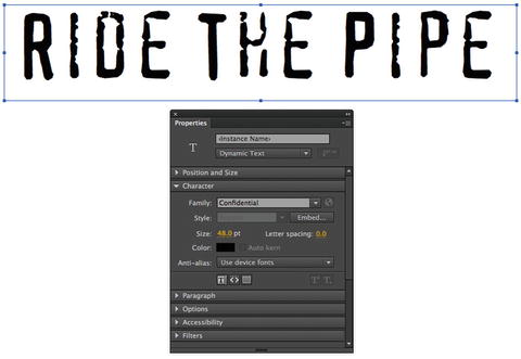
Figure 6-14. We start with a simple line of text that uses a grunge-type font
With the text box selected, choose anti-alias for readability from the Anti-alias drop-down menu . The alert shown in Figure 6-15 will appear. You actually have a couple of choices. Clicking the Not Now button will dismiss the alert, and Animate CC won’t embed anything into the SWF. Click the Embed button, and the characters will be embedded into the SWF once you finish with the Font Embedding dialog box that will open. Click the Embed button .
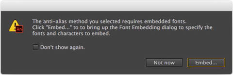
Figure 6-15. You make the decisions regarding embedding
The Font Embedding dialog box that opens, as shown in Figure 6-16, may at first appear to be a bit overwhelming. Let’s go through various bits and pieces of this dialog box.
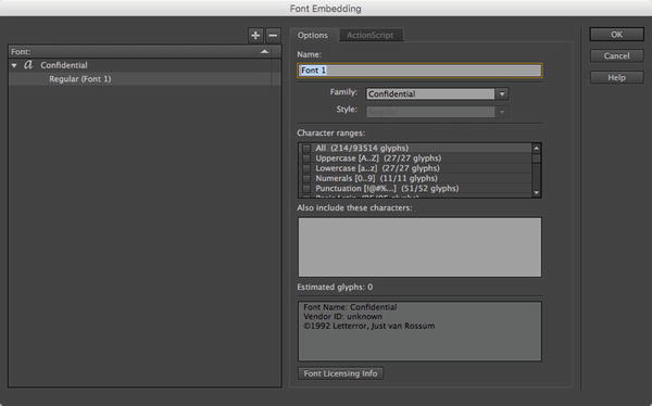
Figure 6-16. The Font Embedding dialog box
On the left side of the dialog box is the name of the font. Click it, and everything on the right side grays out. This is because, as we pointed out earlier, the name of the font is the family name. The fonts in the family or style—Regular (Font 1)—are listed underneath. Select it, and the right side lights up.
The Options area allows you to give the font a name. Do this, and that name will be used in the resulting font symbol in the Library . Your Character range choices allows you to control which glyphs are embedded into the font symbol. The more glyphs added, the larger the SWF. As you make your choices, the number in the Estimated Choices area will change.
Glyph? Each character in the font is called a glyph. In some fronts, the number of characters can range into the hundreds for bitmap, PostScript, and TrueType fonts, whereas OpenType fonts can have several thousand characters. A good example of this concept are these two glyphs: e and é. Notice the accent? The letter with the accent is a variation on the letter e and is a character in the font set.
You can skip the selections and include only selected letters. For example, if you use the contents of the text just entered, you would type ridethp, which, according to the estimated glyphs total , would add only seven characters to the embedded font.
The bottom box gives you information regarding the font. This information is pulled from the font’s metadata. Clicking the Font Licensing Info button will launch the browser, take you to the Adobe site, and open a Font License page. This page gives you a bit of information regarding the end user license agreement (EULA) of the font. This would include whether the font can or cannot be embedded into a SWF. This works really well for Adobe fonts, but some fonts may result in the page telling you, in a nutshell: “We can’t find the font, so you make the licensing call.” Why this legal reminder? It is there to remind you to remain purer than pure when it comes to copyright.
If you click the ActionScript tab , a rather familiar area opens. The Linkage area should tell you that the resulting font symbol can be used by ActionScript.
Click OK to accept the changes and close the Font Embedding dialog box . Open your Library , and you’ll see that a font symbol containing the name (the default is Font 1) has been added to your Library . See Figure 6-17.
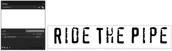
Figure 6-17. A font symbol in the Library tells you a font has been embedded
Your Turn: Working with Text
We covered a lot of “techie” stuff to this point and there is more to come. This would be a good time to take a break and put some of that knowledge to work. In this exercise, you will be formatting text for a screen that will appear on an Android device.
This may strike you as a bit odd but when it comes to mobile—either smartphone or tablet—interactive prototypes have become an integral part of the workflow. These prototypes are used to demonstrate motion and, more often than not, are subjected to rigorous user testing before the project moves into production. Although there is a new class of interactive software—UX prototyping—making an appearance don’t overlook the many advantages and features of Animate CC that make is a great UX/UIU prototyping tool.
Let’s get started:
Open the TextFormat.fla file found in this chapter’s source file folder. When it opens you will see, as shown in Figure 6-18, a typical Android screen. Your job will be to format the headline and the body text.
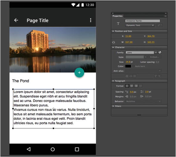
Figure 6-18. We start with an Android screen and unformatted text
Select each of the text boxes on the screen. You will notice, in the Properties panel , that each block uses the _Sans font.
Select the headline and, in the Properties panel, set it to Roboto Medium 20 pt. If you don’t have the Roboto font, you can get it either through Typekit or Google Fonts.
Select the body text and set it to Roboto Regular 14 pt.
Twirl down the Paragraph properties and set the text to Align Left and the Line Spacing to 2 pts. By adding Line Spacing you are adding some “air” to the lines of text. You can think of this as being comparable to leading.
The Material Design specification suggest 16 pixels of space between the edges of the screen and the text. A quick way of accomplishing this is to do a bit of math. The screen is 340 pixels wide. Simply set the width of the text box to 328 pixels. (360- 32 = 328).
To provide even spacing on either side of the text box open the Align panel, select Align to Stage and click the Align Horizontal Center button.
Repeat this with the headline. You have now completed the task, as shown in Figure 6-19.
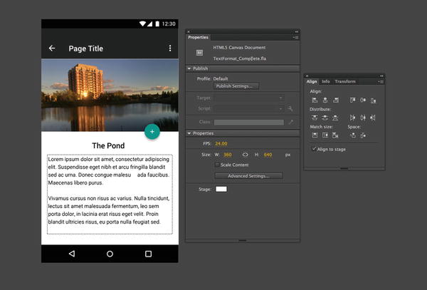
Figure 6-19. The text is formatted and aligned
With the fundamentals out of the way, let’s turn our attention to working with text through code. Our first stop will be something many Flash developers used quite extensively and has somehow disappeared from Animate CC: The Text Layout Framework .
A Word About TLF Text in Animate CC
Back when Animate CC was known as Adobe Flash Professional CS5, a new text engine was introduced that supported typographic features like ligatures, character formatting, text flow, and other nuances that were relatively important for designers who understood the importance of typography. This new text engine was called the Text Layout Framework (TLF) engine and was put to use across projects that required such a deep level of typographic control.
However, when the application was rewritten as Flash Professional CC, this text engine was removed altogether and hasn’t yet made its way back into the program. Considering this engine is only supported in ActionScript-based documents, the authors assume that the only way we would see a feature like this implemented in this era is if Adobe could develop something to work across all document types that support text. This will not likely happen anytime soon.
Dealing with Older Documents Using TLF
You might be wondering what happens when you open an older .fla document that used TLF within Animate CC. If you are a long-time Flash designer, you may even have a good pool of files that employ this text engine. So what happens? The text is automatically converted to make use of the classic text engine—that’s all. So if you want to preserve TLF information within your older files, it’s best to keep a copy of Flash Professional CS6 around!
Interestingly enough, even though TLF is deprecated within Animate CC, if you are using MXML and ActionScript 3.0 via Apache Flex, TLF is still available to implement through Flash Player or AIR. Of course, with no tooling behind it, you’ll need to write all of the TLF instructions using ActionScript 3.0—by hand and in another editor apart for Animate CC. See http://flex.apache.org/ for more details and the latest version of the framework, if you’re interested!
Creating Text with JavaScript
Earlier in this chapter, you learned how to visually create text on the stage with the Animate CC tooling and adjust it if different ways with the Properties panel. Remember when we said that most anything that can tweaked in the Properties panel can also be adjusted and managed through code? You can also create text objects with CreateJS and JavaScript, which is what we’ll have a quick look at now.
We’ll be using the HTML5 Canvas document type for this example.
First, open the file named TextJS.fla from the exercise folder for this chapter.
You will notice that a number of things, as shown in Figure 6-20, have been set up for you here.
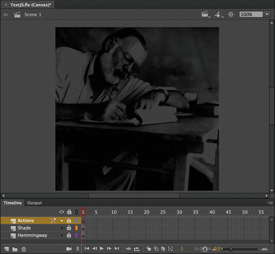
Figure 6-20. The project already has a number of layers and assets present
There are three layers present; the bottom-most layer contains an image of Ernest Hemingway and the layer named Shade simply contains a semi-transparent shape , which helps obscure the layer below it so that the text will be more readable. At the very top of the layer stack is our Actions layer where we will be writing all of our JavaScript.
Select frame 1 of the Actions layer and open the Actions panel.
We will be creating this text object using only JavaScript and adding it to the stage dynamically.
Create the Text object by adding the following line of code to the Script pane of the Actions panel.
var dynamicText = new createjs.Text("", "22px Arial Black", "#B0D575");This creates a new CreateJS Text instance using Arial Black as a typeface at 22px in a light-green tint.
Now we can add some text content to our object using the text property.
dynamicText.text = "Got tight last night on absinthe and did knife tricks.

Great success shooting the knife into the piano. The woodworms are so bad and eat hell out of all furniture that you can always claim the woodworms did it.

 - Ernest Hemingway";
Note that we could have actually included the text content as the first argument within our createjs.Text() initialization, but since we have so much text to include, it is more clear to add it in this way, as a separate property.
Now for the various properties of our Text object. Include the following six lines of code, each of which adjusts an important property of our text instance.
dynamicText.lineWidth = 360;dynamicText.lineHeight = 28;dynamicText.x = 200;dynamicText.y = 30;dynamicText.snapToPixel = true;dynamicText.textAlign = "center";The lineWidth property will determine how wide the Text object is on the stage, while lineHeight specified the leading between lines of text. The next two properties, x and y, do exactly as you would expect—determining the position of the Text object on the stage, relative to its registration point. We then set snapToPixel to true, which is always important when dealing with text to be sure it renders as sharp as possible. The last property, textAlign, we set to string of “center”, which aligns all text within this Text object to the center. We could additionally choose “left” or “right”.
The next thing we will do is add a drop shadow to our text to help it really stand out against the background image. Add the following line of code after the existing properties.
dynamicText.shadow = new createjs.Shadow("#000000", 4, 4, 12);What this does is creates a new Shadow filter with its own specific properties and assigns it to the shadow property of our Text instance. The properties of our shadow, in the order assigned in the constructor function, are as follows; color, offset, offset, and blur amount. You can play with these properties to adjust the Shadow effect to your liking.
Even with all of this code written, if you test the movie now you will not see any text at all. That is because we need to add any visual instance that we create in code to the display list of our project in order for it to appear. Let’s do this now.
Add a final line of text to the Actions panel Script Editor, below everything else we have already written.
this.addChild(dynamicText);We always use the addChild() function to add a display object to the display list. Since we are adding our Text instance directly to the current timeline, we can simply use addChild() on this for it to take effect.
With that last piece of code written, go ahead and perform a test movie command to witness your creation, as shown in Figure 6-21.
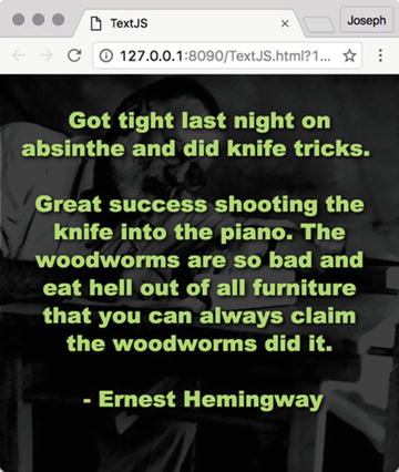
Figure 6-21. The completed HTML5 Canvas project
Ernest Hemingway had a strong affinity for absinthe and had some rather humorous things to say about the mysterious spirit. He isn’t off the hook quite yet—we will be using his quotes as an example in the next exercise as well. It’s an ActionScript version of this same activity!
The full code for this exercise follows:
var dynamicText = new createjs.Text("", "22px Arial Black", "#B0D575");dynamicText.text = "Got tight last night on absinthe and did knife tricks. Great success shooting the knife into the piano. The woodworms are so bad and eat hell out of all furniture that you can always claim the woodworms did it. - Ernest Hemingway";dynamicText.lineWidth = 360;dynamicText.lineHeight = 28;dynamicText.x = 200;dynamicText.y = 30;dynamicText.snapToPixel = true;dynamicText.textAlign = "center";dynamicText.shadow = new createjs.Shadow("#000000", 4, 4, 12);this.addChild(dynamicText);
Creating Text with ActionScript
Okay, so we just saw how to create text with JavaScript, but what if you are working on an ActionScript 3.0 based document? Since we can’t effectively use TLF and likely wouldn’t want to—is there any other way? Well, yes, there is!
As you’ve already seen, TLF has been deprecated by Adobe (even though Apache Flex still makes use of it) and thus is not available in Animate CC. However, that does not mean we cannot employ classic text creation using raw AS3. In fact, for most projects—this is really all you need. As you will see next, while using ActionScript to create text objects in Animate CC is a bit more complicated than performing the same action using CreateJS and JavaScript; it is nowhere near as complex as constructing text using TLF!
First, open the file named TextAS3.fla in the exercise folder for this chapter (Figure 6-22).
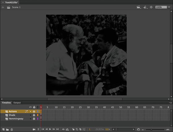
Figure 6-22. This example is nearly identical to the previous one, initially
As we move through this example, do note that the Animate document we are starting with is set up exactly the same as the HTML5 Canvas example; three layers with the bottom-most layer containing an image of Ernest Hemingway and the layer named Shade containing a semi-transparent shape which helps obscure the photo. Finally, above these two contents layers is the Actions layer, within which we will be writing all of our code.
Select frame 1 of the Actions layer and open the Actions panel.
We will be creating a text object using only ActionScript and adding it to the stage dynamically.
Add the following initial lines of code to the Script pane of the Actions panel. These are the import statements we must include for this project.
import flash.text.TextField;import flash.text.TextFormat;import flash.filters.DropShadowFilter;When using various classes in ActionScript, we must import them first for them to be made available to us. Here, we are importing the TextField class, which is our visual text object, the TextFormat class which allows us to control text formatting and visual styles, and finally the DropShadowFilter class, allowing us to create a drop shadow effect for the text .
The next thing to do is to create and configure our TextFormat object. Notice that we do this before even touching the actual TextField class. Add the following two lines after the previous import statements.
var textFormat:TextFormat = new TextFormat("Arial Black", "18", 0xB0D575);textFormat.align = "center";This creates a new TextFormat definition using Arial Black as a typeface at 18px in a light-green tint. The align property is then set to “center”, which aligns all text that this TextFormat object is applied to the center. We could additionally choose “left” or “right”.
We create the TextFormat object first so that is is available to assign onto the TextField instance once we create that in the next step.
Skip a few lines in your code and type in the following to both create a new TextField instance and apply the previously created TextFormat configuration to it.
var dynamicText:TextField = new TextField();dynamicText.defaultTextFormat = textFormat;Now, any text that is assigned to this TextField will be styled through the TextFormat object we created.
Add the following line of code to assign the text content to our TextField using the text property of that instance.
dynamicText.text = "My decision was reached on a consideration of my physical ineptitudes, on the welcome advice of my friends and from the fact that it became increasingly harder as I grew older to enter the ring happily except after drinking three or four absinthes which, while they inflamed my courage, slightly distorted my reflexes.

 - Ernest Hemingway
(on why he quit bullfighting)";
Another brilliant quote from Hemingway!
Now to set the various properties of our TextField to determine things like positioning on the stage , height, width, and so on. Add the following code to the Script Editor.
dynamicText.width = 360;dynamicText.height = 360;dynamicText.x = 200-180;dynamicText.y = 30;dynamicText.wordWrap = true;dynamicText.multiline = true;The properties of width and height determine the size of our TextField. The x and y properties will determine positioning on the stage. You can see here that x is actually calculated based on the width of the stage divided by 2 minus the width of our TextField divided by 2. This could be calculated dynamically, if desired!
The final two properties, wordWrap and multiline, likely do exactly as you would expect. Notice both are set to true. This will enable words to wrap across multiple lines of text since multi-line text is also enabled.
Next, we will apply a nice drop shadow filter to our text so it stands out against the background in a more pronounced way. Add the following line of code.
dynamicText.filters = [new DropShadowFilter(4, 45, 0x000000, 0.8, 12, 12)];The filters property of a TextField accepts an array of filters. Here, we are only concerned with a single DropShadowFilter. We create this filter with the following properties; distance, angle, color, alpha, blurX, and blurY.
As the filter is created, it is assigned to the filters property of our TextField by including it within straight brackets [] – signifying an array.
The only bit of the code left is the instruction assigning our TextField to the display list for rendering. Add in the following line of code to complete this project.
this.addChild(dynamicText);The TextField is now visually assigned to the stage and will appear when we publish or test this movie .
Finally, go ahead and perform a test movie to see the results, as shown in Figure 6-23.
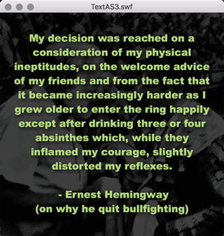
Figure 6-23. The completed HTML5 Canvas project
The full code for this exercise follows:
import flash.text.TextField;import flash.filters.DropShadowFilter;import flash.text.TextFormat;var textFormat:TextFormat = new TextFormat("Arial Black", "18", 0xB0D575);textFormat.align = "center";var dynamicText:TextField = new TextField();dynamicText.defaultTextFormat = textFormat;dynamicText.text = "My decision was reached on a consideration of my physical ineptitudes, on the welcome advice of my friends and from the fact that it became increasingly harder as I grew older to enter the ring happily except after drinking three or four absinthes which, while they inflamed my courage, slightly distorted my reflexes. - Ernest Hemingway (on why he quit bullfighting)";dynamicText.width = 360;dynamicText.height = 360;dynamicText.x = 200-180;dynamicText.y = 30;dynamicText.wordWrap = true;dynamicText.multiline = true;dynamicText.filters = [new DropShadowFilter(4, 45, 0x000000, 0.8, 12, 12)];this.addChild(dynamicText);
Okay, that’s enough picking on poor Mr. Hemingway, although he does present some sound advice here. We’ll find someone else for this final exercise.
Your Turn: Scrollable Text in HTML5 Canvas
The final exercise in this chapter deals with one of the more frequently asked questions regarding text: “How do I scroll a large amount of text?” In fact, there are several ways of approaching this one. We’ll look at the most straightforward—“roll your own”—scroller using JavaScript.
Rolling Your Own Scroller
In this exercise , you are going to wire up a scroller using JavaScript. Just keep in mind that there are several hundred ways of doing this, and the method you are going to use is a very basic example of creating scroll buttons. In this example, you use a simple Button symbol created in Animate CC that can be used to control the scrolling behavior. This button is found in the Library .
In this example in which the whole process is managed by JavaScript, the text moves up or down a short distance with each mouse press. Others may have the text move up or down until the mouse is released. Regardless, the text is scrolling, which is the point of this exercise. Let’s get busy:
Open the ScrollableJS.fla file in this chapter’s exercise folder and examine the different layers, shown in Figure 6-24, in the timeline. Note the various assets on the stage and within the project library.
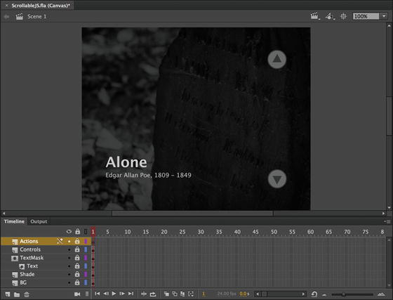
Figure 6-24. Scrollable poem project starter
Let’s look at how things have been organized. Everything is basically already set up in terms of the layer structure and various text blocks, symbol instances, and so on. We only need to add some code to wire it all together.
Starting at the bottom of the layer stack, we have an image—a photograph taken by one of the authors some years ago—along with a Shade layer that obscures it. This is very similar to what we have seen in the preceding exercises.
The next two layers are a mask layer called TextMask, with a Text layer nested within it. The Text layer contains a MovieClip symbol with an instance name of scrolling_text, which holds a basic text field containing the poem “Alone” by Edgar Allen Poe. This is all obscured by the mask layer so that we can only see a portion of the text on-screen at any time.
Above this layer is our Controls layer, containing two instances of the ScrollControl Button symbol, which can be found within the project library. One is given the instance name of up_btn and the other is called down_btn. These are the buttons a user will be able to click to scroll the text one way or the other.
Finally, at the top of our layer stack, we have our Actions layer, which will contain all of the JavaScript code for this project. Let’s move ahead and wire it all together!
Select frame 1 of the Actions layer and open the Actions panel.
We will be adding a bit of JavaScript to allow scrolling of the present text content through user interaction.
Add the following code to the script pane to provide interactivity to the up_btn Button symbol instance.
this.up_btn.addEventListener("click", function(){exportRoot.scrolling_text.y += 27;});This bit of code adds an event listener to our up_btn Button instance, which responds to a click event from the user. When this event is detected, the scrolling_text MovieClip symbol instance has its y position adjusted by 27 pixels—scrolling it behind the mask.
Now, we can add the code to provide interactivity to the down_btn Button symbol instance right after the previous JavaScript.
this.down_btn.addEventListener("click", function(){exportRoot.scrolling_text.y -= 27;});In this block of code, we are basically doing the same thing as in the previous block , except that we are binding our event listener to the down_btn Button instance and scrolling the scrolling_text MovieClip symbol instance in the opposite direction.
Go ahead and test the movie. You should be able to click on each of these Button instances, shown in Figure 6-25, to scroll the text up and down.
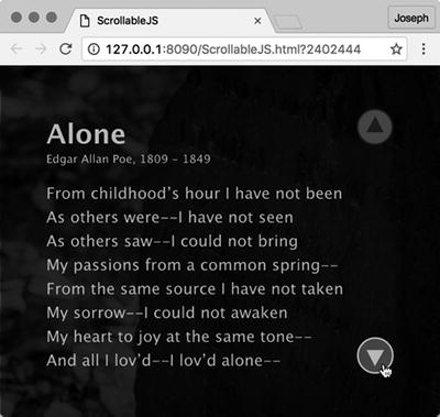
Figure 6-25. The completed scrollable poem project
Here is all the JavaScript you need for this project:
this.up_btn.addEventListener("click", function(){exportRoot.scrolling_text.y += 27;});this.down_btn.addEventListener("click", function(){exportRoot.scrolling_text.y -= 27;});
Scrolling Text Using ActionScript
Okay, but what if you’re working in ActionScript and want to scroll your text on that platform? Not a problem—the same thing you saw previously can be done in ActionScript document types using the following code. Go ahead and open the ScrollableAS3.fla file and have a look!
import flash.events.MouseEvent;up_btn.addEventListener(MouseEvent.CLICK, scrollUp);function scrollUp(e:MouseEvent){scrolling_text.y += 27;};down_btn.addEventListener(MouseEvent.CLICK, scrollDown);function scrollDown(e:MouseEvent):void {scrolling_text.y -= 27;};
You only need to use the exact same layer structure and assets from the HTML5 Canvas version of the project and change the code from JavaScript to the ActionScript code provided previously. When you perform a test movie, the result, shown in Figure 6-26, is nearly identical.
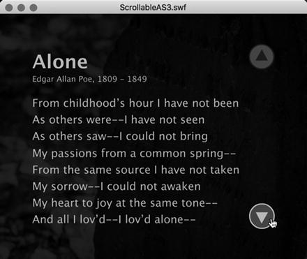
Figure 6-26. The completed scrollable poem project using ActionScript
The main differences in the ActionScript version are that we must import our MouseEvent class in order to add our event listeners to each button instance, that we create specific functions to handle each of the click actions (although we could have handled it this way in JavaScript as well), we have no need to use a scope proxy such as exportRoot, and we can strictly type all of our functions and objects. Conceptually, all functionality is exactly the same.
See? Very similar!
What You Have learned
In this chapter, you learned the following:
How to add text to an Animate CC document
The various text-formatting features available to you in Animate CC
The code necessary to create, format, and provide interactivity through the use of text
When to embed font outlines into a project and how to accomplish that task
How to create scrolling text in a project
We suspect you are more than a little confounded at the possibilities open to you when it comes to using text in Animate CC. If you are one of those who saw text as the gray stuff hovering around your animations, we hope you have seen the error of your ways. And, if you are one of those who want to get going and turn out really cool motion graphics pieces, we hope you paid close attention to what Bringhurst was saying in the quote that opened this chapter. Regardless of which camp you fall into, we know that you are now aware that adding text to an Animate CC animation doesn’t stop with a click of the Text tool and the tapping of a few keys on the keyboard.
Now that you know how to work with text and put it in motion, the time has arrived to put objects in motion. Animation is covered in the next two chapters, and to find out more, turn the page.