
In the previous chapter, we introduced you to the world of object-oriented user interface development, and in particular the core GWT constructs for creating rich web applications. In this chapter, we'll continue to explore the GWT API and delve further into the OO nature of GWT applications. We'll introduce some more advanced widgets such as tables, trees, and dialog boxes. We'll show you how to modularize the application code base and create your own generic GWT components as well. What's more, we'll make good use of all these ideas by applying them to our GWTasks sample application. By the end of this chapter, we'll have a full-blown, well-modularized application with built-in infrastructure for data management.
This chapter is quite long and involves a lot of coding on your part. We strongly recommend you work your way through this chapter using the code that accompanies this book as a reference to all the following discussions.
So without further ado, let's start by checking out some of the more advanced widgets in GWT.
Tables have always played a dual role in web application design. On one hand, they served as a mechanism to present information to the user in a tabular form (that is, column-based lists). On the other hand, although this wasn't their original purpose, they also served as a mechanism for laying out different elements on a web page. While the first role is widely accepted, there's some dispute about the second role as layout components. We won't go into this discussion, but just say that with GWT, you can use tables for both purposes as you wish.
GWT comes with two table implementations: Grid and FlexTable. Both inherit from the same HTMLTable base class.
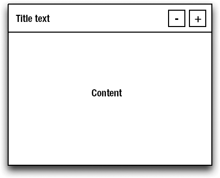
A Grid represents a fixed table. By fixed, we mean that before you create a new Grid, you have to know up front how many rows and columns the table should have. You can, however, change its size after creation by adding rows and/or columns explicitly. This fixed nature of Grid makes it appropriate for static layout. Let's take a look at how you can implement a login form using a Grid. For this example, you can assume the existence of a LoginForm, which is essentially a panel that shows a simple login form. Figure 5-1 shows how this panel should look and how its layout can be achieved using a grid.
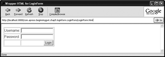
As you can see, each cell in the grid contains various UI elements. The first row holds the username label and input field in two separate cells. The second row holds the password label and field. The third row contains the Login button. Listing 5-1 shows how you can implement this interface using the Grid widget. As the intent here is to learn about Grid, we dropped all logic related to this screen (we assume that by now you can figure out how to add it yourself).
Example 5-1. LoginForm Using a Grid
public class LoginForm implements EntryPoint {
   public void onModuleLoad() {
       Grid grid = new Grid(3, 2);
       grid.setBorderWidth(1);
       grid.setWidget(0, 0, new Label("Username:"));
       grid.setWidget(0, 1, new TextBox());
       grid.setWidget(1, 0, new Label("Password:"));
       grid.setWidget(1, 1, new TextBox());
       grid.setWidget(2, 1, createSubmitButton());
       grid.getCellFormatter()
           .setHorizontalAlignment(2, 1, HasHorizontalAlignment.ALIGN_RIGHT);
       RootPanel.get().add(grid);
    }
    ...

}
Note
For illustration purposes, we set the border width of the Grid to 1. Normally, when using a grid as a layout mechanism, you want to keep the default, which is set to zero.
As can be seen in the listing, you first create a grid with three rows and two columns. Then you set the widget in each cell of the grid using the setWidget method (try comparing these method calls with Figure 5-1). Also note that the grid enables you to customize each cell using the CellFormatter object. You can retrieve a cell formatter for every cell in the grid and use it to set the cell's style name, size, and alignment properties. In this example, you make sure that the login button is aligned to the right as needed.
If the Grid is considered to be a static table, the FlexTable (as its name suggests) is a more flexible implementation of the HTMLTable. This table is meant to be used whenever the size isn't known in advance and is open for dynamic changes. For example, if you need to display a dynamic list of items in tabular form and items can be added or removed at any time, the FlexTable is a good candidate. The tasks list in our sample GWTasks application fits this requirement exactly, which makes it an ideal use case to show how the FlexTable works.
If you recall from the previous chapter, you initially implemented the tasks list view using a VerticalPanel. When you needed to add a new task to the list, you created a proprietary widget (a HorizontalPanel) for it and added it to the vertical panel. You're now going to change this implementation and use FlexTable instead. The change is actually so easy to apply that it's a great opportunity to further enhance this list by showing the priority of each task next to its title.
The basic idea here is simple—the tasks list itself will be a FlexTable, and for each new task, we'll dynamically create a new row for it in the table. The table will have three columns: a check box column, a priority column, and a title column. Listing 5-2 shows the changes you need to apply to the existing code.
Example 5-2. Implemeting GWTasks Task Lists Using a FlexTable
public class GWTasks implements EntryPoint {
    private FlexTable tasksWidget;
    ...
    public Widget createTasksWidget() {
        tasksWidget = new FlexTable(); //CHANGED
        tasksWidget.getColumnFormatter().setWidth(0, "20px");
        tasksWidget.getColumnFormatter().setWidth(1, "20px");
        tasksWidget.getColumnFormatter().setWidth(2, "100%");
        return tasksWidget;
    }
    ...
    public void updateTasksList() {
        List<Task> tasks = getTasksForSelectedCategory();
        // removing all rows
        while (tasksWidget.getRowCount() > 0) {
            tasksWidget.removeRow(tasksWidget.getRowCount()-1);
        }
        // adding a row per task (row indices are zero-based)
        for (Task task : tasks) {
            int row = tasksWidget.getRowCount();
            tasksWidget.setWidget(row, 0, new CheckBox());
            String priorityName = task.getPriority().name();
            Label priorityLabel = new Label(priorityName.substring(0, 1));
            String priorityStyle = "PriorityLabel-" + priorityName.toLowerCase();
priorityLabel.setStyleName(priorityStyle);
tasksWidget.setWidget(row, 1, priorityLabel);
tasksWidget.setWidget(row, 2, new Label(task.getTitle()));
}
}
}As can be seen in Listing 5-2, you only need to change the tasksWidget field type to FlexTable and reimplement two methods. The createTasksWidget method creates and initializes the FlexTable. Using the appropriate ColumnFormatter, you define the width of the expected columns. The first two columns are fixed in size, as they contain the check box and the priority first letter (L for LOW, N for NORMAL, and H for HIGH). The last column is given a width of 100%, by which you tell it to expand as much as it can. The other method you change is the updateTasksList method. It first removes all the rows from the table and then adds a row for each task. Also note that you need to customize the style of the priority label based on the priority it represents. This enables you to display the different priority letters in different colors by just adding the code shown in Listing 5-3 to the style section in the GWTasks.html file.
Example 5-3. Styling the Priority Letters
.PriorityLabel-normal { color: blue; }
.PriorityLabel-high { color: red; }
.PriorityLabel-low { color: orange; }
Now that you have the FlexTable displaying all the tasks, you can also enhance it with a nice table header. Strangely enough, none of the tables provided by GWT support customizing the headers directly via their API. That said, it's quite easy to work around this limitation by treating the first row of the table as the header row. Listing 5-4 shows the modified code (highlighted in bold).
Example 5-4. Adding a Header to the FlexTable
public Widget createTasksWidget() {
    tasksWidget = new FlexTable();
    tasksWidget.getColumnFormatter().setWidth(0, "20px");
    tasksWidget.getColumnFormatter().setWidth(1, "20px");
    tasksWidget.getColumnFormatter().setWidth(2, "100%");
    Label checkHeaderLabel = new Label();
    checkHeaderLabel.setWidth("20px");
    checkHeaderLabel.setHorizontalAlignment(Label.ALIGN_CENTER);
    tasksWidget.setWidget(0, 0, checkHeaderLabel);
    Label priorityHeaderLabel = new Label("!");
    priorityHeaderLabel.setWidth("20px");
    priorityHeaderLabel.setHorizontalAlignment(Label.ALIGN_CENTER);
    tasksWidget.setWidget(0, 1, priorityHeaderLabel);
    Label titleHeaderLabel = new Label("Title");
    titleHeaderLabel.setWidth("100%");
    tasksWidget.setWidget(0, 2, titleHeaderLabel);
tasksWidget.getRowFormatter().setStyleName(0, "TableHeader");return tasksWidget; } public void updateTasksList() { List<Task> tasks = getTasksForSelectedCategory();while (tasksWidget.getRowCount() > 1) {tasksWidget.removeRow(tasksWidget.getRowCount()-1); } ... }
One feature that neither the Grid nor the FlexTable provides out of the box is selection support. In our example, this is quite important, as we want the user to be able to select tasks from the list.
To add row selection to the task list, you need to add two extra class fields to store the currently selected row and task. You then register a ClickListener with the title label of the task that will update these fields when called. Listing 5-5 shows the required changes in the code to accomplish this.
Example 5-5. Adding Row Selection to the taskTable
public class GWTasks implements EntryPoint {
    private FlexTable tasksWidget;
    private Task selectedTask;
    private int selectedTaskRow = −1;
    ...
    public void updateTasksList() {
        List<Task> tasks = getTasksForSelectedCategory();
        while (tasksWidget.getRowCount() > 1) {
            tasksWidget.removeRow(tasksWidget.getRowCount()-1);
        }
        for (Task task : tasks) {
            addTask(task);
        }
    }
    public void addTask(final Task task) {
        int row = tasksWidget.getRowCount();
        tasksWidget.setWidget(row, 0, new CheckBox());
        String priorityName = task.getPriority().name();
        Label priorityLabel = new Label(priorityName.substring(0, 1));
        Label titleLabel = new Label(task.getTitle());
        titleLabel.addClickListener(new ClickListener() {
            public void onClick(Widget sender) {
                handleTaskRowClicked(row, task);
            }
        });
        priorityLabel.setStyleName("PriorityLabel-" + priorityName.toLowerCase());
        tasksWidget.setWidget(row, 1, priorityLabel);
        tasksWidget.setWidget(row, 2, titleLabel);
}
public void handleTaskRowClicked(int row, Task task) {
if (selectedTaskRow == row) {
selectedTaskRow = −1;
selectedTask = null;
tasksWidget.getRowFormatter().removeStyleName(row, "TaskRow-selected");
} else {
if (selectedTaskRow != −1) {
tasksWidget.getRowFormatter()
.removeStyleName(selectedTaskRow, "TaskRow-selected");
}
selectedTaskRow = row;
selectedTask = task;
tasksWidget.getRowFormatter().addStyleName(row, "TaskRow-selected");
}
}
...
}For convenience, the code that adds a task to the table is extracted to a separate addTask method. Then, when creating the task, you register the appropriate ClickListener on the titleLabel, which delegates the call to the handleTaskRowClicked method. In this method, you first check whether the clicked row is already selected, in which case you unselect it. Otherwise, you mark it as selected and store it in the dedicated fields. In order to make the selection visible, the style of the selected row should be updated. A simple style configuration will just update the background color of the selected row, as shown in Listing 5-6.
Well... not really climbing them, but when developing any kind of application, you often need to deal with hierarchical data structures, and in most cases you probably want to display these structures in some sort of a tree. GWT comes with a Tree widget that enables you to do exactly that. It exposes a simple API that's based on TreeItem to represent the tree nodes. Let's see how you can use this widget to enhance the categorization mechanism in our sample application.
The first thing you'll do is change the Category class so it also holds child categories. Listing 5-7 shows the required changes.
Example 5-7. The New Hierarchical Category Class
public class Category {
    private Long id;
    private String name;
private String description;
private List<Category> children;
public Category() {
this(null, null, null);
}
public Category(Long id, String name, String description) {
this.id = id;
this.name = name;
this.description = description;
children = new ArrayList<Category>();
}
public List<Category> getChildren() {
return children;
}
public void addChildCategory(Category category) {
children.add(category);
}
// other gettters and setters
...
}Now that the Category class is ready, let's apply the necessary changes to the GWTasks class (see Listing 5-8).
Example 5-8. Using a Category Tree in GWTasks
public class GWTasks implements EntryPoint {
    ...
    protected Widget createCategoriesWidget() {
        Tree categoryTree = new Tree();
        categoryTree.addTreeListener(new TreeListener() {
            public void onTreeItemSelected(TreeItem item) {
                selectedCategory = ((CategoryTreeItem)item).getCategory();
                updateTasksList();
            }
            public void onTreeItemStateChanged(TreeItem item) {
            }
        });
        List<Category> categories = getAllCategories();
        for (final Category category : categories) {
            CategoryTreeItem item = createTreeItem(category);
            categoryTree.addItem(item);
        }
        return categoryTree;
    }
    protected CategoryTreeItem createTreeItem(Category category) {
        CategoryTreeItem item = new CategoryTreeItem(category);
for (Category child : category.getChildren()) {
item.addItem(createTreeItem(child));
}
return item;
}
protected List<Category> getAllCategories() {
List<Category> categories = new ArrayList<Category>();
Category work = new Category(1L, "Work", "Things at work");
work.addChildCategory(new Category(2L, "Calls", "Make phone calls"));
work.addChildCategory(new Category(3L, "Meetings", "Meetings to attend"));
categories.add(work);
Category home = new Category(4L, "Home", "Things at home");
home.addChildCategory(new Category(5L, "Shoppings", "Things I need to buy"));
home.addChildCategory(new Category(6L, "Bills", "Bills I need to sort"));
categories.add(home);
categories.add(new Category(3L, "Others", "Other things I need to do"));
return categories;
}
protected class CategoryTreeItem extends TreeItem {
public CategoryTreeItem(Category category) {
super(category.getName());
setTitle(category.getDescription());
setUserObject(category);
}
public Category getCategory() {
return (Category) getUserObject();
}
}
}Note
For cleanup purposes, the createCategoryRow and markSelected methods can now be safely removed, as the category rows were replaced by the tree items and the selection of these items is handled by the tree widget itself.
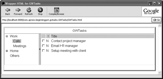
As Listing 5-8 shows, what used to be a VerticalPanel is now a Tree. The createCategoriesWidget method first creates a Tree and registers a TreeListener on it to pick up the selection events. This enables you to change the displayed tasks whenever a new TreeItem is selected. You then iterate over all categories, and for each one, build the appropriate TreeItem by calling the createTreeItem method. This recursive method builds a TreeItem hierarchy that reflects the given Category hierarchy. Note the use of the CategoryTreeItem. This is an extended TreeItem class that associates categories with their representing tree nodes. You also had to change the getAllCategories method, which now generates a hierarchy of categories (instead of the flat category list it used to generate). Figure 5-2 shows the new category tree in action.
Tip
By default, the tree doesn't have any UI indication of the currently selected node. You can fix that either by using one of GWT's predefined themes or by explicitly setting the background-color property in the .gwt-Tree .getTreeItem-selected CSS class.
Pop-up panels have always played a major role in GUI applications. The simple context menu that appears on the screen when you right-click is one kind of pop-up, and the one that you're probably most familiar with. For many years, although technically possible, this basic UI feature was overlooked in standard web-based applications. But it seems to be making a comeback as part of the Web 2.0 trend. Recognizing this, GWT supports pop-up panels out of the box via the PopupPanel widget.
A PopupPanel is a panel that's normally hidden and can pop up on the screen when triggered by an event (usually triggered by user action). There are many use cases for such functionality, ranging from customized tool tips to dedicated dialog boxes. To illustrate how a pop-up can be used, we'll create a simple progress indicator.
So what exactly is a progress indicator? It's often the case that a certain action triggered by the user takes some time to complete. Without any indication of this process, the user might be left puzzled as the application has stopped responding. This is where progress indicators enter the picture. In desktop applications, they usually take the form of a progress bar that's displayed as a pop-up. In RIAs, they can have many shapes and forms, and are mostly used to indicate communication with the server. In fact, the asynchronous nature of Ajax requires such an indication, as almost every action taken in the application requires communicating with the server and waiting for its response.
For our example, we'll create a simple progress indicator, named MessageProgressIndicator, which will be part of a new sample application named PopupSample. It's inspired by the indicators used in most of Google's online applications, and works by showing a small message at the top of the screen. Listing 5-9 shows the implementation of this class.
Example 5-9. The MessageProgressIndicator Class
public class MessageProgressIndicator extends PopupPanel {
    private Label messageLabel;
    public MessageProgressIndicator() {
        this("Loading...");
    }
    public MessageProgressIndicator(String message) {
        super(false, true);
        messageLabel = new Label(message);
        messageLabel.setStyleName("Label");
        setWidget(messageLabel);
        setPopupPositionAndShow(new PositionCallback() {
            public void setPosition(int offsetWidth, int offsetHeight) {
                int x = Window.getClientWidth()/2 - offsetWidth/2;
                setPopupPosition(x, 0);
            }
        });
        setStyleName("MessageProgressIndicator");
    }
    public void setMessage(String message) {
        messageLabel.setText(message);
    }
 }
The MessageProgressIndicator extends PopupPanel. The constructor accepts a message that this indicator should display. It then calls the superconstructor of the PopupPanel with parameters indicating that this pop-up should be modal and shouldn't automatically hide when the user clicks outside its boundaries (which is a typical use case for a context menu). Next, a label is initialized and set as the main wrapped widget of this pop-up. This label will display the message when the pop-up is shown. The setPopupPositionAndShow method is used to register a callback with the PopupPanel that will be called just before it's shown. Using this callback, it's possible to adjust the position of the pop-up based on its size (here we position it at the center top of the screen). Notice that the style names are also set on both the label and the pop-up panel. This will enable you to customize its look on the screen just by adding the following styles in PopupSample.html (see Listing 5-10). Listing 5-11 shows the PopupSample that demonstrates how our indicator works.
Example 5-10. The MessageProgressIndicator Styles
.MessageProgressIndicator .Label {
    padding-left: 5px;
    padding-right: 5px;
padding-top: 2px;
padding-bottom: 2px;
background-color: #ffffcc;
font-size: 14px;
color: black;
}Example 5-11. The PopupSample Entry Point Class
public class PopupSample implements EntryPoint {
    public void onModuleLoad() {
        Button button = new Button("Show Indicator", new ClickListener() {
            public void onClick(Widget sender) {
                final MessageProgressIndicator indicator =
                        new MessageProgressIndicator();
                indicator.show();
                Timer timer = new Timer() {
                    public void run() {
                        indicator.hide();
                    }
                };
                timer.schedule(3000);
            }
        });
        RootPanel.get().add(button);
     }

   }
Listing 5-11 adds a button to the screen that, when clicked, creates and shows our indicator. The Timer is a special class provided by GWT that enables you to schedule future events. In our case, we use it to automatically hide the indicator after three seconds (3000 milliseconds).
The progress indicator we've just developed, although quite useful, is a somewhat passive pop-up. Sometimes, you may wish to show more interactive pop-ups through which the user can provide input to the application. This will mostly be the case where the input from the user doesn't fit anywhere else in the application UI design. When such a requirement is encountered, DialogBox should be considered as a good starting point.
A DialogBox is basically a PopupPanel with a title bar, which is usually used to describe its content and also enables the user to drag it on the screen. Apart from that, there's not much difference between DialogBox and PopupPanel. To learn how it can be used, we'll create a dialog box that shows a form to the user where he can create or edit categories. We'll implement a class named CategoryFormDialogBox that extends DialogBox and add all the required form widgets to it as the content. Listing 5-12 shows a snippet of this class. In the interests of brevity, we left out all details related to the actual construction of the form. We encourage you, though, to look at the full version of this dialog, which can be found in the code accompanying this book.
Example 5-12. The CategoryFormDialogBox Class
public class CategoryFormDialogBox extends DialogBox {
    ...
    private final Category category;
    private CategoryFormDialogBox(Category category, boolean editMode) {
        super(false, true);
        setText("Category Form");
        this.category = category;
        VerticalPanel main = new VerticalPanel();
        ... // here adding all form elements
        main.setStyleName("DialogContent");
        setWidget(main);
    }
    // called when the submitButton is clicked
    protected void handleSubmit() {
        if (validate()) {
            category.setName(nameField.getText().trim());
            category.setDescription(descriptionField.getText().trim());
            Window.alert("Category: " + category);
            hide();
        }
    }
    // called when the cancelButton is clicked
    protected void handleCancel() {
        hide();
    }
    ...
}
The main thing to note about the code in Listing 5-12 is that this custom dialog box is initialized in much the same way as the MessageProgressIndicator pop-up, meaning we call the superconstructor indicating that this dialog should be modal and not hide automatically. The only difference is that we also set the Category Form text to be displayed as the title of this dialog. Also note that we set a style name on its main content widget, which enables us to apply padding around it (for aesthetic reasons). After the form is submitted successfully or canceled, we call the hide method to close the dialog.
To see this dialog in action, you can create a simple sample application like the one shown in Listing 5-13.
Example 5-13. The DialogBoxSample Application
public class DialogBoxSample implements EntryPoint {
    public void onModuleLoad() {
        Button button = new Button("Show Form", new ClickListener() {
            public void onClick(Widget sender) {
                CategoryFormDialogBox dialog = new CategoryFormDialogBox();
dialog.center();
dialog.show();
}
});
RootPanel.get().add(button);
}
}Later on, we'll see how the CategoryFormDialogBox can be incorporated into our GWTasks sample application. In fact, in the final version of this application, all forms (except the login form) will be embedded in dialog boxes. We'll also try to use the MessageProgressIndicator, but these ideas are all for later on, as we still have a lot of ground to cover before we get there.
When we introduced the basic GWT components and panels in the previous chapter, we took the approach of creating a new GWT application for every new component you learned. The main reason for doing that was to keep the code as clean as possible for you to learn from, while still being able to run it and see the appropriate visual results. We finally ended up with multiple applications, where each is responsible for some part of the overall functionality in the GWTasks application.
Naturally, when creating the real application, all this functionality needs to be incorporated within it. In our example, this means that the task form, category form, user registration form, and the main page where the categories and tasks are shown all need to be part of one GWT application. Furthermore, all these distinct parts need to fit into the natural usage flow of the application. For example, when the user enters the application for the first time, she should either log in using her known credentials or alternatively have the option of registering herself. This obviously means that the login screen needs to be in some way associated with the user registration form. The same idea applies to the main categories and tasks views, where the logged-in user should be able to view all her tasks and be able to add new tasks and/or categories using the appropriate forms.
Incorporating all this in one application can be done in many ways. In fact, if we'd really wanted to torture you, we could just have created an application based on one entry point class that would have incorporated all the logic, widgets, and panels of the application. Obviously, a better approach would be to leverage Java as an object-oriented language and split these different pieces of code into the appropriate self-contained components. If GWT provides a set of well-defined components, there's no reason why you wouldn't be able to create a few of your own.
Indeed, there are several ways of writing your own components, two of which we'll cover in the following sections. The first is by directly extending GWT panels, and the second by creating composites (don't worry if you don't understand this term; by the end of this chapter you will).
Extending a GWT panel is as easy as extending any other class in Java. To show how it's done, we'll use the TaskForm example application from the previous chapter. If you recall, in the current version of this application, all form elements are directly bound to their appropriate positions in the hosting HTML file using the RootPanel. In the new version, we want to encapsulate all these elements within one panel, namely the TaskFormPanel. Once we achieve that, we'll only need to bind this panel to the host HTML in the proper position. But before we can go ahead and apply changes in the code, we still need to figure out which panel to extend.
As you know by now, GWT comes with many existing panels, each with a different purpose and layout mechanism. In the original application, we applied the layout within the hosting HTML file, and now we need to translate this layout to GWT code using the appropriate panels. As it turns out so often in programming, there are many ways of achieving the same layout—in this case, by using a different set of panels. For our example, we'll keep it simple and use the HorizontalPanel and VerticalPanel, which you're already familiar with. Figure 5-3 shows a hybrid of a wireframe and a screenshot that describes how this can be done.
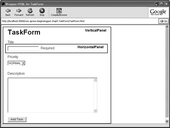
As you can see in Figure 5-3, the top-level panel is a VerticalPanel, which is a good candidate to be the extended panel. To apply the changes to the code, we have to take the following five steps:
Create a new
TaskFormPanelclass that extendsVerticalPanel.Move all the code from the original
TaskFormclass to theTaskFormPanelclass.Remove all the
RootPanelbindings and instead add the elements to the containing panel.Change the host HTML to only contain a placeholder for the
TaskFormPanel.Change the
TaskFormclass to create a newTaskFormPaneland bind it to the appropriateRootPanel.
First let's look at the TaskFormPanel code (shown in Listing 5-14).
Example 5-14. The New TaskFormPanel
public class TaskFormPanel extends VerticalPanel {
    private ListBox priorityField;
    private TextBox titleField;
    private Label titleErrorLabel;
    private TextArea descriptionField;
    private Button submitButton;
    public TaskFormPanel() {
        add(new Label("Title"));
        HorizontalPanel titleRow = new HorizontalPanel();
        titleRow.add(titleField = new TextBox());
        titleRow.add(titleErrorLabel = createErrorLabel());
        add(titleRow);
        add(createVGap("10px"));
        add(new Label("Priority"));
        add(priorityField = new ListBox(false));
        priorityField.setVisibleItemCount(1);
        priorityField.addItem("LOW");
        priorityField.addItem("NORMAL");
        priorityField.addItem("HIGH");
        priorityField.setItemSelected(1, true);
        add(createVGap("10px"));
        add(new Label("Description"));
        add(descriptionField = new TextArea());
        descriptionField.setVisibleLines(10);
        descriptionField.setCharacterWidth(50);
        add(createVGap("10px"));
        add(submitButton = new Button("Add Task"));
        submitButton.addClickListener(new ClickListener() {
            public void onClick(Widget widget) {
                if (validateForm()) {
                    TaskInfo task = new TaskInfo();
                    task.setTitle(titleField.getText());
                    task.setDescription(descriptionField.getText());
                    TaskInfo.Priority priority = resolvePriority();
                    task.setPriority(priority);
                    addTask(task);
                }
             }
         });
      }
// creates a "hollow" widget with a fixed height
protected Widget createVGap(String height) {
Label row = new Label();
row.setHeight(height);
return row;
}
...
}As you can see, all fields and most methods were copied unchanged from the original TaskForm class. The main change consists of altering and removing the code from the onModuleLoad method and putting it into the constructor of our new panel. Note, as mentioned previously, that the RootPanel binding was removed and instead the widgets are added as children of the new panel. We recommend that you compare this implementation with Figure 5-1 and see the one-to-one mapping between the two. We even use an empty widget to simulate the appropriate vertical gap between the widgets.
Now that we have our TaskFormPanel ready, the only thing we still need to do is to create it and bind it to the base HTML. This can all be done within the onModuleLoad method of the TaskForm class (see Listing 5-15).
Example 5-15. The Narrowed-down TaskForm Class
public class TaskForm implements EntryPoint {
    private TaskFormPanel taskFormPanel;
    public void onModuleLoad() {
        taskFormPanel = new TaskFormPanel();
        RootPanel.get("formPanel").add(taskFormPanel);
    }
}
Here we can see that the TaskFormPanel is created and bound to the host HTML under the formPanel element (see Listing 5-16).
Example 5-16. The Narrowed-down TaskForm.html
<html>
    ...
    <body>
        <h1>TaskForm</h1>
        <div id="formPanel"/>
    </body>
</html>
That's it! When running this application, you'll get the same result as you got with the previous version. You've successfully created your first GWT component.
Although it works well, this approach of extending panels has a slight "smell"[3] in terms of API design. We now have a separate component for the task form panel, but unfortunately it's not self-contained. What does being "self-contained" mean and why is it important? Being self-contained basically means that the component has full control of its internal state, and this can only be achieved by having full control over the API it exposes. It can still be open for extensions, but it should always be aware of these extensions.
Looking at our current implementation of the TaskFormPanel, it exposes not only its own public methods but also those of the extended panel, which in our case is the VerticalPanel. This means that in theory, someone can use this component wrong (for example, add yet another component to it via the add(Widget) method) and thus break it. It's safe to say that the intended abstraction of a task form panel leaked via our concrete implementation.[4]An alternative approach is to prefer object composition to the class inheritance model, for which GWT provides special support.
Composites are core GWT widgets that have only one purpose: to help apply the composition over inheritance model when creating new custom components.
A composite is basically a widget that's composed of other widgets (hence the name). This definition implies that a composite will hold a hierarchy of widgets having one root, which istypically a panel. Because it only has to know about that root component, the API that Composite exposes is limited and thus safer to extend without breaking any abstraction.
In practice, creating a composite component is as easy as extending the Composite class and initializing its internal state and structure. In the following sections, we'll start by breaking our GWTasks application into separate components by extending each component from the Composite class. We'll finish by showing that composites are also a great mechanism for developing generic (application-agnostic) reusable components.
Decomposing GWTasks
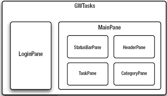
Looking at the wireframe diagram from Chapter 4 (Figure 4-5), it's obvious that the GWTasks application can be broken down into four major separate components:
HeaderPane—responsible for displaying the title and potentially exposing other functionality (such as a logout button).StatusBarPane—responsible for displaying messages to the user.CategoryPane—responsible for displaying the category tree.TaskPane—responsible for displaying the tasks of the currently selected category.
Each of these panes has its own responsibilities and roles within the overall application, and our main goal is to break down the GWTasks class and move each piece of functionality to its appropriate pane.
Implementing HeaderPane and StatusBarPane
We'll start our breakdown with the HeaderPane and StatusBarPane, as they're quite simple to implement. Listings 5-17 and 5-18 show their implementations.
Example 5-17. The HeaderPane Class
public class HeaderPane extends Composite {
    private Label title;
    public HeaderPane(String titleText) {
        title = new Label(titleText);
        initWidget(title);
    }
    public void setTitleText(String titleText) {
        title.setText(titleText);
    }
 }
Example 5-18. The StatusBarPane Class
public class StatusBarPane extends Composite {
    private Label messageLabel;
    public StatusBarPane() {
        messageLabel = new Label();
        initWidget(messageLabel);
    }
    public void setMessage(String message) {
        messageLabel.setText(message);
    }
}
When creating a composite, it's necessary to inform the parent Composite class which widget it's composed from. This is done by calling the initWidget method within the constructor (failing to call this method will cause a compile-time error). In both our previous cases, the panes are composed of single Label widgets. Now let's see how these new components can be used within the GWTasks class (see Listing 5-19).
Example 5-19. The GWTasks Class Using the HeaderPane and StatusBarPane
public class GWTasks implements EntryPoint {
    ...
    public void onModuleLoad() {
        DockPanel mainPanel = new DockPanel();
        mainPanel.setBorderWidth(5);
        mainPanel.setSize("100%", "100%");
        HeaderPane headerPane = new HeaderPane("GWTasks");
        mainPanel.add(headerPane, DockPanel.NORTH);
        mainPanel.setCellHeight(headerPane, "30px");
        mainPanel.setCellHorizontalAlignment(headerPane, DockPanel.ALIGN_CENTER);
        mainPanel.setCellVerticalAlignment(headerPane, DockPanel.ALIGN_MIDDLE);
StatusBarPane statusBarPane = new StatusBarPane();
mainPanel.add(statusBarPane, DockPanel.SOUTH);
mainPanel.setCellHeight(statusBarPane, "25px");
mainPanel.setCellHorizontalAlignment(statusBarPane, DockPanel.ALIGN_CENTER);
mainPanel.setCellVerticalAlignment(statusBarPane, DockPanel.ALIGN_MIDDLE);
...
}
...
}Implementing TaskPane
We'll now move on to implement the TaskPane. This pane is slightly more complex to implement, as it encapsulates a bit more functionality than the HeaderPane and StatusBarPane. Nonetheless, we already have this functionality implemented within the GWTasks class. Since the sole purpose of the TaskPane is to show a list of tasks for a specific category, we can start by drawing a skeleton of the API this pane exposes (see Listing 5-20).
Example 5-20. An Initial TaskPane Skeleton
public class TaskPane extends Composite {
    public void reset() {
         reset(null);
    }
    public void reset(Category category) {
        ...
    }
}
Besides the concrete implementation of the class, the reset methods are perhaps the most important ones. All these methods should do is reset the viewed task list to show only the tasks of the given category, or no tasks at all if the category is null. Later on, you'll see how these methods are being used by the CategoryPane to reset the view whenever a new category is selected.
Now that the skeleton is defined, you can start moving all functionality related to the task table into this new component. Here are the steps that you need to take to complete this task:
Define class fields that will hold the
FlexTable(which displays the tasks) and the currently selected row and task.Move the code that initializes the
FlexTablefrom thecreateTasksWidgetmethod in theGWTasksclass to the constructor of theTaskPane.Call the Composite's
initWidgetwith theFlexTablewidget.Move the code from the
updateTasksListmethod inGWTasksclass to theresetmethod of theTaskPaneclass.Move (and slightly modify) the code that generates the dummy tasks for a given category.
Listing 5-21 shows the TaskPane class after taking all these steps.
Example 5-21. The TaskPane Class
public class TaskPane extends Composite {
    private FlexTable taskTable;
    private int selectedRow = −1;
    private Task selectedTask;
    public TaskPane() {
        taskTable = new FlexTable();
        taskTable.getColumnFormatter().setWidth(0, "20px");
        taskTable.getColumnFormatter().setWidth(1, "20px");
        taskTable.getColumnFormatter().setWidth(2, "100%");
        Label checkHeaderLabel = new Label();
        checkHeaderLabel.setWidth("20px");
        checkHeaderLabel.setHorizontalAlignment(Label.ALIGN_CENTER);
        taskTable.setWidget(0, 0, checkHeaderLabel);
        Label priorityHeaderLabel = new Label("!");
        priorityHeaderLabel.setWidth("20px");
        priorityHeaderLabel.setHorizontalAlignment(Label.ALIGN_CENTER);
        taskTable.setWidget(0, 1, priorityHeaderLabel);
        Label titleHeaderLabel = new Label("Title");
        titleHeaderLabel.setWidth("100%");
        taskTable.setWidget(0, 2, titleHeaderLabel);
        taskTable.getRowFormatter().setStyleName(0, "TableHeader");
        initWidget(taskTable);
    }
    public void reset() {
        reset(null);
    }
    public void reset(Category category) {
        while (taskTable.getRowCount() > 1) {
            taskTable.removeRow(taskTable.getRowCount()-1);
        }
        this.category = category;
        if (category != null) {
            List<Task> tasks = getTasksForCategory(category);
            for (Task task : tasks) {
                addTask(task);
            }
        }
    }
    protected void addTask(Task task) {
        int row = taskTable.getRowCount();
        taskTable.setWidget(row, 0, new CheckBox());
        String priorityName = task.getPriority().name();
        Label priorityLabel = new Label(priorityName.substring(0, 1));
priorityLabel.addClickListener(new ClickListener() {
public void onClick(Widget sender) {
handleTaskRowClicked(row, task)
}
});
priorityLabel.setStyleName("PriorityLabel-" + priorityName.toLowerCase());
taskTable.setWidget(row, 1, priorityLabel);
taskTable.setWidget(row, 2, new Label(task.getTitle()));
}
public void handleTaskRowClicked(int row, Task task) {
HTMLTable.RowFormatter rowFormatter = taskTable.getRowFormatter();
if (selectedRow == row) {
selectedRow = −1;
selectedTask = null;
rowFormatter.removeStyleName(row, "TaskRow-selected");
} else {
if (selectedRow != −1) {
rowFormatter.removeStyleName(selectedRow, "TaskRow-selected");
}
selectedRow = row;
selectedTask = task;
taskTable.getRowFormatter().addStyleName(row, "TaskRow-selected");
}
}
protected List<Task> getTasksForCategory(Category category) {
// return dummy task list
...
}
}Now you can clean up the GWTasks class from all table related code and instead make it use the new TaskPane (see Listing 5-22).
Example 5-22. The GWTaks Class Using the New TaskPane
public class GWTasks implements EntryPoint {
    private Category selectedCategory;
    private TaskPane taskPane;
    public void onModuleLoad() {
        ...
        HorizontalSplitPanel categoriesAndTasks = new HorizontalSplitPanel();
        categoriesAndTasks.setSplitPosition("150px");
        taskPane = new TaskPane();
        categoriesAndTasks.setRightWidget(taskPane);
        Widget categories = createCategoriesWidget();
        categoriesAndTasks.setLeftWidget(categories);
mainPanel.add(categoriesAndTasks, DockPanel.CENTER);
RootPanel.get("main").add(mainPanel);
}
...
public void updateTasksList() {
taskPane.reset(selectedCategory);
}
...
}Implementing CategoryPane
The final task in the GWTasks class breakdown is to create the CategoryPane. This can be done in much the same way as the TaskPane. Let's first define the skeleton of this class (see Listing 5-23).
Example 5-23. An Initial CategoryPane Skeleton
public class CategoryPane extends Composite {
    private TaskPane taskPane;
    public CategoryPane(TaskPane taskPane) {
        this.taskPane = taskPane;
    }
}
As you can see, the CategoryPane needs to know about the TaskPane. This way, whenever a new category is selected, the reset method of the TaskPane can be called to refresh the tasks list.
Next, just as we did with the TaskPane, we'll define the steps needed in order to move the functionality of the category list from the GWTasks class to the CategoryPane class:
Create a class field to hold the category
Tree.Move the code in the
createCategoriesWidgetmethod inGWTasksclass to theCategoryPaneconstructor.Move all related methods and inner classes that the code that was moved depends on (the
createTreeItemandgetAllCategoriesmethods and theCategoryTreeIteminner class).
Listing 5-24 shows the CategoryPane class implementation after all these steps have been taken.
Example 5-24. The CategoryPane Class
public class CategoryPane extends Composite {
    private TaskPane taskPane;
    private Tree tree;
    public CategoryPane(TaskPane taskPane) {
        this.taskPane = taskPane;
        tree = new Tree();
tree.addTreeListener(new TreeListener() {
public void onTreeItemSelected(TreeItem item) {
Category category = ((CategoryTreeItem)item).getCategory();
CategoryPane.this.taskPane.reset(category);
}
public void onTreeItemStateChanged(TreeItem item) {
}
});
List<Category> categories = getAllCategories();
for (final Category category : categories) {
CategoryTreeItem item = createTreeItem(category);
tree.addItem(item);
}
initWidget(tree);
}
protected CategoryTreeItem createTreeItem(Category category) {
CategoryTreeItem item = new CategoryTreeItem(category);
for (Category child : category.getChildren()) {
item.addItem(createTreeItem(child));
}
return item;
}
protected List<Category> getAllCategories() {
// generate dummy category list
...
}
protected class CategoryTreeItem extends TreeItem {
public CategoryTreeItem(Category category) {
super(category.getName());
setTitle(category.getDescription());
setUserObject(category);
}
public Category getCategory() {
return (Category) getUserObject();
}
}
}Note how the reset method of the TaskPane is called when a selection event is handled by the registered TreeListener.
And once more, we can clean up the GWTasks class and make it use the new CategoryPane. The GWTasks breakdown process is done, and the final version of this class is shown in Listing 5-25.
Example 5-25. GWTasks Class After the Component Breakdown
public class GWTasks implements EntryPoint {
    public void onModuleLoad() {
        DockPanel mainPanel = new DockPanel();
        mainPanel.setBorderWidth(5);
        mainPanel.setSize("100%", "100%");
        HeaderPane headerPane = new HeaderPane("GWTasks");
        mainPanel.add(headerPane, DockPanel.NORTH);
        mainPanel.setCellHeight(headerPane, "30px");
        mainPanel.setCellHorizontalAlignment(headerPane, DockPanel.ALIGN_CENTER);
        mainPanel.setCellVerticalAlignment(headerPane, DockPanel.ALIGN_MIDDLE);
        StatusBarPane statusBarPane = new StatusBarPane();
        mainPanel.add(statusBarPane, DockPanel.SOUTH);
        mainPanel.setCellHeight(statusBarPane, "25px");
        mainPanel.setCellHorizontalAlignment(statusBarPane, DockPanel.ALIGN_CENTER);
        mainPanel.setCellVerticalAlignment(statusBarPane, DockPanel.ALIGN_MIDDLE);
        HorizontalSplitPanel categoriesAndTasks = new HorizontalSplitPanel();
        categoriesAndTasks.setSplitPosition("150px");
        TaskPane taskPane = new TaskPane();
        categoriesAndTasks.setRightWidget(taskPane);
        CategoryPane categoryPane = new CategoryPane(taskPane);
        categoriesAndTasks.setLeftWidget(categoryPane);
        mainPanel.add(categoriesAndTasks, DockPanel.CENTER);
        RootPanel.get("main").add(mainPanel);
    }
}
Now it's much easier to see the advantages of breaking the application into components. Not only is the code base cleaner and easier to understand, but the clear separation of responsibilities and roles between the components makes it easier to maintain and extend in future. This separation of responsibilities is commonly referred to as the Separation of Concerns (SoC) principle. It's important that you be well familiar with this principle, as it will follow us as we move along with the application refactoring.
But before we do that, let's enhance our application a little more with yet another component. This time, the component isn't tightly related to our application, but rather is generic. We want to show you that it's possible and even desirable to write generic components that can be reused in any GWT application.
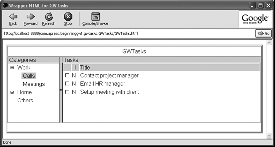
With our current GWTasks application, when users first see the main screen, they may be a bit puzzled about the purpose of the left and right panes. You, as the developer of this application, obviously know that the left pane shows the categories and the right one shows the tasks, but it would be nice if you could somehow communicate this knowledge to the novice user. This can be done by simply adding a title at the top of each pane describing its purpose. Of course, you could add this directly to the CategoryPane and TaskPane classes, but this kind of functionality is more generic and is better implemented in a generic manner. This is why we choose to implement a new generic component named TitledPanel, which you can then reuse in both panes.
Note
GWT already comes with a panel named CaptionPanel, which basically represents a <FIELDSET> element in HTML. As you'll see, our TitledPanel differs quite a bit from it in both its design and functionality.
Let's start off by thinking a bit more about the exact requirements of the new TitledPanel component:
It should be possible to wrap any widget inside it.
It should be possible to update the title text on demand.
It should be relatively easy to customize its look.
This set of requirements is enough to get us started. We'll begin by defining the skeleton of the class based on these requirements (just as we did with the TaskPane and CategoryPane in the previous section). Listing 5-26 shows this initial skeleton.
Example 5-26. An Initial TitledPanel Skeleton
public class TitledPanel extends Composite {
    public TitledPanel() {
        this("");
    }
    public TitledPanel(String titleText) {
        this(titleText, null);
    }
    public TitledPanel(String titleText, Widget content) {
    }
    public void setTitleText(String text) {
    }
    public void setContent(Widget content) {
    }
}
Defining the skeleton is just the first step to communicating what we want the TitledPanel to support. Note also the use of overloaded constructors. When developing reusable components, it's important to make them as simple as possible to use; providing different flavors of constructors is just one way to make the users of the component happy.
The next step is to figure out how to implement this panel internally. Since we want our title to be displayed on top of the main content, the immediate candidate to support this sort of layout is the DockPanel. The problem with this is that the DockPanel has an internal mechanism to manage the size of the different regions. Since we want to have control over it, a better solution would be to use the Grid panel. We can thus define a Grid panel with two rows and one column. The title will be placed in the top cell; the content will be placed on the bottom one. Listing 5-27 shows how this can be implemented.
Example 5-27. The TitledPanel Class
public class TitledPanel extends Composite {
    private final static int TITLE_ROW = 0;
    private final static int CONTENT_ROW = 1;
    private Label titleLabel;
    private Grid grid;
    // overloaded constructors
    ...
    public TitledPanel(String titleText, Widget content) {
        titleLabel = new Label(titleText);
        grid = new Grid(2, 1);
        grid.setBorderWidth(0);
        grid.setCellPadding(0);
        grid.setCellSpacing(0);
        grid.setWidget(TITLE_ROW, 0, titleLabel);
        grid.getCellFormatter().setWidth(TITLE_ROW, 0, "100%");
        if (content != null) {
            grid.setWidget(CONTENT_ROW, 0, content);
        }
        grid.getCellFormatter().setWidth(CONTENT_ROW, 0, "100%");
        grid.getCellFormatter().setHeight(CONTENT_ROW, 0, "100%");
        initWidget(grid);
    }
    public void setTitleText(String text) {
        titleLabel.setText(text);
    }
    public void setContent(Widget content) {
        grid.setWidget(CONTENT_ROW, 0, content);
    }
    public void setContentVerticalAlignment(
            HasVerticalAlignment.VerticalAlignmentConstant alignment) {
        grid.getCellFormatter().setVerticalAlignment(1, 0, alignment);
    }
}
In our current implementation, the TitledPanel simply holds a Label for the title and a Grid with two cell positions, one on top of the other. The width of the label is set so it will spread out as wide as possible. The content cell is also customized so it will try to stretch as much as possible both vertically and horizontally. Also note that using the setContentVerticalAlignment, we enable the user of this component to define the alignment of the content. It's possible that certain scenarios might require the content to be centered while other scenarios require it to be aligned to the top or the bottom. It's important to foresee all the different scenarios in which users will want to use your component.
Although we can now start using our TitledPanel, we're still not quite done with it. We have one more requirement to meet—it should be relatively easy to customize its look.
When developing generic and reusable components, it's important to make them as customizable as possible. The users of your components either can't or don't want to hack into your implementation just to change the background color. This is where CSS styles play a major role. By now, you've seen quite a lot of examples of how you can customize the look of almost any GWT widget. It's time to give the users of your component the same level of flexibility.
The GWT designers really thought through how to support and apply CSS styles to widgets, and they came up with a nice technique that's used by all GWT widgets. The basic idea behind this technique is that when a component is compiled to HTML, its hierarchy of subcomponents is reflected in the generated HTML structure. If we take our TitledPanel as an example, the component itself will be translated to a <DIV> element, under which you'll find a <TABLE> element (the compiled Grid), where the table cells hold other <DIV> elements representing the Label and the content. This enables you to set style names for each component, and customization can be done using nested CSS classes. In our case, we can give the TitledPanel a style named "TitlePanel", the title Label a style named "TitleText", and the grid cell holding the content a style named "Content". Listing 5-28 shows how these style names can be set in our TitledPanel component, and Listing 5-29 shows how you can use these style names to customize the look of the component.
Example 5-28. The TitledPanel Class with Customizable Styles
public class TitledPanel extends Composite {
    private final static String STYLE_NAME = "TitlePanel";
    private final static String LABEL_STYLE_NAME = "TitleText";
    private final static String CONTENT_STYLE_NAME = "Content";
    ...
    public TitledPanel(String titleText, Widget content) {
        titleLabel = new Label(titleText);
        titleLabel.setStyleName(LABEL_STYLE_NAME);
        grid = new Grid(2, 1);
        grid.setBorderWidth(0);
        grid.setCellPadding(0);
        grid.setCellSpacing(0);
        grid.setWidget(TITLE_ROW, 0, titleLabel);
        grid.getCellFormatter().setWidth(TITLE_ROW, 0, "100%");
        if (content != null) {
            grid.setWidget(CONTENT_ROW, 0, content);
        }
        grid.getCellFormatter().setWidth(CONTENT_ROW, 0, "100%");
        grid.getCellFormatter().setHeight(CONTENT_ROW, 0, "100%");
grid.getCellFormatter().setStyleName(CONTENT_ROW, 0, CONTENT_STYLE_NAME);
initWidget(grid);
setStyleName(STYLE_NAME);
}
...
}Note
When setting the style name on the composite itself, it's required that you call initWidget first before actually setting the style. An alternative would be to set the style on the topmost widget of the component (in our case the Grid).
Example 5-29. Setting the Styles in the GWTasks.html File
.TitledPanel .TitleText {
    padding-left: 5px;
    background-color: #e3dede;
}
.TitledPanel .Content {
    border: 1px silver inset;
}
Now we're ready to use our new component. Listings 5-30 and 5-31 show how we can use it within our TaskPane and CategoryPane.
Example 5-30. Using the TitledPanel Within the TaskPane
public class TaskPane extends Composite {
    ...
    public TaskPane() {
        ...
        taskTable.getRowFormatter().setStyleName(0, "TableHeader");
        TitledPanel titledPanel = new TitledPanel("Tasks", taskTable);
        titledPanel.setContentVerticalAlignment(HasVerticalAlignment.ALIGN_TOP);
        titledPanel.setSize("100%", "100%");
        SimplePanel main = new SimplePanel();
        main.setWidget(titledPanel);
        initWidget(main);
        setStyleName("TaskPane");
    }
    ...
}
Example 5-31. Using the TitledPanel Within the CategoryPane
public class CategoryPane extends Composite {
    ...
    public CategoryPane() {
...
TitledPanel titledPanel = new TitledPanel("Categories", tree);
titledPanel.setContentVerticalAlignment(HasVerticalAlignment.ALIGN_TOP);
titledPanel.setSize("100%", "100%");
SimplePanel main = new SimplePanel();
main.setWidget(titledPanel);
initWidget(main);
setStyleName("CategoryPane");
}
...
}As you can see, using the new TitledPanel has minimal impact on the existing code base. The only changes we had to make were to wrap the main widgets in these panes (the tree of the CategoryPane and the table of the TasksPane) with new TitlePanels, each with the appropriate title text. Note that we then wrap the titled panel with yet another SimplePanel. The SimplePanel is another GWT panel that just serves as a wrapper around a single widget. This wrapping enables you to set different style names for the different panes. If we hadn't done so (and passed the titled panel as the argument to the initWidget method), each titled panel in the different pane would have a different style name, and we would have lost the default styles we've just configured. Now, not only do we still gain from the default styles, but we can still customize each titled pane using nested styles (as shown in Listing 5-32).
Example 5-32. Customizing the TitledPanel of the CategoryPane
.CategoryPane .TitledPanel {
/* custom style */
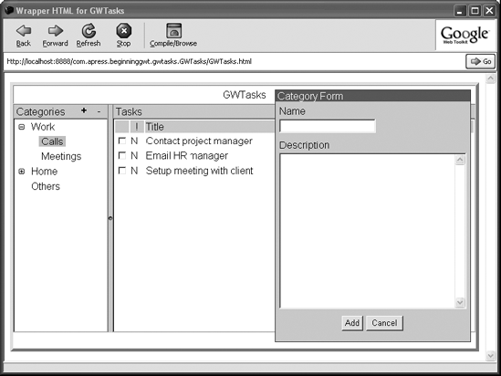
}Figure 5-4 shows the GWTasks application screenshot using the TitledPanel in both panes.
Adding a Toolbar
One thing we've ignored so far in our discussion of the GWTasks application is the mechanism by which users will be able to add, remove, and edit categories and tasks. We've seen how using GWT form widgets, it's possible to design forms for these purposes, but we never took the time to see where these forms fit in the UI.
Several approaches can be taken in tackling this issue. One approach would be to define context menus on the category and task panes that will open when the user right-clicks on them. Although an interesting idea in itself, this approach has some limitations when it comes to browser compatibility (Firefox, for example, always likes to open its own context menu on any right-click). Another approach would be to define a menu bar using the GWT MenuBar widget, which we haven't discussed. The approach that we want to take, however, is quite different. In fact, it involves extending our TitledPanel with the ability to hold a toolbar. Once this functionality is in place, you'll be able to add buttons to each pane that trigger any required action.
Note
Using a MenuBar is definitely a viable option. Sadly, we don't have space to discuss all the widgets provided by GWT, so it would be great if you tackle this as an exercise to see how the MenuBar can be incorporated within our GWTasks application.
So where does a toolbar fit in our TitledPanel? It can be put in more than one place. But we'll place it on the title, where the text of the title is aligned to the left and the toolbar will be aligned to the right. Figure 5-5 shows a small wireframe diagram of how the title of this panel should look.
The first thing we need to do is to define the structure of the title using the layout panels we've come to know so well. Here, as in many cases, there are several ways to achieve the same layout using different panels. We chose a HorizontalPanel for the toolbar itself, where each cell in this panel will contain a tool button. A DockPanel will be used for the title as a whole, where the title's Label will be placed on its CENTER part and the toolbar will be placed on its EAST part. Listing 5-33 shows the changes we need to make in order to implement this functionality.
Example 5-33. The TitledPanel Class with a Toolbar
public class TitledPanel extends Composite {
    private final static String TOOLBAR_STYLE_NAME = "Toolbar";
    private final static String TITLE_STYLE_NAME = "Title";
    private final static String TOOL_BUTTON_STYLE_NAME = "ToolButton";
    private DockPanel title;
    private HorizontalPanel toolbar;
    ...
    public TitledPanel(String titleText, Widget content) {
        titleLabel = new Label(titleText);
        titleLabel.setStyleName(LABEL_STYLE_NAME);
        toolbar = new HorizontalPanel();
        toolbar.setVerticalAlignment(HorizontalPanel.ALIGN_MIDDLE);
        toolbar.setSpacing(0);
        toolbar.setBorderWidth(0);
        toolbar.setStyleName(TOOLBAR_STYLE_NAME);
        title = new DockPanel();
        title.setStyleName(TITLE_STYLE_NAME);
        title.add(titleLabel, DockPanel.CENTER);
        title.setCellVerticalAlignment(titleLabel, DockPanel.ALIGN_MIDDLE);
        title.setCellWidth(titleLabel, "100%");
        title.add(toolbar, DockPanel.EAST);
        title.setWidth("100%");
        grid = new Grid(2, 1);
        grid.setBorderWidth(0);
        grid.setCellPadding(0);
        grid.setCellSpacing(0);
        grid.setWidget(TITLE_ROW, 0, title);
        ...
    }
    ...
    public PushButton addToolButton(
            String text,
            String title,
            ClickListener clickListener) {
        PushButton button = new PushButton(text, clickListener);
        if (title != null) {
            button.setTitle(title);
        }
        addToolButton(button);
return button;}public PushButton addToolButton(Image image, ClickListener clickListener) {PushButton button = new PushButton(image, clickListener);addToolButton(button);return button;}public void addToolButton(PushButton button) {button.setStyleName(TOOL_BUTTON_STYLE_NAME);toolbar.add(button);toolbar.setCellVerticalAlignment(button, HorizontalPanel.ALIGN_MIDDLE);}}
Not only have we introduced the two panels we discussed; we also added extra methods that enable us to register tool buttons in the TitledPanel's toolbar. These methods come in three flavors:
addToolButton(String, String, ClickListener)—this method will register a new button with the given caption and title (tool tip), which will trigger the given click listener whenever it is clicked.addToolButton(Image, ClickListener)—this method will register a new button with the given Image as its face. Here too, the click listener will be called whenever the button is clicked.addToolButton(PushButton)—this is the most flexible method, which enables adding any custom button.
Note the use of the PushButton, which is an extremely flexible implementation of a button. You can customize this button using a set of well-defined faces. For example, you might want to customize its look when it's disabled or when the mouse hovers over it. Each such scenario is associated with a face, which in turn is associated with a style name. To customize our tool buttons, we can set the following styles in the GWTasks.html file (see Listing 5-34).
Example 5-34. The Tool Button Styles
.TitledPanel .Title .Toolbar .ToolButton {
    margin-left: 2px;
    vertical-align: middle;
    text-align: center;
    cursor: pointer;
    width: 22px;
    height: 22px;
}
.TitledPanel .Title .Toolbar .ToolButton-up-hovering {
    font-weight: bold;
}
.TitledPanel .Title .Toolbar .ToolButton-up-disabled {
    cursor: default;
}
.TitledPanel .Title .Toolbar .ToolButton-up-disabled .html-face {
color: gray;
}Now that our TitledPanel has reached its final version, it can be used in the category and task panes to add buttons that trigger some actions. For the CategoryForm, we'll add two buttons. The first will show a form to add a new category, and the second will remove the currently selected category (see Listing 5-35).
Example 5-35. Adding Buttons to the CategoryPane Toolbar
public class CategoryPane extends Composite {
    ...
    private PushButton addButton;
    private PushButton removeButton;
    public CategoryPane() {
        ...
        tree.addTreeListener(new TreeListener() {
            public void onTreeItemSelected(TreeItem item) {
                Category category = ((CategoryTreeItem)item).getCategory();
                CategoryPane.this.taskPane.reset(category);
                removeButton.setEnabled(true);
            }
            public void onTreeItemStateChanged(TreeItem item) {
            }
        });
        ...
        TitledPanel titledPanel = new TitledPanel("Categories", tree);
        titledPanel.setContentVerticalAlignment(HasVerticalAlignment.ALIGN_TOP);
        titledPanel.setSize("100%", "100%");
        addButton = titledPanel.addToolButton("+", "Add Category",
                new ClickListener() {
            public void onClick(Widget sender) {
                CategoryFormDialogBox dialog =
                    new CategoryFormDialogBox(CategoryPane.this);
                dialog.center();
                dialog.show();
            }
        });
        removeButton = titledPanel.addToolButton("-", "Add Category",
                new ClickListener() {
            public void onClick(Widget sender) {
                CategoryTreeItem item = (CategoryTreeItem) tree.getSelectedItem();
                if (item != null) {
                    Category category = item.getCategory();
                    item.remove();
                    removeButton.setEnabled(false);
}
}
});
removeButton.setEnabled(false);
...
}
public void addCategory(Category category) {
CategoryTreeItem item = (CategoryTreeItem) tree.getSelectedItem();
if (item == null) {
tree.addItem(createTreeItem(category));
} else {
item.addItem(createTreeItem(category));
}
}
}As shown in Listing 5-35, the two buttons are registered with the titled panel. The implementation also makes sure they're enabled and disabled appropriately. More concretely, the removeButton is disabled by default, and will be enabled only when a category is being selected (code highlighted in bold). Of course, it's also possible to register other buttons as you see fit (for example, a button that clears the current category selection). Another thing you might have noticed is that as promised, we finally use the CategoryFormDialogBox we created in an earlier section. We had to make a small modification to this class, however, to make it aware of our category pane. Now when the category is created, it's directly added to the category tree via the newly introduced addCategory method on the CategoryPane class.
A similar approach can be applied to the TaskPane. Basically, the same two buttons need to be added to the TaskPane toolbar. One adds a task to the list (which involves creating a TaskFormDialogBox) and the other removes the selected task from the list. We'll leave this for you as an exercise, but of course you can always refer to the code accompanying the book. Figure 5-6 shows what the end result should look like.
Before moving on to the last part of this chapter where we discuss the application architecture, there are still a few gaps in the current GWTasks application that need to be filled. Somewhere along the way, when we continuously enhanced our application, we overlooked one quite important requirement: security. Having the option to add categories and tasks is all nice and dandy, but if this can't be done within the context of an account session, our GWTasks will be useless as an enterprise application. In this section, you'll see how you can incorporate a login screen with which the user can log in to the application before using it. This will require some changes to the code, but bear with us as we take it one step at a time.
The first thing you need to do is to understand the requirement better. When the user first enters the application, he should see a simple login form. Obviously, new users don't have an account ready for them, so they should be able to register as well. Only after logging in with valid credentials should the user enter the main view of the application (which is what we have right now).
To implement this requirement, we'll add two more panes to our application. The LoginPane will contain the login form where the user can enter her credentials. The MainPane will contain all the other panes that we've already defined. In practice, the code that's currently located in the GWTasks class will be moved to the MainPane. The GWTasks will then have a new role, which is to control whether the LoginPane or the MainPane should be displayed.
Let's start with the LoginPane. When implementing this component, we'll try to reuse the TitledPanel we developed in the previous section to give the application a consistent look and feel. Using the title pane will also enable us to add a tool button that will trigger the RegistrationFormDialogBox where the user can register. Listing 5-36 shows the LoginPane class.
Example 5-36. The LoginPane Class
public class LoginPane extends Composite {
    private Label messageLabel;
    private TextBox usernameField;
    private PasswordTextBox passwordField;
    private GWTasks gwtasks;
    public LoginPane(GWTasks gwtasks) {
        this.gwtasks = gwtasks;
        VerticalPanel content = new VerticalPanel();
        content.setSize("100%", "100%");
        ... // constructing and laying out the form widgets and the message label
        TitledPanel main = new TitledPanel("Login", new CenterPanel(content));
        Image registerImage = new Image("image/edit.gif");
        registerImage.setTitle("Register");
main.addToolButton(registerImage, new ClickListener() {
public void onClick(Widget sender) {
handleRegister();
}
});
main.setSize("350px", "150px");
initWidget(new CenterPanel(main));
setStyleName("LoginPane");
}
public void reset() {
... // clearing the messageLabel and the two fields
}
protected Widget createFieldLabel(String text) {
Label label = new Label(text);
label.setStyleName("FieldLabel");
return label;
}
protected void handleLogin() {
clearMessage();
String username = usernameField.getText().trim();
String password = passwordField.getText().trim();
if (authenticate(username, password)) {
gwtasks.showMainPane();
} else {
showErrorMessage("Invalid username and/or password");
passwordField.setText("");
}
}
protected boolean authenticate(String username, String password) {
... // authenticating and returning whether it was successful or not
}
protected void handleRegister() {
RegistrationFormDialogBox dialog = new RegistrationFormDialogBox(this);
dialog.center();
dialog.show();
}
...
}We left out quite a bit in that code snippet, but by now you should feel confident in reading the full version of the class in the accompanying code. The only thing we want to draw your attention to is, once again, the use of the tool button of the TitledPanel along with the RegistrationFormDialogBox. This combination is consistent throughout the whole application, and consistency is valuable in itself. Also note that we use yet another new panel here, the CenterPanel. We created this panel to make it easier to center the login form on the screen. We encourage you to a look at the implementation of the panel to see how it works (remarkably, it's very simple).
The next thing we need to do is to implement the MainPane. This is quite straightforward, as we can just copy the code from the current GWTasks class.
The new GWTasks class will now be responsible for switching the view between the LoginPane and the MainPane. Listing 5-37 shows how it's done.
Example 5-37. The New GWTasks Class
public class GWTasks implements EntryPoint {
    private SimplePanel main;
    private LoginPane loginPane;
    private MainPane mainPane;
    public void onModuleLoad() {
        mainPane = new MainPane();
        mainPane.setSize("100%", "100%");
        loginPane = new LoginPane(this);
        loginPane.setSize("100%", "100%");
        main = new SimplePanel();
        main.setSize("100%", "100%");
        main.setWidget(loginPane);
        RootPanel.get().add(main);
    }
    public void showLoginPane() {
        main.setWidget(loginPane);
    }
    public void showMainPane() {
        main.setWidget(mainPane);
    }

}
As you can see, we use the SimplePanel as a placeholder for the actual content. Whenever showMainPane or showLoginPane are called, the content is switched appropriately. By default, the LoginPane is shown, as this is the view you need to see when first entering the application.
We're now more or less finished with setting up the user interface of our application. Naturally we couldn't cover all available code at the line level, but we tried to explain at least the important aspects. The code base of GWTasks has grown quite a bit as we went along. We started this chapter with three classes and we now have the following 16 classes: Account, CategoryFormDialogBox, Category, CategoryPane, CenterPanel, GWTasks, HeaderPane, LoginPane, MainPane, MessageProgressIndicator, RegistrationFormDialogBox, StatusBarPane, TaskForm DialogBox, Task, TaskPane, and TitledPanel.
This is already quite a few classes to handle and maintain, and in the next section we'll see how we can add more structure to our code base to help us with that.
In the previous section, we were introduced to the importance of breaking down the application into separate components. Although important on its own, this is only a small step toward making the code base of the application clear, maintainable, and extensible. In this section, we'll continue in this direction and a look at a higher architecture level of a GWT application. To be precise, many of the ideas we'll cover here apply to application development in general, not only with GWT. But we feel it's important to show how these ideas can be realized in any GWT application, and GWTasks is a good starting point.
When developing a large application, one of the first things you need to plan in advance is how you want to structure your code base. In Java, this is done by adopting a packaging strategy.
There are many approaches you can take to packaging, as Java itself doesn't enforce any particular strategy. In fact, you can write a whole application without any packages at all. But there's a good reason why packages exist in the first place, and using them can greatly improve your view of the code. That said, if you don't use them wisely, you might not see much benefit, and their added value might be lost. But what is that added value?
Packages let you group a set of classes together. Without packages, it would be quite hard to find your way around an application code base. With them, you can focus on one group of classes at a time. This is similar to our GWTasks application, where the different tasks are put under different categories (imagine how hard it would be to focus on a group of tasks if they were all shown in one huge list). That said, there's not much use in looking at a group of classes if they don't relate to each other in some way. Which brings us to our first rule of thumb—packages should group together closely related classes and subpackages.
Another thing to consider when packaging your code is the interrelationships between the packages themselves. This issue is closely related to the SoC principle we touched on earlier in the chapter, and also to how your classes are designed. Package A is said to be dependent on package B if a class in package A depends on or uses a class in package B. If you also have classes in package B that depend on a class in package A, it's said that there's a circular dependency between these two packages.
Circular dependencies are in general considered harmful, and should always be avoided. The main reason for this is that these dependencies reflect the complex relationships between the different classes of the application, and the more complex these relationships are, the harder it is to maintain the code base. For example, optimally you want to make changes to a certain package with minimal effect on the rest of the application. With circular dependencies, this can be quite hard to achieve. Consider a scenario where changes in package A lead to changes in package B, which in turn lead to changes in package C, which then lead to even more changes to package A again. Before you know it, you can find yourself trapped within this vicious refactoring cycle, which can be quite frustrating to break. To help reduce circular dependencies you can adopt one of the following two approaches:
Top-down approach—a package depends on its subpackages but not vice versa.
Bottom-up approach—a package depends on its parent packages but not vice versa.
We believe that the clearest and simplest approach is the top-down approach, and so this is the approach we chose for our GWT application.
Now that we know what packages are good for, our next step is to figure out how we want to group the different classes. Here, as well, there are two common approaches:
Architecture layering—this packaging strategy suggests grouping classes based on the layers they belong to within the overall application architecture. GWT enforces such layering and packaging by making you put all UI-related classes in the
clientpackage, the server-side classes in theserverpackage, and all publicly accessible resources in thepublicpackage.Functional layering—this strategy suggests grouping classes based on their functionality. For example, all security-related classes would be put under a
securitypackage.
We believe that the best approach is a hybrid of both strategies. Since GWT already provide the architecture layering, it's our job to define the functional layering. Figure 5-7 shows the layering we chose for our GWTasks application.
The next step is to reflect this layering in the package structure of the application, as you can see in Figure 5-8.
Tip
We strongly encourage you at this point to start using an IDE if you haven't already done so. Any decent IDE should have pretty good support for code refactoring. Doing it manually is quite hard and error prone. Check out Appendix A, where we explain how to develop GWT applications with two of the more popular IDEs.
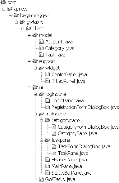
As you can see, we defined three top-level packages. The ui package holds the implementation of the user interface. The support package holds all the infrastructure classes. These are generic and shouldn't be closely tied to the application code. (Who knows, perhaps later you can take these classes out of this code base so you can reuse them in other applications as well.) The last top-level package is the model package, which holds all the domain model classes of the application. These aren't tied only to the UI, either. In fact, in Chapter 6, we'll see that the server also needs to know about them. Apart from these three packages, the rest are quite self-explanatory.
It's clear that by rearranging the classes in an appropriate package structure, we gain much better understanding of the different parts that make up our application. But we're not done yet. In fact, by applying this packaging strategy, we just introduced a huge amount of clutter when it comes to package dependencies. Our current code base clearly has quite a few circular dependencies between its packages. (For example, consider the GWTasks and the LoginPane classes, which have bidirectional dependency between them, while the latter is located in a subpackage of the former). We obviously want to resolve this issue, for all the reasons given previously, but how? This is where application events come to the rescue.
We've seen how the different GWT widgets communicate with each other via events and event listeners. The existence of these events makes it easy to write complex applications where different widgets can communicate without being aware of each other. For example, this is why a tree doesn't have to know about a dialog box that's opened when one of its nodes is clicked. Clearly, the nature of this event-driven design promotes decoupling and thus follows the SoC principle.
The different layers and components of an application are no different in this respect, and we encourage you to apply this design methodology at the application level, by using application-oriented events. In the next few sections, we'll create a simple infrastructure to support such application events. We'll then try to define a few application events for GWTasks and see how they help to decouple the different layers of the application.
Application Event Infrastructure
The simple infrastructure we offer here consists of four classes: ApplicationEvent, ApplicationEventListener, ApplicationEventSource, and ApplicationEventListenerCollection. These four classes will be placed in our new package structure under a new org.apress...client. support.event package.
ApplicationEvent is an abstract class that will later serve as a base class for all custom events we'll define in the application. It holds an ApplicationEventSource, which represents the source from which the event was fired. It also holds a description, which varies based on the concrete event implementation. This enables us, for example, to listen to all events in the application and show their associated description in the StatusBarPane. As the ApplicationEventSource can fire events, obviously it should be possible to register ApplicationEventListeners with it that will listen to these events. The last class is the ApplicationEventListenerCollection. This class serves as a helper class to implement ApplicationEventSources. It serves as a collection of event listeners that can fire events to all the listeners it holds.
GWTasks Application Events
There are many application-level events that we can think of that may be of some use in the application:
CategoryCreatedEvent—fired whenever a new category is created and added in the application.CategorySelectionEvent—fired whenever a category is selected or unselected by the user.TaskCreatedEvent—fired whenever a new task is created and added to a category.TaskSelectionEvent—fired whenever a task is selected or unselected by the user.LoginEvent—fired whenever a user has logged in.LogoutEvent—fired whenever the user has logged out.
These events are all closely related to our specific application, but it's also possible to create more generic events that can be used in different scenarios:
MessageEvent—fired to broadcast a generic message in the system.CancelEvent—fired whenever an action is canceled by the user.
Obviously the possibilities are endless, but there's no point in defining all possible events in advance, as it may result in code bloat. It's better to define events as the need for them arises.
Now that we have the infrastructure in place, let's see how it can solve our tight coupling and package dependency problems. Let's take the case of the GWTasks class and the LoginPane as an example. Since the LoginPane knows when the user is trying to log in to the application and whether or not she does so successfully, it's only natural to have it fire a LoginEvent in the event of a successful login.
At the moment when the user logs in successfully, the LoginPane directly calls the show MainPane method on the GWTasks class. (Not only does it know about the GWTasks class, but it also knows there's a MainPane somewhere in the application.) If instead, we just make the LoginPane an ApplicationEventSource and have it fire a LoginEvent, the GWTasks class can pick up this event and switch the view on its own. Listing 5-38 shows the LoginEvent class implementation, and in Listing 5-39 you can see the changes required in the LoginPane to support it.
Example 5-38. The LoginEvent Class
public class LoginEvent extends ApplicationEvent {
    private final String username;
    public LoginEvent(ApplicationEventSource source, String username) {
        super(source);
        this.username = username;
    }
    public String getDescription() {
        return "'" + username + "' logged in";
    }
}
Note
We will place all application level events under the ui.event package. We do that because the events are strictly used by the different UI components but don't belong to a specific layer within this package. In practice, any event can be used by any layer.
Example 5-39. The LoginPane as an ApplicationEventSource
public class LoginPane extends Composite implements ApplicationEventSource {
    ...
    private ApplicationEventListenerCollection listeners;
    public LoginPane() {
        listeners = new ApplicationEventListenerCollection();
...}public void addListener(ApplicationEventListener listener) {listeners.add(listener);}public void removeListener(ApplicationEventListener listener) {listeners.remove(listener);}public void clearListeners() {listeners.clear();}protected void handleLogin() { clearMessage(); String username = usernameField.getText().trim(); String password = passwordField.getText().trim(); if (authenticate(username, password)) {listeners.fireEvent(new LoginEvent(this, username));} else { showErrorMessage("Invalid username and/or password"); passwordField.setText(""); } } }
Note that by introducing the LoginEvent, we've managed to completely remove the dependency on the GWTasks class. Instead, whenever there's a successful login, the appropriate LoginEvent is fired for any listener who's registered with this pane. To complete this example, we need only modify the GWTasks class to register the appropriate listener on the LoginPane and act accordingly when a LoginEvent is fired (see Listing 5-40).
Example 5-40. The GWTasks Handling LoginEvents
public class GWTasks implements EntryPoint {
    ...
    public void onModuleLoad() {

        ...
        loginPane = new LoginPane();
        loginPane.addListener(new LoginPaneListener());
       loginPane.setSize("100%", "100%");
        ...
    }
    ...
    protected class LoginPaneListener implements ApplicationEventListener {
        public void handle(ApplicationEvent event) {
            if (event instanceof LoginEvent) {
                showMainPane();
            }
        }
    }
}
As mentioned before, we take the top-down approach, where classes may depend on other classes down the package hierarchy but not vice versa. The GWTasks class depends on the LoginPane class, but the latter is no longer dependent on the GWTasks. Voilà! One circular dependency down.
Our mission, however, is only partially accomplished, as there are still many places in the code where circular dependencies need to be removed. Nonetheless, with the application event infrastructure in place, the same approach can be applied practically anywhere in the code, and bit by bit, all circular dependencies can be removed. For example, the category pane can fire a CategorySelectionEvent, and the MainPane can pick it up and update the TaskPane. Or when a task is selected in the TaskPane, we can fire a TaskSelectionEvent that will be picked up by the MainPane, which in turn will show a message on the StatusBarPane. And last, when the user clicks on a Logout link in the HeaderPane, the MainPane picks it up and "bubbles" it up to be picked by the GWTasks class, which in turn switches the view back to the LoginPane (see Figure 5-9).
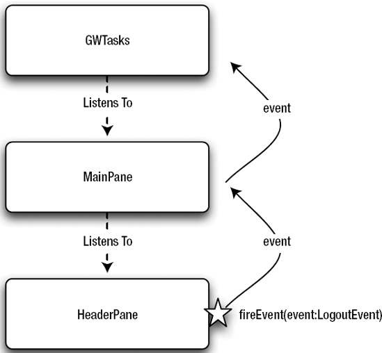
When implementing all these events and listeners, you'll notice in general, the different panes of our applications also serve as ApplicationEventSources. This calls for some code refactoring by introducing a common Pane superclass for all these panes to extend that incorporates the event functionality in it (see Listing 5-41). This simplifies the code in all the concrete panes of the applications and certainly makes it easier to introduce new ones when needed.
Example 5-41. The Pane Class
public abstract class Pane extends Composite implements ApplicationEventSource {
    private final ApplicationEventListenerCollection listeners;
    protected Pane() {
        listeners = new ApplicationEventListenerCollection();
    }
    public void addListener(ApplicationEventListener listener) {
        listeners.add(listener);
    }
    public void removeListener(ApplicationEventListener listener) {
        listeners.remove(listener);
    }
    public void clearListeners() {
        listeners.clear();
    }
    protected void fireEvent(ApplicationEvent event) {
        listeners.fireEvent(event);
    }

}In all our examples thus far, we focused on the UI functionality and how you can use different widgets to build the desired user interface. Although GWT is largely about UI, an application that only shows information but can't actually manage it is quite useless as an RIA, and belongs more in the "static web site" category. When the user manipulates data in the application and then logs out, he obviously hopes that next time he logs in, the application will be in the same state as when he left it.
When developing a GWT application, it's essential that you have a clear idea of how the data is going to be managed, and there are several questions that you need to ask yourself:
What data is being managed?
Where is the data stored?
How can we access and manage the data?
What is the nature of the communication by which the data is being managed?
The first question is quite obvious—you need to know your data. In big enterprise applications, it's likely that the type of managed data is already defined for you by the existing systems you integrate with. Nonetheless, it should be noted that the data your application uses can be only a subset of what the enterprise knows about, and the structure of this data can differ as well. In the next chapter, when we discuss the different GWT remoting strategies, you'll see that in many cases the domain model of your GWT application is located in a completely separate code base from that of your enterprise back-end system. Luckily, in GWTasks, we don't have this problem, and it's quite easy to identify the managed data as being categories, tasks, and accounts (the new package structure makes it even simpler, as all the relevant classes are located under the model package).
The answer to the second question is more interesting and less obvious. There are many places where the data can be stored. It can be stored on a remote server, but it can also be stored locally, on the browser (using cookies or even technologies such as Google Gears). You can even store everything in memory using POJOs (which translate to JavaScript objects at compile time).
Note
Google Gears is an open source project that enables tighter integration between web applications and the native desktop. Among other features, it enables a web application to store data on the local machine. This is normally done by installing a special plug-in in your browser. For more information about this project see http://gears.google.com.
The answers to the last two questions depend greatly on your answer to the second one. If the data is stored on a remote web server, then different data managers can be used depending on the communication protocol used. The nature of this communication is also a major factor. As we mentioned in Chapter 1, Ajax communication is asynchronous by nature, while communicating natively with the browser is synchronous.
So as you can see, a great deal of thought needs to be put into data management. Whatever approach you choose, there are two clear goals that your solution needs to achieve:
It should be clear how data is accessed, and this should be consistent throughout the code base.
Whatever approach you choose, there should be a clear decoupling between the actual implementation and the interface used. If you tie a specific widget to a specific remote implementation, it might be difficult to test the widget without having the remote service available.
In the following sections, we propose a simple and clear abstraction that will enable you to work with any data store and communication protocol. You'll learn how to build an in-memory solution behind this abstraction, and in Chapter 6 you'll see how this abstraction paves the way to using a remote back-end store for the same data.
Managers and ManagerRegistry
Our solution is based on the notion of managers and the manager registry. A manager is a conceptual service that lets you manage data. There is no single interface that all managers should implement and no abstract class to extend. The manager is just a concept, and it can be anything you want as long as it manages something. To explain the idea behind it, it's probably best to see what managers we can define in the GWTasks application.
The first manager in our application is the SecurityManager. This manages everything related to application security and provides appropriate services that can be called from anywhere at any time. Listing 5-42 shows this interface.
Example 5-42. The SecurityManager Interface
public interface SecurityManager {
    void createAccount(Account account, AsyncCallback<Account> callback);
    void login(Authentication authentication, AsyncCallback<Account> callback);
    void logout();
    boolean isLoggedIn();
    Authentication getCurrentAuthentication();
}
As you can see, this manager provides methods to create accounts and authenticate, and also holds the currently logged in authentication. Authentication is a simple object that encapsulates an account's username and password. There's also a clear distinction between services that are strictly local and those that might be remote. The latter can only be executed in an asynchronous manner. Must it be asynchronous? Yes! When creating an abstraction layer, you can't make any assumptions about how the concrete implementation will work. Using an asynchronous abstraction allows for both asynchronous and synchronous implementations. Listing 5-43 shows an in-memory implementation of this manager.
Example 5-43. The InMemorySecurityManager Class
public class InMemorySecurityManager implements SecurityManager {
    private Authentication authentication = Authentication.ANONYMOUS;
    private Map<String, Account> accountByUsername = new HashMap<String, Account>;
    private long accountIdCounter = 0;
    public void createAccount(Account account, AsyncCallback<Account> callback) {
        Account newAccount = new Account(++accountIdCounter, account);
        accountByUsername.put(newAccount.getUsername(), newAccount);
        callback.onSuccess(newAccount);
    }
    public void login(String username, String password,
            AsyncCallback<Boolean> callback) {
        Account account = accountByUsername.get(username);
        if (account == null || !password.equals(account.getPassword())) {
            callback.onSuccess(false);
        } else {
            String username = account.getUsername();
            String password = account.getPassword();
            authentication = new Authentication(username, password);
            callback.onSuccess(true);
        }
    }
    public void logout() {
        authentication = Authentication.ANONYMOUS;
}
public boolean isLoggedIn() {
return authentication != Authentication.ANONYMOUS;
}
public Authentication getCurrentAuthentication() {
return authentication;
}
}As you can see, having an asynchronous interface doesn't stand in the way of implementing a local version of it. Although this seems redundant, there's actually some value in implementing in-memory versions of the manager interface. Since it's a fully working implementation, when configured right, it enables us to test the UI of our application without worrying about the availability of remote services.
The second manager we define for our application is the DataManager. As its name suggests, this manager is responsible for managing the raw data in the application. In GWTasks, we consider the categories and tasks to be raw data and the DataManager should at least provide us with CRUD services—Create, Read, Update, and Delete—for these classes. Listing 5-44 shows this interface.
Example 5-44. The DataManager Interface
public interface DataManager {
    void createCategory(
            Category category,
            Long parentCategoryId,
            AsyncCallback<Category> callback);
    void updateCategory(Category category, AsyncCallback callback);
    void removeCategory(long categoryId, AsyncCallback callback);
    void getCategories(AsyncCallback<List<Category>> callback);
    void createTask(Task task, long categoryId, AsyncCallback<Task> callback);
    void updateTask(Task task, AsyncCallback callback);
    void removeTask(long taskId, AsyncCallback<Task> callback);
    void getTasks(long categoryId, AsyncCallback<List<Task>> callback);
}
Unlike the SecurityManager, the DataManager has no methods that are strictly defined as local, and they're all designed to be used asynchronously. Although we won't show it here, the in-memory version of this manager can be implemented just as easily as we did with the InMemorySecurityManager.
The last manager that we'll define might come as a surprise to you. We call it the UIManager. As we mentioned earlier, a manager is a concept, an abstraction of a general service. Some managers don't necessarily relate to data management or remote calls, and the UIManager is a great example of that. The services this manager provides are what we call application-level UI services—for example, the MessageProgressIndicator we discussed earlier in this chapter. There should probably be one such indicator in our application; it would be best if it's exposed as a service that's accessible from anywhere in the code. Another example would be global error messages, which need to be standardized across the application. Listing 5-45 shows this interface.
Example 5-45. The UIManager Interface
public interface UIManager {
    void showDebugMessage(String message);
    void showErrorMessage(String message);
    void showInfoMessage(String message);
    void showConfirmMessage(String message, AsyncCallback<Boolean> callback);
    ProgressIndicator showProgressIndicator(String message);
}
Also in this manager, although completely local, we find an asynchronous call. The showConfirmMessage should present the user with a confirmation dialog. Usually, when using such dialogs, the application needs to wait for user input in order to continue its normal execution. Since this interface should be implementation-agnostic, we can't assume that all implementations will be able to block execution. For this reason, the asynchronous call emulates execution blocking. When the user enters his input, the callback will be called and execution may continue within the callback. Also note that we chose to abstract away the concrete implementation of the progress indicator into a separate ProgressIndicator interface. This will enable you to change its implementation as you see fit without affecting the rest of the code.
The default implementation of this manager is quite straightforward, as it uses the browser's native support for messages via the Window.alert and Window.confirm methods. As for the ProgressIndicator implementation, we'll use the MessageProgressIndicator that we've already developed at the beginning of this chapter.
These three managers are the only ones we need for our GWTasks application. The only thing left to do is to see how we can access them from anywhere in our code.
One quick solution would be to bind the concrete implementations of these managers to their corresponding interfaces and access them via static methods. For example, to get a concrete SecurityManager implementation, we would call SecurityManager.get(). This solution is indeed quick, but it's also dirty. Once we do that, we lose quite a bit of the abstraction behind the interfaces (which are supposed to stay implementation-agnostic). This also makes it hard to test code that depends on these services—during the test phase you probably want the in-memory implementation of the services, while at runtime you need the remote version of them. So what's the alternative?
A better solution would be to use what we call a ManagerRegistry. The manager registry serves as a simple abstraction from which we can access all managers in the application. Listing 5-46 shows this simple interface for the GWTasks application.
Example 5-46. The ManagerRegistry Interface
public interface ManagerRegistry {
    SecurityManager getSecurityManager();
    DataManager getDataManager();
    UIManager getUIManager();
}
A default implementation of this interface that's configured with all the concrete implementations of the managers can easily be created. The challenging part is to make sure we can access this registry from anywhere in the code.
The solution we chose for this book is to have a single instance of this manager constructed and configured in the topmost layer of the application (in our case, the GWTasks class). Then, propagate this instance down the different layers of the application. The simplest way to do that is to incorporate it in the abstract Pane class, as there more or less seems to be a one-to-one mapping between the different layers and the panes in the application. Listing 5-47 shows the changes in the Pane class that are required to support this.
Example 5-47. The Pane Class
public abstract class Pane extends Composite implements ApplicationEventSource {
    private final ApplicationEventListenerCollection listeners;
    private final ManagerRegistry managerRegistry;
    protected Pane(ManagerRegistry managerRegistry) {
        listeners = new ApplicationEventListenerCollection();
        this.managerRegistry = managerRegistry;
    }
    ...
    protected ManagerRegistry getManagerRegistry() {
        return managerRegistry;
    }

}
Now, each pane in the application must be explicitly configured (constructed) with a manager registry that implicitly makes it accessible from all layers of the application. The only thing that's left now is to go over the code and call the different managers where appropriate. As an example, Listing 5-48 shows the relevant code that's executed when the reset method is called on the TaskPane, which should update the list of tasks for the selected category.
Example 5-48. The TaskPane.reset(Category) Method using the DataManager
public void reset(Category category) {
    while (taskTable.getRowCount() > 1) {
        taskTable.removeRow(taskTable.getRowCount()-1);
    }
    this.category = category;
    if (category != null) {
    getManagerRegistry().getDataManager()
            .getTasks(category.getId(), new Callback<List<Task>>() {
        public void onSuccess(List<Task> tasks) {
            for (Task task : tasks) {
                addTask(task);
            }
         }
     });
  }
Notice the asynchronous nature of this method call. We first issue the call to get all the tasks for the given category, and we continue execution only when the callback is called.
The Callback class in the listing is just a simplified implementation of the AsyncCallback interface that shows a message onscreen for every failed called. We'll discuss this callback class further in Chapter 6.
Note
There are other viable solutions that can be used instead of the ManagerRegistry. A few open source projects aim to bring the power of IoC containers to the GWT world. Although this is beyond the scope of this book, we strongly recommend you to check them out (you can find references to these projects in Appendix B).
Although this isn't strictly related to architecture, we believe it's important to apply the same best practices of consistency and well-defined structure to the CSS styles in your application. We've already discussed the techniques the GWT team came up with to maximize the customizability of the GWT widgets. We strongly recommend you follow this technique, not only for the generic components you develop, but also for all components in your application. Apply styles where possible and make sure you document the possibilities in the Javadoc of the relevant class. We also recommend you extract the styles settings from the hosting HTML file into a separate CSS file. This makes it easier to maintain and cleans up the HTML file. In GWTasks, we define all the styles in the GWTasks.css file.
Tip
CSS files can be declared within the HTML file using the standard <link> tag, but you can also declare them within the GWT module definition file using the <style> element. In fact, GWT theme support is based on this type of configuration.
This chapter has been a long ride. We began with a closer look at some of the more advanced widgets GWT has to offer. You saw how you can use Grids and FlexTables for layout and for displaying tabular content. You also learned how to climb Trees and saw how easy it is to incorporate them in our application. The last widgets we covered were the PopupPanel and the DialogBox, which we then used to implement our wonderful MessageProgressIndicator.
We then moved on to a discussion about the importance of componentizing the application code base. This is the first time we introduced the Separation of Concerns principle, which accompanied us until the end of the chapter. You learned two techniques for creating your own components and found that composition is usually preferable to inheritance. This led to a process where we broke down our GWTasks application into separate composites, which we called panes. We then took you on a step-by-step guide for developing your own generic components. You developed the TitledPanel, which was later extended to hold a nifty toolbar. The application decomposition then ended by introducing the LoginPane and the MainPane as two alternating views that are controlled by the GWTasks class.
In the last part of this chapter, we focused more on the architecture of the application. Weexplained the importance of packaging and the different strategies that can be applied. We then took the top-down approach and applied it to our code base. We also discussed the implications that package dependencies have on the extensibility and maintainability of your code. We concluded that circular dependencies should be considered harmful and showed how application-level events can eliminate and prevent them. We then moved on to discuss how data should be managed within the application and offered a simple way of doing that. Finally, we ended up discussing the importance of using CSS styles properly and consistently.
You were presented with quite a handful of information for one chapter. Don't hesitate to go back and step through it again, just to make sure you're familiar with everything we talked about. If you followed it thoroughly along with the code accompanying this book, you should be well prepared to take advantage of the rest of the book.
In Chapter 6, we'll delve into the world of remote server calls.