In every user interface design, there are three main aspects to consider: UI elements, layouts, and behavior. The UI elements are the core visual elements the user eventually sees and interacts with. The layouts define how these elements should be organized on the screen. And the behavior defines what happens when the user interacts with them.
There are many different ways of implementing these aspects within an application; it all boils down to what technologies are being used. Programming user interfaces in an object-oriented language such as Java differs quite a bit from programming them using languages like HTML and JavaScript. In Java, as in almost every pure OO language, each of these aspects needs to be represented as one or more classes. In Swing[1] applications, for example, component classes are used as building blocks of defining UI elements; containers and layout managers are responsible for laying out the components on the screen; and event and event listener classes are used to bind behavior to the components.
GWT defines its own object-oriented programming model for constructing user interfaces. In many ways, it's similar to Swing (in fact, a lot of the GWT API constructs were borrowed from Swing), yet there's still an essential difference between the two. While a Swing application is compiled to bytecode and runs natively within a JVM environment, a GWT application is compiled to JavaScript and runs within a web browser. In a sense, GWT attempts to provide the same programming and development experience as Swing does, only within a different world—the browser world, a world of HTML and JavaScript.
Bridging these worlds of Java, HTML, and JavaScript is a difficult and complex task, but GWT shines here, too. As you saw in the previous chapter, when building a GWT application, you typically don't need to bother with HTML or JavaScript. Instead, all focus goes to leveraging your Java language expertise and the well-defined GWT API in order to construct the desired web application. Consider for example Listing 4-1, where a simple Java class is used to print the inevitable "Hello World" message on the browser screen. For comparison purposes, Listing 4-2 shows the HTML code to achieve the exact same result.
Example 4-1. Example GWT Java Code That Prints "Hello World" on the Screen
public class HelloWorldPage extends EntryPoint {
    public void onModuleLoad() {
        Label label = new Label("Hello World" );
        RootPane.get().add(label);
    }
}
Example 4-2. HTML Code to Print "Hello World" on the Screen
<html>
    <body>
        <div>Hello World</div>
    </body>
</html>
Note
As you saw in the previous chapter, the HelloWorldPage class is only one of three essential sources GWT needs to work with. The other two are the module definition file and the corresponding hosting HTML file. Nonetheless, as the application builds up, the Java code base grows while these extra two files typically remain unchanged.
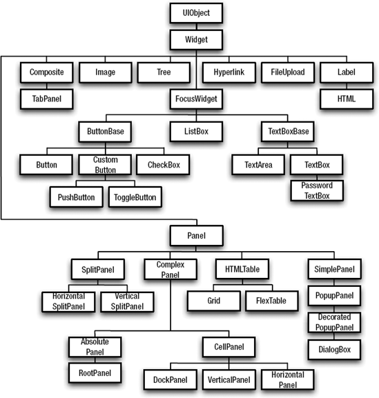
The GWT API provides all the classes needed to create complex web-based user interfaces. It defines an extensible component model that already contains a set of widely used and common components. These components are part of a well-defined class hierarchy (see Figure 4-1) and therefore are naturally grouped based on their common functionality. You can use them directly or alternatively use them as base classes for more complex custom components.
All classes in this component hierarchy derive from the UIObject base class. Although the hierarchy defines multiple hierarchy trees and component groups, they can roughly be split into two main categories: widgets and panels. Widgets represent components the user can interact with, such as buttons or links. Panels represent all those components that serve as containers for other components. In terms of the aspects mentioned at the beginning of this chapter, widgets represent UI elements while panels are in charge of the layout.
The remainder of this chapter will focus on common widgets and panels. We'll see how to work with them and how they fit into our GWTasks sample application. Bear in mind that not all widgets and panels will be covered. We'll only focus on the most widely used ones, and more specifically on those required for our sample application. To learn more about other widgets and available functionality, we strongly recommend you check out the general documentation on the GWT web site at http://code.google.com/webtoolkit, as well as the GWT Class API reference.
Before delving into the core widgets and panels, you first need to understand the function of the RootPanel. While panels in GWT are mainly used for layout, the appropriately named RootPanel serves as the top-level panel in the application. This panel provides the following three main methods:
RootPanel get()—This method returns the panel that represents the body of the HTML page. Once fetched, the returnedRootPanelcan be used to add any number of widgets and/or panels to the body of the HTML.RootPanel get(String id)—A finer-grained version of theget()method that returns aRootPanelrepresenting a specific element within the HTML page. In order for this method to work, the HTML host page needs to contain an element with a matching ID. A common practice is to define<DIV>elements in the HTML host page with specific IDs that will be accessible via this method. The GWT-compiled code takes care to put all components under the appropriate<DIV>elements.Element getBodyElement()—This method returns a Java object representing the body DOM element of the HTML host page.
The RootPanel is the only mechanism for binding components written in Java to the hosting HTML file, so in every application there must be at least one place where this panel is accessed. In the following sections, you'll see how this binding works in practice.
GWT ships with a large set of predefined widgets. In this section, we'll cover some of the basic ones that are essential building blocks for every GWT application. We'll use a few small sample applications to demonstrate these widgets. Consequently, it's important for you to be familiar with the applicationCreator tool we covered in the previous chapter. In the rest of this section, when asked to create a new application named "MyNewApplication", you're expected to follow these steps:
Run the
applicationCreatortool with the following argument:com.apress.beginninggwt.chap4.client.MyNewApplicationClean and edit the appropriate files (the generated entry point Java file and hosting HTML file containing sample code that needs to be removed).
Compile the application using the generated
MyNewApplication-compilescript.Run the application using the generated
MyNewApplication-shellscript.
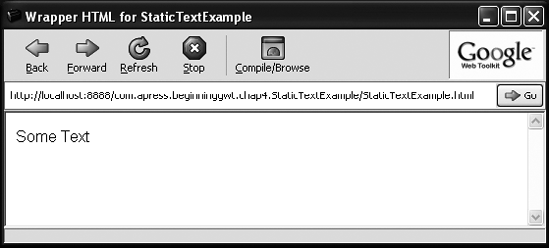
The simplest widget to start with is the Label widget, as its sole purpose is to display plain text on the screen. The StaticTextExample (shown in Listing 4-3) is a small application that demonstrates how a label can be used to display a simple text on the screen:
Example 4-3. A Simple Label Example
import com.google.gwt.core.client.EntryPoint;
import com.google.gwt.user.client.ui.RootPanel;
import com.google.gwt.user.client.ui.*;
public class StaticTextExample extends EntryPoint {
    public void onModuleLoad() {
        Label label = new Label(" Some Text" );
        RootPanel.get().add(label);
    }
}
Note
Just like in any Java class, you must declare the appropriate import statements in order for this code to compile. For the sake of brevity, we've removed these declarations from future code listings. That said, as most of the GWT widgets are defined under the com.google.gwt.user.client.ui package, the import statements in Listing 4-3 should work in most cases. You can always use the GWT API documentation as a reference.
In the onModuleLoad method, we first create a new Label with the appropriate text. Here you can also see how the RootPanel is used to bind the label to the hosting HTML file. In this example, we use the simplest version of the RootPanel.get() method to bind the label directly to the body of the HTML page. Compiling and running this application will display the message "Some Text" onscreen (see Figure 4-2).
Sometimes you may want to give the Label widget HTML content instead of just plain text. Since Label only supports plain text, it will escape all HTML content and show it on screen. This can easily be fixed by replacing the Label with an HTML widget, which is a special label that supports HTML content. Listing 4-4 shows a modified version of the StaticTextExample application that displays the same message in bold text.
Example 4-4. Displaying HTML Content Onscreen
public class StaticTextExample extends EntryPoint {
    public void onModuleLoad() {
        HTML html = new HTML(" <B>Some Text</B>" );
        RootPanel.get().add(html);
    }
}
As you can see, the Label has been replaced by an HTML widget, and the message text itself is wrapped within the HTML <B> element. Running this application will show the desired results.
The HTML widget is powerful, but you should be careful not to overuse it. Always ask yourself whether there's a more appropriate way to accomplish the same result. (In this case, a simple label with a customized style could do the trick.) It's advisable to use the HTML widget only for those cases where the GWT doesn't provide a better alternative.
To see the HTML widget in action, we'll use it to display an external link on the screen.[2] Note that this is strictly for demonstration purposes as the GWT Anchor widget already provides this functionality. Listing 4-5 shows how the example in Listing 4-4 can be modified to display a link to the GWT web site.
Example 4-5. Displaying an External Link Using the HTML Widget
public class StaticTextExample extends EntryPoint {
    public void onModuleLoad() {
        String link = " http://code.google.com/webtoolkit";
        HTML html = new HTML(" <a href=" "  + link + " " >GWT Website</a>" );
        RootPanel.get().add(html);
    }
}
Note
Using the HTML widget extensively also makes it harder to unit test and debug your application. We've already covered debugging in the previous chapter and we'll cover testing in great detail in Chapter 7.
The Button widget represents a simple button that the user can click. The button is normally used to let the user trigger an action of some kind. As such, Button enables registration of click listeners that will be called whenever it's clicked. The ButtonExample application (see Listing 4-6) shows how this widget can be used to display a button that the user can click to issue an alert message.
Example 4-6. A Simple Alert Button Example
public class ButtonExample implements EntryPoint {
    public void onModuleLoad() {
        Button alertButton = new Button(" Alert" );
        alertButton.addClickListener(new ClickListener() {
            public void onClick(Widget widget) {
                Window.alert(" This is an alert!!! " );
            }
        });
        RootPanel.get().add(alertButton);
    }
}
The relevant code can be seen in the onModuleLoad() method in Listing 4-6. First a new Button is initialized and assigned to the alertButton variable. The constructor accepts as an argument a String to represent the button's caption (the text on top of the button). Next, we register a ClickListener on the button by calling its addClickListener() method. When clicked, the onClick(Widget) method will be called for all the button's registered click listeners. In our case, an alert will be shown to the user. Last but not least, the button is bound to the HTML host page using the RootPanel.
Note
The Window.alert(String) method is the GWT counterpart of the JavaScript window.alert(var) function used to display a browser native alert message.
As with many of the GWT widgets, it's also possible to further customize the button by setting some of its supported properties. For example, we could set its width and height and make it disabled by default (which means the user won't be able to click it). Listing 4-7 shows how this can be applied in our ButtonExample (highlighted in bold).
The Button class is just one of several concrete implementations of the ButtonBase class (see Figure 4-1). Another interesting implementation is ToggleButton. A ToggleButton is a special button that at any time can be in one of two states: up or down. Clicking the button toggles its state (hence the name ToggleButton). While toggle buttons are widely used in desktop applications, supporting this type of button in a web application has always required quite a bit of JavaScript crafting. Fortunately, GWT abstracts this complexity away.
Listing 4-8 shows an enhanced version of the ButtonExample that demonstrates how the ToggleButton can be used. In this example, another toggle button is added to the application to control which message the alert shows.
Example 4-8. Using a ToggleButton
public class ButtonExample implements EntryPoint {
    public void onModuleLoad() {
        final ToggleButton messageToggleButton = new ToggleButton(" UP" , " DOWN" );
        RootPanel.get().add(messageToggleButton);
        final Button alertButton = new Button(" Alert" );
        alertButton.addClickListener(new ClickListener() {
            public void onClick(Widget widget) {
                if (messageToggleButton.isDown()) {
                    Window.alert(" HELLLLP!!!!" );
                } else {
                    Window.alert(" Take it easy and relax" );
                }
            }
        });
        RootPanel.get().add(alertButton);
    }
}
In this example, the messageToggleButton state determines which message will be displayed in the alert. When the toggle button is up, a "calm" message is displayed; when it's down, a " stress" message is shown. Note how the ToggleButton is initialized with two constructor arguments. As with the Button captions of the button, one for each state. In our example, we use these captions to indicate its state on the screen (there's no such indication by default—see the sidebar for further details).
You already saw how you can embed an external link using the HTML widget. Internal links, on the other hand, can be embedded using the Hyperlink class. Let's change our ButtonExample once more; this time we'll use a Hyperlink instead of a normal Button (see Listing 4-9).
Example 4-9. Using a Hyperlink
public class ButtonExample implements EntryPoint {
    public void onModuleLoad() {
        final ToggleButton messageToggleButton = new ToggleButton(" UP" , " DOWN" );
        RootPanel.get().add(messageToggleButton);
        Hyperlink alertLink = new Hyperlink(" Alert" , " alert" );
        alertLink.addClickListener(new ClickListener() {
            public void onClick(Widget widget) {
                if (messageToggleButton.isDown()) {
                    Window.alert(" HELLLLP!!!!" );
                } else {
                    Window.alert(" Take it easy and relax" );
                }
            }
        });
        RootPanel.get().add(alertLink);
    }
}
The Hyperlink acts in many ways like a button. All you needed to do in the listing was replace the Button with a Hyperlink, and as the latter also supports click listeners, the rest of the code just works without any additional modifications.
It might seem that the only real change in our application is visual; that is, instead of clicking a button, the user now clicks a link. But there's more to Hyperlink than meets the eye. When clicked, the Hyperlink not only notifies all its click listeners about the event, it also adds an entry to the browser's history. Note in Listing 4-9 the extra argument that's passed to the Hyperlink constructor. This argument is the token that the Hyperlink will add to the history. We'll discuss browser history support in great detail in Chapter 8, but for now, suffice it to say that this integration enables the browser's Back and Forward buttons to be aware of the actions the user performs in the GWT application.
Now that we've covered some of the basic widgets and seen how we can work with them, we'll turn to a more practical approach and use our sample application to introduce form widgets.
Form widgets are a group of widgets that correspond to elements in a typical web form. Some of the more popular form widgets include text fields, password fields, multiline text areas, radio buttons, check boxes, and lists.
GWT supports all the standard HTML form widgets, and more, out of the box. As opposed to their usage in HTML, you can use them in more flexible ways, and they don't need to be bound to an HTML form. In this section, we'll introduce these widgets as we implement two important forms in the sample application: the user registration form and the task form.
The User Registration Form
Before we go over the implementation of this form, we first need to understand its purpose and requirements.
As in most multi-user applications, our task management application should enable users to create new accounts. An account holds the following information:
Full Name—the user's full name.
Email—the user's e-mail address.
Username—the username the user will use to log in to the application.
Password—the password that will authenticate the user when logging in to the application.
We represent this account data in code using the AccountInfo class shown in Listing 4-10. This class will be part of the code base of a new UserRegistrationForm application.
Example 4-10. The AccountInfo Class
public class AccountInfo {
    private String fullName;
    private String email;
    private String username;
    private String password;
    public AccountInfo() {
    }
    // setters and getters
    ...
}
As for the form implementation itself, we'll have to write two main files:
UserRegistrationForm.html—This hosting HTML file contains a simple HTML table for the form layout. Each table cell contains a descriptive and unique ID attribute used when binding specific widgets with theRootPanel.get(String)method. Listing 4-11 shows the main content of this file.UserRegistrationForm.java—Shown in Listing 4-12, this entry point class contains the actual code that defines the form widgets and the form submission logic.
Example 4-11. UserRegistrationForm.html
<html>
    ...
    <body>
        <h1>UserRegistrationForm</h1>
        <table>
            <tr>
                <td id=" usernameLabel" ></td>
                <td id=" usernameField" ></td>
            </tr>
            <tr>
                <td id=" passwordLabel" ></td>
                <td id=" passwordField" ></td>
            </tr>
        </table>
        <p/>
        <div id=" submitButton" ></div>
    </body>
</html>
Example 4-12. UserRegistrationForm.java
public class UserRegistrationForm implements EntryPoint {
    public void onModuleLoad() {
        // username field
        Label usernameLabel = new Label(" Username:" );
        final TextBox usernameField = new TextBox();
        RootPanel.get(" usernameLabel" ).add(usernameLabel);
        RootPanel.get(" usernameField" ).add(usernameField);
        // password field
        Label passwordLabel = new Label(" Password:" );
        final PasswordTextBox passwordField = new PasswordTextBox();
        RootPanel.get(" passwordLabel" ).add(passwordLabel);
        RootPanel.get(" passwordField" ).add(passwordField);
        // retype password field
        Label retypePasswordLabel = new Label(" Retype Password:" );
        final PasswordTextBox retypePasswordField = new PasswordTextBox();
        RootPanel.get(" retypePasswordLabel" ).add(retypePasswordLabel);
        RootPanel.get(" retypePasswordField" ).add(retypePasswordField);
        // the button that will submit the form
        Button submitButton = new Button(" Register" );
        RootPanel.get(" submitButton" ).add(submitButton);
submitButton.addClickListener(new ClickListener() {
public void onClick(Widget widget) {
AddressInfo addressInfo = new AddressInfo();
addressInfo.setUsername(usernameField.getText());
addressInfo.setPassword(passwordField.getText());
register(addressInfo);
}
});
}
/**
* Registers the user in the system.
*/
protected void register(AddressInfo addressInfo) {
Window.alert(addressInfo.toString());
}
}Note
For brevity, the form shown in Listing 4-12 only enables you to enter the user's username and password information. A complete implementation of this form (which can be found in the source code accompanying the book) enables you to enter all properties defined by the AddressInfo class.
Listing 4-12 shows the basic usage of the TextBox and PasswordTextBox widgets. These widgets represent simple input fields where short text-based information can be entered. The main difference between them is in their onscreen appearance (text entered in a PasswordTextBox is masked and hidden from the user). In our example, the TextBox is used to collect the username while the PasswordTextBox accepts the password.
The submitButton is responsible for submitting the form. When clicked, the registered ClickListener collects all the data from the TextBox and PasswordTextBox widgets by calling their getText() methods. It then uses this data to create a new AddressInfo, which is passed to the register() method where the actual registration is performed.
Note
For now, all the register(AddressInfo) method does is display the address information in an alert dialog. We'll see how this can be replaced with a real registration procedure when discussing managers in Chapter 5.
Note how each field is bound to its appropriate position on the screen using the RootPanel.get(String) methods. In addition, a Label widget is used to indicate what type of information should be entered in the field. We could have hard-coded these labels in the HTML host page instead, but we recommend keeping as much functionality as possible in Java code and minimizing the amount of raw HTML code in the application (mainly for maintenance and debugging reasons).
Adding Validation
While the current implementation of our registration form works, it isn't yet complete. In its current state, it's possible for the user to add invalid information that will then be saved in our system. To prevent this from happening, we want to perform extra checks and validate the data prior to its submission. In our example, we'll validate that the user submits a nonblank password and also verify that the retyped password is correct. Listings 4-13 and 4-14 show snippets of HTML and Java code modified to support this new functionality.
Example 4-13. Defining the Location of the Error Messages in UserRegistrationForm.html
<html>
    ...
    <tr>
        <td id=" passwordLabel" ></td>
        <td id=" passwordField" ></td>
        <td id=" passwordErrorLabel" ></td>
    </tr>
    <tr>
        <td id=" retypePasswordLabel" ></td>
        <td id=" retypePasswordField" ></td>
        <td id=" retypePasswordErrorLabel" ></td>
    </tr>
    ...
</html>
Example 4-14. Validating the Retyped Password in UserRegistrationForm.java
public class UserRegistrationForm implements EntryPoint {
    private PasswordTextBox passwordField;
    private Label passwordErrorLabel;
    private PasswordTextBox retypePasswordField;
    private Label retypePasswordErrorLabel;
    public void onModuleLoad() {
        ...
        passwordErrorLabel = new Label();
        RootPanel.get(" passwordErrorLabel" ).add(passwordErrorLabel);
        retypePasswordErrorLabel = new Label();
        RootPanel.get(" retypePasswordErrorLabel" ).add(retypePasswordErrorLabel);
        ...
        submitButton.addClickListener(new ClickListener() {
            public void onClick(Widget widget) {
                if (validateFormInput()) {
                    AddressInfo addressInfo = new AddressInfo();
                    addressInfo.setUsername(usernameField.getText());
addressInfo.setPassword(passwordField.getText());
register(addressInfo);
}
}
});
}
/**
* Validates the form input and returns whether the input is valid or not.
*/
protected boolean validateFormInput() {
// validating the password is not empty
String password = passwordField.getText();
boolean passwordIsValid = password.length() > 0;
passwordErrorLabel.setText(passwordIsValid ? " " : " Required" );
// validating that the retyped password matches the password
String retypedPassword = retypePasswordField.getText();
boolean retypeIsValid = retypedPassword.equals(password);
retypePasswordErrorLabel.setText(retypeIsValid ? " " : " Incorrect" );
return usernameIsValid && passwordIsValid && retypedIsValid;
}
...
}As shown in Listing 4-14, a new Label has been added next to every input field; this will be used to show validation error messages to the user. In addition, the validateFormInput() method was added to the class. This method validates the data entered in the password fields and shows appropriate error messages to the user if invalid input is encountered. The method returns true only when all validation checks are passed. The click listener that handles form submission can now call the validateFormInput() method and continue to submit the data only if it returns true. Note that we also extracted the password widgets (along with the new error labels) and stored them as class fields instead of local variables. This gives validateFormInput() easy and clean access to the text entered in these widgets and, when necessary, lets it write appropriate error messages in the appropriate labels.
Although this example is quite narrow in its validation requirement, extra validation checks can be added in the same manner for all other fields as well.
Styling Validation Error Messages
When displaying validation error messages to the user, a common practice is to highlight these messages onscreen to grab the user's attention.
As we already introduced new labels for the error messages, highlighting the error messages is as easy as adding extra styles to these labels. This can be done by calling the addStyleName(String) method of the Label. The name of the style must correspond to a CSS class defined in the application (either by embedding/linking it within the hosting HTML file or by configuring the <stylesheet> element in the application module descriptor). This CSS class determines the actual styling of the text. Listings 4-15 and 4-16 show the changes in the code required for this to work.
Example 4-15. Defining Error Label CSS Class in UserRegistrationForm.html
<html>
    <head>
        ...
        <style>
            ...
            .errorLabel {
                color: red;
            }
        </style>
    <head>
    ...
</html>
Example 4-16. Adding a New Style to the Error Label in UserRegistrationForm.java
... passwordErrorLabel = new Label();passwordErrorLabel.addStyleName(" errorLabel" );RootPanel.get(" passwordErrorLabel" ).add(passwordErrorLabel); retypePasswordErrorLabel = new Label();retypePasswordErrorLabel.addStyleName(" errorLabel" );RootPanel.get(" retypePasswordErrorLabel" ).add(retypePasswordErrorLabel); ...
With this custom styling in place, whenever the user enters invalid data, a red error message will appear onscreen next to the appropriate widget.
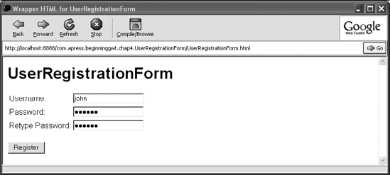
Figure 4-3 shows how the final version of the UserRegistrationForm application looks when run within the GWT shell.
Now that we've seen how to work with the TextBox and PasswordTextBox widgets in a simple registration form, let's see how we can leverage other available form widgets to create the richer task form.
The Task Form
As with the user registration form, before we start implementing the task form, we first need to understand what it's used for and what kind of data it will collect from the user.
As the main goal of GWTasks is to manage user tasks, this application must give the user a mechanism for adding new tasks to the system. This is the main goal of the task form. Tasks are represented by the TaskInfo class (shown in Listing 4-17), which will be placed in the client package of a newly created TaskForm application.
Example 4-17. The TaskInfo Class
public class TaskInfo {
    public enum Priority { LOW, NORMAL, HIGH }
    // a required short descriptive title
    private String title;
    // option (may be null) extra text describing the task in details
    private String description;
    // defines the priority of the task
    private Priority priority = Priority.NORMAL;
    public TaskInfo() {
    }
    // getters and setters
    ...
}
As can be seen in Listing 4-17, the TaskInfo defines three properties: title, description, and priority. The title property is mandatory; the others are optional. This requirement already tells us something about the kind of validation checks the task form should have. Another thing to note is that each property carries a different type of information, which implicitly hints how it should be presented to the user. For example, while the title property should be short and concise, the description property can hold long and detailed text. This difference implies that while the user can enter the title using a simple TextBox, a different kind of widget should be used for the description field, namely the TextArea widget.
Assuming the structure of the HTML host page of the form is clear by now (as it doesn't differ much from the one used in the UserRegistrationForm), let's focus on the TaskForm class.
Implementing the Form
We'll build this form a step at a time, starting with an initial implementation that enables the user to enter the task title and description. Listing 4-18 shows the initial TaskForm class implementation.
Example 4-18. TaskForm.java
public class TaskForm implements EntryPoint {
    private TextBox titleField;
    private Label titleErrorLabel;
    private TextArea descriptionField;
    private Label descriptionErrorLabel;
    public void onModuleLoad() {
        titleField = new TextBox();
        titleErrorLabel = createErrorLabel();
        RootPanel.get(" titleLabel" ).add(new Label(" Title" );
        RootPanel.get(" titleField" ).add(titleField);
        RootPanel.get(" titleErrorLabel" ).add(titleErrorLabel);
        descriptionField = new TextArea();
        descriptionErrorLabel = createErrorLabel();
        RootPanel.get(" descriptionLabel" ).add(new Label(" Description" );
        RootPanel.get(" descriptionField" ).add(descriptionField);
        RootPanel.get(" descriptionErrorLabel" ).add(descriptionErrorLabel);
        Button submitButton = new Button(" Add Task" );
        submitButton.addClickListener(new ClickListener() {
            public void onClick(Widget widget) {
                if (validateForm()) {
                    TaskInfo task = new TaskInfo();
                    task.setTitle(titleField.getText());
                    task.setDescription(descriptionField.getText());
                    addTask(task);
                }
            }
        });
    }
    protected Label createErrorLabel() {
        Label errorLabel = new Label();
        errorLabel.addStyleName(" errorLabel" );
        return errorLabel;
    }
    protected boolean validateForm() {
        boolean titleIsValid = titleField.getText().lenth() > 0;
        titleErrorLabel.setText(titleIsValid ? " "  : " Required" );
        return titleIsValid;
    }
    protected void addTask(TaskInfo task) {
        Window.alert(task.toString());
    }
}
As you can see in Listing 4-18, the basic structure of the TaskForm is similar to that of the UserRegistrationForm. A TextBox widget is used for entering the task title. Furthermore, as the title is a mandatory field, the validateForm() method validates that the user indeed entered it in the form. As for the description field, we chose to use a TextArea widget instead of the TextBox. While the latter is appropriate for short text based data, the TextArea widget provides a more convenient way of entering long multiline texts.
When running this version of the TaskForm, you may notice that the description text area is indeed a better fit for large text entries than the text box. That said, in most cases (and in our example) its default size is less than optimal. We can easily fix this by customizing two properties of the TextArea widget. Listing 4-19 shows (highlighted in bold) the snippet of the code required to customize the size of the area.
Example 4-19. Customizing TextArea Size
... descriptionField = new TextArea();descriptionField.setVisibleLines(10);descriptionField.setCharacterWidth(50);descriptionErrorLabel = createErrorLabel(); ...
Customizing the height of the text area is done by specifying how many lines of text it should display. The width is set by specifying the maximum number of characters each line can contain. One caveat to remember when using the setCharacterWidth(int) method is that the character size varies between browsers and platforms, thus the same text area may appear differently in different environments. To circumvent this problem, you can instead set the size of the TextArea using the more generic setWidth, setHeight, setSize, and setPixelSize methods which are defined in the UIObject class.
Adding the Priority Field
So far we've used simple text widgets as data entry fields for different types of information. We could have chosen to use the TextBox once more to enable the user to enter a task priority. The problem with this approach is that the priority can only hold one of a fixed set of possible values. Letting the user enter this value in a free text manner introduces two issues. First, the user needs to guess which values are valid and acceptable by the system. Second, even if the user knows about the valid values, we introduce extra complexity both for the user (who has to retype the same value over and over again) and for the developer (who needs to validate that the entered text is a valid priority value). Luckily, GWT comes with the ListBox widget, which provides a clean solution to this problem.
The main goal of the ListBox widget is to present to the user a list of options from which she can choose one or more values. Typically, when the user can only choose one option, the list is displayed as a drop-down list. When multiple options can be chosen, it's possible to customize the list box size by specifying how many options should be visible at once.
As a task can only have one priority, a drop-down list of all three possible priorities will suffice. Listing 4-20 shows how this field can be added to our existing TaskForm class (again, highlighted in bold).
Example 4-20. Adding the Priority ListBox to the TaskForm
public class TaskForm extends EntryPoint {
...
private ListBox priorityField;
public void onModuleLoad() {
...
priorityField = new ListBox(false);
priorityField.setVisibleItemCount(1);
priorityField.addItem(" LOW" );
priorityField.addItem(" NORMAL" );
priorityField.addItem(" HIGH" );
priorityField.setItemSelected(1, true);
RootPanel.get(" priorityLabel" ).add(new Label(" Priority" ));
RootPanel.get(" priorityField" ).add(priorityField);
submitButton.addClickListener(new ClickListener() {
public void onClick(Widget widget) {
if (validateForm()) {
TaskInfo task = new TaskInfo();
task.setTitle(titleField.getText());
task.setDescription(descriptionField.getText());
TaskInfo.Priority priority = resolvePriority();
task.setPriority(priority);
addTask(task);
}
}
});
...
}
protected TaskInfo.Priority resolvePriority() {
int priorityIndex = priorityField.getSelectedIndex();
String priorityName = priorityField.getValue(priorityIndex);
return Enum.valueOf(TaskInfo.Priority.class, priorityName);
}
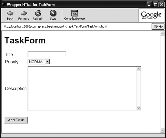
}As shown in the listing, the first thing we need to do is define a ListBox class field. In the onLoadModule(), we instantiate this field and initialize its state. Note that the list box is instantiated with false as a constructor argument, which tells the ListBox not to allow the user to select multiple options. We also configure the ListBox to be displayed as a drop-down list using the setVisibleItemCount(int) method. We then add all possible priorities to the list box and configure the NORMAL priority to be displayed by default. The only thing left is to resolve the priority based on the selected option in the list box (using the resolvePriority method) and set it on the new task. Figure 4-4 shows how our final version of the task form looks within the GWT shell.
There are quite a few widgets we haven't covered that you might find useful. Some will be dealt with as we build our GWTasks sample application, while we'll leave others for you to explore. As mentioned at the beginning of this chapter, the GWT component model is quite consistent in its public API. A good understanding of the widgets we've discussed is a strong foundation for getting up to speed with all the other available widgets.
In all the examples so far, we've used the HTML host page and the RootPanel to lay out the widgets and attach them to the screen. Although this approach worked well for our simple forms, it's bound to fail for most real-world applications, as they require more complex layout schemes. This is where panels come into the picture. A GWT panel can be seen as a UI component whose sole purpose is to contain other components (widgets or other panels) and define their layout on the screen. As usual with GWT, you define the panels in your application's Java code base, and work with them just like any other Java object. Looking back at Figure 4-1, you can even see that all the panels are part of the GWT component class hierarchy, and have a well-defined class hierarchy of their own.
In the next few sections, we'll cover some of the more important panels available. We'll continue working on our sample application and show the important role that panels play in the overall architecture of the application.
Before we move on to showing how to work with panels, we first need to create the sample application project. Learning about panels will finally enable us to create a code base for our sample application. As always, we'll use the applicationCreator to create the application, as shown in Listing 4-21.
Example 4-21. Using applicationCreator to Create the GWTasks Application
> $GWT_HOME/applicationCreator com.apress.beginninggwt.gwtasks.client.GWTasks
Note
Don't forget to clean up all the dummy code that's autogenerated by the applicationCreator tool. You can find this code in both the hosting HTML file and the GWTasks entry point class file.
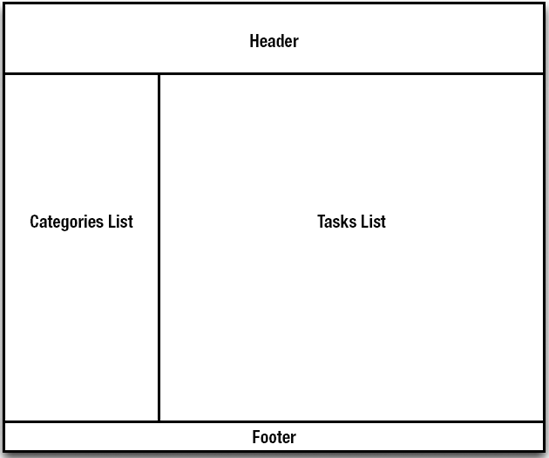
When building rich UI applications, we find that UI design usually takes center stage. It's the design that really distinguishes a great application from a good one, and a good one from a bad one. Coming up with that special design isn't as easy as it may seem and it's beyond the scope of this book. Nonetheless, we'll try to use some of the tools and techniques that UI designers use for our sample application. One of these techniques is wireframes—a simple sketch that defines the blueprint of the user interface. Using wireframes makes it easier to communicate ideas about the interface and also serve as basic documentation. Figure 4-5 shows an initial wireframe for the general structure of the GWTasks main page.
As you can see in Figure 4-5, the main page in our application is divided into four main parts. The top part is called the header and the bottom part is called the footer. These two parts are visible in all pages of the application, and as such, serve to display information and expose functionality that the user would be interested in at all times. The other two parts are closely related to the functional purpose of the main page itself.
When entering the application, the user should be able to easily browse his tasks and manage them (for example, create new tasks, update existing ones, or remove tasks). In the wireframe shown in Figure 4-5, the left part of the screen is dedicated to the task categories while the right part is dedicated to the actual tasks. When the user selects a category on the left, all tasks in that category should be listed on the right.
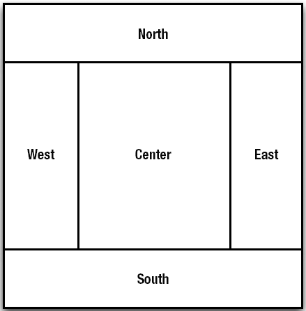
There are several ways in GWT to achieve this layout, one of which is by using a DockPanel. This is a simple yet powerful panel that divides the screen into five regions—north, south, east, west, and center (as shown in Figure 4-6).
DockPanel provides three main methods for binding widgets to the different regions:
add(Widget, DockPanel.DockLayoutConstant)—this method adds the given widget and binds it to the region specified by the given layout constant. As there are only five possible regions,DockPaneldefines five static fields that can be used as the layout constant argument:DockPanel.NORTH,DockPanel.SOUTH,DockPanel.EAST,DockPanel.WESTandDockPanel.CENTER.setCellWidth(Widget, String)—this method enables you to control the width of a region to which the given widget is bound.setCellHeight(Widget, String)—this method enables you to control the height of a region to which the given widget is bound.
Listing 4-22 shows how we can create the main page of our application using these three methods.
Example 4-22. Setting Up the GWTasks Main Page Layout
public class GWTasks implements EntryPoint {
    public void onModuleLoad() {
        DockPanel mainPanel = new DockPanel();
        mainPanel.setBorderWidth(5);
        mainPanel.setSize(" 100%" , " 100%" );
        mainPanel.setVerticalAlignment(HasAlignment.ALIGN_MIDDLE);
        mainPanel.setHorizontalAlignment(HasAlignment.ALIGN_CENTER);
        Widget header = createHeaderWidget();
        mainPanel.add(header, DockPanel.NORTH);
        mainPanel.setCellHeight(header, " 30px" );
        Widget footer = createFooterWidget();
        mainPanel.add(footer, DockPanel.SOUTH);
        mainPanel.setCellHeight(footer, " 25px" );
        Widget categories = createCategoriesWidget();
        mainPanel.add(categories, DockPanel.WEST);
        mainPanel.setCellWidth(categories, " 150px" );
        Widget tasks = createTasksWidget();
        mainPanel.add(tasks, DockPanel.EAST);
        RootPanel.get().add(mainPanel);
    }
    protected Widget createHeaderWidget() {
        return new Label(" Header" );
    }
    protected Widget createFooterWidget() {
        return new Label(" Footer" );
    }
    protected Widget createCategoriesWidget() {
        return new Label(" Categories" );
    }
    protected Widget createTasksWidget() {
        return new Label(" Tasks" );
    }
}
In Listing 4-22, we create widgets that represent the different elements in our design (simple labels for now), bind them to their appropriate regions, and fit the region sizes appropriately. The header and the footer are bound to the north and south regions, and the categories and tasks lists are bound to the west and east regions, respectively. To visualize the design better, we further customize the DockPanel itself by setting its border width and alignments.
Now that we have the skeleton of the main page ready, we can move on to fill it with data. As mentioned earlier, the functionality of the main page revolves around browsing and managing tasks and categories. Figure 4-7 shows a more detailed version of our original wireframe that illustrates how this functionality will be supported by the UI.
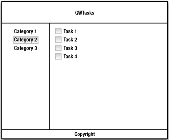
As shown in Figure 4-7, the categories and tasks are presented as lists of rows. The category rows show the name of the categories, and the task rows show the title of each task, with a check box next to it. The tasks list only shows the tasks for the selected category.
To support this layout of categories and tasks, we're going to use two of the most commonly used panels in GWT—HorizontalPanel and VerticalPanel. The HorizontalPanel is a simple panel that enables you to lay out widgets horizontally next to one another. The VerticalPanel, on the other hand, enables you to lay out widgets vertically above (or below) one another.
The Categories List
Let's start by implementing the categories list. Listing 4-23 shows the implementation of the createCategoriesWidget() that creates it.
Example 4-23. Displaying the Categories List
...
protected Widget createCategoriesWidget() {
    VerticalPanel categoryList = new VerticalPanel();
    List<Category> categories = getAllCategories();
    for (final Category category : categories) {
        Widget categoryRow = createCategoryRow(category);
        categoryList.add(categoryRow);
    }
    return categoryList;
}
protected Widget createCategoryRow(Category category) {
    return new Label(category.getName());
}
protected List<Category> getAllCategories() {
    List<Category> categories = new ArrayList<Category>();
    categories.add(new Category(1L, " Shopping List" , " " ));
    ...
    return categories;
}
...
The createCategoriesWidget() method creates a row for every category in the system and adds it to a VerticalPanel. When running this example, the names of all categories will be shown on the left side of the page (the west region) in a vertical list.
In this example, the category row is nothing more than a label displaying the category name. We want to change this to allow the user to click a category and select it. Let's reimplement the createCategoryRow(Category) method to support this behavior (shown in Listing 4-24).
Example 4-24. Adding Behavior to the Categories List
private Widget selectedCategoryRow;
private Category selectedCategory;
...
protected Widget createCategoryRow(final Category category) {
    final Label row = new Label(category.getName());
    row.setWordWrap(false);
    row.setStyleName(" categoryRow" );
    row.addClickListener(new ClickListener() {
        public void onClick(Widget widget) {
            if (row.equals(selectedCategoryRow)) {
                return; // do nothing as it is already selected
}
markSelected(selectedCategoryRow, false);
markSelected(row, true);
selectedCategoryRow = row;
selectedCategory = category;
updateTasksList();
}
});
return row;
}
protected void markSelected(Widget categoryRow, boolean selected) {
if (categoryRow == null) {
return;
}
if (selected) {
categoryRow.addStyleName(" selectedCategory" );
categoryRow.removeStyleName(" unselectedCategory" );
} else {
categoryRow.addStyleName(" unselectedCategory" );
categoryRow.removeStyleName(" selectedCategory" );
}
}
protected void updateTasksList() {
//TODO
}As shown in Listing 4-24, we continue using the standard Label as the category row widget. We also introduce two new global variables to hold the currently selected category and its row. When the user clicks the category row, we first check that the clicked row isn't already selected (in which case nothing should happen) and then we change the currently selected category to the clicked one. The markSelected(Widget, Boolean) method sets the style of the given category row widget appropriately. Note that we also call the updateTasksList() method, which we'll implement next.
The Tasks List
When a category is selected, the relevant tasks should appear on the right side of the page (as shown in Figure 4-7). Listing 4-25 shows how this behavior can be implemented.
Example 4-25. Displaying the Tasks List
...
private VerticalPanel tasksWidget;
...
public void updateTasksList() {
    List<Task> tasks = getTasksForSelectedCategory();
    tasksWidget.clear();
for (Task task : tasks) {
Widget taskRow = createTaskRow(task);
tasksWidget.add(taskRow);
}
}
public Widget createTasksWidget() {
tasksWidget = new VerticalPanel();
return tasksWidget;
}
public Widget createTaskRow(Task task) {
HorizontalPanel row = new HorizontalPanel();
CheckBox checkbox = new CheckBox();
row.add(checkbox);
row.add(new Label(task.getTitle()));
return row;
}
public List<Task> getTasksForSelectedCategory() {
// return the relevant list of tasks
}The createTasksWidget() method is called once when the application is loaded. Its only task is to initialize a shared VerticalPanel that will be used to show the tasks lists. The updateTasksList() method is called when a category is selected. First it retrieves all tasks related to the currently selected category. Then it removes all widgets from the shared vertical panel, creates a task row for each task in the list, and adds each row to the panel. In this example, we use the HorizontalPanel to position a check box next to the task title in the createTaskRow(Task) method.
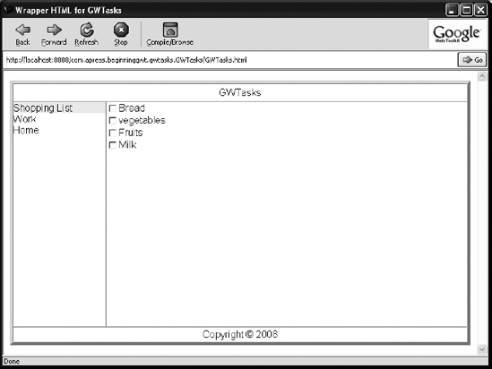
Figure 4-8 shows a screenshot of the current version of our sample application.
Note
At this point, both getAllCategories() in Listing 4-23 and getTasksForSelectedCategory() in Listing 4-25 provide hard-coded dummy data for our sample application. A more appropriate way would be to fetch this data from a central repository where all application data is stored. We'll see how this can be done in the next chapter.
As we've previously shown, the DockPanel enables us to implement the main page layout as defined in Figure 4-5. Nonetheless, there's still a small problem with this implementation that might get bigger once the application runs with real-world data. If you look closely at Listing 4-22, we set the width of the categories widget to a fixed size of 150 pixels. This width was large enough to show the name of the categories in our dummy data, but there's nothing stopping the user from creating categories with longer names that wouldn't fit within this fixed width. To solve this problem, we'll need to slightly modify our layout and introduce yet another useful panel—the HorizontalSplitPanel.
The HorizontalSplitPanel is a panel that can lay out two widgets next to each other and separate them with a split bar. The user can extend or reduce the visual space allocated for each widget by dragging the split bar. When a widget doesn't fit in its visually allocated space, a scrollbar will appear.
Since it's impossible to predict the exact length of the category names in our application, we can use the HorizontalSplitPanel to separate the categories list from the tasks lists. This will enable the user to customize the size of the categories list as she sees fit.
Listing 4-26 shows the reimplemented onModuleLoad() method of our application, this time using the HorizontalSplitPanel (changes highlighted in bold).
Example 4-26. Using a HorizontalSplitPanel to Separate the Categories and Tasks Lists
...
public void onModuleLoad() {
DockPanel mainPanel = new DockPanel();
    mainPanel.setBorderWidth(5);
    mainPanel.setSize(" 100%" , " 100%" );
    Widget header = createHeaderWidget();
    mainPanel.add(header, DockPanel.NORTH);
    mainPanel.setCellHeight(header, " 30px" );
    Widget footer = createFooterWidget();
    mainPanel.add(footer, DockPanel.SOUTH);
    mainPanel.setCellHeight(footer, " 25px" );
    HorizontalSplitPanel categoriesAndTasks = new HorizontalSplitPanel();
    categoriesAndTasks.setSplitPosition(" 150px" );
    Widget categories = createCategoriesWidget();
    categoriesAndTasks.setLeftWidget(categories);
    Widget tasks = createTasksWidget();
    categoriesAndTasks.setRightWidget(tasks);
    mainPanel.add(categoriesAndTasks, DockPanel.CENTER);
    RootPanel.get(" main" ).add(mainPanel);
}
...
Tip
The split bar is transparent by default. To fix this, either apply one of the themes that come with GWT or customize its background color and cursor explicitly by setting up the .gwt-HorizontalSplitPanel .hsplitter { } CSS style.
When running the application, you can now dynamically change the sizes of the categories and tasks lists by dragging the split bar. Figure 4-8 shows a screenshot of the current GWTasks application.
There are many other panels that we haven't covered here. Some, such as FlexTable and TabPanels, will be covered in later chapters as we further extend our sample application.
In this chapter, you took your first dip in the GWT ocean. We started by introducing elements, layouts, and behavior as the three aspects of UI development. We then discussed the basic concepts of component-based UI development and how they relate to these aspects. We showed how GWT provides a well-thought-out programming model to build web-based applications, and how it can bridge the different worlds of Java, HTML, and JavaScript.
You were introduced to the basic UI widgets that ship with GWT. You've seen how a Label can be used to display static text and the HTML widget to display HTML content. You've also used the Button, ToggleButton, and Hyperlink widgets to enable user interaction in the application.
You learned about form widgets, and together we've implemented two different forms in our GWTasks sample applications. You've seen how simple it is to add form validation and customize the look and feel of forms using CSS styles.
We covered the basics of application design and layout. You saw how the GWT panels provide a powerful way to lay out different widgets on the screen. We used basic panels, such as DockPanel, HorizontalPanel, and VerticalPanel, to define the skeleton of our sample application, as well as more complex panels, such as HorizontalSplitPanel, to enhance the user experience.
[1] Swing is the name of a set of APIs for building graphical user interfaces in Java. These APIs have been part of the standard Java Development Kit (JDK) since version 1.2.
[2] An external, as opposed to internal, link references content that is not part of the application itself—typically a web page from another web site.