
Chapter 3
Building Mobile Web Apps
WHAT YOU WILL LEARN IN THIS CHAPTER:
- Building mobile web apps that look like native apps
- Using device geolocation to find a user’s location
- Detecting the orientation of the mobile device screen
- Installing mobile web apps on the iPhone and Android home screens
- Using the jQuery JavaScript library
- Using the jQuery Mobile JavaScript library
- Building a to-do list mobile web app that provides the same user experience as a native app
You are now ready to learn the details of mobile web app development. In Chapter 2, as you built a working sample application, I asked you to accept some of the details on trust. This chapter goes into those details and shows you how to build a mobile web app from the ground up. First, you will see how to access some mobile device functions, such as location detection, from within your app. Then you’ll be introduced to the jQuery Mobile library, which makes mobile web app development much easier. Finally, this chapter shows you how to build a fully working, cross-platform to-do list app with offline storage. At the end of this chapter, you will have this app installed on the home screen of your phone, and it will have the appearance and behavior of a native app.
WHAT YOU CAN DO WITH MOBILE WEB APPS
Mobile web apps are just web pages. You access them on your device, using a standard device web browser. In many cases, your experience with a mobile web app can be as good as your experience with the native installed app. Mobile web apps can support many, although not all, of the device functions available to native apps. These functions include geolocation, on-device storage, native app launching, and offline working. Google and Apple are continually enhancing the capabilities of mobile web apps, so keep an eye out for new capability announcements with each major iPhone or Android release.
Mobile web apps on iPhone and Android run on the built-in WebKit browser. This gives you a single web browser target for your apps, eliminating many cross-browser development issues. In developing web apps, your greatest challenge is dealing with different screen sizes. You can deal with this challenge by following this best-practice web design principle: Make sure your HTML uses a liquid layout that expands to fill the available space. The jQuery Mobile framework, which you will learn about in this chapter, makes layout very easy.
WebKit is an open-source browser engine, and many devices, including Android, use it. The WebKit developer community is committed to supporting the HTML5 web standard. By adopting WebKit as a development platform, you can future-proof yourself. New mobile device operating systems will replace iOS and Android in the future; it is guaranteed that those operating systems will have browsers supporting HTML5, because it is a W3C standard. While this book covers iPhone and Android, you will find that most of the material is also useful for Blackberry version 6 devices, as they use WebKit as well. Other mobile devices that do not use WebKit, such as Windows Phone 7, are nonetheless supporting the HTML5 standard.
Building HTML5 mobile web apps is easy! Instead of spending precious personal time learning Objective-C or Java, you can use your existing HTML, JavaScript, and Cascading Style Sheet (CSS) skills to build beautiful, highly interactive mobile apps. You also have a rapid development advantage over native coders because you can build apps much more quickly by using a scripting language such as JavaScript.
Next, you’ll take a look at what you can do with mobile web apps.
Locating Your User
The HTML5 Geolocation API tells you the current position of the user’s device. You can use it to build location-based services, such as taxi-hailing apps or restaurant finders. The Geolocation API also lets you track the user’s location in real time. The device presents a pop up asking for the user’s permission when you use the Geolocation API. Your app should always handle different cases, such as the user denying permission or an inability to determine the device’s location.
To use the Geolocation API, you call functions on the navigator.geolocation built-in object. To determine the current position, call the getCurrentPosition function. This function expects you to provide two callback functions as arguments. The first function is called if the device position can be determined, and it gives you the latitude and longitude values of the current position. You can use the latitude and longitude values with services such as Google Maps to show a map to the user. The second function is called if the current position cannot be determined. The following is a fully working example that you can run using the nginx web server, as described in Chapter 1.
<!DOCTYPE html><html><head>
  <title>Geolocation</title>
  <meta name="viewport" content="initial-scale=1.0" />
</head><body>
<img id="map" />
<p id="msg"></p>
<script>
var img = document.getElementById('map'),
var msg = document.getElementById('msg'),
navigator.geolocation.getCurrentPosition(
  function(position){
    var latitude  = position.coords.latitude;
    var longitude = position.coords.longitude;
    var timestamp = new Date(position.timestamp);
    msg.innerHTML =
      'Latitude:  '+latitude+'<br />'+
      'Longitude: '+longitude+'<br />'+
      'Timestamp: '+timestamp;
    img.src =
      "http://maps.google.com/maps/api/staticmap?sensor=true&"+
      "center="+latitude+","+longitude+
      "&zoom=14&size=300x200&markers=color:red|"+
      latitude+","+longitude;
  },
  function(error){
    var txt;
    switch(error.code) {
      case error.PERMISSION_DENIED: txt = 'Permission denied'; break;
      case error.POSITION_UNAVAILABLE: txt = 'Position unavailable'; break;
      case error.TIMEOUT: txt = 'Position lookup timed out'; break;
      default: txt = 'Unknown position.'
    }
    msg.innerHTML = txt;
  }
);
</script>
</body></html>
code snippet geo.html
The bold lines in this example are the heart of the Geolocation API. Your callback function is invoked with a position parameter object. This position object has a coords sub-object that contains the actual latitude and longitude values, in decimal degrees. A timestamp for the position lookup is also provided. The rest of this example shows how to display a static map, using the Google Maps service, and how to handle any errors. You can trigger the error-handling code by refusing the page permission to get your location, when the permission pop-up appears.
The position information is not supplied immediately; it can take a few seconds to appear. The location information is not just determined by the satellite global positioning system (GPS). The W3C specification for geolocation says that the device may use any and all methods to determine location. This can include use of the GPS, cell tower triangulation, measurement of nearby Wi-Fi network strength, determination based on IP address, or use of previously cached locations. Geolocation may therefore be slow and inaccurate, depending on circumstances.
It is also possible to continuously track the user’s location by using the watchPosition function. You use this function in exactly the same way you use the getCurrentPosition function. However, watchPosition calls your function every time the device position changes, so you can use it to track the user in (nearly) real time. When you want to stop tracking, you use the clearWatch function. The watchPosition function returns an identifier that you pass to the clearWatch function. When you watch the position in this manner, the device usually provides a visual indication to the user that his or her position is being watched continuously. For example, on the iPhone, a small purple arrow appears in the top bar when you use the following:
...
var watch = navigator.geolocation.watchPosition(
  function(position){
    ...

// some time later, stop tracking position
navigator.geolocation.clearWatch(watch);
WARNING Watching the user’s position continuously reduces battery charge very quickly. Always provide a way for the user to turn off position tracking.
Responding to Device Orientation
Users can hold Android and iPhone devices in either portrait or landscape orientation. In upright portrait orientation, the device is held vertically, with the home button at the bottom. This is by far the most common usage scenario. In landscape orientation, the device is held horizontally on its side, and the home button can be on the left or right. The device browser does not support upside-down portrait orientation, where the home button is at the top. You can verify this for yourself by loading a web page in the device browser and turning the device upside-down. The web page will not change. In practice, this limitation is not normally a problem as it is standard device behavior and users expect it. In addition, a user typically would not attempt to use a device upside down.
Although it is best to design the layout of your application so that it has a balanced appearance in both portrait and landscape orientations, you may need to change the user interface in some way when orientation changes occur. It is possible to detect orientation changes by using built-in JavaScript variables and events.
The browser sets the window.orientation variable to tell you the current orientation of the device. The values are 0 for upright portrait, 90 for landscape with the home button on the right, and -90 for landscape with the home button on the left. Unfortunately, if you are building a cross-platform and backward-compatible mobile web app, you cannot rely on this variable. You have to use the window width and height to determine the orientation. In portrait orientation, height is greater than width. In landscape orientation, width is greater than height. The code in this section shows you how to deal with this case.
You can use the window.onorientationchange event hook to get notifications of device orientation changes. Again, this is not fully cross-platform, so you need to use the window.onresize event hook as well.
In the following fully working example, the API functions names are in bold. This example provides a mini API for handling device orientation:
<!DOCTYPE html><html><head>
  <title>Orientation</title>
  <meta name="viewport" content="initial-scale=1.0" />
</head>
<body>
<div id="orient"><div>
<script>
function getorientation() {
  var orientation = 'portrait';

  if( undefined != window.orientation ) {
    if( 90 == window.orientation
        || -90 == window.orientation )
    {
      orientation = 'landscape';
    }
  }
  else if( window.innerHeight < window.innerWidth ) {
     orientation = 'landscape';
  }

  return orientation;
}

function orientationchanged(callback) {
  if( 'onorientationchange' in window ) {
    window.onorientationchange = function() {
      callback(getorientation());
    }
  }
  else {
    window.onresize = function() {
      callback(getorientation());
    }
  }
}

var orient = document.getElementById('orient'),
orient.innerText = getorientation();

orientationchanged(function(orientation){
  orient.innerText = orientation;
});
</script>
</body></html
code snippet orient.html
Run this example by using nginx as described in Chapter 1. The getorientation method can be called at any time, and it returns a string value, which is either 'portrait' or 'landscape'. You can register your own event handler function by using the orientationchanged function. Your event handler with be called with one argument, a string value of either 'portrait' or 'landscape', whenever the device orientation changes.
This code uses the window.orientation variable and the window.onorientationchanged event hook, if they are available, but it falls back to using the window dimensions and window.onresize event hook if they are not.
More Features for Later
So far, you’ve seen some of the things that are possible with mobile web apps. You can access even more device capabilities from a mobile web app, such as launching other apps, complex touch gestures, networking, and full SQL database storage. You’ll take at look at these capabilities in later chapters. Once you start building hybrid apps with PhoneGap, you’ll be able to access the full capabilities of the device, including taking pictures, measuring device movement, vibration alerts, and more.
Installing Mobile Web Apps on iPhone Devices
Now you will install an iPhone mobile web app. It’s important to go through this process so that you understand the user experience thoroughly. Remember that you will be asking your users to follow this process. The iPhone has supported mobile web apps from very early in its history, and the mobile Safari browser makes the installation process relatively simple. Refer to Figure 3-1 as you follow these steps:

1. Open the mobile web app in the mobile Safari browser. For this example, you can use my Startup Death Clock mobile web app, which is available at http://www.startupdeathclock.com.
2. Tap the bookmark icon on the footer toolbar. The bookmark icon is the icon in the center of the toolbar. In iPhone versions before 3.0, this was a plus symbol, but it is now a forward symbol. An options menu slides up from the bottom of the screen.
3. Select the Add to Home Screen menu option. A simple form slides up from the bottom of the screen, showing the app icon and providing a suggested name for the App, which you can change.
4. Tap the Add button on the navigation bar at the top right. The page closes, and you see one of the pages on the home screen of your iPhone. The mobile web app has been installed as an icon.
5. Tap the mobile web app icon to launch the app.
Installing Mobile Web Apps on Android Devices
The process for installing web apps on Android devices is somewhat more complex than the iPhone process. The Android browser does not provide an option to directly add a mobile web app to a page of the home screen. Instead, the user must first create a bookmark and then add that bookmark to the home screen. Here’s how it works (see Figure 3-2):
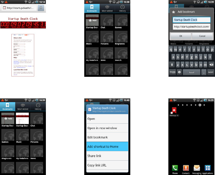
1. Open http://www.startupdeathclock.com in the Android browser.
2. Tap the bookmark button beside the URL address bar. The bookmarks page opens. A miniature faded version of the web app is shown in one of the free slots, with the word Add imposed over it.
3. Tap this free slot. A pop-up appears, showing the name of the app and its URL.
4. Tap the OK button. You have now saved the mobile web app as a bookmark.
5. To add the mobile web app bookmark to the home screen, press and hold your finger on the app bookmark for a few seconds. An option menu appears.
6. Tap the Add Shortcut to Home option. Exit the browser. You should now see an icon representing the app on the current page of your home screen.
INTRODUCING JQUERY AND JQUERY MOBILE
It’s time to build a real application. In this section, you’ll build a simple to-do list app. This type of app is very common in the iPhone and Android app stores. You should take a minute to install one of the free ones in order to gain an understanding of the basic user interface design. It doesn’t really matter which to-do list app you try out; they are all very much alike. In order to build a to-do list app using HTML5, you need to use some utility libraries. If you tried to build the app using only the standard HTML5 JavaScript document API, you would have to write a lot of code. Instead, you can cut down on the number of lines of code you have to write and increase your productivity by reusing code from the libraries described in this section.
The jQuery Library
The jQuery JavaScript library is an essential item in your app development toolkit. It is by far the most popular library for web development. It also provides the underlying framework for the jQuery Mobile library, which you will learn about in the next section. While jQuery is not appropriate for all applications, and there are other excellent mobile-only JavaScript libraries, it is important to be familiar with jQuery. You will also find the jQuery Mobile library to be a significant productivity boost when building mobile web apps. This section provides a quick introduction to jQuery for beginners. If you are new to jQuery, it is well worth the time to learn, as it is a great resume enhancement. If you are already familiar with jQuery, feel free to skip ahead to the next section, on jQuery Mobile.
When a web browser loads your HTML, it constructs a Document Object Model (DOM). This is an internal data structure that maps out your HTML in a logical form. The standard JavaScript API provides many functions and objects that let you query and manipulate the DOM. This is how you create dynamic web apps that change their user interface in response to user actions.
The standard JavaScript DOM API is verbose and results in code that can be hard to read. The big idea with jQuery is that you can write short, easy-to-read code that gets the job done.
JavaScript allows you to use the dollar character, $, in your variable names, and jQuery exploits this by using $ as shorthand notation. The main idea with jQuery, and the reason the word query appears in the name of the library, is that it works by querying your HTML document for HTML elements. You then make changes to the set of elements that matched your query.
TRY IT OUT: Using jQuery
In this example, you will build a simple HTML page that shows off some of the features of jQuery. Follow these steps:
1. Download the latest development version of jQuery from http://jquery.com. It is provided as a single text file containing the JavaScript code of jQuery. The filename contains a version number. In this book, references to jQuery do not contain the version number, so rename the file jquery.js.
2. Create a new project folder called jquery. Copy the jquery.js file you downloaded in step 1 into this jquery project folder.
3. Using your code editor, create a new file called jquery.html in the jquery folder. This file will contain the entire code for this example.
4. Insert the following code into the jquery.html file and save it:
<!DOCTYPE html>
<html>
<head>
  <script src="jquery.js"></script>
</head>
<body>

<h1>Heading</h1>
<p id="para1">Paragraph 1</p>
<p id="para2">Paragraph 2</p>
<p id="para3">Paragraph 3</p>

<script>
$(function(){
  var para = $('<p>'),
  para.attr('id','end'),
  para.html('<i>The End</i>'),
  $('body').append(para);

  $('p').css({color:'green'});
  $('#para2').css({color:'red'});

  $('h1').hide();
  $('h1').fadeIn(500);
  $('#para3').slideUp(500);

  $('#end').click(function(){
    var fontsize = parseInt( $(this).css('font-size'), 10 );
    $(this).css({'font-size':2+fontsize});
  });
});
</script>
</body>
</html>
Code snippet jquery.html
5. Start the Safari web browser. Select File  Open File and then select the query.html file. You should see a page containing some colored text that animates when the page first loads.
6. Click on the final paragraph (with the text “The End”). The font size of the text in the paragraph will increase with each click.
NOTE This book asks you to remove the version number from the jquery.js file. This keeps the examples simple. When building a traditional website, it is often better for performance to load the jquery.js file from a Content Delivery Network (CDN), such as the one provided by Google: http://code.google.com/apis/libraries/devguide.html. The CDN provides high bandwidth and high performance content delivery. When building a mobile web app, things are different. If you need your app to continue working offline, then a CDN is not much use, and you’ll need to provide all the files, including jquery.js. If your mobile web app is more like an interactive mobile web site and cannot function offline, then you should consider using a CDN.
How It Works
The page you created in this example demonstrates the core features of jQuery. The first thing to notice is the way that jQuery lets you know that your HTML page is fully loaded and ready to be updated by your JavaScript code. Instead of using the document.onload event, in jQuery you use the following code:
$(function(){
  // your code goes here
});
The reason for doing things this way is that the document.onload event is not reliable in a cross-browser fashion. One of the advantages of jQuery is that it hides cross-browser issues from you and provides you with a safe interface for common browser events. Although this code may look slightly magical, it is easy to break down. The outer function call has the pattern:
$( ... )
This is a function call. You are calling the jQuery $ function. The jQuery $ variable is both a function and an object. As a function, you give it the code you want to run when your HTML page has fully loaded. You do this with a function definition:
function(){
  // your code goes here
);
This code goes inside the $( ... ) function call, as the first argument.
Once you’ve set your code up, you need to start using jQuery. Here is the general syntax for queries and operations on the DOM:
$( selector ).operation( callback )
selector is a specific DOM object or CSS selector string that identifies what you want jQuery to work on. operation is the type of work you want to perform, such as attaching an event handler or changing a HTML element. callback is your function. This function runs when something happens. It is known as a callback because jQuery calls it to go back to your code. Think of using the callback as leaving a voicemail for jQuery, instructing it to do something, and jQuery calls you back when it is done.
NOTE Callback functions are common in JavaScript code. They are used when a block of code has to run later. You don’t know when the user will click a button, but you do know that you want your code to run when that click happens. Callback functions are passed to other functions as arguments, usually appearing as anonymous function definitions, such as function() { alert("This function has no name!")}. This can appear confusing. Just remember that the callback function does not run right away; it runs at a later time.
When the HTML page has finished loading, your code finally starts to run. The first thing it does is insert a new paragraph at the end of the document:
  var para = $('<p>'),
  para.attr('id','end'),
  para.html('<i>The End</i>'),
  $('body').append(para);
The bold parts of the code are jQuery API calls. The first jQuery API call is $('<p>'). This code follows the pattern $(selector). In this case, operation and callback are optional. The selector is a string value that looks exactly like an HTML paragraph p tag: It instructs jQuery to create a new HTML <p> element. This new element has not yet been inserted into the HTML document and is still invisible to the user.
The attr operation sets an attribute on an HTML element. Here, the attr operation sets the id attribute on the new <p> element. In ordinary HTML, this would look like <p id="end"></p>. The html operation injects HTML code inside the selected element. In ordinary HTML, the new element now looks like <p id="end"><i>The End</i></p>.
Finally, the new paragraph is inserted into the document and becomes visible. The code to do this follows the jQuery pattern:
- $(’body’) — Selects the body tag of the document.
- append(para) — Calls the append operation and appends the para element to the body. The append operation inserts an element into the final position inside the selected element.
You can do many things with jQuery. The following lines of code manipulate the CSS styles of the paragraph elements, using the css operation:
  $('p').css({color:'green'});
  $('#para2').css({color:'red'});
The selectors in this code are marked in bold. The first selector, 'p', selects all p elements in the document. This means that the css operation is applied to all of them. The result is that the text of all the paragraphs is colored green. This is an example of jQuery keeping your code short and sweet. You don’t have to write a for loop to handle each paragraph individually. The '#para2' selector is an example of an id selector. This selector finds the single element in the document with the unique identifier para2. In this example:
<p id="para2">Paragraph 2</p>
The # character tells jQuery to look for an identifier that matches the id attribute of an element. In terms of the traditional JavaScript DOM API, $('#foo') is the same thing as document.getElementById('foo'). You can see that jQuery keeps your code short!
One of the most useful features of jQuery is its prebuilt set of animation effects. The following lines of code use these animation effects, which you can see when you load the page.
  $('h1').hide();
  $('h1').fadeIn(500);
  $('#para3').slideUp(500);
The hide operation hides an element from view. The fadeIn operation is an animation that makes a transparent element visible by gradually making the element less and less transparent until it has no transparency. The slideUp operation inserts an element into your HTML document with an animated upward movement. The number 500 that is given as a argument to the fadeIn and slideUp operations tells jQuery to perform the animation over a 500-millisecond period (half a second).
NOTE The jQuery library has excellent documentation, tutorials, and FAQs. Go to http://docs.jquery.com to get the full list of animation effects.
The last thing you need from jQuery to understand the app example provided later in this chapter is event handling. You want to be able to capture user actions, such as clicking a button or tapping a touch-sensitive screen. These are given to you as browser events, and the jQuery API makes it easy to capture them. The following code is an event handler for clicks on a given HTML element:
  $('#end').click(function(){
    var fontsize = parseInt( $(this).css('font-size'), 10 );
    $(this).css({'font-size':2+fontsize});
  });
This code increases the size of the end paragraph that you created earlier by increasing the font size by 2 pixels with every click. The $(this).css('font-size') operation gets the current font size of the element. The variable this is set by jQuery to be the DOM element that was clicked, in this case the end paragraph. The parseInt function converts this into an integer value. You then store this value in the fontsize variable. You set a new font size by adding 2 to the old font size: 2+fontsize. Finally, you change the font size by using the jQuery css operation again, this time giving it a literal JavaScript object:
{'font-size':2+fontsize}
The property names of this object correspond to the CSS properties that you want to change, in this case, the font-size.
WARNING When writing callback functions, you need to be careful to get your brackets and braces in order. The pattern is always $.operation(function(){...}). You’ll always end your callback function with }). It is easy to end up with code that has mismatched brackets or braces. This confuses the browser, which might give you an inappropriate line number as the location of the syntax error and can be tricky to correct. Always start by writing out $.operation(function(){}) fully and then fill in the contents of the function afterward. This way, you’ll never forget the final }).
When you use jQuery in production, you need to consider your deployment options. During development, it is best to use the development version of jQuery, as instructed previously. The development version is normal, nicely formatted JavaScript code. Do not be afraid to open up jquery.js and look at the code. You’ll learn a lot from it. For production, it is better to use the minimized version, generally named jquery.min.js (leaving out the version numbers). This is the production download on the jQuery site. The JavaScript code in this case has been programmatically compressed to reduce the size of the file, in a process known as “minification.” The minified file can be sent more quickly over the network, and the browser can load and parse it more quickly.
The jQuery Mobile Library
The jQuery Mobile library extends jQuery to provide support for mobile devices. This cross-platform library works particularly well with iPhone and Android devices, which both use the same underlying WebKit browser engine. Unlike jQuery, which is designed to stay out of your way, jQuery Mobile modifies your HTML content to create a native-looking mobile app interface. You must use a prescribed set of HTML tags and attributes to create your desired user interface layout.
Most of the mobile web app frameworks use this approach, and it is an appropriate architecture for building user interfaces on small screens with limited user interaction models. If you want to create a custom or experimental interface, or a game, then jQuery Mobile is not an appropriate choice. If you want to quickly build a mobile web app that has a standard look and feel and operates in much the same way as a native app, then jQuery Mobile is a good choice.
In addition to the use of the $ character as the main entry point for its API, jQuery Mobile also makes use of the data-* custom attribute feature of HTML5. This feature allows you to add custom attributes to HTML elements while preserving the validity of your document. You can use any name after the data- prefix (for example, <div data-foo="bar"></div>). When you build your jQuery Mobile interface in HTML, you can add many of these data-* attributes to your HTML tags to tell jQuery Mobile how to display them. This approach is known as declarative programming, because you declare your user interface using literal tags, rather than executing code.
NOTE Using a declarative programming style means making your program as data driven as possible. Instead of defining the logic and behavior using code, you declare the logic and behavior using data. CSS style sheets are a good example. For jQuery Mobile, the declarative data is the HTML tags and data-* attributes that directly define the appearance of the app.
TRY IT OUT: Using jQuery Mobile
Now you will take a look at the wide range of user interface elements that jQuery Mobile provides by building a user interface that uses most of them. The elements will not trigger any actual functionality, but you will be able to see how they work. Follow these steps:
1. Download the latest uncompressed zip file version of jQuery Mobile from http://jquerymobile.com. The zip file contains a JavaScript file, a CSS file, and an images folder. Rename the files jquery.mobile.js and jquery.mobile.css, removing the version number. Because jQuery is a requirement of jQuery Mobile, ensure that you have a compatible version.
WARNING Using the uncompressed development versions of the jQuery Mobile files is even more essential in this case, as you will almost certainly run into unpredictable differences in behavior on different mobile devices.
2. Create a new project folder called jqmob. Copy into your jqmob project folder the jquery.js file you downloaded in step 1.
3. Copy the jquery.mobile.js and jquery.mobile.css files, as well as the images folder into your jqmob project folder.
4. Using your code editor, create a new file called jqmob.html. This file will contain the entire code example.
5. Insert the following code into the jqmob.html file and save it:
<!DOCTYPE html>
<html>
<head>
  <meta name="viewport"
       content="user-scalable=no,initial-scale=1.0,maximum-scale=1.0" />
  <meta name="apple-mobile-web-app-capable" content="yes" />

  <link rel="stylesheet" href="jquery.mobile.css" />

  <script src="jquery.js"></script>
  <script src="jquery.mobile.js"></script>
</head>
<body>

<div id="list" data-role="page">
  <div data-role="header" data-position="fixed">
    <h1>List Example</h1>
  </div>
  <div data-role="content">
    <ul data-role="listview">
      <li><a href="#content">Content Example</a></li>
      <li><a href="#button">Button Example</a></li>
      <li><a href="#form">Form Example</a></li>
    </ul>
  </div>
</div>

</body>
</html>
code snippet jqmob.html
6. Start Safari, Select File Open File and then select the jqmob.html file to open this file. You should see a page with a header containing an iPhone-style list. None of the list items are yet functional.
7. Edit the jqmob.html file by adding the following code before the closing body tag:
<div id="content" data-role="page">
  <div data-role="header" data-position="fixed">
    <h1>Content Example</h1>
  </div>
  <div data-role="content">
    <h1>Heading</h1>
    <h2>Sub Heading</h2>
    <p>
        Lorem ipsum dolor sit amet, consectetur adipisicing elit.
    </p>

    <div data-role="collapsible">
      <h1>Collapsible</h1>
      <p>
        Sed do eiusmod tempor incididunt ut
        labore et dolore magna aliqua.
      </p>
    </div>

    <h3>Inset List</h3>
    <ul data-role="listview" data-inset="true">
      <li>Row One</li>
      <li>Row Two</li>
      <li>Row Three</li>
    </ul>

    <h3>Columns</h3>
    <div class="ui-grid-a">
      <div class="ui-block-a">
        Ut enim ad minim veniam, quis nostrud exercitation ullamco
        laboris nisi ut aliquip ex ea commodo consequat. Duis aute
        irure dolor in reprehenderit in voluptate velit esse
        cillum dolore eu fugiat nulla pariatur.
      </div>
      <div class="ui-block-b">
        Excepteur sint occaecat cupidatat non proident, sunt in
        qui officia deserunt mollit anim id est laborum.</p>
      </div>
    </div>
  </div>
</div>

<div id="button" data-role="page">
  <div data-role="header" data-position="fixed">
    <h1>Button Example</h1>
  </div>
  <div data-role="content">
    <a href="#list" data-role="button">Link</a>
    <a href="#list" data-role="button" data-icon="star">Icon</a>
    <a href="#list" data-role="button"
       data-inline="true">Small</a>

    <div data-inline="true">
    <a href="#list" data-role="button" data-inline="true">Same</a>
    <a href="#list" data-role="button" data-inline="true">Line</a>
    </div>

    <div data-role="controlgroup" data-type="horizontal">
      <a href="#list" data-role="button">Yes</a>
      <a href="#list" data-role="button">No</a>
      <a href="#list" data-role="button">Maybe</a>
    </div>
  </div>
</div>

<div id="form" data-role="page">
  <div data-role="header" data-position="fixed">
    <h1>Form Example</h1>
  </div>
  <div data-role="content">
    <div data-role="fieldcontain">
      <label for="input">Input:</label>
      <input type="text" id="input" placeholder="input" />

      <label for="textarea">Textarea:</label>
      <textarea rows="4" id="textarea"></textarea>

      <label for="slider">Slider:</label>
      <input type="range" id="slider" value="0"
             min="0" max="100"  />

      <div data-inline="true">
        <label for="toggle">Toggle:</label>
        <select id="toggle" data-role="slider">
          <option value="off">Off</option>
          <option value="on">On</option>
        </select>
      </div>

      <label for="select">Select:</label>
      <select id="select">
        <option>Option One</option>
        <option>Option Two</option>
        <option>Option Three</option>
      </select>
    </div>
  </div>
</div>
code snippet jqmob.html
8. Reload the jqmob.html file in Safari. The list items are now active. Click each one and verify that the relevant page appears. Click the Back button to return to the main list.
9. Open your nginx.conf file and add the following lines to the server configuration section. Refer to the “Setting Up Your Development Tools” section in Chapter 1 if you need a reminder about how to do this.
location /jqmob/ {
  alias   /path/to/your/jqmob/folder/;
}
10. Reload the nginx configuration by using the nginx -s reload command. Verify that you can access the jqmob.html file from your desktop Safari by opening the URL http://localhost/jqmob/jqmob.html.
11. Start the iPhone simulator, open the mobile Safari app, and open the same URL as in step 10 (http://localhost/jqmob/jqmob.html). You should see the jQuery Mobile interface in all its glory! Figure 3-3 shows you what it should look like. Verify that the user interface behaves correctly.

12. Open http://localhost/jqmob/jqmob.html in the Android emulator and verify that it looks and behaves the same as the iPhone version.
13. Open the jqmob.html file on your mobile device browser by visiting http://YOUR_IP_ADDRESS/jqmob/jqmob.html. As explained in Chapter 1, replace the YOUR_IP_ADDRESS placeholder with the IP address of your desktop machine. Verify that the user interface appears as expected and responds correctly to touch events.
How It Works
The demonstration application you just created, although built using jQuery Mobile, follows the standard approach introduced in Chapter 2. You begin the document with the <!DOCTYPE html> declaration to let the browser know that you are using HTML5. You also use the special header metatags that control the mobile browser view port.
To use jQuery Mobile, you need to make sure your page can access all the required files. This includes not only the standard jquery.js file but also the jQuery Mobile files, jquery.mobile.js and jquery.mobile.css, as well as the images folder from the jQuery Mobile distribution. The document references these documents using standard HTML header tags.
The basic structure that jQuery Mobile uses is a set of pages, described by top-level div elements. These pages contain the user interface definition. To create these pages, you give each top-level div element an id attribute and a data-role="page" attribute. data-role="page" turns the div into a top-level page. The first such div in the document will be shown when the app starts, and the others will be hidden. Any other elements at the top level will also be hidden by jQuery Mobile. The id attribute on each page uniquely identifies that page.
This app has four pages, and this is the basic structure, with all content removed:
<div id="list" data-role="page">
  <!-- content removed -->
</div>

<div id="content" data-role="page">
  <!-- content removed -->
</div>

<div id="button" data-role="page">
  <!-- content removed -->
</div>

<div id="form" data-role="page">
  <!-- content removed -->
</div>
You can see that jQuery Mobile provides a simple and clear logical structure for the different pages in your app.
The first page, with id="list" (call this the #list page), contains a header and a list of links to the other three pages. The header is unsurprisingly defined using the data-role="header" attribute. The function of most of the jQuery Mobile data-* attributes is quite clear as they have simple and direct names. You can place whatever you like inside the header element, but the convention is for mobile applications to show some title text and possibly buttons to the left and right of the title. As you will see when you run the app, jQuery Mobile provides you with an automatic back button on the left, so all you need to do for this app is provide the title, like so:
  <div data-role="header" data-position="fixed">
    <h1>List Example</h1>
  </div>
In this header, the data-position="fixed" attribute ensures that the header remains in a fixed position at the top of the screen. Different mobile web app libraries have taken different approaches to providing this functionality. In the case of jQuery Mobile, the header is faded back in if the user scrolls it out of view. This has an advantage in that native browser scrolling is used to scroll the contents of the page, but it also has the disadvantage of the header appearing to disappear temporarily, which is not normal for native apps. This may not be an issue if your app falls into the category of app-like mobile websites. One of the exercises at the end of this chapter points you to the iScroll library, which provides a better approach for native-like mobile web apps.
After the header, the contents of the page are placed within a new div with a data-role="content" attribute. All the pages in this app use this structure. For this first page, you need to show a clickable list of items that link to the other pages. This is where you can really start to leverage the facilities that jQuery Mobile provides. You won’t need to write any JavaScript code to achieve this basic level of user interaction. The list is implemented as follows:
<ul data-role="listview">
  <li><a href="#content">Content Example</a></li>
  <li><a href="#button">Button Example</a></li>
  <li><a href="#form">Form Example</a></li>
</ul>
This code defines everything that jQuery Mobile needs to link up the pages. As usual, you use normal HTML tags to build the interface, and you use data-* attributes to turn them into mobile user interface components. You use the standard ul tag to build the list, and you apply the data-role="listview" attribute to turn the ul tag and its contents into a mobile app list view. Each list item is contained in a standard li tag, and the links to the other pages are standard a tags.
So how does jQuery Mobile link the pages? The value of the href attribute is the key to understanding this. You take the id of the page div you want to link to, prepend a # character, and you use this as the value of the href attribute. The jQuery Mobile library takes over at this point and performs the element manipulations that will hide the current page and make the new page appear. You can use this #id syntax with any a tag. You’ll see how this works with buttons in a moment.
The content page is built using standard HTML tags. The jQuery Mobile library provides a few extra content elements, such as a collapsible section that opens and closes when you tap the section header, as well as support for column layouts. To create a collapsible section, use a div with data-role="collapsible" and place an h1 tag inside this div to provide the text for the section name. Any other elements are contained with the collapsible section.
The jQuery Mobile library does not just use the data-* attributes exclusively. The library also provides a range of utility CSS style classes. In this example, the style classes allow you to build a two-column layout. You can cut and paste this div structure to replicate the layout.
The button page shows you how to create a variety of buttons. In jQuery Mobile, an ordinary button consumes as much horizontal space as it can. You can see this in the top Link button in the example, which fills the page from edge to edge. In the code for this button, you can see the same href linking style as used with the list view:
<a href="#list" data-role="button">Link</a>
Clicking this button returns you to the #list page. To create a button out of an a tag, you use the data-role="button" attribute.
In jQuery Mobile, you have many options for controlling the look and feel of button elements. You can use the data-icon="star" attribute to attach a star icon image to the button. A number of standard icons are provided with the library, such as star, plus, minus, check, and refresh. You can use these keywords as the value of the data-icon attribute. You can also use custom icons; refer to the jQuery Mobile documentation for more on this.
To prevent the button from taking up all the horizontal space, you can use the data-inline="true" attribute. This reduces the width of the button to the size of the text inside the button. To keep a number of buttons on the same line, you enclose them all with a <div data-inline="true"> tag. Finally, to achieve the common mobile interface multi-button effect, where all the buttons are joined together on a single line, you use the following code:
<div data-role="controlgroup" data-type="horizontal">
  <a href="#list" data-role="button">Yes</a>
  <a href="#list" data-role="button">No</a>
  <a href="#list" data-role="button">Maybe</a>
</div>
This code groups the buttons together by using a data-role="controlgroup" div and by specifying with data-type="horizontal" that the controls are to be organized horizontally.
The final page of this example shows you how to construct HTML form elements. As a general principle, jQuery Mobile allows you to do this in the normal manner, using normal HTML tags. Make sure to follow best practice and use label tags to provide a text description of each form element. You connect each label to the correct form input element by setting the for attribute of the label to the value of the id attribute for the form input element. Connecting the elements in this manner gives jQuery Mobile enough information to lay out your form properly on different screen sizes.
A common mobile form element is the sliding toggle switch. You use the following code to create one:
  <label for="toggle">Toggle:</label>
  <select id="toggle" data-role="slider">
    <option value="off">Off</option>
    <option value="on">On</option>
  </select>
The toggle switch is created using a normal HTML select input element. You need to add the attribute data-role="slider" to this select element and ensure that it has only two options. jQuery Mobile does the rest.
This example has given you a feel for what you can do with the jQuery Mobile library. In the next section, you will use jQuery Mobile to build a working mobile web app. However, there is much more to this library, and it has many more features to aid you in developing mobile web apps. Visit http://jquerymobile.com to see the complete reference documentation.
Now that you know how to use jQuery and jQuery Mobile, it’s time to build the To-Do List app. The code structure you will use for this app is something you can also use for more complex apps. This is why, in the examples that follow, the code is broken out into more than one file.
The jQuery code for this app is kept clean and simple. It consists almost entirely of event-handling code, as well as some utility methods. This structure will get you quite far. In later chapters, you will learn how to build much more complex apps and how to organize larger volumes of code. For now, dive right in!
TRY IT OUT: The Basic Interface of the To-Do List App
The first task in building the To-Do List app is to create the app’s basic user interface. You will build it in stages, so that you can verify that everything is working properly. The first step is to make sure that the HTML, JavaScript, and CSS files are all present and correct. After you open your code editor and start the Safari desktop browser, follow these steps:
1. Create a new project folder called todo. Using your code editor, create three files in the todo folder: todo.html, todo.js, and todo.css. The todo.html file will contain the HTML code defining the user interface of the app, the todo.js file will contain the JavaScript code defining the behavior of the app, and the todo.css file will contain the style sheet code defining the visual appearance of the app.
2. Copy the jquery.js, jquery.mobile.js, and jquery.mobile.css files into the todo folder.
3. Insert the following code into the todo.html file and save it. This step does not require jQuery Mobile, so the jquery.mobile.js file is not referenced yet.
<!DOCTYPE html>
<html>
<head>
<title>To Do App</title>
<meta name="viewport"
content="user-scalable=no,initial-scale=1.0,maximum-scale=1.0" />
<meta name="apple-mobile-web-app-capable" content="yes" />
<link rel="stylesheet" href="todo.css" />
<script src="jquery.js"></script>
<script src="todo.js"></script>
</head>
<body>
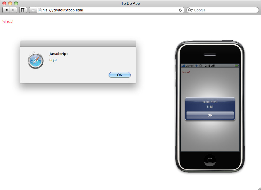
<p>hi css!</p>
</body>
</html>
code snippet todo.html
4. Insert the following code into the todo.css file and save it:
p {
  color: red;
}
5. Insert the following code into the todo.js file and save it. This code will display a pop up alert message when the page loads.
$(function(){
  alert('hi js!'),
});
6. Select File Open File and then select the todo.html file to open this file in Safari. You should see a page containing the text “hi css!” in red and displaying an alert pop-up that says “hi js!” These tracer bullets verify that the todo.html page is working properly. Figure 3-4 shows you what you should see in Safari.
7. Edit the todo.css file by completely replacing its previous contents with the following code:
#cancel {
  display: none;
}

#newitem {
  display: none;
  height: 90px;
}

#save {
  font-size: 8pt;
}

#text {
  font-size: 8pt;
}

div.delete {
  font-size: 8pt;
  float: right;
  border: 1px solid #900;
  border-radius: 5px;
  padding: 5px;
  color: white;
  background: -webkit-gradient(
    linear,
    left bottom,
    left top,
    color-stop(0.18, rgb(173,0,0)),
    color-stop(0.57, rgb(250,120,120))
  );
}

li span.ui-icon-arrow-r {
  display: none;
}

span.check {
  border: 2px solid #333;
  line-height: 20px;
  font-size: 20px;
  width: 20px;
  height:20px;
  display: inline-block;
  margin-right: 10px;
}
code snippet todo.css
8. Edit the todo.js file by completely replacing its previous contents with the following code:
document.ontouchmove = function(e){ e.preventDefault(); }

$(function(){

  $('#add').tap(function(){
    $('#add').hide();
    $('#cancel').show();
    $('#newitem').slideDown();
  });

  $('#cancel').tap(function(){
    $('#add').show();
    $('#cancel').hide();
    $('#newitem').slideUp();
  });

});
code snippet todo.js
NOTE The jQuery library allows you to attach click event handlers to HTML elements using the click function. Your event handler is called when the user clicks on the associated element. When you are using jQuery Mobile, the equivalent is the tap function. Your event handler is called when the user taps on the associated element on their device. When you are viewing a jQuery Mobile interface on a desktop browser, the tap also handles clicks. This means you can use mouse clicks to simulate finger taps when testing on the desktop.
9. Edit the todo.html file by adding the lines marked below in bold. jQuery Mobile uses these lines to build the user interface:
<!DOCTYPE html>
<html>
<head>
<title>To Do App</title>
<meta name="viewport"
content="user-scalable=no,initial-scale=1.0,maximum-scale=1.0" />
<meta name="apple-mobile-web-app-capable" content="yes" />
<link rel="stylesheet" href="jquery.mobile.css" />
<link rel="stylesheet" href="todo.css" />
<script src="jquery.js"></script>
<script src="jquery.mobile.js"></script>
<script src="todo.js"></script>
</head>
<body>
<div id="main" data-role="page">
<div data-role="header" data-position="fixed">
<h1>To Do List</h1>
<a id="add" href="#" data-icon="plus"
class="ui-btn-right">Add</a>
<a id="cancel" href="#" data-icon="delete"
class="ui-btn-right">Cancel</a>
</div>
<div data-role="content">
<div id="newitem">
<input type="text" id="text"
placeholder="Enter To Do item"/>
<a id="save" href="#"
data-role="button" data-inline="true"
data-icon='plus'>Save</a>
</div>
<ul id="todolist" data-role="listview">
<li>
<span class="check">✓</span>
<span class="text">test item</span>
<div class="delete">Delete</div>
</li>
</ul>
</div>
</div>
</body>
</html>
code snippet todo.html
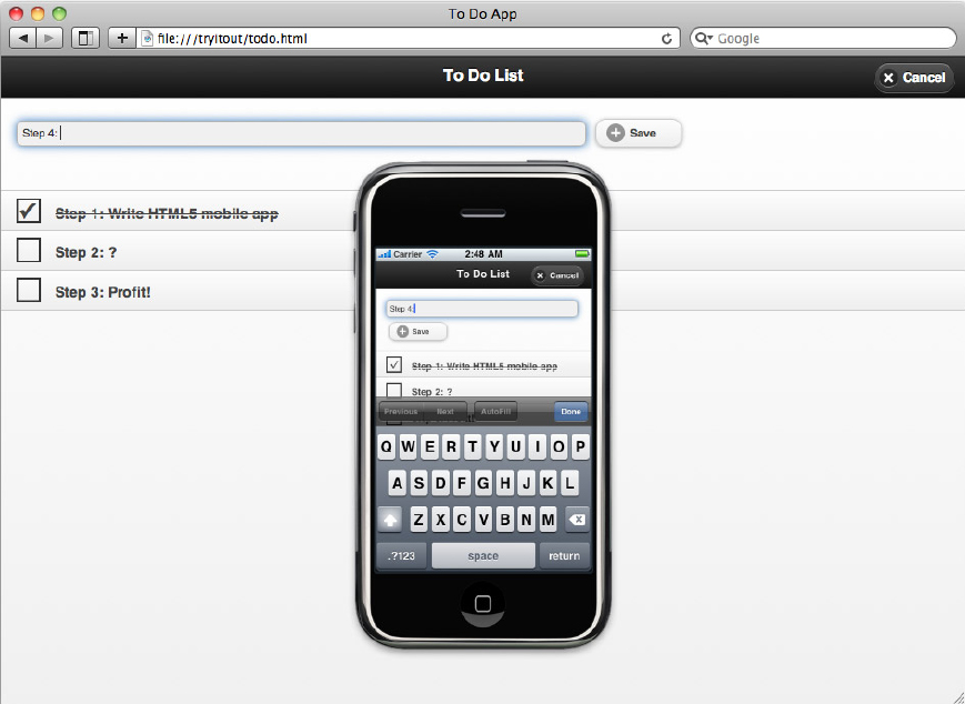
10. Refresh the todo.html page in Safari. The basic interface of the To-Do List app appears, as shown in Figure 3-5. Click the Add button to get the item entry field to slide down.

11. Open your nginx.conf file and add the following lines to the server configuration section.
location /todo/ {
  alias   /path/to/your/todo/folder/;
}
12. Reload the nginx configuration by using the nginx -s reload command. Verify that you can access the todo.html file from your desktop Safari by opening the URL http://localhost/todo/todo.html.
13. Start the iPhone or Android simulator, start the browser app, and open http://localhost/todo/todo.html. You should see the mobile layout of the interface elements.
14. Open the todo.html file on your mobile device browser by visiting http://YOUR_IP_ADDRESS/todo/todo.html. Replace YOUR_IP_ADDRESS with the IP address of your desktop machine. Verify that the user interface appears as expected and responds correctly to touch events.
How It Works
The To-Do List app consists of a traditional iPhone-style navigation bar at the top and a main content pane. You can see that it is functionally similar to the pre-installed note-taking app on iPhone and Android devices. To achieve this app interface layout using jQuery Mobile, you place all the content in a single top-level page div:
<div id="main" data-role="page">
  <!-- page content goes here -->
</div>
jQuery Mobile recognizes the data-role attribute of the div, which marks the div as a top-level page in your application.
The main content of the app is the top navigation bar and the list of to-do items. The top bar is another div, with the data-role="header" attribute telling jQuery Mobile that the div is a top bar. The data-position="fixed" attribute means that the top bar will not scroll off the top of the screen if the content becomes longer than the mobile device screen.
The main content is a list of to-do items. In jQuery Mobile, you use ordinary HTML markup to build this list. The only extra thing is a data-role="listview" attribute on the ul tag. At this stage, the code has a single to-do item so that you can see what it will look like. Each to-do item consists of a check box, the text of the to-do item, and a Delete button, which is normally hidden. In the next section, you’ll see how to reveal the Delete button with a swipe gesture. A swipe gesture occurs when the user drags his or her finger horizontally across the screen. The pre-installed apps on both iPhone and Android recognize this gesture, and users are familiar with it. Supporting this type of gesture gives your app a native feel.
The process you have used to construct this stage of the app is a good method to follow when first developing a new mobile application. It is important to get the screen layouts right and to verify that the app works on the desktop version of Safari, on the device simulators and emulators, and on your physical devices. You can do this without adding too much real functionality. Because jQuery Mobile uses declarative markup in the form of ordinary HTML tags, it is particularly suitable for this early stage of your projects.
WARNING Do not be tempted to use jQuery Mobile for building prototypes that you will show to clients. Here is what will happen: They will think you are finished! Your clients will not understand why you have to bill them for a further month when, quite plainly, the app looks finished and even responds when they use the touch controls. Instead, use wireframes and hand-drawn layouts to subtly communicate that there is a lot more work to do to deliver a production-quality app.
At this stage, the app contains one small piece of interactive behavior that is directly relevant to the user interface design. This is the slide-down animation that reveals the new item input field and Save button. You implement this behavior by using the jQuery API:
  $('#add').tap(function(){
    $('#add').hide();
    $('#cancel').show();
    $('#newitem').slideDown();
  });
This jQuery code selects the Add button in the top bar by its ID, "add". Then it hides the Add button, makes the Cancel button visible, and the new item input field is revealed with a slideDown animation.
TRY IT OUT: The Basic Functionality of the To-Do List App
Now that you have the basic To-Do List app interface ready, you can add the functionality. The user should be able to enter a to-do item and see it appear in the list. If a user taps the item or the check box, the item should be marked as done, with a checkmark in the check box and a line struck through the to-do item text. Here’s how you make it happen:
1. Edit the todo.css file to hide the Delete button by default. To do this, search for the div.delete stylesheet rule in the todo.css file and add the line in bold inside the rule:
...
div.delete {
  display: none;
  font-size: 8pt;
...
2. Edit the todo.css file to hide the template div that defines the appearance of list items. Add the following lines to the end of the todo.css file:
#item_tm {
  display: none;
}
3. Edit the todo.html file to remove the hard-coded list item. The ul tag should be empty, as shown below:
<ul id="todolist" data-role="listview">
  <!-- hard-coded li tag was here but is now gone -->
</ul>
4. Edit the todo.html file to add the hidden list item template div. A hidden template is used because this is a declarative way to define the appearance of list items. Add the following lines to the end of the todo.html file, just before the closing </body> tag:
<div id="tm">

  <li id="item_tm">
    <span class="check"> </span>
    <span class="text"></span>
  </li>

</div>
5. Edit the todo.js file by completely replacing its previous contents with the following code:
document.ontouchmove = function(e){ e.preventDefault(); }
var saveon = false;
$(function(){
$('#add').tap(function(){
$('#add').hide();
$('#cancel').show();
$('#newitem').slideDown();
saveon = false;
activatesave();
});
$('#cancel').tap(function(){
$('#add').show();
$('#cancel').hide();
$('#newitem').slideUp();
$('div.delete').hide();
});
$('#text').keyup(function(){
activatesave();
});
$('#save').tap(function(){
var text = $('#text').val();
if( 0 == text.length ) {
return;
}
$('#text').val(''),
var id = new Date().getTime();
var itemdata = {id:id,text:text,done:false};
additem(itemdata);
$('#newitem').slideUp();
$('#add').show();
$('#cancel').hide();
});
});
function activatesave() {
var textlen = $('#text').val().length;
if( !saveon && 0 < textlen ) {
$('#save').css('opacity',1);
saveon = true;
}
else if( 0 == textlen ) {
$('#save').css('opacity',0.3);
saveon = false;
}
}
function additem(itemdata) {
var item = $('#item_tm').clone();
item.attr({id:itemdata.id});
item.find('span.text').text(itemdata.text);
markitem(item,itemdata.done);
item.data('itemdata',itemdata);
item.tap(function(){
var itemdata = item.data('itemdata'),
markitem(item,itemdata.done = !itemdata.done);
});
$('#todolist').append(item).listview('refresh'),
}
function markitem( item, done ) {
item.find('span.check').html( done ? '✓' : ' ' );
item.find('span.text').css({
'text-decoration': done ? 'line-through' : 'none'
});
}
code snippet todo.js
6. Refresh the todo.html page in Safari. You can now add to-do items to the main content area of the app. Click items to mark them as done. Figure 3-6 shows this new functionality.
7. Refresh the todo.html page on your mobile device. Verify that you can tap items to mark them as done.
How It Works
Each time the user adds a new to-do item, the item template div is cloned and inserted into the list of to-do items. A template div is used because it lets you easily define the appearance of the list item in a declarative way. If you define the list item programmatically by creating element objects and setting their properties, your code will be harder to read and change.
The jQuery clone function creates a new copy of the item template div. The template div itself is very simple. It contains two span elements. One defines the check box, using the HTML character entity for the checkmark symbol (✓). This avoids the need for an external image file to show the checkmark. The other span element holds the text of the to-do item:
  <li id="item_tm">
    <span class="check"> </span>
    <span class="text"></span>
  </li>
The Delete button will also go into the to-do item, as discussed in the next section.
When the user taps the Save button, the JavaScript code creates an itemdata object that describes the new to-do item. The itemdata object has three fields: The id field is a generated identifier based on the current time; the text field contains the text of the to-do item as entered by the user; and the done field marks the item as done, defaulting to false for new items. The additem function is then called to add the new to-do item to the list. Finally, the new item input field is cleared with an empty string and removed with a slideUp animation.
The additem function adds the new to-do item to the list of items. First, the item template div is cloned. Then the id attribute of the clone, which is still set to item_tm, is replaced with the id setting of the new to-do item. This makes the new item visible as the display: none; style applying to the template div with id="item_tm" no longer applying to the new item div, which now has its own id. The to-do item text is then inserted into the to-do item by using the jQuery text function on the class="text" span element. The markitem function is called to mark the item with a checkmark if it is done. New items start off as not done, but this function will be used when reloading saved items in the next section. A tap event-handling function is attached to the new item. This event-handling function toggles the done state of the item when the user taps the item. Finally, jQuery Mobile requires a call to the special listview function to update the item list properly.
NOTE jQuery has a feature called function chaining that is used in this example. It allows you to call more than one function on an HTML element. Instead of writing this:
  var myitem = item.find('span.text'),
  myitem.text(itemdata.text);
the proper convention when using jQuery is to write this:
item.find('span.text').text(itemdata.text);
The markitem function updates the to-do item by setting the text content of the check box and applying strikethrough to the to-do item text. There are two cases: done and not done. This code uses the test ? true : false syntax to keep the code clean. With an if statement, the two lines of the function would be repeated in the else clause. This breaks the DRY (Don’t Repeat Yourself) principle introduced in Chapter 2. Here is the code:
function markitem( item, done ) {
  item.find('span.check').html( done ? '✓' : ' ' );
  item.find('span.text').css({
    'text-decoration': done ? 'line-through' : 'none'
  });
}
To improve the usability of the app, the activatesave function uses a housekeeping saveon variable to disable the Save button if no text has been entered when adding a new item.
TRY IT OUT: Saving the To-Do List
The To-Do List app currently does not save the to-do list to permanent storage, so the users will lose their to-do items if they close the app. You can fix that by following these steps:
1. Edit the todo.html file to add a hidden template div for the Delete button. Add the lines in bold below after the item template div:
<div id="tm">

  <li id="item_tm">
    <span class="check"> </span>
    <span class="text"></span>
  </li>

  <div id="delete_tm" class="delete">Delete</div>

</div>
code snippet todo.html
2. Edit the todo.js file and add the lines marked here in bold. These lines implement the Delete button and the saving of the to-do list items:
document.ontouchmove = function(e){ e.preventDefault(); }
var items = [];
var swipeon = false;
var saveon = false;
$(document).ready(function(){
items = loaditems();
for( var i = 0; i < items.length; i++ ) {
additem(items[i]);
}
$('#add').tap(function(){
$('#add').hide();
$('#cancel').show();
$('#newitem').slideDown();
saveon = false;
activatesave();
});
$('#cancel').tap(function(){
$('#add').show();
$('#cancel').hide();
$('#newitem').slideUp();
$('div.delete').hide();
swipeon = false;
});
$('#text').keyup(function(){
activatesave();
});
$('#save').tap(function(){
var text = $('#text').val();
if( 0 == text.length ) {
return;
}
$('#text').val(''),
var id = new Date().getTime();
var itemdata = {id:id,text:text,done:false};
items.push(itemdata);
additem(itemdata);
$('#newitem').slideUp();
$('#add').show();
$('#cancel').hide();
saveitems(items);
});
});
function activatesave() {
var textlen = $('#text').val().length;
if( !saveon && 0 < textlen ) {
$('#save').css('opacity',1);
saveon = true;
}
else if( 0 == textlen ) {
$('#save').css('opacity',0.3);
saveon = false;
}
}
function additem(itemdata) {
var item = $('#item_tm').clone();
item.attr({id:itemdata.id});
item.find('span.text').text(itemdata.text);
var delbutton = $('#delete_tm').clone().hide();
item.append(delbutton);
delbutton.attr('id','delete_'+itemdata.id).tap(function(){
for( var i = 0; i < items.length; i++ ) {
if( itemdata.id == items[i].id ) {
items.splice(i,1);
}
}
item.remove();
$('#add').show();
$('#cancel').hide();
saveitems(items);
return false;
});
markitem(item,itemdata.done);
item.data('itemdata',itemdata);
item.tap(function(){
if( !swipeon ) {
var itemdata = item.data('itemdata'),
markitem(item,itemdata.done = !itemdata.done);
}
});
item.swipe(function(){
var itemdata = item.data('itemdata'),
if( !swipeon ) {
markitem(item,itemdata.done = !itemdata.done);
$('#delete_'+itemdata.id).show();
$('#add').hide();
$('#cancel').show();
swipeon = true;
}
else {
$('#add').show();
$('#cancel').hide();
$('div.delete').hide();
swipeon = false;
}
});
$('#todolist').append(item).listview('refresh'),
}
function markitem( item, done ) {
item.find('span.check').html( done ? '✓' : ' ' );
item.find('span.text').css({
'text-decoration': done ? 'line-through' : 'none'
});
saveitems(items);
}
function saveitems(items) {
localStorage.items = JSON.stringify(items);
}
function loaditems() {
return JSON.parse(localStorage.items || '[]'),
}
code snippet todo.js
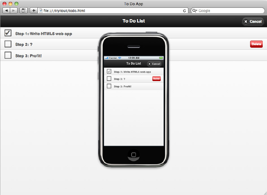
3. Refresh the todo.html page in Safari. You can now delete to-do items by using the swipe gesture (see Figure 3-7).
4. Close and restart Safari, and you see that the state of your to-do items is preserved.
How It Works
The HTML5 localStorage API is used to store the to-do list items between uses of the To-Do List app. This API is very simple; you just use the localStorage object as if it were an ordinary JavaScript object, with the restriction that you can only set properties to string values. The easiest way to store objects like the to-do items is to serialize the object into a string in JSON (JavaScript Object Notation) format. The JSON format is very simple; it is the same as literal JavaScript code! Here’s an example:
{
  propertyone:   'a string',
  propertytwo:   ['an', 'array'],
  propertythree: {sub: 'object'}
}
Modern browsers, and in particular the WebKit engine, provide a built-in JSON utility object. The JSON.parse function converts a string in JSON format into a JavaScript object. The JSON.stringify function converts a JavaScript object into a string. You can also obtain an implementation of the JSON utility from http://crockford.com.
When you are working with JavaScript, it is better to use JSON format for your data. While XML is an important industry standard, it is not as easy to work with.
This final version of the app uses a global items array variable to store the current state of the to-do list items. The saveitems and loaditems functions save and load the to-do list data. These functions do not access the items variable directly as that would be a brittle design. The items variable is passed in as an argument and returned as a result.
The loaditems function is called once when the app starts to load the previously saved to-do items. The additem function is called for each saved to-do item, and it in turn calls the markitem function to mark the to-do item as done or not done. The saveitems function is called whenever there is any change to the to-do items. This automatic saving of state is an established convention for mobile apps, and it helps to make the app feel more native for the user.
The remaining changes to the todo.js file implement the Delete button and the swipe gesture. To ensure that the app has good usability, there is some housekeeping code that uses the swipeon variable. This variable is set to true if the user has performed a swipe gesture and thus caused the Delete button to appear.
You can capture swipe gestures on elements by using the jQuery Mobile swipe function. Your event-handling function is called whenever the user drags his or her finger horizontally across the element to which the swipe gesture is attached. In this case, a swipe gesture is attached to each li HTML tag containing a to-do list item. When a swipe is detected, the Delete button for that to-do item is shown, and the top bar button is switched to a Cancel button so that the user can cancel the delete operation. There is an extra line in the event handler to call the markitem function to toggle the to-do item done state. This is needed because the tap event fires first, and the done state of the to-do item is incorrectly toggled and needs to be flipped back:
    ...
    if( !swipeon ) {
      markitem(item,itemdata.done = !itemdata.done);
    ...
The Delete button is implemented by cloning an invisible template button and inserting the clone into each to-do item. When the Delete button is tapped, the to-do item li tag is removed from the ul list, using the jQuery remove function. The to-do item is also removed from the items array using the built-in JavaScript array splice function.
In order to determine which item was swiped, the code makes use of the jQuery data function. This function lets you store key-value data on an HTML element.
WARNING When you are removing items from an array in JavaScript, always use the splice function. This removes the element entirely and reduces the length of the array. If you use the delete keyword, you will simply replace the element at the given index in the array with a null, and the array will stay the same length.
This chapter introduces some of the device features that are available to mobile web apps directly via built-in JavaScript APIs. These include features such as geolocation, device orientation, and app launching. In this chapter, you also learned about the combination of jQuery and jQuery Mobile as an application-building framework for mobile web apps. Finally, you saw how to construct a working mobile web app from the ground up.
In the next chapter, you’ll learn how to handle the full range of touch and gesture events in order to offer the best user interaction experience. You’ll also learn how to cache your app locally on a device and work effectively offline. This breaks your dependency on having a network connection and gives your users an almost completely native experience.
EXERCISES
1. Add a timestamp to the to-do items so that the user can see when the items were created.
2. Use the -webkit-transform CSS property to animate the appearance of the Delete button so that it appears to slide in. This mimics the native behavior more closely. The Safari Visual Effects Guide link at the bottom of the http://developer.apple.com/devcenter/safari page can help.
3. Add a native scroll effect to the to-do item list by using the iScroll library. See http://cubiq.org/iscroll for help.
Answers to the Exercises can be found in the Appendix.
• WHAT YOU LEARNED IN THIS CHAPTER
| TOPIC | KEY CONCEPTS |
| Geolocation | The iPhone and Android devices can provide you with the location of the device in terms of latitude and longitude. This position is calculated by the device using a number of different methods, such as GPS and cell-tower triangulation. You can get the position of the device using the HTML5 JavaScript Gelocation API. You can even register to get continuous updates as the location of the device changes. While the geolocation feature means you can build interesting apps, be careful not to overuse it, as you will drain the device battery. |
| Device Orientation | The physical orientation of a device screen, either vertical (portrait) or horizontal (landscape). You need to decide if your app works in only one orientation or both. If it supports both orientations, you need to make sure that your user interface layout reformats itself in an appropriate way. Using liquid CSS layouts can help with this. |
| Mobile Web Apps | Both the iPhone and Android provide a facility to save a link to your mobile web site on the home screen of the device. You use special HTML meta tags to define the icon you want to use. When you do this, your mobile web site becomes a mobile web app, and the user experience is similar to using a native app. |
| jQuery Library | This is a general purpose JavaScript library for the manipulation of the HTML page Document Object Model. This library also handles user interaction events. It is designed to be fast and avoids verbose code. |
| jQuery Mobile Library | This is a JavaScript library focused on mobile devices. It builds in the jQuery Library. An important additional feature is the provision of a declarative HTML tag syntax for building mobile user interfaces. |