
Chapter 4
Enhancing Your App
WHAT YOU WILL LEARN IN THIS CHAPTER:
- Making your mobile app work when the device is offline
- Handling one-finger touch events
- Handling multitouch events with more than one finger
- Handling complex gestures
- Handling the two-finger pinch zoom gesture
- Handling the two-finger rotation gesture
- Providing a home screen icon for your app
- Providing a splash screen for your app
Your mobile web app should aim to provide the same level of user experience as a native app. In Chapter 3, you mastered the basic processes involved in building production-ready mobile web apps. Now it’s time to start filling in the details and take your app to the next level.
In general, mobile web apps need an Internet connection. Or do they? In this chapter, you’ll learn how to take your app offline. This is one of the most important things you can do to enhance your app, as mobile devices often have unreliable network connections. Your app should still work in underground rail tunnels, in the air, or in remote areas with weak coverage.
The users of your app will expect it to react to their fingers in the same way as native apps. You need to know how to respond to touch events involving one or more fingers. This chapter shows you how.
Finally, it would be nice to have your own icon for your app, instead of the default one. You’ll learn how to provide one.
HTML5 provides a way for web browsers to cache the files required for a web application. The files are stored locally, and the app can run even without an Internet connection. This works for desktop browsers as well as for mobile web apps. You can use this feature to “install” your web app on an iPhone or Android device. And you don’t need App Store approval to do this.
Your users still have to follow the home screen bookmarking process described in Chapter 3, but after they do that, they can use and launch the app in the same way as they would a native app.
TRY IT OUT: Caching Your To-Do List App
In this section, you will modify the To-Do List app from Chapter 3 to learn how to use the app-caching mechanism. In its Chapter 3 form, the app does not work if your mobile device has no network connection. Here’s how you get the app to work offline:
1. Open the todo project folder that you created in Chapter 3. Open the todo.html file in your text editor.
2. Edit the todo.html file by adding the line in bold at the top of the file:
<!DOCTYPE html>
<html manifest="todo.manifest">
<head>
3. Open the todo.js file in your text editor. At the bottom of the file, add the following lines:
window.applicationCache.addEventListener('updateready',function(){
  window.applicationCache.swapCache();
  location.reload();
});
4. Create a new text file in the todo folder called todo.manifest.
5. Edit the todo.manifest file in your text editor by inserting the following contents:
CACHE MANIFEST
# version 1

todo.html
todo.js
todo.css
jquery.js
jquery.mobile.js
jquery.mobile.css
images/icons-18-white.png
Code snippet todo/todo.manifest
6. Open the top-level folder of your nginx installation. This is the folder that contains the nginx.conf file. Open the mime.types text file in that folder and add the following line in bold at the end of the file, before the closing brace:
    text/cache-manifest                   manifest;
}
WARNING The mime.types file is not included in the downloadable code. This is an nginx configuration file that comes with your nginx installation.
7. Reload your nginx configuration by executing the following command:
nginx -s reload
8. If you have installed a previous version of the To-Do List app by working through the examples in Chapter 3, delete this version from your iPhone or Android device by touching and holding the icon to activate the app delete option.
9. Reinstall the application by visiting http://YOUR_IP_ADDRESS/todo/todo.html in your mobile browser and performing the home screen installation procedure described in Chapter 3. Remember to replace the YOUR_IP_ADDRESS marker with the IP address of your desktop machine.
10. Verify that the To-Do List application works correctly. Close the app.
11. Open your device Settings application and place the device in Airplane or Flight mode. This turns off all network connectivity.
12. Start the To-Do List application again. The app should continue to function correctly. The mobile browser is now using files that it has cached on your device.
How It Works
To use the app-caching mechanism, you must do four specific things:
1. Tell the browser you want to use app caching by adding a manifest attribute to the html tag.
2. Provide a list of files to cache, using a manifest file.
3. Make sure your web server delivers the manifest file properly, with the MIME type text/cache-manifest.
4. Make sure your web server does not cause caching of the manifest file itself.
The first step is easy. Just make sure your html tag looks like this:
<html manifest="todo.manifest">
The value of the manifest attribute should point to the manifest file you created. The value of the manifest attribute is a URL path. In this example, the todo.manifest file is placed in the top-level folder.
WARNING Most browsers limit the total size of the cached files for an individual app to 5MB. Make sure you keep your app resources under this limit if you want app caching to work.
The manifest file is the second item. In the example, this is the todo.manifest file. This is a simple list of the files you would like the browser to cache. Unfortunately, there are no shortcuts here, and you need to list every file, with its exact filename and relative URL path. The easiest way to get this list of files is to enable the Web Inspector console in Safari and open the Resources tab. You then see a list of all the files. Make sure to exercise all the functionality of your app so that you see all possible file requests. For the vast majority of apps, obtaining a list of files is all you’ll ever need to do. If you’d like to know more, you can see the full details of the manifest file format in the W3C specification at http://www.w3.org/TR/html5/offline.html.
You might be asking “What if my app changes? How do I clear the cache?” There is a very specific way to do this, and you need to follow it exactly, or your app will not update. In your manifest file, add a comment line containing an arbitrary version number, like this:
# version 1
Any line in the manifest file that starts with a # character is considered to be a comment. The code example contains the above comment line with a version number. The rule is very simple: To clear the app cache, increase the version number and save the manifest file.
This works because of the way the browser uses the manifest file. When you start a cached app, the browser always tries to load the manifest file. If you are offline, this will not work, and the browser just runs the cached version of the app. If you are online, the browser downloads the manifest file. If the contents of the file have changed, the app cache is cleared, and the latest version of the app is downloaded. If the contents of the manifest file have not changed, the cached version of the app is used. Using a comment line in the manifest file containing a version number that you can change is the easiest way to clear the app cache. The version number in the comment can be anything you like, as long as you change it when you need to update your app.
To actually deliver the manifest file, you need to ensure that your web server does the job properly. This is the third step. You can’t just serve it up as a text file, thanks to the requirements of the W3C specification. The file needs to be delivered with the correct MIME type. You can see the MIME type of a file by using the Safari Web Inspector console. Open the Resources tab, select a file on the left, and click the Headers tab. Look for a line similar to this:
Content-Type: text/html
In this case, text/html is the MIME type for HTML files. When you deliver the manifest file, you want it to say this:
Content-Type: text/cache-manifest
To get this to happen, you need to modify the configuration of your web server. In the case of nginx, you edit a configuration file called mime.types. The acronym MIME stands for Multipurpose Internet Mail Extensions, as the concept of content types was first used for email attachments. If you are not using nginx, you need to follow the instructions for your particular web server. You configure most of them the same way — by editing a text file containing a list of MIME types.
WARNING The MIME type configuration may be awkward, but it is absolutely necessary. The mobile Safari browser will not cache your app without the right MIME type for the manifest file. Don’t forget that you have to do this not only on your local machine, but also on any servers that you deploy your app to.
The fourth item is one that can easily trip you up. If your web server is configured to instruct browsers to cache the manifest file, your app will never update! Luckily, nginx does not do this by default, but other web servers may do it. Use the Safari Web Inspector to check the response headers returned when you request the manifest file. If you see a header called Expires with a date in the future, you need to modify your web server configuration to remove this header. You need to refer to your web server documentation for instructions to do this.
It is possible to track the status of the app cache by using the window.applicationCache object. The status property of this object tells you the current status of the cache. The values of this property are provided as constants on the window.applicationCache object:
- UNCACHED — The app is not cached.
- IDLE — The cache is up-to-date and in use.
- CHECKING — The browser is downloading the manifest file.
- DOWNLOADING — The browser is updating the cache files.
- UPDATEREADY — The cache update is complete.
- OBSOLETE — The cache is missing some files and is not in use.
You can use these status values to provide feedback to the user. To receive notifications of changes to the cache, you can register event handlers on the window.applicationCache object:
- onchecking — Fires when the browser is downloading the manifest file.
- onnoupdate — Fires when the manifest has not changed.
- ondownloading — Fires when files in the manifest begin downloading.
- onprogress — Fires as files in the manifest are downloading.
- oncached — Fires when cache downloading is complete.
- onupdateready — Fires when the cache is ready to use.
- onobsolete — Fires when the cache does not contain the full manifest and the caching fails.
- onerror — Fires when an error occurs and the caching fails.
To force an update of your app, you can call the update function on the window.applicationCache object. When the update is complete, you call the swapCache function to make the browser use the new cache. Finally, you call location.reload to show the new version of your app. When your app first starts, you can use the onupdateready event handler to perform an automatic reload if there is a new version. This is what the To-Do List code example does.
Touch events are at the core of the mobile app user experience. Your mobile web apps should provide the same tactile responsiveness as native apps. The mobile WebKit browser provides touch events that you can use to provide this enhanced experience.
Touch events are not like mouse events, and you need to think about them in a different way. The mouse is a continuous pointing device and is always present on the screen. Fingers touch the screen only to make something happen. They are like a mouse pointer that hops around the screen. This means that traditional mouse-oriented effects and events, such as hovering and mouseover and mouseout, are not usable on mobile devices. In fact, these effects and events do not even make sense.
The mobile WebKit browser must of course still display ordinary websites, so it provides all the standard mouse events. In the context of mobile web app development, these traditional mouse events are more useful as debugging aids when you are running your app in a desktop browser. If you use them as your primary event handlers in a mobile context, you will notice that your app is sluggish and does not respond as quickly as it could. Therefore, in this section, you will learn how to use the touch-oriented events provided by the mobile WebKit browser. You will also learn how to handle multitouch gestures involving more than one finger.
Touch Events
The jQuery Mobile library provides a number of high-level touch events that make dealing with touch interactions quite easy. But it’s also important to understand the basic touch events provided by the WebKit browser. You met, briefly, the touchstart and touchmove events in Chapter 2. Now it’s time to fill in the details. There are four basic touch events:
- touchstart — Fires when a finger first touches the screen.
- touchmove — Fires when a finger moves in contact with the screen.
- touchend — Fires when a finger leaves the screen.
- touchcancel — Fires when the device launches another app.
You register an event handler for these events in the usual manner, by calling the ontouchevent function of an HTML element:
document.getElementbyId('mydiv').ontouchstart(function(e){...})
All the touch event handlers are passed a touch event object as their first argument, which provides information about the finger or fingers that touched the screen.
WARNING If you are using jQuery, you need to use the original event object, not the jQuery event object. The original event is stored in the originalEvent property of the jQuery event object.
The touch event object is an extension of the traditional mouse event object. It provides the following additional properties:
- touches — An array of separate touch details
- targetTouches — An array of touches that started on the same HTML element
- changedTouches — An array of touches that changed in this event
The touches array contains a list of objects that give you the details of each finger that is touching the screen. If more than one finger is touching the screen and some of the fingers are removed, those touches will not be in this list. You can detect up to five fingers simultaneously. The touch objects in this array have the following properties:
- clientX — Horizontal position with respect to the browser window
- clientY — Vertical position with respect to the browser window
- pageX — Horizontal position with respect to the HTML page
- pageY — Vertical position with respect to the HTML page
- screenX — Horizontal position with respect to the screen
- screenY — Vertical position with respect to the screen
- target — The HTML element that the touch hit
- identifier — A unique identifier for this touch
As you can see, a number of different X and Y position values are provided by the touch object. The clientX and clientY values are the most useful for mobile web app development because you usually have a fixed-size browser window.
The targetTouches array contains the subset of touches that began inside the HTML target element. As with the touches array, if a finger is not touching the screen, it won’t be in this list. This list is useful if your user interface needs to know when two fingers touched the same HTML element.
The changedTouches array contains a list of the touch changes that caused this event. So if you remove a finger from the screen, its last position is in this array. If you add a finger to the screen, it appears here as well. You would normally access this array in the touchend event handler. Use the identifier property of each touch object to work out the changed touches.
One complication to bear in mind when dealing with touch events is that they may fire multiple times. For example, if you place two fingers on the screen, you may receive two touchstart events, one containing a single touch and the other containing both touches. This depends on the exact timing of the fingers hitting the screen.
You also need to prevent the default touch behaviors of the browser from interfering with your app. You do this by calling the preventDefault function on touch events. You encountered this function in Chapter 2. In particular, you should do this with the touchmove event on the HTML document object. Because this event is used for browser scrolling, it causes “rubber-banding” of your fixed-size mobile web app. When the user drags a finger over your app, its user interface will bounce up and down in an attempt to scroll. This is hardly a native app experience!
In the code example in this section, you will learn how to use the basic touch events to build an interactive app. The jQuery Mobile library provides high-level touch events that can make your life easier for common cases. Depending on the complexity of your app, you may need to use both the jQuery Mobile higher-level events and the basic events. The jQuery Mobile library provides the following high-level touch events:
- tap — A quick touch and release on an HTML element
- taphold — A touch and hold on an HTML element
- swipe — A swipe gesture in any direction
- swipeleft — A swipe gesture to the left
- swiperight — A swipe gesture to the right
To react to a tap event on a div element, for example, you would use this:
$('#mydiv').tap(function(){...})
Gesture Events
Gesture events provide an easy way to receive notification of two-finger gestures. There are three event handlers for gesture events:
- gesturestart — Fires when a two-finger gesture starts.
- gesturechange — Fires as a two-finger gesture proceeds.
- gestureend — Fires when a two-finger gesture ends.
To listen for these events, you use the ongesturevent function on an HTML element:
document.getElementbyId('mydiv').ongesturestart(function(e){...})
These handlers receive an event object that contains the standard touch properties, as above. In addition, this touch event also includes the following convenience properties:
- scale—The scale property tells you how much two-finger pinch zooming occurred. The decimal value of the property starts at 1.0 and changes in proportion to the zoom. If the user’s fingers move toward each other, the value is below 1.0, and if they move apart, the value is above 1.0.
- rotation —The rotation property tells you how much two-finger rotation occurred. The two-finger rotation gesture occurs when the user places two fingers in contact with the screen and rotates both finger tips around a common central point. The value of the rotation is given in degrees, with positive values being clockwise.
Gesture events are merely abstractions of the underlying touch events. The underlying touch events are also fired, so you can listen for both.
Unfortunately, gesture events are not supported across all devices and versions. The iPhone supports gesture events fully, but Android has very inconsistent support, both in hardware and software. Therefore, you should use multitouch events only as an enhancement to your app, rather than as an essential feature.
When you are testing your app in the iPhone simulator, you can trigger multitouch events by holding down the Option key. Two small semi-transparent circles appear, indicating the simulated touch positions. You move the mouse pointer to input scaling or rotation events. The circles move as mirror images of each other.
TRY IT OUT: An Interactive Image Viewer
This example shows you how to build a simple image viewer with interactive features. You can swipe left and right to browse through a predefined set of images. You can pinch zoom and rotate with two-finger touch gestures, and you can rotate the image in three dimensions by moving your finger or fingers on the screen. In this example, you’ll learn how to capture all these touch events, and you’ll get a preview of WebKit animation effects. Unfortunately, only the single finger interactions will work on your Android device.
1. Create a new file called touch.html for the HTML source code. Save this file to your nginx html folder, as described in Chapter 1.
2. Create a new file called touch.js for the JavaScript code. Save this file to your nginx html folder.
3. Follow the instructions in Chapter 3 to obtain jQuery if you have not done so already. Copy the jquery.js file into your nginx html folder.
4. Place three image files, flower0.png, flower1.png, and flower2.png, in the nginx html folder. They are available from the downloadable code at www.wrox.com. Alternatively, you can create your own images. Just remember to name them flower0.png, flower1.png, and flower2.png.
5. Insert the following code into the touch.html file:
<!DOCTYPE html>
<html>
<head>
  <meta name="viewport"
        content="user-scalable=no,initial-scale=1.0,maximum-scale=1.0" />
  <meta name="apple-mobile-web-app-capable" content="yes" />

  <link rel="stylesheet" href="jquery.mobile.css" />

  <style>
  #main { width:320px; height:480px; padding:0px; margin:0px }
  img.flower {
    display:block;
    width:128px; height:96px;
    position:absolute; top:166px; left:96px;
  }
  img.rightout { -webkit-transform: translate( 400%) }
  img.leftout  { -webkit-transform: translate(-400%) }
  </style>

  <script src="jquery.js"></script>
  <script src="jquery.mobile.js"></script>

  <script src="touch.js"></script>
</head>
<body><div id="main">

<img id="img0" src="flower0.jpg" class="flower">
<img id="img1" src="flower1.jpg" class="flower rightout">
<img id="img2" src="flower2.jpg" class="flower rightout">

</div>
</body>
</html>
Code snippet touch.html
6. Insert the following code into the touch.js file:
document.ontouchmove = function(e){ e.preventDefault(); }

$(document).ready(function(){

  // index of current image
  var imgI = 0;

  var img  = $('#img'+imgI);
  var main = $('#main'),

  var start = {active:false};
  var current = {
    xdeg:0, ydeg:0, zdeg:0,
    h:img.height(), w:img.width()
  };

  main.bind('touchstart',function(e){
    e.preventDefault();

    start.xdeg = current.xdeg;
    start.ydeg = current.ydeg;
    start.zdeg = current.zdeg;

    if( e.originalEvent.touches.length < 2 ) {
      start.x = e.originalEvent.touches[0].pageX;
      start.y = e.originalEvent.touches[0].pageY;
      start.when = new Date().getTime();
      start.active = true;
    }
  });

  main.bind('touchmove',function(e){
    e.preventDefault();
    current.x = e.originalEvent.touches[0].pageX;
    current.y = e.originalEvent.touches[0].pageY;

    if( start.active
        && !isSwipe(e)

        // single finger touch events only
        && e.originalEvent.touches.length < 2 )
    {
      var dr = 160;

      // distance finger has moved
      var dx = current.x - start.x;
      var dy = current.y - start.y;

      // damp the movement
      dx = Math.abs(1 + Math.sin((dx/dr)-(Math.PI/2))) * dx;
      dy = Math.abs(1 + Math.sin((dy/dr)-(Math.PI/2))) * dy;

      // map to degrees of rotation
      current.ydeg = start.ydeg + ( 180 * (dx / dr) );
      current.xdeg = start.xdeg + ( 180 * (dy / dr) );

      rotate();
    }
  });

  main.bind('touchend',function(e){
    e.preventDefault();
    start.active = false;

    if( isSwipe(e) ) {
      var xdist    = current.x - start.x;
      var lastimgI = imgI;
      imgI = 0 < xdist ? imgI-1 : imgI+1;
      imgI = imgI < 0 ? 0 : 2 < imgI ? 2 : imgI;

      if( imgI != lastimgI ) {
        img = $('#img'+imgI);

        var css = {
          webkitTransform:'',
          webkitTransition: '-webkit-transform 1s'
        };

        $('#img'+lastimgI)
          .css(css)
          .addClass( imgI < lastimgI ? 'rightout' : 'leftout' );

        img
          .css(css)
          .removeClass( imgI < lastimgI ? 'leftout' : 'rightout' );

        current.ydeg = 0;
        current.xdeg = 0;
        current.zdeg = 0;
        current.h    = img.height();
        current.w    = img.width();

        setTimeout(function(){
          img.css({webkitTransition:''});
        },1000);
      }
    }
  });

  main[0].ongesturechange = function(e) {
    var scale = e.scale;

    // damp zoom scale
    scale =
      scale <= 1
      ? Math.sin( scale * (Math.PI/2))
      : 1+( Math.pow(scale-1,2) );

    current.w = current.w * scale;
    current.h = current.h * scale;

    img.width( current.w );
    img.height( current.h );

    if( 2 < Math.abs(e.rotation) ) {
      current.zdeg = (start.zdeg + e.rotation) % 360;
      rotate();
    }
  };

  function isSwipe(e) {
    var duration = new Date().getTime()-start.when;
    var xdist    = current.x - start.x;
    return duration < 500 && 160 < Math.abs( xdist );
  }

  function rotate() {
    img.css(
      "-webkit-transform",
      'rotateX('+current.xdeg+'deg) '+
               'rotateY('+current.ydeg+'deg) '+
               'rotateZ('+current.zdeg+'deg)'
    );
  }
});
Code snippet touch.js
7. Make sure the nginx web server is running and open the touch.html file on your iPhone or Android device, using the URL http://YOUR_IP_ADDRESS/touch.html on your mobile browser. As always, replace YOUR_IP_ADDRESS with the IP address of your desktop machine. You can also open touch.html using the desktop Safari browser, but the touch events will not fire. (Refer to Chapter 1 if you need help opening the file in your mobile browser.) You should see the first image in the center of the screen. Try out some touch gestures, such as one-finger rotate, two-finger zoom and rotate, and left and right swipes. Figure 4-1 shows a rotated and scaled image after some touch manipulation.

How It Works
This image-manipulation example shows how to capture and use touch and gesture events. The HTML code for this app sets up three images to view:
<img id="img0" src="flower0.jpg" class="flower">
<img id="img1" src="flower1.jpg" class="flower rightout">
<img id="img2" src="flower2.jpg" class="flower rightout">
The rightout CSS style places the image far to the right, outside the viewable area. The leftout CSS style does the same thing but to the left. Instead of using the more traditional CSS top and left positioning properties, the rightout and leftout styles use the -webkit-transform property:
-webkit-transform: translate( 400% )
This property is provided by the WebKit browser engine to support animation effects, and it is hardware optimized. The swipe gesture, as you will see shortly, is implemented by adding or removing this property, causing an automatic animation to occur.
The HTML code uses a full-screen div with id="main" to capture touch events wherever they occur on the screen. If the events were only attached to the image, the user experience would be very poor because the reactive surface area would change, depending on the image size and rotation.
The JavaScript code for this example listens for touch events and manipulates the image accordingly. The app listens for swipe events to move back and forth between images, in much the same way as the pre-installed gallery app. The app listens for single-finger touch events to rotate the image in the X and Y dimensions, and it listens for two-finger touch events to rotate in the Z dimension and also to zoom the image.
The app needs to maintain some state variables to keep track of the current image and its orientation. The imgI variable stores the current image index — a value between 0 and 2 because there are three images in the example. The img variable stores a jQuery reference to the current img HTML element, and the main variable stores a jQuery reference to the full-screen div that captures the touch events.
The start object stores the screen location and time of the first point of a touch event sequence. Using jQuery, you bind the touchstart event to the main div and then you set the start object’s properties based on this event:
  main.bind('touchstart',function(e){
    e.preventDefault();

    start.xdeg = current.xdeg;
    start.ydeg = current.ydeg;
    start.zdeg = current.zdeg;

    if( e.originalEvent.touches.length < 2 ) {
      start.x = e.originalEvent.touches[0].pageX;
      start.y = e.originalEvent.touches[0].pageY;
      start.when = new Date().getTime();
      start.active = true;
    }
  });
This captures the point at which the user’s finger first touches the screen. The gesture events are used to handle the two-finger manipulations, so only the location of the first touch, provided by e.originalEvent.touches[0], is stored. If there are two or more touches in the e.originalEvent.touches array, touchstart is ignored. Regardless of the number of touches, the touchstart handler always sets the start rotation of the current finger movement equal to the current rotation of the image. The rotation in the X, Y, and Z axes is stored. This is then used as the baseline for subsequent rotations with either one finger or two.
NOTE Each of the event handler functions calls the preventDefault function on the event. This prevents any unwanted side effects from the touch event interfering with your own handling of the touch events.
In addition to the starting position, the other state information you need to keep track of are the current orientation of the image and the current position of the user’s finger as it drags across the screen. By using the difference between the starting position and the current position, you can calculate how much rotation to apply to the image. The current variable stores the degree of rotation of the image around the X, Y, and Z axes in three-dimensional space, as well as the current width and height of the image.
The three-dimensional rotation of the image is controlled in two ways. Single-finger movement causes rotation around the X and Y axes. The X axis is an imaginary line that goes horizontally across the middle of screen. The Y axis is an imaginary line that goes vertically down the center of the screen. The two-finger rotate gesture causes rotation around the Z axis. The Z axis is an imaginary line that goes right through the phone, extending directly out from the center of the screen and directly out from the back of the phone.
The three-dimensional rotation effects are performed by the touchmove event handler. The first thing this handler does is capture the current finger location. Remember that a touchmove event means that the user’s finger has remained in contact with the screen. Here is how you record the position to which it has moved:
    current.x = e.originalEvent.touches[0].pageX;
    current.y = e.originalEvent.touches[0].pageY;
You want to perform the X and Y axis rotations only when the user has one finger on the screen. The event handler checks to make sure this is the case before proceeding. It also checks to make sure the touch event is not a swipe. You’ll see how swipes are handled shortly.
The touchmove handler calculates the distance that the user’s finger has moved by subtracting the starting position from the current position:
      var dx = current.x - start.x;
      var dy = current.y - start.y;
This then needs to be converted to an amount of rotation, in degrees. You need to use a bit of math here to make the conversion nice and smooth. You don’t want the rotation to occur too quickly or too slowly. You also want the rotation to start slowly so the user can make small adjustments and then accelerate for large changes.
The trick to this math is to decide how far you have to move your finger to rotate a full 360 degrees. Actually, the user usually wants to rotate in only one direction at a time, so it’s more useful to think in terms of 180 degrees. So how far should you move your finger to perform a 180-degree rotation? In this example, I opted for half the width of the iPhone screen, which is 160 pixels, stored in the dr variable.
NOTE Mobile device web browsers allow you to specify pixel dimensions in your HTML and CSS. However these pixel values do not match the real physical device pixels! This is because the devices allow the user to scale web sites by zooming in and out with two fingers. The concept of a pixel on a mobile browser is thus not the same as on a desktop browser. When you set the initial-scale=1.0 value using the viewport meta tag, the mobile browser gives you a screen width of 320 virtual pixels, even if you are using a phone that has a higher resolution display like the iPhone 4. Chapter 7 covers this in more detail.
You need to use this same scale for vertical movement as well. Otherwise, the rotation will occur at different speeds around different axes. To convert from a finger-distance movement to a degree of rotation, you multiply 180 degrees by the fraction of 160 pixels that have been covered in the touchmove event. That’s what this code does:
      current.ydeg = current.ydeg + ( 180 * (dx / dr) );
      current.xdeg = current.xdeg + ( 180 * (dy / dr) );
Just before you do this, though, you need to “damp” the motion. Damping adjusts the amount of motion so that it starts off slow and gets faster. Luckily, the sin function from math has exactly this property; it’s a nice curve that starts slow and gets more curvy. The following lines of code adjust the finger distance to give you this effect:
      dx = Math.abs(1 + Math.sin((dx/dr)-(Math.PI/2))) * dx;
      dy = Math.abs(1 + Math.sin((dy/dr)-(Math.PI/2))) * dy;
This code multiplies the original distance by an adjusted fraction of itself. The distance comes in as a positive or negative number, meaning a movement left or right. The Math.abs function preserves the left or right nature of the movement. Without Math.abs, two negatives would make a positive, and you could never move left!
The distance starts from a value of 0, so you want values close to 0 to change slowly and values further away to change more rapidly. The Math.sin function does this for you, but you need to help it out a bit by moving the graph of the function so that the slow part starts at 0. This is why you add 1 to the sin function and subtract π/2 from its argument.
To apply the rotation, you can use the -webkit-transform property. Because you have three dimensions, you have three rotations. This is the syntax for the property value:
rotateX(30deg) rotateY(60deg) rotateZ(90deg)
The rotate utility function in the code example applies this property to the image. Because the touchmove event is fired in near real-time, the result of all this math is a nicely rotating image. Try it yourself now to understand how the motion works.
You still need to deal with rotation around the Z axis. You can use a gesture event to implement this, and you’ll get zooming almost for free. The gesturechange event gives you an event object that has a rotation property. When the user places two fingers on the screen and rotates them around the center of the screen, this rotation property tells you how many degrees of rotation occurred. You can apply this to the image. In this case, damping is not necessary, as it is better if the image rotates at the same rate as your fingers move. This is because there is no translation from distance to degrees; you already have the degrees from the rotation property. The following code applies the rotation:
    if( 2 < Math.abs(e.rotation) ) {
      current.zdeg = (start.zdeg + e.rotation) % 360;
      rotate();
    }
This code ignores rotations of less than 2 degrees, which avoids spurious rotation when the user is just zooming. You offset the rotation reported by the event from the starting rotation (stored in the start object) recorded in the touchstart event handler.
Zooming is also performed in the gesturechange event handler. In this case, damping does give the user more control. The gesturechange event provides a scale property that tells how far the user’s fingers have moved. Values under 1 indicate inward movement, and values above 1 indicate outward movement. To damp inward movement, you can use the Math.sin trick. To damp outward movement, you need to use a different mathematical function because sin works only with values between 0 and 1. A very simple solution is to use a parabolic curve: Just square the increase in scale (subtract 1 from the scale value to get this). This gives you the same sort of slow start effect as sin for values above 1. Here’s how you implement it:
    scale =
      scale <= 1
      ? Math.sin( scale * (Math.PI/2))
      : 1+( Math.pow(scale-1,2) );

    img.width(  start.w * scale );
    img.height( start.h * scale );
The swipe gesture is the last piece of the puzzle. A swipe left or right should cause the next image to the left or right to animate into view. You have to be careful here because the swipe gesture overlaps with X axis rotation. A swipe gesture is considered to be a fast horizontal movement over a long distance. You can use this definition to tell swipes and rotations apart: It’s a swipe if it happens quickly (for example, under 500 milliseconds) and over at least half the screen. The isSwipe utility function puts this into practice:
  function isSwipe(e) {
    var duration = new Date().getTime()-start.when;
    var xdist    = current.x - start.x;
    return duration < 500 && 160 < Math.abs( xdist );
  }
The swipe action can be placed in the touchend event handler. If the touch motion is a swipe, you need to display the next image by animating it on to the screen. To determine if the touch motion is a swipe, you subtract the starting X position from the current X position. Movements to the right are positive, and movements to the left are negative. You can therefore tell whether to animate an image in from the left or right. To perform the animation, you first add the rightout or leftout CSS style to the current image, to get it to animate out of view. Then you remove the rightout or leftout style from the new image, which causes it to return to its normal position in the middle of the screen, effectively animating back into view. You do all this by using the translate value of the -webkit-transform CSS property. The -webkit-transition property is used to specify that the animation should take 1 second. After the animation is finished, the -webkit-transition property is cleared. Otherwise, it would interfere with the rotation and zooming animations by slowing them down.
Providing your users with an interactive map is a common requirement when building mobile applications that make use of the user’s current location. For example, a cab-hailing application can show you the location of nearby cabs, and a restaurant recommendation service can show you nearby restaurants. You don’t have to build a mapping engine yourself, however. Google provides a JavaScript API that you can use, and this API has been tuned for use with mobile applications. The map that it provides supports interactive panning and multitouch pinch zooming. This section shows you how to get started.
WARNING The Google Maps API requires a license for certain types of commercial use. You’ll need to review the terms of service on the Google Maps site (http://code.google.com/apis/maps) in the context of the type of app you are building.
The Google Maps API
To use the Google Maps API, you need to include a script file from Google, and you need to write some JavaScript code to build the map and set its options. First, you create an empty HTML div tag with id="mymap" in your HTML document. Google will fill this div with the map contents. You should use CSS to set the width and height to your desired values:
<div id="mymap" style="width:300px;height:300px"></div>
Next, you set up a JavaScript object with your desired configuration. The most important property, which is also a required property, is the center property. This is the location of the center of the map when it first appears. The value of this property must be the special google.maps.LatLng object. You create this object by using latitude and longitude values. Here’s a quick way to get these: Open http://maps.google.com and navigate to your desired location. Then paste the following code into your browser address bar:
javascript:void(prompt('',gApplication.getMap().getCenter()));
After you grab the values from the pop-up window, you can set up your map configuration:
var options = {
  zoom: 15,
  center: google.maps.LatLng(39.768376,-86.158042),
  };
The zoom property is an integer value between 1 and 18. The value 1 is the maximum zoom-out, and 18 is the maximum zoom-in.
You can display the map using one line of code:
new google.maps.Map(document.getElementById("mymap"), options);
Obviously, there’s a lot more to the Google Maps API than is shown here. For all the details, you should visit http://code.google.com/apis/maps/documentation/javascript/. The following example shows you how to build a simple “find me” app.
NOTE The Google Maps API requires a connection to the Internet to function. Your app needs to retrieve the script file from Google, and it needs to access Google’s servers to load the map image tiles.
TRY IT OUT: A Map That Can Pan and Zoom
This example is a complete, fully working map application that finds your current location and shows you the latitude and longitude of the center of the map, which is indicated by an overlaid marker. Because this example relies on the Google Maps API, you must have an active Internet connection to run it. Follow these steps:
1. Create a new file called map.html, which will contain all the code. Save this file in your nginx html folder, as described in Chapter 1.
2. Create a marker image that will be positioned over the center of the map. You can either copy the point.png file provided in the downloadable code for this chapter or create your own by using a graphics application. If you are creating your own image, remember to create a semi-transparent shadow around the marker image so that it stands out from the map surface. The marker image should be about 40 pixels high and about 55 pixels wide.
3. Insert the following code into map.html:
<html>
<head>
<meta name="viewport"
      content="initial-scale=1.0, user-scalable=no">

<style>
* { margin:0px; padding:0px; }
</style>

<script
  src="http://maps.google.com/maps/api/js?sensor=true"></script>

<script>
  var map;

function onload() {
  var locdiv = document.getElementById('loc'),
  var mapdiv = document.getElementById('map')

  // center on Indianapolis, IN
  var latlng = new google.maps.LatLng(39.768376,-86.158042);
  var options = {
    zoom: 15,
    center: latlng,
    mapTypeId: google.maps.MapTypeId.ROADMAP,
    disableDefaultUI:true
  };

  map = new google.maps.Map(mapdiv, options);
  locdiv.innerHTML = map.getCenter();

  google.maps.event.addListener(map, 'center_changed',
    function() {
      locdiv.innerHTML = map.getCenter();
    });
}

function findme() {
  navigator.geolocation.getCurrentPosition(function(position) {
    var loc = new google.maps.LatLng(
      position.coords.latitude,
      position.coords.longitude );
    map.setCenter(loc);
  });
}

findme();
</script>
</head>
<body onload="onload()">
  <div id="map" style="width:320px; height:300px"></div>
  <img src="point.png"
       style="position:absolute;top:96px;left:140px">
  <input type="button" onclick="findme()" value="Find Me">
  <div id="loc"></div>
</body>
</html>
Code snippet map.html
4. Open the map.html file in Safari. You should see a small map with the marker image placed in the center. You should be able to pan and zoom the map, using your mouse or touchpad. The marker does not move and always remains at the center of the map.
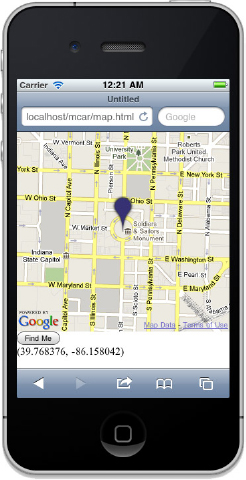
5. Make sure the nginx web server is running and open the map.html file on your iPhone or Android device, using the mobile browser. The URL to open the file is http://YOUR_IP_ADDRESS/map.html. Refer to Chapter 1 if you need help. The map should occupy most of the screen, as in Figure 4-2. Try panning and zooming, using your fingers. Tap the Find Me button to cause the map to display your current location.
How It Works
This mobile web app relies on the Google Maps API for almost all of its functionality. The app prevents web page zooming by using a viewport meta-tag because the zoom action should only apply to the map:
<meta name="viewport"
      content="initial-scale=1.0, user-scalable=no">
To make use of the Google Maps API, you also need to include the required JavaScript file from Google. This is done with a HTML script tag in the head element. One very important thing to remember here is that you have to include the sensor=true parameter:
<script
  src="http://maps.google.com/maps/api/js?sensor=true"></script>
The API requires this, and it lets Google know that the user’s device has a GPS sensor.
The HTML content of the app itself is quite sparse. There is a div to hold the map. Google will fill this div for you. There is also a div to hold the latitude and longitude values, so that the user can see them updating in real time. Finally, a Find Me button lets the user find his or her current location on the map, using the Geolocation API, which is covered in Chapter 3.
To mark the current location visually, a marker image is placed in an absolute position over the center of the map. An external marker is used to achieve the desired interface effect. Internal markers, provided by Google, would scroll with the map. Everything else is done using JavaScript.
To keep things simple, this example uses the standard Document Object Model (DOM) API and does not rely on libraries such as jQuery. First, you grab the map div and the location text div by using getElementById. Then you are ready to set up the Google map. The Google Maps API requires a fixed starting point. To provide this, you create a LatLng object, like so:
var latlng = new google.maps.LatLng(39.768376,-86.158042);
You need to choose the appropriate starting point based on your own app requirements. You can use http://maps.google.com to find the latitude and longitude values of any location.
With a starting point chosen, you can define the options for the map. In the sample code, this is done using the JavaScript Object Notation (JSON) syntax to create an options object with a set of map options. Your starting center point goes in here as the center property. You can also set the zoom level, the type of map, and the types of user interface control elements available to the user. The options in the sample code display a map with no additional controls, zoomed in to street map level. For a full list of options, and to keep up with new options available in future versions of the API, you should refer to the Google documentation at http://code.google.com/apis/maps/documentation/javascript.
Creating the map requires just a single line of code:
map = new google.maps.Map(mapdiv, options);
This line of code dynamically fills your map div with image tiles that build up the map view. It also adds touch event handlers that provide the panning and zooming functionality of the map.
To display the current location under the central marker image in real time as the user moves around the map, you can use one of the custom events that the Google Maps API provides. You listen for the center_changed event, get the new center location using the map.getCenter function, and insert the new location into the location div as text.
To implement the Find Me button, you use the HTML5 Geolocation API. Review the discussion of this API in Chapter 3 if you need some reminders of how it works. When you have the current location of the device, you set the center of the map by passing a LatLng object to the map.setCenter function.
PROVIDING AN APPLICATION ICON AND A STARTUP SCREEN
When the user installs a mobile web app from the browser by saving a bookmark icon to the home screen of his or her device, the default behavior, depending on the device, is to create the home screen icon from a screenshot of the app or to use a built-in bookmark icon. Neither approach is particularly satisfactory, especially if you would like your mobile web app to be as native as possible. There are, however, some link tags that you can use in your HTML head section to define your own home screen app icon. For newer devices, you can also specify a startup splash screen image.
The version of the To-Do List app provided in the downloadable code for this chapter includes the code for app icons. To use your own app icon, you first create a suitable image. For example, you can create a square .png image with a size of 57x57 pixels. The To-Do List app uses an image called todo-icon.png. Bear in mind that the device display will crop rounded borders off your icon and apply a shiny appearance. You add the following link tags to your HTML head element. The second line is needed to get the app icon to work on older Android devices:
  <link rel="apple-touch-icon" href="todo-icon.png"/>
  <link rel="apple-touch-icon-precomposed" href="todo-icon.png"/>
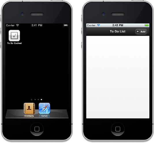
If you install the updated To-Do List application in this chapter, you should see the custom icon.
The iPhone also allows you to provide a startup splash screen. Android doesn’t support this at present, but it might in future versions. Apple recommends, as part of its Human Interface Guidelines, that the splash screen be an “empty” version of the main app interface. This means the user first sees an almost empty page, with just the main navigation items for the app. This improves the user experience because it makes the app feel like it is launching faster. A traditional splash screen implicitly communicates a “Please wait. . .loading” message to the user, whereas the empty main screen approach gives the feeling of an instantaneous launch. To specify a splash screen, use the following link tag:
<link rel="apple-touch-startup-image" href="todo-startup.png" />
The downloadable To-Do List application for this chapter also provides an example of this approach. Figure 4-3 shows the application icon on the left and the loading screen on the right.
This chapter covers some of the ways in which you can enhance your mobile web app to make it feel more native. By caching your app, you can allow it to work offline. Handling touches and gestures properly gives your app a very native feel. Adding an interactive map provides a high-value feature, and providing a proper app icon makes your user’s experience far more native. All these techniques are useful for mobile web apps. And as you will see in Chapter 9, you can also use these techniques to enhance hybrid apps where you package up your web app into a native container.
In the next chapter, you’ll learn how to build the other half of your application — the part that lives in the cloud. Most mobile apps, even games, need to talk to the outside world, and you’ll learn how to use JavaScript on the server side to enable this.
EXERCISES
1. Add an online/offline indicator to the cached To-Do List application. You can use the navigator.onLine property to detect whether you are connected to the Internet. The body element has online and offline event handlers that fire when your device changes connectivity. Visit http://www.w3.org/TR/html5/offline.html to read the specification.
2. The sample code of the image viewer application you created in this chapter always resets the rotation of the image. Modify this app so that it remembers the previous orientation of an image. Hint: You need to change the definition of what a swipe is to prevent spurious rotation when swiping.
3. Add a new Mark button to the map example. When the user taps this button, the map should place a bouncing marker on the center of the map. The marker should remain on the same spot on the map as the user pans around the map. If the user taps the marker, it is removed. The Google Maps API documentation is a good place to start: http://code.google.com/apis/maps/documentation/javascript.
Answers to the Exercises can be found in the Appendix.
• WHAT YOU LEARNED IN THIS CHAPTER
| TOPIC | KEY CONCEPTS |
| HTML5 Web App Caching | The HTML5 standard defines a web app caching feature that allows you to store your entire mobile web app on the user’s mobile device. This means that when they start your app, it loads immediately without waiting for a web server to deliver the files and images in the app. It also means that your app can function without a network connection. The caching mechanism is controlled by a manifest file that lists all of the assets to cache. |
| Touch and Gesture events | Browser events that fire when the user touches the device screen and that you can capture with JavaScript event handlers. These events can be triggered by one or more simultaneous finger touches. The mobile Webkit browser provides you with custom touch and gesture events, although support is not uniform. |
| Google Maps API | A cloud services API provided by Google that lets you directly embed an interactive map inside your web application. Google has optimized this API to support mobile browsers, and the user experience is very fast and smooth. The Google Maps API provides many features and can be customized extensively. Care is needed if you are building a commercial application, as certain terms and conditions have to be met. |
| App icon and startup screen | You can define an icon which that represents your application on the device home screen, using special tags in your HTML. You can also provide a full-screen image that is shown before your app is ready to run. |