
![]()
The linear regressions we have been exploring have some underlying assumptions. First and foremost is that response and prediction variables should have a linear relationship. Buried in that assumption is the idea that these variables are quantitative. However, what if the response variable is qualitative or discrete? If it is binary, such as measuring whether participants are satisfied or not satisfied, we could perhaps dummy-code satisfaction as 1 and no satisfaction as 0. In that case, while a linear regression may provide some guidance, it will also likely provide outputs well beyond the range of [0,1], which is clearly not right. Should we desire to predict more than two responses (e.g., not satisfied, mostly satisfied, and satisfied), the system breaks down even more.
Fortunately, logistic regression provides a mechanism for dealing with precisely these kinds of data. We will start off this chapter going into just enough mathematical background that we can understand when to use logistic regression and how to interpret the results. From there, we will work through a familiar dataset to understand the function calls and mechanisms R has in place to perform such calculations.
15.1 The Mathematics of Logistic Regression
First of all, apologies for the amount of mathematics we are about to go through. This is a methods text, and yet, to properly understand the results of logistic regression, it helps to understand where this all starts. If you are already familiar with logarithms, odds, and probability, feel free to move on to the example. If not, we will keep this as high level as possible, again saving for statistics texts and our appendix the precise reasoning.
At its heart, the advances of modern mathematics are powered by the idea of functions. In mathematics as in R, functions map input values to unique output values. That is, if we input the same information to the same function, we expect the same output. One of the more fascinating functions discovered over the years is the logarithmic function. It has many useful properties; perhaps one of the most impressive is that it converts the multiplication of large numbers into the addition of smaller values. This was terribly useful in computations of early navigation because multiplying large numbers is generally difficult while summing small numbers is comparatively easy.
![]()
Another useful feature of a logarithm is that it is the inverse function of an exponent. In a once popular movie, the protagonist claimed there were three steps to any good magic trick. The final step was that one had to undo the magic and make things right again. That is the power of inverses. We can map our inputs from our world into a more convenient place where it is easy to solve. However, once we have exploited the easy-to-solve feature, we need to take our results back into our world. We will see throughout our example in this section that we often take our answers and go to some pains to pull them back into “our” world. The fact that we are performing a conversion on our data also means we must be cautious with our interpretation of results.
Our goal is to model dummy-coded quantitative information. If we had a function that took inputs that were continuous variables and forced the outputs to live between 0 and 1, we might well be fairly happy. Fortunately, such a function exists. It is called the logistic function and for a single predictor X is as follows:

We will let R worry about how to discover the coefficients; our focus here is that there are exponents on the right-hand side, and that the foregoing function’s range of outputs is trapped between 0 and 1 regardless of the input values. We also care about understanding how to interpret our logistic regression results. A little bit of algebraic manipulation on our function tells us that

The left-hand side of our equation is the odds. As anyone who attends the Kentucky Derby knows, odds and probability are related, but they are not quite the same. Suppose we know from television that four out of five dentists recommend a particular brand of gum. Then the probability of a dentist recommending this gum is 4/5 which would be P(Y) = 0.8. However, our odds would be 4 to 1 which in the foregoing ratio would be 4 since  . Odds can live between 0 and infinity. Still, while we can understand the left-hand side, the right-hand side is not as nice as it might be. Remember, logarithms and exponents are inverses. If we take (or compose) both sides of our equation with a logarithm, we get a left-hand side of logarithmic odds or log odds or simply logit. The right-hand side becomes a linear model.

As we interpret our coefficients from the example model we are about to meet, it will often be convenient to talk about the logit or log odds. If we want to convert to odds, then we may simply take the exponent of logit. Thus, while statistical work often discusses probability, when doing logistic regression, we tend to speak in terms of odds instead. As visible from the preceding equation, this is a linear model. Much of what we calculate will be quite similar to the single and multivariate linear regressions we have already performed, just on the log odds scale!
As a final note, logistic regression assumes that our dependent variable is categorical, that there is a linear relationship between the predictor and response variables in the logistic space (not necessarily in the “real world” space, indeed in some examples we will see decidedly nonlinear probabilities, even though they are linear on the log odds scale), that our predictor variables are not perfectly collinear, and that we have a fairly large dataset (we use z-scores rather than t-scores). Things that we used to require (such as normal distribution for response variable or normal distribution for errors) are no longer required, which is rather convenient.
15.2 Generalized Linear Models
Previously, we talked about linear models. Now we will introduce the generalized linear model (GLM). GLMs, as you might expect, are a general class of models. The expected value of our outcome, Y, is E(Y), which is the mean or μ. GLMs then take the following form:

The first part should look very familiar, except we have replaced ![]() with
with ![]() .
. ![]() is called the linear predictor, because it is always on a linear scale. g() is called the link function. Link functions are functions that link the linear predictor to the original scale of the data, or “our” world. Finally, we will define one more function:
is called the linear predictor, because it is always on a linear scale. g() is called the link function. Link functions are functions that link the linear predictor to the original scale of the data, or “our” world. Finally, we will define one more function:
![]()
h() is the inverse link function, the function that takes us back to “our” world from the linear world. So g() takes us from our world to a linear world, and h() takes us back again. With that said, more or less as long as we can (1) find a suitable link function so that on that scale, our outcome is a linear function of the predictors, (2) we can define an inverse link function, and (3) we can find a suitable distribution, then we can use a GLM to do regression.
For example, linear regression is very simple. It assumes that g(Y) = Y and that h(g(Y)) = Y, in other words, the link and inverse link functions are just the identity function—no transformation occurs, and it assumes the data come from a Gaussian distribution. We have already talked about another link function,
although we did not call it that. For logistic regression,  and
and  , and we assume the data follow a binomial distribution. There are many other distributions and link functions we could choose from. For example, we could fit a log normal model, but using a log link function, but still assuming the data follow a Gaussian distribution, such as for income data which cannot be zero. We will see in R how we specify the distribution we want to assume, and the link function.
15.3 An Example of Logistic Regression
We will use our familiar gss2012 dataset, this time attempting to understand when satisfaction with finances (satfin) occurs. Suppose satfin is a dependent variable, and recall this dataset has age in years (age), female vs. male (sex), marital status (marital), years of education (educ), income divided into a number of bins where higher bin number is higher income (income06), self-rated health (health), and happiness (happy). We explore the dataset to find predictors for financial satisfaction. Also, as before, we will make our library calls first, read our data, and perform some data management. We will also for simplicity’s sake drop all missing cases using the na.omit() function. Handling missing data (in more reasonable ways than dropping all cases missing any variable) is definitely an important topic. In the interest of keeping our focus on logit models, we save that topic for a future book.
> library(foreign)
> library(ggplot2)
> library(GGally)
> library(grid)
> library(arm)
> library(texreg)

> gss2012 <- read.spss("GSS2012merged_R5.sav", to.data.frame = TRUE)
> gssr <- gss2012[, c("age", "sex", "marital", "educ", "income06", "satfin", "happy", "health")]
> gssr <- na.omit(gssr)

> gssr <- within(gssr, {
+   age <- as.numeric(age)
+   educ <- as.numeric(educ)
+   cincome <- as.numeric(income06)
+ })
Our gssr data have 2,835 observations after fully removing every row that had missing data for any of our eight variables. Notice that while age and education were already text numbers that we have forced to be numeric, the income06 variable was descriptive, so we have created a new column named cincome to hold a numeric value for those titles (e.g., “150000 OR OVER” becomes “25”). Recalling that we have deleted the n/a responses from our data, we take a first look at the satfin data in Figure 15-1 generated by the following code:
> ggplot(gssr, aes(satfin)) +
+   geom_bar() +
+   theme_bw()

Figure 15-1. Bar graph satfin levels vs. count
For our first pass at logistic regression, we wish to focus only on satisfied vs. not fully satisfied. We create a new variable named Satisfied to append to our gssr dataset which we code to 1 for satisfied responses to satfin and 0 otherwise. We also look at a table of those results in the code that follows:
> gssr$Satisfied <- as.integer(gssr$satfin == "SATISFIED")
> table(gssr$Satisfied)

   0    1
2122  713
15.3.1 What If We Tried a Linear Model on Age?
These data now seem to satisfy our requirements for running logistic regression. In particular, having financial satisfaction or not fully having financial satisfaction is a qualitative variable and some 2,835 observations seem to be a large dataset. Suppose we select age as a potential predictor for Satisfied. We take a moment to consider a normal linear model. This has the advantage of not only seeing (with real data) why we would want such a creature as logistic regression but also seeing what data that are not normal might look like in the usual plots for exploratory data analysis (EDA). We fit the linear model, generate our plots, and see from Figure 15-2, particularly the Normal Q-Q plot, that a linear model is not the way to go. Of course, none of these four graphs looks anything like the linear model results we saw in the last two chapters. These diagnostics show marked non-normality of the data along with other violations of assumptions.
> m.lin <- lm(Satisfied ~ age, data = gssr)

> par(mfrow = c(2, 2))
> plot(m.lin)

Figure 15-2. Standard plot() call on the linear model Satisfied ~ age
15.3.2 Seeing If Age Might Be Relevant with Chi Square
Earlier, we learned of the chi-square tests for categorical data, such as these. If we converted our age variable (much as we did with satfin) into a discrete variable, we could do a chi-square test. Of course, to do so, we would have to pick some level cut-off for age and recode it; here we create a new variable that is 1 if age is ≥ 45 and 0 if age is < 45. Creating a contingency table and running the test shows highly significant results. By the way, when assigning output to a variable for use later, wrapping the whole statement in parentheses is a simple trick to get the output to print, without too much extra typing.
> gssr$Age45 <- as.integer(gssr$age >= 45)

> (tab <- xtabs(~Satisfied + Age45, data = gssr))
         Age45
Satisfied    0    1
        0  940 1182
        1  249  464
> chisq.test(tab)
        Pearson's Chi-squared test with Yates' continuity correction
data:  tab
X-squared = 18.88, df = 1, p-value = 1.392e-05
The fact that these results are significant does lend weight to our hypothesis that age may well make a good predictor for satisfaction. What if we prefer to leave age as a continuous variable? We turn to logistic regression, which in R uses the GLM and the glm() function. One of the virtues of using R is that the usual functions are often quite adept at determining what sorts of data and data structures are being passed to them. Thus, we will see many similarities between what we have done and what we do now for logit models. We start with our new function and our old friend, the summary() function. You will see that glm() works very similarly to lm() except that we have to use an additional argument, family = binomial(), to tell R that the errors should be assumed to come from a binomial distribution. If you would like to see what other families can be used with the glm() function, look at the R help page for the ?family. You will see that linear regression is actually a specific case of the GLM and if you wanted to, you could run it using the glm() function. You can also use different link functions for each distribution. We did not have to tell R that we wanted to use a logit link function, because that is the default for the binomial family, but if we wanted to, we could have written family = binomial(link = "logit").
15.3.3 Fitting a Logistic Regression Model
> m <- glm(Satisfied ~ age, data = gssr, family = binomial())

> summary(m)

Call:
glm(formula = Satisfied ~ age, family = binomial(), data = gssr)

Deviance Residuals:
    Min       1Q   Median       3Q      Max
-1.0394  -0.7904  -0.6885   1.3220   1.9469

Coefficients:
             Estimate Std. Error z value Pr(>|z|)
(Intercept) -2.086915   0.142801 -14.614  < 2e-16 ***
age          0.019700   0.002621   7.516 5.64e-14 ***
---
Signif. codes:  0 '***' 0.001 '**' 0.01 '*' 0.05 '.' 0.1 ' ' 1

(Dispersion parameter for binomial family taken to be 1)

    Null deviance: 3197.7  on 2834  degrees of freedom
Residual deviance: 3140.4  on 2833  degrees of freedom
AIC: 3144.4

Number of Fisher Scoring iterations: 4
The summary() function is quite as it has been. It starts off echoing the model call and then provides a summary of the residuals. Recall from our earlier discussion of the theory that these estimates are log odds or logits. In other words, a one-year increase in age is associated with a 0.019700 increase in the log odds of being financially satisfied. We’ll spend some effort in a moment to convert that number into something more intuitively meaningful. For now, just keep in mind that our outcome is in log odds scale. Also notice that, again as mentioned, we have z values instead of t values. Logistic regression (as a specific case of GLM) relies on large-number theory and this is the reason we need to have a large sample size, as there is no adjustment for degrees of freedom. The p values (which are significant) are derived from the z values. The intercept coefficient is the log odds of being satisfied for someone who is zero years old. Notice that this is outside the minimum value for our age predictor, and thus it is a somewhat meaningless number. Also notice that log odds can be negative for odds between 0 and 1. This can also be counterintuitive at first.
Looking at the final outputs of our summary tells us that for the binomial model we’re using, dispersion is taken to be fixed. The null deviance is based on the log likelihood and is for an empty model; the residual deviance is based on the log likelihood and is for the actual model. These two numbers can be used to give an overall test of model performance/fit similar to the F test for linear models, but in this case it is called a likelihood ratio test (LRT) and follows the chi-square distribution.
To perform a LRT, we first fit a null or empty model which has only an intercept. To test constructed models against null models in R (or to test any two models against each other, for that matter), the generally agreed upon function call is anova(). It is somewhat confusing as we should not interpret its use to mean we are doing an ANOVA (analysis of variance). This function, when given a sequence of objects, tests the models against one another. This function is also part of the reason we opted to remove our rows with null data. It requires the models to be fitted to the same dataset, and the null model will find fewer conflicts than our constructed model. Of note in the code and output that follows is that there is a significant difference between the two models, and thus we believe our model, m, provides a better fit to the data than a model with only an intercept (not a hard bar to beat!).
> m0 <- glm(Satisfied ~ 1, data = gssr, family = binomial())
>
> anova(m0, m, test = "LRT")
Analysis of Deviance Table

Model 1: Satisfied ~ 1
Model 2: Satisfied ~ age
  Resid. Df Resid. Dev Df Deviance  Pr(>Chi)
1      2834     3197.7
2      2833     3140.4  1   57.358 3.634e-14 ***
As we mentioned previously, the fact that the intercept is fairly meaningless due to being well outside our range of ages might be something to fix to make our model more intuitive. But first, an aside.
15.3.4 The Mathematics of Linear Scaling of Data
If we were to look at a very brief example of just three data points we wished to average, let us say 0, 45, and 45, we would see the arithmetic mean was 30. Now, suppose that we wanted to adjust our x-axis scale in a linear fashion. That is, we might choose to divide all our numbers by 45. If we did that, our new variables would be 0, 1, and 1, and our new average would be 2/3. Of course, we could have simply found our new mean by reducing 30/45 which is of course also 2/3. All this is to say that we might expect linear adjustments to x-axis variables to be well behaved in some convenient fashion. After taking a brief look at Figure 15-3 and the code that created it, notice that linear adjustments of the x axis, while they may change the scale of the x axis, do not change the line really. Here, we make our x-axis conversion by dividing by 5 and adding 3.
> x0 <- c(5, 15, 25, 35, 45)
> x1 <- c(4, 6, 8, 10, 12)
> y <- c(0, 10, 20, 30, 40)
> par(mfrow = c(1,2))
> plot(x0,y, type = "l")
> plot(x1,y, type = "l")

Figure 15-3. A visual demonstration that linear x-axis rescales don’t really change the line
15.3.5 Logit Model with Rescaled Predictor
Let us take a closer look at our age variable. We can see from Figure 15-4 and the summary() code that respondents’ ages ranged from 18 to 89 years. We recall from before that our log odds for increase by a single year were rather low. This all leads us to consider changing our predictor scale to something more suitable.
> hist(gssr$age)
> summary(gssr$age)
   Min. 1st Qu.  Median    Mean 3rd Qu.    Max.
  18.00   35.00   49.00   49.24   61.00   89.00

Figure 15-4. Histogram of age vs. frequency
A more suitable choice might be to center our age data so that 0 is 18 years of age. This would make our intercept much more useful to us. We also might divide by 10 to be able to discuss how satisfaction changes by decades after reaching adulthood.
Now, with this change, since regression models are invariant to linear transformations of predictors, our model is the same, although our output looks a little different. The intercept is now the log odds of being satisfied at age 18 where our age scale starts and the age effect of 0.19700 is the log odds for a decade increase in age.
> gssr$Agec <- (gssr$age - 18) / 10
> m <- glm(Satisfied ~ Agec, data = gssr, family = binomial())
> summary(m)

Call:
glm(formula = Satisfied ~ Agec, family = binomial(), data = gssr)

Deviance Residuals:
    Min       1Q   Median       3Q      Max
-1.0394  -0.7904  -0.6885   1.3220   1.9469

Coefficients:
            Estimate Std. Error z value Pr(>|z|)
(Intercept) -1.73232    0.09895 -17.507  < 2e-16 ***
Agec         0.19700    0.02621   7.516 5.64e-14 ***
---
Signif. codes:  0 '***' 0.001 '**' 0.01 '*' 0.05 '.' 0.1 ' ' 1

(Dispersion parameter for binomial family taken to be 1)

    Null deviance: 3197.7  on 2834  degrees of freedom
Residual deviance: 3140.4  on 2833  degrees of freedom
AIC: 3144.4

Number of Fisher Scoring iterations: 4
Often the log odds scale is not very intuitive, so researchers prefer to interpret odds ratios directly; we can convert the coefficients to odds ratios by exponentiation, since logarithm and exponents are inverses.
> cbind(LogOdds = coef(m), Odds = exp(coef(m)))
               LogOdds      Odds
(Intercept) -1.7323153 0.1768744
Agec         0.1969999 1.2177439
Now we can interpret the effect of age, as for each decade increase in age, people have 1.22 times the odds of being satisfied; they do not have 1.22 times the chance or the probability of being satisfied. These are still odds. Just not log odds.
We may also be interested in the confidence intervals (CIs). As usual, we take the coefficient and add the 95% confidence intervals. We do this in the log odds scale first and then exponentiate that result. This is because our method of discovering CIs is predicated around the linear model of the log odds scale (i.e., estimate ± 1.96 x standard error).
> results <- cbind(LogOdds = coef(m), confint(m))
Waiting for profiling to be done...
> results
               LogOdds      2.5 %     97.5 %
(Intercept) -1.7323153 -1.9284027 -1.5404056
Agec         0.1969999  0.1457785  0.2485537

> exp(results)
              LogOdds     2.5 %    97.5 %
(Intercept) 0.1768744 0.1453802 0.2142942
Agec        1.2177439 1.1569399 1.2821696
For graphing and interpreting, perhaps the easiest scale is probabilities as odds can still be confusing and depend on the actual probability of an event happening. Let us create a new dataset of ages, across the whole age range, and get the predicted probability of being satisfied for each hypothetical person. We will generate the age dataset, get the predicted probabilities, and then graph it. The predict() function knows we are calling it on m which is an S3 class of type GLM. Thus, we are actually calling predict.glm(), which has as its default type the decision to use the "link" scale, which is log odds. We want a probability scale, which is the original response scale, and thus set the type to "response".
> newdat <- data.frame(Agec = seq(0, to = (89 - 18)/10, length.out = 200))
> newdat$probs <- predict(m, newdata = newdat, type = "response")

> head(newdat)
        Agec     probs
1 0.00000000 0.1502917
2 0.03567839 0.1511915
3 0.07135678 0.1520957
4 0.10703518 0.1530043
5 0.14271357 0.1539174
6 0.17839196 0.1548350

> p <- ggplot(newdat, aes(Agec, probs)) +
+   geom_line() +
+   theme_bw() +
+   xlab("Age - 18 in decades") +
+   ylab("Probability of being financially satisfied")
> p
The foregoing code generates Figure 15-5, but notice that it doesn’t quite give us what we want. Namely, while the y axis is now in a very intuitive probability scale, the x axis is still in our linearly transformed scale. It would be helpful to rerun the graph making sure to both analyze the code at years that make sense (i.e. 20, 40, 60, and 80 years of age) and label the x axis in such a way that we could see that. The following code makes this happen, and we show Figure 15-6 on the next page contrasted with our earlier image. When we update the labels, we also need to relabel the x axis to make it clear the axis is now in age in years rather than centered and in decades.
> p2 <- p +
+   scale_x_continuous("Age in years", breaks = (c(20, 40, 60, 80) - 18)/10,
+   labels = c(20, 40, 60, 80))
> p2

Figure 15-5. GLM prediction graph on age minus 18 in decades and probability of being financially satisfied

Figure 15-6. GLM prediction graph as in Figure 15-5 with better breaks and hand labeled for interpretability
15.3.6 Multivariate Logistic Regression
We turn our efforts now to multivariate logistic regression to improve our logit model. It would seem cincome might make a good predictor of income satisfaction and perhaps education, educ, also matters. Income does seem to be significant, although the main effect of education is not statistically significant.
> m2 <- update(m, . ~ . + cincome + educ)
> summary(m2)

Call:
glm(formula = Satisfied ~ Agec + cincome + educ, family = binomial(),
    data = gssr)

Deviance Residuals:
    Min       1Q   Median       3Q      Max
-1.3535  -0.8009  -0.6029   1.0310   2.7238

Coefficients:
            Estimate Std. Error z value Pr(>|z|)
(Intercept) -4.27729    0.27387 -15.618   <2e-16 ***
Agec         0.24130    0.02836   8.508   <2e-16 ***
cincome      0.10989    0.01049  10.478   <2e-16 ***
educ         0.03045    0.01693   1.799   0.0721 .
---
Signif. codes:  0 '***' 0.001 '**' 0.01 '*' 0.05 '.' 0.1 ' ' 1

(Dispersion parameter for binomial family taken to be 1)

    Null deviance: 3197.7  on 2834  degrees of freedom
Residual deviance: 2955.6  on 2831  degrees of freedom
AIC: 2963.6

Number of Fisher Scoring iterations: 4
Perhaps there is an interaction between education and income? Education and income interact when income is zero, higher education is associated with lower log odds of financial satisfaction, but as income goes up, the relationship between education and financial satisfaction goes toward zero.
> m3 <- update(m, . ~ . + cincome * educ)
> summary(m3)

Call:
glm(formula = Satisfied ~ Agec + cincome + educ + cincome:educ,family = binomial(), data = gssr)

Deviance Residuals:
    Min       1Q   Median       3Q      Max
-1.5182  -0.7865  -0.5904   0.9003   2.8120

Coefficients:
              Estimate Std. Error z value Pr(>|z|)
(Intercept)  -1.391097   0.661266  -2.104 0.035406 *
Agec          0.235217   0.028477   8.260  < 2e-16 ***
cincome      -0.051122   0.036209  -1.412 0.157992
educ         -0.190748   0.050788  -3.756 0.000173 ***
cincome:educ  0.012068   0.002647   4.559 5.13e-06 ***
---
Signif. codes:  0 '***' 0.001 '**' 0.01 '*' 0.05 '.' 0.1 ' ' 1

(Dispersion parameter for binomial family taken to be 1)

    Null deviance: 3197.7  on 2834  degrees of freedom
Residual deviance: 2936.8  on 2830  degrees of freedom
AIC: 2946.8

Number of Fisher Scoring iterations: 4
One item of note is that as we add more predictors to our model, unlike with the linear regressions we did in prior chapters, there is not a convenient multiple correlation coefficient (i.e., R2) term to measure if we are progressing toward a “better” model or not. One possibility we have hinted at before is to have two datasets. We could train our model on the first dataset, and then test our model against the second dataset to determine how far off our predictions might be. There are a variety of methods to do so (e.g., cross-validation), and these methods are not particularly difficult to code in R. However, they can be compute intensive. McFadden (1974) suggests an analogous measure using a log likelihood ratio which belongs to a class of measures sometimes labeled pseudo R-squared. There are many alternative approaches available and each has various pros and cons, without any single measure being agreed upon as optimal or the “gold standard.” McFadden’s R2 is straightforward to calculate, and for now, we show a function implementing McFadden’s algorithm.
> McFaddenR2 <- function(mod0, mod1, ... ){
+   L0 <- logLik(mod0)
+   L1 <- logLik(mod1)
+   MFR2 <- 1 - (L1/L0)
+   return(MFR2)
+ }
>
> MFR2_1 <- McFaddenR2(m0,m)
> MFR2_2 <- McFaddenR2(m0,m2)
> MFR2_3 <- McFaddenR2(m0,m3)
>
> McFaddenResults <- cbind( c(MFR2_1,MFR2_2,MFR2_3))
> McFaddenResults
           [,1]
[1,] 0.01793689
[2,] 0.07469872
[3,] 0.08161767
Our model seems to be improving, so we turn our attention to getting results. Before we start looking at predictions, we take a look at our new predictor variables. Based on those explorations, we build our new data model to pass to our predict() function. In this case, we will see from the summary() function calls (and our intuition) that it makes sense to segment education based on high school, university, and postgraduate levels while we model all income bins and fix age to be the mean age. When generating predictions, it is important to have an eye on how we’re going to present those predictions in graphical form. Graphs that are “too complicated” may not clearly convey what is happening in the model. As models become better at uncovering the response variable, they tend to gain predictors and complexity. Only observing certain educational levels and fixing the age to mean age are ways to reduce that complexity somewhat. We want both predicted probabilities based on some choices of inputs to our predictors (with the coefficients from our model) as well as CIs around the predictions. Recall that CIs can be calculated as the model estimates plus or minus 1.96 times standard error. As before, these calculations make sense on linear equations (imagine if we had a predicted probability of zero and subtracted 1.96 x standard error, we would end up with a CI going beyond a probability of zero!). Thus, they must be done first on the log odds scale (the link scale), and then converted to probabilities at the end. To add the CIs, we use the se.fit = TRUE option to get the standard errors, and we get the estimates on the link scale, rather than the response scale.
> summary(gssr$educ)
   Min. 1st Qu.  Median    Mean 3rd Qu.    Max.
   0.00   12.00   14.00   13.77   16.00   20.00

> summary(gssr$cincome)
   Min. 1st Qu.  Median    Mean 3rd Qu.    Max.
   1.00   14.00   18.00   17.04   21.00   25.00

> newdat <- expand.grid(
+   educ = c(12, 16, 20),
+   cincome = 1:25,
+   Agec = mean(gssr$Agec))

> newdat <- cbind(newdat, predict(m3, newdata = newdat,
+                                 type = "link", se.fit = TRUE))

> head(newdat)
  educ cincome     Agec       fit    se.fit residual.scale
1   12       1 3.124056 -2.851555 0.1808835              1
2   16       1 3.124056 -3.566276 0.2598423              1
3   20       1 3.124056 -4.280998 0.4206850              1
4   12       2 3.124056 -2.757866 0.1705653              1
5   16       2 3.124056 -3.424317 0.2470500              1
6   20       2 3.124056 -4.090769 0.4002471              1


> newdat <- within(newdat, {
+   LL <- fit - 1.96 * se.fit
+   UL <- fit + 1.96 * se.fit
+ })
Recall that to calculate CIs, we had to use the log odds scale. Thus, in our predict() function, we chose type = "link" this time. Then we calculated our lower limit (LL) and our upper limit (UL) for each point. Never forgetting that we are presently in the log odds scale, we can now convert the fitted values (these are what R calls predicted values) and the CIs to the probability scale. In R, the inverse logit function plogis() can be applied to the data. At the same time, ggplot can be employed to visualize the results in a strictly functional fashion. The plot color-codes the three education levels and has shaded probability ribbons. Of note is that provided the error ribbons do not intersect the lines of the other plots, then there is a significant difference between education levels, which allows for relatively easy visual inspection of the level of income at which education makes a statistically significant difference in probability of being satisfied. We see that at various income levels, this seems to be the case, although Figure 15-7 isn’t fully clear.
> newdat <- within(newdat, {
+   Probability <- plogis(fit)
+   LLprob <- plogis(LL)
+   ULprob <- plogis(UL)
+ })

> p3 <- ggplot(newdat, aes(cincome, Probability, color = factor(educ))) +
+   geom_ribbon(aes(ymin = LLprob, ymax = ULprob), alpha = .5) +
+   geom_line() +
+   theme_bw() +
+   xlab("Income Bins") +
+   ylab("Probability of being financially satisfied")
> p3

Figure 15-7. Income bin vs. probability of being satisfied with high school, university, and graduate education levels. Not the most attractive graph
While this graph may be functional, it leaves a lot to be desired. It is perhaps difficult to see when the CIs intersect the various education lines. This makes it difficult to see when more or less education might cause statistically significant differences in Satisfaction. We use the scales library here to clean up the y axis. The theme() command increases the size of our legend, and moves it to the bottom of the graph. Notice that in the aes() function the factor(educ) was used for color, fill, and linetype. To remove the factor(educ) and replace it with a nicer label of “Education” for all three of those in our legend, we must change the label in each one. Finally, we force the shown intervals of our Income bins and our y-axis probability via the coord_cartesian() command. Our efforts pay off in Figure 15-8 (be sure to run this code as the printed version of this text won’t show the full color picture).
> library(scales) # to use labels = percent

Attaching package: 'scales'

The following object is masked from 'package:arm':

    rescale

>
> p4 <- ggplot(newdat, aes(cincome, Probability,
+                          color = factor(educ), fill = factor(educ),
+                          linetype = factor(educ))) +
+   geom_ribbon(aes(ymin = LLprob, ymax = ULprob, color = NULL), alpha = .25) +
+   geom_line(size = 1) +
+   theme_bw() +
+   scale_y_continuous(labels = percent) +
+   scale_color_discrete("Education") +
+   scale_fill_discrete("Education") +
+   scale_linetype_discrete("Education") +
+   xlab("Income Bins") +
+   ylab("Probability of being financially satisfied") +
+   theme(legend.key.size = unit(1, "cm"),
+         legend.position = "bottom") +
+   coord_cartesian(xlim = c(1, 25), ylim = c(0, .65))
> p4

Figure 15-8. A much nicer graph, which more cleanly shows the effects of income and education on Satisfaction
In Figure 15-8, one can readily see that on either side of the 15 Income bin ($25,000 to $29,999), there are places where the confidence bands do not include the other line. Thus, in those regions, it seems education has a more potent effect rather than in the middle where there is overlap for middling income levels. Also notice that the y-axis labels are at last in a very intuitive probability scale and are even written as a percent.
A final thought on this example is that satfin was deliberately recoded to an all-or-nothing Satisfaction variable. The natural extension is to consider if there is a way to make this model work well for nonbinary categorical data. It turns out the answer is indeed in the positive, and the next section explores the topic of ordered logistic regression.
15.4 Ordered Logistic Regression
Our first prediction was binary in nature. One was either fully financially satisfied or recoded to a “not fully satisfied” catch-all variable that had both not at all and more or less financially satisfied. This is often a very useful level of masking to engage. Multiple-choice exam question options (e.g., with options A, B, C, and D where only one is correct) are readily coded to a 25% probability of randomly guessing the correct (i.e., True) answer and a 75% probability of randomly selecting an incorrect (i.e., False) answer. The advantage is that such steps simplify the model. One of the challenges in building good models is that they are meant to be simplifications of the real world. To paraphrase Tukey (1962), “Never let your attraction to perfection prevent you from achieving good enough.”
All the same, there are times when more advanced models are required to get any traction on the challenge at hand. In those cases, it can be helpful to recognize that while the overall model is still logistic, we would like some nuances that are more subtle than an all-or-nothing approach. We present two such examples in the next two sections.
15.4.1 Parallel Ordered Logistic Regression
Extending the first example from using predictions of only full financial satisfaction, a model could be developed that predicts each level of satisfaction. From the raw gss2012 data, satfin has three levels, not at all satisfied, more or less satisfied, and satisfied. These are ordered in that not at all satisfied < more or less satisfied < satisfied. Installing and loading the VGAM package, which allows fits for many types of models including ordered logistic models, will allow for a more nuanced exploration of financial satisfaction. The first step is to let the gssr dataset know that satfin in fact holds factored, ordered data. The model is built using the VGAM package’s vglm() function to create an ordered logistic regression. In this particular function call, the cumulative() family is used; we specify parallel = TRUE, and while glm() used the logit link as well (by default), here it is explicitly stated. Finally, the summary() function is called on this null model. The following commands and output have been respaced somewhat for clarity and space.
> install.packages("VGAM")
> library(VGAM)
Loading required package: stats4
Loading required package: splines
> gssr$satfin <- factor(gssr$satfin,
+                       levels = c("NOT AT ALL SAT", "MORE OR LESS", "SATISFIED"),
+                       ordered = TRUE)

> mo <- vglm(satfin ~ 1,
+            family = cumulative(link = "logit", parallel = TRUE, reverse = TRUE),
+            data = gssr)

> summary(mo)

Call:
vglm(formula = satfin ~ 1, family = cumulative(link = "logit",
    parallel = TRUE, reverse = TRUE), data = gssr)

Pearson residuals:
                   Min      1Q  Median     3Q    Max
logit(P[Y>=2]) -1.4951 -1.4951  0.3248 0.8206 0.8206
logit(P[Y>=3]) -0.7476 -0.7476 -0.3036 1.6943 1.6943

Coefficients:
              Estimate Std. Error z value Pr(>|z|)
(Intercept):1  0.84478    0.04096   20.62   <2e-16 ***
(Intercept):2 -1.09063    0.04329  -25.20   <2e-16 ***
---
Signif. codes:  0 '***' 0.001 '**' 0.01 '*' 0.05 '.' 0.1 ' ' 1

Number of linear predictors:  2
Names of linear predictors: logit(P[Y>=2]), logit(P[Y>=3])
Dispersion Parameter for cumulative family:   1
Residual deviance: 6056.581 on 5668 degrees of freedom
Log-likelihood: -3028.291 on 5668 degrees of freedom
Number of iterations: 1
Notice that mo is an empty model. Thus, the only estimates are intercepts for our two levels; one of which is the log odds of being greater than 2 and the other which is log odds of being precisely 3. Since there are only three possibilities, we can solve for the probability of being in any of the three levels. Since this is an empty model, it should match precisely with a proportion table. A handful of function calls to plogis() and some algebra will yield the probability of being satisfied, more or less satisfied, or not satisfied, respectively. The code for this follows:
> plogis(-1.09063)
[1] 0.2514997
> plogis(0.84478) - plogis(-1.09063)
[1] 0.4479713
> 1 - plogis(0.84478)
[1] 0.300529
> prop.table(table(gssr$satfin))

NOT AT ALL SAT   MORE OR LESS      SATISFIED
     0.3005291      0.4479718      0.2514991
With the null model in place, the model may be updated to explore the effect of age (the adjusted age from earlier) on financial satisfaction.
> mo1 <- vglm(satfin ~ 1 + Agec,
+            family = cumulative(link = "logit", parallel = TRUE, reverse = TRUE), data = gssr)

> summary(mo1)
Call:
vglm(formula = satfin ~ 1 + Agec, family = cumulative(link = "logit",
    parallel = TRUE, reverse = TRUE), data = gssr)

Pearson residuals:
                  Min      1Q  Median     3Q    Max
logit(P[Y>=2]) -2.048 -1.3060  0.3395 0.8071 0.9815
logit(P[Y>=3]) -0.937 -0.7183 -0.3167 1.2556 2.1670

Coefficients:
              Estimate Std. Error z value Pr(>|z|)
(Intercept):1  0.38898    0.07587   5.127 2.94e-07 ***
(Intercept):2 -1.57479    0.08193 -19.222  < 2e-16 ***
Agec           0.15128    0.02121   7.132 9.91e-13 ***
---
Signif. codes:  0 '***' 0.001 '**' 0.01 '*' 0.05 '.' 0.1 ' ' 1
Number of linear predictors:  2
Names of linear predictors: logit(P[Y>=2]), logit(P[Y>=3])
Dispersion Parameter for cumulative family:   1
Residual deviance: 6005.314 on 5667 degrees of freedom
Log-likelihood: -3002.657 on 5667 degrees of freedom
Number of iterations: 3
Again, the cbind() function along with exponentiation may be used to compare and contrast the log odds with the odds of the coefficients with code and output as follows:
> cbind(LogOdds = coef(mo1), Odds = exp(coef(mo1)))
                 LogOdds      Odds
(Intercept):1  0.3889768 1.4754703
(Intercept):2 -1.5747920 0.2070506
Agec           0.1512757 1.1633174
Interpreting this, it could be said that for every decade older a person is, that person has 1.16 times the odds of being in a higher financial satisfaction level. To see this graphically, create a new data frame that has 200 values of the adjusted age data. Specifically, ensure that the range of ages is from 0 for 18 to the maximum age of 89 less 18 divided by 10 to adjust the scale. Then, use the predict() function again, which is turning out along with summary() to be very powerful in the number of models it has been built to understand, to ensure that the points are in probability response rather than log odds link. The new dataset that has the created inputs for the predictor variable as well as the resulting output response values may be viewed.
> newdat <- data.frame(Agec = seq(from = 0, to = (89 - 18)/10, length.out = 200))
>
> #append prediction data to dataset
> newdat <- cbind(newdat, predict(mo1, newdata = newdat, type = "response"))
>
> #view new data set
> head(newdat)
        Agec NOT AT ALL SAT MORE OR LESS SATISFIED
1 0.00000000      0.4039636    0.4245020 0.1715343
2 0.03567839      0.4026648    0.4250325 0.1723027
3 0.07135678      0.4013673    0.4255589 0.1730738
4 0.10703518      0.4000712    0.4260812 0.1738476
5 0.14271357      0.3987764    0.4265994 0.1746241
6 0.17839196      0.3974831    0.4271134 0.1754034
Once the data for a graph is thus acquired, it may be plotted. To use ggplot2, it must be a long dataset, and thus the library reshape2 is called along with the function melt(). As with summary(), there is more than one type of melt() function. Regardless of the type, melt() takes an input of data and reshapes the data based on a vector of identification variables aptly titled id.vars. For this particular example, this should be set to id.vars="Agec". Notice the difference between the previous head(newdat) call and the same call on the melted data frame that follows:
> library(reshape2)
> newdat <- melt(newdat, id.vars = "Agec")
> head(newdat)
        Agec       variable     value
1 0.00000000 NOT AT ALL SAT 0.4039636
2 0.03567839 NOT AT ALL SAT 0.4026648
3 0.07135678 NOT AT ALL SAT 0.4013673
4 0.10703518 NOT AT ALL SAT 0.4000712
5 0.14271357 NOT AT ALL SAT 0.3987764
6 0.17839196 NOT AT ALL SAT 0.3974831
The data are ready to graph with fairly familiar calls to ggplot. The only new aspect of this call is perhaps providing better factor names from the raw names to something a little more reader friendly.
> newdat$variable <- factor(newdat$variable,
+                           levels = c("NOT AT ALL SAT", "MORE OR LESS", "SATISFIED"),
+                           labels = c("Not Satisfied", "More/Less Satisfied", "Satisfied"))
>
> p5 <- ggplot(newdat, aes(Agec, value, color = variable, linetype = variable)) +
+   geom_line(size = 1.5) +
+   scale_x_continuous("Age", breaks = (c(20, 40, 60, 80) - 18)/10,
+                      labels = c(20, 40, 60, 80)) +
+   scale_y_continuous("Probability", labels = percent) +
+   theme_bw() +
+   theme(legend.key.width = unit(1.5, "cm"),
+         legend.position = "bottom",
+         legend.title = element_blank()) +
+   ggtitle("Financial Satisfaction")
> p5
Figure 15-9 makes it clear that there is little difference in the percentage of people who are more or less satisfied with financial situation across the lifespan, with the bigger changes happening to those who are not satisfied vs. those who are satisfied. One helpful way to better understand the results besides graphs is to look at the marginal effect. The marginal effect answers the question: “How much would the probability of being financially satisfied [or any of the levels] change for person i if age increased?” This is valuable because although the model is linear on the log odds scale, it is not linear on the probability scale; the marginal effect is the first derivative of the function on the probability scale. With R, fortunately, it is easy enough to compute as follows:
> margeff(mo1, subset = 1)
            NOT AT ALL SAT MORE OR LESS   SATISFIED
(Intercept)    -0.09249320   0.32523987 -0.23274666
Agec           -0.03597124   0.01361342  0.02235782
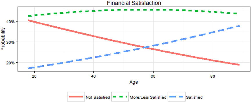
Figure 15-9. Age vs. probability of three levels of financial satisfaction
These results show that for person 1, the instantaneous rate of change in probability of being satisfied is .022, whereas there is a larger decrease of -.036 in probability of being not at all satisfied. Another useful sort of effect size is the average marginal effect in the data. That is, it asks the question: “On average in the sample, what is the instantaneous rate of change in probability of being satisfied [or any of the levels] by age?” We can get this by not subsetting the data, then extracting just the Agec term ignoring intercepts, and taking the mean of each row, to get the averages.
> rowMeans(margeff(mo1)["Agec", ,])
NOT AT ALL SAT   MORE OR LESS      SATISFIED
  -0.031344533    0.003157332    0.028187201
These results show that, on average, a decade change in age is associated with almost no change in being more or less satisfied at .003, about a .028 probability higher chance of being satisfied, and about a .031 probability lower chance of being not satisfied.
As we turn our attention from this example, we call to the reader’s attention that while our primary goal was to explore ordered logistic regression, we deliberately chose to set one of our variables to be parallel = TRUE. Let us explore what happens if we choose otherwise.
15.4.2 Non-Parallel Ordered Logistic Regression
In the prior example, the use of the parallel argument in the function call assumed the effect of any predictors have exactly parallel (equal) relationship on the outcome for each of the different groups. If we set parallel = FALSE, then the effect of predictors, here Agec, would be allowed to be different for each comparison where the comparisons are being satisfied or more or less satisfied vs. not satisfied, and satisfied vs. more or less satisfied or not satisfied. This is still an ordered logistic regression. We are only relaxing the assumption that a predictor has the same effect for each level of response. It is a very minor code change, and we show the code for that as well as a summary() as follows:
> mo.alt <- vglm(satfin ~ 1 + Agec,
+                family = cumulative(link = "logit", parallel = FALSE, reverse = TRUE),
+                data = gssr)
> summary(mo.alt)

Call:
vglm(formula = satfin ~ 1 + Agec, family = cumulative(link = "logit",
    parallel = FALSE, reverse = TRUE), data = gssr)

Pearson residuals:
                  Min      1Q  Median     3Q    Max
logit(P[Y>=2]) -1.873 -1.3518  0.3296 0.8116 0.9033
logit(P[Y>=3]) -1.051 -0.7022 -0.3234 1.1607 2.3272

Coefficients:
              Estimate Std. Error z value Pr(>|z|)
(Intercept):1  0.50092    0.08565   5.849 4.95e-09 ***
(Intercept):2 -1.70992    0.09842 -17.374  < 2e-16 ***
Agec:1         0.11222    0.02505   4.479 7.50e-06 ***
Agec:2         0.19020    0.02610   7.288 3.15e-13 ***
---
Signif. codes:  0 '***' 0.001 '**' 0.01 '*' 0.05 '.' 0.1 ' ' 1

Number of linear predictors:  2
Names of linear predictors: logit(P[Y>=2]), logit(P[Y>=3])
Dispersion Parameter for cumulative family:   1
Residual deviance: 5997.851 on 5666 degrees of freedom
Log-likelihood: -2998.925 on 5666 degrees of freedom
Number of iterations: 4
Note first that, as before, we edited some spaces out for readability. Also notice that this looks very much like our earlier code for a parallel model, excepting Agec:1 and Agec:2. The values for the intercepts have changed, of course, as well. All the prior code and processes we did to discuss log odds vs. odds and to create CIs continues to hold true.
What the preceding code demonstrates is an elegant way to recover essentially the same coefficients without needing to create two variables. Going all the way back to our code near the beginning of this chapter, the non-parallel process in a single step essentially compares satisfied or more or less satisfied with not satisfied as well as compares satisfied with more or less satisfied or not satisfied. To demonstrate this binary logistic model, we could create the two variables from satfin and generate two completely separate models:
> gssr <- within(gssr, {
+   satfin23v1 <- as.integer(satfin != "NOT AT ALL SAT")
+   satfin3v12 <- as.integer(satfin == "SATISFIED")
+ })
>
> m23v1 <- glm(satfin23v1 ~ 1 + Agec,
+              family = binomial(),  data = gssr)
> m3v12 <- glm(satfin3v12 ~ 1 + Agec,
+              family = binomial(), data = gssr)
Now we can explore our models using summary(). As you look through the two models, notice that although not exactly the same, this is essentially what the ordinal logistic model does. There are only very slight differences in the coefficients. It is the job of the researcher to determine if the actual, real-world process makes more sense to model with non-parallel predictor coefficients. Otherwise, we choose to set parallel = TRUE, thereby adding the constraint during parameter estimation that the coefficients for independent predictors be equal. As long as this assumption holds, it provides a simpler or more parsimonious model to the data, as only a single coefficient is needed for age (or all the other predictors we may choose to enter), which can result in a reduced standard error (i.e., it is more likely to have adequate power to detect a statistically significant effect)and is easier to explain to people.
> summary(m23v1)

Call:
glm(formula = satfin23v1 ~ 1 + Agec, family = binomial(), data = gssr)

Deviance Residuals:
    Min       1Q   Median       3Q      Max
-1.7525  -1.4600   0.7976   0.8759   0.9719

Coefficients:
            Estimate Std. Error z value Pr(>|z|)
(Intercept)  0.50474    0.08568   5.891 3.83e-09 ***
Agec         0.11104    0.02505   4.432 9.33e-06 ***
---
Signif. codes:  0 '***' 0.001 '**' 0.01 '*' 0.05 '.' 0.1 ' ' 1

(Dispersion parameter for binomial family taken to be 1)

    Null deviance: 3466.1  on 2834  degrees of freedom
Residual deviance: 3446.2  on 2833  degrees of freedom
AIC: 3450.2

Number of Fisher Scoring iterations: 4

> summary(m3v12)

Call:
glm(formula = satfin3v12 ~ 1 + Agec, family = binomial(), data = gssr)

Deviance Residuals:
    Min       1Q   Median       3Q      Max
-1.0394  -0.7904  -0.6885   1.3220   1.9469

Coefficients:
            Estimate Std. Error z value Pr(>|z|)
(Intercept) -1.73232    0.09895 -17.507  < 2e-16 ***
Agec         0.19700    0.02621   7.516 5.64e-14 ***
---
Signif. codes:  0 '***' 0.001 '**' 0.01 '*' 0.05 '.' 0.1 ' ' 1

(Dispersion parameter for binomial family taken to be 1)

    Null deviance: 3197.7  on 2834  degrees of freedom
Residual deviance: 3140.4  on 2833  degrees of freedom
AIC: 3144.4

Number of Fisher Scoring iterations: 4
To recap what we have accomplished so far, we remind our readers that one of the underlying reasons for logistic regression is to have qualitative response variables. So far, we have explored examples of such qualitative models that were binary, that were ordered, and, just now, that were ordered as well as having the predictors effect different levels of that ordering in not the same way. We turn our attention now to another possibility, namely, that there are multiple, qualitative outcomes that are not ordered.
Multinomial regression is related to logistic regression; it is applicable when there are multiple levels of an unordered outcome. It is conceptually similar to ordered regression, in that we shy away from binary outcomes, yet these outcomes have no particular order or organization. For example, we might look at predicting marital status, which can be married, widowed, divorced, separated, or never married. We may well have access in the gssr dataset to the types of predictors that could get some traction on marital status. Furthermore, such a very qualitative response perhaps precludes any binary process (although never married vs. married at least once comes to mind for some scenarios). The vglm() function from before has various settings for family, and, for our last example, we will use the multinomial() option. First, some EDA:
> table(gssr$marital)

      MARRIED       WIDOWED      DIVORCED     SEPARATED NEVER MARRIED
         1363           209           483            89           691
We see that there are definitely plenty of survey participants in each of the response categories. Additionally, it seems reasonable that Agec may have something to do with this as well. After all, it takes time to move through some of these cycles! We build our model and explore the summary() as follows (again with some spacing edits to enhance readability):
> m.multi <- vglm(marital ~ 1 + Agec, family = multinomial(), data = gssr)

> summary(m.multi)

Call:
vglm(formula = marital ~ 1 + Agec, family = multinomial(), data = gssr)

Pearson residuals:
                      Min      1Q   Median       3Q    Max
log(mu[,1]/mu[,5]) -8.282 -0.7192 -0.40376  0.89433  1.813
log(mu[,2]/mu[,5]) -9.053 -0.1651 -0.05401 -0.01177 21.453
log(mu[,3]/mu[,5]) -8.086 -0.3927 -0.26479 -0.13968  3.970
log(mu[,4]/mu[,5]) -6.431 -0.1918 -0.07934 -0.06021  8.050

Coefficients:
              Estimate Std. Error z value Pr(>|z|)
(Intercept):1 -1.04159    0.10376 -10.038   <2e-16 ***
(Intercept):2 -8.29667    0.40292 -20.592   <2e-16 ***
(Intercept):3 -2.71498    0.14884 -18.241   <2e-16 ***
(Intercept):4 -3.71948    0.26232 -14.179   <2e-16 ***
Agec:1         0.68608    0.03980  17.240   <2e-16 ***
Agec:2         1.89683    0.08399  22.585   <2e-16 ***
Agec:3         0.87255    0.04817  18.114   <2e-16 ***
Agec:4         0.67009    0.07955   8.424   <2e-16 ***
---
Signif. codes:  0 '***' 0.001 '**' 0.01 '*' 0.05 '.' 0.1 ' ' 1

Number of linear predictors:  4

Names of linear predictors:
log(mu[,1]/mu[,5]), log(mu[,2]/mu[,5]), log(mu[,3]/mu[,5]), log(mu[,4]/mu[,5])
Dispersion Parameter for multinomial family:   1
Residual deviance: 6374.723 on 11332 degrees of freedom
Log-likelihood: -3187.362 on 11332 degrees of freedom
Number of iterations: 6
These results are similar to those in our previous logistic regression models. There are five levels of marital status; the model will compare the first four levels against the last level. Thus, one can think of each intercept and coefficient as a series of four binary logistic regressions. There will always be k - 1 models, where k is the number of levels in the dependent/outcome variable. The reason it is important to use a multinomial model, rather than a series of binary logistic regressions, is that in a multinomial model, each person’s probability of falling into any of the category levels must sum to one. Such requirement is enforced in a multinomial model but may not be enforced in a series of binary logistic regressions. Perhaps the last category is not the “best” comparison group. We may readily change it up, and while the coefficients will change (because they are comparing different sets of groups), the model is actually the same (which can be seen from identical log-likelihoods). Perhaps confusingly, VGLM uses 1, 2, 3, and 4 to indicate the first, second, third, and fourth coefficients, regardless of what the reference level is. The software leaves it to us to figure out which specific comparisons 1, 2, 3, and 4 correspond to.
> m.multi <- vglm(marital ~ 1 + Agec, family = multinomial(refLevel = 1), data = gssr)

> summary(m.multi)

Call:
vglm(formula = marital ~ 1 + Agec, family = multinomial(refLevel = 1), data = gssr)

Pearson residuals:
                       Min      1Q   Median        3Q    Max
log(mu[,2]/mu[,1]) -1.7895 -0.2320 -0.09909 -0.010393 21.455
log(mu[,3]/mu[,1]) -1.0607 -0.5687 -0.40601 -0.108840  3.891
log(mu[,4]/mu[,1]) -0.4455 -0.2859 -0.10124 -0.056649  8.637
log(mu[,5]/mu[,1]) -1.4390 -0.5711 -0.31163 -0.009688 15.948

Coefficients:
              Estimate Std. Error z value Pr(>|z|)
(Intercept):1 -7.25508    0.39308 -18.457  < 2e-16 ***
(Intercept):2 -1.67339    0.13649 -12.260  < 2e-16 ***
(Intercept):3 -2.67789    0.25766 -10.393  < 2e-16 ***
(Intercept):4  1.04159    0.10376  10.038  < 2e-16 ***
Agec:1         1.21075    0.07520  16.100  < 2e-16 ***
Agec:2         0.18647    0.03581   5.207 1.92e-07 ***
Agec:3        -0.01599    0.07360  -0.217    0.828
Agec:4        -0.68608    0.03980 -17.240  < 2e-16 ***
---
Signif. codes:  0 '***' 0.001 '**' 0.01 '*' 0.05 '.' 0.1 ' ' 1

Number of linear predictors:  4
Names of linear predictors:
log(mu[,2]/mu[,1]), log(mu[,3]/mu[,1]), log(mu[,4]/mu[,1]), log(mu[,5]/mu[,1])

Dispersion Parameter for multinomial family:   1
Residual deviance: 6374.723 on 11332 degrees of freedom
Log-likelihood: -3187.362 on 11332 degrees of freedom
Number of iterations: 6
The probabilities may also be presented (again as before):
> newdat <- data.frame(Agec = seq(from = 0, to = (89 - 18)/10, length.out = 200))
> newdat <- cbind(newdat, predict(m.multi, newdata = newdat, type = "response"))
> head(newdat)
        Agec   MARRIED      WIDOWED   DIVORCED  SEPARATED NEVER MARRIED
1 0.00000000 0.2444538 0.0001727253 0.04586190 0.01679599     0.6927156
2 0.03567839 0.2485414 0.0001833658 0.04694004 0.01706710     0.6872681
3 0.07135678 0.2526617 0.0001946343 0.04803671 0.01734014     0.6817669
4 0.10703518 0.2568134 0.0002065657 0.04915198 0.01761503     0.6762130
5 0.14271357 0.2609957 0.0002191969 0.05028588 0.01789169     0.6706075
6 0.17839196 0.2652075 0.0002325665 0.05143843 0.01817004     0.6649515
Converting these data into long data allows us to graph it with ggplot2 as seen in Figure 15-10 via the following code:
> newdat <- melt(newdat, id.vars = "Agec")

> ggplot(newdat, aes(Agec, value, color = variable, linetype = variable)) +
+   geom_line(size = 1.5) +
+   scale_x_continuous("Age", breaks = (c(20, 40, 60, 80) - 18)/10,
+                      labels = c(20, 40, 60, 80)) +
+   scale_y_continuous("Probability", labels = percent) +
+   theme_bw() +
+   theme(legend.key.width = unit(1.5, "cm"),
+         legend.position = "bottom",
+         legend.direction = "vertical",
+         legend.title = element_blank()) +
+   ggtitle("Marital Status")

Figure 15-10. Marital status probability vs. age (relabeled)
This can also be visualized using an area plot, where at any given age, 100% of the people fall into one of the possible categories. This allows for visualization of how the probability of being in any specific marital status changes across the lifespan, as seen in Figure 15-11 (of course, since this is cross-sectional data, there may also be cohort effects, with people who were 80 years old at the time of the GSS 2012 survey having grown up with a different culture or experience at age 20 than perhaps those people who were 20 at the time of the GSS 2012 survey were experiencing). It is best to run the following code on your own computer, to allow the full color experience:
> ggplot(newdat, aes(Agec, value, fill = variable)) +
+   geom_area(aes(ymin = 0)) +
+   scale_x_continuous("Age", breaks = (c(20, 40, 60, 80) - 18)/10,
+                      labels = c(20, 40, 60, 80)) +
+   scale_y_continuous("Probability", labels = percent) +
+   theme_bw() +
+   theme(legend.key.width = unit(1.5, "cm"),
+         legend.position = "bottom",
+         legend.direction = "vertical",
+         legend.title = element_blank()) +
+   ggtitle("Marital Status")
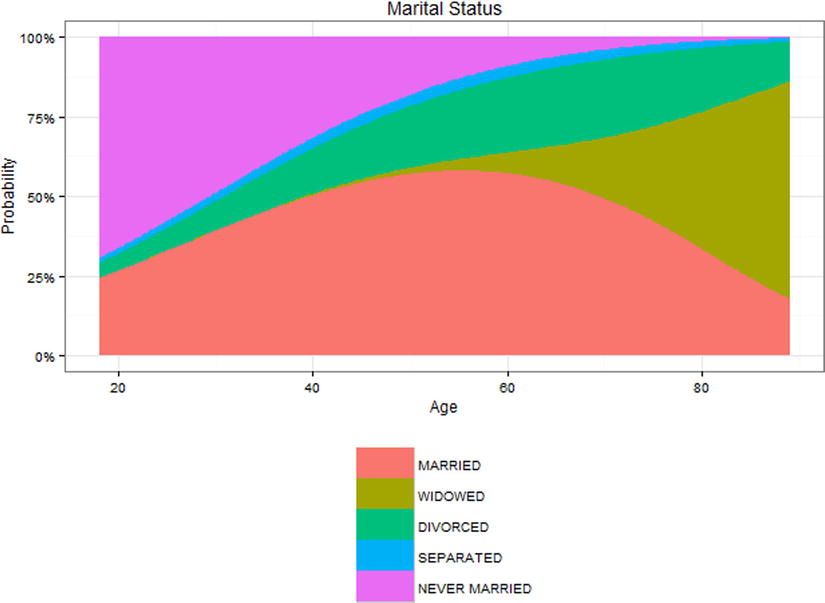
Figure 15-11. Area plot for marital status vs. age (relabeled)
The GLM provides a consistent framework for regression even when the outcomes are continuous or discrete and may come from different distributions. In this chapter we have explored a variety of models that can utilize noncontinuous, discrete outcomes, including binary logistic regression, ordered logistic regression for discrete data with more than two levels where there is a clear ordering, and multinomial regression for discrete data with more than two levels where there is not a clear ordering to the levels. We have also seen how nonlinear transformations (such as the inverse logit) can have finicky requirements. For example, we must compute CIs on the log odds scale and then convert back to probabilities. This can raise some challenges. For example, what if we wanted CIs for the average marginal effects in the probabilities we presented? We averaged the probabilities, which was intuitive, but it is not clear how we could obtain CIs not for an individual probability but for the average marginal effect on the probability scale. Problems like this turn out to be tricky and are often not implemented in software. In the next chapter, we will explore some nonparametric tests, and we will also discuss bootstrapping, a powerful tool that can be used to derive CIs and standard errors and conduct statistical inference when we are not sure what the exact distribution of our data is or when we do not know the formula to estimate standard errors or CIs, or they are just not implemented in the software we are using, such as for the average marginal effect on the probability scale.
References
Gelman, G., & Su, Y-S. arm: Data Analysis Using Regression and Multilevel/Hierarchical Models. R package version 1.8-6, 2015. http://CRAN.R-project.org/package=arm.
Leifeld, P. “texreg: Conversion of statistical model output in R to LaTeX and HTML tables. Journal of Statistical Software, 55(8), 1–24 (2013). www.jstatsoft.org/v55/i08/
McFadden, D. “Conditional logit analysis of qualitative choice behavior.” In P. Zarembka (ed.), Frontiers in Econometrics, pp. 105–142, New York: Academic Press, 1974.
R Core Team. foreign: Read Data Stored by Minitab, S, SAS, SPSS, Stata, Systat, Weka, dBase, .... R package version 0.8-65, 2015. http://CRAN.R-project.org/package=foreign.
R Core Team. R: A language and environment for statistical computing. Vienna, Austria: R Foundation for Statistical Computing, 2015. www.R-project.org/.
Schloerke, B., Crowley, J., Cook, D., Hofmann, H., Wickham, H., Briatte, F., Marbach, M., & and Thoen, E. GGally: Extension to ggplot2. R package version 0.5.0, 2014. http://CRAN.R-project.org/package=GGally.
Wickham, H. ggplot2: Elegant Graphics for Data Analysis. New York: Springer, 2009.
Wickham, H. scales: Scale Functions for Visualization. R package version 0.2.5, 2015. http://CRAN.R-project.org/package=scales.
Tukey, J. W. (1962). The future of data analysis. The Annals of Mathematical Statistics, 1-67.