
![]()
Throughout the book we used quite a few graphs to help you visualize and understand data, but we never went through them systematically. In this cookbook chapter, we will show you how to make a number of different kinds of common graphs in R (most of which you have not seen yet, though for completeness we duplicate one or two).
17.1 Required Packages
First, we will load some packages. Be sure to use install.packages("packageName") for any packages that are not yet installed on your computer. In the section “References,” we cite all these packages, and our reader(s) will note that many are actually quite new (or at least newly updated).
install.packages(c("gridExtra", "plot3D", "cowplot", "Hmisc"))
library(grid)
library(gridExtra)
library(ggplot2)
library(GGally)
library(RColorBrewer)
library(plot3D)
library(scatterplot3d)
library(scales)
library(hexbin)
library(cowplot)
library(boot)
library(Hmisc)
We will start off with plots of a single variable. For continuous variables, we might want to know what the distribution of the variable is. Histograms and density plots are commonly used to visualize the distribution of continuous variables, and they work fairly well for small and for very large datasets. We see the results in Figure 17-1 and Figure 17-2.
p1 <- ggplot(mtcars, aes(mpg))
p1 + geom_histogram() + ggtitle("Histogram")
p1 + geom_density() + ggtitle("Density Plot")

Figure 17-1. Histogram

Figure 17-2. Density plot
We could overlay the density plot on the histogram (see Figure 17-3) if we wished, but for that we need to make the y axes the same for both, which we can do by making the histogram plot densities rather than counts. We also change the fill color to make the density line easier to see (black on dark gray is not easy), and make each bin of the histogram wider to smooth it a bit more, like the density plot, which is quite smooth.
p1 + geom_histogram(aes(y = ..density..), binwidth = 3, fill = "grey50") +
  geom_density(size = 1) +
  ggtitle("Histogram with Density Overlay")

Figure 17-3. Adjusting scales and altering colors are common data visualization techniques
As we mentioned, this also works well for large datasets, such as the diamonds data, which has 53,940 rows. Notice the rather small density measurements in Figure 17-4.
ggplot(diamonds, aes(price)) +
  geom_histogram(aes(y = ..density..), fill = "grey50") +
  geom_density(size = 1) +
  ggtitle("Histogram with Density Overlay")

Figure 17-4. Even very large datasets are readily graphed
For small datasets, a dotplot (Figure 17-5) provides a natural representation of the raw data, although it does not work well for a large dataset, even with just a few hundred or a few thousand dots they become confusing and overly ‘busy’.
p1 + geom_dotplot() + ggtitle("Dotplot")

Figure 17-5. Dotplot is best to pictorially show smaller datasets in full
It can also be helpful to show summary statistics about a distribution—for example, where the mean or median is perhaps with a confidence interval (CI). We can get the mean and 95% CI from a t-test and then use the values for plotting. The result is subtle but highlights the central tendency and our uncertainty about the mtcars data shown in Figure 17-6.
sumstats <- t.test(mtcars$mpg)

p1 +
  geom_histogram(aes(y = ..density..), binwidth = 3, fill = "grey50") +
  geom_point(aes(x = sumstats$estimate, y = -.001), ) +
  geom_segment(aes(x = sumstats$conf.int[1], xend = sumstats$conf.int[2], y = -.001, yend = -.001)) +
  ggtitle("Histogram with Mean and 95% CI")

Figure 17-6. Mean and 95% CI shown on the graph
Finally, a boxplot or a box-and-whisker plot (Figure 17-7) can be a helpful summary of a continuous variables distribution. The bar in the middle is the median, and the box is the lower and upper quartiles, with the whiskers extending the range of the data or until the point of outliers (represented as dots).
ggplot(mtcars, aes("MPG", mpg)) + geom_boxplot()

Figure 17-7. Boxplot and box-and-whisker plot with outlier, bold median line, and 25th and 75th percentile hinges
For discrete, univariate data, we can visualize the distribution using a barplot of the frequencies in Figure 17-8.
ggplot(diamonds, aes(cut)) +
  geom_bar()

Figure 17-8. Barplot
We can also make a stacked barplot as graphed in Figure 17-9.
ggplot(diamonds, aes("Cut", fill = cut)) +
  geom_bar()

Figure 17-9. Stacked barplots serve dual roles as both barplots and rectangular pie charts
If we make a stacked barplot but use polar coordinates, we have a pie chart (Figure 17-10).
ggplot(diamonds, aes("Cut", fill = cut)) +
  geom_bar(width = 1) +
  coord_polar(theta = "y")

Figure 17-10. Polar coordinates are quite useful, and pie charts are just one example
To make the numbers proportions, we can divide by the total, and Figure 17-11 looks more like a traditional pie chart.
ggplot(diamonds, aes("Cut", fill = cut)) +
  geom_bar(aes(y = ..count.. / sum(..count..)), width = 1) +
  coord_polar(theta = "y")

Figure 17-11. Traditional pie chart with percents
We are not limited to using barplots either. Points work equally well to convey the proportion of diamonds with each cut. Although bars are more traditional, most of the space filled by the bars is not informative; all that really matters is the height of each bar, which can be shown more succinctly with a point. Figure 17-12 would also have little room for either misinterpretation or introducing any bias
ggplot(diamonds, aes(cut)) +
  geom_point(aes(y = ..count.. / sum(..count..)),
             stat = "bin", size = 4)
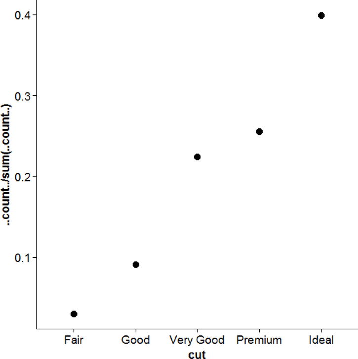
Figure 17-12. A very honest graph
17.3 Customizing and Polishing Plots
One of the most challenging tasks with graphics is often not making the initial graph but customizing it to get it ready for presentation or publication. In this section, we will continue with some of the distribution graphs we showed earlier but focus on examples of how to customize each piece. As a starting point, we can adjust the axis labels as we did in Figure 17-13.
p1 + geom_histogram(binwidth = 3) +
  xlab("Miles per gallon (MPG)") +
  ylab("Number of Cars") +
  ggtitle("Histogram showing the distribution of miles per gallon")

Figure 17-13. Customized axis labels
It is also possible to adjust the font type, color, and size of the text, as well as use math symbols (Figure 17-14).
p1 + geom_histogram(binwidth = 3) +
  xlab(expression(frac("Miles", "Gallon"))) +
  ylab("Number of Cars") +
  ggtitle(expression("Math Example: Histogram showing the distribution of "~frac("Miles", "Gallon")))

Figure 17-14. Labels with mathematical symbols
If we wanted to adjust the fonts, we could create a custom theme object. In Figure 17-15, we change the family for the axis text (the numbers), the axis titles (the labels), and the overall plot title. We can also adjust the size of the fonts and color, inside the element_text() function.
font.sans <- theme(
  axis.text = element_text(family = "serif", size = 12, color = "grey40"),
  axis.title = element_text(family = "serif", size = 12, color = "grey40"),
  plot.title = element_text(family = "serif", size = 16))

p1 + geom_histogram(binwidth = 3) +
  xlab("Miles per Gallon") +
  ylab("Number of Cars") +
  ggtitle("Size and Font Example: Histogram showing the distribution of MPG") +
  font.sans

Figure 17-15. Size and font example
We can manually create our own themes, but for a “minimalist” theme, theme_classic() is a nice option. We can also adjust the axis limits so there is less blank space using coord_cartesian(). This trims the viewing area of the plot, but not the range of values accepted. For example, if there were an outlier in the data, that would still be used for plotting, but coord_cartesian() would just adjust what is actually shown, which is different from adjusting limits using the scale_*() functions. We do this with the following code and show it in Figure 17-16:
p1 + geom_histogram(binwidth = 3) +
  theme_classic() +
  coord_cartesian(xlim = c(8, 38), ylim = c(0, 8)) +
  xlab("Miles per gallon (MPG)") +
  ylab("Number of cars") +
  ggtitle("Histogram showing the distribution of miles per gallon")

Figure 17-16. Controlled viewing area
We can also use less ink by outlining the histogram bars with black and filling them with white. In general, in ggplot2, “color” refers to the color used on the edge, and fill refers to the color used to fill the shape up. These options apply in many cases beyond just histograms. Figure 17-17 shows an example.
p1 + geom_histogram(color = "black", fill = "white", binwidth = 3) +
  theme_classic() +
  coord_cartesian(xlim = c(8, 38), ylim = c(0, 8)) +
  xlab("Miles per gallon (MPG)") +
  ylab("Number of cars") +
  ggtitle("Histogram showing the distribution of miles per gallon")

Figure 17-17. Low-ink graphs demonstrating the use of color and fill
Even if we have numerical/quantitative data, we could add labels, if that would make it more informative, as shown in Figure 17-18.
p1 + geom_histogram(color = "black", fill = "white", binwidth = 3) +
  scale_x_continuous(breaks = c(10, 20, 30), labels = c("Terrible", "Okay", "Good")) +
  theme_classic() +
  coord_cartesian(xlim = c(8, 38), ylim = c(0, 8)) +
  xlab("Miles per gallon (MPG)") +
  ylab("Number of cars") +
  ggtitle("Histogram showing the distribution of miles per gallon")
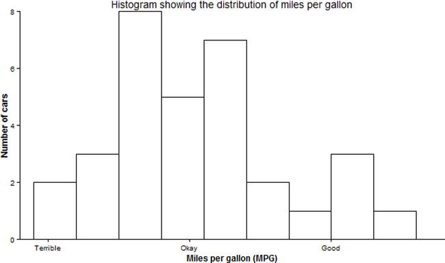
Figure 17-18. Qualitative labels for quantitative data
With longer labels, sometimes the orientation needs to be adjusted (Figure 17-19). The angle can be set using element_text(), as can the horizontal and vertical adjustments, which range from 0 to 1.
p1 + geom_histogram(color = "black", fill = "white", binwidth = 3) +
  scale_x_continuous(breaks = c(10, 20, 30), labels = c("Terrible", "Okay", "Good")) +
  theme_classic() +
  theme(axis.text.x = element_text(angle = 45, hjust = 1, vjust = 1)) +
  coord_cartesian(xlim = c(8, 38), ylim = c(0, 8)) +
  xlab("Miles per gallon (MPG)") +
  ylab("Number of cars") +
  ggtitle("Histogram showing the distribution of miles per gallon")

Figure 17-19. Angled labels
For some data, linear scales are not the best to visualize the data. For example, the price of diamonds is a rather skewed distribution, making it hard to see (Figure 17-20).
ggplot(diamonds, aes(price)) +
  geom_histogram()

Figure 17-20. Histogram of diamonds versus price
We can use a square root or log scale instead. In this example, we also use grid.arrange() from the gridExtra package to put two plots together as in Figure 17-21.
grid.arrange(
  ggplot(diamonds, aes(price)) +
    geom_histogram() +
    scale_x_sqrt() +
    ggtitle("Square root x scale"),
  ggplot(diamonds, aes(price)) +
    geom_histogram() +
    scale_x_log10() +
    ggtitle("log base 10 x scale"))

Figure 17-21. X axis under various scales
Instead of changing the actual scale of the data, we could also just change the coordinate system. First, though, we need to adjust the scale of the data, because with zero and some negative values included, not in the data but on the scale of the plot, square roots and logarithms will not work. So first we use scale_x_continuous() to adjust the scale to be exactly the range of the diamond prices, with no expansion, and then we can transform the coordinates. We show this in Figure 17-22.
grid.arrange(
  ggplot(diamonds, aes(price)) +
    geom_histogram() +
    scale_x_continuous(limits = range(diamonds$price), expand = c(0, 0)) +
    coord_trans(x = "sqrt") +
    ggtitle("Square root coordinate system"),
  ggplot(diamonds, aes(price)) +
    geom_histogram() +
    scale_x_continuous(limits = range(diamonds$price), expand = c(0, 0)) +
    coord_trans(x = "log10") +
    ggtitle("Log base 10 coordinate system"))

Figure 17-22. Change coordinate system
A final aspect of graphs that often needs adjustment is colors, shapes, and legends. Using the diamonds data, we can look at a density plot colored by cut of the diamond in Figure 17-23.
ggplot(diamonds, aes(price, color = cut)) +
  geom_density(size = 1) +
  scale_x_log10() +
  ggtitle("Density plots colored by cut")

Figure 17-23. Adjusting color by cut
The ggplot2 package has a default color palette, but we can also examine others. The RColorBrewer package has a number of color palettes available. We can view the different color palettes for five levels, using the function display.brewer.all(). Using an option, we can pick colors that are colorblind friendly, so that the widest possible audience will be able to easily read our graphs. The type specifies whether we want a sequential palette ("seq", nice for gradients or ordered data) or a qualitative (“qual”, for unordered discrete data), or a divergent color palette (“div”, emphasizing extremes). We used “all” to indicate we want to see all palettes. Please run the code that follows or view the electronic version of this text to see Figure 17-24 in full color.
display.brewer.all(n = 5, type = "all", colorblindFriendly=TRUE)

Figure 17-24. The full color palette
From here, perhaps we like the “Set2” palette, in which case we can use scale_color_brewer() or, if we wanted to use color as a fill, scale_fill_brewer() to pick the palette. We will also move the legend down to the bottom (or remove it altogether using legend.position = "none") in Figure 17-25.
ggplot(diamonds, aes(price, color = cut)) +
  geom_density(size = 1) +
  scale_color_brewer(palette = "Set2") +
  scale_x_log10() +
  ggtitle("Density plots colored by cut") +
  theme(legend.position = "bottom")

Figure 17-25. Improved layout and color
We can change the legend orientation, using the legend.direction argument, and by using the scale names that create the legend (in this case, only color, but it could also be color and shape, or color and linetype, or any other combination) we can also adjust the legend title. If we wanted, we could use math notation here as well, just as we showed for the title and axis legends. We show our code and then Figure 17-26:
ggplot(diamonds, aes(price, color = cut)) +
  geom_density(size = 1) +
  scale_color_brewer(palette = "Set2") +
  scale_x_log10() +
  scale_color_discrete("Diamond Cut") +
  ggtitle("Density plots colored by cut") +
  theme(legend.position = "bottom", legend.direction = "vertical")

Figure 17-26. Vertical legend
We can also move the legend into the graph, by specifying the position as two numerical numbers, one for the x, y coordinates and also by specifying the justification of the legend with respect to the position coordinates (Figure 17-27).
ggplot(diamonds, aes(price, color = cut)) +
  geom_density(size = 1) +
  scale_color_discrete("Diamond Cut") +
  ggtitle("Density plots colored by cut") +
  theme(legend.position = c(1, 1), legend.justification = c(1, 1))

Figure 17-27. Legend moved into the graph
With the scales package loaded (which we did at the start), there are a number of special formats available for axis text, such as percent or dollar. We have price data on the x axis so will use the dollar labels for Figure 17-28. We can also use element_blank() to remove almost any aspect of the plot we want—in this case removing all the y axis information, as density is not a very informative number beyond what we can visually see—thus simplifying the graph.
ggplot(diamonds, aes(price, color = cut)) +
  geom_density(size = 1) +
  scale_color_discrete("Diamond Cut") +
  scale_x_continuous(labels = dollar) +
  ggtitle("Density plot of diamond price by cut") +
  theme_classic() +
  theme(legend.position = c(1, 1),
        legend.justification = c(1, 1),
        axis.line.x = element_blank(),
        axis.line.y = element_blank(),
        axis.ticks.y = element_blank(),
        axis.text.y = element_blank(),
        axis.title = element_blank()) +
  coord_cartesian(xlim = c(0, max(diamonds$price)), ylim = c(0, 4.2e-04))

Figure 17-28. Adjusting axis scales
We can also flip the axes. This can be helpful sometimes with long labels or to make it easier to read some of the labels. Figure 17-29, with boxplots, demonstrates.
grid.arrange(
ggplot(diamonds, aes(cut, price)) +
  geom_boxplot() +
  ggtitle("Boxplots of diamond price by cut") +
  theme_classic(),
ggplot(diamonds, aes(cut, price)) +
  geom_boxplot() +
  ggtitle("Boxplots of diamond price by cut - flipped") +
  theme_classic() +
  coord_flip())

Figure 17-29. Boxplots with flipped axis
In this section we will show how to make a wide variety of multivariate plots. To start, we will examine a bivariate scatterplot. Scatterplots (Figure 17-30) are great for showing the relationship between two continuous variables.
ggplot(mtcars, aes(mpg, hp)) +
  geom_point(size = 3)

Figure 17-30. Multivariate scatterplot relating mpg to hp
For smaller datasets, rather than plotting points, we can plot the text labels to help understand which cases may stand out (here, for example, the Maserati). As we see in Figure 17-31, such labels are not always perfectly clear (depending on point location), and for larger datasets the text would be unreadable. Although not shown, plotting labels and points can be combined by adding both points and text.
ggplot(mtcars, aes(mpg, hp)) +
  geom_text(aes(label = rownames(mtcars)), size = 2.5)

Figure 17-31. Labeled points
We can add another layer of information to scatterplots by coloring the points by a third variable. If the variable is discrete, we can convert it to a factor to get a discrete color palette (Figure 17-32).
ggplot(mtcars, aes(mpg, hp, color = factor(cyl))) +
  geom_point(size = 3)

Figure 17-32. Three variables including a factor cyl via color coding
If the coloring variable is continuous, a gradient may be used instead as shown in Figure 17-33.
ggplot(mtcars, aes(mpg, hp, color = disp)) +
  geom_point(size=3)

Figure 17-33. Continuous third variable colored with a gradient rather than factoring
We can push this even farther by changing the shapes. Putting all this together, we can visually see quite a bit of overlap, where cars with the highest horsepower tend to have higher displacement and eight cylinders, and cars with the highest miles per gallon tend to have only four cylinders and lower displacement. Figure 17-34 shows four variables.
ggplot(mtcars, aes(mpg, hp, color = disp, shape = factor(cyl))) +
  geom_point(size=3)

Figure 17-34. Four variables displayed in one graph
Adding a regression or smooth line to scatterplots can help highlight the trend in the data (Figure 17-35). By default for small datasets, ggplot2 will use a loess smoother, which is very flexible, to fit the data.
ggplot(mtcars, aes(mpg, hp)) +
  geom_point(size=3) +
  stat_smooth()

Figure 17-35. Smooth fitted regression line to highlight trend
We could get a linear line of best fit by setting the method on stat_smooth() directly (Figure 17-36).
ggplot(mtcars, aes(mpg, hp)) +
  geom_point(size=3) +
  stat_smooth(method = "lm")

Figure 17-36. Our familiar linear model linear regression line
A nice feature is that if we drill down by coloring the data, the smooth line also drills down. The command se = FALSE turns off the shaded region indicating the confidence interval. Figure 17-37 shows rather well how different cylinders influence miles per gallon and horsepower.
ggplot(mtcars, aes(mpg, hp, color = factor(cyl))) +
  geom_point(size=3) +
  stat_smooth(method = "lm", se = FALSE, size = 2)

Figure 17-37. There are some distinct differences based on number of cylinders, it seems
If we wanted to color the points but have one overall summary line, we could override the color for stat_smooth() specifically (Figure 17-38).
ggplot(mtcars, aes(mpg, hp, color = factor(cyl))) +
  geom_point(size=3) +
  stat_smooth(aes(color = NULL), se = FALSE, size = 2)

Figure 17-38. A single smooth line
In general in ggplot2, most geometric objects can have different colors, fill colors, shapes, or linetypes applied to them, resulting in a finer-grained view of the data if there are summary functions like smooth lines, density plots, histograms, and so on.
For larger datasets, scatterplots can be hard to read. Two approaches to make it easier to see high-density regions are to make points smaller and semitransparent. We show an example in Figure 17-39.
ggplot(diamonds, aes(price, carat)) +
  geom_point(size = 1, alpha = .25)

Figure 17-39. Smaller dots
Another approach is to bin them and color them by how many points fall within a bin. This is somewhat similar to what happens with histograms for a single variable. Dots within a certain area are grouped together as one, and then color is used to indicate how many observations a particular dot represents. This helps to see the “core” high-density area. We show this in Figure 17-40.
ggplot(diamonds, aes(price, carat)) +
  geom_hex(bins = 75)

Figure 17-40. Color-coded density scatterplot
Another approach is to bin the data (Figure 17-41), which we can do using the cut() function to make ten bins each containing about 10% of the sample. Then we can use a boxplot of the carats for each price decile to see the relationship. The automatic labels from the cut() function help to show what price values are included.
diamonds <- within(diamonds, {
  pricecat <- cut(price, breaks = quantile(price, probs = seq(0, 1, length.out = 11)), include.lowest = TRUE)
})

ggplot(diamonds, aes(pricecat, carat)) +
  geom_boxplot() +
  theme(axis.text.x = element_text(angle = 45, hjust = 1, vjust = 1))

Figure 17-41. Binned data boxplots
To get even more detailed distributional data, we could use a violin plot, which is essentially a series of density plots on their side, and putting carats on a log base 10 scale can help us to more clearly see in Figure 17-42.
ggplot(diamonds, aes(pricecat, carat)) +
  geom_violin() +
  scale_y_log10() +
  theme(axis.text.x = element_text(angle = 45, hjust = 1, vjust = 1))

Figure 17-42. Binned violin plots
Next we use the Indometh data, which records drug concentration in six subjects over time after administration to assess how quickly the drug is processed. Figure 17-43 shows the use of a line plot to visualize these data. We use the group argument to make individual lines for each of the subjects.
ggplot(Indometh, aes(time, conc, group = Subject)) +
  geom_line()

Figure 17-43. Drug concentration vs. time with grouping by subject
We could add points to Figure 17-44 as well if we wanted to, although that is not terribly helpful in this case.
ggplot(Indometh, aes(time, conc, group = Subject)) +
  geom_line() +
  geom_point()

Figure 17-44. Specific points added to show precise concentration at certain times
With so few subjects, a boxplot at each time point would not make a great summary, but perhaps the mean or median would. The stat_summary() function is a powerful function to calculate summaries of the data. Note that because we want to summarize across subjects, we turn off grouping for the summary in Figure 17-45 (although it is used for the lines).
ggplot(Indometh, aes(time, conc, group = Subject)) +
  geom_line() +
  stat_summary(aes(group = NULL), fun.y = mean, geom = "line", color = "blue", size = 2)

Figure 17-45. Shows how various aspects may be set on or to null
Using the stat_summary() we could also get the mean and CI at each time point, and plot using a point for the mean and a line for the 95% CI. Figure 17-46 shows estimates for each time.
ggplot(Indometh, aes(time, conc)) +
  stat_summary(fun.data = mean_cl_normal, geom = "pointrange")

Figure 17-46. 95% CIs for each specified time
When one variable is discrete and another is continuous, a barplot of the means of the continuous variable by the discrete variable is popular. We go back to the diamonds data and look at the price of the diamond by the cut in Figure 17-47.
ggplot(diamonds, aes(cut, price)) +
  stat_summary(fun.y = mean, geom = "bar", fill = "white", color = "black")
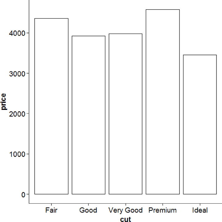
Figure 17-47. Price by grade of cut
It is also common to use the bars to show the mean, and add error bars to show the CI around the mean, which we do in Figure 17-48. The width option adjusts how wide (from left to right) the error bars are in Figure 17-48.
ggplot(diamonds, aes(cut, price)) +
  stat_summary(fun.y = mean, geom = "bar", fill = "white", color = "black") +
  stat_summary(fun.data = mean_cl_normal, geom = "errorbar", width = .2)

Figure 17-48. Price vs. cut with error bars
Because we know the price data are not normal, we may be concerned about using the mean and thus prefer to use the median. To get a CI for the medians, we can write our own median bootstrap function. As output, it must return a data frame with columns for y, ymin, and ymax. This function builds on several things we have done so far in this book. In this case, we use the function is.null() call to see if we want to default to 1,000 bootstraps. Otherwise, we may call our function with a specific value other than 1,000.
median_cl_boot <- function(x, ...) {
  require(boot)
  args <- list(...)
  # if missing, default to 1000 bootstraps
  if (is.null(args$R)) {
    args$R <- 1000
  }
  result <- boot(x, function(x, i) {median(x[i])}, R = args$R)
  cis <- boot.ci(result, type = "perc")
  data.frame(y = result$t0,
             ymin = cis$percent[1, 4],
             ymax = cis$percent[1, 5])
}
Now we can make our plot as before, but passing our newly written function to fun.data. Not surprisingly given that the price data were highly skewed, the median price is considerably lower than the average. Figure 17-49 shows the difference the median makes.
ggplot(diamonds, aes(cut, price)) +
  stat_summary(fun.y = median, geom = "bar", fill = "white", color = "black") +
  stat_summary(fun.data = median_cl_boot, geom = "errorbar", width = .2)

Figure 17-49. Price vs. cut with bootstrapped median error bars
Another type of plot used in business is a waterfall plot (Figure 17-52). Suppose we had the following data for net income each month for a company. We could have R make a nice visual table (Figure 17-50) of the data using the grid.table() function from the gridExtra package.
company <- data.frame(
  Month = months(as.Date(paste0("2015-", 1:12, "-01"))),
  NetIncome = c(-6, 7, -5, 5, 13, -3, -4, -1, 11, 4, -10, 8))
grid.newpage()
grid.table(company)

Figure 17-50. A table showing month and net income
Next we need to do a bit of data manipulation to create the cumulative position over time, and then we use Figure 17-51 to look at the results.
company <- within(company, {
  MonthC <- as.numeric(factor(Month, levels = Month))
  MonthEnd <- c(head(cumsum(NetIncome), -1), 0)
  MonthStart <- c(0, head(MonthEnd, -1))
  GainLoss <- factor(as.integer(NetIncome > 0), levels = 0:1, labels = c("Loss", "Gain"))
})
grid.newpage()
grid.table(company)

Figure 17-51. Cumulative position over time
Now we are ready to make a waterfall plot in R (see Figure 17-52). Although these are basically bars, we do not use geom_bar() but rather geom_rect(), because barplots typically never go under zero, while waterfall plots may. We also add a horizontal line at zero, and make it dashed using linetype = 2. We use a manual fill scale to specify exactly the colors we want for losses and gains, relabel the numeric 1 to 12 months to use their natural names. We label the y axis in dollars, and then adjust the axis labels, put the legend in the upper right corner, and remove the legend title using element_blank().
ggplot(company, aes(MonthC, fill = GainLoss)) +
  geom_rect(aes(xmin = MonthC - .5, xmax = MonthC + .5,
                ymin = MonthEnd, ymax = MonthStart)) +
  geom_hline(yintercept = 0, size = 2, linetype = 2) +
  scale_fill_manual(values = c("Loss" = "orange", "Gain" = "blue")) +
  scale_x_continuous(breaks = company$MonthC, labels = company$Month) +
  xlab("") +
  scale_y_continuous(labels = dollar) +
  ylab("Net Income in Thousands") +
  theme_classic() +
  theme(axis.text.x = element_text(angle = 45, hjust = 1, vjust = 1),
        legend.position = c(0, 1),
        legend.justification = c(0, 1),
        legend.title = element_blank())
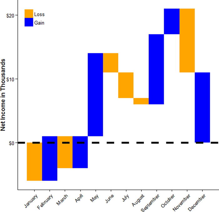
Figure 17-52. Waterfall plot
Often it can be helpful to separate data and have multiple plots. For example, in the diamonds data, suppose we wanted to look at the relationship again between carat and price, but we wanted to explore the impact of cut, clarity, and color of the diamond. That would be too much to fit into one single plot, but it could be shown as a panel of plots. We can do this by using the facet_grid() function, which facets plots by row (the left-hand side) and column (the right-hand side). Figure 17-53 shows the resulting graph.
ggplot(diamonds, aes(carat, price, color = color)) +
  geom_point() +
  stat_smooth(method = "loess", se = FALSE, color = "black") +
  facet_grid(clarity ~ cut) +
  theme_bw() +
  theme(legend.position = "bottom",
        legend.title = element_blank())

Figure 17-53. Price vs. carat as well as cut, clarity, and color
If we do not want a grid, we can just wrap a series of plots together. By default, the individual plots all use the same axis limits, but if the range of the data is very different, to help see each plot clearly, we may want to free the scales (which can also be done in the same way in the facet_grid() function used previously). A downside of freeing the scales, as shown in Figure 17-54, is that for each plot, comparison across plots becomes more difficult.
ggplot(diamonds, aes(carat, color = cut)) +
  geom_density() +
  facet_wrap(~clarity, scales = "free") +
  theme_bw() +
  theme(legend.position = "bottom",
        legend.title = element_blank())

Figure 17-54. Freeing the scales does give more freedom; with great power comes great responsibility
When working with a dataset, it can be helpful to get a general overview of the relations among a number of variables. A scatterplot matrix such as the one in Figure 17-55 is one way to do this, and it is conveniently implemented in the GGally package. The lower diagonal shows the bivariate scatterplots, the diagonal has density plots for each individual variable, and the upper diagonal has the Pearson correlation coefficients.
ggscatmat(mtcars[, c("mpg", "disp", "hp", "drat", "wt", "qsec")])

Figure 17-55. Scatterplot matrix
To get a simple visual summary of the magnitudes of correlations, we could also use the ggcorr() function, which creates the heatmap in Figure 17-56 based on the correlation size.
ggcorr(mtcars[, c("mpg", "disp", "hp", "drat", "wt", "qsec")])
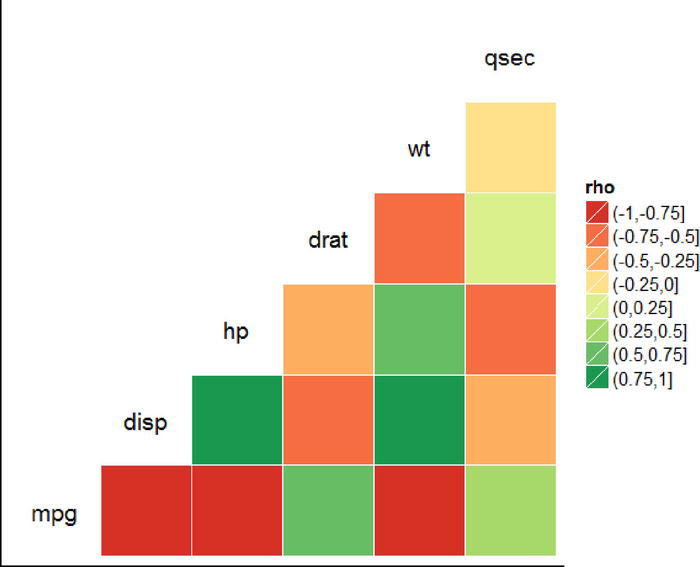
Figure 17-56. A heatmap
The approaches for creating multiple plots we’ve examined so far work well when the data are all together and we are making essentially the same plot repeatedly, but sometimes we want to make a panel of plots that are each quite different. For example, in the code that follows we make three plots to go into a panel of graphs, and store them in R objects:
plota <- ggplot(mtcars, aes(mpg, hp)) +
  geom_point(size = 3) +
  stat_smooth(se = FALSE)
plotb <- ggplot(mtcars, aes(mpg)) +
  geom_density() +
  theme(axis.text.y = element_blank(),
        axis.ticks.y = element_blank(),
        axis.title.y = element_blank(),
        axis.line.y = element_blank())
plotc <- ggplot(mtcars, aes(hp)) +
  geom_density() +
  theme(axis.text.y = element_blank(),
        axis.ticks.y = element_blank(),
        axis.title.y = element_blank(),
        axis.line.y = element_blank())
Now we plot them all together in Figure 17-57 using functions from the cowplot package. Each plot is drawn, and the x and y coordinates are given, along with its width and its height. We can also add labels to indicate which panel is which (A, B, and C, in this case).
ggdraw() +
  draw_plot(plota, 0, 0, 2/3, 1) +
  draw_plot(plotb, 2/3, .5, 1/3, .5) +
  draw_plot(plotc, 2/3, 0, 1/3, .5) +
  draw_plot_label(c("A", "B", "C"), c(0, 2/3, 2/3), c(1, 1, .5), size = 15)

Figure 17-57. Using the cowplot package to plot many graphs together
17.6 Three-Dimensional Graphs
In closing, we are going to examine a few less common but nonetheless helpful ways of visualizing data. We begin by looking at some ways to visualize three-dimensional data. First is the contour plot. Contour plots show two variables on the x and y axis, and the third variable (dimension) using lines. A line always has the same value on the third dimension. To show how this works, we can set up a linear model with some interactions and quadratic terms with carat and x predicting the price of diamonds, and then use the model on some new data to get the predicted prices.
m <- lm(price ~ (carat + I(carat^2)) * (x + I(x^2)), data = diamonds)

newdat <- expand.grid(carat = seq(min(diamonds$carat), max(diamonds$carat), length.out = 100),
                      x = seq(min(diamonds$x), max(diamonds$x), length.out = 100))

newdat$price <- predict(m, newdata = newdat)
Now we can easily graph the data in Figure 17-58 using geom_contour(). We color each line by the log of the level (here price). Examining the bottom line, we can see that the model predicts the same price for the diamond that is just over 1 carat and 0 x as it does for nearly 10 x and close to 0 carats. Again each line indicates a single price value, so the line shows you how different combinations of the predictors, sometimes nonlinearly, can result in the same predicted price value.
ggplot(newdat, aes(x = x, y = carat, z = price)) +
  geom_contour(aes(color = log(..level..)), bins = 30, size = 1)

Figure 17-58. Contour plot
When making contour plots from predicted values, it is important to consider whether the values are extrapolations or not. For example, even though we made our predicted values of carat and x within the range of the real data, a quick examination of the relationship between carat and x (Figure 17-59) shows that not all carat sizes occur at all possible values of x, so many of the lines in our contour plot are extrapolations from the data to the scenario, “what if there were a __ carat diamonds with __ x?” rather than being grounded in reality.
ggplot(diamonds, aes(carat, x)) +
  geom_point(alpha = .25, size = 1)

Figure 17-59. A quick look at carat and x
Another way we can plot three-dimensional data is using a three-dimensional plot projected into two dimensions. The ggplot2 package does not do this, so we will use functions from the plot3D packages. To start with, we can examine a three-dimensional scatterplot in Figure 17-60.
with(mtcars, scatter3D(hp, wt, mpg, pch = 16, type = "h", colvar = NULL))

Figure 17-60. Three-dimensional scatterplot
As before, we can color the points and add titles, although the arguments to do this differ from ggplot2 as this is a different package. Another challenge with three-dimensional plots is choosing the angle from which to view it. The best angle (or perhaps a few) depends on the data and what features you want to highlight, so it often involves trial and error to find a nice set. To put more than one graph together, we use the par() function, and then simply plot two graphs, also showing how to add color and detailed labels in Figure 17-61.
par(mfrow = c(2, 1))

with(mtcars, scatter3D(hp, wt, mpg,
  colvar = cyl, col = c("blue", "orange", "black"),
  colkey = FALSE,
  pch = 16, type = "h",
  theta = 0, phi = 30,
  ticktype = "detailed",
  main = "Three-dimensional colored scatterplot"))

with(mtcars, scatter3D(hp, wt, mpg,
  colvar = cyl, col = c("blue", "orange", "black"),
  colkey = FALSE,
  pch = 16, type = "h",
  theta = 220, phi = 10,
  ticktype = "detailed",
  xlab = "Horsepower", ylab = "Weight", zlab = "Miles per Gallon",
  main = "Three-dimensional colored scatterplot"))

Figure 17-61. Different angles and colors and labels of the same 3D scatterplot
We hope this cookbook chapter has been helpful. The graphs are ones we have used ourselves over the years, and sometimes, when looking at some data, one of the most helpful things to do (especially when attempting to explain to fellow team members what the data indicate) is to reference graphs and charts. One of the authors regularly hoards snippets of code for graphs that either look visually appealing or present well certain types of data. Then, when he encounters data in the wild that might benefit from such a graph, he has the code to make that happen readily available. We turn our attention in the next chapter to exploiting some advantages of modern hardware configurations.
References
Auguie, B. gridExtra: Miscellaneous Functions for “Grid” Graphics. R package version 2.0.0, 2015. http://CRAN.R-project.org/package=gridExtra.
Canty, A., & Ripley, B. boot: Bootstrap R (S-Plus) Functions. R package version 1.3-17, 2015.
Carr, D., ported by Nicholas Lewin-Koh, Martin Maechler and contains copies of lattice function written by Deepayan Sarkar. hexbin: Hexagonal Binning Routines. R package version 1.27.0, 2014. http://CRAN.R-project.org/package=hexbin.
Davison, A. C., & Hinkley, D. V. Bootstrap Methods and Their Applications. Cambridge, MA: Cambridge University Press, 1997.
Harrell, F. E. Jr., with contributions from Charles Dupont and many others. Hmisc: Harrell Miscellaneous. R package version 3.16-0, 2015. http://CRAN.R-project.org/package=Hmisc.
Ligges, U., & Mächler, M. “Scatterplot3d—an R package for visualizing multivariate data.” Journal of Statistical Software, 8(11), 1-20 (2003).
Neuwirth, E. RColorBrewer: ColorBrewer Palettes. R package version 1.1-2, 2014. http://CRAN.R-project.org/package=RColorBrewer.
R Core Team. R: A language and environment for statistical computing. R Foundation for Statistical Computing, Vienna, Austria, 2015. www.R-project.org/.
Schloerke, B., Crowley, J., Cook, D., Hofmann, H., Wickham, H., Briatte, F., Marbach, M., & and Thoen, E. GGally: Extension to ggplot2. R package version 0.5.0, 2014. http://CRAN.R-project.org/package=GGally.
Soetaert, K. plot3D: Plotting multi-dimensional data. R package version 1.0-2, 2014. http://CRAN.R-project.org/package=plot3D.
Wickham, H. ggplot2: Elegant graphics for data analysis. New York: Springer, 2009.
Wickham, H. scales: Scale Functions for Visualization. R package version 0.2.5, 2015. http://CRAN.R-project.org/package=scales.
Wilke, C. O. cowplot: Streamlined Plot Theme and Plot Annotations for ‘ggplot2’. R package version 0.5.0, 2015. http://CRAN.R-project.org/package=cowplot.