
![]()
Discovering a relationship of some sort between various data can often be a powerful model to understand the links between different processes. We generally consider the variable Y to be an outcome or dependent on an independent or input variable X. A statistician would speak of the regression of Y on X while a mathematician would write that Y is a function of X. In this chapter and the next, we are going to take our time to properly explore both the underlying logic and the practice of employing linear regression. Our goal is to avoid what is occasionally called “mathyness” and focus on several practical, applied examples that still allow for the correct sorts of ideas to be living in your head.
In this chapter, we limit our discussion to only two variable (bivariate) data. We will consider correlation (along with covariance), proceed to linear regression, and briefly touch on curvilinear models. Along the way, we’ll explore helpful visualizations of our data, to better understand confidence and prediction intervals for these regression models.
In the next chapter, we will delve even further into regression, leaving behind our single-input, single-output restriction.
13.1 Covariance and Correlation
Our goal is to quickly look at pairs of data and determine their degree (if any) of linear relationship. Consider the cars dataset from the openintro package:
> library ( openintro )
> attach ( cars )
> head(cars)
     type price mpgCity driveTrain passengers weight
1   small  15.9      25      front          5   2705
2 midsize  33.9      18      front          5   3560
3 midsize  37.7      19      front          6   3405
4 midsize  30.0      22       rear          4   3640
5 midsize  15.7      22      front          6   2880
6   large  20.8      19      front          6   3470
It would perhaps make sense that the weight of a car would be related to the miles per gallon in the city (mpgCity) that a car gets. In particular, we might expect that as weight goes up, mpg goes down. Conversely, we might just as well model this type of data by saying that as mpg goes up, weight goes down. There is no particular attachment, statistically speaking, for mpg to be the dependent Y variable and weight to be the independent input X variable. A visual inspection of the data seems to verify our belief that there may be an inverse relationship between our Y of mpg and our X of weight (see Figure 13-1).
> plot(mpgCity ~ weight, data = cars)

Figure 13-1. Weight vs. mpgCity scatterplot
All the same, as before with ANOVA (analysis of variance), we prefer numeric means over visual inspections to make our case. We have data pairs (x, y) of observations. X, the weight, is the input or predictor or independent variable while Y, our mpgCity, is the response or criterion or dependent or output variable. If we take the mean of X and the mean of Y and adjust the variance formula just a bit, we get covariance:
 for population or
  for sample data.
In our case of course, we simply use R code to find covariance:
> with(cars, cov(x = weight, y = mpgCity))
[1] -3820.3
The main point of this is that covariance is a rather natural extension of variance—multiplication (or more precisely cross product) is an excellent way to get two variables to relate to each other. The chief complaint against covariance is that it has units; in our case, these units are weight-mpgs per car. If we divided out by the individual standard deviations of X and Y, then we get what is known as the Pearson product-moment correlation coefficient. It is scaleless or unitless, and lives in the real number line interval of [-1, 1]. Zero indicates no linear association between two variables, and -1 or +1 indicates a perfect linear relationship. Looking at our data in the scatterplot in Figure 13-1, we would expect any straight-line or linear model to have negative slope. Let’s take a look at the R code to calculate correlation:
> with(cars, cor (weight, mpgCity, method="pearson" ))
[1] -0.8769183
The cor.test() function provides a significance test for the correlation coefficient. As we might suspect, the correlation is highly significant with 52 degrees of freedom. We’ve included some additional function parameters, to gently remind our readers that R often has many options that may be used, depending on your precise goals. As always, ?cor.test is your friend!
> with(cars, cor.test(weight, mpgCity, alternative="two.sided",
+                     method="pearson", conf.level = 0.95))

        Pearson's product-moment correlation

data:  weight and mpgCity
t = -13.157, df = 52, p-value < 2.2e-16
alternative hypothesis: true correlation is not equal to 0
95 percent confidence interval:
 -0.9270125 -0.7960809
sample estimates:
       cor
-0.8769183
Having determined that we may reject the null hypothesis, and thus believing that weight and mpg are in fact negatively, linearly correlated, we proceed to our discussion of linear regression.
13.2 Linear Regression: Bivariate Case
We have already covered a good bit about bivariate data, including the addition of the regression line to a scatterplot. Nonetheless, the linear model ![]() = b0 + b1x is sample estimate of a linear relationship between x and y, where b0 is the y-intercept term and b1 is the regression coefficient.
= b0 + b1x is sample estimate of a linear relationship between x and y, where b0 is the y-intercept term and b1 is the regression coefficient.
In the bivariate case, the test for the significance of the regression coefficient is equivalent to the test that the sample data are drawn from a population in which the correlation is zero. This is not true in the case of multiple regression, as the correlations among the predictors must also be taken into account.
We can obtain the intercept and regression (slope) terms from the lm() function. As in ANOVA, we will use a formula to specify the variables in our regression model. A look into the help file for the fitting linear models function reveals that Y data are also sometimes called a response variable while X may also be referred to as a term.
> model <- lm( mpgCity ~ weight )
> model

Call :
lm( formula = mpgCity ~ weight )

Coefficients :
( Intercept )         weight
   50.143042       -0.008833
At this point, it is instructive to look once again at our scatterplot, this time with the least-squares regression line (Figure 13-2). It is worth noting that there do appear to be some outliers to our data—this is not a perfect linear model. One could imagine a better curve to “connect all the dots.” This leads to an interesting question, namely, How “good” is our model? The truth is, good may be defined in a number of ways. Certainly, a linear model is very good in terms of compute time (both to discover and to use). On the other hand, notice that very few of our plotted dots actually touch our regression line. For a given weight in our range, an interpolation based on our line seems likely to be mildly incorrect. Again, a numerical methodology to begin to quantify a good fit based on training data is indicated.
> with(cars, plot(mpgCity ~ weight))
> abline(model, col = "BLUE")

Figure 13-2. Weight vs. mpgCity scatterplot with blue regression line
We find a more detailed summary of our linear model by using summary(). There is a great deal of information shown by this command (see the output below). Briefly, R echoes the function call, what we typed to create the model. This is followed by a summary of the residuals. Residuals are defined as e = y – ![]() = y – (b0 + b1x), that is, it is the difference between the expected value,
= y – (b0 + b1x), that is, it is the difference between the expected value, ![]() , and whatever value is actually observed. Residuals are zero when a point falls exactly on the regression line. R provides a summary showing the minimum value, the first quartile (25th percentile), median (50th percentile), third quartile (75th percentile), and maximum residual.
, and whatever value is actually observed. Residuals are zero when a point falls exactly on the regression line. R provides a summary showing the minimum value, the first quartile (25th percentile), median (50th percentile), third quartile (75th percentile), and maximum residual.
The next part shows the coefficients from the model, often called b or B in textbooks and papers, which R labels as Estimate, followed by each coefficients’ standard error, capturing uncertainty in the estimate due to only having a sample of data from the whole population. The t value is simply the ratio of the coefficient to the standard error, ![]() , and follows the t distribution we learned about in earlier chapters in order to derive a p value, shown in the final column.
, and follows the t distribution we learned about in earlier chapters in order to derive a p value, shown in the final column.
At the bottom, R shows the residual standard error and the standard deviation of residual scores, and of particular note is the R-squared (the square of the correlation). R-squared is a value between [0, 1] which is also called the coefficient of determination. It is the percentage of total variation in the outcome or dependent variable that can be accounted for by the regression model. In other words, it is the amount of variation in the response/dependent variable that can be explained by variation in the input/term variable(s). In our case, 76.9% of the variation in mpgCity may be explained by variation in weight. Contrariwise, 23.1% of the variation in mpg is not explainable by the variation in weights, which is to say that about a fourth of whatever drives mpg is not weight related. We may be looking for a better model!
![]() Warning Correlation is not causation! There is a large difference between an observational analysis, such as what we have just performed, and a controlled experiment.
Warning Correlation is not causation! There is a large difference between an observational analysis, such as what we have just performed, and a controlled experiment.
> summary (model)

Call :
lm(formula = mpgCity ~ weight, data = cars)

Residuals :
      Min         1Q      Median         3Q        Max
  -5.3580    -1.2233     -0.5002     0.8783    12.6136

Coefficients :
               Estimate     Std.  Error  t  value  Pr (>|t|)
( Intercept )  50.1430417  2.0855429        24.04  <2e -16 ***
weight          -0.0088326 0.0006713        -13.16 <2e -16 ***
---
Signif . codes :    0   ***   0.001   **    0.01    *    0.05   .   0.1   1

Residual standard error : 3.214 on 52 degrees of freedom
Multiple R- squared : 0.769 , Adjusted R- squared : 0.7645
F- statistic : 173.1 on 1 and 52 DF , p- value : < 2.2e -16
As we mentioned earlier, the test of the significance of the overall regression is equivalent to the test of the significance of the regression coefficient, and you will find that the value of F for the test of the regression is the square of the value of t used to test the regression coefficient. Additionally, the residual standard error is a measure of how far, on average, our y values fall away from our linear model regression line. As our y axis is miles per gallon, we can see that we are, on average, “off” by 3.2 mpg.
We can also calculate a confidence interval for our regression model. The confidence interval describes the ranges of the means of y for any given value of x. In other words, if we shade a 95% confidence interval around our regression line, we would be 95% confident that the true regression line (if we had a population’s worth of data values) would lie inside our shaded region. Due to the nature of the mathematics powering regression, we will see that the middle of our scale is more stable than closer to the ends (Figure 13-3). Conservative statistics tends to embrace interpolation—using a linear regression model to only calculate predicted values inside the outer term values.
> library(ggplot2)
> p1 <- ggplot(cars, aes(weight, mpgCity)) +
+   geom_point() +
+   stat_smooth(method = lm) +
+   ggtitle("Linear Regression of MPG on Weight") +
+   theme_bw()
> p1
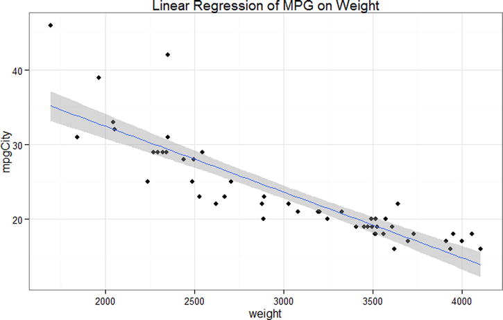
Figure 13-3. 95% Confidence interval shading on our regression line
Diagnostic plots of the fitted data points and the residuals are often very useful when we examine linear relationships. Let us use ggplot2 to produce a plot of the residuals vs. the fitted values, as well as a normal Q-Q plot for the same data. First, we make the plot of the residuals vs. fitted values. We add a smoothed fit line and a confidence region, as well as a dashed line at the intercept, which is zero for the standardized residuals. The plots appear in Figures 13-4 and 13-5.
> p2 <- ggplot(model , aes(.fitted , .resid )) +
+   geom_point() +
+   stat_smooth( method ="loess") +
+   geom_hline( yintercept = 0, col ="red", linetype = "dashed") +
+   xlab(" Fitted values ") +
+   ylab(" Residuals ") +
+   ggtitle(" Residual vs Fitted Plot ") +
+   theme_bw()
> p2

Figure 13-4. Residuals vs. fitted values for the linear model
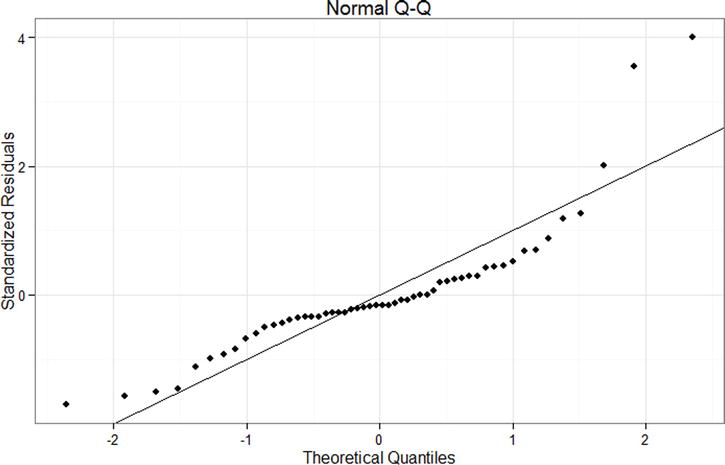
Figure 13-5. Normal Q-Q plot for the linear model
The normal Q-Q plot is constructed in a similar fashion, as follows. Figure 13-5 shows the finished plot.
> p3 <- ggplot(model , aes(sample = .stdresid)) +
+   stat_qq() +
+   geom_abline(intercept = 0, slope = 1) +
+   xlab(" Theoretical Quantiles ") +
+   ylab (" Standardized Residuals ") +
+   ggtitle(" Normal Q-Q ") +
+   theme_bw ()
> p3
A quick examination of the Q-Q plot indicates that the relationship between weight and mileage may not be best described by a linear model. These data seem left skewed. We can also use a histogram as before to visualize whether the residuals follow a normal distribution, as a supplement to the Q-Q plot.
> p4 <- ggplot(model , aes(.stdresid)) +
+   geom_histogram(binwidth = .5) +
+   xlab(" Standardized Residuals ") +
+   ggtitle(" Histogram of Residuals ") +
+   theme_bw()
> p4

Figure 13-6. Histogram of residuals for the linear model
By saving the graphs in R objects along the way, we can put all our results together into a panel of graphs to get a good overview of our model. Note that we can extract output from the model summary. In the example that follows, we extract the estimated R2 value, multiply by 100 to make it a percentage, and have R substitute the number into some text we wrote for the overall title of the graph, using the sprintf(), which takes a character string and where we write the special %0.1f which substitutes in a number, rounding to the first decimal. Note that we could have included more decimals by writing %0.3f for three decimals. Figure 13-7 shows the results.
> library(gridExtra)
> grid.arrange(p1, p2, p3, p4,
+   main = sprintf("Linear Regression Example, Model R2 = %0.1f%%",
+                  summary(model)$r.squared * 100),
+   ncol = 2)

Figure 13-7. Regression summary and overview panel graph
13.3 An Extended Regression Example: Stock Screener
Data on stocks are readily enough available for download, and the process may be quite instructive. The usual sorts of disclaimers about being wise before randomly buying stocks apply. We will first explore the linear regression between the closing share price for a particular telecommunications company and day (technically just an indexing of date). We’ll progress to trying our hand at a curvilinear model, which will both wrap up this chapter and motivate the next chapter’s multiple regression.
Note that for simple and multiple linear regression, an assumption is that the observations are independent, that is, the value of one observation does not influence or is not associated with the value of any observation. With stock data or time series data, this assumption is obviously violated, as a stock’s price on one day will tend to be related to its price on the day before, the next day, and so on. For the moment, as we introduce regression, we will ignore this fact, but readers are cautioned that time series analysis requires some additional methods beyond simple regression.
Unlike some other languages, R starts indexing at 1 rather than 0. As you rapidly move on to more advanced techniques in R, the temptation to repurpose code from the Internet will be strong. While it may even be wise to not reinvent the wheel, you must be canny enough to watch for things such as different indices.
We have included in this text’s companion files the same data we used to run the following code. We also include the code to download stock data “fresh” from the Internet. It is possible that fresh data may not fit our next two models as well as the data we selected; we were choosy in our data. We also edited the first column (with the date data) to be an index. We used Excel’s fill handle to do that surgery quickly and intuitively.
> sData=read.csv(file="http://www.google.com/finance/historical?output=csv&q=T",header=TRUE)
> write.csv(sData, "stock_ch13.csv", row.names=FALSE) #some edits happen here in Excel
> sData <- read.csv("stock_ch13.csv", header = TRUE)
> head(sData)
  Index  Open  High   Low Close   Volume
1     1 35.85 35.93 35.64 35.73 22254343
2     2 35.59 35.63 35.27 35.57 36972230
3     3 36.03 36.15 35.46 35.52 31390076
4     4 35.87 36.23 35.75 35.77 28999241
5     5 36.38 36.40 35.91 36.12 30005945
6     6 36.13 36.45 36.04 36.18 47585217
We create a plot of the closing stock price by year with a linear model fit to the plot with the following code to create Figure 13-8. It is perhaps not too difficult to see that a linear fit is perhaps not the best model for our stock.
> plot(Close ~ Index, data = sData)
> abline(lm(Close ~ Index, data = sData))

Figure 13-8. Closing value in United States Dollars (USD) over the last 251 days of a telecommunication stock
Despite our graph in Figure 13-8 not fitting very well to a linear model, the model does have statistically significant linearity, seen in the regression analysis between day and closing stock price. As we see in our analysis, 14% of the variability in our closing stock price is accounted for by knowing the date.
> results <- lm(Close ~ Index, data = sData)
> summary(results)

Call:
lm(formula = Close ~ Index, data = sData)

Residuals:
     Min       1Q   Median       3Q      Max
-2.28087 -0.68787  0.03499  0.65206  2.42285

Coefficients:
             Estimate Std. Error t value Pr(>|t|)
(Intercept) 33.726751   0.114246 295.211  < 2e-16 ***
Index        0.005067   0.000786   6.446 5.91e-10 ***
---
Signif. codes:  0 '***' 0.001 '**' 0.01 '*' 0.05 '.' 0.1 ' ' 1

Residual standard error: 0.9023 on 249 degrees of freedom
Multiple R-squared:  0.143,    Adjusted R-squared:  0.1396
F-statistic: 41.55 on 1 and 249 DF,  p-value: 5.914e-10
13.3.1 Quadratic Model: Stock Screener
Let us see if we can account for more of the variability in closing stock prices by fitting a quadratic model to our dataset. We are getting near multiple regression territory here, although, technically, we are not adding another term to our mix simply because we will only square the index predictor. Our model will fit this formula:
y = b0 + b1 x + b2 x2
We still save multiple input terms for Chapter 14. We could create another variable in our dataset that was a vector of our squared index values, a common practice in curve-fitting analysis that creates a second-order equation. However, R’s formula interface allows us to use arithmetic operations right on the variables in the regression model, as long as we wrap them in I(), to indicate that these should be regular arithmetic operations, not the special formula notation. Ultimately, this is still a linear model because we have a linear combination of days (index) and days (index) squared. Putting this all together in R and repeating our regression analysis from before yields:
> resultsQ <- lm(Close ~ Index + I(Index^2), data = sData)
> summary(resultsQ)

Call:
lm(formula = Close ~ Index + I(Index^2), data = sData)

Residuals:
     Min       1Q   Median       3Q      Max
-1.69686 -0.55384  0.04161  0.56313  1.85393

Coefficients:
              Estimate Std. Error t value Pr(>|t|)
(Intercept)  3.494e+01  1.387e-01 251.868   <2e-16 ***
Index       -2.363e-02  2.542e-03  -9.296   <2e-16 ***
I(Index^2)   1.139e-04  9.768e-06  11.656   <2e-16 ***
---
Signif. codes:  0 '***' 0.001 '**' 0.01 '*' 0.05 '.' 0.1 ' ' 1

Residual standard error: 0.7267 on 248 degrees of freedom
Multiple R-squared:  0.4463,   Adjusted R-squared:  0.4419
F-statistic: 99.96 on 2 and 248 DF,  p-value: < 2.2e-16
> resultsQ <- lm(Close ~ Index + IndexSQ)
Our quadratic model is a better fit (again, we save for another text a discussion about the risks of overfitting) than our linear model. The quadratic model accounts for approximately 44% of the variation in closing stock prices via our Index and Index^2 predictor(s). Using the predict() function, we produce predicted stock closing prices from the quadratic model, and save them into a new variable called predQuad, into our data frame sData so that we may use the lines() function to add the curved line in Figure 13-9.
> sData$predQuad <- predict(resultsQ)
> plot(Close ~ Index, data = sData, main = "quadratic model")
> abline(results)
> lines(sData$predQuad, col="blue")
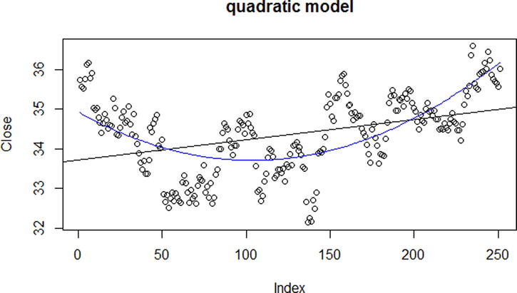
Figure 13-9. Quadratic (curve) and linear (straight) regression lines on scatterplot
We may also call R’s plot() function on resultsQ to see four diagnostic plots based on the distances between predicted values of stock closing prices (which is what our blue line traces) vs. the observed or training values (we call these residuals). Of interest is that R actually has several versions of the plot() function. To be precise, we are using plot.lm(). However, since our object is of the class lm, R is clever enough to use the correct version of our function without us explicitly calling it. R will plot Figures 13-10 through 13-13 one at a time for us.
> class(resultsQ)
[1] "lm"

> plot(resultsQ)
Hit <Return> to see next plot:
Hit <Return> to see next plot:
Hit <Return> to see next plot:
Hit <Return> to see next plot:

Figure 13-10. Residuals vs. fitted values
The normal Q-Q plot shows that excepting a few outliers, our quadratic model is a fairly good fit. Days 156, 157, and 158 show up in the plot as being less-than-ideal residuals, but overall the residuals appear to follow a normal distribution.

Figure 13-11. Normal Q-Q plot for the quadratic model shows good fit
The plot of the standardized residuals against the fitted values can help us see if there are any systematic trends in residuals. For example, perhaps the lower the fitted values, the higher the residuals, which might alert us that our model is fitting poorly in the tails.

Figure 13-12. Scale-Location plot
The final plot shows the standardized residuals against the leverage. Leverage is a measure of how much influence a particular data point has on the regression model. Points with low leverage will not tend to make a big difference on the model fit, regardless of whether they have a large or small residual. R shows the Cook’s distance as a dashed red line, values outside this may be concerning. We do not see the Cook’s distance line in the graph in Figure 13-13 because it is outside the range of data, a good sign that all our residuals fall within it.

Figure 13-13. Residuals vs. leverage plot
One feature of time series data, such as stock prices, is that the value at time t is often associated with the value at time t - 1. We can see this from the graphs of the data where there appear to be some cyclical effects in stock prices. One common type of time series analyses is AutoRegressive Integrated Moving Average (ARIMA) models. ARIMA models can incorporate seasonality effects as well as autoregressive processes, where future values depend on some function of past values. A very brief example of a simple ARIMA model fit to the stock data is shown in the code that follows and in Figure 13-14. Although we will not cover time series analysis in this introductory book, interested readers are referred to Makridakis, Wheelwright, and Hyndman (1998) for an excellent textbook on time series and forecasting.
> install.packages("forecast")
> library(forecast)
> m <- auto.arima(sData$Close)

> pred <- forecast(m, h = 49)

> plot(Close ~ Index, data = sData, main = "ARIMA Model of Stock Prices",
+      xlim = c(1, 300), ylim = c(30, 42))
> lines(fitted(m), col = "blue")
> lines(252:300, pred$mean, col = "blue", lty = 2, lwd = 2)
> lines(252:300, pred$lower[, 2], lty = 2, lwd = 1)
> lines(252:300, pred$upper[, 2], lty = 2, lwd = 1)

Figure 13-14. ARIMA model of closing stock prices with forecasting and 95% confidence intervalsI
13.4 Confidence and Prediction Intervals
For our regression model(s), we can graph the confidence intervals (CIs) and prediction intervals (PIs). The t distribution is used for CI and PI to adjust the standard error of the estimate. In the summary() function we called on our linear results from our stock data, R provides the standard error of the estimate (R calls this residual standard error) near the end of the output:
Residual standard error: 0.9023 on 249 degrees of freedom.
Notice that this is in y-axis units (in this case USD) and estimates the population standard deviation for y at a given value of x. This is not the most ideal fit, since +/- $0.90 doesn’t do much for stock portfolio estimation! Repeating the calculation on the quadratic model is somewhat better. Recall that earlier, our model yielded Residual standard error: 0.7267 on 248 degrees of freedom.
We show the code for the linear model, have the code for both models in this text’s companion files, and show both linear and quadratic models in Figures 13-15 and 13-16, respectively.
> conf <- predict(results, interval = "confidence")
> pred <- predict(results, interval = "prediction")
Warning message:
In predict.lm(results, interval = "prediction") :
  predictions on current data refer to _future_ responses

> colnames(conf) <- c("conffit", "conflwr", "confupr")
> colnames(pred) <- c("predfit", "predlwr", "predupr")

> intervals <- cbind(conf, pred)
> head(intervals)
   conffit  conflwr  confupr  predfit  predlwr  predupr
1 33.73182 33.50815 33.95549 33.73182 31.94069 35.52294
2 33.73688 33.51455 33.95922 33.73688 31.94592 35.52784
3 33.74195 33.52095 33.96295 33.74195 31.95116 35.53275
4 33.74702 33.52735 33.96668 33.74702 31.95639 35.53765
5 33.75208 33.53375 33.97042 33.75208 31.96162 35.54255
6 33.75715 33.54014 33.97416 33.75715 31.96684 35.54746
> intervals <- as.data.frame(intervals)

> plot(Close ~ Index, data = sData, ylim = c(32, 37))
> with(intervals, {
+   lines(predLin)
+   lines(conflwr, col = "blue")
+   lines(confupr, col = "blue")
+   lines(predlwr, col = "red")
+   lines(predupr, col = "red")
+ })

Figure 13-15. Linear fit to sData with CI and PI lines

Figure 13-16. Quadratic fit to sData with CI lines
Either way, as interesting as these data are, perhaps the authors’ choices to remain in academia rather than pursue careers on Wall Street are self-explanatory. Of course, if we were to extend our model with more relevant predictors beyond only time, a more useful model might be uncovered. This is the heart of multiple regression, which we explore in the next chapter.
References
Makridakis, S., Wheelwright, S. C., & Hyndman, R. J. Forecasting Methods and Applications (3rd ed.). New York: John Wiley & Sons, 1998.