
![]()
Multiple Regression
The idea of multiple regression is that rather than just having a single predictor, a model built on multiple predictors may well allow us to more accurately understand a particular system. As in Chapter 13, we will still focus overall on linear models—we will simply have a new goal to increase our number of predictors. Also as before, we save for other texts a focus on the behind-the-scenes mathematics; our goal is to conceptually explore the methods of using and understanding multiple regression. Having offered this caveat, however, doesn’t free us from taking just a little bit of a look at some of the math that power these types of models.
14.1 The Conceptual Statistics of Multiple Regression
In the previous chapter, we stated simply that our general model was ![]() = b0 + b1x. This was mostly true. To get just a shade more technical, our model was
= b0 + b1x. This was mostly true. To get just a shade more technical, our model was ![]() = b0 + b1x while we hoped to be finding the true equation of y = B0 + B1X + ε. In other words, if we had access to an entire population worth of data, we would find y and it would have been predicted by a single input predictor x, up to some error ε which we would assume as a precondition was independent of our input x and normally distributed about zero. For simple regression, this was perhaps not vital as a fine point to focus on understanding. For multiple predictors, however, we will want to have some techniques to determine which predictors are more or less valuable to improving our model.
= b0 + b1x while we hoped to be finding the true equation of y = B0 + B1X + ε. In other words, if we had access to an entire population worth of data, we would find y and it would have been predicted by a single input predictor x, up to some error ε which we would assume as a precondition was independent of our input x and normally distributed about zero. For simple regression, this was perhaps not vital as a fine point to focus on understanding. For multiple predictors, however, we will want to have some techniques to determine which predictors are more or less valuable to improving our model.
This decision of which predictors to include becomes an important part of multiple regression because our formula can be quite a bit more complicated. In multiple regression, we hope to find the true equation of y = B0 + B1X1 + B2X2 + ¼ + BkXk + ε. By using our training data from a limited number of k predictors, we find our regression equation ![]() = b0 + b1x1 + b2 x2 + ¼ + bkxk. Once we remove the restriction of having only a single predictor, one of the questions we’ll have to answer is which predictors we should use. We will want to ensure that we reward simpler models over more complex models. Another question that we will need to consider is whether any of our predictors will have an interaction with each other.
= b0 + b1x1 + b2 x2 + ¼ + bkxk. Once we remove the restriction of having only a single predictor, one of the questions we’ll have to answer is which predictors we should use. We will want to ensure that we reward simpler models over more complex models. Another question that we will need to consider is whether any of our predictors will have an interaction with each other.
Consider the following example, where we wish to study how students succeed at learning statistics. In Chapter 13, we would perhaps have considered how many hours a student studies a week as a predictor for final course score. However, some students arrive at an introductory statistics course fresh out of high school, while other arrive after a decade in the workforce, and still others have already taken calculus and differential equations. So, while hours per week of study (S) may well be one useful predictor, we may also wish to add months since last mathematics course (M) as well as highest level of mathematics completed (H) and percent of book examples read (P) to our mix of predictors. Looking at this example, let us talk through how a model should work.
These all sound useful enough, but it may well turn out that some of them are fairly useless as predictors once we build our model. Furthermore, while studying is all well and good, the fact is that study can be thought of as deliberate practice. Practicing incorrect methods would be a terrible idea, and yet it may well happen. On the other hand, a student who reads her textbook examples cautiously is perhaps less likely to practice incorrect methods. In terms of our equation, we start out imagining that y = B0 + BS S + BM M + BH H + BPP + ε may make a good model. Yet, as mentioned, perhaps incorrect study is a bad idea. We would like to code into our formula the interaction of reading textbook examples with study. We do this through multiplication of the study hours and percent of textbook read predictors: y = B0 + BSS + BM M + BH H + BPP + BSP (S * P) + ε. This interaction term answers the question, “Does the effect of hours per week of study depend on the percent of book examples read?” or equivalently, “Does the effect of percent of book examples read depend on the number of hours per week of study?” Two-way interactions can always be interpreted two ways, although typically people pick whichever variable makes most sense as having the “effect” and which one makes most sense as “moderating” or modifying the effect. Later on in an extended example, we will show how to determine if an interaction predictor may be warranted. Of course, we have already seen such interactions somewhat in Chapter 13, where we made a variable interact with itself to create a polynomial model.
Although each predictor may be important on its own, due to overlap, we may find that not all variables are uniquely predictive. For example, in a sample of college seniors, highest level of mathematics completed (H) and months since last mathematics course (M) may be correlated with each other as students who took math most recently may have been taking it their whole undergraduate and thus have a higher level as well. In this case we may want to drop one or the other in order to simplify the model, without much loss in predictive performance. One of the first ways we can evaluate performance in R is by observing the Adjusted R-squared output of the linear model. Recall from the prior chapter that in the summary() function of linear models, near the end of that output, it gave both Multiple R-squared and Adjusted R-squared values (which in that chapter were the same), and we stated:
R-squared is a value between [0, 1] which is also called the coefficient of determination. It is the percentage of total variation in the outcome or dependent variable that can be accounted for by the regression model. In other words, it is the amount of variation in the response/dependent variable that can be explained by variation in the input/term variable(s).
Adjusted R-squared is calculated from the Multiple R-squared value, adjusted for the number of observations and the number of predictor variables. More observations make the adjustment increase, while more predictors adjust the value down. The formula is given here:

To round out this brief, conceptual discussion of the ideas we’re about to see in action, we make a brief note about standard error. Recall from Chapter 13 that we also claimed “the residual standard error is a measure of how far, on average, our y values fall away from our linear model regression line.” Regression assumes that the error is independent of the predictor variables and normally distributed. The way in which the regression coefficients are calculated makes the errors independent of the predictors, at least linearly. Many people focus on whether the outcome of regression is normally distributed, but the assumption is only that the errors or residuals be normally distributed. Graphs of the residuals are often examined as a way to assess whether they are normally or approximately normally distributed.
As we explore multiple regression through the gss2014 data introduced in prior chapters, we will examine several predictors that we could use, and explain how a cautious look at various graphs and R package outputs will help us create a more powerful model through multiple predictors.
14.2 GSS Multiple Regression Example
Recall that our General Social Survey (GSS) data include behavioral, attitudinal, and demographic questions. For our purposes, we will focus on nine items of age in years, female/male sex, marital status, years of education (educ), hours worked in a usual week (hrs2), total family income (income06), satisfaction with finances (satfin), happiness (happy), and self-rated health. Our goal, by the end of the extended example, will be to use multiple predictors to determine total family income.
We will also use several packages, so to focus on the analysis, we will install and load all those packages now. We will also load the GSS2012 file we downloaded in an earlier chapter as an SPSS file and then call out just the reduced dataset of the nine variables we mentioned earlier and name it gssr (“r” for reduced) as follows (note, R often gives some warnings about unrecognized record types when reading SPSS data files, these are generally ignorable):
> install.packages(c("GGally", "arm", "texreg"))
> library(foreign)
> library(ggplot2)
> library(GGally)
> library(grid)
> library(arm)
> library(texreg)
> gss2012 <- read.spss("GSS2012merged_R5.sav", to.data.frame = TRUE)
> gssr <- gss2012[, c("age", "sex", "marital", "educ", "hrs2", "income06", "satfin", "happy", "health")]
In our gssr dataset we have 4,820 observations on nine variables. Of these, age, education, hours worked in a typical week, and income are all numeric variables, yet they are not coded as such in our data frame. We use the within() function to take in our data, recode these categories as numeric data, and then save those changes. As always, data munging may well take a fair bit of time. The following code does this:
> gssr <- within(gssr, {
+   age <- as.numeric(age)
+   educ <- as.numeric(educ)
+   hrs2 <- as.numeric(hrs2)
+   # recode income categories to numeric
+   cincome <- as.numeric(income06)
+ })
With our data in a data frame and organized into usable data types, we are ready to begin deciding which of our eight possible predictors might best allow us to estimate total family income. As a first pass, we might consider that income may be predicted by age, by education, and by hours worked per week.
14.2.1 Exploratory Data Analysis
We are ready to perform some exploratory data analysis (EDA) on our numeric data using ggpairs(). Our goal is to see if any of the values we just forced to be numeric (and thus easy to graph and analyze) might make good predictors. This code will give a convenient, single image that shows the correlations between each of our potential predictors, the bar graph of each individual predictor, and a scatterplot (and single variable regression line) between each pair of variables. Along the diagonal, we’ll have our bar graphs, while the lower triangle will have scatterplots.
> ggpairs(gssr[, c("age", "educ", "hrs2", "cincome")],
+         diag = list(continuous = "bar"),
+         lower = list(continuous = "smooth"),
+         title = "Scatter plot of continuous variables")
stat_bin: binwidth defaulted to range/30. Use 'binwidth = x' to adjust this.
stat_bin: binwidth defaulted to range/30. Use 'binwidth = x' to adjust this.
stat_bin: binwidth defaulted to range/30. Use 'binwidth = x' to adjust this.
stat_bin: binwidth defaulted to range/30. Use 'binwidth = x' to adjust this.
There were 19 warnings (use warnings() to see them)
Our plan is to use age, education, and usual hours worked weekly as predictors for total family income. As such, the right-most column correlations in Figure 14-1 are of interest. Recall that correlation yields an output between [-1, 1]. The further a variable is from 0, the more interesting we consider it as a potential predictor. Education seems to have a positive correlation with income, which makes sense. As education increases, income might increase. Age and income, on the other hand, seem to have a very weak relationship.
This weak relationship may be readily seen in the scatterplots of the lower triangle of our Figure 14-1. It may be difficult to see in the textbook plot due to size, but run the previous code in R and you will see that the lower right income vs. age scatterplot has a rather boring linear regression line. For any particular income, there are many possible ages that could get there. Contrast this with the income vs. education scatterplot; the regression line shows that higher incomes are related to more educations. Something to notice about these scatterplots is that there a dot for each of our 4,820 observations. Since education is measured in years, and income is binned data (and thus segmented), these scatterplots do not quite show the whole picture. That is because it is not easy to see, without the regression line, that there are many more dots at the (educ, cincome) (20, 25) mark then there are at the (20, 10) mark. Now, with the regression line, one supposes that must be true to pull that line up. In just a bit, we’ll discuss the idea of jitter to make those differences a shade easier to see.

Figure 14-1. Correlations, bar graphs, and scatterplots of age, education, hours worked in usual week, and incomeZ
While we are seeking higher correlations between our potential predictor variables and income, low correlations between our predictors are desirable. The fact that education and hours per week have so little in common with a correlation of -0.0618 and a fairly flat regression line in the (educ, hrs2) scatterplot gives us hope that adding hours into the mix of predictors would be bringing something new to the multiple regression.
Spend some time looking over Figure 14-1. It really has quite a lot of data packed inside one set of charts and graphs.
From Figure 14-1, we decide that education may be a good first predictor for income. The GSS actually allows respondents to select from a range of total family income, then codes those ranges into bins. The higher the bin, the more income the respondent’s family unit makes in a year. Looking one last time at that scatterplot, recall that we pointed out that a single dot on that chart might well be secretly many dots packed directly on top of each other. In the R package ggplot2, we can include a geometric objected aptly titled jitter to introduce just a little wiggle to our data values. This will allow us to visually unpack each dot, so that all 4,820 observations (less some 446 rows of missing data) are more visible. We see the code for this as follows:
> ggplot(gssr, aes(educ, cincome)) +
+   # use jitter to add some noise and alpha to set transparency to more easily see data
+   geom_jitter(alpha = .2) +
+   stat_smooth() +
+   theme_bw() +
+   xlab("Years of Education") +
+   ylab("Income Bins")
geom_smooth: method="auto" and size of largest group is >=1000, so using gam with formula: y ~ s(x, bs = "cs"). Use 'method = x' to change the smoothing method.
Warning messages:
1: Removed 446 rows containing missing values (stat_smooth).
2: Removed 446 rows containing missing values (geom_point).
While we’ve used ggplot2 in prior chapters, let us take a moment to explore how the syntax works. The function call ggplot( data, more_arguments_here) builds a plot incrementally. The data in our case is replaced with the call to our actual data, gssr. Most often in this book, we make an aesthetic map through the aes(x, y, ...) function call as one last argument to the ggplot() function. Since we kept the order that aes() was expecting for x and y, in the code above we simply put our predictor variable educ and our dependent cincome into the function. As we’d already told ggplot() that we were using gssr data, it knew where to look for educ and cincome without more complex row call tags such as gssr$educ.
Next, ggplot2 allows us to incrementally add additional layers. The actual data points are geometric objects, which we want jittered for these data so we call geom_jitter(). The alpha argument is available for most geometric objects, and ranges from 0 to 1, where 0 indicates that the object should be completely transparent, and 1 indicates it should be completely opaque. A value of .2 will be more transparent than opaque. Every geometric object has a default statistic (and vice versa), although that can be overridden as we do in the preceding code by calling stat_smooth() to create the smoothed line in our image. We wrap up the plot with an overall graph theme (bw for black and white, in this example) and explicitly label the x and y axis. Figure 14-2 shows the result.

Figure 14-2. Scatterplot of income vs. years of education (with jitter)
Looking at Figure 14-2, thanks to jittering, we can see the density of our data values. This shows well why higher education had such a higher correlation with higher income (and the smooth line helps demonstrate this as well). By having a better sense of where our data are located, we can collapse our data. Few people have less than 9 years of education. Furthermore, as we can see from the smooth line, there is not much benefit from more than perhaps 18 years of education. We again reduce our data, not removing columns as we did before, but rather recoding education to a new set of values that trims our data if it is below 9 or above 18. The functions pmin() and pmax() return the parallel minimum or maximum. They operate on each element of a vector or variable. In our example, we first ask for the maximum of either years of education or 9, and then the minimum of years of education or 18.
> gssr <- within(gssr, {
+   reduc <- pmin(pmax(educ, 9), 18)
+ })
From here, we may redraw our plot, and see an updated graph that more clearly highlights education’s expected contribution to our multiple regression model:
> ggplot(gssr, aes(reduc, cincome)) +
+   geom_jitter(alpha = .2) +
+   stat_smooth() +
+   theme_bw() +
+   xlab("Years of (Recoded) Education") +
+   ylab("Income Bins")
geom_smooth: method="auto" and size of largest group is >=1000, so using gam with formula: y ~ s(x, bs = "cs"). Use 'method = x' to change the smoothing method.
Warning messages:
1: Removed 446 rows containing missing values (stat_smooth).
2: Removed 446 rows containing missing values (geom_point).
Running the foregoing code yields the updated graph seen in Figure 14-3. We have a fairly straight line, with only a bit of wiggle near what might be the “less than high school” or “more than high school” breaks. Notice we have cautiously relabeled our graph to call out that we have chosen to recode the education data. Any time data are trimmed or otherwise altered, best practice is to call it by a different title inside the code and to purposefully mention such a thing has been done via graph labels on any images.

Figure 14-3. Income bins vs. years of (recoded) education (min. 9 to max. 18)
14.2.2 Linear Model (the First)
Now that we have explored our data somewhat, we are ready to begin building our linear model. Just as in Chapter 13, we start with a simple model:
> m <- lm(cincome ~ reduc, data = gssr)
> summary( m )

Call:
lm(formula = cincome ~ reduc, data = gssr)

Residuals:
     Min       1Q   Median       3Q      Max
-20.1731  -3.2061   0.7609   3.7609  12.6784

Coefficients:
            Estimate Std. Error t value Pr(>|t|)
(Intercept)  3.47003    0.42634   8.139 5.14e-16 ***
reduc        0.98351    0.03049  32.256  < 2e-16 ***
---
Signif. codes:  0 ‘***’ 0.001 ‘**’ 0.01 ‘*’ 0.05 ‘.’ 0.1 ‘ ’ 1

Residual standard error: 5.127 on 4372 degrees of freedom
  (446 observations deleted due to missingness)
Multiple R-squared:  0.1922,    Adjusted R-squared:  0.192
F-statistic:  1040 on 1 and 4372 DF,  p-value: < 2.2e-16
We see that our p values are significant for our adjusted education data. However, our education data can only account for 19.2% of the total variance in income. There is definitely room for improvement here! Notice as mentioned earlier that the Multiple R-squared is the same as the Adjusted R-squared for the single variable case.
It is also important to note that of our 446 deleted values, not all of them have fully missing data. Some are missing education, others miss only income, and of course some are missing both. It is a worthy topic for another time how to handle missing data through more elegant means than list-wise deletion (where cases missing any variable in a regression are removed) for missingness.
Just as we did in the last chapter, we will take a look at our graphs to see if this model makes sense as seen from the following code leading to Figure 14-4:
> par(mfrow = c(2, 2))
> plot( m )

Figure 14-4. The four plot(m) graphs all at once
We can see (perhaps clearly enough from the Normal Q-Q plot) that our residuals look normal enough, except for some odd behavior in the tails.
14.2.3 Adding the Next Predictor
It seems that years of education may well be a good predictor for total family income. However, it still only accounts for 19.2% of the total variance found in income. Returning to our collected data, we next explore if sex makes a difference, starting, as always, with a graph for our EDA generated from the following code and seen in Figure 14-5:
> ggplot(gssr, aes(reduc, cincome)) +
+   geom_jitter(alpha = .2) +
+   stat_smooth() +
+   theme_bw() +
+   xlab("Years of (Recoded) Education") +
+   ylab("Income Bins") +
+   facet_wrap(~ sex)
geom_smooth: method="auto" and size of largest group is >=1000, so using gam with formula: y ~ s(x, bs = "cs"). Use 'method = x' to change the smoothing method.
geom_smooth: method="auto" and size of largest group is >=1000, so using gam with formula: y ~ s(x, bs = "cs"). Use 'method = x' to change the smoothing method.
Warning messages:
1: Removed 178 rows containing missing values (stat_smooth).
2: Removed 268 rows containing missing values (stat_smooth).
3: Removed 178 rows containing missing values (geom_point).
4: Removed 268 rows containing missing values (geom_point).

Figure 14-5. Income vs. years of (recoded) education broken out by sex of survey respondent
Since our income values for both male and female at 18 years of education are roughly similar (by inspection), yet our initial values for income seem lower, we believe that sex may well be interacting with education. We update our model accordingly, and use a new operator ‘.’ which means everything. So we write .~.*sex as shorthand for “everything our model used to have on the left-hand side, while on the right-hand side, include sex and interactions with sex as variables.” In R, this sort of update follows this format: a*b = a + b + a*b where it gives the main effects of a, of b, and of a interacting with b. Note that R uses the colons, “:” to indicate the interaction of two variables, although mathematically, it is the multiplication of two variables and in writing typically indicated by “*” or “x” as in “education x sex”. You can see the specifics in the summary() function call that follows:
> m2 <- update(m, . ~ . * sex)
> summary( m2 )

Call:
lm(formula = cincome ~ reduc + sex + reduc:sex, data = gssr)

Residuals:
     Min       1Q   Median       3Q      Max
-20.4990  -2.8145   0.8855   3.5010  13.5891

Coefficients:
                Estimate Std. Error t value Pr(>|t|)
(Intercept)      5.34540    0.62202   8.594  < 2e-16 ***
reduc            0.89742    0.04446  20.186  < 2e-16 ***
sexFEMALE       -3.45342    0.84833  -4.071 4.77e-05 ***
reduc:sexFEMALE  0.16023    0.06066   2.641  0.00829 **
---
Signif. codes:  0 ‘***’ 0.001 ‘**’ 0.01 ‘*’ 0.05 ‘.’ 0.1 ‘ ’ 1

Residual standard error: 5.087 on 4370 degrees of freedom
  (446 observations deleted due to missingness)
Multiple R-squared:  0.2054,    Adjusted R-squared:  0.2048
F-statistic: 376.5 on 3 and 4370 DF,  p-value: < 2.2e-16
In the summary, we see that while we now have three prediction variables, namely, our adjusted education variable, our dummy-coded sex variable, and our education * sex interaction, we have now accounted for 20.5% of income variability through our model. Our p values remain significant, courtesy of our rather large N even though the additional variance accounted for in this model is only around 1%.
We close out this section by visualizing our predicted results. The function expand.grid() creates a data frame from all possible combinations of factors, in this case the reduc values from 9 to 18 and the levels of gssr$sex data from our gssr dataset. Using the predict() function, we create ŷ data and graph it in Figure 14-6.
> newdata <- expand.grid(reduc = 9:18, sex = levels(gssr$sex))
> head(newdata)
  reduc  sex
1     9 MALE
2    10 MALE
3    11 MALE
4    12 MALE
5    13 MALE
6    14 MALE

> newdata$yhat <- predict(m2, newdata = newdata)

> ggplot(newdata, aes(reduc, yhat, colour = sex)) +
+   geom_line(size=1.5) +
+   theme_bw() +
+   xlab("Recoded Years of Education") +
+   ylab("Income Bin")

Figure 14-6. Income vs. recoded years of education broken out by male/female sex
As can be seen in Figure 14-6, sex seems to have an effect on income. This effect appears larger with lower education, although it is not a dramatic interaction.
14.2.4 Adding More Predictors
As we add more predictors beyond our initial group, we have ever more aspects to consider. Do we need to simply add the new predictors into our model or must we include interactions? This requires some cautious looks at the graphs and at the summary data. We turn to age as that seemed the weakest correlation of our data set. In the code that follows, we see what should now be fairly familiar:
> p <- ggplot(gssr, aes(age, cincome)) +
+   geom_jitter(alpha = .2) +
+   stat_smooth() +
+   theme_bw() +
+   xlab("Age in Years") +
+   ylab("Income Bins")
> p
geom_smooth: method="auto" and size of largest group is >=1000, so using gam with formula: y ~ s(x, bs = "cs"). Use 'method = x' to change the smoothing method.
Warning messages:
1: Removed 470 rows containing missing values (stat_smooth).
2: Removed 470 rows containing missing values (geom_point).
The resulting graph in Figure 14-7 shows what appears to be a quadratic effect of age. Notice that this also explains why the age correlation was weak! Correlation only looks for linear effects, and this is quadratic. We left a breadcrumb for this near the start of our discussion where we noted age had a weak correlation; notice too that the geom_jitter() function is very helpful in seeing how a straight-line average would perhaps give a very incorrect picture of the effect age has on income.

Figure 14-7. Income vs. age (in years) showing a quadratic fit to the data
Age seems to have good things to say about income, but do we need to consider whether the effect of age differs by sex? Again, we use the facet_wrap() function to sort by male and female:
> p2 <- p + facet_wrap(~ sex)
> p2
geom_smooth: method="auto" and size of largest group is >=1000, so using gam with formula: y ~ s(x, bs = "cs"). Use 'method = x' to change the smoothing method.
geom_smooth: method="auto" and size of largest group is >=1000, so using gam with formula: y ~ s(x, bs = "cs"). Use 'method = x' to change the smoothing method.
Warning messages:
1: Removed 186 rows containing missing values (stat_smooth).
2: Removed 284 rows containing missing values (stat_smooth).
3: Removed 186 rows containing missing values (geom_point).
4: Removed 284 rows containing missing values (geom_point).
As seen in Figure 14-8, the quadratic shapes of the graphs are approximately the same. Furthermore (and again we are doing this simply by visual inspection), there does not seem to be anything special about male vs. female income by age beyond what we already knew about their incomes in general.
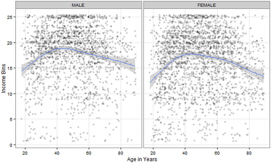
Figure 14-8. Income vs. male age in years and female age in years
Since the age effect is quadratic, we update our model to include both age and age squared (we did this in the last chapter with time on our stock example). Note that to use regular arithmetic operators inside an R formula, we wrap them in another function, I(), which is just the identity function.
> m3 <- update(m2, . ~ . + (age + I(age^2)))
> summary( m3 )

Call:
lm(formula = cincome ~ reduc + sex + age + I(age^2) + reduc:sex, data = gssr)

Residuals:
     Min       1Q   Median       3Q      Max
-19.0198  -2.7655   0.8147   3.4970  12.9333

Coefficients:
                  Estimate Std. Error t value Pr(>|t|)
(Intercept)     -1.2387081  0.8546644  -1.449  0.14731
reduc            0.8620941  0.0439172  19.630  < 2e-16 ***
sexFEMALE       -3.4718386  0.8372444  -4.147 3.44e-05 ***
age              0.3023966  0.0260673  11.601  < 2e-16 ***
I(age^2)        -0.0028943  0.0002505 -11.555  < 2e-16 ***
reduc:sexFEMALE  0.1650542  0.0598623   2.757  0.00585 **
---
Signif. codes:  0 ‘***’ 0.001 ‘**’ 0.01 ‘*’ 0.05 ‘.’ 0.1 ‘ ’ 1

Residual standard error: 5.003 on 4344 degrees of freedom
  (470 observations deleted due to missingness)
Multiple R-squared:  0.2289,    Adjusted R-squared:  0.228
F-statistic: 257.9 on 5 and 4344 DF,  p-value: < 2.2e-16
In this update, we see again that our p value is significant and that our predictors now explain 22.8% of our variability in income. This is from the Adjusted R-squared, which is a good sign that these are useful predictors to have in our model. We haven’t checked our four plots from our regression model recently, so we again run the code for that and view the resulting two-by-two grid in Figure 14-9.
> par(mfrow = c(2, 2))
> plot(m3)

Figure 14-9. The four plot(m3) graphs all at once
Again, we see that the normal residuals precondition holds near the middle of our data, but less so at the tails. As we added more predictors, more predicted values are possible and thus our graphs that at first had very clear “bands” in the residuals vs. fitted values are now more dispersed.
As for our last additions, we use our model to create our prediction lines. This time, we will not only get our lines, but we will include standard errors for our confidence intervals. The 95% confidence intervals for the average predicted value can be obtained as approximately y^ ± 1.96 * SE or precisely y^ + Zα = .025 * SE and y^ + Zα = .975 * SE, which can be obtained in R as qnorm(.025) and qnorm(.975), respectively. However, rounded to two decimals these are +/- 1.96, which is sufficient precision for visual inspection. This time, we select only certain levels of education attainment in three-year increments from our chosen interval. Following is the code for both these steps:
> newdata <- expand.grid(age = 20:80, reduc = c(9, 12, 15, 18), sex = levels(gssr$sex))
> head(newdata)
  age reduc  sex
1  20     9 MALE
2  21     9 MALE
3  22     9 MALE
4  23     9 MALE
5  24     9 MALE
6  25     9 MALE


> newdata <- cbind(newdata, predict(m3, newdata = newdata, se.fit = TRUE))

> head(newdata)
  age reduc  sex      fit    se.fit   df residual.scale
1  20     9 MALE 11.41034 0.3165924 4344       5.003214
2  21     9 MALE 11.59407 0.3070684 4344       5.003214
3  22     9 MALE 11.77202 0.2983259 4344       5.003214
4  23     9 MALE 11.94417 0.2903586 4344       5.003214
5  24     9 MALE 12.11053 0.2831553 4344       5.003214
6  25     9 MALE 12.27111 0.2767002 4344       5.003214
Next, we run the code to plot our new model’s newdata. This time, we let linetype = sex which cycles through different lines types depending on sex. Last time, we did the same process with color (although that may not have been clear in the printed version of this text). The code that follows includes a new geometric object, geom_ribbon(), which shows our confidence intervals. Also the plot will set education constant and contrast income vs. age in years. This is a sort of two-dimensional way to code in the fact that age, sex, and education have us in at least three dimensions (ignoring the addition of interaction predictors). Finally, we include some code to remove the legend’s title, move the legend to the lower part of the graph, and make the legend larger.
> ggplot(newdata, aes(age, fit, linetype = sex)) +
+   geom_ribbon(aes(ymin = fit - 1.96 * se.fit,
+                   ymax = fit + 1.96 * se.fit), alpha = .3) +
+   geom_line(size=1.5) +
+   theme_bw() +
+   theme(
+     legend.title = element_blank(), # get rid of legend title
+     legend.position = "bottom", # move legend to bottom of graph
+     legend.key.width = unit(1, "cm")) + # make each legend bigger
+   xlab("Age in Years") +
+   ylab("Income Bin") +
+   facet_wrap(~ reduc)
We see the result of the preceding code in Figure 14-10. Each panel of the graph has the years of education at the top, although R is only showing the values, not the variable name or anything to tell us those numbers represent years of education (i.e., what a figure legend is for!).

Figure 14-10. Income vs. age in years for males and females segmented by adjusted education data
We see in Figure 14-10 that while there is a significant difference in both the model and the confidence intervals around the model for male and female income, by the upper end of educational attainment, that difference becomes less extreme with the overlap of the shaded confidence intervals (as always, trusting a visual inspection is risky, we ran View(newdata) and looked at the actual confidence intervals to confirm)—not entirely comforting, but perhaps better than might have been.
14.2.5 Presenting Results
We turn our attention now to preparing our results for final presentation. We have increased our predictive ability by 3.58%. Of course, with a dataset as rich as the GSS data, we might be tempted to carry on our efforts. After all, we certainly haven’t used all possible predictors (including the usual hours worked per week). Indeed, an inspection of Figure 14-1, which has a slightly counterintuitive linear regression line, makes the authors wonder if there is not a quadratic shape to that effect as well. It certainly seems possible that income would be low for both part-time and over-full-time workers, while the highest earners might work typical jobs more generally. Still, we are confident that there is enough here for the interested reader to continue adding predictors.
Using the coef() and confint() functions, we extract the coefficients and confidence intervals from our final m3 model and cbind() them together.
> coef(m3)
    (Intercept)           reduc       sexFEMALE             age        I(age^2) reduc:sexFEMALE
   -1.238708083     0.862094062    -3.471838551     0.302396558    -0.002894312     0.165054159
> confint(m3)
                       2.5 %       97.5 %
(Intercept)     -2.914286341  0.436870176
reduc            0.775993915  0.948194210
sexFEMALE       -5.113264804 -1.830412297
age              0.251291337  0.353501778
I(age^2)        -0.003385371 -0.002403252
reduc:sexFEMALE  0.047693534  0.282414783


> output <- cbind(B = coef(m3), confint(m3))
> output
                           B        2.5 %       97.5 %
(Intercept)     -1.238708083 -2.914286341  0.436870176
reduc            0.862094062  0.775993915  0.948194210
sexFEMALE       -3.471838551 -5.113264804 -1.830412297
age              0.302396558  0.251291337  0.353501778
I(age^2)        -0.002894312 -0.003385371 -0.002403252
reduc:sexFEMALE  0.165054159  0.047693534  0.282414783
We see that looks somewhat messy, so we round the output.
> round(output, 2)
                    B 2.5 % 97.5 %
(Intercept)     -1.24 -2.91   0.44
reduc            0.86  0.78   0.95
sexFEMALE       -3.47 -5.11  -1.83
age              0.30  0.25   0.35
I(age^2)         0.00  0.00   0.00
reduc:sexFEMALE  0.17  0.05   0.28
It can be helpful to standardize variables to help make them more interpretable. Gelman (2008) recommends scaling by 2 standard deviations (SD). This is readily enough done with the arm package we installed and included earlier. Running the model again with the standardize() function not only scales the regression inputs but also mean centers variables to make interactions more interpretable.
> z.m3 <- standardize(m3, standardize.y = TRUE)
Now coefficients for continuous variables represent the effect on SDs of income bin per 2 SD change in the predictor roughly equivalent to going from “low” to “high” (i.e., one extreme to the other). For a binary variable like sex, the coefficient is the difference between sexes.
> round(cbind(B = coef(z.m3), confint(z.m3)), 2)
                  B 2.5 % 97.5 %
(Intercept)    0.07  0.05   0.09
z.reduc        0.43  0.40   0.46
c.sex         -0.11 -0.13  -0.08
z.age          0.05  0.02   0.07
I(z.age^2)    -0.30 -0.35  -0.25
z.reduc:c.sex  0.07  0.02   0.13
Writing a generic (and reusable) function to format output, and then calling it on the m3 data yields
> regCI <- function(model) {
+   b <- coef(model)
+   cis <- confint(model)
+   sprintf("%0.2f [%0.2f, %0.2f]",
+           b, cis[, 1], cis[, 2])
+ }

> regCI(m3)
[1] "-1.24 [-2.91, 0.44]"  "0.86 [0.78, 0.95]"    "-3.47 [-5.11, -1.83]"
[4] "0.30 [0.25, 0.35]"    "-0.00 [-0.00, -0.00]" "0.17 [0.05, 0.28]"
Showing the raw and standardized estimates side by side, we note that on raw scale the squared age term is hard to read because age has such a big range. The effect of changing a single year squared was very small, but standardized, the coefficient is much larger matching the importance of age we saw in the graphs.
> data.frame(
+   Variable = names(coef(m3)),
+   Raw = regCI(m3),
+   Std. = regCI(z.m3))
         Variable                  Raw                 Std.
1     (Intercept)  -1.24 [-2.91, 0.44]    0.07 [0.05, 0.09]
2           reduc    0.86 [0.78, 0.95]    0.43 [0.40, 0.46]
3       sexFEMALE -3.47 [-5.11, -1.83] -0.11 [-0.13, -0.08]
4             age    0.30 [0.25, 0.35]    0.05 [0.02, 0.07]
5        I(age^2) -0.00 [-0.00, -0.00] -0.30 [-0.35, -0.25]
6 reduc:sexFEMALE    0.17 [0.05, 0.28]    0.07 [0.02, 0.13]
We can also make nice summaries of models using the texreg package. It creates a little bit prettier model output using the layout of coefficients (standard error) and p values as asterisks. We use an additional argument to put the coefficient and standard error on the same row. If we had many models, we might leave this off, in which case the standard error would go on a new line below the coefficient, making more room across the page for extra models.
> screenreg(m3, single.row = TRUE)

===================================
                 Model 1
-----------------------------------
(Intercept)        -1.24 (0.85)
reduc               0.86 (0.04) ***
sexFEMALE          -3.47 (0.84) ***
age                 0.30 (0.03) ***
I(age^2)           -0.00 (0.00) ***
reduc:sexFEMALE     0.17 (0.06) **
-----------------------------------
R^2                 0.23
Adj. R^2            0.23
Num. obs.        4350
RMSE                5.00
===================================
*** p < 0.001, ** p < 0.01, * p < 0.05
We can also show the iterative model process as a nice summary for this example. It has captured most the results we would want or need to report, including all the coefficients, whether an effect is statistically significant, the number of observations, raw and adjusted R-squared, and the residual standard error, here labeled RMSE for root mean square error. Note that there are options available to control the format of output, including customizing model names to be more informative than the default 1, 2, 3, customizing the row labels, how many digits to round to, whether to include confidence intervals, and many more. The interested reader is referred to the open access journal article on the package by Leifeld (2013).
> screenreg(list(m, m2, m3), single.row = TRUE)

===========================================================================
                    Model 1             Model 2             Model 3
---------------------------------------------------------------------------
(Intercept)         3.47 (0.43) ***     5.35 (0.62) ***    -1.24 (0.85)
reduc               0.98 (0.03) ***     0.90 (0.04) ***     0.86 (0.04) ***
sexFEMALE                              -3.45 (0.85) ***    -3.47 (0.84) ***
reduc:sexFEMALE                         0.16 (0.06) **      0.17 (0.06) **
age                                                         0.30 (0.03) ***
I(age^2)                                                   -0.00 (0.00) ***
---------------------------------------------------------------------------
R^2                 0.19                0.21                0.23
Adj. R^2            0.19                0.20                0.23
Num. obs.           4374                4374                4350
RMSE                5.13                5.09                5.00
===========================================================================
*** p < 0.001, ** p < 0.01, * p < 0.05
14.3 Final Thoughts
Multiple linear regression works well when there is a rich set of data that has many options for predictor or independent variables. As noted earlier in our discussion about the Adjusted R-squared value, larger n can be helpful, particularly when each predictor by itself only explains a small amount of variance. Multiple regression also supposes that the response variable is numeric and continuous. This worked well enough in our GSS data where annual, total family income was used as a response.
This would work less well if we attempted to use income06 to predict sex, on the other hand. Such a categorical, qualitative variable can be better explained through logistic regression or logit models. We will explore models for categorical outcomes, such as logistic regression, in the next chapter.
References
Gelman, A. “Scaling regression inputs by dividing by two standard deviations.” Statistics in Medicine, 27(15), 2865–2873 (2008).
Gelman, A., & Su, Y-S. arm: Data Analysis Using Regression and Multilevel/Hierarchical Models, 2015. R package version 1.8-6. Available at: http://CRAN.R-project.org/package=arm.
Leifeld, P. (2013). “texreg: Conversion of statistical model output in R to LaTeX and HTML tables.” Journal of Statistical Software, 55(8), 1–24. Available at: www.jstatsoft.org/v55/i08/.
R Core Team. (2015). foreign: Read Data Stored by Minitab, S, SAS, SPSS, Stata, Systat, Weka, dBase, .... R package version 0.8-65. http://CRAN.R-project.org/package=foreign.
Schloerke, B., Crowley, J., Cook, D., Hofmann, H., Wickham, H., Briatte, F., Marbach, M., &Thoen, E. GGally: Extension to ggplot2, 2014. R package version 0.5.0. Available at: http://CRAN.R-project.org/package=GGally.