Every time you pass through an airport or a train station, you expect to see myriad signs directing you to points of interest, such as connecting gates, luggage pickup, or a taxi line. And while the words on these signs are certainly important, perhaps just as important are the accompanying visual symbols. Our minds become so accustomed to visual elements that often we don't even need to read the words to understand a sign's meaning, and the presence of visual elements certainly helps when we're in another country where we don't speak the local language.
This universal visual language of signs is the main idea behind the user interface system in Windows Phone 7. Microsoft designers want the elements in the Windows Phone 7 UI to direct users to the content that they want, just as airport signs direct people where they need to go. Within Microsoft, this contemporary UI has been code-named Metro and, per the UI Design and Interaction Guide for Windows Phone 7, elements of Metro UI are meant to be visually appealing and to encourage exploration of the applications you build.
In this chapter, you will explore the most important design principles at the heart of Metro UI and learn how to ensure that your application conforms to them. You will also gain an understanding of themes on the Windows Phone 7 device and learn how to make your application theme-aware. Finally, you will take a look at the controls that are available to you for use in Windows Phone 7 applications, especially the innovative Panorama and Pivot controls that are unique to Windows Phone 7. You have already used many of the controls within Windows Phone 7 in the previous chapters of this book, so this chapter will recap and introduce you to the less common controls.
The big idea behind the Windows Phone 7 design system (Metro) is to direct users to the content they want using design elements that are both effective in conveying their message and attractive. The UI Design and Interaction Guide for Windows Phone 7 (available as a PDF download from http://go.microsoft.com/fwlink/?LinkID=183218) specifically states that visual elements within applications "should encourage playful exploration so that the user feels a sense of wonder and excitement" when using your application. Microsoft strongly encourages all application developers to adopt Metro design principles in their applications. Fortunately, to help those who may not be particularly strong in graphic design, Microsoft has ensured that all application controls (i.e., text box, button, etc.) are Metro-compliant by default. The controls that ship with Windows Phone 7 development tools already have the look and feel dictated by Metro UI guidelines, so it's your job as a developer to preserve that look and feel throughout your applications.
Note
An open source project, Silverlight for Windows Phone Toolkit, contains many additional controls that are ready to use inside your application and that conform to Metro design guidelines as well. This Toolkit is also constantly being updated with new controls and features; make sure to check it out at http://silverlight.codeplex.com/. Perhaps it already contains that cool control that you were considering building yourself (Date or Time Picker, for example).
When you first start working with standard controls within Windows Phone 7 applications, you may be surprised by their minimalistic, two-dimensional look. That appearance, however, emphasizes another one of the main principles of Metro UI design: "Delight through content instead of decoration." Microsoft encourages developers to reduce the complexity of visual elements that are not part of content and to communicate with users of their applications as directly as possible. According to the Metro designers, the content and functionality of the application should be the most engaging factor of the Windows Phone 7 application.
Another pillar of Metro UI is the use of a standard contemporary-looking font. Segoe WP is the standard system font on Windows Phone 7 devices and it is a Unicode font. It is available in the following five styles:
Regular
Bold
Semi-bold
Semi-light
Black
You can also embed your own fonts in any application you write, but they will be available for use only within your application and not outside of it. To conform to the Metro guidelines, however, it's probably wise to stick with the standard fonts that ship with the tools.
The term Windows Phone Chrome refers to two areas on the device screen, one at the top and the other at its bottom, as illustrated in Figure 9-1. The System Tray is one of two primary components of Windows Phone Chrome; the Application Bar is the other.
The System Tray is the top portion of Windows Phone Chrome and contains several indicators that display system-level status information. The System Tray displays the following icons, left to right, in the order listed here:
Signal strength
Data connection
Call forwarding
Roaming
Wireless network signal strength
Bluetooth status
Ringer mode
Input status
Battery power level
System clock
Note
The screen shown in Figure 9-1 is the emulator screen, and it does not include all of the items mentioned in the preceding list.
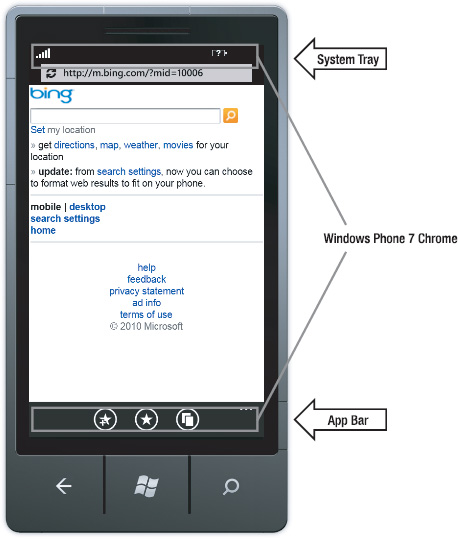
By default, only the system clock is visible at all times. To make other items visible, you need to double-tap (double-click in the emulator) in the System Tray area. These indicators slide into view for approximately eight seconds before sliding out of view. Note that although you can programmatically hide the System Tray, it is not a recommended practice under Metro guidelines.
In Chapter 7, you learned how to work with the Application Bar, the second part of Windows Phone 7 Chrome. To quickly recap, the Application Bar is limited to four icons; if there are more navigational items to display, they should be put inside the menu items. There is a set of default Application Bar icons included with each distribution of Windows Phone 7 tools, and it can be used to build basic Application Bars quickly.
Windows Phone 7 supports three screen orientations: portrait, landscape left, and landscape right. In portrait orientation, the page is vertically oriented with hardware buttons appearing at the bottom of the device. Portrait orientation is the default orientation of the device, and the Start screen is always shown in portrait orientation. In landscape left, the System Tray appears on the left of the device, and in landscape right, the System Tray appears on the right.
Your application can't switch the orientation of its screen by itself, since the Orientation property is read-only. You can, however, set a fixed orientation where you disallow application support for certain screen orientations. Some system components can adjust to changes in orientation. For example, application bar icons automatically rotate when the device changes from portrait to landscape mode. Other components with similar orientation-aware behaviors include the System Tray, Application Bar Menu, Volume/Ring/Vibrate Display, Push Notifications, and Dialogs.
Having discussed some of the principles and components of Metro UI, it's time to turn your attention to the support for themes on Windows Phone 7 devices. Themes make the phone more personal, which goes hand in hand with the Metro guideline that the experience of using the phone should be an engaging one.
A Windows Phone 7 theme is a combination of a background and an accent color. Users can select from themes that ship with the phone, developers can access them in their code, and companies can alter them to match their own branding colors. Themes are set in the Settings
Themes can also be applied dynamically during the runtime of an application by overwriting or injecting the custom themes into Resources.MergedDictionaries found in Application.Current, as shown in the following code snippet:
ResourceDictionary res = new ResourceDictionary();
res.Source =
   new Uri("/MyApplication;component/Assets/MyStyles.xaml", UriKind.RelativeOrAbsolute);
Application.Current.Resources.MergedDictionaries.Add(res);
Currently, there are two possible background settings—Dark (default) and Light. There are ten accent colors to choose from, starting with a Microsoft-ish blue (the default) and ranging all the way to a decidedly 70s lime green.
Note
Microsoft recommends you use as little white color as possible (especially in backgrounds), since excessive use of white color may have a negative impact on battery life.
The combination of two background colors and ten accent colors provides the user with a total of twenty possible themes, delivering on the engagement and personalization promise of Metro design principles. Applications automatically adjust to the selected theme and ensure that all UI elements appear consistently across the platform. A quick walk-through demonstrates theme-awareness of Windows Phone 7 controls and UI elements.
In this walk-through, you will add a set of Windows Phone 7 controls to an application, creating some of them with XAML and some through managed code. You will change the theme in the emulator and observe the effect this change has on the controls. Follow these steps to get a better understanding of theming support in Windows Phone 7.
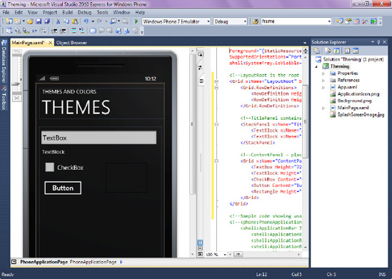
First, you will add a set of standard controls to a Windows Phone 7 application.
Launch Visual Studio 2010 Express and select the Windows Phone Application template. Change the Project Name to Theming, select OK, and Visual Studio will set up a new project.
Open
MainPage.xamlin Design mode and add a text box, textblock, check box, button, and a black rectangular shape to the page. Your end goal is a simple interface that resembles the one in Figure 9-2. Here's the XAML:<!--LayoutRoot is the root grid where all page content is placed--> <Grid x:Name="LayoutRoot" Background="Transparent"> <Grid.RowDefinitions> <RowDefinition Height="Auto"/> <RowDefinition Height="*"/> </Grid.RowDefinitions> <!--TitlePanel contains the name of the application and page title--> <StackPanel x:Name="TitlePanel" Grid.Row="0" Margin="12,17,0,28"> <TextBlock x:Name="ApplicationTitle" Text="THEMES AND COLORS" Style="{StaticResource PhoneTextNormalStyle}"/> <TextBlock x:Name="PageTitle" Text="THEMES" Margin="9,-7,0,0" Style="{StaticResource PhoneTextTitle1Style}"/> </StackPanel> <!--ContentPanel - place additional content here--> <Grid x:Name="ContentPanel" Grid.Row="1" Margin="12,0,12,0"> <TextBox Height="72" HorizontalAlignment="Left" Margin="-4,6,0,0" Name="textBox1" Text="TextBox" VerticalAlignment="Top" Width="454" /><TextBlock Height="30" HorizontalAlignment="Left" Margin="11,80,0,0" Name="textBlock1" Text="TextBlock" VerticalAlignment="Top" Width="329" /> <CheckBox Content="CheckBox" Height="72" HorizontalAlignment="Left" Margin="12,116,0,0" Name="checkBox1" VerticalAlignment="Top" /> <Button Content="Button" Height="72" HorizontalAlignment="Left" Margin="9,194,0,0" Name="button1" VerticalAlignment="Top" Width="160" /> <Rectangle Height="110" HorizontalAlignment="Left" Margin="249,137,0,0" Name="rectangle1" Stroke="Black" StrokeThickness="1" VerticalAlignment="Top" Width="156" /> </Grid> </Grid>
In addition to using the powerful Visual Designer to add controls to Windows Phone 7 pages, as you just did, you can add controls programmatically. The steps here show you how to do that.
Go to the Theming project in Solution Explorer and open
MainPage.xaml.cs(right-clickMainPage.xamland choose View Code).To add a white ellipse to the page, paste the following code inside the
MainPageconstructor:Ellipse e = new Ellipse(); e.Width = 100.0; e.Height = 120.0; e.StrokeThickness = 2.0; e.HorizontalAlignment = HorizontalAlignment.Left; e.VerticalAlignment = VerticalAlignment.Top; Color backgroundColor = Color.FromArgb(255, 255, 255, 255); e.Fill = new SolidColorBrush(backgroundColor); e.Margin = new Thickness(10, 300, 10, 10); ContentPanel.Children.Add(e);
Press F5 to run the application. The application screen should now display all of the controls you've added, including a white ellipse.
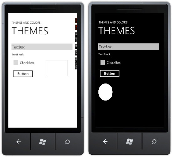
In this part of the walk-through, you will change the emulator's theme to observe the effect it has on the Theming application.
Press the Windows button on the emulator to bring up the Start screen. Then press the
Change the background to Light, and change the accent color to Red (note that you may have to scroll to locate the red accent color).
Press the Windows button again to go back to the Start screen. Note that your application is no longer running (it stopped when you pressed the Windows button), so go back to Visual Studio 2010 Express and press F5 to re-launch your application.
Note that you can see the same controls as before, except the ellipse that you drew from code is nowhere to be found. Figure 9-3 shows two versions of the same application side by side, each with a different theme.
By now, you have probably guessed that the reason the ellipse is not visible is that the application paints it white and then displays it on a white background. But how did the other controls manage to show up on the white background when they originally were white themselves? And how can you make the ellipse behave the same way?
The answers lie in a Windows Phone 7 concept known as theme awareness. By default, Windows Phone 7 controls are theme-aware and adjust their appearance based on the theme selected on the device. Problems arise when the color values are hardcoded in the control, as you have done for the ellipse and the rectangle border. In the next few steps, you'll correct the issue of hardcoded colors, first with a designer and the second in code.
If it's still running, stop the application. Open
MainPage.xamlin the Design view, and select the rectangular shape. Press F4 to bring up the Properties window, and then click the diamond symbol to the right of the Stroke property.From the pop-up dialog, click Apply Resource. From the next dialog, double-click the PhoneAccentBrush setting to use the currently selected accent color to draw a rectangle.
Now, adjust the color of the ellipse to the currently selected accent color. Since you drew the ellipse from code, open the
MainPage.xaml.csfile and change the following line of code fromColor backgroundColor = Color.FromArgb(255, 255, 255, 255);
to
Color backgroundColor =
(Color)Application.Current.Resources["PhoneAccentColor"];
Press F5 to run your application. You should see both the rectangle and ellipse appear in red (or the currently selected accent color).
Note
Avoid using hardcoded values for color if possible. It's hard to predict what combination of themes a user will choose, so your visual elements may not show up as desired. Instead, use one of the predefined theme resources (a full list of resources is available at http://msdn.microsoft.com/en-us/library/ff769552%28VS.92%29.aspx) to ensure that your application is fully theme-aware in accordance with Metro design principles.
Now that you know how to ensure your application is theme-aware, in the next section you will learn how to approach cases where you absolutely must customize your application based on the currently selected theme.
Sooner or later, you'll want to customize your application depending on whether a dark or a light theme is currently active. For example, you may have a beautiful custom graphic within your application that simply does not render well when the background theme colors are changed; instead, you would like to show a different graphic depending on the currently active theme. The following walk-through shows you how to accomplish just that: it detects the currently selected theme and adjusts the message based on whether the current theme has a light or dark background.
Launch Visual Studio 2010 Express and select the Windows Phone Application template. Change the Project Name to DetectTheme, select OK, and Visual Studio will set up a new project.
Open
MainPage.xamlin Design mode, and add a TextBlock to the page. For this walk-through, you will simply modify the message within this TextBlock; for real-world applications, you will probably choose to do something a bit more exotic than this, such as show a different image.Open
MainPage.xaml.cs(right-clickMainPage.xamlin Solution Explorer and choose View Code) and add the following code to theMainPageconstructor, right below theInitializeComponent()method:Visibility v = (Visibility)Resources["PhoneLightThemeVisibility"]; if (v == System.Windows.Visibility.Visible) { textBlock1.Text = "Let there be light!"; } else { textBlock1.Text = "It's dark!"; }
Note that you are using the Visibility property to determine whether the light theme is visible and to take action accordingly.
Press F5 to run the application. If you still have a light background selected from the previous walk-through, you will see a "Let there be light!" message. Otherwise, an "It's dark!" message will be displayed.
So far, you've touched on the basics of theming and looked at how to make your application theme-aware and how to customize its behavior based on the theme selected. Next, you'll look at the controls provided as part of Windows Phone 7 Developer tools, since it's these controls that really make the Metro experience complete.
In earlier chapters, you used of several base controls that ship with the Windows Phone 7 development tools, including text boxes, textblocks, and buttons—the kinds of controls you'd expect within any UI framework. But the Windows Phone developer tools include a number of unique controls as well, including a web browser and a Bing maps control, both of which will be covered in later chapters. Two others are the Panorama and Pivot controls, which are integral to Metro and the Windows Phone user experience.
The Panorama and Pivot controls offer two ways to develop an application that requires page navigation. With a Panorama control, you can present the UI of an application on one horizontal canvas that extends beyond the left and right boundaries of the device screen and can be flicked to the left and right with touch gestures. With a Pivot, you can present the UI of an application as a series of pages, much like tabbed pages, by touching its header or flicking through the pages. A Panorama is like a scroll; a Pivot is more like a series of cards laid down from left to right.
In the following section, you'll learn how to use a Panorama control to create some engaging UI for an airport application that displays arrivals and departures. You'll also take a brief look at the Pivot control, whose outfitting and use is nearly identical to the Panorama control, though its effects are quite different.
In every video ad for a Windows Phone 7 device, the scrollable UI of the Panorama control is usually the first thing that people notice. The People hub on the Start screen of Windows Phone 7 is implemented using this control. So is the Music + Videos hub. These interactions essentially involve the ability to keep scrolling horizontally far past the end of the screen. The Panorama control allows for a unique experience that is associated with the native Windows Phone 7 look and feel.
A Panorama control can be thought of as a long, horizontal canvas. A secondary control called a PanoramaItem serves as a container that hosts content and other controls such as text blocks, buttons, and links. There are three ways to incorporate Panorama behavior into your application:
Create a new Windows Phone project and choose Windows Phone Panorama Application as the template to use for the application. While this is an extremely powerful approach, this type of template creates a Model-View-ViewModel (MVVM)-based project, which has a significant learning curve and is quite different from the way you have developed Windows Phone 7 applications so far in this book (for an example of an MVVM application, see Chapter 3).
Add the Panorama control to the Visual Studio Toolbox (via right-clicking the Toolbox and navigating to the assembly containing this control) and then drag and drop it to your application.
Add a new page to your application that contains a Panorama control. This is perhaps the easiest way to quickly incorporate the Panorama control inside our application; this is the approach you will pursue in this section.
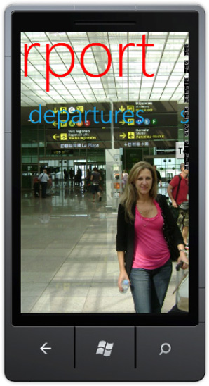
In the following walk-through, you will create an application to display the arrival and departures of flights at a fictional airport. In addition, you will add a search capability (or just the user interface elements of it) to this application. You will use the Panorama control to implement this functionality where the long background gives you the feeling that you are inside the airport as you navigate left or right to the pages.
Your application will not contain any code, since your primary goal in this chapter is to explore the controls available for Windows Phone 7, and in this section you are exploring the Panorama control. To create Panorama control, you will use Option 3 from the list in the previous section and use XAML to build a new page with a Panorama control.
Launch Visual Studio 2010 Express and select the Windows Phone Application template. Change the Project Name to Panorama, select OK, and Visual Studio will set up a new project.
Right-click the project name in Solution Explorer and select Add
You now have a page with the Panorama control in it within the application, but there is no way to get to it. You could either add navigation from
MainPage.xamlor simply makePanoramaPage1.xamlthe main page within the application. To implement the second choice, rename the currentMainPage.xamltoMainPage1.xamland then renamePanoramaPage1.xamltoMainPage.xaml. Now the Panorama page should be the default page that comes up when the application is launched.It is time to customize and add content to the Panorama control. Go ahead and change the
<controls:Panorama...element to the following:<controls:Panorama Title="airport" Foreground="Red">
To add new tabs or containers to the Panorama control, you would use the
<controls:PanoramaItem...XAML element. Go ahead and add a third PanoramaItem that will contain a text box and a button to search for departures to a specific city right above the closing tag for the Panorama control</controls:Panorama>. Notice that as you add PanoramaItem, your designed view reflects the changes.<!--Panorama item three--> <controls:PanoramaItem Header="search" Foreground="{StaticResource PhoneAccentBrush}"> <Grid> <TextBox Height="72" HorizontalAlignment="Left" Margin="-12,-2,0,0" Name="textBox1" Text="TextBox" VerticalAlignment="Top" Width="271" /> <Button Content="Search" Height="72" HorizontalAlignment="Left" Margin="242,-4,0,0" Name="button1" VerticalAlignment="Top" Width="160" /> </Grid> </controls:PanoramaItem>Note
The use of
Foreground="{StaticResource PhoneAccentBrush}"binding allows the foreground color of the text to be the current theme's accent color.Make some minor adjustments to the first two Panorama items to bring them in line with the rest of the UI layout. Replace the top two
<controls:PanoramaItem...elements with the following XAML:<!--Panorama item one--> <controls:PanoramaItem Header="arrivals" Foreground="{StaticResource PhoneAccentBrush}"> <Grid> </Grid> </controls:PanoramaItem> <!--Panorama item two--> <controls:PanoramaItem Header="departures" Foreground="{StaticResource PhoneAccentBrush}"> <Grid/> </controls:PanoramaItem>Finally, add a background image to the Panorama control. The recommended size for the background image is 800 pixels high (of course, that's the standard resolution of Windows Phone 7 devices) and 2,000 or fewer pixels wide. To specify the background image, add the following XAML tag right below the
<controls:Panorama ...tag:<controls:Panorama.Background> <ImageBrush ImageSource="PanoramaBackground.jpg"></ImageBrush> </controls:Panorama.Background>Press F5 to run the application. You should see a screen that looks very similar to Figure 9-4 (minus the background image, perhaps). Flicking the Panorama control from right to left should allow you to see Arrivals and Departures plus a separate tab designated for searching airport schedules.
As you can see, it is pretty easy to use a Panorama control, and you can place different contents within the PanoramaItem tag. Using the Panorama control, together with the Pivot control discussed next, provides a very easy way to impress your users with cool designs, layouts, and coding techniques. Considering that you didn't have to hire a graphics designer to get here, this is a very powerful weapon in the Windows Phone 7 developer arsenal.
Note
Microsoft recommends limiting the number of PanoramaItems to a maximum of four to ensure smooth application performance. In addition, it is considered best practice to hide PanoramaItem until it has content to display.
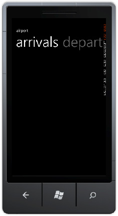
The Pivot control is a close cousin of the Panorama control. The basic premise of having multiple pages easily accessible is preserved; however, the ability to click the header to show the contents of a new page is not possible with a Panorama control. A screenshot of a simple Pivot control is shown in Figure 9-5. A user can tap (or click in the emulator) the word "departures" and be immediately presented with the portion of the application dealing with airport departures.
Creating a Pivot control is very much like creating a Panorama control; there are still three possible ways of adding it to your application (except you would add a Windows Phone Pivot Page, of course). Within the control itself, you would work with PivotItems, not PanoramaItems, but the rest of the design approaches are almost identical. If you feel uncertain about how to work with Pivot controls on Windows Phone 7, you can download a Pivot project available for this book. In addition, you can visit MSDN instructions on working with the Pivot control located at http://msdn.microsoft.com/en-us/library/ff941123(v=VS.92).aspx for a quick reference.
To navigate from screen to screen in a Windows Phone 7 application, an understanding of the PhoneApplicationFrame and PhoneApplicationPage controls is important. There is only one PhoneApplicationFrame available to a Windows Phone 7 application; this frame reserves space for the System Tray and the Application Bar, as well as the content area where PhoneApplicationPage controls live. You can create as many different pages as needed and then navigate to those pages from the frame. Refer to Figure 9-6 to see how the controls are placed in the phone.
To navigate from page to page within your application, use the NavigationService class. This class exposes methods to navigate to pages given a URI, as well as to go back to the previous page. The following walk-through illustrates the use of the NavigationService class.
The NavigationTest project will contain two XAML pages (MainPage.xaml and Page1.xaml) and will navigate between the two.
Launch Visual Studio 2010 Express and select the Windows Phone Application template. Change the Project Name to NavigationTest, select OK, and Visual Studio will set up a new project.
Right-click the project name in Solution Explorer and select Add
Open
MainPage.xamlin Design view. From the toolbox, drag and drop the HyperlinkButton control. With that control selected, press F4 to display its properties and change the contents say "Go to Page1."Open
Page1.xamlin the Design view, and add a button to that page from the toolbox. Edit the contents of the button to say "Go Back to Main Page."Add a TextBlock underneath the button on
Page1.xaml. This TextBlock will be used to show the parameters passed in to this page.
In the next section, you will use NavigationService to navigate between pages.
When the user clicks the "Go to Page 1" hyperlink, you will be using NavigationService to move to Page1.
Open
MainPage.xamland double-click the hyperlink on that page. Implement the hyperlinkButton1_Click event handler with the following code:private void hyperlinkButton1_Click(object sender, RoutedEventArgs e) { NavigationService.Navigate(new Uri("/Page1.xaml", UriKind.Relative)); }Open
Page1.xamland double-click the button on that page. Implement the button1_Click event handler with the following code:private void button1_Click(object sender, RoutedEventArgs e) { NavigationService.GoBack(); }Press F5 to run the application. Now when you click the hyperlink on
MainPage.xaml, you are taken toPage1.xaml. When you click the button onPage1.xaml, you are taken back toMainPage.xaml. In the next section, you will enhance this application slightly to pass parameters between the pages.
In the previous section, you learned how to successfully navigate from page to page. In this section, you will see how to pass parameters from one page to another.
Open
MainPage.xaml.csand change the hyperlinkButton1_Click event handler to the following:private void hyperlinkButton1_Click(object sender, RoutedEventArgs e) { NavigationService.Navigate(new Uri("/Page1.xaml?message=Hello,World", UriKind.Relative)); }Here, you are passing the hard-coded string "Hello, world" to
Page1.xamlfor processing.In
Page1.xaml, you will try to read the query string passed from the prior pages to see if there are non-empty values. OpenPage1.xaml.csand add the following code to that file:protected override void OnNavigatedTo(System.Windows.Navigation.NavigationEventArgs
e)
    {
        base.OnNavigatedTo(e);
        string msg = "";
        if (NavigationContext.QueryString.TryGetValue("message", out msg))
                textBlock1.Text = msg;
    }
Press F5 to run the application. Now, if you press the hyperlink from
MainPage.xaml, you should see the "Hello, world" message displayed on Page1.
Having talked about controls, let's close out this chapter with a neat effect you can add to your application to increase the buzz about it.
To spice up your application, you can add what is called a "tilt" effect to the visual elements. The tilt effect provides visual feedback to the user of the Windows Phone 7 application during manipulation of visual elements within the application. So, instead of just "pressed" and "unpressed" states, elements can also have "being pressed" and "being unpressed" states. The integration of tilt is pretty straightforward, and in the end it will certainly be completely up to you whether you would like to use it within your application. But if you do decide to give this effect a try, follow this walk-through.
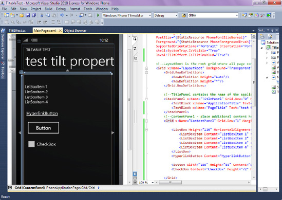
The user interface for the test application will be composed of four controls within the page: ListBox, Button, Hyperlink, and a Checkbox.
Launch Visual Studio 2010 Express and select the Windows Phone Application template. Change the Project Name to TiltableTest, select OK, and Visual Studio will set up a new project.
Open
MainPage.xamlin Design mode, and add a ListBox with four items, a Button, a Hyperlink, and a Checkbox to the page, with the end goal of creating a user interface like the one shown in Figure 9-7.You can also paste the following XAML code to get the same interface depicted in Figure 9-7:
<!--ContentPanel - place additional content here-->
     <Grid x:Name="ContentPanel" Grid.Row="1" Margin="12,0,12,0">

  <ListBox Height="110" HorizontalAlignment="Left" Margin="6,47,0,0"
  Name="listBox1"
          VerticalAlignment="Top" Width="460" ItemsSource="{Binding}" >
                  <ListBoxItem Content="ListBoxItem 1" ></ListBoxItem>
          <ListBoxItem Content="ListBoxItem 2" ></ListBoxItem>
                  <ListBoxItem Content="ListBoxItem 3" ></ListBoxItem>
                  <ListBoxItem Content="ListBoxItem 4" ></ListBoxItem>
          </ListBox>
          <HyperlinkButton Content="HyperlinkButton" Height="30"
HorizontalAlignment="Left"
              Margin="-109,185,0,0" Name="hyperlinkButton1" VerticalAlignment="Top"
              Width="409" />

       <Button Width="186" Height="85" Content="Button" HorizontalAlignment="Left"
        VerticalAlignment="Top" Margin="9,234,0,0" />
                <CheckBox Content="CheckBox" Height="72" HorizontalAlignment="Left"
Margin="12,325,0,0" Name="checkBox1" VerticalAlignment="Top" /> </Grid>
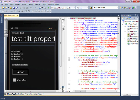
Now that you've added controls to the MainPage, you'll add Tilt effects to the controls.
To integrate the Tilt effect into your application, you will need to download TiltEffect.cs and properly integrate it into your project.
Download the Tilt Effect Control Sample from
http://go.microsoft.com/fwlink/?LinkId=200720, and extract the contents of the .zipfile to a known location.From within the TiltableTest project you created previously, right-click the Add
With
TitlEffect.csnow a part of your project, double-click that file to open it. Change the following statementnamespace Controltitleffect
to
namespace TiltableTest
Essentially, you just changed the namespace of this file so that it now belongs to your application.
Now you need to add the IsTiltEnabled dependency property to the
MainPage.xamlpage. OpenMainPage.xamlin a XAML view and, at the very top of the page, right below thexmlnss:mc=...add the following statement:xmlns:local="clr-namespace:TiltableTest"
You're almost done1 At the top of the page, beneath the statement
shell:System Tray.IsVisible="True"
add
local:TiltEffect.IsTiltEnabled="True">
Right-click the project and select Build. After the project builds, you are ready to run the application.
Press F5 to run the application. Now when you click the button or the items in the ListBox, you should see an animation in which these items first contract and then expand. This is another element of interactivity that you can use to further enhance user experience of your application and add to that Wow factor.
Note
You can suppress the Tilt effect on any control by adding the local:TiltEffect.SuppressTilt="True" attribute to that control.
In this chapter, you learned the basic concepts of the Metro design system and theme support on Windows Phone 7 devices. You learned how to detect which theme is being used, how to create theme-aware applications, and how to navigate between the pages within Windows Phone 7 application. You also learned how to work with Panorama, Pivot, PhoneApplicationFrame, and PhoneApplicationPage controls. Finally, you learned how to further enhance user interaction via the introduction of Tilt effects in your applications. The next chapter covers the integration options available on Windows Phone OS 7.0.