Chapter 1. Behaviors, Causality, and Prediction
We’ve seen in chapter 1 that the core question addressed by this book is “what drives behavior?” and that regression will be our workhorse. However, simply running a linear regression and looking at the coefficient for our variable of interest is not enough, because regression can be subject to biases.
In this chapter, I’ll walk you through a simple example of a linear regression gone awry because of a hidden joint cause. Such variables, which we’ll call “confounders” are the main obstacle to measuring what drives behavior. I’ll then introduce a new tool, causal diagrams, which allow us to identify and cancel confounders and that we’ll use again and again in the rest of the book.


Causal Diagrams to The Rescue
Causal diagrams (CDs) are visual representations of causal relationships. When used correctly, they can allow you to bypass the issues we ran into when pursuing a naive approach to regression when attempting to find the coefficient of causation. In this section I will explain how to read and draw causal diagrams and the different types of relationships that can be documented in CDs.
Causal diagrams have two fundamental building blocks:
-
Boxes, which represent variables
-
Arrows going from one box to another, which indicate causal relationships. An Arrow going from box A to box B indicates that A causes B.
Going back to our C-Mart ice-cream sales example, we recall that an increase (or decrease) in temperature causes an increase (or decrease) in iced coffee sales. This can be simplified to a statement that temperature causes iced coffee sales. Figure 1-28.5 shows the corresponding causal diagram.

Figure 1-5. 5 Our very first causal diagram, representing that temperature is a cause of iced coffee sales
Each rectangle represents a variable we can observe (a variable we have in our dataset), and the arrow between them represents the existence and direction of a causal relationship. Here, the arrow between Temperature and Iced coffee sales indicates that temperature is a causal factor of iced coffee sales.
Sometimes however, we won’t be able to observe a variable but we might still want to show it in a causal diagram. In that case, we’ll represent it with an oval.

Figure 1-6. 6 A causal diagram with an unobserved variable causing an observed variable
In figure 2.6, Customers’ sweet tooth is a cause of Iced coffee sales, meaning that customers with a stronger sweet tooth buy more iced coffee. However, we can’t observe how much of a sweet tooth a customer has. We’ll discuss later the importance of unobserved confounders and more generally unobserved variables in causal analysis. For the time being, we’ll treat unobserved variables in causal diagrams as if they were observable and simply represent their unobservability with an oval box.
Understanding Causal Diagrams
Depending on who you ask, CDs can mean a lot of things; they can be a purely qualitative tool for a discussion of causality, or they can be used as a modeling tool in its own right for statistics (in that case they’re called “probabilistic graphical models”). In this book, we’ll treat CDs as models that link data to the real world (figure 2.7).

Figure 1-7. 7 A causal diagram is linked both with data and causal relations as they are in reality.
There are two loops in this representation, one connecting reality to the causal diagram and one connecting the causal diagram to data. Switching from one perspective to another will require you to do some mental gymnastics at first, akin to that drawing that can be perceived either as a duck or as a rabbit5, but by the end of this book it should be pretty much effortless. And it will pay big dividends by giving you the ability to analyze complex situations effectively and confidently.
Causal Diagrams Represent Our View of Reality

Figure 1-8. 8 First perspective: causal diagrams represent our view of reality.
The first way of looking at causal diagrams is to treat them as representations of causal relationships in reality as we see them (Figure 1-28.8). From this perspective, the elements of CDs represent real “things” that exist and have effects on each other. An analogy from physical sciences would be a magnet, a bar of iron and the magnetic field around the magnet. You can’t see the magnetic field but it exists nonetheless and it affects the iron bar. You may not have any data on the magnetic field and you’ve maybe never seen the equations describing it, but you can sense it as you move the bar and you can develop intuitions as to what it does.
The same perspective applies when we want to understand what drives behaviors. We intuitively understand that human beings have habits, preferences and emotions, and we treat these as causes even though we often don’t have any numeric data about them. When we say “Joe bought peanuts because he was hungry”, we are relying on our knowledge, experience and beliefs about humans in general and Joe in particular.
Here, we’re making a causal statement about reality; we’re saying that had Joe not been hungry he would not have bought peanuts. Because we’re talking about one specific event, we can’t use data to understand it, and we can never be certain about what would have happened if Joe had not been hungry. Therefore, our statement is really just an intuition or an opinion. But that doesn’t mean that we can’t or shouldn’t draw the conclusion we did. Common sense and expertise are subject to a variety of cognitive biases, but more often than not they can still be useful, especially in complex situations where data are missing or it’s not clear which data would be relevant.
However, using CDs to represent intuitions and beliefs about the world introduces subjectivity and that’s okay. CDs are tools for thinking and analysis, they don’t have to be “true”. You and I might have different ideas as to why Joe bought peanuts, which means we would draw different CDs. Even if we fully agreed on what causes what, we couldn’t represent everything and their relationships in one diagram; there is judgment involved in determining what variables and relationships to include or exclude. In some cases, data will help: we’ll be able to reject a CD because the data at hand are incompatible with it. But in other cases, radically different CDs will be equally compatible with the data and we won’t be able to choose between them, especially if you don’t have experimental data.
This subjectivity might look like a (possibly fatal) flaw of CDs, but it’s actually a feature, not a bug. Our world is uncertain and CDs are just reflecting that uncertainty, not creating it. If there are several possible interpretations of the situation at hand that appear equally valid, you should make it explicit. The alternative would be to let people have different mental models in their head and each believe that they know the truth. At least, putting the uncertainty in the open will allow a principled discussion and guide your analysis.
Causal Diagrams Represent Data

Figure 1-9. 9 Second perspective: causal diagrams represent data
Now that you’ve seen the duck in the picture, let’s look at the rabbit. In this second perspective, we’ll assume that CDs represent data (Figure 1-28.9), and that arrows represent linear relationships between variables. This means we’ll be able to use our data to reject certain CDs, and conversely to use our CDs to guide our analysis of data.
From this perspective, the causal diagram from picture 2.6 connecting temperature to iced coffee sales would mean that
IcedCoffeeSales = β * Temperature + ϵ
This linear regression means that if temperature were to increase by one degree, “keeping everything else equal”, then sales of iced coffee would increase by β dollars. Each box in the causal diagram represents a column of data, as with the simulated data in table 2.1.
| Date | Temperature | Iced Coffee Sales | β * Temperature | ε = IcedCoffeeSales – β * Temperature |
|---|---|---|---|---|
| 6/1/2019 | 71 | $70,945 | $71,000 | $55 |
| 6/2/2019 | 57 | $56,969 | $57,000 | $31 |
| 6/3/2019 | 79 | $78,651 | $79,000 | -$349 |
For people who are familiar with linear algebra notation, we can rewrite the previous equation as
As you can see, here it’s all about data—variables and relationships between them. This generalizes immediately to multiple causes. Let’s draw a causal diagram showing that temperature and summer month both cause sales of ice-cream (figure 2.10).

Figure 1-10. 10 A causal diagram with more than one cause.
Translating this causal diagram in mathematical terms would yield the following equation:
IceCreamSales=βT.Temperature + βS.SummerMonth+ϵ
Obviously, this equation is a standard multiple linear regression, but the fact that it is based on a CD changes its interpretation. Outside of a causal framework, the only conclusion we would be able to draw from it is “an increase of one degree of temperature is associated with an increase of βT dollars in ice-cream sales”. Because correlation is not causation, it would be illegitimate to infer anything further. On the other hand, based on our CD, we can now say “assuming that the causal relationships represented in our CD are correct, then an increase of one degree of temperature will cause an increase of βT dollars in ice-cream sales”, which is what the business cares about.
Because data analysts tend to be more comfortable with quantitative approaches, I wouldn’t be surprised if this approach makes more sense to you and you’re tempted to try to avoid the qualitative side entirely. Couldn’t you build CDs based only on observed correlations in data without making any judgment call? Unfortunately, no. As in the optical illusion, neither of these two perspectives is “right” or “wrong”—CDs can be thought of as qualitative representations of the causal relationships we believe to exist in the world and they can be treated as an organizing tool for your data. The key to reaping the most benefits from your CDs is to go back and forth between the two perspectives and not stick only with one. This will allow you to check your intuitions against the data, while also ensuring that you’re interpreting the data correctly.
Fundamental Structures of Causal Diagrams
Causal diagrams can take a bewildering variety of shapes. Fortunately, researchers have been working on causality for a while now, and they have brought some order to it:
-
There exists only three fundamental structures and all causal diagrams can be represented as combinations of them: chains, forks and colliders.
-
By looking at CDs as if they were family trees, we can easily describe relationships between variables that are far away from each other in the diagram, for example by saying that one is the “descendant” or the “child” of another.
And really, that’s all there is to it! Once you have familiarized yourself with these fundamental structures and how to name relationships between variables, you’ll be able to fully describe any CD you work with.
Chains
A chain is a causal diagram with 3 boxes, representing 3 variables, and 2 arrows connecting these boxes, as in Figure 1-28.11.

Figure 1-11. 11. Causal diagram for a chain
What makes this CD a chain is that the two arrows are going “in the same direction”, i.e. the first arrow goes from one box to another, and the second arrow goes from that second box to the last one. This CD is an expansion of the one in figure 2.1. It represents the fact that temperature causes sales of iced coffee, which in turn cause sales of donuts.
Let’s define a few terms that will allow us to characterize the relationships between variables. In this diagram, Temperature is called the parent of Iced coffee sales, and Iced coffee sales is a child of Temperature. But Iced coffee sales is also a parent of Donuts sales, which is its child. When a variable has a parent/child relationship with another variable we call that a direct relationship. When there are intermediary variables between them, we call that an indirect relationship. The actual count of variables that makes a relationship indirect is not generally important, so you don’t have to count the number of boxes to describe the fundamental structure of the relationship between them.
In family terms, we say that a variable is the ancestor of another variable if the first variable is the parent of another, which may be the parent of another, and so on, ending up with our second variable as a child. In our example, Temperature is an ancestor of Donuts sales because it’s a parent of Iced coffee sales, which is itself a parent of Donuts sales. Very logically, this makes Donuts sales a descendant of Temperature.
If this were a complete diagram, another way of looking at it would be that Temperature influences Donuts sales only through its influence on Iced coffee sales. This makes Iced coffee sales the mediator of the influence of Temperature on Donuts sales.
If a mediator value does not change then the variables earlier in a chain won’t influence the variables further along the chain. For example, if C-Mart experiences a shortage of iced coffee, then we can expect that for the duration of that shortage, changes in temperature will not have an effect on the sales of donuts.
Taking it one step further, the influence that Temperature has on Donuts sales is already completely taken into account when we examine the relationship between Iced coffee sales and Donuts sales. If we were to run a regression of IcedCoffeeSales on DonutsSales without adding Temperature as a variable, it would not matter because the role of Temperature in DonutsSales would already be in the model.
Collapsing Chains
The causal diagram above translates into the following regression equations:
DonutsSales=βI.IcedCoffeeSales
IcedCoffeeSales=βT.Temperature
We can replace IcedCoffeeSales by its expression in the second equation:
DonutsSales=βI.(βT Temperature)= (βIβT)Temperature
But βIβT is just the product of two constant coefficients, so we can treat it as a new coefficient in itself: DonutsSales=βT.Temperature.6. We have managed to express DonutsSales as a linear function of temperature, which can in turn be translated into a causal diagram (figure 2.12).

Figure 1-12. 12. Collapsing a CD into another CD.
Here, we have collapsed a chain, that is, we have removed the variable in the middle and replaced it with an arrow going from the first variable to the last. By doing so, we have effectively simplified our original causal diagram to focus on the relationship that we’re interested in. This can be useful when the last variable in a chain is a business metric we’re interested in and the first one is actionable. In some circumstances we might be interested in the intermediary relations between temperature and iced coffee sales, and between iced coffee sales and donuts sales, for example to manage pricing or promotions In other circumstances, we might be interested only in the relation between temperature and donuts sales, for example, to plan for inventory.
Expanding Chains
The collapsing operation can obviously be reversed: we can go from our last CD to the previous one by adding the Iced coffee sales variable in the middle. More generally, we say that we are expanding a chain whenever we inject an intermediary variable between two variables currently connected by an arrow. For example, let’s say that we start with the relationship between temperature and donuts sales (figure 2.8 above). This causal relationship translates into the equation DonutsSales=βT.Temperature. Let’s assume that Temperature affects DonutsSales only through Iced Coffee Sales. We can add this variable in our CD (figure 2.13).

Figure 1-13. 13 Expanding a CD into another CD.
Expanding chains can be useful to better understand what’s happening in a given situation. For example, let’s say that temperature increased but sales of donuts did not. There could be two potential reasons for that:
-
First, the increase in temperature did not increase the sales of iced coffee, e.g. because the store manager has been more aggressive with the AC. In other words, the first arrow in figure 2.9 disappeared or weakened.
-
Alternatively, the increase in temperature did increase the sales of iced coffee, but the increase in the sales of iced coffee did not increase the sales of donuts, e.g. because people are buying the newly offered biscuits instead. In other words, in figure 2.9, the first arrow is unchanged but the second one disappeared or weakened.
Depending on which one is true, you might take very different corrective actions--either turning off the AC or changing the price of biscuits. In many cases, looking at the variable in the middle of a chain, aka the mediator, will allow you to make better decisions.
Forks
When a variable causes two or more effects, the relationship creates a fork. We have seen that temperature causes both iced coffee sales and ice-cream sales, so a representation of this fork would be as in figure 2.14.

Figure 1-14. 14 A fork between 3 variables.
This CD shows that temperature influences both iced coffee and ice-cream sales, but that they do not have a causal relationship with each other. If it is hot out, demand for both iced coffee and ice-cream increase, but buying one does not make you want to buy the other, nor does it make you less likely to buy the other.
This situation where two variables have a common cause is very frequent but also potentially problematic, because it creates a correlation among these two variables. It makes sense that when it is hot out, we will see an increase in sales of both, and when it is cold fewer people will want both. A linear regression predicting the sale of ice-cream from iced coffee sales would be fairly predictive, but here correlation does not equal causation and the coefficient provided by the model would not be accurate, since we know that the causal impact is 0.
Another way to look at this relationship is that if C-Mart experienced a shortage of iced coffee, we would not expect to see a change in the sale of ice-cream. More generally, it would only be a slight exaggeration to say that forks are one of the main roots of evil in the world of data analysis. Whenever we observe a correlation between two variables that doesn’t reflect direct causality between them (i.e. neither is the cause of the other), more often than not it will be because they share a common cause. From that perspective, one of the main benefits of using CDs is that they can show very clearly and intuitively what’s going on in those cases and how to correct for it.
Forks are also typical of situations where we look at demographic variables: age, gender and place of residence all influence a variety of other variables without necessarily any causal relationship between these other variables.
A question that sometimes comes up when you have a fork in the middle of a CD is whether you can still collapse the chain around it? For example, let’s say that we’re interested in analyzing the relationship between Summer Month and Iced Coffee sales and we have the CD in figure 2.15.

Figure 1-15. 15. A CD with a fork and a chain.
In this CD, there’s a fork between Summer Month on one side and Ice-cream sales and Temperature on the other, but there’s also a chain Summer Month → Temperature → Iced coffee sales. Can we collapse the chain?
In this case yes, because Ice-cream sales is not a confounder of the relationship between Summer Month and Iced coffee sales, which is the one we’re interested in. We can simplify our CD as in figure 2.16.

Figure 1-16. 16 A collapsed version of the previous CD.
We’ll see in chapter 5 criteria to determine when our relationship of interest is confounded; when variables are not involved in any confounding, as in the CD above, they can safely be ignored and the CD simplified. However, we can do that only because neither sales of ice-cream nor temperature are confounders of the relationship between summer month and sales of iced coffee. If we were interested in the relationship between summer month and sales of ice-cream in figure 2.11, we could neglect sales of iced coffee but not temperature.
Colliders
Very few things in the world have only one cause. When two or more variables cause the same outcome, the relationship creates a collider. Since C-Mart’s concession stand sells only two flavors of ice-cream, chocolate and vanilla, a causal diagram representing taste and ice-cream purchasing behavior would show that appetite for either flavor would cause past purchases of ice-cream at the stand. This would be displayed as in figure 2.17.

Figure 1-17. 17 CD of a collider.
Colliders are often created when you slice or disaggregate a variable to reveal its components, as we’ll now see.
Slicing/Disaggregating Variables
Forks and colliders are often created when you slice or disaggregate a variable to reveal its components. In a previous example, we looked at the relationship between Temperature and Donuts sales, where Iced coffee sales was the mediator (Figure 1-28.18).

Figure 1-18. 18 The chain that we will slice.
But maybe we want to split iced coffee sales by type to better understand demand dynamics. This is what I mean by “slicing” a variable. This is allowed, because we can express the total iced coffee sales as the sum of sales by type, say Americano and Latte:
IcedCoffeeSales = IcedAmericanoSales + IcedLatteSales
Our CD would now become figure 2.19, with a fork on the left and a collider on the right.

Figure 1-19. 19 A chain where the mediator has been sliced.
Each slice of the variable would have its own equation:
IcedAmericanoSales = βT,A.Temperature
IcedLatteSales = βT,L.Temperature
Since Temperature is mediated by our Iced Coffee sales slices, we can create a unified multiple regression for Donuts sales as follows:
DonutSales = βIA.IcedAmericanoSales + βIL.IcedLatteSales
This would allow you to understand more finely what’s happening—should you plan for the same increase in sales in both types when temperature increases? Do they both have the same effect on Donuts sales or should you try to favor one of them?
Aggregating Variables
As you may have guessed, slicing variables can be reversed, and more generally we can aggregate variables that have the same causes and effects. This can be used to aggregate and disaggregate data analysis by product, region, line of business, etc. But it can also be used more loosely, to represent important causal factors that are not precisely defined. For example, let’s say that age and gender both impact taste for vanilla ice-cream as well as the propensity to buy ice-cream at C-Mart concession stand (Figure 1-28.20).

Figure 1-20. 20. CD where age and gender are shown separately.
Because Age and gender have the same causal relationships, they can be aggregated into a Demographics variable (figure 2.21).

Figure 1-21. 21 CD where age and gender are aggregated into a single demographics variable.
In this case, we obviously don’t have a single column in our data called “Demographics”; we’re simply using that variable in our CD as a shortcut for a variety of variables that we may or may not want to explore in further detail later on. Let’s say that we want to run an A/B test and we want to understand the causal relationships at hand. As we’ll see later, randomization can allow us to control for demographic factors so that we won’t have to include them in our analysis, but we might want to include them in our CD of the situation without randomization. If need be, we can always expand our diagram to accurately represent the demographic variables involved. Remember however that any variable can be split, but only variables that have the same direct and indirect relationships can be aggregated.
What About Cycles?
In the three fundamental structures that we’ve seen, there has been only one arrow between two given boxes. More generally, it was not possible to reach the same variable twice by following the direction of arrows (e.g. A → B → C → A). A variable could be the effect of one variable and the cause of another, but it could not be at the same time the cause and the effect of one variable.
In real life however, we often see variables that influence each other causally. This type of CD is called a cycle. Cycles can arise for a variety of reasons; two of the most common in behavioral data analysis are substitution effects and feedback loops. Fortunately, there are some workarounds that will allow you to deal with cycles when you encounter them.
Understanding Cycles: Substitution Effects and Feedback Loops
Substitution effects are a cornerstone of economics theory: customers might substitute a product for another, depending on the products’ availability, price, and the customers’ desire for variety. For example, customers coming to the C-Mart concession store might choose between iced coffee and hot coffee based on temperature, but also special promotions and how often they had coffee this week. Therefore, there is a causal relationship from purchases of iced coffee to purchases of hot coffee, and another causal relationship in the opposite direction (figure 2.22).

Figure 1-22. 22. A CD with a substitution effect generating a cycle.
One thing to note is that the direction of the arrows shows the direction of causality (what is the cause and what is the effect), not the sign of the effect. In all of the CDs we looked at before the variables had a positive relationship where an increase in one caused an increase in the other. In this case, the relationships are negative, where an increase in one variable will cause a decrease in the other. The sign of the effect does not matter for causal diagrams, and a regression will be able to sort out the sign for the coefficient correctly as long as you correctly identify the relevant causal relationships.
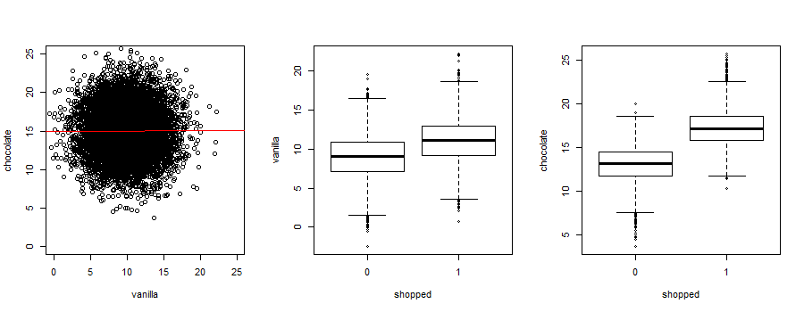
Another common cycle is a feedback loop, where an actor modifies their behavior in reaction to changes in the environment. For example, a store manager at C-Mart might keep an eye on the length of waiting lines and open new lines if the existing ones get too long, so that customers don’t give up and just leave (figure 2.23).

Figure 1-23. 23 Example of a feedback loop generating a cycle.
Managing Cycles
Cycles reflect situations that are often complex to study and manage, which is why a whole field of research, called systems thinking, has sprouted for that purpose7. Complex mathematical methods, such as Structural Equation Modeling, have been developed to deal accurately with cycles, but their analysis would take us beyond the scope of this book. I would be remiss however if I didn’t give you any solution, so I’ll mention two rules of thumb that should allow you to not get stuck with cycles.
The first one is to pay close attention to timing. In almost all cases, it takes some time for one variable to influence another, which means you can “break the cycle” and turn it into a noncyclical CD by looking at your data at a more granular level of time. For example, let’s say that it takes 15mn for a store manager to react to an increasing waiting time by getting new lines open, and it similarly takes 15mn for customers to adjust their perception of waiting time. In that case, we can rewrite the CD above as in figure 2.24.
Figure 1-24. 24 Breaking a feedback loop into time increments.
Let’s break this CD down into pieces. On the left, we have an arrow from average waiting time to number of customers waiting:
NbCustomersWaiting(t+15mn) = β1.AvgWaitingTime(t)
This means that the number of customers waiting at say 9:15am would be expressed as a function of the average waiting time at 9:00am. Then the number of customers waiting at 9:30am would have the same relation to the average waiting time at 9:15am and so on.
Similarly, on the right, we have arrow from average waiting time to number of lines open:
NbLinesOpen(t+15mn) = β2.AvgWaitingTime(t)
This means that the number of lines open at 9:15am would be expressed as a function of the average waiting time at 9:00am. Then the number of lines open at 9:30am would have the same relation to the average waiting time at 9:15am and so on.
Then in the middle, we have causal arrows from the number of customers waiting and from the number of lines open to the average waiting time. This would translate into the equation
AvgWaitingTime(t) = β3.NbCustomersWaiting(t)+β4.NbLinesOpen(t)
This means that the average waiting time for customers reaching the checkout lines at 9:15am depends on the number of customers already present and the number of checkout lines open at 9:30am. Then the average waiting time for customers reaching the checkout lines at 9:30am depends on the number of customers already present and the number of checkout lines open at 9:30am and so on.
By breaking down variables into time increments, we have been able to create a CD where there is no cycle in the strict sense. We can estimate the three linear regression equations above without introducing any circular logic.
The second rule of thumb to deal with cycles is to simplify your CD and keep only the arrows along the causal path you’re most interested in. Feedback effects (where a variable influences the variable that just influenced it) are generally smaller, and often much smaller, than the first effect and can be ignored as a first approximation.
In our example of iced and hot coffee, you might be worried that the increase in sale of iced coffee when it is hot will decrease the sale of hot coffee; this is a reasonable concern that you should investigate. However, it’s unlikely that the decrease in sales of hot coffee would in turn trigger a further increase in sales of iced coffee and you can ignore that feedback effect in your CD (figure 2.25).

Figure 1-25. 25 Simplifying a CD by neglecting certain relationships.
In figure 2.21, we delete the arrow from Purchases of hot coffee to Purchases of Iced coffee and ignore that relationship, as a reasonable approximation.
Once again, this is just a rule of thumb, and certainly not a blanket invitation to disregard cycles and feedback effects. These should be represented fully in your complete CD, to guide future analyses.
Review of Elements in Causal Diagrams
Chains, forks and colliders represent the only possible 3 ways for 3 variables to be related to each other in a CD. They are not exclusive of each other, however, and it’s actually reasonably common to have 3 variables that exhibit all 3 structures at the same time, as was the case in our very first example (figure 2.26).

Figure 1-26. 26 a 3-variable CD containing a chain, a fork and a collider at the same time.
Here, Summer month influences Ice-cream sales as well as temperature, which itself influences Ice-cream sales. The causal relationships at play are reasonably simple and easy to grasp, but this graph also contains all three types of basic relationships:
-
A chain: Summer month → Temperature → Ice-cream sales
-
A fork, with Summer month causing both Temperature and Ice-cream sales
-
A collider, with Ice-cream sales being caused both by Temperature and Summer month
Another thing to note in a situation like this one is that variables have more than one relationship with each other. For example, Summer month is the parent of Ice-cream sales because there is an arrow going directly from the former to the latter (a direct relationship); but at the same time, Summer month is also an ancestor of Ice-cream sales because of the chain Summer month → Temperature → Ice-cream sales (an indirect relationship). So you can see these are not exclusive!
Paths
Having seen the various ways variables can interact, we can now introduce one last concept that encompasses all of them: paths. We say that there is a path between two variables if there are arrows between them, regardless of the direction of the arrows and no variable appears twice along the way. Let’s see what that looks like in a CD we have seen before (figure 2.28).

Figure 1-27. 28 Paths in a causal diagram
In the previous CD, there are two paths from Summer month to Iced coffee sales:
-
One path along the chain Summer month → Temperature → Iced coffee sales,
-
A second path through Ice-cream sales, Summer month → Ice-cream sales ← Temperature → Iced coffee sales
This means that a chain is a path, but so are a fork or a collider! Also note that two different paths between two variables can also share some arrows, as long as there is at least one difference between them, as is the case here: the arrow from temperature to iced coffee sales appears in both paths.
However, the following is not a valid path between Temperature and Iced Coffee sales because Temperature appears twice:
-
Temperature ← Summer Month → Ice-cream sales ← Temperature → Iced Coffee sales
One consequence of these definitions is that if you pick two different variables in a CD, there is always at least one path between them. The definition of paths may seem so broad that it is useless, but as we’ll see in chapter 5, paths will actually play a crucial role in identifying confounders in a CD.
Chapter Conclusion
Linear and logistic regressions are the workhorses of data analysis, but their results can be biased by the presence of confounders. Unfortunately, as we’ve seen through examples, simply throwing all available variables and the kitchen sink in a regression is not sufficient to resolve confounding. Worse, controlling on the wrong variables can introduce spurious correlations and create new biases.
As a first step toward unbiased regression, I introduced a tool, causal diagrams. CDs may be the best analytical tool you’ve never heard of. They can be used to represent abstract causal relationships in the real world, as well as causal correlations in our data; but they are most powerful as a bridge between the two, allowing us to connect our intuition and expert knowledge to observed correlations in data, and vice versa.
CDs can get convoluted and complex, but they are based on three simple building blocks: chains, forks and colliders. They can also be collapsed or expanded, sliced or aggregated, according to simple rules that are consistent with linear algebra.
The full power of CDs will become apparent in chapter 5, where we’ll see that they allow us to optimally handle confounders in regression, even with non-experimental data. But CDs are also helpful more broadly, to help us think better about data. In the next chapter, as we get into cleaning and prepping data for analysis, they will allow us to remove biases in our data prior to any analysis. This will give you the opportunity to get more familiar with CDs in a simple setting.
References
-
Pearl, Causality, Cambridge University Press, 2009. Pearl’s earlier book on causality, with detailed graduate-level math.
-
Pearl & Mackenzie, The Book of Why: The New Science of Cause and Effect, Basic Books, 2018. The most approachable introduction to causal analysis and causal diagrams I have encountered so far, by one of the prominent researchers in the field.
-
Shipley, Cause and Correlation in Biology: A User’s Guide to Path Analysis, Structural Equations and Causal Inference with R, Cambridge University Press, 2016. You’re not a biologist? Neither am I. That book has still helped me deepen my understanding of causal diagrams, and with the limited number of books on the topic, beggars can’t be choosers.
Exercises
Building causal diagrams is like swimming or riding a bike: no amount of theoretical preparation can replace trying to do it again and again until it works. However, as you get the hang of it, it gets more and more enjoyable and you’ll find yourself quickly drawing a CD to analyze or explain a situation.
My hope is that these exercises will offer you a gentle learning curve that will minimize the pain along the way.
Exercise 1. The following descriptions relate to a C-Mart located across the street from a university campus. In each case, draw the corresponding causal diagram and give the name of the fundamental structure it represents.
-
Sales of alcohol are higher on certain days of the week, namely Friday and Saturday; whenever sales of alcohol are high on a given day, sales of aspirin are higher the next day.
-
Sales of ramen “120 for the price of 100!” maxi-packs are higher in September; sales of pens and paper are higher in September.
-
Sales of alcohol are higher on certain days of the week, namely Friday and Saturday; Sales of alcohol are higher during Spring Break, regardless of the day of the week.
Exercise 2. Complete the sentences for the CD in figure 2.29.
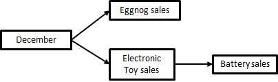
Figure 1-28. 29 A Christmas CD.
-
Electronic Toy sales is the parent of ___
-
Eggnog sales is the child of ___
-
Battery sales is the descendant of ___
-
December has ___ (a direct/an indirect) relationship with Electronic Toy sales
-
December has ___ (a direct/an indirect) relationship with Battery sales
1 The book of Why, p160. In case you’re wondering, the aforementioned statistician is Donald Rubin.
2 https://en.wikipedia.org/wiki/Berkson’s_paradox
3 Technically speaking, this is a slightly different situation, because there is a threshold effect instead of two linear (or logistic) relationships, but the underlying principle that including the wrong variable can create artificial correlations remains.
4 Xiaolin Wu & Xi Zhang, “Automated Inference on Criminality Using Face Images”, https://arxiv.org/pdf/1611.04135.pdf.
5 You’ve probably seen that picture already, but just in case: https://www.illusionsindex.org/i/duck-rabbit.
6 In the Early Release, this is incorrectly rendered. There should be a tilde spanning the top of βT.
7 Interested readers are referred to Thinking in Systems: A Primer by Donella Meadows and Diana Wright, as well as The Fifth Discipline: The Art & Practice of The Learning Organization by Peter Senge.