3 Trendsetting with some Simple Moving Measures
Whenever we are faced with data that changes over time or over some other ordered sequence such as a build number, we usually want to know whether there is any underlying trend: going up, coming down or staying put. There’s a variety of Moving Measures that can help us.
3.1 Going all trendy: The could and the should
Very rarely are we provided with the luxury of data with a totally smooth trend. It is more usual for us to be presented with data that is generally smooth but which is also characterised by what appears to be a degree of random behaviour. Failing that, the data might even resemble a random scatter similar to a discharge from a shotgun.
Faced with one of three scenarios, we might respond in different ways (Table 3.1). We might want to consider ‘removing’ some of the random variations in order to see the underlying pattern or trend in the data using one or more of the basic trend smoothing techniques of Moving Averages, Moving Medians, Exponential Smoothing, Cumulative Averages or Cumulative Smoothing. This chapter will discuss some of the options available.
3.1.1 When should we consider trend smoothing?
If the data can be classified as falling into a natural sequence but the data is characterised by variations, some of which are a consequence of its position in the sequence, but others are due to factors of a more random nature, e.g. where there is a genuine difference in performance between a number of activities, or where the integrity of the booking discipline or data capture is in question.
If the natural data sequence is date based, then it is often referred to as a Time Series, examples of which include escalation indices, exchange rates, delivery rates, arising rates or failure rates, sales, etc., all of which are recorded as values at a regular point in time. (Note: Here time is defined in relation to a calendar date to differentiate it from time as a measure of resource effort expended, e.g. hours of working.)
Table 3.1 Going all Trendy — The Could and the Should
Other natural sequences might be based on the cumulative physical achievement, examples of which include Learning Curves, Number of Design Queries Raised per Production Build Number, etc.
Both of these are discrete sequences where the interval between successive units in the sequence is fixed or constant, and the sequence position might be considered to be an indicator or driver of the value we are trying to predict or understand. There is, of course, another category in which data occurs in a natural sequence but the gap between values is irregular, such as batch costs where the batch size is variable. In such cases an output based Cumulative Average might remain a valid smoothing option, but Moving Average and Moving Median Smoothing would not be appropriate.
Whilst it is recognised that months have different numbers of days, for the purposes of defining a natural date-based sequence, months are usually considered to be of equal duration i.e. constant; the same applies to quarters and years.
For data which occur in a natural sequence, trend smoothing should always be considered when we want to extrapolate to a later (or earlier) value in the sequence, i.e. outside of the range for which data is available. If we want to interpolate a typical value within the range then trend smoothing remains a ‘good practice’ option but other techniques might also be considered, for example a simple or a weighted average of adjacent points (see Volume II Chapter 2 on Measures of Central Tendency).
3.1.2 When is trend smoothing not appropriate?
It is not appropriate to smooth data which does not fall into a natural sequence or cannot be ordered logically. Nor is it appropriate to smooth sequential data drawn from different populations, e.g. failure rates for a number of different products with no common characteristics. (In other words, trying to compare ‘apples with oranges’ or, worse still the complete basket of fruit!).
If there is data missing in the natural sequence (either time or achievement based) then whilst some sequential data smoothing techniques may still present a viable option, we may have to resort to more sophisticated methods for smoothing data such as Curve Fitting. If we were simply to regard it as ‘missing data’ and assume that it ‘would have probably fitted the pattern of the rest of the data anyway’, then we are making a potentially dangerous assumption. By ignoring its existence, or rather its absence, we risk introducing statistical bias into the analysis with a potentially flawed conclusion. What if the missing data were extreme, but not to the extent that we might classify it as an ‘outlier’ (Volume II Chapter 7) if it were known? Where do we draw the line between ‘plausible deniability’ and ‘unmitigated optimism’?
Where there is no natural sequence in which the data occurs, but the data can be ordered and plotted in relation to some scale factor which discriminates the data values, e.g. some form of size or complexity measure, then we might still want to consider trend smoothing. Typically the scale factor might represent cost driver values, examples of which might include: number of tests performed, component weight, software lines of code (SLOC), batch size, etc. In this case the scale factor can be a continuous function just as much as a discrete one. However, in this case the trend analysis is more appropriately dealt with through a Curve Fitting technique as opposed to trend smoothing by Moving Averages, Moving Medians, Exponential Smoothing, Cumulative Averages or Cumulative Smoothing. We will consider Curve Fitting in Chapters 5 to 7.
While we are on the subject of batch sizes . . .
You may have spotted that we have cited examples where it is both ‘appropriate’ and ‘not appropriate’ to smooth data where the batch size is an indicator of cost. It is appropriate to use Cumulative Averages or Cumulative Smoothing when the batch size is merely a multiplier of the unit cost which is itself subject to some underlying trend, e.g. a learning curve. In this case the inference is that there are no batch set-up costs.
However, it is not appropriate to use any of the basic sequential smoothing techniques in this chapter where there is a distinct difference in the level of unit costs within any batch that may be attributable to the batch size being produced. In other words, where there are batch set-up costs to consider.
Clearly, we can use our judgement here as the estimator’s world is rarely so black and white. We need to consider the relative size of the variation in unit cost without set-up with the value of the set-up costs divided by the likely minimum batch size to be produced. If the former is of a similar magnitude to the latter then the batch size influence on the level or driver of unit costs can probably be ignored and a Cumulative Average or Cumulative Smoothing technique used.
Enough chatter, let us look at the basic smoothing techniques for sequential data available to us.
3.2 Moving Averages
Definition 3.1 Moving Average
A Moving Average is a series or sequence of successive averages calculated from a fixed number of consecutive input values that have occurred in a natural sequence. The fixed number of consecutive input terms used to calculate each average term is referred to as the Moving Average Interval or Base.
The Moving Average, sometimes known as Rolling Average or Rolling Mean, is a dynamic sequence in the sense that every time an additional input value in the sequence becomes available (typically the latest actual), a corresponding new Moving Average term can be calculated and added to the end of the Moving Average sequence. The new term is calculated by replacing the earliest value used in the last average term with the latest input value in the natural sequence. Most definitions of Moving Average in the public domain do not include the need for multiple successive average terms from a sequence of values. Without this distinction, a single term from a Moving Average array is nothing more than a simple Average.
3.2.1 Use of Moving Averages
The primary use of Moving Averages is in identifying and calculating an underlying steady ‘state value’ in a natural sequence. A secondary use is in identifying a change in that steady ‘state value’ or a change in the underlying trend, or ‘momentum’ in the case of the stock market. In both cases, if we choose the Moving Average Interval appropriately, the technique can act as a means of normalising data for differences that occur in a repeating cycle, or a seasonal pattern, such as our quarterly gas or electricity bills; we will return to this in Chapter 8.
Moving Averages are widely used in the generation of governmental produced economic indices published for use by businesses and government agencies, typically those that reflect monthly, quarterly or annual economic trends, for example:
- Retail price index
- Producer price indices
- Public service output, inputs and productivity
There are two basic types of Moving Average:
- Simple Moving Average – a sequence of simple averages or Arithmetic Means
- Weighted Moving Average – a sequence of simple weighted averages
Note: There are corresponding averages based on the entire range of values in this natural sequence which we will consider in Sections 3.5 and 3.6 on Exponential Smoothing and Cumulative Averages.
3.2.2 When not to use Moving Averages
We should not contemplate applying a Moving Average to data that does not fall into a natural sequence, or to data that is at irregular intervals even though it may fall in a natural sequence. This includes instances where there are multiple missing values scattered at random through a sequence. We can accommodate the occasional missing value in a sequence; this is discussed and demonstrated in Section 3.2.8.
As previously noted, although calendar months are not of equal length, and accounting periods may be configured in a pattern of 4 weeks, 4 weeks and 5 weeks, both can be considered to be ‘regular’ on the pretext of being a month or an accounting period.
Even though cumulative data occurs by default in a natural sequence, and may well have regular incremental steps such as time periods or units of build, we should resist the temptation to apply moving averages to such data. Whilst we can go through the mechanics of the calculations, it is probably questionable from a ‘does it make sense’ perspective. We would, in essence, be double counting. Taking the Cumulative Value of a sequence of data points is in itself a trend smoothing technique that removes random variations between successive values. We are probably better using some other form of Curve Fitting routine if the data is not yet smooth enough. Moving Averages are simple, but they are not without ‘issues’ that we must address.
3.2.3 Simple Moving Average
A Simple Moving Average with Interval N computes the simple average or Arithmetic Mean for the first N terms in a natural sequence, and then repeats the process by deleting the first term used in the calculation and adding the (N+1)th term. The process repeats until the end of the sequence is reached.

In the example below (Table 3.2 and Figure 3.1) a ‘steady state’ value for ‘hours booked per month’ can be inferred to be around 160 hours per month. In this case, it has been recognised that there are thirteen weeks in a quarter (52 in a year), and that for accounting purposes these are considered to be a repeating pattern of 4–4-5. For this reason, it should be considered that an appropriate Moving Average Interval would be 3. In this situation, the hours can be considered to have been normalised to reflect an average of 4.33 weeks per month, or 30 to 31 days per month.
Incidentally, if ‘trial and error’ had been used to determine the Moving Average Interval, then inappropriate interval lengths will be highlighted by Moving Averages that are less smooth than the ‘appropriate’ one. (Notice that I resisted saying ‘correct’?) Unfortunately, the simplistic nature of the Simple Moving Average will also give smooth results for any

Table 3.2 Simple Moving Average with an Interval of 3
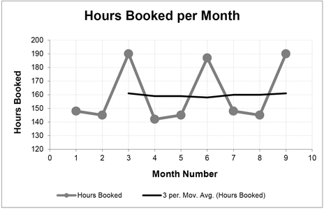
Figure 3.1 Simple Moving Average with an Interval of 3

Figure 3.2 Simple Moving Averages with Increasing Intervals
integer multiplier of the ‘appropriate’ interval. In Figure 3.2, below, this would be an Interval of 6, (i.e. twice 3). So, if you are going to guess, start low and increase!
It is custom and practice in many circles to record the Moving Average at the end of the interval sequence as displayed in Table 3.2. This practice is reflected in Microsoft Excel, in both the Data Analysis Tool for Moving Average, and in the Chart Moving Average Trendline Type (used in Figures 3.1 and 3.2).
If our objective is to identify a ‘steady state’ value, this practice of recording the average at the end-point is not a problem. However, if our objective is also to understand the point in the series at which that ‘steady state’ commences, or to ascertain whether there is an underlying upward or downward trend, the practice of plotting the average at the cycle end-point means that the moving average is a misleading indicator as it will always lag the true underlying trend position as shown in Figure 3.3.

Figure 3.3 Example of Simple Moving Average Lagging the True Trend
Pictorially, this lag is always displaced to the right of the true trend . . . looking like a fugitive leading a line of data in its pursuit. OK, a bit of a contrived link to the work of William Mauldin, but I liked the quote. (Casaregola, 2009, p. 87.)
The true underlying trend position will always occur at the mid-point of the Moving Average Interval, and the length of the lag can be calculated as:
A word (or two) from the wise?
'I feel like a fugitive from the law of averages'
William H. Mauldin
American cartoonist
1921-2003
Therefore, it is recommended (but perhaps we should make it our Law of Moving Averages) that all Simple Moving Averages are plotted at the mid-point of the Interval rather than at the end of the cycle. Whilst this may well mean that we have to introduce an extra calculation step in a spreadsheet (Microsoft Excel will not do it automatically), it may help us in justifying to others that the Moving Average Interval chosen does produce the trend that is representative of the data.
For the Formula-phobes: Why is the lag not just half the interval?
Consider a line of telegraph poles and spaces (or a chain-linked fence):

The number of spaces between the poles is always one less than the number of poles. For every odd number of poles there are an equal number of spaces on either side of the pole in the middle. which is clearly at the mid-point. In the case of a Moving Average, the number of terms in the Interval is equivalent to the number of telegraph poles, but the mid-point can be described in relation to the spaces.
The same analogy works for an even number of terms or telegraph poles, where the mid-point is defined by the space in the middle (there being an odd number of spaces).
Many quarterly and annual economic indices published by government agencies are Simple Moving Averages. It is important we note that although the indices are published at the end of the quarter or year, they do in fact represent the average for the quarter or year – nominally the mid-point taking account of the lag we have discussed.
3.2.4 Weighted Moving Average
One criticism of the Simple Moving Average is that it gives equal weight to every term in the series, and in the case of non-steady state trends, the Simple Moving Average is slow to respond to changes in the underlying trend. One way to counter this is for us to give more emphasis or weight to the most recent data and less to the oldest or earliest data. One commonly used method is to apply a sliding scale of weights based on integers divided by the sum of the integers in the series; this guarantees that the sum of the weights is always 100%.

For example, in Table 3.3, using an interval of 5, the weights might be calculated as:
The weight of nth term in the Interval, 1 to N, can be calculated as:
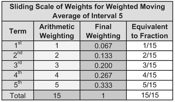
Table 3.3 Sliding Scale of Weights for Weighted Moving Average of Interval 5

Figure 3.4 Weighted Moving Average cf. Simple Moving Average Before Lag Adjustment
As we can see, in reality, the difference in response to changes in data between Simple and Weighted Moving Averages is marginal, especially for small interval moving averages as shown in Figure 3.4. In order to adjust for the residual lag in response, the estimator can always resort to plotting the Weighted Moving Average at an earlier point in the cycle rather than the end as for the Simple Moving Average. In this case, the true underlying trend position of a Weighted Moving Average Interval using an increasing Arithmetic Progression of weights can be calculated as:
However, it is debatable whether this presents any tangible benefit over offsetting the Simple Moving Average, especially for small intervals, as depicted in Figure 3.5 (Spot the Difference if you can!).
For the Formula-philes: Why is the lag not the same as that for a Simple Moving Average?


Figure 3.5 Weighted Moving Average cf. Simple Moving Average After Lag Adjustment
Table 3.4 Moving Average Trend Lags
| Interval | Simple Moving Average Lag | Weighted Moving Average Lag |
|---|---|---|
| 2 | 0.5 | 0.33 |
| 3 | 1 | 0.67 |
| 4 | 1.5 | 1 |
| 5 | 2 | 1.33 |
| 6 | 2.5 | 1.67 |
| 12 | 5.5 | 3.67 |
| N | (N-1)/2 | (N-1)/3 |
The lags for both Simple Moving Averages and Weighted Moving Averages can be summarised in Table 3.4 above.
3.2.5 Choice of Moving Average Interval: Is there a better way than guessing?
Basically, we can choose the Moving Average Interval (the number of actual terms used in each average term) in one of three ways:
- a) Where possible, it is recommended that the choice of Moving Average Interval is determined by a logical consideration of the data’s natural cycle which might explain the cause of any variation, e.g. seasonal fluctuations might be removed by considering four quarters or twelve months.
- b) If there is no natural cycle to the data, or it is not clear what it might be, we can determine the Moving Average Interval on a ‘trial and error’ basis. In these circumstances, it is recommended that we start with a low interval and increase in increments of one until we are satisfied with the level of smoothing achieved. However, some of us may not feel totally comfortable with this ‘trial and error’ approach, tending to regard it as more of a ‘hit and miss’ or ‘hit and hope’ approach!
- c) As an alternative, we can apply a simple statistical test for ‘smoothness’ that will yield an appropriate Moving Average interval systematically.
In terms of the latter, one such systematic numerical technique would be to calculate the Standard Deviation of the differences between corresponding points using adjacent Moving Average Interval Differences or MAID for short (but I promise not to milk it); Standard Deviation being a Descriptive Statistic that quantifies how widely or narrowly data is scattered or dispersed around its mean (Volume II Chapter 3).
This MAID Minimal Standard Deviation technique requires us firstly to calculate the difference between the start (or end) of each successive Moving Average interval, and then to calculate the Standard Deviation of these Differences. We can also calculate the Difference Range by subtracting the Minimum Difference from the Maximum Difference. If we repeat this procedure for a number of different potential Moving Average Intervals, we can then compare the MAID Standard Deviations; the one with the smallest Standard Deviation is the ‘best’ or smoothest Moving Average. This is likely to coincide with one of the smaller Difference Ranges, but not necessarily the smallest on every occasion.
The MAID calculation is illustrated in Figure 3.6 for an interval of 3. The difference between each point and the point that occurred three places earlier has been marked with a dotted arrow for the first three data pairs.
- The difference between the 4th point and the 1st point is -2
- The difference between the 5th point and the 2nd point is +4
- The difference between the 6th point and the 3rd point is +2

Figure 3.6 Example of Moving Average Interval Difference (MAID)
For the Formula-phobes: Why are we looking at Interval Differences?
The rationale for looking at Interval Differences is fundamentally one of ‘swings and roundabouts’. If we have a pattern in the data that repeats (roundabouts) with some values in the cycle higher and others values lower (swings), then there will probably be only a small variation in all the highs, and a small variation in all the lows, but also a small variation in all the middle range values.
Fuel bills are a typical example of this where winter consumption will vary from year to year, as will that for spring, summer and autumn. However, they are all likely to vary only within the confines of their own basic seasonal level.

If we looked at every third season instead of four, we would get a much wider variation in consumption between the corresponding points in the cycle
If we were to look at fuel costs instead of consumption we might find a similar pattern of banding but with an underlying upward trend in all four seasons (Come on, can you remember the last time that fuel prices reduced?)
Table 3.5 summarises the differences for all 24 data observations for intervals of 2 through to 12. An interval of one is simply the difference between successive raw data values and is included as a point of reference only. The standard deviation of each of these columns of differences can then be calculated using STDEV.S(range) in Microsoft Excel. Finally, we can also calculate the range of the differences for each interval by subtracting the minimum difference from the maximum. The purpose of this is to provide verification that the standard deviation is highlighting the interval with the narrowest range of difference values.
In the example, an interval of 4, 5, 6, 10 and 11 all have a MAID Standard Deviation which is less than that of the raw data differences, implying that they will all smooth the data to a greater or lesser extent. The smallest standard deviation is for a Moving Average of Interval 10, so technically this gives us the MAID Minimum Standard Deviation. However, from a more practical rather than a theoretical viewpoint, a Moving Average Interval of 5 in this case also improves the MAID Standard Deviation substantially in relation to the raw input data differences. It is quite possible that an acceptable result might be produced using an interval of 5. Perhaps unsurprisingly, the largest two standard deviations fall between these two (at 7 and 8.)
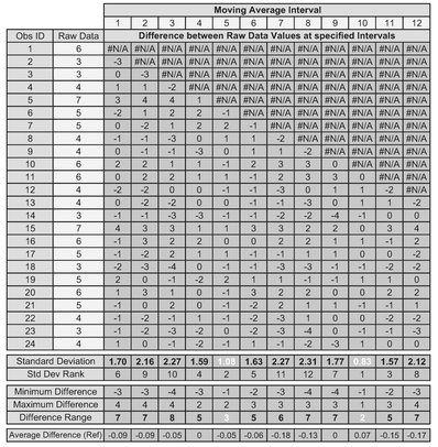
Table 3.5 Choosing a Moving Average Interval Using the MAID Minimal Standard Deviation Technique
Incidentally, in case you were wondering, searching for an average difference close to zero does not work. For both Intervals 4 and 9 in Table 3.5, the average difference is zero due to the influence of some relatively large differences in comparison to the rest of the set of differences, but these are not the best from a data smoothing perspective.
Figure 3.7 compares the MAID Standard Deviation for the 11 actual intervals (2–12) with the standard deviation for Interval 1 (simple difference between successive raw data values).
Both results for Intervals 5 and 10 are shown in Figure 3.8 and Table 3.6. We can then make the appropriate judgement call – go for a low standard deviation, or simply the lowest? Hence why the technique is called the ‘MAID Minimal Standard Deviation’ as opposed to the ‘MAID Minimum Standard Deviation’; the intent is to lessen or reduce the significance of the standard deviation, rather than find the absolute minimum per se. As a general rule, we are often better opting for the smaller interval if we want to track changes in rate earlier – longer intervals are slower to respond to changes in the underlying trend. Unsurprisingly, if a Moving Average Interval of 5 gives an acceptable result, then so will any multiple of 5, e.g. 10, 15, etc.
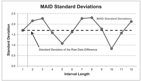
Figure 3.7 MAID Minimal Standard Deviation Technique

Figure 3.8 Moving Average Interval Options Using the MAID Minimal Standard Deviation Technique
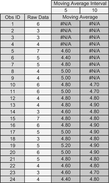
Table 3.6 Moving Average Interval Options Using the MAID Minimal Standard Deviation Technique
The MAID Minimal Standard Deviation Technique can also be made to work (sorry, bad pun), where there are underlying increasing or decreasing trends in the data. The following series of figures and tables illustrate the process we have just followed:
| Figure 3.9 | Data to be smoothed by a Moving Average |
| Table 3.7 | MAID Calculations for Intervals of 2 through to 12 |
| Figure 3.10 | Comparison of MAID Standard Deviations highlighting that an Interval of 4 is the best (minimum) option for this dataset |
| Table 3.8 | Moving Average Calculation for an Interval of 4 |
| Figure 3.11 | Moving Average Plot of Interval 4 with the inherent lag offset to the Interval mid-point |
In this situation, we would be advised going for the shorter interval of 4, which happens to be the one which returns the MAID Minimum Standard Deviation.
However, we should seriously reflect on whether the MAID Minimal Standard Deviation technique is any better than ‘trial and error’ as it would suggest a level of accuracy
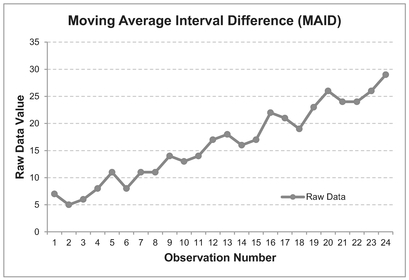
Figure 3.9 Data with Increasing Trend to be Smoothed
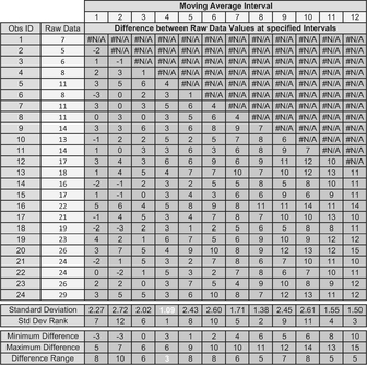
Table 3.7 Applying the MAID Minimal Standard Deviation Technique to Data with an Increasing Trend

Figure 3.10 Results of the MAID Minimal Standard Deviation Technique with an increasing trend
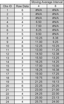
Table 3.8 Moving Average Interval Options Using the MAID Minimal Standard Deviation Technique

Figure 3.11 Moving Average Interval Options Using the MAID Minimal Standard Deviation Technique
that some might argue is inappropriate for what is after all a simple, even crude, method of trend smoothing. The one distinct advantage that MAID gives is that it fits with our objective of TRACEability (Volume I, Chapter 3.)
3.2.6 Can we take the Moving Average of a Moving Average?
The answer is ‘Yes, because it is just a calculation’; the question we really ought to ask is ‘Should we?’ It is better to consider an example before we lay the proverbial egg on this. (Sorry, did someone call me a chicken? OK, in short, the answer is ‘Yes, but . . . ’)
In Table 3.9 let us consider those economic indices we estimators all love to hate. The quarterly index is a three-month moving average of the monthly index. The annual index is a twelve-month moving average of the monthly index. Does that mean that the annual index is also a four-quarter moving average of the quarterly index?
As we can see from the example, there is a right way (Col I) and a wrong way (Col J).
- Columns B-D is the published Retail Price Index (RPIX) data from the UK Office of National Statistics (ONS, 2017). If we calculate a 3-month moving average (Col F) on the published Monthly indices, we will get the published quarterly indices. As a bonus we will also get the intervening rolling quarterly data (e.g. February–April, etc.).
- Similarly, if we calculate a 12-month moving average (Col G) on the published Monthly indices, we will get the published annual indices. Again as a bonus we will also get the intervening rolling annual data (e.g. February–January, etc.).
- In Col I, if we calculate a moving average of every fourth 3-month moving average value then we can replicate the values in Col G. For instance, Cell I14 equals the average of cells F5, F8, F11 and F14.
- However, in Col J, if we blindly take a simple 4-period moving average of the last four 3-month moving average values in Col F, then we will not replicate the values in Col G. For instance, the value in Cell J8 takes the average of Cells F5, F6, F7 and F8. If I can paraphrase the catchphrase from Punch and Judy ‘That’s not the way to do it!’
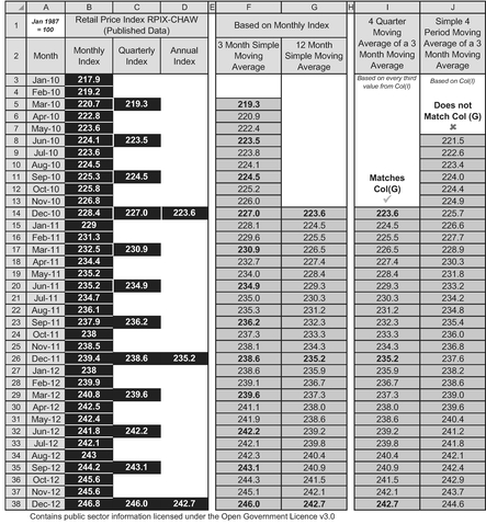
Table 3.9 Moving Average of a Moving Average
For the Formula-philes: Moving Average of a Moving Average
Consider the monthly data sequence values, M1 . . . Mi . . .:

If in doubt, always go back to the published data and calculate a moving average from scratch.
3.2.7 A creative use for Moving Averages — A case of forward thinking
We need to restrict our thinking on Moving Averages to be from a retrospective standpoint. For instance, we can calculate the level of resource required over a production build line using a Forward Weighted Moving Average, where the weightings are based on the known or expected resource distribution over a standard production build cycle for a unit (see Example: A ‘forward thinking’ use for a Weighted Moving Average).
Example: A 'forward thinking' use for a Weighted Moving Average
Consider a production line of some 20 units, each of four weeks build duration in which it is anticipated resource per unit will be required in the following proportions:
| Week 1 | 10% | or | 0.1 |
| Week 2 | 25% | or | 0.25 |
| Week 3 | 30% | or | 0.3 |
| Week 4 | 35% | or | 0.35 |
Take the weighting factors in reverse order (35%, 30%, 25%, 10%) and calculate a Weighted Forward Moving Average with an interval equal to the build cycle (in this case 4 weeks) of the Planned Number of Completions per Week to give the equivalent number of units produced per week.
Multiply the equivalent units produced by the hours or cost per unit to get the estimated hours or costs required in each week. A similar calculation based on the cumulative number of units completed will give the S-Curve profile of hours or cost over a period of time.

In Microsoft Excel, Cell L8 is SUMPRODUCT($C$4:$F$4, L7:O7) where $C$4:$F$4 are the reverse order of the weightings, and L7:O7 are the deliveries per month over the next build cycle commencing at Week 10. This Forward Weighted Moving Average of the deliveries determines the number of equivalent units to be built in that week.
Note: As the weights summate to 100%, there is no need to divide by the Sum of the Weights
The weightings do not have to be those illustrated in the example, we can consider any value of weightings that are pertinent to the data being analysed so long as the weights summate to 100%.
3.2.8 Dealing with missing data
What if we have missing data; what should we do? The worst thing we can do is ignore that it is missing! It is far better that we simply stop the Moving Average calculation at the last point at which data was available; then resume the Moving Average after the next full cycle or interval has elapsed following the missing data.
For example in Figure 3.12, data is missing for months 10 and 11. The moving average, based on an interval of 3, cannot be calculated for months 10 and 11, and consequentially it cannot be calculated for months 12 and 13, as these include values from months 10 and 11.
This will clearly leave a gap in our analysis but at least it is an honest reflection oi the data available. The length of the gap will be the number of consecutive missing data points minus one, plus the interval length. In the example above, this is (2-1)+3, i.e. 4.
We can always provide an estimate of the missing data (because that’s what we do; we are estimators), but we should not include that estimate in the Moving Average calculation. Microsoft Excel provides an estimate of the Moving Average by interpolating the gaps for us by changing the Moving Average Interval incrementally by one for every missing data point. In the example in Figure 6, the average at months 10 and 12 would be based on a Moving Average of Interval 2, whereas at Month11, it would be based on an Interval of 1, i.e. the last data point.
The same advice applies equally to missing data from Weighted Moving Averages just as much as Simple Moving Averages.
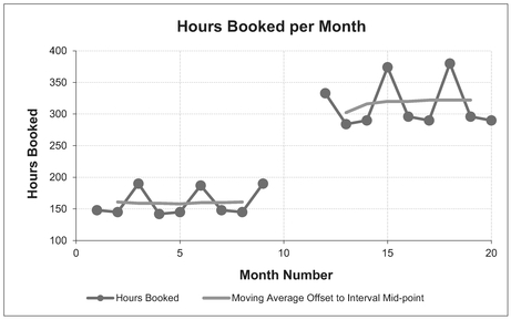
Figure 3.12 Moving Average Plot with Missing Data
In many cases it may not influence your judgement unduly, but why does it always seem to happen when something unusual is happening, like a change in the level? (Does that sound a little paranoid? In my defence: it can be seen as a positive trait in estimators ... always suspicious of data!)
3.2.9 Uncertainty Range around the Moving Average
Whilst Moving Averages are not predictive in themselves, in instances where we are considering them to identify a steady state value, we might choose to use that steady state value as a forward estimate. However, the whole principle of the Moving Average is that we accept that the value will change over time or a number of units of achievement. In short any estimate we infer will have a degree of uncertainty around it. We might want to consider how best to articulate the uncertainty. We have a number of options summarised in Table 3.10.
The absolute measures of minimum and maximum are clearly sensitive to extreme values in the raw data, but are a useful reminder of the fact that things have been ‘that good’ or ‘that bad’ before and so might be again. The main benefit of calculating a Moving Average is that it gives us a topical view of the movement in the underlying data. On that basis we might want to consider the minimum or maximum of the Moving Average array rather than the total history. None of these measures need to be adjusted for interval lag.
Table 3.10 Potential Measures of Moving Average Uncertainty
| Moving Average Interval | Absolute Measures (All data points) | Moving Measures (based on Interval used) |
|---|---|---|
| Small interval (say 2–5) | • Absolute Minimum and Maximum • Moving Average Minimum and Maximum • Standard Deviation • Moving Average Standard Deviation |
• Moving Minimum and Moving Maximum • Moving Standard Deviation |
| Large interval (say <6) | • All of the above + • Absolute Percentiles (user defined) • Moving Average Percentiles (user defined) |
• All of the above. + • Moving Percentiles (user defined) |
On the other hand in the spirit of ‘Moving Statistics’, we can always create pseudo prediction limits based on the Moving Minimum and Moving Maximum of the data for which we have calculated the Moving Average.
Definition 3.2 Moving Minimum
A Moving Minimum is a series or sequence of successive minima calculated from a fixed number of consecutive input values that have occurred in a natural sequence. The fixed number of consecutive input terms used to calculate each minimum term is referred to as the Moving Minimum Interval or Base.
Definition 3.3 Moving Maximum
A Moving Maximum is a series or sequence of successive maxima calculated from a fixed number of consecutive input values that have occurred in a natural sequence. The fixed number of consecutive input terms used to calculate each maximum term is referred to as the Moving Maximum Interval or Base.
A variation on this concept is to look at the minimum and maximum of past Moving Averages as ‘absolute’ lower and upper ranges of uncertainty around the Moving Average. However, the downside of this is that it is really only suitable for a basic ‘steady state’ system; the bounds will diverge if there is an increasing or decreasing trend. One way around this would be to consider true Moving Minima and Maxima. Figure 3.13 illustrates both of these options for minima and maxima bounds in relation to some reported weekly performance data using a Moving Average Interval of 5. (Let’s hope that we find it to be a ‘moving performance’ . . . You really didn’t expect me to let that one go unsaid, did you?) Note: the averages, minima and maxima have not been offset by half the interval in this instance to aid clarity. In normal practice, this would be recommended. We will revert to that recommended practice before the end of this section.
Furthermore, as discussed in Volume II Chapter 2 on Measures of Central Tendency, depending on the circumstances, average performance may be better analysed using a Harmonic Mean (in this case, a Moving Harmonic Mean), or a Cumulative Smoothing technique. For illustration purposes, we will consider a simple Moving Average here.
For those who like to follow where the graphs have come from, the data to support this is provided in Table 3.11.

Figure 3.13 Moving Average Uncertainty Using Minima and Maxima

Table 3.11 Moving Average Uncertainty Using Minima and Maxima
A more sophisticated way of looking at the potential spread or dispersion around the Moving Average is to calculate the Standard Deviation (see Volume II Chapter 3). Again we have a choice over whether to use absolute or moving measures. We would typically plot the absolute measure around the absolute average of all data to data (we will revisit this later under Cumulative Averages). Alternatively, we might want to calculate the equivalent Moving Standard Deviation over the same interval that we used to calculate the Moving Average.
A Moving Standard Deviation is a series or sequence of successive standard deviations calculated from a fixed number of consecutive input values that have occurred in a natural sequence. The fixed number of consecutive input terms used to calculate each standard deviation term is referred to as the Moving Standard Deviation Interval or Base.
If we believe that the raw data is normally distributed around an approximately steady state Moving Average value, then we might want to plot tram-lines 1.96
For the Formula-philes: Standard Deviation in relation to 95% Confidence Intervals

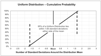
times the standard deviation either side of the average. If we think that raw data is uniformly distributed around the average (i.e. randomly with a band), then we might want to plot tram-lines 1.65 times the standard deviation either side of the average.
Psychic I am not but I can hear many of you thinking, ‘Now why on Earth would I choose some fairly random looking numbers like 1.96 or 1.65?’ Well, you are probably right, you just wouldn’t; you’re more likely to think ‘about twice’ and ‘about one and two-thirds’, and you would be correct to think that, as they are probably more appropriate levels of imprecision to use with, what is after all, a somewhat simple (some might say ‘crude’) measure such as a Moving Average. However, these are not random numbers but the values that allow us to plot tram-lines that represent a 95% confidence interval around the Moving Average. We covered this in Volume II Chapters 3 and 4.
Figure 3.14 and Table 3.12 illustrates both the absolute and moving results based on an assumption of a uniform distribution.
The eagle-eyed will have already noted the similarities but also the differences between Figures 3.13 and 3.14. For those who haven’t compared them yet, the standard deviation technique largely mirrors the ‘worst case’ of the minima-maxima technique (in terms of its deviation from the Moving Average). The main difference is that the standard deviation technique then mirrors its deviation either side of the mean.
For your convenience, Table 3.13 provides you with a list of the number of standard deviations either side of the Mean that are broadly equivalent to different confidence intervals for both the normal and uniform distributions.
All the above can be done using standard functions in Microsoft Excel (MIN, MAX and STDEV.S with a sliding range just as we would have for the Moving Average. However, remember that a Moving Average is not a sophisticated measure of trend, so do not over-engineer the analysis of it. (‘Just because we can, does not mean we should.’) Take a step back and ask yourself ‘what am I trying to achieve or show here?’
We can use either the minima-maxima, or the standard deviation technique with both Simple and Weighted Moving Averages for any of the following:
- There is variation around a basic steady state level (discussed above)
- There is a change in the steady state level, or a change in the degree of variation
- There is an upward or downward trend, as illustrated in Figures 3.15 and 3.16.
The latter illustrates the benefit of plotting the data to take account of the lag between the Moving Average calculation and the true underlying trend in the data. Figure 3.15 uses Moving Minima and Maxima to denote uncertainty ranges, whereas Figure 3.16 uses the factored Moving Standard Deviation approach. The upper graph in each figure is plotted ‘as calculated’ at the end of the Moving Average interval, whereas the lower graphs are re-plotted to take account of the lag in the various Moving Measures. In both
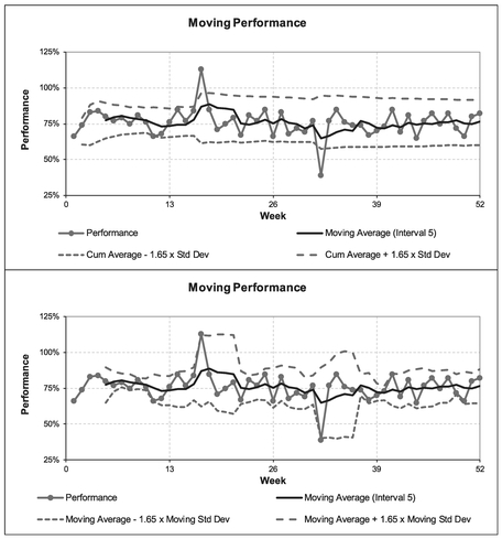
Figure 3.14 Moving Average Uncertainty Using Standard Deviations

Table 3.12 Moving Average Uncertainty Using Factored Standard Deviation
Table 3.13 Confidence Intervals in Relation to Standard Deviations Around the Mean
| Confidence Interval | Approximate number of Standard Distributions either side of the Mean | |
|---|---|---|
| Normal Distribution | Uniform Distribution | |
| 99.73% | 3.00 | 1.73 |
| 95% | 1.96 | 1.65 |
| 90% | 1.65 | 1.56 |
| 80% | 1.28 | 1.39 |
| 67% | 0.97 | 1.16 |
| 50% | 0.67 | 0..87 |

Figure 3.15 Moving Minima and Maxima with Upward and Downward Trends
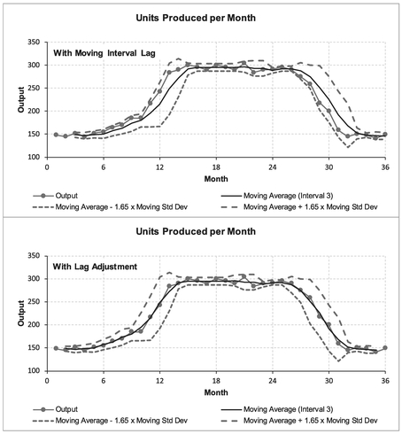
Figure 3.16 Moving Standard Deviation with Upward or Downward Trends
‘unadjusted’ cases the actual data hugs the upper limit of the uncertainty tramline for an increasing trend, and hugs the lower limit for a decreasing trend. The lag adjusted graph gives a more acceptable perspective of what is happening.
The adjusted graphs highlight that the uncertainty range is wider for increasing and decreasing trends than for ‘steady state’ values (unless there are more extreme, or atypical, data in the so-called ‘steady state’ values.)
3.3 Moving Medians
Critics of the Moving Average who argue that it is too sensitive to extreme values, especially for small intervals, might want to consider the alternative but closely related technique of Moving Medians.
Definition 3.5 Moving Median
A Moving Median is a series or sequence of successive medians calculated from a fixed number of consecutive input values that have occurred in a natural sequence. The fixed number of consecutive input terms used to calculate each median term is referred to as the Moving Median Interval or Base.
From the discussion on Measures of Central Tendency in Volume II Chapter 2, a median is one of the other Measures of Central Tendency; the Median puts the spotlight on the middle value in a range. Depending on its intended use, we may find this quite helpful.
If we try this with our earlier weekly performance example, we will notice that it gives comparable results to the Moving Average where the data is ‘well behaved’, but it is unaffected by the two spikes that drag the Moving Average up or down for the duration of the ‘moving’ cycle (Figure 3.17). This can be done quite easily in Microsoft Excel using the in-built function MEDIAN with a sliding range representing the data points in the Interval.
However, we win some and we lose some, there are different issues with a Moving Median compared with those of a Moving Average. If we use a Moving Median over a Time Series where there is a seasonal pattern, there is a risk that it will completely disregard some key seasonal data. This is especially so where there are only one or two seasonal extremes. For example, our thirteen-week accounting calendar example will be reduced to one that reflects only four-week months. For annual data on labour salaries containing annual bonus payments a Moving Median will treat the bonus payments as if they never existed (Try telling the employees that their bonuses don’t matter!). Figure 3.18 illustrates the point with Hours Booked per Month.
In essence, we have to decide what we are seeking to achieve:
- Elimination of extreme values that occur at random? Moving Medians work well.
- Smooth data that represents the middle ground through seasonal data? Moving Medians are probably less appropriate than Moving Averages.

Figure 3.17 Moving Median Compared with Moving Average (Unadjusted for Lag)

Figure 3.18 Moving Median can Disregard Important Seasonal Data
3.3.1 Choosing the Moving Median Interval
Just as we discussed for Moving Averages, the interval for a Moving Median should be based on the natural cycle of data if there is one. If the natural cycle is not obvious, we can iterate for different interval sizes, starting with a low number until we achieve a degree of smoothing that we are happy to accept. We can use the MAID Minimum Standard Deviation techniques discussed in Section 3.2.1 and apply that interval to the Moving Median.
Note that a Moving Median can only be used as a distinct measure for intervals of 3 or more, as the Moving Median of two points defaults to being the Moving Average of those two points.
For the Formula-phobes: A Moving Median of Interval of 2 defaults to Moving Average?
Recall the analogy of the telegraph poles and spaces from Volume II Chapter 2

If we have an odd number of telegraph poles, then there will always be one that is in the middle, and that would represent the Median.
If we have an even number of telegraph poles, then there will always be a space in the middle; there will never be a pole. The convention in that case is for the Median to equal the average of the two points that flank that middle space.

In the case of an interval of two, the median would be simply the average of the two points either side of the middle space making the Median equal the Arithmetic Mean, so a Moving Median of Interval 2 is identical to a Moving Average of Interval 2.
3.3.2 Dealing with missing data
What if we have missing data, what should we do? Well, it is the same advice as for Moving Averages – do not ignore it! (Sorry am I beginning to sound repetitive?) It is better practice to truncate the Moving Median calculation at the last point at which data was available; then resume the Moving Median after the next full cycle or interval has elapsed following the missing data.
As estimators we can always provide an estimate of the missing data, but we should not include that estimate in the Moving Median calculation. Microsoft Excel provides an estimate of the Moving Median by interpolating the gaps for us by changing the Moving Median Interval incrementally by one less for every missing data point, similar to the discussion we had on missing data for Moving Averages.
3.3.3 Uncertainty Range around the Moving Median
We can use the Moving Minima and Moving Maxima just as we did with Moving Averages to give a pseudo Confidence Interval around a steady state value. However, we should not use the factored Moving Standard Deviations approach in conjunction with the Median as that principle is predicated on a scatter around an Average or Mean. However, the natural corollary to selecting a Moving Median is to consider Moving Percentiles.
If we want to quote a particular Confidence Interval around the Moving Median, or we want to use asymmetric confidence levels, e.g. a lower limit at the 20% Confidence Level and an upper limit at the 90% Confidence Level, we can always calculate any percentile for a range of data; the Median is by definition the 50th percentile, or 50% if expressed as a Confidence Level.
The procedure for calculating percentiles is quite simple:
- Arrange the data in the range in ascending size order
- Assign the 0th percentile (0%) to the smallest value, and the 100th percentile (100%) to the largest
- The percentile for each successive data point, n, between the first and the last is calculated as being at (n-1)/(Interval-1). For example, for an interval of 5 data points, the percentile of each is 0%, 25%, 50%, 75%, 100%
- For any percentiles in between these, they can be calculated by linear interpolation between the two points
There are two specific PERCENTILE functions in Microsoft Excel that allows us to do this with ease without having to worry about the procedure or the mathematics. An open interval version with the suffix .EXC and a closed interval version with suffix .INC (see Volume II Chapter 3 for the difference.)
However, for small intervals, there is an argument that citing Specific Confidence Intervals is misleading, giving the impression of more precision than the data actually supports. For larger intervals, the approach can be rationalised quite easily. For an interval of eleven, each constituent value in the range is equivalent to ten percentile points from the previous one. (Yes, it is our favourite telegraph poles and spaces analogy again.) However, we should note that the percentiles approach does have a potential issue with granularity. If we have several repeating values in our data then we may get the situation where two distinct percentile calculations can return the same value (think of them all stacked up vertically), and all those interpolated between them will do so also. The percentiles approach does not allow for random errors in the observed values.
For the Formula-phobes: How do we calculate percentiles?
Consider a line of five telegraph poles and spaces:
The first telegraph pole on the left is 0%; the last on the right is at 100%. The remaining poles are equally spread at 25% intervals:

The 40th percentile or 40% is just past halfway between 25% and 50%. More precisely it is 60% or 3/5 of the way between the two.
Figure 3.19 illustrates that whilst the Median disregards any extreme values we might collect, the Moving Percentiles, used as Confidence Levels or Intervals, do take account of their existence if used appropriately. As with Minima, Maxima and factored Standard Deviations used in conjunction with Moving Averages, we can use percentiles at either an absolute level, based on the entire history, or as a rolling or moving measure of confidence. A summary of appropriate measures of uncertainty around a Moving Median are provided in Table 3.14.
3.4 Other Moving Measures of Central Tendency
As we have already intimated, there are occasions where we might want to consider some of the other Moving Measure of Central Tendency, around which we might also want to consider applying our Uncertainty Range as before.) We will briefly discuss three other Moving Measures here.

Figure 3.19 Moving Median with Moving 10th and 90th Percentiles as Confidence Limits
Table 3.14 Potential Measures of Moving Median Uncertainty
| Moving Median Interval | Absolute Measures (All data points) | Moving Measures (based on Interval used) |
|---|---|---|
| Small interval (say 2–5) | • Absolute Minimum and Maximum • Moving Median Minimum and Maximum |
• Moving Minimum and Moving Maximum |
| Large interval (say >6) | •All of the above+ • Absolute Percentiles (user defined) • Moving Median Percentiles (user defined) |
•All of the above+ • Moving Percentiles (user defined) |
3.4.1 Moving Geometric Mean
As we will see in Chapter 8 on Time Series Analysis, there are conditions where we should be using a Geometric Mean instead of a simple Arithmetic Mean to calibrate an underlying trend that is accelerating or decelerating in relation to time. This is particularly true in the case of economic indices relating to costs and prices.
Definition 3.6 Moving Geometric Mean
A Moving Geometric Mean is a series or sequence of successive geometric means calculated from a fixed number of consecutive input values that have occurred in a natural sequence. The fixed number of consecutive input terms used to calculate each geometric mean term is referred to as the Moving Geometric Mean Interval or Base.
If we have access to Volume II Chapter 2 we may recall that we can only use a Geometric Mean with positive data, so if there is any chance that the observed data might be zero or negative (such as variation from a target or standard) then we cannot use a Moving Geometric Mean.
3.4.2 Moving Harmonic Mean
If we recall from Volume II Chapter 2 (unless that was when you decided it was time to put the kettle on and missed that discussion), a Harmonic Mean is one we should consider using when we are dealing with data that is fundamentally reciprocal in nature i.e. where the ‘active’ component being used to derive a statistic is in the denominator (bottom line of a fraction or ratio.) Performance is one such statistic, measuring Target Value divided by Actual Value; the Actual Value is the ‘active’ component.
Definition 3.7 Moving Harmonic Mean
A Moving Harmonic Mean is a series or sequence of successive harmonic means calculated from a fixed number of consecutive input values that have occurred in a natural sequence. The fixed number of consecutive input terms used to calculate each harmonic mean term is referred to as the Moving Harmonic Mean Interval or Base.
Again, we can only use a Harmonic Mean with positive data (Volume II Chapter 2), so if there is any chance that the observed data might be zero or negative then we cannot use a Moving Harmonic Mean.
In many practical cases where the performance is pretty much consistent or only varies to a relatively small degree, then it will make very little difference to any conclusion we draw from using a Moving Harmonic Mean in comparison with one we would make using a Simple Arithmetic Moving Average. Where we have obvious outliers, the Harmonic Mean will tend to favour the lower values.
As we previously indicated, the Harmonic Mean may often be a better trend measure for Performance than a simple Arithmetic Mean. Figure 3.20 compares our earlier Moving Average Performance with a Moving Harmonic Mean Performance.
3.4.3 Moving Mode
Don’t do it!
It is highly unlikely that we would find ourselves in circumstances where this would be a reasonable option to consider. Modes really only come into their own with large datasets. Pragmatically thinking, in the context of Moving Measures, the intervals we are likely to be considering will be small, and the chances of getting consistently meaningful modes would be small – remote even.
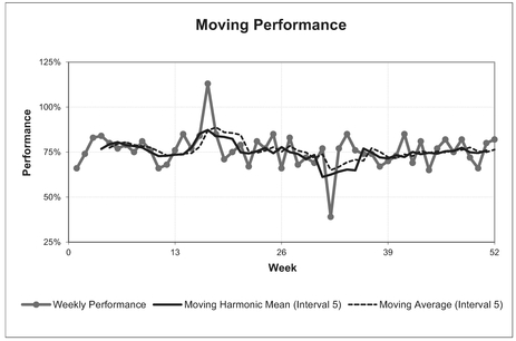
Figure 3.20 Moving Harmonic Mean of Performance cf. Arithmetic Mean
3.5 Exponential Smoothing
Now we wade into the muddy waters of Exponential Smoothing. In essence, Exponential Smoothing is a self-correcting trend smoothing and predictive technique. Sound too good to be true? Hmm, perhaps you should be the judge of that ...
Definition 3.8 Exponential Smoothing
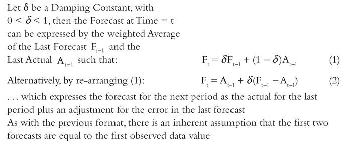
Exponential Smoothing is a ‘single-point’ predictive technique which generates a forecast for any period based on the forecast made for the prior period, adjusted for the error in that prior period’s forecast.
Exponential Smoothing generates an array (i.e. a series or range of ordered values) of successive weighted averages based on the prior forecast and the prior actual reported against the prior forecast. It does this by applying either a percentage Smoothing Constant or a percentage Damping Factor, the magnitude of which determines how strongly forecasts respond to errors in the previous forecast. Exponential Smoothing only predicts the next point in the series, hence the reference to it being a ‘single-point predictive technique’ in the definition above. However, we may choose to exercise our judgement and use this ‘single-point prediction’ as an estimate of a steady state constant value for as many future points that we think are appropriate.
The technique was first suggested by Holt (1957), but there is an alternative form of the equation which is usually attributed to Brown (1963).
3.5.1 An unfortunate dichotomy
However, it must be noted before any formulae are presented in terms of what it is and how it works, that statisticians, mathematicians, computer programmers etc have not got their communal acts together! (No change there, did I hear you say?) It appears to be generally (but not universally) accepted in many texts on the subject that the terms ‘Smoothing Constant’ and ‘Damping Factor’ are complementary terms such that:
Smoothing Constant + Damping Factor = 100%
In terms of the weighted average, the Smoothing Constant is the weighting applied to the Previous Actual, and the Damping Factor is the weighting applied to the Previous Forecast. However, this is not always the case, and some authors appear to use the terms interchangeably. If we are generating the formula from first principles, then it does not really matter, so long as it is documented properly and clearly for others, but if we are using a pre-defined function in a toolset such as Microsoft Excel (available using the Data Analysis ToolPak Add-In which comes as standard with Excel), then it would be a good idea if we knew which version was being used.
Unfortunately, Microsoft Excel appears to be on the side of ‘laissez faire’. In Excel 2003, 2007 and 2010, Excel quite correctly prompts (in terms of how it works) for the Damping Factor in respect of the weighting to be applied to the Previous Forecast, whereas the Excel Help Facility (normally an excellent resource) refers to the Smoothing Constant when it appears to mean Damping Factor, and this appears to infer that they are interchangeable terms.
Regardless of this unfortunate dichotomy, this gives two different, yet equivalent, standard formulae for expressing the Exponential Smoothing rule algebraically, depending on whether the Smoothing Constant, a, or Damping Factor, d, is the parameter being expressed.
For the Formula-philes: Exponential Smoothing Calculation

The equation proposed by Brown (1963) applied the Smoothing Constant to the previous Actual, and it’s residual from 100%, as the Damping Factor to the previous Forecast.
In this format, Exponential Smoothing could be said to smooth the previous Forecast by a proportion of the previous Forecast Error.
An alternative form in common use, and also the one adopted by Microsoft Excel (if that were to influence you one way or another) applies the Damping Factor to the previous Forecast, and it’s residual from 100%, as the Smoothing Constant to the previous Actual:
For the Formula-philes: Exponential Smoothing Calculation
Consider a sequence of Time Series actual data, A1...At for which a Forecast, Fi is generated for the next time period, i
In this format Exponential Smoothing could be said to be damping the previous Actual by a proportion of the previous Forecast Error. (Note: the sign of the error term in this version is the reverse of the former!)
The two formats do not give different forecasts, they are just different conventions, and the Damping Factor and Smoothing Constants are complementary values:
Ft = αAt_1 + δFt_1
α + δ = 1
Where:
Perhaps the logical thing to do to avoid confusion would be for us to write it in terms of ‘Smoothing the Actual and Damping the Forecast’: or choosing one of the F-A:D-S (Forecast or Actual implies either Dampen or Smooth in that order).
For the Formula-philes: Why is it called Exponential Smoothing?
Consider Brown’s version of the Forecast value, Ft at period t based on the Actual, At-1 and Forecast, Ft-1 at Period t-1 with a Smoothing Constant of α:
3.5.2 Choice of Smoothing Constant, or Choice of Damping Factor
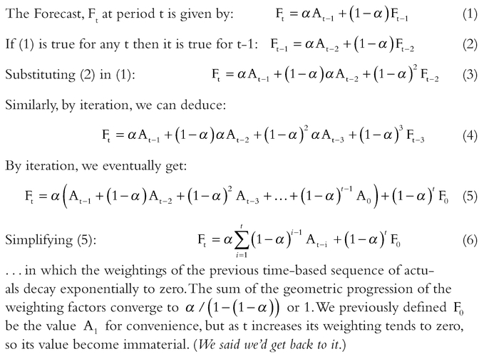
You may find it documented in some sources (e.g. Microsoft Excel Help) that Smoothing Constants values between 0.2 and 0.3 are considered reasonable. However, as we have already discussed, Excel appears to use the terms Smoothing Constant and Damping Factor interchangeably; it prompts the user to provide a Damping Factor, and even assigns a default of 0.3 if it is not input by the user, but then in the Help Facility it refers to 0.2 to 0.3 as being reasonable values for the Smoothing Constant. (Clearly they cannot both be values in this range if we accept the position of others that they must summate to 1.) However, all this is an over-generalisation, and we might be better choosing the value of either based on the objective of the analysis in question. If we choose smaller Damping Factors (i.e. larger Smoothing Constants), this will give us a faster response to changes in the underlying trend, but the results will be prone to producing erratic forecasts. On the other hand, if we choose larger Damping Factors (i.e. smaller Smoothing Constants), we will be rewarded with considerably more smoothing, but as a consequence the downside is that we will observe much longer lags before changes in forecast trend values are seen to be relevant. These are illustrated in Table 3.15 and Figure 3.21.
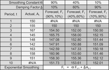
Table 3.15 Exponential Smoothing – Effect of Using Different Parameters

Figure 3.21 Exponential Smoothing – Effect of Using Different Parameters
Rather than pick a Smoothing Constant or Damping Factor at random, or empirically, we could derive a more statistically pleasing result perhaps, (yes, I know I need to get out more), by determining the best fit value of α or δ for a given series of data by using a Least Squares Error approach (these principles are discussed and used later commencing with Chapter 4 on Linear Regression – ‘Oh, what joy’, did you say?)
3.5.3 Uses for Exponential Smoothing
The most common use of Exponential Smoothing perhaps is with time-based data or Time Series data, but this is not necessarily its only use. As with general Moving Averages, any data series in which there is a natural order, with nominally constant incremental steps (e.g. integer build numbers) might be analysed and predicted using Exponential Smoothing. In these situations, it is aesthetically more appropriate to substitute an alternative letter, such as n, in place of the time period, t:
Fn = α An-1 + δ Fn-1
Figure 3.22 provides a non-time-based example of Exponential Smoothing with a Smoothing Constant of 75% and a Damping Factor of 25%.
Figure 3.22 Exponential Smoothing – Non-Time-Based Data

Figure 3.23 Exponential Smoothing – Long Lags with Small Smoothing Constants
Just as with ordinary Moving Averages, wherever there is an upward or downward trend, Exponential Smoothing will always lag the true trend. Furthermore, the smaller the Smoothing Constant (larger Damping Factor) is then the more the calculated trend will appear to diverge from our true trend initially, before settling down to run parallel to it, some 1/α periods or units to the right – so, not really that helpful perhaps as an indicator (see Figure 3.23). For data that oscillates around a steady state or constant value, then Exponential Smoothing might be the solution you have been looking for. (Exponential Smoothing is also known by the less snappy name of ‘Exponentially Weighted Moving Average’.)
As you can probably tell, I am not the biggest fan of Exponential Smoothing.
3.5.4 Double and Triple Exponential Smoothing
Just when you thought that it couldn’t get any better ...
Where there is a trend in the data, Double Exponential Smoothing was suggested as a way of dealing with it. One method (yes, there is more than one) is the Holt-Winters Method (Winters, 1960) which is an algorithm best performed in a spreadsheet.
For the Formula-philes: Double Exponential Smoothing Calculation for Underlying Trends

Did you know that your eyes have just glazed over again?
Although it may look quite scary it is easily performed within a spreadsheet such as Microsoft Excel. The main difficulty is in choosing appropriate values for α and β, which we might as well calibrate using a Least Squares Error approach if we are going to all this trouble with double exponential Smoothing. As mentioned previously, this will be discussed in Chapter 7 on Curve Fitting. However, Double Exponential Smoothing does allow an estimator to forecast more than one period or unit in advance, unlike simple Exponential Smoothing.
If that wasn’t enough, Holt-Winters’ Triple Exponential Smoothing was evolved to take account of both trend and seasonal data patterns (Winters, 1960). However, for Time Series data where there is a distinct Seasonal Pattern, e.g. gas and electric consumption, and a clear linear trend or steady state value, we might be better considering using the alternative techniques covered under Time Series Analysis (see Chapter 8).
So, the good news is that we are not going to discuss Double or Triple Exponential Smoothing further here; they are merely offered up as potential topics for further research if other simpler techniques elsewhere in this book do not work for you – good luck.
3.6 Cumulative Average and Cumulative Smoothing
Definition 3.9 Point Cumulative Average
A Point Cumulative Average is a single term value calculated as the average of the current and all previous consecutive recorded input values that have occurred in a natural sequence.
A Moving Cumulative Average, sometimes referred to as a Cumulative Moving Average, is an array (a series or range of ordered values) of successive Point Cumulative Average terms calculated from all previous consecutive recorded input values that have occurred in a natural sequence.
In reality, we will probably find that the term ‘Cumulative Average’ is generally preferred, and is used to refer to either the single instance term or to the entire array of consecutive terms, possibly because the term ‘Moving Average’ is typically synonymous with a fixed interval average, i.e. the number of input terms used in the calculation. With the Cumulative Average, the fixed element is not the number of input terms, but the start point. In the case of time-based data, this will be a fixed point in time, whereas for achievement based data, it will be from a fixed reference unit; more often than not (but not always) it will be the first unit.
With Moving Averages, the denominator used (i.e. the number we divide by) is always a whole number of time periods or units. In the case of Cumulative Averages, the denominator usually increments by one for every successive term used (month 1, 2, 3 . . ., or unit 1, 2, 3 ... etc). ( Yes, you are right, well spotted – ‘usually’ implies not always – we will come back to this later in this section when we discussed equivalent units completed.)
3.6.1 Use of Cumulative Averages
Sometimes we are not interested in just the current value or level, but what is happening in the long run. Just as with professional sportsmen and sportswomen, there will be good days and bad days; ultimately, as Jesse Jackson (Younge, 1999) pointed out, we judge their performance by what is happening over a sustained period: if the Cumulative Average is rising or falling then the underlying metric is rising or falling too.
Cumulative Averages are frequently used to iron out all those unpleasant wrinkles that we get with actual data due to the natural variation in performance, integrity of bookings and the like. It is the hoarder’s equivalent of a moving average, taking the attitude that all past data is relevant and nothing shown be thrown away.
A word (or two) from the wise?
'We have to judge, politicians by their cumulative score ... In one they score a home run, in another they strike out. But it is their cumulative batting average that we are interested in.'
Jesse Jackson
American Baptist minister
and politician
b.1941
Table 3.16 Cumulative Average Over Time and Over Number of Units Completed
Table 3.16, and corresponding Figures 3.24 and 3.25, illustrate a Cumulative Average over time, and over the number of units completed. (Note that the similarity of the number of data points is coincidental and will be dependent on the build cycle and programme rate- they have been chosen for this example purely for the aesthetics of fitting on the page.)
It will generally be the case that Cumulative Averages, over either Time or Units Completed are far smoother than any Simple or Weighted Moving Average for that same data, and that the degree of smoothing increases as the number of terms increases. However, the downsize is that where there is an upward or downward trend lag in the raw data the lag between the raw data and the Cumulative Average will be quite excessive in comparison with Simple or Weighted Moving Averages, and worse still, it will diverge! As Figure 3.26 illustrates, where there is a change in the underlying trend, a Cumulative Average is very slow to respond.
We might be forgiven for thinking, ‘Well, a fat lot of use they are to us then’, but perhaps we should not be too hasty to judge . . . they do have a special property.
Where there is a continuous underlying linear trend of the raw data, then the underlying trend of the Cumulative Average will also be linear, but with the ‘magic’ property of being half the gradient or slope of the actual data (yes, always), and of course, it will be much smoother than the underlying data because that is what averages do, and therefore it is easier to identify any linear trend in the data plotted. In Figure 3.26 the actual data rises from 100 to 200 in 20 periods before achieving a steady state output of 200 units

Figure 3.24 Cumulative Average Hours Over Time

Figure 3.25 Cumulative Average Hours Over Units Completed
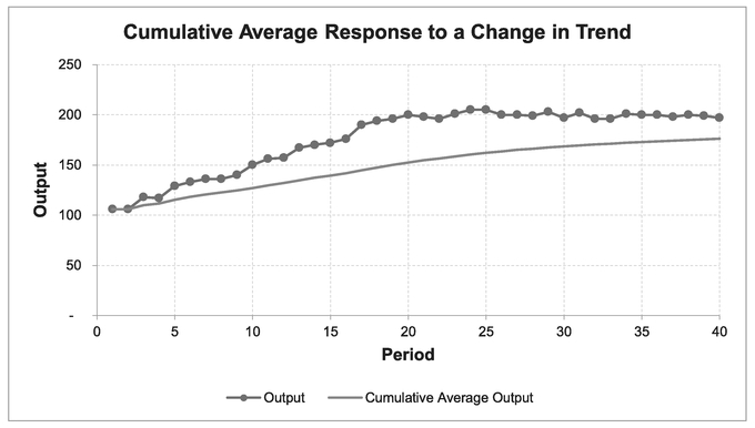
Figure 3.26 Cumulative Average Response to Change in Trend
per period – that is an increasing slope of 5 units per period on average. Meanwhile the Cumulative Average rises from 100 to 150 over the same number of periods, equivalent to an increase of 2.5 units per period, or half the true underlying slope (see Chapter 2). (Not so useless after all perhaps, we might conclude.)
This property of Cumulative Averages leads us to a range of potential uses for detecting underlying trends in data; for example:
- If we find that a Cumulative Average plot indicates a nominally steady state constant value, then our underlying raw data trend will also be a steady state constant value, (even though it might look like the data is in trauma). Incidentally, if we were to plot the Cumulative value of the raw data, in this scenario, it would be a straight line, the slope of which would be the steady state value.
- If the Cumulative Average of a series of batch cost data values follows a straight line then the unit costs will follow a straight line of twice the slope. (See Section 4.2.2 below on Dealing with Missing Data.)
Caveat augur
If the Cumulative Average cost rate is reducing, then the underlying input cost data will be reducing at twice the rate. In the long run such reduction may be unsustainable, as eventually the unit cost, and ultimately the Cumulative Average cost, will become negative! Our conclusion might be that the apparent straight line is merely a short-term approximation of a relationship which is potentially non-linear in the longer term – or at least, has a discontinuity when the data hits the floor!
However, that does not imply that negative values of Cumulative Averages or Unit data are never acceptable. Consider a cash flow profile over a period of time. The Cumulative Average may be decreasing month on month and the cash balance at any point in time may be negative and getting worse. It only becomes unsustainable in the longer term. (Yep, the company is likely to go broke.)
3.6.2 Dealing with missing data
When it comes to missing data with Cumulative Averages, then it can go one of two ways:
- Cumulative Averages can be more forgiving than Moving Averages or Exponential Smoothing.
- It can be terminal – stopping us in our tracks.
If we begin by considering the case where we only have the most recent data – we cannot find any reliable ancient history, for whatever reason. Whenever we take a Cumulative Average over time, we are starting from a fixed reference point i.e. a calendar date, month, year etc. We never go back to the beginning of time, whenever that was, do we?
Yes, I know that Microsoft have defined the beginning of time as 1st January 1900 in Excel (i.e. Day Number 1), but we have to accept that that was probably just a matter of convenience rather than any moment of scientific enlightenment.
On that basis then we can start a Cumulative Average sequence that is based on physical achievement, also from any fixed reference point, not necessarily 0 or 1. So, if we do not have the history of the first 70 units we can calculate the Cumulative Average from Unit 71. Naturally, we should state that assumption clearly for the benefit of others.
However, what if the missing data occurs in the middle of the series of data we are analysing?
If we happen to know the cumulative value of the units that we are missing, or the cumulative value over the periods of time we are missing, then the good news is that we can deal with it. Unfortunately, if we do not know the cumulative value missing, or the number of missing units, then we will be unable to continue with a Cumulative Average. There are only two solutions in this latter case:
- Replace the entire analysis with a Moving Average (leaving a gap plus an interval for all the missing data points, as we discussed in Section 3.2.8)
- Consider using a Curve Fitting routine (see Chapters 6 and 7)
An example of the former might be where current records are being maintained monthly, but more historical records are only available to us at quarterly intervals, and ‘ancient’ history might only be available as annual records. However, we can still create a Cumulative Average as illustrated in Table 3.17 and Figure 3.27. (We could, of course, still calculate a Moving Average over 12 months but it would be very ‘staccato’ like and may not be the most appropriate interval to consider.)
In order to make a visual comparison of the raw data with the Cumulative Average, we will take the liberty of representing the raw data as an average value for the period it represents i.e. 12 months or 3 months, but only plot the Cumulative Average for the periods that we know to be correct, in other words the end of those points where only the cumulative data has been retained, (see Figure 3.27).
Table 3.17 Cumulative Average with Incomplete Historical Records

Figure 3.27 Cumulative Average with Incomplete Historical Records
3.6.3 Cumulative Averages with batch data
This leads on naturally to using Cumulative Averages where we only have batch averages, and that these might be incomplete records.
If we know the cumulative values and corresponding denominator values (i.e. the quantities that we are dividing by to get the Cumulative Averages, e.g. time or units produced) then we do not need every single value to calculate and plot the Cumulative Average. This is extremely useful if we only know batch costs and batch quantities.
Table 3.18 illustrates the purchase costs we may have discovered for a particular component. Unfortunately, we only seem to know the total for batches 4 and 5 combined. If we consider the batch number merely to be a label for correct sequencing, we can still calculate a Cumulative Average that is of use to us.
Bizarrely, we can now plot the data in Figure 3.28 that appears to show that we can conjure up one more average point than we have raw data to do! (Now what were we saying about number jugglers, conjurers and a sleight of hand?)
3.6.4 Being slightly more creative — Cumulative Average on a sliding scale
We said earlier that Cumulative Average denominators usually increment by one for every successive term, the implication being that Cumulative Averages are discrete functions. However, we do not need to be that prescriptive; we are estimators – we have a responsibility to consider anything that we can do legitimately to identify a pattern of behaviour in data that we can then use to aid or influence the judgement process used to predict or estimate a future value.
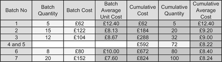
Table 3.18 Cumulative Averages with Partial Missing Data

Figure 3.28 Cumulative Average with Partial Missing Data
A lesser used derivative of the traditional Cumulative Average is one that is based on Cumulative Achievement as a continuous function; in other words, we can consider the Cumulative Average based on non-integer denominators. For instance:
- We might collect the cost of successive units completed and calculate a Cumulative Average per unit to remove any unseemly variation in costs between units (see Volume IV Chapter 2 on Basic Learning Curves). This is a discrete function, dividing by a number of units completed (see previous Figure 3.25).
- We might also the collect output per unit of input cost over time, and calculate a Cumulative Average productivity or efficiency measure over time. This again is a discrete function, dividing by a number of time periods that have elapsed (see previous Figure 3.24).
- Then again, we might want to be a little bit more creative with the data we have and calculate the Cumulative Cost per time period divided by the Cumulative Achievement realised. This is a continuous function, dividing by the cumulative equivalent number of units completed (see Table 3.19 and Figure 3.29)
The topic of Equivalent Units will be discussed further in Volume IV Chapter 5 on Equivalent Unit Learning Curves.
3.6.5 Cumulative Smoothing
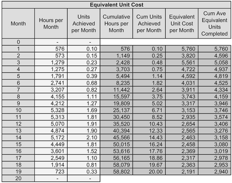
Table 3.19 Cumulative Average Equivalent Unit Costs
A natural corollary to Cumulative Average smoothing is Cumulative Smoothing. In general, we may be better looking at Cumulative Smoothing under the section on Curve Fitting (Chapters 6 and 7) but as a simple taster of what is to come, we might like to consider an example where neither Moving Average nor Cumulative Average appear to be much help to us in answering a couple of simple questions such as ‘what is the average component delivery rate, and at what point in time did it begin?’
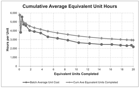
Figure 3.29 Cumulative Average Equivalent Unit Costs
Consider actual component deliveries over a period of time (Table 3.20 and Figure 3.30). We can see that we have done some preliminary analysis of the data, and calculated the Cumulative Average Deliveries over time, and also a number of Moving Averages with increasing intervals.
In our example we can observe that:
- The actual deliveries per month are erratic with wild swings (so, true to life, you will agree no doubt?)
- There is no clear interval or repeating pattern on which to base the Moving Average calculation, but from the table higher order intervals yield smoother data (we said they would!)
- The Cumulative Average appears to be rising unabated
- Our best estimate of a nominal steady state for component deliveries per month would be in the region of 3 to 3.25 per month (... but are we comfortable with that? Probably not)
- The nominal steady state rate commences at Month 11 if we accept that a Moving Average of Interval 6 is appropriate.

Table 3.20 When Moving Averages and Cumulative Averages do not Appear to Help

Figure 3.30 When Moving Averages and Cumulative Averages do not Appear to Help
OK, time for an honesty session now. How many of you thought that ‘Month 11’ was a misprint and should have read ‘Month 16’? We must not forget that the Moving Average here has been depicted at the end of the cycle for which the average calculated is relevant; the start of the cycle for that average is given by the endpoint minus the interval plus one, hence 16–6 + 1 = 11.
It’s not that intuitive immediately from the graph, I must admit? Even plotting the data at the interval mid-point doesn’t really help. What we need is something simple that really makes it obvious ... Perhaps we have just the thing.
For the Formula-phobes: Why do we not just deduct the interval to find the start point?
Consider a line of 5 black telegraph poles and spaces, followed by 5 white ones:

If we just deduct half the total number of poles from the last white one, we will end up with the last of the black ones. By adding 1 back on, we get the first of the white ones; we have to go in-between
If we take a step back from the Cumulative Average and plot the Cumulative data that we have available (Figure 3.31), we can immediately confirm the following:
- After Month 10 the cumulative number of units delivered per month follows a straight line – indicative of a nominally constant rate per month over Months 11 to 24
- The average rate per month can be determined from the difference between the cumulative deliveries at Month 24 and Month 10 divided by the number of months:
The average delivery rate is (59–13)/14 = 3.28 units per month after Month 10, i.e. beginning with the first delivery in Month 11. Clearly, the end of Month 10 is the start of Month 11.
The eagle-eyed will have spotted that the calculation gives 3.28 but the graph shows a straight line slope of 3.25. We are estimators, and precision of this nature is probably unnecessary and inappropriate, that’s why the straight line on the graph has been rounded to increments of 3.25 or three and a quarter deliveries per month.
The curious amongst us who do not like loose ends, might ask how this all stacks up with Moving Averages and Cumulative Averages:

Figure 3.31 Cumulative Smoothing where Moving Averages and Cumulative Averages Fail
- In our example, we detected by observation that the Cumulative Deliveries followed a straight line from Month 10 to Month 24 – a difference of some 14 months.
- 14 is the product of 2 and 7, so it might be reasonable to try Moving Averages for intervals of 2 or 7
- We have also remarked that Cumulative Averages are slow to respond to changes in the underlying trend. However, we have also discussed that Cumulative Averages have to begin at a fixed reference point – usually observation point 1, but that does not have to be the case. In this instance we could begin the Cumulative Average at Month 10.
With this in mind, let’s revisit the data from Table 3.20 in Table 3.21 but use higher order Intervals than previously used. We will consider the Cumulative Average only after Month 10 (i.e. Month 10 will become the new zero start point.)
From the table we can see that the difference between the Minima and Maxima is at it lowest level for a Moving Average of Interval 7, but only just ahead of a Moving Average of Interval 8.
Figure 3.32 shows us that the Cumulative Average between Months 10 and 24 is much more stable than the full holistic calculation. Also, the Cumulative Average provides an earlier indicator of there being a nominally steady state delivery rate per month over this period than the Moving Averages. The Moving Average can also be reconciled with the start point of the steady state average rate by deducting the interval minus 1 from the start month indicated by the plot. This gives us the offset lag commencing at Month 11 as indicated by Table 3.22:

Table 3.21 When Moving Averages and Cumulative Averages do not Appear to Help – Revisited
Ah, the estimator’s equivalent of Utopia – compatible answers from more than one method!
3.7 Chapter review
We can apply basic trend smoothing techniques to any natural sequence whether time or achievement based. Moving Averages are simple to use and are ideal for estimating Steady State values, or changes in the Steady State value. However, they need to be adjusted where there is an upward or downward trend to take account of the inherent lag between the true underlying trend and the traditional practice of plotting the Moving Average at the end of the cycle. We can make this lag adjustment by plotting the Moving Average earlier in the middle of its Interval or cycle. Weighted Moving Averages

Figure 3.32 Cumulative Smoothing where Moving Averages and Cumulative Averages Fail – Revisited
Table 3.22 Moving Average Steady State – Applying the Offset Lag
| Moving Average Base in Months Giving Steady State | Steady State Commences at Moping Average Endpoint Month | Moving Average Lag in Months (Base - 1) | Steady State Commences at Month (Endpoint – Lag) |
|---|---|---|---|
| 7 | 17 | 6 | 11 |
| 8 | 18 | 7 | 11 |
can be adjusted also to take account of the inherent lag; the adjustment will depend on the weightings used.
We can use other Moving Measures such as Maxima and Minima, Factored Standard Deviations or Percentiles to reflect the uncertainty around the steady state or upwards or downwards trend. However, Moving Averages can be unduly affected by extreme values or outliers but Moving Medians can provide a more stable alternative provided the interval is greater than two.
We have seen that Exponentially Weighted Moving Averages (Exponential Smoothing) is also useful for determining steady state values but need more complex analysis in order to take account of the inherent lag where there is an upward or downward trend. We have also discussed the apparent confusion and interpretation of the terms ‘Smoothing Constant’ and ‘Damping Factor’ and that it is important that we recognise how others use them.
We have also explored the use of Cumulative data and Cumulative Averages as an often overlooked smoothing mechanism. Whereas Moving Averages and Exponential Smoothing both require the full data history that is equally spaced with no missing values in order to maximise their value as trend smoothing techniques, the Cumulative and Cumulative Average techniques allow us to use a reduced number of observations.
If we want a more sophisticated trend smoothing technique that is also inherently predictive in nature, then we should be considering line or curve fitting techniques; these are discussed in the chapters that follow. Volume IV deals specifically with Learning Curves.
References
Brown RG (1963) Smoothing Forecasting and Prediction of Discrete Time Series, Englewood Cliffs, New Jersey, Prentice-Hall.
Casaregola, V (2009) Theaters of War: America’s Perceptions of World War II, New York, Palgrave MacMillan, p. 87.
Holt, CC (1957) ‘Forecasting Seasonals and Trends by Exponentially Weighted Averages’, Office of Naval Research Memorandum, 52, reprinted (2004) in International Journal of Forecasting, 20 (1) pp. 5–10.
ONS, (2017) MM23 Consumer Price Inflation time series dataset, Newport, Office of National Statistics, 14 February 2017, [online] Available from: https://www.ons.gov.uk/economy/inflationandpriceindices/datasets/consumerpriceindices [Accessed 14–02–2017].
Winters, PR (1960) ‘Forecasting sales by exponentially weighted moving averages’, Management Science, 6 (3), pp. 324–342.
Younge, G (1999) ‘Jesse Jackson: Power, politics and the preacher man’, London, The Guardian, 17th April [online] Available from: https://www.theguardian.com/world/1999/apr/17/uselections2000.usa [Accessed 12/01/2017].