
7 Least Squares Nonlinear Curve Fitting without the logs
What if we have what looks from the historical data to be a good nonlinear relationship between the variable we are trying to estimate and one or more drivers, but the relationship doesn’t fit well into one or more of our transformable functions? Do we:
- Throw in the proverbial towel, and make a ‘No bid’ recommendation because it’s too difficult and we don’t want to make a mistake?
- Think ‘What the heck; it’s close enough!’ and proceed with an assumption of a Generalised form of the nearest transformable function, estimate the missing constant, or just put up with the potential error?
- Shrug our shoulders, and say ‘Oh well! We can’t win the all!’, and go off for a coffee (other beverages are available), and compile a list of experts whose judgement we trust?
- Use a Polynomial Regression and only worry if we get bizarre predictions?
- Consider another nonlinear function, and find the ‘Best Fit Curve’ using the Least Squares technique from first principles?
Apart from the first option which goes against the wise advice of Roosevelt, all of these might be valid options, although we should really avoid option iv (just because we can it doesn’t mean we should!) However, in this chapter, we will be looking at option (v): how we can take the fundamental principles that underpin Regression, and apply them to those stubborn curves that don’t transform easily.
A word (or two) from the wise?
"It is common sense to take a method and try it. If it fails, admit it frankly and try another; but above, all, try something."
Franklin D Roosevelt 1882-1945 American president
7.1 Curve Fitting by Least Squares . . . without the logarithms
In Volume II we explored the concepts of how data can be described in terms of representative values (Volume II Chapter 2 – Measures of Central Tendency), the degree and manner of how the data is scattered around these representative values (Volume II Chapter 3 – Measures of Dispersion and Shape), and examples of some very specific patterns of data scatter (Volume II Chapter 4 – Probability Distributions.)
Sometimes we may want to describe our data in terms of a probability distribution but not really know which is appropriate. We can apply the principle of Least Squares Errors to our sample data and measure whether any particular distribution is a better fit than another. To help us do this we can enlist the support of Microsoft Excel’s Solver facility.
Even though here we will be discussing the fitting of data to Cumulative Distribution Functions (CDFs), we can try applying this Solver technique to any non-transformable curve. What we cannot do is give you a guarantee that it will always work; that depends heavily on how typical our random sample is of the curve we are trying to fit and how large our data sample is.
Initially we are going to consider the distribution of a Discrete Random Variable, before applying the principle to Continuous Random Variables.
7.1.1 Fitting data to Discrete Probability Distributions
Let’s consider the simplest of all Discrete Probability Distributions, the Uniform or Rectangular Distribution. For simplicity, we will consider a standard six-sided die (i.e. one that is ‘true’ and not weighted towards any particular value, the values of the faces being the integers 1 to 6.)
Suppose we threw the die 30 times and got each integer face-up, exactly five times each; what could we determine from that, (apart from how lucky or fluky we were?) We could infer that we had a one-in-six chance of throwing any number (which in this case we already knew), or we could infer that the cumulative probability of throwing less than or equal to each successive integer from 1 to 6 is a straight line. (Again, something we already knew.)
This straight line could be projected backwards to zero, where clearly we had no results, giving us the simple picture in Figure 7.1 (left-hand graph). Realistically, we would probably get a different number of scores for each integer, as illustrated by the cumulative graph on the right-hand side. With a greater number of observations, the scatter around the theoretical cumulative probability line would be, more than likely, reduced, but with fewer observations it could be significantly more scattered.
If we recall the concept of Quartiles from Volume II Chapter 3 we could determine the five Quartile start and end values using the QUARTILE.INC(array, quart) function in
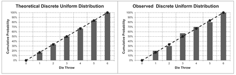
Figure 7.1 Theoretical and Observed Discrete Uniform Distribution
Table 7.1 Casting Doubts? Anomalous Quartile Values of a Die
| Quartile Parameter | Quartile Value Returned | Associated Confidence Level with Quartile | Uniform Distribution CDF for Quartile Value Returned |
|---|---|---|---|
| 0 | 1 | 0% | 17% |
| 1 | 2.25 | 25% | > 33% and < 50% |
| 2 | 3.5 | 50% | > 50% and < 67% |
| 3 | 4.75 | 75% | > 67% and < 83%, |
| 4 | 6 | 100% | 100% |
| Quartile Array based on the successive integers 1, 2, 3, 4, 5, 6 | |||
Microsoft Excel," where quart takes the integer values 0 to 4. If the array is taken to be the six values on the faces on the die then we will get the Quartile values in Table 7.1.
No prizes for spotting that this in blatantly inconsistent with the CDF from Figure 7.2. So what went wrong? (Answer: We did! Our logic was incomplete – recall the telegraph poles and spaces analogy from Volume II Chapter 4.)
For the Formula-phobes: Resolving doubts cast over quartile values of a die
Consider the telegraph poles and spaces analogy again. If we had seven poles and six spaces this would define the Sextiles synonymous with a die.

The sextiles then return the same values as the CDF of the Discrete Uniform Distribution.
This also works for other quantiles. All we needed to do to correct our original mistake was add the last value on the left that has zero probability of occurring, as an additional leading telegraph pole.
We can take this as a rule of thumb to adjust any quartile, decile, percentile or any other quantile to align with the empirical Cumulative Probability.
If instead we include the last value for which we have zero probability of getting – in this case the number 0, we can recalculate our quartiles based on the integers 0 to 6, summarised in Table 7.2.
For the Formula-philes: Calculating quantiles for a discrete range
Consider a range of discrete consecutive numbers Ii arranged in ascending order of value from I1 to In. Let Q(r, n)% represent the Confidence Level of the rth quantile based on n intervals, such that r can be any integer from 0 to n

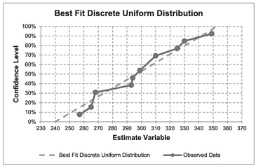
Figure 7.2 Theoretical and Observed Cumulative Discrete Uniform Distribution
Table 7.2 Resolving Doubts? Quartile Values of a Die Re-Cast
| Quartile Parameter | Quartile Value Returned | Associated Confidence Level with Quartile | Uniform Distribution CDF for Quartile Value Returned |
|---|---|---|---|
| 0 | 0 | 0% | 0% |
| 1 | 1.5 | 25% | > 17% and < 33% |
| 2 | 3 | 50% | 50% |
| 3 | 4.5 | 75% | > 67% and < 83% |
| 4 | 6 | 100% | 100% |
| Quartile Array based on the successive integers 0, 1, 2, 3, 4, 5, 6 | |||
This adjustment is very similar in principle to Bessel’s Correction Factor for Sample Bias (Volume II Chapter 3), and that which we discussed previously in Volume II Chapter 6 on Q-Q plots.
Suppose we have a traffic census in which the volume of traffic is being assessed at a busy road junction. At the busiest time of day between 8 and 9 a.m. over a three-day period, the ‘number of vehicles per quarter of an hour’ have been recorded in Table 7.3. We suspect that the data is uniformly distributed but have to estimate the range. We can adapt the technique described and justified for the die problem to help us. With the die, we knew what the lower and upper bounds were. In this case we don’t; we only know what we have observed, and the actual minimum and maximum may fall outside of those that we have observed, i.e. they have not occurred during the sampling period. In deriving the empirical cumulative probabilities or confidence levels we will assume that there is one extra data point (n+1). This will allow us to assume that the last observed point is not at the 100% Confidence Level; furthermore, it is unbiased in the sense that the Confidence Level of our last observed point is as far from 100% as the first is from 0%. The symmetry of this logic can be further justified if we were to arrange our data in descending order; neither the first or last points are ever at the minimum or maximum confidence level.
The model setup to use with Microsoft Excel’s Solver is illustrated in Table 7.3.
The data is arranged in ascending order of observed values. In terms of our ‘Adjusted Observed Cum %’, this is simply the Running Cumulative Total Number of Observations divided by the Total Number of Observations plus one.
In setting up our theoretical Discrete Uniform Distribution model we will assume that there is one more value than the difference between the assumed maximum and minimum (the telegraph poles and spaces analogy again) just as we did for the die example. The Theoretical Confidence Level % is the difference between the Observed Values and the assumed minimum divided by the Range (Maximum – Minimum).
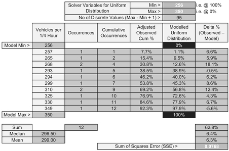
Table 7.3 Solver Set-Up for Fitting a Discrete Uniform Distribution to Observed Data
The Solver Variables (minimum and maximum) can be chosen at random; here we have taken them to be one less and one more than the observed minimum and maximum. The Solver objective is to minimise the Sum of Squares Error (SSE) subject to a number of constraints:
- The Theoretical Minimum is an integer less than or equal to the observed Minimum
- The Theoretical Maximum is an integer less than or equal to the observed Maximum
- The Minimum is less than or equal to the maximum minus 1
- The Median Error is to be zero.
Note that the last constraint here is different from that used for Regression in which we assume that the Sum of Errors is zero, and therefore the Mean Error is zero too. We may recall from Volume II Chapter 2 that there are benefits from using the Median over the Arithmetic Mean with small sample sizes in that it is more ‘robust’ being less susceptible to extreme values. If we are uncomfortable in using the Median instead of the Mean we can exercise our personal judgement and use the Mean.
Table 7.4 and Figure 7.2 illustrate the Solver solution derived using the Zero Median Error constraint.
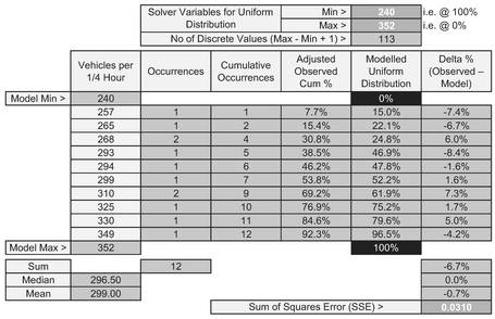
Table 7.4 Solver Results for Fitting a Discrete Uniform Distribution to Observed Data
In some instances, however, we may know that we will have a discrete distribution but not know the nature of the distribution. For instance, the sports minded amongst us will know that we score or count goals, points, shots, fish caught, etc., in integer values. Let’s ‘put’ in a golf example (sorry!)
Are elite golfers normal?
We can use this approach to try and address that provocative question of whether elite golfers can ever be described as just being “normal” golfers! To answer this, let’s consider a number of such elite professional and top-notch amateurs golfers whose scores were recorded at a major tournament in 2014 on a par 72, 18-hole course.
For the non-golfers amongst us (myself included) the ‘tee’ is where the golfer starts to play a particular hole and the ‘green’ is the location of the hole and flag (pin) where the grass is cut very short. The ‘fairway’ is a section of reasonably short grass between the tee and the green from where most golfers are expected to play their second and third shots etc towards the green unless they are expected to reach the green in one shot. This contrasts with the ‘rough’ which is where they don’t want to be playing any shot as it is characterised by long uneven areas of grass. I mention this just in case you have no idea of golfing terms, but want to understand the areas or risk and uncertainty.
For those unfamiliar with scoring in golf:
Each hole has a ‘standard’ number of shots that a competent golfer could be expected to need to complete the hole. This is based on the estimated number of approach shots required to reach the green from the tee plus two putts on the green. This estimate is called the ‘par’ for the hole. Typically, a hole might have a par of 3, 4, or 5. Anything above 5 would be very exceptional.
The number of approach shots is determined by the length and complexity of the fairway leading to the green (e.g. location of hazards, dog-legged or straight approach etc.) In this example, the sum of the individual par values of all the 18 holes is 72.
(Notice how I worked a bottom-up detailed parametric estimate into the example using metrics and complexity factors?)
We know that there must be at least one shot per hole and typically we would expect an absolute minimum around 36 based on approach shots, and even then, that assumes that the last approach shot on each hole goes straight in the hole, and how fluky would that be if it happened eighteen times on the bounce? Realistically we can expect that the number of cumulative scores for 18 holes against the par of 72 will be distributed around it. Suppose we want to assess the probability of getting any particular score? Is the distribution symmetrical or skewed?
The distribution of scores on any hole is likely to be positively skewed as our ability to score more than par for the hole is greater than our ability to score less than par (both in skill terms and mathematically), as it is bounded by 1 as an absolute minimum, but unbounded as a maximum. The phenomenon of central tendency (otherwise known as ‘swings and roundabouts’) suggests that we can probably expect a more symmetrical result from a number of players and that the best overall score for the round will be greater than the sum of the best scores for each hole.
Although the Normal Distribution is a Continuous Distribution we have already commented in Volume II Chapters 4 that it can be used as an approximation to certain Discrete Distributions. Let’s see if it works here.
Table 7.5 summarises the scores for each of two rounds of 18 holes by all 155 professional and amateur golfers at that Major Golf Tournament in 2014. The data reflects their first and second round scores before the dreaded ‘cut’ is made, at which point only the lowest scoring ‘half’ continue to play a third and fourth round. In this particular case, because we have a large sample size, we will revert to the more usual case of setting a constraint that the Mean Error is zero. (If we were to set the Median Error to zero we would get a very slightly different, but not inconsistent answer.) For the eagle-eyed amongst us (no golf pun intended, but I’ll take it) we do have one, and potentially two outliers in the rounds of 90 and 84, using Tukey’s Fences (Volume II Chapter 7) (the Upper Outer Fence sits at 91 and the Upper Inner Fence at 83.5 based on first and third quartiles of 71 and 76 respectively). This might encourage us to take the Median again rather than the Mean to mitigate against the extreme values.
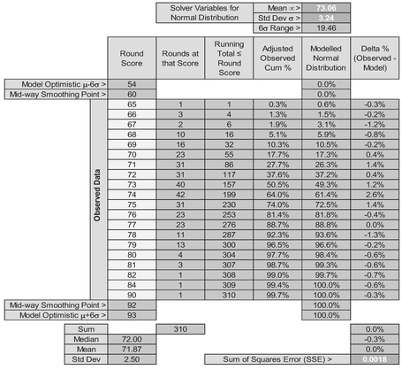
Table 7.5 Solver Results for Fitting a Normal Distribution to Discrete Scores at Golf (Two Rounds)
In setting up the Model in Table 7.5 we have again calculated our ‘Adjusted Observed Cum %’ as the Running Cumulative Total Number of Observations divided by the Total Number of Observations plus one.
The Theoretical Distribution is calculated using Microsoft Excel’s NORM.DIST function with a Mean and standard deviation equal to our Solver Parameters at the top, and the Cumulative Value parameter set to TRUE. The x-values here are the round scores.
The Solver starting parameters can be chosen at random, but it would be sensible to start with values that are similar to the observed Mean or Median of around 72 and a standard deviation of around 2.5.
Taking the results of the Solver from Table 7.5, despite the inclusion of the potential outliers, the scores do appear to be Normally Distributed. Figures 7.3 and 7.4 illustrate this.
If we were to consider these elite golfers in two groups, those who qualified for the third and fourth rounds of the tournament and those who didn’t, we can see whether they are still Normally Distributed.
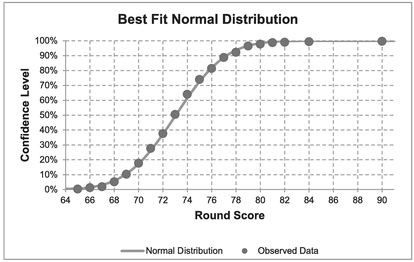
Figure 7.3 Best Fit Normal Distribution to Golf Tournament Round Scores (Two Rounds)
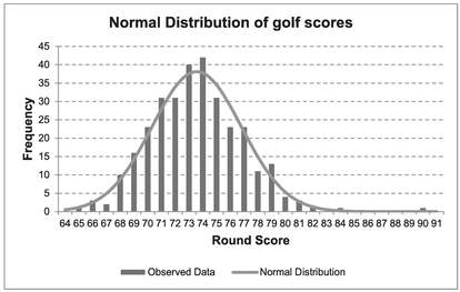
Figure 7.4 Normal Distribution of Golf Scores (Two Rounds – All Competitors)
- Table 7.6 and Figures 7.5 and 7.6 analyses the score of the ongoing qualifiers across all four rounds. Again, there is strong support that their scores are Normally Distributed.
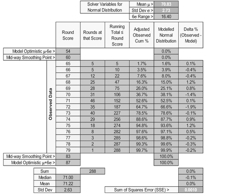
Table 7.6 Solver Results for Fitting a Normal Distribution to Discrete Scores at Golf (Top half)
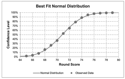
Figure 7.5 Best Fit Normal Distribution to Golf Tournament Round Scores (Top Half)
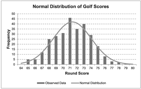
Figure 7.6 Normal Distribution of Golf Scores (Four Rounds – Top Competitors)
- Figure 7.7 shows the results of a similar analysis based on the scores of those failing to make the cut (i.e. not qualifying to continue in to the third round).
Finally, just out of interest, we can compare the scores of those eliminated with those who qualify to continue into the third round. For this we have used just the scores from the first two rounds (to normalise playing conditions, etc.). Both groups appear to be distributed Normally as illustrated in Figure 7.8 with a difference of some 4 shots between their Mean scores over two rounds. Also, there is a wider range of scores for the ‘bottom half ’ being some 2.5 shots across the six-sigma spread of scores, thus indicating that those eliminated are less consistent with a bigger standard deviation. The overlap between the two distributions also illustrate that even elite golfers have good days and bad days.
So, in conclusion to our provocative question, we can surmise that, statistically speaking, elite golfers are indeed just normal golfers, and if we can parody Animal Farm (1945) by George Orwell, ‘All golfers are normal but some are more normal than others’!
7.1.2 Fitting data to Continuous Probability Distributions
If we were to draw a sample of values at random from a truly Continuous Distribution (not just an approximation where in reality only discrete integer values will occur) then in many instances, we will not draw the minimum or maximum values (where they exist)
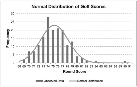
Figure 7.7 Normal Distribution of Golf Scores (Two Rounds – Eliminated Competitors)
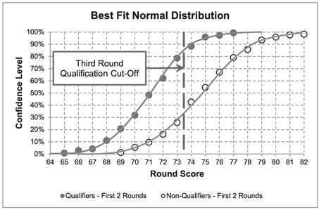
Figure 7.8 Random Rounds from Normal Golfers
or the very extreme values where the distribution tends towards infinity in either or both directions. As a consequence, we need to use the same, or at least a similar, method of compensating for values outside of the range we have observed. We can use the same argument that we used for discrete distributions at the start of the preceding section, and assume that there is always one more point in our sample than there actually is! A fuller explanation of why this works and is valid can be found in Volume II Chapter 4.
An alternative adjustment can be achieved by subtracting a half from the running cumulative total and dividing by the true sample size. This also equalises the difference between 0% and the first observation Confidence Level, and the last observation and 100%. For simplicity’s sake, we will stick with the same adjustment that we used for Discrete Distributions.
Let’s consider a typical problem where we have a range of values for which we want to establish the most appropriate form of Probability Distribution that describes the observed data. Suppose we have a number of component repairs the time for which vary. Table 7.7 summarises the observed values and sets up a Solver Model to create the best fit Continuous Uniform Distribution. (Afterwards we will compare the data against a number of other continuous distributions.)
The procedure to set up the model is very similar to that for Discrete Distributions:
- Arrange the data in ascending order of value
- The ‘Adjusted Observations Cum %’ are calculated by dividing the Running Total number of observations divided by the Total Observations plus one
- The Modelled Uniform Distribution is calculated by determining the difference between the Observed Value and the assumed Minimum Value and dividing by the Range (Max – Min)
- The Delta % expresses the difference in the Observed and Theoretical Confidence Values
- The Solver objective is to minimise the Sum of Squares Error (Delta %) by varying the Minimum and Maximum values of the Theoretical Distribution, subject to the constraint that the Median Delta % is zero. We have reverted to the median here because of the small batch size.
The results of the Solver algorithm are shown in Table 7.8 and Figure 7.9.
Whilst this is the best fit Continuous Uniform Distribution to the observed data, it is clearly not a particularly good fit as the data is arced across the theoretical distribution, which in this case is a straight line. Ideally, the slope of a trendline through errors would be flat, indicating a potential random scatter. However, we should never say ‘never’ in a case of distribution fitting like this with a small sample size as this could be just a case of sampling error.
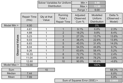
Table 7.7 Solver Set-Up for Fitting a Continuous Uniform Distribution to Observed Data
Table 7.8 Solver Result for Fitting a Continuous Uniform Distribution to Observed Data
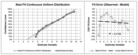
Figure 7.9 Solver Result for Fitting a Continuous Uniform Distribution to Observed Data
However, let’s compare other potential distributions, starting with the Normal Distribution. The Model set-up is identical to that for a Continuous Uniform Distribution with the exception that the Solver Parameters are the Model Distribution Mean and standard deviation, and that the Model Normal Distribution can be written using the Excel function NORM.DIST(Repair Time, Mean, Std Dev, TRUE). The Solver starting parameters can be based on the Observed Mean or Median and sample standard deviation, giving us the result in Table 7.9 and Figure 7.10.
Again, we would probably infer that the Normal Distribution is not a particularly good fit at the lower end, but is better ‘at the top end’ than the Continuous Uniform Distribution. Let’s now try our flexible friend the Beta Distribution which can be modelled with four parameters using the Microsoft Excel function as BETA. DIST(Repair Time, alpha, beta, TRUE, Start, End). Table 7.10 and Figure 7.11 illustrate the output from such a Solver algorithm. We do have to set a couple of additional constraints, however. We may recall from Volume II Chapter 4 (unless we found we had a much more interesting social life) that alpha and beta should both be greater than one in normal circumstances, so we can set a minimum value of 1 for both these parameters.
In the output, we may have noticed that the Best Fit Beta Distribution has a parameter value of alpha = 1. Volume II Chapter 4 informs us that this is in fact a right-angled triangular distribution with the Mode at the minimum value. (If it had given a beta parameter of 1, then this would have signified a right-angled triangular distribution with the Mode at the maximum value. Both parameters equalling one would have signified a uniform distribution.)
Visually, from Figure 7.11, this is a very encouraging result, giving what appears to be a very good result. This is not unusual as the Beta Distribution is very flexible.
Based on this outcome we can now turn our attention to fitting a Triangular Distribution instead, the outcome of which is shown in Table 7.11 and Figure 7.12.
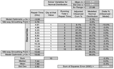
Table 7.9 Solver Result for Fitting a Normal Distribution to Observed Data
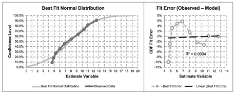
Figure 7.10 Solver Result for Fitting a Normal Distribution to Observed Data
We may recall from Volume II Chapter 4 that Microsoft Excel does not have an in-built function for the Triangular Distribution, and we have to ‘code’ one manually as a conditional calculation:
If the Repair Time ≤ Mode, then
Confidence Level=(Repair Time-Min)2/((Mode-Min) × Range)
If the Repair Time > Mode then
Confidence Level=(1-(Max-Repair Time)2)/((Max-Mode) × Range)
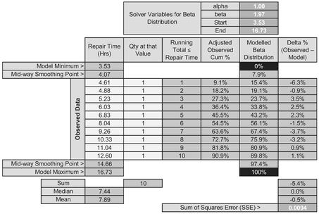
Table 7.10 Solver Result for Fitting a Beta Distribution to Observed Data
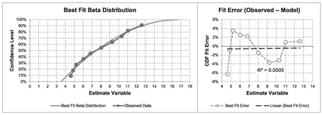
Figure 7.11 Solver Result for Fitting a Beta Distribution to Observed Data
Again, Solver has found a right-angled Triangular Distribution as the Best Fit. However, you will note that it is not identical to the special case of the Beta Distribution. Why not? It’s a reasonable question to ask.
The values are very similar but not exact, and the only thing we can put it down to is that the Beta Distribution function in Microsoft Excel is a close approximation to the true distribution values. We cannot lay the ‘blame’ at Solver’s door in getting stuck at a local minimum close to the absolute minimum as this would go away if we typed the results of one model into the other and vice versa. It doesn’t!
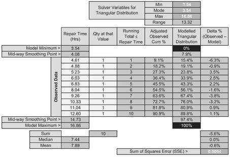
Table 7.11 Solver Result for Fitting a Triangular Distribution to Observed Data
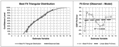
Figure 7.12 Solver Result for Fitting a Triangular Distribution to Observed Data
We will have to console ourselves with the thought that they are both accurate enough, as in reality they will be both precisely incorrect in an absolute sense. (One more or less data point will give us a slightly different answer.)
There are other distributions we could try, but most of us will have lives to lead, and will be wanting to get on with them. Nevertheless, the principles of the curve fitting are similar.
Despite this, overall, we may conclude that the right-angled Triangular Distribution is a reasonable representation of the sample distribution in question.
7.1.3 Revisiting the Gamma Distribution Regression
In Section 7.2.2 we concluded that it was a little too difficult to use a Multi-Linear Regression to fit a Gamma Distribution PDF due to collinearity and other issues, and I rashly promised to get back to you on that particular conundrum. (That time has come, but please do try to curtail the excitement level; it’s unbecoming!)
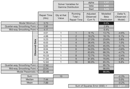
Table 7.12 Solver Result for Fitting a Gamma Distribution to Observed Data
In the last section we could have tried an offset Gamma Distribution to our data, and this would have worked, giving us the solution in Table 7.12 and Figure 7.13 (although not as convincing as a right-angled Triangular Distribution.) If we look at the error distribution in Figure 7.13 it is does not appear to be homoscedastic, leaving quite a sinusoidal looking error pattern around the fitted curve. However, this example does conveniently illustrate the difficulties of using a transformed Multi-Linear Regression with small sample sizes. Here, we have a frequency value of one for each observed value. If we were to take the logarithmic transformation of this frequency it would always be zero, regardless of the observed Repair Time and its logarithm. In short the regression would force every coefficient to be zero in order to achieve the result that 0 = 0 + 0 +0! (Which is neat, but now falls into the category of ‘useless’!)
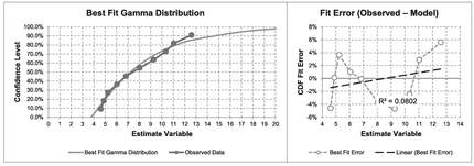
Figure 7.13 Solver Result for Fitting a Gamma Distribution to Observed Data
However, it is not always this catastrophic. Instead let’s consider a large sample of data (100 points) collected at a busy set of traffic lights which are set to change after a set time interval. The data we have collected is shown in Figure 7.14 and Table 7.13. Incidentally, this data appears to be a very close approximation to the cumulative discrete integer values of a Continuous Gamma Distribution; it will help us to understand a little better what is happening when we try to fit discrete data to Continuous Distributions. However, a quick peak at the error terms in Table 7.13 suggests that the scatter is not homoscedastic with the right-hand tail consisting exclusively of negative errors.
Incidentally, in this model we have had to use a Weighted Sum of Errors and a Weighted Sum of Squares of Errors to take account of the frequency in which the error occurs. In Microsoft Excel, we can do this as follows:
Weighted Sum of Errors = SUMPRODUCT(Frequency, Delta%)
Weighted Sum of Squares Error = SUMPRODUCT(Frequency, Delta%, Delta%)
. . . where Frequency is the Frequency of Occurrence range of values, and Delta% is the Delta % (Model – Observed) range of values
In this case we have used Microsoft Solver to calculate the Least Squares Error around the Gamma CDF to determine potential parameters for α and β of 2.44 and 2.39 respectively. (What was that? It sounds all Greek to you?) Let’s see if we can replicate the result using a Transformed Nonlinear Regression of the PDF data (i.e. the frequency per queue length rather than the cumulative data).
From Volume II Chapter 4 and here in Section 7.2.2, the Linear Transformation gives us the relationship that the logarithm of the Queue Length Frequency is a function of two independent variables (Queue Length and the logarithm of the Queue Length) and a constant term.
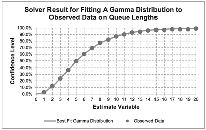
Figure 7.14 Solver Result for Fitting a Gamma Distribution to Observed Data on Queue Lengths
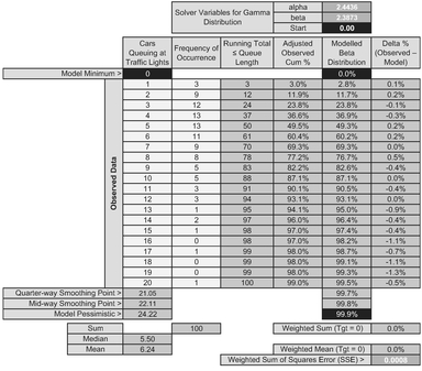
Table 7.13 Solver Results for Fitting a Gamma Distribution to Observed Data on Queue Lengths
For the Formula-philes: Multi-linear transformation of a Gamma Distribution PDF
Consider a Gamma Distribution PDF of dependent variable y with respect to independent variable x with shape and scale parameters α and β

This immediately gives us a problem (see Table 7.14) that Queue Lengths of 16, 18 and 19 vehicles have not been observed so we must reject the zero values from our analysis to avoid taking on Mission Impossible, i.e. the log of zero. We have also had to make another adjustment to the data because we are trying to fit a Continuous Distribution to Discrete values – we’re offsetting the Queue Length by one half to the left. (This may seem quite random but is entirely logical.)
For the Formula-phobes: Offsetting Discrete Movements in a Continuous Distribution
When we are using a Continuous Probability Distribution to model a Discrete Variable, the CDF is measuring the cumulative probability between consecutive integer values.

On the other hand, the PDF is measuring the relative density at each discrete value. To equate this to a tangible probability we are implying that it is the area of the trapezium or rectangle that straddles the integer value. In theory, this is always half a unit too great, so we have to adjust it downwards.
On running the Regression without these zero values we get the statistically significant result in Table 7.15.
From the earlier formula-phile summary of the Gamma Distribution we can translate the Regression Coefficients to get the Gamma’s Shape and Scale Parameters as summarised in Table 7.16.
Table 7.14 Regression Input Data Preparation highlighting Terms to be Omitted

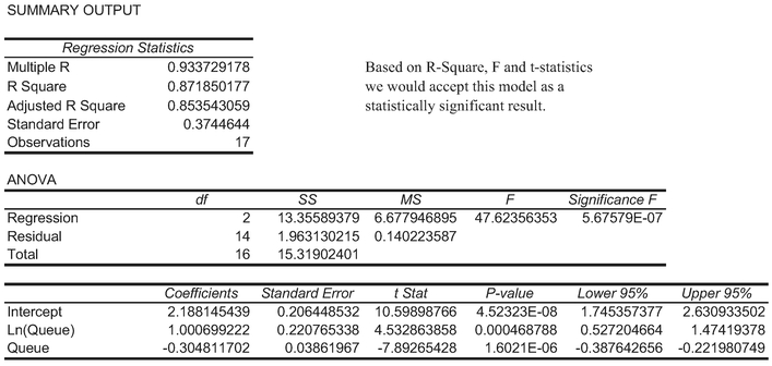
Table 7.15 Regression Output Data for Queue Length Data Modelled as a Gamma Function
However, we would probably agree that as estimates of the parameter values these Regression Results are disappointingly different to those values derived using the Least Squares Error technique on the CDF in Table 7.13.
The problem is that Regression is assuming (quite rightly in one sense) that Queue Lengths of 16, 18 and 19 are just missing values. However, the adjacent, somewhat proportionately inflated unity values at 17 and 20 are artificially driving a higher degree of positive skewness than is rightly due – the Regression is ‘tilted’ a little in their favour.
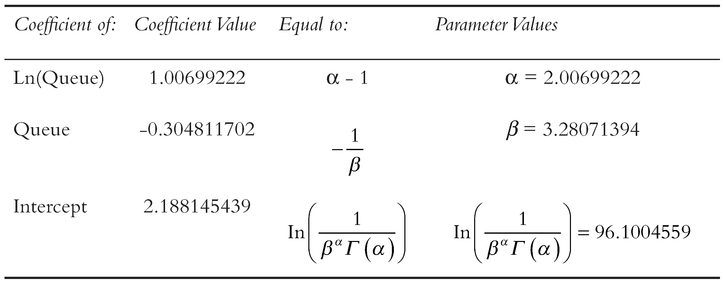
Table 7.16 Interpretation of Regression Coefficients as Gamma Function Parameters
In order to clarify what is happening here, let’s be a little pliable ourselves in how we use the data; let’s re-run both techniques using only the observed data for Queue Lengths of 1.15, thus ensuring a contiguous range (i.e. no missing values) in both techniques.
In Table 7.17 we have still used the full 100 observations to derive the Adjusted Observed Cum%, but have only used the first 15 queue lengths on which to minimise the Least Squares Error. This gives us a revised Gamma Distribution with shape and scale parameters 2.44 and 2.39. (They will have changed slightly in the third decimal place because we have excluded the tail-end errors.)
Table 7.18 shows the regression results for this reduced set of observations. The coefficients are then mapped to the Gamma Shape and Scale Parameters in Table 7.19, with values of 2.41 and 2.40, which are similar to those generated by the CDF Solver technique.
The implication we can draw from this is that with very large sample sizes we can probably expect to get very compatible results using the two techniques, but with small sample sizes the Regression technique can be adversely affected by disproportionate or unrepresentative random events.
The reason why the two techniques do not give identical results is down to differences in how they treat the random errors or residuals; the Cumulative Technique inherently compensates for random error and hence is minimising a smaller set of values. We can observe this by comparing the minimised Solver SSE of 0.0007 in Table 7.17 with the Residual Sum of Squares of 0.6213 in Table 7.18. Also, the log transformation then forces the line of best fit through the Geometric Mean, not the Arithmetic Mean.
Finally, we may recall from Section 7.1 that any Linear Regression that involves a logarithmic transformation passes through the Arithmetic Mean of the transformed Log
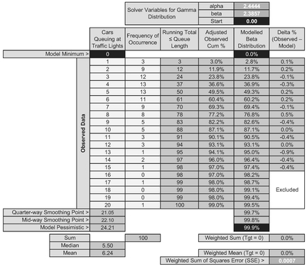
Table 7.17 Solver Results for Fitting a Gamma Distribution Using Restricted Queue Length Data
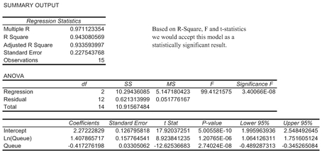
Table 7.18 Revised Regression Output Data for Queue Length Data Modelled as a Gamma Function
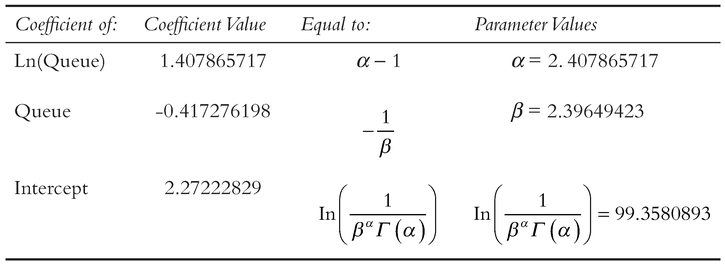
Table 7.19 Interpretation of the Revised Regression Coefficients as Gamma Function Parameters
data which is the Geometric Mean of the raw data. If we want to force the regression through the Arithmetic Mean of the raw data then we can always set up a model to do that and use Solver to find the slope and intercept. That said, we would then have to re-create all the measures for goodness of fit long-hand in order to verify that the best fit is indeed a good fit. We must ask ourselves in the context of being estimators ‘Is it worth the difference it will make. Anything we do will only be approximately right regardless.’
7.2 Chapter review
Wow, perhaps not the easiest technique, but if followed through logically one step at a time it is possible to fit nonlinear, untransformable curves to our data, exploiting the principles of Least Squares Regression, and the flexibility of Microsoft Excel’s Solver.
On a note of caution, we may find that our data may not meet the desired attribute of homoscedasticity, but if we think that the fit is good, and has good predictive potential (perhaps bounded), and we have no other realistic alternative, then the technique is a good fallback.
Reference
Orwell, G (1945) Animal Farm, London, Secker and Warburg.