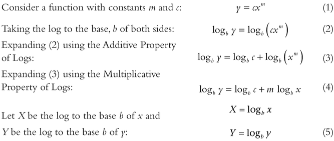
5 Linear transformation: Making bent lines straight
A straight line is just a curve that never bends!
Estimating would be so much more straightforward if our estimating or forecasting technique was, well, straight forward . . . or backward, i.e. just a question of projecting values along a straight line. That way we only need to concern ourselves with one input variable and two constants (an intercept and a slope or gradient) in order to get an output variable:
Output = slope × Input + Intercept
Unfortunately, in reality many estimating relationships are not linear. However, there are some instances (especially where we need to interpolate rather than extrapolate) a linear approximation may be adequate for the purposes of estimating. As George Box pointed out (Box, 1979, p. 202; Box & Draper, 1987, p. 24), just because the model is not right in an absolute sense, it does not mean that it is not useful in helping to achieve our aims.
A word (or two) from the wise?
"Essentially; all models are wrong, but some are useful."
George Box 1919-2013 Statistician
Even if a linear approximation is not appropriate, it still does not mean that we have to throw in the proverbial towel. There are many estimating relationships that follow generic patterns and can be considered to be part of one of a number of families of curves or functions. Whilst some of these may be distinctly nonlinear in reality, they can often be transformed into linear relationships with just a little touch of a ‘ mathe-magical sleight of hand’ called a linear transformation (a case perhaps of unbending the truth!)
In this chapter, we will be dealing in the main with the transformation of the perfect relationship. In the next chapter, we will be looking at finding the ‘best fit’ linear transformation where we have data scattered around one of these nonlinear relationships or models.
Whilst there are some very sophisticated linear transformations in the dark and mysterious world of mathematics, the three groups that are probably the most useful to estimators are the relatively simple groups of curves which can be transformed using logarithms. As we will see later this also includes the special case of reciprocal values. Before we delve into the first group, we are probably better reminding ourselves what logarithms are, and some of their basic properties. (What was that? Did someone say that they have never taken the logarithm of a value before? Really? Well you’re in for a treat – welcome to the wacky weird world of logarithms!)
5.1 Logarithms
Logarithms – another one of those things we may (or may not) have done in school just to pass an exam (or at least we may have thought that at the time.) Some of us may have tried to bury the event as a mere bad memory. We probably just know them by their shortened names of logs, and anti-logs when we want to reverse them.
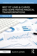
Those of us who were lucky enough to own a slide rule were using logarithms to the base 10. (Yes, you’ve spotted it, there’s more than one base that can be used for logarithms.) As some of us may never have seen a slide rule, the principle is illustrated in Figure 5.1 – it’s an ingenious device, but now largely obsolete, that converts multiplication into addition. (From an evolutionary computational aid perspective, a slide rule falls between an abacus and a calculator.)
Definition 5.1 Logarithm
The Logarithm of any positive value for a given positive Base Number not equal to one is that power to which the Base Number must be raised to get the value in question.
For the Formula-philes: Definition of a logarithm to any given base
Consider any two numbers N and B:
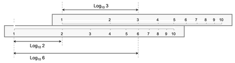
Figure 5.1 Slide Rules Exploit the Power of Logarithms
Many people may look at the definition of a logarithm, shake their heads and mutter something like, ‘What’s the point of raising a number to a power of another number, just to get the number you first thought of?’ Well, sometimes it does feel like that, but in truth logarithms are just exploiting the power of powers, so let’s take a short detour into the properties of powers . . . it should help later!
5.1.1 Basic properties of powers
Let’s consider powers from a first principles perspective:
When we take a number raised to a power, we are describing the procedure of taking a number of instances (equal to the power) of a single number, and multiplying them together. For instance:
| Ten to the power of 3: | 103 | = | 10 × 10 × 10 | = | 1000 |
| Two to the power of 5: | 25 | = | 2 × 2 × 2 × 2 × 2 | = | 32 |
| Four to the power of 2: | 42 | = | 4 × 4 | = | 16 |
This gives us an insight into one of the basic properties of powers:
In the special case of powers of ten, the value of the power tells us how many zeros there are in the product following the leading digit of one. By implication, ten raised to the power of zero has no zeros following the digit one. We can conclude that ten raised to the power of zero is one.
In the case of two values that are the powers of the same number, when we multiply them together, this is equivalent to raising that number to the power of the sum of the individual powers. This is known as the ‘Additive Property of Powers’.
By implication, any value raised to the power of zero takes the value of one. If we multiply a number by one, we leave it unaltered. This is the same as adding zero to a power; it leaves it unaltered. (So, it is not just for power of ten that this works.)
If we extend this thinking further to square roots, the definition of a square root of a number is that which when multiplied by itself gives the original number. By implication, this means that the square root of a number can be expressed by raising a number to a power of a half, i.e. when multiplied by itself, this is equivalent to doubling the power of a half to get one, and any number raised to the power of 1 is simply the number itself.
The other major property that we can derive from our example is the ‘Multiplicative Property of Powers’. Consider a value that is the power of a number. If we then raise that value to a power then the result would be another value which can be expressed as the original number raised to the power of the product of the two constituent powers.
For the Formula-phobes: Example of the Additive Property of Powers
This is one area where we cannot get away totally from using formulae, but we can avoid symbolic algebra.
Let’s consider powers of 2:

For the Formula-phobes: Example of the Multiplicative Property of Powers
Again, let’s consider powers of 2:

For the Formula-philes: The Additive and Multiplicative Properties of Powers
Consider n, p and q which are all real numbers:

The flipside to these properties is that their inverses relate to the properties of subtraction and division. If we take a number raised to a power and divide it by that same number raised to another power, this can be simplified by subtracting the latter power from the former. This implies (correctly) that a negative power is equivalent to a ‘real division’.
Also, raising a value to a fractional power is equivalent to taking the appropriate root of the value.
For the Formula-phobes: Examples of subtracting and dividing powers
Again, using powers of 2:

So where does all this leave us? Well, if only we could express all multiplication and division calculations in terms of the powers of a common number, we could just use addition and subtraction operators. Oh, guess what! That’s where logarithms come to the fore, courtesy of mathematician John Napier in 1614.
5.1.2 Basic properties of logarithms
The word ‘logarithm’ is a bit of a mouthful to say every time (even to ourselves), so we normally just say ‘log’ or to be correct we should say ‘log to the base n’ where n is whatever number is being used as the basis. Notationally, we should use Logn. However, in cases where we omit mentioning the base, we are usually implying that we are using Common Logs, although some people (such as Engineers) prefer to use Natural Logs:
- Common Logs are logs to the base 10, usually abbreviated to Log or Log10
- Natural Logs, sometimes known as Naperian Logs, and usually abbreviated to Ln, are logs to the base e, where e is the ‘Exponential Number’ or ‘Euler’s Number’ and is approximately 2.71828182845905.
Caveat augur
Even though 10 is considered to be a Natural Number, and is the base for counting in many cultures, Natural Logs are not logs to the base 10. Natural Logs are those logs based on Euler’s Number, e.
Euler’s Number, e, does occur in nature and not just in the minds or virtual realities of mathematicians and other scientists, but it’s choice as the base for Natural Logs may be construed as an oxymoron, as there appears to be nothing ‘natural’ about it to the lay person. Even in mathematics a ‘natural number’ is defined as one of the set of positive integers used in counting, not some irrational number such as e. On that basis, we could argue that the more obvious choice for the base of Natural Logs would have been the number ten – we have ten digits across our two hands, and ten more across our two feet. However, we are where we are; we won’t change centuries of convention by having a whinge here!
As the constant e is transcendental, with decimal places that go on infinitely and cannot be substituted by a fraction, mathematicians would call it an ‘irrational’ number. Many non-mathematicians would probably agree.
In truth, it the majority of cases it does not make any difference what number base we choose to use as our preference for logarithms, so long as we are consistent in what we use within a single relationship or equation. Until more recent versions were released, the logarithmic graph scale in Microsoft Excel assumed logs to the base 10; now we can use whatever base we want. The beauty of logarithms is that their properties transcend the choice of base and can be related back to the properties of powers:
| The Additive Property of Logs: | The log of the product of two numbers is equal to the sum of the logs of the two individual numbers |
| The Multiplicative Property of Logs: | The log of a number raised to a power is equal to that power being multiplied by the log of the number |
However, the first property that we should recognise is based on the definition of a log, i.e. the log of a value is that power to which the Base Number must be raised to get the value in question. If we were to raise the Base Number to the power of one, we would simply get the Base Number – nothing would change. Therefore, for any Base Number, the log of the Base Number to that base is simply, and invariably, 1.
For the Formula-philes: The Additive Property of Logs


Table 5.1 Example of the Additive Property of Logarithms
Table 5.1 illustrates an example of the use of the Additive Property:
- The left-hand set of columns calculate the products of x and y; the right-hand set of columns show the Common Log values for x, y and xy; the last of these columns is the sum of the previous two columns.
- Similarly, on the left-hand side the third row is the product of the first and second rows. In terms of corresponding log values, the third row is the sum of the previous two rows.
- Rows 1, 3 and 5 show that as the product of x and y increases by a factor of ten, the log values of 6, 60 and 600 all increase by 1, which is the Common Log of 10. Row 4 shows that the Common Log of 100 is 2.
We can see from this that multiplication operations in terms of ‘real space numbers’ are replaced by addition operations in ‘log space’. The inverse of a multiplication operation in ‘real space’ is a division operation; the equivalent inverse operation in ‘log space’ is subtraction.
However, we do have multiplication and division operations with logarithms; these are equivalent to powers and roots in ‘real space’.
For the Formula-philes: The Multiplicative Property of Logs


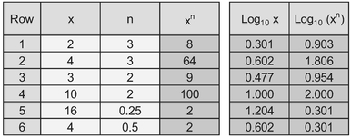
Table 5.2 Example of the Multiplicative Property of Logarithms
Table 5.2 illustrates the Multiplicative Property of Logs:
- The left-hand set of columns are examples of the calculation that raise x to the power of n
- The right hand two columns are the logs of x and xn. In all cases we can arrive at the log of the latter by multiplying the former by the power, n
There is one other noteworthy property of logs and that is the Reciprocal Property, which allows us to switch easily and effortlessly between different bases.
The log of one number to a given base of another number is equal to the reciprocal of the log of the second number to the base of the first number.
Some examples of the Reciprocal Property are provided in Table 5.3 in which for any pair of values for b and c, we calculate the log of one value to the base of the other value. If we multiply these two logs together, we always get the value 1.
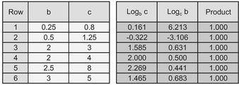
Table 5.3 Example of the Reciprocal Property of Logarithms
Now that’s what I call a bit of mathe-magic! I can feel a cold shower coming on to quell my excitement.
For the Formula-philes: The Reciprocal Property of Logs

The good news is that we don’t have to start using Log Tables out of a reference book, or learn how to use a slide rule, Microsoft Excel is log friendly, providing three different complementary (and complimentary) functions as standards:
| LOG(number, base) | We can specify any base so long as the value is positive and not equal to l. The base is an optional parameter; if it is omitted it defaults to 10 |
| LOG10 (number) | We might be forgiven for thinking that this is a superfluous function given the above. All we can say is that it provides an option for improved transparency in a calculation |

For the Formula-phobes: Logarithms are a bit like vision perspective
Think of looking at a row of equally spaced lampposts on a straight road. The nearest to you will appear quite far apart, but the ones furthest away, nearer the horizon will seem very close together. Similarly, with speed: distant objectives appear to travel more slowly than those closer to us travel more slowly than those closer to us

For the Formula-phobes: How can logs turn a curve to a line?
In effect that is exactly how they work . . . by creating a ‘Turning Effect’. This is achieved as the natural outcome of the compression of large value and amplification of smaller values.

Figure 5.2 Impact of Taking Logarithms on Small and Large Numbers
If there is already a curve in the direction of the turning effect, taking logarithms will emphasise the curvature.

It works on either or both the vertical and horizontal axes in the same way.

The last and arguably the most important property of logarithms (to any base) for estimators is that they amplify smaller numbers in a range and compress larger numbers relative to their position in the range, as illustrated in Figure 5.2 – as the real value gets bigger, the rate of change of the log value diminishes. It is this property that we will exploit when we consider linear transformations in the next section.
5.2 Basic linear transformation: Four Standard Function types
OK, now we can get to the nub of why we have been looking at the property of logarithms. As we discussed in Volume I Chapter 2, there are a number of estimating relationships that are power based rather than linear. Typical examples include Learning Curves, Cost-weight relationships, Chiltern Law, etc.
There are three basic groups of functions that we can transform into straight lines using logs depending on whether we are taking the log of the vertical y-axis, the horizontal x-axis, or both. The Microsoft Excel users amongst us may be familiar with the graph facility where we can define the type of Trendline (Linear, Logarithmic, Exponential and Power) that we may want to fit through some data. The names relate to the basic groups or Function Types we will consider initially.
Note that in all instances that follow, the specific shape and direction of curvature of the transformations depend on the parameter values of the input functions (e.g. slope and intercept), and that logarithmic values can only be calculated for positive values of x or y. (Strictly speaking, we can take logs of negative numbers, but this needs us to delve into the weird and wonderful world of Complex and Imaginary Numbers – and you probably wouldn’t thank me for going there!)
Definition 5.2 Linear Function
A Linear Function of two variables is one which can be represented as a monotonic increasing or decreasing straight line without any need for mathematical transformation.
5.2.1 Linear functions
Just to emphasise a point and to set a benchmark for the other Function Types, we’ll first look at what happens if we try to transform something using logs when it is already a simple linear function. (We just wouldn’t bother in reality, but it may help to understand the dynamics involved.)
The 2x2 array of graphs in Figure 5.3 show what happens if we were to calculate the log values for either or both the x and y axes. And plot the four possible combinations:
| Transformation graph | Characteristics |
|---|---|
| Linear x by Linear y | The input function is already a straight line, so no transformation is required. |
| Log x by Linear y | If we take the log of the x-value we will create a curve because we have ‘stretched’ the distance between low values and ‘compressed’ the distance between high values relative to each other. The degree of curvature will depend on the value of the intercept used in the input function (bottom left quadrant) relative to its slope, and the direction of the input slope. |
| Linear x by Log y | If we take the log of the y-value we will create a curve because we have ‘stretched’ the distance between low values and ‘compressed’ the distance between high values relative to each other.The degree of curvature again will depend on the value of the intercept used in the input function (bottom left quadrant) relative to its slope. |
| Log x by Log y | If we take the log of both the x-value and the y-value we will usually create a curve because of the ‘stretching’ and ‘compressing’ property inherent in taking log values. The degree and direction of the curvature will depend largely on the value of the intercept used in the input function (bottom left quadrant). In the special case of a zero intercept, we will get a Log-Log transformation that is also linear. So the smaller the intercept relative to the slope, the straighter the Log-Log Curve will appear |

Figure 5.3 Taking Logarithms of a Linear Function
Unsurprisingly, the family name under which we classify straight lines is Linear Function. As a general rule, taking the log of a Linear Function distorts its shape into a curve, so we would not apply a transformation in this case. The only exception would be in the case where the straight line passes through the origin, i.e. the intercept equals zero. In this case alone, the straight line remains a straight line if we transform both the x and y-values (but only for positive values, as we cannot take the log of zero or a negative value.)
In terms of the special case of a zero intercept, in the majority of circumstances, we just wouldn’t bother making the transformation, even though we could (why create work for ourselves?) However, there is the exception where the relationship is just part of a more
For the Formula-philes: Special case of a Log-Log transformation of a straight line


complex model involving multiple drivers. We will discuss this at the appropriate time in Chapter 7.)
We will find that Linear Functions can increase or decrease as illustrated in Figure 5.4 in which we might consider the time from departure or to arrival if we travel at a constant or average speed:
5.2.2 Logarithmic Functions
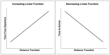
Figure 5.4 Examples of Increasing and Decreasing Linear Functions
Despite its generic sounding name (implying that it may cover all the transformations using logarithms that we are considering), a Logarithmic Function is actually a specific type of curve that transforms into a straight line when we take the log of the horizontal x-value plotted against the real value of vertical y-axis. Figure 5.5 highlights what happens if we take the log of either the x or y variable, or both.
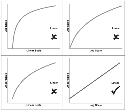
Figure 5.5 Taking Logarithms of a Logarithmic Function
In our example, the bottom left quadrant again depicts the raw untransformed data which is clearly nonlinear. If our ‘Log x by Linear y’ graph, as depicted in the bottom right quadrant, is a straight line then we can classify the raw data relationship as a Logarithmic Function.
If we take the upper quadrants with the log of y with either the Linear or log of x, it will still leave us with a curve as shown in the top two quadrants. As was the case with our Linear Function, the degree of curvature in these transformed values is very much dependent on the initial parameters of the raw data function.
In the case of a Logarithmic Function, the dependent variable, y or vertical axis, can alternatively be described as the power to which a given constant must be raised in order to equal the independent variable, x or horizontal axis. Both the power and constant parameters of the function must be positive values if we are to take logarithms.
A Logarithmic Function of two variables is one in which the dependent variable on the vertical axis produces a monotonic increasing or decreasing straight line, when plotted against the Logarithm of the independent variable on the horizontal axis.
For the Formula-philes: Linear transformation of a Logarithmic Function
Consider a function with positive constants

Logarithmic Graphs can express positive or negative trends yielding convex or concave curves, as illustrated in Figure 5.6. For a decreasing trend, the power parameter is greater than zero but less than one; for an increasing trend the power parameter is greater than one. The function cannot be transformed if the power parameter is one, zero or negative. The intercept must also always be a positive value.
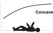
Concave Curve: one in which the direction of curvature appears to bend towards a viewpoint on the x-axis, similar to being on the inside of a circle or sphere
Convex Curve: one in which the direction of curvature appears to bend away from a viewpoint on the x-axis, similar to being on the outside of a circle or sphere
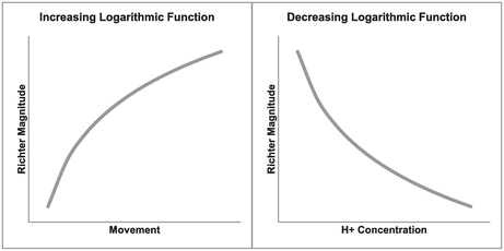
Figure 5.6 Examples of Increasing and Decreasing Logarithmic Function
When we come to the generalised version of these standard functional forms, we will see that a simple vertical shift can change a concave function into a convex one and vice versa.
For the Formula-phobes: Concave and Convex Functions
Consider yourself lying on the horizontal axis, close to the origin, looking up at the curve. Does it bend inwards or outwards?

The Richter Magnitude Scale (usually abbreviated to ‘Richter Scale’) is used to measure the intensity of earthquakes and is an example of a Logarithmic Function. Each whole unit of measure on the Richter Scale is equivalent to a tenfold increase in intensity, i.e. an earthquake of magnitude 4.3 is ten times more powerful than one of magnitude 3.3. (The vertical y-axis is the Richter Magnitude and the horizontal x-axis is the ‘Amplified Maximum Ground Motion’, as measured on a seismograph a specified distance from the earthquake’s epicentre.)
On the other hand (the right one in this case), pH is a Logarithmic Function with a decreasing rate. pH is a measure of acidity or alkalinity of an aqueous solution that some of us may have tested using litmus paper in school; it is actually measuring the concentration of hydrogen ions which are present in a liquid. Another well-known Logarithmic Function is the decibel scale used as a measure of sound intensity or power level of an electrical signal.
With decreasing Logarithmic Functions, there is a likelihood that the output y-value may be negative for extreme higher values of x. We need to ask ourselves whether this passes the ‘sense check’ that all estimators should apply – the C in TRACE (Transparent, Repeatable, Appropriate, Credible and Experientially based, see Volume I Chapter 3).
Caveat augur
It is quite commonplace to depict a date along the horizontal x-axis. However, we should never take the log of a date! It is meaningless. Date is a relative term, a label, but in reality, it is transcendental as we do not know when Day 1 occurred, and any attempts to define a specific start date is inherently arbitrary.
Microsoft Excel makes the assumption that Day 1 was 1st January 1900, but this is more a matter of convenience. We can take the log of an elapsed time, duration or time from a start point, but not a date. Just because we can, does not mean we should! (Dates can be used as an indicator of technology used.)
Having determined that a curve falls into the genre of a Logarithmic Function, we will probably conclude that the transformed linear form is the easier to use in interpolating or extrapolating some estimated value because its output will give us an answer for the ‘thing’ we are trying to estimate (usually the vertical y-scale). However, there may be occasions when we want to ‘reverse engineer’ an estimate insomuch that we want to know what value of a driver (or x-value) would give us a particular value for the thing we want to estimate (the y-value). For that we need to know how to reverse the transformation back to a real number state. In simplistic terms, we need to raise the answer to the power of the log base we used. (We will look more closely at examples of these in Chapter 7.)
We could simply use the Logarithmic Trendline option in Microsoft Excel and select the option to display the equation on the graph. For those of us who are uncomfortable with using Natural or Naperian Logs, you’ll be disappointed to hear that is how Excel displays the equation (i.e. there is no option for Common Logs.)
For the Formula-philes: Reversing a linear transformation of a Logarithmic Function

5.2.3 Exponential Functions
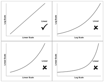
Figure 5.7 Taking Logarithms of an Exponential Function
In Figure 5.7, we can do exactly the same process of taking the log of either or both of the axes for another group of curves called Exponential Functions. These are those relationships which gives rise to expressions such as ‘exponential growth’ or ‘exponential decay’. Commonly used Exponential Functions in cost estimating, economics, banking and finance are ‘steady state’ rates of escalation or inflation, e.g. 2.5% inflation per year, discounted cash flow and compound interest rates.
Exponential Functions are those that produce a straight line when we plot the log of the vertical y-scale against the linear of the horizontal x-scale.
Definition 5.4 Exponential Function
An Exponential Function of two variables is one in which the Logarithm of the dependent variable on the vertical axis produces a monotonic increasing or decreasing straight line when plotted against the independent variable on the horizontal axis.
For the Formula-philes: Linear transformation of an Exponential Function
Consider a function with positive

In common with Logarithmic Functions, the two parameters of the Exponential Function must both be positive otherwise it becomes impossible to transform the data, as we cannot take the log of zero or a negative number. (I’m beginning to sound like a parrot!) This may lead us to think ‘What about negative inflation?’ This is not a problem when inflation is expressed as a factor relative to the steady state, so 3% escalation will be expressed as a recurring factor of 1.03; consequently 2% deflation would be expressed as a recurring factor of 0.98.
For any Exponential Function, a recurring factor:
- greater than zero but less than one, will give a monotonic decreasing function
- greater than one will result in a monotonic increasing function
- equal to one gives a flat line constant
Examples of increasing (positive slope) and decreasing (negative slope) Exponential Functions are shown in Figure 5.8. Steady-state Inflation or Economic Escalation is probably the most frequently cited example of an Increasing Exponential Function. Radioactive Decay is an example of a decreasing Exponential Function, as are discounted Present Values (see Volume I Chapter 6). Interestingly all Exponential Functions are Convex in shape.
There may be occasions when we want to estimate a date based on some other parameters. If we follow the normal convention then the date (as the entity we want to estimate) will be plotted as the vertical y-axis (rather than the horizontal x-axis which we would use if date was being used as a driver. In this case, we can read across the same caveat for dates that we stated for Logarithmic Functions, for the same reason:
Never take the log of a date!
As we will see from the example in Figure 5.8, we can use date in an Exponential Function so long as it is the x-scale or independent input value, but not if it is the y-scale output value.
Where we have used the linear form of an Exponential Function to create an estimate we will need to reverse the transformation to get back to a real space value for the number. To do this we simply take the base of logarithm used and raise it to the power of the value we created for the transformed y-scale.

Figure 5.8 Examples of Increasing and Decreasing Exponential Functions
For example, if we have found that the best fit straight line using Common Logs is:
- log10 y = 2x + 3
- Then, y = 102x + 3
- or, y = 1000 x 102x
- or, y = 1000 x 100x
Sorry, we just cannot avoid the formula here.
For the Formula-philes: Reversing linear transformation of an Exponential Function

5.2.4 Power Functions
Definition 5.5 Power Function
A Power Function of two variables is one in which the Logarithm of the dependent variable on the vertical axis produces a monotonic increasing or decreasing straight line when plotted against the Logarithm of the independent variable on the horizontal axis.
In Figure 5.9, we can repeat process of taking the log of either or both of the axes for final group of curves in this section called Power Functions. These are those curves which mathe-magically transform into straight lines when we take the log of both the horizontal x-axis and the vertical y-axis, as illustrated in the top-right quadrant. Taking the log of only one of these exacerbates the problem of the curvature, although the precise degree is down to the parameters involved.
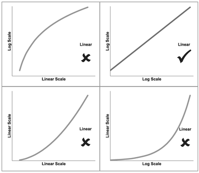
Figure 5.9 Taking Logarithms of a Power Function
For the Formula-philes: Linear transformation of a power function

For exactly the same reasons as we discussed under Logarithmic and Exponential Functions:
Never take the log of a date!
(Yes, I know what you’re thinking – that I’m beginning to turn into a bit of an old nag – well, just be a little more charitable and think of it as ‘positive reinforcement’.)
There are many examples of Power Functions being used in estimating relationships such as:
- Chilton’s Law (Turré, 2006) is used in the petrochemical industry to relate cost with size (). This is represented in the left-hand graph of Figure 5.10 by the increasing slope.
- Learning Curves or Cost Improvement Curves are used in the manufacturing industry to relate the reduction in effort or cost or duration observed as the cumulative number of units produced increases, as illustrated in the right-hand graph of Figure 5.10 by the decreasing slope.
The Power Function is the most adaptable of the set of logarithmic-based transformations depending on the value of the Power/Slope parameter; the Power parameter in real space is equivalent to the slope parameter in log space. Figure 5.11 illustrates the range of different shapes created by the different parameter values:
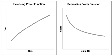
Figure 5.10 Examples of Increasing and Decreasing Power Functions
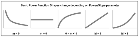
Figure 5.11 Basic Power Function Shapes Change Depending on Power/Slope Parameter
- Less than zero: Convex and decreasing like a playground slide
- Equal to zero: Returns a constant value
- Greater than zero but less than one: Concave and increasing (up then right)
- Equal to one: Increasing straight line (i.e. a Linear Function)
- Greater than one: Convex and increasing (right then up)
Where the Power/Slope parameter equals -1, we have the special case Power Function that we normally call the Reciprocal.
In order to use the output of a Power Function that has been transformed into Linear form for the purposes of interpolating or extrapolating a value we wish to estimate, we need to be able to convert it back into ‘real space’ values. To do this we must raise the logarithm base to the power of the predicted y-value of the transformed equation:
- The real intercept is the base raised to the power of Transformed Linear Intercept.
- The x-value must be raised to the power of the Transformed Linear Slope.
- The y-value is then the product of the above elements.
For the Formula-philes: Reversing a linear transformation of a Power Function


5.2.5 Transforming with Microsoft Excel
When it comes to real life data and looking for the best fit curve to transform, we are likely to find that the decisions are less obvious than the pure theoretical curves that we have considered so far. This is because in many situations the data will be scattered in a pattern around a line or curve. Consequently, we need an objective measure of ‘best fit’. Microsoft Excel’s basic Chart utility will provide us with some ‘first aid’ here.
In essence we are looking for the straight line best fit after we have transformed the data. If we recall (unless you opted to skip that chapter, of course) in Volume II Chapter 5 on Measures of Linearity, Dependence and Correlation, we discussed how Pearson’s Linear Correlation Coefficient would be a helpful measure. Unfortunately, Excel’s Chart Utility will not generate this directly; however, it will generate the Coefficient of Determination or R-squared (R2), which is the square of Pearson’s Linear Correlation. Consequently, the highest value of R2 is also the highest absolute value of the Correlation Coefficient. (It has the added benefit being a square that we don’t have to worry about the sign!)
Furthermore, unless we really want to go to the trouble of changing the axes of the charts, we can trust Excel to do it all in the background by selecting a Trendline of a particular type:
- A Linear Trendline will do exactly what we would expect and fit a line through the data
- A Logarithmic Trendline will fit a straight line through Log x and Linear y data, but then display the resultant trend as the equivalent ‘untransformed’ curve of a Logarithmic Function
- An Exponential Trendline will fit a straight line through Linear x and Log y data, but then display the resultant trend again as the equivalent ‘untransformed’ curve of an Exponential Function
- No prizes for guessing what a Power Trendline does. It calculates the best fit through the Log x and Log y data and then transforms the Trendline back to the equivalent Power Function in real space.
In each case, we will notice that there is a tick box to select whether we want to display the R2 value on the chart. We do.
Figures 5.12 to 5.15 show examples of the above. The four quadrants in each of these are equivalent to the four graphs discussed in the previous sections, but in these latter

Figure 5.12 Examples of Alternative Trendlines Through Linear Data

Figure 5.13 Examples of Alternative Trendlines Through Logarithmic Data
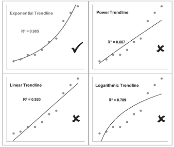
Figure 5.14 Examples of Alternative Trendlines Through Exponential Data
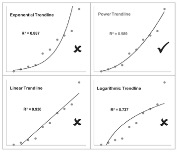
Figure 5.15 Examples of Alternative Trendlines Through Power Data
cases we have chosen not to change any of the scales to logarithmic values as the different trendlines do this ‘in the background’. In all cases the best fit Trendline returns the highest R2 (i.e. closer to the maximum value of 1 – see Volume II Chapter 5), but also the distribution of our data points around the Trendline is more evenly scattered than in the other three cases and not arced. Values of R2 less than 0.5 are indicative that the function type is a poor fit.
We can also observe that it is not unusual in the case of increasing data for a Power Function to look very similar to a Linear Function through the origin, especially where the power value is close to one.
- We will observe that the Exponential and Logarithmic Trendlines curve in opposite directions to each other.
- We might like to consider a Power Trendline to be a weighted average of these two. For this reason, it can often require a judgement call by the estimator whether the relationship is really a Linear Function or a Power Function. We will address this issue in Chapter 7 on Nonlinear Regression and also later in this Chapter in Section 5.3
Caveat augur
We should note that just because we can find the best fit trendline using Excel does not mean that it hasn’t occurred by chance. This is especially the case where there are equally acceptable levels of R2 returned for the other Trendlines.
We should always look at the pattern of data around the Trendline. Any ‘bowing’ of the data around the selected Trendline, characterised by data being on one side of the line or curve at both ‘ends’ but on the other side in the middle area, may be indicative that the selected Trendline is not a particularly good fit. We will look into this more closely in Chapter 7 on Nonlinear Regression. (I know . . . Have a cold shower if the thought is getting you all excited with anticipation – I find that it usually helps.)
If we prefer, we can quite easily check in Microsoft Excel whether it is possible to transform a curve into a straight line by changing either or both of the variables or axes to a Logarithmic Scale. We can do this either:
- By making a conversion using one of the in-built Functions (LOG, LOG10 or LN) and plotting the various alternatives
- By plotting the untransformed data and fitting the four Trendlines in turn to determine whether a Linear, Exponential, Logarithmic or Power Trendline fits the data best, using R2 as an initial differentiator of a ‘Best Fit’
- By plotting the untransformed data and changing the scale of each or both axes in turn to a Logarithmic scale
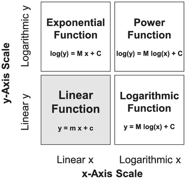
Figure 5.16 Summary of Logarithmic-Based Linear Transformations
Figure 5.16 summarises the three standard logarithmic-based linear transformations. (Yes, you’re right, the use of the word ‘standard’ does imply that there are some non-standard logarithmic-based linear transformations – just when you thought it couldn’t get any better! . . . or should that be worse?) We will consider the case of ‘near misses’ to straight line transformations in Section 5–3 that follows where we will consider situations where there appears to be a reasonable transformation apart from at the lower end of the vertical or horizontal scale, or both.
In the majority of cases we will probably only be considering values where both horizontal and vertical axis values are positive. However, it is possible for negative values of the vertical y-axis to be considered in the case of Linear and Logarithmic Functions, and for negative values of the horizontal x-axis to be considered in the case of Linear or Exponential Functions. We must ask ourselves whether such negative values have any meaning in the context of the data being analysed. Where Excel cannot calculate the Trendline or the log value because of zeros or negatives, it will give us a nice helpful reminder that we are asking for the impossible!
Microsoft Excel provides us with an option to fit a polynomial up to an order 6. The higher the order we choose, the better the fit will be if measured using the Coefficient of Determination R2.
However, fitting a Polynomial Curve without a sound rationale for the underlying estimating relationship it represents, arguably breaks the Transparency and the Credibility objectives in our TRACEability rule, and if we are honest with ourselves, it is a bit of an easy cop-out!
Just because we can doesn’t mean we should!
There are some exceptions to our Caveat augur on not using Polynomial Curve Fitting. One of them we have already discussed in Chapter 2 on Linear Properties which we will revisit briefly in Section 5.6, in that the cumulative value of a straight line is known to be a quadratic function (polynomial of order 2.) We will discuss others in Chapter 7 on Nonlinear Regression.
5.2.6 Is the transformation really better, or just a mathematical sleight of hand?
Having used this simple test to determine which function type appears to be the best fit for our data, we should really now stand back and take a reality check. We wouldn’t dream of comparing the length of something measured in centimetres with something measured in inches without normalising the measurements, would we? Nor would we compare the price of something purchased in US dollars with the equivalent thing measured in Australian dollars, or pounds’ sterling, or euros without first applying an exchange rate.
The same should be true here. Ostensibly, the R-Square or Coefficient of Determination, is a measure of linearity, but in the case of Exponential or Power Functions, we are measuring that linearity based on logarithmic units and comparing it with those based on linear units. Oops!
To ensure that we are comparing like with like, we must first normalise the data by reversing the log transformation of the model back into linear units. We can then compare the errors between the alternative functional best fit curve (exponential or power) with the best fit line (linear). We will be revisiting this in the next chapter, when we look at nonlinear regression, but just for completion, we will finish the last example we started.

Table 5.4 Comparing Linear and Power Trendline Errors in Linear Space (1)
In Table 5.4 we have taken the data from which we generated Figure 5.15 and:
- Determined the Best Fit Lines in Linear and Log Space
- Reversed the transformation on the Best Fit Line for the Power Function by taking the anti-log of the Best Fit Line to get the Best Fit Curve. To do this we just raised 10 (the log base) to the power of the Best Fit Line, e.g. 1.35 = 100.1316.
- Calculated the error between the raw data and the two alternative Best Fits. We make the comparison on the Sum of Square Errors
In this case, we see that the Power Function is the Best Fit Function for our data. So, what was all the fuss about? Well, let’s just change the position of the last data point (Table 5.5) and re-do the calculations. The simple R-Square test still indicates that the Power Function is the best fit, but when we normalise the scales again, we find that the Linear Function is the one that minimises the Sum of Square Errors in linear space.
To be completely thorough, we should also check for homoscedasticity in the error terms for both models. We will not prove it here but both models pass do White’s Test for homoscedasticity (see Chapter 4, Section 4.5.7 for further details.)
Where the difference in R-Square Values is large, it is reasonable expect that the R-Square test will suffice, but where it is relatively small, then we will need to verify that the normalised Sum of Square Errors has been minimised.
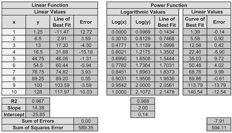
Table 5.5 Comparing Linear and Power Trendline Errors in Linear Space (2)
Note that this normalisation process only needs to be done where the Best Fit Curves appear to be Exponential or Power Functions. We don’t need to worry about Logarithmic Functions because the error terms are still measured in linear space not log space.
5.3 Advanced linear transformation: Generalised Function types
Or what if our transformations are just a near miss to being linear?
When we try transforming our data, we may find that one or more of our four standard function types appear to give a reasonable fit apart from a tendency to veer away from our theoretical best fit line at the lower end (i.e. closest to the origin). This may be because the assumption of a perfect Function Type is often (but not always) an over-simplification of the reality behind the data. It may be that our data may not fit any one of the four standard Function Types, but before we give up on them, it may be that there is simply a constant missing from the assumed relationship.
If we are extrapolating to a point around which or beyond where the fit appears to be a good one, then it may not matter to us. Where we want to interpolate within or extrapolate beyond a value where the fit is not as good as we would like, we may be tempted to make a manual adjustment. This may be quite appropriate but it may be better to look for a more general linear transformation that better fits the data.
Let’s consider three more generalised versions of our three nonlinear function types:
- Generalised Logarithmic Functions
- Generalised Exponential Functions
- Generalised Power Functions
Linear Functions are already in a Generalised form compared with a straight line through the origin, which is equivalent to being the Standard form in this context.
The difference between these generalised forms and the Standard Transformable versions is that we have to make an adjustment to the values we plot for either or both the x and y values. The good news is that the adjustments are constant for any single case; the bad news is that we will have to make an estimate of those constants.
For the Formula-philes: Generalised Transformable Function types

Let’s look at each in turn and examine whether there are any clues as to which generalised function we should consider. We will then look at a technique to estimate the missing constants for us in a structured manner. (We could just guess and iterate until we’re happy. We might also win the lottery jackpot the same way.)
5.3.1 Transforming Generalised Logarithmic Functions
In Figures 5.17 and 5.18 we can compare the shape of the Generalised form of a Logarithmic Function with the Standard form both in Real Space and the appropriate Transformed Log Space. Here, the solid lines are the Standard form with the additional ‘Offset Constant’ term set to zero. The dotted lines show examples of the effect of introducing negative and positive offset constants. The constant simply adjusts the horizontal x-scale to the left or right for the same y-value. If we were to substitute x for a new left or right adjusted X value as appropriate (X = x + a), we would recover our linear transformation; the logarithmic scale is stretched for lower values of x and compressed for the higher values. Both the outer curves are asymptotic to the Standard form in the Linear-Log form if we were to extend the graph out to the right.
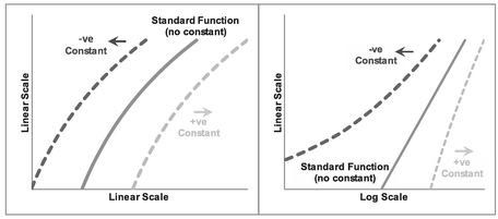
Figure 5.17 Generalised Increasing Logarithmic Functions

Figure 5.18 Generalised Decreasing Logarithmic Functions
In the case of positive adjustments, despite being asymptotic to the Standard form, we may find that an approximation to a Standard form is a perfectly acceptable fit for the range of data in question (as it is in the cases illustrated.) In reality, with the natural scatter around an assumed relationship, where we have a fairly small range of x-values, we will probably never really know whether we should be using the Standard or Generalised form of the relationship. Only access to more extreme data would help us. However, putting things into perspective, we are not looking for precision; we are estimators and are looking instead for a relative level of accuracy. There’s a lot of merit in keeping things simple where we have the choice. Both curves would generate a similar value within the expected range of acceptable estimate sensitivity.
Let’s bear that in mind when we look at what happens when we consider our Generalised values in the four Linear/Log graph Matrix with a slightly different offset constant than in Figure 5.17. Figure 5.19 gives us a real dilemma. Here we are assuming that the true underlying relationship is a generalised Logarithmic Function, but for the data range in question for the negative offset constant, we would be forgiven for assuming that the relationship was a Standard Power Function as its transformation appears to be fairly linear in the top right-hand Log-Log Quadrant. In the case of a positive offset constant, we may well interpret it to be a Standard and not a Generalised Logarithmic Function as it could easily be taken as a straight line.

Figure 5.19 Generalised Increasing Logarithmic Functions
In the case of Figure 5.20, we have assumed that the underlying relationship is a decreasing Generalised Logarithmic Function. In the case of a negative offset constant, we would probably not look much further than a Standard Exponential Function. With a positive offset constant in a decreasing Generalised Logarithmic Function we may be spoilt for choice between a Standard Exponential or Standard Logarithmic Function. (The slight double waviness of the transformed curves in the top left Log-Linear Quadrant may easily be lost in the ‘noise’ of the natural data scatter. Consequently we should always consider it to be good practice to plot the errors or residuals between the actual data and the assumed or fitted underlying relationship to highlight any non-uniform distribution of the residuals.

Figure 5.20 Generalised Decreasing Logarithmic Functions
Note: It is not always the case that the Offset Constant term will create this dilemma, but we should be aware that certain combinations of the offset constant and the normal slope and intercept constants may generate these conditions – forewarned is forearmed, as they say.
5.3.2 Transforming Generalised Exponential Functions
If we repeat the exercise on the assumption of a true underlying Generalised Exponential Function with either positive or negative Offset Constants, we will discover (perhaps to our continuing dismay) that we may get other dilemmas of a similar nature. Unsurprisingly perhaps, the difficulties with the Generalised Exponential Function Types largely mirror those of the Generalised Logarithmic Function Types.
Figure 5.21 illustrates that we could be misled into thinking that an increasing Generalised Exponential Function with a positive offset constant was just a Standard form of Exponential Function (top left quadrant). Similarly Figure 5.22 suggests in the case of a decreasing Generalised Exponential Function, we could easily be convinced that (with the inherent data scatter characteristic of real life) that a positive offset function was a Standard Exponential Function. Furthermore, in the case of certain positive or negative offsets, we would be tempted to believe that the relationship was a Standard Logarithmic Function (bottom right quadrant). Again, the waviness would be lost in the natural data scatter.
Figure 5.21 Generalised Increasing Exponential Functions

Figure 5.22 Generalised Decreasing Exponential Functions
Oh, the trials and tribulations of being an estimator!
Before we consider what we might do in these circumstances, let’s complete the set and examine the possible conclusions we could make with Generalised Power Functions, depending on the value of the constants involved.
5.3.3 Transforming Generalised Power Functions
Figure 5.23 illustrates that in the case of a small positive offset adjustment in both the horizontal and vertical axes, we might accept that the result could be interpreted as just another Standard Power Function. If we did not have the lower values of x, we may conclude also that a Generalised Power Function could be mistaken for a Standard Exponential Function also.
However, where we have a small positive offset constant in either the horizontal or vertical axis, with a small negative offset constant in the other, then to all intents and purposes the effects of the two opposite-signed offsets exacerbate the effects of each other, as illustrated in Figure 5.24. However, we would be prudent to check what happens with a
Figure 5.23 Generalised Increasing Power Functions with Like-Signed Offsets Constants
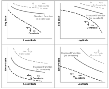
Figure 5.24 Generalised Increasing Power Functions with Unlike-Signed Offset Constants
decreasing Generalised Power Function first as illustrated in Figure 5.25 before making any premature conclusions.
Where we have a decreasing Generalised Power Function with both offset constants being positive and relatively small in value, the results (see Figure 5.25) could easily be mistaken for a Standard Power Function. However, where we have two negative offsets, we could also look at the result as being a Standard Logarithmic Function.
In the case where the signs of the two offsets are in similar proportions but with opposite signs, i.e. small negative of one paired with a small positive value of the other, we may find the result is similar to Figure 5.26 which again may lead us to look no further than a Standard Power Function, a Standard Logarithmic Function or possibly even a Standard Exponential Function!
The moral of these dilemmas is that sometimes ‘being more sophisticated’ can equal ‘being too smart for our own good’! There is a lot of merit in keeping things simple.
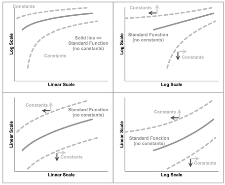
Figure 5.25 Generalised Decreasing Power Functions with Like-Signed Offset Constants
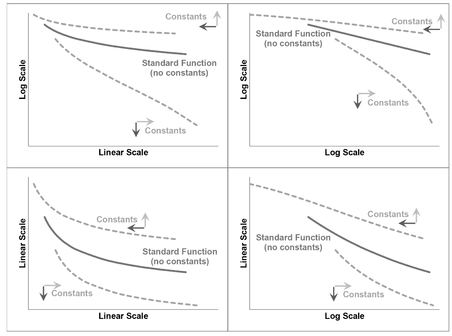
Figure 5.26 Generalised Decreasing Power Functions with Unlike-Signed Offset Constants
5.3.4 Reciprocal Functions — Special cases of Generalised Power Functions
There are two special cases of Generalised Power Functions – those that give us reciprocal relationships for either x or y. Where the power parameter is -1 (or very close to it), a Reciprocal Function of either x or y will transform our data observations into a linear function. A simple graphical test of plotting y against the reciprocal of x or vice versa is a simple option to try without digging into more sophisticated curve fitting routines required for these Generalised Functions.
For the Formula-philes: Reciprocals are special cases of Generalised Power Functions


Figure 5.27 illustrates the first type where the offset constant applies to the vertical axis. This is the expression of y as a function of the reciprocal of x. Figure 5.28 illustrates the second special case of the Generalised Power Function where the offset constant applies to the horizontal axis. This is the case where the Reciprocal of y is a function of x.
5.3.5 Transformation options
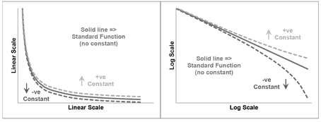
Figure 5.27 Reciprocal-x as a Special Case of the Generalised Power Function
So if we suspect that we have a relationship that could be classified as one of these Generalised Function types, how can we find the ‘Best Fit’? We could simply use the old ‘Guess and Iterate’ technique, but in reality that is only likely to give us a ‘good fit’ at best, and not the ‘Best Fit’, prompting the question ‘Is a ‘good fit’ not a ‘good enough fit’?’ If we are going down that route (and it’s not wrong to ask that question; in fact there is a strong case of materiality to support it in many instances), we may as well look at whether we can approximate the Generalised form to one of the Standard forms for the range of data we are considering?
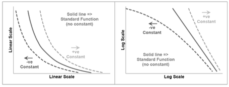
Figure 5.28 Reciprocal-y as a Special Case of the Generalised Power Function
We can summarise the results of our observations from the discussion of each Generalised Function in Table 5.6. We should note that these are examples and not a definitive
Table 5.6 Examples of Alternative Standard Functions that might Approximate Generalised Functions
| Conditions when an alternative Standard Functional Form may be appropriate | ||||
|---|---|---|---|---|
| Function Type | Standard Logarithmic | Standard Power | Standard Exponential | |
| Generalised Logarithmic | Increasing Trend | With +ve Offset | With –ve Offset | |
| Decreasing Trend | With +ve Offset | With –ve Offset | With any offset (including zero) | |
| Generalised Power | Increasing Trend | With any small Offsets | With any small Offsets | |
| Decreasing Trend | With any small Offsets | With any small +ve Offsets | With any small Offsets | |
| Generalised Exponential | Increasing Trend | With +ve Offset | ||
| Decreasing Trend | With any ofiset (including zero) | With +ve Ofiset | ||
list of all potential outcomes of using an alternative Standard Function type based on our discussions above.
The practical difficulties of transforming the Generalised Function Types into corresponding Standard Function Types so that we can subsequently transform them into Linear Functions can be put into context if we reflect on the words of George Box (1979, p.202) with which we opened this chapter: ‘Essentially all models are wrong, but some are useful’.
If we find that a Standard form of a function appears to be a good fit, we would probably have no compunction in using the transformation – even though it may not be right in the absolute sense. So what has changed? Nothing – if we didn’t know about the Generalised Function Types, we wouldn’t have the dilemma over which to use. So, unless we know for certain, that the Standardised Function is not appropriate on grounds of Credibility, we should use that simpler form as it improves Transparency and Repeatability by others in terms of TRACEability. In other words, is it reasonable to assume that another estimator with the same data, applying the same technique, would draw the same conclusion?
Caveat Augur
Beware of unwarranted over-precision!
If we cannot realistically justify why we are making a constant adjustment to either our dependent or independent variables, then we should be challenging why we are making the adjustment in the first place. ‘Because it’s a better fit’ is not valid justification.
However, in the majority of cases where we believe that the Generalised form of one of these Function Types is a better representation of reality (note that we didn’t say ‘correct’), we can still use the Standard form if we first estimate (and justify) the offset constant(s) involved. That way we can then complete the transformation to a linear format. The process of doing this is a form of Data Normalisation (see Volume I Chapter 6).
In many circumstances we may also feel that there is little justification in looking for negative offset constants, especially in the output variable (y-value) that we are trying to estimate. Positive offset constants can be more readily argued to be an estimate of a fixed element such as a fixed cost or process time. In truth, the model is more likely to be an approximation to reality, and the constant term may be simply that adjustment that allows us to use the approximation over a given range of data. Consequently, in principle a negative offset constant is often just as valid as a positive one in terms of allowing that approximation to reality to be made. However, in practice it presents the added difficulty that it may limit the choice of Generalised Function type that can be normalised into a Standard form if that then requires us to take the Log of a negative number.
However, regardless of whether we have a positive or negative offset constant we should always apply the ‘sense test’ to our model, i.e. ‘Is the model produced logical? Does the model make sense?’
Hopefully, we will recall the argument we made in the previous section on the Standard Function types:
Never take the log of a date!
In theory, we could with the Generalised form but the positive Offset Constant would be so enormous as to render any adjustment pointless.
5.4 Finding the Best Fit Offset Constant
Before we rush headlong into the details of the techniques open to us, let’s discuss a few issues that this gives us so that we can make an informed judgement on what we might do.
At one level we want to transform the data into a format from which we can perform a linear regression that we can feel comfortable in using as an expression of future values. The principles of linear regression lead us to define the Best Fit straight line such that:
- It passes through the arithmetic mean of the data.
- Minimises the Sum of Squares Errors (SSE) between the dependent y-variable and the modelled y-variable.
We already know that by taking the Logarithm of data then the Regression Line will pass through the arithmetic mean of the log data, which is equivalent to the Geometric Mean of the raw data.
If we add or subtract an offset value to transform a Generalised Function into a Standard Functional form then the ‘adjusted’ Sum of Squares Error and the R-Square value will change as the offset value changes. Ideally, we want to minimise the SSE or maximise the values of R-Square. Where we have an offset to the independent x-variable, these two conditions coincide. However, where we have an offset to the dependent y-variable, these two conditions will not coincide! (You were right; you just sort of knew that it was all going too well, didn’t you?) In fact there are many situations where the Adjusted SSE reduces asymptotically to zero. Table 5.7 and Figure 5.29 illustrate such a situation.
Sometimes we may have three options with three different results. We can look to:
- Maximise R-Square of the transformed offset data as a measure of the ‘straightest’ transformed line
- Minimise the value of SSE of the transformed offset data to give us the closest fit to the line. As the example shows this is not always an option.
- Minimise the value of the SSE of the untransformed data
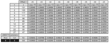
Table 5.7 Non-Harmonisation of Minimum SSE with Maximum R2 Over a Range of Offset Values

Figure 5.29 Finding the Maximum R2 Where the SSE does not Converge to a Minimum
It is worth noting that we can probably always ‘improve’ the linearity or fit of any curve by tweaking the offset value(s) – even those where we might have been happy to use a standard curve as if we’d never heard of the Generalised version! So, if it would have been good enough before what has changed now?
This last point is hinting that to make such a refinement in the precision of fit would be bordering on the ‘change for change sake’ category, and in a real sense would often be pointless and relatively meaningless. So perhaps the sensible thing to do would be to ignore option 3 (we do at present with standard linear transformations) and consider majoring on the simpler option of maximising R-Square rather than go to the trouble of calculating the SSE, either by an incremental build-up of the square of each error, or taking a short-cut approach using the Excel calculation INDEX(LINEST(known_y’s, known_x’s, TRUE, TRUE), 5, 2) as we have done in Table 5.7.
If we are unhappy with this, the only other sensible option we could try would be to run it both ways and assess whether the difference was significant. If it was different, then we could use both results to derive a range estimate. In the example in question, this is not an option. Figure 5.30 illustrates the results of our endeavours choosing to maximise the R-Square value. What appears to be a relatively small change in R-Square from 0.94 to 0.982 we get a much better looking fit to the data by a relatively large offset value.
5.4.1 Transforming Generalised Function Types into Standard Functions
In terms of determining the offsets we should apply to give us the maximum R-Square there are two basic approaches:
- A logical rationalisation or estimate of what the adjustment may be, and then testing whether it is credible. This approach is often used in the analysis of Learning Curves (see V olume IV)
- ‘Guess and Iterate’ to find the ‘Best Fit’
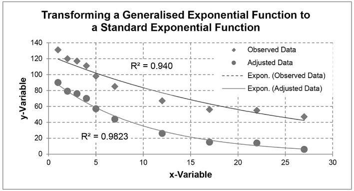
Figure 5.30 Transforming a Generalised Exponential Function to a Standard Exponential Function
All models will carry some inaccuracy in relation to actual data. If there is a valid logical reason for a particular offset constant to be used this should be considered preferable to using a better fit that we may find through an iteration procedure or technique.
If we are going to use the ‘Guess and Iterate’ technique, we may as well do it in a structured manner using the ‘Random-Start Bisection Method’ or ‘Halving Rule’, or even better we can let Excel’s Solver or Goal Seek facilities do all the work for us. However, as Excel is an algorithm, it can sometimes fail to converge. This might be interpreted as Solver or Goal Seek being ‘a bit flaky’ but, in reality, it is probably more likely the case that we have given it one of the following problems:
- Mission Impossible: There is no acceptable solution with the data and constraints we have given it, i.e. the data is not one of the Generalised Function Types
- Hog Tied: We have been too tight or restrictive in the constraints we have fed it — we need to widen the boundaries
- Needle in a Haystack: We have been too loose in the constraints we have fed it — it has effectively 'timed out'
- Wild Goose Chase: We gave it a false start point and Set it off on in the wrong direction.We can try giving it a different starting position.
Before we look in more detail at how Excel can help us, let’s look at the ‘Random-Start Bisection Method’.
5.4.2 Using the Random-Start Bisection Method (Technique)
By our definition of the terms ‘method’ and ‘technique’ we would refer to it as a technique not a method (Volume I Chapter 2). However, it is referred to as the ‘Bisection Method’ in wider circles.
The principle of the Random-Start Bisection Method as an iteration technique is very simple. It is aimed at efficiency in reducing the number of iterations and dead-end guesses to a minimum. We take an initial guess at the parameters and record the result we want to test. In this case we would probably be looking to maximise the Coefficient of Determination or R2 (Volume II Chapter 5). We then take another guess at the parameters and record the result. The procedure is illustrated in Figure 5.31 and an example given in Figure 5.32 for a Logarithmic Function.
Model Set-up
- Choose a Generalised Function type for the data that we want to try to transform into a Standard form. (We can always try all three if we have the time!)

Figure 5.31 Finding an Appropriate Offset Adjustment Using the Random-Start Bisection Method
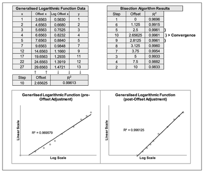
Figure 5.32 Example of Offset Adjustment Approximation Using the Random-Start Bisection Method
- Choose whether we want to apply the offset adjustment to either the x or y value, or both in the case of a Power Function (we can always try another function later)
- Set up a spreadsheet model with an offset adjustment as a variable with columns for x, y, the adjusted x or y, and the corresponding log values of each depending on the Function Type chosen. The y-value should assume that it is the Standard Function chosen at Step 1.
- Calculate the R2 value for combinations of the adjusted x and y-values) for both their linear and log values, depending on the Function Type chosen. We can use RSQ(y-range, x-range) within Microsoft Excel to calculate R2.
- In the example shown in Figure 5.32 we have calculated ‘Offset x’ as the value of x plus a ‘fixed’ Offset Constant, and the log of that value as we are considering a Generalised Logarithmic Function. The constant is ‘fixed’ for each iteration.
- R2 is calculated using the data for y and the log of the Offset x
Model Iteration
The circled numbers in Figure 5.31 relate to the following steps
- We start with an assumption of zero adjustment (i.e. the Standard form of the Function Type). We calculate and plot the R2 on the vertical y-axis against zero on the horizontal axis depicting the offset adjustment
- Choosing a large positive (or negative) offset value at random, we can re-calculate R2 and plot it against the chosen offset value. In this case we have chosen the value 10.
- Now we can bisect the offset adjustment between the one chosen at random (i.e. 10) and the initial one (i.e. zero offset). Calculate and plot R2 for the bisected offset adjustment value (in this case at 5)
As we do not know whether the optimum offset value lies to the left or right of the value from step 3, we may need to try iterating in both directions:
- In this case we have guessed to the right first. Now bisect the offset adjustment between the one chosen at random in Step 2 and the previous bisection from step 3. Calculate and plot R2 for the bisected offset adjustment value (at 7.5).
If the R2 from step 4 is higher than both those for the offset values on either side of it (i.e. that led to the bisected value from Steps 2 and 3) we can skip step 5 and move to step 7. In the example illustrated this is not the case:
- Repeat the last step but this time to the left of the value derived in step 3 and bisect the value between step 1 (zero offset) and that calculated for step 3. Calculate the R2 and plot it. In this case we plot it at 2.5
- Select the highest of the three R2 values from steps 3–5 (or steps 1–4 if we have skipped step 5) and repeat the process of bisecting the offset value between the steps to the left or right. In this case step 6 has been chosen between steps 1 and 5.
- If the R2 in step 6 is less than either value for the steps to the left or right of it, then we should try bisecting the offset on the opposite side of the highest R2, in this case from step 5.
For steps 8 and up, we repeat the procedure until the R2 does not change to a level of precision appropriate. The graph should steer us into which direction we should be trying next.
For the example summarised in Figure 5.32, we can derive an offset value of some 2.65625 after 10 steps. We should note that all the values of R2 are high, and that this alone is an imperfect measure of the linearity of the Generalised Functions being discussed here. It is important that we observe the scatter of data (residual or error) around the best fit line to identify whether the points are evenly scattered. For the raw data shown in the left-hand graph of Figure 5.32, the data is more arced than it is for the adjusted data, but this only represents a relatively small numerical increase in the value of R2 from 0.9696 to 0.9961.
5.4.3 Using Microsoft Excel's Goal Seek or Solver
Microsoft Excel has two useful features (OK, let me re-phrase that . . . Microsoft Excel has many useful features, two of which that can help us here.) that allow us to specify an answer we want and then get Excel to find the answer. These are Goal Seek and Solver, both of which are iterative algorithms. Solver is much more flexible than Goal Seek, which to all intents and purposes can be considered a slimmed down version of Solver:
- Goal Seek:
- Included as standard under the Data/Forecast/What-If Analysis
- Allows us to look for the value of a single parameter in one cell that generates a given value in a target cell (or as close as it can get to the specified value)
- It is a one-off activity that you must initialise every time you want to find a value
- Solver:
- Packaged as standard but must be loaded from the Excel Add-Ins. Once loaded it will remain available to us under Data/Analysis until we choose to unload it
- Allows us to look for the values of one or more parameters in different cells that generate a given value in a target cell, or minimises or maximises the value of that target cell
- It allows us to specify a range of constraints or limits on the parameters or other values within the spreadsheet
- It has ‘memory’ and will store the last used/saved parameters and constraints on each spreadsheet within a workbook, thus it is fundamentally consistent with the principles of TRACEability (Transparent, Repeatable, Appropriate, Credible and Experientially-based; see Volume I Chapter 3).
Let’s use Solver on the data and model we set up in the previous section for the Random-Start Bisection Model. The Model Set-up is the same as before and is not repeated here. The principle is the same in that we wish to maximise the Correlation between the data and the theoretical offset adjusted Logarithmic Function.
Running Solver
- Start with an assumption of zero adjustment (i.e. the Standard Form of the Function Type).
- Select Solver from the Excel Data Ribbon. A dialogue box will appear
- Under ‘Set Objective’ specify the Cell that contains the calculation with R2
- Below this, select the Radar Button to ‘Max’
- In ‘By Changing Variable Cells’ identify the cell in which the Offset Constant is defined. (For Power Functions we can include additional parameters separated by commas.)
As an option, under ‘Subject to the Constraints’ we can add the constraint that the Offset must never allow the situation where our model tries to calculate the log of a negative number or zero (e.g. in the case of a Generalised Logarithmic Function we can specify that the offset cell must be greater than the negative of the minimum of the x values). We can add as many constraints as we feel necessary to limit the range of iterations that Solver will consider, but if we add too many it may become restrictive leading to a ‘Failure to converge’ message. If we add too few, it may find an answer that it not expected or appropriate.
Underneath the Constraints block ensure that the option to ‘Make Unconstrained Variables Non-negative’ is not checked. (Yes, I spent twenty minutes trying to figure out why one of my models wasn’t converging.)
An example of the Model and Solver set up is illustrated in Figure 5.33.
- When we click ‘Solve’, another dialogue box will advise whether Excel has been able to determine an appropriate answer (Figure 5.34).
If we get a message that Solver cannot find an appropriate solution, then we may wish to try a different start point other than zero offset. Alternatively, we may have to consider an alternative transformation model.
Caveat Augur
There should be some bound on the degree of offset that is reasonable otherwise Solver will try to maximise it to an extent that any curvature in the source data becomes insignificant and indistinguishable from a very shallow almost flat line.
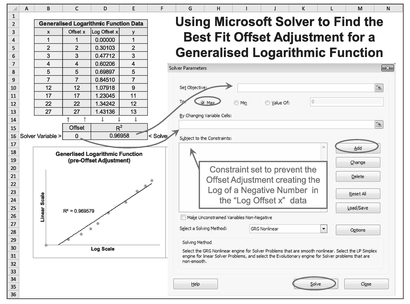
Figure 5.33 Using Microsoft Excel Solver to Find the Best Fit Offset Adjustment for a Generalised Logarithmic Function

Figure 5.34 Finding an Appropriate Offset Adjustment Using Solver (Result)
In this case we could have found the same answer as this using the Random-Start Bisection Method if we had continued to iterate further. . . assuming that we had the time, patience (and nothing better to do). Solver is much quicker than the manually intensive Random-Start Bisection Method. We could also have used Goal Seek, but that loses out in the transparency department as it does not record any logic used; Solver does.
Wouldn’t it be good if we could find the best solution out of all three in one go? Well, we can, at least to a point . . .

Table 5.8 Using Solver to Maximise the R-Square of Three Generalised Functions – Set-Up
- If we set up our model with all three Generalised Functions side by side we can then sum the three R-Square values together. In its own right this statistic has absolutely no meaning but it can be used as the objective to maximise in Solver – the three R-Square values are independent of each other so the maximum of each one will occur when we find the maximum of their sum.
- A suggested template is illustrated in Table 5.8. Whatever template we use, it is strongly advised that each function type is plotted separately so that we can observe the nature of the scatter of the offset or adjusted data around each of the best fit trendlines provided in Excel for the Standard Function Types of interest to us; this will allow us to perform a quick sensibility check on the Solver solution rather than just being seduced into accepting the largest possible R-Square. In Volume II Chapter 5 a high value R-Square can indicate a good linear fit but does not measure whether a nonlinear relationship would be an even better fit; a graph will help us with this. In the graph, we are looking for signs of the trendlines arcing through the data as a sign of a poor fit rather than one that passes through the points ‘evenly’ as an indicator of a good fit to the data. (Recall that big word, that’s not too easy to say that we discussed in Chapter 3 . . . Homoscedasticity? We want our data errors to have equal variance i.e. homoscedastic not heteroscedastic.)
The set-up procedure for the template illustrated is:
- In terms of the R-Square we are looking to maximise (i.e. get as close to 1 as possible) by allowing the offset value to vary, we need to calculate R-Square for each function type using the RSQ function in Microsoft Excel based on any starting parameter for the offset; a value of zero is a logical place to start as that will return the standard logarithmic function. Note that R-Square is calculated on different data ranges for each Function Type:
- For a Logarithmic Function, R-Square should be calculated based on our raw y-variable with the log of the x-variable plus its offset parameter
- For an Exponential Function, R-Square must be calculated based on the log of the y-variable plus its offset parameter with our raw x-variable
- For a Power Function, R-Square is calculated based on the log of the y-variable plus its offset parameter with the log of the x-variable plus its offset parameter
- We can now open Solver and set the cell containing the sum of the three R-Square calculations as the Solver Objective to Maximise.
- By maximising R-Square we are inherently minimising the Sum of Square Error (SSE) as R2 = 1 – SSE/SST from Chapter 4 Section 4.5.1 (the Partitioned Sum of Squares)
- In terms of setting the constraints, the offset value chosen can be positive or negative but not too large in the context of the raw data itself.
- As a lower limit the offset cannot be less than or equal to the negative of the smallest x-value in our data range, otherwise we will cause Microsoft Excel to try to do the impossible and take the log of a negative value during one of its iterations; this will cause Solver to return a failure error.
- In our example in Table 5.8 we should consider setting a Solver Constraint that the Offset parameter is greater than -1. In reality, we can’t do this in Solver as the option provided is for something that is ‘greater than or equal to’ some value. Recognising this we may want to pick a value arbitrarily close to the negative of the minimum, such as -10.9999. As we have done here for the x-value offset we have overwritten this minimum to say that we do not want it to be less than zero rather than a value of -0.9999. The argument here is that an offset less than one either way is probably not significant in the scheme of things.
- We should also set a maximum positive value to prevent Solver from trying to iterate towards infinity. (The closer the values are around a constant value, the closer to 1 that R-Square will get.) The choice of value is down to Estimator Judgement. As a starting point, we may want to consider a limit of approximately twice the maximum absolute value. It is often more useful to specify an integer value as the constraint, or one that creates an integer somewhere else in the template so that it is easier to spot if the constraint is invoked.
- For this example, we have also placed a constraint that the x-variable offset must be an integer value only
- Underneath the Constraints block ensure that the option to ‘Make Unconstrained Variables Non-negative’ is not checked. It may prevent our model from converging if we don’t.
- Click ‘Solve’. In the example in question, we will get the result in Table 5.9 and the three mini-plots in Figure 5.35
In their own right, all three values of R-Square are good, but a quick look at the mini-plots show that the data is not an Exponential Function as the data is Concave and exponential data is always Convex. The raw statistic can deceive – always plot the data!

Table 5.9 Using Solver to Maximise the R-Square of Three Generalised Functions

Figure 5.35 3-in-1 Solver Graphical Sensibility Check (Before and After)
There is not much to choose between Logarithmic and Power Functions, in terms of the value of R-Square. This problem is not uncommon. However, a quick look at the Solver output summary shows us that the iterations truncated when the offset parameter, b, reached the maximum allowed value. (Do you see what I mean about being easy to spot?). If we want to be sure that this is a limiting factor and not just (coincidentally) the best fit result, then we can extend our maximum range, and re-run Solver.
In this particular case, our ‘three-in-a-bed’ Solver Model has found that a best fits our raw data if we transform our data by offsetting our x data by a value of 1 to the right. We still get an excellent fit for a Generalised Power Function if we are prepared to accept such a large adjustment to the y-variable. Each case must be looked at in its individual context.
Note that this example highlights that in practice this technique often offers us little clear difference to inform our choice of Generalised Logarithmic and Generalised Power Functions, as they are always concave or convex together. Consequently, the estimator must make that choice based on which model is more intuitively correct, or at least more supportable (i.e. in the spirit of the credibility principle of TRACE-ability.) This is particularly the case with small data samples as we have here. The technique is more powerful (and helpful) where we have larger data samples covering a wider range of data values.
However, there is another constraint we could apply . . .
If we were to take a step back and reflect on what we are doing here we could make the argument that we should only be prepared to offset the x-values for Logarithmic and Power Functions, and the y-values for Exponential and Power Functions by the same amount each (that is, one x offset value and one y offset value.)
The rationale for this approach would be that we are offsetting the observed data to take account of something tangible within the model that has a significant impact on the observed values – not just because we can get a better fit! It is far better to have a sound rationale for offsetting by a particular value than allowing one to be picked that we observe but cannot justify. It’s the estimating equivalent of the age-old parental retort when a child questions a decision of:
‘Why do I have to do that?’ ‘. . . Because I say so!’
An example of where we might justify such an adjustment could be observed reductions in production costs due to operator and organisational learning, but there may be an element of fixed material cost that cannot be reduced. Simply taking the Best Fit simple curve unchallenged may simply be smoothing over the cracks of a more complex relationship with greater unexplained variances.
Having said all that, if we applied this logic to our model, tying the two x-offset values together and likewise the two y-offset values, we would get the same results as we got in Table 5.9. You’re probably thinking, ‘So, why mention it then?’ . . . because we can! . . . No, seriously, we mention it because such duplication is not always the case!)
As Microsoft Excel’s Solver is an iterative algorithm, it may not always converge first time to the optimum solution. We should always try either:
- Running Solver again from where it left off to see if it will converge further (which we did here because it ‘timed out’)
- Or, we can give it a different set of initial parameter values to prevent it from getting stuck in a ‘local turning point’
- Or, we can set more stringent convergence criteria in the Solver Options (i.e. make it work harder)
For the Formula-phobes: What are local turning points?
Nothing to do with that moment when realisation and understanding sets in, necessarily, but things do turn around . . .
If we have identified a variable whose value changes when a parameter changes then we can choose to minimise (or maximise) that variable’s value by choosing the appropriate value of the parameter. The relationship may not be a simple one. It becomes even more difficult to minimise the variable if there is more than one parameter that affects the variable. We may end up in what might be described as the mathematical equivalent of a cul-de-sac. The only way out is to go back out at the top and carry on down the main road.

As a consequence, we may find that what we intuitively expect to be the rational model, does not necessarily return the best fit to the scatter of the data. In fact, the shape of some Generalised Functions may well masquerade as Standard form of themselves, or other functional forms or as Generalised forms of other Functional Types, as we demonstrated in Sections 5.3.1 to 5.3.3. Sometimes estimators have to trust their instincts more than the maths! (Did I hear someone mutter something about heresy?)
5.5 Straightening out Earned Value Analysis . . . or EVM Disintegration
This section is not intended to be as defamatory or demeaning of EVM as some might think that the title suggests . . .
Earned Value Management (EVM) is all about an integrated approach to managing cost and schedule on a project. It is an invaluable tool for the cost estimator or schedule planner who can use it to track performance and achievement against a plan.
EVM graphical reports typically display three curves representing the Planned Cost, the Actual Cost and the Achievement on a single graph to give it that integrated perspective against the schedule; the horizontal scale is almost invariable a date scale. More often than not these three elements form a set of ‘lazy S-curves’ as depicted in Figure 5.36. (Is it me, or do the majority of examples of EVM chart examples always show us to be late and overspent?)
As the name suggests, EVM is a management technique encompassing the Plan-Do-Review Cycle. As part of the review cycle, there is an expectation that someone with the appropriate skills analyses the data. This element might be referred to as Earned Value Analysis (EVA).
One of the EVA challenges with which estimators are often tasked is in predicting an outturn value and date of completion. It is the practice of displaying the three graphs as a group of S-Curves against time that makes this so challenging because the integrated approach of EVM is both its strength and its weakness – it’s hard to see beyond the three S-Curves. Projecting the direction of curves is difficult. We should fervently resist any temptation we might feel to use Microsoft Excel’s Polynomial Trendlines; it is highly unlikely that there is a strong case to support that the underlying relationship for each line is a polynomial function of time (be it cubic, quartic, or any other higher order). So, just because we can, does not mean we should!
All is not lost! We can dissect the problem into its fundamental components (we could call it our ‘dis-integration’ technique!) It is the time scale that really causes us the difficulty. Take a moment to review Figure 5.36 and form an opinion on what the cost outturn might be and the date when it will be achieved by projecting the actual and achievement curves across time, and compare it with the answer we get at the end of Section 5.5.2. (No cheating or pretending you forgot – write it down on a piece of paper.) There, we are going to explore how we can look at the EVM problem as one that we can express in simpler terms, hopefully linear ones. Before that we will just remind ourselves of the basic EVM/EVA terminology.
5.5.1 EVM terminology
EVM is a TLA (Three-Letter Abbreviation) for Earned Value Management. EVM itself has a proliferation of two-, three- and four-letter abbreviations that ‘describe’ the different elements of a Spend and Achievement, or Cost and Scheduling Monitoring system. EVM or its component EVA has its own terminology or language, which now comes in two different dialects – the old and the new, as various people and organisations have tried to simplify the terminology used:
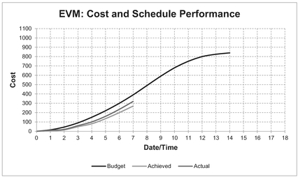
Figure 5.36 Lazy S-Curves Typical of EVM Cost and Schedule Performance
Each point represents the cumulative budgeted value of the work authorised to be completed at that point in time. The curve represents the budget profile over time for a defined scope of work. Generally, it excludes any unallocated contingency. (Note: As estimators are often keen to point out, this may or may not be the value they estimated.)
- BCWS – Budgeted Cost of Work Scheduled, or more simply the Planned Value (PV)
- BCWP – Budgeted Cost of Work Performed, or simply the Earned Value (EV). Each point represents the cumulative budgeted value of the work completed at that point in time, including Work In Progress. The curve represents the profile by which the budgeted value has been consumed or achieved over time.
- ACWP – Actual Cost of Work Performed, or just the Actual Cost (AC) Each point represents the cumulative actual cost of the work completed or in progress at that point in time. The curve represents the profile by which the actual cost has been expended for the value achieved over time.
- BAC – Budget At Completion The last value on the BCWS or PV (and BCWP or EV) lines, equivalent to 100% of the defined scope of work
EAC – Estimate At Completion
This is the sum of the actual cost to date for the work achieved, plus an estimate of the cost to complete any outstanding or incomplete activity or task in the defined scope of work.
CV – Cost Variance
The difference between the value achieved (BCWP or EV) and the actual cost (ACWP or AC) at any point in time (CV = BCWP – ACWP or CV = EV - AC)
CPI – Cost Performance Index
The ratio of the value achieved (BCWP or EV) divided by the actual cost (ACWP or AC) at a point in time
SV – Schedule Variance (cost impact)
The difference between the value achieved (BCWP or EV) and the planned value (BCWS or PV) at any point in time (SV = BCWP - BCWS or SV = EV - PV)
SPI – Schedule Performance Index
The ratio of the value achieved (BCWP or EV) divided by the planned value (BCWS or PV) at a point in time
ES – Earned Schedule
This is a relatively new term in the vocabulary of EVM and EVA, coined by Lipke (2003). It represents the time at which the work achieved was scheduled to have been achieved. In old EVM dialect, it may have been referred to as the Budgeted Time of Work Performed (BTWP) (but it wasn’t around when the four-letter abbreviations were being defined)
AT – Actual Time
This is another relatively new term to EVM, also created by Lipke (2003). It is the corresponding term to ES which denotes the time that work was actually completed. In old-style terminology, it may have been referred to as ATWP (but again it hadn’t been thought of at the time)
SV(t) – Schedule Variance (time impact)
The difference between the Actual Time (AT) that an Earned Value (EV or BCWP) was achieved and the time when it should have been achieved – the Earned Schedule (ES) such that SV(t) = ES - AT
SPI(t) – Schedule Performance Index-Time
This is the ratio that Lipke (2003) created that compares the time at which work was actually performed with the time when it was planned to be performed. It is the measure ES divided by AT. (I wonder why they never capitalised it all instead of putting the last letter in brackets? Some people just don’t have a sense of humour.)
These terms are illustrated in Figure 5.37. Despite its unfortunate name SPI(t) is not something we should look down on and avoid. The main reason that the SV(t) and SPI(t) variations were promoted (successfully) by Lipke was that there is a fundamental flaw in the original SPI measures in that it will always converge to 1 regardless of how late a project delivery is, because the Earned Value at Completion will always be the Planned Value at Completion.
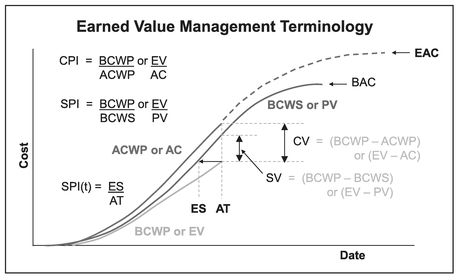
Figure 5.37 Earned Value Management Terminology
Furthermore, in EVM circles it is standard to depict cost on the vertical axis, and imply schedule by the horizontal date axis. If we think about it, we may conclude that it seems somewhat bizarre that traditional Schedule Variance (SV) and the corresponding SPI is measured by a vertical difference rather than a horizontal one i.e. measuring a schedule performance in terms of a cost measure. SV(t) and SPI(t) resolves this inconsistency.
5.5.2 Taking a simpler perspective
Let’s take a step back and look at what we can conclude from this. In an ideal EVM world we would expect that the Budget against Time, Actual Spend against Time, and Achievement against Time would always be perfectly correlated. It is the activity ramp up and wind down that creates the characteristic lazy s-curves, the specific profile of which is dependent on the activity schedule, and progress (or otherwise) against it. It is this integrated view that makes forecasting more complicated than it needs to be, so let’s consider Cost and Schedule separately for the moment (let’s ‘dis-integrate’ them!)
As we expect Actual Cost and Achieved Value to be reasonably linearly correlated, why don’t we simply plot one against the other to see whether it is true? The only role that the Date plays is in matching the data pairs.
Also, if our progress or achievement slips in time relative to the planned schedule that it may be considered reasonable to expect that the actual cost would also move to the right, assuming that we were managing these things appropriately. (Good point, we don’t always manage these things properly . . . that’s why we have EVM.)
Let’s consider plotting the following matching pairs of data in Table 5.10 against our objective of determining cost and schedule outturn:
The slope of our Cost Performance graph in Figure 5.38 depicts the trend of Actual Cost in relation to Earned Value we have achieved. The average EVM Cost Performance Index (CPI) is the reciprocal of slope of the best fit line through the data.
As the horizontal scale is bounded by the minimum and maximum achievement (equivalent to 0% and 100%), any projection of the Cost Performance Trend cannot
Table 5.10 Key Component Elements of Earned Value Analysis
| Requirement | Horizontal x-axis | Vertical y-axis | Comments |
|---|---|---|---|
| Cost Outturn or EAC | Achievement (BCWP or EV) | Actual Cost (ACWP or AC) | Graph will directly compare the actual data (ACWP or AC) against a measure of achievement (BCWP or EV) |
| Schedule Completion Date | Actual Time (AT) | Earned Schedule (ES) | Graph will directly compare the actual date achieved (AT) with the schedule's planned date (ES) |

Figure 5.38 EVM Cost Performance Trend
extend beyond that maximum Earned Value. Where any projection we make intersects that right hand maximum Earned Value boundary, this is a view of the Estimate At Completion. In answer to our unasked question ‘What type of projection should we be making?’ is that we should be informed by what we observe in the graph.
Theoretically speaking from an EVM First Principles perspective, the relationship of Actual Cost to Achievement should be fundamentally linear in nature. Unfortunately that inconvenient thing called reality keeps getting in the way. Instead, when we have plotted our data and analysed it, we may be faced with one of the four possible conclusions (five if we count the silly or undesirable one at the end). Our potential response may be as summarised in Table 5.11.
In terms of an example of where we may legitimately have a nonlinear Cost Performance trend would be in of a recurring production activity in which the budget has been based on an assumption of a given Learning Curve rate (see Volume IV Chapter 2), but that in reality the true Learning Curve rate turns out to be steeper or shallower than this. We would then observe that the Cost Performance trend is likely to be a Power Function. We will discuss this more fully in Volume IV Chapter 3.
We can repeat the process with the Schedule Performance Data as shown in Figure 5.39.
In this case the intercept of the Line of Best Fit through the Schedule Performance graph measures how early or late work commenced relative to the scheduled start. The slope of the Line of Best Fit depicts the trend of Earned Schedule in relation to the Actual Time we have taken. The average EVM Schedule Performance Index (time) or SPI(t) is the slope of the best fit line through the data. (Note: Unlike Cost Performance it is not the reciprocal of the graph’s slope this time around.)
Depending on the pattern we observe in our Schedule Performance Trend we have all the options discussed in Table 5.11, with the exception that the trend should be projected to the maximum vertical scale value, equivalent to 100% of the Earned Schedule i.e. 100% achievement. By now we will be familiar with our well-voiced mantra ‘Never take the log of a date!’ but in this case we can take the log of the horizontal axis because we are not considering Actual Time as a date as such, but as a duration of time that has elapsed from the start. So, in this case we do know when time began. Furthermore, by the very nature of a slip in the start time, it opens up the possibility of using the Generalised form of a Logarithmic or Power Function.
Our two plots can now be recombined to provide a forecast through to completion for both Cost and Schedule in the standard EVM Lazy S-curve format as shown in Figure 5.40.
Now doesn’t that just give you a nice warm feeling? So how did we compare with the ‘guessedimate’ value we wrote down on that piece of paper just before Section 5.5.1?
We can, of course apply any of the transformations discussed in the earlier sections of this chapter in place of a simple linear extrapolation if the underlying trend is progressively getting better or worse. Note that in the case of the Schedule progress we are considering elapsed time from the start or planned start so the ‘never take the log of a date’ rule does not apply here.
Table 5.11 Potential Response to EVM Cost Performance Trends
| Observed Cost Performance Pattern | Potential Response |
|---|---|
| 1 The graph is perfectly mono tonic, increasing, and appears to be a Linear Function | We can project the best fir straight line through to the right hand axis to give us a Cost Estimate At Completion if we believe that the steady state cost performance to date will continue through to the end of the contact or project |
| 2 The graph is perfectly monotonic, increasing, but appears to be a composite of two or more straight lines e.g. one straight line up to and including one level of achievement or Earned Value, breaking to another straight line afterwards | If we believe that the current (latter) steady state cost performance will continue, then we can project it through to the right hand axis. If we understand the reason why the cost performance trend changed, we can make a judgement whether that revised trend will continue, or change again, possibly back to the original steady state trend. Based on our decision we can project the trend through to the right hand axis to get the Cost Estimate At Completion |
| 3 The graph is perfectly mono tonic, increasing, but appears to be a nonlinear Function (i.e. it is curved) | Here, we might want to consider whether the observed pattern fits any of the three Standard Function Types i.e. Logarithmic, Exponential or Power (as if you had forgotten them already). It may be difficult to justify why we would want to consider the Generalised Forms of these functions in this case as inherently they should pass through the origin (no cost implies no achievement and vice versa). Regardless of the transformation type used, the EAC is the value equivalent to the right-hand side. |
| 4 The data is generally, but not perfectly, monotonic and increasing | If we accept the fundamental principle on which EVM is based that Actual Cost is incurred in proportion to Earned Value achieved then the Cost Performance graph should always be mo no tonic and increasing. However, we will probably accept that mistakes do happen (e.g. fat fingers inputting data) and that it is right to make appropriate corrections. If on investigation we find, understand and accept the reason why Actual Cost or Earned Value has reduced, then in an ideal world we should either back flush the change to the point that the error occurred, or remove all the prior data where the error is known to exist. As the data is cumulative in nature, this should not adversely affect the underlying true trend. If we find we have this situation, don’t forget to document the change in the Basis of Estimate and then check whether the data pattern now fits any of the three prior situations |
| 5 The data is largely not mono tonic and/or decreases | We have major data integrity problems, or a creative accountant, or a project manager in denial! If we genuinely do have this, then we need to understand why as it breaks the fundamental principles on which EVM is based |

Figure 5.39 EVM Schedule Performance Trend
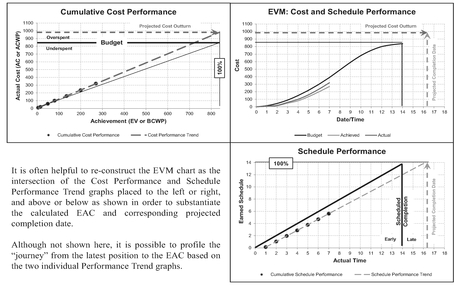
Figure 5.40 EVM Cost and Schedule Outturn Based on Current Trends
5.6 Linear transformation based on Cumulative Value Disaggregation
As we saw in Chapter 2 on exploiting linear properties, the Cumulative Value of a straight line is a Quadratic through the origin. If we are confident that the cumulative values we have are correct, but that we have an incomplete history for the constituent units, then we can exploit this property. We can use a polynomial trendline of order 2 to identify the underlying quadratic equation through the cumulative values and then disaggregate it to find the Best Fit straight line through the unit data. (Yes, I know we said earlier in Section 5.2.5 that we should resist the temptation to use Polynomial Trendlines in Microsoft Excel, but we did add the caveat of ‘unless we have a sound rationale’ for doing so; this is one of those sound rationales and not a hypocritical convenience!)
To demonstrate the point we will again consider perfect world data before looking at a real world scenario. Consider a history of design effort to resolve a number of design queries we have received, as depicted in Table 5.12 and Figure 5.41. Plotting a Quadratic Trendline through the origin provides a perfect fit to the data, i.e. one in which the Coefficient of Determination, R2 (see Volume II Chapter 5) equals 1. (We did say we would be looking at perfect world scenario initially – don’t expect it with the real world stuff!)
The implication of this is that the unit data is linear and that we can transform the cumulative trend into a linear unit trend. The slope of the line is double the coefficient of the x2 term, and the intercept is the coefficient of the x term minus that for the x2 term (see Chapter 2 on Exploiting Linear Properties.) For the case in question:
- Slope, m equals 0.3 (i.e. twice 0.15)
- Intercept, c equals 4.85 (i.e. 5 minus 0.15)
- Straight line is:
The implication is that the effort required in design, y, to resolve each new query gets progressively more as the cumulative number of queries, x increases, presumably because the easier or most obvious queries were raised first.
Although we have not shown it graphically here, we could use the Cumulative Average data in Table 5.12 to indicate that there is an underlying linear relationship; we may recall from Chapter 2 that the Cumulative Average of a discrete straight line is also a straight line of half the slope.
If we now look at an equivalent problem using data more representative of real life (in other words, there is some variation around a perfect ‘Best Fit’ curve, we can perform the same procedure. Table 5.13 and Figure 5.42 illustrates this. In this case the Trendline is not perfect, but due to the smoothing property of cumulative data, we can expect there to be a very high Coefficient of Determination, R2 – assuming that the underlying unit relationship is linear, of course.
Figure 5.42 shows that there is a good fit to a Quadratic through the origin. Applying the standard conversion back to a linear function we get a straight line with a slope twice that of the quadratic’s x2 term, or 0.29 and an intercept of the difference between the x and x2 coefficients i.e. 4.965–0.145 = 4.82
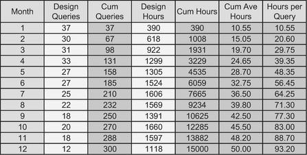
Table 5.12 Design Effort in Response to Design Queries (Perfect World)
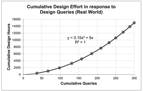
Figure 5.41 Cumulative Design Effort in Response to Design Queries (Perfect World)
In truth, the mathe-magical principle we are using here is differential calculus. (Now that wasn’t too scary, was it?)
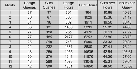
Table 5.13 Design Effort in Response to Design Queries (Real World)

Figure 5.42 Cumulative Design Effort in Response to Design Queries (Real World)
5.7 Chapter review
In this chapter we considered the techniques we can exploit in some cases to transform curved estimating relationships into straight lines. Extrapolating and interpolating straight lines is easier than it is with curves, and arguable is less prone to error.
Many of the transformations we can use, exploit the properties of logarithms, which themselves exploit the properties of powers. As we saw, logarithms (or logs) effectively compress the difference between large values and stretch the difference between small values. This stretching and compressing creates a bending effect on a line or curve. Obviously we are trying to find one that straightens out a curve. Incidentally, we also discussed that whilst Common Logs (those based on the number 10) and ‘Natural’ or Napierian Logs (those based on Euler’s Number, commonly referred to as ‘e’) are the most frequently used logs, we can take the log to any base so long as we are consistent within a single transformation.
The properties of logs lead us to consider four Standard Function types:
- Linear Function:Those which are already straight lines and need no transformation
- Logarithmic Functions:Those which transform into straight lines when we take the log of the horizontal x-axis
- Exponential Functions:Those which transform into straight lines when we take the log of the vertical y-axis
- Power Functions:Those which transform into straight lines when we take the log of both the horizontal x-axis and vertical y-axis
The easiest technique for determining which transformation type is appropriate is to plot four versions of the data on graphs with different combinations of linear and log scales. If we select the appropriate trendlines in Excel’s Chart utility and also select the option to display the Coefficient of Determination, R2, we can identify visually which options appear to be linear and which don’t. R2 can be used to discriminate between ‘close calls’:
In addition to the latter three Standard Nonlinear Functions, there are also three generalised forms of these functions which effectively offset the standard ones by a constant. In order to transform these functions, we must first estimate a value for the Offset Constant. We can do this manually by iteration using the Random-Start Bisection Method, or we can exploit the Solver feature in Microsoft Excel to maximise the Coefficient of
Table 5.14 Function Type Transformation Summary
| Function and Trendline Type: | Horizontal x-axis Scale | Vertical y-axis Scale |
|---|---|---|
| Linear | Linear | Linear |
| Logarithmic | Logarithmic | Linear |
| Exponential | Linear | Logarithmic |
| Power | Logarithmic | Logarithmic |
Determination (the closer it is to one, the stronger the degree of linearity). Once we have an estimate of the constant we can transform the curves using the technique discussed for Standard forms.
Reciprocal functions of x or of y are special cases of the Power Function.
We then looked at how we can apply these concepts to Earned Value Analysis in a two-step approach to straightening out the traditional Lazy S-curves typical of EVM Reports in order to determine Estimates At Completion and Completion Dates. In these circumstances, we can dis-integrate the EVM data into plots of Actual Cost versus Earned Value or Achievement and Actual Time versus Earned Schedule. We can then examine whether the data trends in either or both of these sub-ordinate plots fit any of the function types (standard or generalised) discussed previously.
Finally, we took a quick look at how we can transform the Cumulative Value of a Linear Function back into a straight line by differentiating the Best Fit Quadratic curve through the data to give us the straight line’s slope and intercept from the Quadratic’s coefficients.
Perhaps now after all that we can claim that we are truly all transformed characters at last!
References
Box, GEP (1979) ‘Robustness in the strategy of scientific model building’, in Launer, R. L.; Wilkinson, G. N., Robustness in Statistics, New York, Academic Press, pp. 201–236.
Box, GEP & Draper, NR (1987) Empirical Model-Building and Response Surfaces, Hoboken, NJ, John Wiley & Sons, p. 424.
Lipke, W (2003) ‘Schedule is Different’, The Measurable News, Project Management Institute, March.
Turré, G (2006) ‘Plant Capacity and Load’ in Foussier, P, Product Description to Cost: A Practical Approach, Volume 1: The Parametric Approach, London, Springer-Verlag, pp. 141–143.