Chapter 4
Numerical Color Specification: Colorimetry
We have learned that color is quite complex and can be described in many ways. We can describe physical properties that lead to color, such as colorant concentration or an object's spectral properties. We can describe physiological properties such as receptor responses and opponent signals. We can describe color perceptions using color names such as red and pink, or with color‐order systems. If a manufacturer and customer both have the same system, they can specify colors numerically and validate a material's color visually using the system's atlas. Physical standards and visual matching have been practiced, likely, for hundreds of years including today. For many applications, visual matching is inadequate because of a lack of control of illuminating and viewing geometries and variability in color vision. The solution to this problem is threefold and occurred during the early twentieth century. First, spectrophotometers were used to measure a sample's spectral‐reflectance factor. The spectrophotometers' geometries were standardized to include only two choices. Second, lighting was standardized to include only three choices. (Today, there are a large number of standardized illuminants.) Third, only two observers were standardized. The standard observers and lights were tables of data. By calculation, an object's color was defined numerically. This numerical system is the subject of this chapter.
A. COLOR MATCHING
One of the ways to simplify color specification greatly is to reduce the problem to one of color matching. The color to be reproduced must match the color of a sample viewed and illuminated under a specified set of conditions. If the standard and its reproduction are both materials, we would place the samples adjacent to one another under the specified set of conditions. If we are comparing colored lights with material samples, for example, comparing a color display to a color print, we further simplify the viewing conditions so that the light emitted from the display matches the light reflected off of the paper. The problem in its simplest form, shown in Figure 4.1, is answering the question, “Do two colored lights match one another?”

Figure 4.1 A color specification can be reduced to a color‐matching problem: Do the two fields match in color?
Color‐matching experiments with light were first performed by Newton (1730) in the early 1700s. He found that combining only blue and yellow wavelengths could reproduce white light, shown in Figure 4.2. This experiment produced a metameric match: different stimuli, one being all of the wavelengths and the other, only yellow and blue wavelengths, produced identical visual responses. Either stimulus could be used to specify other white lights.

Figure 4.2 Newton found that when blue and yellow lights were mixed together, white resulted.
Imagine that we have a portable device that generates light varying in hue, lightness, and chromatic intensity, shown in Figure 4.3. Mixing red, green, and blue lights produces a large range of colors, that is, a large color gamut. We have controls that enable us to vary the color of the light continuously. If we want to specify a color, we dial in the color on the device. We can take the device to our supplier and show him the color. His job is to produce his product with color identical to that displayed on the device. Eventually, we realize that it would be more efficient to have two identical devices. If the deviceshad digital controls, we could text numerical specifications to our supplier. We have designed a visual color‐matching system, a process often called visual colorimetry.
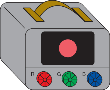
Figure 4.3 A portable visual colorimeter using red, green, and blue lights.
Visual colorimetry dates back to the late nineteenth century. Lovibond (1887), a brewer, developed a device with which he could specify the color of beer visually, using sets of colored glasses. The Lovibond Tintometer generated a gamut of colors encompassing the color range of beer and other liquids including oils, paint vehicles, and sugar solutions. In another early example, the first production of the 1929 Munsell Book of Color was based on a spinning disk, with which a set of colored papers and their percentage area coverage were used to specify each Munsell designation (Berns and Billmeyer 1985). The disk is spun at a sufficient rate so that only a single color is observed. This is known as disk colorimetry.
All of these visual colorimeters, by definition, are based on the principle of metamerism. As a consequence, a match for one person will probably not remain a match when viewed by another person. The greater the differences in spectral properties between the output of the visual colorimeter and the manufactured material, the more likely that problems will arise when several observers are involved in the specification process. Use of a visual colorimeter that is not designed for a specific application will often result in significant metamerism. If we could replace any particular observer with an average observer, this limitation would be reduced slightly, based solely on the principles of statistics. If this average observer were standardized, the standard observer, then all specifications would be consistent, and not dependent on any particular observer's visual properties.
This concept, using visual colorimetry with a standard observer and a standardized device as a method of color specification, dates to the 1920s (Troland 1922). The International Commission on Illumination (Commission Internationale de l'Éclairage, or CIE) wanted a method of specifying red, green, and yellow colored lights used in railroad and, shortly thereafter, highway traffic control (Holmes 1981). The concept quickly evolved into a measurement‐based system in which stimuli requiring specification were first measured spectrally. The spectral information was used to calculate the standardized device controls such that when the standard observer viewed the stimulus and device, they matched in color, a colorimetric match. This system was first standardized by the CIE in 1931 (CIE 1931; Judd 1933; Wright 1981b; Fairman, Brill, and Hemmendinger 1997; Schanda 2007). It is the “heart” of all modern color‐measurement systems.
We learn in Chapter that two stimuli match in color when they lead to equal cone responses. It seems that specifying color matches should be very straightforward: cone responses would provide the numerical system. These are directly calculated from the average observer's cone spectral sensitivities (cone fundamentals) and spectral measurements of the stimuli. During the early twentieth century when colorimetry was developed, accurate measurements had yet to be made of the eye's spectral sensitivities. A standardized color‐matching system was the only viable approach. MacAdam (1993) and Schanda (2007) have compiled a number of historical publications that form the framework for modern colorimetry. Richter (1984) has summarized the contributions of the “founding fathers and mothers” of colorimetry.
The CIE technical report, “Colorimetry,” CIE Publication 15:2018 describes the current recommendations (CIE 2018).
B. DERIVATION OF THE STANDARD OBSERVERS
Theoretical Considerations
Let's imagine an ideal observer—with respect to visual colorimetry—with cone fundamentals as shown in Figure 4.4. For any stimulus, the cone responses can be calculated via integration, shown in Eqs. (4.1)–(4.3):
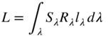
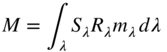

where Sλ is an illuminant's spectral power distribution, Rλ is an object's spectral‐reflectance factor, and lλ, mλ, and sλ are the cone fundamentals of the ideal observer. We need to build a visual colorimeter that can display a color that matches any stimulus the ideal observer encounters. The easiest way to build the colorimeter is by using three lights. Suppose that the lights are monochromatic (a single wavelength) with wavelengths of 450, 550, and 650 nm. As shown in Figure 4.5, varying the radiance of the 450 nm light results in changing the response of only the ideal observer's short‐wavelength receptor. The long‐ and middle‐wavelength receptors cannot “see” light at 450 nm, having no response at this wavelength. In a similar fashion, varying the 550 nm light only causes responses in the ideal observer's middle‐wavelength receptor; varying the 650 nm light only causes responses in the ideal observer's long‐wavelength receptor. Thus, any stimulus can be matched by varying the amounts of the 450, 550, and 650 nm lights. It is possible to “dial in” any response for this ideal observer. A visual colorimeter with primaries of 450, 550, and 650 nm could be used to standardize the color of any stimulus of interest for this ideal observer.
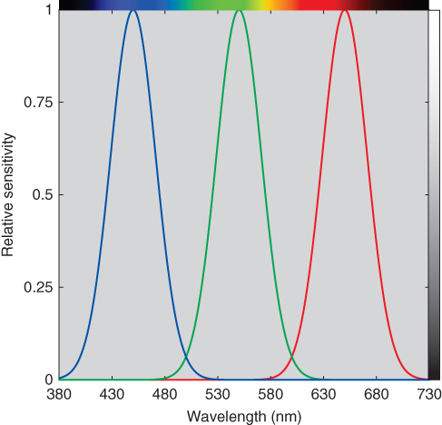
Figure 4.4 The spectral sensitivities of an ideal observer when building a visual colorimeter with three lights. At 450, 550, and 650 nm, one of the three receptors has its maximum sensitivity while the others have none.
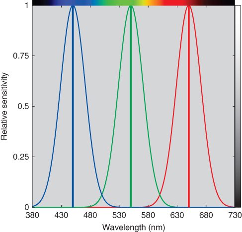
Figure 4.5 When building a visual colorimeter, the optimal primaries for this ideal observer are 450, 550, and 650 nm. Each primary stimulates only a single receptor type. The primaries coincide with the receptor spectral‐sensitivity maxima, yielding optimal efficiency.
What happens when we apply this reasoning using a real observer? We would like to find three primaries that enable each cone response to be independently controlled. Evaluating a real observer's cone spectral sensitivities reveals that it is not possible to achieve this aim. About the best that can be achieved uses wavelengths of 400, 520, and 700 nm, shown in Figure 4.6. Although it is straightforward to choose wavelengths that stimulate only the short‐wavelength and long‐wavelength receptors, it is impossible to select a wavelength that stimulates only the middle‐wavelength receptor because of the large amount of overlap between it and the long‐wavelength receptor. As a consequence, any visual colorimeter that contains only three primaries cannot produce matches to every possible stimulus. (By extension, any three‐primary‐color system has the same limitation.)
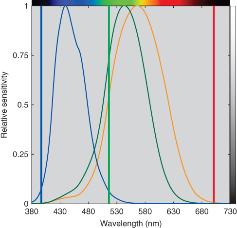
Figure 4.6 Primaries of 400, 520, and 700 nm maximize the independent stimulation of the eye's cone responses and, in turn, maximize the visual colorimeter's color gamut.
The Color‐Matching Experiment
Let's suppose that a student has an interest in color science. She secures funding from the university and is hired as a summer intern to learn firsthand about colorimetry. Having knowledge of the theoretical considerations just described, she designs and builds a visual colorimeter, such as shown in Figure 4.7. The colorimeter produces two fields of light, forming a bipartite field. In the adjustment field, light results from the admixture of three primaries: 440, 560, and 620 nm. (Though not shown in the drawing, the radiance of each light is adjustable.) Unit amounts of each primary when combined produce a white equal to the color of the equal‐energy spectrum. The spectra are plotted in Figure 4.8. In the fixed field, a number of different lights can be used. A masking screen is used to control the size of the bipartite field, expressed as a field of view in degrees.
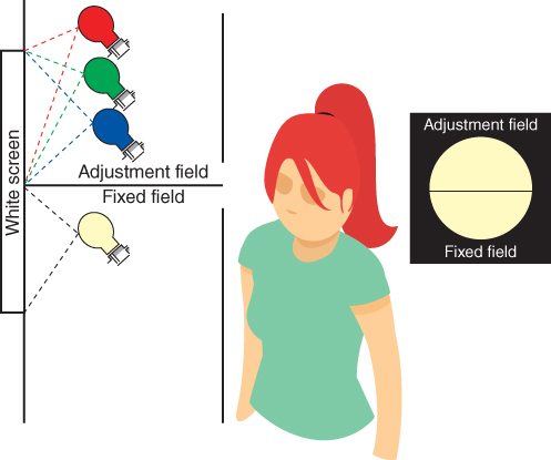
Figure 4.7 A visual colorimeter and the bipartite field as seen by the summer intern.
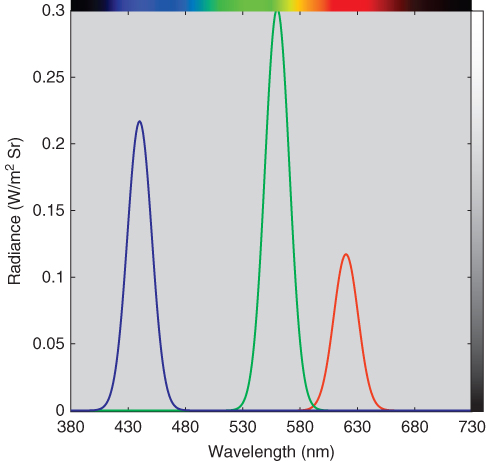
Figure 4.8 Spectral radiance of each primary at unit amount. When combined, a color equal to the color of the equal‐energy spectrum results.
In the first experiment, the three lights are adjusted until a match is made to an incandescent light. Our intern has verified the principle of metamerism: that colors can be matched despite their differences in spectral properties. In her second experiment, she doubles the amount of light in both fields. She finds that although the two fields look brighter, they still match. She doubles them again with the same result. Next, she reduces the amount of light in both fields. Even though the two fields get dimmer, they continue to match. This matching property is known as proportionality.
In a third experiment, shown in Figure 4.9, the fixed field contains a combination of greenish‐blue light and the red primary at a moderate intensity. The resulting color has lower chromatic intensity than the greenish‐blue light alone. Again, she adjusts the primary radiances in the adjustment field until it and the fixed field are indistinguishable. If she increases the red primary by the same amount in both fields, the two fields continue to match, although their color changes. If she decreases the red primary by the same amount in both fields, the two fields continue to match. This matching property is known as additivity. She also notices that as she decreases the amount of red light in the adjustment field, chromatic intensity increases. The red primary modulates color between greenish‐blue and white, shown in Figure 4.10.
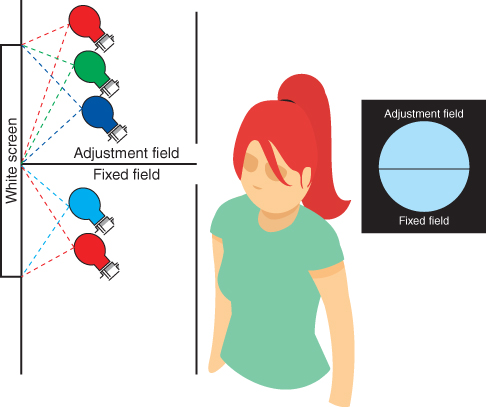
Figure 4.9 Visual colorimetric match of a greenish‐blue light mixed with a moderate amount of the red primary.

Figure 4.10 Colors that result from adding red light to a greenish‐blue light. Increasing the amount of red (moving left to right) reduces the chromatic intensity of the greenish‐blue light.
Our budding scientist has verified what are known as Grassmann's laws of additive color matching (Grassmann 1853; Wyszecki and Stiles 1982). Essentially, color matching follows the principles of algebra. She has also discovered a “trick” that can help her overcome the inability to select primaries that control each of the cone responses separately. Can you guess what it is?
When one is performing a color‐matching experiment, the question arises as to what colors to match. Rather than thinking about a test light as a spectral power distribution with power that is continuous over the entire wavelength range, it is helpful to think of it as a combination of monochromatic (or nearly so) lights, each suitably weighted, shown in Figure 4.11. If 301 sources, each of equal radiance and of 1 nm width and centered at 400, 401 nm, and so on through 700 nm were simultaneously projected into the fixed field, they would produce a color that matches a continuous spectrum with equal radiance at each wavelength. Using this reasoning, every color stimulus can be thought of as a combination of light at individual wavelengths. Thus, it is sufficient to perform a color‐matching experiment in which an observer matches the two fields at each wavelength. In practice, the experiment is performed at every 10 nm throughout the visible spectrum. Interpolation is used to estimate the 1 nm data.

Figure 4.11 A continuous spectrum (on the left) can be thought of as a additive mixture of 1 nm lights.
Our industrious intern next builds a device that produces variable monochromatic light at constant spectral radiance, shown in Figure 4.12. As she varies its wavelength, she notices a large change in the brightness of each individual wavelength: green wavelengths appear much brighter than the other visible wavelengths. She decides to perform a brightness experiment in which the monochromatic light is set to 555 nm. Next, the blue primary in the adjustable field is varied (while the other primaries are turned off) until a brightness match is made. This is repeated for the green and red primaries. This type of experiment is called heterochromatic brightness matching and despite how difficult this visual task is to perform consistently, our intern found that about 50 times more radiance for the blue primary and about three times more radiance for the red primary were required to match the brightness at 555 nm. The green primary had similar radiance to 555 nm. That is, if all four lamps were adjusted to the same radiance and displayed next to one another, the blue primary would appear the dimmest and 555 nm would appear the brightest. Recalling that our cone receptors reduce in sensitivity toward each end of the visible spectrum, these results are reasonable.

Figure 4.12 Visual colorimeter where the fixed field is a monochromatic light at constant radiance (achieved by using neutral‐density filters). A heterochromatic match is made between the red primary and 555 nm.
Having completed a number of experiments, including verifying Grassmann's laws and brightness matching, the student is ready to perform a color‐matching experiment. The experimental task is determining the amounts of each primary necessary to match monochromatic light presented in succession throughout the visible spectrum. From her experiments verifying Grassmann's laws and a realization that monochromatic light has very high chromatic intensity, it is clear that she will have to use one or more of the primaries in the fixed field in order to reduce the chromatic intensity of the monochromatic light such that the two fields can be matched, shown in Figure 4.13. This “trick” enables the experiment to be completed.
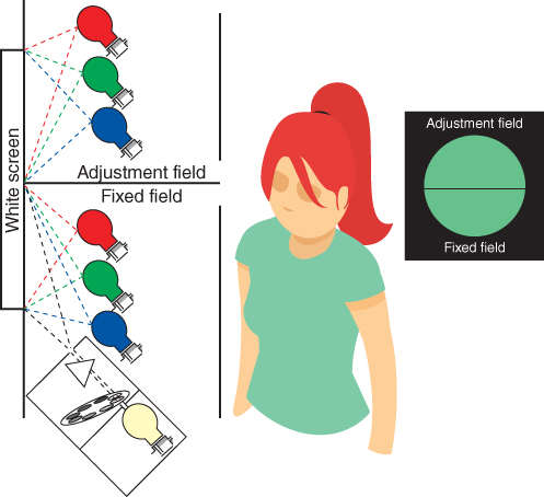
Figure 4.13 Visual colorimeter capable of measuring the amounts of the three primaries necessary to match the visible spectrum presented wavelength by wavelength.
Having to keep track of the amounts of each of the six primaries would be cumbersome. Instead, Grassmann's laws are used to define color matches with positive and negative quantities, essentially rearranging an algebraic equation. The results of the color‐matching experiment performed by our intern are shown in Figure 4.14 as a plot in which the amounts of each primary are functions of wavelength. These curves are called color‐matching functions. Notice that they have both positive and negative lobes. The negative lobes indicate the amounts of a given primary added to the fixed field. The net amounts of each primary required to match a color are called tristimulus values. Tristimulus values can be both positive and negative. At the end of the summer, the student is encouraged to apply for a PhD in color science.

Figure 4.14 Color‐matching functions that might result from using 440 nm (blue), 560 nm (green), and 620 nm (red). The amounts of each primary are called tristimulus values. The tristimulus values are scaled so the maximum tristimulus value is unity. Notice that the primaries are located where two of the color‐matching functions have values of 0, not their peak values.
The 1924 CIE Standard Photopic Observer
During the beginning of the twentieth century, it was noticed that physical measurements of the power of a light source (i.e. radiance or irradiance) correlated poorly with the source's visibility. Two lights that produced equal radiance often had very different brightnesses. Our intern found this out as well when comparing the brightness of each of her primaries (440, 560, and 620 nm) with 555 nm. Rather than perform heterochromatic brightness‐matching experiments, known to be difficult and imprecise, a technique known as flicker photometry was used. In flicker photometry, the two lights are displayed alternately rather than simultaneously. The rate of flicker is set such that only the visual system's white opposed by black opponent channel is stimulated. (The opponent channels' temporal responses are similar to their spatial responses, described in Chapter 2.) The radiance of the test lamp is varied until flicker is minimized. Based on performing flicker photometry or heterochromatic brightness matching for each wavelength of the spectrum in comparison to results at a reference wavelength (such as 555 nm), a brightness‐sensitivity function is derived. In 1923, Gibson and Tyndall compiled the results from a number of studies, about 200 observers in total. They calculated a weighted average based on several criteria (see Kaiser 1981). In 1924, the CIE adopted Gibson and Tyndall's “visibility curve,” known today as the CIE standard photometric observer or luminous efficiency function, plotted in Figure 4.15 and denoted by Vλ (CIE 1926, 2018).
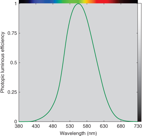
Figure 4.15 The 1924 CIE standard photometric observer. Observers are less efficient in converting radiance to visibility at each end of the visible spectrum in comparison to 555 nm.
The “brightness” of a source is calculated by multiplying its spectral properties by the Vλ function, wavelength by wavelength, followed by integration, and finally multiplying by a normalization constant, Km, shown in Figure 4.16 and Eqs. (4.6) and (4.7)
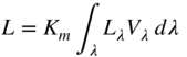

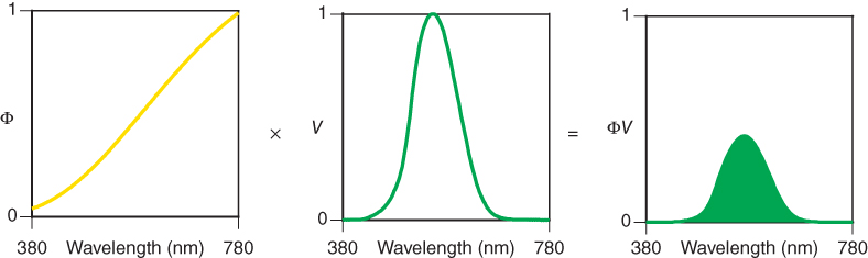
Figure 4.16 Photometric quantities are calculated by multiplying the stimulus, Φλ (generally expressed by irradiance or radiance), and the luminous efficiency function, Vλ, wavelength by wavelength, to give the curve (ΦV)λ. The area under this curve, suitably normalized, is the photometric quantity.
The normalizing constant, Km, equals 683 lm/W, known as the maximum luminous efficacy. A lumen is a quantity that weights light by the luminous efficiency function, Vλ. When a light source's spectral irradiance, Eλ, is measured, illuminance, E, has units of lux (lx, lumens per square meter). When spectral radiance, Lλ, is measured, luminance, L, has units of candelas per square meter (cd/m2, or lumens per square meter per steradian). A candela is a unit of luminous intensity defined as 1/683 W/Sr. Illuminance is used to define the amount of light falling on a surface expressed as lux or foot‐candles (fc, lumens per square foot). Foot‐candles multiplied by 10.76 equals lux. Luminance is used to define the amount of light generated by a source. Essentially, luminance measurements are not dependent on distance; illuminance measurements are. See Wyszecki and Stiles (1982) and McCluney (2014) for greater details on photometry and radiometry.
We have referred to brightness in quotations because of the large body of experimental evidence that indicates that a source's photometric measurement does not correlate with its perceived brightness (Kaiser 1981; Wyszecki and Stiles 1982; CIE 1988). A computer display appears much brighter in a darkened room than in one that is fully lit. If two lights are adjusted to have the same photometric quantity but one is highly chromatic while the other appears white, the chromatic source appears brighter. Despite the known limitations of photometry, it is still used extensively to define the level of illumination, and in other industrial applications as diverse as gloss and photographic film speed.
The 1931 CIE Standard Colorimetric Observer
Two experiments were performed during the 1920s in England that measured the color‐matching functions of a small number of color‐normal observers. Guild (1931) measured seven observers and Wright (1928, 1929) measured 10 observers. Both experiments employed the same viewing conditions, a bipartite field subtending a 2° field of view that was surrounded by darkness. In 1931 at a meeting of the Colorimetry Committee of the CIE, delegates representing a number of countries agreed to adopt a color‐matching system based on the Guild and Wright experimental results. The committee concluded that the agreement was sufficiently close to provide both independent validation and reasonable population estimation. The average data were calculated based on a set of primaries that would provide excellent repeatability when building laboratory visual colorimeters. The primaries selected were 435.8, 546.1, and 700 nm. (In imaging, these are known as the CIERGB primaries.) The first two wavelengths correspond to two of the mercury emission lines. It was reasoned that 700 nm would stimulate only the long‐wavelength receptor and therefore, small errors in setting this wavelength accurately would have a negligible effect on color matching. Another requirement when calibrating a colorimeter is defining the white that results from the admixture of the three primaries, each set to a unit amount. The white produced by an equal‐energy light source was selected. This set of color‐matching functions, shown in Figure 4.17 is known as ![]() ,
, ![]() , and
, and ![]() . They define the tristimulus values of the spectrum colors for this particular set of primaries. The bar over each variable implies average, as in
. They define the tristimulus values of the spectrum colors for this particular set of primaries. The bar over each variable implies average, as in ![]() .
.
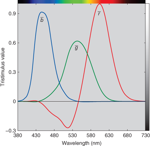
Figure 4.17 These curves are the RGB color‐matching functions for the CIE 1931 standard observer, the average results of 17 color‐normal observers matching each wavelength of the equal‐energy spectrum with primaries of 435.8, 546.1, and 700 nm normalized to produce the color of the equal‐energy spectrum at unit amounts.
At this time period, the General Electric‐Hardy Recording Spectrophotometer (Hardy 1929; Oil 1929) was near completion and soon to be marketed. This instrument produced an analog signal that traced an object's spectral reflectance or transmittance. It was envisioned, correctly, that this signal could be interfaced with mechanical or electrical devices that would be used to perform tristimulus integrations. This would allow colorimetry to evolve from a visual system to a computational system. However, since the ![]() ,
, ![]() , and
, and ![]() color‐matching functions all have both positive and negative tristimulus values, such devices would have to have six channels, greatly increasing their complexity and cost. If a second set of primaries was defined that resulted in all‐positive color‐matching functions, these devices could be built practically since only three channels would be required.
color‐matching functions all have both positive and negative tristimulus values, such devices would have to have six channels, greatly increasing their complexity and cost. If a second set of primaries was defined that resulted in all‐positive color‐matching functions, these devices could be built practically since only three channels would be required.
A second concern about ![]() ,
, ![]() , and
, and ![]() was also raised. Photometry using the visibility curve was already in use by the lighting industry. Since this system was based on different experimental techniques and a different set of observers, it was possible that two colors having the same tristimulus values could have different photometric values. Furthermore, for some applications, it might be necessary to calculate both colorimetric and photometric values — four integrations.
was also raised. Photometry using the visibility curve was already in use by the lighting industry. Since this system was based on different experimental techniques and a different set of observers, it was possible that two colors having the same tristimulus values could have different photometric values. Furthermore, for some applications, it might be necessary to calculate both colorimetric and photometric values — four integrations.
These two major concerns were alleviated by deriving an approximately linear transformation such that the color‐matching functions were all positive and that one of the color‐matching functions would be the 1924 CIE standard photometric observer function, Vλ. Having all‐positive color‐matching functions meant that the corresponding primaries would be physically nonrealizable. Variables X, Y, and Z were used for the new system to clarify that the primaries were not actual lights, resulting in color‐matching functions labeled as ![]() ,
, ![]() , and
, and ![]() , plotted in Figure 4.18. These color‐matching functions are known as the CIE 1931 standard colorimetric observer, or simply, the standard observer.
, plotted in Figure 4.18. These color‐matching functions are known as the CIE 1931 standard colorimetric observer, or simply, the standard observer.
Figure 4.18 The CIE XYZ 1931 standard colorimetric observer.
The details of how the transformation from ![]() ,
, ![]() ,
, ![]() to
to ![]() ,
, ![]() ,
, ![]() was derived can be found in Fairman, Brill, and Hemmendinger (1997, 1998). We will focus on several of them. First,
was derived can be found in Fairman, Brill, and Hemmendinger (1997, 1998). We will focus on several of them. First, ![]() ,
, ![]() , and
, and ![]() , and Vλ were normalized to unit area as shown in Eq. (4.10)
, and Vλ were normalized to unit area as shown in Eq. (4.10)
The ![]() color‐matching function was arbitrarily defined to equal Vλ
color‐matching function was arbitrarily defined to equal Vλ
Ideally, ![]() is a linear combination of
is a linear combination of ![]() ,
, ![]() , and
, and ![]() . Least squares (i.e. pseudo‐inverse) was used to calculate the scalars of each color‐matching function, shown in Eq. (4.12):
. Least squares (i.e. pseudo‐inverse) was used to calculate the scalars of each color‐matching function, shown in Eq. (4.12):

where superscript + denotes pseudo‐inverse. These scalars define the position of primary Y.
Because Y defines luminance, the other primaries are without luminance. This constrained the locations of primaries X and Z along a specific line. Two additional constraints were imposed to locate X and Z on this line. The first was to define the volume of the new XYZ space to just encompass the gamut of real colors. The second was to maximize the number of wavelengths where ![]() equaled zeroes. This resulted in the transformation matrix shown in Eq. (4.13)
equaled zeroes. This resulted in the transformation matrix shown in Eq. (4.13)
Because there was a small amount of residual error in estimating ![]() , color‐matching functions
, color‐matching functions ![]() ,
, ![]() , and
, and ![]() were first normalized by multiplying by nλ such that
were first normalized by multiplying by nλ such that ![]() was identical with Vλ. The final transformation is shown in Eqs. (4.14) and (4.15):
was identical with Vλ. The final transformation is shown in Eqs. (4.14) and (4.15):
where
The CIEXYZ system with color‐matching functions of ![]() ,
, ![]() , and
, and ![]() is often referred to as the 1931 standard observer or the 2° observer and is assumed to represent the color‐matching results of the average of the human population having normal color vision and viewing stimuli with a 2° field of view. When we compare color‐matching functions with cone fundamentals (e.g. Figure 4.6), it is clear that color‐matching functions should not be referred to as the eye's spectral sensitivities. As we will show below, they can be referred to as linear transformations of the eye's spectral sensitivities.
is often referred to as the 1931 standard observer or the 2° observer and is assumed to represent the color‐matching results of the average of the human population having normal color vision and viewing stimuli with a 2° field of view. When we compare color‐matching functions with cone fundamentals (e.g. Figure 4.6), it is clear that color‐matching functions should not be referred to as the eye's spectral sensitivities. As we will show below, they can be referred to as linear transformations of the eye's spectral sensitivities.
The 1964 CIE Standard Colorimetric Observer
We describe in Chapter 2 how the structure of the eye is different in the central region of the retina, the fovea, than in the surrounding regions. The experiments leading to the 1931 CIE standard observer were performed using only the fovea, which covers about a 2° angle of view. Because of experimental limitations during the 1920s, it was much easier to produce uniform bipartite fields if they were kept small. Also, the light that could be generated by visual colorimetry was somewhat dim. Since the fovea does not contain rods, the resulting color‐matching functions should be equally applicable for colors viewed at typical levels of illumination. That is, Grassmann's law of proportionality should be upheld.
However, there are a number of applications in which stimuli subtend a much larger field of view. The CIE encouraged experiments that would both determine whether the 2° observer would accurately predict matches for larger fields of view and validate the continued use of the 1931 standard observer.
During the 1950s Stiles, at the National Physical Laboratory in England, performed a pilot experiment in which 10 observers' color‐matching functions were determined for both 2° and 10° fields of view. The two fields of view are compared in Figure 4.20. The CIE Colorimetry Committee concluded that for practical colorimetry, the 1931 standard observer was valid for small‐field color matching; however, for large‐field color matching, research should continue (Wyszecki and Stiles 1982).

Figure 4.20 At a normal viewing distance of 0.5 m (19.7 in.), the circle on the top represents the 2° field on which the 1931 CIE standard observer is based. The figure on the bottom is the 10° field on which the 1964 CIE standard observer is based. The center of the 10° field is black to remind us that the 2° field was ignored (Stiles and Burch 1959) or masked (Speranskaya 1959) so that the central 2° was not included in the visual data.
Stiles and Burch (1959) measured the color‐matching functions of 49 observers with a 10° field of view. Very high levels of illumination were used to minimize rod intrusion and further computations eliminated these nearly negligible rod effects. Speranskaya (1959) measured the color‐matching functions of 27 observers, also with a 10° field of view, but at considerably lower levels of illumination. The CIE removed the effects of rod intrusion in Speranskaya's data and weight averaged the two data sets, resulting in the 1964 CIE standard colorimetric observer (Wyszecki and Stiles 1982; Trezona and Parkins 1998; CIE 2018). It is usually referred to as the 1964 standard observer or the 10° observer. Its color‐matching functions are notated as ![]() ,
, ![]() ,
, ![]() and compared with the 1931 standard observer in Figure 4.21. A word of warning:
and compared with the 1931 standard observer in Figure 4.21. A word of warning: ![]() is not the same as
is not the same as ![]() , or Vλ, and the corresponding tristimulus value Y10 does not directly represent a color's luminance. Its use is recommended whenever color‐matching conditions exceed a 4° field of view.
, or Vλ, and the corresponding tristimulus value Y10 does not directly represent a color's luminance. Its use is recommended whenever color‐matching conditions exceed a 4° field of view.

Figure 4.21 The color‐matching functions  ,
,  , and
, and  of the 1931 CIE standard colorimetric observer (solid lines) and
  ,
,  , and
, and  of the 1964 CIE standard colorimetric observer (dashed lines) are compared here.
Clearly, the 10° observer has a firmer statistical foundation since it is based on many more observers. Furthermore, large‐field color matching has higher precision (Wyszecki and Stiles 1982). Anecdotally, it is often believed that the 10° observer correlates more closely with visual evaluations when judging the color difference within metameric pairs. However, this is likely observer dependent. Most industries that manufacture colored products use the 1964 standard observer. For imaging applications, the 1931 standard observer is used.
Cone‐Fundamental‐Based Colorimetric Observers
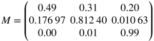
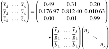
In Chapter , we describe that there is a range of color vision among color‐normal observers. In 2006, the CIE published a model in which cone fundamentals can be calculated for average observers ranging in age from 21 to 80 years old and from a 1° to a 10° field of view (CIE 2006a). However, cone fundamentals are not all‐positive color‐matching functions. Work is underway by the CIE to provide a standard practice to convert cone fundamentals to the XYZ system, enabling the practical use of the 2006 CIE model. Thus far, matrices have been published that convert cone fundamentals for 32 years of age and either a 2° or 10° field of view, notated as ![]() ,
, ![]() ,
, ![]() and
and ![]() ,
, ![]() ,
, ![]() , respectively. Both standard observers have color vision equivalent to the average population of 32‐year‐old color‐normal observers. The transformations are shown in Eqs. (4.16) and (4.17), respectively (CIE 2018)
, respectively. Both standard observers have color vision equivalent to the average population of 32‐year‐old color‐normal observers. The transformations are shown in Eqs. (4.16) and (4.17), respectively (CIE 2018)

The 2° standard observer is based on the 1924 CIE standard photometric observer, as we described above. With time, it became clear that the weighting used by Gibson and Tyndall when deriving Vλ was in error, particularly in the short‐wavelength region where visibility was underestimated. For full‐spectrum lights, ignoring this error is inconsequential. Today, where stimuli can be narrow band such as LED lighting and laser primary digital projection, this error cannot be ignored. The 1931 standard observer and the 32 years of age and 2° field of view cone‐fundamental observer are compared in Figure 4.22, showing the magnitude of error. When accurate photometric quantities are required, either the cone‐fundamental or 1964 standard observer should be used.

Figure 4.22 Comparison between the CIE 1931 standard colorimetric observer (solid lines) and the cone‐fundamental‐based colorimetric observer for 32 years of age and a 2° field of view (dashed lines).
C. CALCULATING TRISTIMULUS VALUES FOR MATERIALS
Tristimulus values for materials are calculated in a similar fashion to the L, M, and S integrated signals described in Chapter . The ![]() ,
, ![]() , and
, and ![]() color‐matching functions replace cone fundamentals, the new formulas shown in Eqs. (4.18)–(4.21):
color‐matching functions replace cone fundamentals, the new formulas shown in Eqs. (4.18)–(4.21):
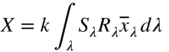

where Sλ is a CIE standard illuminant, Rλ is an object's spectral‐reflectance factor, and k is a normalizing constant such that Y for the perfect reflecting diffuser is 100. Tristimulus integration is visualized in Figure 4.23.

Figure 4.23 Here are all the spectral curves needed to calculate CIE tristimulus values X, Y, and Z. Wavelength by wavelength, the values of the curves of Sλ and Rλ are multiplied together to give the curve, (SR)λ. Then this curve is multiplied, in turn, by  , by
, by  , and by
  to obtain the curves
  ,
,  , and
, and  . The areas under these curves, followed by a normalization (not shown) are the tristimulus values X, Y, and Z.
The CIE color‐matching function data are an ISO standard and defined from 360 to 830 nm in 1 nm increments (ISO 2007a). The CIE has determined that a wavelength sampling of 380 to 780 nm with a 5 nm increment has sufficient accuracy when approximating integration with summation. For instruments sampling at larger increments, it is necessary to interpolate and extrapolate the missing values. The ASTM has published a method of calculating tristimulus values that incorporates both interpolation and extrapolation (ASTM 2015a). This method precalculates tristimulus weights for different instrument characteristics and is used by most instrument manufacturers. Weights are published for the most common instrument characteristics, CIE illuminants, and the 1931 and 1964 standard observers. A CIE technical committee is developing a recommendation and method for calculating tristimulus values in a similar fashion to ASTM. At the time of this writing, a CIE method has not been published.
The practice of normalizing tristimulus values to Y or Y10 = 100 for reflecting (and transmitting) materials is not universal. In many imaging applications, Y or Y10 = 1. In both cases, these are relative units and absolute appearance attributes of brightness and colorfulness cannot be determined. When using the 1931 system, the tristimulus value Y of an object is known as the luminance factor, or the luminous reflectance or the luminous transmittance, whichever is appropriate, and is expected to be related to the material's lightness.
The value Y = 100 (or 1), assigned to a perfect white object reflecting 100% at all wavelengths, or to the perfect colorless sample transmitting 100% at all wavelengths, is the maximum value that Y can have for nonfluorescent samples. There is no similar restriction to a maximum value of X or Z. Their values may be greater or less than 100 (or 1). For example, when illuminant D65 and the 1931 standard observer are used, the values for the perfect white or colorless sample are approximately X = 95 and Z = 109. The exact values depend slightly on factors such as the choice of wavelength interval and method of tristimulus integration.
Fluorescent samples can have higher values of X, Y, and Z than those for the perfect white if what is measured is the total radiance factor.
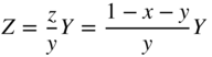
D. CHROMATICITY COORDINATES AND THE CHROMATICITY DIAGRAM
Tristimulus values, as three variables, can be thought of as a three‐dimensional space in which each axis is a primary 풳, 풴, and 풵, and a sample's tristimulus values define a position within the three‐dimensional space, shown in Figure 4.24. Recall that color‐matching functions define the tristimulus values necessary to match each wavelength forming the equal‐energy spectrum. When these tristimulus values are plotted three‐dimensionally, they begin and end nearly at the origin, forming an unusual shape. A plane can be drawn through the three‐space at a unit distance from the origin. Limiting this unit plane to the three axes results in an equilateral triangle. A line can be drawn beginning at the origin, passing through one of these tristimulus values, and ending on the triangular unit plane. Repeating for all the wavelengths of the color‐matching functions results in a horseshoe shape. It is customary to add a line between the shortest and longest wavelengths. This is a projection from three dimensions onto a two‐dimensional plane. A second projection is performed resulting in a right triangle. Again, a horseshoe shape emerges, known as the spectrum locus. The straight line is known as the purple line. The final projection is defined as a chromaticity diagram, having coordinates of lowercase x and y.

Figure 4.24 (a) CIE tristimulus space can be thought of as a three‐dimensional space with axes, 풳, 풴, and 풵 and coordinates X, Y, and Z. The tristimulus values of a set of color‐matching functions plot as an unusual shape (blue line). (b) A unit plane is added to the three‐space. Lines beginning at the origin, passing through each coordinate forming the color‐matching function, and ending on the surface of the unit plane form a horseshoe shape (green line). A line is added between the shortest and longest wavelengths (also a green line). (c) A rotation of (b). (d) A projection of the unit plane looking down the Z‐axis results in a chromaticity diagram with coordinates of lower‐case x and y.
The formulas for projecting from X, Y, and Z to x, y, and z are shown in Eqs. (4.22)–(4.24)
Notice that chromaticity z can be calculated directly from x and y. Thus, there are only two independent variables. The projective transformation has transformed three variables into two variables. Looking at Eqs. (4.22)–(4.24), magnitudes of the tristimulus values are transformed into ratios of tristimulus values. Historically, color information that was independent of luminance (or luminance factor) was called chromaticness, hence the chromaticity diagram. Chromaticities should correlate to some extent with a stimulus's hue and chromatic intensity.
The chromaticity coordinates x, y, and z are obtained by taking the ratios of the tristimulus values to their sum, (X + Y + Z). Since the sum of the chromaticity coordinates is 1 for any stimulus, they provide only two of the three coordinates needed to describe a color. One of the tristimulus values, usually Y, must also be specified. Notice that calculating tristimulus values from chromaticity coordinates, shown in Eqs. (4.25) and (4.26), requires knowing Y
An alternative set of coordinates in the CIE system, sometimes called the Helmholtz coordinates of dominant wavelength, λd, and excitation purity, pc, somewhat correlate with the visual aspects of hue and chromatic intensity, respectively, shown in Figure 4.25, although their steps and spacing are not visually uniform. The dominant wavelength of a color is the wavelength of the spectrum color whose chromaticity is on the same straight line as the sample point and the illuminant point. Excitation purity is the distance from illuminant point to sample point, divided by that from illuminant point to the spectrum locus. If the sample point lies between the illuminant point and the purple boundary connecting the ends of the spectrum locus, the construction is made between the illuminant point and the purple line and the wavelength is known as the complementary dominant wavelength, designated λc.
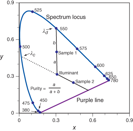
Figure 4.25 The definitions of dominant wavelength, complementary dominant wavelength, and purity are shown on this chromaticity diagram. These are also known as the Helmholtz coordinates.
We are often asked where the 풳, 풴, and 풵 primaries lie on the chromaticity diagram: the answer is at x = 1, y = 0; x = 0, y = 1; and x = 0, y = 0 (where z = 1), respectively. Like all other points outside the area bounded by the spectrum locus and the purple boundary, they do not represent real colors.
It is important to note that the CIE tristimulus system is not based on steps of equal visual perception in any sense, although many modifications have been proposed as approaches to equal perception. Indeed, the CIE tristimulus system is intended to do no more than tell whether two colors match (they match if they have the same tristimulus values, otherwise not). The CIE chromaticity diagram, likewise, is properly used only to tell whether two colors have the same chromaticities, not what they look like, or how they differ if they do not match. In fact, a given chromaticity can have a wide range of appearances depending on adaptation and viewing conditions. For example, Hunt (1976) has demonstrated how a chromaticity can appear sky blue or pink. In the demonstration of chromatic adaptation in Figure 2.6, the lemon has constant chromaticities although it appears yellowish or greenish. Coordinates of XYZ, or xyY should never be used as direct estimates of a color's appearance.
The lack of uniformity is often demonstrated by plotting Munsell colors in xyY as a rectangular three‐space, shown in Figure 4.26 for the renotation colorimetric coordinates (Newhall, Nickerson, and Judd 1943) at Munsell value 3, 5, and 8. The hue loci are curved, the chroma contours are oblong, and the area encompassed reduces as value increases.
Figure 4.26 Munsell colors at value 3, 5, and 8 plotted in xyY at different orientations.
It is common to find chromaticity diagrams that have been colored, for example, in Figure 4.27. However, any set of inks used to produce the chart will not fully encompass the diagram. The same is true for a color display. The location of white is static; it should change with changes in the illuminant used when calculating tristimulus values. Furthermore, the third dimension of color, lightness, is not shown. Where is black, gray, or brown? In the third edition of this book, we suggested tearing up such diagrams. Because this is difficult to do when the colored chromaticity diagram is a displayed image, we urge our readers to remember the limitations of this diagram.
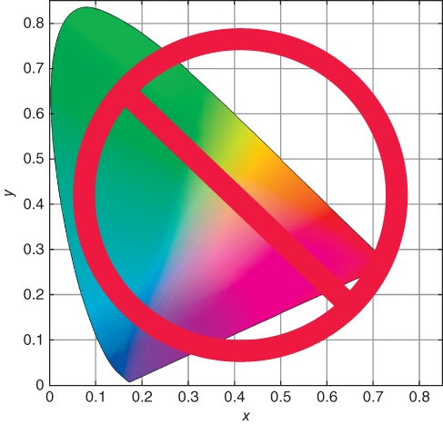
Figure 4.27 It is common to find chromaticity diagrams that have been colored. However, any set of inks used to produce the chart will not fully encompass the diagram. Furthermore, the third dimension of color, lightness, is not shown. Where is black, gray, or brown?
Only two of the three dimensions of color can be shown on a chromaticity diagram. Often, a three‐dimensional CIE color space is made by plotting an axis of luminance factor, rising from the illuminant point of the chromaticity diagram. Only colors of very low luminance factor, such as spectrum colors, can lie as far away from the illuminant axis as the spectrum locus; all other colors have lower purity. The limits within which all nonfluorescent reflecting colors must lie have been calculated (Rösch 1929; MacAdam 1935) and are shown projected onto the plane of the chromaticity diagram in Figure 4.28. They serve to outline the volume within which all real nonfluorescent colors lie. Although Rösch predates MacAdam, these limits are known as the MacAdam limits.
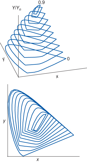
Figure 4.28 The MacAdam limits of surface colors calculated using the 1931 standard observer and CIE illuminant D65.
Note that there is a significant difference in concept as well as in shape between the three‐dimensional xyY space and color‐order systems with uniform perceptual spacing. Both have white located at a single point on the top of an achromatic axis (e.g. Munsell value or NCS blackness). In a perceptual space, black is located at a single point at the bottom of the achromatic axis, as our perceptual senses tell us it should be. But in xyY space the location of black is not well defined, for it corresponds to all three tristimulus values X, Y, and Z equal to zero, and by the mathematical definitions of x and y, black can lie anywhere on the chromaticity diagram. This is but one of many examples supporting our earlier warning that one should not associate the appearance of colors with locations on the x, y diagram!
E. CALCULATING TRISTIMULUS VALUES AND CHROMATICITY COORDINATES FOR SOURCES
We have shown that calculating the tristimulus values of a color requires knowledge of the source, object, and observer. This is true for materials that reflect or transmit light interacting with them.
There are many colors that are not materials, such as lights and displays. When calculating their tristimulus values, the spectral‐reflectance factor is not included in the tristimulus‐integration equations. Furthermore, the convention of normalizing Y such that it equals 100 or 1 is generally not used. Instead, photometric units are used, for which the normalizing constant in the tristimulus equations, k, equals 683 lm/W, known as the maximum luminous efficacy with Km replacing k, shown in Eqs. (4.27)–(4.29):
where Φλ is either spectral irradiance, Eλ, or spectral radiance, Lλ.
Devices that measure the colorimetric values of sources, such as spectroradiometers and colorimeters, do not report X, Y, Z, rather they report x, y, Y. This separates the chromatic and achromatic information, since these two parameters can easily be varied independently. Tristimulus value Y has units of either lx (from irradiance) or cd/m2 (from radiance).
F. TRANSFORMATION OF PRIMARIES
Displays
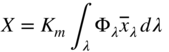
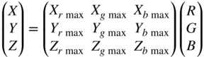
The spectral radiance measurements of each primary of an LED backlight liquid‐crystal display, each at six different levels, are shown in Figure 4.29. Each primary has similar spectral characteristics. The relationship between these spectra is defined in Eqs. (4.30)–(4.32):
Figure 4.29 Spectral radiance of each primary of an LED backlight liquid‐crystal display, each at six different intensities between zero and maximum.
where R, G, and B are scalars modulating the intensity of each primary between zero and maximum. This property is known as scalability.
The relationship between spectral radiance and tristimulus values is linear, shown in Eqs. (4.33)–(4.35) for the red primary. Similar equations can be written for the green and blue primaries


Linearity between R and XYZ, G and XYZ, and B and XYZ, where RGB is defined using Eqs. (4.30)–(4.32), means that the tristimulus values of each primary define a line in the 풳풴풵 three‐space, shown in Figure 4.30.
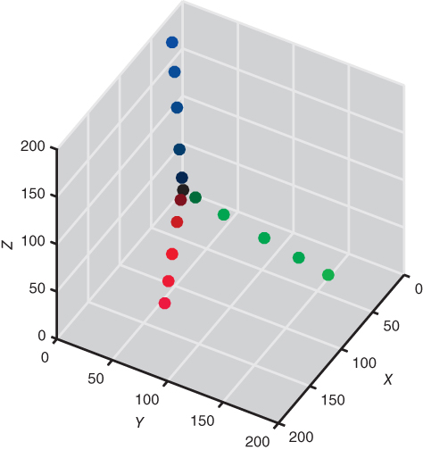
Figure 4.30 Tristimulus values of the spectra plotted in Figure 4.29 plotted in XYZ three‐space. XYZ have units of cd/m2.
A second aspect to explore is whether the sum of individual measurements of the three primaries is identical to a measurement of the three primaries displayed simultaneously, shown in Eq. (4.36)
This is verified experimentally, sampling the display's color gamut. This property is known as additivity.
A simple way to analyze scalability and additivity is to plot the chromaticities based on measurements of each primary at several intensities and their sum, producing a gray scale. There should be four points, one for each primary and one for the neutral. This is shown for two displays in Figure 4.31, one that is scalable and additive and one that is not.
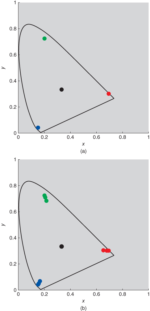
Figure 4.31 LED backlight liquid‐crystal display with either (a) stable primaries, or (b) unstable primaries. The instability was caused by backlight leakage.
For the display that is scalable and additive, also known as having stable primaries, we can predict tristimulus values for any color combination from measuring the spectral radiance of each primary, that is, three measurements. This is shown in Eq. (4.37)
The white point of the display, Xn, Yn, and Zn, is calculated by setting the display to R = G = B = 1, shown in Eq. (4.38)

Each primary's chromaticities remain stable for any setting. Accordingly, the primary tristimulus matrix can be expanded into a product of a chromaticity matrix and a luminance matrix, shown in Eq. (4.39) for a display's white point, expressed by chromaticities and peak luminance
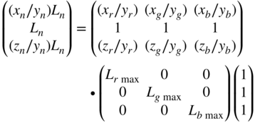
By rearranging Eq. (4.39), the luminance of each channel can be calculated for any desired white point, shown in Eq. (4.40)

Usually, the luminance ratio is specified. By defining Ln = 1 and performing the multiplication on the left‐hand side of Eq. (4.40), the luminances of each channel are calculated, shown in Eq. (4.41)

Finally, the tristimulus matrix is calculated as shown in Eq. (4.42)
Cone Fundamentals
Thus far, we have used the well‐established (Smith and Pokorny 1975) cone fundamentals when plotting the eye's spectral sensitivities. However, these fundamentals are not linear transformations of CIE color‐matching functions as shown above in Figure 4.22 and there are a number of applications where LMS functions that are linear transformations of CIE color‐matching functions are useful. The set derived by Hunt and Pointer (1985) based on research by Estevez on color‐defective vision is in most common use, known as the HPE cone fundamentals. The transformation matrix is given in Eq. (4.49) and the cone fundamentals compared with the Smith and Pokorny set are plotted in Figure 4.33
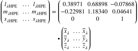

Figure 4.33 The Smith and Pokorny (solid lines) and HPE (dashed lines) cone fundamentals.
G. APPROXIMATELY UNIFORMLY SPACED SYSTEMS
It has often been said that one of the greatest disadvantages of the CIE tristimulus or chromaticity systems is that they are far from equally visually spaced. But why should they be, since neither is meant to give any information about the appearance of colors? In fact, we would be shocked if tristimulus space or the xy projection were equally visually spaced given that the primaries were arbitrary, having been defined to overcome engineering limitations during 1931. If the tristimulus values recorded cone responses, it would be reasonable to expect better visual correlation.
Between 1931 and today (we feel confident that whenever this book is read, this statement will still be valid), color scientists and engineers have developed and continue to develop new color spaces with the goal of providing uniform visual spacing and correlation with color perception.
Why is this task so difficult? Given the computational tools at our disposal today, it should be possible to find a new color space that achieves these goals. However, several factors work against us. First, visual data are inherently highly variable, that is, noisy. It is often difficult to separate consistent trends from random noise. Second, color perception is very complex with many factors affecting judgments. In order to develop a color space with general applicability to all industries, experiments must be performed in which each factor is studied separately and analyzed in comparison to a set of baseline factors. Despite the importance of this step, there has been insufficient effort to generate this knowledge.
Despite these difficulties, progress has been made. During the twentieth century, the problem was reduced in complexity by focusing on developing color spaces that had reasonable performance for quantifying color differences between pairs of samples not too different in color. That is, the difference in color coordinates for the sample pair correlated with their perceived difference in color. All the factors affecting discrimination, such as color and level of illumination, sample size, sample texture, sample separations, and so on (CIE 1993) were assumed to have a negligible effect on this correlation. Ideally, samples were compared if and only if their physical properties were identical and illuminated and viewed identically. Complexity was also reduced by assuming that lightness and chromaticness (i.e. hue and chromatic intensity) were independent perceptually. Each could be modeled separately and then combined into a single three‐dimensional space. CIELAB and CIELUV are examples of this approach.
Toward the end of the twentieth century, emphasis switched from developing improved color spaces to developing different ways to measure distance. A color difference became a function of the color coordinates of either the average of the pair or the sample identified as the standard. Formulas such as CMC and CIEDE2000 are examples.
Moving into the twenty‐first century, color‐appearance spaces have developed. These are spaces that predict color based on knowledge of viewing and illuminating conditions. CIECAM02 is an example (CIE 2004b, 2018).
L* Lightness
The achromatic property of a color is one of the most important color attributes. Accordingly, scales that relate physical measurements with our perceptions of lightness, blackness, whiteness, etc. have received great attention over the years. As we described in Chapter , the Munsell value scale was the first achromatic scale to have both careful visual and instrumental definitions. Accordingly, it became the basis for a CIE lightness scale. When the Munsell system was published as colorimetric data (Newhall, Nickerson, and Judd 1943), luminance factor was a function of value, the function a fifth‐order polynomial. Although this was useful for producing color chips with specific value, the inverse transformation, used to relate luminance factor and lightness, required the use of a precalculated published table (Nickerson 1950).
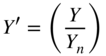
Glasser et al. (1958) determined that the relationship between luminance factor and value was well modeled using a cube‐root psychometric function plus an offset. This led to the CIE L* formula, given in Eqs. (4.50) and (4.51) (CIE 2018):
where

The relationship between luminance factor and L* is plotted in Figure 4.34.

Figure 4.34 Relationship between luminance factor and CIE L*.
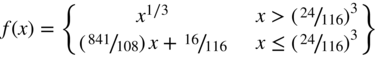
Approximately uniform color‐difference spaces recommended by the CIE use an asterisk to differentiate them from other formulas that use the same letters. Robertson (1990) describes the derivation of L* and Berns (2000) provides a historical review of lightness formulas. Because of the −16 offset, black colors (i.e. luminance factor less than about 0.009) could lead to negative lightness values. As a consequence, a straight line from zero to the tangent of the cube‐root function was used to avoid negative values (Pauli 1976) and as a result, a logical operator is necessary when calculating L*.
The need for an offset resulted from defining the psychometric function as a cube root. By fitting an exponential psychometric function, the Munsell value scale can be predicted equally well without an offset, shown in Eq. (4.52) (Fairchild 1995)
By replacing 10 with 100, a lightness function results that could be used instead of Eqs. (4.50) and (4.51).
u′v′ Uniform‐Chromaticity Scale Diagram
The lighting and display industries have used the xy chromaticity diagram since its inception in 1931. This enabled the specification of color that was independent of luminance. Regions in chromaticity space were defined for signal lights. Broadcasting defined the colors of the red, green, and blue primaries and white point of televisions using chromaticities. The need to specify acceptable ranges in chromaticities quickly led to improved projections that had better visual uniformity. Rather than projecting tristimulus values onto a unit plane, shown in Figure 4.24, tristimulus values were projected obliquely. The geometry was determined by using color‐discrimination data where observers scaled differences in chromaticities (Judd 1935; MacAdam 1937).
As an example, two lines are drawn in 풳풴풵 space, one about four times longer than the other, shown in Figure 4.35. The endpoints represent a color‐difference pair. Each pair has the same perceived color difference. Depending on our viewing direction, the differences in line length vary considerably. The optimal viewing direction, equivalent to a specific oblique projection, occurs such that the two lines are equal in length. At this projection, the calculated distance predicts the perceived distance.
Figure 4.35 Two lines of unequal length, shown from different viewpoints.
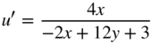
Projections with improved visual spacing are known as uniform chromaticity scale (UCS) diagrams. The current CIE recommendation is u′ (“u‐prime”), v′, the formulas shown in Eqs. (4.53) and (4.54). See Berns (2000) for its historical development
It is also possible to calculate u′ and v′ from x and y and its inverse, shown in Eqs. (4.55)–(4.59). The third coordinate is w′, calculated in similar fashion to z
Plots similar to those shown in Figure 4.26 are shown for u′v′Y in Figure 4.36. There is clear improvement compared with xyY.
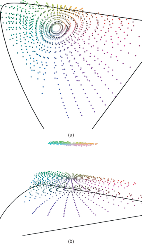
Figure 4.36 Munsell colors at value 3, 5, and 8 plotted in u′v′Y at different orientations.
CIELUV
The volume of nonfluorescent reflecting colors in xyY, shown in Figure 4.28, or u′v′Y, shown in Figure 4.36, has a somewhat conical shape with its apex at Y = 100. As a consequence, two color‐difference pairs, each pair having the same chromaticity difference but dissimiliar average luminance factor, will appear unequal in color‐difference magnitude. This can be corrected by scaling the chromaticity diagram as a function of luminance factor such that the cone becomes a cylinder. Hunter (1942) used this approach in the design of a tristimulus colorimeter and corresponding color space.
The u′v′ UCS and L* were combined, resulting in CIELUV (Robertson 1990), having rectangular coordinates of L*, u*, and v*. The formulas for L*, u*, and v* are shown in Eqs. (4.60)–(4.63) (CIE 2018):
where se 4.76,77

Because a white point can have a wide range of coordinates within u′v′, u* and v* result from a translation about the reference white, notated as ![]() and
and ![]() . This results in coordinates that are positive and negative and neutrals with u* = v* = 0. The Munsell colors at value 3, 5, and 8 are plotted in Figure 4.37.
. This results in coordinates that are positive and negative and neutrals with u* = v* = 0. The Munsell colors at value 3, 5, and 8 are plotted in Figure 4.37.
Figure 4.37 Munsell colors at value 3, 5, and 8 plotted in CIELUV at different orientations.
Historically, CIELUV was used when both a UCS diagram and corresponding color‐difference space were desired. Because of improvements in color‐difference formulas that are not based on CIELUV, as we explain below, maintaining correspondence is not seen as advantageous and the use of CIELUV had diminished appreciably.
CIELAB
A second approach was taken to develop an approximately uniform color‐difference space, also during the early 1940s. Adams's (1942) approach was to transform tristimulus values directly without the intermediate step of a UCS. He used XYZ data for the Munsell system to develop and evaluate his new color space. Adams first rescaled the tristimulus values so that neutral colors would have equal tristimulus values, shown in Eqs. (4.64)–(4.66) (We introduce the prime superscript as a teaching aid.)

Since neutrals colors have X′ = Y′ = Z′, then (X′ − Y′) and (Z′ − Y′) are zero. Plotting colors this way would result in coordinates that are both positive and negative, in a similar fashion to Hunter (1942). Adams reasoned that the nonlinearity between Munsell value and luminance factor should be applied to all the tristimulus values, finally resulting in his chromatic value space.
Nickerson and Stultz (1944) modified Adam's space by optimizing constants using their color‐difference data. With the suggestion by Glasser and Troy (1952) to rearrange one of the chromatic axes to result in opponent properties similar to those of Hunter, ANLAB resulted, shown in Eqs. (4.67)–(4.69):
where fV(x) is the nonlinear relationship requiring table lookup.
The CIE Colorimetry Committee met in 1973 and by combining ANLAB and the Glasser et al. (1958) cube‐root psychometric function, CIELAB was “born,” shown in Figure 4.38. Following the meeting, the final coefficients were determined (Robertson 1990). The new color space was named CIELAB with rectangular coordinates of L*, a*, and b*. The formula is shown in Eqs. (4.70)–(4.73):
Figure 4.38 The “birth” of CIELAB during the colorimetry subcommittee meeting of the CIE, held at the City University, London. From left to right: E. Ganz, D. MacAdam, A. Robertson, and G. Wyszecki.
Source: Courtesy of F. W. Billmeyer.
where
Inverting CIELAB to tristimulus values is shown in Eqs. (4.74)–(4.77):


where
The Munsell renotation colors at value 3, 5, and 8 are plotted in Figure 4.39. The circularity is excellent and the hue lines are well spaced. However, the blue and purple lines are quite curved. Because the Munsell system has five principal hues, they do not line up with the a* and b* axes. Therefore, the color names red, green, yellow, and blue should not be associated with +a*, −a*, +b*, and −b*, respectively. In fact, the CIE documentation defining both CIELAB and CIELUV never refers to the chromatic axes with color names (CIE 2018).
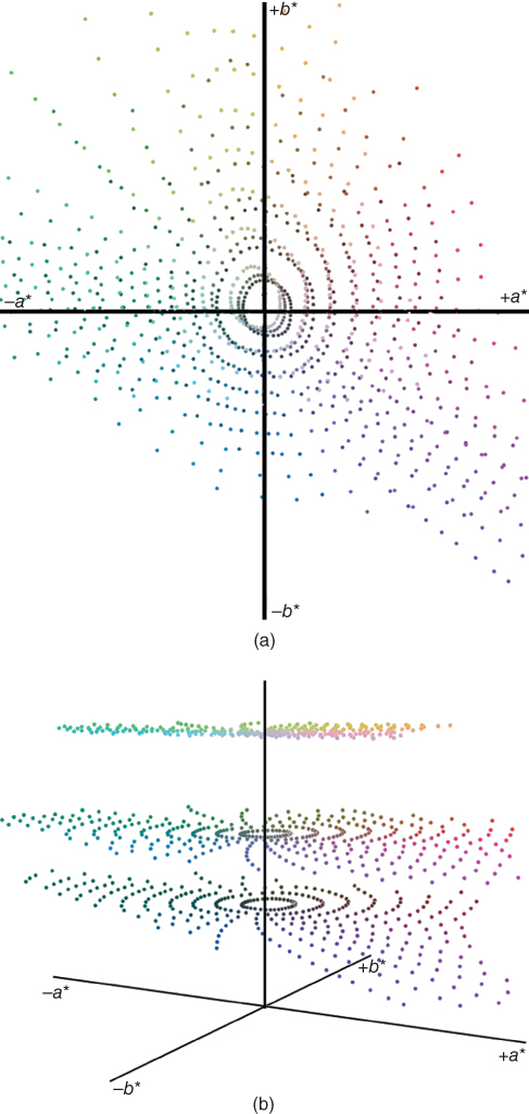
Figure 4.39 Munsell colors at value 3, 5, and 8 plotted in CIELAB at different orientations.
Rotation of CIELAB Coordinates
Although CIELAB (and CIELUV) are rectangular systems, it is straightforward to define positions using polar‐cylindrical coordinates. In this manner, there are approximate correlates of hue, hab, lightness, L*, and chroma, ![]() . The forward and reverse formulas for CIELAB hue and chroma are shown in Eqs. (4.78)–(4.82)
. The forward and reverse formulas for CIELAB hue and chroma are shown in Eqs. (4.78)–(4.82)

CIELAB hue angle and chroma are shown in Figure 4.40. By convention, CIELAB hue angle is defined in degrees with the following values for each semiaxis: +a* = 0° (360°), +b* = 90°, −a* = 180°, and −b* = 270°. The same caution about color names applies to hab. The NCS elementary hues red, yellow, green, and blue have hab values of approximately 25°, 90°, 165°, and 260°, respectively. Chroma is the distance from the neutral point (a* = b* = 0) to the sample. We prefer the use of a*b* for near neutrals and ![]() for chromatic colors.
for chromatic colors.
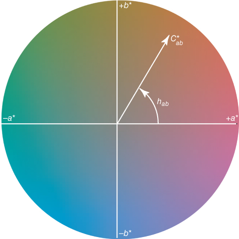
Figure 4.40 CIE 1976 a*b* projection at a constant lightness, L* = 50. CIELAB hue is measured in degrees starting with hab = 0° in the +a* direction and increasing counterclockwise. CIELAB chroma is measured as the length of the line from the neutral point (a* = b* = 0) to the sample point.
Thus far, we have considered lightness and chromaticness independently. However, colors in mixture vary in both dimensions simultaneously. Billmeyer and Saltzman (1966) described terms used by textile dyers and paint formulators, shown in Figure 4.41. There is a rotation within a plane of constant hue.

Figure 4.41 Terminology sometimes used by colorists.
We pointed out in Chapter that NCS is arranged as a double cone. For some hues, this geometry is evident when the colors of constant nuance are plotted in CIELAB chroma versus lightness, for example, in Figure 4.42 for NCS R10B.
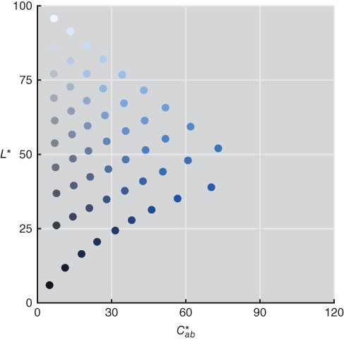
Figure 4.42 NCS colors of constant nuance plotted in CIELAB for NCS hue R10B.
Berns (2014a) introduced two CIELAB variables, vividness, ![]() , and depth,
, and depth, ![]() , in order to increase the utility of CIELAB in relating coordinates with perception. Their formulas, both forward and inverse, are shown in Eqs. (4.83)–(4.88)
, in order to increase the utility of CIELAB in relating coordinates with perception. Their formulas, both forward and inverse, are shown in Eqs. (4.83)–(4.88)
The inverse formulas are based on triangular coordinates where the third coordinate is calculated by knowing the coordinates of two other coordinates from among L*, ![]() ,
, ![]() , and
, and ![]() . Their geometric meanings are diagrammed in Figure 4.43. Colors that become “cleaner” or “brighter” increase in CIELAB vividness. Colors that become “deeper” or “stronger” increase in CIELAB depth. The words “vivid” and “deep” have been used as adjectives to identify regions of the Munsell system (Kelly and Judd 1976). In the textiles industry, depth or depth of shade is a metric to aid in determining whether a batch of dyestuff has similar money value to previous batches (Smith 1997). Dye concentration is well correlated with
. Their geometric meanings are diagrammed in Figure 4.43. Colors that become “cleaner” or “brighter” increase in CIELAB vividness. Colors that become “deeper” or “stronger” increase in CIELAB depth. The words “vivid” and “deep” have been used as adjectives to identify regions of the Munsell system (Kelly and Judd 1976). In the textiles industry, depth or depth of shade is a metric to aid in determining whether a batch of dyestuff has similar money value to previous batches (Smith 1997). Dye concentration is well correlated with ![]() (Berns 2014a).
(Berns 2014a).
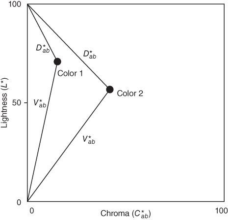
Figure 4.43 Dimensions of vividness,  , and depth,
  , for colors 1 and 2. Line lengths define each attribute.
When Berns was preparing visualizations of chroma, he noticed that if a color had the same lightness as the background, it became less distinct, seeming to fade away. This effect resulted irrespective of the starting color at maximum chroma or the color of the background, whether achromatic or colored. This led to a third dimension, clarity, ![]() , defined in Eq. (4.89) and its reverse defined in Eqs. (4.90) and (4.91)
, defined in Eq. (4.89) and its reverse defined in Eqs. (4.90) and (4.91)
An orange color is reduced in depth, clarity, chroma, and vividness in Figure 4.44 as an example. The background for the clarity calculation is the gray background used in the graph.

Figure 4.44 Orange color reducing in depth, clarity, chroma, and vividness.
The NCS eight principal hues at maximum chromaticness are reduced in CIELAB chroma, depth, vividness, and clarity, shown in Figure 4.45. In a recent experiment, over 100 naïve observers assessed about 120 samples using the words “saturation,” “vividness,” “blackness,” and “whiteness.” There was high correlation between CIELAB depth and “saturation,” CIELAB clarity and “vividness,” CIELAB vividness and “blackness,” and CIELAB lightness and “whiteness” (Cho, Ou, and Luo 2017). CIELAB chroma had poorer correlation with “saturation” and “vividness,” indicating the importance of having CIELAB variables that vary in both lightness and chroma.
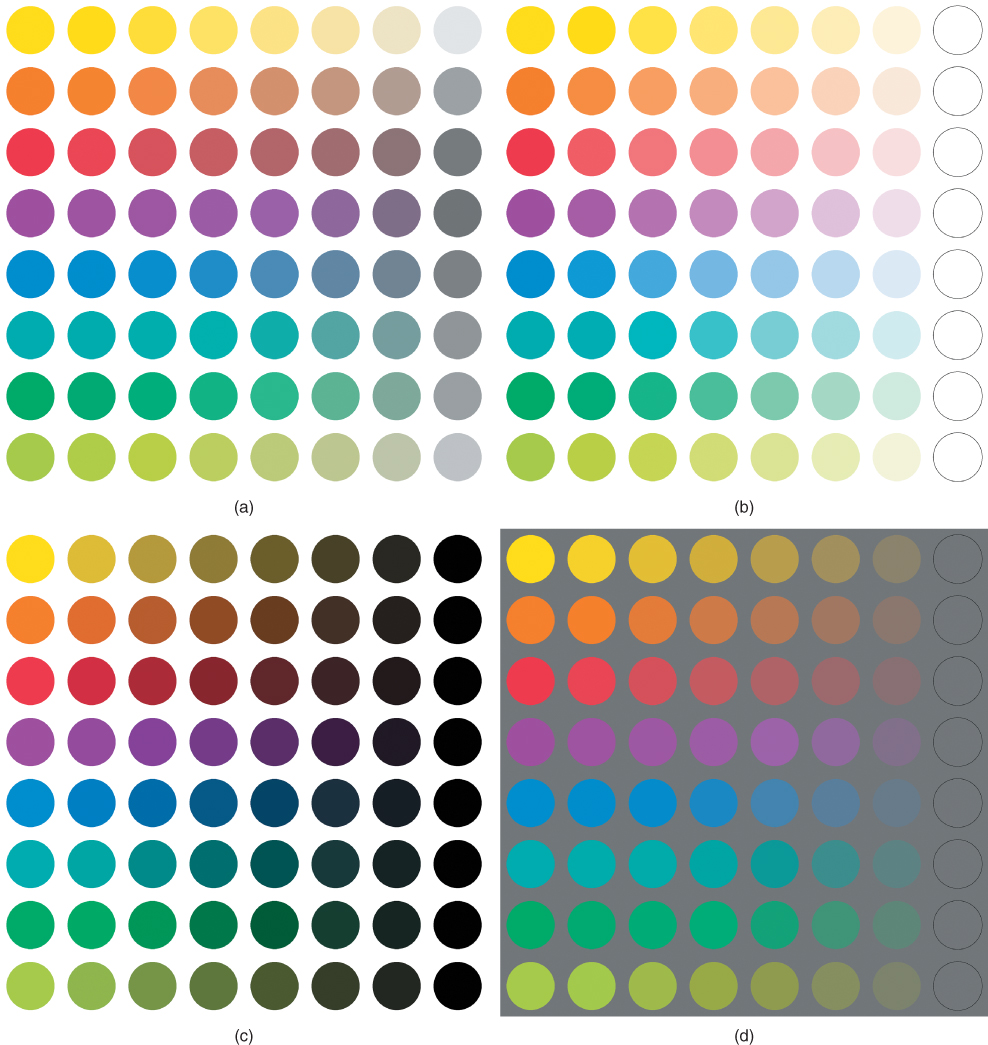
Figure 4.45 Eight principal hues of the NCS system at maximum NCS chromaticness are reduced in (a) chroma, (b) depth, (c) vividness, and (d) clarity.
H. COLOR‐APPEARANCE MODELS
For many industries, CIELAB and CIELUV are sufficient for color specification. If two physical samples have the same CIELAB coordinates, then they match each other in color. (We devote an entire chapter to handling the more common case of having dissimilar coordinates: Chapter 5.) There is an expectation that both samples are illuminated identically, placed on the same surface in edge contact, and viewed by a single observer. In most cases, the samples have similar physical characteristics, such as size and texture.
In color imaging, the expectation is that the illuminating and viewing conditions are often dissimilar and the physical characteristics are usually different, for example, display and print. In such situations, CIELAB and CIELUV may be inadequate. A color‐appearance model or CAM, by design, accounts for these differences.
As an example, an animator makes a movie. The movie has been created and viewed on a computer display in a dimly lit room, known as a dim surround. The movie will be shown using a digital projector and projected onto a large screen in a darkened room (dark surround). If the computer file is used directly as input to the digital projector, the movie will appear different compared with its appearance when created. By using a CAM, the data will be changed such that the projected movie matches the color appearance of the movie when seen on the computer display.
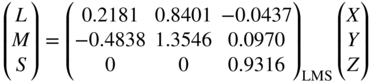
CAMs are used as shown in Figure 4.46. There are three sets of viewing conditions: source, reference, and destination. A forward model transforms source data to the reference condition. A reverse model transforms reference data to the destination condition. Quite often the two steps are concatenated, resulting in a single transformation from source condition to destination condition.
Figure 4.46 Use of color‐appearance models (CAMs) in color reproduction where the source and destination conditions are dissimilar.
CAMs used today account for differences in light and chromatic adaptation, background lightness, and surround. The appearance attributes of lightness, brightness, chroma, colorfulness, saturation, and hue are predicted, described in Chapter . The greatest challenge was adaptation, and extensive research by Nayatani and by Hunt during the 1980s became the backbone for CAMs (Fairchild 2013). Research by Fairchild (1996) on the degree of chromatic adaptation added another component. Earlier research by Hunt (1952) and Stevens and Stevens (1963) was used to enable the estimation of colorfulness and brightness. Research by Bartleson and Breneman (1967) was used to estimate effects due to different surround. In 1998, the CIE recommended its first color‐appearance space, CIECAM97s (1998). It was published as an “interim” space to be tested by both academia and the imaging industry. The results of these tests revealed shortcomings and in 2004, the CIE recommended a new CAM, CIECAM02, with better performance in predicting visual data and invertible mathematics, critical for use in imaging when needing to invert the model to transform between reference and destination viewing conditions (CIE 2004b).
Since 2002, mathematical inconsistencies in CIECAM02 have been uncovered (Brill and Mahy 2013; Li, Luo, and Wang 2014) and a CIE technical committee will likely be updating this model based on research by Li et al. (2017). Because of the complexity of the mathematics and the research nature of CAMs, we have decided to focus on deriving CAMs in general rather than provide formulas for CIECAM02 that will change in the near future. We encourage readers requiring the use of CAMs to read the book on the same subject by Fairchild (2013).
Our color‐appearance space has coordinates of LPCTaPCTbPCT, retaining the familiar L, a, and b variables and the superscript PCT are the initials for Principles of Color Technology. We begin by defining reference conditions—the 1964 standard observer, CIE illuminant D65, an adapting illuminance of 1000 lx, and an average surround (e.g. light booth or fully lit room). Illuminant D65 was selected because chromatic adaptation is always complete, irrespective of adapting illuminance.
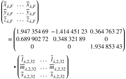
The four stages of color vision described in Chapter 2—trichromacy, adaptation, compression, and opponency—are defined. The CAM will use cone fundamentals; thus, the first step is to transform XYZ to LMS. The CIE 2006 physiological observer for 32 years of age and the 10° field of view is used, equivalent to the 1964 standard observer (CIE 2006a). The matrix shown in Eq. (4.18) was inverted and rescaled to a D65 white point (Xn = 0.94811, Yn = 1, Zn = 1.0734) using Eqs. (4.43)–(4.46), the result shown in Eq. (4.92)
The chromatic adaptation transformation (CAT) introduced in Chapter will be used, the formula shown again in Eq. 4.93:
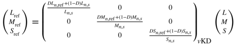
where subscript s indicates the source condition and subscript ref indicates the reference condition. This transform is based on the von Kries model and includes incomplete adaptation. The degree of adaptation, D, is defined by the user and typically ranges between 0.6 and 1.0.
The exponential psychometric function is used for the compression stage, shown in Eqs. (4.94)–(4.96). For the reference viewing condition, γ = 2.3 (Fairchild 1995)
The last required transform converts L′M′S′ to opponent channels, LPCTaPCTbPCT, the form of the transform shown in Eqs. (4.97)–(4.100):

where


The constraints are added such that the perfect reflecting diffuser has coordinates of LPCT = 100 and aPCT = bPCT = 0.
The Munsell colorimetric data for the 10 principal hues, 5R, 5YR, …, 5PR, sampling value 3, 5, and 8 at all chroma levels were used as aim data. Ideally, the data should be plotted as shown in Figure 4.47 where the hue angles are equally spaced and samples of constant hue plot as straight lines.

Figure 4.47 Spacing of the Munsell renotation data plotted in an ideal Lab system looking down the L axis.
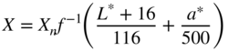
In order to use the colorimetric data, defined for the 1931 standard observer and illuminant C, the transformation developed by Derhak and Berns (2015a,b), known as a material adjustment transform, was used to transform the data for the 1964 standard observer and illuminant D65. This type of transform is required when converting between observers. The matrix coefficients, e1–e9, shown in Eq. (4.97), were determined using optimization where the average of the distance between each aim coordinate and its estimated value was minimized. The resulting matrix is shown in Eq. (4.101)

The Munsell colors are plotted in Figure 4.48. The performance is similar to CIELAB, plotted in Figure 4.49 for comparison.
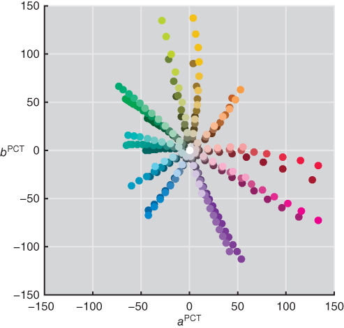
Figure 4.48 The Munsell renotation data plotted in LPCTaPCTbPCT looking down the LPCT axis.

Figure 4.49 The Munsell renotation data plotted in L*a*b* looking down the L* axis.
Chroma and hue angle are calculated in the usual manner, shown in Eqs. (4.102) and (4.103)
Saturation is calculated from lightness and chroma, shown in Eq. (4.104)
An important feature of CAMs is the prediction of brightness and colorfulness, defined in Chapter . This requires knowing the adapting illuminance, EA. Hunt (1952) performed an experiment with chromatic stimuli and found that colorfulness increased with an increase in adapting illuminance and that high chroma samples increased at a faster rate than low chroma samples, known as the Hunt effect. The general trend is modeled using Eq. (4.105):
where M refers to colorfulness and EA is the adapting illuminance in units of lux. The value of 1000 in the denominator corresponds to the reference illuminance of 1000 lx. Enumerating Eq. (4.105) was used to visualize the relationship between illuminance and colorfulness and is plotted in Figure 4.50.

Figure 4.50 The Hunt effect where colorfulness increases with increasing adapting illuminance. Each line corresponds to a sample with chroma as indicated.
Stevens and Stevens (1963) performed an experiment where neutral samples were scaled for brightness with changes in adapting illuminance. Their results were similar to those of Hunt (1952). In this case, brightness increased with increases in illuminance. The increase depended on the lightness of the sample. Light samples increased in brightness at a faster rate than dark samples. The same model used to predict colorfulness was used to predict brightness, Q, the formula shown in Eq. (4.106)
The relationship between illuminance and brightness, known as the Stevens effect, is plotted in Figure 4.51, based on enumerating Eq. (4.106).

Figure 4.51 The Stevens effect where brightness increases with increasing adapting illuminance. Each line corresponds to a sample with lightness as indicated.
Recalling the example of the animator, he or she would have noticed that the lightness of the projected movie was incorrect where midtones looked somewhat washed out. Viewing the movie in the dark rather than in dim conditions caused this change in appearance. Bartleson and Breneman (1967) performed experiments to quantify the effect of surround on lightness. Fairchild (1995) modeled this surround effect by changing the γ in the psychometric function. Average conditions have γ = 2.3, dim conditions have γ = (2.3 × 1.25) = 2.9, and dark conditions have γ = (2.3 × 1.5) = 3.5. In imaging, this change is often called a change in contrast. The relations between luminance factor and lightness for these three surrounds, known as the Bartleson–Breneman effect, are plotted in Figure 4.52.
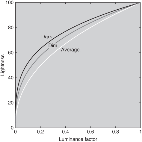
Figure 4.52 The Bartleson–Breneman effect where the relationship between luminance factor and lightness is changed to compensate for the effects of surround.
Although LPCTaPCTbPCT was optimized using Munsell renotation data, Munsell hue was not well predicted, seen by comparing the hue spacing in Figure 4.48 with Figure 4.47. Furthermore, relating Munsell designations with appearance requires training. NCS hue is more intuitive, relying on our ability to imagine unique red, yellow, green, and blue. The samples at maximum chromaticness for the 24 hues of the NCS system were used as aim data to transform hPCT to UPCT. (“H” was not used to avoid confusion with a hue‐difference calculation, described in Chapter 5.) Nonlinear optimization was used to fit a parabola for each quadrant where NCS R was defined at UPCT = 0. The optimization was constrained to avoid discontinuities between quadrants. Hue is assigned in which red, yellow, green, and blue have UPCTof 0 (or 400), 100, 200, and 300. For example, a color with UPCT = 50 would appear orangish. The conversion from hPCT to UPCT is plotted in Figure 4.53, the formula shown in Eq. (4.107)


Figure 4.53 The conversion from hPCT to UPCT based on enumerating Eq. (4.107).
Our textbook example of “PCT‐CAM,” while capturing many of the features of a CAM, does not account for all the effects modeled in CIECAM02 and more comprehensive models such as CIECAM97s and accordingly, we are not advocating its use. CAMs are an important advancement in color technology and are indispensable in cases where it is critical to account for differences in viewing conditions such as chromatic adaptation, adapting illuminance, background luminance factor, and surround.
I. WHITENESS AND YELLOWNESS
Whiteness
Whiteness is associated with a region in color space within which objects are recognized as white; degree of whiteness is, in principle, measured by the degree of departure of the object from a “perfect” white. Unfortunately, there are strong prejudices associated with industrial and national preferences which have prevented agreement on exactly what the “perfect” white is, and which directions of departure from it (toward blue, yellow, red, or green) are preferred or avoided. One consistent trend is that bluish whites appear whiter than neutral whites for samples having identical lightness. This is observed in Figure 4.54. In some circumstances, increasing blueness at the expense of reducing lightness increases whiteness.
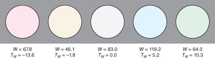
Figure 4.54 CIE whiteness, W, and tint, Tw, of five samples. The samples all have the same lightness.
With the introduction of fluorescent whitening agents (FWAs), it became possible to increase blueness without a reduction in lightness. FWAs absorb UV radiation and emit bluish light. These are used extensively, for example, in paper products, detergents, and plastics to increase whiteness. As fluorescent materials, the spectral properties of the illumination strongly affect the material's whiteness. This occurs for both visual evaluations and instrumental measurements.
Methods exist to evaluate whiteness using visual and instrumental measurements. See Smith (1997) for a historical review. Instrumentally, either spectral or colorimetric data can be analyzed. The CIE method uses colorimetric data (CIE 2018). It is also an ISO standard (2004). Research by Ganz (1976, 1979) and Griesser (1994) are the basis for a CIE whiteness index W—or commonly WI—where both luminance factor and hue are used in the calculation, shown in Eqs. (4.108) and (4.109) for the 1931 and 1964 standard observers, respectively
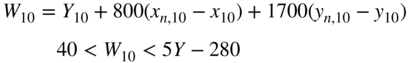
The illuminant in both cases is illuminant D65. These formulas assume that luminance factor for the perfect reflecting diffuser is 100.
The index is based on luminance factor, dominant wavelength, and purity, shown in Figure 4.25. With an increase in purity, a correlate of chromatic intensity, whiteness decreases. Depending on the dominant wavelength, a correlate of hue, whiteness will either increase or decrease. The hue weighting is along a blue‐yellow axis where blue is favored over yellow. Ganz and Pauli (1995) derived an approximate whiteness index in CIELAB based on the CIE WI; whiteness was a function of only L* and b*. The CIE whiteness index for the five colors is listed in Figure 4.53. The central color is neutral. The bluish sample has a higher whiteness than the neutral while the other colors have lower values. The yellow sample has the lowest whiteness.
The CIE method also includes the calculation of tint, TW, shown in Eqs. (4.110) and (4.111)
When TW is positive, the sample is greenish; when TW is negative, the sample is reddish.
For materials suspected of being fluorescent, the spectrophotometer's light source must closely approximate D65 in both the UV and visible regions of the spectrum (Bristow 1994; Lin, Shamey, and Hinks 2012). We describe the measurement of fluorescent materials in detail in Chapter 6.
There are two obvious limitations of the CIE whiteness index. The first is the limitation to a single illuminant — D65. The use of a chromatic adaptation transform overcomes this limitation (Wei et al. 2017). The second limitation is the use of a color space with poor visual uniformity — xyY. However, since the region of color space is quite limited, a uniform color space is unlikely to lead to marked improvement.
Yellowness
The presence of small amounts of yellowness in nearly white (or nearly colorless) samples is both common and, usually, objectionable; therefore, considerable attention has been paid to devising uniform yellowness scales. The ASTM (2015b) has adopted a yellowness index, YI, for both standard observers and illuminants C and D65 that is based on CIE tristimulus values, the formula shown in Eq. (4.112)

There are two constants, CX and CZ. Their values depend on the illuminant and observer combination, listed in Table 4.2. These scales correlate with visual perception only for colors seen as yellow or blue; in the latter case, the yellowness index is a negative number. They should never be used to describe colors that are visibly reddish or greenish.
J. SUMMARY
Numerical color specification relies on the principle of metamerism in which two colors producing the same trichromatic response match in color. At first, a reference device that is able to produce all colors is standardized. If each color matches the reference device, then the two colors match each other. The reference device for CIE colorimetry has primaries of 풳, 풴, and 풵 with amounts specified using tristimulus values, X, Y, and Z. This is referred to as the XYZ system. Any device that is related linearly to XYZ, that is, a linear transformation, can be used equivalently. Most RGB systems have this property. There are also reference observers that are surrogates for individual observers: the 1931 standard observer, the 1964 standard observer, and the 2006 cone‐fundamental‐based colorimetric observers. Soon after colorimetry was defined, it was apparent that this matching system was inadequate for quantifying color differences and relating numerical values to perceptual attributes. This led to approximately uniform color spaces such as CIELUV and CIELAB. By considering coordinates simultaneously, there are correlates of lightness, hue, chroma, saturation, vividness, depth, and clarity. Both CIELUV and CIELAB are designed for color specification under a single set of viewing and illuminating conditions. When it is necessary to compare colors under dissimilar conditions, CAMs may be required. These include the additional correlates of brightness and colorfulness. Whiteness and yellowness also require numerical specification and specific formulas have been developed for this purpose. In the next chapter, we will use numerical specification for defining color quality and setting color tolerances.