
3. How To Matter
What design can do for you—how design communicates with people—how the design of products and services creates an emotional connection with your customers—how great design builds bulletproof brands.
In the 1880s, Lunsford Richardson, a pharmacist in Selma, North Carolina, was experimenting with a formula to relieve colds and pneumonia for his customers. He arrived at the active ingredients of Camphor, Eucalyptol, and menthol, and inactive ingredients of cedar leaf oil, nutmeg oil, Petrolatum, Thymol, and turpentine oil. A classic was born. The product succeeded because it worked when other products sold by snake oil salesmen didn’t. People came to depend on it, and they liked it better than anything else they had tried. Richardson moved to Greensboro, North Carolina, and started marketing his formula as Vicks VapoRub, in honor of his brother-in-law, a Selma physician named Dr. Joshua Vick.
© Procter & Gamble. All Rights Reserved.

The company become known as the Vicks Chemical Company and was sold to Procter & Gamble (P&G) in 1985. VapoRub is currently manufactured in Mexico and India. Why does it keep selling? When people feel sick, they reach for Vicks because it has formed an emotional bond with a customer base that nothing has replaced. VapoRub’s brand value seems pretty bulletproof even today. What would happen if P&G tried to take Vicks off the market? Public outrage. People care. The product matters.
Product design enlightened by the customer experience has been around for some time. Although the packaging for Vicks VapoRub is unlikely to end up on permanent display at a museum of packaging art, the product continues to be mindfully marketed by P&G, who is really good at brand management. A focus to deeply connect with the customer has become increasingly important as the organizing principle of a total design. And we think this will always be the case—not just for success, but for survival. Your design, brand, business, and company must matter in the heart and mind of your customer.
© Procter & Gamble. All Rights Reserved.

When P&G released the Swiffer in 1999, it caught on—not because it mimicked design cues that could make it the iMop, but because it made life easier for anyone cleaning a floor or spill. People liked that. The bond was emotional. No more of the distasteful wringing out a mop and then deciding where to hang it while it dried. Just throw away the pad. Someone thought about the parts of daily life that aren’t easy or fun and found a way around them. That made people happy. That’s what drives modern product performance, as with any traditional product that has survived. People connect with it and buy it. They justify purchase decisions with reason and stay connected through emotion. You must continually contemplate how engaging hearts and minds is part of your total concept of product design.
Notice that we did not start out this chapter with examples of design that were stunning physical objects destined to become objects of lust, such as the iPhone. This would only have reinforced an already too limited concept of design implanted in too many minds. Yes, you can become a choreographer of timeless objective beauty, if you want. However, if this is all you are, it won’t be enough. You don’t start with all the stuff you have in the back end or all the stuff you have on the shelf; you start with a person who is, or will become, your enduring customer. And you should ask yourself, "What do I want that person to feel?" What do I want my customer to feel after he has bought my plasma screen? If you’ve ever arrived home with a wagonload of home theater gear and tried to hook up an HDTV monitor, a receiver, and a 5.1 surround system, you’ve definitely wished someone had asked this question sometime during the design process.
When Best Buy couldn’t get manufacturers to collaboratively work this out, and they knew it was costing them money, they bought The Geek Squad, who will show up in their VW Bugs and (for a fee) get it together for you. The consumer electronics industry desperately needs to listen and apply the Apple tag line: "it just works." In the meantime, get yourself a Logitech Harmony Remote if you’re desperately seeking home theater domestic harmony. You’ll have a direct experience of what great design can do for you. Harmony felt customers’ pain as they struggled with an array of miserably designed remotes and on-screen user interfaces that even an engineer’s mother couldn’t love. Then Harmony developed an activity-based design for its universal remote. People and the reviewing press love them.
That’s what good design is about. So when you’re creating a product, what do you want people to feel when they take delivery? When they use it? The product and its impact can be growing and evolving. Quite often, great successes do not start out scripted and designed. You have an idea, you start somewhere, you see something working, you develop it, and you run with it. You hit snags; you iron them out. It’s simultaneously a conscious and strategic process.
Let’s take a look at the iPod as an example of how you can design and evolve a product. We want you to pay special attention to how the process of creating a customer experience supply chain did not flow from a set script and was certainly not without snags and obstacles. Look from a 40,000-foot level and see that after Apple had embraced the idea of the iPod as a portal to a rich user experience, it kept running with it, building on it, making it better, and looking for more opportunities. In Success Built to Last (Plume, 2007), authors Porras, Emery, and Thompson describe the unexpected role of serendipity in the journey to greatness. This is certainly true in the story that follows.
First, consider the recorded music environment from a customer perspective in those pre-iPod days. With the advent of CDs, the 45-rpm single was dead. Now if you wanted to buy a single song you liked, you had to buy a whole CD for $15 to $20 to get the one song you wanted, plus a dozen more you didn’t give a damn about. Screw Big Music is pretty much how you felt about that if you were a teenager or a college student. Then along came Napster, Kaaza, and the file-sharing universe. During the ongoing legal war between Big Music and its customer base, the idea that you should be able to buy a single cut from a CD penetrated the mainstream. Still, although you could now legally load songs onto a hard drive, this fell far short of a pinnacle of portable convenience.
The iPod story has been told in a number of places and in multiple versions. While we share with you our version (although not Apple approved), we want you to focus on the aspects of the underlying design process that will help you develop products and services that matter. Also think about the implications of the fact that Apple did not invent what became the iPod. Instead, Apple developed (and this is what matters) the iPod as a portal to an incredibly valuable ongoing consumer experience—a huge distinction.
Our story starts with Tony Fadell, who had worked for General Magic and Philips and set himself up as an independent contractor because he had an idea he wanted to shop around.[1] Bulky flash memory–based MP3 players were on the market from companies such as Rio, or the Nomad Jukebox (from Singapore-based Creative). The Nomad was about the size of a CD player, and it had a hard disk in it. It was phenomenal, in the sense that suddenly you could load your whole collection of music on this one piece of hardware and begin to understand the power of a digital music device.

Of course, there was a list of "buts." The Nomad had a really miserable user interface that most people barely understood, and its battery life was abysmal. You couldn’t really use it as a portable unit; it was best suited for a home stereo. And you could create play lists, but only with some difficultly. At 6 inches in diameter by about 1.5 inches thick, you could put it in your backpack, but you probably wouldn’t carry it around. Fadell wanted to deliver a small hard drive–based player linked to a content delivery system through which users could legally download music and easily create playlists. "A 1,000 songs in your pocket" was the idea here. People loved it. Good start. He was on the path to an emotional link with customers, but he had a ways to go.
Fadell shopped his idea to companies such as RealNetworks, Philips, and Palm. When they said no (consider the irony of this: Palm was on a roll at the time, and now it’s teetering on the edge of a hungry grave), he reluctantly approached Apple, knowing the company was consumer electronics shy after painful experiences with the Pippin and Newton. He didn’t know Apple had bought the rights to SoundJam MP a few months before he approached the company. Apple hired Fadell in 2001 and gave him a team of about 30 people and a one-year deadline to build out and release a product.
With limited time and uncertain funding, Fadell looked around for an existing player to use as a basis for the Apple player. After looking at Rio and Creative, his team found PortalPlayer, which had not yet released its own player, although it had helped other companies develop MP3 players using common software. Before Apple, PortalPlayer had been working with IBM on a flash memory–based player with a Bluetooth headphone system, but it thought its chances of getting to a consumer-friendly MP3 player would be better by working with Apple.
According to Ben Knauss, who was at that time a senior manager for PortalPlayer, Fadell was filled with optimism and predicted from the start, "This is the project that’s going to remold Apple, and ten years from now, it’s going to be a music business, not a computer business." But the first PortalPlayer prototypes could not handle a play list larger than ten songs, did not have equalizers, and had outdated interfaces. On top of that, the player’s batteries lasted for less than three hours. And as Knauss has admitted, "It was fairly ugly. It looked similar to an FM radio with a bunch of buttons."
PortalPlayer’s reference design was 80-percent complete when Apple came along. The company dropped a dozen other clients to work exclusively with Apple. For Apple and its tight schedule, the attraction was that the software and hardware were already done. According to Knauss, Apple spent eight months using the company’s 200 American employees and 80 engineers in India to focus exclusively on the design and development of the iPod. Even more important to the project’s success, Steve Jobs became personally involved in the project, eventually giving it nearly all his time—something he rarely did.
Initially, Jobs’s involvement was in iPod meetings every two or three weeks. But as soon as the first prototypes were completed, he got involved on a daily basis. From Fadell’s notion and business plan, Jobs’s participation meant approaching the project from the customer’s point of view and using that perspective to mold the device’s shape, feel, and design. Jobs reportedly threw a fit if he couldn’t get to a song in three touches of a button. "We’d get orders," said Knauss. "Steve doesn’t think it’s loud enough, the sharps aren’t sharp enough, or the menu’s not coming up fast enough." He focused on every detail, from the interface to the size of the scroll wheel. Even Jobs’s quirks show through. The iPod ended up louder than most other MP3 players.
In spite of all the hard work, and a good deal of typical Apple obsessive secrecy during the design process, the product nearly died just before it was scheduled to ship. It drained batteries even when turned off. It could run for maybe three hours, and then it just died. With production lines already set up, the mad scramble that took place to fix the problem and ship the product is a CEO’s nightmare.
When the first iPod finally did roll out, inside was a 5GB Toshiba hard drive about the size of a quarter, the same ARM processor used in the Newton and the Acorn, an operating system from Pixo, a large high-resolution display, a lithium polymer battery (that could last quite a bit longer than three hours), and, of course, the scroll wheel.[2] This was a distinct departure from the Sony Walkman kind of controls, a huge advantage for the user who could now simply spin a wheel to sort through a capacity for thousands of songs. This feature gave the iPod a significant experiential user advantage over MP3 players such as those from Nomad or Compaq. One profound lesson here is that details matter big-time. Jobs knew this and got involved at the level of tiniest design detail to make the iPod a success.
In a way, the iPod story is a dream scenario for what we are discussing here. Design, as a fully integrated approach to the user experience, contains elements of risk, serendipity, and lessons learned from failure. As with anything in life, you don’t get anywhere by sitting comfortably in your living room, warm and cozy. You really have to step outside and take risks to make progress. This is an important part of design as well—after you learn from your failures and you get on to something that’s working, you build on it and move forward. Behind all the scrambling and luck—sometimes good, sometimes bad—you see a consciously designed series of events emerge in which you earn your good fortune by being incredibly intentional about creating an experience with great design as a core strategic element.
Apple has released subsequent generations and versions of the iPod. The premiere version was presented to the world in a rented auditorium in Cupertino to a shocked audience that was more hostile than friendly. The $400 price and absence of Windows compatibility were considered two strikes against the first iPod. Although the reception in Europe was more enthusiastic, Apple was quick to roll out a 10GB version and, as soon as it could, provide a utility that enabled users to access the iPod experience from a Windows PC. As part of the evolutionary process, Apple replaced the original spinning scroll wheel with a solid-state version, similar to a notebook touchpad. And the beat went on, through generations two, three, four, and beyond. The driving principle of each change and iteration came from an intense focus on the customer experience, by valuing customers’ emotional connection to the Apple-enabled world of digital music.
The iPod is an iconic product, a portal to a customer experience that has redefined an entire industry. Jobs did not play the game; he changed the game.
The crucial point of the evolving iPod story is that if you want to transform your brand to the point where you matter, you have to start with design that’s "designed in" not "added on." It can’t be a veneer. Design is not an event or a process you apply to physical and mechanical reality. You are designing a customer experience supply chain. If you are the CEO and this is something you really want to do, it’s not just a matter of getting together your executive staff and saying, "Go design some good stuff." You have to look at your business from beginning to end and see how it all relates to your customer; then you must decide how you will design all the pieces of a customer experience solar system and go about accomplishing true organizational change.
You won’t accomplish this by holding an offsite meeting and saying, "And remember that design’s important these days, so report back to me in six months and show me some really cool stuff." You have to design an entire organizational system aligned top to bottom with being design driven. Any dissonance in the culture design, the organizational structure, and the incentives will produce toxic waste in the environment and you will lose. Trust us on this—the environment always wins.
Let’s loop back to Jobs and Apple for a moment. Was the reception to the idea of what became the iPod, and all the steps that followed, mostly luck (remember, some capable companies passed), or was it the result of a company-wide driving spirit of regard for the "customer experience" embedded in the Apple culture? Our answer is that "you earn your luck." Take the Macintosh as an example. It might have started with a belief in the power of the personal computer, but the good design started with seeking to bring this power to the people in a form factor they could use. The process that led to the Mac evolved through the development of the Apple I and II, Apple’s focus on releasing reasonably priced, reliable, and easy-to-use computers for the rest of us.
You probably recall that the early Apples didn’t look appealing, and the message wasn’t great. However, the ease of use and what happened on the screen from a user experience made the Mac an icon. The company figured out the power of design, and Jobs drove that from many points of view—from the size, to the insistence on an elegant graphic user interface for the operating system, to the incorporation of a mouse, to the insistence that it couldn’t have a fan. He wanted the total experience to be great. You must get the experience right. Jobs and Apple transformed the computer from this sort of complicated, scientific thing into this cute little box—one with killer applications such as Adobe Photoshop and PageMaker.
Images 1-5, 7-8 Courtesy of Apple Inc.
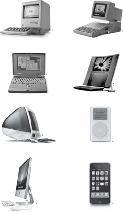
That was the first period for Apple. The second period began when the company understood the power of the icon and the physical experience. During the first period, the company used what we refer to in design language as "Silicon Valley provincial." It was from the HP genre—everything was beige, contained angles on the corners, and was designed like a credenza. Then Apple said, "Look, there’s a whole other world out there." And that’s when Jobs hired Hartmut Esslinger and Frog Design to create what was one of the first and most successful brand-driven design languages—driving toward a look and feel that will be pervasive across a product line (design language is the subject of Chapter 7, "Your Products and Services Are Talking to People"). They were very successful at that. This was when design took hold and Apple became a bona fide design-driven enterprise.
The period between after Jobs was fired and before he was encouraged to return was about leveraging the impact of being a design-driven enterprise and growing it. People don’t realize that although this period is somewhat forgotten, Apple grew into a $12 billion company and was selling products everywhere. It really leveraged the idea of the Apple brand. At the same time, the flurry of activities focused toward growth shifted some of the tightness of focus away from the total customer experience. John Scully was a good leader, with design in his background (Rhode Island School of Design), and he had a strong interest in innovation (such as the original PowerBook), but at the same time many people were coming in from Sun and HP, and the company goal was to make the business big and broad. Apple continued to build an extraordinary design capacity, make great products, and win awards, but all the various parts of the business side were trying to be everything for everyone, which diminished the focus on core Apple experience and ideals.
Then Jobs came back and refocused on creating a significantly better user experience. He said, "Look, this is about the experience, and you have to understand that the most powerful asset that Apple has is its brand and the experience that people have. You cannot sacrifice that. In fact, you have to constantly make it better." That ushered in the third period, and with it, the iMac. If you look back, Apple has always been about icons. It had the PowerBook, which still stands today as the MacBook—the same design with different materials. It had the original Mac, then the iMac, and then the iPod, and now the iPhone, the Apple TV, and the MacBook Air. These products have always represented the company’s core values. It’s interesting design history, but Apple didn’t have it from the very beginning. It has been a living, growing process. The Mac illuminated the power of experience design and the iconic nature of products similar to it.
The possibility for an organization to get the notion of "Don’t just play the game, change the game" goes far beyond the world of electronic devices and household products. No matter what business you’re in, you should focus on this sort of integrated design. Let’s look at an example from an entirely different category.
Cirque du Soleil (French for "Circus of the Sun") began in 1984 in Quebec with a synthesis of circus styles, no ring, no animals, no curtains, continuous live music, and a poetic central theme and storyline to its performances. During its 1988 North American tour, which included appearances at the Calgary Winter Olympics and in San Francisco, New York, Washington, and Toronto, it was a smashing iconic success. The title of the tour was "We Reinvent the Circus." But why did Cirque du Soleil feel the need to reinvent the circus?
In the heyday of the traveling circus, from 1880 to 1920, Barnum and Bailey’s "The Greatest Show on Earth," the Ringling Brothers, and many more circuses such as these traveled in tent shows to all the major U.S. cities with clowns, elephants, acrobats, and a predictable array of apparitions, acts, and novelties. The circus, as an art or entertainment form, significantly declined in popularity during the 1950s and 1960s—a period infused with an increased concern for the welfare of animals and a general public boredom with a genre that had changed little in a world that was changing a lot. The circus was also a populist medium in a setting where it had to compete with television and a growing number of equally colorful distractions. Yet the circus drum beat on to an unchanged cadence, and the man was fired out of the cannon in the same way he had always been. It was no longer an emotionally moving experience for many people.
Cirque du Soleil changed the game forever with an artful, integrated experience in a changing and evolving format, to become named cirque nouveau, the new circus. The audience also changed to one that appreciates skilled artisans swinging from sweeping drapes to music written by modern composers, amazing paired contortionists, and teams of acrobats working in synchronization—all to an unfolding, compelling story. It is a totally engaging experience that lifts the emotions and provides fresh entertainment.
Cirque du Soleil is now an annually touring business with movies, related products, and a yearly revenue of more than $500 million. P. T. Barnum is likely spinning in his grave. However, its origins were more humble. Two street performers, Guy Laliberté and Daniel Gauthier, founded the company in 1984. The early years were tough, and they needed the support of government grants for two years. They hired Guy Caron away from The National Circus School to create the experience-driven atmosphere of shows with a central theme and storylines. The troupe had successes in the 1980s, such as the Los Angeles Arts Festival, but it also had failures. Then, under the direction of Franco Dragone, the show Nouvelle Expérience was created, and that brought Cirque profit by 1990 and encouraged new shows. But the driving and shaping force that ebbed and flowed and kept the show alive was a design based on experience, on an emotional engagement with the audience.
Janice Steinburg, who witnessed Cirque du Soleil’s 1987 appearance in San Diego on its first American tour, said, "Like a really fabulous first kiss, that show lingers—it shimmers and dances in the memory of anyone who was lucky enough to experience it."[3] According to Mindy Donner, a puppeteer and arts educator, in the show that took place in a 1,500-seat tent in the parking lot of the former Naval Hospital near Balboa Park, there were "poignant characters on risky business, alone and vulnerable in the spotlight, or appearing and disappearing through fog and rigging." Reviewing for the San Diego Tribune, Robert J. Hawkins described the production We Reinvent the Circus as a "diaphanous illusion in which the ragtag artists stumbled out of the eerie light and mist … clinging to each other like gentle escapees from some asylum." Said Steinburg, "I remember seeing those macabre, tender figures and being moved to tears."
We earlier mentioned that design, as a fully integrated approach to the user experience, contains elements of risk, serendipity, and lessons learned from failure. Few examples speak better to that than Cirque du Soleil. Laliberté not only reinvented the circus, but he also kept reinventing Cirque du Soleil, a process that continues as the company marches on. However, in the beginning, think of the courage it took to say, "Circuses are largely for children; we’ll make it largely an adult experience. Circuses always have animals; we’ll have no animals. Circuses show the same events wherever they go; we’ll innovate a different event each time, and begin each with a story. Circuses offer a low form of entertainment; we’ll raise it to a high form. Going to the circus is a cheap date; we’ll raise the price point until the experience is aspirational, one that fewer can afford."
Laliberté sinks as much as 70 percent of the company’s revenues into research and development for new themes and talent—quite a far cry from the 1987 show at the Los Angeles Arts Festival where the gamble was a huge risk. If the show had not been a success, Laliberté wouldn’t have had the money to get the company and equipment back to Canada. Yet they did make it back and have achieved many successes in the face of a number of imitators. Cirque du Soleil accomplishes this by constantly reinventing itself and shifting designers and talent. It doesn’t seek traditionally trained talent because these performers tend not to be independent thinkers—and that’s the sort of verve this company wants to maintain.
With its enormous success, many are concerned that the growing commercialization will cause the Cirque to lose the magic that made it work in the first place. Is it possible to become overpolished and lose the humanity that made the emotional connection to its audience? Christopher Isherwood, in a New York Times review of Cirque’s KÁ show at MGM Grand, said, "The sheer scope of this theatrical enterprise…precludes emotional engagement in the fate of the characters." Is it possible to offer the personal experience of the original shows yet have major audience appeal? That is the tightrope Cirque du Soleil must walk if it is to keep its driving design alive and create success built to last.
Design, as we’ve been discussing it, is a living, ongoing process that has to learn from mistakes, refresh itself, and take new risks all the time. You must keep coming back to the idea of an experience and design toward it, embrace the vigilance of maintaining it, and remember the many facets. That holds true for a product, a service, an entertainment, or even something such as fixed-location retailing. Especially in that environment, the location where you sell your goods demands artful design for the total customer experience.
For example, when you go into a Whole Foods Market, you are treated to a designed experience. You don’t have to ask where the baskets and carts are. A beam of light from track lighting is directed toward each, catching your eye as you enter. The main entrance is typically through the produce section, where every bin is full, with vegetables and fruits arranged in symmetric rows—shiny, taut, green next to yellow beside red—and a "foodie" clerk is always handy to remove any flawed or fallen produce, or to help with a selection. That informed person is able to tell you the difference between two kinds of onions or which type of ginger you might try. If you have a special need, such as new red potatoes all smaller than a golf ball for a special dish to go with your salmon, a clerk will gladly go into the back and dig through boxes to get you exactly what you need. And when you later go to the fish department to get your salmon fillets, the person behind the counter is likely to throw in a couple lemons "because you’ll need these."

Free sample stations stand in most departments so you can have a wedge of apple or a taste of the five-seed farmer’s bread. As you pass the cheese section, you "smell" cheese. A large wheel has been cut and placed where the breeze wafts it to you. By the barrels of coffee beans, several pots are brewing and the aroma lures you closer for a sample of today’s Kona blend. Throughout the store, you’re likely to find places attended to by live people where you can sit at a counter and have a seafood meal, a snack, Italian food, or sushi, each with buckets of different wines coordinated with the meals so you can have a glass in a relaxing moment—an experience.
You can find the row of foods prepared for the busy worker who is stopping by on the way home but wants to prepare a special meal. If you decide to eat at the store, there’s also a wide selection of cold and warm foods ready to eat at the tables inside or, better yet, at those outside on the flagstone patio, where a rill of water courses in a small stream between the umbrella-covered tables. As you check out, the wall behind the registers is covered with evidence of the store’s involvement in the environment and local community activities. Sure, the prices are, in general, a bit higher than those at the nearest supermarket, but if you don’t leave with a warm and fuzzy feeling that you deserve to shop this way, then you haven’t been paying attention.
Constant vigilance, we have said, is part of an active, integrated design. Consider a store such as The Sharper Image, where some could argue that the originally innovative design has faded. The original idea was that you would discover all these products and learn from the editorial thread. Part of going to the store was about this experience, similar to browsing a multidimensional magazine. Perhaps you didn’t always buy something—you just went there to play with the products. It was really the sort of venue where you could learn about technology with its myriad embodiments, and experience fun and inspirational things. But the stores have too much stuff now and have lost a lot of that editorial thread. They have just filed for chapter 11 bankruptcy protection.
A company that does not interact face-to-face with its customers has a harder time feeling the emotional experience of its customers. Consider Dell, for example. People don’t really experience the brand until they get their product. Their contact is only through the Dell web site. The problem is how to interact with and feel what the brand means to customers. It can mean efficiency, currency, and low cost. But does Dell get an answer to the question, "What do the products feel like to the customer?" It’s not so easy, rather something to work toward. For a while, Dell put kiosks in malls with people in blue polo shirts to show the products, but the consumers couldn’t buy them there, and that led to more confusion than understanding.
When Amazon.com first started, it had to take a number of innovative steps to connect at the emotional level of a customer’s experience. How do you have a customer feel more cared for by a web site than when dealing with a live person? (Actually, that’s not so hard if you reflect on your average experience at a big-box store.) Making purchases easy and secure was one step. "1 Click" was a stroke of brilliance. Providing a forum to review offerings opened an interactive avenue and created a sense of community that mitigated the fear of buying without touching and feeling. A data system tapped the interests of customers. Whether you were buying for yourself, your children, or your grandparents, you got relationship sales suggestions that often resulted in additional sales for Amazon and a better experience for you. See if most human clerks you talk to remember your personal preferences. But is Amazon bulletproof? No, nothing is. Would you miss it if it went away? We would. Would you?
That leads us to the context of all people in any business. Why is it so important that design be part of all aspects of your business, from one end to the other? What is a design-driven company? It’s where any company begins by putting the experience in the center and then working outward from there. You can look at companies whose core offering might be technology or maybe a service, and it’s design driven when it’s shaped and driven by what customers see, experience, and value. For these companies, that’s what drives development—marketing and sales, even manufacturing and distribution. It all comes from the idea of "What are we designing for people, for what emotional response, and how do we do that?"
With the earlier Whole Foods example, we touched on the fact that sometimes people are willing to pay a little more for an experience that is emotionally positive. In that way, design represents part of the value of the equation people will pay a premium for. You are designing for the category of customer you want, the kind willing to pay a premium for a superior experience, as is the case with Whole Foods. In the case of Southwest Airlines, you usually get a better experience for less—how good is that?
So when you’re talking about the direction of your company, you have to understand that when people will pay you a premium for an experience that you have designed for them and that they have connected with and value, it’s the only thing your competitor can’t replicate instantly. United cannot replicate Southwest. When your customers have decided that you matter, it’s yours to lose after that. When you do it well and you stay on top of it, it’s an unbelievable asset, and you can earn a lot of revenue from it. It’s the gift that keeps on giving. However, that doesn’t mean you rest on your laurels.
Now, all this is not just a good idea—it’s do or die. If your company doesn’t embrace the concept of design we’ve been talking about, the kind that embodies a positive and emotional customer experience, then it could be on life support sometime soon. Many reasons exist why doing business has become so much more challenging. As time goes on, customers become more demanding in terms of design. All you have to do is go to any number of blogs, review sites, or even sales platforms to see candid feedback that motivates companies to improve designs if they want to stay in business. Products and services get better. At least the very best get amazingly good, and the poor, well, the poor get poorer.
Especially here in the United States, during the last ten years of significant growth, a public understanding of design has emerged. People have become more interested in and discerning about how things are, how they work, how they look, and how they behave. This starts to move companies to invest in design. More companies are spending money and time on design—although many of them are still not doing it well. The trend continues to grow.
A broader idea playing out here is that designing a unique and highly valued set of customer experiences is really one of the only truly defensible strategies. If you have your own brand-driven approach to design, others can’t really take this from you. People can try to copy it, but then they become merely derivative. If you do a good job at it, you have something that becomes a very strong and defensible strategy. With brilliant customer experience supply chain management, when a customer purchases your product or pays for your service, they feel they have joined something. This goes way beyond just the physicality of the product. It’s the totality of the experience of the community of customers, all the people who do business with you, and everyone who uses the products and services you produce and deliver.
Diners at Alice Waters’s legendary Chez Panisse feel connected to the community of growers and to the very earth itself as they experience memorable delights of wonderful food, naturally and exquisitely prepared from extraordinary ingredients. Waters might not think of herself as an architect of a design-driven business, but we have known her for 30 years and she is also this.
So, if this level of attention to the details of the experience is not designed in, then you’re going to be commoditized, and there’s no way in the world you can win a war of commoditization. You’ll lose that call.
In many ways, Dell is a living example of this reality. Michael Dell is seriously smart. Dell is obviously an extremely successful company built around a brilliantly designed operational model. But because, as a company, it has never completely embraced design with the full spectrum of its customers’ total experience at the center, it becomes prey in a commoditized world. For one thing, people have copied Dell’s operational model because they can; you can figure it out and do it. As a result, the company now has diluted equity with the consumer. It recently released some terrifically well-designed products and has consistently delivered durable and excellent technology. However, this is not the same as being a design-driven company, and we assert that its market cap suffers in consequence.
You build equity over time. When you do it successfully, it’s similar to equity in anything: It builds up, it’s stable, and it’s there. When you don’t build equity, people don’t really know who you are. When your company is consistent and focused on design and the impact of design on experience, you build up a capital reserve in people’s hearts and minds about who you are and that you matter to them. This is a very valuable asset.
The fact is, many companies have consciously gone about creating equity with the customer as part of their strategic plan instead of viewing it as something that happens accidentally along the way. But they don’t always include all the elements that really do matter. Dell has built a lot of its equity around pricing, its delivery model, its ability to configure and customize, and its aim to be a business partner. This is all good. But wait—there has to be more. These good things are not sufficiently aspirational or inspirational to bond customers to a company, brand, or product. Dell is working on the "but wait—there has to be more" part. The company has smart people. If Dell believes design of the total customer experience is important (and it is), the company will figure it out.
Some companies, such as Apple, Nike, and BMW, do this consistently well over a long period of time. A surprising consequence is that when a company establishes this enduring commitment to a design-driven culture, focused on the customer experience as the defining criteria of great design, then the customer, in turn, often grants the company the option to fail once in a while. If you’re a BMW driver and BMW puts out a less-than-perfect model (and they’ve had a few that have been stinkers design wise), you cut the company some slack. "This is BMW," you say. "They’re just messing around. They’re trying something out, and they’ll get back on track." On the other hand, if Chevrolet comes out with a clunker, you will probably say, "There you go again, that’s Chevrolet for you." Chevrolet has just lived up to your worst expectations, so you have a different response.
When a company establishes an idea, people will grasp it and grow it, for better or for worse. It’s up to you to create and hold positive equity. It’s vital that you do. Depending on the emotional nature of the equity you build, it can leverage you forward or take you down. As a customer, this object or service that you’re interacting with is sending you information. When you see it, touch it, and use it, it’s giving you information.
This is a really important notion that helps provide the answer to the questions: "Why? Why design or die, and why now?" As Marty Neumeier put it, "We’ve moved from an economy of mass production to one of mass customization."[4] Products previously were produced in mass quantities, and you had relatively few choices. The amount of capital and time it took to develop a product was so significant that the variables or different options available were generally quite limited. In the last ten (and especially last five) years, the ability to manufacture quickly has grown exponentially along with the ability to manufacture different variations. The ability to configure to order is rapidly growing also.
Consequently, you can no longer make product decisions based on only features and benefits because everybody either has the features and benefits or can get to them fairly quickly. So, as a consumer, on what basis do you now make choices? You make choices on an emotional basis. You make choices based on what the product is saying to you, your connection to a brand you trust, and the qualities and meaning you have invested in that brand.
This describes the current state. But many companies don’t fully recognize the importance of the emotional component because this component is not spreadsheet friendly. Rational features and benefit analysis aren’t as effective anymore because too much exists for mere mortals. Go buy a TV. How the heck do you start if you’re not looking at how it looks, how the picture connects to you, and how the sound quality resonates for you?
If you try to do it by reading resolution specs (let’s see, is 1080i good enough, or do I need 1080p?), analyzing features, comparing size, and even comparing price—forget it. How do you make a decision? You will look at them and say, "Well, I know Sony’s a good brand, and I know Samsung’s a good brand." Then "Oh, I like the way that one looks. It will fit well in my home." And when you see it, "Oh, that picture really jumps out at me, and the sound is great." Those are the things that matter in how people make choices today. That’s the crux of why the design experience driving brand connection has become so important. It has always been important but now it’s crucial.
If you’re not already integrating the design of the customer experience supply chain throughout your company, you need to get cracking. In the next chapter, we take a deeper look at design-driven companies and consider how yours could take steps toward becoming one.