
Chapter 19
Conjoint Analysis, Multidimensional Scaling and Correspondence Analysis
Learning Objectives
Upon completion of this chapter, you will be able to:
- Understand the concept and application of conjoint analysis
- Interpret the conjoint analysis output obtained from the statistical software
- Use SPSS to perform conjoint analysis
- Understand the concept and application of multidimensional scaling
- Interpret the multidimensional scaling output obtained from the statistical software
- Use SPSS to perform multidimensional scaling
- Understand the concept and application of correspondence analysis
- Interpret the correspondence analysis output obtained from the statistical software.
- Use SPSS to perform correspondence analysis
Research in Action: Paytm
An Indian payment and commerce company Paytm, based out of Delhi NCR (India), was launched in August 2010. Paytm is the consumer brand of its parent One97 Communications. The name is an acronym for “Pay Through Mobile.” In 2015, Paytm became the first Indian company to receive funding from Chinese e-Commerce company Alibaba, after it rose over $625 million at a valuation of $1.5 billion.1 Paytm is an unconventional company with unusual business issues for the common person who is very conventional in India. The company’s website is also designed in an entirely new way which further exhibits the unconventionality of Paytm (see Figure 19.1).
On 8 November 2016, the government of India announced demonetization of Rs 500 and Rs 1,000 currency notes. This event came as an opportunity for a company like Paytm. The firm explored this opportunity fully using heavy advertisement as Indians started using e-wallets in the face of heavy cash crunch. For the first time in the history, Indians saw small vendors using Paytm services for daily monetary transaction. Just after demonetization, Vijay Shekhar Sharma, who is the CEO of Paytm, emerged as the largest incidental beneficiary of the demonetization move.
Overnight, Vijay Shekhar Sharma’s Paytm, which allows users to pay bills online, became the default payment app for millions of cash-starved Indians. The number of Paytm users jumped from 125 million to 185 million in just three months. Its founder, the burly, bespectacled Sharma, emerged as the undisputed “king of demonetization.”2 It will be great to see when the impact of demonetization is over in six months, what would be the growth of the company, or in other words, what will be the fate of its success momentum which seemed to be a lucky coincidence. The company is hopeful that the compulsion of using digital money at the time of demonetization would turn into a habit that will not change even after the cash-crunch days are over.

Figure 19.1 Paytm’s web home page
Suppose, a researcher wants to explore some attributes for the successful operation of a departmental store. In the conventional research model, this researcher has never used digital payment options as a success criteria for a departmental store. In the light of this new development discussed above, the researcher has to redesign his study and has to include digital payment option as one of the attribute. Additionally, for a visual display of the positioning of different departmental stores, the researcher collects some data. He has to use some standard procedure of positioning these departmental stores on a perceptual map. Multidimensional scaling procedure or correspondence analysis discussed in this chapter presents an idea to the researcher about how he can use such techniques to obtain a visual display of similarities or dissimilarities between various departmental stores taken for the study on a perceptual map. Chapter 19 mainly deals with conjoint analysis, multidimensional scaling and correspondence analysis.
19.1 conjoint analysis
In the field of management, conjoint analysis has got wide applications in marketing research and product development. A marketing manager faces a common problem—how do customers evaluate various tangible or intangible attributes offered by a particular product? For example, a customer may wish to purchase a colour television. Now, he or she will have to make a judgement about his preference for various attribute combinations such as brand image, flat screen, screen size, sound quality, picture quality, price of different models, and so on. Conjoint analysis provides an answer to this question. The main objective of conjoint analysis is to find out the attributes of the product that a respondent prefers most.
The main objective of conjoint analysis is to find out the attributes of the product that a respondent prefers most.
19.1.1 Introduction
The word ‘conjoint’ refers to the notion that relative value of any phenomenon (product in most of the cases) can be measured jointly, which may not be measured when taken individually. People tend to be better at giving well-ordered preferences when evaluating options together (conjointly) rather than in isolation; this method relieves a respondent from the difficult task of accurately introspecting the relative importance of individual attributes for a particular decision.1 Conjoint analysis determines the relative importance of various product attributes (attached by the consumers to different product attributes) and values (utilities) attached to different levels of these attributes. It is an attempt to measure the value of each attribute on the basis of the responses provided by the customers in a systematic way. It uses the customer’s responses to infer their value system about the attributes of a product instead of using self-evaluation of the consumer’s preference of different product attributes. In fact, conjoint analysis asks the participants to give an overall evaluation of the product that vary systematically on a number of attributes.2
The word conjoint refers to the notion that relative value of any phenomenon (product in most of the cases) can be measured jointly, which may not be measured when taken individually.
19.1.2 Concept of Performing Conjoint Analysis
To understand the concept of conjoint analysis, let us consider the colour television example once again. Suppose the consumer has got two choices in terms of two different brands: “Brand A” and “Brand B.” The consumer is willing to consider three attributes—brand image, sound quality, and picture quality. The consumer is supposed to provide his preference for these three attributes on a 5-point rating scale (where 5 indicates very high degree of preference and 1 indicates very low degree of preference). The consumer’s preference is given in Table 19.1.
Table 19.1 Consumer’s preference for the attributes of two brands of television
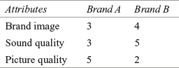
The general tendency of the respondents is to indicate that all the attributes are important. In conjoint analysis, the respondent is supposed to make trade-off judgements. In Table 19.1, he or she is willing to trade-off the superiority of Brand B on brand image and sound quality over the superiority of Brand A on picture quality because utility may be attached to “picture quality.” The conjoint analysis is based on the assumption that subjects evaluate the value or utility of a product or service or idea (real or hypothetical) by combining the separate amount of utility provided by each attribute.3 It works on the simple principle of developing a part-worth or utility function stating the utility consumers attach to the levels of each attribute.
Conjoint analysis works on the simple principal of developing a part-worth or utility function stating the utility consumers attach to the levels of each attribute.
As discussed, the conjoint analysis has a wide range of application in the field of marketing. It can be effectively used in situations when alternative products or services have a large number of attributes with each having two or more levels. The example of the consumer’s preference for the attributes of two brands of television is the simplest one in terms of comparison of the attributes of the product. In real-life situations, the attributes offered to consumers to indicate their preference may be conflicting in nature. For example, a consumer has to select between mileage and pick-up capacity of a motorbike. The main issue of focus in conjoint analysis is to find out compromise set of attribute levels. The procedure of using conjoint analysis can be better explained by the steps in conducting the conjoint analysis, which are discussed in the next section.
19.1.3 Steps in Conducting Conjoint Analysis
The conjoint analysis is performed using the following five steps: problem formulation, trade-off data collection, metric versus non-metric input data, result analysis and interpretation, and reliability and validity check. These steps are explained in Figure 19.2.

Figure 19.2 Five steps of conducting conjoint analysis
19.1.3.1 Problem Formulation
To formulate a problem, as a first step, a researcher must identify the various attributes and attribute levels. These attributes can be identified from discussion with the management or industry expert, secondary data, pilot survey, and so on. While selecting an attribute, the researcher should keep in mind that the selected attribute should be actionable. An actionable attribute means that the company or management can do something about the attribute based on the result of conjoint analysis.
To formulate a problem, as a first step, a researcher must identify the various attributes and attribute levels.
The number of attributes used in the conjoint analysis should be selected with care. As a thumb rule, the number of attributes used in a typical conjoint analysis study averages six or seven. After identification of the salient attributes to be used, appropriate (actual) levels of each attributes should be specified. The number of attribute levels determines the number of parameters that will be estimated, and consequently, it affects the consumer’s preference of an attribute and level. To minimize the consumer’s evaluation task and to estimate the parameter with reasonable degree of accuracy, it is desirable to have a check on the number of attribute levels. It is important to understand that the model is linear depending on the number of the most desired attributes. In other cases, the model may be non-linear or there may not be any systematic relationship between the consumer’s preference and the attribute level. For example, while purchasing an air conditioner, most of the consumers would like to prefer a low price or less electricity bill indicating a linear relationship between the utilities and the attribute level. In the same situation, many consumers may prefer a medium price range rather than high or low, indicating a non-linear relationship.
As a thumb rule, the number of attributes used in a typical conjoint analysis study averages six or seven.
It is obvious that the attribute level selected will affect the consumer’s process of evaluation. For example, if the price of the colour television varies at Rs 500, Rs 700 and Rs 900, the price will be relatively unimportant as compared with the situation when the price varies at Rs 1000, Rs 2500 and Rs 4000. A researcher should consider the attribute levels that exist in the market to enhance the consumer’s believability of the evaluation task. Using attribute levels that are not prevalent in the market will decrease the believability of the consumers but can increase the accuracy with which the parameters are statistically estimated. In this regard, the general recommendation is to select the attribute levels that are larger than the attribute levels prevailing in the market but not as large as it can make the options unbelievable.
To understand the concept of conjoint analysis, let us continue with the colour television example. Suppose the company has conducted a qualitative research and three attributes, such as screen, sound quality, and price, have been identified as salient attributes. Each attribute is defined in terms of three levels that are given in Table 19.2.
Table 19.2 Attributes and levels of colour television

19.1.3.2 Trade-off Data Collection
To construct conjoint analysis stimuli, two broad approaches are available: the pair-wise (two-factor) approach and full-profile approach. The respondents can reveal their trade-off judgements by either considering two attributes at a time or making an overall judgement of a full profile of the attributes.4 In the pair-wise approach, the respondents are required to evaluate two attributes at a time until all the possible pairs of attributes have been exhausted. These attributes can be identified through discussion with the management and industry experts, analysis of secondary data, qualitative research, and pilot survey.5 In the case of the colour television, this approach is illustrated in Tables 19.3, 19.4 and 19.5.
Table 19.3 Pair-wise (two-factor) approach for comparison between screen and sound quality
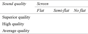
Table 19.4 Pair-wise (two-factor) approach for comparison between screen and price

Table 19.5 Pair-wise (two-factor) approach for comparison between sound quality and price

To construct conjoint analysis stimuli, two broad approaches are available: the pair-wise (two-factor) approach and full-profile approach.
In full-profile approach, a full profile of the brands is constructed with all the attributes. An index card is used to describe each profile. Figure 19.3 is an example of the full-profile approach.

Figure 19.3 Full-profile approach for collecting conjoint data
It is easy for the respondents to supply information through pair-wise judgement as compared with the judgement based on the full-profile approach. There are some advantages and disadvantages of pair-wise judgement. In the disadvantage side, when the number of attributes and levels are high, the respondent may supply mechanical information (supplying information for the sake of supplying information). In other cases, the task of evaluation may become unrealistic because only two attributes are being compared simultaneously. Apart from these disadvantages, this approach has got few advantages in terms of checking the consistency of the respondents in answering. The respondents who show great deal of inconsistency in answering can be removed from the analysis. Both the methods, that is, pair-wise (two factor) approach and full-profile approach, have their own utility, but full-profile approach is the most widely used method. It gives a more realistic description of stimuli by defining the levels of the factors and possibly taking into account the potential environmental correlation between the factors in real stimuli.6
Both the methods, that is, pair-wise (two-factor) approach and full-profile approach, have their own utility, but full-profile approach is the most widely used method.
In the colour television example, three attributes and three levels of each attribute are given. Hence, following full-profile approach, a total of 3 × 3 × 3 = 27 profiles can be constructed. To minimize the evaluation risk of the respondents, fractional factorial design will be used and nine set of responses will be kept in estimation stimuli set and nine set of responses will be kept in the category of validation stimuli. The next step discusses on making decisions about the form of input data with a focus on estimation data set only.
In the colour television example, three attributes and three levels of each attribute are given. Hence, following full-profile approach, a total of 3 × 3 × 3 = 27 profiles can be constructed.
19.1.3.3 Metric Versus Non-Metric Input Data
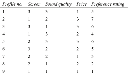
Conjoint analysis data can be of both the forms: metric data and non-metric data. For non-metric data, the respondents indicate ranking, and for metric data, the respondents indicate rating. Rating approach has got popularity in recent days. As obvious, in conjoint analysis, the dependent variable is consumer preference or intention to buy a product (rating or ranking provided by the customers for buying a product). In the colour television example, ratings are obtained in a 7-point Likert scale with 1 as not preferred and 7 as highly preferred. These ratings are given in Table 19.6. This is to be noted that Table 19.6 shows nine profiles which are being generated using SPSS. This procedure is explained in the section ‘Using SPSS for Conjoint Analysis.’
Table 19.6 Selected profile of colour television example (SPSS generated orthogonal design)
19.1.3.4 Result Analysis and Interpretation
In this step, a proper technique is selected to analyse the input data obtained in the previous step and then interpretation is made. The conjoint analysis model can be represented by the following formula:
![]()
where U(x) is the utility of an alternative, uij the part-worth contribution (utility of jth level of ith attribute), ki the number of levels for attribute i, and m the number of attributes. xij = 1 if the jth level of the ith attribute is present and xij = 0 otherwise.
Importance of an attribute Ri can be defined as the range of part-worth contribution, across the levels of attributes.
Importance of an attribute (Ri) = [maximum(uij) − minimum(uij)]
The relative importance of the attribute can be computed by dividing the importance of an attribute by the total importance of all the attributes. Symbolically,

where
![]()
To estimate the model, a variety of techniques are available. The most popular and widely applied technique is dummy variable regression technique. In most of the researches, the researchers assign 0 or 1 to code dummy variables. It is important to note that the assignment of code 0 or 1 is arbitrary and numbers merely represent a place for the category. In many situations, indicator or dummy variables are dichotomous (dummy variables have two categories such as male or female, graduate or non-graduate, married or unmarried, etc.). A particular dummy variable xd is defined as
To estimate the model, a variety of techniques are available. The most popular and widely applied technique is dummy variable regression technique.
![]()
and
![]()
Another important point in analysing the data is to decide whether the data will be analysed on individual basis or aggregate basis. In terms of individual-level analysis, each respondent (data obtained from the respondent) is analysed separately. To apply aggregate-level analysis on the basis of similarity in part-worth, the respondents can be grouped and then an aggregate-level analysis can be performed for each cluster.
To analyse the conjoint analysis data, dummy variables are treated as independent or explanatory variables and preference rating obtained from the respondent is treated as dependent variable. If the ith attribute has ki levels then it is coded in ki − 1 dummy variables. To analyse the data obtained from the respondent (given in Table 19.6), ordinary least square regression analysis is applied on dummy variables. In the regression model, there will be six dummy variables, two for each attribute. The data converted into dummy variables are listed in Table 19.7.
Table 19.7 The colour television data converted into dummy variables for applying regression technique

To estimate utility, regression model can be formed as
![]()
Using any statistical software (as discussed in Chapter 15 and Chapter 16), regression equation can be obtained as
![]()
Figure 19.4 exhibits SPSS output (multiple regression) for the conjoint problem.

Figure 19.4 SPSS output (multiple regression) for conjoint problem
In this model, x1 and x2 are dummy variables representing the attribute “screen,” x3 and x4 are dummy variables representing the attribute “sound quality,” and x5 and x6 are dummy variables representing “price.” For screen, attribute levels are coded as below:
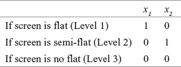
Similarly, other attribute levels can also be coded. From the regression equation, we can obtain the regression coefficients, such as b0 = 8.000, b1 = −1.333, b2 = −1.667, b3 = −2.000, b4 = 0.000, b5 = −3.333, b6 = −2.667.
From the coding pattern of the dummy variables (exhibited from coding of screen), it can be noted that Level 3 is the base level. Each dummy variable coefficient can be represented as the difference between part-worth for the concerned level and the base level. For example, for the first attribute, screen
![]()
and
![]()
In estimating the part-worth, on an interval scale, the origin is arbitrary. Hence, among the three utilities, the following equation exists.
![]()
After substituting the values of b1 and b2, for screen, the following three equations are obtained.
![]()
![]()
and
![]()
Solving these equations, we get
![]()
![]()
and
![]()
Similarly, for the second attribute, sound quality, below equations can be obtained:
![]()
![]()
and
![]()
Solving these equations, we get
![]()
![]()
and
![]()
For the third attribute, price, below equations can be obtained:
![]()
![]()
and
![]()
Solving these equations, we will get
![]()
![]()
and
![]()
As discussed, the importance of an attribute is given as
![]()
Thus, importance of the first, second, and third attributes can be computed as
![]()
![]()
and
![]()
![]()
The relative importance of the attribute can be computed by dividing the importance of an attribute by the total importance of all the attributes. Symbolically,

where
![]()
Therefore,


and

The result of the conjoint analysis is presented in Table 19.8. It can be noted that utilities are given in Column 4 and relative importance of various attributes are given in Column 5.
Table 19.8 Result of the conjoint analysis

For easy interpretation of the result obtained from conjoint analysis, it is important to plot a graph of utility functions. From Table 19.8, it can be seen that flat screen is mostly preferred by the customer, followed by no-flat and semi flat screen; in terms of sound quality, superior quality and high quality are equally preferred followed by average quality; and in terms of price, low level price, that is Rs 10,000 is mostly preferred followed by the price of 15,000 and 20,000. In terms of relative importance of the attribute, it can be seen that the price is most important for the customers, followed by sound quality and screen.
For easy interpretation of the result obtained from conjoint analysis, it is important to plot a graph of utility functions.
19.1.3.5 Reliability and Validity Check
The following are some of the points that a researcher should strictly adhere to assess the reliability and validity of conjoint analysis:
- As discussed in regression, to estimate the best-fit model, the value of R2 is an indicator. In our model, value of R2 is obtained as 97.9%, which indicates a good-fit model.
- Earlier discussed test–retest method of reliability assessment can be applied.
- In an aggregate level analysis, the total sample can be divided into various sub-samples, and conjoint analysis can be performed on all the sub-samples. Then across-samples results are compared to assess the stability of conjoint analysis.
19.1.4 Assumptions and Limitations of Conjoint Analysis
Conjoint analysis is based on the assumption that all the attributes that contribute to the utility of the product can be identified and are independent. Conjoint analysis also assumes that the consumers evaluate the alternatives and make trade-offs. One limitation of the conjoint analysis is that there may be few situations where brand name is an important factor and then the consumer may not evaluate the brands or alternatives in terms of attribute. For a large number of attributes, collection of data may be difficult.
19.1.5 Using the SPSS for Conjoint Analysis
In case of using SPSS for performing conjoint analysis, as a first step, we will have to generate 9 orthogonal profiles out of total 27 profiles for the colour television example. For this, click on Data/Orthogonal design/Generate. Then, Generate Orthogonal Design dialogue box, as exhibited in Figure 19.5, will appear on the screen. In this dialogue box, against Factor Name, place first attribute Screen and then place Screen against Factor Label. Repeat the procedure for Sound and Price as exhibited in Figure 19.6. As a next step, after selecting Screen, click on Define Values. A dialogue box titled Generate Design: Define Values will appear on the screen (see Figure 19.6). In this dialogue box, place the value for Value and Label and click on Continue. Repeat the procedure for the second attribute Sound and third attribute Price (see Figure 19.6). After placing the values of Value and Label for the three attributes Screen, Sound and Price, select Create new date file and click OK (see Figure 19.7). This will lead to successful generation of SPSS orthogonal plan.

Figure 19.5 Dialogue box for SPSS Generate Orthogonal Design
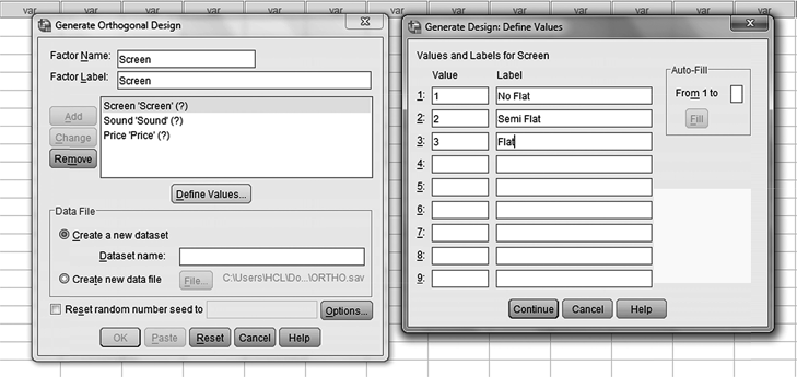
Figure 19.6 Dialogue box for SPSS Generate Orthogonal Design/Generate Design: Define Values
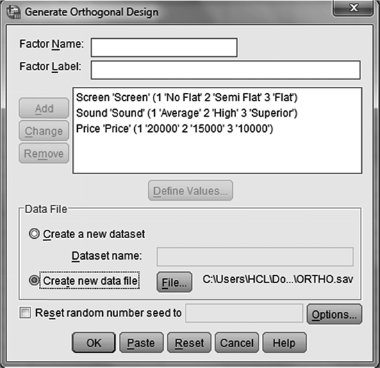
Figure 19.7 Dialogue box for SPSS Generate Orthogonal Design
After successfully generating the orthogonal plan, we will use SPSS Data Editor Window to display the plan. For doing this, from the SPSS Data Editor Window, select Data/ Orthogonal Design/Display (refer to Figure 19.8). A dialogue box, as shown in Figure 19.9, will appear on the screen. In this dialogue box, click on Open Data File and SPSS Open Data dialogue box will appear on the screen (see Figure 19.10). In this dialogue box, select ORTHO.sav and Click on Open. An orthogonal plan consisting of nine profiles, which will be used for further treatment, will be generated (displayed) by SPSS (Figure 19.11). Save this data by specifying a path (Disk F: in our case). Please note that this file is saved as Conjoint 1.

Figure 19.8 SPSS Data Editor Window

Figure 19.9 SPSS dialogue box with a click on Data/Orthogonal Design/Display

Figure 19.10 Dialogue box for SPSS Open Data

Figure 19.11 SPSS generated nine profiles (orthogonal)
As a next step, open a new SPSS data window and feed preference data as shown in Figure 19.12. This file should again be saved with specifying a path (Disk F: in our case). Please note that this file is saved as Conjoint 2.
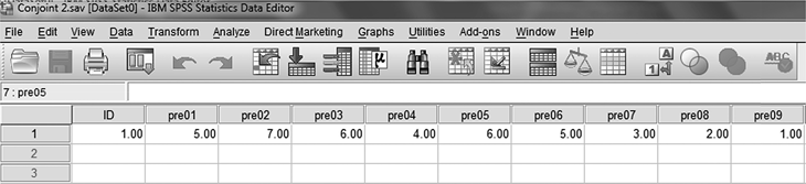
Figure 19.12 SPSS Data View Window with preference data
After saving first two files as Conjoint 1 and Conjoint 2, open a new Syntax Editor Window by selecting File/New/Syntax. Write Syntax commands and click on Run Selection, as exhibited in Figure 19.13. SPSS conjoint analysis output, as shown in Figure 19.14, will appear on the screen. In the output, one additional part indicating Correlation is being exhibited. This is the correlation between observed and estimated preferences. This is higher and significant at 99% confidence level; as a result, the conjoint model seems to be appropriate.

Figure 19.13 SPSS Syntax Editor Window

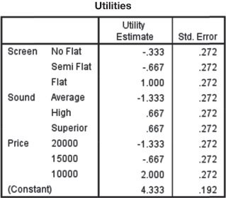


Figure 19.14 SPSS output for conjoint analysis problem
19.2 MULTIDIMENSIONAL SCALING
This section deals with a famous multivariate technique known as multidimensional scaling. It presents some basic understanding about the multidimensional scaling procedure and deals with the use of SPSS for performing multidimensional scaling.
19.2.1 Introduction
In the field of marketing, companies are generally concerned with the issue of positioning a product. Management of a company is always interested in knowing the position of its products as compared with the position of competitor’s product in the market.
Multidimensional scaling is an attempt to answer such questions.
Multidimensional scaling commonly known as MDS is a technique to measure and represent perception and preferences of respondents in a perceptual space as a visual display.
Multidimensional scaling commonly known as MDS is a technique to measure and represent the perception and preferences of respondents in a perceptual space as a visual display. The goal of multidimensional scaling is to represent the relationships among objects by constructing a configuration of n points in low dimension from pair-wise comparison of similarities/dissimilarities among a set of n object.7 Multidimensional scaling handles two marketing decision parameters. As a first case, the dimension on which respondents evaluate objects must be determined. As a convenient option, only two dimensions are worked out as the evaluation objects are graphically portrayed. As a second case, objects are to be positioned on these dimensions.
The output of multidimensional scaling happens to be in the form of location of objects on the dimensions and is termed as spatial map or perceptual map.
The output of multidimensional scaling happens to be in the form of location of objects on the dimensions and is termed as spatial map or perceptual map.
As discussed, cluster analysis groups individuals or objects or cases into relatively homogeneous (similar) groups on the basis of similarity. Subjects grouped within the cluster are similar to each other and there is dissimilarity between the clusters.
Multidimensional scaling attempts to infer the underlying dimensions from the preference judgment provided by the customers.
Multidimensional scaling attempts to infer the underlying dimensions from the preference judgment provided by the customers. This is done by assigning responses of the respondents to a specific location in a perceptual space in a manner that the distances in the space match the given dissimilarity as closely as possible. In fact, cluster analysis ends with grouping subjects into clusters, whereas multidimensional scaling ends with the construction of a graph in which the distance between objects can visually and quantitatively be examined. Data obtained from the respondents can be metric or non-metric. As a case of metric data, rating of respondent’s preference can be obtained and as a non-metric data, ranking of the respondent’s relative preference can also be obtained. Multidimensional approaches are available for analyzing metric as well as non-metric data.
19.2.2 Some Basic Terms Used in Multidimensional Scaling
Following list presents some basic terms quite commonly used in multidimensional scaling:
Stress: Stress measures lack of fit in multidimensional scaling. A higher value for stress is an indication of poorer fit.
R-square (squared correlation): R2 value indicates how much of the variance in the original dissimilarity matrix can be attributed to multidimensional scaling model. Higher value for R2 is desirable in multidimensional scaling model. In fact, R2 is a goodness-of-fit measure in multidimensional scaling model.
Perceptual map: Perceptual map is a tool to visually display perceived relationship among various stimuli or objects in a multidimensional attribute space.
19.2.3 The Process of Conducting Multidimensional Scaling
For conducting multidimensional scaling, a researcher usually follows six steps as exhibited in Figure 19.15. These six steps are as follows: problem formulation, input data collection, selection of multidimensional scaling procedure, determining number of dimensions for perceptual map, substantive interpretation, and check the model fit. A step-by-step description of performing multidimensional scaling is presented in the following section.

Figure 19.15 Steps involved in conducting multidimensional scaling
19.2.3.1 Problem Formulation
As a first step of conducting multidimensional scaling, brand or stimuli that are to be compared are selected. The number of brands that are to be selected is a matter of researcher’s discretion, but as a matter of understanding, too few brands like three of four will not be able to produce the desired perceptual map and using too many brands will be difficult to interpret through perceptual map. So there exists a question as to how many brands should be included in multidimensional scaling procedure.
A minimum of 8 to 10 brands can be included to construct a well-defined perceptual map, and a maximum of 25 to 30 brands can be included in multidimensional scaling model. In fact, the number of brands or stimuli to be included is based on some factors such as research objective, past researches, decision of researchers, or requirement of management.
A minimum of 8 to 10 brands can be included to construct a well-defined perceptual map, and a maximum of 25 to 30 brands can be included in multidimensional scaling model. In fact, the number of brands or stimuli to be included is based on some factors such as research objective, past researches, decision of researchers, or requirement of management.
We will take a hypothetical example of 10 edible oil brands for better understanding the concept of multidimensional scaling with special reference to obtaining a perceptual map. These 10 edible oil brands are Fortune, Sundrop, Saffola, Gemini, Nutrela, Dhara, Ginni, Maharaja, Vital, and Nature Fresh. Step 2 of performing multidimensional scaling provides discussions on how we can collect data for theses 10 brands of edible oil.
19.2.3.2 Input Data Collection
The input data used for multidimensional scaling may be connected with the similarity data or the preference data. As a first case, similarity data are described as follows:
Similarity Data: Similarity data are collected through the respondents by just noting the perceived similarity between the two brands or objects. While collecting similarity data, the respondents are not provided with a set of attribute list to judge the similarity or dissimilarity, rather they make their own assessment about similarity or dissimilarity between two objects. These data are often referred to as similarity judgment. Figure 19.16 provides respondent’s similarity judgment between two pairs (Fortune–Saffola) of edible oil brands.
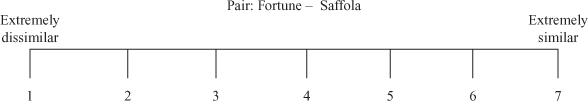
Figure 19.16 Respondent’s similarity judgment between two pairs of edible oil brands
Number of pairs required to be judged based on similarity judgment are ![]() .
.
Number of pairs required to be judged based on similarity judgment are ![]() . Hence, in the edible oil example, number of pairs to be judged are
. Hence, in the edible oil example, number of pairs to be judged are ![]() This approach of data collection is referred to as the direct approach.
This approach of data collection is referred to as the direct approach.
As a second way, derived approach for data collection in terms of conducting multidimensional scaling can also be used. Using this approach, the respondents are supposed to rate the brands for identified attributes on a rating scale. Responses obtained from a single respondent are summarized in Table 19.9 above.
Table 19.9 Similarity score data for different brands of edible oil (data that will be used for multidimensional scaling)

Preference Data: In some cases, a researcher may be interested in knowing the respondent’s preference for a stimuli or object. In such situations, the respondent is asked to provide rank order for all the objects or stimuli as per their preference.
The configuration derived from similarity data and preference data are not the same but are different.
The configuration derived from similarity data and preference data are not the same but are different. Two objects can be perceived differently through a similarity data produced map but may be close together for a preference data. For taking care of this dimension, an ideal object approach is considered.
An ideal object is the object that a respondent will like to prefer over all other objects included in the study. It is very interesting to note that this ideal object is actually a hypothetical object. This object can be conceptualized in the map but does not really exist. Respondents may be having similar perception about objects but their preference may vary considerably. Ideal objects are of two types. These two ideal objects can be explained with the help of two examples. As a first example, the respondent is required to rate his preference on an attribute scale related to the “smell of the edible oil when boiling.” As his response, suppose the respondent has not selected extreme points but selected some middle point in the scale. The scale is given below:
Good smelled — — — — — — — Bad odoured
As a second example, a respondent is required to rate his preference for edible oil on a scale (for three attributes) given below:
Very good packaging — — — — — — — Not at all good packaging
Health friendly — — — — — — — Not health friendly
Fat free — — — — — — — Containing fat
In the second case, suppose the respondent has preferred an extreme point of the scale as very good packaging. This case is different from the first case. In the first case, when the respondent has selected some middle point, the ideal object lies within the perceptual map. In the second case, when the respondent has selected an extreme point as his point of preference, the ideal point is reflected by a direction or vector in the perceptual map.
19.2.3.3 Selection of Multidimensional Scaling Procedure
While selecting multidimensional scaling procedure, a researcher should focus on two important issues. The first issue is related to the nature of the data and the second point is related to using multidimensional scaling procedure for average similarity ratings. The input data play a key role in determining multidimensional scaling procedure.
Non-metric multidimensional scaling procedure is based on the ordinal nature of the input data, whereas metric multidimensional scaling procedure is based on the assumption that the input data are interval scaled.
Non-metric multidimensional scaling procedure is based on the ordinal nature of input data, whereas metric multidimensional scaling procedure is based on the assumption that the input data are interval scaled. In multidimensional scaling procedure, ordinal or non-metric information is preferred. It is important to learn that non-metric multidimensional scaling procedure results in a metric output. Obviously, metric multidimensional scaling procedure produces a metric output. Here, it is important to note that metric and non-metric multidimensional scaling procedure both produce similar type of results.
As a second issue, a researcher has to determine whether multidimensional scaling procedure should be performed on an individual or an aggregate data is required.
Individual-level multidimensional scaling procedure results in a perceptual map for each respondent. While performing multidimensional scaling procedure on aggregate data, a perceptual map on the basis of average similarity rating can be obtained very easily.
Individual-level multidimensional scaling procedure results in a perceptual map for each respondent. While performing multidimensional scaling procedure on aggregate data, a perceptual map on the basis of average similarity rating can be obtained very easily. When using multidimensional scaling procedure for aggregate data instead of an individual’s ranking, an aggregate ranking for various individuals is obtained. Aggregating of multidimensional scaling input data is based on the assumption that all the respondents included in the study use the same dimension to evaluate the objects, but these common dimensions are weighted differently by different respondents. Our discussion of multidimensional scaling is based on the edible oil brands example for which data are rank ordered (ordinal) and the adopted procedure is non-metric.
19.2.3.4 Determining Number of Dimensions for Perceptual Map
The focus of multidimensional scaling is to develop a perceptual map with smallest number of dimensions for which there is a “best-fit” between the similarity ranking as input data and resulting perceptual map.
In the light of the visual interpretation objective of multidimensional scaling procedure, a two-dimensional or at most a three-dimensional perceptual map is desirable.
In the light of the visual interpretation objective of multidimensional scaling procedure, a two-dimensional or at most a three-dimensional perceptual map is desirable. As discussed in the beginning of the discussion of multidimensional scaling, a statistic “stress” is used. Stress measures lack of fit in multidimensional scaling as the higher value for stress is an indication of poorer fit. Stress measure indicates the proportion of the variance of the disparities (differences in distances between objects on the perceptual map and the similarity judgment of the respondents) not accounted for by multidimensional scaling model.8 A widely used criteria to determine the number of dimensions in multidimensional scaling is to construct a plot between stress values (obtained as the SPSS output) and dimensionality. An elbow in the plot indicates number of dimensions to be included in the study to construct a perceptual map.
19.2.3.5 Substantive Interpretation
For generating a perceptual map, we will use the SPSS. The SPSS output for edible oil data is presented from Figures 19.17(a) to 19.17(d). Figure 19.17(a) is the SPSS output exhibiting iteration for stress-value improvement, stress value, and R2 value. Figure 19.17(b) is the SPSS output exhibiting stimulus coordinates. Figure 19.17(c) is a SPSS-produced two-dimensional perceptual map. Figure 19.17(d) is a SPSS-produced three-dimensional perceptual map.

Figure 19.17 (a) SPSS output exhibiting iteration for stress value improvement, stress value, and R2 value
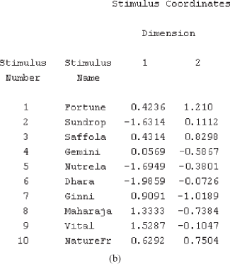

Figure 19.17 (b) SPSS output exhibiting stimulus coordinates, (c) SPSS-produced perceptual map (two dimensional)

Figure 19.17 (d) SPSS-produced perceptual map (three dimensional)
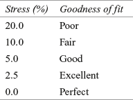
As discussed, Figure 19.17(a) is the SPSS output exhibiting iteration for stress-value improvement, stress value, and R2 value. As discussed, this stress index indicates lack of fit in multidimensional scaling. This stress value is commonly known as S-stress or Kruskal’s stress. This value ranges from the worst fit (stress value as 1) to best fit (stress value as 0).
In fact, stress value is based on the type of multidimensional scaling procedure adopted and the data on which multidimensional scaling is performed.
In fact, stress value is based on the type of multidimensional scaling procedure adopted and the data on which multidimensional scaling is performed. Now, we will analyse the acceptable stress value in multidimensional scaling. The acceptable stress value is suggested by J. B. Kruskal as given below:9
As a second step, we are required to examine the value of R2. As discussed,
As a second step, we are required to examine the value of R2. As discussed R2 value indicates how much of the variance in the original dissimilarity matrix can be attributed to multidimensional scaling model. Higher value for R2 (close to 1) is desirable in multidimensional scaling. An R2 value greater than or equal to 60% is considered acceptable.
R2 value indicates how much of the variance in the original dissimilarity matrix can be attributed to multidimensional scaling model. Higher value for R2 (close to 1) is desirable in multidimensional scaling. An R2 value greater than or equal to 60% is considered acceptable.
Figure 19.17(b) exhibits the stimulus number (brands) and their scores on different dimensions. Figure 19.17(c) is the desired SPSS-produced perceptual map (two dimensional).
Spatial map may be interpreted by examining the coordinates of the map and relative position of the brands with respect to these coordinates.
Spatial map may be interpreted by examining the coordinates of the map and relative position of the brands with respect to these coordinates. The labelling of horizontal axis (X-axis) and vertical axis (Y-axis) is a matter of researcher’s judgment and depends on factors such as researcher’s insight, obtained information parameters, and so on. In some cases, the respondents are often asked to provide the base of similarity they have used for judging the different brands or objects.
Figure 19.18 exhibits perceptual map (two dimensional) with labelling of dimensions. Brands

Figure 19.18 Perceptual map (two dimensional) with labelling of dimensions
Brands located close to each other may have competitive nature on related dimension. A brand located in isolation may have unique image.
located close to each other may have competitive nature on related dimension. A brand located in isolation may have unique image. This perceptual map is based on the similarity judgment of a single respondent. If we take an aggregate score of the responses, a perceptual map based on multiple responses (when taken as aggregate) can also be constructed and is very helpful for marketing managers to assess the positioning of their own brand as compared with different brands on some defined attributes.
19.2.3.6 Check the Model Fit
After performing multidimensional scaling, it is very important for a researcher to assess the reliability and validity of multidimensional scaling model. As a first step of checking reliability and validity of the model, the value of R2 must be examined. As discussed, an R2 value greater than or equal to 60% is considered acceptable. In edible oil multidimensional scaling model, R2 value comes to 0.9707 (97.07%), which is very close to 1 and hence the model is very well acceptable. As a second step, stress value must be examined. In the previous section, the interpretation of an S-stress or Kruskal’s stress is already presented. In edible oil multidimensional scaling model, stress value comes to 0.0746 (close to 5%). This is an indication of a good-fit multidimensional scaling model.
As usual approach for performing multidimensional scaling, the original data should be divided in two or parts and obtained results must be compared. As another measure, input data must be gathered at two different points of time and test–retest reliability must be computed.
As a usual approach for performing multidimensional scaling, the original data should be divided in two or parts and obtained results must be compared. As another measure, input data must be gathered at two different points of time and test–retest reliability must be computed.
19.2.4 Using SPSS for Multidimensional Scaling
Figure 19.19 exhibits arrangement of data in the SPSS sheet for performing multidimensional scaling. For performing multidimensional scaling with the SPSS, click Analyze/Scale/Multidimensional Scaling (ALSCAL). Multidimensional Scaling dialogue box will appear on the screen (Figure 19.20). Place all the brands in the ‘Variables’ box and select ‘Data are distances’ and click on ‘Shape.’ Multidimensional Scaling: Shape of Data dialogue box will appear on the screen (Figure 19.21). As our data are in the shape of a square symmetric matrix (number of columns are equal to number of rows), click Square symmetric and click Continue. Multidimensional Scaling dialogue box will reappear on the screen. From this dialogue box, click on Models. Multidimensional Scaling: Model dialogue box will appear on the screen (Figure 19.22). In this dialogue box, from ‘Level of Measurement’ select ‘Ordinal,’ from ‘Conditionality’ select ‘Matrix,’ and from ‘Scaling Model’ select ‘Euclidean distance.’ Click Continue. Multidimensional Scaling dialogue box will reappear on the screen. From this dialogue box, click on Options. Multidimensional Scaling: Options dialogue box will appear on the screen (Figure 19.23). In this dialogue box, select ‘Group plots,’ ‘Individual subject plots,’ ‘Data matrix,’ and ‘Model and options summary’ from ‘Display’ part. From ‘Criteria’ select the ‘S-stress convergence’ as 0.001, ‘Minimum s-stress value’ as 0.005, and ‘Maximum iterations’ as 30 (these are the default values in Multidimensional Scaling: Options dialogue box). Then place 0 in ‘Treat distance less than___as missing’ and click Continue. Multidimensional Scaling dialogue box will reappear on the screen. Click OK. The SPSS output as exhibited in Figure 19.17(a) to 19.17(d) will appear on the screen.
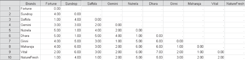
Figure 19.19 Arrangement of data in the SPSS sheet for performing multidimensional scaling
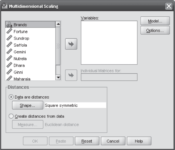
Figure 19.20 SPSS Multidimensional Scaling dialogue box

Figure 19.21 SPSS Multidimensional Scaling: Shape of Data dialogue box
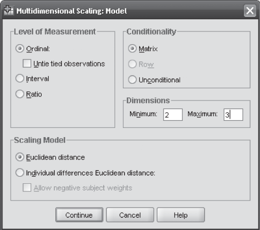
Figure 19.22 SPSS Multidimensional Scaling: Model dialogue box

Figure 19.23 SPSS Multidimensional Scaling: Options dialogue box
19.3 Correspondence Analysis
In Chapter 18, we have discussed factor analysis as a technique of describing relationship among variables in a low dimensional space. Factor analysis essentially requires metric data. Correspondence analysis is free from the requirement of collecting metric data. In fact, correspondence analysis is designed to analyze categorical data (in most cases, it’s nominal data) arranged in a row and column table. Due to use of non-metric data, correspondence analysis has become popular in recent years in the field of business research.
19.3.1 Introduction
Discriminant analysis and factor analysis both are based on the assumption of interval-scaled data, which generally is rated on a 1- to 5-point or 1- to 7-point rating scale. However, there are situations when the input data is either binary or categorical if the respondents are asked to state which attribute apply to a list of several brands. In this case, respondents are supposed to present their answer only in “Yes” and “No,” where “Yes” indicates attribute being applicable to the concerned brand and “No” being not applicable to the concerned brand. Correspondence analysis is a technique that looks like multidimensional scaling and is used to scale qualitative data in the field of business research. Correspondence analysis also generates a perceptual map in which both attribute elements and object or stimuli are positioned. As a matter of difference from multidimensional scaling, correspondence analysis generates perceptual map from nominal or categorical scaled data. Correspondence analysis has the capacity to position products or brands with respect to any type of data (e.g., attribute, attitude, usage occasions and the like). Both multidimensional scaling and correspondence analysis are based on the concept of similarity. Correspondence analysis defines similarity in terms of sharing the same level of categorical variables. In
In correspondence analysis, numerical scores are assigned to rows and columns of a data matrix so as to maximize their interrelationship.
correspondence analysis, numerical scores are assigned to rows and columns of a data matrix so as to maximize their interrelationship. Correspondence analysis scores are placed in corresponding units allowing all the variables to be plotted in the same space for the ease of interpretation.10
In correspondence analysis, contingency table contains row and column information that is being analyzed by researchers.
In correspondence analysis, contingency table contains row and column information that is being analyzed by researchers. In fact, correspondence analysis is a statistical technique that provides a graphical representation of cross tabulations, which are also known as cross tabs or contingency tables.11 Analysis of a two-way contingency table where there exist only one row and one column is referred to as simple correspondence analysis. The word “simple” is not an indication of ease of execution or interpretation of the correspondence analysis. Instead, it refers to the most basic, or simple, data set – a two-way contingency table as different to multiple correspondence analysis which allows more than two categorical variables for the analysis.12
19.3.2 Process of Conducting Correspondence Analysis
Correspondence analysis can be done using a simple four-step procedure: problem formulation; input data collection; running analysis through any statistical software and interpretation of the output including two-dimensional plot. Figure 19.24 exhibits four steps in conducting correspondence analysis:

Figure 19.24 Four steps in conducting correspondence analysis
Correspondence analysis can be done using a simple four-step procedure: problem formulation; input data collection; running analysis through any statistical software and interpretation of the output including two-dimensional plot.
19.3.2.1 Problem Formulation
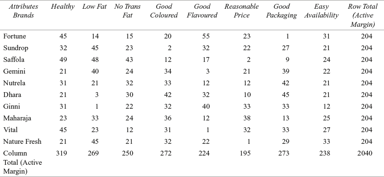
For understanding correspondence analysis, we will again take the example of edible oil brands with non-metric data. In this example, 204 respondents were asked to freely associate each oil brand with different attributes. Table 19.10 presents the responses of the respondents arranged in rows and columns.
Table 19.10 Correspondence table for edible oil brands and attributes
19.3.2.2 Input Data Collection
As discussed earlier, input data in correspondence analysis is non metric in nature. For the edible oil brands example, the input data is number of “yes” respondents for association of brands (in rows) and attributes (in columns) as exhibited in Table 19.10. Obviously, input data is a contingency table where row indicates a brand and column indicates attributes for different brands. Cell in the contingency table indicates the number of respondents of a concerned brand associating with the concerned attribute. From Table 19.10, we can
From the table, we can see that the heading of the last column and the last row is active margin which is the indication of row and column totals, respectively.
see that the heading of the last column and last row is active margin which is the indication of row and column totals, respectively. It is important to note, in correspondence analysis, both the variables are being investigated for nominal information only. It is a simple analysis of understanding that some subjects are in one category and some subjects are in another with no assumption of any order between row or column variables. For easy interpretation of biplot, attributes are abbreviated as: Healthy = H; Low Fat = LF, No Trans Fat = NTF, Good Coloured = GC, Good Flavoured = GF, Reasonable Price = RP, Good Packaging = GP, and Easy Availability = EA.
19.3.2.3 Running Analysis through Any Statistical Software
The SPSS output for the edible oil and attributes example is provided from Figure 19.25 (a) through 19.25 (i).

Figure 19.25 (a) Correspondence table for the edible oil and attributes example

Figure 19.25 (b) Row profiles for the edible oil and attributes example

Figure 19.25 (c) Column profiles for the edible oil and attributes example
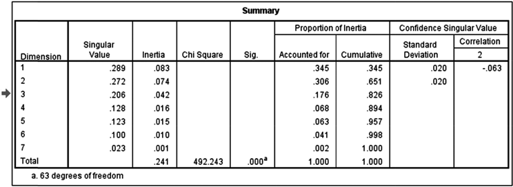
Figure 19.25 (d) Summary table for the edible oil and attributes example
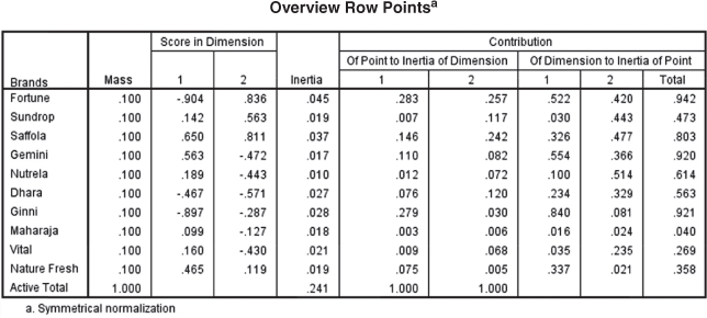
Figure 19.25 (e) Overview row points for the edible oil and attributes example

Figure 19.25 (f) Overview column points for the edible oil and attributes example
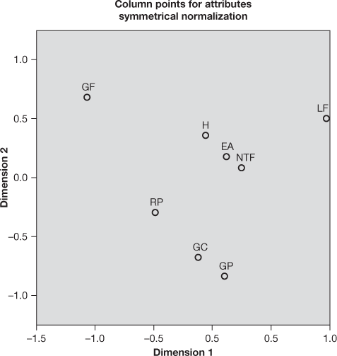
Figure 19.25 (h) Column points for attributes plot for the edible oil and attributes example
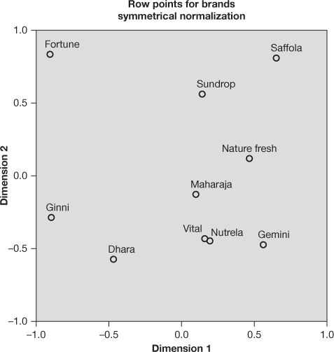
Figure 19.25 (g) Row points for brands plot for the edible oil and attributes example
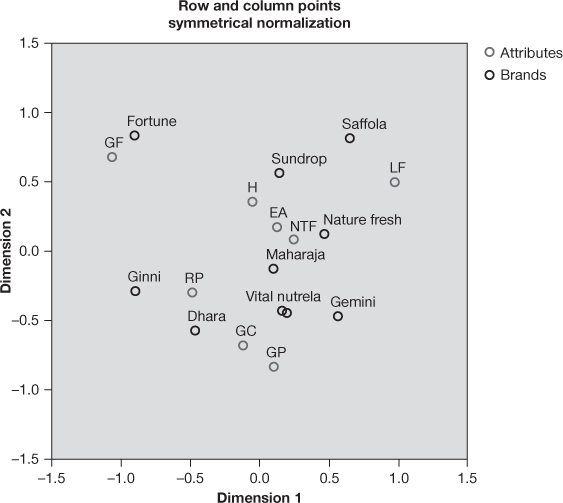
Figure 19.25 (i) Biplot for edible oil and attributes example
19.3.2.4 Interpretation of the Output Including Biplot
Figure 19.25(a) represents correspondence table for the edible oil and attributes example. The names of different brands constitute the heading of different rows, whereas the abbreviated forms of different attributes are the heading of different columns. This is a simple correspondence table which looks quite similar to Table 19.10. In the
In the last column and in the last row, summation of each column value and summation of each row value are given.
last column and in the last row, summation of each column value and summation of each row value are given. This is referred to as active margin.
Figure 19.25 (b) exhibits row profiles for edible oil and attributes example. Each
Each row profile can be computed by dividing each row point by the concerned active margin.
row profile can be computed by dividing each row point by the concerned active margin. For example, the first row profile, for the first row point in front of the Fortune brand can be computed as![]() . Similarly, all other row points can be computed. For all the rows, the last point under the heading active margin is obtained as
. Similarly, all other row points can be computed. For all the rows, the last point under the heading active margin is obtained as ![]() . In the last row of the table, mass can also be computed by dividing the concerned active margin by the grand total. For example, first mass value can be computed as
. In the last row of the table, mass can also be computed by dividing the concerned active margin by the grand total. For example, first mass value can be computed as![]() . Similarly, other mass values of the row can be computed.
. Similarly, other mass values of the row can be computed.
Figure 19.25(c) exhibits column profiles for the edible oil and attributes example. Like row profiles, first column profile for the first column point in front of the Fortune brand can be computed as ![]() . For all the other columns, last point under the heading active margin is obtained as
. For all the other columns, last point under the heading active margin is obtained as![]() . As computed for rows, last row of the table can be computed as
. As computed for rows, last row of the table can be computed as ![]() and so on. For column profile, first mass value can be computed as
and so on. For column profile, first mass value can be computed as![]() . Similarly, other mass values of the column can be computed.
. Similarly, other mass values of the column can be computed.
Figure 19.25(d) is the summary table for the edible oil and attributes example and it is the most important part of SPSS output. This table presents the chi-square value to test the statistical significance of the association between row variable and column variable. A high value of chi square is the indication of high correspondence between rows and columns of the table. Figure 19.25 (d) indicates a high chi-square value of 492.24 and corresponding p value of 0.000. This is the indication of highly significant model (p value less than 0.001). The first column of the figure shows dimensions. For a correspondence analysis, the maximum number of dimensions is the minimum of number of rows minus one and number of columns minus one. We have ten rows and eight columns in the analysis as shown in Figure 19.25 (a); so, the maximum number of dimensions will be minimum of (rows − 1) or (columns − 1), i.e. (10 − 1 = 9) or (8 − 1 = 7). Hence, we have seven dimensions included in the model exhibited in the first column of the figure under the heading dimension.
The summary table [refer to Figure 19.25 (d)] presents the chi-square value to test the statistical significance of association between row variable and column variable. A high value of chi square indicates high correspondence between row and columns of the table.
Third column of the summary table in Figure 19.25(d) shows inertia. Inertia is the strength of association between two variables taken for study. This is based on chi-square statistic. The total inertia value can be obtained by dividing total chi-square value (492.243) by grand total (2040). In this manner, total inertia for the edible oil and attributes example is![]() . Proportion of inertia, as explained by the number of dimension, is referred to as goodness of fit as correspondence analysis is mainly dependent on the strength of association between two variables. Total inertia 0.241 represents overall association between two variables. While executing correspondence analysis, SPSS, by default, includes dimensions which can be interpreted well rather than including all the dimensions accounting for 100% of the variation. This is a reason why total variation explained by the dimensions is not always equal to 100%. In the table, dimensions are listed according to the amount of variance explained by each. Dimension 1 is explaining 8.3% of the variation, dimension 2 is explaining 7.4% of the variation and so on. There is no rule of thumb or criteria for keeping or rejecting dimensions for analysis based on the proportion of inertia; it depends on the research question and the researcher decides what is clinically significant versus statistically significant for a given case.13 Practically, in the light of interpretation convenience, two or three dimension plots are generally used. Column two of Figure 19.25(d) presents singular values. These values can be obtained by square root of the corresponding inertia values. For example, first singular value 0.289 can be obtained by getting a square root of first inertia value 0.083
. Proportion of inertia, as explained by the number of dimension, is referred to as goodness of fit as correspondence analysis is mainly dependent on the strength of association between two variables. Total inertia 0.241 represents overall association between two variables. While executing correspondence analysis, SPSS, by default, includes dimensions which can be interpreted well rather than including all the dimensions accounting for 100% of the variation. This is a reason why total variation explained by the dimensions is not always equal to 100%. In the table, dimensions are listed according to the amount of variance explained by each. Dimension 1 is explaining 8.3% of the variation, dimension 2 is explaining 7.4% of the variation and so on. There is no rule of thumb or criteria for keeping or rejecting dimensions for analysis based on the proportion of inertia; it depends on the research question and the researcher decides what is clinically significant versus statistically significant for a given case.13 Practically, in the light of interpretation convenience, two or three dimension plots are generally used. Column two of Figure 19.25(d) presents singular values. These values can be obtained by square root of the corresponding inertia values. For example, first singular value 0.289 can be obtained by getting a square root of first inertia value 0.083 ![]() . Similarly, other singular values, presented in the table can be obtained. This is correlation between rows and columns. As a rule of thumb, any value of this correlation coefficient in excess of 0.2 is the indication of significant dependency.14
. Similarly, other singular values, presented in the table can be obtained. This is correlation between rows and columns. As a rule of thumb, any value of this correlation coefficient in excess of 0.2 is the indication of significant dependency.14
Inertia is the strength of association between two variables taken for study. This is based on chi-square statistic.
The proportion of inertia, as explained by the number of dimension, is referred to as goodness of fit as correspondence analysis is mainly dependent on the strength of association between two variables.
In the summary table provided in Figure 19.25(d), column 6 and column 7 represent proportion of inertia. This is the proportion of variation with respect to total variation of the model. For example, first proportion can be obtained as a division of the proportion of variation by first dimension and total variation explained by the model![]() . Similarly, other values of the column can also be computed. In column 7, cumulative values for proportion of inertia are being given. In column 8 of the summary table, we find that the standard deviation of the singular value for the first two dimensions as 0.02 and 0.02. This indicates that correspondence analysis is going to present almost same solution for different samples of the same population. The last column of the table represents the correlation of the singular values for the first two dimensions. This correlation value is relatively small (−0.063) representing that both the dimensions are different from each other.
. Similarly, other values of the column can also be computed. In column 7, cumulative values for proportion of inertia are being given. In column 8 of the summary table, we find that the standard deviation of the singular value for the first two dimensions as 0.02 and 0.02. This indicates that correspondence analysis is going to present almost same solution for different samples of the same population. The last column of the table represents the correlation of the singular values for the first two dimensions. This correlation value is relatively small (−0.063) representing that both the dimensions are different from each other.
Singular values can be obtained by square root of the corresponding inertia values.
Figure 19.25(e) presents overview row points for the edible oil and attributes example. In the first column, mass values are given. As discussed earlier, this is the proportion of each row’s contribution to all ten row’s contribution. Second and third column of Figure 19.25(e) represents ‘score in dimensions’ placed for the two dimensions. These are the coordinates of respective brands in biplot. For example, −0.904 and 0.836 are the scores of Fortune brand on dimension one and dimension two in biplot. In the next column, contribution is divided into two parts. The first part, ‘Of Point to Inertia of Dimension’ indicates how each point loads well onto each of the dimension. For our example, we can see that Fortune’s contribution to inertia for dimension one is high (0.283). This is also high for dimension 2 (0.257). This indicates that out of ten brands, Fortune dominates on dimension 1 and dimension 2. The second part, ‘Of Dimension to Inertia of Point’ indicates how well the extraction of each dimension explains each of the points. In our example, we can see that the extraction of dimension one is explaining 52.2% of the variance for the Fortune brand and two explains 42.0% of the variance for the same brand. This contribution conveys the ‘quality of representation’ of row and column points on the map.15 In our example, 94.2% [see the last column of Figure 19.25(e)] of the inertia is being contributed by first two dimensions. This indicates that brand Fortune is strongly represented in a two dimensional biplot. Similarly, if we examine the last column of the figure, we will find that for brand Maharaja only 4.0% of the inertia is being contributed by the first two dimensions; hence, this brand is poorly represented in a two-dimensional biplot. Figure 19.25(f), which presents the overview column points for the edible oil and attributes example, can also be interpreted in a similar manner as done for Figure 19.25(e).
If we examine the last column of Figure 19.25(e), we will find that for brand Maharaja, only 4.0% of the inertia is being contributed by first two dimensions, hence, this brand is poorly represented in a two-dimensional biplot.
Mass value is the proportion of each row’s contribution to all ten row’s contribution.
Figure 19.25(g) presents row points for brands plot for the edible oil and attributes example. In this figure, row points (for brands) for dimension one and two are being plotted. Figure 19.25(h) represents column points for attributes plot for edible oil and attributes example. In this figure, column points (for attributes) for dimensions one and two are being plotted.
Figure 19.25(i) presents biplot for the edible oil and attributes example. This plot is a two-dimensional representation of association among different brands and attributes for the brands. We notice that this plot and previously discussed two plots are symmetrically
Biplot is a two-dimensional representation of association among different brands and attributes for the brands.
normalized. Symmetric normalization technique standardizes row and column data. In this procedure, row scores are the weighted average of the column scores divided by the concerned singular value. Similarly, column scores are the weighted average of the row scores divided by the concerned singular value. This technique is most commonly used for making general comparison between rows and columns.
Biplot interpretation is based on the simple concepts of similarities (or dissimil
Biplot interpretation is based on the simple concepts of similarities (or dissimilarities). In the plot, closely associated points indicate a similar profile and remotely associated points indicate a dissimilar profile.
arities). In the plot, closely associated points indicate a similar profile and remotely associated points indicate a dissimilar profile. Points close to centre indicated an undifferentiated profile. Form the bipolt, we can see with respect to brands, Maharaja is close to origin, whereas with respect to attributes, NTF (no trans fat) is close to origin. This indicates that Maharaja brand and NTF (no trans fat) have most undifferentiated profiles. Last column of Figure 19.25(e) and Figure 19.25(f) indicates lowest values for Maharaja brand and NTF attribute, respectively. For easy interpretation, we use the chart editor facility of SPSS and make a reference line to X- and Y-axis. Using the same facility of chart editor, we insert grid line in the biplot. Figure 19.26 shows what the shape of modified biplot will look like. From the same figure, we can see that Fortune brand has a unique profile. Similarly, GF attribute has also got a unique profile. Fortune brand is closely associated with GF attribute. Suffola-Sundrop-Nature Fresh have a similar profile. Similarly, Vital and Nutrela are very close to each other. Vital-Nutrela-Gemmni share a similar profile. These three brands are also associated with GC and GP attributes. On the basis of position of points on the plot, a similar kind of interpretation can be done for all the brands and attributes.
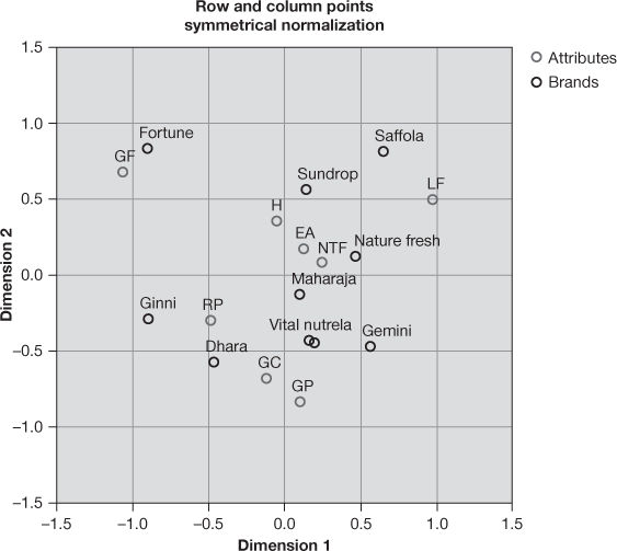
Figure 19.26 Modified biplot using SPSS chart editor
19.3.3 Using SPSS For Correspondence Analysis
In case of using SPSS for correspondence analysis, we will have to feed data in SPSS Data View window as shown in Figure 19.27. As exhibited in Figure 19.27, brands, attributes and frequency are vertically placed in column. As a next step, click Data/Weight Cases. A dialogue box titled Weight Cases, as exhibited in Figure 19.28, will appear on the screen. From this dialogue box, select Weight cases by and place Frequency in Frequency Variable box and click OK. As a next step, click Analyze/Dimension Reduction/Correspondence Analysis. The Correspondence Analysis dialogue box will appear on the screen (see Figure 19.29). Afterwards, place Brands in Row box and click on Define Range. A dialogue box named ‘Correspondence Analysis: Define Row Range’ will appear on the screen (refer to Figure 19.30). In this dialogue box, from Category range for row variable: Brands, place 1, against Minimum value box and place 10, against Maximum value box. Click on Update and Continue; then repeat the procedure for column as exhibited in Figure 19.31, which is the dialogue box for Correspondence Analysis: Define Column Range, and click Continue. Previously discussed dialogue box titled ‘Correspondence Analysis’ will reappear on the screen. In this dialogue box, from Model and Statistics appropriate features can be selected and finally click OK. SPSS output as exhibited from Figure 19.25(a) to 19.25(i) will appear on the screen output window.
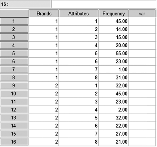
Figure 19.27 Data feeding in SPSS Data View window
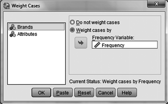
Figure 19.28 Dialogue box for SPSS ‘Weight Cases’
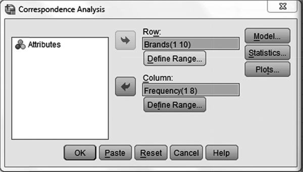
Figure 19.29 Dialogue box for SPSS ‘Correspondence Analysis’
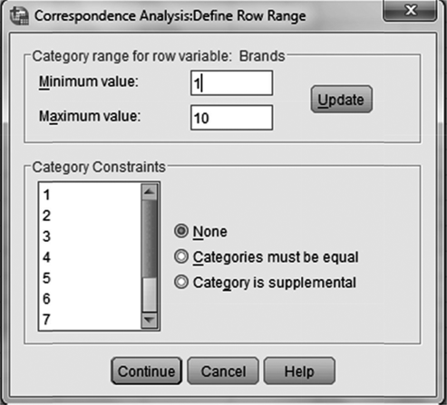
Figure 19.30 Dialogue box for SPSS ‘Correspondence Analysis: Define Row Range’

Figure 19.31 Dialogue box for SPSS ‘Correspondence Analysis: Define Column Range’
Endnotes |
1. Green, P. E. and V. R. Rao (1971). “Conjoint Measurement for Quantifying Judgmental Data”, Journal of Marketing Research, 8: 355–63.
2. Caruso, E. M., D. A. Rahnev and M. R. Banaji (2009). “Using Conjoint Analysis to Detect Discrimination: Revealing Covert Preferences from Overt Choices”, Social Cognition, 27(1): 128–37.
3. Schaupp, L. C. and F. Belanger (2005). “A Conjoint Analysis of Online Consumer Satisfaction”, Journal of Electronic Commerce Research, 6(2): 95–111.
4. Aaker, D. A., V. Kumar and G. S. Day (2000). Marketing Research, 7th ed., p. 597. Wiley, Asia.
5. Malhotra, N. K. (2004). Marketing Research: An Applied Orientation, 4th ed., p. 623. Pearson Education.
6. Green, P. E. and V. Srinivasan (1978). “Conjoint Analysis in Consumer Research: Issues and Outlook”, The Journal of Consumer Research, 5(2): 103–23.
7. Huang, J., C. Ong and G. Tzeng (2006). “Interval Multi-Dimensional Scaling for Group Decision Using Rough Set Concept”, Expert System with Applications, 31(3): 525–30.
8. Hair, J. F., W. C. Black, B. J. Babin, R. E. Anderson and R. L. Tatham (2009). Multivariate Data Analysis, 6th ed., p. 125. Pearson Education.
9. Kruskal J. B. (1964). “Multidimensional Scaling by Optimizing Goodness of Fit to a Nonmetric Hypothesis”, Psychometrica, 29: 1–27.
10. Hoffman, D.L. and G.R. Franke (1986). “Correspondence Analysis: Graphical Representation of Categorical Data in Marketing Research,” Journal of Marketing Research, 23(3): 213–227.
11. Yelland, P.M. (2010). “An Introduction to Correspondence Analysis.” The Mathematical Journal, 23: 1–23.
12. Beh, E.J. (2004). “Simple Correspondence Analysis: A Bibliographic Review,” International Statistical Review, 72(2): 257–284.
13. Doey, L. and J. Kurta (2011). “Correspondence Analysis Applied to Psychological Research,” Tutorials in Quantitative Methods for Psychology, 7(1): 5–14.
14. Bendixen, M. (2003). “A Practical Guide to the Use of Correspondence Analysis in Marketing Research,” Marketing Bulletin, 14: 16–38.
15. Malhotra, N. K. and S. Dash (2012). Marketing Research: An Applied Orientation, 6th ed., p. 664. Pearson Education.
Summary |
The main objective of the conjoint analysis is to find the attributes of the product, which a respondent mostly prefers. The word conjoint refers to the notion that relative value of any phenomenon (product in most of the cases) can be measured jointly, which may not be measured when taken individually. Conjoint analysis determines the relative importance of various product attributes (attached by the consumers to different product attributes) and the values (utility) attached to different levels of these attributes. Conjoint analysis is conducted through the following five-step procedure: problem formulation, trade-off-data collection, metric versus non- metric input data, result analysis and interpretation, and reliability and validity check.
Multidimensional scaling commonly known as MDS is a technique to measure and represent perception and preferences of respondents in a perceptual space as a visual display. Multidimensional scaling handles two marketing decision parameters. As a first case, the dimension on which the respondents evaluate objects must be determined. As a convenient option, only two dimensions are worked out as the evaluation objects are graphically portrayed. As a second case, the objects are to be positioned on these dimensions. The output of multidimensional scaling happens to be in the form of location of the objects on the dimensions and is termed as spatial map or perceptual map. Multidimensional scaling is performed using six steps. These six steps are as follows: problem formulation, input data collection, selection of multidimensional scaling procedure, determining number of dimensions for perceptual map, substantive interpretation, and check the model fit.
Correspondence analysis is a technique that looks like multidimensional scaling and is used to scale qualitative data in the field of business research. Correspondence analysis also generates a perceptual map in which both attribute elements and object or stimuli are positioned. As a matter of difference from multidimensional scaling, correspondence analysis generates perceptual map from nominal or categorical scaled data. Correspondence analysis has the capacity to position products or brand with respect to any type of data (e.g., attitude, usage occasions). Both multidimensional scaling and correspondence analysis are based on the concept of similarity. Correspondence analysis defines similarity in terms of sharing the same level of categorical variables.
Key Terms |
Biplot interpretation, 733
Biplot, 733
Conjoint analysis, 701
Correspondence analysis, 726
Dissimilarity matrix, 720
Functions, 710
Inertia, 732
Input data collection, 717, 727
Map, 716
Multidimensional scaling, 716
Part-worth or utility, 701
Preference data, 718
Problem formulation, 702, 717, 726
Similarity data, 717
Spatial map or perceptual map, 716
Notes |
- 1. Retrieved from https://en.wikipedia.org/wiki/Paytm on April 11, 2017.
- 2. Retrieved from http://www.ndtv.com/india-news/ foreign-media-on-paytms-vijay-shekhar-king-of-demonetization-1658157 on March 17, 2017.
Discussion Questions |
- 1. Explain the conceptual framework of conjoint analysis and its application in the field of marketing.
- 2. What is part-worth or utility function in conjoint analysis?
- 3. What is the conceptual framework of multidimensional scaling? Under what circumstances a researcher should apply multidimensional scaling?
- 4. What are the steps used in performing multidimensional scaling?
- 5. Write short note on following topics related to multidimensional scaling:
(a) Spatial map or perceptual map
(b) Stress, R2 (squared correlation)
(c) Similarity data
(d) Preference data
- 6. What do you understand by correspondence analysis? Under what conditions a researcher should be applying correspondence analysis?
- 7. What are the steps in performing correspondence analysis?
Case Study |
Case 19: Sterlite Technologies Limited: A New Age company
Overview of the Company
From a humble beginning almost two decades ago, the company has come a long way to become the world’s leading and India’s only vertically integrated firm. Today, Sterlite Tech is a pure-play telecom products, services and software company that transforms lives by delivering smarter networks. Sharing a common lineage with Vedanta Resources Plc., Sterlite Tech is among the global leaders in optical communication products, such as, optical fibres, fibre optic cables and data cables, through its operations in India, China and Brazil, and sales network across six continents. Sterlite Tech products have enabled top telecom operators with smarter networks in more than 100 countries across the world.1 The company has a wide sales network in six countries and has manufacturing presence in India, China and Brazil. It has India’s only centre of excellence for broadband research.
Sterlite Tech is enabling top telecom operators and governments with a huge and smart network in more than 100 countries. Highlighting the vision of the company, Ankit Agarwal, its Global Head-Sales and New Ventures, has said, “As an end-to-end digital technology provider, our smart network capabilities have optical fibre connectivity as the backbone that offers network convergence of multiple services with OSS/BSS offering, customer management and modernization capabilities, within a single access network. Through such type of network convergence, the company can deliver a wide range of services, adopt new business models, offer innovative services and enter new markets.”2 Sterlite is visualizing a bright future ahead. It has exhibited sales at a compounded annual rate of 28 percent between 2011–12 and 2015–16 (revenue in 2015–16 stood at Rs 2,265 crore), as a result, profits (before interest and tax) has shot up by 40 percent. With investment by global telecom companies in fibre infrastructure expected to witness a big jump in the next few years due to the roll-out of 4G and 5G networks, there is a good opportunity for optic fibre makers such as Sterlite.3
Development of OFC Network in Many Parts of the Country Including J & K
The company is partnering for the development of optical fibre cable (OFC) network in many regions of the country. Sterlite has received a prestigious offer to develop OFC network in the state of Jammu and Kashmir (J&K). In an interview given to Business Standard in 2014, Anand Agarwal, who is the CEO of Sterlite Tech, has said, “ J&K is one of India’s most sensitive areas in all aspects of national interest. We take pride in establishing the critical infrastructure in both electronic communication and power transmission. We have recently been awarded a project to establish a power transmission infrastructure in J&K under NRSS 29. We are happy that our capabilities of creating end-to-end infrastructures in power and telecom are being put to use in India’s critical corridors.”4 Very enthusiastic and optimistic about the sector growth, the CEO added in the same interview, “The overall sector growth looks positive. We have recently entered in Latin America with a joint venture with Conduspar, a leading cable manufacturer, in Brazil with an initial greenfield capacity of 0.5 million fibre kilo meter (fkm) of optical fibre cables to be ramped up to 1–2 million fkm in the next 2–3 years as market grows. The Brazil plant will be operational by end of September this year. The total annual production capacity of Sterlite will be be 17 million fibre kilo meter (fkm).5
The government of India has announced 100 smart city projects. With a couple of start-up partnerships, the company is also looking to participate in smart city projects launched by the Indian government. In short, Sterlite Tech is exploring all the opportunities present in its field of expertise and operation.
Moving Beyond Business
Sterlite firmly believes that technology can transform Indian education system. The company has reached 400 municipal schools in Mumbai through virtual classrooms. The aim of this project is to provide quality education to students for improving their English. Sterlite has also participated in woman empowerment through Jeewan Jyoti Women’s Empowerment Programme. Through this programme, it provides professional training to women of rural areas to uplift their social status. For women empowerment and enhancement of their income, Sterlite provides vocational training in tailoring. It is actively participating in welfare schemes like mobile dispensary, water conservation and the like. The company has also initiated child welfare and education activities. It has provided specialized infant care equipment to an orphanage in Aurangabad. The company has also facilitated in constructing sanitation and bathing infrastructure in schools for underprivileged children. This shows company’s belief in taking care of social responsibility activity.
Suppose Sterlite wants to find some actionable attributes and attributes levels for its product and service range. This is clear from the above discussion that the company deals in a major way with institutional buyers, not the conventional consumers. This makes Sterlite different from the general fast moving consumer goods companies. Performing a conjoint analysis on product and services offered by Sterlite would be an unconventional use of conjoint analysis. Suppose the company has contacted a market researcher or more specifically, as a business analyst for discovering attributes and attributes levels. What strategy in terms of developing a research plan should be adopted? The market researcher or business analyst should collect data, perform conjoint analysis technique described in the chapter and discuss the obtained result. As discussed in the situation, the company is engaged in lots of social activities which may result in enhancing brand goodwill. In light of this, the market researcher or business analyst should collect similarity data with respect to nine international companies dealing in similar type of product and services, select an appropriate multidimensional scaling procedure, construct a two-dimensional perceptual map, check the model fit and discuss the result. How can correspondence analysis be used as discussed in the chapter to make the market researcher’s understanding clear about the positioning of the company as compared to the available competitive brands?
NOTES |
1. Accessed on March 2017 at https://www.sterlitetech.com/about_us.
2. Accessed on March 2017 at https://www.sterlitetech.com/press _release/448.
3. Accessed on March 2017 at http://www.thehindubusinessline.com/portfolio/sterlite-technologies-connecting-the-digital-dots/article9601318.ece.
4. Accessed on March 2017 at http://www.business- standard.com/article/technology/sterlite-tech-to- set-up-optical-fiber-network-for-defense-services- 114070100788_1.html.
5. Accessed on March 2017 at http://www.business- standard.com/article/technology/sterlite-tech-to- set-up-optical-fiber-network-for-defense-services-114070100788_1.html.