
CHAPTER 8
Measuring Risk using Statistics of Distributions
This chapter introduces some key terms and core aspects of risk measurement, focusing on principles and concepts that apply both to general risk measurement and to properties of simulation inputs and outputs. We aim to use an intuitive and practical approach; much of the chapter will be supported by visual displays, mostly using @RISK's graphical features.
8.1 Defining Risk More Precisely
Precise measures of risk are necessary for many reasons, not least because a statement such as “one situation is more risky than another” may be either true or false according to the criteria used. For example, the implementation of risk-mitigation actions that require additional investment may increase the average cost, whilst reducing the variability in a project's outcomes.
8.1.1 General Definition
Risk can be described fairly simply as “the possibility of deviation from a desired, expected or planned outcome”. Note that this allows the deviation to be driven either by event-type or discrete risks, as well as by fluctuations due to uncertainty or general variability.
8.1.2 Context-Specific Risk Measurement
Risk often needs to be described at various stages of a process, such as pre- and post-mitigation. More generally, as noted earlier in this text, one usually has a choice of context in which to operate, and a fundamental role of risk assessment is to support this choice.
Thus, risk represents the idea of non-controllability within any specific context, so that a more precise definition may be “the possibility, within a specific context, of deviation from a particular outcome that is due to factors that are non-controllable within that context”.
When making quantitative statements about risk, it is often overlooked to state or specify explicitly which context is being assumed. However, such information is, of course, very important for any quantitative measure to be meaningful. For example, the risk involved in crossing the road, when measured quantitatively (such as by the probability of having an accident), will be different according to whether, and how carefully, one has looked before crossing, or whether one is wearing running shoes or a coloured jacket.
By default (in the absence of other information), it would seem that any measurement of risk for a situation should be the one that applies in the optimal context. For example, it would not make sense to measure the risk in crossing the road as that associated with not looking before crossing (unless this was explicitly stated and done for particular reasons). In the optimal context, the risk is the residual after all economically efficient mitigation and response measures have been implemented, and is essentially non-controllable, in that it no longer makes sense to alter the context (i.e. to one other than that which is optimal).
Thus, when measuring risk, one either needs to state the context, or one should be aware that a “true” measure of risk in a situation is that which relates to the non-controllable (residual) element within the optimal context.
8.1.3 Distinguishing Risk, Variability and Uncertainty
In the text so far, we have not made a specific distinction between the terms “risk”, “uncertainty” and “variability”, and have generally simply used the term “risk”. In some cases, a more precise and formal distinction may be made:
- In natural language, “risk” is often used to indicate the potential occurrence of an event, whose impact is typically adverse. One often uses the word “chance” in place of “risk”, especially where the impact may have a benefit: thus, “there is a risk that we might miss the train”, but “there is a chance that we might catch it”.
- Uncertainty is used to refer to a lack of knowledge (e.g. the current price of a cup of coffee in the local coffee shop, or whether a geological area contains oil, or at what time the train is due to depart). Uncertainty can often be dealt with (mitigated) by acquiring additional information, but often such information is imperfect or excessively expensive to acquire, so that a decision will need to be taken without perfect information. For example:
- To find out (with certainty) if oil is present or not in a geological prospect, one could simply drill a well. However, if in the particular context the chance of finding oil is low, then it may be better first to conduct further testing (e.g. seismic assessments) and to abandon the project if the chance of oil truly being present is indicated as low. Conversely, one would drill for oil if the test indicates its presence is likely. In aggregate, the cost incurred in conducting any worthwhile testing procedure should be more than offset by the savings made by not drilling when oil is unlikely to be present, so that drilling (or other expensive) activities are focused only on the most promising prospects.
- One may first conduct additional market research about the likely success of a potential new product, rather than launching the product directly; a direct launch would give perfect information, but the cost of doing so would be wasted if the product did not appeal to customers.
- In general, in the presence of uncertainty, one often naturally proceeds with activities and decisions in a stepwise or phased fashion, so that further information is acquired before any final decision is made at any point in the sequence.
- Variability is used to refer to the random (or stochastic) nature of a process (e.g. the tossing of a coin producing one of two outcomes, or whether a soccer player scores during a penalty shoot-out). Philosophically, there is arguably no difference between uncertainty and variability: for example, once a coin has been tossed, whether it lands heads or tails is not random, but is fully determined by the laws of physics, with the outcome simply being unknown to the observer, and therefore uncertain from his/her perspective.
In many practical cases, the specific terminology used to describe the causes of deviation in a process (e.g. whether it is a risk or an uncertainty) is not particularly helpful or necessary. However, there can be cases where such distinctions can be useful, as discussed in the following.
The use of the terms “uncertainty” or “variability” (rather than “risk”) may help to ensure that the frame being considered is not too narrow. In particular, it can help to avoid inadvertently (implicitly) assuming that every risk item is of an event-type or operational (“yes/no”) nature; such a framework is not appropriate for many forms of general variation, as discussed earlier in the text. Especially where a set of risks that has initially been described qualitatively is used as a starting point for risk modelling, the use of these terms can ensure a wider focus on the true nature of the items. Similarly, the term “risk” often invokes negative connotations in natural language, whereas risk analysis makes no assumption on whether the various outcomes in a situation are good or bad; indeed, the variability under consideration may be a source of potential value creation, such as when considering the benefits that may be achievable by exploiting operational flexibilities. Thus, once again, the use of terms such as uncertainty or variability can be preferable in many cases.
In Bayesian analysis and other formal statistical settings, a distinction between uncertainty and variability can be helpful in the choice of distributions and their parameters.
In principle, in this text, we shall continue not to make a formal distinction between these terms, unless we feel it necessary in specific areas: we shall mostly use the term “risk” as a general term to cover all cases. However, sometimes we will use “risk or uncertainty” (or similar combinations of terms) to reinforce that in that particular context we are referring to the more general case, and not only to event-type or operational risks.
8.1.4 The Use of Statistical Measures
The discussion in Chapter 6 showed that distributions of outcomes arise naturally due to the effect of varying multiple inputs simultaneously. We also noted that, generally, an individual outcome within the set of outputs is simply one of many possibilities, which in most cases does not require a specific focus to be placed on it. Rather, key questions about the situation are addressed with reference to specific statistical measures of the appropriate distribution(s) of outcome(s), such as:
- The position of the “central” point(s) of the possible range of outcomes (e.g. average, mid-point, most likely).
- The spread of the possible outcome range (e.g. best and worst 10% of cases).
- The likelihood of a particular case being achieved (e.g. a base or planned case).
- The main sources of risk, and the effect and benefits of risk mitigation.
8.2 Random Processes and Their Visual Representation
The use of frequency (probability) distributions is essentially a way of summarising the full set of possible values by showing the relative likelihood (or weighting) of each.
In the following, we make reference to a simple illustrative example. We assume that the cost of a project to renovate an apartment can be described as a distribution of possible values, with a minimum value of £10,000, a most likely value of £15,000 and a maximum value of £25,000 (although it is not of particular relevance at this point, we use a PERT distribution [see Chapter 9] to reflect the weighting of each outcome within the range).
8.2.1 Density and Cumulative Forms
The distribution of cost may be expressed in a compact way using one of two core visual displays:
- As a density curve, where the y-value represents the relative likelihood of each particular x-value (see Figure 8.1). The advantage of this display is that key properties of the distribution (e.g. the mean, standard deviation and skew) can be more or less seen visually. The disadvantage is that the visual estimation, for any x-value, of the probability of being below or above that value is harder.
- As a cumulative curve, where the y-value represents the probability of being less than or equal to the corresponding x-value (see Figure 8.2). The advantage of this display is that the probability of being less (or more) than a particular x-value can be read from the y-axis (as can the probability of being between two values, or within a range). The disadvantage is that some potentially important properties are harder to notice without careful inspection; for example, whether the range is symmetric, or is made up of discrete scenarios.
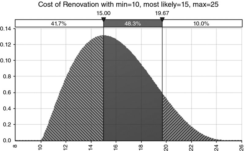
Figure 8.1 Example of a Probability Density Curve for a Continuous Process
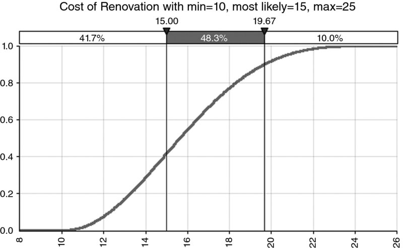
Figure 8.2 Example of a Cumulative Curve for a Continuous Process
The cumulative curve itself may also be expressed in the descending form rather than in the (traditional) ascending one, as shown in Figure 8.3.
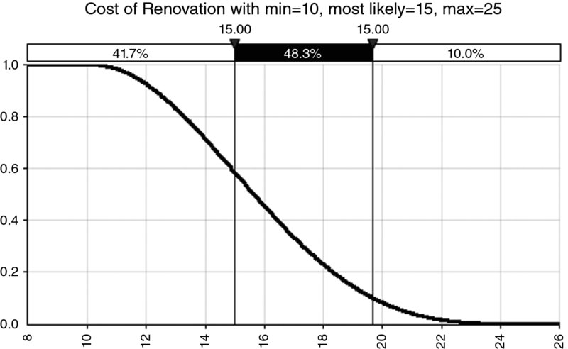
Figure 8.3 Example of a Descending Cumulative Curve for a Continuous Process
8.2.2 Discrete, Continuous and Compound Processes
Distributions, whether they are used for model inputs or as a result of model outputs, can broadly be classified into three categories:
- Discrete. These describe quantities that occur as separate (non-continuous) outcomes. For example:
- The occurrence or not of an event (see Figure 8.4 for an example).
- The number of goals in a soccer match.
- The outcome of tossing a coin or rolling a die.
- Where there are distinct scenarios that may arise.
- Continuous. These represent processes that can take any value within a single range. There are an infinite number of possible outcomes, although the distribution may still be bounded or unbounded on one or both sides. For example:
- Many processes that involve money, time or space are usually thought of as continuous. Even where a quantity is not truly infinitely divisible (such as money, which has a minimum unit of one cent, for example), for practical purposes it is often perfectly adequate to assume that it is divisible (for example, one may still be able to own half of such a project). Hence, financial items such as revenues, costs, cash flows and values of a business project are usually considered as being continuous.
- The duration of a project (or a journey) would have a bounded minimum, but the values of longer durations could be potentially unbounded. For example, although in practice one may return home if one encounters a large snow storm shortly after leaving, the underlying process associated with completing the journey irrespective of the conditions could have a very long duration in some extreme cases.
- Compound. These typically arise where there are multiple discrete scenarios that are possible, and where within one (or more) of these scenarios another process can take a continuous range (see Figures 8.5 and 8.6 for an example of the density and ascending cumulative curve). This would result in a discrete–continuous compound distribution (the second process could also be discrete, resulting in a discrete–discrete situation). For example:
- There may be three discrete scenarios for the weather, and within each there may be a continuous range of possible travel times for a journey undertaken within each weather scenario.
- There may be several possible macro-economic (or geo-political) contexts; within each the price of a particular commodity (such as oil) may take a range of values.
- Very often the reality of a situation (as well as management's expression and thought processes) is that there are compound processes at work; when informally discussing the minimum, most likely and maximum values, one may, in fact, be referring to distinct cases or scenarios. It may be that each of these points is (for example) the central or most likely point of three separate discrete scenarios.
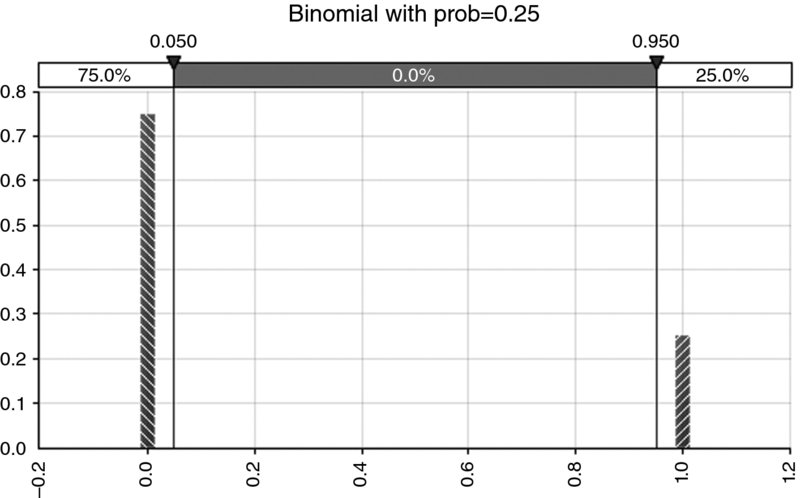
Figure 8.4 Example of Distribution for an Event Risk (Bernoulli or Binomial)
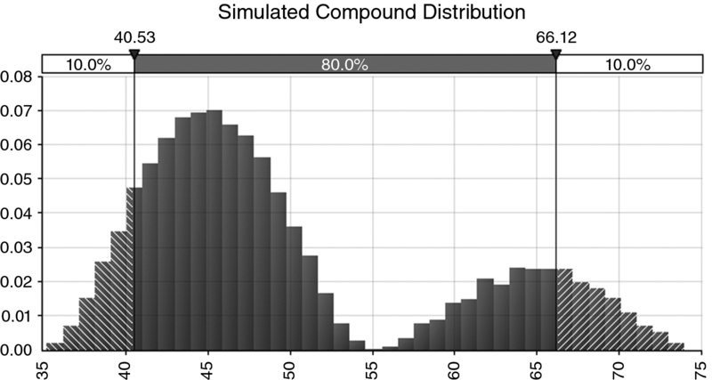
Figure 8.5 Example of a Compound Distribution: Density Curve
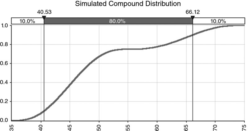
Figure 8.6 Example of a Compound Distribution: Cumulative Curve
Note that the interpretation of the y-axis as the relative likelihood of each outcome is always valid. However, for a discrete distribution, this relative likelihood also represents the actual probability of occurrence, whereas for a continuous distribution, a probability can be associated only with a range of outcomes.
8.3 Percentiles
A percentile (sometimes called a centile) shows – for any assumed percentage – the x-value below which that percentage of outcomes lies. For example, the 10th percentile (or P10) is the value below which 10% of the outcomes lie, and the P90 would be the value below which 90% of occurrences lie. Typical questions that are answered by percentiles of a distribution include:
- What is the probability that a particular case will be achieved (such as the base case)? The answer is found by looking for the percentile that is equal to the value of the particular case, and reading its associated probability.
- What budget is required so that the project has a 90% chance of success of being delivered within this budget?
We can see that in the illustrative example (with reference to Figure 8.1 or Figure 8.2), the value of £15,000 corresponds to (approximately) the P42, so that the budget will be less than that in approximately 42% of cases. The P90 of the project (approximately £19,670) would provide the figure corresponding to that for which the project would be delivered in 90% of cases. The difference between these (£4670) is the contingency required for a 90% chance of success.
In Excel, functions such as PERCENTILE, PERCENTILE.INC and PERCENTILE.EXC can be used to calculate percentiles of data sets, depending on the Excel version used.
8.3.1 Ascending and Descending Percentiles
The above definition is more accurately called an ascending percentile, because the value of the variable is increasing as the associated percentage increases (for example, in the simple example, the P90 is larger than the P42). Sometimes it can be more convenient to work with descending percentiles, which show – for a given assumed percentage – the value of a variable above which that percentage of outcomes lies. That is, the ascending P90 would be the same figure as a descending P10 (or P10D). Descending percentiles are often used when referring to a “desirable” quantity. For example, the P10D of profit would be the figure that would be exceeded in 10% of cases.
8.3.2 Inversion and Random Sampling
In visual terms, the mapping of a percentage figure into a percentile value (such as 10% leading to the P10) is equivalent to selecting a point on the y-axis of the cumulative distribution (10%), and reading across to meet the curve and then downwards to find the corresponding x-value. In mathematical terms, this is equivalent to the “inversion” of the cumulative distribution function. In other words, the regular (non-inverse) function provides a cumulated probability for any x-value, whereas the inverse function provides an x-value for any cumulated probability.
As an example, Figure 8.7 shows the density curve for a standard normal distribution (i.e. with a mean of zero and a standard deviation of one), for which approximately 84% of outcomes are less than the value one. Figure 8.8 shows the cumulative normal distribution, showing the inversion process, i.e. that when starting with approximately 84%, the inverted value is one.
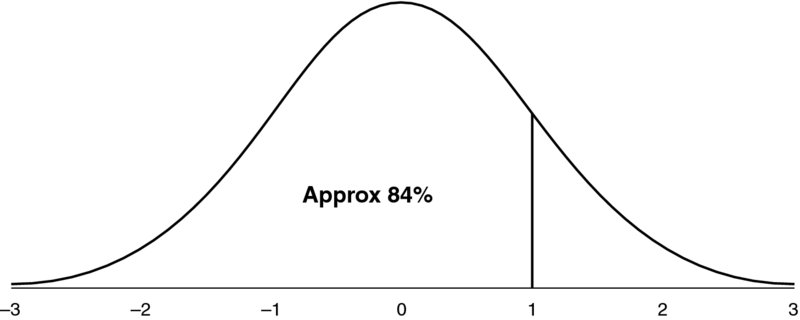
Figure 8.7 Standard Normal Distribution, Containing Approximately 84% of Occurrences in the Range from Infinity to One Standard Deviation Above the Mean
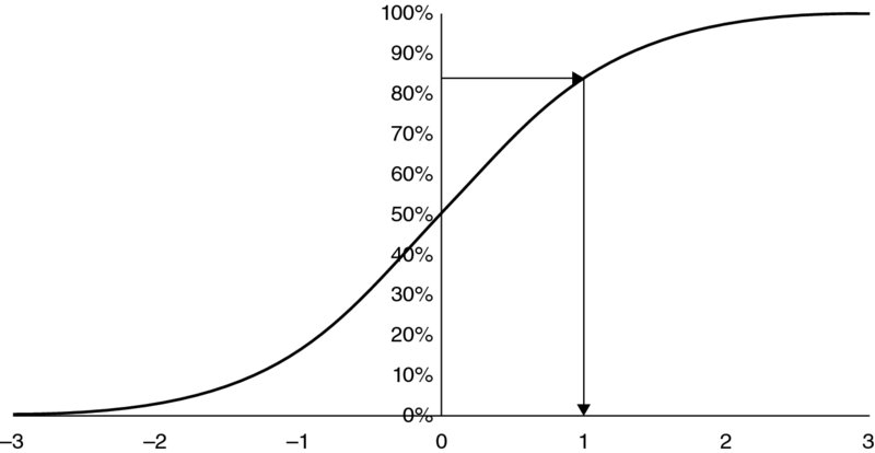
Figure 8.8 Inversion of the Standard Normal Distribution: Finding the Point Below which Approximately 84% of Outcomes Arise
This inversion process is of fundamental importance for the implementation of simulation methods because:
- If the particular probability that drives the inversion is chosen randomly, the calculated percentile is a random sample from the distribution. If the probabilities are created in a repeated fashion as random samples from a uniform continuous (UC) distribution (between 0 and 1, or 0% and 100%), then the calculated percentiles form a set of random samples from the distribution. For example, samples (from the UC) for the probability between 0% and 10% will create samples between the P0 and P10 of the inverted distribution. Similarly, 10% of (UC) sample values will be between 30% and 40%, and hence 10% of inverted (percentile) values will lie between the P30 and P40 of the distribution.
- Where the distribution to be sampled (and its cumulative form) is a mathematical function described by parameters (such as a minimum, most likely or maximum), which – for any given x-value – returns a probability (P), the inverse function will be a mathematical function of the same parameters. In other words, it will – for any given probability (P) – return the x-value (percentile) corresponding to this probability, taking into account the functional form of the inversion calculation, which will depend on the parameters of the distribution. Thus, if an explicit formula can be found for the inversion process (i.e. one that takes the parameter values and a given probability value as inputs and returns the corresponding x-value as the output), then one can readily create samples from the distribution. This process is required when creating simulation models using Excel/VBA, and is discussed in detail in Chapter 10. On the other hand, when using @RISK, the sampling procedure is taken care of automatically as an in-built feature, as also discussed later.
- The quality of the UC sampling process will determine the quality of the samples for the inverted distribution (assuming that the inversion is an exact process).
- Any relationship between the processes used to sample two UC distributions will be reflected in the samples of their corresponding inverted distributions. For example, if the processes that sampled the two UC distributions were “linked”, such that high values for one occurred when the other also had high values, then the percentiles of the sampled distributions would also be such that higher values would tend to occur together. In particular, for simulation methods, if the UC sampling processes are correlated, then a correlation will arise in the sampled distributions. (As discussed later, in the special cases that the uniform processes are correlated according to a rank correlation, then this same value of the rank correlation would result between the distribution samples.)
8.4 Measures of the Central Point
This section discusses various ways to measure central outcomes within a possible range.
8.4.1 Mode
The mode is the value that occurs with highest frequency, i.e. the most likely value:
- The mode may be thought of as a “best estimate”, or indeed as the value that one might “expect” to occur: to expect anything else would be to expect something that is less likely.
- The mode is not the same as the mathematical or statistical definition of “expected value”, which is the mean or average.
The mode is often the value that would be chosen to be used as the base case value for a model input, especially where such values are set using judgement or expert estimates. Such a choice would often be implicit, and may be made even where no explicit consideration has been given to the subject of probability distributions. Of course, other choices of model input values may be used, but modal values to some extent represent “non-biased” choices.
Despite this, the calculation of a mode can pose challenges: for some processes, a single mode may not exist; these include the toss of a coin, or the throw of a die. More generally, in a set of real-life observations of a continuous process, typically no mode exists (generally, every value will appear exactly once, so that each is equally likely). One could try to overcome this by looking for clusters of points within the observations (in order to find the most densely packed cluster), but this could easily lead to a wrong or unstable conclusion simply depending on the placement of the points within the range, on the size of the cluster or on random variation; two random data points may be close to each other even though the true mode is in a different part of the range.
In Excel, functions such as MODE and MODE.SNGL can be used to calculate the statistic, depending on the Excel version used, and on the assumption that the data set does contain a single mode (the function returns error messages for data sets of individual distinct values, as would be expected).
8.4.2 Mean or Average
The mean (μ) of a distribution is simply its average, and is also known as:
- The weighted average, or probability weighted average. Just as the average of a data set is easy to calculate by summing up all the values and dividing by the number of points, the “weighted” average is effectively the same calculation, but in which values that are more frequent than others are mentioned explicitly only once, but at a weighting that corresponds to their frequency of occurrence; this is equivalent to using a full data set of individual values but where values are repeated a number of times, according to their frequency. Thus, for many practical purposes of communication, it is often simplest just to use the term “average”, which covers all cases.
- The “expected value” (“EV”). This is a mathematical or statistical expectation, rather than a pragmatic one (which is the mode). The EV may not even be a possible outcome of discrete processes (e.g. the EV for a die roll is 3.5, and in practice a coin will not land on its side). However, for processes that are continuous in a single range, the average will be within the range and will be a valid possibility.
- The “centre of gravity”. The mean is the x-value at which the distribution balances if considered visually; this can be a useful way to estimate the mean, when a visual display for a distribution is available.
From a mathematical viewpoint, the definition is therefore:
where the ps are the relative probability for the corresponding x-values, and E denotes the mathematical expectation. This formula applies for a discrete process; for a continuous one, the summation would be replaced by an integral.
In economics and finance, the mean is a key reference point (especially when analysing the outputs of models); it plays a fundamental role in the definition of “value” in processes whose payoff is uncertain. It is the payoff that would be achieved from a large portfolio of similar (but independent) projects, as some would perform well whilst others would not, with the aggregate result being the average (or very close to it depending on the number of projects). Similarly, it represents the payoff if many similar independent projects were conducted repeatedly in time, rather than in a large portfolio at a single point in time. For a single project that could be shared or diversified (i.e. by owning only a small fraction of any project), in a portfolio of many such projects, the outcome that would arise would be (very close to) the average. Specific examples of the role of the mean in economics and finance include:
- The economic value of a game that has two equally likely payoffs of zero or 10 is usually regarded as being equal to five.
- In corporate finance, the net present value of a series of cash flows is the mean (average) of the discounted cash flows, with the discount rate used to reflect both the risk and timing of the cash flows when using the Capital Asset Pricing Model.
- In the valuation of options and derivatives, the value of an instrument is the mean (average) of its payoff after appropriate (usually risk-free) discounting.
Underlying the use of the mean (average) in economics and finance is the implicit assumption of the “linearity” of financial quantities: in simple terms, that two extra dollars are worth twice as much as one, and that the loss of a dollar on one occasion is offset if one is gained shortly thereafter.
The mean is therefore typically not relevant when the variable under consideration is not of a linear nature in terms of its true consequence: i.e. where a deviation in one direction does not offset a deviation in the other. For this reason, the mean (average) is often not so relevant in many non-financial contexts, for example:
- When regularly undertaking a train journey, arriving early on some days will not generally compensate for being late on others. Similarly, arriving on time for work on average might be inappropriate if there is an important coordination meeting at the start of each day.
- If a food product contains low levels of toxins that are safe on average, it is nevertheless important for any individual sample to also be within safety limits, and not that some have levels well below the safety threshold and a few have levels that are above it. Similar remarks can be made in general about many quality control or safety situations.
In terms of modelling, where a model's logic is linear and additive (such as the simple example discussed in Chapter 6), if the input values are set at their average values, then the output value shown will directly be the true average of the output: in other words, there would be no need to run a simulation in order to find the average. The average is also easy to measure from a set of data. Thus, when building static models, the setting of model inputs to be their average values is often considered. However, such a choice may not be suitable in many cases:
- Average (mean) values may not be valid outcomes of the input process, especially for discrete ones (and hence inappropriate to use). Examples include “yes/no” event-risk processes (such as whether there will be oil in a prospect), or the roll of a die (where the average is 3.5). Similarly, a model that contains IF or lookup functions may return errors or misleading figures if invalid values are used, such as if integer inputs are required.
- Average values will often not be equal to the most likely ones, and hence may be regarded as inappropriate. Especially in group processes (or multi-stage “sign-off” processes) this can result in a circular process happening in which one cycles between mean and most likely values (from one meeting to the next), with resulting confusion!
- Where a model has a non-linearity in its logic (e.g. it uses IF, MAX or MIN functions), then the value shown for the output when the inputs are their average values will not generally be the same as the true average; generally, one would have to rely on the results of a simulation to know what the average was. (Thus, generally speaking, the mean value of the output of a financial model may only be able to be calculated (estimated) using simulation techniques.)
In Excel, functions such as AVERAGE and SUMPRODUCT are most relevant to calculating the mean of a data set. In some cases, such as using SUM and COUNT, other functions may be useful, as may AVERAGEIFS, SUMIFS or COUNTIFS if one is working with categories or subsets of a full list.
8.4.3 Median
The median is simply the 50th percentile point (P50); that is, the value at which half of the possible outcomes are below and half are above it. It can measure the “central view” in situations where large or extreme values are (believed or required to be) of no more significance than less extreme ones. For example:
- To measure the “typical” income of individuals, when a government is considering how to define poverty, or is setting income thresholds for other policy purposes. If one used the average income level, then the reference figure would be increased by the data of individuals with very large incomes. Thus, a reasonably well-off person (who has an income larger than most but less than this “distorted” average) would be considered as having a “below average” income; in other words, a more appropriate measure may be one that is of a relative nature.
- To measure the “average person's” opinion about some topic, such as a political matter.
In Excel, either the PERCENTILE-type functions or the MEDIAN function can be used to calculate the statistic, depending on the Excel version used.
8.4.4 Comparisons of Mode, Mean and Median
The above statistical measures of the central points of a distribution are identical in some special cases (i.e. for processes that are symmetric and have a single modal value, such as the normal distribution). However, there are a number of potential differences between them:
- In the case of non-symmetric processes, the values may be different to each other. For example, in the hypothesised distribution of costs used earlier, the modal value is £15,000, whereas the median and means are approximately £15,637 and £15,833, respectively; these latter two values are shown in Figure 8.9 by means of the two delimiter lines.
- For discrete distributions, the median and mean may not represent outcomes that can actually occur (e.g. the toss of a coin or roll of a die). However, the mode (even if there are several) is always a valid outcome, as it is the most likely one.
- Whereas independent processes have the (additive) property that the sum of their means is the same as the mean of the sum of the processes (so simulation is not required in order to know the mean of the sum), this does not hold for modal and median values (unless they happen to be equal to mean values due to symmetry or other reasons). Thus, there is generally no “alignment” between the input case used and the output case shown, when modal or median (or indeed most other) input cases are used as inputs even in a simple additive model. The modal (most likely) case is especially important because it may correspond to a model's base case.
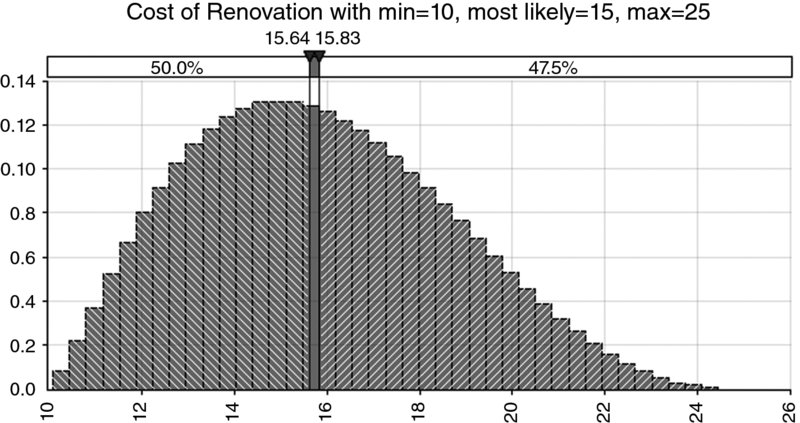
Figure 8.9 Hypothesised Input Distribution for Cost Example
8.5 Measures of Range
It is clear that measuring risk is very closely related to measuring the extent of variability, or the size of a range. In this section, we discuss a number of possible such measures.
8.5.1 Worst and Best Cases, and Difference between Percentiles
The worst and best cases are essentially the 0th and 100th percentiles. In general, the occurrence of either is highly unlikely, and so not likely to be observed. For example, some ranges may be unbounded (e.g. in the direction of large values), so that any observed (high) value is nevertheless an understatement of the true maximum, which is infinite. As discussed in Chapter 6, even for bounded ranges for individual variables, there are generally very few combinations of multiple variables that lead to extreme values when compared to the number of combinations that create values toward more central elements of a range. (The main exception is discrete distributions, where the theoretical worst and best cases may have some significant probability of occurrence, and, if these are dominant in a situation, then values closer to the extremes will typically become more likely. Similarly, if there are strong [reinforcing] dependencies between variables, values close to extreme ones are more likely to be observed.)
Thus, the worst (or best) cases, as observed either in actual situations or in simulation results, are likely to be underestimates (in their respective directions) of the true values. For this reason, it is often better to work with less extreme percentiles. Thus, the difference between two percentiles (such as the P90 and P10) can often be a useful indicator of the range of outcomes that would be observed (in 80% of cases).
Of course, these are non-standardised measures, because one still has to choose which percentiles to work with, such as P10 to P90, P5 to P95 or P25 to P75, and so on.
8.5.2 Standard Deviation
The standard deviation (σ) provides a standardised measure of the range or spread that applies to all data sets or distributions. In a sense it measures the “average” deviation around the mean. All other things being equal, a distribution with a standard deviation that is larger than another is more spread and is “more risky” in a general sense.
The standard deviation is calculated as the square root of the variance (V):
and:
There are several points worthy of note:
- Strictly speaking, the standard deviation measures the square root of the average of the squared distances from the mean: this is not exactly the same as the average deviation of the (non-squared) distances; the squaring procedure emphasises values that are further from the mean than does the absolute deviation.
- The standard deviation has the same unit of measurement as the quantity under consideration (e.g. dollar or monetary values, time, space, etc.), and so is often straightforward to interpret in a physical or intuitive sense; the variance does not have this property (e.g. in a monetary context, its unit would be dollar squared).
- As well as being a measure of risk, the standard deviation is one of the mathematical parameters that define the normal and lognormal distributions, the other parameter being the mean:
- These two parameters therefore provide full information about each distribution, from which all of their properties can be determined (such as the P10 or P90, and so on).
- These are important and frequently occurring distributions, as in many contexts it is often assumed, believed or can be demonstrated statistically (to within reasonable accuracy in many cases) that the underlying processes are distributed in this way. In such contexts (such as in financial markets), the standard deviation is often thought of as the core measure of risk, and is often called volatility.
A useful rule of thumb is that the one standard deviation band around either side of the mean contains about two-thirds of the outcomes. For a normal distribution, the band contains around 68.3% of the outcomes, as shown in Figure 8.10. For the cost distribution used earlier (which is a PERT, not normal distribution), Figure 8.11 shows that the one standard deviation band around the mean contains approximately 65% of the area (i.e. approximately the range from £13,069 to £18,597, as the mean is £15,833 and the standard deviation is approximately £2764); this percentage figure would alter slightly as the parameter values are changed but would typically be approximately about two-thirds. The two standard deviation band on either side of the mean contains around 95.4% of the outcomes for a normal distribution, as shown in Figure 8.12; once again this figure would be approximately the same for other single-moded continuous processes.
- This two-thirds rule of thumb applies with reasonable accuracy to continuous processes with a single mode, but not to discrete processes. For example, for the binomial distribution (representing a single possible event risk), the mean is equal to p, and the standard deviation is equal to
 . So, when p < 0.5, the standard deviation is larger than the mean and hence the lower part of the band around the mean contains the entire outcome of non-occurrence (which has probability 1 – p, which will approach 100% for small values of p); similarly for large values of p, the entire outcome of occurrence (which has probability p) will be within the upper part of the band. Figure 8.13 shows an example in which (with a probability of occurrence of 25%) the non-occurrence outcome (represented by zero) has a 75% probability and is entirely contained within the one standard deviation band around the mean, as the mean is 0.25 and the standard deviation is approximately 0.43.
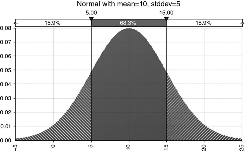
Figure 8.10 Normal Distribution with Average of 10 and Standard Deviation of 5; Approximately 68% of Outcomes are within the Range that is One Standard Deviation Either Side of the Mean
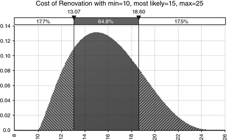
Figure 8.11 The One Standard Deviation Bands for the Hypothesised Cost Distribution
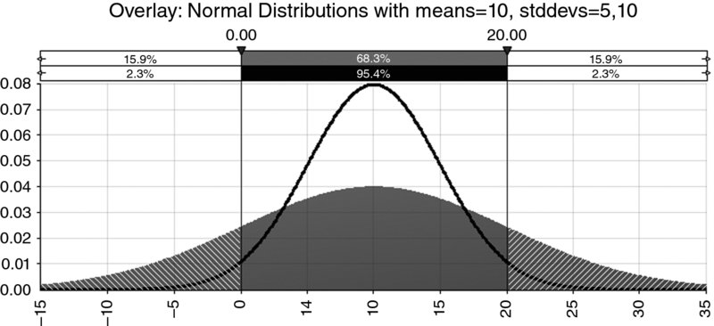
Figure 8.12 Comparison of Normal Distributions with Various Standard Deviations
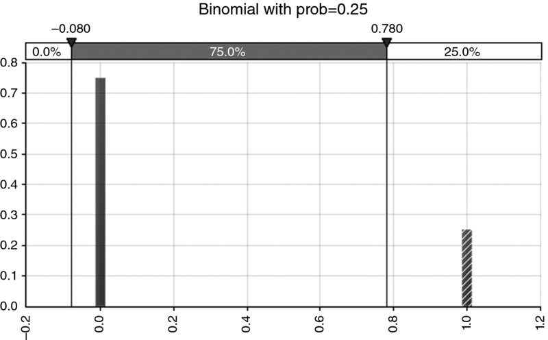
Figure 8.13 The One Standard Deviation for the Bernoulli (Binomial) Distribution Contains the Bar with the Larger Probability
Note that by expanding the term in square brackets (and using the fact that ![]() ), the formula for the variance can be written as:
), the formula for the variance can be written as:
or:
The following observations result from this:
- The formula gives a more computationally efficient way to calculate the standard deviation: fewer steps are required to square the x-values, take the average of these figures and then subtract the square of the average of the original values, than (as would be done with the original formulae) to deduct the mean from each value, square these differences and then take the average of the squared figures.
- Since the variance is a sum of squared values, it is always greater than zero (for any process with more than one outcome). Therefore, the right-hand side of the formula shows that the average value of the square of a random process is greater than the square of the average of the original process.
Note that the above formulae assume that the data represent the whole population for which the standard deviation is to be calculated. If one were dealing with only a sample (i.e. a subset) of all possible values, then one may need to address the issue as to whether the formula accurately represents the actual standard deviation of the population from which the sample was drawn. In this regard, one may state:
- Any statistical measure of the sample can be considered an estimate of that of the underlying population.
- There is a possibility that the data in the sample could have been produced by other underlying (population) processes, which each have slightly different parameters (such as slightly different means or standard deviations).
In fact, the standard deviation of a sample does not (quite) provide a “best guess” (non-biased estimate) of the population's standard deviation, and requires multiplication by a correction factor of ![]() , where n is the number of points in the sample. The application of this factor will avoid systematic underestimation of the population parameter, although its effect is really of much practical relevance only for small samples: where n = 5 this results in a correction of approximately 10%, which when n = 100, 1000 and 5000 reduces to approximately 0.5%, 0.05% and 0.01%, respectively. (Such correction factors are not required for the calculation of the average, where the sampled average is a non-biased estimate of that of the population.) In Excel (depending on the version), the functions STDEV or STDEV.S can be used to calculate the estimated population standard deviation from sample data; these functions have the correction factors automatically built in. The functions STDEVP and STDEV.P can be used to calculate the population standard deviation from the full population data. Note that the @RISK statistics functions for simulation outputs (e.g. RiskStdDev) do not have these correction factors built in, so samples are treated as if they were the full population.
, where n is the number of points in the sample. The application of this factor will avoid systematic underestimation of the population parameter, although its effect is really of much practical relevance only for small samples: where n = 5 this results in a correction of approximately 10%, which when n = 100, 1000 and 5000 reduces to approximately 0.5%, 0.05% and 0.01%, respectively. (Such correction factors are not required for the calculation of the average, where the sampled average is a non-biased estimate of that of the population.) In Excel (depending on the version), the functions STDEV or STDEV.S can be used to calculate the estimated population standard deviation from sample data; these functions have the correction factors automatically built in. The functions STDEVP and STDEV.P can be used to calculate the population standard deviation from the full population data. Note that the @RISK statistics functions for simulation outputs (e.g. RiskStdDev) do not have these correction factors built in, so samples are treated as if they were the full population.
Even after the application of appropriate correction factors, one is, in fact, provided with a non-biased estimate of the value of the population's parameter. However, since (slightly different) parameters could have nevertheless produced the same sample, this figure provides only an estimate of the central (average) value of this parameter, and its true possible values could be different. Typically, if desired, one can measure a confidence interval in which the parameter lies (with the interval being wider if one needs to have more confidence). Of course, as the sample size increases, the required width of the confidence interval (for any desired level of confidence, such as 95%) decreases, so that this issue becomes less important for large sample sizes. This topic is explored further in Chapter 9 in order to retain here a focus on the core principles.
8.6 Skewness and Non-Symmetry
Skewness (or skew) is a measure of the non-symmetry (or asymmetry), defined as:
The numerator represents the average of the “cube of the distance from the mean”, and the denominator is the cube of the standard deviation, so that the skewness is a non-dimensional quantity (i.e. a numerical value with a unit such as dollars, time or space). As for the calculation of standard deviation, a sample will underestimate the skewness of the population, so that the above formula would be multiplied by ![]() in order to give a non-biased estimate of the population's skewness parameter, with the standard deviation figure used as the estimate of that of the population, i.e. the non-biased corrected figure calculated from the sample. In Excel, the SKEW function has this correction factor built in; later versions include the SKEW.P function, which does not have the correction factor, and so can be used for population data.
in order to give a non-biased estimate of the population's skewness parameter, with the standard deviation figure used as the estimate of that of the population, i.e. the non-biased corrected figure calculated from the sample. In Excel, the SKEW function has this correction factor built in; later versions include the SKEW.P function, which does not have the correction factor, and so can be used for population data.
Although there are some general rules of thumb to interpret skew, a precise and general interpretation is difficult because there can be exceptions in some cases. General principles include:
- A symmetric distribution will have a skewness of zero. This is always true, as each value that is larger than the mean will have an exactly offsetting value below the mean; their deviations around the mean will cancel out when raised to any odd power, such as when cubing them.
- A positive skew indicates that the tail is to the right-hand side. Broadly speaking, when the skew is above about 0.3, the non-symmetry of the distribution is visually evident.
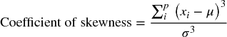
Figure 8.14 shows an example of a lognormal distribution with a mean and standard deviation of 10, a mode of approximately 3.54, a median of approximately 7.07 and a coefficient of skewness of 4.0.
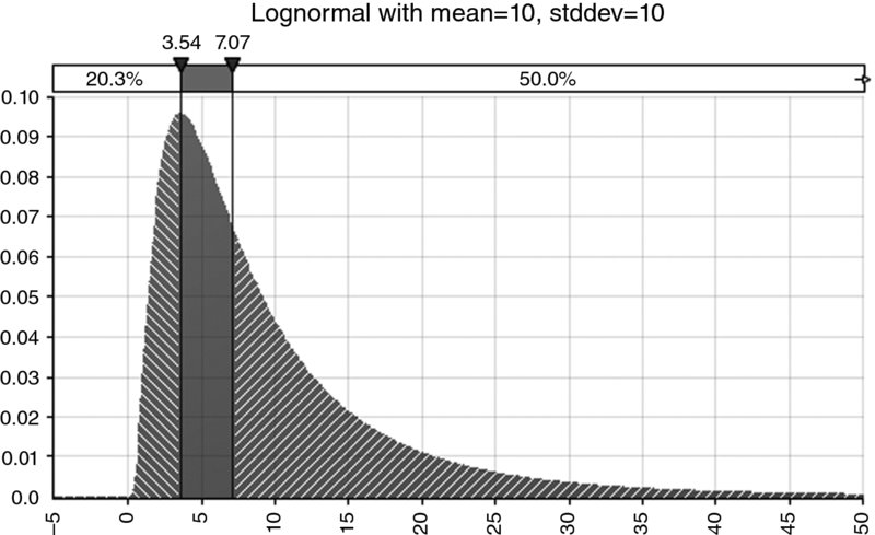
Figure 8.14 Example of a Lognormal Distribution
On the other hand, in special cases, the properties of distributions and their relationship to skew may not be as one might expect:
- A zero skew will not necessarily imply symmetry; some special cases of non-symmetric distributions will have zero skew, as shown by the example in Figure 8.15.
- For positively skewed distributions, typically the mean is larger than the median, which itself is typically larger than the mode: intuitively, the mean would be larger than the median (P50 point), because the 50% of outcomes that are to the right of the median are typically more to the right of the median than are the corresponding points to the left. However, this ordering of the mode, median and mean values does not hold for all distributions:
- Figure 8.16 shows an example of a positively skewed distribution in which the mean (approximately 1.64) is less than the mode (2.0).
- Figure 8.17 shows an example of a positively skewed distribution where the modal, median and mean values are all identical (and equal to zero).
Figure 8.15 A Special Case of a Distribution with Zero Skewness
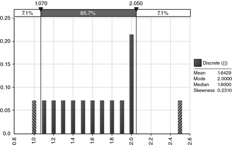
Figure 8.16 A Special Case of a Positively Skewed Distribution Whose Mean is Less than its Mode
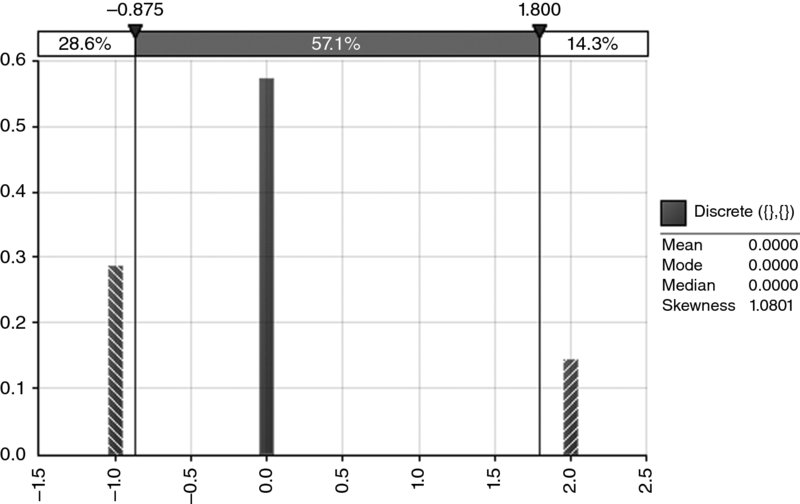
Figure 8.17 A Special Case of a Positively Skewed Distribution with Identical Mean, Median and Mode
8.6.1 The Effect and Importance of Non-Symmetry
Although the issue of non-symmetry is not precisely identical to that of skewness, or to that of whether a distribution has the same modal and mean values, in most practical applications there will be a very close relationship between these topics (the counter-examples shown to demonstrate possible exceptions were specially constructed in a rather artificial manner, using discrete distributions). Thus, non-symmetry is a loose proxy for situations in which the mode and mean values are different to each other (and also generally different to the median).
In practice, as mentioned earlier, where the modal and mean (and median) values of an input distribution are not equal, then even for simple linear additive models, the output case shown in the base case may not correspond to the input case. For example, if the inputs are set at their most likely values, then the output calculation will often not show the true most likely value of the output. Thus, a simulation technique may be required even to assess which outcome the base case is showing.
8.6.2 Sources of Non-Symmetry
There are a number of areas where non-symmetry can arise. For the discussion of these, it is important to bear in mind that, in general, model inputs could typically be further broken down so that they become outputs of more detailed calculations (i.e. of explicitly modelled processes). For example, an initial assumption about the level of sales could be broken down into volume and unit price assumptions, and the volume further broken down into volume by product or by month, and so on. In practice, however, this process of “backward derivation” cannot continue forever, and is chosen (usually implicitly) to stop at some appropriate point at which model inputs become represented either as numbers or as distributions (even where there is a more fundamental nature that is not explicitly captured).
Some of the key reasons for the existence of non-symmetric processes in practice include:
- Multiplicative processes. Generically speaking, multiplying two small positive numbers together will give a small number, whereas multiplying two large numbers together will give a very large number. As a practical example, the cost of a particular type of item within a budget could be that of the product of the (uncertain) number of units with the (uncertain) price per unit. However, where such a cost type is a direct model input (rather than being explicitly calculated), a non-symmetric process may be used as a proxy. This is discussed in more detail in Chapter 9 especially in relation to the lognormal distribution.
- The presence of event risks (or some other discrete processes). When used as a model input, an event risk may create non-symmetry in the output. On the other hand, non-symmetric continuous processes are sometimes used as model inputs, with the non-symmetry used as a proxy to implicitly capture the effect of underlying events. For example, one may use a skewed triangular process to capture the risk that the journey time (or the cost) of an item may be well above expectations.
- Non-linear processes. Processes that result from applying IF or MAX statements (amongst other examples) will usually have non-symmetry within them. For example, the event of being late for work may really be a test applied as to whether the uncertain travel time is more than that required to arrive on time. This applies also to outputs of calculations, but non-symmetric inputs can be a proxy for non-explicitly modelled non-linearities.
- Small sample sizes. Where one aims to estimate a probability of occurrence from small sample sizes of actual data, there is, in fact, typically a range of possible values for such a probability. For example, if one has observed five occurrences in 20 trials, then one may consider the probability to be 25% (or 5/20). However, any probability between 0% and 100% (exclusive) could have produced the five outcomes, with 25% being the most likely value. As discussed in Chapter 9, the true distribution of possible values for the true probability is, in fact, a beta distribution, which, in this example, would have a mean value of around 27% (3/12).
- Optimism bias. This is one of several biases that can occur in practice (see Chapter 1). Such biases are not, in fact, a source of non-symmetry of the underlying distribution, but rather reflect the place of the chosen (base) case within it. For example, a journey may have a duration that is 20 minutes on average and with a standard deviation of 5 minutes. However, if one makes an assumption (for base case planning purposes) that the journey will be undertaken in 18 minutes, then the nature of the journey does not change as a result of this assumption; rather, the likelihood of achieving the base plan is affected.
8.7 Other Measures of Risk
The above ways to describe and measure risk are usually sufficient for most business contexts. In some specific circumstances, notably in financial markets and insurance, additional measures are often referred to. Some of these are briefly discussed in this section.
8.7.1 Kurtosis
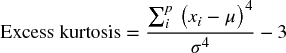
Kurtosis is calculated as the average fourth power of the distances from the mean (divided by the fourth power of the standard deviation, resulting in a non-dimensional quantity):
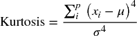
A normal distribution has a kurtosis of three. Distributions are known as mesokurtic, leptokurtic or platykurtic, depending on whether their kurtosis is equal to, greater than or less than three.
The Excel KURT function (and some other pre-built calculations) deducts three from the standard calculation in order to show only “excess” kurtosis (whereas in @RISK, the stated kurtosis is the raw figure):
As for the standard deviation and the skewness, corrections are available to estimate population kurtosis from a sample kurtosis in a non-biased way; however, these are not built into the Excel formulae (or into @RISK) at the time of writing.
Kurtosis can be difficult to interpret, but in a sense provides a test of the extent to which a distribution is peaked in the central area, whilst simultaneously having relatively fat tails. One situation in which the kurtosis is high is in the presence of discrete or event risks, particularly where the probability of occurrence is low but the impact is large (relative to other items). Figure 8.18 shows a discrete distribution with a central value that has 80% probability, and two tail events each having 10% probability; the total kurtosis is five. The kurtosis would increase if the probability of the tail events were reduced (with the residual probability being added to the central value's probability); hence, the use of kurtosis to measure “tail risk” is not straightforward to interpret in practice.
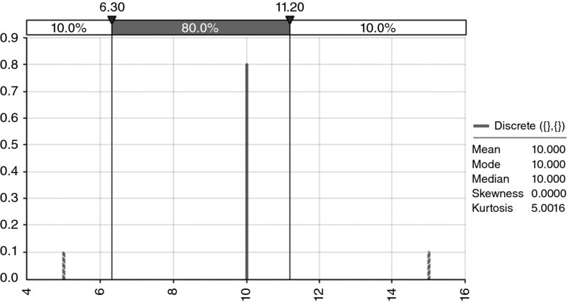
Figure 8.18 The Kurtosis of a Discrete Process may Decrease as Tail Events Become Less Likely
8.7.2 Semi-Deviation
The semi-deviation is a measure of average deviation from the mean, but in which only those data points that represent adverse outcomes (relative to the mean) are included in the calculation (i.e. it represents “undesirable” deviation from the mean). For example, the semi-deviation of a distribution of profit would include only those outcomes that are below the mean; for a cost, it would count only those points above the mean.
For example, for the data set {1,2,3,4,5,6,7}, whose average is 4, assuming that larger values are undesirable, the semi-deviation would be calculated by considering only points 5, 6 and 7. The sum of the squared deviations (from 4) of these points is 14 (i.e. 1 + 4 + 9). So the average squared deviation of these points is 14/3, and the semi-deviation is the square root of this, i.e. approximately 2.16; see Figure 8.19.
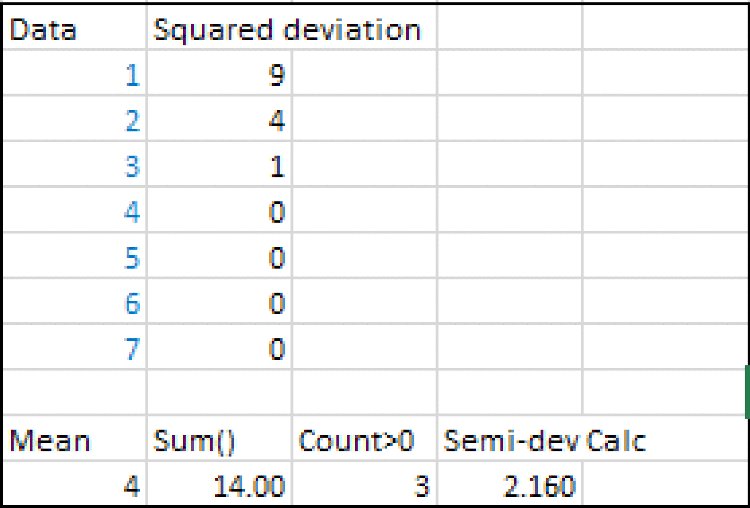
Figure 8.19 Simple Example of the Calculation of the Semi-Deviation of a Data Set
At the time of writing, there is no Excel (or @RISK) function to directly calculate the semi-deviation of a data set. In this context, a VBA user-defined function can avoid having to explicitly create tables of calculation formulae in the Excel sheet, and allows a direct reference from the data set to the associated statistic.
For readers who intend to implement simulation techniques using Excel/VBA, user-defined functions are generally important; they allow flexible ways to create distribution samples and to correlate them (see Chapters 10 and 11). An introduction to basic aspects of the implementation of user-defined functions is given in Chapter 12. Here, we simply provide code that would calculate the semi-deviation of a data set, including the possibility of using an optional argument (iType) to define whether it is the values below or above the mean that one wishes to use for the measurement.
Function MRSemiDev(Data, Optional iType As Integer)
'Semi-deviation of items
'iType is an optional argument
'iType =1 is semi-deviation below the mean, and is the default
'iType =2 is semi-deviation above the mean
Dim n As Long, ncount As Long, i As Long
Dim sum As Single, mean As Single
ncount = 0
mean = 0
sum = 0
n = Data.Count
mean = Application.WorksheetFunction.Average(Data)
'Determine which form of function to use
 If IsMissing(iType) Then
  iType = 1
  Else
  iType = iType
 End If
'Calculate semi-deviation
If iType = 1 Then
 For i = 1 To n
  If Data(i) < mean Then
  ncount = ncount + 1
  sum = sum + (Data(i) - mean) ^ 2
  Else
  End If
 Next i
Else
 For i = 1 To n
  If Data(i) > mean Then
  ncount = ncount + 1
  sum = sum + (Data(i) - mean) ^ 2
  Else
  End If
  Next i
End If
MRSemiDev = Sqr(sum / ncount)
End Function
8.7.3 Tail Losses, Expected Tail Losses and Value-at-Risk
In a sense, the standard deviation represents all deviation, and the semi-deviation only the undesirable deviation. A related idea is to consider only the more extreme cases (which could be either double-sided, as for a standard deviation, or single-sided, as for a semi-deviation). Thus, a range of risk measures can be designed to reflect “realistic worst cases”, for example:
- What is the loss in the worst 1% of cases?
- The P99 of the distribution of losses (or the P1 using descending percentiles) would provide an answer to this.
- The average loss for all cases that are above the P99 figure; this (conditional) mean or “expected tail loss” would be larger than or equal to the P99 itself.
- What is the value-at-risk (VaR)?
- This is similar in principle to the above, but the percentage under consideration is usually converted into the corresponding number of standard deviations from the mean, rather than directly into a percentile figure; the implicit assumption is that the distribution is close to a normal one, so that each approach is effectively equivalent. Additionally, the standard deviation is used as a measure of volatility, so that the VaR is often calculated with respect to a quoted volatility. Finally, VaR is typically used as a short-term measure of risk (in percentage terms of asset price movements), so that the average would typically be low (and often ignored), with the dominant effect being that of volatility. For example, since a normal distribution has about 4.6% of the area that is more than two standard deviations from the mean (about 2.3% on each of the downside and upside), the VaR at the 2.3% level would be equal to two standard deviations in movement. Thus, for a portfolio valued at $1000, with a daily volatility of 1%, the daily VaR at the 2.3% level would be $1000*2*1%, or $20.
- “Conditional value at risk” is a measure of the average loss when the outcome is within the tail of the distribution, i.e. the average loss when the outcome is at least as bad as the particular individual VaR point.
Note that for many practical business examples, rather than the use of the VaR, a simple statement of, say, a P95 (or other relevant percentile) is usually sufficient for the purposes at hand, even if the use of such a measure would be very close in concept to that of VaR.
8.8 Measuring Dependencies
When implementing risk models, it is important to capture any dependency relationships between risks, their impacts and other model variables. When historic data or experience suggest a particular strength or type of dependency, it would, of course, be important for these to be captured within a model as far as possible. In this section, we provide a brief description of some core measures; many of these topics are covered in more depth in Chapter 11.
8.8.1 Joint Occurrence
At the most basic and intuitive level, dependency between risk items can be considered from the perspective of joint occurrence: risks that occur together (or do not do so) display some explicit or implicit dependence between them.
For example, if the probability of occurrence of each of two events were known, as were the frequency with which they both occur together (or both do not occur together), then one could calculate the frequency of all combinations and the conditional probabilities. Figure 8.20 shows an example of the initial data on individual probabilities and joint occurrence, and Figure 8.21 shows the completed matrix with the frequency of all combinations, derived in this simple case by simply filling in the numbers so that row and column totals add up to the applicable totals.
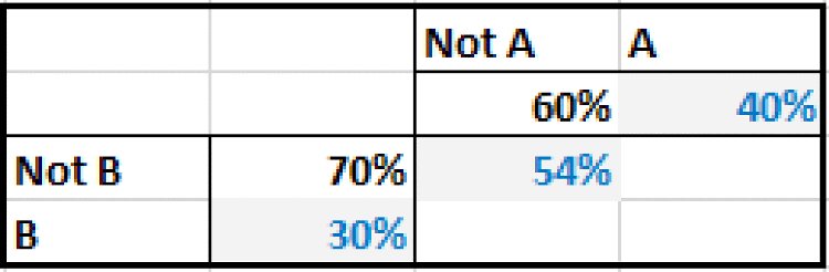
Figure 8.20 Initial Given Data on Probabilities
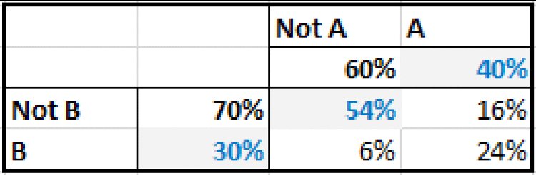
Figure 8.21 Completed Data on Probabilities
From the completed matrix, one can calculate the conditional probabilities, for example:
- P(B occurs given that A has occurred) = 24%/40%, i.e. 60%.
- P(B occurs given that A has not occurred) = 6%/60%, i.e. 10%.
Note that if the variables were independent, then the conditional probabilities would be the same as the underlying probabilities for each event separately (i.e. 30% probability of B whether A occurs or not), which would give the matrix shown in Figure 8.22.
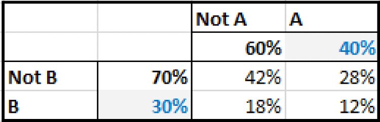
Figure 8.22 Data on Probabilities that would Apply for Independent Processes
Despite the apparent simplicity of this approach to considering dependencies between risks (and the use of conditional probabilities in some of the example models shown later), there are also drawbacks:
- It requires multiple parameters to define the dependency: in the above example, with only two variables, three pieces of data are required to define the dependency (the probability of each as well as that of joint occurrence). When there are several variables, the number of parameters required and the complexity of the calculations increases significantly.
- The extension of the methodology to cover the cases where the outcomes are in a continuous range, rather than having discrete values, is less intuitive.
8.8.2 Correlation Coefficients
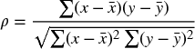
The correlation coefficient (ρ) provides a single measure of the extent to which two processes vary together. For two data sets from the processes, X and Y, each containing the same number of points, it is calculated as:
where x and y represent the individual values of the respective data set, and ![]() represents the average of the data set X (and similarly
represents the average of the data set X (and similarly ![]() is the average of the Y data set).
is the average of the Y data set).
From the formula, we can see that:
- The correlation between any two data sets can be calculated as long as each set has the same number of points (at least one). Thus, a correlation coefficient can always be observed between any two data sets of the same size, although it may be statistically insignificant, especially if the sample sizes are small.
- The coefficient is usually expressed as a percentage, and it lies between –100% and 100%. This can be seen in a manner similar to the earlier discussion about the calculation of variance (in which the sum of the squares of numbers is at least as large as the square of the sum of those numbers, so that the denominator is at least as large as the numerator).
- Correlation refers to the idea that each variable moves relative to its own mean in a common way. By considering the numerator in the above formula, it is clear that a single value, x, and its counterpart, y, will contribute positively to the correlation calculation when the two values are either both above or both below their respective means (so that the numerator is positive, being either the product of two positive or of two negative figures). Thus, the values in one of the data sets could have a constant number added to each item, or each item could be multiplied by a constant factor, without changing the correlation coefficient. This has an important consequence when correlation methods are used to create relationships between distributions in risk models; for example, the values sampled for the Y process need not change, even as the nature of the X process is changed, and thus a correlation relationship is of a rather weak nature, and does not imply a causality relationship between the items (see Chapter 11).
From a modelling perspective, the existence of a (statistically significant) correlation coefficient does not imply any direct dependency between the items (in the sense of a directionality or causality of one to the other). Rather, the variation in each item may be driven by the value of some other variable that is itself not explicit or known, but which causes each item to vary, so that they appear to vary together. For example, the change in the market value of two oil-derived commodity or chemical products will typically show a correlation; each is largely driven by the oil price, as well as possibly having some other independent or specific variation. Similarly, the height above the seafloor of each of two boats in a harbour may largely be driven by the tidal cycle, although each height would also be driven by shorter-term aspects, such as the wind and wave pattern within the harbour. On the other hand, when a direct dependency between two items does exist, then generally speaking there will be a measured correlation coefficient that is statistically significant (there can always be exceptions, such as U-shaped relationships, but generally these are artificially created rather than frequently occurring in practical business applications).
There are, in fact, a number of ways to measure correlation coefficients. For the purposes of general risk analysis and simulation modelling, the two key methods are:
- The product or Pearson method. This uses the measure in the above formula directly. It is sometimes also called “linear” correlation.
- The rank or Spearman method (sometimes called “non-linear” correlation). In this case, the (product) correlation coefficient of transformed data sets is calculated. The transformed data sets are those in which each value in the X and Y set is replaced by sets of an integer that corresponds to the rank of each point within its own data set. The rank of a data point is simply its position if the data were sorted according to size. For example, if an x-value is the 20th largest point in the X data set, then its rank is 20.
Another measure of rank correlation is the Kendall tau coefficient; this uses the ranks of the data points, but is calculated as the number of pair rankings that are concordant (i.e. two pairs of x–y points are concordant if the difference in rank of their x-values is of the same sign as the difference in rank of their corresponding y-values). It is also more computationally intense to calculate, as each pair needs to be compared to each other pair; thus, whereas Pearson or rank correlation requires a number of calculations proportional to the number of data points, the calculations for the tau method are proportional to the square of that number. This method is generally not required for our discussion of simulation techniques (however, there is some relationship between this measure and the use of copula functions that are briefly discussed later in this text).
An example of the calculation of the Pearson and Spearman coefficients is given in the next section.
8.8.3 Correlation Matrices
Given several data sets (of the same size), one can calculate the correlation between any two of them, and show the result as a correlation matrix. It is intuitively clear (and directly visible from the formula that defines the correlation coefficient of any two data sets) that:
- The diagonal elements are equal to one (or 100%); each item is perfectly correlated with itself.
- The matrix is symmetric: the X and Y data sets have the same role and can be interchanged with each other without changing the calculated coefficient.
The file Ch8.CorrelCalcs.xlsx contains an example of the calculation of each type of coefficient, as shown in Figure 8.23. The calculation of the Spearman rank correlation first uses the RANK function (to calculate the rank [or ordered position] of each point within its own data set), before applying the CORREL function to the data set of ranks. (At the time of writing Excel does not contain a function to work out the rank correlation directly from the raw underlying data; another way to achieve this compactly is to create a VBA user-defined function directly with the intermediate set of the calculation of ranks being done “behind the scenes” in the VBA code).
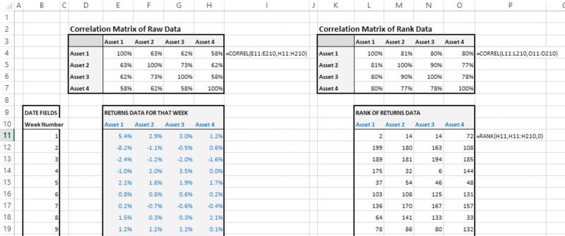
Figure 8.23 Calculation of Pearson and of Rank Correlation
Note that, for a fixed number of data points, as the data values themselves are altered, one could create infinitely many possible values for the Pearson correlation coefficient. However, for the rank correlation coefficient, as the basis for calculation is simply some combination of all the integers from one up to the number of data points, there would only be a finite number of possible values. In other words, if the value of a data point is modified anywhere in the range defined by the values of the two closest points (i.e. those that are immediately below it and above it), the rank of that point within its own data set is unaltered, and the rank correlation statistic is unchanged. This property partly explains the importance of rank correlation in simulation methods, because for any desired correlation coefficient it allows flexibility in how the points are chosen.
8.8.4 Scatter Plots (X–Y Charts)
In a traditional Excel model, a chart that shows (as the x-axis) the values of a model input and (on the y-axis) the values of an output as that input varies would form a line: as an input is varied individually (with all other items fixed), any other quantity in the model (such as an output) would vary in accordance with the logical structure of the model. For example, if there is a change in the production volume, then revenues may increase in proportion to that change, whereas fixed cost may be unaffected. Such a line would be horizontal if the input had no effect on the output (volume not affecting fixed cost) but would very often be a straight or perhaps curved line in many typical cases.
In a simulation model, the corresponding input–output graphs will generally be an X–Y scatter plot, rather than a line: for any particular fixed value of an input (i.e. if one were to fix the value of a particular random process or risk at one particular value), there would be a range of possible values for the model's output, driven by the variability of the other risk items. These charts can provide additional insight into the structure of a model or a situation in general.
The slope of a (traditional, least-squares) regression line that is derived from the data in a scatter plot is closely related to the correlation coefficient between the X and Y values, and the standard deviations of each:
Of course, the slope of a line also describes the amount by which the y-value would move if the x-value changed by one unit. Therefore, the above equation shows that if the x-value is changed by σx then the y-value would change by an amount equal to ρxyσy.
The file Ch8.ScatterPlot.xlsx contains an example with a data set of X–Y points, and the calculations of slope directly using the Excel SLOPE function and indirectly through the calculation of the correlation coefficients and standard deviations. A screenshot is shown in Figure 8.24.
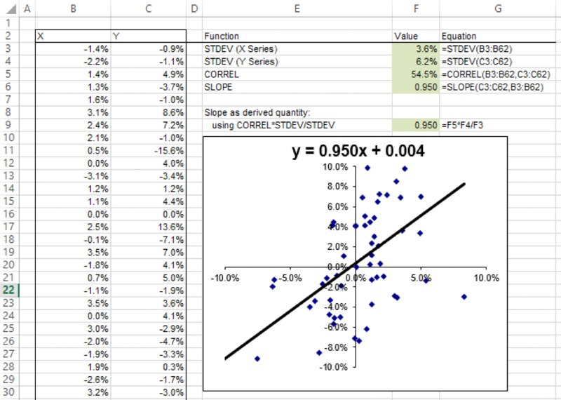
Figure 8.24 A Scatter Plot and its Associated Regression Line
8.8.5 Classical and Bespoke Tornado Diagrams
In relation to the above equation regarding the slope of an X–Y scatter plot, we noted that if the x-value was changed by σx then the y-value would change by ρxyσy. Thus, if the Y-variable is the output of a model, and has standard deviation σy, the multiplication of this by the coefficient of correlation with any individual input would provide the change in the Y-variable that would occur on average if the particular input was changed by its own standard deviation (σx).
In this sense, for each input variable, the correlation coefficient ρxy provides a (non-dimensional) measure of the extent to which the Y-variable would change as the X-variable was changed, bearing in mind that the range of change considered for each input is its own standard deviation, and thus different for each variable, with the dimensional (or equivalent absolute) values formed by taking the standard deviations (or extent of variability) into account.
Note that the presentation (in bar chart form) of either the correlation coefficients or of the scaled values is often called a “tornado diagram”. This can be produced in both Excel/VBA and @RISK. However, as discussed in Chapter 7, in practice one may need to use bespoke tornado displays that show the effect of decisions, rather than the effect of risks within a specific assumed context.