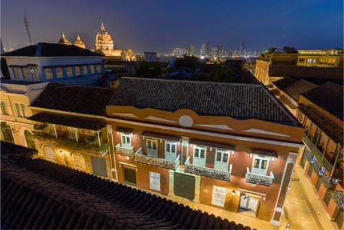
The theme of this book is dealing with natural and found lighting, rather than the constructed lighting of studios, but there are still occasions for adding to or subtracting from that light. Some photographers prefer to stay entirely with what light is available, and make shooting decisions like viewpoint and composition accordingly. Others, particularly on planned commercial shoots, want to tweak the lighting to help their idea of what the image should be. The smaller the scene, the more possible it is to modify the light at the point of shooting, and the first part of this section looks at modifiers, from reflectors to diffusers. I’ll even cover flash, briefly, though I’m not a great fan of on-camera units myself, and it steps over the line into created rather than captured light.
Moving from front-of-camera to simply front-of-lens, filters have a long history of modifying the light that reaches the film or sensor. Many of them certainly compete with digital processing, which can apply color-balance settings and can handle a range of different exposures, but filters also help with the argument that it’s always better to get things right at the point of shooting rather than rely on processing and post-production. Often, it boils down to the time available, which is why landscape photographers, whose time-frames run to minutes or hours rather than seconds, still favor filter types such as grads, polarizers, and neutral-density filters (for slow-motion water effects).
Moving downstream in the workflow, processing is impossible to ignore. It occupies an odd position in modern digital photography. Some photographers think of it as a technical mystery, and by not getting to grips with it, fail to do full justice to their work. Others treat it as more important than shooting, so of course fail in a more complete way because at heart they just want to play on a computer. Getting the balance right is critical, but in any case it is important to invest time and energy in mastering what has become a rich and complex procedure. This is unavoidable. Even if many of your shots need minimal processing because your shooting technique was excellent, there will always be some that depend on using Photoshop (or another application) skills to get them to the state you want. This is not, really not, about software trickery, but simply using the tools developed by good software engineers to control your imagery. I’m not overly keen on phrases like “achieving your vision,” which sound a bit pompous, but if you’re shooting with full attention, you know how you want the image to look at the end of it, and intelligent processing is the solution to that. There is plenty of room for interpretation—unlike, say, Kodachrome, there is not a standard way of doing it—and this alone should convince anyone that it is worth integrating personal processing with shooting. Yes it can be highly technical, but that’s no reason to shy away from it. You may be convinced of this already, but I’m still surprised at how many photographers I meet who don’t use processing effectively.
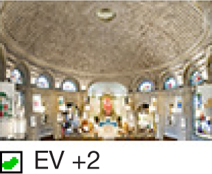
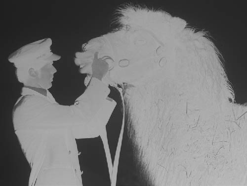
FILLED LIGHT Tai Chi in a Tea Garden
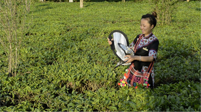
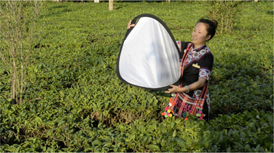
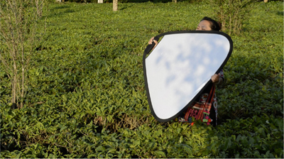
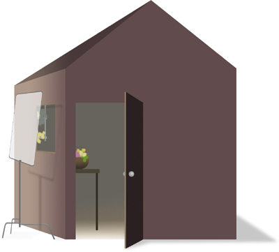
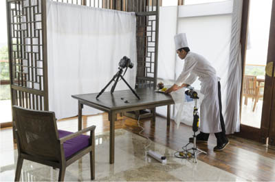
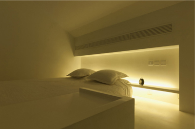
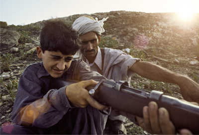
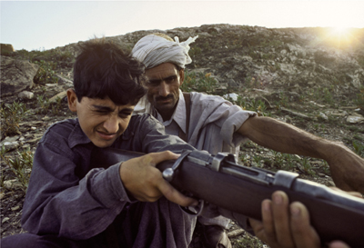
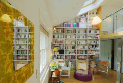
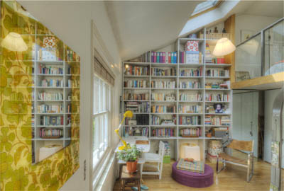
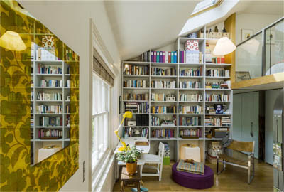
Reflectors, despite clever new designs, are completely low-tech, which in photography means one less thing to worry about in case it goes wrong. So, a good thing. This is passive equipment that comes into play only because of the natural light that is already there. Their most basic use is to fill in the shadows on the side opposite the sunlight, but there are subtle differences even in this, from a simple balancing act between light and dark, all the way to a distinct “second light” effect. In this example, a commercial shoot in China, the intention was more toward a second light to add a sparkling glow to the two actors.
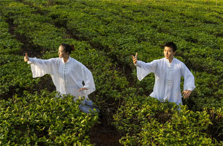
Tai Chi, Jingmaishan, Yunnan, 2012
Opinion is divided on using reflectors, and the lines tend to be drawn between those who see photography as essentially documentary—telling it as it is—and those who want to show it as they want it to look. This could be a cue for getting altogether too philosophical and navel-gazing, and I’ll resist that, but ultimately it boils down to purpose. If you have to deliver an attractive picture of a subject that’s already been decided—a definition of a commercial assignment, surely—then there are certain things you are honor-bound to do. Lighting being so important to the outcome of most photographs, helping it out where necessary is fundamental, and filled light is a basic tool for this. In fact, this has a lot to do with the way I organized this book, dividing it into sections on waiting (with some expectation that things will work out as you hoped), chasing (basically, coping pro-actively), and helping (doing whatever you’re comfortable with to make it all look good). I make a reluctant nod to on-camera flash in a few pages’ time, and using flash sparks an even more divided opinion.
This is probably the classic use of strong reflected fill, in which the camera angle is conventional, with the sun to one side and slightly back, and the reflector managed separately by an assistant from approximately opposite the sun. This was early in the morning with a clear sky, so I could expect a strong fill because the sun was low and available for a powerful bounce-back. Exact positioning of the reflector was important; it needed to be from an angle that took in both of the actors without casting a shadow from the nearer one onto the second. ![]()
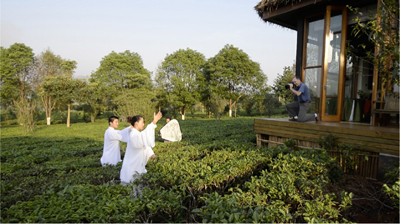
The setup
Shooting within an hour of sunrise on a clear day meant that the fill from a medium-sized handheld reflector was powerful.
A RANGE OF SURFACES
Using stripes allows variations in reflectivity, and adding gold adds a measure of warmth to counter the blue tone that a clear sky brings to shade.
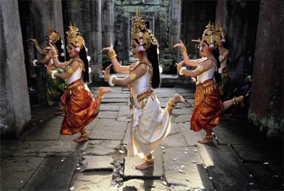
FILLED LIGHT In the Hall of Dancers
Key Points
Catch the Light
Direct the Light
Assistant
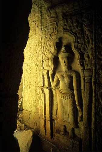
This was a situation, well planned, where the sunlight was directly in front of the camera, even though masked off by the building, so in one way it was a little similar to the situation on pages 140–141, Spot Backlight—Light Against Dark, but also the dancers were edge-lit as on pages 130–131, Edge Light—Elusive & Special. However, unlike an off-the-cuff edge-light shot, exposing down so as to hold the lit edges of the figures was not an option. This was an organized shoot in which the troupe of dancers had been hired, and it was important to show all the details of costume and faces. A reflector from the camera position was essential.
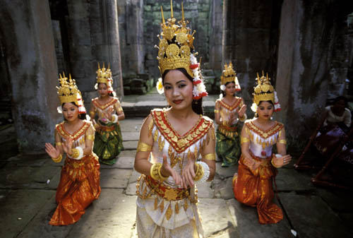
Khmer dancers, Preah Khan, Angkor, 2002
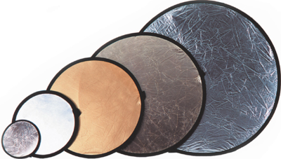
Range of Reflectors
Different sizes and surfaces with different reflectivity and color
Managing the reflector fill needs attention, and always needs an assistant, even a co-opted companion. There are two absolutely key steps, very simple, but essential. First, you need to catch the light, which means looking at the reflector itself, standing in maximum sunlight (avoiding shadows cast by branches or buildings), and angling the reflector so that it holds the full sunlight. Next (and these two do need to happen in sequence), you direct the sunlight already caught toward the subject, which means shifting attention from the reflector to the subject. Simple and obvious though this is, it goes wrong surprisingly often, sometimes because the light shifts, or the subject moves, or the assistant holding the reflector needs to move back so as to widen the spread of light from the reflector. For such a simple piece of passive equipment, there is a certain skill and attention needed when using it. ![]()
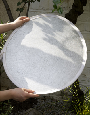
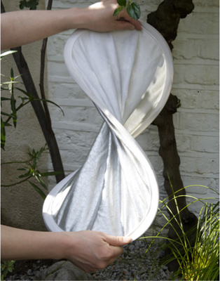
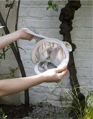
Unfolding the reflector
The circumference held with a band of flexible steel, circular reflectors are designed to fold in a figure-of-eight way for compact storage.
Khmer dancers, Preah Khan, Angkor, 2002
Key Points
Alters Appearance
Personal Choice
Rear-curtain Sync
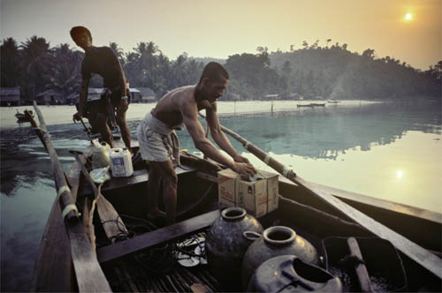
I’m breaking one of my own habits here, but only by as much as I like to break it when shooting. The habit is to avoid on-camera flash. This may seem perverse, and probably is, because as you can easily tell from the many references throughout this book, I’m completely comfortable with planned lighting, and use it wherever necessary. When the occasion demands—and it’s nearly always for a commercial shoot—working with a 9000K Maxi Brute or more demanding still, 5000-joule flash units, can even be fun. But that’s another book, one about constructing lighting rather than, as here, capturing it.
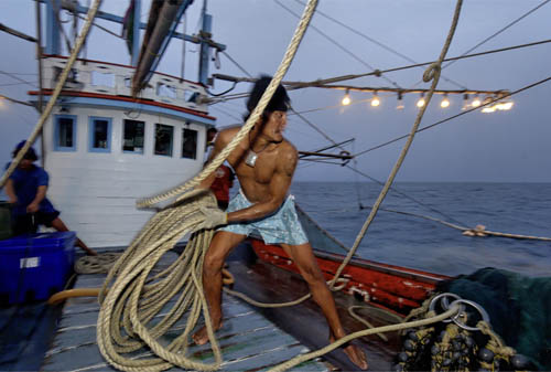
Squid fisherman, Gulf of Thailand, 2007
My reason for not using flash is that it interferes with showing what things actually look like. This is an entirely personal view, and not one I’m necessarily recommending, although I’m in the company of a number of like-minded photographers. Basically, it’s about the purpose of the job, which on the editorial shoots that I normally do, means documentary. The rapid rise of sensor sensitivity, combined with the superior Raw processing now available (and detailed a little later in this section), weakens the case for flash further. And it was Cartier-Bresson, after all, who wrote, “And no photographs taken with the aid of flash light, either, if only out of respect for the actual light—even when there isn’t any of it.”
Even so, it really would be perverse of me to ignore using flash on location to perform the same kind of fill as the reflectors we’ve been looking at. Try hard though I do not to use on-camera flash, there are situations when the only alternative answer would be to walk away from the shot entirely. If you shoot only for yourself, you can do that, but assignments are a different matter. These two pictures were both in that assignment category where I needed to shoot in a level of darkness with fast movement, and flash was unavoidable. Flash offers fill lighting with a difference—it lasts a very small fraction of a second. On a good, modern portable unit, speeds can be in the order of a ten-thousandth to twenty-thousandth of a second. Both of these situations had fast movement in near-darkness, one before dawn on a sugar plantation in Sudan (above), the other on squid boat at night in the Gulf of Thailand (opposite). Both needed to rely on ambient light to show the setting, so the flash fill was triggered as rear-curtain (or second-curtain). This method means that the flash fires at the very end of the exposure, putting the stamp of a sharp closure to a partially streaked image. The technical settings vary from equipment to equipment, but all are relatively straightforward. Incidentally, on the squid boat, shortly before shooting, I received a text message from a photographer friend, Chien Chi Chang: “Remember, HCB says no flash!” His idea of a joke. ![]()
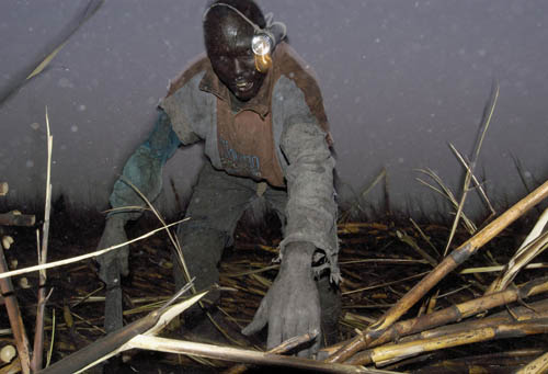
Katakau, Kenana sugar plantation, Sudan, 2004
REROUTED LIGHT Deep into an Angkor Temple
Key Points
Raking Light
Proxy Sunlight
Reflector as Source
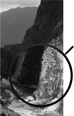
Reflectors can be used in a fundamentally different way to the usual fill. When necessary, and given a direct route from the light source to the subject, reflectors can provide the actual lighting. This usually means a bigger throw, because situations where there is almost no light tend to be very deep recesses, sheltered a long way from direct daylight. This was exactly the case here, in one of the more complex temples at Angkor in Cambodia. Preah Khan, built in the twelfth century, was one of the largest temples as well as a Buddhist university, and has many convoluted enclosures with narrow galleries. A very long exposure with the camera’s noise reduction switched on would have coped with the very low light levels, but deep in shadow also meant lacking in any kind of contrast. The solution was to wait until the sun was in the right part of the sky (mid-afternoon), and reroute its light from outside the gallery to deep within, as the illustration shows. There was nothing more complicated to it than this, and the effect was perfect. Bas-reliefs—which is the form that most of Angkor’s decoration takes—project themselves strongly and best in raking light, as we already saw on pages 42–43 in Raking Light—Perfect for Bas-reliefs, and this put a proxy sun in the right position.
The method follows the same principle as for normal fill in sunlight. First, you position the reflector in full sunlight to catch the maximum, and the effect is strongest when you face the sun. Then you direct the caught light from the reflector into position. When I mentioned that we waited for the right time of day, the strongest fill is when the sunlight is being directed at close to 180º, almost straight back. One variation on this is to use two reflectors to turn another angle, but the amount of light is heavily reduced. ![]()
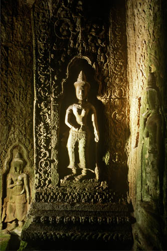
Devata, gallery of Preah Khan, Angkor, Cambodia, 1991
Devata, gallery of Preah Khan, Angkor, Cambodia, 1991
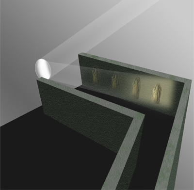
Reflected light as source
The construction of stone temples like these at Angkor creates galleries and chambers completely cut off from direct light, and for this a reflector can make a spectacular difference.
ENVELOPING LIGHT A Sense of Scale
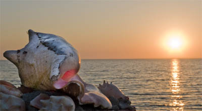
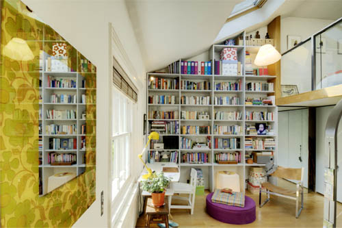
The idea here was to produce an image of this heavily worn shell interior (above) that would look large in scale when printed large. Of course, printing large (to a yard/meter or more) is part of the effect, and not possible to show here, but the other two keys are the depth of field and the lighting. In other words, I’m trying to confuse the sense of scale, and there are lessons to be learned from a sub-genre of photography in which scale models are created and shot to look exactly like the real, full-size thing. I’m not attempting that here, as it is, after all, recognizably part of a shell.
Full depth of field is not what we expect from a close-up picture, and so it becomes a very convincing technique when applied as here. Optical physics make full front-to-back depth of field impossible in macro photography, but focus stacking solves this problem. Several-to-many images are shot at different focus points, and then specialized software blends them together, choosing the sharpest areas from each. That was done here, and is a fairly automatic process. The lighting, however, needed more thought. With miniature sets, photographic lighting often gives the game away for two reasons: one is the fall-off because of the inverse square law that we saw in Window Light—Classic Fall-off on pages 86–87, the other is the softening of shadow edges with distance. The combined result is that hard lighting lacks the naturalness of true sunlight. One solution is to shoot in natural daylight, which is what the American photographer Michael Paul Smith does for his scale model recreations of 1950s small-town street scenes.
The alternative lighting solution is to remove all shadows. The way to do this, as here, is to create enveloping light with first, a broad source, and next, invasive fill reflections. The reflections need careful management to keep them anonymous, and in this case (opposite) involved several dental mirrors, each lighting a particular part of the shell. The light source was simply a window, and cloudy daylight. ![]()
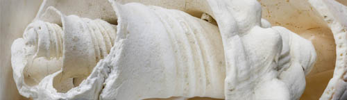
Eroded gastropod shell, 2011
Actual size
Only the spiral central structure of this relatively large sea gastropod remains.
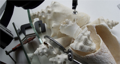
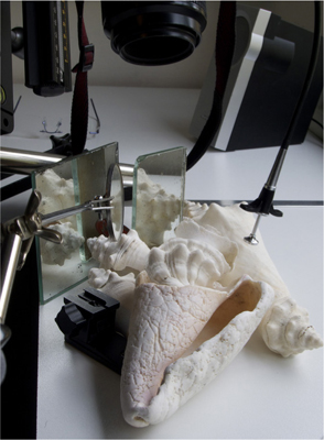
With daylight as the base source, the lighting was constructed with small mirrors to remove shadows and shadow edges.
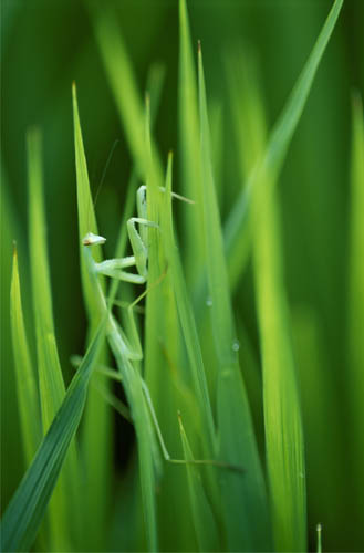
Praying mantis, Ise Grand Shrine sacred rice field, Japan, 1996
ENHANCED LIGHT Boosting Highlights
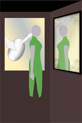
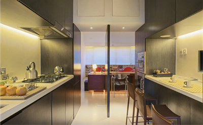
Reflectors, as we’ve just seen, have more uses than many people realize, and straight shadow fill is just the start. In fact, as here, reflectors can be used opposite of their normal effect. Instead of filling shadows to lower the overall dynamic range of a scene, they can raise the dynamic range by adding to the highlights. Positioning the reflector is a little trickier, because I’m trying to put the light in on the same side as the sunlight, but is still useful. This was a situation in which the lighting inside the room was already quite soft, but because I’d chosen to do a mirror-reversed portrait, I wanted to increase the modeling on the face. The mirrored reflection was automatically taking down the contrast and softening the image slightly, which was part of the intention, but I certainly didn’t want a flattened effect on the face. The light from the window behind came from sunlight reflected on the courtyard’s walls, and so was quite broad and pleasant. What the face lacked was definition on the profile side—camera left, and that was where the reflector came in. I had a helper stand in the courtyard in full sunlight and aim the light to the edge of the face. Looking at it in reverse in the mirror this became an edge light, so I positioned the camera (this was a tripod shot) so that this edge-lit half-profile was set against the pale shadow on the wooden wall beyond. This heightened the local contrast and made it better defined.
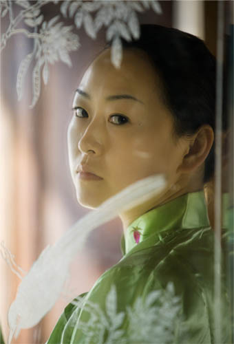
Young woman in qipao, Heshun, Yunnan, China, 2009
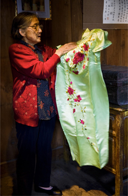
A family heirloom
Almost a century old, this green silk qipao belonged to the owner’s mother.
A word about the setup. This was an impromptu portrait on a more general assignment—on the ancient trade route called the Tea Horse Road, in southwest China. Impromptu because the owner of the house we were shooting, whose family had been traders on the Road, showed me an old, exquisite silk qipao (also known as a cheongsam). That prompted the portrait session. The reason for shooting into the wall mirror, incidentally, was to take advantage of the lovely glass engraving, which when kept a little soft in focus would both add depth to the shot and provide some framing interest. ![]()
The setup
Rather than filling shadows, the reflector was used to add to and exaggerate existing highlights on the side of the face.
Engraved mirror
The engraving on an old wall mirror suggested a layered setting for the portrait.
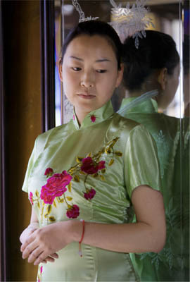
Silk qipao
The qipao as worn.
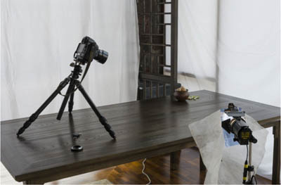
SOFTENED LIGHT Making a Window a Light Source
Key Points
Window as Source
Diffusion Panel
Sidelit Modeling
I mentioned earlier, in Window Light—Directional with Soft Shadows on pages 84–85, that as long as there is no direct sunlight coming through, a window effectively becomes the light source, rather than the sky beyond being the source. Even so, it can still be improved on, by the simple method of adding a diffuser and turning the window into an oversized softbox. This is particularly useful if you want to show the window in-frame and to guarantee that it appears as a blank, white rectangle. One advantage of doing this is that it removes any distractions that might be seen through the window, such as buildings, trees, or changes in color or tone in the sky. More than this, however, it blocks any direct sunlight. This is important because, while direct rays from the sun can be very attractive, as we saw on pages 88–89 in Window Light—Streaming Sunlight, and also on pages 148–149 in Patterned Light—Windows & Blinds, they do not lend themselves to the kind of planned shot that can take an hour or two to set up. Sunlight falling through a window moves visibly in several minutes. Worse still, you might set up facing a skylight only to find that the arrangement takes longer than you thought and the sun starts to stream through.
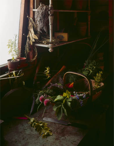
Herbs, garden shed, London, 1974
That was the case here, where the brief called for a delicately lit still life of herbs and other plants. There were two ways of doing this, one of them involving gathering the plants and bringing them to a studio; the other, shooting on location. Once some scouting had found this old allotment garden shed, full of the weathered and natural detail that is almost impossible to reproduce authentically as a studio set, that tipped the balance to shooting on location. The lighting plan was decided as a Vermeer-ish single window from the side, with the north European muted colors and rich shadows that the Dutch painters captured so well (see pages 84–85). Shooting at a slight angle into the window, and including part of it in-frame, just as in Vermeer’s The Milkmaid, increased atmosphere and mood, so no other light was wanted. A barely noticeable, and sufficient, fill came from the shed’s open door. All of this made it important for the window to function perfectly as a large light bank, hence the use of a lighting silk slightly larger than the window and fixed in place outside. ![]()
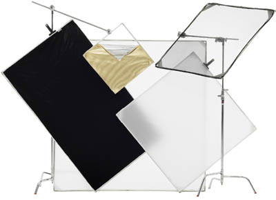
Range of location lighting panels
For location shooting, rigid-framed panels on adjustable stands are standard.
The setup
A silk slightly larger than the window was fixed just outside, while the open door allowed minimal front fill.
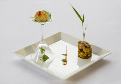
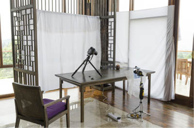
BROADENED LIGHT Wide Diffusion from a Large Window
A variation on the use of a silk to turn a window into a light bank, shown on the previous pages, is to stretch the diffuser inside so that it becomes a large and even light source. One very good reason why you might want to do this is to give solid backlighting. This kind of effect is standard practice in studio still-life shooting for the kind of image you see here—an even flood of light from behind the subject. This in turn is what you need for two kinds of arrangement, both shown here, and both useful in different ways for shooting food. One is a horizontally aimed shot that effectively puts the subject against a clean, white backdrop (opposite). If there is no other light, the result is a silhouette, but for normal still-life shooting it’s usual to either add a light or a strong reflector from front or side. The other is a more normally framed food shot, looking slightly down (the eater’s viewpoint) so that the backlight is just out of frame but bathes the top of the subject (right). There are many styles and fashions of food photography, but clean and broad lighting from this angle, so that it heightens any glistening textures, is a perennial. Doubly necessary in this case, because of the glossy ceramic surface, which is going to reflect something whether I like it or not, so it might as well be a large and smooth light. This will convey the sense of the plate’s high glaze without showing distracting objects.

Chinese desserts, 2012
The location, however, was remote and we needed to improvise a food still-life studio. You might think that the lights themselves with their stands are the bulkiest part of a studio kit, but the real difficulty for location work is carrying a large enough pristine background (unscratched, smooth, unmarked). Often this is impractical, as it was here in the far southwest of China. Absolute evenness of illumination is the ideal in this kind of set-up, and when the entire backlight—or its reflection—is in shot this becomes critical. In the studio, where the light sources are always close—much closer than the sun, that is—the thickness of the diffuser is important. The thicker it is, the more evenly it spreads the light, and we saw this in the illustration on pages 68–69 of translucent sheets. Using daylight instead solves this particular problem, because even if there is direct sunlight falling on the diffusing sheet, the distance of the sun ensures that there is no side-to-side fall-off. However, the material itself can create shadows, and if I’m improvising with a bedsheet or tablecloth, as here, smoothing out the natural folds takes time. One partial solution is to be careful with the aperture setting. It needs to be small enough to have the whole subject in sharp focus, but no more than that, so that the background will be out of focus, as this will smooth out folds, shadows, and marks. ![]()
Scallops, 2012
Improvised diffusers
Two large bedsheets were hung inside the large glass window on both sides of the corner of the dining room to create an enveloping, soft, and shadowless light.
FILTERING LIGHT Grads, Stoppers, Band-stops, & More
Key Points
Analog Solutions
Low Shutter Speed
Video Work
Much of what filters did for film can be replicated in processing and post-production, so why bother with the extra equipment and the extra time it takes in shooting? The reasons are specific to each type of filter, and we can start by dismissing color correction and color balancing filters, which really are unnecessary if you shoot Raw. Those are settings that can be applied and tweaked as you process. The others here, however, do have uses. Some, like a circular polarizer, do something selective to the light entering the camera that no amount of post-production can recover. Others, notably grads, have digital alternatives, but are liked by the school of get-it-right-when-you-shoot.
Birds’ Nest collectors, Ko Phi Phi, Thailand, 1983
First, grads, which are slidable, rotating filters that we already saw in action in Top Light—Deep Forest on pages 82–83 and Window Light—Classic Fall-off on pages 86–87. Half is clear, half is darker by a certain amount, and the transition line is blurred to some degree. The main use of these is to darken the sky by aligning the transition line with the horizon, and grads that darken by 1 or 2 ƒ-stops are the most popular. The exact blurring of the transition is important for a natural result, and there are two ways of controlling this. One is to buy either a sharp-cut grad or a soft-cut (hard-edge, soft-edge)—whichever is appropriate. The second is to alter the combination of aperture and focal length—the sharpest transition is with a wide-angle lens stopped right down, while opening the aperture and/or zooming in for a longer focal length will spread the transition out. In the main shot here, a 2-stop grad was placed to darken just the sky—and the reddish color around the sun, by the way, is not because the filter was tinted, but because at this lower exposure the early morning sky was warm.
ND STOPPERS
While ISO sensitivity in new sensors races in one direction, there are also reasons for wanting to reduce the amount of light passing through the lens. One is so that you can use the maximum aperture of a fast lens for highly selective focus (this can be difficult in bright daylight). Another is the kind of water shot that turns waves and flowing water into a mist because of very long exposures, and a third is video-plus-selective focus, where you want to keep the shutter speed down to 1/30 second. For all of these, neutral-density filters have their use in varying strengths (misty sea shots in daylight call for something like a 10-stop filter).
POLARIZERS
Polarizing filters suppress reflections from non-metallic surfaces (includes water and glass, and therefore reflections from minute water droplets in the atmosphere). One obvious effect is to darken blue skies—this effect is strongest at 90º to the sun—but more generally useful is the increased saturation from surfaces, including rock, which would normally appear lighter. Circular polarizers generally allow more accurate metering than linear polarizers (both are round; the term circular applies to the polarization, not the shape of the filter). For suppressing reflections from flat or flattish surfaces like water or glass, the effect is strongest at about 35º to the surface. With blue skies, because the effect varies with the angle to the sun, using a polarizer on a wide-angle lens (wider than about 28mm) gives unnatural-looking deeper shading to just part of the sky.
These are optically clear filters that cut infrared, generally above 700nm, with a sharp-cut effect. The technology involves reflecting infrared wavelengths back to source while passing the visible spectrum, and has become more important than it was because inherently, digital sensors are sensitive to infrared. The sensor’s high-pass filter is intended to take care of this, but for an absolute solution to infrared pollution (as it’s now called), hot-mirror filters are the answer.
These are one of the rarer members of the filter collection, and use Didymium glass, which was developed for safety glasses used in glassblowing and forges, to selectively enhance reds. Dydymium does this because it acts as an optical band-stop filter, by blocking a narrow band around orange. This in turn makes reds appear more vibrant because orange and yellow-orange components in red tend to give it a muddy appearance. These are expensive filters, but popular in particular for shooting fall colors. ![]()
Circular polarizer
The more subtle effect of a polarizer in landscape shooting is to increase saturation and therefore contrast, which translates into black and white also.
Oversized grad
DSLR video adds another reason for using a grad to reduce the dynamic range, as applying a grad effect digitally to a moving mage is much more time-consuming than for a still. New fittings are available for ultra-wide lenses, such as this 14–24mm.
BROKEN-SPECTRUM LIGHT Making the Best of CFLs
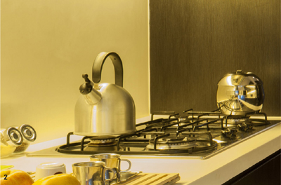
The wholly admirable drive toward energy efficiency has created a minor visual disaster for photography. The warm and lovable tungsten lamps that continued the ancient tradition of lighting by burning are being ousted by CFLs (Compact Fluorescent Lamps), and the light in home interiors has plummeted in quality. In this sense, by quality, I mean light that looks pleasant and as it should be, which is surely not an unreasonable thing to ask. CFLs, however, produce a light that can be described only as white(ish), with something hard to pin down but wrong about the way they render human skin to the eye (unless you like that zombie/living dead appearance). And this is just the appearance to the human eye, which is very tolerant and adaptable. Photography much less so, whether on film or via a sensor.
The bottom line is that CFLs completely fail to emit some colors of light, so little wonder that processing images shot under their light is so unsatisfactory. The reason is that while both daylight and tungsten emit a smooth and continuous range of wavelengths (that is, colors), CFLs emit spikes of narrow wavelengths. Phosphor coats the inside of the glass tube, and it glows when backlit by ultraviolet light from mercury vapor. As a continuous range is impossible, CFLs have a combination of phosphors, each glowing a different color, the idea being that when the eye adds them together, it approximates white. Needless to say, this approximation varies between brands, but it seems that only photographers care, so we are not catered to.
Zhong Song apartment, Beijing, 2007
Spaced 2 ƒ-stops apart, these four frames cover the dynamic range, but also show that the color changes with brightness.
This is definitely a light-capturing problem, which I’ll now tackle, but be warned that there is no completely happy ending. The missing bits of the spectrum are simply absent colors, and there is no way of replacing them. The best result possible is a slightly monochrome effect that you can place according to taste between neutral white and creamy. Even achieving this meager goal takes some effort in processing, and what follows is my workflow when I have to shoot by CFL light. First, though, a reasonable suggestion is to replace the lamps or shoot in daylight. These are possible sometimes, but it’s more likely that a room will have a number of different light fittings, making replacement impractical.
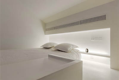
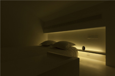
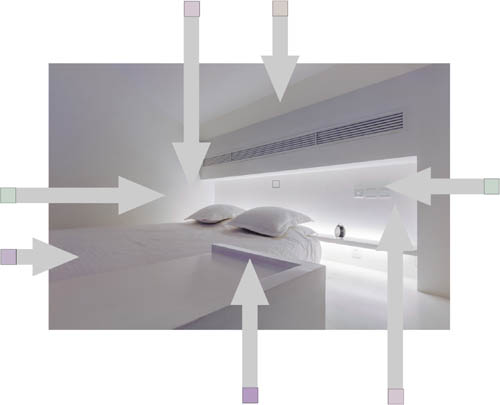
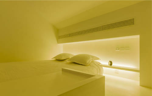
The small mezzanine bedroom here is a case study, a minimalist space that if lit with tungsten would be pleasant, light, and graphic. As with all forms of this kind of concealed lighting, which first became popular in the 1920s with Art Deco, the dynamic range is very high, because the total effect depends on a bright glow from parts of the room. The eye manages this perfectly well, but photographically it calls for a range of exposures and HDR, which we’ll see in a short while, on pages 242–247. This would be the case with tungsten or any kind of lamp, and is not complicated, but as you see from the four original frames, shot at Auto color balance, with CFLs there is an additional problem. Not only is the base color an unpleasant yellow with green tendencies, but also it varies according to brightness. However we handle it, this will translate into an exasperating color banding in the top highlights. ![]()
Zhong Song apartment
The apartment in which the main shot was taken. The bedroom was in fact at the top of the flight of steps in this picture. In combination with the bluish hue from daylight and the orange-yellow from the tungsten ceiling downlighter, the CFL lighting does not dominate and is more acceptable.
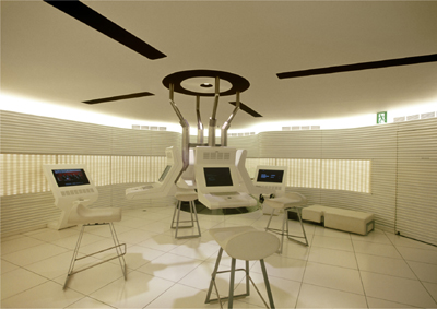
Nissan Showroom control center, Ginza, Tokyo, 2002
Also lit by fluorescents, the hi-tech room in the car manufacturer’s principal showroom had similar light problems, and was filtered for a warm, creamy effect.
A JAGGED SPECTRUM
This is the spectral emission from a typical CFL, and while it’s evident that the manufacturer tries to mimic “white” and the eye’s response by peaking in important colors, there are large and irreplaceable gaps. The pale bell-shaped curve is the response of the human eye.

The first step is to combine the different exposures into a single HDR 32bpc (bits-per-channel) file. I’m jumping ahead, as this technique is dealt with on pages 244–245, and I will not repeat the technical steps here. The point, however, is that with this degree of high dynamic range, there’s no real need to use the tone-mapping techniques that introduce artificiality. If we simply save the Photoshop-merged image as a 32bpc TIFF, we can reopen it in the ACR Raw-processing window and recover all that we need to from highlights and shadows. Again, see pages 244–245 for how this works in detail. You can see the result before I’ve made any attempt at color correction, and it’s fairly unpleasant. Worse still, the color shifts that we saw in the original exposures have been combined, and in the higher register of brightness, there’s a cross-color shift between greenish and pinkish.
Raw processing complete
With the color corrected by eye during Raw processing, the now-16bpc image shows patchy color shifts as arrowed. The ends of each arrow show the shift, slightly enhanced for clarity.
The target color
Using the small square area outlined in the picture on the right, the image is color-adjusted to this warmer target color.
Intermediate step
The 32bpc file generated from the four originals has been re-opened in Photoshop ACR and at this stage simply optimized: Highlights and Whites fully down, Shadows fully up, Contrast higher and Blacks down to the point just above clipping. The color remains untouched.
As I mentioned, we would have to do this anyway for any light source in a situation like this, just so that the highlights can be smoothed, to avoid clipping. At the same time, however, we can use the Raw processor to alter the color, and what I’ve done here is to judge it by eye and make the overall appearance very slightly warmer than neutral, taking it very far from the greenish-yellow. The result, nevertheless, is far from good, with patchy discoloration—and this discoloration has shifted because of the color adjustment just made to the overall image. In the higher register of brightness, there are now green notes adjacent to pale magenta notes.
At this stage, the only way to deal with the discoloration is selective color shifts of some kind. The method I used here was to choose an acceptable target color with reduced blue—a creamy hue—and then use a soft brush set to Color and a 60% opacity to work over the offending areas. What’s wrong with this technique, of course, is that it goes partway toward making a monochrome image. But it can’t be helped. As I said, no perfectly happy ending. ![]()
Zhong Song apartment, Beijing, 2007
The kitchen of the same apartment. Here the problem is balancing the CFL-lit kitchen with the more attractive combination of daylight and tungsten in the living room beyond. This called for selective area adjustment, but the fact that there is a variety of cultured lighting compensates a bit.

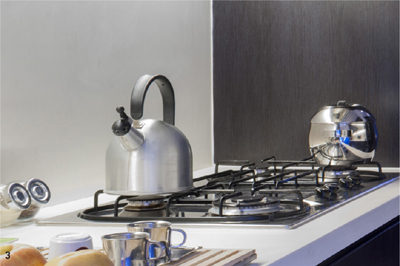
Detail processing sequence
This part of the scene is lit by CFLs. (1) as opened in the Raw processor; (2) Exposure, Highlights, Shadows, and Whites adjusted; (3) color adjusted by setting the handle of the kettle at neutral; (4) lowering the color temperature and increasing Vibrance.
FLARE UP Distressing an Image
Key Points
Added Artifacts
Imperfect Reality
B&W Conversion
As we saw in Flared Light on pages 170–171, this optical fault—well, imperfection, anyway—can be useful for atmosphere and for getting across a more intense feeling of brightness. Depending on personal taste, it can enhance rather than detract from an image. And with so much possible in processing, it’s also natural to consider increasing or controlling flare at the final stage. Here are two examples, one using purely processing tools to make the flare more prominent, and the other going much further.
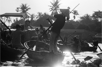
Floating market near Can Tho, Vietnam, 2011
Default process
Optimized process
Black & white points closed up

Contrast curve applied to shadows & darks
In the shot of the Vietnamese boat woman in the Delta (opposite), the glint of early morning sun off of the water is a key part of the shot, but there are two problems. One, the flare, attractive around the water ripples, has leaked across most of the image, weakening the contrast. Second, this flare has also contributed to an unpleasant greenish yellow in the light mid-tones. The processing sequence shows the solution, which is first to optimize in the Raw processing, recovering highlights while increasing contrast, then to convert to black and white, raising the lightness of reds and yellows, which are concentrated around the water. Next, use levels to close in the black and white points, and finally, apply a contrast curve to the darker 50% of tones. In Photoshop, there is a button under Channels that automatically selects the lighter 50% of pixels. This selection is concentrated by increasing the contrast to a Quick Mask of this, and then inverting the selection. The result is to darken and enrich the shadow areas, while leaving the flare alone.
The next procedure is contentious. There are post-production techniques for introducing flare, and though I won’t even try to justify this to a purist, it really is worth considering why this software exists in the first place. All the effort that goes into making superior optics, with coatings that protect the clarity of the image from flare, and some people actually add it back in! Well, where it routinely gets added back in, though you might not always be aware of it, is in the movies, and the motive is simple—to add reality. Most movies are fiction, and increasingly use CGI (computer generated imagery) to achieve effects that would be impossibly expensive, or just impossible, in front of the camera. Now there happens to be a repertoire of camerawork techniques—movie and still—that help to give the impression of being in the real world, with all its little imperfections. These include cinema vérité, handheld cinematography mimicking amateur practice (The Blair Witch Project, Cloverfield), framing that cuts into foreground subjects, and lens flare.
Real lens flare doesn’t always behave in the way you might like it to, and the alternative is to generate it as CGI, overlaying it on a video sequence or still image. The software used here is professional level and very convincing, called Knoll Light Factory from Red Giant software. This is deep stuff, with a huge number of flare elements that can be combined and adjusted infinitely, created by people who have a very good understanding of lenses (as you would expect in Hollywood). In fact, it’s the invention of John Knoll, visual effects supervisor at Industrial Light and Magic and co-creator with his brother Thomas of Photoshop. I once did a story for Smithsonian on ILM, at the start of digital effects, and remember Knoll explaining to me how a spline algorithm worked. Here in this flare generator there are glowballs, ramps, rings, caustics, and polygon spreads, and just operating the controls is itself a lesson in how light works. ![]()


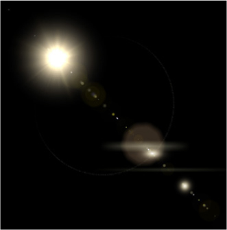
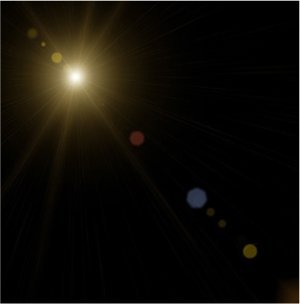

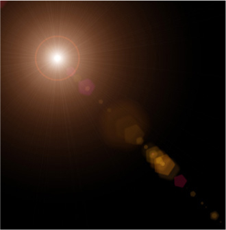
An infinite combination of flare elements from Light Factory
Because flare can contain multiple elements, and each of these varies in intensity, size, and color, the possible combinations are endless.
Pathan boy learning to shoot, Northwest Frontier Province, Pakistan, 1979
Original without digital flare applied
FLARE DOWN Flagging the Source
Having just more or less promoted the case for injecting atmospheric, image-destroying flare into the picture, I’ll now take the more conservative, cautious, and basically professional view for eliminating it. This is the technical, lens manufacturer’s view, which is concerned with well-designed and well-made optics. Indeed, good optics are the first port of call, as decades of research have gone into contemporary lenses, and the arrival of multi-coating in the 1970s made a huge practical difference to lens flare.
Zhanglang village, Xishuangbanna, China, 2009
Nevertheless, even with coated lenses and a lens hood, shooting toward the sun always creates some degree of flare. One of the standard techniques for reducing the diffuse flare that comes from bright surroundings outside the frame is flagging off. A flag is a sheet of something, such as black card or metal, designed to be held or fixed in front of any light forward of the camera. With a set-up shot where there are the facilities and the time to perfect things, and the camera is locked on a tripod, it’s usual to put a flag on a stand so that its shadow just falls across the lens without appearing in shot—one thing less to worry about—but you can improvise with your hand. In fact, it’s much easier to use someone else’s hand: They stand in front and to one side, at a distance of a few feet, and simply watch where the shadow falls—no more than a fraction beyond the lens surface. But for the image I’m showing here, the only solution was an extreme one. The view I wanted, of a Bulang minority village in the border hills between China and Myanmar, was exactly this, and there were no other real choices. I needed the sun to illuminate the roofs, and this was the one effective viewpoint. If I waited any longer, the sun would go off the village. The only answer was to lock the camera off on a tripod and take two rapid shots, one with my hand blocking the sun, the other without. Combining the two as layers digitally was straightforward; it meant simply erasing part of the upper layer. ![]()
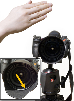
Flagging precision
The key to effective flagging is to shade the lens exactly up to the edge of the front element—always best performed from a position in front looking back at the lens.
A two-step shot
The sun’s position and the viewpoint made this inevitable: a rapid sequence with and without the sun obscured by the photographer’s hand.
FLARE DOWN High-Radius Sharpening
The most effective way of controlling flare is at the time of shooting, by blocking a direct view of the sun, as we saw on pages 56–57 Into the Light—Blocking the Sun and pages 60–61 Reflection Light—Mirror Smooth. Even so, post-production can also definitely help with generalized flare, and there is one easy and very effective procedure in Photoshop, developed in the printing industry by reprographic houses to deal with flare on scanned photographs. Flare, as we saw, is caused by light reflecting from lens surfaces instead of passing through and refracting to make the image. Scanning an image can also do this when there is an optical system involved. The answer is to treat the flare as lowered contrast spreading out from bright light within the frame. High-radius, low-amount sharpening is a way of increasing contrast, and this variation applies it to just the brighter areas caused by flare.
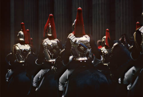
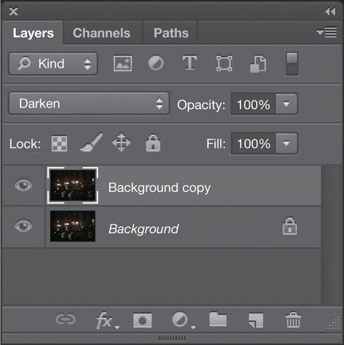
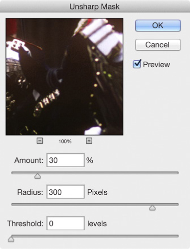
Household Cavalry at the Lord Mayor’s Show, 1977
STEP ONE
Make a duplicate layer and set it to Darken. This means that only the darkening effects of whatever procedure happens next will be visible.
STEP TWO
Apply USM sharpening at a low level (approximately 15–30%), a large Radius (here 300 pixels as already measured above), and without any Threshold protection (not necessary for this procedure).
This use of USM (Unsharp Masking) inverts the normal settings, which are a tiny radius to enhance the contrast from one pixel to its neighbor (typically slightly less to rather more than one pixel) combined with an amount in the region of 100%. A larger radius, of several pixels, creates an unpleasant halo effect around edges, but when the radius is increased greatly, up to a few hundred pixels, the sharpening effect is diffused, and if the amount is kept down to something like 15% to 25%, the result is not at all artificial looking. What makes this technique so good for flare is that it is applied to a duplicate layer set to Darken. Only the brighter flare is affected.
This image has all the makings of flare that is difficult to control. The polished armor of the Horse Guards is reflecting weak sunlight against a dark street background, and the surrounding flare is noticeable, as if through spectacles that need cleaning. The ideal radius depends on the resolution of the image, as it’s measured in pixels, and on how far you want to darken from the bright areas that cause this kind of flare. The amount chosen in this case is shown graphically. The amount is best judged by eye; although in this case I’ve measured the amount needed on the image beforehand—about 300 pixels. ![]()
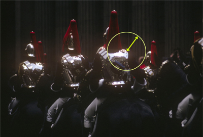
Flare as shot
The original, with flare leaking into the dark areas surrounding the body armor. The circle shows the amount of spread, which in this image has a radius (the arrow) of about 300 pixels.
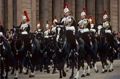
Conventional contrast
Some seconds before, I shot this more conventionally lit version of the cavalry.
PROCESSED LIGHT Making the Most of Raw
Think of digital capture as being something like an iceberg. A good digital camera, working in 12-bit or 14-bit, captures more visual information than a computer or tablet screen, or a printed page, can display. Modern DSLRs have a very good dynamic range, in the order of 13 to 14 ƒ-stops, of which about 10 to 11 stops is clean and usable, but in the end this will be reduced to a displayable 8-bit image. Processing allows the “hidden” parts of this range to be recovered and used, such as by lifting shadow detail. The camera’s own processor can do this to deliver a JPEG or TIFF, or you can do it with much more computing power and a wide range of tools on a computer, using one of a number of what are called Raw-processing engines. Adobe Camera Raw (ACR), the engine used in Photoshop and Lightroom, is probably the best known of these.
This is the reason for shooting in Raw format rather than JPEG or TIFF. It captures more information and you can put this to use when you process. What you see, on the camera back or on a database screen, is simply a JPEG generated on the fly from the Raw file, so is at best just an indication of the tonal detail actually contained in the file. If you invest in a 14-bit monitor, such as an Eizo, you can see a little more into the shadows, but practically, the only way to tell what you can pull out of a 14-bit Raw file is to work the processing sliders, and pay close attention at 100% magnification to noise in the shadows.
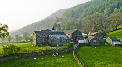
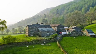
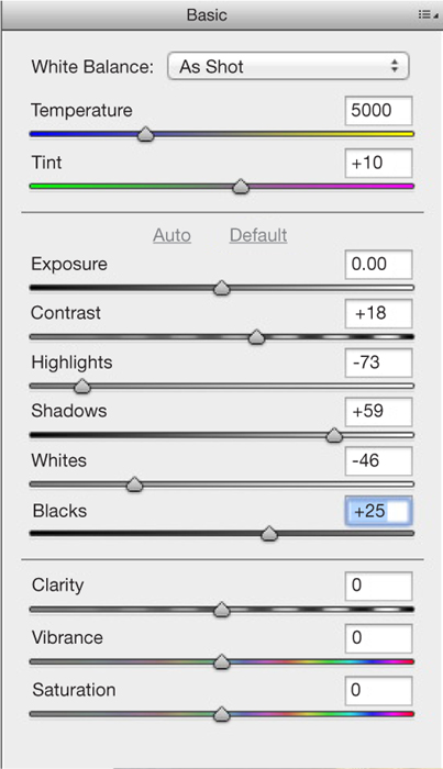
There is enough material for an entire book on best practices in processing Raw files, though I suspect it might end up being rather dull. Here I want simply to introduce the potential and what it means for the play of light and light quality that was originally shot. Raw processing really comes into its own when the dynamic range is high. For the main image here, shot into the sun which was lightly masked by the tree, I exposed down to the point of being able to hold the top highlights, knowing approximately what I could—or could not—recover in the processing. There are many permutations of the six main sliders that control tonal value, each with subtle differences. I relied here mainly on recovering highlights and shadows with their respective sliders, but as they tend to flatten the image, I raised the overall contrast to compensate. The upper limit to highlight recovery was an edge effect around the outer leaves of the tree. Even when the original is within range and has no obvious problems, Raw processors offer many—almost infinite—subtle variations in such personalized qualities as contrast, color balance, vibrance, and clarity. This alone argues very strongly for shooting in Raw, so that with important images you can take your time, well away from the shooting, to make them look their best. ![]()
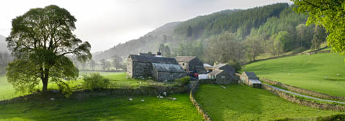
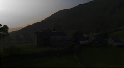
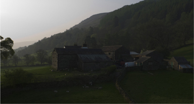
Farm, Dentdale, Cumbria, 2011
The width of the Raw exposure adjustment
The Raw-processing exposure range, from minus 4 stops to plus 4 stops (though the image file itself does not contain that entire range). The second image is the default as exposed.
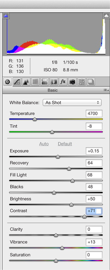
The Raw settings applied
The main work done here is by the Highlights and Shadows sliders to recover their respective tones, with Contrast raised to counter the flattening tendency that both of these have.
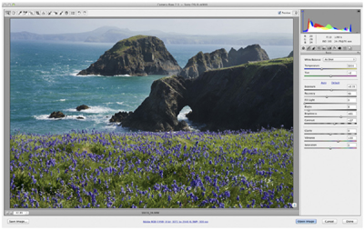
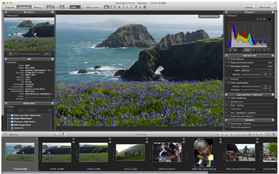
TWO DIFFERENT RAW PROCESSORS
There are several Raw processing packages on the market including Photoshop (above right) and DxO Optics Pro (below right). All can perform the same basic functions, so there is nothing to be judged from results, only from ease-of-use and operating features. Photoshop offers a slightly fuller set of controls, while DxO Optics Pro concentrates on delivering good Auto settings by default.
PROCESSED LIGHT Local Control in Raw
One of the biggest improvements made in Raw processors was to enable local control, which is hands-on and specific—the digital equivalent of the old wet-darkroom techniques of dodging and burning. The advantage of doing this digitally rather than on a projection print is that the clock is not ticking, and local selections can be fine-tuned down to the nth degree. And you can revisit and rework. On the previous pages, the controls used for recovering, brightening and generally bringing into range the hidden potential of a Raw file were all sliders that work in some way globally across the image. Local control is an entirely different operation, both in concept and in action, because it allows you to specify distinct areas for your changes.
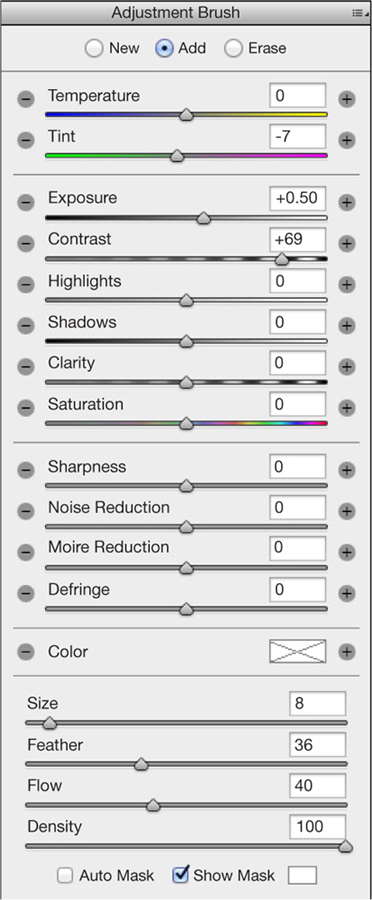
Indeed, it depends very much on your judgment and manual skill to bring it off. If we assume that a Raw file has up to two stops of recoverable shadow and another two stops of recoverable highlight (not all images do, but it’s certainly possible), this means that you could have two adjacent areas on the image with four stops of processed contrast between them. This can easily look extreme, which is where judgment comes in, while the making of the selection involves fine control over the edges, which can be from sharp to very soft. In the example here, I’m using Photoshop’s ACR, and by checking the box that displays the mask used for local selection I can show these edge transitions.
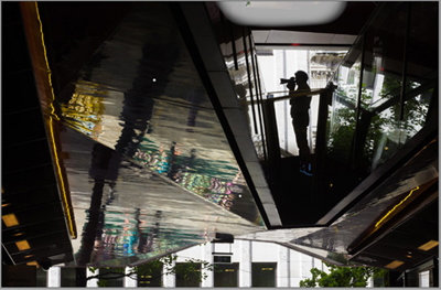
With any picture that you think is worth making an effort for, it helps to have a plan before processing. I had taken this shot because I liked the abstraction of what was actually a shopping mall, so the processing plan was to enhance the abstract design. This in turn meant heightening the contrast, and exaggerating the color pattern (which came from distorted reflections in a polished metal ceiling) and the lines of orange lights. This was a clear case for local control. There were three steps, meaning three masks: one to darken and increase the contrast of the upper left area; a second to darken the distracting gray patch top and slightly right; and a third to lighten and increase the contrast of the colored patterns and lines. This last alone emphasized the colors; there was no need to alter Saturation. ![]()
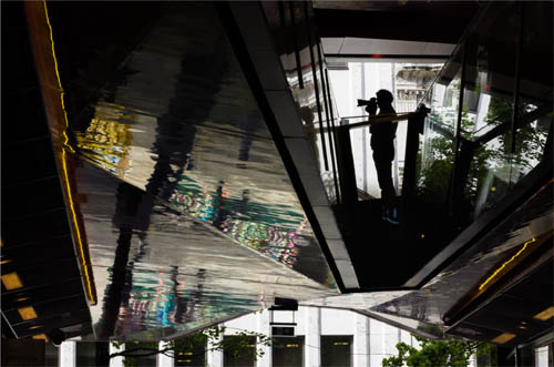
One New Change, London, 2012
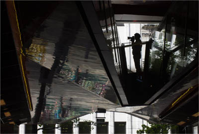
The unprocessed original image
Considerably flatter than the final version, this would have a global increase in contrast applied, in addition to the local controls.
THE PROCESSING PLAN
The goal was to have a clean, abstract, and essentially monochrome design, over which would be laid the strengthened block of distorted colors and the distinct arrangement of orange lines fanning out.
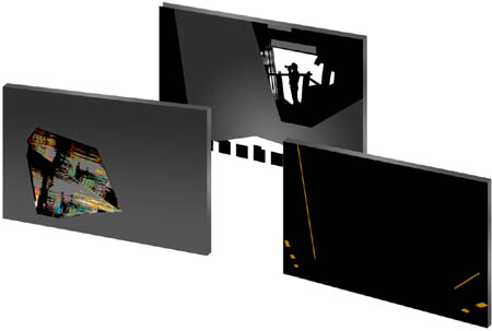
Exposure down and contrast up to knock back the upper left.
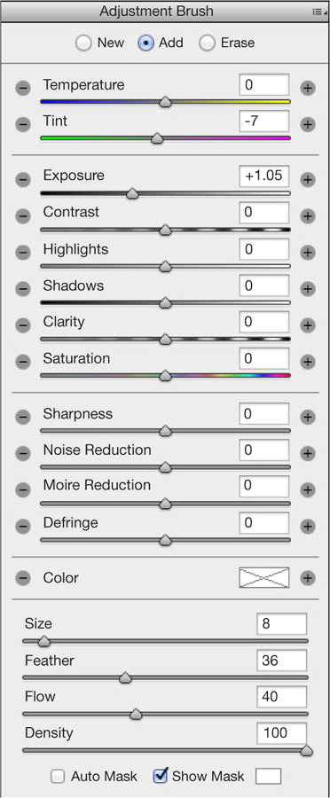
LOCAL MASK #2
Exposure right down to take the small lighter area at top back into the background.

LOCAL MASK #3
Exposure up and contrast strongly up on the colors.
PROCESSED LIGHT Smoothing Banding
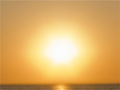
One of the stickiest problems in processing is handling images that have a sun and clear sky in view. The reason is that, because the rest of the landscape has to be taken into account, a typical exposure leaves the sun well overexposed. This in itself is no disaster, as we’ve already seen—there’s nothing wrong with overexposure if you want a bright, glowing effect—but it usually creates visible circular banding. This happens because of the way the photosites in a sensor work. Each one, which produces one pixel, is a light well that catches photons. The more it fills, the brighter the pixel. But when it fills to the top, it simply delivers nothing—total white. It is the abruptness of this filling-up that causes the banding, because the visual difference between pixels that are almost white and those that are totally white is a sharp edge. And because each of the three channels may clip at a different point, there may be two or more concentric bands. Other things contribute, including the color space, color profile, the bit depth, and the specific Raw processor (some handle this issue better than others).
So, what we typically have is a gradient converging on the sun’s disc going from pale to white, and at some point it breaks into an edge—or two or three edges. Worse still, this is surprisingly resistant to the normal Raw recovery processes. Highlight recovery algorithms can actually worsen the banding problem be making banding edges more definite. As we saw in Glowing Light—Things Burning on pages 124–125, Highlight and White recovery is not the answer.
With banding reduced
With the procedures shown on the cropped version applied: first the colors of bands adjusted as much as possible using Replace Color, then 20% noise applied to a soft selection around the sun, then 15-pixel Gaussian blur.
Optimally processed
Here, nothing has been done to banding around the sun, and there has been no highlight recovery, but otherwise exposure has been raised, shadows filled, and local contrast and brightness increased on the shell.
This is a purely digital problem, and we’ve seen it rear its head earlier, both on pages 124–125 and in Golden Hour—Facing into Soft Golden Light on pages 98–99. Film, which loses to digital sensors in so many ways, here delivers smoothness automatically. While just saying that hardly helps matters, understanding the difference between the response of film and sensor to bright graded light makes it a little easier to process this tricky condition. The response of film to increasing light tails off gradually, so it has a natural smoothing action. And what we need is just this, a smooth gradient from the bright highlights to the truly overexposed center.
All solutions involve local selections in the area around the sun, and there are two ways of doing this. One is to make a soft-edged circular selection around the sun (in Photoshop, a large soft brush in Quick Mask or in ACR). The other is to layer two versions of the entire image, normal on top, filtered below, and erase around the sun in the upper layer. Sharpness/blur controls work to an extent, but highlight recovery, exposure, and clarity sliders usually exaggerate the band edge. The ultimate solution is not particularly elegant, but works, and takes advantage of the way in which noise can break up an image. As shown here, apply noise, then Gaussian blur. The amounts need experiment, and depend on the specific image. ![]()
Default
Cropped, this is the file as opened with no adjustments. Noticeable banding in both color and tone.
Selective brightening
A soft-edged selection has been made around the sun, then brightness increased and contrast reduced. This is an independent solution from the more effective noise/blur procedure.
Noise added
A soft-edged selection has been made around the sun, and 20% uniform noise added.
Noise & banding blurred together
Immediately after the noise filter, Gaussian blur is added at a radius of 15 pixels.
PROCESSED LIGHT Pro-level Dodge & Burn
In wet-darkroom photography, the duo of dodging and burning is the height of craftsmanship, and in pre-digital days it was an important skill. Digital processing methods have pushed it into the background, as there are several other ways of exercising local control over tones, but in professional retouching it is still used, and for good reason.
In a wet darkroom, dodging means holding back exposure from an area of the print by holding something in the light path below the enlarger lens: a piece of shaped card, your hand, or one of a number of tools on the ends of rods. The effect is to lighten part of the image by hand, and this of course had to be done in real time—the length of the exposure. Burning is the opposite, using a hole in a larger card to increase the exposure for part of the image so that it darkens.
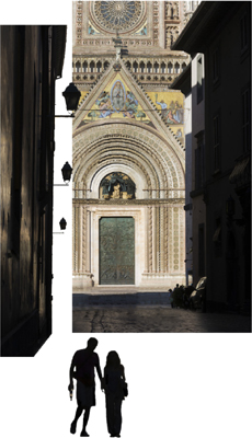
The separate elements
The three key elements of the image are tonally separated: the brightly lit façade of the Duomo, the shadowed street, and the dense silhouette of the couple.
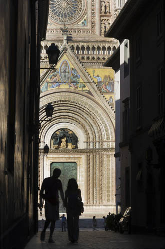
The Duomo, Orvieto, Italy, 2011
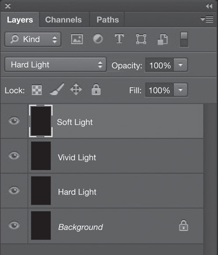
In Photoshop there are Dodge and Burn tools, with much more control than in a darkroom, but still not quite enough for high-level retouching. Instead, we can use layers, and the principle is that different blending modes allow you to paint on the image in such a way that you lighten or darken—and very usefully split this between Highlights, Shadows, and Mid-tones. Retouchers have their own idiosyncrasies when it comes to the type of blending mode and the settings, but here is one that I use:
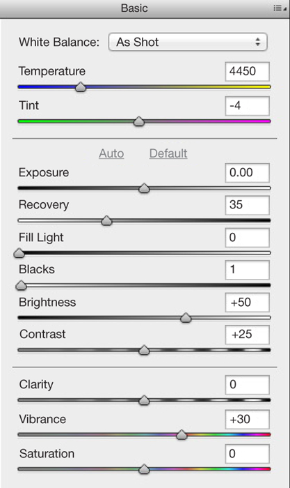
Three layers, all filled with 50% gray, and all set to a very low opacity: 10%
LAYER 1
Set to Hard Light. Paint with black to burn (darken) Highlights. Paint with white to dodge (lighten) Shadows.
LAYER 2
Set to Vivid Light. Paint with black to burn Shadows. Paint with white to dodge Highlights.
LAYER 3
Set to Soft Light. Paint with black to burn Mid-tones. Paint with white to dodge Mid-tones.
Vary the opacity of the brush as necessary. To restore parts of a layer to their original state, paint in 50% gray.
Some of this dodging and burning, incidentally, can be done on a 32bpc floating-point TIFF, although there are fewer blending modes for the layers because we’re dealing with a floating-point image. For instance, make a layer filled with 50% gray and set it to Multiply mode. Painting on this with black does not simply darken the image, but actually reveals parts of the dynamic range that were out of the monitor’s range. Very powerful, but also very difficult to control. ![]()

At this stage, the processing has been taken to its full extent using Photoshop ACR, but there is still room for increasing contrast in the shadow areas of the walls and cobblestones.
Make three 50% gray layers
Three dodge-and-burn layers are made above the image, each with a different function.


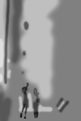
The retouching record
The three layers shown at 100% opacity to give an idea of the retouching in black and in white (normally never seen this way). Most of the work has been to give more punch to the shadow areas, revealing more of the rich reflections of the Duomo on the shaded walls of the narrow street facing it, while separating better the silhouetted couple from the paving and the green bronze door beyond.
ARCHIVED LIGHT What HDR Really Means
HDR, meaning High Dynamic Range, may well be shorthand for breathless, steroidal processing, but what it really means is just a way of capturing the full dynamic range in a scene, however contrasty it is. I know I need to restrain myself from being hypercritical of the HDR offerings swimming out there in the online image-sharing oceans, but the problem is that almost all of them look exactly the same. It’s a classic case of the process swamping the personality of the photographer. More on how to overcome this in a few pages’ time, but for now I want to concentrate on what’s much more interesting about this technique—the idea of archiving light.

Basilica of Saint Lawrence, Asheville, North Carolina, 2007
It’s a strange concept, the archiving of light. What it means is collecting all the visual data possible from a scene, and storing it somewhere for future use. That’s what archives really are—an historical record—in this case of all the light falling on the scene. What is interesting about this is that as long as you have all that data, it’s not so important whether or not you have software to make it all visible on a screen or in a print in exactly the way you want. You will be able to at some point, as software improves and evolves. As it happens, there are some real perceptual difficulties in showing all of an HDR scene, but I’ll save that for the following pages. For now, the point is the camera’s limitations.
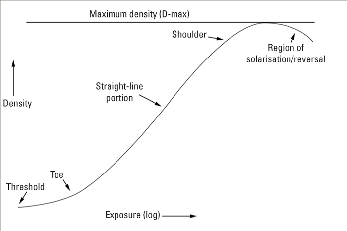
Sensors get better all the time, but even the best are nowhere near able to capture all of a really contrasty scene, such as shooting straight into a bright sun in clear weather with foreground shadow detail. At least, not in a single shot, which is what the inventors of HDR realized. Neither, frankly, was film able to capture everything, but at least it has a built-in smoothing-out response. That means at the bright and dark ends of the range the image recorded on film does not simply and sharply go pure white and pure black. It tails off in a natural-looking way. For those familiar with film, these are the toe and heel of the characteristic curve.
Down to the nitty-gritty. If you shoot the same scene, identically framed, at different exposures, then you can capture all the detail. It may take several, even many shots, but the result is that you will have captured it all. The perfect procedure is to lock the camera down on a tripod, then shoot a sequence of frames from a very dark exposure to a very light one. Vary the shutter speed, not the aperture, as the latter changes the depth of field. Start by finding the darkest exposure at which there is no clipping (overexposure) of the highlights, then continue shooting at slower shutter speeds until you reach the lightest exposure at which the deepest shadow detail looks like middle tones. If you shoot Raw, for the reasons we just looked at, then you can space out the exposures by 2 ƒ-stops. For safety overkill, space them by 1 ƒ-stop. And there you have it, all the light information from the scene archived safely.
What you do with all this extra data later is another matter, for which see below. ![]()
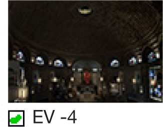
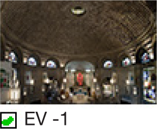

A range of exposures
With exposures at 1/2 second, 2.5 seconds, 5 seconds, and 10 seconds, these four exposures cover a range of almost 12 stops (6 stops of exposure spacing plus the range contained in the brightest and darkest frames).
Making no adjustments in the Raw-processing stage, the longest exposure shows clipping in the highlights.
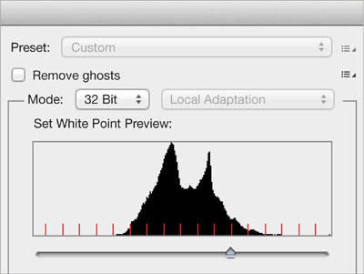
A 32-bits-per-channel HDR image file
The Photoshop window at the stage of combining the four different exposures into a single image file that contains all the values. This is an archived-light file, although unviewable on a normal monitor. The slider allows you to view just parts of the entire range that it contains.
FILM’S GENTLER FALL-OFF
A black-and-white film negative as it typically looks on a lightbox, covering a range of grays with no pure black or white. The characteristic curve of film shows how its response to light fades smoothly at both ends, unlike the abrupt clipping of a digital file.
ARCHIVED LIGHT Realistic HDR from 32pbc Editing
As we just saw, HDR is really about capturing all the light information in a scene. What you then do with it is a different matter, and what concerns many professionals is delivering an image that looks like a normal photo rather than an illustration. There are many options, but the problem is that all the ways of showing photographs, from screen to print, cover a much more limited range than we can experience with our eyes. The popularity of extreme HDR tone mapping is a by-product of software that tries in various ways to cram the information into that short range of tones. At the risk of disappointing people who like that kind of effect, I’ll move beyond that solution to ones that promise a more photographic look. On the following pages is the way to use exposure blending to combine exposures, but here is the 32 bits-per-channel solution, and of all the ways I show, this is my preferred one.
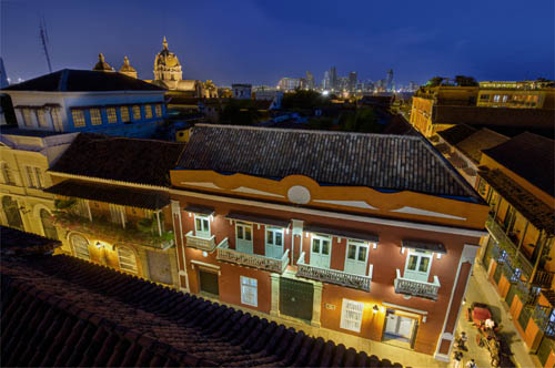
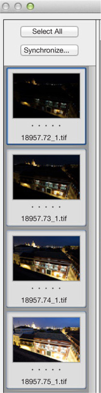
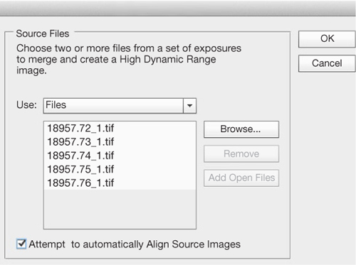
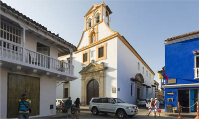
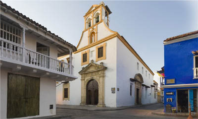
Cartagena, Colombia, 2008
Without any great fanfare, Photoshop can now handle HDR images in a normal and photorealistic way that for most images completely does away with the usual problems of HDR processing. The key to this is that you can now open an HDR file as if it were a regular Raw file, in Photoshop’s ACR (Adobe Camera Raw). This may sound like a small thing, but it makes a huge difference for professionals who simply want to recover more highlight and shadow detail from a shot.
First, shoot the exposure range of several frames, with as little movement between them as possible (see the previous pages). Then combine them into an HDR file as follows:
1. Go to Preferences > Camera Raw and at the bottom choose the last option: Automatically open all supported TIFFs. This now means that each time you open a TIFF, it will open in ACR, so you may need to go back to these preferences after processing the HDR image and revert to the default Automatically open TIFFs with settings.
2. Open the Raw files, adjust the lens and chromatic aberration, but nothing else. Save as DNG or TIFF.
3. File > Automate > Merge to HDR Pro, and follow the instructions.
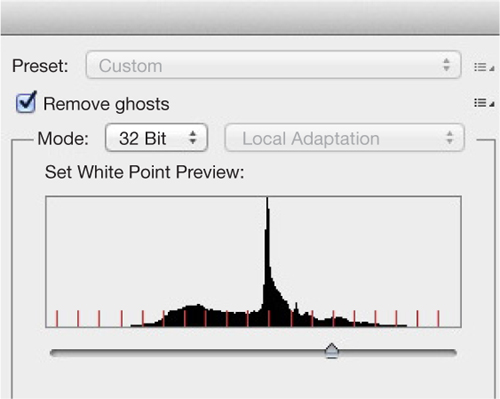
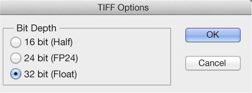
4. In the top-right corner of the resulting window, choose 32 Bit for Mode, and click OK.
5. Save as a TIFF (under Format) and as 32 bit (Float).
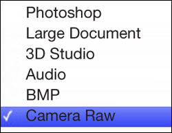
6. Open the saved 32bpc TIFF, with Format set to Camera Raw.
7. You now have all the ACR tools available for processing this file. As you slide the Exposure control, you’ll see that you now have a huge range to play with.
Simply using the adjustment sliders—but taking them further than you would normally—can be sufficient for a surprising number of high-range situations. If you then add in the local brush and grad controls, the processing becomes very powerful indeed. In a way, it’s like turbo-charged Raw processing, and yet still retains a natural feel that tone mapping does not. An interesting starting exercise is to take Highlights to the minimum and Shadows to the maximum, and then adjust Contrast. ![]()

1. Enable ACR to open TIFFs.
2. Open Raw sequence and save as TIFFs.
3. Merge to HDR Pro.
4. Check 32 bits per channel.
5. Save as 32bpc Float TIFF.
6. Set Format to Camera Raw for opening the 32bpc in the Raw processor.
7. Use the sliders, particularly Highlights and Shadows
8. Continue with local adjustments.
ARCHIVED LIGHT Natural Exposure Blending
More familiar as a way of rendering an HDR file is dedicated software, of which Photomatix is the most well known. Tone mapping is the most powerful method for showing every tone, but it carries a penalty of looking less than realistic. You could perfectly well argue that it depends on your definition of realism, but for me in photography it means “photorealistic,” i.e., looking like a photograph. The term tone mapping explains all: Each tone in the huge HDR image file with its unviewably large dynamic range is mapped to a predetermined viewable tone. The formula for working out what gets mapped to where, called the algorithm, holds the secret, and there are many of them, devised by different software engineers, all striving to offer users the most effective tools.
So, between the different software packages available and the many slider controls that each one has, there are infinite ways of processing an HDR image, and I could fill this entire book with variations on just a single image. However, if the goal is to keep the image looking photorealistic while pulling back in all the highlights and shadows, there are much fewer possibilities. Here I’m using just Photomatix, which intelligently divides its processing into three groups. One is global tone mapping, called by Photomatix Tone Compressor, in which the tones across the board are allocated together. The second is local-contrast tone mapping, called Details Enhancer, which searches local neighborhoods of pixels and takes these neighbors into account as it processes. This is the most powerful method, but also the one that most easily looks unrealistic. The third is not tone mapping at all, but Exposure Fusion, in which the “best” exposed areas from each of the original sequence of exposures are chosen. This is how the main image here was processed, and while it is by no means as powerful as the two tone-mapping methods, it stays looking fairly realistic. However, that said, for me the 32bpc process on the previous pages gives the most powerful, yet most photorealistic result, with the least complications and effort. For comparison, I include a version of this image done in this way. ![]()
Interior, Primrose Hill, 2007
The sequence of exposures, each separated by 2 ƒ-stops. Roughly calculated, the entire dynamic range covers about 11–12 stops, made up of the 6-stop difference between the four exposures plus the latitude within the lightest and darkest Raw files.
Exposure Fusion
This is Photomatix’ name for exposure blending, designed to look more photographic while sacrificing recovery at either end.
Tone Compressor
Of the two tone-mapping methods offered by Photomatix, this one is designed for more photo-realism (though not as much as Exposure Fusion), by sacrificing some recovery power.
Details Enhancer
The most powerful tone mapper from Photomatix, and the one commonly used for extreme (i.e. non-realistic) results.
32bpc opened in Raw
For comparison, the same HDR file treated in the 32bpc process from the previous pages, and ultimately the most realistic method of all.
TIME-LAPSE LIGHT Accumulating Light & Shade
Key Points
Stacking
Impossible Light
Shooting Sequence
What used to be a separate piece of equipment, an intervalometer, is now built into many cameras, as is video capability, and due to of this, time-lapse video has become very popular. Less common, but a by-product of this, is time-lapse light, in which a scene shot at different times of day with the camera locked off is combined into a single image. The combination is automatic and makes use of Photoshop’s Stack Modes, and although the work is intensive for the computer, it needs little attention for the photographer. I say “by-product” because the shooting procedure is the same, and you can choose later to do one or the other, or both.
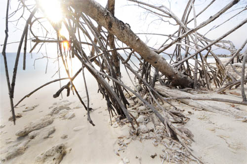
Punta Iguana, Baru Island, Colombia, 2012
The result is that you capture the movement of light over hours, so in theory you’re adding the dimension of time to the image. In practice, whether it is successful or not depends on anticipating how the light will move, how you combine all the frames, and on taste. In principle, time-lapse lit images have less form, and less chiaroscuro than most, simply because they tend to average out different lighting directions. This can often be quite dull, and less interesting than a normal image, so this is where preference comes in. To be worth doing, the effect has to have some point of difference from a cloudy-day image, which it can often resemble. Shooting in bright sunlight has some advantage, because the expected shadows (from the other clues, such as blue sky) are absent. Nevertheless, results can be disappointing, and by no means always predictable.
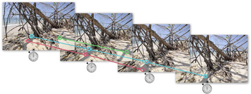
I’ll go through the technical side of the blending process in a couple of pages, but for now I want to look at the possible results, because there is always a choice, depending on the kind of blend. The example here, which we’ll follow through in detail on the following pages, was shot over five hours from the middle of the day to dusk, on a Caribbean beach. It works very well as a time-lapse video, for which the shoot was intended, because it has long-term speeded up movement in the form of the shadows of the mangrove tree on the white sand, and the sun itself at the end setting. This is usually the key—showing movement that the eye doesn’t normally register. You can view the video on this site: www.ilex-press.com/resources/capturinglight
It also gives possibilities for time-lapse light in a single image, for the same reasons. Because it was shot with a ultra wide-angle lens (14mm) close to the ground in stark sunlight, the shadows are definite and move a lot. As we’ll see, they can be combined to cancel each other out, or to add to each other, or as an average. The only justification for going to this trouble is to end up with an image that looks slightly strange or otherworldy, that couldn’t be achieved any other way. In this case, I liked the combination of stark and flat light with an absence of shadows, apparently at the same time under a cloudless sky. The final descent of the sun, with a string of sunstars, also appealed. ![]()
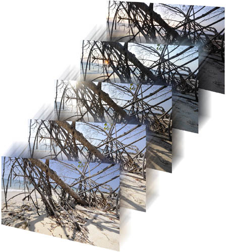
Constantly moving shadows & sun
Over the course of almost six hours, the shadows, the position of the sun, and the colors all shifted. These five moments from a sequence of 364 show the range available to combine.
Emptying a busy street #1
Visually less successful was this combination from a similar sequence shot in the center of Cartagena, Colombia. Using Median mode achieves the effect of emptying the scene of people and traffic, but the image itself is bland.
The actual scene
One frame from the sequence shows the typical appearance, with a constant flow of activity. At no point were the streets empty.
Emptying a busy street #2
Using both Mean and Median modes allows for some variation in how the sunlight appears on the façade of the old church.
TIME-LAPSE LIGHT Shooting Procedures
Whether you choose to shoot time-lapse for a video sequence or a single composited image, it demands a careful setup with no mistakes and no camera movement over a long period, typically a few to several hours. You need the camera locked off securely (MoCo, or motion control, is another world), as any camera movement at all will ruin the sequence, and you need a fully charged battery. In the example here, shot for almost six hours on a beach, one potential problem was movement from wet sand as the tide moved, so the tripod was supported on stones. Another was exposure to salt air and to heat from a Caribbean sun, so the camera was covered. A third was the slight possibility of someone coming close to investigate, hence the notice taped to the equipment. Time-lapse is very much about planning and anticipation.
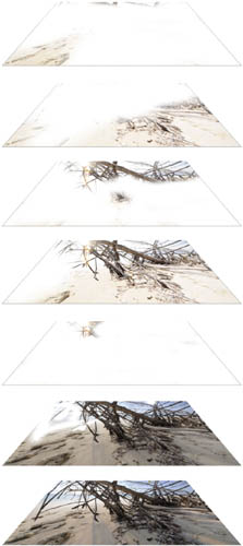
Fast-moving shadows from a 14mm lens
Four frames from the beginning of the sequence of 364 give an idea of the speed of the moving shadows and the direction. Using a very wide angle from very close exaggerated this movement toward the lower right of the frame.
How long you shoot for depends first on the movement you expect in the scene, for example, the movement of shadows. It also depends on how long you will want the clip to play for if it is to be a video, and what variation of light and shade you need if the main purpose is a composited image. The calculation for video is as follows. Assume a playback rate of 24 or 30 frames per second, at which rates the movie will look smooth and realistic (any less and it may flicker), and a ten-second clip (not long, just count it in your head) will need 240 to 300 frames. If you shoot late afternoon shadows, you’ll probably need about three hours to get a good effect, so that would mean around one shot every 40 seconds.
Also decide whether to use a fixed exposure or automatic; for this there are two options. If the light will remain fairly constant, fixed will give less flicker, but if you’re shooting from, say, late afternoon through to night, you’ll need to vary the exposure, and autoexposure is the easiest way of doing this, and also avoids the risk of camera movement. Shooting Raw or TIFF is overkill for most projects. If you take care of the exposure settings, shooting JPEG is fine.
Time-lapse video generally works best when there is a smooth movement during the period. Jerky can be successful too, but is less mainstream. One of the guaranteed-to-please movements is of shadows, and one of the reasons why this image works as a video clip is that the close view of mangroves with a wide-angle lens, and the angle chosen toward the sun, allow the sharp shadows to race across the almost-white sand. Rendered as a composited still image, it works because of the changing angle of the sun, which ends up facing into the camera. ![]()
The complete sequence of 364 frames, from 12:24pm to 6:30pm.
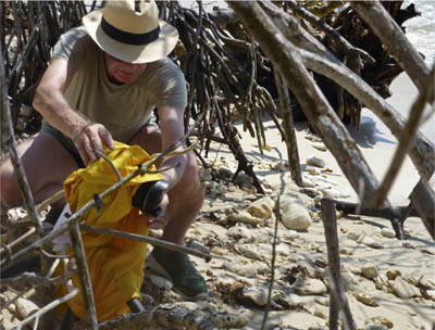
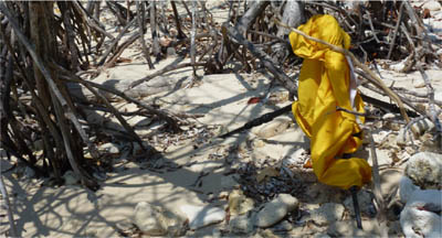
The setup
Setting up the camera for an uninterrupted sequence involved securing the tripod on stones to minimize the risk of shifting sand as the tide moved, protecting the camera from salt air and heat, and warning off potentially curious passersby.
TIME-LAPSE LIGHT Blending Procedures
Staying with the Punta Iguana shot, here are the four potentially useful ways of combining the 364 images. The advantage of shooting a large number of images in a time-lapse sequence—a few hundred—is that the tiny differences between each frame smooth out all the light changes. Also, the sequence becomes available for a time-lapse video if you want. The technical procedures for time-lapse, which are quite strict, are on the preceding pages. One caution, though: Shooting even just JPEGs at full size can result in a huge file when a few hundred of them are stacked, and this severely taxes Photoshop. It may even be impossible to save the file after you’ve finished working with it—the beach image here grew to more than 2GB. Check that your computer can handle it.
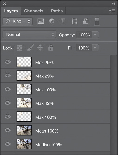
The final image shown on page 248 was combined from three different stack modes: Median, Mean, and five differently treated versions of Maximum. It involved considerable manual erasing, together with varying percentages of opacity.
In post-production, first load the frames into one image file as a stack of layers. There are two easy procedures for this in Photoshop. One is File > Scripts > Load Files into Stack. The other, in case you are working from a video, is File > Import > Video Frames to Layers. In either case, the next step is to combine all the layers into a Smart Object. With the Load Files into Stack script, simply check the box Create Smart Object after Loading Layers. Otherwise, go to Layer > Smart Objects > Convert to Smart Object. Then choose a Stack Mode by going to Layer > Smart Objects > Stack Mode and on to the choice offered in the list of modes. (These were originally designed for statistical analysis, and most are irrelevant for normal photographic imagery.) There are generally four useful Stack Modes for this kind of image. One is the well-known Median, often used to remove passing people from a shot of a fixed subject such as a monument. Median means the middle value, and the effect in an image stack is to remove elements that appear just occasionally, like something moving across the scene.
Also possible is Mean, which is what most people think of as averaging—the sum of every image averaged out, so changing elements in a scene tend to appear ghosted, as opposed to being filtered out, as happens with Median. Maximum Stack Mode gives the brightest combination possible, while Minimum gives the darkest. In practice, it’s difficult to predict which will be the most useful, so the best procedure is to make versions of all four, and then consider which of these to combine. In the case of the beach scene with mangroves and a sun that finally sets, the Maximum version was the most dynamic because of the several sunstars. For the final image, this was combined with Mean and Median as layers, using copies in different blending modes and at different opacities, and then using an eraser brush to remove different parts. There are no set procedures for doing this, and experimentation by eye works best. ![]()
STEP 1
Photoshop has a stack-loading script already prepared.
STEP 2
Choose the image files to load. Check the box that will automatically convert them into a smart object.
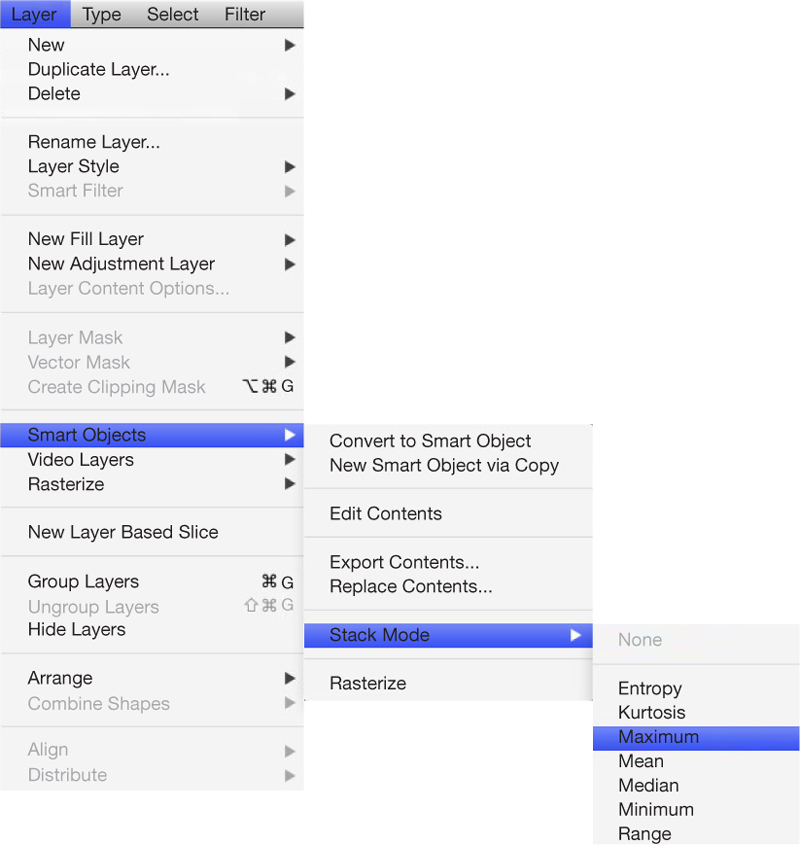
STEP 3
Choose which stack mode you want.
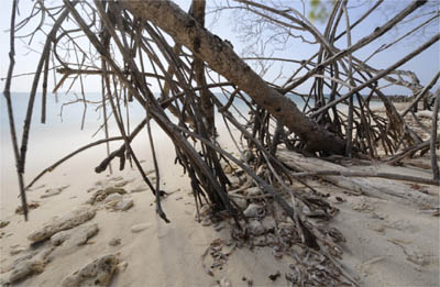
Mean Mode
This mode gave a flat, shadowless result.
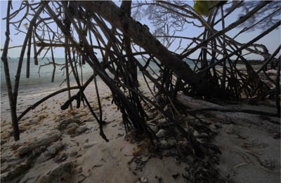
Minimum Mode
Striking in its own dark way, there was eventually no place for this in the final composite, as I chose to go for the Maximum version—effectively the opposite of this.
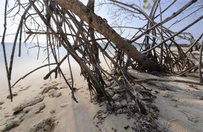
Median Mode
This version is the most realistic, preserving some sense of the shadows.
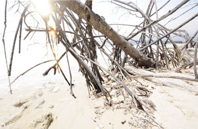
Maximum Mode
Probably the most striking of the four modes because of its harsh light and the multiple images of the sun, this was very useful for giving a slightly surreal air to the final image, although the overexposure had to be moderated by lower opacity and selective erasing.