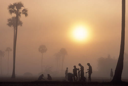
Sitting around waiting doesn’t sound like much of a management technique, let alone a light-management technique, but done properly it delivers the results. It depends, though, on knowing what you’re waiting for, and this understanding takes things to a different level. Natural light, which is mainly what we’re dealing with here, comes from a combination of climate, weather, and time of day. Climate means location, and you can plan for that by organizing a trip. Weather and time of day continue without any possibility of influence from you, and this is where intelligent waiting comes in. “Intelligent” because waiting involves planning, and it’s a very deliberate approach to photography. Most of all, it’s about knowing what light is possible from all the combinations, what each kind of light is good for in shooting, and how to extract the most from it in timing, framing, composition, viewpoint, and a sense of color (or black and white).
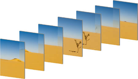
Practically, as a photographer, I divide light into the kinds I can expect, and the kinds that take me by surprise. This makes perfect sense for shooting, because they each prompt a different way of working. With the first group—the group in this first section of this book—you can anticipate and use your imagination to work out the kind of image you’re about to shoot. With the second, unpredictable group, you have to react to the situation as it appears. Naturally, there are borderline cases, such as a shaft of sunlight that spotlights a small part of a scene. If you’re just passing through a new place, and the weather is uncertain, this will probably come as a surprise. But in a location you know well, and in a bout of predictable sunny weather, that spotlight will be repeated, with a slight difference, the following day.
Shooting in the kinds of lighting described here in the Waiting section depends on having reasonable expectations. It also depends on having a feeling for what the light does to landscape, people, and buildings. This includes the more technical matters of contrast: where the shadows fall and how strong they are, how well or not the light separates a subject from its background, and how clearly it explains the shape and form of things. But it also goes further, into the realm of sensation and atmosphere, which are less easy to pin down, but nevertheless powerful components of a photograph. One thing I’m going to warn about is falling into line too easily with the accepted norms of attractive light for photography. Not every scene has to be gorgeous and lyrical. Imagery means variety, and hunting for the perfect—and therefore the same—golden light across a pretty landscape actually means giving up on your imagination and following the herd. I’ve done it myself, and it’s often hard to resist. It’s especially common in contemporary published landscape photography. The problem is that taking this approach means heading in the same direction as others—a sort of photographic gold rush. Just a caution.
Key Points
Precise Timing
Elevation
Technology
This is not a book about meteorology or trigonometry, but you’ll excuse me for a moment if I trip through some basics that will help in identifying the kinds of light that bring richness to photography; they matter more for this section than the following two. Time of day meets weather to create these many lighting situations, and behind them lay location and climate. Quite a lot to keep a handle on, particularly if you travel.
It helps, I think, first to subtract the weather and just concentrate on the sun and its passage through the sky. The key end-points, as you’d expect, are sunrise and sunset, and not only do these set the timing for the day’s light, but on either side of them, for about a couple of hours, the light not only changes more rapidly, but is also for various reasons especially favored for shooting. This means that most people like the light at these times of day, and even non-photographers start paying attention. Nevertheless, I learned early on that there’s little point asking around for when the sun rises and sets (standard practice before GPS and smartphones could give you a running commentary on the timetables). There are, in fact, relatively few professions and trades that live by the sun; photography happens to be one of them.
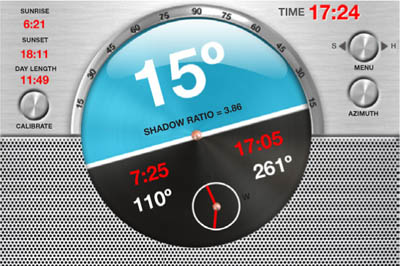
It makes every sense now to rely on phones, tablets, or laptops for daylight tables, without needing to calculate anything, but the track of the sun through the sky is a slightly different matter. It changes constantly—very slowly near the equator, more definitely in higher latitudes. Personally, I use a phone app called Helios, which was designed for cinematographers, and has everything from a clinometer to a shadow-length calculator. As long as it has my location, I can work out not only where and when the sun will hit the horizon, but also where and when it will clear a skyline ridge or a high-rise block.
Factoring in the weather dramatically multiplies the possibilities, for confusion as well as shooting opportunities, so be aware that certainty is rare. Weather includes everything from atmospheric haze to clouds and storms—basically anything that prevents the sky from being crystal clear—and it’s the subtleties of weather that create the many nuances of lighting that figure largely in the lives of photographers, filmmakers, and painters, but not too many others. ![]()

The sun’s height
With Golden Hour taking up the lower 20º of the sun’s path above the horizon, it’s useful to be able to judge its height, particularly if you want to match this to tables. Approximately, then, if you hold your hand like this, arm out-stretched, these are the heights: 8º for the top of the palm and 15º for the tip of the thumb. Add a third again for 20º.
An iPhone app designed for cinematographers, Helios gives many timings and calculations, including length of shadow as a ratio, 3D views of the sun’s path, a clinometer, and a way of calculating when and where the sun will clear a hill or a building.
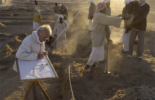
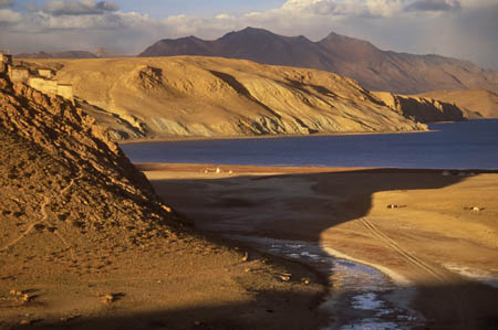
Archaeological dig, Kerma, Sudan, 2006
This dig in northern Sudan continued predictably. The variable was the sunlight. I wanted the exact moment at which the sun would clear one of the earthen walls of the site, so that light just caught the archaeologist’s hair and the site plan on which he was writing. This is where timing becomes important.
SOFT SUNLIGHT Manageable Shadows
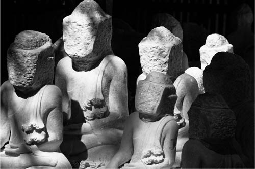
Some light is simply more useful and less troublesome than others—not necessarily exciting, but certainly practical. Soft sunlight stands at the head of this list. This is sunlight softened by haze, to a degree that takes the edge off its clarity while still remaining what anyone would still call “sunny.” It’s a little like cheesecake—pleasant, but not to die for, and everyone likes it. This is universally attractive lighting that does a good job on most subjects, from people to buildings to landscapes. There’s a reasonable amount of contrast that gives form and shape to things, but the gentleness in the atmosphere keeps the shadows open, their edges softened and the whole scene rounded rather than harsh.
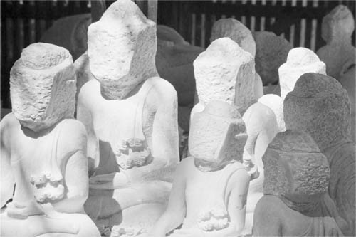
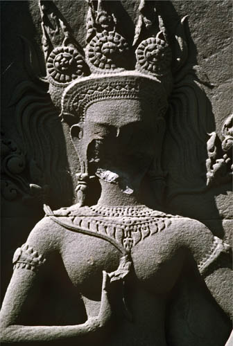
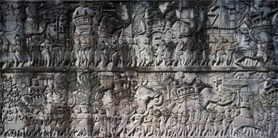
All this makes soft sunlight particularly good for modeling things in a rounded, gentle way, perfect especially for faces. These famous towers that make up the ancient temple of Bayon at Angkor, Cambodia, also carry faces, more than 200 of them. Who they represent is disputed, possibly a Buddhist entity, possibly a king, Jayavarman VII. In any case, on this morning I thought they appeared exquisite, peaceful, and timeless. There was no one else there. I climbed onto another tower and shot.
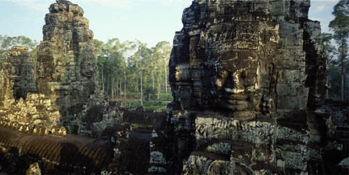
Bayon, Angkor, Cambodia, 1989
Softened shadows and a hint of warm color.
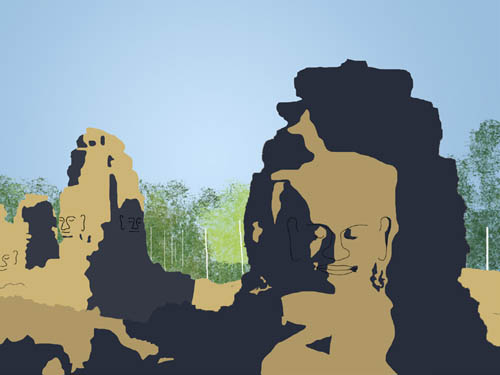
Under hard sunlight
This is how the scene would have looked under normal clear sunlight, the shadows deeper and with hard edges, and the colors more saturated.
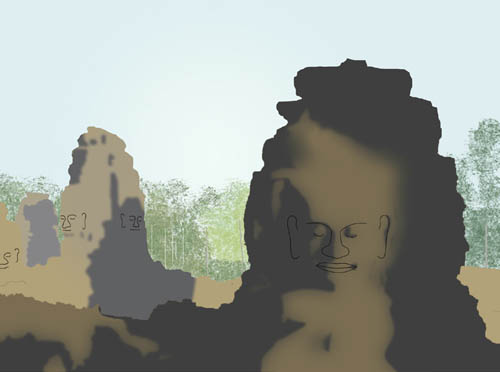
Under soft sunlight
In the scene as it was shot, the slight atmosphere—much less than misty—takes the edge off the sunlight, which becomes gentler, with less contrast because the shadows are now more open. The shadow edges are slightly softened also, the colors a little muted, and there is a more definite sense of depth to the entire scene.
The cup of tea glowing in a similar soft sunlight, though later in the day, was taken on the terrace of a tea shop on Rong Hu Lake in Guilin. Tea in China has a much greater significance than its mere appearance suggests, and I wanted to capture the atmosphere of sitting with fresh green tea on a soft day. The shallow depth of field from a very wide aperture helps, but it’s much more about the light. Stronger and more insistent sunlight would have been too sharp.
This is light that works particularly well on commercial assignments, when there’s a planned subject to be photographed and a client to be satisfied, and what makes it particularly useful is its medium contrast range that fits the sensor response nicely. There’s a good distance between highlight and shadow that avoids any sense of flatness, but there’s still unlikely to be any need for shadow fill. It’s also a condition that tends to persist, for hours at least. And because the sunlight is soft rather than intense, it stays more generally acceptable and attractive for longer, even when the sun is higher than you might like it on a really bright day. Again, this is a practical benefit that’s likely to appeal more to photographers who have a specific assignment, often commercial, and who like to plan and guarantee things rather than simply go out and explore. ![]()
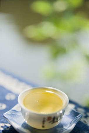
Oolong tea, Rong Hu Lake, Guilin, China, 2010
GRAY LIGHT The Beauty of Restraint
Poor gray light. Few people seem to want it. It’s too ordinary, an all-too-predictable condition in mid-latitudes, often persisting day after day to the irritation of people who know that just above that low layer of shapeless cloud (low-level stratus is the culprit), a warm bright sun is shining. Not only does it give a featureless sky, but also it casts no distinct shadows that might at least give form to objects. If there’s a horizon in the view, nothing above the line of hills or row of buildings is of any interest whatsoever. This is truly the orphan of photography’s lighting repertoire.
Well, hang on a minute. Is there really nothing to do with it? Are we just conditioned to find it boring? Maybe instead it’s worth wondering whether we’re overstimulated by impressive light. A glance at the majority of competent landscape images suggests this, as photographers go to great lengths to capture the simply gorgeous—fiery sunsets, shafts of light, rich magentas, and blazing reflections. It’s like the Hudson River School of painting all over again. Don’t worry, we’ll meet all these and more in this book, and high-octane lighting can indeed be spectacularly beautiful, and appropriate. But not all of the time. The word “mood” crops up frequently when photographers talk about light, and how it contributes. A full range of moods includes more than elation, the sublime, and surprise. There are many occasions for moods that are more reflective, quieter, even melancholy. I learned much about this in the few years I spent shooting in Japan, where restraint in many things conveys a kind of pleasure.
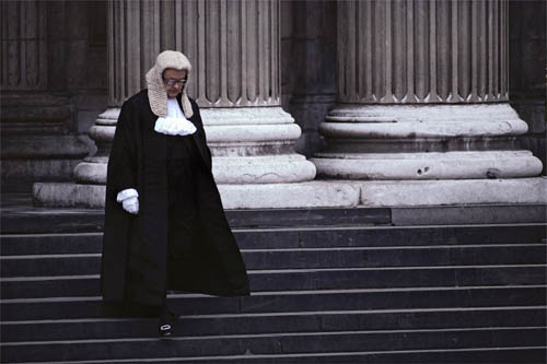
High Court Judge, St Paul’s Cathedral, 1982
Above all, this is sober light that does little to interfere with the subject. It demands, perhaps, a more rigorous approach to composition, especially with placing subjects against backgrounds that contrast because of their natural tones and colors. Colors, interestingly, can benefit from gray light, as we’ll see on the following pages. Both of the pictures here work beautifully in this shadowless light—to my mind, better than they would have in any kind of sunlight (a personal view, naturally). In one, a High Court judge descends the steps of St Paul’s Cathedral in London; in the other, a yoga position on a rock in a still Chinese river. Contemplative light in both cases, you might say. The pair also illustrates an important choice when working with gray light: how light or dark to make the exposure. The contrast in this lighting is low, so there are no benchmarks for brightness. You can see the scene as darker gray or paler gray, and expose and process accordingly. ![]()
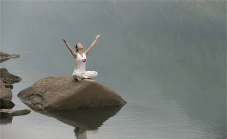
Yoga salutation, Beibei, Chongqing, China, 2012
Darker gray
If you treat the overall gray theme as medium-to-dark, the shadow areas tend to come across more forcefully. This is treating gray light as darker-than-normal sunlight.

Paler gray
With the lower overall contrast under gray light there is always a choice of brightness. Overexposing lifts the sense of the image to something lighter and more open.
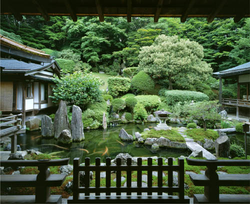
GRAY LIGHT In the Japanese Garden
In case you weren’t convinced by the previous pages, let me take you through a shoot that might explain some more of gray light’s qualities. I was making a book about Japanese gardens, contemporary gardens in fact, but many of them nevertheless followed traditional principles, or developed on them. There have been a number of styles within the long history of Japanese garden design, but most of them eschewed overt colorfulness. Occasional color certainly exists, which explains cherry-blossom and maple-leaf viewing, both valued for their short seasonality. On the whole, however, bright colors from lots of flowers are considered a bit uncouth, and what is valued is a subtle interplay of greens.
To capture these delicate differences, you have to avoid distractions, and one way of doing this is to avoid the contrast from direct sunlight. Another thing you may have noticed from these and the pictures on the previous pages is that I’ve been careful to frame the shots without any sky. Most skies on gray days have no features, and more than that, they are usually much brighter than the land. The result is that the sky raises the overall contrast, but to no purpose. More than this, however, is the effect of gray light on color saturation, and I learned the lesson quite quickly that Japanese gardens often look their best this way. At least, they tend to look the way that the gardener liked (and gardening in Japan is a fully formed art). The interesting thing here is that if you take a range of colors all from the same group—the same sector of the color circle—they appear at their best saturation when the lighting is even and gentle, not bright and contrasty. This seems counterintuitive, but it’s because flat light does away with bright highlights and sharp, dark shadows, neither of which have much color at all. Look at the two illustrations. The hues are the same, but the lighting is different. The sunlit version catches attention because of its contrast, but the saturation in the other one is actually stronger by a quarter. ![]()
Ichijo-in temple garden, Koya-san, Japan, 1996

The illusion of richer color
In sunlight, the higher contrast gives a sense of colors being rich, but this is an illusion, albeit an effective one. In this illustration, the greens are actually 25% less saturated than those on the next illustration.
Deeper saturation in flat light
In gray light, without shadows or edges, the same colors are better saturated, by 25%.
Rich greens
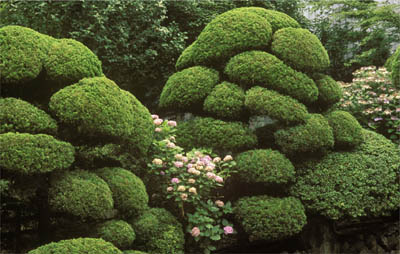
Pillow-like Japanese topiary, also on Koya-san, looks well modeled and rich in color under the same light.
Green variety
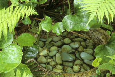
More gray light and a detail of another Japanese garden, this time featuring a deliberate variety of green hues, which extends to the specially selected pebbles.
SOFT GRAY LIGHT On West Lake
Key Points
Soft
Melancholy
Low Contrast
One of the secrets of photographing the gardens on the previous pages was to frame the shot so that no sky appeared. A wedge or bar of sky would take the contrast of the scene completely out of range. If you include sky, or as in this case here, its reflection in water, you have to deal with the exposure in a different way. This is West Lake in Hangzhou, China. Along with the renowned Dragon Well tea from the surrounding hills, and a history of cultured learning, this lake is what Hangzhou is famous for, and it has served as inspiration for poets, philosophers, and artists for centuries. You walk along the lake paths, or take a small boat, or simply sit and look. With thousands of other people unfortunately, if it’s a weekend (this is where photography’s ability to turn off the sound is a positive advantage). I had my usual ideas about how lakes can be captured, which in the past have generally involved low sunlight from one direction or another. But on this day in May, sunlight was West Lake, Hangzhou, 2012 unlikely, and my first reaction was some disappointment, though my friends who live here said that this is exactly what to expect—Hangzhou is also famous for rain.
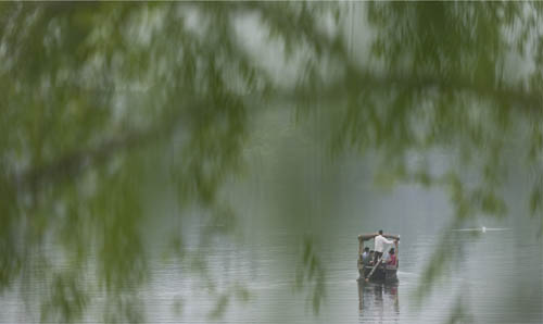
West Lake, Hangzhou, 2012
So, what to do with West Lake on a gray day? The answer was to learn a little bit more about its place in Chinese culture, and what better way than the poets themselves? Here are the opening lines from a series of poems written by Ouyang Xiu in the eleventh century (there are some very different sounding English translations because the combination of characters is open to interpretation):
A light boat with short oars—West Lake is good.
A gentle curve in the green water
Deep in spring, the rain’s passed—West Lake is good.
A hundred grasses vie in beauty
Who can explain why we love it—West Lake is good.
The beautiful scene is without time
I read other poems and picked out lines and phrases that evoked a similar mood:
Fine mist on distant water,
One white egret flying from the Immortal Isle
Misty mountains shrouded the rain
In the shade of the green willows
The blur of color across the hills is richer still in rain
The direction was plain. Gray cloud and still water, green willows, a small boat, a bird, and above all, soft. Little pleasure boats still operate, and all that remained was to find the right, simple combination, keep bright colors out of the frame, and enjoy the gray. ![]()
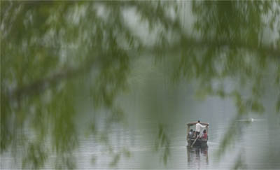
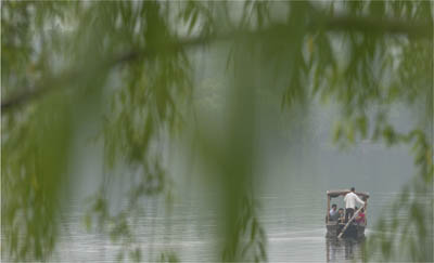
West Lake, Hangzhou, 2012
Other versions of the same scene, trying to capture the traditional appeal of West Lake.
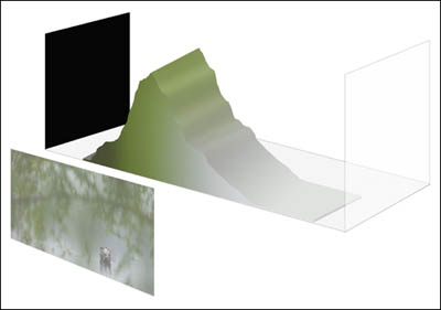
Because of the lower contrast in gray light, the tones do not fill the width of histogram from black to white. As a result, you can choose where to place them, darker (as here), or brighter.
DARK GRAY LIGHT Wild Weather
Iceland is one of the truly wild and strange landscapes in the world. In fact, most of it is landscape, because with a population of just over 300,000 and a capital city that feels like a small town, the feeling of traveling around the island is distinctly primordial. Even sheep are thin on the ground. This has often attracted filmmakers, particularly when the film has a science-fiction theme, though they tend to founder on the number of bad-weather days. One film that made a virtue of this was the recent Prometheus by Ridley Scott, and here is the wild waterfall that opens the movie. Typically, the weather had changed totally in several hours; the day before had been cloudless and had also been the longest day of the year, with a 24-hour midsummer sun here in the north. Now there was a looming dark sky, which suited this landscape very well, and made it look distinctly otherworldly.
It also raises an interesting question with this kind of low-contrast light. How dark is a gray sky? No, it’s not a Zen koan; it does have an answer. The idea of normal brightness for any kind of scene revolves around the idea of a mid-tone—something we take for granted in photography. It’s the principle behind the camera’s metering system, and indeed behind all the ways of presenting images, in print and on screen. An average mid-tone is the benchmark, and if you decide to go higher or lower, it’s for a purpose, generally that of mood. Gray days are no exception, but they are easier to see and experience on a scale of brightness. Once you get used to the idea of gray light, you find that it comes in different shades. There are paler grays and heavier grays, and because the contrast is lower than in bright sunlight, there is room for interpretation. As the histograms show, you can expose higher or lower with impunity. Within a range of a couple of stops, the scene will stay within the sensor’s dynamic range, but it will look and feel different—and the feeling is what it’s all about.
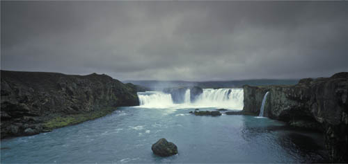
Icelandic waterfall, 1987
So who decides? Certainly not the camera. Given the flexibility you have in exposing, and later in processing, the only sensible way to judge is to rely on your impression at the time. And yes, this can be influenced by things other than just the physical light—the scene, the subject, your mood, some idea you might have. Shooting in gray light with low contrast is technically easy (it’s difficult to expose out of range) and that makes it important to think about the feeling of the scene at the time of shooting, and even more, to remember it. ![]()
Very dark gray
Normally our eyes simply adjust to the level of gray brightness, but with the lighting situations shown here, the sensation is distinctly darker than average.
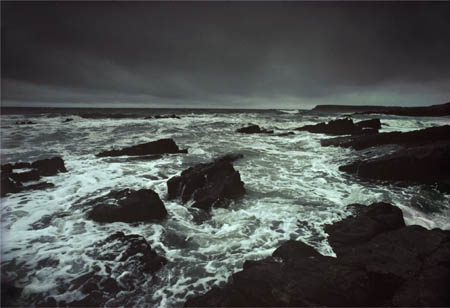
Port-Eynon Bay, 1980
SHIFTING THE HISTOGRAM LEFT
A low-contrast subject under diffuse gray lighting always gives a processing choice, as the histogram does not fill the scale. Shifting it left until the darkest tone becomes black makes the most of dark gray light.
WET GRAY LIGHT Falling Rain
One of the things about flat gray days is that they often lead seamlessly to rain. And rain has a bad reputation in photography, though it’s not entirely deserved. For a start, most people find it uncomfortable, and photographers instantly feel the need to protect expensive gear from it, so it’s generally a much easier option to avoid it and put your feet up. Drops get on the lens and have to be wiped off constantly, the humidity causes condensation on internal glass surfaces like the eyepiece and lens filter, and the camera body itself can take only so much. And even so, the light is still gray. If you’re wondering what the difference is between gray light on the previous pages and this, the answer is something like a glistening, or slicked effect. If gray light suits green plant life, vegetation positively basks in rain. The water adds a sheen to leaves that lifts the local (very local) contrast in a special way that gives a subtle sharpness. Rain also does other good things, such as adding raindrops to glass surfaces and rings to water. Generally, people don’t like getting wet in rain, but they do respond to its soft melancholy, as long as they’re dry while they watch it—as if it were already a photograph.
Backwaters, Pattanakkad, Kerala, 1981
Falling rain is actually less visible in a still photograph than many people think, and certainly less than in a video. The vertical streaks have a habit of blending into what looks like a kind of mist, and to stand out, the rain needs to be heavy, or the lighting bright, enough to highlight them (see Rain Light—Shower in a Sculpture Park on pages 162–163). What usually helps the atmosphere is the collection of side effects, like umbrellas and drops bouncing off the ground.
I had an assignment once, early on in my career, to photograph the coastline of Kerala in southern India for the Sunday Times Magazine. The shoot was scheduled for late October, which should have been fine, but that year the monsoon was late, and we had unremitting rain for a week. I wanted “good” light, but had to put up with this, which I found annoying; but really, that was a rather childish reaction. Of course it wasn’t comfortable—everything was sodden, including me—but that was the point, if I had only realized at the time. If you get too locked into the idea of “good” light being golden hour, you also start to associate rewarding photography with pleasant, holiday-style weather. In reality, they’re not perfectly matched. I ended up with many good shots from that week, but appreciated them only later. Another lesson learned. ![]()
Light in falling rain
For rain to be visible, it usually has to be heavy, and contrasting in some way with the background. Backlighting helps. Overall, it has an almost misty effect.
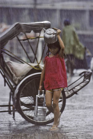
Cambodian girl in rain, Phnom Penh, 1989
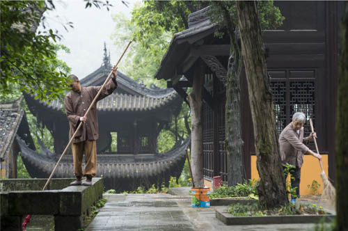
The more you look into all this wetness and grayness, the more variations you discover, and if you’re prepared to enjoy the subtleties, there’s a surprising amount to explore in terms of viewpoint, tone, color, depth, and more. In a valley north of Chongqing is an old Buddhist monastery on a forested slope among natural hot springs. I was working for a client who had a high-end resort property close to the monastery, and early in the morning, before breakfast, I went for a walk in very light drizzle. Just a few occasional small drops, not enough to shelter from, but the grounds of the temple were laden with a soft, damp atmosphere that seemed to dampen sounds. I passed this old drum tower, on a lower level because of the slope, and thought how perfect it would be if someone just happened to walk by, giving a kind of purpose to the gray flaring roof and an air of abandonment. No one did, even though I waited a while. The best action that happened was a monk and some women sweeping the grounds and clearing a pond, which didn’t really do it for me (opposite, top).
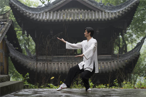
Tai chi, Wen Quan Buddhist Temple, Beibei, Chongqing, China, 2012
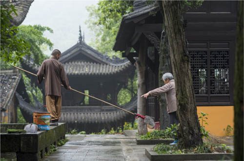
After a quarter of an hour, some activity.
But a little later, I found that I had a shot to do for my client—a tai chi demonstration by a visiting kung-fu master (opposite). Well, I had the perfect location. He would be wearing white, for which this dark and delicate background was as perfect as if it had been a stage set. I filmed the subject also, and in the video the light drizzle is just visible, adding a little bit more mood. Above all, what works in the lighting is the very slight aerial perspective as the drizzle adds a layer of substance to the air. This gently helps the man stand forward from the temple building, and the temple building from the trees behind. It also suffuses everything with a muting effect that reduces color. As with all of these gray scenes, the low contrast makes it important to decide how dark or light the gray should be. I was mainly concerned with keeping a good, but not overdone, contrast between the man and the parts of the building under the spreading eaves. Overall, I went for a slightly darker result than average. Practically, what I did was to shoot according to the meter, which was set to matrix metering, then reduced Whites and Shadows a little during processing. ![]()
The temple drum tower, early morning
The scene as I came across it, with no people, an hour earlier.
WET GRAY LIGHT Glistening Stones
When the rain stops, it leaves behind yet another slightly different variety of gray light. Often the air is clearer, and the wetness gives a fresh feeling to the scene. Unless there’s more rain on the way soon, it’s a situation that doesn’t last as long as you might think, as evaporation starts quite quickly. In warm weather, the water will start to dry off surfaces well within the hour; and in the tropics, in the monsoon season, even faster than that. Another thing that affects shooting is that rain tends to clear other people out of the scene—very useful if you’re shooting in a site populated by tourists, as with Angkor in this picture. When it stops, they slowly reappear, along with muddy footprints.
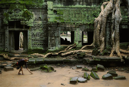
Ta Prohm, Angkor, Cambodia, 2002
It’s interesting that you need only a few visual clues, like the glistening surfaces of stones in the shot of Angkor opposite, or the unbelievably costly stone in a Japanese artist’s garden (right), to turn the perception of plain gray light into its wet version. Just a hint of something slicked with water, tucked away in the image, and suddenly the mood has changed. As before, wet weather is lovely to look at, all the more so when you’re not standing in it.
The picture of the semi-ruined temple of Ta Prohm in Angkor was shot in the rainy season, making a refreshing change from all the other times I had been there, which had always been in the cool dry season when the sunlight is guaranteed. This monsoon shoot had a lot going for it, not least the greenery and the moss. There were also fewer people around, which suited me. My first visits to Angkor were during the civil war and there were truly no other foreigners at all, so I became a little spoiled. This, though, was exactly what I wanted: early morning after rain, no tourists, even the muddy ground freshened overnight, and the old caretaker working on a few fallen leaves.
The Japanese garden on the right belonged to a painter, and this was the view from his studio, looking out to the costliest stone I ever came across. In the Japanese tradition of paying great attention to rocks and stones, which goes back to at least the sixteenth century, this artist, Akira Kaho, had had his eye on one special stone for two decades before he could afford to buy it at a staggering twenty million yen (about $10,000). Called a sajiishi, it is unique, with a flat top eroded into a complex of deep runnels, as if some strange worms had tunneled into it. Most stones look their best when wet, and this one certainly deserved special treatment. ![]()
Wet gray light
Reflections in flat wet surfaces, while top surfaces reflect light from the sky, givng a glistening effect and higher local contrast.
Painters’ Stone, Kyoto, 2001
HARD LIGHT Graphic Geometry
After gray light, the most commonly rejected and unloved is the hard-edged light from a high sun. You’ll find more advice published about how to avoid it than how to use it. There’s little mystery about hard light, and this is one of the reasons why it often gets thought of as un-special, unkind to subjects, and even downright ugly. The “hard” refers to the shadows that it casts, because the source is a bright sun in a clear sky, with little of the filtering effect from atmosphere that characterizes soft sunlight. The result is dense shadows with hard edges, and inevitably high contrast.
Here we’re back to likeability, and the attractiveness index of hard light is rated low by most photographers—hence its name, and the common refrain, “the light’s too hard.” The reasons given include poor modeling (true), high contrast with blocked-up shadows (yes, if you need them open), and coming from above, so that it casts shadows in strange places on people’s bodies and faces (without a doubt). Technically, then, it’s problematic if you’re trying to make people look attractive, when you’ll need a lot of help in the form of filling, shading, or diffusing (see Section 3—Helping).
Greenberg House, Los Angeles, 1994
Hard light
The intensity of this hard light creates denser shadows, which play a greater part than usual in photographs.
Normal sunlight
Standard sunlight gives reasonably strong contrast and hard edges to shadows, but not to the extent of the lighting in the Greenberg House image shown opposite.
However, this apart, the reputation of hard light may be overdone. When it comes to, say, the raking light of the following pages, where hard shadows and intense sunlight can pick out details and texture in a highly tactile way, it becomes desirable. And at the ends of the day, during golden hour (see below), the intensity of rich, warm sunlight set off against deep shadows gets many landscape photographers excited, particularly those shooting in stark landscapes like the Arizona desert. What hard light does have going for it is hard shadows and an intensity that, with a suitable subject, can deliver a degree of abstraction. Abstract imagery is a move away from the real, turning a scene into something else, at least until the viewer’s eye has settled down to seeing what is really going on.
Geometrical abstraction is arguably what hard light does best, and it’s no coincidence that my example here is a Los Angeles house by the renowned architect Ricardo Legorreta, not the first or last Mexican architect to design specifically for the cloudless skies of southern California and northern Mexico. Everything here is straight-line sculptural and hard-edged, and specifically created to be overlaid with shadows and enhanced by contrast. ![]()
SEPARATING COLOR CONTRAST & SHADOWS
The total deliberate effect comes from combining the rectilinear geometry of the structure (below) with strong colors (top left, one of these from the Southern Californian sky), and hard-edged shadow shapes (top right).
We can go further with the idea of hard light suiting hard-edged subjects. Largely because of portraiture, where the aim is usually (though thankfully not always) to make people look attractive, the idea of soft, directional light to give gentle, rounded form gets a lot of promotion. Yet angular objects tend to do better with lighting that shows off their hard edges and contrasting surfaces. Lighting angle becomes more critical when there is no diffusion, but when it’s right for the subject, the effect is strong and eye-catching.
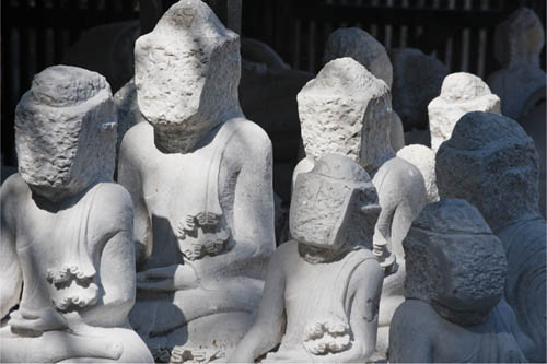
There is a street in the Burmese city of Mandalay, just one street, where the entire activity is the carving of statues of the Buddha from local white marble. The demand for these across Myanmar is considerable, so it’s a busy place, and the statues are in all stages of production in the small workshops lining the street. Because of the weather (hot), these are open with awnings, but stones that are waiting for attention are more usually out in the tropical sun. The combination of white marble and a high Burmese sun makes for extreme brightness, and so this is really pushing the limits of contrast. Again, a choice: return for a lower sun, or do something with these midday extremes? If the latter, why not take the extreme and push it further? We’re back to graphic imagery, for which hard light can definitely do favors. Besides, there were these blocky, faceless statues waiting for the sculptor (labor is divided here, with the top craftsmen concentrating on the more demanding face of the Buddha).

Faceless Buddhas, Mandalay, Myanmar, 2008
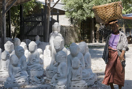
The setting
Midday in Mandalay, with a group of Buddha statues waiting for the master carver to start on their faces.
At this time of day, the sun is pounding down across vertical surfaces—raking light, as we’ll see shortly—and that was putting a lot of attention onto the yet-to-be-carved face blocks. One option was to shoot for black and white, which for the reasons explained on the following pages, makes it easier to process for extreme contrast. The fairly simple division between just dark and light, with very little intermediate shading, thanks to the hard light, made it possible to take the contrast in the final image very high. The shadows could go to perfect black, and the white marble simply had to remain a couple of levels below knock-out white. ![]()
As exposed, without processing, and in color.
Processed for maximum visibility
The Raw file opened up to the full—more information, much less impact.
Processed for maximum contrast
Going even further than the main picture with the high-contrast processing, emphasizing the cast shadows.
HARD LIGHT The Case for Black & White
Key Points
Monochrome
Texture
Tonal control
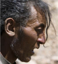
Black and white has its own particular aesthetic, quite different in many ways from shooting in color. For example, tonal gradations—from richness to nuance—are an important part of it, as the image is free from the distractions of color. But among the special values of black and white, two of them make it a very useful solution for lighting issues such as hard light. If you’re a die-hard black-and-white photographer, this will not impress, but for anyone who shoots mainly in color yet is prepared to experiment, this is one way of turning disappointing conditions into strong imagery.
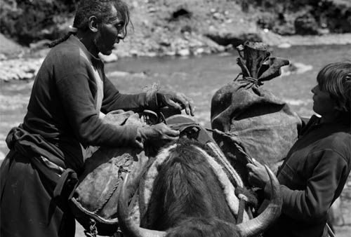
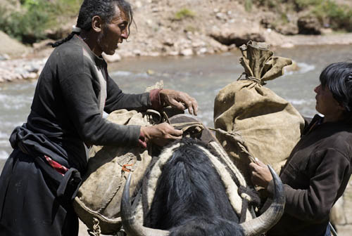
Yak caravan, Manigange, Sichuan, 2009
The first of these two reasons is that black and white is, if not exactly immune to the time of day, much less restricted by it than color photography. Just look at the many lighting situations in this book that are located in the golden and magic hours. Probably the strongest component of these two very popular times of day is their color, and because so many photographers prize these end-of-the-day hues, by comparison midday tends to be ignored. Black and white does not suffer from this problem (if you consider it a problem; not everyone does). The second reason is that you can push the tones to extremes much more acceptably in black and white, so a hard, contrasty treatment that might look unpleasant in color can look great in monochrome.
This shot (left) of Tibetans loading up a yak caravan for the trail used both of these black-and-white special values. It was midday in western Sichuan, at high altitude and clear, so the light was stark and the colors of the riverbed where they were camped were bland and uninteresting. They weren’t going to wait for late afternoon and good light just for me, so I just had to get on with it, as usual. I quickly decided to switch my mind to black-and-white mode, and concentrate on tonality and shape. There was one tone in particular that I focused on—the leathery face of this man. Leathery is a cliché, of course, but here was a case where it was completely justified, not just because his skin was so weather-beaten, but also because of the comparison with the leather sacks they were loading. For my purposes this was wonderful—here was a yak caravan in the 21st century using traditional leather sacks, not plastic. The general lack of color made it less easy to pull off in post, but I managed to do what I wanted and use B&W conversion to get that face dark and rich. ![]()

A choice of conversions
A range of conversion options, though not extreme because of the lack of intense colors to begin with (black and white conversion works more powerfully on strong hues).
As a color image, for me weakened by the insipid colors and hard top-lighting.

An alternate take on a B&W conversion, aiming to deliver maximum information—and as a result, little more than a monochrome version of the color default.
The Raw file, unprocessed
In itself, acceptable as a color image, but the monochrome tint brings little to the image, suggesting a B&W conversion so as to allow concentration on the tonal nuances.
Darker alternative
Even with an apparently monochrome-yellowish original, B&W conversion by channels allows tonal values to be altered, as here, to a darker, denser version.
Water buffalo, Yalong River, Sichuan, 2009
HARD LIGHT Stark City Contrast
Key Points
Unflattering Light
Juxtaposition
Key Shots
There’s a reason for the order in which I’ve started this book, even though it might at first look a bit haphazard. The first entry, on soft sunlight, is a perennial favorite and unassailably pleasant, but I followed this with an opposite gray light. Now, with hard light, we have another group of normally rejected candidates. This is all aimed at undermining the idea that a good use of lighting is always in the service of being conventionally attractive. Mainly, perhaps, but to aim for it every time is highly questionable. More than that, it simply limits the range of what you can do.
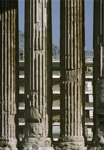
Temple of Olympian Zeus, Athens, 1977
As we just saw, one of the many things that lighting can do is to help evoke the physical sensation of a place and a time. It doesn’t necessarily matter that the location may not itself be conventionally attractive. Here in Athens, though, there was something else again—I had a specific job to do. This was to be a book in a big Time-Life series called Great Cities, and the editors had made an interesting choice of approach. As much as any high-volume publishing to a wide audience can tolerate, there was a negative undercurrent running through the book. This was not to be the Athens of tourist brochures, but instead a more complicated city that had grown to be quite ugly and polluted. This ran through the text, and the choice of pictures reflected it. The editors wanted this to be an interesting book rather than just a pretty one. A particular issue was how to deal with the many famous ancient monuments. Naturally, I shot around them over the month of shooting in every way possible—including every kind of light from before dawn to dusk—yet always knowing that the editors needed an edge to it all. With so many existing beautiful images of the Acropolis, for example, it wasn’t really Time-Life’s job to add to the store. Accordingly, the monuments photo essay was conceived as an aerial, using a helicopter to show these ancient sites crowded by the spread of cheap building that makes up the modern city.
This theme turned out to be the choice for the cover, also. It meant, inevitably, a juxtaposition shot, and almost as inevitably a telephoto treatment to compress contrasting elements. The best candidate for this turned out to be the Olympeion, also known as the Temple of Olympian Zeus: 2nd-century marble columns set against a 1970s apartment block. It had the added advantage of being graphic—verticals against horizontals. What light would work best? A pretty end-of-day, or something starker and more in keeping with the idea?
I used a similar setup for the forlorn traffic junction on the right, which is not, as you may suspect, the scene of recent heavy shelling, but yet another Chinese city block in the process of redevelopment. ![]()
Athens cover
The picture as used.
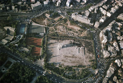
The aerial view
Part of a photo essay in the book, the aerial view shows the monument far from impressive, hemmed in by a busy, ugly city.
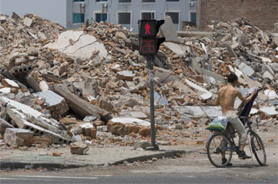
Demolished city block, Ninghai, Zhejiang, 2011
Key Points
Minimum Relief
Stress Absence
Minimalism
Here is another case of looking for a way to get across the physical sensation of a place—a strange place, and one of the emptiest I’ve ever been in. To be honest, the “flat” part of this light refers more to the land that it’s falling on, but the result is certainly that. No relief to speak of, and at the time we drove across it, the sun was almost overhead with not a hint of cloud. This is in the Nubian Desert of northern Sudan, and the country is mainly desert in any case. Even within deserts (which qualify as such if they have a moisture deficit, normally taken to mean less than 10 inches [25cm] of rainfall a year) there are extremes, and this is one such. This section, called the Bayuda Desert, is exceptional in flatness and lifelessness. I wanted to get both of these qualities across, and the way to do it seemed to include just a touch of their opposites. I should explain this thinking: It’s a quintessentially minimal situation, with land and sky reduced to two bands. One approach would be to present this minimally, choosing a view that had no relief at all and no life. This was an available option at the time, as we had our Land Cruisers and I could select anywhere to shoot as we drove, hour after hour. It would also be a valid choice, and for the marine equivalent see Hiroshi Sugimoto’s photographs of seascapes.
But I chose the other way, which is to try and stress the featurelessness by means of contrast, namely by including a hint of relief and of life. Eventually we passed this spot, with an extremely isolated bush and two swellings of sand beyond. The remaining element in the photographic mix was the light, and here I was happy that it was so stark, and, well, flat. Now, deserts look excellent in raking light at either end of the day, and that is definitely the picturesque approach: sand dunes casting sinuous shadows and ripples standing out in the foreground. But deserts definitely look hotter and emptier—more desert-like to my mind—under flat, high, midday light like this. ![]()
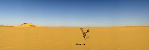
Bayud Desert, northern Sudan, 2004
Stitched assembly
The shot was given higher resolution by taking a panorama of overlapping frames.
High sun, no relief
The combination of a near-overhead sun and almost nothing on the ground to cast shadows gives a flatness in keeping with the essence of this bleak desert.
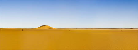
An alternative
A second shot without the bush: emptier, but lacking the contrast that the isolated bush gives.
Key Points
Lunar Quality
Sky Blue to Violet
Polarize
The higher you go, the less atmosphere there is, and so the more intense the sunlight. For most people, altitudes over about 2 miles (3km) are unfamiliar, and that alone makes this kind of shooting location interesting. The examples here are from western Tibet, higher than Lhasa and the east, and where the base of the plateau is at around 3 miles (5km). There’s a simple correlation for this kind of locale: at 5,000 meters the oxygen pressure is 50% of that at sea level. Apart from breathlessness, the other effect is that sunlight is a little bit more like it is on the Moon—unremittingly hard, giving a massive dynamic range.
Bear in mind, though, that dynamic range matters only if you want to recover all the details in the shadows and highlights. And why would anyone want to do that in this special environment? What makes the Tibetan plateau here so special is exactly this hardness of light, which you can find only at altitude. In other words, this is not a problematic lighting situation, but rather one that is worth exploring for its rarity. The only pity is that a photograph cannot get across the genuinely disorienting, dreamlike sensation of not being able to breathe properly. But at least it can preserve the lunar quality of the sunlight, and way to make the most of this is to look for subjects and arrangements that are themselves contrasty: white prayer flags shot from low so as to place them against the darker sky overhead, dense shadows, snow on the south face of Mount Kailash against the sky, and so on.
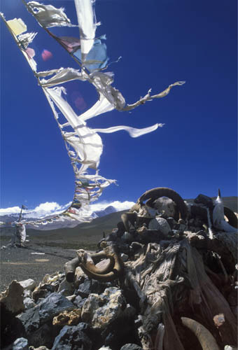
Prayer flags over a chorten, Nara Pass, western Tibet, 1997
High-altitude hard Light
The contrast between light and shade is as high as it gets anywhere, and open shade is noticeably blue.
All this blue is a reminder of the very high UV content of the light, or rather the failure of the thin atmosphere to block it. How you deal with it is a matter of preference. You could simply go for it and use the blues, or make it more realistic by fitting a strong UV filter and/or taking some of the blue out in processing. Yet another approach is to us a polarizing filter to push the already-deep blue sky into an even deeper violet. High altitude encourages exaggeration, which is no bad thing. ![]()
Mount Kailash, western Tibet, 1997
POLARIZING FILTER AT ALTITUDE
The darkening effect of a polarizing filter on a blue sky is strongest at right angles to the sun, and at these altitudes, is stronger than usual.
RAKING LIGHT Façades
Light can also be a collaboration between the sun and the surface, and the idea of raking light is when the source is sharp and pinpoint (like the sun on a clear day) and glancing across a surface that has some kind of delicate relief. When we come to bas-reliefs on the following pages, the relief effect that the carvers and artists intended under cross light was deliberate, but there are many more situations when it just happens to be. Here are two such cases, and in both, the façades were designed in one way, but photographed in another.
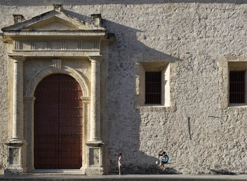
Football, Cathedral, Cartagena, 2009
Religious buildings, like the cathedral on the left, are often aligned to the cardinal points, which naturally means that one of the sides tends to be side-on to the early and late sun. That was exactly the case here, in Cartagena, and very predictable in February, when the skies are usually clear and the sun rises and sets not quite so much toward the south as in the rest of the year. This was indeed a planned shot, for Sony, who commissioned a number of photographers to shoot pictures of football (soccer) being played around the world. With this brief, it was obvious that the setting and players were going to be important—more so than the ball itself. In particular, this was because the readers of the book would already know the subject and be looking for the variations on a theme. I needed to step back, and so needed a background that located us firmly in the colonial era of the Americas, without being cheesily obvious. The south side of Cartagena Cathedral (left) seemed good to me, especially as there was a plaza across which I could shoot without having to angle the camera steeply upward—in the end I didn’t want converging verticals, and there would need to be some Photoshop perspective adjustment.
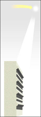
Raking light does two important things to a wall like this—and to that of the old Mexican mansion in Mérida also (right). It reveals texture, and it adds the shapes of shadows. These are actually two quite different things. The texture enhancement simply shows more of what the subject is about—in the case of the cathedral, the coral limestone blocks and the way that the portico projects. The shadow shapes are purely graphic additions, overlaid on the rest of the image. Together, both breathe life into the wall. And a final thing, those raking shadows are very narrow, front to back, so that I could place the boys just a few feet in front and have them side-lit, standing out against the shadows, and considering that I wanted the two players small against the huge cathedral, doing this ensured they caught the eye. ![]()
Shadow movement over three hours
Over a period of nearly three hours, from 3:38pm to 6:12pm, this is how the shadows lengthened and moved across the south wall of Cartagena cathedral. The atmosphere was slightly hazy, with the result that the shadows weaken as the sun approaches the horizon. Only on crystal clear days do they stay sharp and solid until the end (see Golden Hour—Last Moments pages 100–101).
Mansion, Mérida, Yucatán, 1993
RAKING LIGHT Perfect for Bas-reliefs
Key Points
Sculpture
Appears Deeper
Keep Hard
I don’t like getting locked into one kind of light for one kind of subject, as seems to happen, for example, with a lot of contemporary landscape photography. There’s nearly always a choice of interpretation, as I’m showing throughout this book. Bas-reliefs, however, are very much made to be seen under a light that shows their details, and that really does mean raking side-lighting of one kind or another. The term means low relief, carvings, or moldings that just stand out from the surface. Deep relief is almost sculpture, where you can put your fingers into and behind some of the carvings; bas-relief works more subtly. It needs the help of lighting to do it justice—lighting from an acute angle, ideally just grazing the surface.
Here are two ancient sites famous for the excellence of their bas-reliefs: Angkor in Cambodia (right) and Persepolis in Iran (opposite). In both, the stone carvers certainly knew what they were doing, and what effect the light would have. The Persian bas-relief starts to come alive in the late afternoon, particularly in winter, as the entire complex is aligned northwest-southeast, so that with the sun setting north of west, this southwest-facing wall catches the grazing light. The Angkor carving of a devata (minor goddess) is a little different. It likewise catches late afternoon light—and early morning, too, as it is on a south-facing wall—but it also catches midday light. It was vandalized, probably during the Khmer Rouge years, as the face has been hacked into rather than removed, which thieves would have done, and I was looking to include this kind of damage for a story. The hardness of the sunlight, and its direction from above, gives a stark treatment that makes the most of the hacked-away face, leaving a deep black slash. In a way, I’m doing much the same thing here as with the marble sculptures on pages 30–31.
Vandalized devata, Thommanon, Angkor, 1989
In both cases, light coming in from the side exaggerates the relief visually. Both carvings seem to stand forward much more than they really do, and compared with how they look in flatter lighting at other times, the effect is a kind of illusion. There would be almost no point in filling in shadows with a reflector (see Filled Light—Tai Chi in a Tea Garden pages 206–207); that would just weaken the relief. Moreover, as this is the sun rather than flash or any other kind of photographic lighting, its distance means there is no fall-off (see Window Light—Classic Fall-off pages 86–87) across a carved wall, even a large one like the smaller image below of the Bayon in Angkor. If you want a choice of lighting, and the sky is clear, wait until the sun is close to the horizon and the effect begins to disappear (see Golden Hour—Last Moments, pages 100–101). ![]()
The Khmer army, Bayon, Angkor 1990
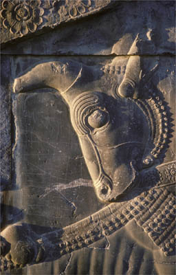
Bull in bas-relief, Persepolis, Iran, 1977
High raking light on a south-facing wall
The effect of top raking light as in the image of the devata at Angkor. With the sun high (tropical light), it moves quickly, and for just a very short time, rakes the wall from above.
RAKING LIGHT Sharpening the Landscape
Then, of course, there’s raking light bathing the entire landscape. It’s also light from the golden hour, inevitably, because unlike the walls we’ve been looking at, there are only two times of day in most latitudes when this happens: early morning and late afternoon. Nearer the Arctic and Antarctic, on the other hand, the time for this light spreads out across the day. This type of lighting is naturally attractive and popular because of the way in which it sends long bands of light and shade across the landscape. I argued against the grain in Hard Light—Nubian Desert on pages 36–37, but that was for a very specific reason (showing emptiness). As I mentioned then, the raking light that throws up every ripple in sand is more conventionally appealing.
Polo pony, Gran Sabana near Bogotá, Colombia, 2011
In common with the other, smaller-scale raking light situations, it depends not just on the sun being low, but also on there being really clear air. As the sun gets lower, its light has to pass through much more atmosphere than when it is shining straight down onto the land, and this acts like a softening filter. On top of this, haze and pollution tend to hug the ground, so that those last few degrees of the sun above the horizon often—I could say usually—see a rapid softening of shadow edges. In practice, it means that what looked like a bright day an hour before sunset unexpectedly becomes almost shadowless three-quarters of an hour later. The lesson learned is not to expect the crisp light to last for a moment longer than you can see it, even though hanging on until the last minute is what most of us do in these conditions. The answer is to keep shooting, because the frame you just shot may well turn out to be your best.
The main shot is from the high savannah surrounding Bogotá, where the air is usually clearer because of the altitude, nearly 9,000 feet (2600m). I’ve also included a shot from the Tibetan plateau at over 16,000 feet (5000m), because at this height the air is thinner, so the light is sharper, more incisive, with little of the haze that’s normal elsewhere. The effect is that the same sharp shadows continue to the horizon, which can be breathtaking. Clarity covers the entire view, so that while we know from common sense that the farthest shore of the lake is really distant (a few miles), it looks as if we could reach out and touch it. I think it is this contradiction that makes lunar views like this one interesting. ![]()
Lake Manasarovar, western Tibet, 1997
SHADOWS LENGTHEN, RELIEF ACCENTUATES
Shown with directionless light at the top for comparison, this is what happens as the sun sets in clear light. Prominent things sticking up, like trees, already cast a distinct shadow, but this lengthens spectacularly, while less obvious features like hills eventually cast shadows that darken the entire landscape, spreading east rapidly toward the end.
TROPICAL HARSH Midday on Lake Inle
Key Points
Vertical Light
Hard Edges
Solid Clouds
Low latitudes, around the equator and into the tropics, take the sun even higher in the middle of the day, which means that if you insist on going for traditionally “pretty” each time you shoot, your working hours are going to be quite limited. It’s best to find ways of accommodating this high and harsh light into the photography.
Monk & lake monastery, Ywama, Lake Inle, Myanmar, 1982
And one more thing: Lighting can contribute to giving the experience of being somewhere, and especially somewhere different. This idea is historically quite recent, at least since large numbers of people began traveling sufficiently to actually care what the places felt like. In the 19th and 20th centuries, there was a near-universal interest in what foreign places looked like; hence early photographers such as John Thomson, Carleton Watkins, and Edward S. Curtis traveling with plate cameras through Asia and the West of America, and the later success of magazines like Life, Picture Post and National Geographic. This is not to say that photographers were any less concerned about light, but using it for sensation was lower on the agenda than it has become recently. The tropics became a recognized destination for travel around the 1970s, when long-haul travel started to become affordable and made tropical beaches a possibility for a week’s holiday. And there’s no doubt that the tropics deliver a different experience to most people, quite apart from their cultures and landscapes. So, far from avoiding the tropical midday, with its top light and often stunning heat, there’s every reason to explore the lighting effects. This is Lake Inle in Myanmar, with intense and high sunlight, bouncing off the water to be almost blinding and giving those solid-looking cumulus clouds that have been building over the hot landscape for the last couple of hours their characteristically tropical look.
Tropical Harsh Light
Tropical light comes into its own in the middle of the day, when by the mid-latitude standards of Europe and North America, the sun is unusually high and the shadow footprint tiny, but intense.
Everything here on this shallow body of water is built on stilts, including the Buddhist monastery at right and the walkway. The monk was approaching, and I followed him. Daily life goes on regardless of whether the light looks pretty or whatever, and this was not a case of waiting for another monk to come by later in the day, even if I wanted that. In any case, the traditional lacquered paper parasol makes the shot, and here it was very much a midday accessory. ![]()
Mirrored reflections emphasize clouds & deep shadows
The clouds, top-lit and very white, have a typically tropical solidity, in this case worth making something of by repeating them with their reflection in the still lake.
One of the qualities that a high tropical sun has going for it is that it casts shadows almost vertically, and this is something unfamiliar to anyone from the other latitudes. In particular, it means that underneath trees there will be dappled light, and this is guaranteed all the more because the tropics have more broad-spreading trees than elsewhere. In fact, such broad-spreading trees were deliberately planted in tropical towns for the very purpose of shielding parks and pavements from the sun, and are usually called “shade trees.” This is what is happening here in this Caribbean island village of Baru, where the time I visited was not exactly what I would have chosen. A feature of the village is its inhabitants’ clear love of color—pinks, yellows, greens, reds, and here, blue.
Blue house, Baru, Bolívar, Colombia, 2011
My first thought was that I should return when the sun was lower, because the old blue house was definitely worth shooting; so like most of us my reaction tends toward the guaranteed light that I know well, with the sun lower. But while I was here there was no point wasting the opportunity, so I scouted around for a way to handle this. It was not an architectural shot, so I was looking for some combination, which meant people, though there were few about at this time of day. Then it dawned on me, as you can see from the sequence, that the distinct pattern of dappled light and shade could become part of the composition. Rather than angle the camera upward to avoid bright ground, and then have to deal with converging verticals, I could use the pattern to counterbalance the house. I also included in the middle-distance the blue house’s companion yellow-and-red building, to add to the sense of colorfulness. I found a stone to stand on so that I could keep the camera level and the verticals more natural, and waited. Anyone passing by would also be in this dappled zone, and so mainly dark themselves, and the ideal place to have them in the frame was where the girl is—between the two colored houses, virtually in silhouette. This kind of dappling is technically chiaroscuro, which I go into in more detail on pages 132–135. ![]()
Tropical shade
Overhead branches and an overhead sun create a complex and high-contrast chiaroscuro pattern.
Working toward the shot
The sequence from finding the building, wondering whether the shot could work in this harsh light, and moving to make the dappled shadows an integral part of the image.
SNOW LIGHT The Ultimate Reflector
The tropical light we just saw is a kind of environmental light, depending very much on place. Another is what I call “snow light,” which is when snow covers the ground and as a result has a major effect on the light overall. Snow completely changes the normal relationship between ground and sky, which tends to be dark below and bright above. In a cloudless sky, the snow-carpeted land will be much brighter than the sky, and even when cloudy, there’s more of a match. This means that not only is there much less of a sense of light coming down onto a scene from above, but that objects in the landscape receive a lot of bounced reflection from below.
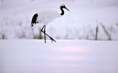
Japanese crane, Hokkaido, 1997
Fallen snow is, in fact, unique in landscape lighting, and its nearest competitors, beaches and water, don’t really come close (with the single exception I know of being White Sands in New Mexico). There are a number of things you can do with it, and one of my favorites is to use it as a kind of white canvas background for things happening in the snow. The Japanese crane standing in the shallows of a snowbound stream may not be typical of snow photography, but it gives a hint of the range of effects. This occasion happened to include some freezing fog, which only added to the ethereal bluish white light.
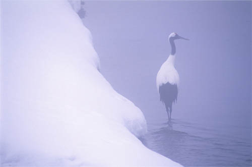
Japanese crane, Hokkaido, 1997
And when the sky is clear, one short-lived effect happens at the ends of the day, easily missed if you don’t know what to look for and aren’t in the right position for the several minutes that it happens. As we will see on pages 60–61 with the waterline shot of Lake Dal, the sharper the angle, the more perfect the reflection, and the same thing happens with snow—even more so if it turns to ice. In the late afternoon shot of a crane on the left, taken with a 600mm lens, the gentle rise of the slope meant that we’re almost at the level of the snow, which catches the delicate pink of a weakly setting sun over Hokkaido. ![]()
The sun’s reflection in snow
Ordinarily, a covering of snow acts as a broad reflector, uplighting objects (below left). But near sunrise and sunset, from a low angle it picks up the pinkish glow, adding a special subtlety.
INTO THE LIGHT Reflections & Refractions
It’s one of the simplest lighting actions to take, yet with the biggest effect. Turning around from the default position, in which light shines on the subject from somewhere more or less behind you, so that you now face directly into the light, changes everything. Suddenly, from the technically efficient and simple, you’re dealing with many of the things that make camerawork complicated and unpredictable: flare, high contrast, silhouettes, and uncertain exposure. But what you can get from shooting into the light is mood, atmosphere, and creative choice. There’s more room for individuality in this kind of situation, and there is certainly a choice of treatment. At one end of the treatment scale is the dense, rich silhouette. At the other is the flared, well-exposed style which opens up the foreground shadows but lets the bright detail behind go off the register to pure white.
Cienaga de Cholon, Caribbean coast, Colombia, 1979
The conditions need to be bright and sunny, and the sun, or its reflections, needs to be low enough to be in-frame. This happens in several other lighting situations in the book, including golden hour, reflection light, edge light, and sunstars, but even so, this is so distinctive a kind of lighting that it merits its own entry. For the next several pages I want to look at the variations of into-the-light, and there are many. Here, to introduce the theme, are two of the classic evocative effects of shooting toward the sun: reflections off of surfaces and refractions through something. The reason why they are an important part of this kind of shooting is that they bring the sun actually into the scene, rather than having it just sitting above and behind.

Shooting toward the sun
Compare this illustration with the alternatives at the same time of day on pages 94–95.
Reflections are about angle: your angle to the surface you’re shooting, and the sun’s angle to the landscape. It would be a little tedious to start talking physics at this point, but with a flat surface, like water, the lower the sun, the lower the camera position needs to be in order to catch the brightest reflection. Basically, the angle of incidence equals the angle of reflection. Under Reflection Light—Concentrated Bands on pages 64–65, there’s a side-on illustration that shows this. The angle at which the sun strikes the surface is the same as what you could call the viewing and shooting angle. In the picture here of a canoe being slowly paddled across a lake, the sun has only just risen, which you can tell because I was shooting from another such boat, close to the surface. The ripples, however, which help make the shot, are reflecting different things, and the dark bands are from the trees out of frame behind.
Refractions are another way in which the sun interacts with the scene. To have refraction, the thing that the light shines through has to be transparent or translucent, and the many effects are because of the change of angle of the light. On the left is an obvious one, bottles (of oil) for sale in Omdurman market, Sudan. But clouds also refract light, which is why the sun behind clouds that are not too thick can make such a variety of effect. ![]()
Oil bottles, Suq Libya, Omdurman, Sudan, 2004
Shooting directly into the sun carries its share of technical problems, simply because of the huge range between the sun’s disc and foreground shadows. The term for this is dynamic range (what photographers pre-digitally used mainly to call the contrast range), which technically speaking is the ratio between the maximum and minimum light intensity in a scene. There is also the dynamic range that the camera is capable of, and the dynamic range of how you show the final image, whether on a screen or as a print, but for the time being let’s discuss the scene dynamic range.
Cow Close, Wharfedale, Yorkshire, 1980
Shooting straight into the sun gives about the highest dynamic range that you can face in photography, and in fact, truly high dynamic range (HDR) means any view in which the light source itself is visible. For more on HDR see Archive Light—What HDR Really Means on pages 242–243. Oddly enough, dynamic range was less of a problem with film than with digital, according to my point of view (not everyone’s). This might sound strange, given that digital images have such amazing potential for being processed any way you like, but one of the differences between film and a sensor is clipping. The way film responds to having the sun in-frame is to grade smoothly from highlights to the out-of-range white of the sun. A sensor just loses it sharply, because once each photosite on the sensor is full of photons, it delivers pure white to the processor. This is known as clipping, because there is a sharp cut-off in what the sensor can record of highlights. It also varies by channel between red, blue and green. One effect of this, when the colors go beyond the gamut of the color profile, is banding, which, as you can see from the image on the right, looks terrible. It takes some careful processing to avoid having these odd-looking bands encircling the sun. The glass-like river scene in Golden Hour—Facing into Soft Golden Light on pages 98–99 needed just this careful processing for the sky around the sun to look smooth.
A detail of an into-the-sun shot processed normally (below left) with evident banding, and with processing attention (below right) to smooth out the gradation.
None of this is any reason to avoid shooting into the sun, but be aware that the processing will take longer. This banding reduces if you reduce the exposure with the Raw converter’s slider; also, the Raw converter’s highlight-recovery slider will help. It may even be necessary to make two versions from the Raw converter and blend them later. Finally, using Replace Color in Photoshop after Raw conversion allows you to target “bands” and change their hue (yellow tending to green is common), saturation and lightness. An alternative if you have the camera locked down is to shoot a range of exposures and make an HDR image file. See pages 242–247 for more on this. ![]()
Irula rat-catchers, Tamil Nadu, India, 1992
INTO THE LIGHT Blocking the Sun
You can shoot into the sun without having to see its disc, and avoid the dynamic range problems that we learned about in the previous pages. One useful way around the dynamic range problem is to position yourself so that something blocks the sun’s image. The dynamic range is still high, but more manageable. Depending on what is doing the blocking, and on whether there is space beneath it, there are two possible side effects, and they can be turned to advantage in making the shot more interesting. One is a cast shadow, the other a reflection of the sun on the ground or whatever other flat surface you see.
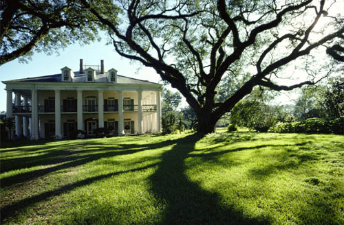
Oak Alley Plantation, Louisiana, 1978
For a cast shadow, much depends on the shape of the object, and also on the texture of the ground. The example I’ve chosen here is a well-known antebellum mansion on a plantation in Louisiana, on the banks of the Mississippi. Called Oak Alley Plantation, it has a long alley of 300-year old live oaks, broad-spreading and with heavy branches. Blocking the sun with one of these made it possible to use its powerful shape a second time in the image, by bringing its shadow on the light-green grass into the frame. There’s a strong link to silhouettes with this way of positioning yourself, and there’s more about that under Backlight—The Silhouette on pages 70–71. The difference is intention, because silhouette is about shape and outline and a deliberately two-dimensional cutout effect, while here the idea is more to do with light management. Nevertheless, in this image, the combination of silhouette and shadow, twisting and enclosing, has become as important to the composition as showing the mansion in the background.
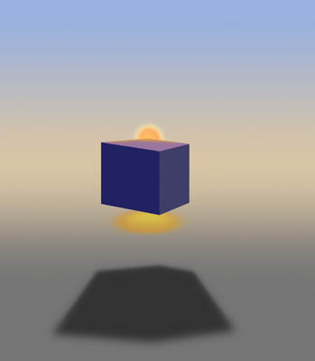
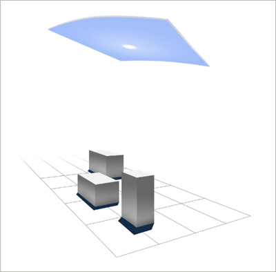
Two lighting effects from blocking
The floating cube stands in for any number of objects that you could put between you and the sun (this view is slightly above camera level). It both casts a shadow on the ground and, if there is any shininess to the surface, reveals the sun’s colored reflection.
The second image, of what was at the time the principal spy aircraft for the U.S., uses the reflection effect that the illustration here shows. I had spent the afternoon having the Blackbird towed around the airfield at Beale AFB, and this was to be the last shot before sunset. Of course, gauging the exact point of sunset and having the aircraft positioned exactly on the axis between sun and camera meant a lot of messing around, but it was worth it. I did not want a silhouette in this case. Instead, I needed to show detail, hence blocking the sun to pull down the dynamic range, and with the camera low on the runway pick up the red glow of the sun’s reflection. If the sun had been in shot, incidentally, it would have overwhelmed this kind of reflection. ![]()

SR-71 Blackbird, Beale AFB, California, 1986
SHADE TO LIGHT Looking Out & Beyond
Key Points
A Stage Set
Natural Progression
Leading the Eye
Standing back from the sunlight, either inside or in the shade, and looking out is also a classic way of framing a shot. More even than the examples we just saw, it makes use of the natural, almost unavoidable tendency of the eye to move toward the light. Added to this is some psychology, because in an image like this one, not only is the viewer firmly placed within the scene, looking out, but there is a sense of the outside sunlit scene being somehow positive and attractive. That, at any rate, was the idea behind this view of Canterbury Shaker village in New Hampshire on a bright fall day, seen from a Shaker-built rocking chair. Exposure is key to this kind of shot. If set so that there is more detail in the shadows and the outside is washed out, the eye is not invited quite so strongly to move outward. Here, the exposure was for the exterior—but then a touch lighter—so that there is everything to look at. The sun streaming in through the doorway keeps the chair and door alive, too.
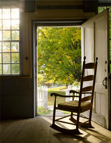
Rocking chair, Canterbury Shaker village, New Hampshire, 1985
This effect of pulling the eye out toward the distance, almost despite itself and working both visually and psychologically, was used in painting well before photography hit upon it. I’ve mentioned this before, in The Photographer’s Mind, but it’s worth re-visiting. The hugely influential Claude Lorrain, the great seventeenth-century landscape painter who first began treating landscapes as subjects in their own right, devised a way of constructing a composition that led the eye very precisely. It was one of his most distinctive treatments, and goes as follows. A dark, shadowed foreground, weighted and partly framed to one side with trees, like the wings of a theatre. On the other side, and a little beyond, another framing mass, not quite as dark, but still like a theatre wing, so that the scene becomes a kind of stage set. Beyond, the landscape receding to the horizon becomes lighter and lighter, and the sky lighter still, because the view is into the sun. This structure and lighting takes the eye from the foreground on one side across and beyond to the middle ground, and then toward the luminous distance and sky in the center and slightly above. The image has structure, and leads the eye.
Later painters copied these ideas, not least another great landscape painter, J.M.W. Turner, as the illustrations show. A key addition to moving the eye from shade to light was that classical landscape paintings also needed human figures, and both Lorrain and Turner used another special technique to coax the viewer’s attention. They created a pool of light within the foreground-to-middle ground. Two great examples are Lorrain’s “Rest on the Flight into Egypt,” painted in 1644 (his “Moses Saved from the Waters,” 1639 is startlingly similar) and Turner’s “Crossing the Brook” from 1815. The human eye is naturally drawn to figures and faces, so this mini-scene draws the attention before it goes off into the distance. ![]()

Shade to Light
Looking out from a shaded area into the light reinforces our natural attraction to brightness, and so leads the eye very strongly toward the distance.
Claude Lorrain’s “Rest on the Flight into Egypt,” 1644
This highly influential landscape painter developed a much-copied method of leading the viewer’s eye out toward the distance through a series of darker foregrounds and middle grounds.
J.M.W. Turner’s “Crossing the Brook,” 1815
The British painter Turner made great use of this method from Claude Lorrain, as here. The pool of light with people in the near-middle ground is typical.
REFLECTION LIGHT Mirror Smooth
To avoid any confusion, here I’m talking about shooting into the reflections of light, rather than using reflected light to bounce up onto a subject—that’s dealt with later, in Reflected Light from pages 188–197. The reflections here are of the sun and the sky around it, usually in water and bright and sparkling. Being reflected, it’s a touch less bright than the sun itself, possibly around one ƒ-stop, but much depends on what happens to the water, as we’ll see on the following pages. Here to start with is the setting when the water is mirror calm, and the reflections are close to perfect. This is a lot more common when the water body is small and shallow, naturally, so that when there is the same effect on a lake, for example, we immediately see it as being slightly special, an unusually still day, probably an early morning before the day has really got moving. The angle to the surface is important, because the lower the camera—the sharper the angle, in other words—the stronger and brighter the reflection.
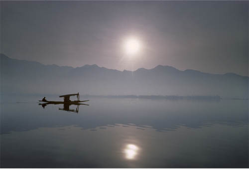
Shikara on Lake Dal, Kashmir, 1984
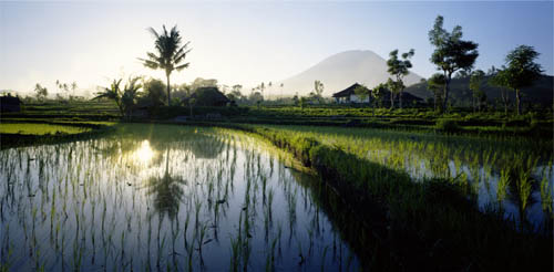
Rice paddy below Tirtagangga, with Gunung Agung, Bali, 1996
Mirrored reflections of sun & silhouette
Approximately a stop darker than the scene above water, near-perfect reflections like this catch a mirror image of the sun at the high end of the brightness scale, and the silhouette of anything floating at the dark end.
Flat water and shooting into the sun means double the trouble for exposure, and the dynamic range is almost guaranteed to be outside the camera’s range. This is not necessarily a problem, but it does place a high premium on getting the exposure just right, because there is inevitably going to be a lot of recovery going on in the Raw processing—certainly of highlights and probably of shadows also. That means the processing is going to be at full stretch, and will need all of the extra dynamic range that the 14-bit or 12-bit Raw file contains. There are different opinions, but mine is, with digital, to let the sun clip to just the amount that the Raw processor can recover without having sharp banding around the disc. Better still, if you have a neutral grad handy and there’s a reasonably straight horizon, use it to bring the exposure of the sky down to the brightness of the reflection in the water. A 1 ƒ-stop reduction from a 0.30 grad or a 2 ƒ-stop reduction from a 0.60 grad will help, given that you are pushing the performance of the sensor in the first place. Another possibility for keeping the dynamic range down is to block the sun in some way, as suggested on pages 56–57. The shot here of rice fields in Bali uses this little technique. ![]()
The mirror-smooth reflection on the previous pages, which in effect give you a double sun, is a real technical challenge to pull off because of the contrast. However, when the sunlight being reflected is spread out across the frame, the situation is more friendly. In fact, given a few necessary elements in the picture, these conditions can more or less guarantee you a striking result. The reflection, of course, provides an overall backlight, a bright and consistent backdrop for whatever is in front—or in the case of the Thailand shot, whatever is on the water.
Fish farms in the Gulf of Thailand, Songkhla, 1997
I mentioned necessary elements. There are four ingredients that go into this kind of lighting. The first is a certain amount of haze, which in the direction of the sun not only softens contrast, but also spreads the light more across the sky. The hazier, or indeed cloudier, the sky, the broader the light. Thin, high cloud will do this, though without the warm glow, but the thicker it gets, the less directional the light becomes, so this kind of effect needs a kind of balance—the light spread out across just a part of the sky.
This explains the second ingredient, focal length, because the longer the lens, the tighter the framing and the better chance you have of keeping the reflected light evenly bright across the frame. Well, it’s not a studio and there are no black marks for failing to get the backlight completely even, but as the Thai fish farms and boat show, it’s a good effect when the light is smooth. The third ingredient is silhouette. As this is a reflection shot, and usually by the sea or a lake or river, there needs to be a subject neatly within it. The edge of a coast or a riverbank won’t do it alone, so it’s a matter of finding something either floating or, happily in this case, actually built in the water.
The final ingredient is elevation. The laws of physics mean that the angle at which the light strikes the water is the same as the angle it bounces up to you and the camera. Basically, the higher the sunlight in the sky, the higher the camera has to be. Finding the viewpoint is where most of the effort usually goes in a shot like this.
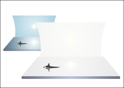
Haze broadens the reflection
Compared with the relatively clear sun of the previous pages, a hazy or misty atmosphere broadens the light source, and equally broadens the reflection, like a softbox in a studio.
Slightly different is the waterline shot of bathers in the Hooghly River in Calcutta. The sunlight is only slightly hazy here, and the sun’s disc still quite intense. By positioning myself so that the bathers partially block the sun’s reflection (see also the Balinese rice field shot on the previous pages), I could use the surrounding reflection of bright sky as the backlight. ![]()
Morning bathers at the Howrah Ghat, Calcutta, 1984
REFLECTION LIGHT Concentrated Bands
Key Points
Design Element
Breeze & Ripples
Exact Timing
More familiar than the mirror-like image of the sun, floating and moving gently in still water, is the vertical band with a rippled, almost striped appearance. The boy wading across the shallows of the Mekong River is, dare I say it, a classic situation. Non-photographers might think, “ripples, so what?” Yet, as just this image shows, it becomes a strong compositional device. In fact, it’s even more the subject of this photograph than the boy.
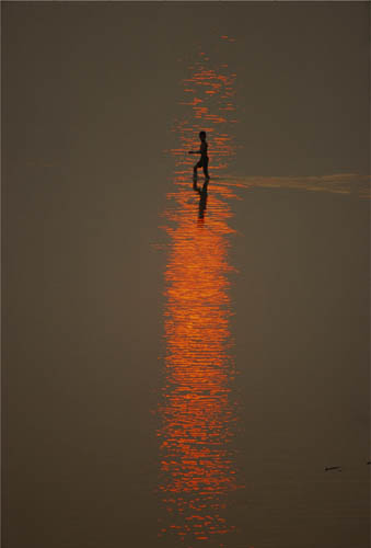
Boy wading through shallows, Mekong River, Vientiane, 2002
As in all these reflection shots on these pages, there has to be something in the water or on the ice, but the object is often a device to show off the lighting, and the two of them—object and light—usually share the billing in this kind of image. Timing, of course, was key to this particular picture. I stood on the bank of the Mekong in Vientiane, at an angle that put me facing the shallows looking toward the western sunset, and waited for an object—a person wading or a small skiff, both were around. The timing was critical in another sense, because the window of opportunity for a shot like this is narrower than you might think. Even ten minutes earlier, the sun was so strong that its reflection totally dominated the shot—look at the smaller image of the skiff (opposite), which crosses over the band of light and becomes lost in the darker water on either side. Prime time for this lasts only a few minutes, when the sun’s intensity is not much greater than the surrounding water, and when its color is the deepest red. You then need to factor in the pattern of ripples, affected by the breeze, and the likelihood of getting an object conveniently in place. None of this is guaranteed, and another late afternoon in the same spot delivered no such success, despite the clear sunset.
How ripples form patterns depends mainly on the wind, and even the lightest breath of air can send a shiver across the water that breaks the image of the sun into pieces. Generally, the lightest breezes create a column of light, and this can jump up and down in height very quickly and unpredictably. All of this is exaggerated if you use a telephoto, which is usual for these kinds of shot so as to isolate the subject. A little windier and the column spreads sideways to become an area of ripples, which are also more closely packed. ![]()
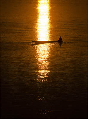
10 minutes earlier
Timing for this kind of sunset reflection is critical. Shadows could have been recovered more from this in processing, but the effect is far from the more delicate, richer result in the main shot.
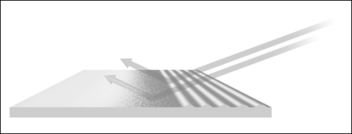
How ripples break up the reflecting surface
From still water at left, through light ripples from a gentle breeze, to the beginnings of waves at right, the movement of water divides the surface into small reflectors that face in different directions.
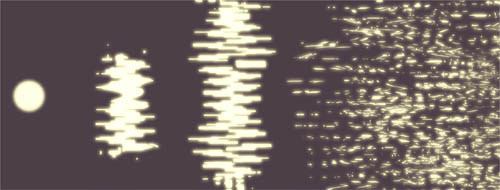
From vertical band to overall texture
Just a slight movement in the water surface changes the sun’s disc into a column, and not much more movement loses this to an overall pattern of bright and dark that covers the surface.
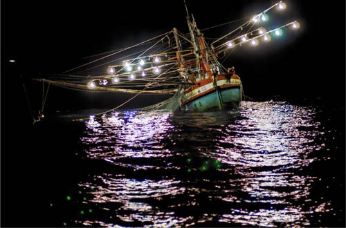
Squid boat, Gulf of Thailand, 2007
REFLECTION LIGHT Projected Ripples
A much more unusual type of reflection light is when the ripples of sunlight are themselves projected onto a surface. When it happens, the effect is very special and worth taking advantage of, with the warning that it usually looks better with the movement that you see at the time than in a still image. There always is movement, naturally, because the ripples are being created by something that is moving the water slightly—either a breeze or the flow of water.
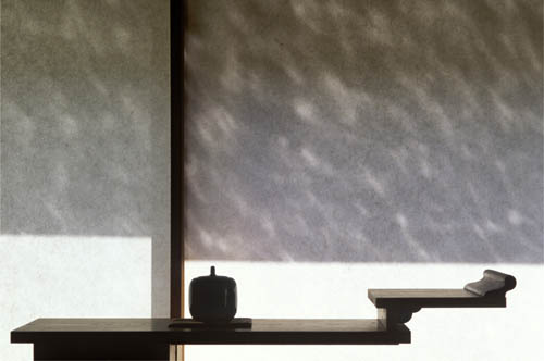
Reflections on shoji screen, house in Yamaguchi, Japan, 1998
Both of these examples happen to be from Japan, and both from the same book assignment on contemporary Japanese design, but that’s a coincidence. The conditions are special, and there are two ways in which this lighting effect happens. The more obvious is when you have a translucent screen, which could be a ground glass pane, but here happened to be the perfect material for projection—a shoji screen made of hand-laid Japanese paper stretched across a light wooden frame (left). The illustration shows the setup, and it depends on the time of day, aspect to the sun and, of course, a very bright sun in a clear sky. The moving effect which you could capture on video is lovely, even mesmerizing, but translating this into a still image can sometimes be disappointing, because the screen itself is already light in tone. The projected ripples usually move quickly across a screen like this (the projection magnifies them), and they benefit from being sharp rather than blurred, so it’s worth checking the shutter speed needed to freeze them. Also shoot many frames; like people’s expressions, they vary, and there will be some moments of capture that look better than others. After all of that, it is also tempting to heighten the contrast during processing to make them stand out clearly—in Adobe Camera Raw, both the Contrast and Clarity sliders have an effect.
The second way in which ripples are projected is onto a solid dark surface. The darker it is, and in this case the wall is stone, the more intense the reflections will be. Also, a slower shutter speed does not necessarily reduce the effect, as it does on backlit screens like the shoji example. Instead, the longer exposure adds to the intensity of the reflection by superimposing the different ripple shapes onto the surface, and they can sometimes add up to an interesting wave-like effect, as here. This particular situation was unusual, comprising a shallow trough of an interior pond, open at one end to the sky and facing east, with sculpted glass blocks in the form of large stones in the center. Shortly after sunrise, the light refracted exquisitely through the glass onto the wall, which itself had a sheet of water falling down over it. All precisely calculated by the architect, the famous Kengo Kuma. ![]()
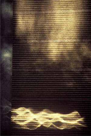
Reflections on water wall, Water Glass House, Atami, Japan, 1999
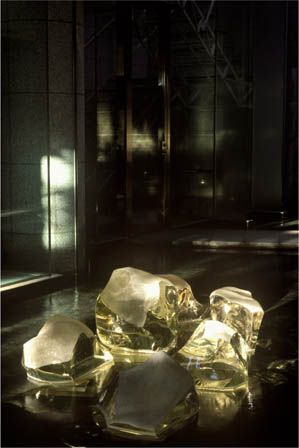
Glass rocks, Water Glass House, Atami, Japan, 1999
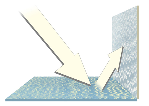
How ripple reflections project
BACKLIGHT Translucent Windows
In Reflection Light—A Broad Wash on pages 62–63 we saw what happened when the sunlight is hazy enough to spread out and when you use a telephoto to keep tight in on a broad area of light. A broad light source makes a backlight, one of the favorites in studio photography because it creates a kind of blank white canvas against which you can place objects or people clearly and simply. And if the objects are themselves translucent or transparent, backlighting is indeed the lighting of choice, because it allows light to play through the object without the distraction of the things in the background. As a classic studio still-life set-up—for drinks in particular—it usually calls for special photographic lighting (see pages 84–85 Window Light—Directional with Soft Shadows for the equipment), but daylight can do the job equally well. You simply need some kind of translucent screen, such as the one we saw on the previous pages. To be completely anonymous, however, a backlight is better with no texture at all, which favors materials like sandblasted glass and milky Plexiglas. In the case of the masks shot, this was a translucent window in a Hong Kong hospital. The masks look disturbing, and are. They are targeting masks worn by cancer patients for radiotherapy, made of transparent plastic. No other kind of lighting would have worked for these—reflections would have made them complicated, while like this, the extreme simplicity of the tones gives emphasis to what the eye reads into the masks as expressions.
Masks for radiotherapy, hospital in Hong Kong, 1993
Window thickness & diffusing strength
How evenly a sheet of translucent material spreads the light depends on two things: the way in which it diffuses, and its thickness. Sandblasted glass gives a less even spread than milky Plexiglas, but both diffuse more broadly when they are thicker. Unfortunately, extra thickness transmits less light, also.
Exposure sequence for an HDR file
The peony-painted doors were of sandblasted glass, which does not spread the light evenly. To make the light even across the frame, as I wanted in this case, the solution was to shoot a sequence of different exposures and combine them using HDR techniques as explained on pages 242–247.
The other photograph is of painting on glass, which looked more intense and more interesting backlit rather than frontlit. However, as the glass was sandblasted, it did not spread the backlight evenly, as the individual exposures show, and to achieve this totally even effect I had to shoot different exposures and blend them together. A single shot with light concentrated in the center would have made a good image in a different way, but here the purpose was to show the painted peonies to their best advantage. ![]()
Glass doors painted with peonies, courtyard hotel, Beijing, 2010
Finally, when shooting into the light, there is always the option of going for a silhouette, and this means ignoring all shadow detail, exposing for the bright background, and relying on the way that shapes and outlines of things work graphically. Some situations are natural for a silhouette, as we saw in the Thai fish farm shot on pages 62–63, while others can be pushed to work in this way by the way in which you expose for them and process them. I believe it’s important, though, to see silhouettes as a graphic form in their own right rather than just an exposure choice. When they work well, it’s because they follow a very particular visual way of representing something, which relies heavily on outline and, strange to say, on the principles of caricature. This may sound a little odd, but there is something to learn from this, and it’s worth going back to the height of popularity of silhouettes in the 18th and 19th centuries. There was even a connection with photography, though a contrary one, because it was the camera that took over from the cut-out black card silhouette as a cheap way of making a portrait. A silhouette relies on its outline, which means that if you want the image to read clearly, the outline has to be the right aspect and the right moment. For capturing a person, that would usually mean in profile (so that the face reads), and at a moment when gesture and stance are expressive (for example, a hand outstretched, both legs clearly separated if walking). Getting that stance, that exact moment, is especially important for a silhouette, which relies entirely on this, and explains why I chose this exact frame for the shot on the Nanjing lake, particularly for the two figures at the right but also for having a few people all neatly between trees at the same time (I shot 40 frames).
Xuanwu Lake, Nanjing, China, 2010
Of course, just being clear and recognizable may not be as interesting as being mysterious. Silhouettes have a certain graphic attraction that has continued long after the original card cut-out method. This comes both from the viewer having to put a little effort in to work out what the scene is about, and from the overall neatness and precision of black against light. That is why I preferred this silhouetted version of two Akha girls carrying grass to any of the others that I shot—the first take is of a pair of very odd creatures on the skyline. In any way of shooting a silhouette, the key is to expose for the light background and keep the subject dark—even black, as in the case of the Nanjing lake shot. Silhouettes do better without depth and dimension. ![]()
Enhancing the silhouette effect
From left to right: unprocessed detail, black and white points closed up, converted to black and white, blacks and whites clipped.
Unprocessed exposure in hazy sunlight
The same scene as the main image, from farther back and with no processing.
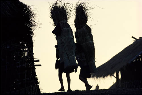
Akha girls carrying grass for thatching, Chiang Rai province, Thailand, 1981
AXIAL LIGHT Low-Sun Telephoto
Low-sun telephoto means light that follows the lens axis, looking straight down the line of sight. In the studio you need some trickery to manage this, and one method is to angle a sheet of glass at 45º in front of the lens while aiming a light at the glass from 90º. Another method, developed originally for medical use and later taken over by fashion photographers, is a ring flash, which encircles the front of the lens with a circular flash tube. The natural light equivalent is when the sun is exactly behind the camera, and that means usually when it is low on the horizon. That might not sound so unusual, but in practice it turns out that quite a few photographs are taken with this light—and the way it falls does have some unusual characteristics.
The Dome of the Rock, Jerusalem, 1984
To begin with, axial light is shadowless but at the same time intense, which comes across as unexpected. We usually associate shadowless with heavily diffused light, as on the gray days that began this section, yet this one has sparkle. Where it gets interesting is in the reflections, which naturally are also axial, bouncing straight back to the camera. And when the surfaces have some textural quality to reflect back, it can justify the entire shot, as in the picture of the Dome of the Rock in Jerusalem, from the Mount of Olives (left). Even the Thai Royal elephant’s hide (above) glistens in the axial light of a morning sun, giving intricate texture without shadows, which is quite a feat for any light.
Royal elephant, Sakon Nakhon, Thailand
Ah, did I say shadowless? There is, in fact, one shadow that’s always potentially present—that of you and the camera. Unless you’re planning on a self-portrait silhouette (perfectly reasonable idea), this is quite hard to accept in a picture, and difficult to eliminate. The classic solution is to shoot from a distance with a longer lens, and without a foreground in view. The picture of the Dome of the Rock, taken with a 400mm lens, is a perfect case, so distant that from there I would hardly be visible, let alone cast a shadow. Better still, the ground falls away from the Mount of Olives, so there was no need to raise the camera slightly—that’s another solution. A third solution, slightly less satisfactory, is to move a little off-axis (see the elephant), while the fourth and last is simply to wait until the sun has risen a bit and your shadow has moved back toward you, out of frame. That’s quite a frustrating process, as you watch the axial effect diminish before your eyes. With the elephant, by the way, the bounce-back of the sunlight from its hide gives a lovely textural quality. ![]()
Axial sunlight
With the sun behind the camera, everything is lit, with just a light surrounding shadow to deep or rounded objects.
Key Points
Frontal Light
Flat
Edge Shading
Doorways and windows, particularly when there is one behind the camera, create conditions for axial light that, unlike the low sun on the previous pages, do not depend on the time of day. The basic situation is an enclosed space with no other light except from behind you, standing in the doorway, and the effect comes close to being shadowless. What shadows there are fall around the edges of objects in your line of sight, as the illustration shows, and this is not at all the same as the wrap-around shadowless lighting in fog and mist, or in pale gray light. The difference, as always with subtle distinctions in lighting, lies in the clues that the eye takes from the scene, especially that slight but telltale shading-off around the edges of objects. If at this point you start to think of ring flash, you wouldn’t be totally wrong.
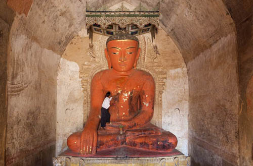
Buddha image, Sulamani temple, Bagan, Myanmar, 2003
The example below is an old brick temple on the Bagan plain in Myanmar (Burma). The way in which many of these Buddhist pagodas were designed meant that on each of the four sides a large doorway opens onto a vaulted chamber, not particularly deep, with a Buddha statue facing out. For many people, the very flatness of the lighting, which naturally kills any modeling, argues against it. Hence the alternative treatment from one corner, as shown in the illustration. However, another point of view—mine in this particular case—is that there’s a cool, formal objectivity to this light that brings a kind of restraint to the image. At the risk of straying from photography, I want to show next to it a painting by one of China’s leading artists, Shao Fan, who is also a friend. In this period of his work, Shao Fan is returning to some older principles of Chinese art, in particular to the idea of showing form without the help of light, and this is one of the key differences between the Chinese and Western art traditions. To me (my words, not Shao Fan’s), there does seem to be a virtual light source in this and other paintings of his. The darkening at the edges of the horse make the light seem to come straight from the viewer. ![]()
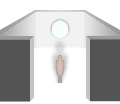
Virtually shadowless light
Seen from slightly above the camera position for clarity, the only shadows in this kind of scene are the slightly darkened edges of solid subjects.
Light from in front
An angled view of a similar temple chamber in a nearby temple, to show the frontal daylight from the large doorway out of frame at left.
Shao Fan
A painting in Beijing artist Shao Fan’s “lightless” style at his 2012 solo show—the artist at right.
This is a more unusual variation on the open doorway, because here we’re looking straight down into a ship’s hold. The lighting quality, however, is the same as before, and what’s interesting here is how the interior where the man is working reacts to this axial light, and essentially makes this particular shot work. This is the hold of a ship, and what’s inside (peering down, we’re curious, of course) looks like the aftermath of a catastrophe, and very dirty. In fact, this is a burned-out dhow on the Dubai waterfront. After a fire gutted the ship, it was towed here where an Indian crew is cleaning it out. When they have finished, it will be towed to India to be repaired. Everything is coated in black grease and soot, even the worker, who is blending into the gray mess (but note the catchlights in the eyes).
Cleaning out a burned-out dhow, Dubai waterfront, 2012
One of the qualities that I personally get from axial light is a sense of almost dissecting the subject. With everything lit, no corners concealed and no shadows, I don’t think it’s too fanciful to say that it’s a kind of forensic view. Going back for a moment to the ring-flash effect I mentioned on the previous pages, that specialized kind of photographic lighting that fits around the front of the lens was actually first designed for medical photography. I might be pushing this insect-pinned-down feeling too far, but the fact that we’re looking down on the man seems somehow to fit with this kind of lighting. Nothing is hidden, so that every grimy bit is exposed. One feature of axial lighting is that in most situations the contrast is low, simply because there are no deep shadows. The exception, which we saw a few pages ago, is when there is a highly reflective subject and sunlight bounces right back. This doesn’t apply here, but it does mean that you need to think about the overall level of brightness when setting the exposure. Here, it’s soot-covered, so it needs to stay dark. ![]()
An alternative framing
From the same position, zoomed back a little and horizontall framed.
The situation
From the side, a well-like effect with top-lighting as described on pages 82–83, but from the hatch opening overhead, purely axial light.
A workshop shoot
This was, in fact, part of a photography workshop, with local Dubai and Sharjah students.
SKYLIGHT Blue Shade
Ever since color photography became possible, photographers have had to worry about color temperature (or what now gets called white balance), and more than anything, about the dangers of a blue cast from open shade on a clear sunny day. The effect is certainly there, but whether it’s a problem is questionable. What happens should be immediately obvious from the illustration. Take a cloudless day: Most of the light, in the region of 85%, comes from the sun, but some also comes from the rest of the sky, a large area reflecting sunlight, but reflecting only the blue wavelengths. For the technically curious, this is called diffuse sky radiation, and appears blue because normal atmospheric particles are smaller than the wavelength of sunlight and scatter the shortest wavelengths, which happen to be blue. Anywhere shaded from the sun is lit by this blue light, plus a little bouncing up from the ground or from walls.
Park Avenue, New York, 1998

How skylight works
Typically, shade on a clear sunny day makes the subject lit by the blue sky alone, with a small amount of white light bounced up from the ground.
So, what’s the problem? It’s a legacy of the days of film, which is color-balanced to one kind of light only. Most color film is/was daylight balanced, meaning to light from a midday sun. With this set as neutral, skylight is blue-ish, to be corrected with a film camera only by warming filters over the lens. But it is also a legacy of a mindset that promoted correctness. Portraiture more than anything carries certain expectations about lighting and color, and accurately portraying the color of skin tends to be a priority. Digitally this is simple, and tweaking color balance in or out of the camera is easy. And because it is so easy to choose color balance after the event—a normal action if you shoot Raw—I can see a shift in attitude over the years. Fewer people these days seem to worry about “correctness” of color, and I suspect it’s because it is no longer fixed. If you can’t do anything about a color shift, it qualifies as a problem, but if you have total freedom, it becomes a choice. The good thing about this choice is that the blue in shade can add color interest to a shot, especially when it contrasts with the warmer sunlight. We’ll see more of this when we get to Magic Hour (pages 104–107), but for now here are two images that work partly because of the added blue. ![]()

Woman & child, Fatahillah Square, Jakarta, 2012
SKYLIGHT COLOR BALANCE
Although the light intensities are very different, you can choose from the camera settings or in Raw processing how to balance the color. At the ends of the scales, neutralizing the sunlight renders the skylight blue, while neutralizing the skylight makes sunlit areas appear yellowish.
In the years between mainly black-and-white film photography and digital, when the majority of professionals were shooting color transparency, shade on a clear sunny day used to drive photographers crazy. The blue shade from skylight, which can be used as a color element in the kinds of image we just saw on the previous pages, does no favors to skin tones in a portrait. This was a pity, because in other respects the qualities of open shade, especially with some bounced reflections from brightly sunlit ground out of frame, are all to the good. Painters in their studios, always built for the north light, never had this problem, because they chose their pigments according to what they saw—or wanted to see—and the eye’s famous ability to normalize the color cast took care of everything. The flexible settings in a digital camera take us back to this relaxed state of affairs, meaning that you can have any color balance you like, especially with a Raw file.
Cesar Gorinsky, rancher, Rupununi, Guyana, 1973
I’m exaggerating a little when I title this “portrait standard,” because the naturally lit ideal is a studio with control over the reflections from walls and ceiling, but the principle holds true even in the uncontrollable outside world. On a bright clear day, move your subject to the side of a building that is blocked off from the sun, and you have instead the broad and soft light from up to 180º of sky, which generally means a downward angle of around 45º. The moment you move from sun to shade, the immediate impression is of losing most of the light—easily a 4- to 5-stop reduction—but give your eye some seconds to adjust by facing into the shade, and its soft-yet-directional qualities become obvious. The occasional bright reflection from beyond the shade—as you can see happening in the black-and-white portrait here, taken in the tropics and with a fleck of sunlight already reaching the sitter’s hat—only adds to the interest. And the color balance is no longer an issue. ![]()
Skylight set-up for a portrait
An effective way to use skylight for a portrait is to sit the subject just in shade, to allow bounced light from the ground to open up the shot, and even, in the case of the black-and-white portrait here, hint at some patches of sunlight.
Pathan elder, Swat Valley, 1980
TOP LIGHT Deep Forest
The skylight that we just saw is, naturally, mainly from above, but there’s another, more concentrated kind of top lighting, and it happens when the surroundings are closed off in some way. The extreme version would be standing at the bottom of a well, although this is not the most likely scenario. In the situation we just saw in Axial Light—Ship’s Hold, if instead of looking down on the man we were at his level, this would certainly qualify. Or an atrium of the kind popular in hotel design.
Logging elephant, Mae Sariang, Thailand, 1998
The light floods down from above, broadly rather than in the form of a spotlight or shaft of sunlight, but there is little in the way of fill lighting from the sides. Because there are relatively few situations where you find this lighting on a large scale (paradoxically, it is common in still-life studio shooting), it has a certain unusual feel to it, with even a hint of being enclosed and restricted. Psychologically it usually feels more inspiring to be on top of things, like a hilltop, than at the bottom.
Choosing the right neutral grad
Grads are available in different strengths and softness of transition. The sharp-cut 0.60 grad at left is less suitable than the smoother 0.30 at right, both because of strength and the transition.
The location I’ve chosen here is forest, the deep kind with tall trees, and you can find it from tropical rainforest to the north woods. This particular example is subtropical, on the Thai-Burmese border, where elephants are used for logging. Or rather were, because this practice is now banned on the Thai side, and this elephant is working for the Forestry Department recovering illegally felled tree trunks. This is where the special atmosphere of top lighting comes in to play, because the more we sense it, illuminating the upper surfaces only, the stronger the idea is that we are deep and that these are physically impressive surroundings. The light shades from top to bottom, so there is always the possibility that the exposure may be a little too high for the upper part of the picture, but beware of over-correcting—light flooding down is part of the experience.
If you have plenty of time when shooting (not the case in this shot of the elephant), a neutral-grad filter would be worth using, or you could use the digital version when processing. But these things are easy to overdo. The illustration shows the difference between a sharper cut 2-stop grad and a soft-cut 1-stop. The smoothness of the gradation also depends on the focal length of the lens (wide-angle shows it sharper) and on the aperture (small aperture also shows it sharper). The second photograph is a still landscape that would take the grad treatment, and in fact it was shot very slowly, on 4×5-inch film with a view camera, on a tripod. ![]()
Top light in a forest
The mass of dark tree trunks eliminate lighting from the side, leaving a flood of light from above that weakens from top to bottom.
Hoh Rainforest, Olympic Peninsula, Washington, 1984
WINDOW LIGHT Directional with Soft Shadows
Long before softboxes were invented to make flash light gentler, in the professional world there were shaped aluminum boxes that were heavier and bulkier and did the same thing. Fronted by translucent acrylic, they became popular in the 1960s and 1970s in studios, particularly for advertising still-life shoots. They were known not only as “banks” but also as “window lights,” because that was the light they mimicked—a rectangular white light source positioned close. They came in different sizes, from smaller square units around 50×50cm, through the basic workhorse of still-life shooting known as a Fish Fryer, measuring 3×2ft (0.9×0.6m), up through a Super Fish Fryer to the largest, a 6×4ft (1.8×1.2m) Swimming Pool. These names, incidentally, were actual models from the best-known manufacturer of professional studio lighting at the time, Strobe Equipment.
Wooden Shaker bucket, Pleasant Hill, Kentucky, 1986
Though it might seem I’ve wandered completely off topic by talking about studio lighting, these lights were invented and became popular (they still are in the softbox collapsible versions) precisely because of the wonderful modeling qualities of north-facing windows. Go back further in the history of imaging, and north-facing skylights were preferred for painters’ studios. The reason for facing north was, and is, that at no point does the sun shine directly through like a spotlight and change the nature of the lighting. Instead, the window acts as a large rectangular bank of light, and creates a very special and attractive balance between modeling and softness. What this exactly means is that the light is directional, so that it casts shadows and rounds out forms, but at the same time, the shadows have soft edges and retain some detail. Many painters, particularly the Dutch, with their affinity for northern cool light, loved this effect, and Johannes Vermeer’s “The Milkmaid” is just one example. Both of the photographs here, from the same project on the Shakers, make full use of natural window light, with no need for any shadow fill. In the picture of the milk bucket, the camera angle is deliberately half toward the window, which increases the contrast and makes more of the highlighting on the beautifully curved wood. The nuances of camera angle to the window are important with this lighting. ![]()
Vermeer & window light
Vermeer’s “Het Melkmeisje” is the quintessential portrait that uses the decisive-but-soft modeling from a close window. Note that because the window is forward of the room’s corner, Vermeer can use counter-shading to bring three-dimensionality—the shading on the figure runs counter to that on the wall behind, and as a result she stands out firmly.

No light
Minus shadows
Cloudy sky

Blue sky
The window becomes the source
Provided that no sunlight enters, window light is remarkably consistent in quality, though not in color. The difference between light from a cloudy sky and from a blue sky can be dealt with by adjusting the color balance.
Shaker man’s linen shirt, Pleasant Hill, Kentucky, 1986
It’s time for one of those opaque (if you’ll excuse the term) lighting calculations that no one wants to do while they’re shooting, but that can’t be avoided if you’re doing any serious interior photography by natural light. The key fact about windows is that they do not just let daylight through; they become the light source. This in turn means that something called the Inverse Square Law comes into play much more noticeably. This is simply one of the laws of physics that applies when you have force or energy radiating outward, and it means that the intensity of light, for instance, doesn’t just weaken with distance, but it weakens with the square of the distance. One way of visualizing this is that if you think of a sphere surrounding a light and the amount of light it receives, and then imagine another surrounding sphere twice the distance away, the same amount of radiating light reaches both, but the larger sphere has much more surface area—bigger by the square of the extra distance.
Stephen Barber & Sandi Harris, lutemakers, Elephant & Castle, London, 2012
Typical falloff of illumination, obeying the inverse square law. The top illustration is the reality, but our eyes are inclined to minimize the fall-off, as shown on the right.
This is more or less irrelevant for most natural-light photography. If the sun is low and behind you, the light bathing a foreground rock and a mountain 20 miles (32km) distant is to all intents the same. On a scale of the sun’s distance from the Earth, the difference between your foreground and background is minute. However, with a light source much closer, like a window set in one wall, there’s a big difference in the light halfway into the room and at the far end.
Does it even matter? Well, it depends on what you’re shooting and why. Remember that we’re up against the eye’s ability to compensate. If you’re looking across a room with light coming in from one side, you know the light falls off and that the side farthest from the window is darker, but you perceive it as being more or less equal. A sensor doesn’t do that, so if you were shooting a formal architectural interior, you would definitely need to lighten one side or darken the other to some degree, just to get close to the eye’s real-time view. The fall-off appears strongest in this kind of side-on view, as you would expect. You could deal with it when processing, or even take different exposures with a view to blending them later (see the final Helping section). Or you could deal with it on the spot with one or more neutral grad filters. In a planned, locked-off shoot, this is the sensible approach. And it’s because of the Inverse Square Law that, if the view is wide, a single grad is unlikely to do the trick. ![]()
Applying the grad
For the lutemakers portrait, the grad was slid into position, judging by eye when the darker half was just covering the window and man.
Matching grads to the fall-off
A neutral grad filter is the classic solution, but needs attention: (top) the transition on the filter is too sharp for the room, (middle) transition softened either by using a smoother-transition grad or by opening up the aperture, (bottom) two grads overlapping to smooth the effect across the room.
WINDOW LIGHT Streaming Sunlight
Key Points
Pattern of Light
Low Sun
Secondary Bounce
When direct sunlight does stream in through the window, the results can be almost magical, although uncontrollable. This is one of those lighting situations that could as well go in the next section, Chasing, as here, and which it is rather depends on whether you are just visiting briefly or have long-term access. In either case, it calls for quite rapid shooting, as it rarely lasts long and poses some exposure issues because of the very high contrast.
Meeting Room, Pleasant Hill Shaker Village, Kentucky, 1986
Entrance Hall, Monticello, Virginia, 1988
Useful and controllable window light depends, as we just saw over the last few pages, on the window facing north, or at least away from the sun. In the situation here, however, the large rectangular light source is overlaid, in a sense, with a broad shaft of much more intense sunlight. Typically, the pattern of light, which includes the grid of window muntins, moves relatively quickly across the floor and walls. Variations of this appear in the early part of Chasing, from pages 132–135 and also 192–195, because where the sunlight hits the floor or wall, it becomes a secondary light source itself, bouncing away.
There is a built-in attractiveness to this kind of lighting because it usually occurs in or approaching Golden Hour, which we’ll be looking at next. This is all to do with angle, because for sunlight to have any real reach into most rooms through a normal window, the sun needs to be fairly low, meaning lower than about 40º. In the picture of the hallway of Thomas Jefferson’s home, Monticello, the sunlight was at half an hour after sunrise, which accounts for both the warmth and the glinting highlights dotting the wall. For interior photography, the appeal of this short-lived lighting is that it shows the room off in an unusual and special way. Both of these shots would have been that much more predictable and a little duller if they had been taken in more usual daylight. In the picture of the Shaker Meeting Room, not only does the sunlight punch into the floor and far wall, but also secondary reflections make the lower ceiling at left glow subtly. The brightest highlights are very likely to blow out, but if they are small, as here, that is no disadvantage at all. As with some of the flare we’ll see in the next section, the extremes add a sensation of brightness that would be missing if every tone were brought under control. ![]()
An overlay of bright pattern
The projected pattern of the window brings a clear sensation of brightness to the image, an effect sometimes mimicked in studio lighting.
WINDOW LIGHT Narrow Window, Dark Space
Small windows in dark rooms (the two go together, naturally) are a thing of the past, generally. Quite simply, in contemporary living, windows are getting bigger, because there is an almost universal desire for bright interiors. However, going back to the Japanese writer Jun’ichirō Tanizaki, mentioned in the introduction, white and bright Modernism may have taken over most of the world of contemporary interiors, but in photography, hidden things, only partly revealed, go a long way toward making an interesting image. So, in praise of the shadow world, let’s look at under-lit interiors, where light leaks in through very small spaces. We’re more likely to find this happening in an ancient style of dwelling, and it’s no coincidence that two of my best examples of this are from minority communities, building in wood and bamboo.
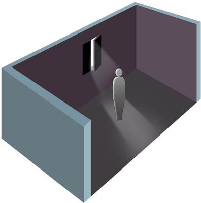
A single small, high window
The set-up for the portrait of the Shan man.
Shan man, Lake Inle, Myanmar, 1982
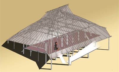
The structure
The low, overhanging eaves allow just a narrow band of bounced light into the interior, but here in the tropics this is still bright.
The isolating effect of this kind of situation—the illustrations show how the interiors were arranged—is excellent, provided that you follow a few simple guides. The effect of a single small window has something of the spotlight about it (see pages 136–143), but without the beam and concentration. The reliable way to handle this is to avoid shooting toward the window, and not attempt to show anything in the shadows. In the case of the Shan man in Myanmar, I was almost side-on to the light from the window, which was perfect for the texture of his face. I exposed for his face alone, which working quickly meant underexposing by about 1.5 ƒ-stops from the camera’s matrix metering. This kind of image tends to be ruined by overexposure, whereas the surroundings can go as black as anything.
The image on the right is almost a kind of axial light. This was a hill minority large bamboo house, with no windows. Instead, the light bouncing up from under the deeply overhanging eaves gave an illumination that you simply got used to when you settled in. Walking in from bright sunlight was like entering total darkness, until the eyes adjusted. I like the effect because it’s not at all clear from the picture alone where the light is coming from, and the position of the girl, with most of the interior space behind her, makes her stand out from darkness, without being harshly lit. The light level was very low. ![]()
Akha girl, Maw La Akha village, Chiang Rai province, Thailand, 1980
WINDOW LIGHT Managing Several Windows
Key Points
Multiple Lighting
Lighting Balance
Shallow Focus
Not many rooms or buildings have a number of windows opening out in different directions; as we just saw, the most typical arrangement is one or two windows in one wall, so that the light comes from a single direction, with the inevitable fall-off that is more extreme than the eye imagines. Several windows in different walls, however, offer the possibility of control. This is largely to do with size, wealth, and purpose: Mansions have bigger rooms than simple apartments, so they need better lighting. Corner rooms offer two walls with windows, projecting rooms offer three, while open-plan design and lofts often span the width of a building. In this case, a lovely teak Buddhist temple in Cambodia, the structure is a single space, freestanding with a series of windows and doors on all four sides. When not in use, the shutters are all kept closed, and for photography that meant I could choose which to open, as if turning on a 360º bank of lights—almost a natural daylit studio. The caretakers were amenable.
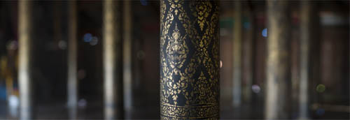
Wat Maha Leap, Kompong Cham, Cambodia, 2011
All I wanted from this particular shot was to show in detail the teak pillars, painted black with stenciled gold decoration. They were a very special feature, possibly unique in Cambodia. During the genocidal years of the Khmer Rouge, almost everything of art, craft and religion that could be destroyed was, systematically. Here was an exception, because the nineteenth century building was used as a hospital, and the pillars were structural. The cadre accepted that they had to remain, but their beauty was hidden with clay, in a rare case of preservation.
The shiny surface of the pillar needed lighting care, and we lit this nearest one with two windows from the left as a main light. Then a thin catchlight from a door to the right and beyond. The plan was to shoot a close-up, but with a background that gave an idea of the number of pillars—basically dark, but with just enough side-lighting to make sense of it. The door right and beyond did the job for the pillars on the right; opening the opposite door far left lit the others. The shallow focus from a wide-aperture lens (85mm ƒ/1.4 at full aperture) was deliberate, to keep the attention focused on the nearest pillar’s details. ![]()
The setup
The layout and arrangement of open and closed windows and doors.
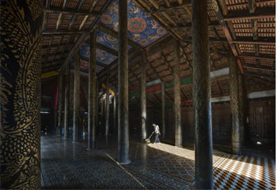
Wat Maha Leap, Kompong Cham, Cambodia, 2011
The more conventional view.
GOLDEN HOUR Basking in Warmth
Key Points
Low-angled Light
Three-point Choice
Seasonal Changes
Having begun this book with some of the less obvious kinds of lighting, I hesitate a little before introducing the perennial favorite. For one, it’s been written up rather too much, and for another there’s an almost herd-like view that this hour or two at the ends of the day is the authoritative best, a kind of ideal that all other lighting conditions aspire to. Some caution is in order. Golden Hour is excellent for photography, no doubt about it, but the more you gear your efforts toward it, the less special it becomes, little by little. Just a thought. And that thought prompted me to wonder how much photography is in fact concentrated at this time of day. I counted up the main shots in this book, where I’m consciously trying to cover the entire range of light. A third were taken at this time of day, which surprised me.
Old city, Cartagena, Colombia, 1999
Golden Hour is quite simply when the sun is low in the sky. The end-points are sunrise and sunset, but the maximum height is a little vague. It’s when the sunlight in clear sky is yellow-to-orange, and that’s approximately below 20º above the horizon. Hold your hand out horizontally at arm’s length, then turn the palm to face you and stick your thumb up. The tip of the thumb will be at about 15º, so when the sun is a bit above that, golden hour begins (see pages 10–11). How long does it last? That depends on the path of the sun, according to the latitude and the season. The equator is the simplest: At either solstice, June or December, the sun rises at 06:00 and sets at 18:00 in the middle of the time zone, and it takes 90 minutes to reach 20º from sunrise, and the same time from 20º to sunset. In the mid-latitudes there’s much more variation throughout the year. In Washington, DC in midsummer it takes just under 60 minutes to reach 20º, and in winter 150 minutes. In Stockholm it takes 200 minutes in midsummer, but in midwinter it gets no higher than 7º, lasting all day (what there is of it).


Three-point lighting
This time of day gives a basic directional choice of three: sun behind the camera, side-lighting and shooting into the sun.

The lower 15–20º
As the sun sets in a clear sky, both its color and that of the surrounding atmosphere change like this. The reverse happens in the morning, depending on local conditions.
A combination of things makes Golden Hour good for shooting. The color is warm, and people generally like that, possibly because it reminds them atavistically of fire (that could be a bit far-fetched). The angle is low, which gives all the benefits of raking light (pages 40–45). And then we have the three-point choice, which basically means that in any one spot you have three possibilities with distinctly different light situations: side-lighting, into the sun, and with the sun behind you. There are many more pages devoted to these, such as under Raking Light, Into the Sun, Backlight, and Axial Light, among others.
Above all, the Golden Hour experience is warm and fairly luxurious. There are many variations, from rich to soft, and the examples here are among the obvious, with others to follow on the next several pages. The light changes quite swiftly in all its qualities, so shooting at this time can be quite fast-paced and challenging. ![]()
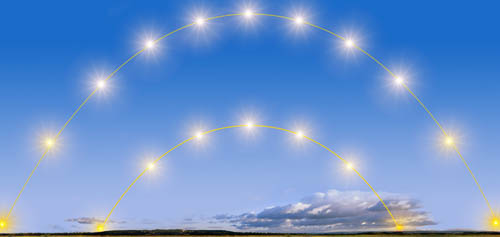
Golden Hour equals height of sun
Because the height of the sun during the day determines its color and angle, Golden Hour lasts longer in a mid-latitude winter (lower track) than summer (upper).
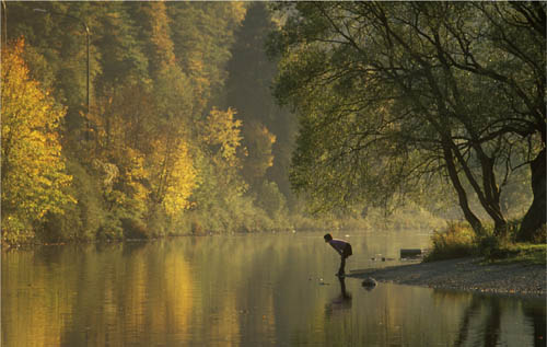
Semois River, Bouillon, the Ardennes, Belgium, 1996
GOLDEN HOUR Three-point Lighting
Key Points
Coincident Choice
Change Viewpoint
Research Location
We’ve already seen two of these lighting directions in detail—backlight and axial light—and it’s obvious that these depend on the low sun that creates the Golden Hour. What often gets overlooked is the simple, but important, practical advantage that at the same time you have a choice of different lighting effects. I call it three-point lighting, although this is really just a convenient summary of what you get from a 360º lighting system. All you have to do is keep looking around you at this time of day to realize that you have potentially a full circle of lighting. The exact opposite is a high midday sun, which gives a single lighting direction—from above. The closer the sun is to the horizon, the greater the choice of lighting.
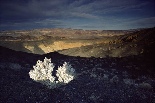
Ubehebe Crater, Death Valley, California, 1982
Three-point #1—Axial

Three-point #3—Back

Three-point #2—Side

This is really a single point that I’m making, which is to keep thinking of different lighting choices, though it’s surprisingly easy to forget when you have in sight one good shot. Give or take a number of degrees, the lighting choice in Golden Hour boils down to axial (sun behind the camera), side-lighting from either left or right, and into the sun. Any one of these can be strong, but even if you hone in on just one opportunity, the others may also be waiting for you, depending on your location. It’s rare, certainly, to find all three from one viewpoint, without moving a distance, and in these three examples, which are all from very different places (California, Tuscany and northern Myanmar), they were the only good scenes on offer. Nevertheless, thinking about Golden Hour in terms of three lighting possibilities is a useful, practical way of shooting. And it might also be possible to do some scouting earlier in the day to imagine what might work from what camera position. On certain kinds of location shooting, this is standard practice. Use the down-time when the light is not as good as it will be later to plan shots and camera positions. Particularly with scenic images, early afternoon can be a time to work out the shots for the end of the day—and for the following early morning, when it’s never easy finding a viewpoint in pre-dawn darkness. Always better to have thought about it earlier. ![]()
Sorano, Tuscany, Italy, 1991
Irrawaddy ferry, Myitkyina, Myanmar, 1995
GOLDEN HOUR Facing into Soft Golden Light
This is one of the kinds of light we dream about. Although the premise of this section is that you can wait for the light to come right, few things are completely predictable, and sometimes a number of elements, like the viewpoint, the clarity of the air, the subject, fall apart. At other times, like this early morning on the Yulong River near Guilin, China, instead they just fall into place, and you realize that you have nothing to do with that. It’s just a privilege to be there.
Cormorant fisherman on the Yulong River, Guizhou, China, 2010
The Golden Hour is often rushed for shooting, because the light changes more quickly than in the middle of the day, and also because, as we just saw, it offers different directions for shooting. This case, facing into the late sunrise with a misty wash over the landscape, is a very specific set of conditions, and the only one I wanted to pursue. The all-important soft atmosphere, which in this exact place was a condition given by the water and from the time of year—late autumn days that start cool and become warm often do the same—does several things. First, it suffuses the scene in a golden glow, because we’re facing into the light. Second, it gives a gentle version of the well-known ability of real fog to separate a scene into distinct planes. Third, and very valuably, it means that we can hold the sun in view until it’s quite a few degrees up above the horizon.
This was what I was banking on, that by the time the sun cleared the mountains, it would still be soft enough to be able to hold in the image—though it would need some recovery by the Raw processor. The time of the shot was 7:35am, exactly half an hour after sunrise. In a clear sky the sun would clip immediately, and I would have had to rely on catching just a fraction of its disk, the rest cut by the mountain top. This would in any case have captured quite a different mood.
The fishing in action
The main purpose of the exercise was not the sunrise, but the act of cormorant fishing, and so included more of the action involved as the birds dive and look for fish. Using the sun reflected in their ripples was deliberate, and I had the boatman position us for this.
The still waters of the river were another unexpected bonus, mirroring everything, from the lovely limestone peaks for which this part of China is famous, to the delicate sky. Unexpected because it was a series of artificial weirs that created the stillness, and also provided the conditions for the local fishermen to work with their cormorants. Which brings me to the subject, because I was adding to an assignment on cormorant fishing, and that came first. I followed this fisherman for half an hour as we drifted downstream, and I hadn’t predicted this particular scene with its pristine reflection, though I had intended to work on the sunrise. Would the shot have worked without the man and his birds, relying just on the beauty of the light? I don’t know. For some people yes, but for me it was a case of working with the light rather than just reacting to it.
The tones were so delicate everywhere in this scene that I didn’t want a hint of noise, and so shot at the camera’s slowest sensitivity, ISO 100. This in turn meant shooting fairly wide on the aperture—ƒ/5.6—to allow a safe shutter speed from my rather unstable raft, 1/125 second. Most of the scene is distant, so there were no problems with depth of field. Holding the sun and its subtle color meant very careful Raw processing that included local adjustment. ![]()
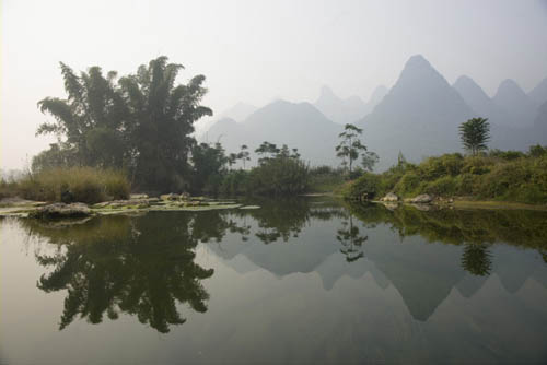
Searching for locations the day before—upstream before finding the main location. Quite pretty but a little late at 8:50am, as sunrise was at 7:05am.
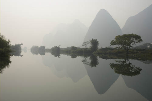
The location, found the day before—atmospheric but really late, at 9:54am.
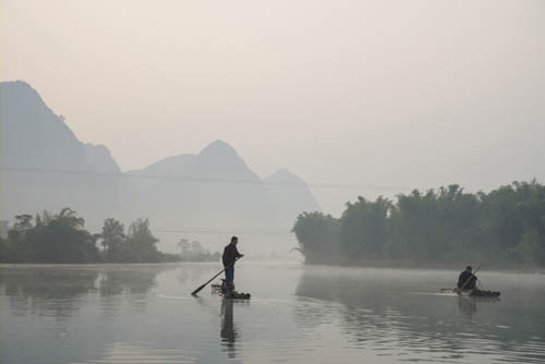
On the day—floating downstream at 7:15am, still bluish though the sun had risen somewhere behind the mountains.
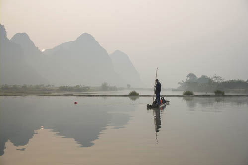
Some color coming into the sky at 7:20am, getting close to the location.
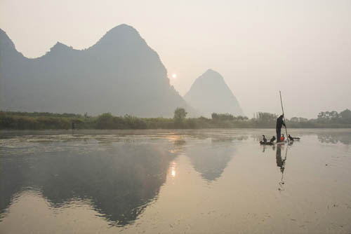
Almost there at 7:30am, the sun just coming out. The position of my raft is now going to be critical to keep the sun on the edge.
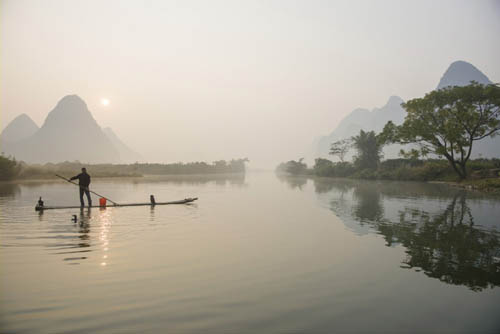
Game over at 7:40am. Still good in its way, but the sun is getting stronger and whiter.
Light moves faster during this period than at any other time of day, making it a dynamic hour or two. Toward the end, which is sunset, the angle of the sun is so acute that the pattern of shadows and highlights moves visibly. Finally, the minute or so when the sun is just touching the horizon is the shortest moment of light in a normal day, and it’s special not just because we’re in a place to notice it, but because it lights just one small part of the scene and nothing else. Not to get too philosophical about it, it’s a brief favor bestowed on one small surface or thing. The color, too, may be special, and an intense red has a high value for many people (though can be too lurid for some, and certainly in danger of becoming a surfeit of warmth when seen more than occasionally).
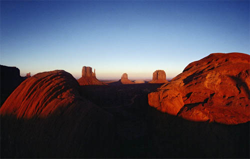
The Mittens, Monument Valley, 1979
This is a countdown that can be prepared for, up to a point. With a completely clear sky, you can anticipate the trajectory of shadows, and set up a shot at least approximately. Several things happen at once. Shadows travel upward, reducing the lit area until it divides into patches and ultimately a single spot. As the lit area reduces, it affects the composition, while at the same time the exposure needs almost constant attention. Then there’s the complexity of the shadow edges. The clarity of the atmosphere determines the sharpness of these edges, and the lower the sun, the more of this atmosphere its light has to travel through. What might have been a crystal-clear late afternoon half an hour before sunset can quite suddenly soften. Another accelerating effect on the edges comes from whatever is casting them. As the sun gets lower, more distant objects, like hills, come into play, and their shadow edges become softer. And allied to a softer shadow edge is falling contrast: shadows opening gradually as the lit areas become less intense. Soft edges, as in the shot of the erotic bas-relief on the Khajuraho temple in India, can have an attractive uncertainty and encapsulate the sense of the day fading away, so it’s not a cause for frustration as the edges weaken.
I include the picture of Monument Valley—the Mittens framed by two curving sandstone boulders—as an example of an extreme sunset. It’s extreme in color intensity, contrast, and the precision of the shadow edges. Here we’re actually less than a minute away from the sun’s extinction, and the air is so clear that it’s almost as penetrating as at midday. Not so uncommon here, but a rarity in most of the world. The viewpoint, by the way, almost had me fooled. I knew it from an Ansel Adams picture, and later from a Volkswagen commercial that was a kind of parody. I had assumed the foreground boulders were quite large hills, and couldn’t see them, until I realized they were small and on the edge of the car park right in front of me. ![]()
Atmosphere & shadow edges
Truly clear air at sunset is not at all common, but makes a strong difference to the shadow edge, as the sunlight is passing through more of the lower atmosphere than earlier in the day. Even a slight haze blurs the edges.
Proximity & shadow edges
The sharpness of the shadow edge also depends on how near or far is whatever is casting the shadow. The two photographs illustrate the contrast, which comes from a mixture of atmosphere and proximity.
Mithuna & apsaras, Kandariya Mahadeva temple, Khajuraho, India, 2000
MAGIC HOUR Burmese Days
Key Points
Timing
Gradation
Subtle Colors
Magic Hour is a term from the movie industry, and it refers specifically to the short period after sunset and before nightfall. It’s a fascinating time of day for light and color, both of which seem fugitive, shifting and sliding at a rate that is fast enough to affect shooting (over several minutes), yet too slow to perceive if you just watch. It’s also notoriously difficult to work with, not only because the light levels are low, but also because it’s missing the normal clues about time of day that we get from the sun—even behind a cloud, we’re generally aware of the sun’s presence and its progress from morning through afternoon. Nevertheless, for all the difficulties, the reward is a special and delicate light, suffused with some elegant and calm colors, as the main picture here shows.
Sagaing, Myanmar, 1995
Pagodas among rice fields, Sinbyugyun, Myanmar, 1997
The movies also provide one of the most famous examples of a work shot mainly in the Magic Hour—Terrence Malick’s Days of Heaven, made in 1978. The cost of crew, actors and equipment normally compel directors to shoot throughout the day, so to limit it to less than an hour each day was an unusual decision. Malick had worked out the look for the film with his first director of photography, Nestor Almendros, who said of the Magic Hour, “It is the moment when the sun sets, and after the sun sets and before it is night. The sky has light, but there is no actual sun. The light is very soft, and there is something magic about it.” But he added that the name is “a euphemism, because it’s not an hour but around 25 minutes at the most. It limited us to around twenty minutes a day, but it did pay on the screen.”
These old pagodas scattered across rice fields look as if they should belong to some significant site. However, as I’ve come almost to expect from Myanmar over the years, its time-warp status (until very recently) has meant that across the country there are gentle surprises like this, and you need only to explore. The light and colors matched the idea, and I waited until a flock of birds appeared over the spires. This is Sinbyugyun, a small town a few hours by boat downriver from Bagan. The scene may be peaceful, but the shooting was not. A Burmese friend in Bagan had suggested and organized the trip, with his own boatman, but a little too optimistically. We were looked on with a kind of horror as we disembarked the previous afternoon and walked up the dusty main street, were promptly detained by the police and the crew of two invited to the jail. We didn’t have permits for this jaunt. We were put under a kind of house arrest in the community center, with an M.I. man (Military Intelligence) as a very sticky chaperone. I managed to sneak out before dawn for this walk in the fields, but it wasn’t long before the M.I. man (probably a local deputed to the task) came running after me. I kept exclaiming how beautiful it all was, which perplexed him. ![]()
A DIFFERENT COLOR GRADIENT
As the sun dips below the horizon, and until darkness, the sky color changes in subtle and different ways (lower half of cylinder) from the Golden Hour (upper half of cylinder).
MAGIC HOUR SKIES
Four of many gradations of sky color after sunset. Pinks and mauves are common.
The reason why this special time of the day has its name is, as Nestor Almendros put it, “It gave some kind of magic look, a beauty and romanticism.” “Magical” because it is mysterious and very unpredictable. The combinations can be unusual, as these two pictures illustrate. In each case, on quite different assignments, I was there to shoot what I came for, rather than simply reacting to the light and looking for something to shoot. I already had my subjects. Nevertheless, the colors were an unexpected bonus. The maiko (apprentice geisha, distinguishable by, among other things, her platform geta shoes) was in Kyoto, in the traditional entertainment district of Gion. Neither they nor geishas are easy to find and photograph these days in a normal, candid way, as their numbers have declined, and the little trips between engagements at exclusive tea-houses, or o-chaya, are short and hurried, along quiet lanes. What makes the shot something of a favorite for me is the color, which has a bluish-purple-violet range, but isn’t across the entire image—it’s the maiko alone. I was facing west, and the sky in front of the camera was warm, while behind and above me it was blue-to-violet. The result was that most of the background, though dark, is fairly neutral. By contrast, the maiko is mainly lit by reflection from the bluish part of the sky, its color exactly visible in the traditionally thick white makeup on her face. That she happened to be wearing a purplish-violet combination was good fortune. These are subtle small points, but they add up.
Color scheme
Here and elsewhere in the book, the colors are abstracted from the image, with the larger cylinder underneath representing the background. What makes this shot work is that all the hues ranged around violet are in the subject—the maiko—while the setting by contrast is more or less neutral.
Maiko, Gion, Kyoto, 1999
A slightly foggy pre-dawn in the state of Tamil Nadu in southern India was the setting for, of all things, a rat hunt. Field rats are responsible for looting an estimated quarter of India’s rice crop, and this Irula tribal group makes a living out of catching them. The work of finding nests and tunnels starts before dawn, and the slight morning mist had an almost watercolor effect of washing ground and sky colors together. As we’ll see on the following pages, there are good reasons why the colors from opposite sides of the sky blend so well, and here, with the yet-to-rise sun behind the camera, the light falling on the group and the brown rice stubble is warm, while the sky beyond is slightly cool, though filtered by the mist into a chromatic gray. The wide-angle lens, a 20mm, takes in a wide range of the scene, and so also a wide spectrum of its slightly strange colors. ![]()
Color scheme
There is a delicate contrast of color between the lower and upper parts of the scene, punctuated by the color accents of the Irulas’ clothes.
Irula rat-catchers, Tamil Nadu, India, 1992
One of the reasons why colors start to become interesting when the sun is close to the horizon is not particularly that the sunlight is yellow to red, but that the sky becomes double-hued. As we saw in Golden Hour (pages 94–102), toward sunset the light starts to fall across the land from the west, and this leaves the eastern sky blue. At the extreme, in clear air as in the photograph of The Mittens on page 100, the image fills with two opposed colors, on roughly opposite sides of the color circle. This is all to do with the scattering of wavelengths by the atmosphere—blue is a short wavelength and gets scattered first, leaving behind an orange sunlight.
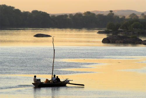
Sabaluqa, Sudan, 2004
But with the sun above the horizon, there is a huge difference in the brightness of these two differently colored sides of the sky. The sunlight naturally overwhelms the shadows. This is where the Magic Hour has something different to offer. As soon as the sun sets, the intensity of light from the west and from the east are much more closely balanced. The exact colors, as we’ve been seeing, are difficult to predict and can certainly vary, but the western sky in the evening is always in the warmer third or half of the color circle, and the eastern sky the opposite. The contrast between the two, if you capture both in the same image, is more striking than at any other time of day, while at the same time being subtler because of the overall subdued light.
One way of making full use of this opposition is having surfaces in the frame that properly reflect the sky behind the camera. Highly reflective surfaces like water, glass, and chrome do it perfectly, but anything pale and neutral, from white to light gray, also does the job. Here, on the Nile below Khartoum, the calm waters downriver from the Sixth Cataract do a wonderful job of reflecting two sides of the sky. What I liked particularly about this scene was the very Orientalist color palette. Orientalism was a form of nineteenth century Academic painting that explored what was then the exotic Middle East for European painters. As the Tate Gallery in London explains, “Many British artists, especially those under the influence of Pre-Raphaelitism, looked carefully at the cultured shadows of dawn and dusk. These effects were most striking of all in the desert, which often appears not as dangerous, but as a beautiful wilderness containing places resonant with the ebb and flow of civilizations.” ![]()
An orientalist evening
Divided almost in half by color, the stiller waters of the Nile reflect the yellowish hue of the western sky, while the surface, ruffled by a light breeze, reflects the bluer tint from the sky behind the camera.
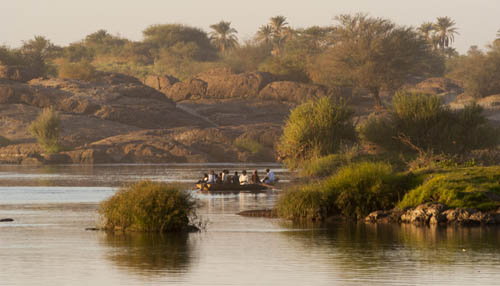
15 minutes earlier
Just before sunset, the colors are more predictable, with the setting sun overwhelming, and blue shadows.
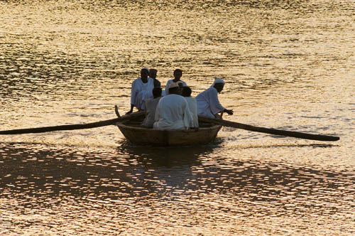
10 minutes earlier
A fraction after sunset, and there is some hint of blue in the shadowed clothes of the men, but not yet in the darker reflections of the sky.
OPPOSED COLORS
From top to bottom, the opposing sky colors at different times and in different conditions: a clear rich sunset, about 20 minutes into a typical Magic Hour, and the Nile scene shown here, at the beginning of Magic Hour.
MAGIC HOUR First & Last Light Silhouettes
Key Points
Surprise Colors
Subject Outline
Short Timing
You can sub-divide Magic Hour as you please. It is, after all, just a transition in brightness, color, and mood, and calling it one distinct period of time is just something that photographers do for convenience. Different parts of the Magic Hour are useful in different ways, and one of my favorites is the just-visible silhouette of first light, well before the sun rises, and its counterpart at the end of the day, last light. To get technical about it, the entire Magic Hour is twilight, which simply means light coming from the atmosphere without direct sun. The period when just outlines are visible when you look toward where the sun was or will be is called nautical twilight (simply because you can take star readings against the horizon). Technically again, this is when the sun is between 12º and 6º below the horizon, though for shooting we don’t need to be that precise.
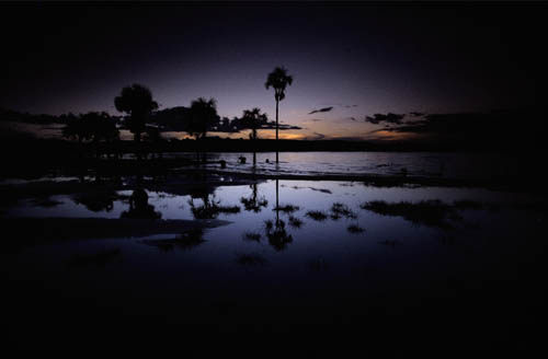
Dawn, Rio Carrao, Canaima, Venezuela, 1978
For photography, the value of this very narrow slice of time is that if the sky is right and the outlines interesting enough, it can deliver simple and powerful scenes. We are back in the land of silhouettes (see pages 70–71), where a viewpoint that keeps things simple and recognizable is important. But beyond that, the shading or ramping of the sky, and the subtlety of its color, are what count in this kind of image. By comparison, silhouettes around sunrise and sunset are gaudy and a bit predictable, with none of the gentler color surprises that happened in both of these pictures. As for planning and preparing for this kind of shot, this is much easier—and perhaps possible only—at the end of the day rather than the beginning. There may be as little as 15 minutes for this subtlety of light, and setting up, framing and composing in pre-dawn darkness is difficult.
Nevertheless, the image at left, taken in the shallows of the Carrao River in Canaima, was an early-light shot. The reflections from still, shallow water on the margins of the river made it more predictable, and easier to organize the foreground, because it would obviously be partly a mirror of the sky. What makes it more interesting, from my point of view, is that there is only a hint of orange and the rest is a ramp from pale violet through dark blue to black. The Shwedagon picture has more color both in the sky—dominated by an irresistible purple—and in the foreground, lit up for the annual Festival of Lights. This was evening, but again, the presence of grays (in the clouds) gives it a more interesting color palette than a normally glowing sunset. ![]()
Silhouetted shots of all kinds, including those on pages 70–71, graphically separate the image into the silhouette layer and the colored background layer.
Shwedagon illuminated for full moon festival, Yangon, Myanmar, 1982
BLUE EVENINGS Remains of the Day
Are late evenings really blue? It’s not an easy question to answer, because color exists in the eye and mind as well as in wavelength. And the eye adapts. If you stand and wait through the sunset until darkness falls, your eye simply accepts the light as “normal,” not colored. Nevertheless, this is special and highly desirable lighting, particularly on professional assignments that demand richly attractive exterior scenes that include additional lighting. This is a typical example, familiar to all photographers who shoot resorts and luxury hotels and who need to ramp up the desirability of the location.
Yoga, Brilliant resort, Jingmaishan, Yunnan, China, 2012
This is toward the end of Magic Hour (or near the beginning if in the very early morning), and it’s a very specific time. After the pastel and sometimes-melancholy hues after the sun has set, this is the downslope of light as it descends into night. It lasts a very short time in middle and low latitudes, and because the eye is constantly adapting to the change in color and slow extinction of light, this Blue Evening phase can seem to rush onto the scene and quickly disappear. As we’ll see in the example on the following pages, for safety I allow it just 10 minutes.
This was a shoot that I happened to record as it went along: a model in a classic yoga posture at the edge of a pool and with tea mountains in the distance behind. This being yoga, a certain calmness and tranquility was called for, and while the late afternoon backlighting was soft and quiet enough, I felt it was worth waiting for the Blue Evening light—another 3 hours away. That meant taking the slot that had been planned for another shot, but it looked as if it would be worth it. Small candles were a natural prop, and to give the client a choice, we put in a high-wattage tungsten light from the side. The purpose was to create a complementary color contrast that, as we’ll see in the following pages, is naturally attractive—small bright orange lights counterpointing a large deep blue setting. In the end, I still can’t quite decide which version I prefer—lit or unlit—but if I were forced to choose, I suppose I would go for the unlit version on the grounds that it is calmer and more in keeping with the idea of yoga. ![]()
The onset of blue
Between the top and bottom images are 48 minutes, during which time the ambient light moves from almost neutral to a distinct blue.
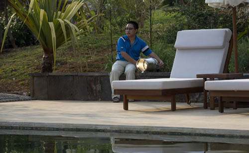
A theatrical tungsten spot was aimed from one side at about 20 meters for one version.
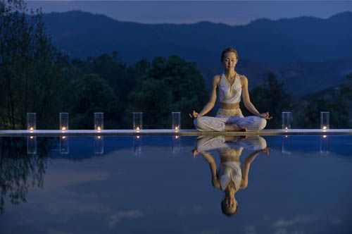

Lit & unlit versions
Shot one minute apart, the color and tonality of the two versions is different, because the exposure needed to be reduced for the tungsten light on the model. As a result, the blue evening light appears deeper in the lit version.
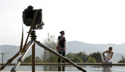
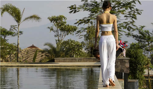
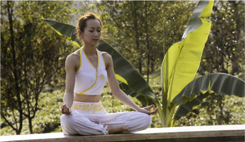
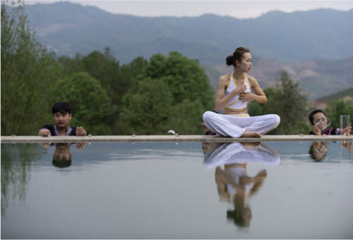
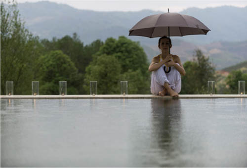
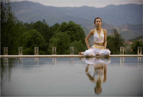
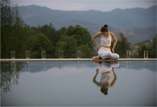
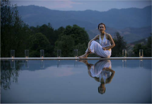
Preparing & waiting
Over a three-hour span, what began as a late afternoon backlit shot became the altogether more meditative blue final image.
BLUE EVENINGS The 10-minute Window
Key Points
Ten Minutes
Sure-fire Attractive
Planning
Provided that the weather is clear and the sun kind, there are a few predictable moments during the day that have a high attractiveness index, guaranteed to help make anywhere look good. This is one of the most special, but also one of the shortest, when the skylight is a rich blue and the tungsten lights a pleasant yellow-orange—and when both are nicely balanced for brightness. As often is the case, the architect and designers here at the Brilliant Resort in Yangzonghai, China, have arranged the lighting for just this effect, in particular the concealed lights under the seating in the sunken islands, and the underwater floods. This late evening combination of light has the extra advantage, fortunately not needed here, of reducing unwanted things that would be glaringly obvious in daylight. And of course, it’s a classically attractive combination of complementary colors: large blue-violet against small yellow-orange.
Lakeside resort, Yangzonghai, Yunnan, China, 2012
Watch carefully, as the magician says, because this happens faster than you might expect. In the sequence here, the first shot of the evening was taken at 7:50pm, exactly 20 minutes after sunset and what seemed like a long time to go before the magic blue light set in. This was a kind of ranging shot, just to see how things were going, and the real shooting didn’t begin until three minutes later. The last shot, when the balance of color and light was perfect and just before the evening sank into blackness, was at taken at 8:02pm. It took two hours to set up props, models and lighting, but only ten minutes to shoot, between the time when the blue became strong and the fading to near black. The extra floodlighting was laid on for insurance, because in ten minutes there’s no time to change anything that hasn’t already been installed, but this was hardly used. ![]()
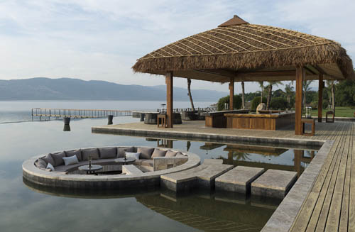
Daytime test
A morning snapshot as part of preparing lights and models for the evening shoot.
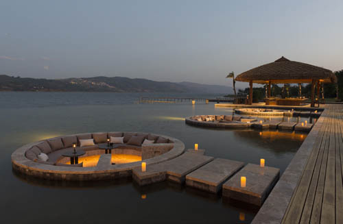
7:50pm
Half an hour after sunset. Floodlights in the middle distance just beginning to show.
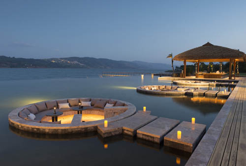
7:54pm
The sky just beginning to turn blue, but more of a weak cyan at this point. The floodlighting already becoming too strong.
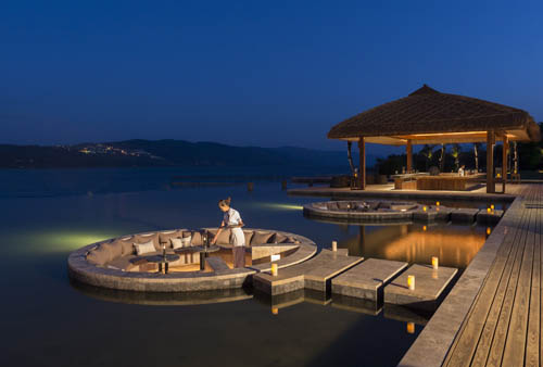
8:00pm
Sky now a rich blue. Middle distance floodlighting reduced to suit, but it’s already several minutes too late for foreground lighting.
THE SHIFTING BALANCE OF COLOR AND LIGHT
This sequence shows how the relationship between the sky and artificial tungsten lights appears to change at the end of the day. The larger cube is the sky, the smaller is tungsten light. In daytime, the light is hardly visible, very weak against the surroundings, with little color showing. This persists through sunset, when the color temperatures briefly match. As the sky deepens after sunset, so the tungsten light becomes not only more prominent, but it also seems richer in color. This is at its most intense in the brief window of deep blue, before night sets in, removing color from the sky; at this point the tungsten light dominates, but also appears less colorful to our eyes.

Daytime

Late afternoon

Sunset
Magic hour

Blue evening

Night
BLUE EVENINGS An Architectural Choice
The shoot detailed on the previous pages hinged on the relationship between the descending blue from the sky and the rising small orange tungsten lights. This is what makes blue evenings so reliable for architectural photography, because as long as the day is clear enough to deliver a rich blue to the sky and you have control over the lighting, this will happen. In fact, even if the day is overcast, much of the same effect will come through, which often makes it a fail-safe time for a planned architectural shoot when the weather is not behaving itself.
I.M. Pei’s Suzhou Museum, Suzhou, 2007
It’s worth mentioning that the color relationship between large blue and small orange is a happy coincidence, because the human vision system is conditioned to “see” complementary colors as naturally satisfying. To be strictly accurate, across the color circle the matching hues are blue tending toward violet together with a yellowish orange. It was the German philosopher, poet, and general polymath J. W. Goethe who in 1810 came up with this theory, and more than this, suggested that opposing colors complement each other best when their brightness is taken into account. Violet, for example, is the darkest color, and yellow the lightest, so they combine in a natural way to the eye when the yellow takes up much less space than the violet. Incidentally, there is no light violet, just as there is no dark yellow. We call them by different names instead—such as mauve and ochre. Buildings in blue evening light showcase all of this perfectly.
In this case, I was shooting one of architect I.M. Pei’s last projects, the new Suzhou Museum (left), both for my own book and for the architect’s, so I had instructions to follow. The design referenced a traditional Suzhou style of white geometric shapes edged with gray, and with these strong graphic qualities, the building photographed well in sunlight also. However, on an assignment like this, there is a need for a few to several overall shots, not just a single best one, so extending the shoot throughout the day was inevitable. All the shots work, which you prefer is really a matter of personal preference. ![]()
Tent, Aman-i-Khas, Ranthambore, Rajasthan, 2004
The meeting point
The critical color moment is when the darkening sky reaches a deep blue that contrasts to the maximum with the yellowish tungsten lamps.
In morning light
Perfectly acceptable, a morning shot in sunlight appears more restrained than the richer colors of evening.
CITY LIGHT Street Lights
From a technical point of view, the kind of lighting used in streets is about as unsatisfactory as it could be for shooting. Lamps in shot, pools of light, a strangled color spectrum, none of it is good for color balance or for any kind of portraiture. On the other hand, as a color display in its own right, street lighting as a lot to offer. The colors are: long-spectrum orange from old-fashioned tungsten (increasingly rare in street lighting); uncorrectable narrow-spectrum yellow-orange from sodium; blue-green (usually) from fluorescent; blue-to-white from mercury vapor; and a similarly blue-tinted light from metal halide. Now that digital images can be given whatever color balance you choose, and this chosen after the event when you process a Raw file, these colors need to be qualified. The camera assumes a basic 5000k to 5500k setting, but if the street scene contains at least a couple of these different sources, as in the Sharjah picture, this basically neutral setting shows these color differences. And working on the color balance of each of these kinds of lamp has varied success. Tungsten light, because it is incandescent and comes from burning, has a continuous spectrum over its range, and so processes well in the sense that it has a “rounded” appearance. At the other end of the scale, sodium lighting is sharp-cut and narrow, and simply does not embrace any other wavelengths beyond a narrow spike at just over 589nm. It is essentially monochromatic; there are no other colors to pull in.
In both of these images, it was the play of street-light colors that motivated the shot. Villa de Leyva is an historic small town in Colombia—widely regarded as one of the finest colonial settlements in the country, and its architecture has been protected since the 1950s. The large old cobbled plaza is, thankfully, neither floodlit nor full of traffic, and just the line of cold, greenish fluorescent lamps along the far wall set up a color counterpoint for the slight warmth of sunset leaking very slightly through the mountain clouds. In Sharjah, it is the distinct color contrast between three different lights that makes the shot: a tungsten streetlamp, a cold vapor streetlamp just out of frame, and the blue evening sky beyond. ![]()
Plaza, Villa de Leyva, Boyacá, Colombia, 1979
Color schema
An abstracted representation of the color and light relationships.
Sharjah Heritage Area, Emirates, 2012
Color schema
The same kind of abstract for this image. The fluorescent light at left is off camera.
Cities at night are getting brighter, particularly downtown areas of big cities. More energy is being devoted to lighting up public and commercial buildings, while display advertising is extending to huge areas covering the sides of buildings. Maybe a couple of decades ago, lighting simply added some sparkle to a long view of a city. Now, in cities like Shanghai, the view is transformed between day and night, and it’s deliberate. There are several ways of dealing with it, and this is just my take on big city light.
The Bund (Waitan), Shanghai, 2011
The unspoken first step is to find the right viewpoint, which in this case was researched beforehand—the roof terrace of a building just beyond the southern end of the Bund, offering a view of the full curve and, importantly, high enough to take in ground level and the Huangpu River. It always helps to have a plan, and mine in this case was to go for good visibility throughout the scene. That suggested two light-related techniques. One was to time the shot for Blue Evenings (see pages 110–115), which gives both a slight shadow fill and a pleasant color contrast with the streetlights and floodlighting. The other was to bracket a sequence of exposures and blend them using one of the methods detailed in the last section, pages 242–247.
Earlier light
Just 15 minutes earlier, hazy and humid with no blue yet apparent.
Getting closer
Five minutes before final shooting.
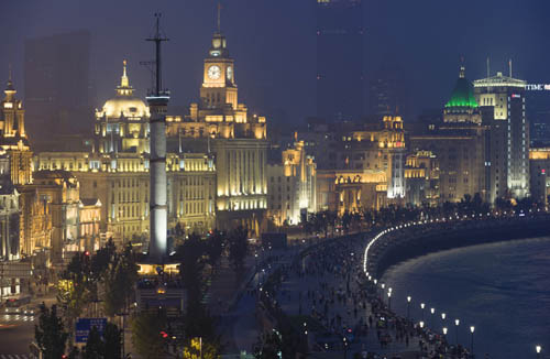
Default
The default (unprocessed) appearance of a single exposure.
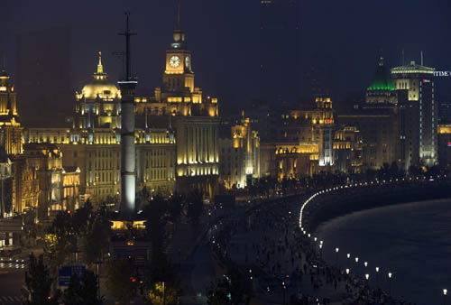
Auto
The same single image with Auto settings applied in Photoshop’s ACR.
All of this called for—calls for in general—plenty of planning and preparation, beginning with being on site early, before or around sunset. The weather was poor, in the sense that it was cloudy and with a muggy haze, not perfect for a long-distance view, but this is where nighttime shooting can save the picture. The lights raise the contrast, and this continues to rise as the ambient light level goes down. You can choose the exact amount of contrast that makes it into the final image with the timing of the shot, and also by how you combine the sequence of exposures. Here, there were just three, beginning with the darkest at ƒ/8 and 1/4 second, at which setting there is no clipping of lights, so that their color is captured. Then 1.5 stops brighter for the second, and another 1.5 stops brighter for the third. ![]()
Shooting
Some minutes before the actual shot, preparing the camera on the roof terrace.

Basic construction
In depth, the scene breaks down into three distances: the nearer column, the curve of waterfront buildings, and the high-rise blocks of the city behind.
Big city centers like London, New York, and Tokyo, have an extra bonus for nighttime photography—display advertising. In the fight to get people’s attention, displays are getting bigger and brighter, and it all makes for more shooting opportunities. The light levels in some concentrated areas, especially in Asian cities, are intense. Size matters in the search for spectacular imagery, and both the Tokyo and Beijing examples here are giants, though it’s unwise to say “biggest” because there is always something bigger being planned or even nearly finished. The principles for shooting are much the same as on the previous pages, with much to recommend Blue Evening Light as prime time for shooting, so that the sky stays alive and doesn’t just disappear into blackness.
Neon sign, Bangkok, 1982
Sadly, neon display lighting may have had its day, although it’s doing quite well as contemporary installation art in galleries. The sheer scale and motion possibilities of LCD displays is making it old-fashioned, and it’s a pity because neon displays are very physical and light up their immediate surroundings in a kind of unintentional way, as the very well exposed version in the strip of three here shows. One curious thing about neon displays is that you can photograph them at a wide range of exposure settings—up to several ƒ-stops—and they still look good. Or rather, they look different. At a short exposure, the setting disappears into darkness, and their color is very saturated, while at the opposite end of the exposure scale they appear to glow more, though paler in color, and their setting becomes more visible. The choice is yours. ![]()
The Place, shopping mall in Central Business District, Beijing, 2007
Exposure & effect
Colored neon displays tolerate a wide variation in exposure. What changes is the effect, varying from a darker version that looks like an illustration rather than a light, to a bright and glowing treatment that lights up its surroundings.
Display screen, Shibuya Crossing, Tokyo, 2002
CANDLE LIGHT Spheres of Illumination
Candles are special, in that they not only give light, but they’re the focus of attention in a candle-lit room. Not many light sources are both a pleasantly viewable subject as well as a method of illuminating the space. In the introduction, I mentioned the book In Praise of Shadows by the early twentieth-century Japanese writer Jun’ichirō Tanizaki, and it’s time to return to it here. Among other things, in it he praised the effect of a flickering candle flame as its light passed over half-seen surfaces such as gilt lacquer. Candlelight takes us back in time and presents a warm, flickering, enclosed world. And it’s possible to shoot entirely by candlelight, without flash or any other extra fill. The key thing to remember is that practically, we are dealing with a sphere of illumination. The light falls off rapidly away from the flame (the inverse square law), but in the way that candles are normally used, they are usually half a meter or less from people’s faces. Within this, there is the immediate surrounding of the flame, a few centimeters, which lights up the top of the candleholder. With this in mind, you need simply expose always for the face, but include the flame in shot and let it expose out of range—as it’s usual to shoot candlelight with a wide aperture, the flame will usually be out of focus, too.
Visakha Puja, Wat Benjamabophit, Bangkok, 1983
Spheres of illumination
Candles are normally placed at a consistent distance from the people who are using them, and the key sphere of illumination is the one that covers the face. The smaller one, immediately around the flame, can overexpose quite happily. Tiny catchlights in eyes are also important.
There is a famous example that is well worth seeing. When Stanley Kubrick made Barry Lyndon in 1975, he went to his usual meticulous lengths to research not just the period, the eighteenth century, but also its imagery. One of the effects he wanted to capture was the pre-electric experience of nighttime interiors (shades of Tanizaki!), something we rarely experience now. For key scenes, set in a castle at night (a card game and a conversation over dinner), he was determined to film entirely by the light of candles, to give the feeling of the period. Candles are par excellence for what are called “practical lights” in movie terminology, meaning a light source that is actually in view as well as illuminating the scene. For this reason, using film was difficult without the help of the high-ISO sensitivities we now take for granted with modern digital sensors. To solve the problem, Kubrick bought and had modified a Zeiss 50mm Planar lens with the exceptional aperture of ƒ/0.7. More usually in filmmaking, the practical light is subtly enhanced by an out-of-scene light that enhances the practical’s illumination, but Kubrick chose to stay pure and film with the candles alone.
And so can we. The faster the lens, the more beautiful the effect, because only the face—sometimes only an eye—needs to be sharply focused. The range of brightness between face and flame is considerable, but always go for the face. The flame will tolerate more overexposure than you might think, not least because it is always small relative to the scene. There are no guides for this kind of exposure, but fortunately testing and previewing on the camera’s LCD screen is a perfectly workable method. ![]()
Loi Krathong, the November full moon festival, Mekong River, Thailand, 2011
GLOWING LIGHT Things Burning
Candlelight brings us logically to other, larger things that burn intensely, like fires in general and materials heated to the point of melting. Here we have one example of each, and the lighting effect is different from that of candles, or for that matter, the sun and other intentional light sources. This kind of glowing light actually has dimension. We’re no longer dealing with a point source of light, but something that is pretty much the subject itself. Any photograph that includes the light source is automatically going to be outside the range of a sensor. As we’ll see in the third section, Helping, on pages 242–243 Archived Light—What HDR Really Means, scenes including the light source are inevitably high dynamic range. With point sources of light, it hardly matters if they blow out, simply because they are so small, and expected by the viewer to be over-bright. Here, however, both the fire that’s roasting the pig and the crucible full of melting gold are significant in size, and the focus of everyone’s attention.
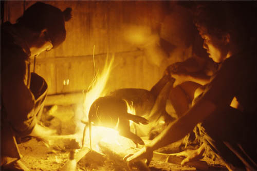
Roasting piglet, Maw La Akha village, Chiang Rai province, Thailand, 1980
The core problem is highlight clipping, because any exposure dark enough to hold all three channels in the center of the fire will be too dark to show anything useful of the surroundings. Bracketing is normal and recommended in any situation like this, because you may well change your mind about which way to go when it comes to the processing. The two opposite directions are: allow the burning area to blow out brightly, or make a darker, more abstract version exposed for the rich color of the burning area. These two are shown here, with the cooking fire treated more expressively and strongly glowing, and the gold bars made into a more abstract image, a kind of inverted silhouette. When going for a brighter look, the clipping problem surfaces in the processing, because normal techniques, like exposure reduction and highlight recovery, simply show up the clipping edge. The solution, counterintuitively, is to use local control in two steps. The area of yellow immediately surrounding the clipped center of the fire is taken down a little in exposure, but the center itself has its exposure raised, to destroy any clipping edge. A slight addition of pale yellow to the center makes it more natural. ![]()
Smelting 20-kilo ingots, gold refinery, Chessington, England, 1983
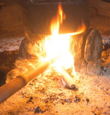
Default
This is a tight crop from a larger image, and locally overexposed. The center of the flame is clipped and featureless.
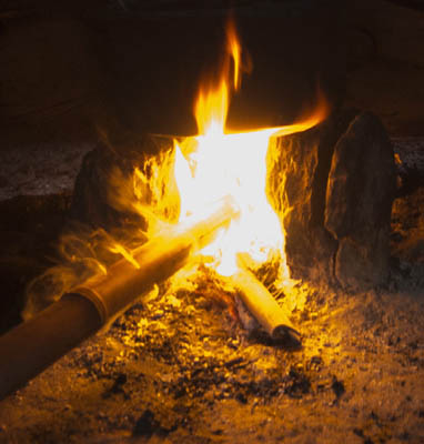
Exposure reduced
This worsens the problem by accentuating the sharp edge where clipping begins.
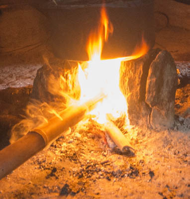
Recovering highlights & whites
Using the Highlighters and Whites sliders also enhances the clipping edge.
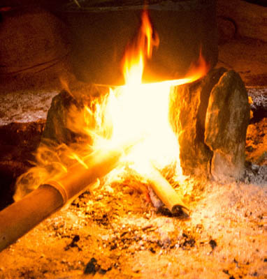
This produces the best possible result, given that the centre is featureless. Conrast increased overall, but no exposure change. Then locally, the area of yellow immediately surrounding the white center is reduced in exposure to strengthen it. Next, the white center, including its edge, is given a slight exposure increase, and a slight yellow tint.
COLOR TEMPERATURE
Strictly speaking, color temperature applies to light sources that burn. From a wooden building burning through an oxy-acetylene torch to sunlight, the hotter the burning, the higher (less orange) the color temperature.