Chapter 5. Selecting a Color Scheme for Your Data Visualization
When people don’t take the time to learn about colors, they wind up staggering through project after project with clashing ideas, mismatched pairs, and distracting usage that dooms them before an audience member even tries to discern the meaning of the actual data. Let’s take a look at some of the biggest jumping-off points when it comes to selecting a color scheme for your visuals.
Importance of Choosing Colors
Deciding on what colors you’re going to use for any project is equal parts exciting and daunting. Exciting because you might stumble across a beautiful combination that takes your data points and creates something truly memorable and unique. Daunting because there’s also the possibility that what you create will be a total disaster and convey the wrong message about your brand to the intended audience.
How significant is choosing the right color? Research tells us that more than 50% of people who decide to leave a website and never return do so because of poor color and design choices.1 No pressure, right? The same holds true for our data visualizations. If you don’t capture your audience’s attention from the get-go, they’re not going to give you the time of day. Just like leaving a website, if your colors don’t pop and your message isn’t clear, the likelihood of an audience member giving you a second chance is horrifyingly low.
Know Your Audience
A solid first step in picking the best colors for the job is knowing who your target audience is, starting with their culture and country of origin. Different colors mean different things. For instance, in Japan, yellow is a color that represents courage. But in the United States, calling someone yellow typically means they are a coward, and in China, yellow is associated with being vulgar. It’s not just culture or country of origin that make a difference when it comes to color, however. Perception is also influenced by gender, religion, social class, race, and age. Doing market research and understanding how your target audience reacts to certain colors and combinations is a vital first step to appealing to them with the data representations that you are concocting. Never start working on a visualization without knowing your target audience front to back, up and down.
Consider Industry Associations
Once you’ve got your target audience in mind, consider how appropriate certain colors are for certain industries. If you’re building a business plot bar graph for the expenditures and revenue of a funeral home, using lime green and hot pink isn’t the way to go. Certain colors fit certain industries more than others. Lime green and hot pink might look better highlighting the profit margins of a surf shop in Miami (Figure 5-1).

Figure 5-1. Line graph showing profit changes over time for a surf shop
We don’t design a bank’s loan reports in bright orange and yellow because we know they don’t reflect the seriousness of the industry. We need to be aware of the weight of the things we are preparing. Financial institutions utilize light shades of blue because a majority of people see blue as a color that speaks of trust, honesty, and confidence.
If you’re showing off the return on investment for a new dating app, red and pink suddenly become appropriate (Figure 5-2).
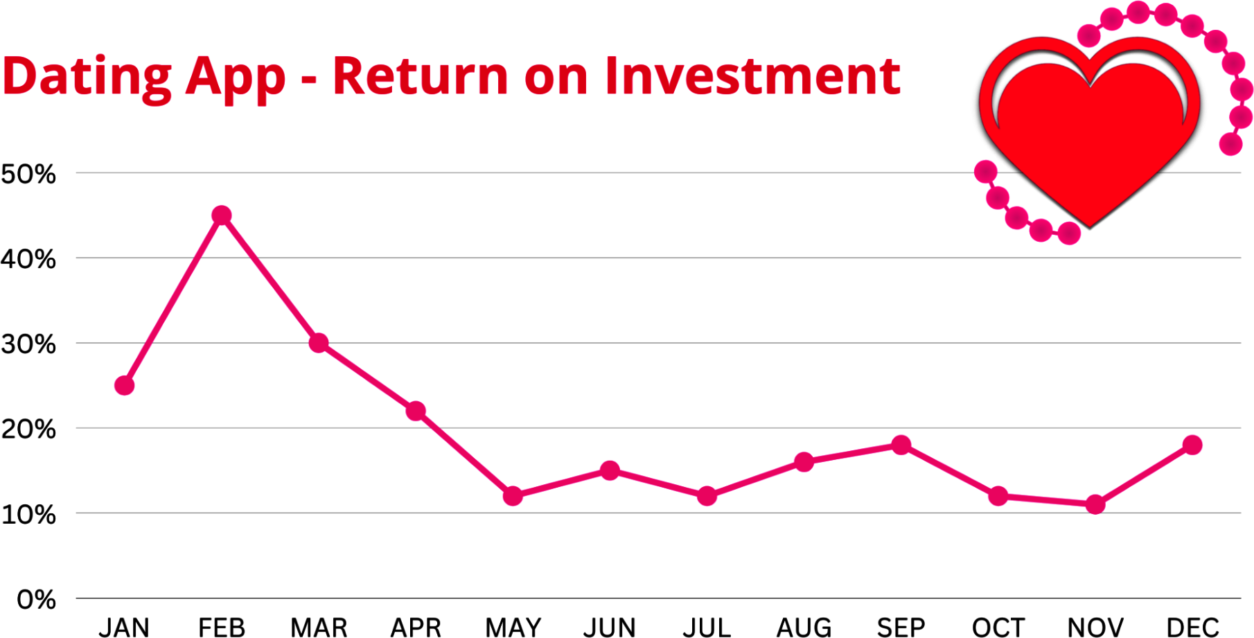
Figure 5-2. Line graph showing return on investment for a dating app
If you are designing a bar graph showing how various companies in the area have reduced their carbon footprints, then the greens and browns of the color wheel that do a good job describing the environment are suddenly in style. Figure 5-3 provides an example of a chart depicting carbon footprints by diet type—you’ll notice several greens and browns used in the visual.
Offending the audience with inappropriate colors is a surefire way to lose not only their attention, but also their trust. Don’t expect to get either one back once you do.

Figure 5-3. Stacked bar chart showing CO2e per person categorized across diet preferences2
Brand Colors
Branding is massively important in the marketing and advertising schemes of your company. If you can get consumers and business partners to identify certain colors with your brand, you’re golden (pun intended). When a person sees a certain shade of green and starts wanting a hot cup of coffee (thanks, Starbucks) or sees deep blue and thinks about that great Ford pickup truck their family used to own, the power of color has worked like magic in advertising. But data visualization is not advertising, and the same colors that look lovely on a billboard or an internet ad are not necessarily going to come shining through when you’re using them on charts, graphs, and tables.
That mindframe might be counterintuitive and even hard to accept for people in the C-suite who want everything to conform, but your allegiance should not be acting overly agreeable but doing your absolute best to get the data you’re in charge of to pop to the audience and represent itself as good as possible. At any company, a dozen people have probably had their say in brand colors and gone through multiple permutations to get them just right. That usually results in a style guide of some sort that is the unofficial bible of how all company documents and representations must be done to keep that cohesive feeling going on at all times. But here are three reasons why your brand colors might not work so great when it comes to data visualization:
They don’t have enough contrast between them.
There aren’t enough colors.
The colors don’t work for the data.
The challenge becomes to balance the identity of your brand by creating color palettes for different types of data while maintaining adherence with the tenets of color vision deficiency and contrast so that you’re not alienating anyone while branding your data uniquely. For example, let’s say you work for a company where a specific blue Pantone color is the guide for all charts produced by the company. In 1963, Pantone (meaning “all colors,” combining pan and tone) developed the first color matching system. This system allows graphic designers to see exactly what “blue” would look like on paper and provide the printer with the Pantone number to make sure that they got what they wanted.3 Thanks to Pantone, we now have color consistency for designers, printers, ink makers, and their clients.
Blue is a nice color for a lot of things, but it’s tough for people to tell the difference between shades of blue in a report. Light blue and dark blue and royal blue and navy blue have a tendency to run together, so differing shades are not going to make that big of a difference for audience members trying to unspool what’s being presented. The same goes for other colors: it’s not that easy for humans to tell the difference between varying shades of the same color (unless they are drastic). To showcase data complexity, more colors are going to be needed. You might run into a situation where your superiors aren’t going to want to branch outside of your brand colors, so you’ll have to make an example of what it will look like to show them why it’s absolutely necessary. Don’t do it out of spite or malice; just create two versions of the same thing: one using only the approved colors and one using a bit more that shows the improvement. Let the work sell itself.
For the example that follows, let’s pretend that Figure 5-4 is our client’s company logo—we are working with “Candylicious” that happens to have a bright red logo!

Figure 5-4. Candylicious logo
We are tasked with designing a data visualization that compares the taste of Candylicious candy versus our two competitors, Sweetstuff and Goodcandy. The client wants us to use its logo colors for the charts and graphs we design.
The problem is that our audience is based in the US and our chart gets misinterpreted by our audience because when it comes to evaluating performance, Western culture believes that red means bad. In Figure 5-5, you can see a before-and-after chart using the brand colors for a comparison of flavor and variety ratings versus using one color to highlight the company in question—Candylicious—and graying out the rest.
When you’re picking those extra colors, don’t just randomly grab a few to use and assume that’s the only step you need to take, however. You want colors that are going to reflect on your company’s brand, and that means doing your homework. Start with the organization’s brand guidelines, its mission statement, and any other literature that might exist that talks about what the company stands for, what its touchpoints are, what values it holds dear, and what its motivations to do what it does are.

Figure 5-5. Two bar charts demonstrating how the use of red might trigger negative emotions even if they are brand colors
Brand identity is just as important as the brand’s colors and can make it a lot easier to pick which complementary colors you want to use in your data visualization. If your company mission statement is big on innovation, toss in some orange. If you’re selling trust and historic reputation, consider blue. Don’t just settle for the standard colors, though; work on tints and shades that pair up well with your brand colors. You also need to consider contrast between your colors and between the ones you use and the background so that anyone can read and distinguish them. Contrast goes beyond crisp colors, however; it also is vital for people who are visually impaired or have low vision.
Suggested Color Schemes
There are all sorts of websites and apps that will suggest color schemes for you that pair well and have been used to great success in the past. I would definitely suggest a hands-on approach when you’re doing your data visualization work—specifically building the graphics, charts, and illustrations in “grayscale mode” first and then applying various colors to them to find what you like best.
Not everything needs its own color in your creation. This is critical to remember because it keeps you honest and keeps you appreciating the point of color in general. When everything is digital and it’s not a single cent more expensive to send out something in color as opposed to grayscale, it can become tough to realize that. For those who are still paying extra to print advertisements on paper in color, the weight of each drop of ink is still a factor and typically makes these professionals a bit more humble and conservative with how they spread out their usage.
People tend to get overwhelmed by color choices, especially when they realize that there aren’t just 10 or 12 that could be used, but literally thousands. That 64-crayon set you got in your annual school supply package has nothing on what your professional wheels can deliver. But having that giant selection doesn’t mean you should mix and match without a purpose. Remember our poorly dressed job interview at the beginning of the book? We don’t want to smash our colors together any more in our data representation than we did in that gaudy outfit.
When you’re linking colors together, we want colors that complement each other and to use saturation and lightness to work for the purpose that you’re after. Like we’ve said before, if your purpose is to sell Hawaiian shirts on the beach in Florida, go crazy with those bright colors. For everyone else, subtleness is a factor in what you pick. Stay away from colors that bleed into each other and those that don’t have very much variance when you alter the saturation or lightness. If you have orange and you lighten it up 25%, it’s still very orange, and if you pair those two together on a graph, you’re not going to get much in the way of contrast. See the stacked area chart in Figure 5-6 that uses four different orange colors, each with a varying level of saturation; it’s difficult to tell them apart.

Figure 5-6. Stacked area chart that shows the difficulty in deciphering between colors closely related to each other
A great combination of colors that several data visualization designers like is yellow/orange/red/blue. See Figure 5-7 for an example of a chart that uses these four colors.
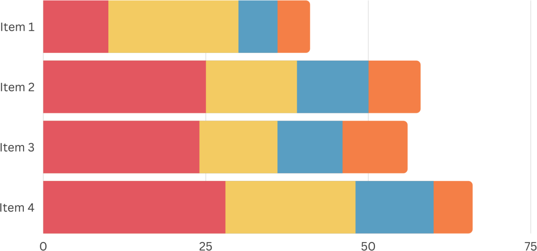
Figure 5-7. Stacked bar chart showing an effective use of color combinations
What’s the attraction? You’re combining warm colors with cool blue and it makes a difference every time. Even though red and yellow are primary colors that combine to make orange, the three of them are so distinctive that they are easily distinguishable from one another. Plus, blue is the great equalizer for most data presentations. It’s so diverse in its shades, and lots of blues can carry the mantle of professionalism, calming, or pleasing emotions whether you use a darker or lighter shade, or full saturation versus just a little bit.
While those four pack a punch, green is surprisingly not as effective in its purest form. See Figure 5-8, which includes green rather than the original blue color in Figure 5-7.
Forest green seems to retract in contrast to other colors, and if you lighten it up, it goes neon pretty quickly, which is an even worse look. But when you lighten it up and desaturate it, you get a very distinct color that holds its value nicely, especially if you add some blue or yellow to it to shift it lighter or darker. Solid green is also a tough sell for people who are colorblind, as it is tough to tell the difference between green, red, and brown.
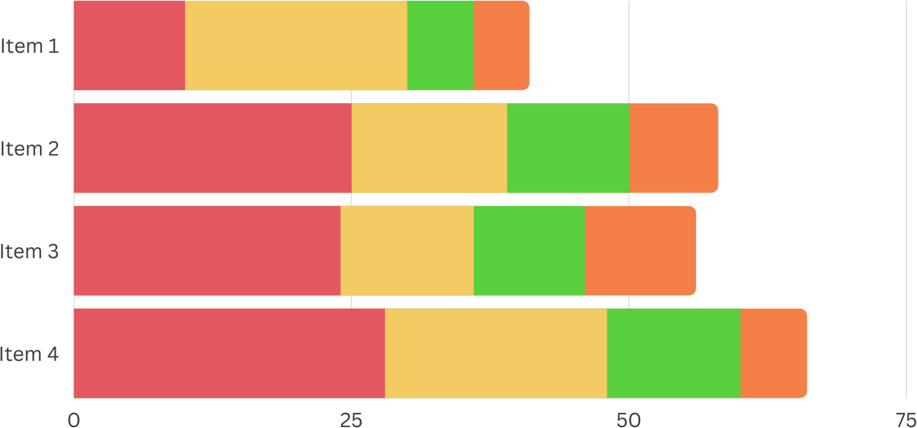
Figure 5-8. Adding green versus blue can make the color combination less effective
Regardless of what combinations you decide on, you need to avoid pure colors that are bright and saturated (Figure 5-9).
Pure colors are primary, secondary, and tertiary colors that haven’t had any white, black, or a third color added to them. You can see the pure colors identified on the inner ring of the color wheel above, with the other colors representing tints, tones, and shades of those colors.

Figure 5-9. Color wheel demonstrating pure colors, tints, tones, and shades4
Neon colors definitely attract the eye—that’s why most of us can’t see a yellow highlighter without having a cringe-worthy flashback to studying for a college midterm at 3 a.m. A good example of how frustrating bright neon colors can be is when you put them together in a pie chart or an area chart where they are touching each other without discernible borders. Take a look at Figure 5-10—how is this pie chart making you feel? Overwhelmed?

Figure 5-10. Pie chart demonstrating that neon colors are not effective in data visualization
It might seem like a good idea to use those bright colors, but if they all have the same amount of lightness, it’s going to be a struggle for your audience to separate them. If you aren’t sure if your design fits the bill, convert your colors to black and white. If they are all in the same range of gray, they all have the same lightness and need to be broken up. Let’s see the prior neon example in black and white (Figure 5-11)—can you tell the difference between the slices?

Figure 5-11. How the neon colors appear when printed in black and white
There are two ways to avoid this problem. One is to change the darkness/lightness of each color to differentiate them; the other is to use a white border to separate one from the other. The first option is usually much better, as the colors will look dynamic and it works better for those who are color blind. Here in Figure 5-12, we have chosen both various lightness for the colors and added the white border to separate the slices.

Figure 5-12. Two pie charts that demonstrate the effectiveness of properly selecting colors for each slice (right image illustrates black and white appearance)
Selecting Key Colors in a Palette
So you’re going to build a palette for all of your future data visualization needs? You have to start small to get big, and that means selecting a key color that’s going to be the standard bearer for everything you do going forward. What is the key color going to represent? It can be a lot of different things, including (but not limited to):
A color found in an image that compliments the data representation
The dominant color of your brand
A color that evokes a certain feel for the data based on predetermined associations, such as blue for financial services institutions or green for an environmental cause
A color that matches other media in a presentation, such as PowerPoint slides
Regardless of what your reason is, this key color is going to be used in key situations, such as to denote your data points or the point in the presentation that you feel requires the most attention. All of the other colors in your palette will be selected based on how many colors you need overall, where those colors exist on the color wheel, and what sort of relationship the rest of your data has to the key color’s data.
For this example, let’s say we go with orange as our key color. The orange we go with will have a certain hue, saturation, and lightness associated with it. As we go around the color wheel looking for colors to pair with the key color, we want to keep those hue, saturation, and lightness values the same for each one. This consistency lets us tie the palette together and makes for a very visually pleasing chart, graph, or infographic. Figure 5-13 demonstrates the pairing of orange and blue; we can create a color palette based on the complementary color pairing.

Figure 5-13. Color wheel demonstrating the complementary color pairing of blue and orange
When we change values within the colors, we want to just change one of them—either hue, saturation, or lightness. What we change depends on what we are trying to achieve, but in general if we are using categorical data, we should change the hue to create distinctions. If we are using values or continuous data, we should change the lightness or the saturation.
There are tools available to identify the exact colors used in data visualizations—you can use RGB or HEX values to remain consistent in your content.
RGB is a color spectrum of light using red, green, and blue to render colors on screen. When designing for web, digital, or TV, the RGB color system is used.
HEX, which stands for hexadecimal, is also used on screens and is basically a short code for RGB color. A HEX color is a six-digit combination of letters and numbers. The first two numbers represent red, the middle two represent green, and the last two represent blue. In most programs the HEX number is automatically generated for you.5
Figure 5-14 is an example of the RGB and HEX values for the color in the image.
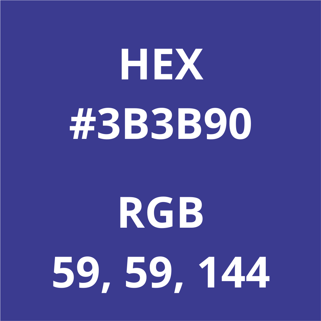
Figure 5-14. Illustration of the HEX and RGB values for a specific color
Using Colors Found in Nature
If you are struggling with selecting a beautiful color palette, you can get inspiration by using colors that can be found in nature. Select a picture that has colors you think are beautiful. Here is a nature photo from one of my morning runs around the neighborhood (Figure 5-15).

Figure 5-15. Photo of a river and trees including the key colors in the image
The next step is to pick colors out of them with an eyedropper tool. I use Canva, but you can use Photoshop or other design tools. Take a look at the 18 different colors that were picked out of the nature photo.
You can also use a tool called “Color Thief”6 to grab the color palette from an image. You can simply drag an image into the browser and identify the key colors used in the image. I dropped in an image (Figure 5-16) from when I took part in a New York City building climb adventure.

Figure 5-16. Photo of NYC skyline including color palette used in the image
The image provides great views of the city and Color Thief provides us with an effective color palette, along with a suggested dominant color in the image.
Color Palettes for Comparing Two Things
If you’re going to compare two things, and the purpose is to make one more important than the other, a smart idea is to use the key color for the one you deem important and use gray for the other one. If you’re going to compare two things out of a field of say, a dozen or more, or if there are lots of different elements at play and you want to distinguish a couple of key groups, then you’ll likely need to use two different focus colors.
That can be difficult if you don’t know your color wheel particularly well. People tend to think about “opposite” colors being necessary or they just pick one bright one and one dark one and roll with it from there. When we are looking for color harmonies for highlighting two series, we can envision a color wheel like the face of a clock with the following colors at the following digits (Figure 5-17):
12—Red
1—Orange
2—Yellow
3—Light green
4—Green
5—Blue-green
6—Light blue
7—Blue
8—Indigo
9—Purple
10—Pink
11—Pinkish-red
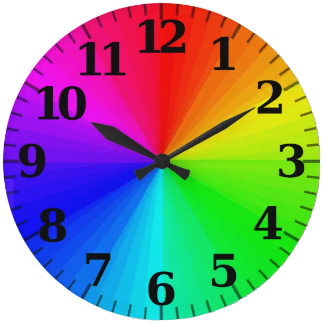
Figure 5-17. Color wheel in the form of a clock
Let’s run through a few scenarios on how to pick two colors for comparisons in data visualization.
Analogous Harmony
Analogous harmony is the easiest to understand and the easiest to achieve. Start with your key color, move exactly one color over to the left or right of it on the color wheel, and use the same level of saturation. Using one or two neighboring colors makes sure that none of them are emphasized more than the others. If your key color happens to be your brand’s color, it might make an audience give it a bit of extra scrutiny, but not to the point where it alters their view of the graphic. So for the sake of this example, let’s say our selected key color is orange. On the color wheel described in Figure 5-17, one step to the left would be red and one step to the right would be yellow. Both of these are analogous with orange, complementing it well. Figure 5-18 provides a look into the color palette that’s created from neighboring colors of orange.

Figure 5-18. Color wheel demonstrating analogous colors
Complementary Harmony with a Positive/Negative Connotation
While your key color can be well supported by the colors near it on the color wheel, it can be much more strongly supported by the colors on the opposite side. Complementary colors are direct opposites and offer the very best contrast possible. That makes them good for showcasing positive and negative differences.
When you are using your brand’s main color as your key color, it works perfectly because it can be the positive in the equation and the complementary color can be the negative. Try to stay away from using your brand color as a negative, even if it is something like red or black, which is often used to mean something negative. To match complementary colors, draw a line from one spot on the color wheel clock face to the number directly across from it. In our orange example, it matches up with blue (Figure 5-19).

Figure 5-19. Color wheel showing complementary colors
Other combinations (Figure 5-20) in this format are:
Yellow and indigo
Light green and purple
Green and pink
Blue-green and reddish-pink
Light blue and red

Figure 5-20. Examples of complementary colors on various color wheels
Near Complementary Harmony for Highlighting Two Series Where One Is the Primary Focus
Instead of using polar opposite colors, in this motif you can still get good contrast without any possible reason to believe the colors are complementary. This is achieved by going just 33% of the way around the color wheel instead of the full 50%. So if our example of orange is at 1 o’clock on the clock face, its near-complementary color could be found by going 33% forward to 5 o’clock, which is blue-green, or 33% backward to 9 o’clock, which is purple. Ideally in this situation, your key color will be warm and your complementary colors will be cool, but if this is not the case, you can mute the secondary color by decreasing its saturation or altering its lightness so it has less contrast with the background (Figure 5-21).

Figure 5-21. Color wheel with near complementary colors
What are “warm” and “cool” colors? Figure 5-22 demonstrates how the color wheel can be split into warm and cool colors.
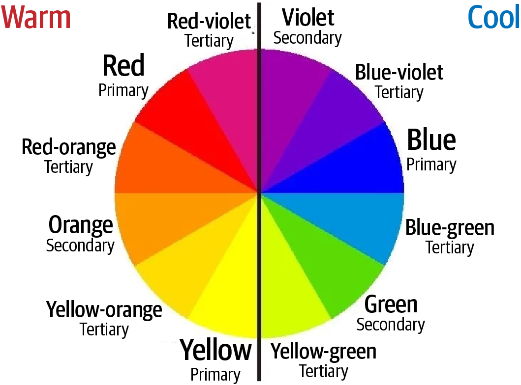
Figure 5-22. Color wheel identifying warm and cool colors
On the color wheel of primary and secondary colors, the warm colors are red, yellow, and orange. Colors that have a red, yellow, and orange hue will also be warm. On the contrary, green, purple, and blue are cool, thus colors that lean towards these tints will be cool too.
Warm and cool colors are categorized as warm and cool due to the feelings that one gets when looking at the hues. Reds, yellows, and oranges make us think of the sun and fire. Therefore, they tend to convey a sense of warmth and comfort. Cool colors, on the other hand, make us think of grass and water. These hues often feel cool and refreshing, much like the outdoor areas that they are associated with.
Color Palettes for Comparing Three Things
Moving from two color palettes to three colors is a bit like taking the training wheels off your bike and suddenly getting on a Harley Davidson. We want to use colors that are visually pleasing to our intended audience, but we also need to imply specific relationships among the different data points that make sense to the audience in an intuitive form. Here are a few examples, based on the same clock face color wheel we used earlier.
Analogous/Triadic Harmony for Highlighting Three Series
Analogous harmony works when you are making simple distinctions among categories. This is the simplest of the bunch, as you simply use both neighboring colors to your key color. So for our key color of orange, we would add red from one side and yellow from the other to accent our key color. Because it is familiar from our branding, the key color will have a slightly stronger visual emphasis, but that typically works well for our purposes. Figure 5-23 shows the color palette for comparing three things.

Figure 5-23. Color wheel showing analogous triadic colors
Triadic harmony grabs your key color and the two complementary colors that are evenly spaced around the color wheel. There is more contrast here than with analogous harmony. It will look better on a big screen as a result. The weak point is that you will lose the feeling of one color being the key color.
Highlighting One Series Against Two Related Series
In this arrangement, your key color is one side of the wheel and the other two are on the opposite side of it, each one step away from the complementary color we discussed in the previous section. So with orange as our key color and blue as its complementary color, we move one click over to indigo on the left and light blue on the right and add those to the equation (Figure 5-24).

Figure 5-24. Color wheel demonstrating one series versus two related series colors
This is a good formula when you’re going to use the two complementary colors as parts of a whole represented by the key color. For instance, if your key color of orange represented the total revenue generated by a school’s athletic booster club, indigo might represent donations gathered at the annual golf tournament and light blue could represent sales from T-shirts and other merchandise (Figure 5-25).

Figure 5-25. Treemap demonstrating a color palette for two complementary colors for parts and one representative of the whole
Color Palettes for Comparing Four Things
The need to compare four distinct things with four distinct colors in one visualization is rare. We know from previous experience in this book that we are trying to use color to focus attention, which is considerably difficult with so many colors working at the same time. But it does happen from time to time, and we need to be prepared to handle it when it does.
Analogous Complementary for One Main Series and Its Three Components
Analogous harmony is still possible with four colors, assuming you’ve got the size and contrast to make it work. Take our key color (still orange) and add its complementary color (blue). Now take one step in both directions away from that blue, adding light blue and indigo, and you’ve got your quartet. The similarities of the three complements allow your key color to easily stand out (Figure 5-26).

Figure 5-26. Color wheel showing analogous complementary colors for one series and three components
Double Complementary for Two Pairs Where One Pair Is Dominant
A likely scenario when there are four different data series is that there are two groups of two series. If that’s the case, then double complementary harmony makes sense as the choice to go with. Start with your key color and pick one of its two analogues—the two colors that reside adjacent to it on the color wheel. Now choose the complements of your key color and the analogue to serve as their partners in the pairing. If at all possible, it’s very helpful for your key color and its analogue to both be warmer colors and the complementary colors to be cooler colors (Figure 5-27).
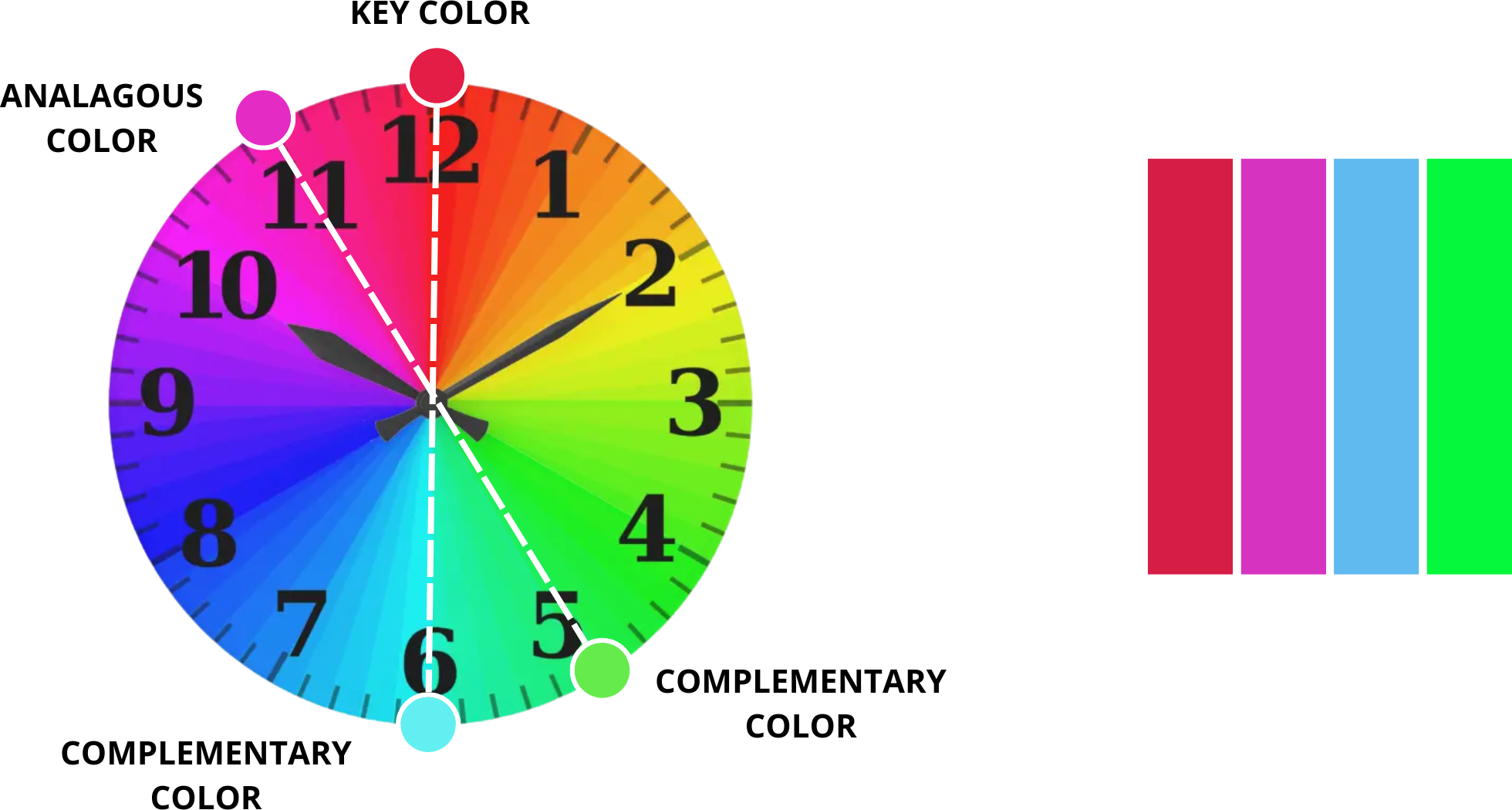
Figure 5-27. Color wheel showing two pairs where one is dominant
Rectangular or Square Complementary for Four Series of Equal Emphasis
If your objective is to use colors to make categorical distinctions across four series where none is more important than the rest, then a square/rectangular harmony can do the trick. Similar to the double complementary, you take the key color and its complementary, but instead of using an analogue, you select a near analogue—two steps away on the clock. Then you take that near analogue’s complementary and you’ve got your rectangular pattern. In square or rectangular harmony, also known as tetradic harmony, you begin with the key color and go every third step around the clock to form your quartet (Figure 5-28).

Figure 5-28. Color wheel showing rectangular harmony
While the rectangular harmony suggests that the four series are really two pairs, the square harmony puts the four colors far enough apart that they all possess equal footing from one another.
Summary
The key point to remember is that you shouldn’t accept the default settings within a data visualization software—unless you get lucky and those settings help you tell your data story effectively. Take the time to intentionally select the appropriate color palette that will help you communicate your insights to your target audience.
1 Neil Patel, “Color Psychology: Meanings & How It Affects You,” blog post, last updated May 12, 2021, https://oreil.ly/dbHZj.
2 Image credit: Jane Richards, “Food’s Carbon Footprint,” Green Eatz (blog), last updated October 14, 2020, https://oreil.ly/jVCwl.
3 Daniella Alscher, “Color Me Confused: What Is Pantone?,” G2, June 12, 2019, https://oreil.ly/krY8h.
4 Image credit: “Color Philosophy #1,” Villa30 Studio (blog), March 4, 2018, https://oreil.ly/L6Mcy.
5 Nicole Oquist, “Color Systems Guide - The Difference Between PMS, CMYK, RGB, & HEX,” RCP, July 20, 2018, https://oreil.ly/9v60C.
6 Lokesh Dhakar, “Color Thief,” https://oreil.ly/CzIVB.