Chapter 2. Data Visualization and Data Storytelling
Like so many other revolutions before it, data is a great teacher, with the ability to transfer information from the ephemeral to the tangible with powerful results. Data is defined as factual information (such as measurements or statistics) used as a basis for reasoning, discussion, or calculation. Additionally, we can define data as information in digital form that can be transmitted or processed.1
Data becomes more useful once it’s transformed into a data visualization or used in a data story. Data storytelling is the ability to effectively communicate insights from a dataset using narratives and visualizations. It can be used to put data insights into context and inspire action from your audience. Color can be very helpful when you are trying to make information stand out within your data visualizations.
In data storytelling, color helps to set the tone and enforces a unique message for the underlying visualizations. Color aids in developing a specific atmosphere that can convert a data visualization into an emotion-packed data story.
In this chapter, we will discuss the concept of data visualization, exploring different methods for portraying data such as time series, frequency, relationships, networks, and more. You’ll learn about data storytelling and the types of colors that can be used to deliver insights (i.e., diverging, sequential, categorical).
What Is Data Visualization?
Data visualization is the practice of taking insights found in data analysis and turning them into numbers, graphs, charts, and other visual concepts to make them easier to grasp, understand, learn from, and utilize. It is the graphic representation of data, the ability to snapshot what has been collected, learned, and revealed, so that it can be harnessed and utilized not just in the moment it is revealed, but in the future term as well.
The visualization of data can be thought of as both a science and an art in that the way it is displayed is often as important to its understanding as the actual information that is being displayed. At its very best, it takes complex data sets that have been compiled over different time intervals and turns them into visual representations that are much easier to understand, commit to memory, and adopt into future practices.
Let’s review an example of how data visualization is easier to interpret than data in its raw form. Take a look at Figure 2-1. The data on the left (table) and the data on the right (line graph) is the same; however, the data within the line graph makes it easy to follow the trends of inbound leads month to month and see the dip in inbound leads in April as well as the surge in May.

Figure 2-1. A table and graph that shows monthly inbound leads for 2019
History tells us that the Ishango bone (Figure 2-2) is not just the first use of recorded data in history, but also the first look at data visualization. In 1960, archeologists in what is now Uganda made a startling discovery while sifting through artifacts from a prehistoric site of Paleolithic tribes. A tally stick that later was named the Ishango bone showed notches placed on it that scientists believe were used to count the number of supplies a tribe had or how much it had to trade with other tribes of a certain resource. The calculations performed here were nothing more than simple addition, but having those numbers in hand let them make assumptions about how much food they had in storage for the future and how much they could afford to trade.2

Figure 2-2. Ishango bone that was used as a tally stick for calculations in prehistoric times
Theirs was a technique that is still practiced by every farmer, rancher, and businessperson who deals in a natural or manmade resource today, placing the “birthdate” of data collection and visualization at around 20,000 BC.3 The natives who scratched or carved their supply tallies into these bones and sticks were doing so not just to take count in the moment, but to have a reference point to return to and utilize in the future.
In terms of human achievement and brain power, it is one of the most overlooked and underappreciated developments in history—not living in the moment, concerned only with the next need for fire, the next hunger pangs, the next quenching of the thirst, but instead focused on planning for what’s coming next, trying to make an uncertain future more predictable by the use of data and planning.
Throughout history, some of the greatest leaps forward in human understanding have come as a result of data visualization. Claudius Ptolemy created a map projection of the earth (Figure 2-3) as a sphere with latitude and longitude lines in the second century that remained a standard reference throughout the world for more than 1,200 years.
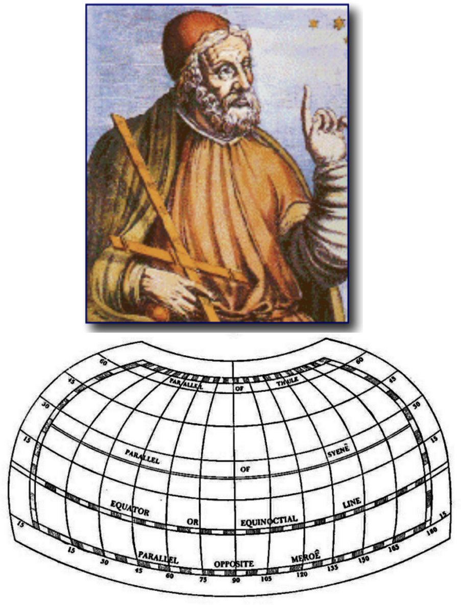
Figure 2-3. Map projection of the earth (created by Claudius Ptolemy)4
Rene Descartes cocreated the idea of a two-dimensional coordinate system as well as analytic geometry that heavily influenced how most charts and graphs look today.5 Pierre de Fermat and Blaine Pascal combined to push this work forward through the use of statistics and probability theory that are the very foundation of how we conceptualize data in the modern world.6 According to data scientists, the current amount of data produced is 2.5 quintillion bytes of data per day.7 That’s 2,500,000,000,000,000,000 if you’re scoring at home. Figure 2-4 demonstrates the amount of data we create and notes that 90% of the world’s data today has been created in the last two years alone! To help you visualize this, imagine filling 10 million Blu-ray discs with data. If you stack those discs on top of each other, this would end up being the height of four Eiffel Towers!
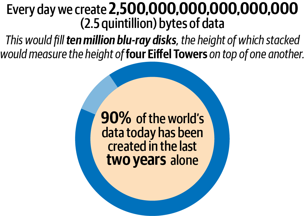
Figure 2-4. The vast amount of data we create on a daily basis8
Deriving Meaning from Data
Especially when working with large data sets, visualization is entirely necessary for data to be put to use by anyone past data scientists. Without this medium for understanding, it becomes impossible to quantify, impossible to put into practical use, and by the time it could be explained through some other format, it would already be outdated.
In business use and beyond, the most valuable component of data analysis is the ability to identify trends and patterns, visualize them, and use them to change behaviors and plan for the future. As data has become more commonplace and data sets begin to stretch the breadth of human comprehension, being able to accurately visualize and understand data has become an absolutely essential component of every business.
Even data analysts themselves are not always able to grasp the meaning and see the revelation involved from the process of analysis without the use of visual stimulus. Processes such as machine learning (ML) and other forms of artificial intelligence (AI) can actively find trends and turn them into insights to be implemented. However, if the human component of this equation cannot grasp what is being seen and what can be done about it, none of it bears any relevance.
Our machines are helpers, not decision makers. Their insights are not the final word in the discussion, merely the work of our most nimble observers who can ramp up time spent on analysis by factors that our counterparts even a generation ago would have a hard time believing. In statistics classes, we are taught to be able to read raw numbers and gain insight from them. Seeing patterns on a spreadsheet or an Excel table takes skill, but it is doable, and even essential to get an early grasp of what trends and patterns look like.
For someone wishing to go into data analysis as a profession, it is and should be a required skill, just like someone learning photography should start on a film camera and learn to develop negatives in a dark room to understand what the basic process looks like and how things come together to form the modern use of the technical skill. However, understanding the process is not required by everyone. A great photographer does not ask the editor of their magazine to venture into the dark room with them anymore and look at a single image with a magnifying glass under a red light to approve of a single image; they use digital cameras and transmit images by text or email for approval in seconds.
Similarly, data analysts and scientists aren’t going to dump 50 pages of printer paper onto the desk of the CFO of their corporation and ask her to sift through the raw data to identify trends. For example, we can’t expect that the CFO will be able to identify the trend of a certain product no longer selling well so that she can then deduce that it should be taken out of the company’s normal rotation of stock. Instead, they will take the raw data and construct a graph, chart, or other visual representation that lets the C-suite level leaders easily see the reduction in sales over the course of a few months or a year compared with the increase of other items to establish the pattern that forms the insight into what should be done next.
In the business world, understanding is the great equalizer so that everyone in a company that is a key stakeholder or decision maker can be on the same page and look at issues through the same lens.
Speaking the Same Language
One of the most debilitating things in business is that different teams often feel like they are trying to communicate in foreign languages to other teams, and to the management of their company. The sales department has a term for all of its metrics, advertising a second, logistics a third, and accounting yet another. This breakdown in communication can have enormous consequences that are not even realized at the moment. Trends that have tremendous significance to your research and development department might not register as such to sales and marketing, and vice versa.
The common language in all of these arenas is data—numbers that cannot be misrepresented by different choices of terms. Carefully designed charts and graphs and other representations break down communication barriers and ensure that the true meaning of the data is on display to be grasped by everyone present.
Power of Visualizing Data
What are the advantages of understanding data and being able to visualize it? It starts with the obvious: our eyes are naturally drawn to colors and patterns. One need only look at the standard children’s toy or educational aid to grasp that from the moment we arrive in this world, we are drawn to these concepts.
Our eyes filter information quickly to our brains as we see different representations of color, different lines symbolizing different meanings, and so forth. Not only do we quickly grasp the patterns, but we more readily grasp the outliers. When we see a pie chart (Figure 2-5) of contributions to our annual fundraising event with three fairly equal slices but one tiny sliver representing donations from the local chamber of commerce, you can bet that every time we see the chamber’s emblem somewhere or speak to one of its members, our brains will immediately flash to that tiny sliver of donation failure.

Figure 2-5. Pie chart of annual fundraising contributions
Every set of data tells a story, but when you utilize the power of visualization, that story has a purpose that is known to all who view it.
Note
Data visualization has the power of unity, to put everyone on the same page and in the same frame of mind when collaborating, whether it’s in the conference room, the boardroom, or over a virtual video call.
Visualizations can remove the background noise from enormous sets of data so that only the most important points stand out to the intended audience. This is particularly important in the era of big data. The more data there is, the more chance for noise and outliers to interfere with the core concepts of the data set.
Sometimes, the simple pie charts and bar graphs we all learned as school children are not always the best representation for the complex concepts we are seeking to simplify in the business world. That’s one of the reasons we refer to data visualization as both an art and a science. Visual designers need to be able to use the proper form and format to harness the data they are sharing to make it palatable to their target audience and also truly represent what the point of this data set is. Being too simple and boring is just as much of a risk as a visualization that is too complex and technical. Keep in mind though that unless you know how to properly design complex data visualizations, the best advice is to keep it simple.
What Is Data Storytelling?
Data storytelling is an effective way to get your team and your users the answers they need with a minimum amount of time and effort committed on their part. The more digital everything gets, the more dashboards, spreadsheets, and other business intelligence tools come trickling down from on high. The problem that results from having all these forms of interpretation is that while dashboards and spreadsheets are great at telling you what happened, they’re not nearly as good at telling you why it happened.
In short, the need for human intervention in manual reporting and data wrangling slows down the process of communicating what data is finding in an organization.
While there are numerous great tools capable of presenting data in tables and charts, they lack the extremely important component of a narrative that can more effectively and efficiently communicate both information and key insights.
Data storytelling is a method of communicating information that is custom-fit for a specific audience and offers a compelling narrative to prove a point, highlight a trend, make a sale, or all of the above. Sharing stories to share information is a human tradition that dates back as far as our distant ancestors gathered around a fire or painting pictures on cave walls.
Plenty of scientific evidence exists that shows storytelling as the primary form of how knowledge was transmitted from one large group of people to another, and how stories, traditions, and mythology was passed on from one generation to the next. You can see a timeline of this in Matt Peters’s article “The History of Storytelling in 10 Minutes”.
The arrival of data storytelling allows us to put a human perspective on a data set and convey emotion and intuition seamlessly. Data storytelling combines three critical components, storytelling, data science, and visualizations, to create not just a colorful chart or graph, but a work of art that carries forth a narrative complete with a beginning, middle, and end.
Good data stories have three key components: data, narrative, and visuals. You can see a diagram illustrating this from Brent Dykes in Figure 2-6.

Figure 2-6. The components of an effective data story9
The data part is fairly obvious—data has to be accurate for the correct insights to be achieved. The narrative has to give a voice to the data in simple language, turning each data point into a character in the story with its own tale to tell. The visuals are what we are most concerned about. They have to allow us to be able to find trends and patterns in our datasets and do so easily and specifically. The last thing we want is for the most important points to be buried in rows and columns.
As stated by the well-known data visualization expert, Stephen Few, “Numbers have an important story to tell. They rely on you to give them a clear and convincing voice.”10 Therefore if you have an insight that you want to share, it’s best to share it in the form of a data story.
Types of Data Visualizations
There are different methods to represent data. Let’s discuss some of the most well-known uses for data visualization.
Changes over Time
This is probably the simplest method to teach and to learn, yet no less valuable because of it. Children can plot points based on how many candy bars they sold at the school store over the course of a week to determine what days they should stock the most and what days they can reorder without loss of revenue. They see that more kids are buying candy on Tuesday and Friday—Tuesday because they all remember about the candy on Monday but don’t have money until they go home that night to ask for some, and Friday because it’s the class snack day and a fun way to welcome in the weekend.
Businesses can chart the popularity of certain items over the course of a quarter, a year, or a decade to see what historical events are influencing their sales and how to prepare for them in the future.
A hotel chain can plot its drop in revenue during years when gas prices soared, such as in 2008 when tensions in the Middle East and the United States’ faltering relationship with Argentina drove the price of unleaded gas domestically toward $4/gallon. With fewer Americans taking long road trips and the price of jet fuel skyrocketing, predicating that airlines raise their prices and cut down on the flexibility of how much luggage each person could bring accordingly, far fewer Americans traveled that summer and hotel reservations took a nosedive.
While these numbers impact some when they simply hear them, they garner a much more severe, immediate reaction when they can be seen on a bar chart as a series of tall, vibrant colored lines for each year preceding 2008, then a huge dropoff in number of reservations and corresponding number of dollars earned for 2008. The bounceback that follows only mitigates the damage done, but does not solve the problem should it happen again.
Seeing that visualization (Figure 2-7) helps get people into a problem-solving mode: at what price point in gasoline costs does our revenue start to fall beneath a sustainable level? What are the indicators that this will repeat itself in the future? Since we cannot control the price of gas, what other avenues can we take to combat the drop in revenue when another gas spike occurs?

Figure 2-7. Average gasoline prices over the past 20 years (upper graph) and the annual changes in hotel revenue (lower graph)11
Determining Frequency
Determining frequency is another basic use of understanding data through visualization that is still powerful and relatable today, particularly if it is coupled with time. If you have ever taken your car to a car wash business, you have likely been asked if you want to join their exclusive membership club where for a flat rate a month, you can get your car washed an unlimited amount of times. Most people say no, but some jump at the opportunity, always eager for a deal if they see it as such. Now turn that scenario around to a data analyst at a car wash chain realizing that most customers bring their cars to be washed on a pretty erratic schedule—most no more than one time a month, and some a lot less than that—typically when there is a coupon online or in the mail, or when they are about to go on a trip out of town or have just returned from one and feel the need for a clean car.
The data analysis shows that there is a small percentage of customers who come a few times a month, and when they do, they tend to spend more money inside the car wash on drinks or snacks or air freshener or various knick-knacks sold, such as bumper stickers, key chains, etc. The ideal then would be to create a program that encourages more visits per month for more customers because the data reads that when people come more often, they spend more money.
By putting this information into a visualization package, analysts can show their executives that by offering an “unlimited wash” program for a flat fee, they will entice more customers to enroll in it because of the free/reduced rate aspects and have the chance to bring in more revenue based on the extra spending.
Since very few people come to the car wash two or three times a month, the business will be losing next to nothing in terms of “free” car washes because those who do join the program will be carrying the mentality that since the car wash is free, they can spend a few dollars on extra items while there. Getting a financially minded executive to agree to a program for as many free car washes as you want in a month gets a lot more palatable with the data points when extra revenue comes into play. Figure 2-8 provides an example of this data.

Figure 2-8. Bar chart illustrating the number of vehicles that visited the car wash in the last 30 days12
Determining Relationships
The practice of finding relationships between different sets of data—also known as correlations—is the bread and butter of what data analysis, and by proxy data visualization, is all about.
The easiest correlations are simple even without visualization: when the temperature increases in the summer, the average electricity bill goes way up and so do ice cream sales. But others are so subtle that it takes the likes of machine learning to discover them and visualization to make them palatable to human comprehension. Understanding the fundamentals of correlation is the first step forward to making sense of it enough to harness change for the better in a business. Without one, the other cannot go forward. You can see in Figure 2-9 an example scatter plot of temperature versus ice cream sales.
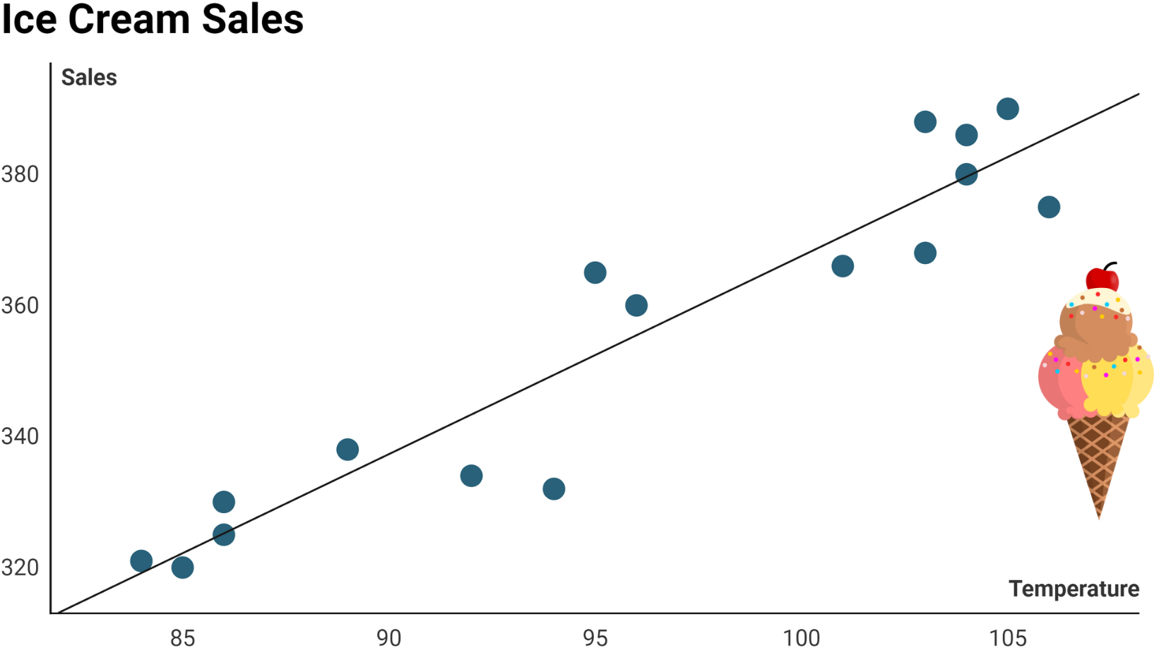
Figure 2-9. Scatter plot showing the rise in ice cream sales as the temperature increases13
Examining Networks and Marketing
The advance of data analysis in general and data visualization in particular has taken the field of marketing from a nebulous study of impressions and tenuously gathered results to a fantastically structured and highly relatable science of quantifiable metrics that have allowed marketing sales to blend into one super-organism in many industries. Examining a network of customers and how they want to be informed and sold to as well as what message types they respond to is essential for branding, sales, customer retention, and long-term successful relationships.
The advent of being able to collect customer data from sign-up sheets for things like special offers, newsletters, coupons, etc., has opened up a huge window for data analysis. Couple this with gathering data from social media and marketing departments have gone from starving to stuffed in terms of how much information they suddenly have available for processing. But like the other points made earlier, this information is only as powerful as a department’s ability to translate it into actionable visuals that tell the tale of what they are seeing.
Convincing the executive powers that your customer base no longer wants to drink champagne toasts at fancy dinner parties but instead wants you to include hot chocolate in your catering service is a tough sell without the data to back it up, and unless that data is put together in exceptionally powerful visuals that leave no room for error, you’re going to be fighting a serious uphill battle.
Figure 2-10 demonstrates a strong preference for hot chocolate (from our fictitious survey) so you might have a chance at convincing the executives.
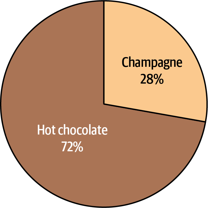
Figure 2-10. Pie chart showing the beverage preferences of hot chocolate versus champagne
You’ll notice that for the pie chart in Figure 2-10, we leveraged “natural colors” for hot chocolate and champagne. We selected colors that are associated with the items represented—brown for hot chocolate and a yellowish color for champagne. This makes it easier for our audience to distinguish between the two slices.
Scheduling
Has there ever been a happier group of people than schedule makers when understanding data through visualization became available to the general masses in the business world? If you worked in business before the age of the internet, schedule making was one of the most rigorous, mistake-prone, and unforgiving tasks that a company could ask for. But using data based on workers’ availability, project due dates, availability of resources and materials, and the power of AI to sort through it all makes things so much easier now.
Even better is the ability of data visualization to structure it all in a way that is easy for anyone to comprehend; the reduction in loss of labor-hours based on being able to easily visualize schedule making is enormous. Figure 2-11 is a great example of a schedule visualized to demonstrate the time spent before and after having a baby.
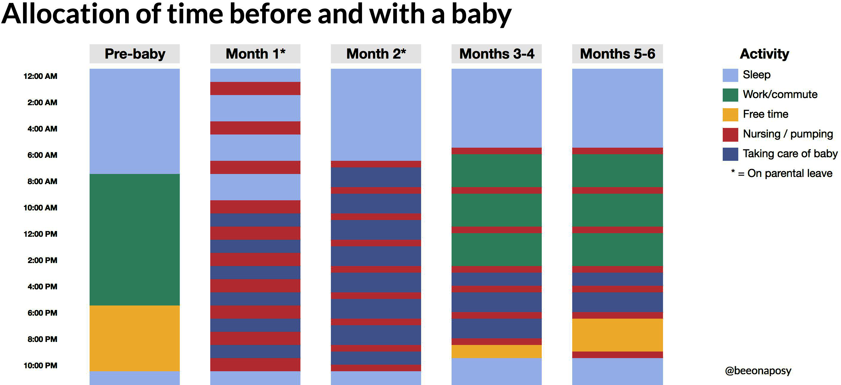
Figure 2-11. Schedule chart showing the allocation of time before and after having a baby14
Chart Selector Guide
Hopefully the examples were helpful in getting you familiar with the different ways that data visualization can be used across various industries. Figure 2-12 is a Chart Selector Guide that provides more examples of the different types of data visualizations, as well as sample charts for each category.

Figure 2-12. Chart Selector Guide
Summary
In this chapter, the main takeaway is that data visualization and data storytelling play a key role in communicating information with stakeholders. We covered the various types of visualizations that can be used when crafting stories with data.
1 Merriam-Webster, “Data,” https://oreil.ly/cH1YK.
2 Anne Hauzuer, “Ishango Bone,” in Encyclopaedia of the History of Science, Technology, and Medicine in Non-Western Cultures, Springer, 2008, https://oreil.ly/UFH3A.
3 “Prehistoric Math,” Story of Mathematics, https://oreil.ly/Z9f6O.
4 Image credits: Rachel Quist, “Ptolemy’s Geographia,” Geography Realm, November 30, 2011, https://oreil.ly/9otCt; #119 Ptolemy, https://oreil.ly/0cHRi.
5 “Rene Descartes and the Fly on the Ceiling,” Wild Maths, last accessed November 7, 2022, https://oreil.ly/7a1Q6.
6 “Probability Theory / Blaise Pascal / Pierre de Fermat,” https://oreil.ly/8PGTM.
7 Eric Griffith, “90 Percent of the Big Data We Generate Is an Unstructured Mess,” PCMag, November 15, 2018, https://oreil.ly/qIv08.
8 Image credit: Griffith, “90 Percent of the Big Data We Generate Is an Unstructured Mess.”
9 Image credit: Brent Dykes, Effective Data Storytelling: How to Drive Change with Data, Narrative, and Visuals, Wiley, 2020.
10 Jim Stikeleather, “How to Tell a Story with Data,” Harvard Business Review, April 24, 2013, https://oreil.ly/WBDwm.
11 Image credits: Robert Allison, “Let’s Track the Falling Gas Prices!” SAS (blog), January 15, 2019, https://oreil.ly/efz2u; Robert Mandelbaum and Andrea Foster, “Hotel Spa Departments Following Industry Trends,” Hotel Online, February 17, 2016, https://oreil.ly/JyCzl.
12 Image credit: “Unlimited Car Wash Membership Program,” Washify, https://oreil.ly/Djm4G.
13 Image credit: Lenke Harmath, “A Focus on Visualizations: Scatter Plot,” Sweetspot (blog), May 30, 2014, https://oreil.ly/NCOvC.
14 Image credit: Caitlin Hudon, “Schedule Change with a Baby,” FlowingData, January 13, 2020, https://oreil.ly/n8NEq.