Chapter 1. Color Theory and History
Mention the word “color” and most people’s minds explode into their favorite sights and memories. The deep blue of the ocean. Shades of green in a lush forest. The perfectly balanced blend of brown-and-white in a chocolate-vanilla ice cream sundae. The golden hues of sunlight bursting through the clouds on a stormy day (Figure 1-1).

Figure 1-1. Four images showing a view of the ocean, a forest, a chocolate-vanilla sundae, and sun shining through clouds
In this chapter, we will define “color” and take a brief walk through history to discuss its evolution through time. You’ll learn about how humans biologically see color, including an introduction to color theory and color psychology.
So What Is Color?
Color is the aspect of things that is caused by differing qualities of light being reflected or emitted by them. You need light to see color. When light hits an object, some colors bounce off the object and some are absorbed by the object.
Back in the 1660s, Sir Isaac Newton did more to contribute to science than letting an apple pop him in the head; he also started experimenting with prisms and sunlight, showing that the clear white light that made up everything people could see outside was actually composed of seven visible colors—the scientific establishment of the visible spectrum (Figure 1-2).

Figure 1-2. Isaac Newton experimenting with prisms and sunlight
Newton’s work was the progenitor for a massive number of breakthroughs in chemistry, optics, physics, the study of color in nature, and how perception works. His studies were predated by others going back thousands of years to the time of Aristotle in ancient Greece, who postulated that God sent celestial rays of light from heaven; he believed all colors originated from white and black—the visual representations of lightness and darkness—and that they were directly related to the four earthly elements of fire, earth, air, and water. These beliefs were widely held until Newton’s time.
Newton posed his theories in his work Opticks, which has been slightly modified in spelling over time, but remains a commonly used business phrase into the 21st century. He revolutionized the idea of light being only one color by writing, “[I]f the Sun’s Light consisted of but one sort of Rays, there would be but one Colour in the whole World…”
Newton identified the colors inside the prism that would become the acronym learned the world over by school children as ROY G BIV (red, orange, yellow, green, blue, indigo, and violet) (Figure 1-3).

Figure 1-3. Prism colors—red, orange, yellow, green, blue, indigo, and violet
The visible spectrum is the part of the electromagnetic spectrum that can be seen by the human eye (Figure 1-4). There are seven parts of the electromagnetic spectrum:
- Radio waves
- The lowest range, used for communications including voice, entertainment media, and data.
- Microwaves
- The second lowest, used for radar, high-bandwidth communications, and as a heat source in industrial applications and consumer and commercial microwave ovens.
- Infrared
- The range between microwave and visible light. Humans can feel it as heat if it is intense enough, but cannot see it. Animals such as frogs, snakes, fish, and mosquitos rely on it for their vision.
- Visible light
- Right in the middle of the electromagnetic spectrum, these are the wavelengths visible to most, but not all human eyes.
- Ultraviolet
- Falls between visible light and X-rays and is a component of sunlight invisible to the human eye. It has multiple uses in medicine and industry, but also causes skin cancer in large doses.
- X-rays
- There are actually two types of X-rays, designated as “soft” and “hard,” that have different spots on the spectrum. Soft X-rays are between ultraviolet and gamma rays, while hard X-rays are in the same region as gamma rays.
- Gamma rays
- Mostly known throughout the world as the stuff that turned Bruce Banner into the Incredible Hulk, it does in fact cause damage to living tissue, but in small doses can be used to kill cancer cells. In large amounts, it is very dangerous, and even fatal to humans.
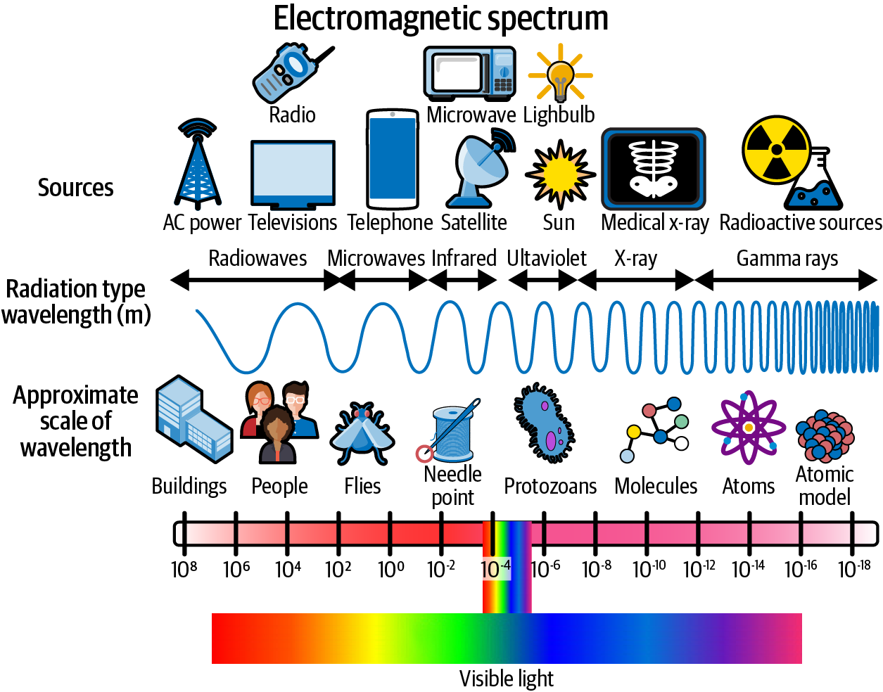
Figure 1-4. Electromagnetic spectrum from various sources, along with radiation type and approximate scale of wavelength
Newton further shook up previously held beliefs when he revealed that color does not inherently exist in objects, but rather the surface of an object reflects certain colors and absorbs the rest. Only the colors that get reflected are the ones that we see, and thus the ones that define the color of an object. Therefore, a ripe banana sitting on your kitchen counter is not yellow because yellow is part of a banana’s characteristics, but because the surface of its peels reflects the wavelengths that our eyes and brains translate into “yellow” and absorbs the rest. Thus, an all-white object like a sheet of printer paper reflects all visible wavelengths of color and a freshly laid tar designed to fix a pothole appears black because it absorbs all of the wavelengths.
Red, green, and blue (RGB) are known as the additive primary colors in the spectrum. There are many sets of RGB values, each producing part of the visible color spectrum. When these three are combined in balanced amounts, they make pure white. By varying the amount of the three of them, all other colors on the spectrum can be produced.
How Do We See Color?
The process of seeing color starts in the retina, which is physically part of the eye, but considered to be part of the brain (Figure 1-5). It is covered by millions upon millions of light-sensitive cells called rods and cones based on their similarities to those shapes. These cells act as receptors that process the incoming light into nerve impulses and send them via the optic nerve to the cortex inside the brain.
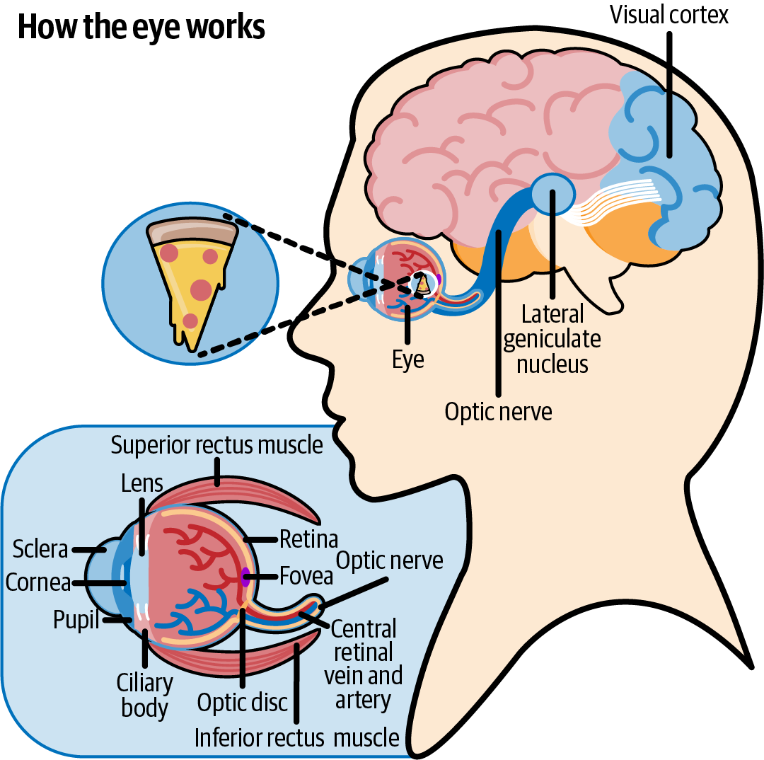
Figure 1-5. Demonstration of how the human brain perceives color
The rods are found in the highest concentration around the edge of the retina, with more than 120 million found in each eye (Figure 1-6). The rods are useful for low-light vision. The cones are responsible for luminance, which is the grayscale part of color.
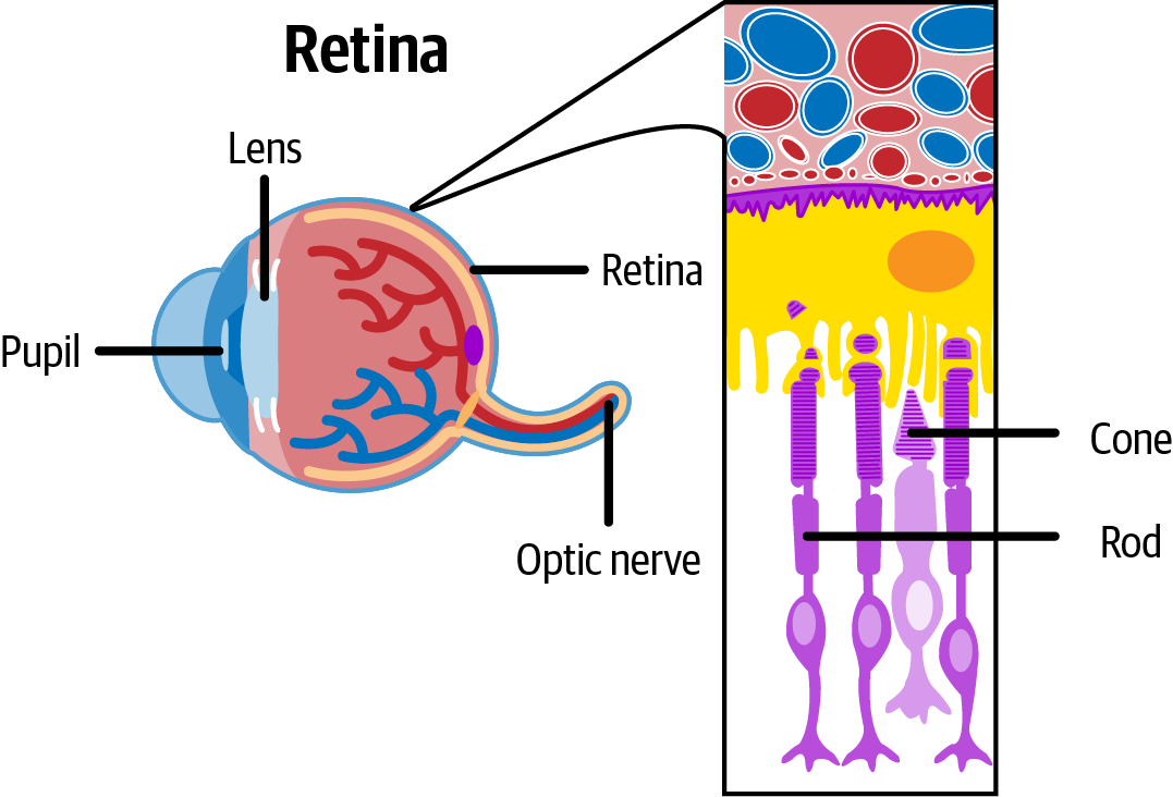
Figure 1-6. The cellular organization of the retina1
Cones, meanwhile, are most frequent in the middle of your retinas, and diminish in number toward the periphery. There are about six million cones in each eye transmitting the more intense levels of light, which translate into colors and visual sharpness. The cones come in three different types: long, medium, and short, which are sensitive to long, medium, and short wavelengths of light. When they work in harmony, they supply the brain with ample interpretation to identify colors and interpret them as well, key tasks for data visualization and storytelling (Figure 1-7).

Figure 1-7. Visible light wavelengths impact the eyeball and are interpreted by the brain
The optic nerve connects to the thalamus, sort of a central hub for all kinds of signals coming into our brains from our senses. The thalamus takes these signals and processes them, determining what is necessary and what isn’t. It also combines and repackages what it receives with new information from elsewhere and sends that information to other parts of the brain for further use. In data visualization, color can be used as both signal and noise. We’ll discuss in future sections how to avoid using color as noise and focus on using it as a signal for important insights.
The next stop is the visual cortex, located at the back of the brain (Figure 1-8). There are different types of cells located here that break down the information being sent by the thalamus. Some of the cells identify what shape an object is, while others note what color it is, what texture it appears to be, and whether it is moving or not. All of the signals combine to form the entire image. This construct moves on to the prefrontal cortex, located above the eyes and behind the forehead, where the brain combines and processes multiple types of information from the senses, along with emotions and memories, to produce not only a total picture of the item, but what we know and/or believe about that object from prior experiences and learned knowledge.
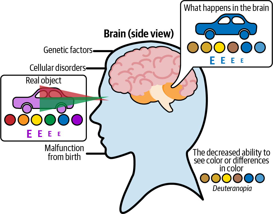
Figure 1-8. How the eye works when viewing an object
Let’s take an example that could easily be a case of mistaken identity. You’re walking down the street on a brisk evening jaunt and you pause when you notice something coiled up in a neighbor’s yard a couple of doors down (Figure 1-9). The light is receding as the sun sets and it’s costing you the ability to see much beyond the object’s shape and size. Long and wrapped around itself multiple times, it gives your brain two immediate options—it could be a garden hose that hasn’t been properly put up after being used, or it could be a snake lying in wait for its next dinner to saunter by.
Only when you get closer can you see either the bright green of the hose or the organic textured brown-black of a snake’s skin. The bright green color of the hose triggers information in your brain that designates the hose as harmless and maybe calls up images of plants getting watered or you as a child racing through a sprinkler on a hot summer day. If you see the darker color and slimy look instead, your brain will trigger danger signals and emotions of fear and the need to retreat to safety will emerge.

Figure 1-9. Long green garden hose laying on a lawn that looks like a snake
What Is Color Theory?
Color theory blends the science and art of color and details how we perceive color, and how colors mix, match, and contrast with one another. It also involves how colors influence the messages we communicate to one another. To understand how color theory works, put yourself at your local grocery store in your mind’s eye. When you turn down the aisle for soft drinks, you know you want to buy a case of Coca-Cola Classic (Figure 1-10).

Figure 1-10. Cans of Coca-Cola and other soda bottles on display in a supermarket
Despite the fact that there are hundreds of selections lining the shelves from the floor to several feet above your head, it only takes you a moment or two to identify a case of Coke from all the rest and set it in your basket. Did you look at the label on each and every item to find out where they keep the Coke? Of course not! Instead, you headed straight for the tell-tale red box, the color of which I suspect you can call up in your mind right now, and the white script lettering that goes along with it. This is the power of color theory and why color is so vital to things like product branding.
Note
Most people will decide within 90 seconds if they like a product or not, and 90% of that decision is based solely on the color of the packaging.2
As mentioned earlier, red, green, and blue combine to form the additive color mixing model. Televisions and movie projectors use these primary colors to create the rest when they broadcast a show or a movie (Figure 1-11).
A second model is the subtractive color mixing model, composed of the colors cyan, magenta, yellow, and black (CMYK). This model is used for colors on physical surfaces like packaging, signage, and paper. Newspapers use them when printing color editions or using color advertising. It’s known as the subtractive model because adding more color subtracts more light from the paper. CMYK is the better model for printing things out.

Figure 1-11. Additive and subtractive color models and when to use each one
Color theory can be represented by the color wheel (Figure 1-12), which breaks colors into three categories:
Primary colors
Secondary colors
Tertiary colors
We have our old friend Isaac Newton to thank for the color wheel. He documented the first one, which is used today by artists and designers the world over in an amazing array of ways. The primary colors on the wheel are red, yellow, and blue. The secondary colors—those created when the primary colors are mixed together—include purple, orange, and green. There are six additional tertiary colors, which are created by mixing primary and secondary colors together to get combinations like red-violet or blue-green.

Figure 1-12. Color wheel that demonstrates the primary, secondary, and tertiary colors
Drawing a line down the center of the color wheels also distinguishes between the warm colors (red, orange, yellow) and the cool colors (blue, green, purple). Warm and cool associate colors with different temperatures, which are essential in creating advertising, branding, and data visualization for different audiences. Warm colors create sensations of action, brightness, and energy.
Remember that case of Cokes you spotted in just a few seconds at the grocery store? In the Western world, red is proven to be a color that promotes excitability and stimulates appetites in most people. When your cones feed that bright Coca-Cola red into your brain, it can trigger thoughts, emotions, and memories of things like hot summer days, a cold glass in your hand, the sound of the “fizz” when you pour a drink over ice, and so on. Cool colors, on the other hand, such as blue, purple, and green, are often identified with feelings of calm, peace, serenity, and trust in the Western world. Next time you’re watching TV, try to count the number of car companies and healthcare companies using blue in their logos; you might need a calculator to add them all up!
When you are looking to make a pair of colors stand out by using them at the same time, you can select a warm color and a cool color together. These pairs are called contrasting colors, or in some disciplines, complementary colors. Two colors that appear on opposite sides of the color wheel are often thought of as clashing with one another, but matching them up often results in very pleasing contrasts.
For instance, red and green are contrasting colors that appear on opposite ends of the color wheel, but few people complain about seeing them together on Christmas wrapping paper (Figure 1-13)! The more transitional colors there are between a pair of colors, the greater the contrast between them.

Figure 1-13. Green- and red-colored Christmas wrapping paper
Other well-used combinations include analogous colors, which sit right next to each other on a color wheel, such as blue and purple, or orange, red, and yellow. In an analogous color scheme, one color will dominate, another will support the first, and the third will provide small accents.
Triadic colors are usually a trio that are evenly spaced around the color wheel to give a lot of contrast. International fast-food chain Burger King is a well-known example of this, mixing its red lettering inside the orange “burger bun” with a blue circle wrapped around both (Figure 1-14).

Figure 1-14. Burger King logo
Hues, Shades, Tints, and Tones
Seeing how there are only 12 colors on the color wheel we just discussed, your childhood self might be wondering how in the world that short supply translates into the set of 64 crayons (Figure 1-15) we all loved as kids (and many of us continue to use as adults).
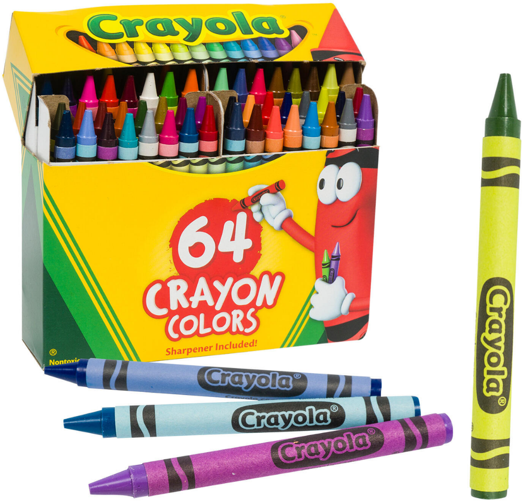
Figure 1-15. Open box of 64 crayons with a few crayons out of the box
You know what I’m talking about—for every standard blue, red, or yellow, you’ve also got periwinkle, cornflower, sea green, and my personal favorite—neon carrot. The variations come from hues, shades, tints, and tones, four terms that get horribly mixed up and interchanged by people—both amateurs and professionals—who have no idea what any of them actually mean. Let’s break all four of them down so that you never confuse one for another again.
Hues
Hues are easiest to remember, because they are simply the pure colors that appear on the color wheel. Those are the primary, secondary, and tertiary colors. Hues do not include black or white. When a hue is altered by adding black, white, or both to it, it ceases to be a hue and becomes something else. So, the next time someone tells you that they want to change a color to a slightly lighter hue, remind them that they don’t know what they’re talking about, or at least be smug in your own mind that they don’t.
Shades
Shades are created when black is added to a hue, producing richer, darker, and more intense colors. It’s easy to remember that shade means adding black to it if you consider the origin of the word “shade” in mythology. In Greek mythology, shades were spirits living in shadow in the underworld dominion of Hades. They were perpetually in darkness. Mixing black into other colors can be a difficult task because black tends to change hues quickly, even if only a small amount is used. Sometimes, other dark hues like purple and blue are added to brighter colors in place of or in addition to black to make the mix more palatable.
Tints
Tints appear when white is added to a hue on the color wheel. The addition of white makes any color less intense, desaturating it in the process. Tints are often referred to as pastel colors—particularly when red is desaturated into pink and blue is considerably lightened. These lighter colors often generate emotions of calm and quiet.
Tones
Tones are the result of adding both black and white to a hue—which is roughly the equivalent of adding gray. The mixture of black and white can send hues in a number of directions; they can be darker or lighter than their original incarnation, less saturated, or more intense. Tones often emulate the colors we see in the natural world better than hues, tints, or shades because they often have complex qualities that are reflective of the way that items in nature are affected by age, light, and weather.
Here is a visual that helps explain the four concepts with the color yellow; observe the differences between the pure hue, tints, shades, and tones (Figure 1-16).
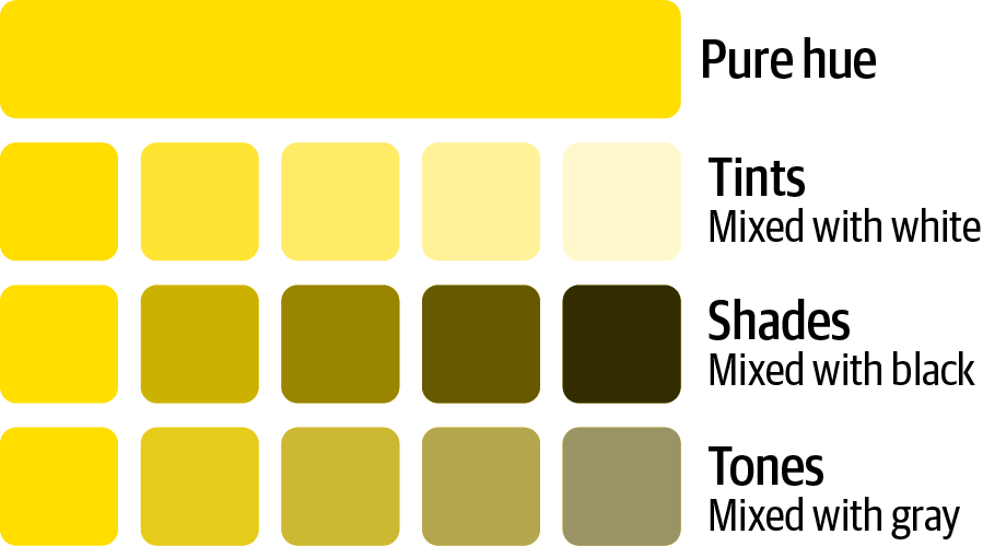
Figure 1-16. Demonstration of the difference between hues, tints, shades, and tones
The Psychology of Color
We’ve danced a few times throughout this chapter on particular emotions and feelings that different colors create. There is a clear connection between our feelings, moods, and behaviors and different colors. Certain colors are even associated with physiological reactions such as eyestrain, higher blood pressure, and faster metabolism. How does color psychology work in general? Some of what people perceive when they see colors is inextricably tied to the culture they hail from. This is a topic we’ll explore further in the book. Here, we can break down the most well-known and well-used colors in the world and see the different emotions they often conjure up and the symbolism that we tend to associate with them at first sight.
Black
Black is not on the color wheel and isn’t actually considered a color in technical terms; it’s the absorption of all colors. That said, it is very commonly used in multiple forms of visualization and is considered a color in the design sense. It has one of the widest ranges of emotions tied to it, giving perceptions of power, mystery, luxury, boldness, and unhappiness. Car companies often use it to promote elegance and sophistication, the kind of emotions you get when you see couples in black dresses and tuxedos headed to a classy party. Of course, in many cultures, black is the color of death, fear, and all things evil. Considering the audience you’re using when black comes into play is very important, especially if you are crossing cultural lines.
White
Much like black, white does not appear on the color wheel but is still considered a color in the design sense. Objects look white when they reflect all the visible light in the environment, which varies. Also, much like black, white’s meaning can change dramatically depending on which culture you are using it in. In Western cultures, white means purity, peacefulness, and cleanliness. It’s frequently seen on wedding dresses, in hospital corridors, and in church paintings of angels and heaven. In Eastern cultures, it has the polar opposite meaning, being tied to funerals and mourning rituals, and associated with sadness and death. It can also give negative emotions of cold, isolation, and starkness, such as an empty room. On the positive side, that can translate into freshness, simplicity, and cleanliness, all nice qualities when designing something and being comfortable with the use of white space.
Red
We’ve touched on red a time or two in our discussion. The more you look around outside, the more you’ll realize that it’s not just the leading beverage in the world that is addicted to red, but scores of makers of food and drink. The reason? Red is known to be a color that increases your appetite. When you’re driving down the road and see a McDonald’s, Chick-fil-A, Wendy’s, or Sonic, you’ll notice there’s plenty of red on the signs. That’s to get your brain talking to your stomach about the fact that a giant hamburger and a side of fries is probably the best thing in the world for you right now. Research finds that red provokes the strongest emotions of any color out there. It is used to create feelings of power, anger, passion, and love in different circumstances. Red symbolizes danger and caution, which is why it is used for stop signs and traffic lights, along with other cautionary traffic signals in Western cultures. In Eastern cultures, red is often celebrated and considered a positive color. But it also is a color that is meant to stimulate buyers with excitement and passion for products. It is one of the colors that can stimulate physical responses in people, including an uptick in respiration, heart rate, and blood pressure. It also is associated with aggression and dominance.3 In data visualizations, red is often used as an alert that something bad has happened; this is more common in North America.
Blue
Generally considered the most popular color in the world—blue has ties to calmness and serenity that touch on its natural association with water. It is seen as conservative and traditional, and as a sign of both reliability and stability. However, the term “feeling blue” goes against all of these characteristics and can create feelings of sadness and aloofness, as showcased with legendary painter Pablo Picasso during his “blue period.”
Green
Few colors are more associated with nature than green, which calls to life images of your childhood backyard, wide meadows, and lush forests. It is often described as being both refreshing and tranquil. Green is considered a cool color because it has shorter wavelengths. Particularly in the last few decades, it has also been tied to feelings of health and products that are organic, creative, or environmentally friendly. Of course, in the United States, green is also irrevocably tied to money and wealth since it is the color of US currency. That doesn’t always translate to foreign audiences, however.
Yellow
Yellow is bright, intense, and quickly grabs attention, but it can also lead to visual fatigue if it is used too long or too much. Most people associate it with brightness and warmth because of its connection to the sun and sunlight. However, of the most-used colors, it is considered to generate the most eye fatigue. Using it as a background for computer monitors or on paper can lead to eyestrain. At its best, yellow works well to stimulate positive feelings—like when someone sees the golden arches of McDonald’s off in the distance and knows that grumbling in their stomach can soon be quelled. It is also known to increase metabolism,4 but in large amounts, such as a room painted yellow, it can also result in more frustration and anger. It is recommended to use yellow to promote purchases; the eyes see yellow first, and with so many other distractions in retail stores, you need to capture your customer’s attention quickly.
Purple
Purple is rather unique among the colors in that it is used less frequently than most but tends to be viewed as majestic, mysterious, imaginative, and intriguing—with few negatives in its ledger. The origin of purple as a royal, regal color dates all the way back to ancient times when Phoenician purple dye was affordable only by the aristocracy of the day; it was quite rare and extremely expensive. Its legacy has endured for millennia, to the point of royal purple being a well-known derivative. In both Virgil’s Aeneid and Homer’s Iliad, Alexander the Great and the ancient kings of Egypt are depicted as dressing in purple robes. In more recent times, the late Queen Elizabeth II wore purple following her coronation in 1953. Purple is also associated with wisdom, spirituality, and bravery, although in parts of Europe, it is used to symbolize mourning and death as well. In the US military, the Purple Heart is one of the highest honors a soldier can have awarded, symbolizing bravery and courage. Its history dates back to George Washington, who created the Badge of Military Merit in 1782.
Brown
While most people find this color oddly unappealing, brown has its uses across the board. Its concept of the woods invokes ideas of strength, security, and nature, but on the flip side, those come with isolation, sadness, and loneliness. There are plenty of popular brands that turn to brown for their marketing, including the world-famous UPS, along with a couple that will get your stomach churning—M&Ms and Hershey’s.
Orange
Like yellow, orange can be way overused with people growing to hate it when it’s everywhere. At its best, it is energetic, innovative, and enthusiastic, and often used with new businesses that are hoping to stand out as well as in tropical settings where sunshine and happiness are the staple of the day. Since orange is a secondary color born of red and yellow, it tends to symbolize a lot of excitement and enthusiasm. It also has quite a bit of range, given that it is tied to the autumn season with leaves changing colors, pumpkins, and Halloween, but also to healthy spring and summer feelings and events like fresh citrus fruits and sunsets.
Pink
Although gender roles are continuously being redefined in the 21st century, most people associate pink with all things girly and female, including love, kindness, and romance. Pink in a room usually means there’s a baby on the way, and can symbolize nurturing and calming effects. This has even been used as a reverse psychology effect, where sports teams will paint the visitors’ locker room pink to throw their opponents off their naturally aggressive, confident frame of mind!5 Being joyful and creative are also states of mind that revolve around pink.
Gray
Gray is useful in data visualizations as it can be used for all of the supporting details; this also helps the colors of your more important elements stand out and makes it easier for the reader to distinguish what is important. An example of supporting details can be the axis, tick marks, less important annotations, or simply data points that are not conveying the key message. In the Christian religion, gray is the color of ashes and can be interpreted as a biblical symbol of mourning and repentance. It is also the color worn by monks and represents modesty and humility. Gray is also linked in many cultures with the elderly because of the association with gray hair.
Why People Don’t Always See the Same Color
One of the biggest viral phenomena of the last decade occurred in 2015 when a photograph of a dress appeared on social media accompanied by the question of whether the two-tone apparel was black and blue or white and gold (Figure 1-17). It seemed like a bizarre question to just about anyone who looked at the photo, but more bizarre still were the looks on people’s faces when their friends, family members, and coworkers glanced at the photo and saw a garment with completely different colors than they themselves registered. The dress was bought by the mother of a bride-to-be on the small island of Colonsay, Scotland. When she posted it on her Facebook page, a considerable debate ensued among other members of the wedding party, then the whole island, then seemingly the whole world! Within a day, the debate had been written up on Buzzfeed in an article that generated 673,000 views, and a Wired article rang up 32.8 million unique visitors. When popular singer Taylor Swift commented on it, her Tweet was liked 154,000 times and retweeted 111,000 times.
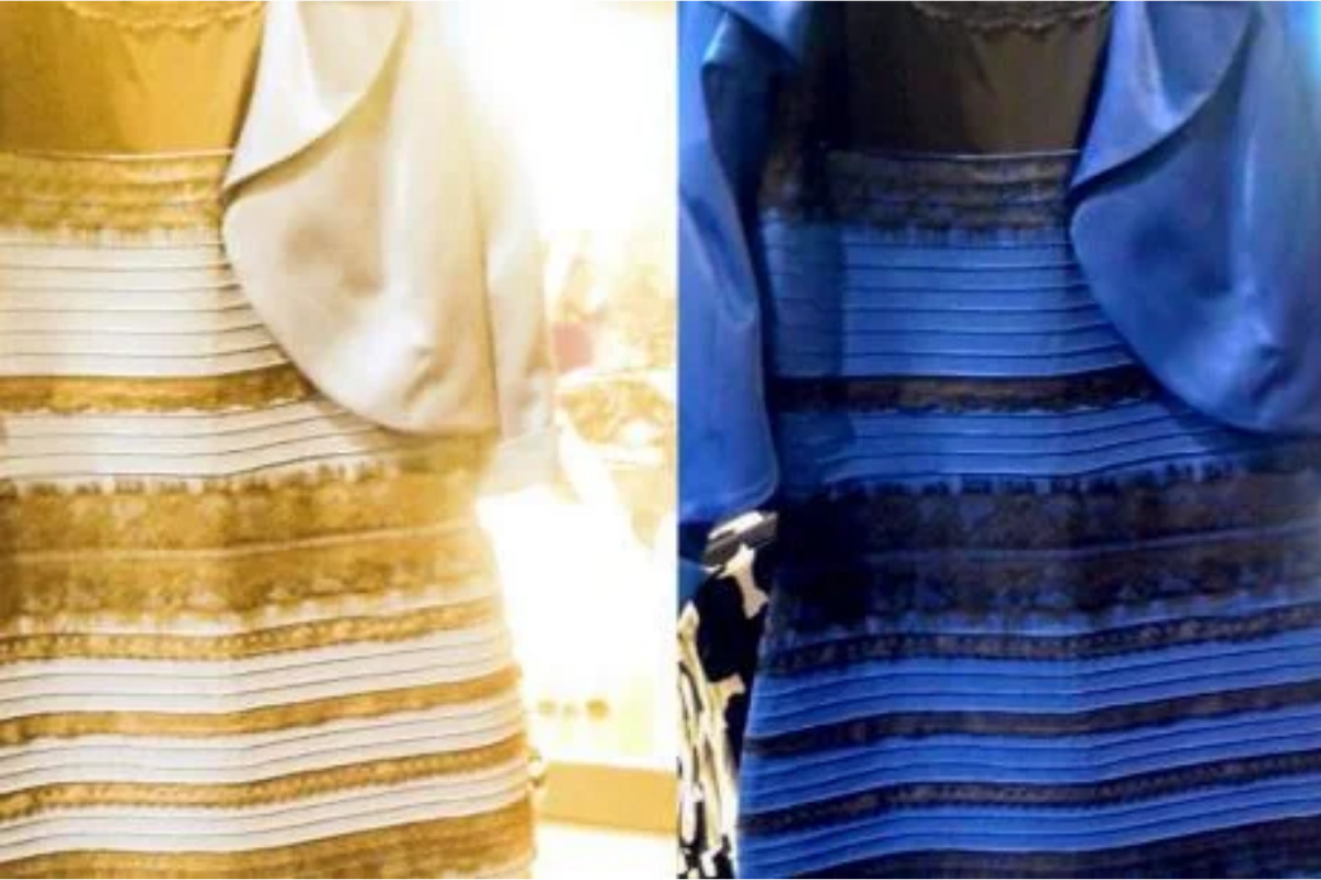
Figure 1-17. A dress that appears to be different colors—white and gold or black and blue
So, which was it? Well, when the wedding occurred, the dress turned out to be blue and black, which baffled some wedding goers and did the same for many across the internet. Bevil Conway, a neuroscientist from Wellesley College who studies vision and color, said the discrepancy came from the visual system trying to discount the chromatic bias. Some people discounted the blue side and saw the dress as white and gold, while others discounted the gold side and saw blue and black.
It happens more often than you think, and some of the problem is with a feature that photo editors and photographers use called white balance in which color casts are removed from an object that is physically white, so it remains white in the picture. White balancing shifts all the colors, not just the white objects. A more biological reason is that people have differences in their color vision that has them seeing different tints, shades, and tones when presented with an object. This leads to confusion where both sides think they are right and are baffled when people claim to see something that completely goes against what their own eyes are telling them.
There are other reasons why people don’t see the same color—this is related to color vision deficiency, or “color blindness,” a topic we will cover in a later chapter.
Summary
This chapter covered some important concepts around how we see color. Next, we’ll discuss how to intentionally use color for data storytelling. We will use what we’ve learned about color theory and color psychology to design effective data visualizations.
1 Image adapted from Cleveland Clinic.
2 Cecile Jordan, “Color Psychology: How Color Influences Opinions About Your Brand,” Beyond Definition, July 22, 2021, https://oreil.ly/eUyYt.
3 Kendra Cherry, “The Color Psychology of Red,” Verywell Mind, last updated September 13, 2020, https://oreil.ly/LhP5A.
4 Kendra Cherry, “The Color Psychology of Yellow,” Verywell Mind, last updated May 11, 2022, https://oreil.ly/v79J0.
5 Kabir Chibber, “Sports Teams Think the Color Pink Can Help Them Win,” Quartz, August 28, 2018, https://oreil.ly/qawAg.