
Chapter 5: Building a Narrative in Comet
Data narrative, also known as data storytelling, is the art of telling stories starting from data. It is not simply a matter of summarizing the data but of building compelling stories, which can attract not only the attention of the audience they are aimed at but also arouse emotions that push the audience to action.
Data narrative is one of the final processes of the data science project life cycle and can be implemented either in parallel with the model deployment phase or immediately after.
In this chapter, you will review the basic concepts and techniques to build a narrative from data, including an overview of the Data, Information, Knowledge and Wisdom (DIKW) pyramid, and learn how to turn your data into a story. Then, you will learn how to build a narrative in Comet, using the concepts you are already familiar with, such as panels and reports. You will also implement two practical examples.
In detail, the chapter is organized as follows:
- Discovering the DIKW pyramid
- Moving from data to wisdom
- Choosing the correct chart type
- Using Comet to build a narrative
Before moving to the first step, let’s install the technical requirements needed to run the code described in this chapter.
Technical requirements
We will run all the experiments and code in this chapter using Python 3.8. You can download it from the official website, https://www.python.org/downloads/, choosing the 3.8 version.
The examples described in this chapter use the following Python packages:
- comet-ml 3.23.0
- matplotlib 3.4.3
- pandas 1.3.4
We already described the first five packages and how to install them in Chapter 1, An Overview of Comet, so please refer to that for further details on installation.
In this chapter, you will also implement some code in JavaScript, by using some online libraries, which do not require any offline installation.
Now that you have installed all the libraries needed in this chapter, we can learn the concept of DIKW pyramid.
Discovering the DIKW pyramid
When you want to build a story from data, you first need to explore your data to understand which questions it can answer, as well as which data is relevant for your project. You already learned how to perform EDA in Chapter 2, Exploratory Data Analysis in Comet, so in this chapter, we suppose that you already have relevant data and, in general, have an idea of which questions your data can answer.
To build a story from data, you first need to think about the audience that will read your story. When you write a story, your preliminary purpose should be one of the following:
- Entertaining the audience
- Informing the audience
- Teaching something to the audience
The effect of your story should be calling the audience to action. To achieve your goal, you need to transform your data by interpreting it, enriching it with contextual information, and finally, linking it to an ethical model that calls the audience to action.
The Data Information Knowledge Wisdom (DIKW) pyramid helps you to understand how to move from raw data to the final message, which encourages the audience to action. More formally, the DIKW pyramid is a hierarchical representation of the relationships between data, information, knowledge, and wisdom, as shown in the following figure:

Figure 5.1 – The DIKW pyramid
The DIKW pyramid involves the following four steps:
- Data
- Information
- Knowledge
- Wisdom
Let’s investigate each step separately, starting with the first – data.
Data
Data is at the bottom of the pyramid. It is the basis of everything – without data, you cannot build a story. To proceed with the other steps of the pyramid, you need to prepare your data by cleaning it, and enriching it, if needed. In a final report, you should not present your data as it is because usually, it is raw data. The following table shows an example of data:

Figure 5.2 – An example of data
The table specifies the output of a survey, where users should indicate their gender. Data is raw and still needs to be elaborated to transmit something to your audience.
Information
Information involves extracting meaning from data; it is about interpreting your data. In this step, the data is transformed into information that can be used by the common user in the form of readable content, including graphics, videos, images, and plain text. To achieve your goal, you need to perform EDA. However, this is not sufficient because you also need to generate readable content for the final user. The following figure shows a possible interpretation of the table shown in Figure 5.2:

Figure 5.3 – Extracted information from the table in Figure 5.2
We have removed the people who preferred to not say their gender, since they were only 1%. Then, we have extracted the following information: out of five people, four are men and one is a woman. Note that we have rounded the values.
Knowledge
Knowledge permits you to add context to your data. Data context is the set of circumstances that surrounds data and influences the data trending and behavior. The context should explain why a certain phenomenon happens. Data context can include the following:
- Events – something that happens
- Environment – an external or internal constraint
- Time – a chronological order in the data
Through a context, you can connect data to other data, discover causes and effects among it, and explain why some data behaves in a certain way. The following figure adds a possible context to the male/female example:

Figure 5.4 – Adding context to the extracted information of Figure 5.3
The context explains why data behaves in a certain way. In the previous figure, we can see that the survey refers to the third quarter of 2021, when there was a peak in maternity leave. This could explain why the percentage of women participating in the survey is so low.
Wisdom
Wisdom involves a call to action. In this phase, you should decide what is the best strategy to follow for the future and why you should choose it. All the actions involved in this phase should follow a specific ethical evaluation framework, including but not limited to the following ones:
- Virtues – the best choice follows a set of predefined values
- Fairness – the best choice optimizes equity
- Common good – the best choice optimizes societal well-being
- Utilitarian – the best choice optimizes global happiness
Referring to the previous example, a possible call to action could be incentivizing women to answer the survey, although they are on maternity leave. How could you achieve this objective? For example, if you followed a utilitarian approach, you could give a reward to women participating in the survey.
Now that you have learned the main steps of the DIKW pyramid, we can move to the next step, to build the final narrative.
Moving from data to wisdom
Each step of the DIKW pyramid adds value to the initial data. You have surely noticed how data is transformed progressively into a story when you move from one step to another on the DIKW pyramid. When you get to the top of the pyramid, the story is ready.
In this section, you will learn the main strategies for moving from one step of the DIKW pyramid to the other:
- Turning data into information
- Turning information into knowledge
- Turning knowledge into wisdom
Let’s start from the first point, turning data into information.
Turning data into information
Often, the datasets we are dealing with are organized in a tabular form, so they already have a structure. Our task is therefore to select the relevant data that answers our questions. The principle is that the more data we have, the less meaning we can extract from a single piece of data. This is because, the more data we have, the less our brain is able to process it in order to extract meaning from it.
Turning data into information involves trying to give meaning to data. Data is a fact, something that is present and available, while information is the data enriched with meaning.
You might think that turning data into information can just be done by transforming it into a graphic form, but in reality, this is not exactly true, as shown in the following figure:

Figure 5.5 – Different representations of the same data
The previous figure shows some data in tabular form on the left and the form of a graph on the right, as a bar chart. Looking at the two representations of the same data, you can see how the graph adds nothing to what is already expressed by the table.
Therefore, that graph does not carry any information. Conversely, the table is clearer than the graph because it makes the raw data immediately accessible.
To turn data into information, you should apply the following strategies:
- Focusing on a single message: if your message brings everything, it brings nothing. Your audience gets confused if you try to communicate more than a single message. But it is very common to try to say everything with your data, thus saying little at all. Although your data may bring more than a single message, you should represent just one piece at a time.
- Simplifying: You should not give all the details relating to the data – for example, the thousandth degree of precision – unless it is explicitly requested. The idea is to abstract data as much as possible in order to enrich it with meaning. For example, it is easier for an audience to understand that one in five people play sport than 22.38% of the population plays sport. We have made a simplification, but surely the reader better grasps the meaning of that data. The simplification also involves the use of colors in graphs. It is advisable to use a maximum of three colors in the graphs.
The following figure shows a possible way to turn the data contained in Figure 5.5 into information:
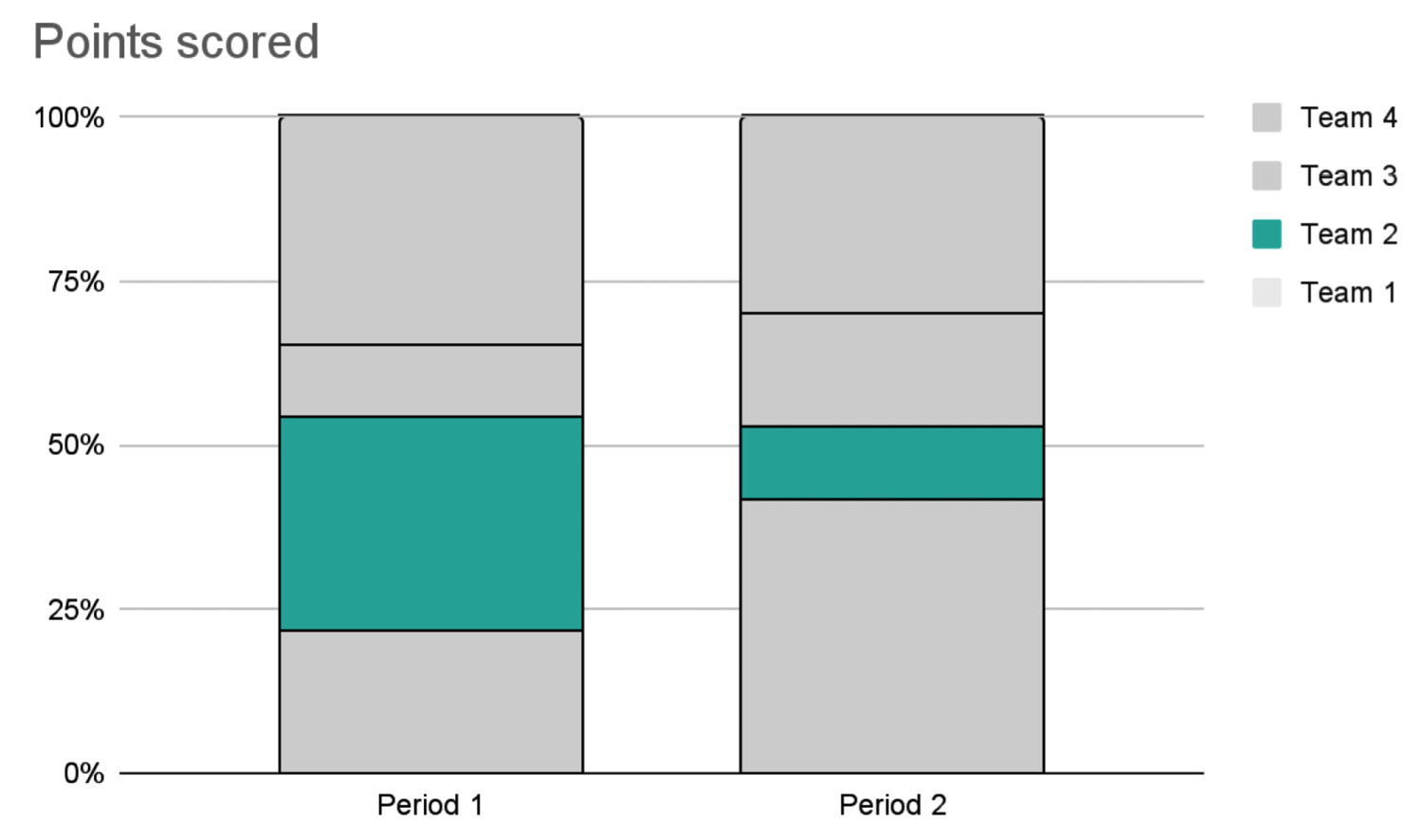
Figure 5.6 – Possible information extracted from data contained in Figure 5.5
We have adopted the following strategy:
- Focusing on a single message – the points earned by Team 2 drastically decreased in the second period
- Blacking out all the other teams, by coloring them in gray and focussing only on Team 2
- Simplifying the graph, showing it as a stacked bar
Once you have extracted information from data, you are ready to move on to the next step, turning information into knowledge.
Turning information into knowledge
Turning information into knowledge means adding context to your data that's already enriched with meaning. Adding context to your data permits your audience to understand your message. Obviously, different contexts produce different knowledge; thus, you should pay attention to the type of context you would like to add to your data.
To turn information into knowledge, you should apply the following strategies:
- Defining communication goals by defining clearly what you want to communicate to your audience.
- Choosing only information that permits you to achieve your communication goals and removing all the other information.
- Adding annotations in terms of a story, the description of an environment, a statistic, a metric, and so on. Within an annotation, you can use terms that address a position, such as first, second, and third, which are easily understood by the human brain.
Let’s consider again the previous example, shown in Figure 5.6. Depending on the context you add, the message totally changes. The following figure adds a possible context to the previous graph:

Figure 5.7 – A possible context for the information described in Figure 5.6
The annotation on the right explains why Team 2 marked a low score in Period 2. The explanation is that Team 2 is composed of machine learning engineers, who have little knowledge about data visualization. During Period 1, most of the questions applied machine learning and similar topics; thus, they achieved a high score. During Period 2, instead, most of the questions involved data visualization; thus, Team 2 achieved a low score.
A totally different context can produce a different interpretation of the same information, as shown in the following figure:
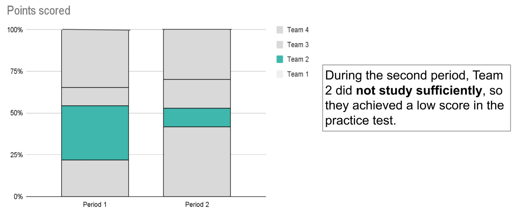
Figure 5.8 – Another possible context for the information described in Figure 5.6
In this case, the annotation simply states that in Period 2, Team 2 marked a low score because they did not study sufficiently.
You should pay attention to the type of context you add to your information because it can be misunderstood by the audience, thus producing misinterpretations of the message and bad decision-making. For example, during intercultural communication, the context could be incorrectly interpreted, due to different cultural bias.
Once you have added context to your information, you are ready to move to the next step, turning knowledge into wisdom.
Turning knowledge into wisdom
This step consists of involving the audience to make decisions, and to act. It is the final step, which projects the data that typically concerns the past into the future. You turn knowledge into wisdom when you apply your knowledge to make the right decisions.
If you have developed the previous steps well, the call to action is automatic and is typically expressed with one of the following questions:
- What can be done to improve the results?
- What opportunities do you have?
- What scenarios can be outlined?
In this phase, it is not enough to just invite the audience to action; you should also listen to their proposals and their answers to your questions. This is the discussion phase.
Referring to the example shown in Figure 5.7, a possible call to action could be to incentivize machine learning engineers to learn the data visualization principles. Instead, referring to the example shown in Figure 5.8, a possible call to action could be the organization of recovery courses.
Now that you have learned how to move from knowledge to wisdom, we can move to the next step, choosing the correct chart type.
Choosing the correct chart type
Representing data with the correct chart type is what makes the difference between a standard graph and an excellent one. You may have the best data in the world, context-specific and processed to convey an important message, but if you use the wrong graph to represent it, your message will likely not be fully grasped.
In this section, we briefly discuss which chart types to use, based on the specific shape of the data. These are guidelines that you will have to adapt from time to time to your needs.
The section describes the most common graphs and when you should use them. We will review the following chart types:
- A line chart
- A bar chart
- An area chart
- A pie chart
Let’s start with the first chart, a line chart.
A line chart
A line chart compares data values that are sequentially connected. Usually, you can use a line chart to represent time series, as shown in the following figure:

Figure 5.9 – A line chart
The previous graph shows the trend line of a generic quantity over time. The graph is very clear. Usually, you use a line chart to compare one or more series, as shown in the following figure:

Figure 5.10 – A line chart for multiple series
The previous graph does not focus on any series in particular. However, it is a good practice to focus on a single series by highlighting it to make the graph more readable, as described in the previous sections.
Now that you have learned when you should use a line chart, we can move on to the next chart, a bar chart.
A bar chart
A bar chart compares data values for different groups of data, or categories. They are very similar to line charts. Similar to line charts, you can have different series of data.
Tip
In general, you can use a bar chart whenever you want to compare large changes or differences in data among categories.
There are different types of bar charts, including the following ones:
- A vertical bar chart
- A horizontal bar chart
- A stacked bar chart
- A 100% stacked bar chart
- A diverging bar chart
A vertical bar chart
The following figure shows an example of a vertical bar chart:

Figure 5.11 – A vertical bar chart
The graph is clear and easy to understand. When the difference between the values in categories is small, the bar chart is not appropriate, as shown in the following figure:

Figure 5.12 – Bad use of a vertical bar chart
In the previous graph, all the values range from 10 to 11; thus, it is not easy to understand the gaps between categories. In addition, the graph is not ordered.
Tip
A good practice is to order a bar chart.
The following figure shows an example of a vertical bar chart for multiple series:

Figure 5.13 – A vertical bar chart for multiple series
There are three series in the graph: circle, rectangle, and square. Note that the previous graph is difficult to read because it uses too many colors. If you want to use this type of graph, you should focus on a single series and highlight only that.
A horizontal bar chart
A horizontal bar chart is an alternative to the vertical bar chart, as shown in the following figure:
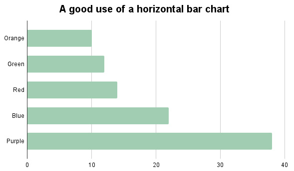
Figure 5.14 – A horizontal bar chart
You can use the vertical bar chart and horizontal bar chart interchangeably. However, you should always use a vertical bar chart for categories that represent time spans. The following figure shows an example of the misuse of the horizontal bar chart:

Figure 5.15 – Bad use of a horizontal bar chart
Dates are represented as categories on the ordinate axis, and it is difficult to understand the temporal progression.
A stacked bar chart
The objective of a stacked bar chart is to show how members of a category contribute to the total. You can use a stacked bar chart to represent multiple series. The following figure shows an example of a stacked bar chart:

Figure 5.16 – A stacked bar chart
The graph shows the same data shown in Figure 5.13 in a much clearer way. In fact, for each category (orange, green, red, blue, and purple), you can read the contribution of each series.
You can build a stacked bar chart either vertically, as shown in the previous figure, or horizontally.
A 100% stacked bar chart
A 100% stacked bar chart is an alternative to the stacked bar chart. In the 100% stacked bar chart, the contribution of each series is scaled to 100%, as shown in the following figure:

Figure 5.17 – A 100% stacked bar chart
You can use the 100% stacked bar chart and the stacked bar chart interchangeably. The only difference between the two graphs is that the stacked bar chart represents absolute values, while the 100% stacked bar chart represents relative values.
Tip
You can use a 100% stacked bar chart to represent small changes in temporal data, such as changes between different quarters of a year, as shown in Figure 5.6.
A diverging bar chart
A diverging bar chart compares two (opposite) series along a common scale, as shown in the following figure:

Figure 5.18 – A diverging bar chart
The previous graph compares Male and Female categories. When using the diverging bar chart, you should pay attention that the two series represent two divergent concepts, such as positive and negative, male and female, and so on.
Now that we have learned when we should use a bar chart, we can move on to the next chart, an area chart.
An area chart
An area chart is a line chart that fills the area under a line, as shown in the following figure:

Figure 5.19 – An area chart
You can use an area chart to show the cumulative trend over time of data values. You can use an area chart to plot more than one series, as shown in the following figure:

Figure 5.20 – Bad use of an area chart
You may find the areas of series other than the lowermost series in this graph difficult to understand because the contribution of each series is given by the sum of the other series beneath it. Thus, you may not immediately recognize the cumulative value associated with the uppermost series in the graph.
Tip
You should use an area chart to compare two series at most, with an emphasis to the lowermost series.
Now that we have learned when we should use an area chart, we can discuss the last type of graph, a pie chart.
A pie chart
You can use a pie chart to represent parts of the total, as shown in the following figure:

Figure 5.21 – A pie chart
A best practice is to use pie charts to compare only two or three series of data. The idea is to think of a pie chart as a Pac-Man chart, where there are two different values, one much larger than the other, making the chart resemble the videogame character Pac-Man.
Tip
If you have multiple series of data, you should avoid using a pie chart because you can always replace it with a bar chart.
Now that you have learned how to choose the correct graph to represent your data, we can move to the next step, using Comet to build a narrative.
Using Comet to build a narrative
Comet provides two main features to build a narrative – panels and reports. You have already learned some basic concepts related to panels in Chapter 1, An Overview of Comet, and other advanced concepts relating to panels and reports in Chapter 2, Exploratory Data Analysis in Comet.
Regarding panels, you have already learned how to implement them in Python using the SDK provided by Comet. Comet also allows you to implement panels in JavaScript. In this section, you will learn the main classes and functions provided by Comet to implement a panel in JavaScript. In addition, you will learn some advanced concepts about reports. We will create two examples, which will allow you to practically learn how Comet can be used to transform data into a story.
The section is organized as follows:
- JavaScript panels
- Advanced reports
- Example one
- Example two
Let’s start with the first point, JavaScript panels.
Using JavaScript panels
A JavaScript panel is a Comet panel written in JavaScript. Comet defines the Comet.Panel class to build a panel in JavaScript. This class provides many methods, including, but not limited to, the following ones:
- setup() – to configure the environment, including default options for the panel.
- draw(experimentKeys, projectId) – to build a panel. This receives the list of experiment keys and the project ID as input. You should modify this method to build your panel.
- drawOne(experimentKey) – to build a panel for a single experiment, passed as an input parameter.
For further details on the methods provided by the Comet.Panel class, you can refer to the Comet official documentation, available at the following link: https://www.comet.ml/docs/javascript-sdk/getting-started/.
To build your own panel, you should extend the Comet.Panel class by defining at least the draw() method, as follows:
class MyPanel extends Comet.Panel { draw(experimentKeys, projectId) {// code to draw the panel
}
}
You should name your panel MyPanel.
The Comet.Panel class also provides an interface to the Comet experiments and projects through the this.api object. The this.api object is an instance of the API class, which implements all the methods to access logged metrics, parameters, objects, and so on.
Here is the list of the most important methods provided by the API class:
- experimentMetricsForChart() – to get the logged metrics for all the experiments passed as an input parameter
- experimentMetric() – to get a specific metric for a specific experiment passed as an input parameter
- experimentParameters() – to get the logged parameters for a given experiment passed as an input parameter
- experimentAssets() – to get the logged assets for a given experiment passed as input parameter
You can find the list of all the methods provided by the API class in the Comet official documentation, available at this link: https://www.comet.ml/docs/javascript-sdk/api/.
Now that you have learned how to build a panel in JavaScript, we can move on to the next step, advanced reports.
Building advanced reports
The Comet report is the main tool provided by Comet to build a story from your data because it wraps panels and text together. You already learned how to build a report in Chapter 2, Exploratory Data Analysis in Comet. In this section, we will explore the report options and how to integrate external media into a report.
Report options include the following features:
- Downloading a report as a PDF: You can click the download button, located in the top-right corner of the screen, once your report is open, as shown in the following figure:

Figure 5.22 – The position of the download button for a report
Saving the report as a PDF creates a static file, which you can print for further discussions.
- Sharing a report: You can click one of the sharing options, as shown in the following figure:

Figure 5.23 – The position of the sharing buttons in a report
Sharing a report permits you to maintain the report interactivity but requires that the people you share the report with have a Comet account.
In a report, you can include external media, such as short videos, images, and audio. For example, you could shoot a video showing your model and then include it in your report. To include media in a report, you should perform the following steps:
- Firstly, you should upload your media to cloud storage, which is publicly available on the web. If the media is already on the web, you can simply copy its URL.
- Then, you can add the media in a textual section of your report as you usually do in Markdown. For example, if you want to add an image, you can use the following syntax:

Since each textual section of the Comet report is a Markdown cell, you can use it to add every type of media.
Now that you have learned some advanced concepts on reports, you can apply the learned concepts to two practical examples. You can download the code of the two examples from the book official GitHub repository, available at the following link: https://github.com/PacktPublishing/Comet-for-Data-Science/tree/main/05.
Example one
As a practical example, you will solve the exercise provided by storytellingwithdata.com, a very popular website that helps communities and people to transform data into stories. The exercise is available at the following link: https://community.storytellingwithdata.com/exercises/how-can-we-improve-this-graph.
The dataset contains hospital stay lengths after surgery, as shown in the following table:

Figure 5.24 – The hospital stay dataset
The objective of this example is to transform the previous dataset into a narrative shown in a Comet report. You will also build a custom panel using the D3.js library. In this example, we assume that you are familiar with the D3.js library. If you are not, you can refer to the D3.js official documentation to get started, which is available at this link: https://d3js.org/.
To achieve our objective, we will perform the following steps:
- Firstly, we export the previous table as a CSV file – for example, named data.csv.
- Then, we create a Comet experiment, which logs the CSV file as an asset. To create a new experiment, you can refer to Chapter 1, Overview of Comet. The following code shows how to log the CSV file in Comet:
import pandas as pd
from comet_ml import Experiment
df = pd.read_csv('data.csv')
experiment = Experiment()
experiment.log_table('data.csv', tabular_data=df)
We read the CSV file as a pandas DataFrame, and then we log it in Comet through the log_table() method provided by the Experiment class. The log_table() method receives as the first parameter the name of the uploaded file in Comet (in our case, it is the same as that of the original file in our local filesystem) and the DataFrame as the second parameter.
- You can access the CSV file in Comet under the Assets and Artifacts menu item, as shown in the following figure:

Figure 5.25 – The CSV file available in Comet under the Assets and Artifacts menu item
- Now, you can create a custom panel, which loads the CSV file and builds a chart. The idea is to use the Comet panel to transform data into information. The panel will contain a stacked bar chart, which shows the trend of each period of stay over the different quarters, as shown in the following figure:

Figure 5.26 – A stacked bar showing the data described in Figure 5.9
The graph also focuses on a single message: since Q1, there is a progressive increase in the short stay (less than 24 hours) after surgery.
To build the panel, you can access the online SDK, as described in Chapter 2, Exploratory Data Analysis in Comet, and then select JavaScript as the main programming language.
- Under the Resources tab, you should add the link to the D3.js library. In this specific example, we will use the following version of D3.js, https://d3js.org/d3.v4.js, so you should add it.
- Under the HTML tab, you should create a new div container, which will contain the graph, as follows:
<div id="stacked_bar"></div>
- Under the Code tab, the editor already shows some code. You should modify the setup() method to include the default options, as follows:
setup() {
this.options = {
highlight : "<24 HOURS",
width : 860,
height : 350,
margin : {top: 10, right: 80, bottom: 20, left: 50},
};
}
The options include the width, the height, and the margins of the graph, as well as the column name to highlight in the graph.
- Now, you can modify the draw() method, as follows:
async draw(experimentKeys, projectId) {
experimentKeys.forEach(async experimentKey => {
const data = await
this.api.experimentAssetByName(
experimentKey,
'data.csv');
this.drawGraph(data);
});
}
We loop over all the experiments, and for each experiment key, we retrieve the asset named data.csv. We use the experimentAssetByName() method provided by the API to access a single asset. Then, we call the drawGraph() method to draw the graph.
- The drawGraph() method contains the code to build the graph in D3.js:
async drawGraph(data_string){}
- The method receives as input the CSV file parsed as a string by experimentAssetByName(). Within the drawGraph() method, first, you can define the graph size:
let highlight = this.options.highlight;
var margin = this.options.margin,
width = this.options.width - margin.left - margin.right,
height = this.options.height - margin.top - margin.bottom;
We retrieve the parameters from the options variable.
- Then, you can append an SVG object at the end of the div defined in the HTML section:
var svg = d3.select("#stacked_bar")
.append("svg")
.attr("width", width + margin.left + margin.right)
.attr("height", height + margin.top + margin.bottom)
.append("g")
.attr("transform",
"translate(" + margin.left + "," + margin.top + ")");
- Now, you need to convert the data string passed as input to an object, which can be parsed by D3.js:
var data = await d3.csvParse(data_string, function(d) {
return {
Period : d.Period,
'<24 HOURS' : +d['<=24'],
'24-36 HOURS' : +d['24 and 36'],
'36-48 HOURS' : +d['36 and 48'],
'48-59 HOURS' : +d['48 and 59'],
'+60 HOURS' : +d['>=60'],
'UNKNOWN' : +d['Unknown'],
};
});
data.columns = ['Period', '<24 HOURS','24-36 HOURS','36-48 HOURS','48-59 HOURS','+60 HOURS','UNKNOWN'];
We use the csvParse() method provided by D3.js to perform such a conversion. In addition, we rename all the columns for better visualization, and we convert strings to numbers through the + symbol before each column.
- You prepare data for graphical representation as follows:
var subgroups = data.columns.slice(1);
var groups = d3.map(data, function(d){return(d.Period);}).keys();
var stackedData = d3.stack().keys(subgroups)(data);
Firstly, we extract the list of subgroups from the columns by removing the first column, which contains Period. This list contains the length of stay (<24 HOURS, 24–36 HOURS, and so on). Then, we extract the list of groups, which includes the periods (Q1, Q2, Q3, and Q4). Finally, we build a D3.js stack generator, which we will use to build the graph.
- You can add the x axis as scaleBand():
var x = d3.scaleBand()
.domain(groups)
.range([0, width])
.padding([0.2]);
svg.append("g")
.attr("transform", "translate(0," + height + ")")
.call(d3.axisBottom(x).tickSizeOuter(0));
- Then, you can add the y axis as a linear scale:
var y = d3.scaleLinear()
.domain([0, 105])
.range([ height, 0 ]);
svg.append("g")
.call(d3.axisLeft(y));
- Now, you can draw the stacked bar, as follows:
svg.append("g")
.selectAll("g")
.data(stackedData)
.enter().append("g")
.attr("fill", function(d) { if(d.key == highlight) return '#40b7ad';return '#D9D9D9'; })
.selectAll("rect")
.data(function(d) { return d; })
.enter().append("rect")
.attr("x", function(d) { return x(d.data.Period); })
.attr("y", function(d) { return y(d[1]); })
.attr("height", function(d) { return y(d[0]) - y(d[1]); })
.attr("width",x.bandwidth())
.attr("stroke", "#FFFFFF")
.attr("strokewidth", 3);
We build a rectangle for each group and subgroup, and then we set the position, the color, and the size.
- In the last part of the drawGraph() method, we should add the annotations. We prepare data as follows:
var q4 = data[3];
var sum = 0;
var ann_data = [];
for(var i = 0; i < subgroups.length; i++){
var index = subgroups[i];
sum += q4[index];
ann_data.push({'key' : index, value : sum });
}
The ann_data array stores for each subgroup the position in the graph. The current position is given by the sum of the previous positions plus the current one.
- Finally, we append text to the SVG object for each group, as follows:
svg.append("g")
.selectAll('text')
.data(ann_data)
.enter()
.append("text")
.text(function(d){return d.key;})
.attr('x', width + 65)
.attr("y", function(d) {if (d.key == 'UNKNOWN') return y(d.value)-10; return y(d.value); })
.text(function(d){return d.key;})
.attr('font-size', function(d) {if (d.key == highlight) return 15; return 12;})
.attr('text-anchor', 'end')
.attr('font-weight', function(d) {if (d.key == highlight) return 'bold'; return 'normal';});
We also set some properties, including font size, font weight, and position. With respect to the y position, we shift it slightly if the key is equal to UNKNOWN, to avoid text overlapping.
- Now, your graph is ready. You can click the Run button, and you will see the graph shown in Figure 5.26 in the right part of your JavaScript SDK.
Once the panel is ready, you can build a report, showing the results:
- Firstly, you can create a new report, as described in Chapter 2, Exploratory Data Analysis in Comet.
- Then, you can add the title, which should already highlight the message you want to communicate, such as the following one: How long is the hospital stay after surgery?.
- Next, you can add an image to get the audience’s attention, as well as a short introduction to the problem, as shown in the following figure:

Figure 5.27 – The report header
We include an image about patients, created by pch.vector - www.freepik.com, and available under the Freepik license, which permits use and redistribution, provided that the source is properly cited. To include the image shown in the previous figure, you can write the following Markdown code:

- Now, you can add the panel showing your graph, as described in Chapter 2, Exploratory Data Analysis in Comet. You can add some words, which add some meaning to it, such as the following ones: Thanks to the new hires in the day hospital wards in the previous period, there is a progressive reduction in hospitalization times after surgery. The following figure shows the produced section of the report, which includes the panel:
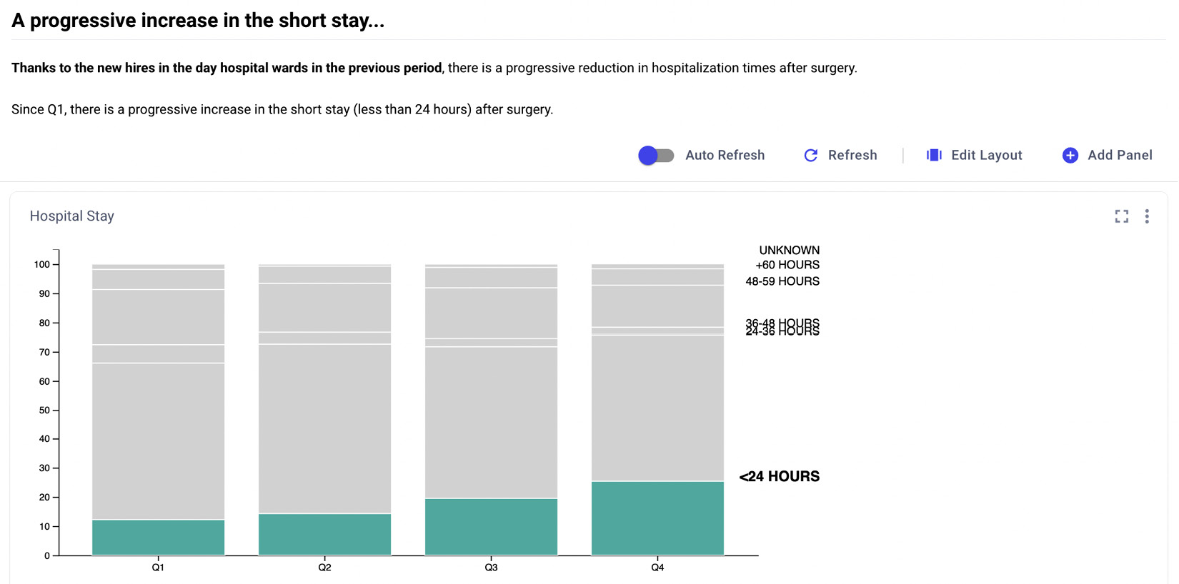
Figure 5.28 – The first section of the report
You can personalize the size of the panel by clicking on the Edit Layout button, located at the top-right part of the section.
- You can add a second panel, which shows the trend for long stays. In this case, when you configure the panel, on the options tab, you can set the highlight option as follows:
{"highlight": "+60 HOURS"}
This permits you to highlight long stays, as shown in the following figure:

Figure 5.29 – The second section of the report
- Similar to the previous section of the report, we can add some words that add context to the panel: Since Q1, there is not any improvement for long stays, because no investment was done during this period for long stays.
- So far, you have built your report, which shows data turned into knowledge. You still need to add a wisdom section, which calls the audience to action. You can do it by adding a third section, which contains some questions, such as the following ones:
- What can we do to reduce long stays?
- Can we invest some money for long stays?
- Now, your report is ready, and you can download it as a PDF file or share it with your audience.
You can continue to practice with Comet to build a narrative from data, so let’s move on to the second example.
Example two
For the second example, you will solve another exercise provided by storytellingwithdata.com. The exercise is available at the following link: https://community.storytellingwithdata.com/exercises/visualize-the-insight. The dataset contains the output of a survey where customers expressed what they liked and what they did not like about a clothes retailer company, compared to all the other competitors. The following table shows the dataset:

Figure 5.30 – The survey dataset
For each question, the table shows the level of importance for Our store and for the competitors, named as All stores.
The objective of this example is to build a Comet report that calls the company’s decision-makers to action. In other words, you should build a story with your data. The report will contain two panels built in Python, using the matplotlib library.
You can adopt the following strategy:
- Firstly, you prepare the dataset by loading it as a pandas DataFrame and cleaning it, as shown in the following piece of code:
import pandas as pd
df = pd.read_csv('source/data.csv')
columns = ['Our store', 'All stores']
for col in columns:
df[col] = df[col].str.replace('%', '').astype(int)
We loop over the two columns contained in the columns variable to remove the % symbol and convert strings to numbers.
- Then, you can build two experiments in Comet, one for Our store and the other for All stores. For each experiment, you consider each question as a metric and you log it in Comet, as follows:
from comet_ml import Experiment
def run_experiment(df, store):
experiment = Experiment(project_name="data-narrative-2")
experiment.set_name(store)
for i in range(len(df)):
experiment.log_metric(df['Questions'].iloc[i], df[store].iloc[i])
run_experiment(df,'Our store')
run_experiment(df,'All stores')
We define a function, named run_experiment(), which receives as input the DataFrame and the column name to evaluate. The function builds an experiment and logs the metrics corresponding to the DataFrame column passed as an argument. Then, we call the function for both the columns, Our store and All stores.
- You build a custom panel using the Comet SDK, which compares the two experiments. Access the Comet SDK, as described in Chapter 2, Exploratory Data Analysis in Comet, and select Python as the programming language. The objective is to build the following panel:

Figure 5.31 – A comparison between Our store and All stores
In the previous graph, we have calculated the difference between the values for Our store and All stores, and we have ordered questions by increasing the difference. Then, we have shown Our store as a bar chart and All stores as a line. These operations have turned data into information. In addition, we have highlighted in green what we are doing right.
- To build the previous graph, we first retrieve all the metrics’ names, and we build a pandas DataFrame containing them, as follows:
from comet_ml import API, ui
import matplotlib.pyplot as plt
import pandas as pd
api = API()
options = api.get_panel_options()
metric_names = api.get_panel_metrics_names()
df = pd.DataFrame(metric_names, columns=['Questions'])
We use get_panel_metrics_names() provided by the API class to retrieve all the metrics’ names.
- Then, we get all the experiment keys and the objects containing the metric values, as follows:
experiment_keys = api.get_panel_experiment_keys()
metrics_obj = api.get_metrics_for_chart(experiment_keys,metric_names)
The get_metrics_for_chart() method returns a dictionary that contains the metrics for each experiment.
- We loop over each metric object to retrieve the single metric value for each experiment, as follows:
for experiment_key in metrics_obj:
experiment = api.get_experiment_by_key(experiment_key)
column = []
for metric in metrics_obj[experiment_key]["metrics"]:
column.append(metric['values'][0])
df[experiment.name] = column
We store the list of metrics for each experiment in a temporary variable called column, and then we append it to a new column of the DataFrame.
- Now, the DataFrame is ready. We can calculate the difference between Our store and All stores, as follows:
df['diff'] = df['Our store'] - df['All stores']
df = df.sort_values(by=['diff'])
We also order the DataFrame by the new column, through the sort_values() method.
- We define some color options, as follows:
cc=list(map(lambda x: '#508DED' if x < -1 else '#D9D9D9', df['diff']))
if options['filter'] == 'greater':
cc=list(map(lambda x: '#40B7AD' if x > 2 else '#D9D9D9', df['diff']))
We use the options variable to make the plot customizable. In practice, depending on the filter option, a specific part of the bar chart will be highlighted, as shown in the following figure:
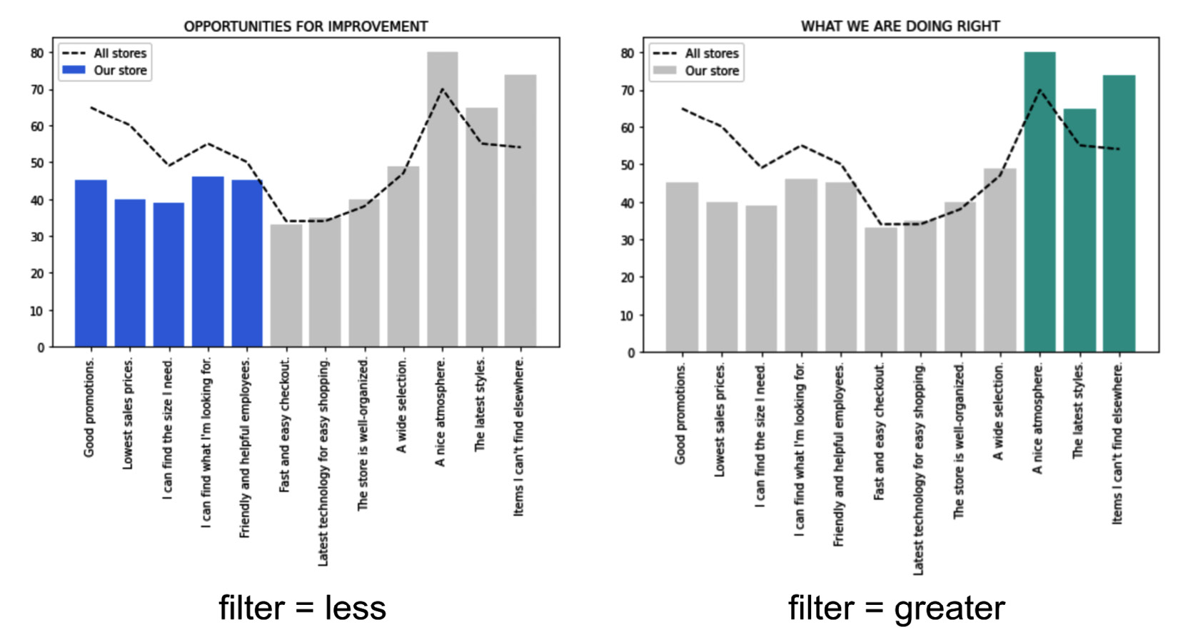
Figure 5.32 – Different highlights for different filters
If the filter is set to greater, then the greatest values are highlighted; otherwise, the lowest values are highlighted.
- We are now ready to plot the graph:
plt.figure(figsize=(8,4))
plt.bar(df['Questions'], df['Our store'], color = cc, label='Our %store')
plt.plot(df['Questions'], df['All stores'], color='#000000', ls='--', label='All stores')
plt.xticks(rotation=90)
plt.title(options['title'])
plt.legend()
plt.tight_layout()
ui.display(plt)
We set the figure size, as well as the title, extracted from options, and the legend, and finally, we show the graph through the ui.display() method.
- Finally, you build a report that tells the story. You can create a new report, as described in Chapter 2, Exploratory Data Analysis in Comet. You can set the title and a short context, as shown in the following figure:

Figure 5.33 – The report header
- In the first section, you can add a text that calls to action, as well as the two panels, as shown in Figure 5.19. The following figure illustrates the resulting section:

Figure 5.34 – The first section of the report
The discussion should focus on the following two questions: Which opportunities do we have? and How can we maintain what we are doing right?.
- Now, your Comet report is ready. You can share it with your company or download it as a PDF document.
We have just completed the journey to build a narrative in Comet!
Summary
Throughout this chapter, you learned about the DIKW pyramid, with the related concepts of data, information, knowledge, and wisdom. You also learned how to turn your data into wisdom by building a story. You learned that to transform data into information, you should add meaning to your data, and to turn information into knowledge, you need to add context. Finally, to turn knowledge into wisdom, you should call your audience to action. In general, while building your story, you should always pay attention to your audience, who they are, and how they can understand your message.
In this chapter, you also learned how to build a story in Comet by using some concepts you already know – panels and reports. You learned how to share a report, either as a static PDF document or an interactive dashboard. You also learned how to build a panel in JavaScript.
Finally, you implemented two practical examples, which demonstrated how you can use Comet to build a narrative from data.
Data narrative is one of the final steps of a data science project life cycle. The other step is a deployed model. In the next chapter, you will review some basic concepts regarding DevOps, which will permit you to deploy your model.
Further reading
- Berengueres, A. F. J., and Sandell, M. (2019). Introduction to Data Visualization & Storytelling: A Guide for the Data Scientist
- Knaflic, C. N. (2015). Storytelling with data: A data visualization guide for business professionals. John Wiley and Sons
- Knaflic, C. N. (2019). Storytelling with Data: Let’s Practice!. John Wiley and Sons
- Kriebel, A., and Murray, E. (2018). # MakeoverMonday: Improving How We Visualize and Analyze Data, One Chart at a Time. John Wiley & Sons