
Chapter 2: Exploratory Data Analysis in Comet
To successfully carry out a data science project, we must first try to understand the data and ask ourselves the right questions. Exploratory Data Analysis (EDA) is precisely this preliminary phase that allows you to extract important information from data, and understand which questions data can and cannot answer. Therefore, a data science project should always include the EDA phase.
There are several tools for carrying out EDA, some of which require specific programming skills, such as the many visual libraries provided by Python and JavaScript, as well as others that do not, such as Tableau and Weka.
As already seen in the previous chapter, Comet is an experimentation platform that can be used in almost all phases of a data science project life cycle. In this chapter, we will see how to use Comet to perform EDA. Comet provides different features we can use to perform EDA, including panels, reports, and metric logs. We will also describe each of these three features by providing general concepts and practical examples.
In this chapter, we will adopt the following terminology:
- Dataset or Data – All the data we want to analyze. We will work with a tabular dataset containing rows and columns.
- Feature – A subset of the columns, typically used as input to a machine learning model.
- Target – A subset of the columns, typically used as the output of a machine learning model.
- Record – A row that contains features and targets.
- Variable – A column.
In this chapter, we will focus on the following topics:
- Introducing EDA
- Exploring EDA techniques
- Using Comet for EDA
You can download the full code of the examples described in this chapter from the official GitHub repository of the book, available at the following link: https://github.com/PacktPublishing/Comet-for-Data-Science/tree/main/02.
Before moving on to how to use Comet for EDA, let's install all the Python packages needed to run the code and the experiments contained in this chapter.
Technical requirements
We will run all the experiments and code in this chapter using Python 3.8. You can download it from the official website: https://www.python.org/downloads/ – make sure to choose the 3.8 version.
The examples described in this chapter use the following Python packages:
- comet-ml 3.23.0
- matplotlib 3.4.3
- numpy 1.19.5
- pandas 1.3.4
- scikit-learn 1.0
- pandas-profiling 3.1.0
- seaborn 0.11.2
- sweetviz 2.1.3
We have already described the first five packages and how to install them in Chapter 1, An Overview of Comet. So please refer to that chapter for further details on installation. In this section, we describe the last two packages: pandas-profiling and seaborn.
pandas Profiling
pandas-profiling is a Python package that generates reports, both visual and quantitative, on pandas DataFrames. The official documentation of this package is available at the following link: https://pandas-profiling.ydata.ai/docs/master/index.html. You can install the Pandas Profiling package by running the following command in a terminal:
pip install pandas-profiling
seaborn
seaborn is a useful package for data visualization. It is fully compatible with Matplotlib. You can install it by running the following command in a terminal:
pip install seaborn
For more details, you can refer to the seaborn official documentation, available at the following link: https://seaborn.pydata.org/installing.html.
sweetviz
sweetviz is a Python package that generates automatic reports for EDA, starting from a Pandas DataFrame. You can install it by running the following command:
pip istall sweetviz
For more details, you can refer to the sweetviz official documentation, available at the following link: https://github.com/fbdesignpro/sweetviz.
Now that you have installed all the software needed in this chapter, let's move on to how to use Comet for EDA, starting from reviewing some basic concepts on EDA.
Introducing EDA
Exploratory Data Analysis (EDA) is one of the preliminary steps in a data science project life cycle. It enables us to understand our data in order to extract meaningful information from it. Through EDA, we can understand the underlying structure in the data.
We can think about the EDA phase as a small data science project, in which the real data analysis part (model definition and evaluation) is missing. Therefore, a typical EDA process is composed of the steps shown in the following figure:

Figure 2.1 – The main steps of an EDA process
The previous figure shows that an EDA process is composed of the following steps:
- Problem setting
- Data preparation
- Preliminary data analysis
- Preliminary results
Let's investigate each step separately, starting from the first step – problem setting.
Problem setting
Problem setting is the capability to define which kind of questions our dataset can answer. The problem-setting phase is strictly related to the first step of the data science project life cycle – problem understanding – because it permits us to understand whether our dataset can answer questions in line with the main objectives of the project.
Some typical questions include, but are not limited to, the following:
- What are the typical values of a column, its ranges, uncertainties, and distributions?
- Which are the most important/influential columns?
- Can we establish a correlation among columns?
- Which is the best value for a given column?
- Does a specific column present one or more outliers?
- For a specific column, are there missing values?
Not all the questions may be relevant for a given dataset, so we should select only those that fit the specific case. When we have defined the target questions, we should order them in decreasing order of importance, thus always maintaining the focus on the most important questions first.
When we have formulated all the possible questions, we must prepare our data for further analysis. So, let's move to the next step, which is data preparation.
Data preparation
Data preparation involves all the techniques for preparing the dataset or the datasets for the next step. In this phase, we define the relevant datasets and delete the others, as well as clean and transform the selected datasets. In other words, in this phase we structure our data to be consumed in the preliminary data analysis.
This phase includes the following steps:
- Identifying the dataset size – In this phase, we should determine whether the number of records is potentially sufficient for our problem. Depending on the number of samples we could adopt different strategies in the next steps. For example, a little number of samples may require additional data collection, while, if we have a big dataset, we could think about the use of more sophisticated platforms for further analysis.
- Identifying data types – There are the following data types:
- Numerical – A column that can be quantified. A numerical column can be either discrete or continuous. A discrete column is countable while a continuous column is measurable.
- Categorical – A column that can assume only a limited number of values.
- Ordinal – A numeric column that can be sorted.
- Identifying a preliminary set of input features and the target variable (or the target variables) – Depending on the problem to solve, we should define which columns of the dataset will be used as features and which as target(s).
Once we have structured our data, typically in a tabular form, we can move to the next step, which is preliminary data analysis.
Preliminary data analysis
Preliminary data analysis aims at dissecting the data to discover hidden patterns, relationships between the data and any recurring trends, extract important variables, detect outliers and anomalies, and so on. Through our preliminary analysis, we can provide an initial answer to the questions we asked previously.
We can perform two types of preliminary data analysis:
- Univariate analysis – When we focus only on a single variable at a time. Usually, we calculate statistics about each column, such as the minimum, maximum, and average value, as well as data distribution, the most frequent values, and so on.
- Multivariate analysis – When we focus on multiple variables at a time. Usually, we calculate the correlation among the variables.
In both cases, we can use hypothesis testing to verify whether data satisfies a certain hypothesis.
We can perform preliminary data analysis through different techniques, both visual and non-visual. We will describe them in more detail in the next section of this chapter.
When we have completed the preliminary data analysis phase, we can move on to the last step: preliminary results.
Preliminary results
In this phase, we draw the first conclusions about our data, determining which items of data are relevant to our questions and discarding the rest. To confirm our decisions, we can select some graphs or statistics that we made in the previous phase. If something is not clear or if we still have some doubts about the answers provided, we can go back to the previous steps and try to answer the questions.
Usually, the output of this phase is a preliminary report, which motivates our choices and includes some statistics and graphs.
We may be tempted to confuse the whole EDA process with building a summary. Actually, a summary is a fairly passive operation that tries to reduce the numerical data. EDA, on the other hand, is an active process that tries to understand the message contained in the data.
Now that we have described an overview of the EDA process, we can investigate the main EDA techniques in more detail.
Exploring EDA techniques
We can perform EDA through different techniques. In this chapter, we focus on two techniques:
- Non-visual EDA – We calculate some statistics or metrics to extract insights from data.
- Visual EDA – We use graphs to extract insights from data.
You will see the main concepts behind the two techniques through a practical example in Python.
This section is organized as follows:
- Load and prepare the dataset.
- Non-visual EDA.
- Visual EDA.
Let's start from the first step: loading and preparing the dataset.
Loading and preparing the dataset
Let's consider the Hotel Booking dataset available at https://www.kaggle.com/jessemostipak/hotel-booking-demand?select=hotel_bookings.csv under the CC-BY 4.0 license. Let's proceed as follows:
- Firstly, we import all the Python packages we will use in this example:
import pandas as pd
import matplotlib.pyplot as plt
import seaborn as sns
from datetime import datetime
We will use matplotlib and seaborn for visual EDA and datetime to make some simple transformations to the data.
- Then, we load the dataset as a pandas DataFrame:
df = pd.read_csv('hotel_bookings.csv')
The dataset contains 119,390 rows and 32 columns. The following figure shows a sample of the dataset:

Figure 2.2 – An example record in the Hotel Booking dataset
The previous figure shows that there is more than one column used to represent the date.
Now, we perform the following preliminary operations on the dataset:
- Extract the month number associated with each record.
- Extract the date of each record.
- Extract the season of each record.
- We want to extract the month number associated with each record since the arrival_date_month column is provided as a string. We build a new column that extracts the number associated with the month by defining the following function:
def get_month(x):
month_name = datetime.strptime(x, "%B")
return month_name.month
The previous function simply uses the strptime() function provided by the datetime package, and returns the month.
- We apply the previous function to the arrival_date_month column to build a new column in the dataset:
df['arrival_date_month_number'] = df['arrival_date_month'].apply(lambda x: get_month(x))
We have used the apply() method of the DataFrame to operate on every single value of the column.
- Now, we build a new column that contains the full date:
df['arrival_date'] = df[['arrival_date_year','arrival_date_month_number','arrival_date_day_of_month']].apply(lambda x: '-'.join(x.dropna().astype(str)), axis=1)
df['arrival_date'] = pd.to_datetime(df['arrival_date'])
We have selected all columns containing the arrival date and have merged them through the join() method. Then, we converted the built date to a datetime object through the to_datetime() function provided by the pandas package.
- Finally, we extract the season from the date. We define the following function that extracts the season:
def get_season(date):
md = date.month * 100 + date.day
if ((md > 320) and (md < 621)):
return 'spring'
elif ((md > 620) and (md < 923)):
return 'summer'
elif ((md > 922) and (md < 1223)):
return 'fall'
else:
return 'winter'
The previous function converts the date into a number and calculates in which range this number falls.
- We apply the previous function to the arrival date column:
df['arrival_season'] = df['arrival_date'].apply(lambda x: get_season(x))
Similar to the previous case, we used the apply() method to extract the season of each record.
Now that we have prepared our dataset, we are ready to perform EDA. Let's start with non-visual EDA.
Non-visual EDA
Non-visual EDA calculates some statistics on the given data, and then presents the output in a numeric or tabular format. We can perform non-visual EDA both for univariate and multivariate analysis. In the case of univariate analysis, we can calculate descriptive statistics (for numerical data), missing values, negative and distinct values, and memory size. In the case of multivariate analysis, usually we calculate the correlation among columns.
To illustrate the most common techniques for non-visual EDA, you can use different packages that automatically build a report, such as pandas_profiling and sweetviz. To build the report in pandas_profiling, we can run the following code:
from pandas_profiling import ProfileReport
profile = ProfileReport(df, title="Hotel Booking EDA")
profile.to_file("hotel_bookings_eda.html")Firstly, we created a ProfileReport() object by passing the pandas DataFrame as input. Then, we saved the produced report as an external HTML file. The produced report is organized into the following sections:
- Overview
- Variables
- Interactions
- Correlations
- Missing values
- Sample
- Duplicate rows
The Overview part contains a summary of the datasets, as shown in the following figure:

Figure 2.3 – The first part of the report produced by the pandas-profiling package
The report contains information on the whole dataset, including the number of variables, observations, missing cells, duplicate rows, total size in memory, and the variable types.
In addition, the summary contains information on the cardinality and correlation between the different columns, as shown in the following figure:

Figure 2.4 – A summary of the correlations between the different columns in the dataset
We note that some columns, such as country and reservation_status_date, have a high cardinality.
Regarding the Variables section, we can distinguish between categorical and numerical data. For categorical data, the report provides many details, as shown in the following figure:
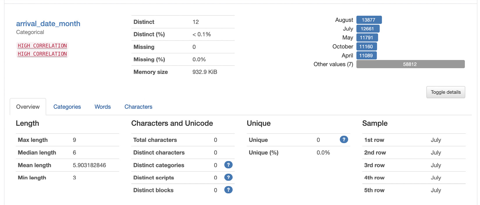
Figure 2.5 – Information provided for categorical data
For example, the report shows details on the distinct and missing values, as well as the minimum, median, and maximum length of labels.
For numerical variables, the report provides additional information, as shown in the following figure:

Figure 2.6 – Information provided for numerical data
For example, the report shows various statistics on the data, including the minimum, maximum, percentiles, standard deviation, mean, skewness, and so on. Similar to the categorical data, the report also shows distinct and missing values.
The other sections of the report show information in the form of graphs; thus, we can consider them as part of visual EDA.
As an alternative to pandas-profiling, you can use sweetviz. To build a report in sweetviz, you can run the following code:
import sweetviz as sv
report = sv.analyze(df)
report.show_html('report.html')We use the analyze() function provided by the sweetviz library, and then we save the produced report as an HTML file.
The sweetviz library generates similar results to those already described for pandas-profiling.
Now that we have reviewed some general concepts on non-visual EDA, we can move to the next step: visual EDA.
Visual EDA
Visual techniques use the ability of the human eye to recognize trends, patterns, and correlations by simply looking at a visual representation of the data. We can plot our data using different types of graphs, such as line charts, bar charts, scatter plots, area plots, table charts, histograms, lollipop charts, maps, and much more. We can use visual techniques for both univariate and multivariate analysis.
The type of graph used depends on the nature of the question we want to answer. During the EDA phase, we do not care about the aesthetics of the graph, because we are only interested in answering the questions we ask. The aesthetic part will be studied in the narrative data phase.
Let's investigate the main techniques for visual EDA in the two cases, univariate and multivariate analysis, starting from the first: univariate analysis.
Univariate analysis
The objective of univariate analysis is to calculate the behavior of a variable, including the frequency of each value and its distribution. If the variable is categorical, we calculate the frequency of each value; if the variable is numerical, we calculate its distribution and other statistics, such as mean, median, and so on.
We can consider two types of univariate analysis, one for categorical variables, and the other for numerical variables. Regarding categorical variables, we can plot the following graphs:
- Countplot – This counts the frequency of a variable and shows it as a bar chart. For example, we can build the countplot graph of the arrival date month through the following code:
colors = sns.color_palette('mako_r')
sns.countplot(df['arrival_date_month'], palette=colors)
plt.show()
In the previous example, we firstly set the color palette to mako_r through the color_palette() function provided by seaborn. We note that the seaborn library provides a function named countplot() that automatically builds the countplot of the variable passed as input. The following figure shows the produced graph:

Figure 2.7 – A countplot graph for the arrival month date column of the dataset
We note that August is the most frequent category.
- Pie chart – This is very similar to the countplot graph, but it also shows the percentage of each category. We can build a pie chart of the arrival month date column as follows:
values = df['arrival_date_month'].value_counts()
values.plot(kind='pie', colors = colors, fontsize=17, autopct='%.2f')
plt.legend(labels=values.index, loc="best")
plt.show()
Note that we used the plot() function provided by pandas. The following figure shows the resulting graph:

Figure 2.8 – A pie chart graph for the arrival month date column of the dataset
In the previous graph, we also have information on percentages displayed.
We have just reviewed the most common graphs for univariate categorical analysis. Now we can illustrate the most common graphs for univariate numerical analysis. This type of graph includes the following:
- Histogram – A distribution plot, usually used to represent continuous variables. It splits all the possible values into bins and calculates how many values fall in each bin. We can build a histogram of the stays_in_week_nights variable as follows:
plt.hist(df['stays_in_week_nights'], bins=50, color='#40B7AD')
plt.show()
In the previous code, we used the hist() function of the matplotlib library and we set the number of bins to 50. The following figure shows the resulting plot:

Figure 2.9 – A histogram for the stays_in_week_nights column of the dataset
The previous figure shows that almost all the values are concentrated in the first 10 bins.
- Dist plot – Similar to the histogram plot, but it also shows the Kernel Density Estimate (KDE). We can build a dist plot of the stays_in_week_nights variable as follows:
plt.figure(figsize=(15,6))
sns.distplot(df['stays_in_week_nights'], color='#40B7AD')
plt.show()
We used the distplot() function of the seaborn library. The following figure shows the resulting plot:

Figure 2.10 – A dist plot for the stays_in_week_nights column of the dataset
The previous figure shows the KDE as a continuous line.
- Box plot – This shows the distribution of data for a continuous variable. A box plot allows you to visualize the center and distribution of the data. In addition, it can be used to identify possible outliers. We can build a box plot of the stays_in_week_nights column as follows:
sns.boxplot(df['stays_in_week_nights'], color='#40B7AD')
plt.show()
We used the boxplot() function provided by seaborn to build the box plot. The following figure shows the resulting plot:

Figure 2.11 – A box plot for the stays_in_week_nights column of the dataset
The previous figure shows the average value (in color), as well as other information, such as the presence of outliers (near the value 50).
- Violin plot – Similar to the box plot, but it also shows a rotated kernel density plot. We can build the violin plot of the stays_in_week_nights column as follows:
sns.violinplot(df['stays_in_week_nights'], color='#40B7AD')
plt.show()
We used the violinplot() function provided by the seaborn library. The following figure shows the resulting plot:

Figure 2.12 – A violin plot for the stays_in_week_nights column of the dataset
The previous graph is a combination of the box plot and dist plot.
We can use all the previously described graphs for univariate analysis. Let's now look at which types of visualizations we can use for multivariate analysis.
Multivariate analysis
Multivariate analysis considers multiple variables at a time. In this chapter, we focus on two variables at a time (bivariate analysis), but we can calculate multivariate analysis also for more variables, through techniques for dimensionality reduction or by using the style options provided by the graphs.
There are three types of bivariate analysis:
- Numerical to numerical
- Categorical to categorical
- Numerical to categorical
Let's analyze the graphs provided by each type separately, starting from the first: numerical to numerical.
Numerical-to-numerical analysis
In numerical-to-numerical bivariate analysis, we can plot a scatter plot that shows the relationship between two variables. The following piece of code shows how to build a scatter plot in seaborn:
sns.scatterplot(df['adults'], df['stays_in_week_nights'],color='#40B7AD')
plt.show()
We used the scatterplot() function to represent the adults column on the x axis and the stays_in_week_nights on the y axis. The following figure shows the resulting figure:

Figure 2.13 – A scatter plot for adults versus stays_in_week_nights
The previous figure shows the correlation between the stays_in_week_nights and adults variables.
Categorical-to-categorical analysis
In the categorical-to-categorical bivariate analysis, the most common graph is the heatmap, which plots the correlation between two variables through colors. We can plot a heatmap as follows:
sns.heatmap(pd.crosstab(df['customer_type'], df['arrival_date_month']), cmap='mako_r')
plt.show()
The previous piece of code plots the heatmap of two categorical variables, customer_type and arrival_date_month. In addition, it uses the crosstab() function provided by the pandas library to build the matrix to be plotted. The following figure shows the resulting plot:

Figure 2.14 – A heatmap for customer_type and arrival_date_month
The previous figure shows the relationship between the category labels in terms of different gradients. The stronger the relationship, the darker the color.
Number-to-category analysis
In the number-to-category bivariate analysis, the most common graph is the bar plot, which draws categorical variables as rectangular bars with lengths proportional to the numerical variables they are compared with. We can plot a bar plot as follows:
sns.barplot(df['adults'], df['arrival_date_month'],color='#40B7AD')
plt.show()
In the previous example, we used the barplot() function provided by seaborn to plot the arrival_date_month column with respect to the number of adults. The following figure shows the resulting plot:

Figure 2.15 – A bar chart of the arrival_date_month column versus the number of adults
There are two additional types of graphs, geographical maps, and trend lines, that we can use for EDA. We can use geographical maps to study the distribution of a variable over a map and we can use trend lines to understand the behavior of a variable over time.
So far, we have reviewed the general concepts behind EDA. Now it is time to apply them to Comet. So, let's move to the next section: Comet for EDA.
Using Comet for EDA
Comet provides the following features to deal with EDA:
- Log – A mechanism to store assets, metrics, and objects in general in Comet
- Panel – A visual representation of one or more logged objects
- Report – A combination of panels
From a logical point of view, firstly we log all the needed objects, then we build all the designed panels, and, finally, we build a report. We can adopt this strategy in all the phases of the data science project life cycle, such as EDA and model evaluation. In this chapter, we focus on how to adopt this strategy during the EDA phase.
Before describing the single features, separately, here is a practical tip that permits you to integrate Comet with notebook documents. Usually, we use notebook documents (or simply notebooks) to perform EDA because we can use them to show both code and text, to run temporary code, and so on. Comet can also be integrated with Jupyter notebooks, by simply adding one line of code at the end of the experiment:
experiment.end()
After the end() method, the experiment is concluded.
Before calling the end() method, we can view the experiment results within the current notebook, by simply calling the following method:
experiment.display()
We can use the display() method to directly access our Comet dashboard in our notebook.
Now we are ready to analyze each feature provided by Comet separately, starting with the first one: logs.
Comet logs
A Comet log is an object that stores something within an experiment. In Comet we can log metrics, models, figures, images, and much more. Comet defines two types of logs:
- Values – This type of log includes metrics and other parameters that are available under the Comet dashboard. To log one or more values, we can use the following methods of the Experiment class:
- log_metrics() – Logs a dictionary of key-value pairs that conceptually are metrics, such as precision, recall, and accuracy. We can access the logged values in the Metrics menu of the Comet dashboard.
- log_metric() – Logs a single key-value pair. Similar to the previous method, we can access the logged value in the Metrics menu of the Comet dashboard.
- log_parameters() – Logs a dictionary of key-value pairs that conceptually are hyperparameters. We can access the logged values in the Hyperparameters menu of the Comet dashboard.
- log_parameter() – Similar to log_parameters(), but it logs a single key-value pair.
- log_others() – Logs a dictionary of key-value pairs. These values could be used to keep track of some used parameters. We can access the logged values in the Others menu of the Comet dashboard.
- log_other() – Similar to log_others(), but it logs a single key-value pair.
- log_html_url() – Logs an HTML URI, which can be accessed in the HTML menu of the Comet dashboard.
- log_text() – Logs a text, which can be accessed in the Text menu of the Comet dashboard.
- Files – This type of log includes datasets, figures, models, and files in general that are available in the Assets & Artifacts menu. We can log different types of files in Comet. Referring only to EDS, we can use the following methods provided by the Experiment class:
- log_dataframe_profile() – Logs a summary of a pandas DataFrame, produced by the pandas profiling library
- log_histogram_3d() – Logs a 3D histogram chart
- log_html() – Logs an HTML file
- log_image() – Logs an image
- log_table() – Logs a CSV file or a pandas DataFrame
In this section, we have described an overview of the most important methods provided by the Experiment class for logging. For more details on the parameters they receive as input, you can refer to the Comet official documentation, available at this link: https://www.comet.ml/docs/python-sdk/Experiment/.
We have already described how to log an image and a metric in Comet in Chapter 1, An Overview of Comet. In this section, we describe how to log a pandas-profiling report and different values for the same metric.
We will use the hotel_booking.csv dataset we described in the previous section:
- Firstly, we import all the packages needed for this experiment:
import pandas as pd
from comet_ml import Experiment
We will use two packages: pandas to transform the original dataset into a DataFrame, and comet_ml to build the Comet Experiment. Make sure to create a new project from the main dashboard, as illustrated in Chapter 1, Overview of Comet.
We have created the Experiment object. Note that to make the previous code run, we should configure the .comet.config file, as explained in Chapter 1, Overview of Comet.
- Let's suppose that we have already loaded the hotel_bookings.csv file as a pandas DataFrame, as described in the previous section, and we have stored it in a variable named df. We can log the associated pandas profile report in Comet as follows:
experiment.log_dataframe_profile(df, "hotel_bookings")
We have used the log_dataframe_profile() method, which generates an asset containing all the required statistics. The logging process may require some time. Some progressive bars, such as those shown in the following figure, show when the logging process is complete:

Figure 2.16 – The progressive bar produced by the log_dataframe_profile() method
The previous figure shows that there are three progressive bars: Summarize dataset, Generate report structure, and Render HTML. When all the bars are complete, the result is available as a Comet asset.
- Now, we make sure that Comet has logged all the outputs. We access the Assets & Artifacts menu item from the Experiment dashboard in Comet. In the Assets tab, there is the dataframes directory, which contains our original dataset and the logged profile summary, as shown in the following figure:

Figure 2.17 – The Assets tab, with a focus on the dataframes directory
The original dataset (hotel_bookings.json) is provided as a JSON object, while the summary is an HTML file. We can either download or view both of the files by simply clicking on the respective button near the file. Now that you have logged the pandas profiling object, you can see how to log multiple values for a single metric:
- Let's suppose that we want to log at what time families check in at some hotels. For simplicity, we consider as a family a record with at least two adults, as follows:
families = df[df['adults'] > 1]
families.set_index('arrival_date', inplace=True)
We assume that the DataFrame df contains the hotel_bookings dataset.
- Now we group all the families by arrival_date, and we count the number of families for each date:
ts_families = families['adults'].groupby('arrival_date').count()
We used the groupby() method to group the dataset by families and the count() method to count the number of records in each group.
- Now, we can log the ts_families values through the log_metric() method of the Experiment class, as follows:
import time
import datetime
for i in ts_families.index:
index = time.mktime(i.timetuple())
experiment.log_metric('ts_families', ts_families[i], step=index)
We used the step parameter of the log_metric() method to log different values of the same metric. In addition, we converted the arrival_date to timestamp, since log_metric() does not support dates.
- We can see the logged metric in the Comet dashboard, under the Metrics menu item, as shown in the following figure.

Figure 2.18 – The logged metric in Comet
The Comet dashboard shows the last, minimum, and maximum values for the ts_families variable.
As an alternative to the pandas_profiling library, you can use sweetviz, which is fully integrated with Comet. To log a sweetviz report, you can simply run the following code:
report.log_comet(experiment)
The log_comet() function receives as input an experiment object. As a result, the report is saved in Comet under the HTML menu item, as shown in the following figure:

Figure 2.19 – The output of the log_comet() method provided by the sweetviz library
The HTML file generated by the log_comet() method is interactive, so you can browse it to explore every column of the dataset.
Now that you are familiar with Comet logs, we can move to the next feature provided by Comet for EDA: panels.
Panels
We can use Comet panels to implement all the EDA techniques. We introduced the concept of panels in the previous chapter: Chapter 1, Overview of Comet. In this section, we describe how to implement custom panels in Comet.
We can create custom panels in Comet either in Python or JavaScript. Although the focus of this book is mainly on the Python language, at the end of this section we will also provide some general concepts to build custom panels in JavaScript. Comet provides a practical Python/JavaScript SDK to build custom panels directly from the online platform. At the moment, we cannot implement our custom panels offline.
Building a custom panel involves the following four steps:
- Accessing the SDK
- Retrieving the environment variables
- Building the panel content
- Showing the panel in Comet
Let's investigate all the steps separately, starting from the first step: environment setup.
Accessing the SDK
The SDK is the place where we write the code to build our custom panel. To access the Comet SDK, perform the following operations:
- From the main dashboard, click Add → New Panel → Create New.
- A new window opens with the online SDK, as shown in the following figure:
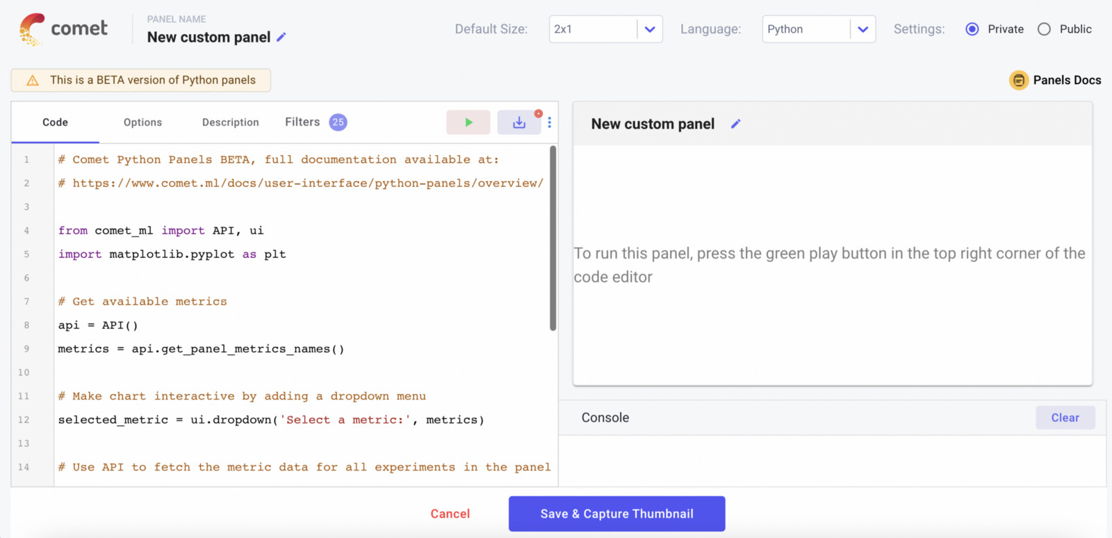
Figure 2.20 – The online SDK in Comet to build custom panels
At the top of the window, there are some options that permit us to configure the panel name, its size, the preferred language (Python or JavaScript), and the panel visibility (private or public). The main part of the window is divided into two parts: on the left, there is the editor, where we can write the code to produce the panel, while on the right, there is a preview of the panel. To see the preview, we should click the run button (the green triangle in the editor). We can save the panel by clicking on the button near the run button. In the bottom part of the window, there are two buttons used to save or cancel changes.
The editor part of the window is composed of the following four tabs:
- Code – The main code editor.
- Options – An option is a runtime value provided as input to the panel. For example, we can build generic panels that can be used in multiple projects. For each project, we need to change only the current values, but the type of panel remains constant. We can define options as key-value pairs, as shown in the following piece of code:
{
"key 1" : "value 1",
"key 2" : "value 2",
...
"key N" : "value N"
}
- Description – A textual description of the panel, including a name and an image.
- Filters – A selection of targets to be included in the panel, such as only certain experiments or certain metrics.
Now that you have learned how to set up the environment to build a custom panel in Comet, let's move to the next step – retrieve the environment variables.
Retrieving the environment variables
Comet provides the API class to easily and quickly access from the Comet SDK all the information we have logged in Comet. For example, through the Comet API, we can select all the experiments or just a subset, along with the logged metrics, assets, artifacts, workspaces, and projects.
To import the API class, we can write the following code:
from comet_ml import API
api = API()
The API class permits you to read all information saved in the workspaces, projects, and experiments, but it does not permit you to log new values. When the api object has been created, we can call many methods. Among them, the most important are the following:
- get() – Returns all the workspaces, projects or experiments associated with the current user.The type of object returned by this method depends on the level of granularity passed as input parameters. For example, get(MY_WORKSPACE) returns all the projects contained in the MY_WORKSPACE workspace, and get(MY_WORKSPACE, MY_PROJECT) returns all the experiments contained in the MY_PROJECT project, itself contained in the MY_WORKSPACE workspace.
- get_experiment(MY_WORKSPACE, MY_PROJECT, MY_EXPERIMENT_KEY) – Returns a specific experiment. The experiment is returned as an object of the APIExperiment class, which differs from the Experiment class because it is used within a Comet panel. There are three ways to retrieve an experiment key:
- Through the get_Panel_experiment_keys() method
- By setting the experiment key manually when creating the experiment, as follows:
experiment = Experiment(experiment_key = MY_EXPERIMENT_KEY)
- Copying the value returned by the Comet output when running the experiment, as shown in the following figure:
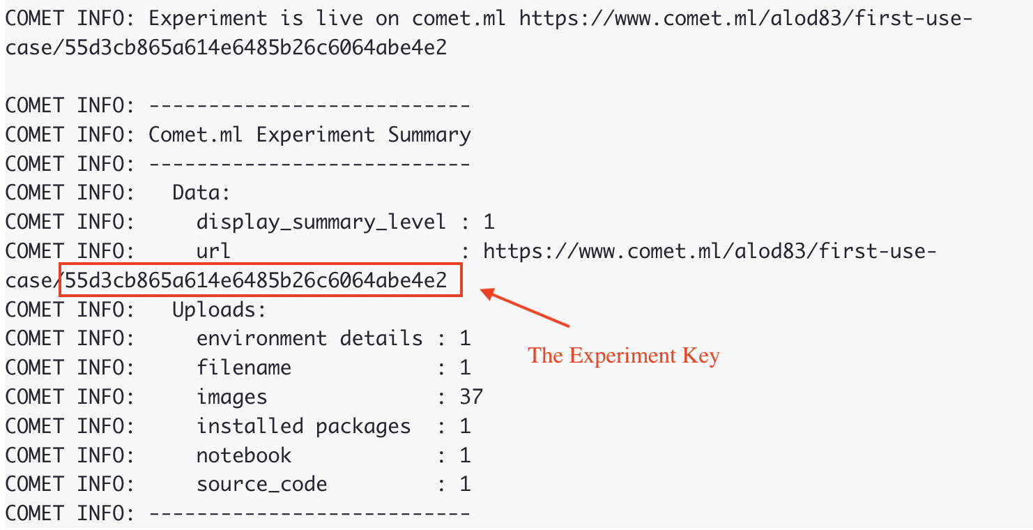
Figure 2.21 – The experiment key returned when running the experiment
In the previous figure, the experiment key is 55d3cb865a614e6485b26c6064abe4e2.
- get_panel_options() – Returns the options provided as input in the Option tab of the SDK. This method returns options as a Python dictionary.
- get_experiment_*() – A collection of methods to access all the information logged in an experiment. The * must be replaced by one of the following words: code, curves, graphs, HTML, metric, or images. So, for example, to access the experiment graphs, we can use the get_experiment_graphs() method, while to access the experiment code, we can call the get_experiment_code() method.
For a complete list of methods provided by the API class, you can refer to the Comet official documentation, available at this link: https://www.comet.ml/docs/user-interface/python-Panels/API/.
Now that you have learned how to access all the environment variables within a Comet panel, let's analyze how to build the content of a panel.
Building the panel content
We can use all the environment variables to build our graphs, tables, and whatever else. Comet panels are integrated with the Matplotlib and Plotly libraries, as well as with the Python Image library. Thus, we can implement our charts as we usually do, directly in the Comet SDK.
We will describe some practical examples in the next sections of this chapter.
Once we have implemented our panel content, we are ready to export it as a custom Comet panel.
Showing the panel in Comet
Comet defines the ui subpackage to build a custom Panel in Python. We can use the ui subpackage only within the Comet SDK. Firstly, we need to import it as follows:
from comet_ml import ui
Once imported, we can use its functions to display objects, figures, and texts in the panel:
- display() – Shows a generic object
- display_figure() – Shows a figure, such as graphs produced with the matplotlib library
- display_image() – Shows a JPEG, GIF, or PNG image, or alternatively, a PIL image
- display_text() – Shows some text
- display_markdown() – Shows some text written in the Markdown syntax
- dropdown() – Creates a drop-down menu with the list of items passed as an argument, returns the selected item, and triggers a change to run the code
- add_css()/set_css() – Adds/sets an additional CSS style to display
We can use and combine the previous functions to build our custom panels.
Now that you have learned how to build a custom panel in Python, we will quickly describe how to build a custom panel in JavaScript.
Custom panels in JavaScript
The Comet SDK permits you to also build your custom panels in JavaScript. To create a custom panel in JavaScript, select JavaScript as the language in the panel window. In addition to the tabs described in the previous section, the tab menu of the JavaScript editor contains these additional tabs:
- HTML – For HTML containers.
- CSS – For styles.
- Resources – To import new libraries or CSS stylesheets. Any additional resources need to be provided as a URL.
The JavaScript SDK defines the Comet.Panel class as the starting point to build a panel. The Comet.Panel class defines the following methods:
- draw()/drawOne() – Draws one or more experiments
- print() – Prints some text in the panel
- getOption() – Gets an option
- clear() – Clears all of the printed objects
- select() – Creates a HTML select widget
For more details on the methods defined by the Comet.Panel class, you can refer to the Comet official documentation, available at this link: https://www.comet.ml/docs/javascript-sdk/getting-started/.
The Comet.Panel class also defines the interface to the Comet workspaces, projects, and experiments through the this.api variable, which is an interface to the JavaScript API class. Similar to the API class defined in Python, the JavaScript API class provides methods to access metrics, images, code, graphs, and so on. We can use the experiment*() method, where * must be replaced by one of the following keywords: Code, HTML, Images, Graph, or Metric. For example, to get a given metric, we should use the experimentMetric() method. For more details on the JavaScript API, you can refer to the official Comet documentation, available at this link: https://www.comet.ml/docs/javascript-sdk/api/.
To build a custom panel, we need to extend the Comet.Panel class, as follows:
class MyPanel extends Comet.Panel {
...
}
If we want to access the options defined in the Option tab, we can use the this.options variable. Typically, we define some default values of this variable in the setup() method, and then, at runtime, the JavaScript SDK will substitute them with the actual values set in the Option tab.
Within a JavaScript panel, we can use all the JavaScript libraries that we prefer, including Plotly, Highcharts, d3.js, Google Charts, and much more.
Now that you have learned how to build custom panels in Comet, we can build a practical example using the hotel_bookings.csv dataset and the ts_families logged metric from the previous section.
An example of a custom panel
The log_metric() method produces the following default chart:

Figure 2.22 – The default chart produced by the log_metric() method
We note that the x axis does not correspond to dates, but to timestamps. So, in this example, we build a custom panel that converts timestamps into dates:
- Firstly, we access the Comet online SDK and we create a new panel. We make sure that the selected language is Python. Then, in the SDK editor, we start writing our code. We import all the required libraries, as follows:
from comet_ml import API, ui
import matplotlib.pyplot as plt
from datetime import datetime
To access the Comet objects, we will use the API, while to display objects in the panel, we will use the ui package.
- Now, we retrieve the logged metric as follows:
api = API()
experiment_keys = api.get_Panel_experiment_keys()
metric = api.get_metrics_for_chart(experiment_keys, ['ts_families'])
We used the get_metrics_for_chart() method provided by the API to retrieve the specific ts_families metric.
- After that, we build the graph, as follows:
for experiment_key in metrics:
for metric in metrics[experiment_key]["metrics"]:
cdate = [datetime.fromtimestamp(x) for x in metric['steps']]
plt.figure(figsize=(15,6))
plt.grid()
plt.xticks(rotation=45)
plt.ylabel('Number of travelling families')
plt.xlim(cdate[0], cdate[len(cdate)-1])
plt.plot(cdate, metric['values'])
We loop over all the experiments (in our case, there is just one experiment) and all the possible metrics (just one in our case) and after converting the timestamp contained in the metric['steps'] variable to a date, we plot the graph by calling the display() function:
ui.display(plt)
- We click on the run button, and the Comet SDK produces the following graph:

Figure 2.23 – The output of the custom panel
We have now converted timestamps to dates. Now we can add the produced custom panel to our project from the Comet dashboard simply by clicking Add | New Panel | Workspace | Number of Travelling Families | Add.
Now that you are familiar with custom panels, we can move on to the next feature provided by Comet for EDA: Comet Report.
Comet Report
A Comet Report is an interactive document that can contain text, panels, and experiments. A Comet Report is associated with a single project and we can create a new Report in Comet simply by clicking Add → New Report from the main dashboard. The following figure shows an example of a newly created empty report:
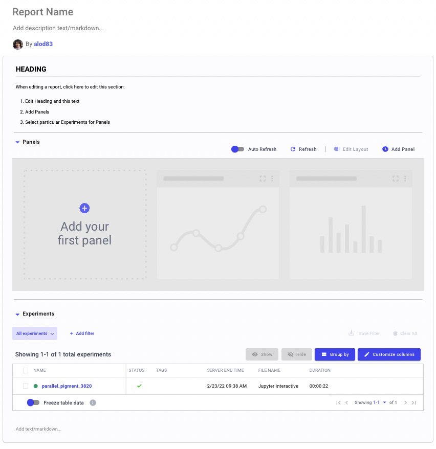
Figure 2.24 – An empty report in Comet
The previous figure shows that the default report is divided into the following parts:
- Title and description
- A section, with the heading, panels, and experiments
We can add other sections by clicking the Add section here button, located at the bottom of the default report.
Once our Report is ready, we can save it by clicking the Save button. We can also view a preview of the Report by clicking the Preview button. We can share the Report by copying its link on the main Report page.
Now, let's look at a practical example to illustrate how we can create a Comet Report. This example uses the features offered by the pandas-profiling package to explore the hotel_bookings dataset. Let's suppose that we have logged the output of the pandas-profiling package relating to the hotel_bookings dataset. Thus, we can proceed with report building.
From the project main dashboard, we perform the following steps:
- Click New → New Report.
- Click on Report Name to customize the name – for example, we can name the report EDA for the diabetes dataset. Optionally, you can add also a description.
- Click on the Section box to highlight the heading, and then enter some text, or optionally, simply remove the default text.
- Click on the area named Add your first panel. The panel window opens.
- In the search box, write the text HTML, and select HTML Asset Viewer by clicking the Add button, as illustrated in the following figure:

Figure 2.25 – How to select HTML Asset Viewer in the Comet Panel Window
- The Comet SDK opens with a preview of the HTML Asset Viewer. We click on the Done button. The panel is added to the Report, but it is small.
- To enlarge the panel, click on Edit Layout and drag the panel to cover the entire width of the screen. Then, click on the Done Editing button.
- The Report is ready. As a final step, we save it by clicking on the Save button, located at the top right of the dashboard.
Now our report is ready with all our statistics. We can access it from the main dashboard under the Report tab.
Summary
We just completed the journey of performing EDA in Comet!
Throughout this chapter, we described some general concepts regarding EDA, as well as the main EDA techniques, including visual and non-visual EDA. We also illustrated the importance of EDA in a data science project: EDA permits us to understand our data, correctly formulate the questions we want to solve, and discover hidden patterns.
In the third part of the chapter, we learned which features Comet provides to perform EDA and how we can use them through a practical example. We illustrated the concepts of logs, custom panels, and reports through a practical example.
Throughout this chapter, you learned how easy it is to use Comet to run EDA, as Comet provides very intuitive features that can be combined together to build fantastic reports for EDA.
Now that you have learned how to perform EDA in Comet, we can continue our journey of the discovery of Comet for data science.
In the next chapter, we will review some concepts related to model evaluation and how to perform it in Comet.
Further reading
- Meier, M, Baldwin, D. and Strachnyi, K. (2021). Mastering Tableau 2021. Packt Publishing Ltd.
- Mukhiya, S. K., and Ahmed, U. (2020). Hands-On Exploratory Data Analysis with Python: Perform EDA techniques to understand, summarize, and investigate your data. Packt Publishing Ltd.
- Swamynathan, M. (2019). Mastering machine learning with Python in six steps: A practical implementation guide to predictive data analytics using Python. Apress.