Chapter 5. GUI Programming
GUI stuff is supposed to be hard. It builds character.
—Jim Ahlstrom, May 1995
(verbally at Python Workshop)
In this chapter...
• Tkinter and Python Programming
• Related Modules and Other GUIs
In this chapter, we will give you a brief introduction to the subject of graphical user interface (GUI) programming. If you are somewhat new to this area or want to learn more about it, or if you want to see how it is done in Python, then this chapter is for you. We cannot show you everything about GUI application development in this one chapter, but we will give you a very solid introduction to it. The primary GUI toolkit we will be using is Tk, Python’s default GUI. We’ll access Tk from its Python interface called Tkinter (short for “Tk interface”).
Tk is not the latest and greatest, nor does it have the most robust set of GUI building blocks, but it is fairly simple to use, and with it, you can build GUIs that run on most platforms. We will present several simple and intermediate examples using Tkinter, followed by a few examples using other toolkits. Once you have completed this chapter, you will have the skills to build more complex applications and/or move to a more modern toolkit. Python has bindings or adapters to most of the current major toolkits, including commercial systems.
5.1. Introduction
Before getting started with GUI programming, we first discuss Tkinter as Python’s default UI toolkit. We begin by looking at installation because Tkinter is not always on by default (especially when building Python yourself). This is followed by a quick review of client/server architecture, which is covered in Chapter 2, “Network Programming,” but has relevance here.
5.1.1. What Are Tcl, Tk, and Tkinter?
Tkinter is Python’s default GUI library. It is based on the Tk toolkit, originally designed for the Tool Command Language (Tcl). Due to Tk’s popularity, it has been ported to a variety of other scripting languages, including Perl (Perl/Tk), Ruby (Ruby/Tk), and Python (Tkinter). The combination of Tk’s GUI development portability and flexibility along with the simplicity of a scripting language integrated with the power of systems language gives you the tools to rapidly design and implement a wide variety of commercial-quality GUI applications.
If you are new to GUI programming, you will be pleasantly surprised at how easy it is. You will also find that Python, along with Tkinter, provides a fast and exciting way to build applications that are fun (and perhaps useful) and that would have taken much longer if you had to program directly in C/C++ with the native windowing system’s libraries. Once you have designed the application and the look and feel that goes along with your program, you will use basic building blocks known as widgets to piece together the desired components, and finally, to attach functionality to “make it real.”
If you are an old hand at using Tk, either with Tcl or Perl, you will find Python a refreshing way to program GUIs. On top of that, it provides an even faster rapid prototyping system for building them. Remember that you also have Python’s system accessibility, networking functionality, XML, numerical and visual processing, database access, and all the other standard library and third-party extension modules.
Once you get Tkinter up on your system, it will take less than 15 minutes to get your first GUI application running.
5.1.2. Getting Tkinter Installed and Working
Tkinter is not necessarily turned on by default on your system. You can determine whether Tkinter is available for your Python interpreter by attempting to import the Tkinter module (in Python 1 and 2; renamed to tkinter in Python 3). If Tkinter is available, then no errors occur, as demonstrated in the following:
>>> import Tkinter
>>>
If your Python interpreter was not compiled with Tkinter enabled, the module import fails:
>>> import Tkinter
Traceback (innermost last):
File "<stdin>", line 1, in ?
File "/usr/lib/pythonX.Y/lib-tk/Tkinter.py", line 8, in ?
import _tkinter # If this fails your Python may not
be configured for Tk
ImportError: No module named _tkinter
You might need to recompile your Python interpreter to gain access to Tkinter. This usually involves editing the Modules/Setup file and then enabling all the correct settings to compile your Python interpreter with hooks to Tkinter, or choosing to have Tk installed on your system. Check the README file for your Python distribution for specific instructions for compiling Tkinter on your system. After compiling the interpreter, be sure that you start the new Python interpreter otherwise, it will act just like your old one without Tkinter (and in fact, it is your old one).
5.1.3. Client/Server Architecture—Take Two
In Chapter 2, we introduced the concept of client/server computing. A windowing system is another example of a software server. These run on a computer with an attached display, such as a monitor. There are clients, too—programs that require a windowing environment in which to execute, also known as GUI applications. Such applications cannot run without a windows system.
The architecture becomes even more interesting when networking comes into play. Usually when a GUI application is executed, it displays to the computer that it started on (via the windowing server), but it is possible in some networked windowing environments, such as the X Window system on Unix, to choose another computer’s window server to which the application displays. Thus, you can be running a GUI program on one computer, but display it on another.
5.2. Tkinter and Python Programming
In this section, we’ll introduce GUI programming in general then focus on how to use Tkinter and its components to build GUIs in Python.
5.2.1. The Tkinter Module: Adding Tk to your Applications
So what do you need to do to have Tkinter as part of your application? First, it is not necessary to have an application already. You can create a pure GUI if you want, but it probably isn’t too useful without some underlying software that does something interesting.
There are basically five main steps that are required to get your GUI up and running:
1. Import the Tkinter module (or from Tkinter import *).
2. Create a top-level windowing object that contains your entire GUI application.
3. Build all your GUI components (and functionality) on top (or within) of your top-level windowing object.
4. Connect these GUI components to the underlying application code.
5. Enter the main event loop.
The first step is trivial: all GUIs that use Tkinter must import the Tkinter module. Getting access to Tkinter is the first step (see Section 5.1.2).
5.2.2. Introduction to GUI Programming
Before going to the examples, we will give you a brief introduction to GUI application development. This will provide you with some of the general background you need to move forward.
Setting up a GUI application is similar to how an artist produces a painting. Conventionally, there is a single canvas onto which the artist must put all the work. Here’s how it works: you start with a clean slate, a “top-level” windowing object on which you build the rest of your components. Think of it as a foundation to a house or the easel for an artist. In other words, you have to pour the concrete or set up your easel before putting together the actual structure or canvas on top of it. In Tkinter, this foundation is known as the top-level window object.
Windows and Widgets
In GUI programming, a top-level root windowing object contains all of the little windowing objects that will be part of your complete GUI application. These can be text labels, buttons, list boxes, etc. These individual little GUI components are known as widgets. So when we say create a top-level window, we just mean that you need a place where you put all your widgets. In Python, this would typically look like this line:
top = Tkinter.Tk() # or just Tk() with "from Tkinter import *"
The object returned by Tkinter.Tk() is usually referred to as the root window; hence, the reason why some applications use root rather than top to indicate as such. Top-level windows are those that show up stand-alone as part of your application. You can have more than one top-level window for your GUI, but only one of them should be your root window. You can choose to completely design all your widgets first, and then add the real functionality, or do a little of this and a little of that along the way. (This means mixing and matching steps 3 and 4 from our list.)
Widgets can be stand-alone or be containers. If a widget contains other widgets, it is considered the parent of those widgets. Accordingly, if a widget is contained in another widget, it’s considered a child of the parent, the parent being the next immediate enclosing container widget.
Usually, widgets have some associated behaviors, such as when a button is pressed, or text is filled into a text field. These types of user behaviors are called events, and the GUI’s response to such events are known as callbacks.
Event-Driven Processing
Events can include the actual button press (and release), mouse movement, hitting the Return or Enter key, etc. The entire system of events that occurs from the beginning until the end of a GUI application is what drives it. This is known as event-driven processing.
One example of an event with a callback is a simple mouse move. Suppose that the mouse pointer is sitting somewhere on top of your GUI application. If you move the mouse to another part of your application, something has to cause the movement of the mouse to be replicated by the cursor on your screen so that it looks as if it is moving according to the motion of your hand. These are mouse move events that the system must process portray your cursor moving across the window. When you release the mouse, there are no more events to process, so everything just remains idle on the screen again.
The event-driven processing nature of GUIs fits right in with client/server architecture. When you start a GUI application, it must perform some setup procedures to prepare for the core execution, just as how a network server must allocate a socket and bind it to a local address. The GUI application must establish all the GUI components, then draw (a.k.a. render or paint) them to the screen. This is the responsibility of the geometry manager (more about this in a moment). When the geometry manager has completed arranging all of the widgets, including the top-level window, GUI applications enter their server-like infinite loop. This loop runs forever waiting for GUI events, processing them, and then going to wait for more events to process.
Geometry Managers
Tk has three geometry managers that help with positioning your widgetset. The original one was called the Placer. It was very straightforward: you provide the size of the widgets and locations to place them; the manager then places them for you. The problem is that you have to do this with all the widgets, burdening the developer with coding that should otherwise take place automatically.
The second geometry manager, and the main one that you will use, is the Packer, named appropriately because it packs widgets into the correct places (namely the containing parent widgets, based on your instruction), and for every succeeding widget, it looks for any remaining “real estate” into which to pack the next one. The process is similar to how you would pack elements into a suitcase when traveling.
A third geometry manager is the Grid. You use the Grid to specify GUI widget placement, based on grid coordinates. The Grid will render each object in the GUI in their grid position. For this chapter, we will stick with the Packer.
Once the Packer has determined the sizes and alignments of all your widgets, it will then place them on the screen for you.
When all the widgets are in place, we instruct the application to enter the aforementioned infinite main loop. In Tkinter, the code that does this is:
Tkinter.mainloop()
This is normally the last piece of sequential code your program runs. When the main loop is entered, the GUI takes over execution from there. All other actions are handled via callbacks, even exiting your application. When you select the File menu and then click the Exit menu option or close the window directly, a callback must be invoked to end your GUI application.
5.2.3. Top-Level Window: Tkinter.Tk()
We mentioned earlier that all main widgets are built on the top-level window object. This object is created by the Tk class in Tkinter and is instantiated as follows:
>>> import Tkinter
>>> top = Tkinter.Tk()
Within this window, you place individual widgets or multiple-component pieces together to form your GUI. So what kinds of widgets are there? We will now introduce the Tk widgets.
5.2.4. Tk Widgets
At the time of this writing, there were 18 types of widgets in Tk. We describe these widgets in Table 5-1. The newest of the widgets are LabelFrame, PanedWindow, and Spinbox, all three of which were added in Python 2.3 (via Tk 8.4).
We won’t go over the Tk widgets in detail as there is plenty of good documentation available for you to read, either from the Tkinter topics page at the main Python Web site or the abundant number of Tcl/Tk printed and online resources (some of which are available in Appendix B, “Reference Tables”). However, we will present several simple examples to help you get started.
 Core Note: Default arguments are your friend
GUI development really takes advantage of default arguments in Python because there are numerous default actions in Tkinter widgets. Unless you know every single option available to you for every single widget that you are using, it’s best to start out by setting only the parameters that you are aware of and letting the system handle the rest. These defaults were chosen carefully. If you do not provide these values, do not worry about your applications appearing odd on the screen. They were created with an optimized set of default arguments as a general rule, and only when you know how to exactly customize your widgets should you use values other than the default.
5.3. Tkinter Examples
Now we’ll look at our first GUI scripts, each introducing another widget and perhaps showing a different way of using a widget that we’ve looked at before. Very basic examples lead to more intermediate ones, which have more relevance to coding GUIs in practice.
5.3.1. Label Widget
In Example 5-1, we present tkhello1.py, which is the Tkinter version of “Hello World!” In particular, it shows you how a Tkinter application is set up and highlights the Label widget.
Example 5-1. Label Widget Demo (tkhello1.py)
Our first Tkinter example is—well, what else could it be but “Hello World!”? In particular, we introduce our first widget: the Label.
1 #!/usr/bin/env python
2
3 import Tkinter
4
5 top = Tkinter.Tk()
6 label = Tkinter.Label(top, text='Hello World!')
7 label.pack()
8 Tkinter.mainloop()
In the first line, we create our top-level window. That is followed by our Label widget, which contains the all-too-famous string. We instruct the Packer to manage and display our widget, and then finally call mainloop() to run our GUI application. Figure 5-1 shows what you will see when you run this GUI application.
Figure 5-1. The Tkinter Label widget.
5.3.2. The Button Widget
The next example (tkhello2.py) is pretty much the same as the first. However, instead of a simple text label, we will create a button. Example 5-2 presents the source code.
Example 5-2. Button Widget Demo (tkhello2.py)
This example is exactly the same as tkhello1.py, except that rather than using a Label widget, we create a Button widget.
1 #!/usr/bin/env python
2
3 import Tkinter
4
5 top = Tkinter.Tk()
6 quit = Tkinter.Button(top, text='Hello World!',
7 command=top.quit)
8 quit.pack()
9 Tkinter.mainloop()
The first few lines are identical. Things differ only when we create the Button widget. Our button has one additional parameter, the Tkinter.quit() method. This installs a callback to our button so that if it is pressed (and released), the entire application will exit. The final two lines are the usual pack() and invocation of the mainloop(). This simple button application is shown in Figure 5-2.
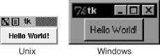
Figure 5-2. The Tkinter Label widget.
5.3.3. The Label and Button Widgets
In Example 5-3, we combine tkhello1.py and tkhello2.py into tkhello3.py, a script that has both a label and a button. In addition, we are providing more parameters now than before when we were comfortable using all of the default arguments that are automatically set for us.
Example 5-3. Label and Button Widget Demo (tkhello3.py)
This example features both a Label and a Button widget. Rather than primarily using default arguments when creating the widget, we are able to specify additional parameters now that we know more about Button widgets and how to configure them.
1 #!/usr/bin/env python
2
3 import Tkinter
4 top = Tkinter.Tk()
5
6 hello = Tkinter.Label(top, text='Hello World!')
7 hello.pack()
8
9 quit = Tkinter.Button(top, text='QUIT',
10 command=top.quit, bg='red', fg='white')
11 quit.pack(fill=Tkinter.X, expand=1)
12
13 Tkinter.mainloop()
Besides additional parameters for the widgets, we also see some arguments for the Packer. The fill parameter tells it to let the QUIT button take up the rest of the horizontal real estate, and the expand parameter directs it to visually fill out the entire horizontal landscape, stretching the button to the left and right sides of the window.
As you can see in Figure 5-3, without any other instructions to the Packer, the widgets are placed vertically (on top of each other). Horizontal placement requires creating a new Frame object with which to add the buttons. That frame will take the place of the parent object as a single child object (see the buttons in the listdir.py module, [Example 5-6] in Section 5.3.6).
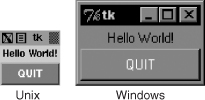
Figure 5-3. Tkinter Label widget, together.
5.3.4. Label, Button, and Scale Widgets
Our final trivial example, tkhello4.py, involves the addition of a Scale widget. In particular, the Scale is used to interact with the Label widget. The Scale slider is a tool that controls the size of the text font in the Label widget. The greater the slider position, the larger the font, and vice versa. The code for tkhello4.py is presented in Example 5-4.
Example 5-4. Label, Button, and Scale Demonstration (tkhello4.py)
Our final introductory widget example introduces the Scale widget and highlights how widgets can “communicate” with each other by using callbacks (such as resize()). The text in the Label widget is affected by actions taken on the Scale widget.
1 #!/usr/bin/env python
2
3 from Tkinter import *
4
5 def resize(ev=None):
6 label.config(font='Helvetica -%d bold' %
7 scale.get())
8
9 top = Tk()
10 top.geometry('250x150')
11
12 label = Label(top, text='Hello World!',
13 font='Helvetica -12 bold')
14 label.pack(fill=Y, expand=1)
15
16 scale = Scale(top, from_=10, to=40,
17 orient=HORIZONTAL, command=resize)
18 scale.set(12)
19 scale.pack(fill=X, expand=1)
20
21 quit = Button(top, text='QUIT',
22 command=top.quit, activeforeground='white',
23 activebackground='red')
24 quit.pack()
25
26 mainloop()
New features of this script include a resize() callback function (lines 5–7), which is attached to the Scale. This is the code that is activated when the slider on the Scale is moved, resizing the size of the text in the Label.
We also define the size (250 × 150) of the top-level window (line 10). The final difference between this script and the first three is that we import the attributes from the Tkinter module into our namespace by using from Tkinter import *. Although this is not recommended because it “pollutes” your namespace, we do it here mainly because this application involves a great number of references to Tkinter attributes. This would require the use of their fully qualified names for each and every attribute access. By using the undesired shortcut, we are able to access attributes with less typing and have code that is easier to read, at some cost.
As you can see in Figure 5-4, both the slider mechanism as well as the current set value show up in the main part of the window. The figure also shows the state of the GUI after the user moves the scale/slider to a value of 36. Notice in the code that the initial setting for the scale when the application starts is 12 (line 18).
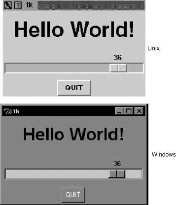
Figure 5-4. Tkinter Label, Button, and Scale widgets.
5.3.5. Partial Function Application Example
Before looking at a longer GUI application, we want to review the Partial Function Application (PFA), as introduced in Core Python Programming or Core Python Language Fundamentals.
PFAs were added to Python in version 2.5 and are one piece in a series of significant improvements in functional programming. Using PFAs, you can cache function parameters by effectively “freezing” those predetermined arguments, and then at runtime, when you have the remaining arguments you need, you can thaw them out, send in the final arguments, and have that function called with all parameters.
Best of all, PFAs are not limited to just functions. They will work with any “callable,” which is any object that has a functional interface, just by using parentheses, including, classes, methods, or callable instances. The use of PFAs fits perfectly into a situation for which there are many callables and many of the calls feature the same arguments over and over again.
GUI programming makes a great use case, because there is good probability that you want some consistency in GUI widget look-and-feel, and this consistency comes about when the same parameters are used to create similar objects. We are now going to present an application in which multiple buttons will have the same foreground and background colors. It would be a waste of typing to give the same arguments to the same instantiators every time we wanted a slightly different button: the foreground and background colors are the same, but the text is slightly different.
We are going to use traffic road signs as our example, with our application attempting to create textual versions of road signs by dividing them up into various categories of sign types, such as critical, warning, or informational (just like logging levels). The sign type determines the color scheme when they are created. For example, critical signs have the text in bright red with a white background; warning signs are in black text on a goldenrod background; and informational or regulatory signs feature black text on a white background. We have the “Do Not Enter” and “Wrong Way” signs, which are both critical, plus “Merging Traffic” and “Railroad Crossing,” both of which are warnings. Finally, we have the regulatory “Speed Limit” and “One Way” signs.
The application in Example 5-5 creates the signs, which are just buttons. When users press the buttons, they display the corresponding Tk dialog in a pop-up window, critical/error, warning, or informational. It is not too exciting, but how the buttons are built is.
Example 5-5. Road Signs PFA GUI Application (pfaGUI2.py)
Create road signs with the appropriate foreground and background colors, based on sign type. Use PFAs to help “templatize” common GUI parameters.
1 #!/usr/bin/env python
2
3 from functools import partial as pto
4 from Tkinter import Tk, Button, X
5 from tkMessageBox import showinfo, showwarning, showerror
6
7 WARN = 'warn'
8 CRIT = 'crit'
9 REGU = 'regu'
10
11 SIGNS = {
12 'do not enter': CRIT,
13 'railroad crossing': WARN,
14 '55
speed limit': REGU,
15 'wrong way': CRIT,
16 'merging traffic': WARN,
17 'one way': REGU,
18 }
19
20 critCB = lambda: showerror('Error', 'Error Button Pressed!')
21 warnCB = lambda: showwarning('Warning',
22 'Warning Button Pressed!')
23 infoCB = lambda: showinfo('Info', 'Info Button Pressed!')
24
25 top = Tk()
26 top.title('Road Signs')
27 Button(top, text='QUIT', command=top.quit,
28 bg='red', fg='white').pack()
29
30 MyButton = pto(Button, top)
31 CritButton = pto(MyButton, command=critCB, bg='white', fg='red')
32 WarnButton = pto(MyButton, command=warnCB, bg='goldenrod1')
33 ReguButton = pto(MyButton, command=infoCB, bg='white')
34
35 for eachSign in SIGNS:
36 signType = SIGNS[eachSign]
37 cmd = '%sButton(text=%r%s).pack(fill=X, expand=True)' % (
38 signType.title(), eachSign,
39 '.upper()' if signType == CRIT else '.title()')
40 eval(cmd)
41
42 top.mainloop()
When you execute this application, you will see a GUI that will look something like Figure 5-5.
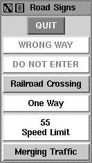
Figure 5-5. The Road signs PFA GUI application on XDarwin in Mac OS X.
Line-by-Line Explanation
Lines 1–18
We begin our application by importing functools.partial(), a few Tkinter attributes, and the Tk dialogs (lines 1–5). Next, we define some signs along with their categories (lines 7–18).
Lines 20–28
The Tk dialogs are assigned as button callbacks, which we will use for each button created (lines 20–23). We then launch Tk, set the title, and create a QUIT button (lines 25–28).
Lines 30–33
These lines represent our PFA magic. We use two levels of PFA. The first templatizes the Button class and the root window top. This means that every time we call MyButton, it will call Button (Tkinter.Button() creates a button.) with top as its first argument. We have frozen this into MyButton.
The second level of PFA is where we use our first one, MyButton, and templatize that. We create separate button types for each of our sign categories. When users create a critical button CritButton (by calling it, for example, CritButton()), it will then call MyButton along with the appropriate button callback and background and foreground colors, which means calling Button with top, callback, and colors. You can see how it unwinds and goes down the layers until at the very bottom, it has the call that you would have originally had to make if this feature did not exist yet. We repeat with WarnButton and ReguButton.
Lines 35–42
With the setup completed, we look at our list of signs and create them. We put together a string that Python can evaluate, consisting of the correct button name, pass in the button label as the text argument, and pack() it. If it is a critical sign, then we capitalize the button text; otherwise, we titlecase it. This last bit is done in line 39, demonstrating another feature introduced in Python 2.5, the ternary/conditional operator. Each button is instantiated with eval(), resulting in what is shown in Figure 5-5. Finally, we start the GUI by entering the main event loop.
You can easily replace the use of the ternary operator with the old “and/or” syntax if running with version 2.4 or older, but functools.partial() is a more difficult feature to replicate, so we recommend you use version 2.5 or newer with this example application.
5.3.6. Intermediate Tkinter Example
We conclude this section with a larger script, listdir.py, which is presented in Example 5-6. This application is a directory tree traversal tool. It starts in the current directory and provides a file listing. Double-clicking any other directory in the list causes the tool to change to the new directory as well as replace the original file listing with the files from the new directory.
Example 5-6. File System Traversal GUI (listdir.py)
This slightly more advanced GUI expands on the use of widgets, adding listboxes, text entry fields, and scrollbars to our repertoire. There are also a good number of callbacks such as mouse clicks, key presses, and scrollbar action.
1 #!/usr/bin/env python
2
3 import os
4 from time import sleep
5 from Tkinter import *
6
7 class DirList(object):
8
9 def __init__(self, initdir=None):
10 self.top = Tk()
11 self.label = Label(self.top,
12 text='Directory Lister v1.1')
13 self.label.pack()
14
15 self.cwd = StringVar(self.top)
16
17 self.dirl = Label(self.top, fg='blue',
18 font=('Helvetica', 12, 'bold'))
19 self.dirl.pack()
20
21 self.dirfm = Frame(self.top)
22 self.dirsb = Scrollbar(self.dirfm)
23 self.dirsb.pack(side=RIGHT, fill=Y)
24 self.dirs = Listbox(self.dirfm, height=15,
25 width=50, yscrollcommand=self.dirsb.set)
26 self.dirs.bind('<Double-1>', self.setDirAndGo)
27 self.dirsb.config(command=self.dirs.yview)
28 self.dirs.pack(side=LEFT, fill=BOTH)
29 self.dirfm.pack()
30
31 self.dirn = Entry(self.top, width=50,
32 textvariable=self.cwd)
33 self.dirn.bind('<Return>', self.doLS)
34 self.dirn.pack()
35
36 self.bfm = Frame(self.top)
37 self.clr = Button(self.bfm, text='Clear',
38 command=self.clrDir,
39 activeforeground='white',
40 activebackground='blue')
41 self.ls = Button(self.bfm,
42 text='List Directory',
43 command=self.doLS,
44 activeforeground='white',
45 activebackground='green')
46 self.quit = Button(self.bfm, text='Quit',
47 command=self.top.quit,
48 activeforeground='white',
49 activebackground='red')
50 self.clr.pack(side=LEFT)
51 self.ls.pack(side=LEFT)
52 self.quit.pack(side=LEFT)
53 self.bfm.pack()
54
55 if initdir:
56 self.cwd.set(os.curdir)
57 self.doLS()
58
59 def clrDir(self, ev=None):
60 self.cwd.set('')
61
62 def setDirAndGo(self, ev=None):
63 self.last = self.cwd.get()
64 self.dirs.config(selectbackground='red')
65 check = self.dirs.get(self.dirs.curselection())
66 if not check:
67 check = os.curdir
68 self.cwd.set(check)
69 self.doLS()
70
71 def doLS(self, ev=None):
72 error = ''
73 tdir = self.cwd.get()
74 if not tdir: tdir = os.curdir
75
76 if not os.path.exists(tdir):
77 error = tdir + ': no such file'
78 elif not os.path.isdir(tdir):
79 error = tdir + ': not a directory'
80
81 if error:
82 self.cwd.set(error)
83 self.top.update()
84 sleep(2)
85 if not (hasattr(self, 'last')
86 and self.last):
87 self.last = os.curdir
88 self.cwd.set(self.last)
89 self.dirs.config(
90 selectbackground='LightSkyBlue')
91 self.top.update()
92 return
93
94 self.cwd.set(
95 'FETCHING DIRECTORY CONTENTS...')
96 self.top.update()
97 dirlist = os.listdir(tdir)
98 dirlist.sort()
99 os.chdir(tdir)
100 self.dirl.config(text=os.getcwd())
101 self.dirs.delete(0, END)
102 self.dirs.insert(END, os.curdir)
103 self.dirs.insert(END, os.pardir)
104 for eachFile in dirlist:
105 self.dirs.insert(END, eachFile)
106 self.cwd.set(os.curdir)
107 self.dirs.config(
108 selectbackground='LightSkyBlue')
109
110 def main():
111 d = DirList(os.curdir)
112 mainloop()
113
114 if __name__ == '__main__':
115 main()
In Figure 5-6, we present what this GUI looks like on a Windows-based PC. The POSIX UI screenshot of this application is shown in Figure 5-7.
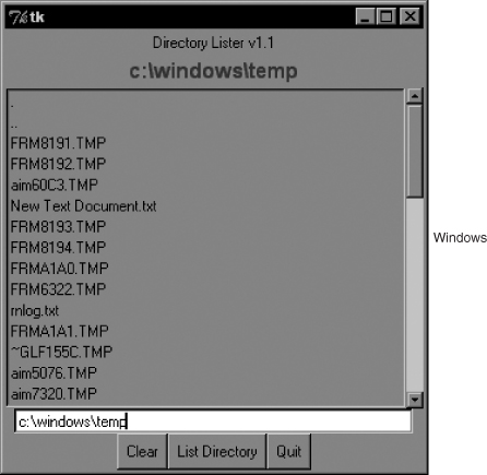
Figure 5-6. Our List directory GUI application as it appears in Windows.
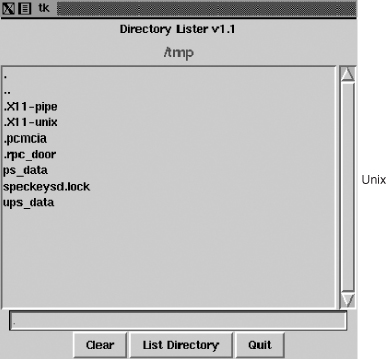
Figure 5-7. The List directory GUI application as it appears in Unix.
Line-by-Line Explanation
Lines 1–5
These first few lines contain the usual Unix startup line and importation of the os module, the time.sleep() function, and all attributes of the Tkinter module.
Lines 9–13
These lines define the constructor for the DirList class, an object that represents our application. The first Label we create contains the main title of the application and the version number.
Lines 15–19
We declare a Tk variable named cwd to hold the name of the directory we are on—we will see where this comes in handy later. Another Label is created to display the name of the current directory.
Lines 21–29
This section defines the core part of our GUI, the Listbox dirs, which contain the list of files of the directory that is being listed. A Scrollbar is employed to allow the user to move through a listing if the number of files exceeds the size of the Listbox. Both of these widgets are contained in a Frame widget. Listbox entries have a callback (setDirAndGo) tied to them by using the Listbox bind() method.
Binding means to tie a keystroke, mouse action, or some other event to a callback to be executed when such an event is generated by the user. setDirAndGo() will be called if any item in the Listbox is double-clicked. The Scrollbar is tied to the Listbox by calling the Scrollbar.config() method.
Lines 31–34
We then create a text Entry field for the user to enter the name of the directory he wants to traverse and see its files listed in the Listbox. We add a Return or Enter key binding to this text entry field so that the user can press Return as an alternative to clicking a button. The same applies for the mouse binding we saw earlier in the Listbox. When the user double-clicks a Listbox item, it has the same effect as entering the directory name manually into the text Entry field and then clicking the Go button.
Lines 36–53
We then define a Button frame (bfm) to hold our three buttons: a “clear” button (clr), a “go” button (ls), and a “quit” button (quit). Each button has its own configuration and callbacks, if pressed.
Lines 55–57
The final part of the constructor initializes the GUI program, starting with the current working directory.
Lines 59–60
The clrDir() method clears the cwd Tk string variable, which contains the current active directory. This variable is used to keep track of what directory we are in and, more important, helps keep track of the previous directory in case errors arise. You will notice the ev variables in the callback functions with a default value of None. Any such values would be passed in by the windowing system. They might or might not be used in your callback.
Lines 62–69
The setDirAndGo() method sets the directory to which to traverse and issues the call to the method that makes it all happen, doLS().
Lines 71–108
doLS() is, by far, the key to this entire GUI application. It performs all the safety checks (e.g., is the destination a directory and does it exist?). If there is an error, the last directory is reset to be the current directory. If all goes well, it calls os.listdir() to get the actual set of files and replaces the listing in the Listbox. While the background work is going on to pull in the information from the new directory, the highlighted blue bar becomes bright red. When the new directory has been installed, it reverts to blue.
Lines 110–115
The last pieces of code in listdir.py represent the main part of the code. main() is executed only if this script is invoked directly; when main() runs, it creates the GUI application, and then calls mainloop() to start the GUI, which is passed control of the application.
We leave all other aspects of the application as an exercise for you to undertake, recommending that it is easier to view the entire application as a combination of a set of widgets and functionality. If you see the individual pieces clearly, then the entire script will not appear as daunting.
We hope that we have given you a good introduction to GUI programming with Python and Tkinter. Remember that the best way to become familiar with Tkinter programming is by practicing and stealing a few examples! The Python distribution comes with a large number of demonstration applications that you can study.
If you download the source code, you will find Tkinter demonstration code in Lib/lib-tk, Lib/idlelib, and Demo/tkinter. If you have installed the Win32 version of Python and C:Python2x, then you can get access to the demonstration code in Liblib-tk and Libidlelib. The latter directory contains the most significant sample Tkinter application: the IDLE IDE itself. For further reference, there are several books on Tk programming, one specifically on Tkinter.
5.4. A Brief Tour of Other GUIs
We hope to eventually develop an independent chapter on general GUI development that makes use of the abundant number of graphical toolkits that exist under Python, but alas, that is for the future. As a proxy, we would like to present a single, simple GUI application written by using four of the more popular toolkits: Tix (Tk Interface eXtensions), Pmw (Python MegaWidgets Tkinter extension), wxPython (Python binding to wxWidgets), and PyGTK (Python binding to GTK+). The final example demonstrates how to use Tile/Ttk—in both Python 2 and 3. You can find links to more information and/or download these toolkits in the reference section at the end of this chapter.
The Tix module is already available in the Python Standard Library. You must download the others, which are third party. Since Pmw is just an extension to Tkinter, it is the easiest to install (just extract it into your site packages). wxPython and PyGTK involve the download of more than one file and building (unless you opt for the Win32 versions for which binaries are usually available). Once the toolkits are installed and verified, we can begin. Rather than just sticking with the widgets we’ve already seen in this chapter, we’d like to introduce a few more complex widgets for these examples.
In addition to the Label and Button widgets, we would like to introduce the Control or SpinButton and ComboBox. The Control widget is a combination of a text widget that contains a value which is “controlled” or “spun up or down” by a set of arrow buttons close by. The ComboBox is usually a text widget and a pulldown menu of options where the currently active or selected item in the list is displayed in the text widget.
Our application is fairly basic: pairs of animals are being moved around, and the number of total animals can range from a pair to a maximum of a dozen. The Control is used to keep track of the total number, while the ComboBox is a menu containing the various types of animals that can be selected. In Figure 5-8, each image shows the state of the GUI application immediately after launching. Note that the default number of animals is two, and no animal type has been selected yet.
Things are different once we start to play around with the application, as evidenced in Figure 5-9, which shows some of the elements after we have modified them in the Tix application.
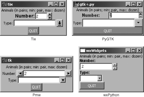
Figure 5-8. Application using various GUIs under Win32.
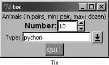
Figure 5-9. The Tix GUI modified version of our application.
You can view the code for all four versions of our GUI in Examples 5-7 through 5-10. Example 5-11, which uses Tile/Ttk (the code is supported in Python 2 and 3) supersedes these first four examples. You will note that although relatively similar, each one differs in its own special way. Also, we use the.pyw extension to suppress DOS command or terminal window pop-ups.
5.4.1. Tk Interface eXtensions (Tix)
We start with Example 5-7, which uses the Tix module. Tix is an extension library for Tcl/Tk that adds many new widgets, image types, and other commands that keep Tk a viable GUI development toolkit. Let’s take a look at how to use Tix with Python.
Example 5-7. Tix GUI Demo (animalTix.pyw)
Our first example uses the Tix module. Tix comes with Python!
1 #!/usr/bin/env python
2
3 from Tkinter import Label, Button, END
4 from Tix import Tk, Control, ComboBox
5
6 top = Tk()
7 top.tk.eval('package require Tix')
8
9 lb = Label(top,
10 text='Animals (in pairs; min: pair, max: dozen)')
11 lb.pack()
12
13 ct = Control(top, label='Number:',
14 integer=True, max=12, min=2, value=2, step=2)
15 ct.label.config(font='Helvetica -14 bold')
16 ct.pack()
17
18 cb = ComboBox(top, label='Type:', editable=True)
19 for animal in ('dog', 'cat', 'hamster', 'python'):
20 cb.insert(END, animal)
21 cb.pack()
22
23 qb = Button(top, text='QUIT',
24 command=top.quit, bg='red', fg='white')
25 qb.pack()
26
27 top.mainloop()
Line-by-Line Explanation
Lines 1–7
This is all the setup code, module imports, and basic GUI infrastructure. Line 7 asserts that the Tix module is available to the application.
Lines 8–27
These lines create all the widgets: Label (lines 9–11), Control (lines 13–16), ComboBox (lines 18–21), and quit Button (lines 23–25). The constructors and arguments for the widgets are fairly self-explanatory and do not require elaboration. Finally, we enter the main GUI event loop in line 27.
5.4.2. Python MegaWidgets (PMW)
Next we take a look at Python MegaWidgets (shown in Example 5-8). This module was created to address the aging Tkinter. It basically helps to extend its longevity by adding more modern widgets to the GUI palette.
Example 5-8. Pmw GUI Demo (animalPmw.pyw)
Our second example uses the Python MegaWidgets package.
1 #!/usr/bin/env python
2
3 from Tkinter import Button, END, Label, W
4 from Pmw import initialise, ComboBox, Counter
5
6 top = initialise()
7
8 lb = Label(top,
9 text='Animals (in pairs; min: pair, max: dozen)')
10 lb.pack()
11
12 ct = Counter(top, labelpos=W, label_text='Number:',
13 datatype='integer', entryfield_value=2,
14 increment=2, entryfield_validate={'validator':
15 'integer', 'min': 2, 'max': 12})
16 ct.pack()
17
18 cb = ComboBox(top, labelpos=W, label_text='Type:')
19 for animal in ('dog', 'cat', 'hamster', 'python'):
20 cb.insert(end, animal)
21 cb.pack()
22
23 qb = Button(top, text='QUIT',
24 command=top.quit, bg='red', fg='white')
25 qb.pack()
26
27 top.mainloop()
The Pmw example is so similar to our Tix example that we leave line-by-line analysis to the reader. The line of code that differs the most is the constructor for the control widget, the Pmw Counter. It provides for entry validation. Instead of specifying the smallest and largest possible values as keyword arguments to the widget constructor, Pmw uses a “validator” to ensure that the values do not fall outside our accepted range.
Tix and Pmw are extensions to Tk and Tkinter, respectively, but now we are going to leave the Tk world behind and change gears to look at completely different toolkits: wxWidgets and GTK+. You will notice that the number of lines of code starts to increase as we start programming in a more object-oriented way with these more modern and robust GUI toolkits.
5.4.3. wxWidgets and wxPython
wxWidgets (formerly known as wxWindows) is a cross-platform toolkit that you can use to build graphical user applications. It is implemented by using C++ and is available on a wide range of platforms to which wxWidgets defines a consistent and common applications programming interface (API). The best part of all is that wxWidgets uses the native GUI on each platform, so your program will have the same look-and-feel as all the other applications on your desktop. Another feature is that you are not restricted to developing wxWidgets applications in C++; there are interfaces to both Python and Perl. Example 5-9 shows our animal application using wxPython.
Example 5-9. wxPython GUI Demo (animalWx.pyw)
Our third example uses wxPython (and wxWidgets). Note that we have placed all of our widgets inside a “sizer” for organization. Also, take note of the more object-oriented nature of this application.
1 #!/usr/bin/env python
2
3 import wx
4
5 class MyFrame(wx.Frame):
6 def __init__(self, parent=None, id=-1, title=''):
7 wx.Frame.__init__(self, parent, id, title,
8 size=(200, 140))
9 top = wx.Panel(self)
10 sizer = wx.BoxSizer(wx.VERTICAL)
11 font = wx.Font(9, wx.SWISS, wx.NORMAL, wx.BOLD)
12 lb = wx.StaticText(top, -1,
13 'Animals (in pairs; min: pair, max: dozen)')
14 sizer.Add(lb)
15
16 c1 = wx.StaticText(top, -1, 'Number:')
17 c1.SetFont(font)
18 ct = wx.SpinCtrl(top, -1, '2', min=2, max=12)
19 sizer.Add(c1)
20 sizer.Add(ct)
21
22 c2 = wx.StaticText(top, -1, 'Type:')
23 c2.SetFont(font)
24 cb = wx.ComboBox(top, -1, '',
25 choices=('dog', 'cat', 'hamster','python'))
26 sizer.Add(c2)
27 sizer.Add(cb)
28
29 qb = wx.Button(top, -1, "QUIT")
30 qb.SetBackgroundColour('red')
31 qb.SetForegroundColour('white')
32 self.Bind(wx.EVT_BUTTON,
33 lambda e: self.Close(True), qb)
34 sizer.Add(qb)
35
36 top.SetSizer(sizer)
37 self.Layout()
38
39 class MyApp(wx.App):
40 def OnInit(self):
41 frame = MyFrame(title="wxWidgets")
42 frame.Show(True)
43 self.SetTopWindow(frame)
44 return True
45
46 def main():
47 pp = MyApp()
48 app.MainLoop()
49
50 if __name__ == '__main__':
51 main()
Line-by-Line Explanation
Lines 5–37
Here we instantiate a Frame class (lines 5–8), of which the sole member is the constructor. This method’s only purpose in life is to create our widgets. Inside the frame, we have a Panel. Inside the panel we use a BoxSizer to contain and layout all of our widgets (lines 10, 36), which consist of a Label (lines 12–14), SpinCtrl (lines 16–20), ComboBox (lines 22–27), and quit Button (lines 29–34).
We have to manually add Labels to the SpinCtrl and ComboBox widgets because they apparently do not come with them. Once we have them all, we add them to the sizer, set the sizer to our panel, and lay everything out. On line 10, you will note that the sizer is vertically oriented, meaning that our widgets will be placed top to bottom.
One weakness of the SpinCtrl widget is that it does not support “step” functionality. With the other three examples, we are able to click an arrow selector which increments or decrements by units of two, but that is not possible with this widget.
Lines 39–51
Our application class instantiates the Frame object we just designed, renders it to the screen, and sets it as the top-most window of our application. Finally, the setup lines just instantiate our GUI application and start it running.
5.4.4. GTK+ and PyGTK
Finally, we have the PyGTK version, which is quite similar to the wxPython GUI (See Example 5-10). The biggest difference is that we use only one class, and it seems more tedious to set the foreground and background colors of objects, buttons in particular.
Example 5-10. PyGTK GUI Demo (animalGtk.pyw)
Our final example uses PyGTK (and GTK+). Like the wxPython example, this one also uses a class for our application. It is interesting to note how similar yet different all of our GUI applications are. This is not surprising and allows programmers to switch between toolkits with relative ease.
1 #!/usr/bin/env python
2
3 import pygtk
4 pygtk.require('2.0')
5 import gtk
6 import pango
7
8 class GTKapp(object):
9 def __init__(self):
10 top = gtk.Window(gtk.WINDOW_TOPLEVEL)
11 top.connect("delete_event", gtk.main_quit)
12 top.connect("destroy", gtk.main_quit)
13 box = gtk.VBox(False, 0)
14 lb = gtk.Label(
15 'Animals (in pairs; min: pair, max: dozen)')
16 box.pack_start(lb)
17
18 sb = gtk.HBox(False, 0)
19 adj = gtk.Adjustment(2, 2, 12, 2, 4, 0)
20 sl = gtk.Label('Number:')
21 sl.modify_font(
22 pango.FontDescription("Arial Bold 10"))
23 sb.pack_start(sl)
24 ct = gtk.SpinButton(adj, 0, 0)
25 sb.pack_start(ct)
26 box.pack_start(sb)
27
28 cb = gtk.HBox(False, 0)
29 c2 = gtk.Label('Type:')
30 cb.pack_start(c2)
31 ce = gtk.combo_box_entry_new_text()
32 for animal in ('dog', 'cat','hamster', 'python'):
33 ce.append_text(animal)
34 cb.pack_start(ce)
35 box.pack_start(cb)
36
37 qb = gtk.Button("")
38 red = gtk.gdk.color_parse('red')
39 sty = qb.get_style()
40 for st in (gtk.STATE_NORMAL,
41 gtk.STATE_PRELIGHT, gtk.STATE_ACTIVE):
42 sty.bg[st] = red
43 qb.set_style(sty)
44 ql = qb.child
45 ql.set_markup('<span color="white">QUIT</span>')
46 qb.connect_object("clicked",
47 gtk.Widget.destroy, top)
48 box.pack_start(qb)
49 top.add(box)
50 top.show_all()
51
52 if __name__ == '__main__':
53 animal = GTKapp()
54 gtk.main()
Line-by-Line Explanation
Lines 1–6
We import three different modules and packages, PyGTK, GTK, and Pango, a library for layout and rendering of text, specifically for I18N purposes. We need it here because it represents the core of text and font handling for GTK+ (version 2.x).
Lines 8–50
The GTKapp class represents all the widgets of our application. The topmost window is created (with handlers for closing it via the window manager), and a vertically oriented sizer (VBox) is created to hold our primary widgets. This is exactly what we did in the wxPython GUI.
However, wanting the static labels for the SpinButton and ComboBoxEntry to be next to them (unlike above them for the wxPython example), we create little horizontally-oriented boxes to contain the label-widget pairs (lines 18–35) and placed those HBoxes into the all-encompassing VBox.
After creating the quit Button and adding the VBox to our topmost window, we render everything on screen. You will notice that we create the button with an empty label at first. We do this so that a Label (child) object will be created as part of the button. Then on lines 44–45, we get access to the label and set the text with white font color.
The reason we do this is because if you set the style foreground, for instance, in the loop and auxiliary code on lines 40–43, the foreground only affects the button’s foreground and not the label—for example, if you set the foreground style to white and highlight the button (by pressing the Tab key until it is “selected”) you will see that the inside dotted box identifying the selected widget is white, but the label text would still be black if you did not alter it such as we did with the markup on line 45.
Lines 52–54
Here, we create our application and enter the main event loop.
5.4.5. Tile/Ttk
Since its inception, the Tk library has established a solid reputation as a flexible and simple library and toolkit with which to build GUI tools. However, after its first decade, a perception grew among the current user base as well as new developers that without new features, major changes, and upgrades, it became perceived as being dated and not keeping up with more current toolkits such as wxWidgets and GTK+.
Tix attempts to address this by providing new widgets, image types, and new commands to extend Tk. Some of its core widgets even used native UI code, giving them a more similar look and feel to other applications on the same windowing system. However, this effort merely extended Tk’s capabilities.
In the mid-2000s, a more radical approach was proposed: the Tile widget set, which is a reimplementation of most of Tk’s core widgets while adding several new ones. Not only is native code more prevalent, but Tile comes with a themeing engine.
Themed widget sets and the ability to easily create, import, and export themes give developers (and users) much more control over the visual appearance of applications and lends to a more seamless integration with the operating system and the windowing system that runs on it. This aspect of Tile was compelling enough to cause it to be integrated with the Tk core in version 8.5 as Ttk. Rather than being a replacement, the Ttk widget set is provided as an adjunct to the original core Tk widget set.
Tile/Ttk made its debut in Python 2.7 and 3.1. To use Ttk, the Python version you’re using needs to have access to either Tk 8.5 as a minimum; recent but older versions will also work, as long as Tile is installed. In Python 2.7+, Tile/Ttk is made available via the ttk module; while in 3.1+, it has been absorbed under the tkinter umbrella, so you would import tkinter.ttk.
In Examples 5-11 and 5-12, you’ll find Python 2 and 3 versions of our animalTtk.pyw and animalTtk3.pyw applications. Whether using Python 2 or 3, a UI application screen similar to that found in Figure 5-10 will be what you’ll get upon execution.
Example 5-11. Tile/Ttk GUI Demo (animalTtk.pyw)
A demonstration application using the Tile toolkit (named Ttk when integrated into Tk 8.5).
1 #!/usr/bin/env python
2
3 from Tkinter import Tk, Spinbox
4 from ttk import Style, Label, Button, Combobox
5
6 top = Tk()
7 Style().configure("TButton",
8 foreground='white', background='red')
9
10 Label(top,
11 text='Animals (in pairs; min: pair, '
12 'max: dozen)').pack()
13 Label(top, text='Number:').pack()
14
15 Spinbox(top, from_=2, to=12,
16 increment=2, font='Helvetica -14 bold').pack()
17
18 Label(top, text='Type:').pack()
19
20 Combobox(top, values=('dog',
21 'cat', 'hamster', 'python')).pack()
22
23 Button(top, text='QUIT',
24 command=top.quit, style="TButton").pack()
25
26 top.mainloop()
Example 5-12. Tile/Ttk Python 3 GUI Demo (animalTtk3.pyw)
A Python 3 demonstration using the Tile toolkit (named Ttk when integrated into Tk 8.5).
1 #!/usr/bin/env python3
2
3 from tkinter import Tk, Spinbox
4 from tkinter.ttk import Style, Label, Button, Combobox
5
6 top = Tk()
7 Style().configure("TButton",
8 foreground='white', background='red')
9
10 Label(top,
11 text='Animals (in pairs; min: pair, '
12 'max: dozen)').pack()
13 Label(top, text='Number:').pack()
14
15 Spinbox(top, from_=2, to=12,
16 increment=2, font='Helvetica -14 bold').pack()
17
18 Label(top, text='Type:').pack()
19
20 Combobox(top, values=('dog',
21 'cat', 'hamster', 'python')).pack()
22
23 Button(top, text='QUIT',
24 command=top.quit, style="TButton").pack()
25
26 top.mainloop()
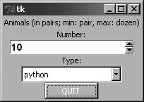
Figure 5-10. The animal UI in Tile/Ttk.
Line-by-Line Explanation
Lines 1–4
The Tk core widgets received three new widgets in Tk 8.4. One of them was the Spinbox, which we’ll be using in this application. (The other two are LabelFrame and PanedWindow.) All others used here are Tile/Ttk widgets: Label, Button, and Combobox, plus the Style class, which helps with the widget themeing.
Lines 6–8
These lines just initiate the root window as well as a Style object, which contains the themed elements for widgets that choose to use it. It helps define a common look and feel to your widgets. Although it seems like a waste to use it just for our quit button, you cannot specify individual foreground and background colors directly for buttons. This forces you to program in a more disciplined way. The minor inconvenience in this trivial example will prove a more useful habit in practice.
Lines 10–26
The majority of the rest of the code defines (and packs) the entire widgetset, which matches pretty much what you’ve seen in this application using the other UIs introduced in this chapter: a Label defining the application, a Label and Spinbox combo that controls the numeric range of possible values (and increment), a Label and Combobox pair letting users select an animal, and a quit Button. We end by entering the GUI mainloop.
This line-by-line explanation is identical to that of its Python 3 sibling shown in Example 5-12, with the only changes being in imports: Tkinter is renamed to tkinter in Python 3, and the ttk module becomes a submodule of tkinter.
5.5. Related Modules and Other GUIs
There are other GUI development systems that can be used with Python. We present the appropriate modules along with their corresponding window systems in Table 5-2.
Table 5-2. GUI Systems Available for Python
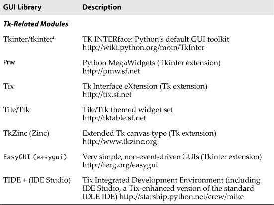
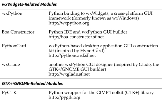
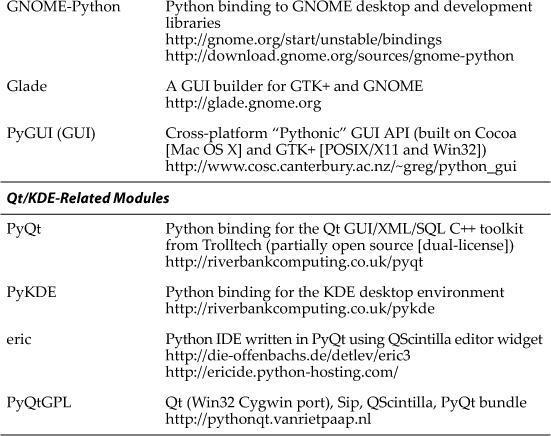
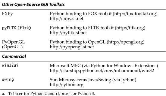
You can find out more about all GUIs related to Python from the general GUI Programming page on the Python wiki at http://wiki.python.org/moin/GuiProgramming.
5.6. Exercises
5-1. Client/Server Architecture. Describe the roles of a windows (or windowing) server and a windows client.
5-2. Object-Oriented Programming. Describe the relationship between child and parent widgets.
5-3. Label Widgets. Update the tkhello1.py script to display your own message instead of “Hello World!”
5-4. Label and Button Widgets. Update the tkhello3.py script so that there are three new buttons in addition to the QUIT button. Pressing any of the three buttons will result in changing the text label so that it will then contain the text of the Button (widget) that was pressed. Hint: You will need three separate handlers or customize one handler with arguments preset (still three function objects).
5-5. Label, Button, and Radiobutton Widgets. Modify your solution to Exercise 5-4 so that there are three Radiobuttons presenting the choices of text for the Label. There are two buttons: the QUIT button and an Update button. When the Update button is pressed, the text label will then be changed to contain the text of the selected Radiobutton. If no Radiobutton has been checked, the Label will remain unchanged.
5-6. Label, Button, and Entry Widgets. Modify your solution to Exercise 5-5 so that the three Radiobuttons are replaced by a single Entry text field widget with a default value of “Hello World!” (to reflect the initial string in the Label). The Entry field can be edited by the user with a new text string for the Label, which will be updated if the Update button is pressed.
5-7. Label and Entry Widgets and Python I/O. Create a GUI application that provides an Entry field in which the user can provide the name of a text file. Open the file and read it, displaying its contents in a Label.
Extra Credit (Menus): Replace the Entry widget with a menu that has a File Open option that pops up a window to allow the user to specify the file to read. Also add an Exit or Quit option to the menu to augment the QUIT button.
5-8. Simple Text Editor. Use your solution to the previous problem to create a simple text editor. A file can be created from scratch or read and displayed into a Text widget that can be edited by the user. When the user quits the application (either by using the QUIT button or the Quit/Exit menu option), the user is prompted whether to save the changes or quit without saving.
Extra Credit: Interface your script to a spellchecker and add a button or menu option to spellcheck the file. The words that are misspelled should be highlighted by using a different foreground or background color in the Text widget.
5-9. Multithreaded Chat Applications. The chat programs from the earlier chapters need completion. Create a fully-functional, multithreaded chat server. A GUI is not really necessary for the server unless you want to create one as a front-end to its configuration, for example, port number, name, connection to a name server, etc. Create a multithreaded chat client that has separate threads to monitor user input (and sends the message to the server for broadcast) and another thread to accept incoming messages to display to the user. The client front-end GUI should have two portions of the chat window: a larger section with multiple lines to hold all the dialog, and a smaller text entry field to accept input from the user.
5-10. Using Other GUIs. The example GUI applications using the various toolkits are very similar; however, they are not the same. Although it is impossible to make them all look exactly alike, tweak them so that they are more consistent than they are now.
5-11. Using GUI Builders. GUI builders help you to create GUI applications faster by auto-generating the boilerplate code for you so that all you have to do is “the hard stuff.” Download a GUI builder tool and implement the animal GUI by just dragging the widgets from the corresponding palette. Hook it up with callbacks so that they behave just like the sample applications we looked at in this chapter.
What GUI builders are out there? For wxWidgets, see PythonCard, wxGlade, XRCed, wxFormBuilder, or even Boa Constructor (no longer maintained), and for GTK+, there’s Glade (plus its friend GtkBuilder). For more tools like these, check out the “GUI Design Tools and IDEs” section of the GUI tools wiki page at http://wiki.python.org/moin/GuiProgramming.