
The user interface for Tableau Public was created to be simple and intuitive. It comes with three primary features (as discussed in Chapter 1, Getting Started with Tableau Public), namely connecting to data, opening your work, and discovering Tableau Public. Since Tableau Public is a tool for data discovery as well as data visualization, the interface is designed to encourage discovery through the drag-and-drop features for data. The user interface for Tableau Public is segmented into separate areas, namely data elements, cards, shelves, and the canvas. The data is also divided into two general categories—dimensions and measures. By understanding how data interacts with the user interface, you can design, configure, and polish chart objects that will be built into worksheets. These worksheets can then be assembled into one or more dashboards.
In this chapter, we will cover the following topics:
- The Tableau Public user interface
- The side bar, including the Data window and the Analytics pane
- The toolbars and menus
- The Columns, Rows, and Filters shelves
- The Marks card
- The Filters and Pages shelves
- The ShowMe card
- In the previous chapter, we discussed how to download and install Tableau Public. We also saw what the start screen looks like and how you can use it to connect to data, explore your own work or that of others, or discover how to use the tool. On opening either a data file or an existing workbook with Tableau Public, you will see the worksheet view.
The starting point that appears when opening a new Tableau workbook is the worksheet view. This is the working area where you can build your dashboard. Let's take a quick look at it.
The visualization shown in the following screenshot uses data from the Federal Aviation Administration (FAA) on every commercial flight at the domestic airports of the United States in March 2015 to average the departure delay (in minutes) for every weekday. You can download this data from http://www.transtats.bts.gov/DL_SelectFields.asp?Table_ID=236&DB_Short_Name=On-Time. Also, you can download the companion Tableau Public workbook from the profile of this book at https://public.tableau.com/profile/tableau.data.stories#!/. We will use this workbook to explore parts of the Tableau Public interface, as shown in the following screenshot:
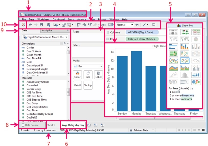
The following are the parts of the user interface that are shown in the preceding screenshot:
- Workbook (1): This is the workbook title, which is the name given to the workbook when you save it
- Toolbar (2): This is where you can save your work, among other functions
- Cards and shelves (3): These are the areas where you can add fields or filters to the visualization
- The View, or the Visualization (4): This is the graph itself
- The ShowMe card (5): This prompts you to create different visualization types based on the data selected
- Sheet tabs (6): This allows you to create, rename, or duplicate sheets and dashboards
- The Status bar (7): This shows the aggregated totals of the marks on your visualization
- Data Source (8): Links back to data sources
- The Sidebar (9): This contains both the Data window and the Analytics pane
- The Start button (10): This takes you back to the home screen
Our discussion about the parts of the user interface starts with the side bar because it contains both the Data window and the Analytics pane. First, we will talk about the Data pane. After that, we will discuss the Analytics pane.
The Data pane is where your data sources load. In addition to listing the fields in your data source either alphabetically or by folder, the Data pane includes visual cues that tell you the type of each field. The following screenshot shows the visual cues of the Data pane:
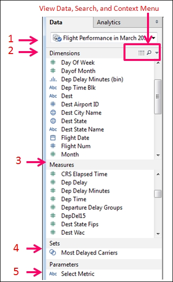
The Data pane has the following five different sections:
- The data source name (1): When you load data, you should provide the data source with a name that identifies the contents, because that is what you and your consumers will see when they download your workbook from Tableau Public. Once you have added several data sources, you can condense their window in order to save space and then select different sources from the drop-down menu.
- The Dimensions pane (2): This includes categorical fields with qualitative data. The Dimensions pane typically consists of a string field, a date field, and a field that has geographical attributes, as well as unique identifiers, such as
IDfields. - The Measures pane (3): This usually includes quantitative fields with numerical data that can be aggregated. Tableau Public will automatically group numerical fields, except the ones with the
IDstring in the name as measures. - The Sets pane (4): This includes user-defined, custom fields that interact just like dimensions and measures do. Sets pane can also create subsets of data that you can use just like dimensions.
- The Parameters pane (5): This includes dynamic placeholders that can replace constant values in calculated fields and filters. Parameters are unique to a workbook and not a data source. You'll see the parameters available in your workbook no matter which data source you are viewing.
From the Data pane, you can can create fields for the Data window, as follows:
- Right-click on the data source to edit it.
- Click on the View Data icon to see a sample of your data set.
- Click on the search icon (the little magnifying glass) to search for fields.
- Click on the arrow that points downwards, which is the Context menu, to create calculated fields, parameters, and change the sort/view options for the Data window.
Within the Data pane, each field name is displayed, but there is also a visual cue that tells you what type of field it is. Field types determine the function and capability of joining data sources. In addition to showing the field type, Tableau Public allows you to change a field's type by right-clicking on it and selecting the Change Data Type option. The following list shows the fields and their descriptions:
- The Abc field: This indicates that the field is a string field, which means that the contents of the field may include letters, special characters, or numbers
- The calendar icon: This indicates a date, datetime, or time field
- The # sign: This indicates a numeric field that can have any type of native numeric format, from
biginttodecimal - The globe icon: This icon indicates that the field has geographic attributes
- The paper clip icon: This indicates that the field is a group that you have created in Tableau Public
- The Venn diagram icon: This indicates a set
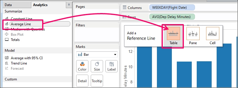
The Analytics pane is next to the Data pane. You can access it by clicking on its header. It provides you with the ability to add summaries, average lines, constant lines, distribution bands, medians, boxplots, forecasts, and other visual analytics to your visualization. You can then customize and edit them by using the reference line and formatting user interfaces.
The Analytics that you can add are dependent on the data elements in your visualization, which include the following:
- Summarized Analytics: This includes the following elements:
- A constant line: This is an integer on an axis that you can input
- An average line: This displays the mean of the measure that you have selected either across the table, pane, or cell
- Median line with 25% and 75% quartiles: This creates a median reference line and a quartile distribution band that you can edit
- A box plot
- Totals and subtotals
- Modeling: This includes the following elements:
- Average (or mean) with confidence intervals
- Trend lines with the most commonly used models (such as linear, exponential, and so on)
- Forecast
- Custom: With the help of this element, you can add custom reference lines and distribution bands as well as box plots, which can also be used by right-clicking on an axis
In the following screenshot, we added the average delay in minutes per day to the graph as a reference line by performing the following operations:
The menus in Tableau Public are arranged and named in a way that is similar to those in other modern applications. Their primary uses are shown in the following screenshot:

Let's look at each of them in the following list:
- File: You can open and save your work to Tableau Public via this menu. Remember that Tableau Public does not auto-save.
- Data: From here, you can add new data sources and modify the existing ones.
- Worksheet: From here, you can create new worksheets, copy the visualization or data on your worksheet, and modify the title, caption, tooltip, and other features.
- Dashboard: This is used to create and format dashboards as well as to add actions.
- Story: This is used to add Story Points, which enhance the narrative capabilities of a data visualization. Story Points refers to a specific function in Tableau Public, and it's beyond the scope of this book.
- Analysis: This can be used to aggregate and disaggregate measures, create forecasts, totals, and trend lines, and create and edit calculated fields.
- Map: By changing the Map options, you can modify background maps and images, and add custom geocoding and WMS.
- Format: This is used to modify the appearance of visualizations.
- Window: This can be used to switch between the presentation and development mode as well as other views in the workbook
- Help: You can use this to get help and manage performance.
The buttons on the toolbar are graphically descriptive of their function. When you roll over each with your mouse, the instructions for use pop up as well.
The buttons of the toolbar include the following:
- The Start button: This takes you back to the Start screen
- The Undo button: This reverses the previous action that you took and can go as far as back to the state of the workbook when you opened it
- The Redo button: This repeats actions that you have reversed
- The Save button: This is critical, as Tableau Public does not auto-save
- Add New Data Source: This adds a new data source
- Add New Worksheet: This adds a new worksheet
- The Duplicate button: This duplicates the current worksheet
- The Clear button: This clears the current worksheet
- The Swap button: This swaps the fields on the Rows and Columns shelves
- Ascending: Sorts in ascending order
- Descending: Sorts in descending order
- Group: This is inactive in the view, as shown in the previous screenshot
- Show Mark Labels
- The Reset cards: These allows you to show legends and cards that you might have hidden or removed
- Fit: This allows you to change the fit of the visualization within a window
- Fit Axes: This allows you to set axis ranges
- Highlight: This allows users to click on dimension members and highlight the related records in other visualizations on the dashboard
- The Presentation mode: This hides the menus, the Data pane, or the Dashboard pane
Tableau Software has a user interface that is very different from that of the older reporting or data analysis tools that you may have used at work or in school. It uses a methodology of dragging and dropping objects for most of the functions that you need to perform to build a visualization. The areas of the workspace where you place objects are called Shelves and Cards. Many of the tasks in this book instruct you to drag a field to the Columns or Rows shelf.
The far right side of the screen is called the canvas area. It is where sheet objects, such as a chart, are built. The chart area itself starts out blank, and you must drag the fields that you want to analyze to an axis, header, or the Columns or Rows shelf, which also determines on which axis or header the field appears.
In the following screenshot, we have highlighted the Columns and Rows shelves, the canvas, the Marks card, the Filters shelf, and the Pages shelf. This screenshot shows how the workspace looks before we add fields to it, and the description is as follows:
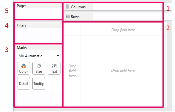
- The Columns Shelf (1) is where you put fields that you want on the horizontal header or the x axis, that is, the axis that goes from left to right. The Rows shelf is where you put fields that you want on the y axis.
- The Canvas (2) has three places where you can drop fields, namely the x axis/header, the y axis/header, and the visualization space itself.
- The Marks card (3) includes the controllers that are used to mark color, size, text label, and shape. In addition to this, the level of the Detail and Tooltip controllers allows you to control the appearance of the visualization. You can change the mark type for each individual axis as well as control the size, color, label, and shape. (Since the Marks card is critical to the function of the visualization, we will describe it in depth in the next section).
- The Filters shelf (4) is where you put fields that you want to use to limit the values included in your visualization. After dragging a field onto the Filters shelf, you can select values in the dialog box of that data element's Filters shelf.
- The Pages shelf (5) allows users to progress through your visualization based on the fields that you put on it. For instance, you can use a date field on the Pages shelf, and your users can click on changes over time without having to manually select the subsequent values.
As discussed earlier, the fields that you place on the Columns and Rows shelves will appear either on the x and y axis, or the row or column headers of the visualization respectively. The following are a few new concepts related to the uses of these shelves:
- Once a field is on the shelf, it is referred to as a pill, or an active field
- A pill on a shelf has a context menu
- Instances of fields that are discrete will appear in blue, and continuous fields will appear in green. The following is a description of both these fields:
- Discrete fields have specific values, and the range of values is finite
- Continuous fields, on the other hand, have an infinite range of values with infinite possibilities
- The Information Lab blog does a great job explaining the differences in Tableau Public; you can have a look at the explanation by visiting http://www.theinformationlab.co.uk/2011/09/23/blue-things-and-green-things/
- In case you have multiple pills on a shelf, the discrete pills appear first because they are used to group fields, and the continuous pills appear second because they are used to measure fields
The following screenshot shows an example of a basic graph that we created:
In order to create the graph shown in the preceding screenshot, we will perform the following steps:
- Drag Flight Date to the Columns shelf from the Dimensions pane.
- Choose WEEKDAY as the part of the data that we want to show.
- Add a set that we created that groups airlines by the criteria that we established.
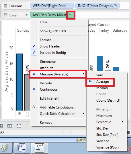
- When we drag the Flight Date field and the set to the Columns shelf, they both appear in the column headers. Drag the Delay minutes from the Measures pane to the Rows shelf.
- When you do this, it defaults to aggregating as a SUM. Click on the Context menu of the pill and change the aggregation to Average.
Next, we will discuss how to use the Marks card to add color and labels.