Although the Quick Filter can be applied to the worksheets using its data source, it can't be applied to worksheets using other data sources. In order to filter multiple data sources with one list, we need either a reference table or a parameter.
While you can use parameters for many important functions, such as determining which worksheets appear on a dashboard, there are some disadvantages:
- Only one value can be selected at a time
- The list of values for static parameters, and they need to be maintained manually
- Parameters are related to the Data sources through the use of calculated fields, which can be complicated to maintain
In the next few exercises, we will accomplish several tasks via the creation of three parameters. We will create parameters that integrate with calculated fields to:
- Show a single year in one graph and a range of years in another graph
- Filter across multiple Data sources
- Allow users to select the detail that needs to be explored
There are a couple of key concepts about parameters that you should keep in mind as we go through this chapter:
- Each parameter is unique to a workbook and not to a Data source.
- Each parameter has a name, data type, format, and value.
The first task that we need to accomplish by creating a parameter involves using a Year filter for the dashboard. Two of the visualizations, namely the map and the line graph, have a Time dimension. We want to create a filter from which users can select the year. When a user selects a year, the map will be filtered to show only that year, but the line graph will show five years on either side of dashboard.
In order to build this functionality, we will need to create three new elements. The descriptions of these elements are as follows:
- The
Yearparameter: This has a data type ofINTand a range of values - A Calculated field: This will be used as a filter on the map so that the year that we are showing in the map matches the selection from the parameter
- A Second Calculated field: This will be used as a filter on the line graph that allows five years on either side of the selected year
Let's create a Year parameter by performing the following steps:
- Create a new parameter by clicking on the Context menu in the Data window or by right-clicking on the white space in the Data window and selecting Create Parameter.
- Give the parameter a name that represents what you want users to do. Ensure that the name does not match any of the field names in your data source. Otherwise, this will cause issues.
- We named our parameter Select a Year.
- Select the data type of the parameter. When you are using a parameter in a Calculated field, you can convert it to different types. We want ours to be a string because Year is a string field in the Data source.
- If we had selected a different type of field, we would have had to format it accordingly. One of the reasons why we left it as a string is that we won't be running the risk of displaying improperly formatted values.
- Select List for the Allowable values, as shown in the following screenshot:
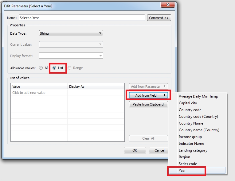
- You have the option of populating the list from your own list of values or from one of the fields in either of the two Data sources.
- Click on the Add from Field button and then select the Year field.
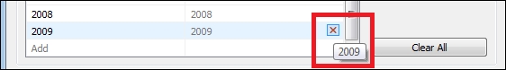
- Now, the list of values matches that of the source field from the Data source. But from the bottom of the list of values, remove the years after 2008 because the data collected for these years is not complete. You can do this by hovering the pointer of the mouse over the row and clicking on the X that appears to the right of a values, as shown in the following screenshot:
- Also, keep in mind that Tableau is case-sensitive, which means that the contents of the parameter list must match the contents of the field list.
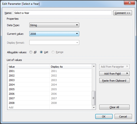
- The final parameter has been set to a default of 2008, as shown in the following screenshot:
- Now, click on OK.
You now have a parameter that you can use to filter certain fields. In the following steps, we will create two new calculated fields—the first will filter the map to show only the Year selected, and the second will filter the line graph to show five years on either side of the Year selected:
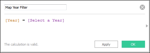
- On the map's worksheet, the first task is to create a new Calculated field called Map Year Filter.
- The formula is simple; it is Boolean expression, and it tells Tableau Public that we want only the Year values that map the parameter selection, as shown in the following screenshot:
- Remove the filter on the Year field, which is a blue pill on the Filters shelf.
- Drag this new field from the Dimensions pane to the Filters shelf and select True.
- Apply this filter to the Region KPIs worksheet.
- Right-click on the Select a Year parameter, which is below the Measures in the Data window, and show the parameter control.
Next, we will create a Calculated field for the line graph that filters to show five years on either side of the parameter.
Open the worksheet with the line graph, perform the following steps to create a Calculated field:
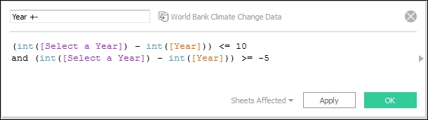
- Create a new Calculated field and name it Year +-.
- In the following screenshot, we used a formula to convert both the parameter and field to integers so that we can perform mathematical functions on them. If you want to, you can create another parameter to allow users to input the number of years that they would like to see on either side and then replace the instances of 5 with it:
- Click on OK.
- Add this new field from the Measures pane to the Filters shelf and select True.
Now, we will return to the dashboard and continue making modifications. The first thing that we want to do is show the parameter.
- From the Context menu for the map worksheets on the dashboard, click on Parameters and then click on the Select a Year parameter.
- The parameter automatically appears next to the Region Quick Filter. It would look better if the two were stacked. So, add a Vertical Layout Container to the Horizontal Container with the header and filter, and then move the Filter and parameter into it.
- Add an extra 100 pixels of height to the dashboard.
We can modify the header of the dashboard to reflect the selection of a year as well. The title is hard-coded to identify CO2 emissions from 2008, but if we select a different year from the parameter, such as 2005, then we need to ensure that the title is updated.
We can add the parameter to the title by performing the following steps:
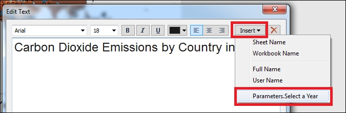
Since this title is actually a text object on the dashboard and not a specific worksheet title, we cannot insert field values, but we can insert parameters. It's always a good idea to make it very obvious what your user is looking at so that they don't run the risk of assuming the wrong thing.
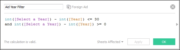
Parameters are useful when you need to filter across multiple Data sources. We loaded a second Data source, which contains data related to the foreign aid given to various countries by the United States since 1948, into our workbook. There are several fields that have the same name, namely Region, Country, and Year. We created a simple bar graph that shows the total aid in dollars over a period of time on a new worksheet called Aid Graph.
We created a filtering field for this visualization that shows only the Year selected in the parameter and the 30 years before it. In this case, we're using the same Year parameter that is being displayed on the dashboard. We also created a Calculated field, referencing it in the Foreign Aid Data sources, and then added it to the Filters shelf, just like we did on the map and line graph, as shown in the following screenshot:
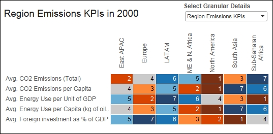
We will create a new parameter that allows users to select the visualization that they wish to view in the third of the last workbook, which is where we show granular details. Currently, the Region KPIs worksheet is displayed there, but we would like to provide users with the option of deciding what to see in the workbook.
In order to do this, we will create a new parameter. Then, we will create a Calculated field that can be used as a filter in each Data sources.
Let's create a parameter by performing the following steps:
- Create a new parameter and name it Select Granular Details, which is a string with a list of two possible values.
- We have capitalized these two values carefully because Tableau Public is case-sensitive. We will include following values in a Calculated field in the next step. The values are shown in the following screenshot:
- Region Emissions KPIs
- Foreign Aid Dollars
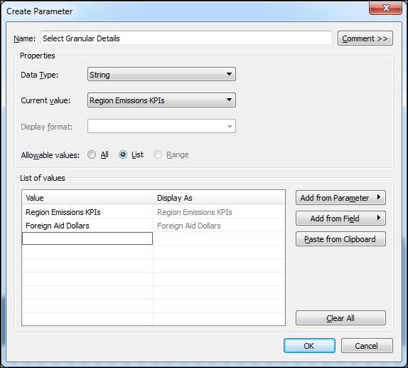
- Click on OK.
- In the Foreign Aid Data source, create a new Calculated field. This field will use a case statement to create a string output based on the parameter's selection.
- We named the field Granular Selection Filter, and we wrote a case statement that states that if Region Emission KPIs is selected, then the output is emissions; otherwise, it's Foreign Aid. If there were more than two values, then we would have another condition, as shown in the following screenshot:
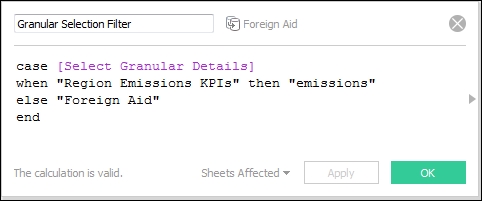
- Click on OK.
- Add the Granular Selection Filter field to the Filters shelf of the Aid Graph.
- The string value that corresponds to the current value of the parameter will be displayed in the Filter list. Select it and click on OK.
- Select Show Parameter Control and select the other value. The graph should now appear.
- Right-click on the Granular Selection Filter field and select Copy. We'll paste it exactly as is into the Data source that contains the other worksheet on that we want to work.
- Go to the Region KPIs worksheet. In the Dimensions pane, right-click on it and select Paste. The field that you just created now exists in both the data sources.
- Right-click on the Select Granular Details parameter and select Show Parameter Control. You have to do this on every sheet on which you'd like to see it.
- Ensure that the value selected corresponds to the graph that you're viewing.
- Drag the Granular Selection Filter field to the Filters shelf and select emissions, as shown in the following screenshot:
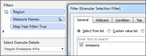
- Click on OK.
Now, we can go back to the dashboard and add the parameter and the new visualization.
We will stack the visualizations into a Vertical Layout Container, and we will hide the title of each so that no space is unnecessarily taken up when it isn't selected. Then, we will modify the space in the title names of account for the parameter selection by performing the following steps:
- First, add a Vertical Layout Container to the bottom of the dashboard and add the Region KPIs and Aid Dollars worksheets into it.
- When you do this, the the parameters that appear in these worksheets will be added to the container with the filter and parameter at the top.
- Add a Horizontal Layout Container within the new Vertical Layout Container.
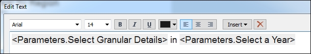
- Change the title for this area so that it is not floating and drag it into the Horizontal Layout Container.
- Drag the parameter from the top into the Horizontal Layout Container as well.
- Modify the text for the title so that it represents exactly what we can see in the following screenshot:
- Right-click on the title for the Aid Graph and hide it.
- Note that when you change the parameter value, both the title and the visualization change.
- If you're having issues with the visualizations changing properly, the first thing that you need to check is the capitalization and spelling in the case statement. It's fairly common to make mistakes when writing these statements. Therefore, you should check them to ensure that you have written conditions that match the parameter values perfectly: